Chapter 15: API Analytics and the Developer Portal
Toward the end of Chapter 2, Introducing API Connect, you were briefly introduced to API Connect components and how they can assist your adoption of digital transformation and modernization. Now is a good time to learn in deeper detail two features of API Connect specifically related to how it impacts your digital transformation and/or modernization effort. Those two key features are the Developer Portal and analytics. In this chapter, you will see API Connect has several valuable components and having a better understanding of them will be helpful in your understanding of how best to take advantage of their capabilities.
Here, we're going to cover the following main topics:
- Customizing the Developer Portal
- Introducing analytics
- Creating visualizations and dashboards
Some of the new skills you will learn from this chapter are the following:
- Understand how to apply simple Portal changes.
- Learn about the basic configuration of the Developer Portal.
- Understand how to change themes to match your corporate branding.
- Identify where analytics are presented to improve your company's insights.
- Learn how to create new visualizations and dashboards to meet your needs.
Creating new user experiences is always fun and you'll understand how easy it is to do by the end of this chapter. You won't need any other tools to install so let's get started.
Customizing the Developer Portal
As you learned in Chapter 1, Digital Transformation and Modernization with API Connect, social interaction in digital transformation can bring valuable marketing value and product awareness but on the flip side, this social interaction can also bring negative attention. That is why customizing your Developer Portal is as important as developing APIs. In this section, you will learn about the beneficial features provided by API Connect and its Drupal implementation of the Developer Portal. You'll begin by learning about what comes out of the box with Drupal 9 and how API Connect has hooks to make the experience a simple and natural experience for the developer. The out-of-the-box theme of the API Connect Drupal Developer Portal is shown here:
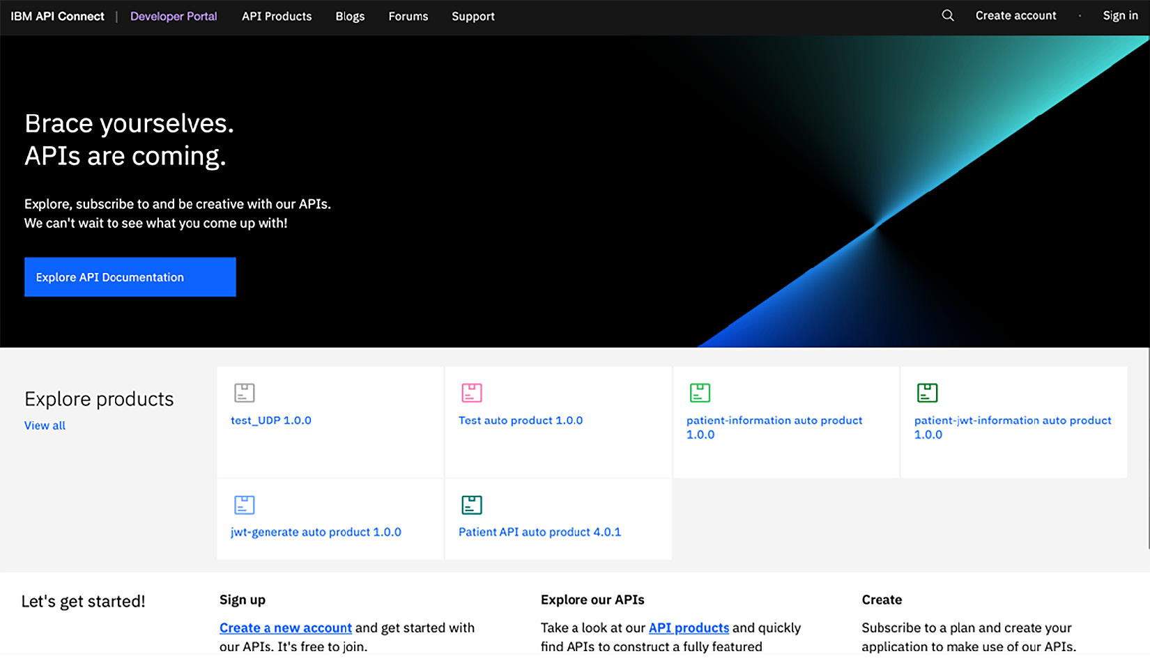
Figure 15.1 – API Connect Developer Portal default view
It is rather bland, but does show the API components that your consumers will be looking to discover and subscribe to. Wouldn't it be nice to make it match your company branding? We will start on learning these capabilities in the next section.
Reviewing Drupal 9 capabilities
Drupal 9 is an open source content management system. IBM has improved the open source implementation to provide an enterprise version that is more secure and has API Connect modules that extend the developer's experience.
Important Note
It should be noted that the Portal implementation does not support PHP framework code.
Drupal supports many additional modules that can be added. Some of the out-of-the-box capabilities are as follows:
- Content creation: Build new content to welcome the potential consumers and provide additional documentation to the developers about your APIs.
- Blog capabilities: Allow a provider to blog on the ongoing development activities at your company, providing valuable information for app developers.
- Forums: Provide forums to allow developers to learn and discuss your APIs and much more.
- Social media links: Links to social apps including LinkedIn, Twitter, and Facebook.
- Security add-ons: This helps the organization secure and lock down the portal from malicious activities.
There are many more features that you can find in the Portal documentation at https://www.ibm.com/docs/en/api-connect/10.0.x?topic=apis-configuring-developer-portal-site.
To provide the best user experience with the Developer Portal, having a resource that is skilled in Drupal is required, but for simple extensions, a combination of administrator capabilities and some web design skills such as Cascading Stylesheets (CSS or Sass). To understand how to customize Drupal, you need to be familiar with Drupal 9 concepts. By understanding these concepts, it will be easier to create new content. The node is the first concept you should learn.
Node types can be thought of as content objects. Items such as pages, blog posts, or forum topics are nodes. When modifying how you will navigate around the portal, you work with menus and blocks. Various types of fields can be added to add more metadata to the node. Regions are the areas to which the content just discussed can be added. The content within regions is contained in blocks. Drupal operates using a layered approach. Figure 15.2 shows those layers.
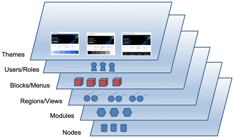
Figure 15.2 – Overview of Developer Portal components
The layers allow you to apply these features to build your portal site to your specification. You define what and where you want to place using content blocks and menus and apply these to one of the packaged themes provided with the API Connect installation. By having layers, you can make updates to layers independently without impacting the existing view. Then whenever you wish to apply new visual components, you simply apply the changes where you want them.
To further your understanding, Figure 15.3 shows a visual layout of how you can build your user experience:
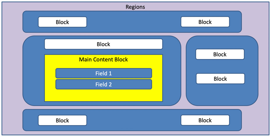
Figure 15.3 – Drupal layout
All of these regions and blocks form the theme of the portal. A Drupal theme is divided into regions where you can place blocks or create your own custom blocks. You have the ability to create and extend themes either by creating them from scratch or using an existing theme created by IBM for API Connect or the Drupal community.
Tip
It is a recommended practice to utilize the existing theme provided by IBM and create a sub-theme for your customization.
The IBM Documentation website provides a considerable list of tutorials on the Developer Portal. You can visit the site at https://www.ibm.com/docs/en/api-connect/10.0.1.x?topic=apis-developer-portal-tutorials.
There are many tutorials on how to customize Portal that will help your organization provide the user experience you desire. With that in mind, what you will learn in this section is what you can accomplish as the Drupal administrator. These are simpler cases that may not require web developer skills.
Tip
When developing the portal look and feel on Drupal 9, you should understand the concepts of blocks and Drupal theming. There are many websites to learn these capabilities, but as a starting point please see the official Drupal documentation at https://www.drupal.org/docs.
With that short introduction out of the way, it's now time to learn about customization. Let's begin with some of the activities the Portal administrator can perform.
Customizing the Portal as the administrator
Since there are so many tutorials already available in the IBM Documentation on API Connect on how to customize the portal user interface, this section will focus on some customizations not covered in the documentation, but that are beneficial.
Those customizations are as follows:
- Removing blogs and forums if not needed
- Adding backup administrators to allow customization using the administration role
- Adding new themes envisioned by your marketing teams
- Updating the Welcome Banner
We start with learning how to remove blogs and forums.
Removing blogs and forums
Not every organization desires to offer blogs or forums to its consumers – for instance, if you are using API Connect for on-premise utilization between the internal departments of an organization. So, if you want to disable the links to the blogs and forums you can do that with just a few quick clicks. Figure 15.4 shows the admin user logged on to the portal.
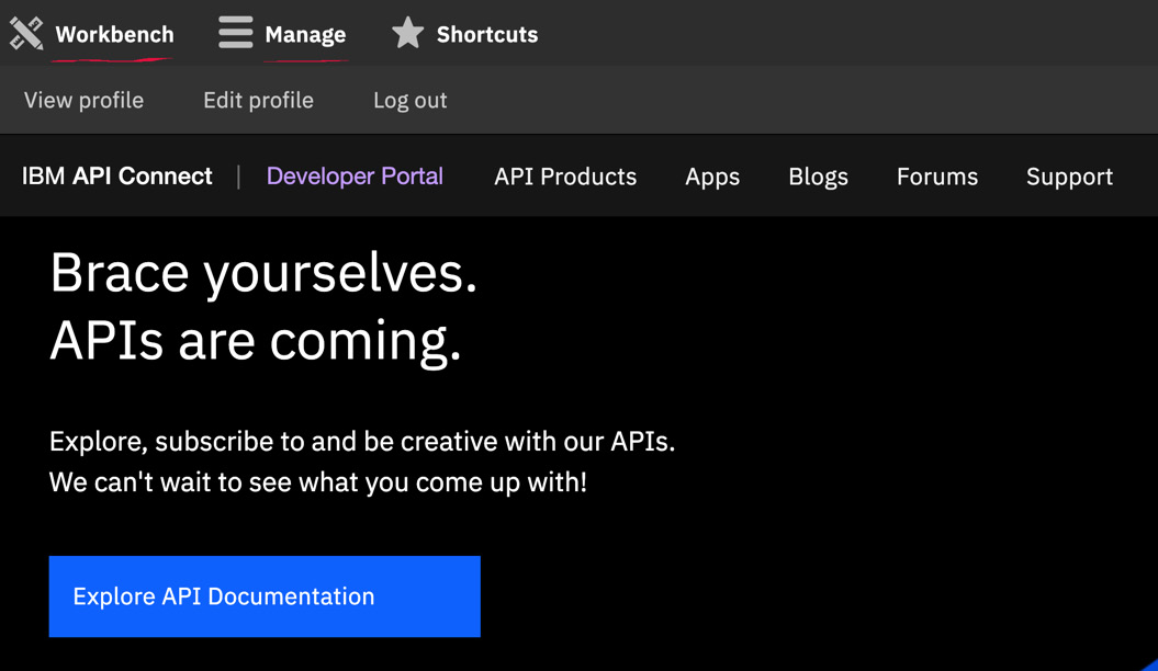
Figure 15.4 – The administrator view
You can see that there are some additional menu links for Workbench and Manage. You will be using the Manage menu to begin your customization.
Reminder
The admin user is established when the provider organization creates a Catalog and assigns a new portal instance. When that occurs, an email is sent to establish the password for the admin account. You use this account to perform customization on the portal.
In Figure 15.5, you can see the main menu for the Developer Portal. You will be removing the menu options for Blogs and Forums.

Figure 15.5 – Main menu showing Blogs and Forums
You'll begin by logging on as the admin for the particular Catalog instance of the Developer Portal. Once logged on follow these steps:
- Navigate to Manage | Structure | Menus | Main navigation. Figure 15.6 shows the displayed screen:
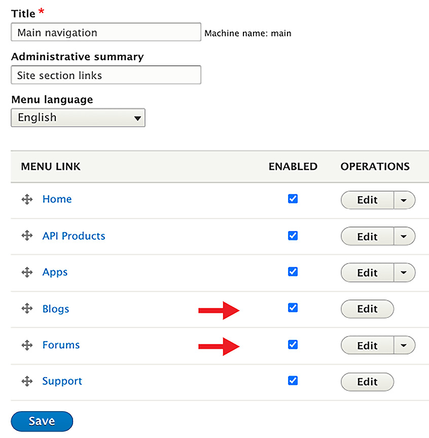
Figure 15.6 – Removing Blogs and Forums
As you can see, it shows the menu items displayed in the menu. You'll want to disable Blogs and Forums.
- To disable the inclusion of Blogs and Forums simply uncheck those items as shown in Figure 15.6. This will remove them from the menu but not remove them from the system.
- Once done, click the Save button and click Back to Site in the upper left corner.
When the screen returns, you will notice that Blogs and Forums are no longer displayed.

Figure 15.7 – An updated menu without Blogs and Forums
Having a backup administrator account is important because you don't always want to use the default admin user to perform customizations. You'll learn how to do that next.
Adding another user with the administrative role
It's easy to make changes as an admin user but once those changes occur it may be a while before you need to make additional changes. It's not unheard of that the admin password is forgotten. This is why you want a backup user with administration permissions. This user should be someone from your corporation and not an external consumer. Here is how you accomplish that:
- With the admin user logged on, navigate to Manage | People. You will see a list of users who have joined the portal. Figure 15.8 shows a sample of the list:
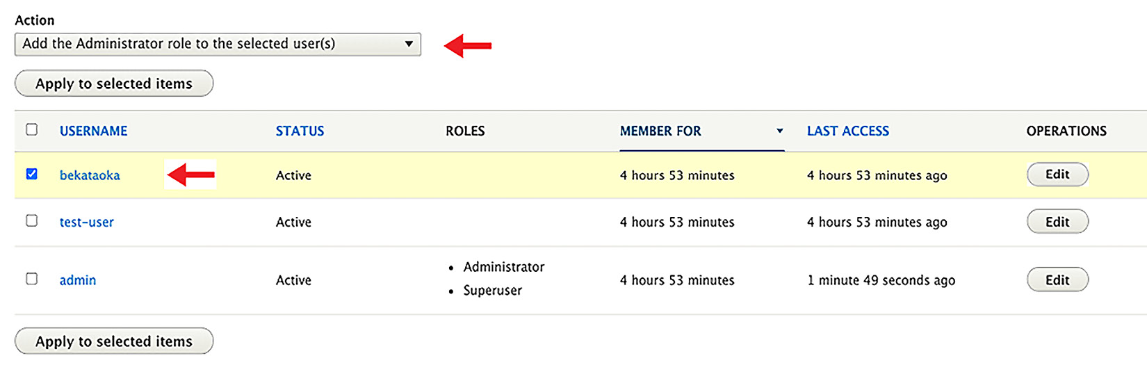
Figure 15.8 – Always add a backup administrator
As you can see there are three usernames. There is also an Action called Add the Administrator role to the selected user(s). Ensure that is the action listed.
- Select a username that you wish to add to the administrator role and click Apply to selected items.
You will now see that under the ROLES column the user has been given the administrator role.
You have now added a backup administrator, which you can use as the primary portal web designer.
Next, you need to know the steps for how to modify the default look and feel of the Developer Portal. You'll do that next.
Creating a sub-theme from the API Connect default theme
Everybody loves choices. When it comes to user experience and brand awareness your marketing team will definitely be looking for color changes, logo updates, and default content updates. In this section, you'll learn the basics of taking the existing default API Connect theme and making some minor modifications so you can learn how to do updates. Let's begin with the following steps:
- Log on as a user with the administrator role and navigate to Manage | Appearance | Generate sub-theme.
- Provide a sub-theme name and sub-theme type CSS.
- Under Template, choose one of the six provided themes. See Figure 15.9. In our example, we chose Ruby Red.
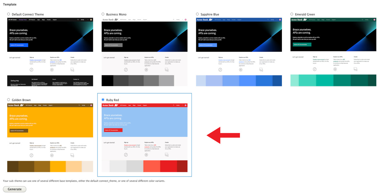
Figure 15.9 – Option themes to create sub-themes
- Click Generate to create the sub-theme.
- When your sub-theme is created, download the sub-theme to your workstation. The file is zipped so you need to unzip it.
- Locate the CSS folder and edit the overrides.css file. This is where you or your web designers can make color changes. If you do not want to make color changes you can skip this step.
- Save your changes and re-zip the download. Now go back to your portal and navigate to Appearance | Install new theme.
- Upload your updated ZIP file using the Browse button. Click Install.
- You'll see a success message and Next steps. Select Enable newly added themes as seen in the following figure:
Figure 15.10 – A new theme has been installed
- You have now created a new sub-theme. Click Back to Site to review the differences.
Your final change will be to update the Welcome Banner from Brace yourself. APIs are coming to Digital Transformation and Modernization with API Connect. Building APIs that transform your enterprise.
- While on the home page move your mouse to the section where Brace yourself is shown. A pencil should appear in the right corner of that section if you click anywhere in that area. Click the pencil to bring up the editor and choose Edit.
- Change the text in the Body field from Brace yourself. APIs are coming to Digital Transformation and Modernization with API Connect. Building APIs that transform your enterprise
See Figure 15.11 as a guide:
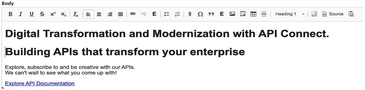
Figure 15.11 – Updating the Welcome Banner
- Click Save and you are now done. Admire your work.
You have completed some simple activities to prepare you for future updates. You learned how to navigate the portal site using the administrator account. I'm certain that this will spur your marketing team to ask more questions on how to improve the site. With the tutorials provided in the IBM Documentation on API Connect you should be able to continue to customize your portal to your satisfaction.
Another component that is equally as important as the Developer Portal is the analytics service. Analytics can provide you and your organization important information about the use and performance of your APIs. Let's explore the analytics capability next.
Introducing Analytics
This section will introduce the analytics that comes with API Connect and how to begin customizing it for your needs. The analytics that come with API Connect is implemented with open source from the Elastic Stack (ELK – Elasticsearch, Log Stash, and Kibana). In version 5 of API Connect, this component was installed on the management server. With version v10, analytics is separated from the management service and provides greater flexibility and better performance. Analytics servers are associated with Gateways. The administrator configures this relationship in the Topology view in the Cloud Manager. The Gateway collects the metric data for each API executed and sends the data to the associated analytics server.
Architect Tip
While this book is primarily for architects and developers, understanding some basic planning and configurations for analytics can be valuable knowledge. For instance, you should consider using MQ queueing to ensure your Gateway analytics aren't lost due to the loss of network storage. This will provide extra reliability in maintaining your analytics. You should also be aware that you can have multiple Gateways associated with a single Analytics service, but keep in mind that each Gateway can be associated with only one Analytics service. There are other planning considerations an architect should be aware of so you should review the IBM documentation on planning the Analytics deployment: https://www.ibm.com/docs/en/api-connect/10.0.x?topic=deployment-planning-your-analytics.
Understanding the analytics initial setup
Although the deployment of the Analytics server is outside the scope of this book there are a few contextual bits of information that will help you better understand the scope of the analytics provided by API Connect. Having this background will help you understand how analytics are captured and certain organizational traits that will make your analytics more aligned to your deployment. Next, you will learn, at a high level, how the analytics server is set up in the Cloud Manager topology.
Associating the Analytics server in the Cloud Manager topology
After your API Connect components (Cloud Manager/API Manager, Gateways, Portal, and Analytics server) are installed the cloud administrator will set up within the default availability zone the API Connect components. You can set up components in different availability zones but that is a topic beyond the scope of this book.
In Figure 15.12, you see the Topology page from the Cloud Manager user interface. What you are seeing are the components that are implemented in the Default Availability Zone. The Cloud Manager is not shown because it exists at a higher level and is the manager of the overall topology across the availability zone.
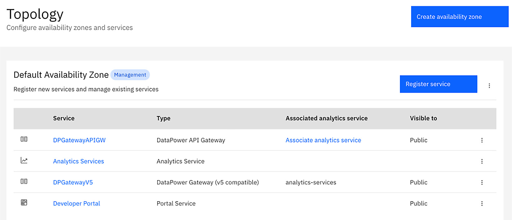
Figure 15.12 – Topology showing associating Analytics with a Gateway
Looking closer at Figure 15.12 you will see two references to DataPower Gateways. DPGatewayV5 is for the version 5 compatible Gateway and DPGatewayAPIGW is for the new higher performance Gateway simply known as the API Gateway. You also see a single Analytics Service that was deployed. In this simple case, there is only one analytics server. That is not a limitation because you can have more analytics servers deployed in different availability zones or the same availability zone as the other services. There is also a Portal server, which you learned about earlier in this chapter.
When the administrator is configuring the topology, one task is to associate a Gateway to an Analytics server. In Figure 15.12, you see that the DPGatewayV5 service is associated with the analytics-services service. So that means all analytics generated by the DPGatewayV5 Gateway will be sent to that specific Analytics Service. You'll also notice that DPGatewayAPIGW is not associated yet because it shows the Associate analytics service link.
If the administrator wants to associate that Gateway with the same analytics service, they simply click the link and will be presented with a popup to perform the association. Figure 15.13 shows that popup:
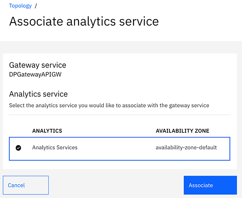
Figure 15.13 – Associate an Analytics server with a Gateway
Once this association is completed the Cloud Manager interacts with the Gateway to inform the Gateway to send its analytics to the associated analytics service. Once the Gateway is associated with an analytics service it cannot be associated with another analytics service.
You have been briefly introduced to how the topology setup is accomplished and should have a good idea of how Gateways send analytics to a designated analytics service. There are more sophisticated scenarios that can be configured. If you are interested in diving even deeper into this subject, you can review https://www.ibm.com/docs/en/api-connect/10.0.x?topic=topology-creating-availability-zone to learn more about the flexibility of availability zones.
Now it's appropriate to begin learning how to use the Analytics user interface within API Connect. You'll be learning where you can find the Analytics user interfaces and how to create or modify existing dashboards and visualizations.
Viewing analytics
There are several locations where you can view analytics using the API Connect management and portal interfaces. What if your company utilizes a different tool to report analytics, such as Splunk? API Connect allows you to download the analytics information to your own servers to use alternative tools to render them. We won't cover that in this chapter, but you should be aware that the capability exists.
The first place you can review analytics is within a Catalog. You log on to the API Manager and select Manage to see your Catalogs. Once you choose a Catalog, you then click on the Analytics tab as shown in Figure 15.14. If your Analytics tab is not enabled, it is because the associated Gateway for the Catalog has not been associated with an Analytics service.
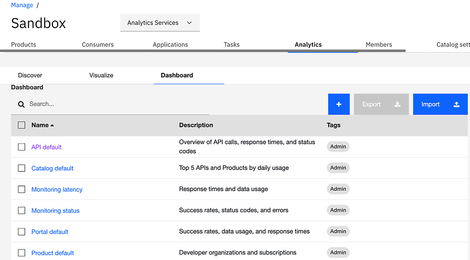
Figure 15.14 – Analytics default dashboards
The dashboards you see in Figure 15.14 are the default dashboards provided by API Connect. A dashboard is a view of a comprised list of visualizations. Visualizations are the metrics rendered in various graphs and charts that you define. You will learn this in the Creating visualization and dashboard section later in the chapter. Dashboards can also be customized to contain relevant visualization.
You will also find Analytics under Spaces if you have created Spaces within a Catalog. The view is identical to Figure 15.14. You learned about Spaces in Chapter 3, Setting Up and Getting Organized.
The other place you can review analytics is within the Developer Portal. You may notice in Figure 15.14 that there is a Portal default dashboard. This default out-of-the-box dashboard contains relevant information for the API consumers. As a consumer, you find those analytics under the Applications link on the portal. Figure 15.15 shows the default dashboard for the portal:
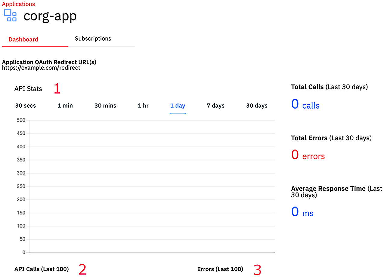
Figure 15.15 – Developer portal default analytics view
A consumer who has created an application with your APIs will be interested, for example, in various API statistics organized by time periods, total API Stats, Total Errors, and Average Response Time. You can see them in Figure 15.15 as numbered items 1 through 3.
It should be noted that the consumer cannot create their own dashboards but they can request that the portal dashboard be customized by someone within the provider organization.
You now know where to find the Analytics user interfaces in API Connect. It's time to understand how analytics are organized. That organization is done with dashboards and you'll learn that next.
Understanding dashboards
In the last section, you heard about dashboards, but what are they really? A dashboard is where you aggregate various visualizations to provide a custom view. There are several out-of-the-box dashboards that you can choose from, or you can create your own customized dashboards. When you navigate to any Catalog and click on the Analytics tab, you are by default shown the Dashboard view as shown in Figure 15.16:
Figure 15.16 – Default dashboards
As you can see there are six default dashboards provided by API Connect as follows:
- API default
- Catalog default
- Monitoring latency
- Monitoring status
- Portal default
- Product default
If you were to click on the API default you would see various visualizations added to the API default dashboard for you to review. This is shown in the following figure:
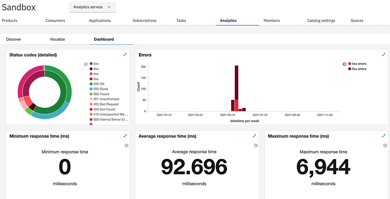
Figure 15.17 – Default API dashboard visualization
Figure 15.17 is just one example of the provided dashboard. You should peruse the others to see how they are constructed.
Understanding the analytics hierarchy
As you may recall, analytics are associated with a Gateway. In API Connect, Catalogs have associated Gateways. So, dashboards are related to the Gateway associated with an analytics service. Since portals are also associated with a Catalog it makes sense that the Developer Portal dashboard is also associated with the same analytics server. You see this relationship in Figure 15.18:
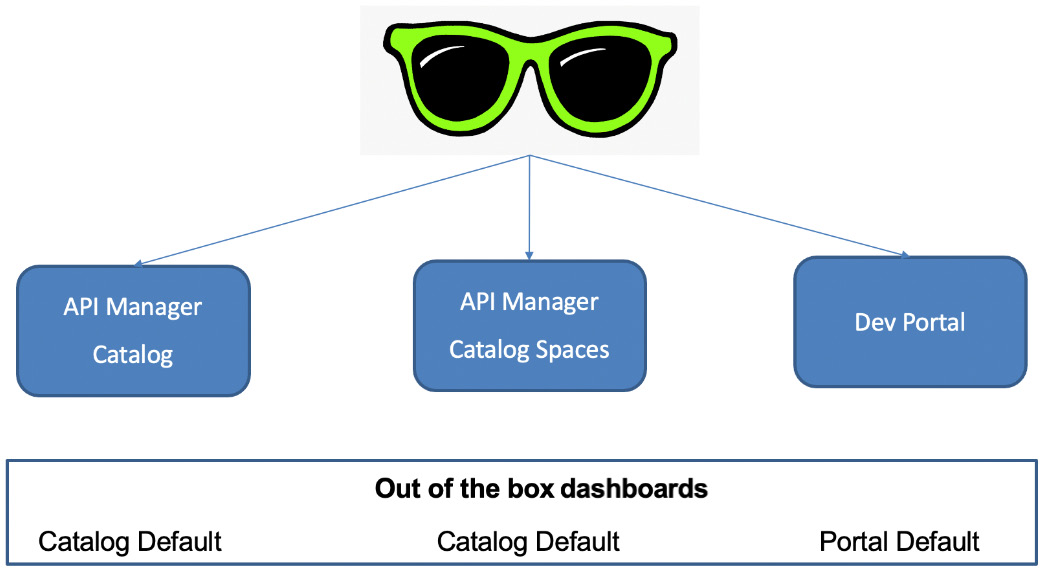
Figure 15.18 – Dashboard and Catalog/Space relationship
When you view the dashboards, the out-of-the-box implementation supports dashboards at the Catalog and Space levels as well as for the Developer Portal. A hierarchy exists between Catalogs and Spaces. Catalog analytics visualization and dashboards are propagated over to a Space. If you want to modify the search criteria, the dashboard, or a visualization seen in a Space of a Catalog, you must clone the Catalog dashboard first before modification. See https://www.ibm.com/docs/en/api-connect/10.0.1.x?topic=page-cloning-dashboard for more details. For clarity's sake, it doesn't work in reverse. You cannot clone a Space dashboard to update a Catalog dashboard.
How does API Connect identify which analytics object was created within this hierarchy? It utilizes tags. Tags are used to designate the originator of the dashboard, visualization, and search. Figure 15.19 shows the various tags and where they are related:
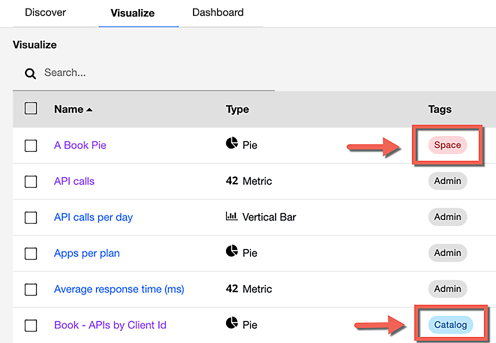
Figure 15.19 – Tags identify the location of the visualization
As you can see in Figure 15.19, A Book Pie has a tag that signifies that it was created for Space whereas Book – APIs by Client Id was created at the Catalog level. The Admin tag represents visualizations that are part of the default set of visualization provided by API Connect.
So now that you know where to find the analytics it's time to learn how to navigate within the analytics to find metrics. Let's learn about searching next.
Searching within analytics
Collecting data for metrics is necessary and with that data, you need to be able to categorize it and display it in multiple ways. When you launch the analytics dashboard user interface you are presented the default time range of Last 15 minutes. Clicking on that link allows you to choose a different time range. That view is shown in the following figure:
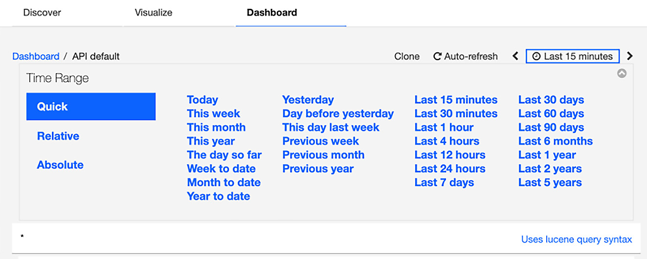
Figure 15.20 – Narrowing collection time
Figure 15.20 shows you the Quick time range that has a list of predetermined time ranges. If you want to be more specific you can choose either Relative or Absolute to refine your search even deeper. Relative gives you the ability to specify a start time relative to the current time. So, if you were looking for events that happened 20 minutes ago or 3 days ago, you could set those values to retrieve that information. Absolute provides you the capability to set a specific date range and retrieve information only for those days. For instance, if you were to specify May 3 to May 13, 2021, you would be able to see the information for those 10 days.
You can also use the Discover tab to customize searches. When you do a search, the default response shows you all elements that were captured and you may not need to see all the elements. You can select individual display elements by clicking on the Available Fields items on the left side of the page. Figure 15.21 provides an example of all the available elements displayed:
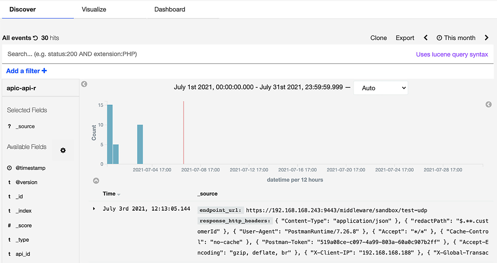
Figure 15.21 – Select elements from Available Fields
So, if you were to select api_name, catalog_name, product_name, and transaction_id, your new search results screen would look like this:
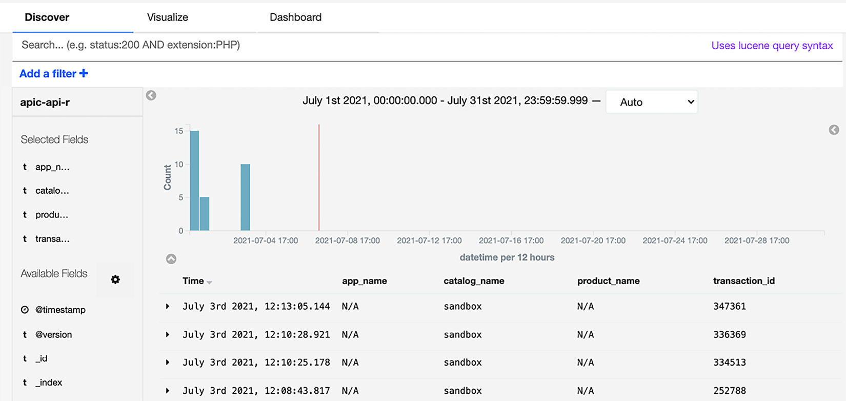
Figure 15.22 – New display items in search
As you can see in Figure 15.22, the presentation is much cleaner and more specific to what may be relevant. If you like this type of presentation, you can then save it with a search name and it will be available for future searches.
Narrowing your search criteria
Now that you know how to organize the data that is presented back to you, you can learn how to apply search criteria to narrow the number of returned results. To apply a query, you simply provide the name of the field and the value to search on, separated by a colon.
As you recall you have a list of the Available Fields that are located on the left side of the search panel. You can scroll through the list and select a field to run your query. For instance, if you wanted to find all APIs with the api_name of member-api, you can specify that in your query as api_name:member-api. Figure 15.23 shows how that would render:
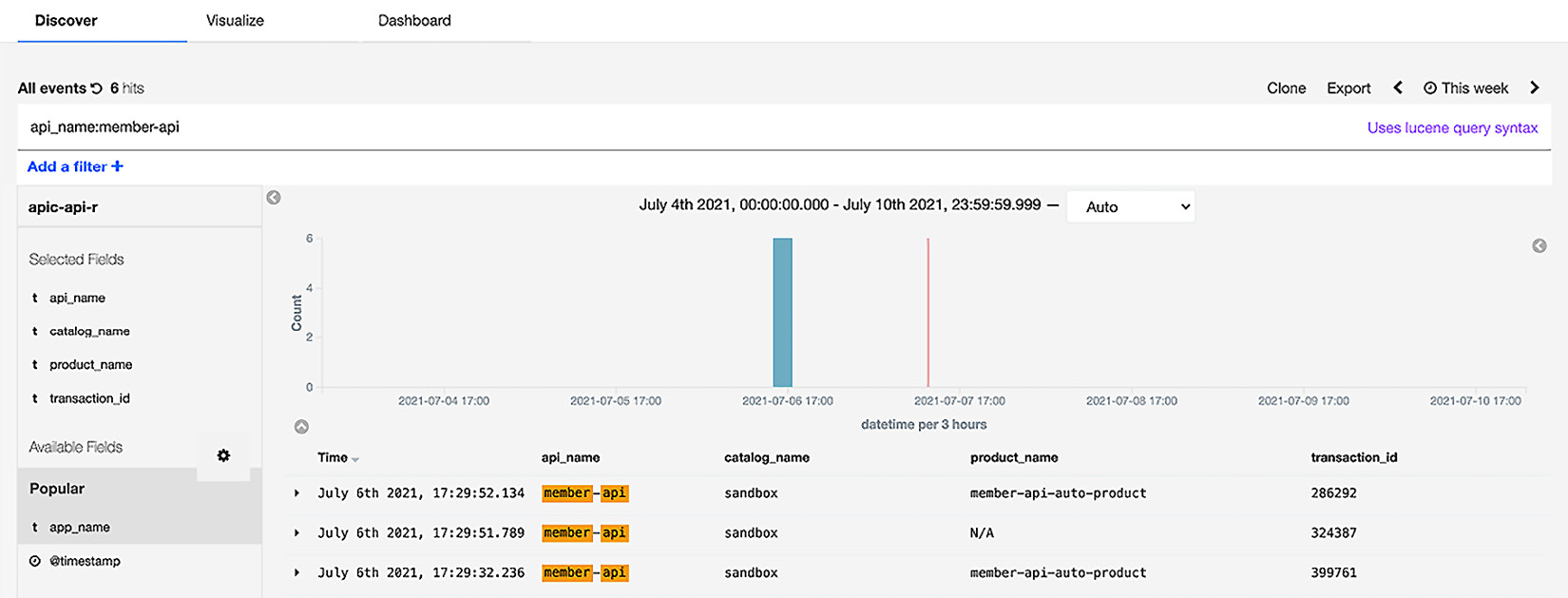
Figure 15.23 – Entering a query can narrow your search
So, your next question might be, how do I use a compound query such as api_name and product_name? It is rather simple. You enter api_name:member-api AND product_name:member. Figure 15.24 shows you those results:
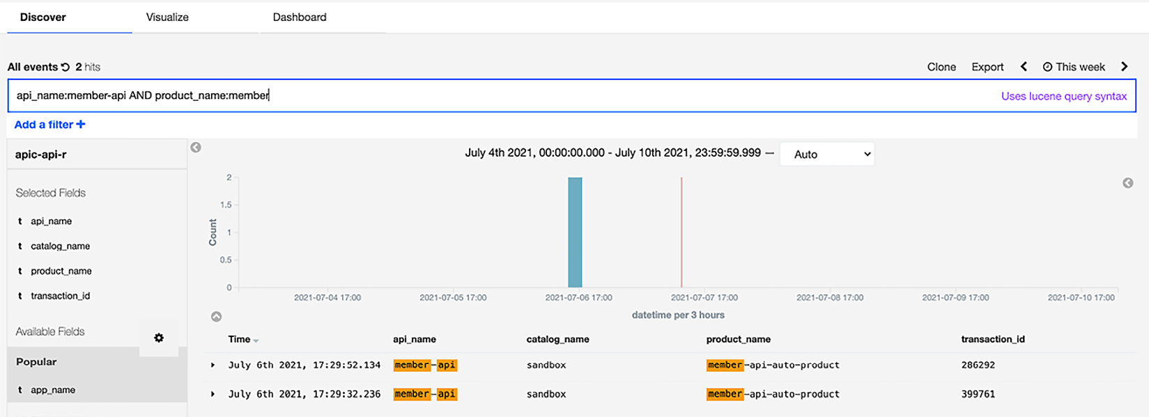
Figure 15.24 – Compound statements are allowed
There are other Boolean operators you can use, such as OR and NOT. In addition, if you want to search on ranges, you can enclose the range within braces (inclusive) or brackets (exclusive) with the word TO that separates the range values – for example, transaction_id:[3532049 TO 3532225].
At this point, you have learned a lot about how analytics is organized and displayed. You are aware of the default dashboards that come with API Connect and most likely will use some of them for initial implementation. You now know how to rearrange your search views and create new searches. Given that background, it's a good time to learn how to create your own visualizations to add to the new dashboards you desire. You'll explore that in the next section.
Creating visualizations and dashboards
While the default dashboards address a number of common scenarios, you'll most likely have some additional ways you want to review your analytics. In this section, you'll learn how to create new visualizations and add them to the dashboards. You'll discover how to customize the data arrangements, but for more in-depth learning you should visit https://www.elastic.co/training/free.
Information
If you want to update one of the default dashboards that come with API Connect, you'll need to clone the dashboard first to create a new custom dashboard.
Since the dashboard is the primary view of your analytics, we'll begin by creating dashboards first.
Creating a new dashboard
When you click on the Analytics tab in any of the Catalogs, the first thing you see is the default dashboard. If you want to create a completely new dashboard, you simply click the + button. If you want to update one of the default dashboards, you need to click the dashboard name and then clone it. In this section, we will be creating a new dashboard. Here are the steps:
- Navigate to the Catalog where you wish to create a new dashboard. When the dashboard page displays, click the + button, as shown in Figure 15.25:
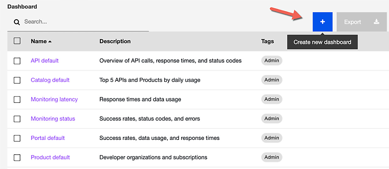
Figure 15.25 – Creating a new dashboard
- You'll be presented with a new page that allows you to add visualizations. Since your dashboard is empty you need to click the Add link to add visualizations.
- You will now be presented with existing visualizations. Scroll through the list of visualizations and select the visualizations you want on your new dashboard. This is shown in Figure 15.26:
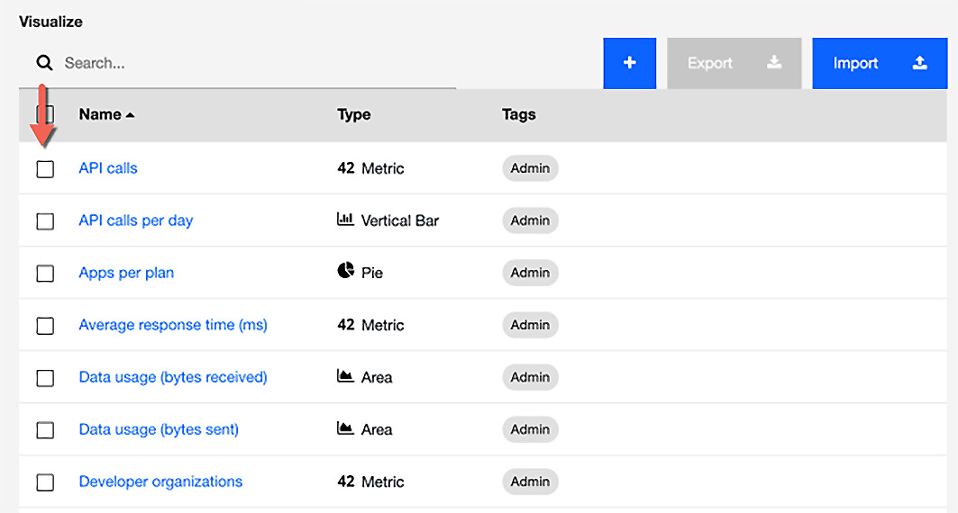
Figure 15.26 – Choosing visualizations
If you want to review the visualization first, click on the visualization name link and review what its capabilities are.
- When you have selected all the visualization you desire, save the dashboard with a new name. Review your new dashboard and make any adjustments that you would like to see. Your new dashboard is also added to the list of dashboards. It will also be propagated to any Spaces you have created in the Catalog. You will also notice that the dashboard list will show a tag of Catalog that displays at what hierarchy level it was created.
Note
Since analytics is Catalog-specific, you cannot create a dashboard that includes data from multiple Catalogs. You should also remember that any new dashboard created is scoped to the Catalog or Space in which the API exists.
You have created your first new dashboard with existing visualizations. What if you didn't find a visualization that properly represents the analytics the way you want? This is when you need to create your own visualization with the data received from your APIs. You'll perform those steps in the next section.
Creating a new visualization
When you create a new visualization, you are taking metrics and creating viewable graphics that provide insight. The following table presents the various visualization types available to choose from:

Table 15.1 – Available types of visualizations
As you can see in Table 15.1 there is a wide variety of graph types. Creating a visualization is essentially a two-step process. You first choose the graph/visualization type (bar chart, line chart, and so on) and then define the content and layout.
When you define the content and layout, you will use the Data tab to configure the metric and bucket objects. If you want to add a legend, you can use the Options tab.
For this introduction to creating new visualizations, you'll choose one graphic that fits some of the API transactions you have run in the book. We'll choose a Pie chart so we can choose the buckets to display segmentation of the total amount of API calls. A bucket is a collection of organized data that has been filtered (similar to a SQL GROUP BY statement).
Let's start creating a new visualization:
- Navigate to the Analytics tab within a Catalog and then choose Visualize. Then click the + button to create a new visualization, as shown here:
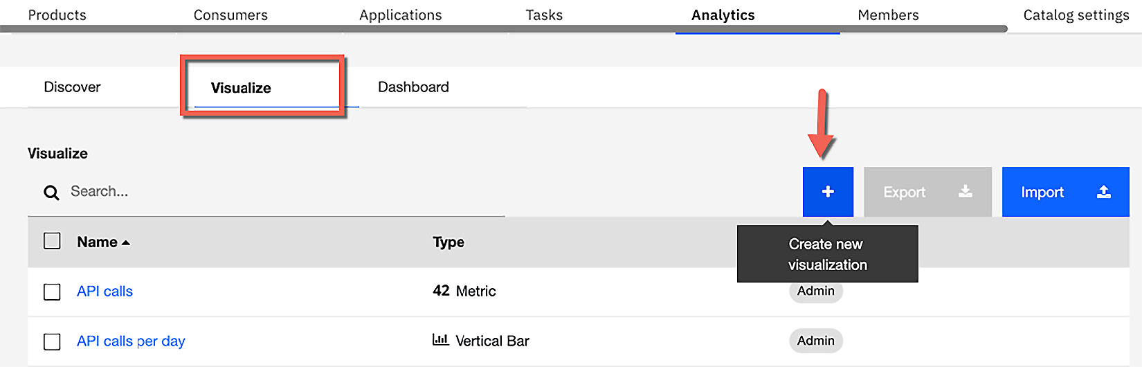
Figure 15.27 – Creating a new visualization
After clicking the + button, you can select the type of visualization to create. Figure 15.28 shows a partial list of the available visualization types:
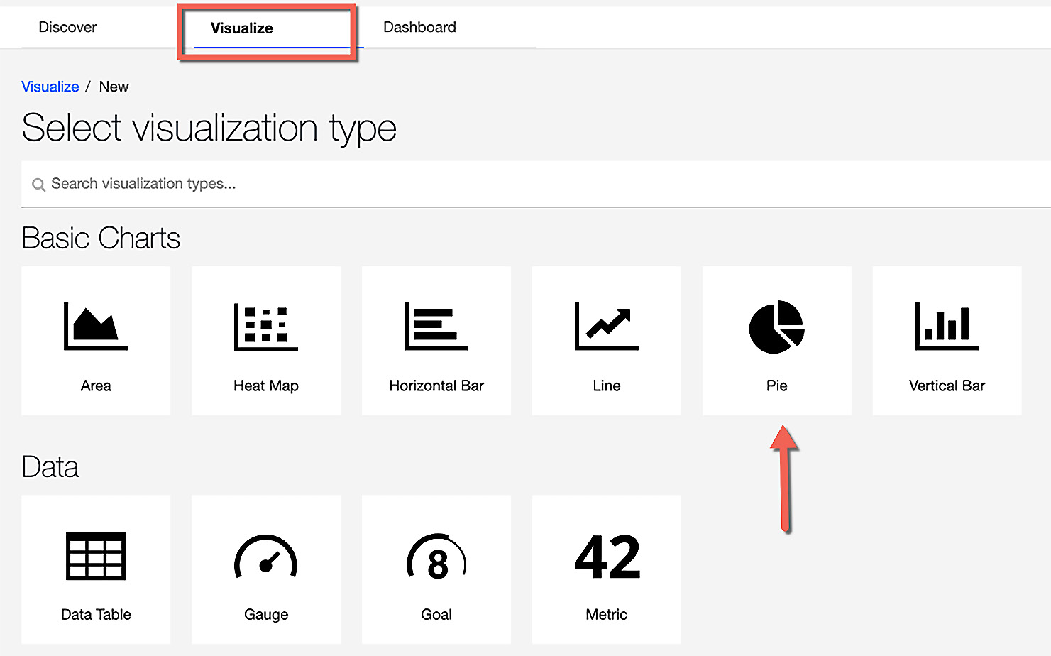
Figure 15.28 – Choosing the Pie visualization type
- Choose the Pie visualization type and you will be presented with a panel to choose the type of data. This is shown in Figure 15.29:
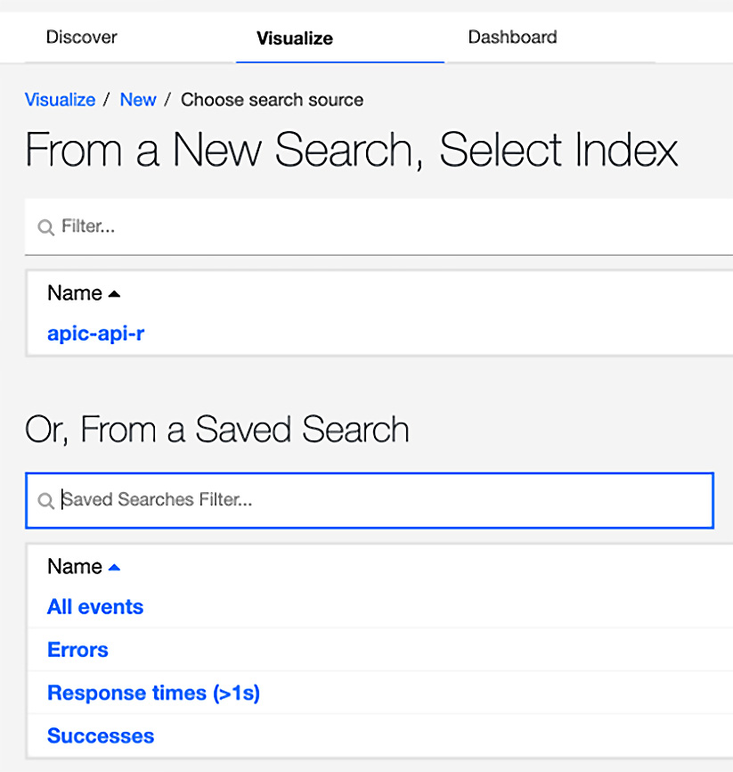
Figure 15.29 – Choosing the source of data
In Figure 15.29, you see some predefined searches. These were created by API Connect. All Events are all the events that have been captured on the Gateway. You will choose All Events since it provides many event fields to choose from.
- On the left side, under buckets, choose Split Slices as shown in Figure 15.30:
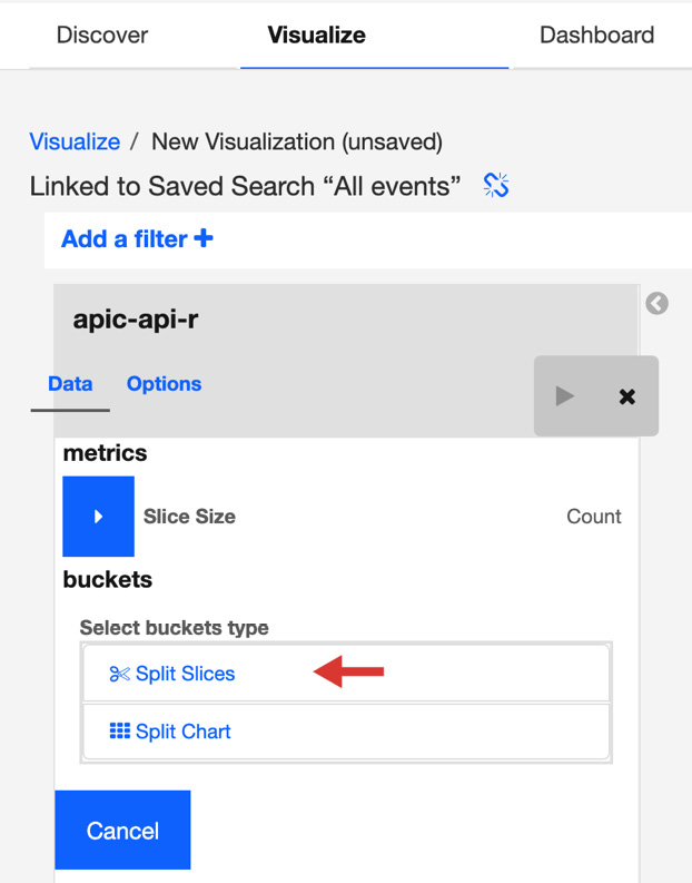
Figure 15.30 – Choosing type of bucket
- When you chose Split Slices the panel changes and you will see an aggregation dropdown. Under the aggregation dropdown, choose Terms.
- The dynamic nature of the panel will then re-draw the panel with a new set of fields. In the Field dropdown, you choose a field that appropriately represents your needs. Scroll down and choose client_ip.
- Click the play button next to the Data and Options tabs to see the results.
Figure 15.31 shows the results from our limited sample size. Your results will be different. You may also have to change the time range to ensure you have the appropriate metrics.
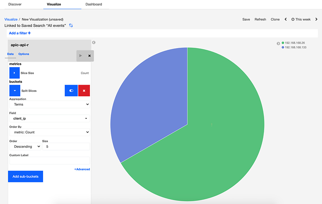
Figure 15.31 – A new visualization based on data
The new visualization shows which client IP made API calls through the configured Gateway.
- Let's further enhance the same visualization by adding a sub-aggregation. Locate the Add sub-buckets button and click on it. This is shown in Figure 15.32:
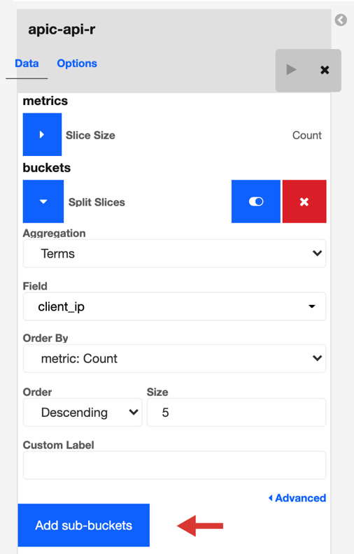
Figure 15.32 – Add sub-buckets to do sub-aggregation
When you click Add sub-buckets, another entry field setup screen will appear so you can split the slice even more. You will need to click on Split Slices. The panel will refresh with more fields visible.
- Click the Sub Aggregation dropdown and select Terms. Then choose app_id under the Field dropdown and click the play button again. See Figure 15.33:
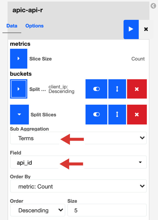
Figure 15.33 – Adding a sub aggregation
- Figure 15.34 now show your new sub-aggregation pie chart:
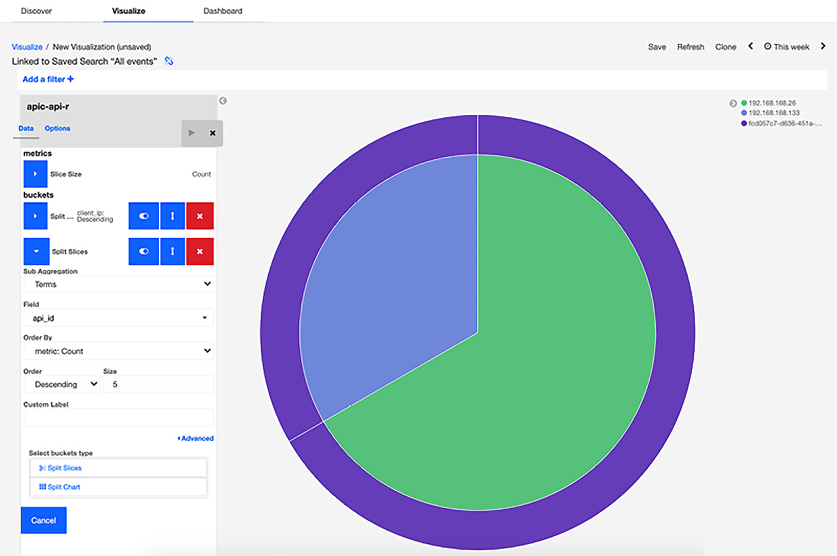
Figure 15.34 – Sub-aggregation example
This shows visually (by client IP) the various applications calling the same API. You have now completed creating a visualization. You can add it to a dashboard of your choice.
You can also save your new visualization. Figure 15.35 shows how this is done:
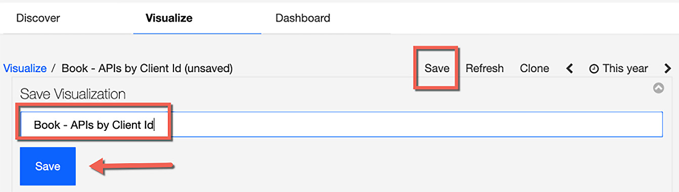
Figure 15.35 – Saving your visualization
You have now finished creating a custom visualization and dashboard. There will be many more opportunities to create and update your analytics.
Note
Metric aggregations give you the ability to calculate metrics based on values extracted from indexed fields. The Analytics service indexes the field received from the Gateway.
You can think of metrics as the y axis and buckets as the x axis.
Most likely in the real world, you will be making your visualization and dashboard changes in a lower environment, such as Developer or User Acceptance Testing. After all your hard work, you'll want to ensure the same views are available in Production. The way you ensure the dashboards and visualization are available in those environments is by exporting and importing them. You'll do that in the next section.
Deploying analytics to new environments
In many cases, API Connect is deployed in multiple environments, whether on-premises or on the cloud. Now that you've created and tested your dashboards and visualizations, you are ready to promote them to upper environments. This is simple, and can be accomplished by exporting and importing the resource. The process is the same for both visualizations and dashboards. Let's begin by showing you how to do this with a visualization and then you can perform the same steps for dashboards on your own:
- If you are not on the Analytics tab, please navigate to the appropriate Catalog and select Analytics. Select the visualization and a new set of buttons appear:
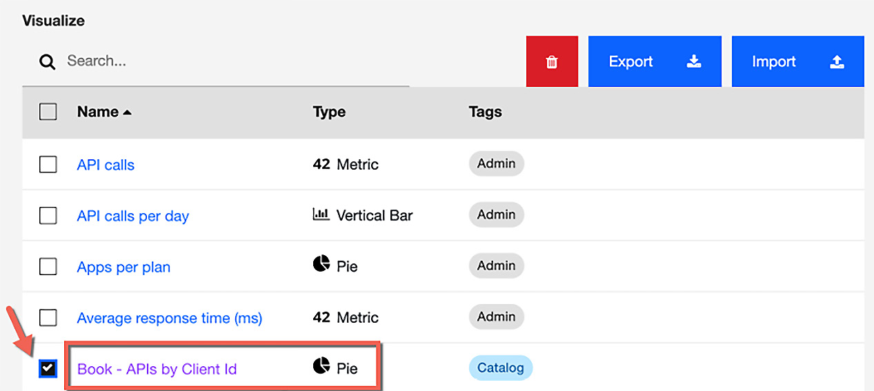
Figure 15.36 – Export to another environment
- Select Export. It creates and downloads an export.json file. You can rename the .json file to represent your new visualization and later import it into other Catalogs. Figure 15.36 shows where the Import button is located. In your target environment, just follow the same process to get to the Visualization tab and then import your visualization.
That completes the section on customizing analytics. You learned a number of new skills that will help you create meaningful analytics that can be shared with your organization. The skills you learned for accessing the analytics tab and creating new visualizations and dashboards will be invaluable to your organization.
Summary
This chapter was all about customizing API Connect's user interfaces. We covered the customization of the Developer Portal and Analytics service.
In the Developer Portal sections, you learned how to make visual changes to the portal using the administrator role. As you know, the social aspects of your digital transformation are extremely important and having the ability to apply your branding and social interaction with your users is vital.
The important portal adjustments you learned included ensuring you have backup administrators, as well as learning how to develop a new sub-theme where you can change colors simply by adjusting the CSS. You also learned how to update the Welcome Banner. Since not all portals are external facing, you explored how to disable features such as blogs and forums as some organizations may not need them.
Another topic in this chapter that you learned was how to make simple changes to the Analytics service provided by API Connect. Analytics have a very high value in your digital transformation effort. Providing analytics to your internal organization as well as your consumers shows how well thought out your API implementation was.
In this chapter, you found out how Analytics is organized and how there exists a hierarchy between Catalogs and Spaces. You also learned how the Analytics service is associated with your Gateways and that you can have multiple Gateways output metrics to an analytics service. You learned how to locate where Analytics data is viewed within the API Connect environment and how it is displayed on the Applications page on the Developer Portal. Finally, you learned how to modify and create new dashboards and visualizations. You also learned how to export your changes and import them into other environments of your choosing.
Having these new skills provides you with the ability to craft new and exciting graphical views, which will add value to your organization and consumer experience.
Your journey of learning about API Connect is nearly complete. Who knows what the future holds? You'll learn about upcoming technologies in the next chapter, so prepare yourself to learn even more.