Charts are new in Microsoft Dynamics CRM 2011. They provides another type of visualization to the end user, and give the end users new analytics and reporting capabilities. Charts are tied to entities; they support out-of-the-box entities and custom entities. CRM comes with charts that all of us can leverage. It also allows us to create custom charts. Charts work with views, filtering, and sub-grids, and we can drill-down on charts.
Microsoft CRM 2011 comes with over 50 system charts for the following entities:
- Account
- Activity
- Article
- Campaign
- Case
- Goal
- Lead
- Opportunity
- Order
We can easily view the system for the above entities by following these steps:
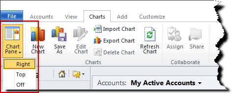
- Navigate to the chart area on the ribbon by clicking on Charts.
- Click on the Chart Pane button in the Layout group.
- Click on Right in the drop-down menu.
Charts can be displayed on the Right or the Top of the grid:
Alternatively, we can click on the Click here to view the chart pane to the right of the grid as shown in the following screenshot:
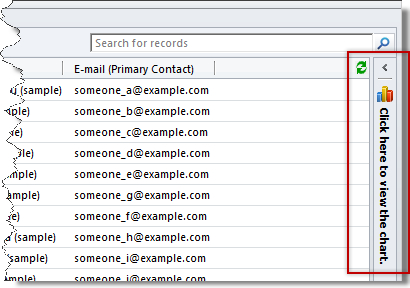
Once we launch the chart pane on the right, we can select the system charts from the chart view list.
Microsoft Dynamics CRM 2011 allows end users to drill down on charts to further slice and dice data. In addition, the grid also updates the section when we click on the chart. Let's drill down on the Sales Pipeline chart that is associated to the Opportunity entity.
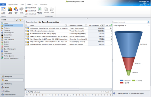
Click on one of the sections on the funnel chart. The drill-down menu appears, as shown in the following screenshot:
In the Select Field list, select Est. Close Date, and then click the Bar chart option. Click on the OK icon to see the result, as shown in the following screenshot:
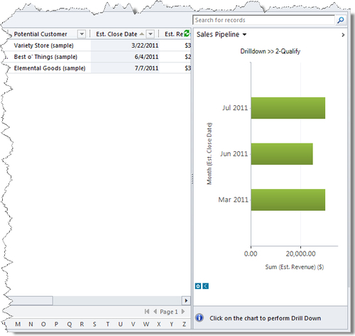
The chart above shows the estimated closed date for all of the opportunities that have revenue between $35,000 and $85,000. As we can see now, the grid updates to show the end user's selection.
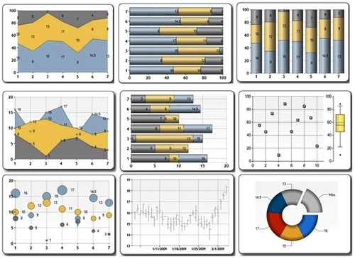
Now that we understand the power of the built-in system charts, we can also create our own charts to fulfill our needs. Microsoft Dynamics CRM 2011 supports the following chart types and set aggregations:
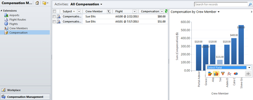
Now let's build a custom chart to display the Compensation by Crew Member. To create a new chart in CRM 2011, navigate to the ACM Solution, select Components | Entities | Crew Member | Charts, and then click the New button. The Chart Designer appears.
Alternatively, you can create a new chart by navigating to Crew Members in CRM, clicking on the Chart tab on the ribbon, and then clicking the New Chart button. This way, you are creating a chart in the default solution.
- Legend Entries (Series): Compensation | Sum
- Horizontal (Category) Axis Labels: Crew Member
The chart name will be automatically generated as: Compensation by Crew Member.
Click the Save and Close button on the ribbon.
To create a column chart, we don't have to change the chart type. To change the chart type, click on the chart type button under the Chart Tools section on the ribbon.
That's it! You just created a chart of the compensation result by crew member.
You can also see individual's compensation by clicking on the relevant part of the chart, and then even drill-down by other columns:
Once we have created our chart, we can assign it to another end user or share it with another user in the system:
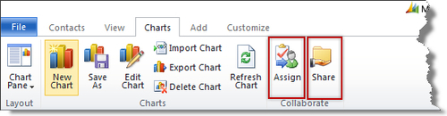
To assign a chart to another user in the system, click on the Assign button. Then select the user or team that you would like to assign it to.
Microsoft Dynamics CRM 2011 provides the ability for developers to extend the charting capabilities beyond the basics. We can export the chart XML, modify the chart, and then import the chart back to CRM. There are two XML files associated with each chart: Data XML and Presentation XML. Data XML is a Fetch XML used to retrieve data from CRM, and Presentation XML is used to present the chart to the end-user.
- Data XML:
<entity name="incident">
  <attribute alias="aggregate_column" name="title" aggregate="count" />
  <attribute groupby="true" alias="groupby_column" dategrouping="day" name="createdon" />
  <attribute alias="groupby_origin" name="caseorigincode" groupby="true" />
</entity>
- Presentation XML:
<Series ChartType="StackedColumn" Font="{0}, 9.5px" LabelForeColor="59, 59, 59"></Series>
</Series>
<ChartAreas>
  <ChartArea BorderColor="White" BorderDashStyle="Solid">
    <AxisY TitleForeColor="59, 59, 59" TitleFont="{0}, 10.5px" LineColor="165, 172, 181" IntervalAutoMode="VariableCount">
    </AxisY>
    <AxisX TitleForeColor="59, 59, 59" >
    </AxisX>
Because CRM is a .Net application, there are 35 ASP.NET chart types that we can leverage: