
Chapter 8. Forms
| This chapter covers |
|
Anyone who has winced at the things toddlers unwittingly thrust into their mouths will understand the anxiety developers feel when building forms. Any opening into the application raises questions of security and stability. Just as a biological body must have its protective measures, so must our forms.
Having said that, protecting our forms isn’t the only thing we need to take into consideration; they must also be usable. A form’s usability is difficult to determine without a reasonable period of testing, which actually means that there is a hidden requirement of form design—flexibility. Discovered insecurities, usability issues, updates, and additions to the underlying architecture may all require forms to change. A flexible system allows these changes to be made promptly and inexpensively.
Zend Framework has many options for the design of forms, from its MVC architecture to its data filters and validators. Previous chapters have demonstrated various approaches to building forms; in this chapter we’ll look at a component designed specifically for the job, Zend_Form.
8.1. Introducing Zend_Form
Because Zend_Form did not arrive until Zend Framework 1.5, early adopters had a lot of time to get along without it. That meant that one or two of us were a little suspicious of Zend_Form when it finally arrived and were going to need convincing as to its value. We’re glad to say that while it isn’t without a quirk or two, we’ve found that the more acquainted we get, the more we like it.
In a broader sense, the three main advantages of using Zend_Form are rapid application development, flexibility, and consistency. But you’ll need to be comfortable enough with the component before those benefits become apparent. The aim of this chapter is, of course, to get you to that stage. Later in the chapter, we’ll work on a login form for our Places application, but before we do so, we’ll take a look at some Zend_Form features.
8.1.1. Integrated Data Filters and Validators
If you’re familiar with the security mantra “filter input—escape output,” you’ll also know that all forms need to validate and sanitize the user’s input and escape the output that may be inserted into a database or displayed in a view script.
Zend_Filter and Zend_Validate are independent components used in Zend_Form and on their own, as we’ll show. Table 8.1 lists the current filter classes that are available for use with any forms, including Zend_Form forms.
Table 8.1. Standard Zend_Filter classes available for use with Zend_Form
|
Standard Zend_Filter class |
Function |
|---|---|
| Alnum | Removes all but alphabetic and digit characters. |
| Alpha | Removes all but alphabetic characters. |
| Digits | Removes all but digit characters. |
| HtmlEntities | Converts characters to their HTML entity equivalents where possible. |
| Int | Equivalent to (int). |
| StringToLower | Converts alphabetic characters to lowercase. |
| StringToUpper | Converts alphabetic characters to uppercase. |
| StringTrim | Strips characters from the beginning and end; equivalent to trim(). |
| StripTags | Strips all HTML and PHP tags |
You may question the benefit of some of the filters in table 8.1, such as Int or StringTrim. What could be more easy than casting to an integer using (int) or removing white space with trim()? Why would we need an extra class to do that? The answers lie in the ability to chain together and apply multiple filters to data, as demonstrated in listing 8.1.
Listing 8.1. Using Zend_Filter filter chains to apply multiple filters to input data
require_once 'Zend/Filter.php';
require_once 'Zend/Filter/StringTrim.php';
require_once 'Zend/Filter/Alnum.php';

$filterChain = new Zend_Filter();
$filterChain->addFilter(new Zend_Filter_Alnum())
        ->addFilter(new Zend_Filter_StringToLower());

$username = $filterChain->filter($_POST['password']);
Imagine that the user typed “MyPassword123 ”. The filter chain in listing 8.1 would strip out nonalphabetic and nonnumeric characters and lowercase them, returning “mypassword123”.
While this is certainly cleaner, it’s a little troubling on its own, as we should not presume that the user hadn’t intended that to be her password, even if our application doesn’t approve of it. What we should have done is used Zend_Validate to check that the input matched our requirements and allowed the user a chance to change it if it did not pass. Table 8.2 shows the built-in validation classes we could have used to perform this check.
Table 8.2. Standard Zend_Validate classes available for use with Zend_Form
Using table 8.2 as a reference, we can see that StringLength and Alnum could be used to validate our password. Put through the validation chain in listing 8.2, our user’s original password would fail the isValid() check, and we could return her to the form to make any corrections.
Listing 8.2. Using validation chains to apply multiple input data checks
require_once 'Zend/Validate.php';
require_once 'Zend/Validate/StringLength.php';
require_once 'Zend/Validate/Alnum.php';

$validatorChain = new Zend_Validate();
$validatorChain->addValidator(new Zend_Validate_StringLength(6, 15))
          ->addValidator(new Zend_Validate_Alnum());

if ($validatorChain->isValid($_POST['password'])) {
   //password meets our requirements
}
The examples in listings 8.1 and 8.2 demonstrated how data can be validated and filtered independently. Later in this chapter we’ll look at how the integration of these components with Zend_Form makes the process a lot easier to manage.
8.1.2. Integrated Error Handling
In discussing listing 8.2, we mentioned having to return the user to his form to make changes to the input. This could be done with code something like the following:
$this->view->formMessages = $validatorChain->getMessages();
Those messages could then be shown to the user in our view script:
<?php if (!empty($this->formMessages): ?>
<ul>
<?php foreach ($this->formMessages as $message): ?>
   <li><?php echo $message; ?></li>
<?php endforeach; ?>
<ul>
<?php endif; ?>
Doing that for every element would clearly be a chore. Thankfully, Zend_Form has error handling built in, in the form of decorators, which reduce the amount of coding needed to achieve the same effect.
8.1.3. Decorators to Simplify Markup
The previous error-handling example partly illustrates the labor involved in form markup, from the form HTML itself, to showing the errors a user may have made in his submission. Picture all that markup for a long form, and you’ll see that we have a lot of code to write and track.
Zend_Form decorators are based on their namesake Decorator design pattern, and they essentially allow layers of markup to be wrapped around form elements. Table 8.3 lists the standard decorators available in Zend_Form.
Table 8.3. Zend_Form standard decorators used to add markup to form items
|
Function |
|
|---|---|
| Callback | Executes a callback to render content. |
| Captcha | Used with the Captcha form element to prevent unwanted automated form submission. |
| Description | Displays a description on items, such as for form hints. |
| DtDdWrapper | Wraps content in an HTML definition list. |
| Errors | Displays errors in an HTML unordered list. |
| Fieldset | Wraps content in an HTML fieldset element. |
| Form | Wraps content in an HTML form element. |
| FormElements | Iterates through all items, and renders and joins them. |
| HtmlTag | Wraps content in an HTML element you define. |
| Image | Inserts an HTML img element. |
| Label | Renders form element labels. |
| ViewHelper | Allows you to specify a view helper that will create an element. |
| ViewScript | Allows you to specify a view script that will create an element. |
As with the filters and validators, these decorator classes are only the standard ones available in Zend Framework, and for many cases they’re sufficient. If not, they can all be customized, and the next feature is particularly useful in that regard.
8.1.4. Plug-in Loaders for Customization
If your particular needs are not met by the standard validators, filters, and decorators, you’ll be pleased to know that Zend_Form allows you to use Zend_Loader_Plugin-Loader to add your own alternatives. We could, for example, specify a location for our own filters like so:
$passwordElement->addPrefixPath(
   'Places_Filter', 'Places/Filter/', 'filter'
);
Or for validators:
$passwordElement->addPrefixPath(
   'Places_Validator', 'Places/Validator/', 'validate'
);
Or for decorators:
$passwordElement->addPrefixPath(
   'Places_Decorator', 'Places/Decorator/', 'decorator'
);
The great thing about the PluginLoader is that it gives your alternative locations priority over the standard locations. If we have, for example, a Places_Form_Decorator_Errors decorator class in library/Places/Validator/Errors.php, it’ll be used instead of the standard Zend Framework Zend_Form_Decorator_Errors class just by using the same naming convention.
8.1.5. Internationalization
Somewhat surprisingly, Zend_Form was the first component to be fully integrated with the other Zend Framework internationalization components. We’ll give a brief example of this in the coding examples that follow, but the subject itself is covered more fully in Chapter 15 on internationalization and localization.
8.1.6. Subforms and Display Groups
Subforms and display groups are both ways of grouping form elements. Display groups are used in much the same way that the HTML fieldset is and in fact renders as a fieldset by default. Subforms are, as you may expect, Zend_Form or Zend_Form_SubForm objects that can be used within other forms.
To understand the distinction, we could consider a date-selector widget subform used for the birth date in a user registration form, like so:
$form->addSubForm($dateSelectorForm, 'birthdate'),
The user’s address details could be grouped within an address fieldset with a display group like so:
$form->addDisplayGroup(
     array('street', 'town', 'state','postcode'), 'address'),
The form we’re going to be building will have no need for display groups or subforms, but even these brief examples demonstrate their value in larger forms.
Subforms and display groups, in our opinion, are the key features that make Zend_Form an attractive option when building forms. The proof, though, is in the use, and so far we’ve not really demonstrated Zend_Form in any depth. In the next section, we’ll take a step-by-step approach and show how these features work together by recreating the login form that was developed in Chapter 7 on user authentication and authorization.
8.2. Building a Login Form
We have presented some of the options available when using Zend_Form, and there are clearly a lot of them. Using Zend_Form is very much about adding layers of functionality to form items, and this is best explained in a step-by-step way. For that reason, we’re going to stick to the simple two-field login form discussed in the previous chapter. To get the full sense of the improvements that Zend_Form brings, please refer to the examples in Chapter 7 as you work through this one.
We’ll start by setting up the required files and the paths to their locations.
8.2.1. Setting up Paths
To start, we need to add an application/forms directory in which we’ll store our form classes and add that location to our include path in the bootstrap file:
set_include_path(get_include_path()
   . PATH_SEPARATOR . ROOT_DIR . '/library/'
   . PATH_SEPARATOR . ROOT_DIR . '/application/models/'
   . PATH_SEPARATOR . ROOT_DIR . '/application/forms/'
);
Next, we need to add the main files and start coding.
8.2.2. Our form View Script
Once rendered our form is going to have to be displayed somewhere. We already have an auth/login.phtml view script from the previous chapter that we’re going to leave for comparison. In listing 8.3 we’ve created a form.phtml file and added the code to show our Zend_Form version of the same authorization form from the previous chapter.
Listing 8.3. Our auth/form.phtml login view script using Zend_Form

If, like us, you’ve read a lot of technical articles, you’ll be forgiven for raising your eyebrows in suspicion at the cliché “all that in one line of code” which starts our discussion. Bear with us, as the updates to the controller action file are almost equally impressive.
8.2.3. Updating the AuthController Controller Action
Ruby on Rails has a useful idiom of “skinny controller—fat model,” the basic premise of which is to keep your controller files lean and easy to understand by moving as much logic as possible to your model files. In Chapter 7, we built some fairly complex controller files that we’re now going to refactor using Zend_Form.
We’ll start with a minor modification to our indexAction() method, as shown in listing 8.4. This checks whether the user has been identified, and, if not, he is forwarded to the formAction() method in listing 8.5, where he is shown the login form. In later development, this could allow us to add an else option to direct the user to his account page if he’s already logged in.
Listing 8.4. Our refactored indexAction() controller action

Next we need to add a new action method, shown in listing 8.5, that will handle all aspects of our login form, from processing the POST request to setting up and rendering the form. Parts of it may seem unclear initially, but we’ll cover them in more detail later in the chapter. We’re showing it here because it remains unchanged throughout the process.
Listing 8.5. Our formAction() in our AuthController controller action class

The first thing our formAction() method does is instantiate the login Zend_Form object, passing it the URL to be used in the HTML form element’s action attribute  . After checking whether the request is an HTTP POST
  , and therefore a form submission, the submitted data is passed as a parameter to the isValid() method, which returns a Boolean from which we determine the next action
  .
.
If it’s valid, we retrieve the authAdapter object from our Places_Validate_Authorise custom validator via the username form element  , and from that we get the database row that includes the user’s authorization information, excluding the password for security
reasons
, and from that we get the database row that includes the user’s authorization information, excluding the password for security
reasons  . We can then use Zend_Auth to store the database row to whatever storage method it’s set to use (sessions, by default)
  . Finally, we redirect the user to whatever page we decide
  .
.
If the submitted data isn’t valid, we set a message to let the user know there were problems  , which they’ll see in the rendered form that has been sent to the view
  .
.
At this point, it’s worth mentioning that if we had wanted to, we could have used the following code to set the values of our form:
$form->populate($this->_request->isPost());
This would have been appropriate if we had wanted to set default values to fill the form with. Since this is a login form, we don’t need to do that and, besides, the isValid() method automatically populates the form with the POST values.
With the controller action done, we can now move on to building our LoginForm class, which we’ll do in a series of steps starting with the most basic version.
8.2.4. The Basic Login form Class
We’ll start by creating the most minimal elements needed to render a form consisting of a username field, password field, and submit button. The first step, shown in listing 8.6, is to create our LoginForm.php file in /application/forms/ and add a log-inForm class that extends Zend_Form.
Listing 8.6. Our basic login form using Zend_Form
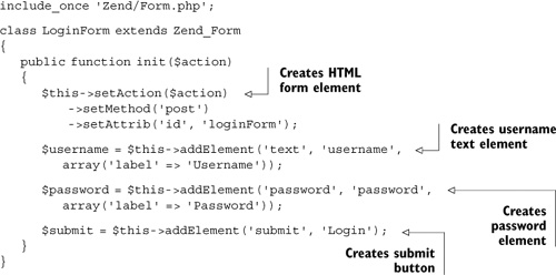
The first thing to note with this code is that the form is being set up within the init() method, which is a convenience method that is called from within the constructor of Zend_Form. It adds components of the form, starting with the form element and its various attributes, followed by the other elements of the form.
The next point to note is that our elements are being created using the Factory Method design pattern for adding elements. The alternative is to instantiate the elements ourselves and pass them to the form, like this:
$username = new Zend_Form_Element_Text('username'),
$this->addElement($username);
We’ve chosen the factory approach because it has the advantage of inheriting any settings we make in the form object.
Together with the controller action we created earlier, this form will work perfectly adequately as long as the submitted data always meets the requirements of our application. We all know that this isn’t always the case, and users will often submit incorrect or empty fields that we need to account for by validating and filtering the data.
8.3. Filtering and Validation
Earlier in this chapter, we mentioned that Zend_Filter and Zend_Validate are integrated into Zend_Form, and here we get a chance to show how that simplifies their use.
8.3.1. Basic Filtering and Validation
In listing 8.7 the username and password elements have been expanded to include filtering and validation, using the fluent interface of the addValidator() and addFilter() methods.
Listing 8.7. Adding filtering and validation to our login form elements
$this->addElement('text', 'username',
   array('label' => 'Username'));
$username = $this->getElement('username')
        ->addValidator('alnum')
        ->setRequired(true)
        ->addFilter('StringTrim'),

$this->addElement('password', 'password',
   array('label' => 'Password'));
$password = $this->getElement('password')
        ->addValidator('stringLength', true, array(6))
        ->setRequired(true)
        ->addFilter('StringTrim'),
All of these additions rely on their namesake Zend_Filter or Zend_Validate components; even setRequired() uses the NotEmpty validator. The role of the validator is to highlight any data submitted that does not pass validation. This can then be used by the error decorator to indicate fields that need correction when the form is rendered. Figure 8.1 shows the error messages in the rendered form after an empty form is submitted.
Figure 8.1. The results of an empty form submission

Beyond the required setting, which ensures the element has a value when submitted, we’ve insisted that usernames be alphanumeric with any whitespace trimmed, and that passwords be no shorter than six characters with whitespace trimmed. If we then submit the form with information that doesn’t meet those requirements, we’re returned to the form with the messages shown in figure 8.2.
Figure 8.2. The results of submitting invalid data

Error messages like “‘@@@@@@’ has not only alphabetic and digit characters” and “‘***’ is less than 6 characters long” may not suit the kind of application you’re building. Luckily it’s quite easy to add your own custom messages.
8.3.2. Custom Error Messages
Adding our own messages to validators is simply a case of getting the validator by name and using its setMessage() method to change the message to one that suits our needs. These further additions to our form elements are shown in listing 8.8.
Listing 8.8. Adding custom messages to our login form elements
$this->addElement('text', 'username',
   array('label' => 'Username'));
$username = $this->getElement('username')
       ->addValidator('alnum')
       ->setRequired(true)
       ->addFilter('StringTrim'),
$username->getValidator('alnum')->setMessage(
   'Your username should include letters and numbers only'),

$this->addElement('password', 'password',
   array('label' => 'Password'));
$password = $this->getElement('password')
       ->addValidator('stringLength', true, array(6))
       ->setRequired(true)
       ->addFilter('StringTrim'),
$password->getValidator('stringLength')->setMessage(
 'Your password is too short'),
If we now submit the same information we did before changing the messages, we get feedback that is much more suitable for our Places site, as shown in figure 8.3. We should note that while it may be helpful to our users, our form may be providing a little too much feedback information that could help those trying to break into our site. You should obviously consider this when building your own forms.
Figure 8.3. Our login form with custom error messages

Places is currently focused on entertainment for families in the United Kingdom, so the only thing we needed to do was make the messages more friendly. Once it becomes popular enough to move into other European countries, we’d need to start looking at internationalizing the forms and other content.
8.3.3. Internationalizing the Form
It’s interesting that Zend_Form is the first component in Zend Framework to be incorporated with its internationalization components. The benefit for our use is the ease with which we can change the form to show error messages in another language, such as the German version shown in listing 8.9.
Listing 8.9. Our login form with translated error messages

The translations for each element are based on the value for the constants contained in each validator class, so for Zend_Validate_StringLength, the constant is
const TOO_SHORT = 'stringLengthTooShort';
The stringLengthTooShort value is the one we use as the key in our translation array:
'stringLengthTooShort' => 'Ihr Kennwort ist zu kurz'
Once we’ve added all the translation data, our error messages will now be automatically translated to the language we specify, as shown in figure 8.4.
Figure 8.4. Our login form translated into German

You may notice that while our messages are in German, the submit button is still in English, which means our translation is incomplete. We’ll look at internationalization in more detail in Chapter 15. For now we have to move on to making a custom validator.
8.3.4. Adding a Custom Validator
The last thing we need for our login form is a way to check whether or not the user is registered. We could do that as an added step in the formAction() controller action method, but earlier in this chapter we described how plug-in loaders allow us to add our own filters, validators, and decorators to forms. In listing 8.10 we do just that with our Authorise validator.
Listing 8.10. Our username element with custom Authorise validator added

Our Authorise validator, shown in listing 8.11, is going to check the contents of both the username and password fields and only validate the form if both pass. We’re attaching it to the username field, which means its error messages will be displayed under the username field. To allow for that, we have kept the message suitably vague, so it isn’t really an issue.
Listing 8.11. Our custom Authorise validator

Our Authorise custom validation class should feel familiar to readers of the previous chapter, so we’ll stick to pointing out the additions we have made to make it a validator.
First, it must extend Zend_Validate_Abstract, use the Places_Validate name prefix we gave to our plug-in loader in the loginForm class , and be placed in Places/Validate/Authorise.php. It must also contain an isValid() method , which will have the value of the attached element, username in this case, automatically passed through it, as well as the $context array of all the other form values.
Since we need both the username and password to determine whether our user is registered, we first check whether the $context array is available and whether it includes a password item . If all information is present and the user is found to be a valid user, our validator will return a true response; otherwise it’ll return false together with any error messages that can be shown to the user.
Now that we’ve added the custom validators, the backend functionality of the form is complete and we can turn our attention to the frontend with decorators.
8.4. Decorating Our Login Form
As mentioned earlier in this chapter, decorators are a way to add layers of markup to forms and form elements. In this section, we’ll use them to change the HTML markup of our form.
8.4.1. Zend_Form Default Decorators
Up to now, we’ve been using the default decorators that are loaded in Zend_Form_Element, like so:
$this->addDecorator('ViewHelper')
   ->addDecorator('Errors')
   ->addDecorator('HtmlTag', array('tag' => 'dd'))
   ->addDecorator('Label', array('tag' => 'dt'));
We’ve also used the ones in Zend_Form, like so:
$this->addDecorator('FormElements')
   ->addDecorator('HtmlTag',
    array('tag' => 'dl', 'class' => 'zend_form'))
   ->addDecorator('Form'),
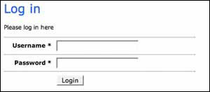
For our login form, these default settings produce the markup shown in listing 8.12, which essentially displays our form elements wrapped within an HTML definition list.
Listing 8.12. Our login form HTML produced by the default decorators
<form id="loginForm" enctype="application/x-www-form-urlencoded"
                     action="/auth/index/" method="post">
<dl class="zend_form">
   <dt><label for="username" class="required">Username</label></dt>
   <dd> <input type="text" name="username" id="username" value=""></dd>
   <dt><label for="password" class="required">Password</label></dt>
   <dd><input type="password" name="password" id="password" value=""></dd>
   <dt></dt>
   <dd><input type="submit" name="Login" id="Login" value="Login"></dd>
</dl>
</form>
With the addition of some CSS, a definition list can be styled very effectively, but for our needs, we’d rather our form was wrapped in a slightly simpler HTML unordered list. This is what we’ll do next.
8.4.2. Setting Our Own Decorators
When using Zend Framework, you’ll find there are often several ways to write your code. This is the case with decorators, so bear in mind that the way we add our decorator settings in listing 8.13 isn’t the only way to do it. We’ll try to point out our reasoning as we go.
Listing 8.13. Our login form with decorator settings
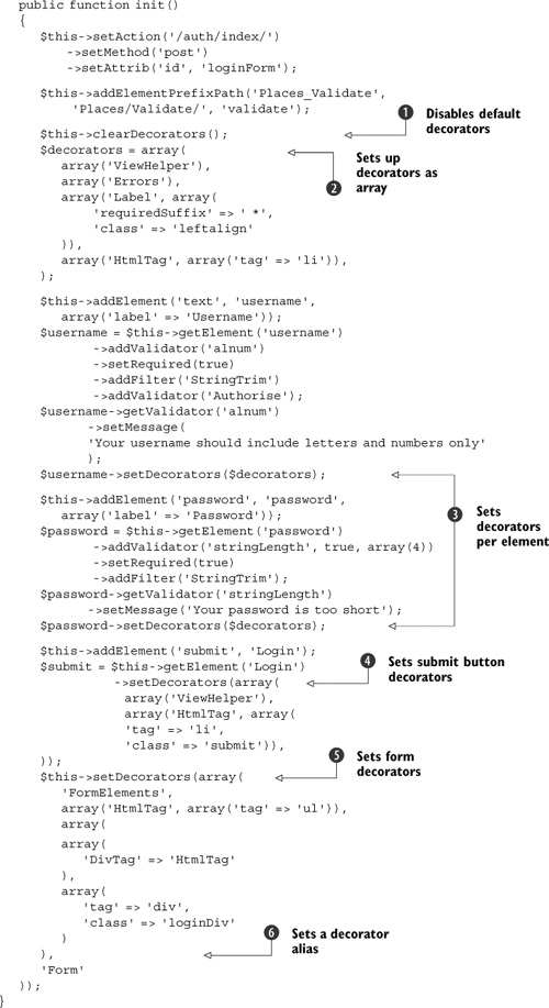
Before adding our own decorator settings, we first must disable the default decorators using the clearDecorators() method . Having done that, we can set up a default array of element decorators . Our settings aren’t too dissimilar from the default decorators, aside from the addition of a leftalign class name for the HTML label, an asterisk suffix for all required elements (not strictly necessary in this case, but included
here for illustration), and wrapping that all in an HTML list tag. The resulting HTML looks like so:
<li><label for="username" class="leftalign required">Username *</label>
<input type="text" name="username" id="username" value=""></li>
One advantage of using the factory method to add form elements is that we could set all element decorators at once, and they would inherit our decorator settings like so:
$this->setElementDecorators($decorators);
With only two form fields, we won’t benefit from this convenience, so we’re setting our decorators on a per-element basis
, except for the submit button, which is set individually because it doesn’t require a label or error messages .
To finish up, we set the overall form decorator . The order in which decorators are added is important, and in this case we add the form elements first followed by a ul HTML tag and, sounding a little like a cookery lesson, we wrap all that in an HTML div tag.
Notice that because we’re wrapping with one HtmlTag followed by another, we need to give the second one an “alias”; otherwise, multiple decorators of the same type will overwrite
one another. In this case, our second HtmlTag decorator is given the alias DivTag, which uniquely identifies it . Admittedly, for our form, this last div tag isn’t necessary, but for the sake of the demonstration, let’s imagine it’s a
request from our designer.
In listing 8.14, we can see that the full HTML generated by our changes is notably different from the original default HTML in listing 8.12.
Listing 8.14. Our login form HTML produced by our custom decorator settings
<form id="loginForm" enctype="application/x-www-form-urlencoded"
    action="/auth/index/" method="post">
<div class="loginDiv">
   <ul>
      <li>
         <label for="username" class="leftalign required">
            Username *
         </label>
         <input type="text" name="username" id="username" value="">
      </li>
      <li>
         <label for="password" class="leftalign required">
            Password *
         </label>
         <input type="password" name="password" id="password" value="">
      </li>
      <li class="submit">
         <input type="submit" name="Login" id="Login" value="Login">
     </li>
  </ul>
</div>
</form>
Although we have been able to customize the markup considerably, Zend_Form does allow for even more complex customization. Whether you do that by building your own custom decorators, which extend Zend_Decorator_Abstract, or with custom view helper scripts, or even just using your own view scripts, is dependent on your particular needs. We do suggest that you look at keeping your HTML as simple as possible and do as much styling as possible using CSS.
Styling With CSS
For the sake of completeness, we’ll finish building our form by demonstrating the changes that even the small amount of CSS shown in listing 8.15 can make to the simple HTML our new decorator settings produce.
Listing 8.15. The form.css CSS styles used to style our login form
form div#loginDiv {width: 400px; }

form ul {
   list-style: none;
   margin: 0;
   padding: 0;
}

form ul li {
   margin: 0;
   clear: both;
   border-top: 1px dotted #666;
   padding: 0.5em 0;
}
label.leftalign {
   display: block;
   float: left;
   font-weight: bold;
   padding-right: 10px;
   line-height: 1.6em;
   text-align: right;
   width: 100px;
}
form li.submit {padding-left: 110px; }
In figure 8.5, we can see how these CSS styles improve our login form by aligning the labels to the left and adding borders to differentiate the form fields. We could clearly have gone further, had styling forms with CSS been the focus of this book.
Figure 8.5. Our login redecorated and styled with CSS
Our basic login form now not only is translatable and filters, validates, and produces custom error messages, but it can be styled to suit the requirements of our application too.
8.5. Summary
We hope you’re confident about using Zend_Form and more aware of the flexibility it provides. The benefits of using Zend_Form become more apparent as you build up a library of components that can be used in various applications. Separating out your forms into subclasses of Zend_Form as we have done also improves the structure of your application and makes testing easier.
Unfortunately, there is much that we could not cover, such as using subforms and exploring the customization options, but Zend_Form has enough functionality to fill several chapters, and we need to move on. A great place to get more information on Zend_Form is from the blog of our technical proofreader, Matthew Weier O’Phinney, at http://weierophinney.net/matthew/.