
The implementation guide is an important step in building any website. It defines a set of expectations that the development team can follow to produce a fully functioning website that meets the needs of the business for which the site is being built. Ektron implementation guides may differ slightly from what you are familiar with on other ASP.NET projects, just as the way developers approach Ektron projects differs from standard ASP.NET projects. These differences are discussed in the first section of this chapter.
Following the discussion on the Ektron approach, this chapter describes the implementation guide in detail, and discusses the OnTrek implementation guide in particular. These sections describe the content of the guide, and walk through some example components of the document. You'll also walk through the steps for creating an implementation guide; each section is fully discussed so that in the future you can document your projects ahead of time.
Note
The full implementation guide for the OnTrek site is available for download at p2p.wrox.com: this chapter will only cover a small subset of the functionality in the implementation guide. Also note that the document is designed to convey the minimal information necessary for a developer to implement against.
Finally, this chapter discusses some best practices and notes to keep in mind as you develop an implementation guide for your project. Creating an effective implementation guide is the key to minimizing the risk of scope creep and underestimation of initial scope.
Before you dig into the implementation guide, a quick review of the Ektron Framework and how you should approach it is in order. While the Ektron Framework is built on ASP.NET and utilizes the component-based architecture inherent in the platform, Ektron takes it a step further through a technology called PageBuilder.
PageBuilder is a feature that takes the concept of ASP.NET User Controls and moves it one step further. In a normal ASP.NET implementation, the typical workflow is for designers to come up with a site layout, and for developers to break that down into components called user controls, which are then declaratively placed onto templates. This approach makes it easy and straightforward for developers to maintain the site because it encapsulates features and layout elements into easily reusable pieces of code.
PageBuilder takes .NET User Controls to the next level, providing controls that allow non-developers to add components to pages and modify component settings. It eschews the need for a developer to intervene, and entirely drops the requirement for Visual Studio from the page layout update cycle.
The basic Ektron implementation lifecycle approach is to remove the dependency on developers as early in the website management cycle as possible. To this end, it is best to group the user interaction requirements into three camps.
Developer: The developer serves the same function as in a normal ASP.NET implementation, working with designers to stabilize the styles used, as well as developing templates and components. Where the exercise differs is that the components in this case are mostly PageBuilder Widgets, which you can then place onto pages by the website production manager.
Messaging Expert: This role is to manage the raw content elements that are used in the website. Beyond a bare minimum, messaging experts do not need to know how content is used on the site, and they do not need to worry about styling or functionality of the site. They simply generate the content that is then used by the website's production manager.
Web Production Manager: This is the key role that differentiates an Ektron implementation using PageBuilder from a standard ASP.NET implementation. The website production manager takes the content developed by the messaging expert, and the components and templates created by the developers, and combines them through a drag-and-drop WYSIWYG layout management process.
The addition of a website production manager role alleviates the need to have developers continually returning to existing templates to add a small piece of functionality, or move an element from one location on the page to another. Those requirements can, with the addition of PageBuilder, be moved to a non-technical role filled by someone much closer to the business requirements side of the project. PageBuilder is covered in greater detail in Chapter 9.
One of the most important deliverables that comes out of the discovery phase of the Ektron website development methodology is the CMS implementation guide. Put simply, the CMS implementation guide provides a technical blueprint for exactly how the Ektron website will be constructed. It defines, on a component-by-component basis, which server controls, widgets, user controls, or other pieces of functionality are required to produce a given Web page. CMS implementation guides are fairly technical documents and are not typically well-suited for presentation to non-technical audiences.
Before proceeding, let's review the discovery phase of Ektron's site development methodology. The discovery phase is intended to capture the requirements and design for the solution. It collects the unique perspectives of business owners, marketing and user experience specialists, and technical or engineering resources. Among the core deliverables that are produced during the discovery process are:
The functional requirements guide: Captures, from a business perspective, how the site should operate.
The information architecture guide: Defines the structure of content in the Ektron Workarea and the use of metadata and taxonomy.
The CMS implementation guide: Builds upon both the functional requirements and information architecture documents, including screenshots of user interface prototypes or Wireframes. It explains step-by-step which components are necessary in order to produce the desired functionality.
Note
For a full discussion of the Implementation Process, which includes the discovery phase, see Chapter 2.
Oftentimes, the construction of a website is compared to the construction of a building. Following this analogy, you could compare the CMS implementation guide to the blueprints that construction workers use as they assemble the structure. Similarly, application engineers and CMS architects use the CMS implementation guide to guide the development of the actual Web pages and the components that are required to create them. Done properly, the CMS implementation guide provides enough detail and direction to the programming team so that they clearly understand all aspects of what is to be produced.
From the perspective of document formatting, the CMS implementation guide consists of several elements:
Sitemap: This is included in the implementation guide merely as a reference to the overall information architecture of the website. It is helpful to refer to the sitemap while constructing the CMS implementation guide to ensure that all pages are properly documented.
Page layouts, in Wireframe or screenshot formats: These provide a visual reference for each page type that will be found in the website. Page layouts should include either screenshots of approved Wireframes or actual screenshots of the final user interface. By providing a visual reference, application engineers and CMS architects can understand the visual aspects of the programming tasks.
Object tables that describe the components in each Wireframe or screenshot: The role of the object tables is to provide an appropriate label, description, and documentation around expected interactions on a component-by-component basis for each page layout type.
Widget listing: As mentioned in the first section of this chapter, PageBuilder is an important part of building an Ektron-based website. It allows developers to encapsulate pieces of functionality into widgets, which are user controls with additional functionality. These widgets can then be placed onto pages by website production managers, reducing the need for developers in the maintenance stage. The widget listing describes these page components as standalone elements.
Object tables specific to widgets: These describe the elements of a widget, so that a developer can understand the functionality of that widget.
The best way to understand how to construct the CMS implementation guide is to review an existing document. To that end, Ektron has provided a copy of the OnTrek implementation guide with this book, available at www.wrox.com. We encourage you to review this guide and to use it as a template for your own projects. The OnTrek CMS implementation guide is based on a website that, following Ektron best practices, heavily utilizes PageBuilder technology. As such, the CMS implementation guide contains sections devoted to both the pages in the site and the widgets available for use on the site.
In the pages section, all aspects of the website are detailed, including a breakdown of product displays, search and detailed product information, the checkout process, event information, content areas, careers and job postings, maps related to locations, a contact form, and much more. Because the OnTrek site also includes social networking community functionality, the pages section also includes overviews of community functionality, personal profile information, friends, activity feeds, blogs, photos, and other group-related functionality. Of course, common elements to all websites are addressed, including search functionality, terms of use, and sitemaps.
The widgets section then documents the full list of widgets available on the site, with details about functionality and the user interface, along with editing options and technical notes. Examples of the kinds of widgets that are documented include most popular products, highest rated, tabbed interfaces, recent posts, discussion forum topics and search functionality, social networking functionality, career searches, search filters, e-commerce discounting rules, event registration, product cross-selling, and accordion menus, among others. These widgets can then be incorporated into any other part of the site by content managers.
For each section, object tables are included that describe the expected interaction and functionality of each element of the page.
In this exploration of the OnTrek CMS implementation guide, you will review three representative pages, and their related object tables. You will also look at the wireframes for the widgets that appear on those pages, followed by their object tables. The discussion begins with the homepage.
The user interface for the homepage, shown in Figure 3-1, is really just a screenshot of the Wireframe.
Note
Throughout the interface Wireframe, there are specific footnote references embedded in the image. The placement of these footnote references indicates the component that the reference is documenting and is cross-referenced in the page object table.
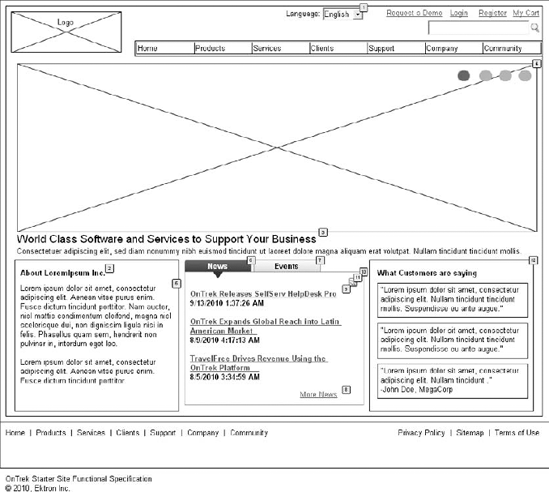
For each footnote defined in the user interface, the object table, reproduced in Table 3-1, provides a label, expected interaction for the component, and a description of how the component should be constructed. For example, many of the components on the homepage are actually widgets. When looking at the language selector, footnote number one, you'll notice that the description of the object table indicates its expected functionality, including the need for the language selector control content languages for all components found on the page, including menus. As you review the remainder of the objects defined in this specific page, you'll notice that the majority of the remaining components are in fact, widgets.
Table 3.1. Object Table for the Homepage
For each widget defined within the page, a similar screenshot and object table are required. This example uses the What Customers Are Saying Widget. Similar to the page interface, the interface for the widget is separately documented in the CMS implementation guide. As before, the separate object table, related specifically to this widget, is also included. The User Interface for the What Customers Are Saying Widget is shown in Figure 3-2.
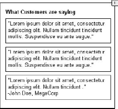
For the What Customers Are Saying Widget, the object table provides detailed references to the desired functionality of the widget, including how the functionality changes based on whether a user is currently editing the page. The object table for the What Customers Are Saying Widget is reproduced in Table 3-2.
Table 3.2. Object Table for the What Customers Are Saying Widget
FOOTNOTE | LABEL | INTERACTIONS | DESCRIPTION |
|---|---|---|---|
1 | What Customers Are Saying Widget | This display shows what one comment would look like. Widget Settings: Widget should allow user to choose which comments to show (collections? content list?), change the header text, how many to show, enable paging, how many per page, and whether or not to rotate them on page refresh. |
The layout for the products page user interface, as shown in Figure 3-3, is different from the homepage example in the last section. While maintaining the global navigation and company logo across the top of the page, this page produces a new layout and function in the left column. Based on this wireframe, the product details are shown. In the right column, widgets display similar products, items listed as upgrades for the current product, and products other customers have purchased.
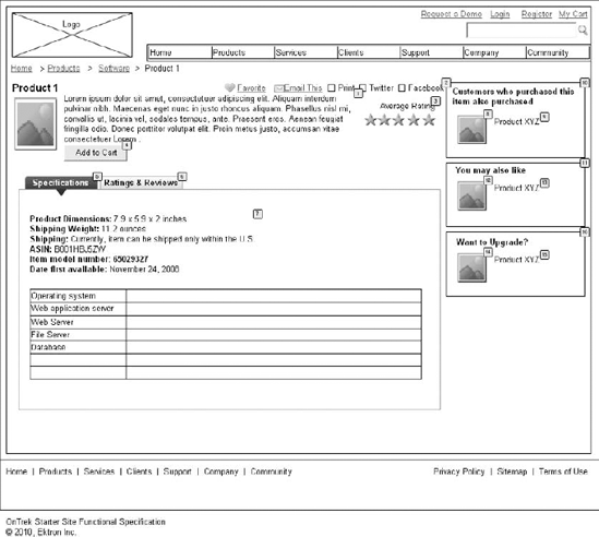
The object table for the products page is more complicated than the first example. As before, footnotes make visual references to individual components found in the page. Based on this example, the CMS architect has created this layout leveraging a combination of Ektron Server Controls and widgets. Notice also that in this section, the architect has defined specific interactions for certain components. For example, several items contain an OnClick interaction. This signifies that when the user clicks on the item, the interface will respond by performing the action listed. The object table for this page is reproduced in Table 3-3.
Table 3.3. Object Table for the Products Page
FOOTNOTE | LABEL | INTERACTIONS | DESCRIPTION |
|---|---|---|---|
1 | Product details | Case 1: Open Product Page in Current Window | Display the product title, image, details, average rating, and add to cart button. |
2 | Social Bar Widget | Social Bar Widget allowing users to add to favorites (visible when logged in), E-mail link to someone, print the page, tweet the URL, or facebook the URL. | |
3 | Average rating | Display stars showing the average rating for the product. If not yet rated, display "Not yet rated." | |
4 | Add to Cart | Add the item to the user's cart. | |
5 | Specifications Tab | OnClick: Case 1: Set Panel state to Specifications State | Displays detailed specifications of the product. |
6 | Ratings & Reviews Tab | OnClick: Case 1: Set Panel state to Ratings State | Displays ratings and reviews entered by customers for the current product. |
7 | Product Specs | Display product specifications (size, weight, etc). | |
8 | Product Image | OnClick: Case 1: Open Product Page in Current Window | Image displayed inside the Product Customer Sell Widget. |
9 | Product Name | OnClick: Case 1: Open Product Page in Current Window | Name of product shown in 8. |
10 | Product Customer Sell Widget | Show products that customers have also purchased when they purchased this item. If none are available, do not display. | |
11 | Recommends products to the user. Displays products associated to the product being displayed on the page using the Recommendation server control. If there are no associated products, this should not display. | ||
12 | Product Image | OnClick: Case 1: Open Product Page in Current Window | Image for product displayed in 11. |
13 | Product Name | OnClick: Case 1: Open Product Page in Current Window | Name of product displayed in 11. |
14 | Product Image | OnClick: Case 1: Open Product Page in Current Window | Image for product displayed in 16. |
15 | Product Name | OnClick: Case 1: Open Product Page in Current Window | Name of product displayed in 16. |
16 | Product Upsell Widget | Display product upgrade(s) for the product displayed on the page. If no upgrade available, do not display. |
As before, certain elements of the page interface are comprised of widgets. An object table and widget screenshots are required for each specified widget. The user interface for the Product Cross Sell Widget is shown in Figure 3-4.
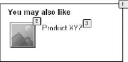
The object table for the Product Cross Sell Widget is reproduced in Table 3-4. This object table defines the display and available widget settings that content managers can customize, as well as the link action for the displayed event.
Table 3.4. Object Table for the Product Cross Sell Widget
FOOTNOTE | LABEL | INTERACTIONS | DESCRIPTION |
|---|---|---|---|
1 | Product Cross Sell Widget | Recommends products to the user. Displays products associated to the product being displayed on the page using the Recommendation server control. Widget Settings: Header text. How many items to display. Set which product to make recommendations from. | |
2 | Product Image | OnClick: Case 1: Open Product Page in Current Window | Image for the product being cross sold. |
3 | Product Name | OnClick: Case 1: Open Product Page in Current Window | Name of the product being cross sold. |
The final example that you see in this section is related to the user's personalized dashboard page. Compared to the previous pages you've reviewed, the user dashboard is fairly complex. Consisting of many server controls and a large amount of custom code, the user dashboard is a very powerful and highly functional element of the OnTrek website. As before, the user interface relies upon a consistent placement of the OnTrek logo and global navigational components across the top of the page. In the left column, an accordion menu is presented that offers links to the user's profile, groups, friends, favorites, a calendar, a blog, documents, and photos.
The right column of the dashboard page is devoted to the display of a user's individual widgets. These widgets are personalization controls that site visitors can add, modify, or remove. Thus, you must define those interactions in the implementation guide. Across the top of the right side of the page, a status bar allows the users to update their friends with activity statuses. Below the status bar, a scrolling list of widgets is displayed. Finally, below the scrolling tray of widgets are the actual widgets that the users have selected for their individual dashboard. The user interface for the user dashboard is shown in Figure 3-5.
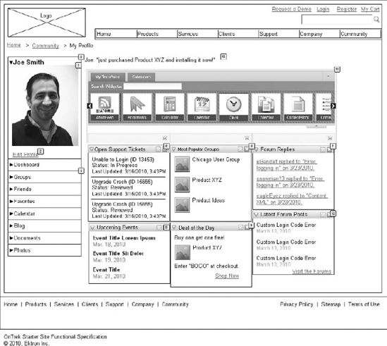
The object table for the dashboard is similarly complex. However, in the page view, most of the references point to individual widgets and as such, are defined in the widget object table. Please note that the object table also includes guidance related to business rules that drive the functionality of individual components. The object table for the user dashboard is reproduced in Table 3-5.
Table 3.5. Object Table for the User Dashboard Page
FOOTNOTE | LABEL | INTERACTIONS | DESCRIPTION |
|---|---|---|---|
1 | Profile Avatar | User profile image uploaded by user. | |
2 | Edit profile | OnClick: Case 1: Open Link in Current Window | Edit profile brings user to edit profile screen. |
3 | My profile | Shows the user profile basics. Uses profile format from Eintranet, an earlier project. | |
4 | Left Nav Tabs | Tabs are prioritized in this order for the profile. | |
5 | Status Bar | This should be updated from the current view on the Eintranet to use this format. | |
6 | Open Support Tickets Dashboard Widget | See Dashboard Widget specs. (download the full Implementation Guide for this section). | |
7 | Most Popular Groups Dashboard Widget | See Dashboard Widget specs. | |
8 | Forum Replies Dashboard Widget | See Dashboard Widget specs. | |
9 | Upcoming Events Dashboard Widget | See Dashboard Widget specs. | |
10 | Deal of the Day Dashboard Widget | See Dashboard Widget specs. | |
11 | Latest Forum Posts Dashboard Widget | See Dashboard Widget specs. | |
12 | Personalization Dashboard | User's personalized dashboard. Can include any out-of-the-box widget, plus the widgets shown here. This view shows a proposed search widget box that should function the same as the PageBuilder Widget search. |
We have selected the Most Popular Groups Dashboard Widget as an example of the many widgets that make up the dashboard page. Note the default settings are specified in the widget object table and even performance concerns are documented at this stage. The user interface is shown in Figure 3-6, and the object table for the widget is reproduced in Table 3-6.
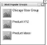
Table 3.6. Object Table for the Most Popular Groups Dashboard Widget
FOOTNOTE | LABEL | INTERACTIONS | DESCRIPTION |
|---|---|---|---|
1 | Most Popular Groups Dashboard Widget | Widget for Personalization Dashboard. Avatar and text link to the group profile. Widget Settings: Set how many groups to display. Default is 5. (Set a max of 25 for performance.) |
Now that you have seen a detailed view of what a content management system implementation guide looks like, this chapter will wrap up by sharing some best practice ideas to guide you as you create your own implementation guides. See Table 3-7.
Table 3.7. Best Practice Ideas for Creating an Implementation Guide
IDEA | DESCRIPTION |
|---|---|
Be thorough. | If there's one area where CMS implementation guides are not successful, it's generally in their lack of thoroughness in capturing all requirements. The amount of effort you spend planning up front is returned to you many times over because doing so streamlines the development process. Before finalizing your implementation guide, cross-reference all aspects of the guide to existing functional requirements and information architecture standards. |
Don't cut corners. | Make sure that you have an extensive set of Wireframes or user interface prototypes to include in your implementation guide. Ensure that your functional requirements and information architecture documents are complete and thorough before beginning work on the implementation guide. |
Think strategically. | With the Ektron Framework, you often have many different methods, controls, or components that accomplish similar tasks. When considering different options, always think long-term. The goal of the implementation guide is not just to define how to build this current version of the website, but also to provide the flexibility that you need as the site evolves and grows in the future. If you have questions about which control to use, take advantage of the Ektron devCenter at |
Develop your implementation guide in multiple passes. | Involve other members of the development team in reviewing your implementation guide to get their input and advice. |
Remember to consider the various contexts in which your pages will be rendered. | For example, think about how the page performs for a general website visitor, for a user who has login access, or for a user who is a CMS account holder. |
Remember to plan for user interaction. | Keep in mind the flow of specific components of functionality. For example, consider a login process. The interaction design of this process is that users click a login button that opens a new window. In the new window, users enter their usernames and passwords and press the login button in the pop-up. If successful, the login window closes and the page refreshes. If not, an error message displays in the pop-up window and the users have the opportunity to enter the user password again. |
Wherever possible, reiterate the business rules that govern functionality. | As seen previously in this chapter, it is always helpful to document relevant business rules in the context of individual components. For example, keeping performance in mind while developing business rules related to taxonomy-driven lists can have a major impact in the overall performance of your website. Including rules like "display only 10 matches" in the context of the implementation guide ensures that your development team will actually implement code in a way that optimizes performance. |
Remember that the implementation guide is a living document. | In addition to providing documentation to the development team that is initially building out the site, the implementation guide is also used as a form of ongoing documentation about the functionality the site contains and the key elements of that functionality. Maintaining the implementation guide allows you to bring new team members up to speed quickly, helps alleviate duplicate code, and helps to keep new development exercises in line with existing functionality. |