
How do you log into the CMS and use the Workarea?
How do you work with content in the Ektron Framework?
How can you organize content and assets using folders and the library?
How do you manage permission structures and create approval chains?
Learning a new framework can be very confusing. You need to figure out what is most central to the framework and what the overall stack looks like. This type of 30,000-ft. view can be difficult, which is why the book addresses these fundamentals.
In the Ektron Framework, the most important concept to grasp is that of content. Almost everything in the system is designed either as an extension of content, such as Calendar Events and PageBuilder pages, or as an organizational tool for content, such as collections and taxonomy. This densely knotted structure is, in many ways, a unique aspect of the Ektron Framework. In most content management systems and portals there is a concept of content, but content is not the basis for other things in those systems.
This chapter starts with the Workarea, which is a browser-based application installed into your site. The Workarea is where the vast majority of management of your site happens. This chapter covers how to log in to the system, and takes you on a tour to get a feel for navigation in the Workarea.
The next section covers how to create, work with, and display content. The interaction with content covered here will be expounded upon in later chapters as you cover other features based on core content such as HTML forms and PageBuilder pages.
You'll also explore some concepts closely related to content, such as permissions, approval chains, and history. These tools allow you as a developer to understand the features content authors will need to interact with regularly, and how those features can impact your overall site design.
One of the largest things that impact site design is the overall site infrastructure, and you will cover the concepts of folders and the library in this chapter as well. When you complete this chapter you will understand how to address the information architecture of your site so that content authors can manage the information of your site on an ongoing basis.
Almost all interaction with the Ektron CMS occurs from an application inside your site called the Workarea. The Workarea provides an interface to manage your folder structure, content, menu system and metadata, system setup—just about anything that is configurable and manageable for your site. In this chapter, you'll go through some of the basics of interacting with the Workarea application, and learn how the features are organized.
The Workarea is the primary interaction point for content managers in an Ektron installation. It is installed in the directory ~/Workarea. The Workarea is not precompiled or obfuscated, meaning you can look at the code to see how it performs any action. It can also be customized to add functionality, but this is only recommended for advanced users.
Before you dig into the Workarea itself, you'll learn how to log into a freshly installed CMS400Min site. Once you've logged in, you'll learn the process of adding a user to the site and to a group. Then you'll do a run through of the Workarea, which is where all content customizations happen from here on out.
The Ektron Framework has two primary types of users: membership users and content authors. The Workarea is usable only by content authors and is available only if a correct license key is used. This means no key is necessary for localhost operations, but a non-expired license key is required for any domain access. The special user builtin, can always access the Workarea, which allows the license key to be updated for a live site. The account types can be found in Table 5-1.
Table 5.1. Special Users in the Ektron Framework
USERNAME | PASSWORD | DESCRIPTION |
|---|---|---|
admin | Automatically granted all permissions. | |
builtin | An emergency account that can be used if all admin accounts are accidentally disabled or locked out. Builtin can log in even if the license key is invalid. The account is only able to access particular areas of the CMS—particularly the user management and setup screens. | |
n/a | Only used for programmatic access. It automatically passes all permission checks. | |
vs | Used if data services for Visual Studio are enabled. It connects to the server from the Ektron Framework Server Controls in Visual Studio via Web services, and allows you to select hardcoded values such as Content Block IDs. |
The password for the admin, builtin, and vs accounts should always be changed on any production site. Until the site goes live, however, it is fine to leave these accounts with the stock information. In addition to these special users, there are also two special user groups defined in Table 5-2.
Table 5.2. Special Groups in the Ektron Framework
GROUP NAME | DESCRIPTION |
|---|---|
Everyone | Every user in the system is automatically in this group. |
Administrators | Members of this group automatically pass all permission and role tests. |
Note
Members of the Administrators group have powerful privileges and can modify anything in the framework, at will. Be careful who you grant this membership to in a production site.
Since you are working with a freshly installed copy of the OnTrek site, log in with the admin user and create an administrator account for use by a developer.
To log into the site you follow these steps:
Simply go to the home page. Visit the freshly installed site at
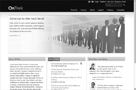
http://localhost/ontrek/default.aspxunless you installed to a different location. On the home page, you'll see a link in the toolbar, shown in Figure 5-1, to log into the site.Click the Login button and login as admin/admin. Once you're logged in as a CMS user, the Login button will be replaced by a link to the Workarea. If you are starting with a min site, the process is slightly different. The min site ships with a simple template called login.aspx (
http://localhost/cms400min/cmslogin.aspx.), and doesn't have the login in the aforementioned toolbar. When you visit this template, you'll see Figure 5-2 on the page.This image is produced by the Login Server Control. The login server has the same functionality as the toolbar on the homepage of the OnTrek site, but with a less form-fitting layout.
You may find that there is no login available on the front end. If worse comes to worst, the login functionality is available at
http://localhost/OnTrek/workarea/login.aspx. Once logged into the site, the Workarea can be launched by visitinghttp://localhost/OnTrek/workarea/workarea.aspx.Once logged in, you should create an account for use on the development site. This is especially important when you are sharing a demo site, because each login supports only one session at a time. If you were to log in on another browser, the system would invalidate your first session.
Launch the Workarea now by clicking the Workarea link. When you enter the Workarea, the first thing you see is the Dashboard, pictured in Figure 5-3. This chapter will walk through the tabs one-by-one after you've created your development user.
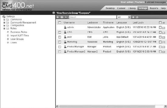
On the top right, select the Settings tab. Once you're viewing the Settings tree, select Users from it. In Figure 5-4, you'll find the Settings tree on the left and a list of users defined in the system on the right.
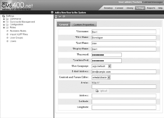
Create a new user by clicking the Add icon just above the list of users. The Add a New User to the System form has a list of fields that must be entered, as pictured in Figure 5-5.
Enter the username, first and last name, display name, password, confirm password, and e-mail. Clicking the Save icon throws an error.
Click over to the Custom Properties tab and select a time zone for the user to correct the error. Select your time zone, and click the Save icon.
Note
Custom properties can be created that apply to all users at any time. These properties will appear under the Custom Properties tab on the user registration and modification screen, and can be used for programmatic purposes.
This user is now ready for use, except that as a developer, you will likely need administrator privileges on your account. To add the newly created user to the administrator group, select the User Groups node on the Settings tree.
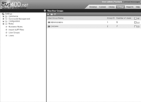
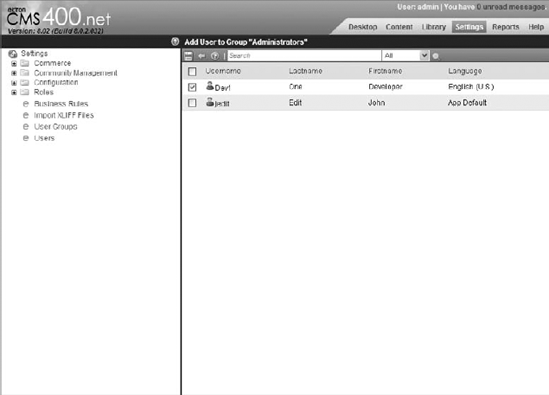
You can see the two built-in groups shown in Figure 5-6. Click Administrators, and the page will instead list the users in the Administrators group. The add icon on this screen allows you to add your user to the group.
Select the Dev1 checkbox in the list, shown in Figure 5-7, and click the Floppy icon to save, then click OK on the confirmation dialog. Now that Dev1 is a member of the administrator group, Dev1 now has all privileges in the system. You can now close the Workarea browser window, click Logout on the toolbar on the front page of the site, and then log back in as Dev1.


Upon launching the Workarea, the first view that comes up is the Dashboard, also known as the Smart Desktop. The Dashboard is a personalized view into the CMS. It allows each user to add widgets to the display and manage the layout of those widgets. The preloaded widgets can display reports on content in certain states, eCommerce trends and orders, and analytics information. The Workarea Dashboard uses the same personalization engine as Member User Dashboards, which are covered in Chapter 11.
After the Dashboard tab comes the Content, Library, Settings, and Reports tabs. These tabs follow a common layout. They are divided into two parts: one on the left and one on the right. The right side, called the "display pane," is used to show the interface of the particular option or content you are currently modifying. The left side is called the "navigation pane," and allows you to select the particular feature you want to interact with in the display pane.
The Settings tab of the Workarea is the key to managing options on the Ektron Framework. This area is where everything that isn't managed content is configured. This includes users and groups, and also more fundamental elements such as aliasing options and system templates.
The Desktop is the first tab to appear because it is helpful to see what workflows require a user's interaction, as pictured in Figure 5-8.

This makes ongoing management of the content and components of the website easier. However, this tab provides only a brief overview of the state of the system. To see the system in more depth, it is necessary to switch tabs to other views. The tabs are at the top right of the Workarea, the second tab being Content.
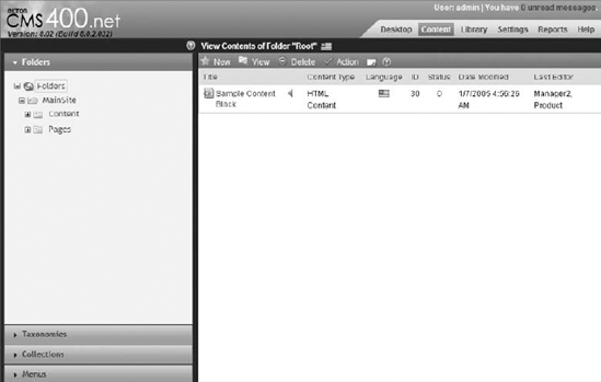
The Content tab is where interaction with the primary elements of the CMS occurs. This Content tab, as mentioned in the general discussion, is comprised of a navigation pane on the left and a display pane on the right. This is shown below in Figure 5-9.
In the navigation pane on the content tab, there are four accordions — Folders, Taxonomies, Collections and Menus. Each accordion contains a "navigation tree," which displays the respective elements associated with that type. For example, in the folders accordion, the navigation tree shows the folders at each level. Selecting a folder from the navigation tree updates the display pane to show the details for that folder — in this case the detail view is the list of content within that folder.
It may seem unusual that all four accordions in the navigation pane of the Content tab do not display content. This is completely normal, since all four accordions are methods of organizing the content. For instance, when showing the Collections accordion, the navigation tree lists each of the collections defined in the site. Selecting one of the collections updates the display pane to show the content associated with that collection.
Interactions with content items also occur through the Content tab. Selecting one of the content items listed in the display pane when navigating the folders tree brings you to the content display page. This page lists all the details for a particular piece of content, and by interacting with the display pane toolbar, shown in Figure 5-10, a content author can manage all aspects of the content.

The two last tabs oriented towards system management are the Settings tab and the Reports tab. The Settings tab is where non–content oriented options are managed. This includes system wide configuration options like license keys, user and community management, as well as eCommerce management. One of the most important items available in the Settings tab is the Setup pane, accessible through Settings
Content is the fundamental unit of information displayed on your website. While not everything in the Ektron Framework is based on content, most things are. For example, calendar events, PageBuilder pages, and HTML forms are all based on content, whereas menus, taxonomy categories, and collections are not.
Content in the Ektron Framework follows a predetermined process. This process starts with its addition to the site and ends with its eventual publication. The process incorporates approval chains and permissions to ensure each piece of content has been approved by the necessary people before going live to the site.
In addition to basic properties, such as creation dates, content items also have extensive roots throughout the framework. For instance, content items can belong to taxonomy nodes, collections, and appear on menus. They can have metadata associated with them, support multilingual representations, and can be associated with URL aliases. This section won't cover every connection that content has, but will focus on the process of entering content, how to move it through publication stages, and how, as a developer, to display it.
Depending on the current version state, content is stored in one of three separate tables in the database:
content: The current live version of a piece of content is always found in thecontenttable. This is the version that is accessible to users who aren't logged in, membership users, and anyone not previewing the site.content_edit: This table stores the most current version of the content that has not yet been published. Once the changes have been published, the row is removed from thecontent_edittable and moved to thecontenttable.content_history: This is where all previous checked in and published versions of content go. Content can be restored from thecontent_historytable by users with the correct permissions.
Each version of content has a status associated with it. The possible content states are listed in Table 5-3 and as a piece of content moves through the states, only certain actions can be taken. The end goal in each case is to reach the A state, which means that content is viewable to users with the correct permissions.
Table 5.3. Content States
LETTER | MEANING | DESCRIPTION | POSSIBLE NEXT STATES |
|---|---|---|---|
A | Approved | Content has been through the entire workflow and is published and available on the site. | O, M |
O | Checked Out | Content is currently checked out to a user. This means the item is currently being edited. It cannot be edited by another user until it has been checked in. | I, S |
I | Checked In | Content checked in for other users to edit. Has not yet been published, so it not visible on the site. | A, O, S, M, P, T |
S | Submitted for Approval | Content will enter this state only if it has an approval chain it needs to complete. This state is entered when the author submits the content into the chain after making edits. | A, O, S, M, P, T |
M | Marked for Deletion | The equivalent of the S state, but for deleting content. When a user attempts to delete content from a folder with an approval chain, the content will remain in the M state until the request is approved or declined. | A, Deleted |
P | Pending Go Live Date | The content has been approved and is ready to appear on the site, but it has been marked with a go live date. The content will remain in the P state until the go live data occurs, at which point the content transitions to A and is visible on the site. | A, O, M |
T | Awaiting Completion of Tasks | Tasks are items associated to a piece of content and assigned to a person. A piece of content will not be visible on the website until all tasks associated with it have been completed. If there is nothing stopping a piece of content from being displayed except for the completion of tasks, it is in the T state. When the necessary tasks are completed, it will move automatically to A state and become visible on the site. | A, O, M |
The movement from one state to the next is limited by the permissions of the current user, as well as any applied approval chains and tasks associated with the content. For instance, the T state will be reached only when attempting to publish a piece of content that has tasks associated with it. Additionally, the S and M states will be reached only if an approval chain has been applied to the folder. If the folder does not have an approval chain, the content moves directly to the A state or is deleted, respectively.
Content in the Ektron Framework is managed through a lock model, which means that when one user is editing content, no other user can edit at the same time. It's very similar to a source control model, in that content can only be checked out to one user at a time, and the next user must wait until the content has been checked back in before he or she in turn can check it out to edit it. Publishing content to bring it live on the site can then be done with any version that has been checked in. Each time the content is checked in or published, an additional record is made in the history table that contains that version of the content.
This section covers some fundamental tasks associated with managing content in the Ektron Framework.
Creating a content item
Viewing the content in the Workarea
Interacting with the Document Management System (DMS) menu and editing in context
Using the Content Block Server Control
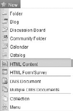
To create a content block in the installed site, open the Workarea and navigate to Root
The page that appears to collect information about your new content has several tabs, each of which has inputs associated with a particular aspect of the content. In many cases, the tab is prepopulated with information inherited from the folder. However, in some cases the tab is blank and information must be entered at this time. This section first covers the universally available fields in this form, then iterates over the tabs, and finally looks at the available options on the toolbar.
There are only two options on the form that aren't included in a tab:
The title of the content: The title must be unique within the folder. If it is not, then a number in parentheses will be appended to the end of the name, per Microsoft naming conventions.
The Content Searchable field: This determines whether the content item will be returned in content searches on the site. This only affects the Ektron built-in search results, not external search engines such as Bing or Google.
Let's now move on to the tabs that are used to manage all other aspects of the content. Figure 5-12 displays the various tabs.

Content: The first tab, Content, is where the actual content is entered. The Ektron eWebEdit400 editor is displayed inside the tab. eWebEdit400 is a full-featured JavaScript-based HTML editor, and is compatible with any recent release of all the major browsers. The discussion of the functionality in eWebEdit400 is outside the scope of this book. This editor displays the content that will actually be displayed to users browsing on the site.
Summary: The Summary tab also has an instance of eWebEdit400. This instance is used to enter the summary for the content. The summary can be displayed optionally in many locations that would display a link to this content. For example, the summary can be displayed alongside the link in search results, in folder listings using the ListSummary Server Control, and in collection listings using the Collection Server Control. If you know that the summary won't be displayed on the site, it is not necessary to fill it out, but it is considered Best Practice to enter a summary here.
Metadata: Metadata is additional information associated to the content. This can be in two forms:
Traditional, SEO-style metadata that would be rendered into the document such as the description and keywords.
Metadata in the Ektron Framework. That is data that associates this content to other content, or stores settings for display or content tags.
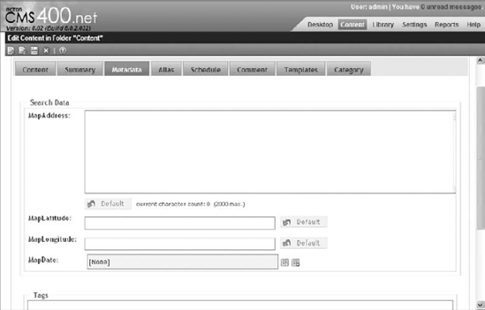
The metadata definitions that apply to a given piece of content are inherited from the folder where the content resides, and the values for the metadata may have defaults associated with the definitions for the metadata. The values you want to use for this particular piece of content, however, should be entered in the area displayed in Figure 5-13.
Alias: Aliases are alternative URLs that can be used to access the content in addition to the quicklink for a given piece of content. This allows content managers to manage the SEO needs for a given piece of content. The alias tab allows you to manage a manual alias for the content, which is user entered, and also shows a list of the automatic aliases available for the content.
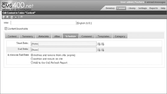
Schedule: Pictured in Figure 5-14, this tab allows the content manager to set when the new published version should go live, and when a piece of content should expire. It also allows you to set the action to take upon expiration. These options can all be left blank, in which case the content remains in its normal state indefinitely. By setting a Start date for the content, however, you can control exactly when the content becomes visible. There are three options for the action to take on expiration:
Archive and remove from site: Changes the content to be archived. The content is still visible in the Workarea by setting the filter to Archived Content, but is not visible on the site.
Archive and remain on site: Removes the content from active navigation elements such as ListSummaries, but is still located by search and by direct navigation such as bookmarks. This option also archives the content.
Add to the CMS Refresh Report: This adds an entry to a list of items that need to be reviewed by an author. However, the content is still completely normal in terms of front-end navigation and display, as well as with Workarea interaction.
Comment: Comments are internal-only notes that can be entered for each piece of content. These are not displayed anywhere on the front end. Instead, they are used to store information that may be useful to a future editor of the content.
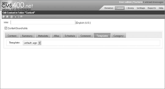
Templates: The Templates tab, pictured in Figure 5-15, allows users to select the template for this particular piece of content. The only allowed templates are the ones that the parent folder is configured to use. This controls the template the content is rendered on when a user follows a system-generated link to the content. However, any Content Block Server Control on any template has the ability to display the content item if the controls
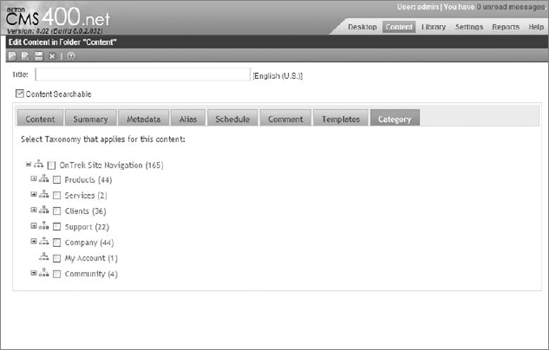
DefaultContentIDproperty is set to the ID of the content item.Category: The Category tab, pictured in Figure 5-16, allows the content author to associate the content item to any applicable taxonomy nodes. Only nodes that have been associated with the parent folder are available for selection on this screen. Also remember that when a piece of content is associated to a taxonomy node, that update happens outside of the normal content workflow. In other words, if an author modifies a piece of content to be associated to a different node, that change happens immediately.
If they have been marked on the parent folder, the only required fields for content are the title, content, metadata, and categories. Enter the following details into those fields now. Table 5-4 provides the fields and corresponding values.
Now let's examine the available buttons on the toolbar in the content entry pane. Figure 5-17 displays the toolbar.

Submit/Publish: This button will submit the content into the approval chain if configured, and will publish the content immediately if there is no approval chain for the folder.
Checkin: Checks in the content but does not submit it to the approval process or bring it live. Checking in content will allow other authors to begin working on the content.
Save: This keeps the content checked out to the current editor, locking it to other users, while updating the copy in the database so that no changes will be lost.
Cancel: Discards any changes made from the version in the database.
Submit the content now by clicking the first button on the toolbar. This returns you to the View Content screen, where you can see all the details of the content you just created.
The View Content screen, shown in Figure 5-18, displays almost the same interface as the Edit Content screen. It has a toolbar with many more options, along with the same tabbed interface from before, and even some of the tabs are the same. This section goes through the screen in the same order as before, first covering the display below the toolbar, and then diving into each item on the toolbar itself.
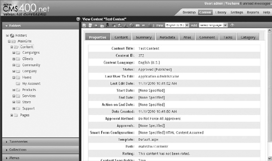
Properties: Shown in Figure 5-19, this displays everything you need to know at a system level about the content. It displays the title, the ID, language, current content status, action dates, template, system path, and content rating.
Content: Shown in Figure 5-18, this renders the content that will be shown on the site. Content is rendered without any custom stylesheets you may have configured for the folder. This differs from the editor, which does interact with the content with custom stylesheets applied.
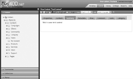
Summary: Just like the Content tab, the Summary tab displays the HTML entered into the summary. If nothing is entered for the summary, the summary is automatically generated by the system from the content. Figure 5-20 displays the Summary tab.
Metadata: The Metadata tab, pictured in Figure 5-21, shows the values stored for each metadata definition for this content item. In some cases this will differ from what was entered on the edit screen. These items, just like all items in the CMS, can be modified by Framework Plugins and Extensions. The reason it is mentioned explicitly here is that one of the extensions shipped with the framework is a GeoMapping Plugin. This reads the data stored in the MapAddress metafield, and converts it to a latitude and longitude, which are stored in the corresponding metafields.
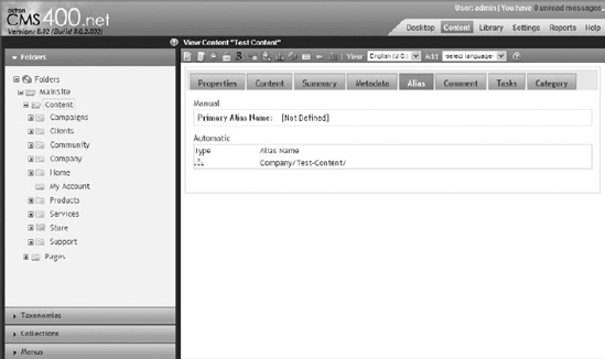
Alias: Shown in Figure 5-22, this tab allows you to update the manual alias for the content if aliasing has been enabled on the site, and it will also list any current automatically generated aliases which can come from taxonomy or folder aliasing. For more information on aliasing, see Chapter 6.
Comment: This simply displays whatever information was entered into the Comment field on the Edit screen.
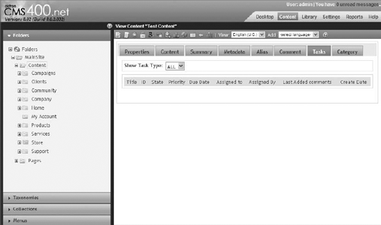
Tasks: Shown in Figure 5-23, this displays a report of all tasks currently associated with the content. Tasks are notes attached to a piece of content that can be assigned to specific users. If there are any tasks associated with a piece of content, the content will not go live until they have been marked as complete. Administrators can see all tasks associated with a piece of content, but non-administrative users can only see tasks assigned to them.
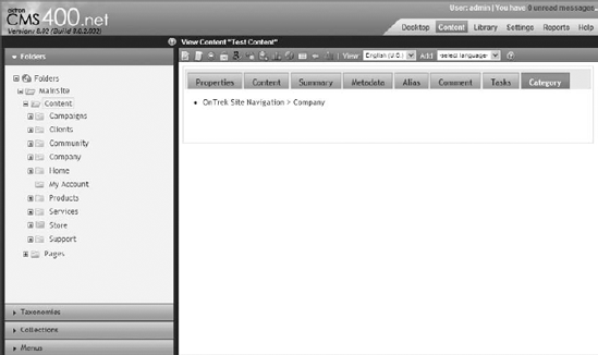
Category: Pictured in Figure 5-24, this simply lists all the taxonomy nodes the content item has been associated with.


As you have seen, the tabs displayed when viewing a piece of content are very closely related to the tabs that are visible when editing content. The toolbar however, is very different, as you'll see in Figure 5-25.
Let's now look at each item and what it does.

The Edit button allows a user to edit the piece of content. It will first check the content out to the user, preventing other users from making changes at the same time.

The History screen, shown in Figure 5-26, displays a list of all the stored versions of a piece of content. This includes each time the content has been checked in, and each time it has been published. The History screen allows a user to restore a particular version of the content, as well as view the differences between any two versions of content. The title, content, summary, metadata, and comments are all stored on a version-by-version basis—all other items have no restore capability.

View Publish allows you to switch between the version of the content that is currently visible on the site and the version that has not yet been published. This option is available only when there is a version that has been edited since the last time the content was published.

The View Diff functionality opens a new window that displays any differences between the last published version of the content and the most recent edit of the content. This option appears only when the content has been edited since the last time the content was published.

The Delete button will delete the current content from the website.

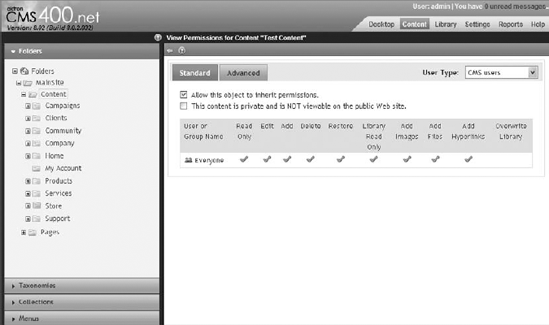
View Permissions, shown in Figure 5-27, brings up the same permission management screen as is used with folders. Content items inherit permissions from their parent folders by default, but this can be overridden on a per item level. It is recommended that you have the permissions be inherited, and override them only when necessary.

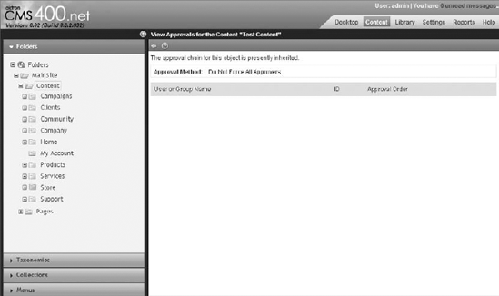
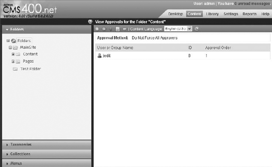
View Approvals, pictured in Figure 5-28, are inherited the same way as permissions. The parent folder settings are applied to the content by default, but can be overridden when necessary.

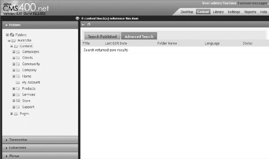
Link Search produces a list of any content that links to this content. Figure 5-29 displays the Search Content Folder. This is useful if you are, for example, considering deleting the content item, but need to ensure that nothing relies on the item before doing so. The Broken Link Checker can also help you solve for this scenario.

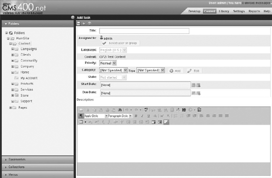
This is how you assign a task to users in the system so they can perform some action on the current content item. Add Task produces a form where you can specify the priority, category, type, start and due date, and description. The form is displayed in Figure 5-30. The assigned user then receives a notification to perform the task. Once complete, the item returns to you for approval or rejection.

The Content Reports interface shows you feedback for content left by users on your site. It has three tabs, as pictured in Figure 5-31: Rating, Messages, and Flagging. The first tab, Rating, shows the star ratings and comments left by users using the Content Review Server Control. The second tab, Messages, shows comments left by users using the MessageBoard Server Control. The third tab shows flags selected for the content by users interacting with the ContentFlagging Server Control.

When you click Analytics, a new window displays information about the page where the content item appears. It only functions with publically accessible pages, meaning no localhost addresses can be used. It shares information such as an SEO analysis of the page, W3C Validator feedback, Alexa rank, image analysis, and traffic charts.

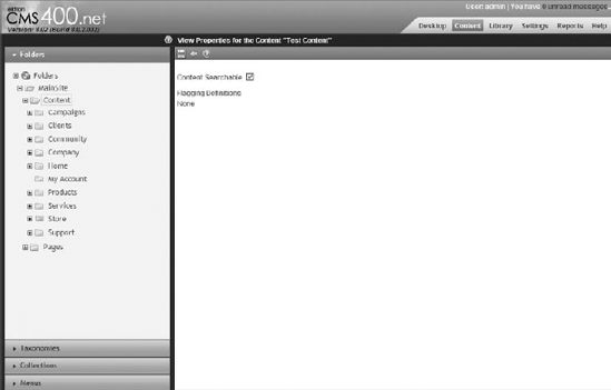
Edit Properties, shown in Figure 5-32, allows you to select from two options: whether the content is searchable and what flagging definitions to use.

Export for Translation presents you with a list of languages to target for translation, along with a history of translations. The export generates an XLIFF file, which can be directly sent to a translation company. They will then return the file with translated entries, at which point the file can be uploaded into the CMS to enter the data.

The Language Toolbar allows you to select a different language version of the content. Each language can have its own permissions, approval process, and metadata. In fact, everything about the content, including everything that ties it to the rest of the system, can be modified on a language-by-language basis.


Not all interaction with a piece of content must happen through the content pane in the Workarea. Content can also be managed from a workflow perspective through any content listing on the site and in the Workarea. This interaction is performed through what is called the DMS menu, which is displayed in Figure 5-33.
The DMS menu can be used to access the content pages, with options to view the content page in the Workarea, view the content on the site, interact with the item's properties, and move the item through its workflow. The DMS menu is most useful for bringing these shortcuts to the front end of the site. By combining the DMS menu with the inline editing capabilities of the Content Block Server Control, much of the interaction that would require the user to launch the Workarea can instead be performed on the site itself.
The in-context editing capabilities of the Content Block Server Control simplify the experience of maintaining existing content. Anywhere the Content Block Server Control is used, a logged in author has the ability on the Editors menu (Figure 5-34) to edit in context (Figure 5-35).
Hovering over the Editors menu produces many options. When a content author clicks Edit, it launches the Workarea, allowing the user to edit the properties and the HTML content item in its entirety. However, selecting Edit In Context allows the author to do cursory editing of the content item without launching the Workarea. Editing in context takes place directly on the Web page, meaning the author can see the applied CSS in real time, and see exactly how the content will look when it is published. The drawback is that the inline editor does not have the full range of options that the eWebEdit400 editor in the Workarea supplies to users. Table 5-5 describes the available options and what the options achieve.


Table 5.5. Edit in Context Options
ICON | NAME | DESCRIPTION |
|---|---|---|
 | Save | Saves the content with the current changes. This will also check the content in, and submit it to the approval chain. In the in-context editor, these actions cannot be separated. |
 | Spell Check | This will spell check the content currently entered. Spell Check is not live as content is entered. |
 | Add/Remove Hyperlink | Manages hyperlinks in the content. |
 | Add Library Item | Allows for adding items from the library, and managing existing library items. |
 | Bold/Italic | Text styling. |
 | Cancel | Cancels the edits and returns the content to the original state. |
In-context editing is not too useful for managing content layout or styling. Instead it is more useful for immediate textual changes.
The Content Block Server Control is probably the most commonly used server control in the Ektron Framework. Its function is simple: It reads content items from the database and displays them on the website. It can be hardcoded to a specific content item, it can be configured to read the content ID from the query string, or the ID of the content to display can be set programmatically at runtime.
For authors, the Content Block Server Control shows the Editors menu access point, which is a silver bullet rendered just above the content display on the Web page. The access point exposes options to manage the content item directly from the website, including editing in context, managing tasks, and viewing the history of the item. Most of these items launch the Workarea directly to the area of interest. A few of them, including items that moved the content through the workflow, just perform the selected action.
This section covers implementing the Content Block Server Control on a page. Follow these steps:
Open Visual Studio, and then open the website by selecting File
On the Open Site dialog box that comes up, select File System and browse to C:InetpubwwwrootOnTrek. In the Solution Explorer, right-click the root of the site, and select Add New Item.
In the Add New Item dialog box, which is pictured in Figure 5-36, select Web Form with Visual C# as the language. Check the Place code in separate file checkbox, without choosing a master page. Enter in content.aspx for the filename.
The dialog box creates the content.aspx file, as well as the content.aspx.cs codebehind file.
To add the Content Block Server Control, you don't need the codebehind, but the ASPX file itself is where you will declaratively add your control. Make sure the ASPX file is open now.
Once you are looking at the content.aspx file, switch to code view, and open the toolbox. As part of the Ektron installation, the Ektron Server Controls are registered with Visual Studio. This adds all the available controls into the toolbox, which allow you to simply drag the controls onto the page. At this point, the code on the page should look like the code in Listing 5-1.
Example 5.1. Content.aspx
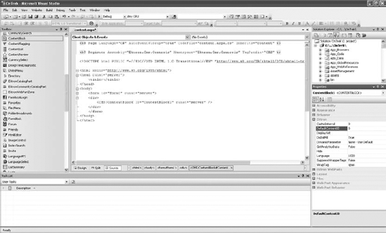
<%@ Page Language="C#" AutoEventWireup="true" CodeFile="content.aspx.cs"
  Inherits="content" %>

<!DOCTYPE html PUBLIC "-//W3C//DTD XHTML 1.0 Transitional//EN"
  "http://www.w3.org/TR/xhtml1/DTD/xhtml1-transitional.dtd">

<html xmlns="http://www.w3.org/1999/xhtml">
<head runat="server">
    <title></title>
</head>
<body>
    <form id="form1" runat="server">
    <div>

    </div>
    </form>
</body>
</html>
Now select the Content Block Server Control from the Ektron Server Controls tab in the toolbox, and drag it between the
<div>tags, as shown in Figure 5-37.Dragging the Content Block Server Control onto the page modifies the code to look like it does in Figure 5-38.
Now open the Properties window, as shown on the right of Figure 5-38. When organizing the properties by category, the Ektron properties are grouped together. The most important property is highlighted in the screenshot—
DefaultContentIDspecifies the ID of the content item to display by default. Additionally, theDynamicParameterproperty specifies which parameter from the query string to read in order to override theDefaultContentID.The Content Block Server Control retrieves and displays the appropriate content item based on the permissions and language settings. To set the content item to display programmatically, set it on the server control using code like the following snippet, which will run in the Page_Load event.
public void Page_Load()
{
  ContentBlock1.DefaultContentID = 123;
  ContentBlock1.Fill();
}


Calling the Fill method forces the server control to read from the database or cache. The data can also be read from the content block programmatically after it has been loaded from the cache or database, by reading the EkItem property from the Content Block Server Control. The EkItem property returns an object of the type Ektron.Cms.Common.ContentBase, which in turn contains all the information about the content item itself. Content can also be retrieved programmatically without the use of the Content Block Server Control. This task is most frequently achieved through the use of the Ektron.Cms.Core.Content.Content object. This object exposes methods for adding content, updating content, deleting content, retrieving single pieces of content, and providing lists of content through the use of criteria objects.
Content is the core of the Ektron Framework. Most items in the CMS are based on the concept of content, which allows these items to support related concepts such as metadata, permissions, and workflow. Content is mostly authored through the Workarea and displayed on the front end of the site. It can be retrieved and displayed through the use of the Content Block Server Control or through programmatic APIs.
Folders are the categorizing tool of the Ektron Framework. They are the most basic way of categorizing content, and through the application of inheritance they also supply items contained in them with allowed properties such as metadata, assigned taxonomies, and permissions.
This section explores the process of creating folders, including the properties associated with them. It also covers the library and its uses.
In addition to containing content, folders are capable of storing other types of data. For instance, a standard content folder can store HTML content, Smart Form content, documents, and PageBuilder pages side-by-side. For consistency purposes, the Ektron Framework also has a concept of folder types. Items such as blogs, calendars, and forums are simply folders with a different subtype. All the APIs that allow a developer to interact with folders will also work with these other types of folders.
Folders have the concept of inheritance as well. By default, when a new folder is created, it inherits permissions, metadata definitions, taxonomy subscriptions, templates, and breadcrumbs from its parent folder. When content is created, it inherits from the containing folder any associated permissions and applicable properties.
You can create a folder programmatically, but the most common way to create folders is through the Workarea. The form to create a folder can be accessed by right-clicking the parent folder, in the folder tree on the Content tab and selecting the New Folder icon. You can access the same form by selecting the appropriate parent folder, and then selecting New on the menu in the right pane.
Folders can have many associated properties, ranging from permissions to approval chains, through metadata to taxonomy. Options such as associated templates and allowed types of content are covered in this section.
In addition to fundamental content types, folders can also store additional data such as images, multimedia files, and QuickLinks in what is called the library. The library is accessible through the Library tab in the top-right side of the Workarea.
In this section you won't be following any particular part of the implementation guide, but instead you will spend time experimenting with some of the options in folder configuration. Since folders are one of the most fundamental parts of your site information architecture, it is important to understand the folder configuration options and what will be affected by those options. This section also explores the concept and management of the library.
The implementation tasks in this section are slightly more freeform than most. Specifically, this section covers:
In later sections, you'll learn about the concepts of approval chains and permissions. This chapter will also cover:
Navigating the library
Adding items to the library
More on the library
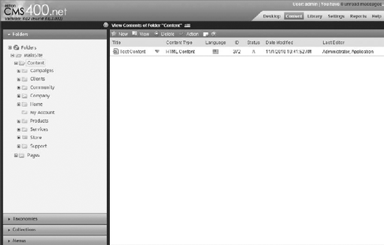
Open the Workarea and switch to the Content tab. The Content tab is where interaction with content and folders takes place. Looking at Figure 5-39, you can see the key elements of working with folders. On the left is the folder tree, starting at the root folder, marked Folders, and continuing down to list all the user-created folders. On the right is the folder menu, and below that the contents in the folder.
Starting with the tree, one of the first things you might notice is that some folders have different icons. As mentioned earlier, folders have a concept of type in which each icon corresponds to a different type of folder. Table 5-6 provides a description of each folder type.
Table 5.6. Folder Types
Each of these folder types can be created either by selecting the folder you want to create it in, and then selecting New on the toolbar menu in the content pane or by right-clicking the parent folder and selecting the appropriate entry on the contextual menu. We will cover the majority of these folder types in later chapters.
On the right side of Figure 5-39 you can see the list of content contained in this folder. Above that are the menu items appropriate for this folder. Starting from the left are the following items:
New allows a user to create new content and new subfolders where appropriate.
View allows the user to filter the list of items by types, certain attributes, and language.
Delete allows the user to delete content from the folder or the folder itself.
Action allows the user to take additional actions such as copy and paste, or export content for translation to another language.
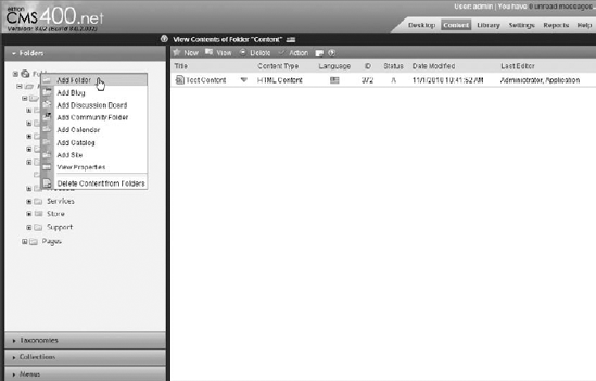
To create a folder, right-click the Root folder and select Add Folder, as shown in Figure 5-40.
This brings up the Add Folder interface. This interface is the same when editing a folder, and allows for all properties of the folder to be modified. Consider the tabs from left to right, as displayed in Figure 5-41.

Properties: This is where basic information is entered, such as the content name. The Properties tab has two options:
The stylesheet that's used in the editor so that editing matches the look and feel of the item when it is published.
The field Publish as PDF, which informs the system whether or not to automatically convert Office documents to PDF when published for greater accessibility by users browsing the site.
Taxonomy: Controls which taxonomies are associated with this folder. Taxonomies can be marked either as assigned or as required. If required, content cannot be published until it is assigned to one or more categories. By default, the settings for taxonomy are inherited from the parent folder.
Templates: Determine the form of QuickLinks for a given piece of content. Every time a piece of content is created, the system creates stored URLs to the content in the form of the assigned template, followed by a query parameter, which indicates which content item to load. When you assign templates to a folder, you are indicating which templates are allowed for users to base content on. Certain templates, called Wireframes, allow for PageBuilder content to be created in this folder. If a Wireframe is not associated with a folder, PageBuilder content cannot be created in that folder. Template configuration is inherited by default.
Flagging: Allows you to select a set of flags that users can choose to flag content. These flags are frequently used for items as Helpful, or Inappropriate. Flagging is inherited from the parent folder by default.
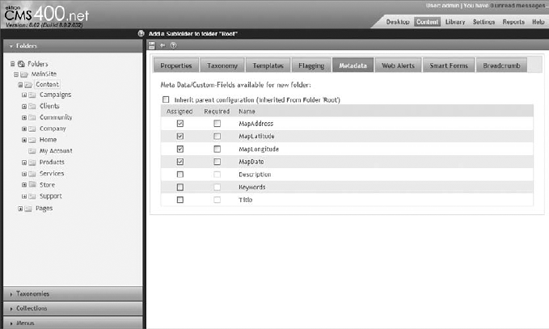
Metadata: As highlighted in Figure 5-42, this tab contains a list of all the metadata definitions in the system. The user is invited to mark some as assigned or required. These options are inherited by default from the parent folder.
Web Alerts: Web Alerts are e-mail notifications sent to users who subscribe to them when new content is published on the site. The Web Alerts tab allows you to configure the form of the notifications. This tab inherits from the parent folder by default.
Smart Forms: Smart Forms are most easily understood as a graphically designed DTD for XML. They are created within the CMS through eWebEditPro, which defines the HTML comprising the field elements, the format the XML is stored in, and the default XSLT data is rendered against for display on the site. Unlike standard HTML content, Smart Form content is not freeform. This allows for uniformity throughout the content.
The Smart Form tab on the folder configuration allows the user to select which Smart Forms are supported in this folder. The user can opt to have no Smart Forms, or Smart Forms exclusively, or some combination thereof. The folder inherits these values from the parent folder by default.
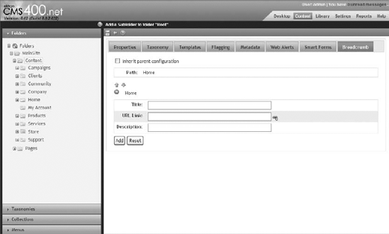
Breadcrumbs: These generate the site map for a site. They are also used to create the breadcrumb links that are frequently found at the top of a typical site design. These are inherited by default, but the inherited behavior is rarely desirable.
When creating breadcrumbs, the items are displayed on the site in the same order they appear on the page in the folder properties, with a preview of what they look like appearing above the list. Reordering is achieved through the use of the green arrows, and the red minus sign deletes an item.
You use the fields that follow to create or edit a given item in the breadcrumb trail. These correspond with Figure 5-43.
Title: Sets what is displayed in the breadcrumb itself.
URL link: Is the page or QuickLink the breadcrumb will route to.
Description: Appears in the hover text for that item.
It is not necessary to configure most of the items on the tabs in the folder properties screen, except when overriding the default values. But for most users, the default values will achieve what is needed. To create the sample folder, simply enter the title Test Folder on the Properties tab, and click the Save icon.
Modifying the properties for the created folder is done by simply right-clicking the folder in the tree and selecting Properties, or by selecting the folder in the tree and, on the right-side menu, selecting View
Note
Remember that changing options on the folder will not un-publish content in that folder, even if it is in a broken state. For instance, removing a taxonomy from the folder will not unassign content in that folder from the taxonomy. Similarly, requiring an additional field of metadata in a folder does not automatically provide content in that folder with that additional metadata item until they are republished.
The library, as displayed in Figure 5-44, is a parallel structure to the content tree. Every folder created in the Content tab has an equivalent folder in the library. The difference between the two is the type of stored content and the content's uses.

The library stores files, images, and three types of links. It also stores these objects on a per-language basis. Let's go through the five items on the list one-by-one.
Files: The default allowed extensions for files uploaded to the library are PPt, PDF, XLS, and DOC. This is a legacy option, and is still supported, but uploading these files into the content tree, instead of the library, offers significant advantages, such as permissions, a history of modifications, approval chain support, and content scheduling. The library should be used for files only when you don't want the features provided by the content tree.
Forms: This is a bit misleading, because the HTML forms themselves are stored in the content tab. What is stored here is the link that is used for the form, with an interface the same as that used for QuickLinks except that it uses
ekfrmas the query string parameter rather thanid.Hyperlinks: Hyperlinks are shortcuts to external sites. By storing them in the library, content authors can embed them into content throughout the site. By updating the URL in one location you can ensure that content authors are always using the most up-to-date version of the URL.
Images: Images are the primary reason for everyday use of the library. By placing images into the library, it is easy for content authors to select the image and embed it in their content on the fly.
QuickLinks: QuickLinks are the other main item in the library. QuickLinks store the URL that is used to reach a certain piece of content. They are automatically created when a piece of content is created, and follow the format
[template file name]?id=[id of content]. These QuickLinks can be updated manually by selecting the Update QuickLink button
Let's explore the functionality of the library by adding an image to the new folder. The image will then be available for embedding into content items to CMS users with view permissions. Follow these steps:
Start by selecting the Test Folder in the folder tree on the Library tab. From the dropdown of types on the toolbar, select Images.
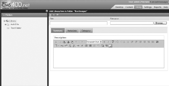
Click the green plus Add icon. This opens the Add Library Item form pictured in Figure 5-45.
At the top of the form, you need to enter a title and select a file for upload. Select an image from your system and type in a title.
Below that you can enter a summary, metadata, and category for your image. This is because these items have inherited selected options on the parallel content folder.
Once this information is filled out, select the Save icon to return to the list view.
The list view, pictured in Figure 5-46, provides a preview and filename of the image. The file is served directly from that location by IIS when requested, with no pre- or post-processing. Selecting the item returns you to viewing the details for that item.

There are a couple of additional features in the library that haven't yet been covered. The first of these features is search, which exists for both the content folders and the library folders. Search is recursive, meaning you can search at the level of any ancestor folder of the content or library item you are trying to find. To search in the content, on the menu for your folder, select Action Í Search. To search in a library folder, select the
There is another type of search also available in the library, called Link Search. Link Search allows you to find all the content items throughout the system that have the selected library item embedded. For example, this allows you to ensure that when you remove an item, all content items that rely on the item have been updated not to use the item. To use the Link Search feature, select an item in the library of any type, and select the Link Search icon
Another feature worth mentioning about the library is the settings and how they are updated. For instance, we mentioned that files are only supported with a few extensions. The list is longer for images, but still holds true. However, you may want to add files to your site that are not on the supported file types list. This option and others can be updated.
As an administrator, select a folder in the library, and on the toolbar select the properties button

Image Extensions: A comma-delimited list of extensions allowed when uploading images.
Image Upload Path: The path that images uploaded to the library will be served from. It must be under the site path, since the files are served directly from the disk. It is used to build the appropriate URL to the library item.
Physical Path: This is the location on disk that the images are uploaded into. This is automatically generated based on the Image Upload Path.
File Extensions: The list of supported extensions for files added to the library.
File Upload Path: The path that files uploaded to the library will be served from. It follows the same pattern as the Image Upload Path.
Physical Path: This is the location on disk that files are uploaded into. This is automatically generated based on the File Upload Path.
You won't always be accessing folders and their contents via the Workarea. From a developer perspective, you are very likely to approach the information from a programmatic standpoint. Ektron has a very large API for you to do so in addition to a lengthy series of server controls. For example, the ListSummary Server Control will create a list of the contents of a folder and display it on the Web page.
For API access, the Ektron.Cms.Framework.Core.Folder.Folder object contains all the operators for simple creation, retrieval, updating, and deletion (CRUD) operations. These operate with the Ektron.Cms.FolderData object.
The library is also accessible through the API, via the Ektron.Cms.API.Library object.
Folders are one of the fundamental concepts in the Ektron Framework. They store many types of content, and associated data can be stored in the library. They support the concept of inheritance, and nearly all properties passed on to content come from the folder it is contained in. Folders determine how authors interact with and manage content, and support permissions and workflow on contained items.
The Ektron Framework comes with a full permission model similar in nature to the permission model featured in Windows. This permission model is based around inheritance of properties, with the option to override at every level. It supports assigning permissions to individual users, as well as on a group level.
In addition to permissions, the framework also supports managing content access through the use of approval chain workflows, which allow content administrators to define a set of individuals or groups that must approve a piece of content before it goes live.
In this section you will explore the capabilities of the permission model for folders and content, the approval chain model for content, and the role model objects other than content. Although these systems perform their respective functions on different areas of the framework, they can be combined in order to operate together.
Permissions comprise a structure that controls whether a given user has access to perform a given action on a given object. There are several methods of creating access control lists, but the method that Ektron follows is closest to the Windows access control. It has the concept of user groups, as well as single users for actors. Objects can be anything based on content. This group includes, but is not limited to, Smart Forms, documents, HTML content, events, and PageBuilder pages. The permission model in Ektron has a couple of points that must be understood.
One thing to be aware of is that the View action is slightly different from other actions in that it is checked only if a given piece of content is marked Private. If it is marked Private however, all permission entries are treated exactly the same.
Another point to keep in mind is the method by which a given permission request is checked. In the Ektron Framework, negative access control entries are not supported. The system will simply loop through the list of direct entries (naming the particular user directly), and the loop of inherited entries (naming groups the user is a member of), until it finds an entry that grants the user access. If it doesn't find an entry granting access to the request object and action, it blocks that action.
Approval chains are similar to permissions in that they restrict publishing rights to a given piece of content. Approval chains in Ektron refer to a linear workflow, with each approval simply moving the content to the inbox of the next approver. If a piece of content resides in a folder that has an approval chain defined, any request to publish the content or delete the content forces the content to move through the entire approval chain before the requested action takes place. Each approver along the way has several options: He can modify the content, approve the content, or decline the requested modification. Depending on the configuration of the approval chain, modifying the content may force it back to the first approver, so that each approver is effectively approving the final version of the content, or the approval chain can simply move the content forward through the chain. Modifying the approval chain requires the Folder Admin role.
This leads the discussion into roles. Roles in Ektron are a secondary permission system that control access to all objects that are not directly inherited from content. For instance, there is a Taxonomy Administrator Role, as well as a Folder Admin Role. These roles respectively control whether a user can modify taxonomy structures or modify folder properties. Just like permissions, roles are a first positive system. If a user appears in the list of entries for the role directly, or is a member of a group in the list of entries for the role, that user is approved for that role. There are no negative entries.
Roles are not tied to individual items. For example, if a user has the Taxonomy Administrator role, she can modify all taxonomies. Additionally, the Ektron framework allows custom roles to be created and managed via the Workarea, and checked programmatically. This can be a useful way of managing access to custom functionality in your website.
You won't be tying the implementation to any particular folder or set of functionality in this section; instead you will just try on some of the various types of tasks required to maintain your permission layout. The implementation section covers:
Restricting permissions to a folder
Setting up an approval chain
Creating a custom role
To edit the permissions associated with a folder, follow these steps:
View the properties of that folder by either selecting View
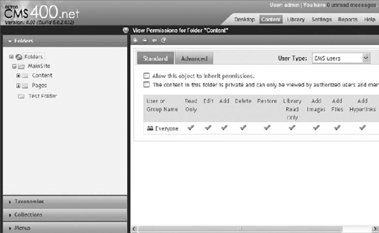
Once in the Properties pane, select the View Permissions icon from the toolbar

The first checkbox under the Standard tab is to enable or disable the inheritance of permissions. The second checkbox determines whether the folder is marked private. As previously noted, this only affects whether the read-only permission is followed as marked. If checked, it restricts users from viewing the content unless they are specifically approved. The reason this checkbox exists is that checking permissions can be costly, and because most content on a website is designed to be publically accessible, Ektron can improve performance by simply assuming everyone has read access unless specifically marked otherwise.
Uncheck the box for permission inheritance to modify the permissions associated with this folder. The Workarea asks for confirmation to break inheritance.
Approve the dialog box. When the Permission pane reloads, you see that the interface has not changed much:
Note that two buttons have been added to the toolbar, a plus icon and a minus icon. The plus icon allows you to add actors to the list of entries. The minus icon allows you to remove them. The other change is less obvious, but you can now click the name of each actor in the list, Everyone for instance, to modify the permissions granted to that actor.
Add the user jedit to the list of users for the folder. Grant jedit all permissions and click Save to continue. You should now have jedit and Everyone as your list of actors for the folder, both with all permissions.
Approval chains are also administered from the Folder Properties pane. Follow these steps:
Return to the Folder Properties pane by clicking View Properties in the context menu for a given folder in the Folders tree, or by viewing a folder and selecting View
Once you're in the Properties view, select View Approvals on the toolbar

To modify the approval method, select the Edit icon on the toolbar. This presents you with two options: Force All Approvers and Do Not Force All Approvers. The difference between these two options refers to the behavior when an approver modifies the content during the approval process:
If the chain is set to Force All Approvers, when the content is checked in after editing, the approval chain is restarted from the beginning. Every approver sees the content in its final form.
If the chain is set to Do Not Force All Approvers, the content simply moves forward in the chain. Any approvers prior to the approver who edited the content do not see the final version.
Return to the main screen for the approvals. Click the plus icon to add an approver to the list. Figure 5-50 shows the User Selection Interface that appears.
You'll notice the users and groups displayed for addition to the approval chain is not the complete list of all the users in the system. The list only displays those users explicitly granted permissions for the folder. This is why you added jedit to the list of users.
Select jedit from the list now. Doing so returns you to the approval chain with jedit in the list, as pictured in Figure 5-51.


Now that your approval chain has been configured with jedit, no piece of content in this folder will go live until jedit has approved it. Remember approval chains are always serial, meaning if you add a second user to the list, approval will first be required from jedit, and then from the second user. If you want any individual in a certain list of users to be able to approve the content, and not all of those users, you should add those users to a group, and require approval from the group instead.
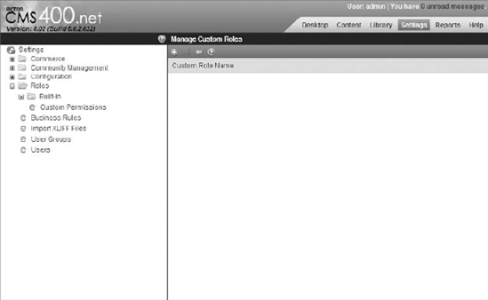
Custom roles allow you to create a list of users who have access to specific functionality on your site. They are configured in the Workarea and can be checked programmatically, allowing you to administer easily access lists for your feature. For instance, you might create a site moderator role, and add a Flag Server Control to pages throughout your site. You could then control the visibility of the Flag Server Control by checking if the user is a member of your moderators role. To get to where custom roles are defined in the Workarea, follow these steps:
Click the Settings tab, and navigate the tree to Settings
When you click the plus icon to add a new role, you are presented with a page first asking for the name of this role.
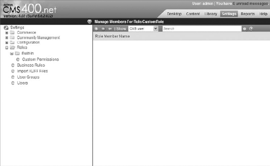
Enter CustomRole and click the Save icon to continue. You now are returned to the previous screen, with your CustomRole showing up first on the list of roles.
Clicking the CustomRole now brings you to the Manage Members for Role screen, as shown in Figure 5-53.
Just like in the permissions screen, clicking the plus icon lets you select the users and groups you want to add to this role. Clicking the minus icon removes them from the role.
To check programmatically whether a user is a member of the CustomRole, you simply call the following code.
Ektron.Cms.CommonApi _commonApi = new Ektron.Cms.CommonApi();
            if (_commonApi.GetRolePermissionSystem("CustomRole", _commonApi.UserId))
            {
//is a member of role
}
else
{
//is not a member of role
}
There are a few things to remember when working with permissions, roles, and approval chain workflows. In this section we'll cover those notes and discuss some best practices when working with these subsystems.
There are over a dozen types of permissions that can be set in the Ektron Framework. Each type of permission applies to a specific object and action type pair. If a positive setting is set, that user has permission. The administrator account and all members of the administrator group are automatically granted all permissions. Likewise, for programmatic access, the InternalAdmin account (Ektron.Cms.Common.EkConstants.InternalAdmin) is automatically granted all permissions. To use the InternalAdmin account for your programmatic calls, when you create an API object, set the RequestInformation member variables CallerID and UserID to the InternalAdmin constant.
Table 5-7 lists the permissions and what they affect.
Table 5.7. Permission Types
PERMISSION NAME | DESCRIPTION |
|---|---|
View permissions. This is ignored unless the content is marked "Private." | |
Edit permissions. | |
Add new item permissions. | |
Delete item permissions. | |
Restore a version of the content from the history. | |
View and download items in the corresponding library folder. | |
Permissions to add images to the corresponding library folder. | |
Permissions to add files to the corresponding library folder. | |
Permissions to add hyperlinks to the corresponding library folder. | |
Permissions to overwrite existing items in the corresponding library folder. | |
The ability to add or remove items from collections associated with this folder. | |
Permissions to add subfolders to this folder. This includes typed folders, such as Calendars and Blogs. | |
Permissions to modify the folder properties for the selected folder. | |
Permissions to delete subfolders from this folder. This includes typed folders, such as Calendars and Blogs. | |
Permissions to access folders under this folder. This overrides permissions on subfolders, in that users must have traverse permissions on all parent folders to perform any operation on a specific folder. | |
This lists the users that a piece of content is assigned to when a task is created for it. It is then up to this user or group of users to assign it to an editor to perform the task. |
Due to the way approval chains are implemented in the Ektron Framework, there are a couple of things to keep in mind when developing against them. First, a user can't be in the same approval chain twice. The system sees the first approval as satisfying the second condition, so the content moves immediately past the user.
Also note that approval chains are language specific. If the site you are developing supports multilingual content, remember to select the language from the View menu that you want to administer, and then modify the approval chain to set it for that language.
When content is assigned to a user for approval, the system can send out an e–mail. There are a couple steps involved in setting this up. Check the manual for details on how to enable the sending of system e-mails.
Roles in the Ektron Workarea are split into folder-specific roles, and system-wide roles. There is no technical difference in the way these roles are applied, only that roles in the system–wide section affect actions not associated with folders. Note also that administrators automatically pass all role tests. Finally, remember it is Ektron Best Practice to create a group for roles, and make users a member of the group, rather than having many users directly as role members. Table 5-8 displays the list of built-in roles.
Table 5.8. List of Built-In Roles
ROLE NAME | DESCRIPTION |
|---|---|
Alias Admin members have the ability to modify the aliasing rules, including adding new automatic aliases, changing existing aliases, and activating or deactivating aliasing altogether. | |
This role applies to the granular ability to add and modify manual and secondary aliases. | |
This allows users to view analytics reports on content and PageBuilder pages. | |
Covers creating and editing business rules. | |
Allows users to create, modify, and delete collections and menus. | |
Defines the group of users that can approve changes to collections. Only takes effect if collections require approvals. | |
Allows for access to all eCommerce screens. | |
Allows for management of default community preferences, activity types, messages, and management of notifications. | |
Allows for management of existing community groups, and the ability to create new groups. | |
Allows users to create groups and manage groups they created. | |
Allows users to create Master Layout PageBuilder templates. | |
Allows users to approve pending comments and delete existing comments on message boards for groups, users, and content. | |
Allows for creation, modification, and deletion of metadata types. | |
Allows for management of synonyms and suggested results in search. | |
Allows for management of Smart Form definitions. | |
Allows users to manage sync settings, and perform sync operations. | |
Creates tasks. | |
Deletes tasks. | |
Assigns tasks to users. | |
Allows users to create and edit taxonomies. | |
Manages system templates. | |
Manages users and groups. | |
Allows users to export and import content to XLIFF format for translation to other languages. | |
Allows users to manage the properties for all folders they have at least Read Only and Traverse permissions to. For more details, see the user manual. | |
Allows users to perform Copy and Move operations in the Workarea in folders they have the appropriate permissions to. |
To programmatically check whether a user is a member of a specific role, use the GetRolePermissionSystem and IsARoleMember system calls in Ektron.Cms.CommonApi. The built-in roles are defined in the enumeration Ektron.CMS.Common.EkEnumeration.CmsRoleId.
This chapter explored some of the fundamentals of the Ektron Framework. You may have noticed that some of the structuring decisions that the Ektron team took in developing their framework differ, sometimes significantly, from other content systems out there:
The biggest differentiator from many systems out there is that in the Ektron Framework, almost everything is based on content in an object-oriented pattern. This is helpful for developers in that once you understand how features that interconnect with content — such as the categorization tools like taxonomy, collections, and folders — function, you can generalize that understanding to features other than core content. For content managers the same holds true, but more with respect to the content creation and the process by which content goes live.
To recap, here are some of the ideas covered:
The primary location of interaction from a content management perspective in the Ektron Framework is the Workarea. You learned how to log in to the system, content authoring, and how content and other features hang together in the Ektron Framework. You explored how content is authored both from the Workarea, as well as managed from the site itself.
Folders and library content, specifically how folders and content then recombine to create other types of features, like blogs and forums.
How inheritance factors into the system, and how the combination then informs the approach you take in your information architecture.
How folders work in the Ektron system.
Permissions and roles, which is the way all actions are verified and controlled in the Ektron Framework. The use of permissions is necessary to ensure that authors do not accidentally overstep into areas they should not be managing. Roles, on the other hand, are a great way for administrators to enable authors to go above and beyond, and manage subsystems they would not ordinarily be able to.