
7 Time series analysis: Day trading with machine learning
- Working with time series data
- Constructing a custom feature set and response variable, using standard time series feature types
- Tracking intraday profits from our ML pipeline
- Adding domain-specific features to our dataset to enhance performance
- Extracting and selecting features to minimize noise and maximize latent signal
We have been through a lot together, from tabular data to bias reduction to text and image vectorization. All of these datasets had one major thing in common: they were all datasets based on a snapshot in time. All of the people represented in the COMPAS dataset had their data aggregated before we started our analysis. All of the tweets were already sent. All of the images were already taken. Another similarity is that each row in our datasets was not dependent on other rows in the dataset. If we pick a single person from the COMPAS set or a tweet from our NLP dataset, the values that are attached to each person do not depend on another data point in that dataset. We aren’t, for example, tracking values for a person across time. Another similarity between datasets we have been working with up until now is that we were always given a pretty straightforward response variable to target in our ML pipelines. We always knew, for example, the sentiment of the tweet, the object in the photo, or whether the patient had COVID-19. There was never any doubt as to what we were trying to predict.
This case study will break all of these assumptions and conventions. In this chapter, we are working with time series data, which means each row depends on the previous row, and our dataset has a direct dependence on time. Furthermore, it will be up to us to construct our response variable because a clear one will not be given to us.
Time series data are not the most common type of data out there, but when we are faced with them, we have to shift our mindset to a whole new way of thinking about feature engineering. Time series data, in a way, are the ultimate challenge because we are not given clean features, nor are we given a clean target. Those are up to the creativeness and cleverness of the domain experts and data scientists with a stake in the data. Let’s jump right in with our time series case study of intraday stock price trading.
Warning This chapter also has some long-running code samples toward the end of the chapter. Be advised that some code samples may run for over an hour on the minimum requirements for this text.
7.1 The TWLO dataset
Our dataset today is a dataset that yours truly put together via Yahoo! Finance. I have a hobby of making ML models predict stock price movements, and I am excited to bring the basics of the problem to this case study! We will look to predict intraday (within the same day) stock price movements of Twilio (one of my favorite tech companies). The ticker for Twilio is TWLO, so our data are called twlo_prices.csv. Let’s dive in, shall we? Let’s begin by ingesting our TWLO data in the following listing.
Listing 7.1 Investigating the TWLO data
import pandas as pd
price_df = pd.read_csv(f"../data/twlo_prices.csv")
price_df.head()
Our time series dataset has three columns (figure 7.1):

Figure 7.1 Each row of our time series data represents a minute’s worth of trading data with associated closing price and volume of shares traded in that minute.
With only these three columns, we don’t seem to have much to work with. But this is the nature of most time series data! We often have to start with a bare-bones dataset and transform our raw columns into usable and clean features, as in this case.
This is also true for our response variable—the column that we will eventually use as the ML pipeline’s predictive goal. You may have noticed that, along with not really having any features to use, we don’t have a clear response variable. What will our ML pipeline try to predict? We will have to construct a viable response variable as well while setting up our data.
Before we do anything though, let’s fix up our DataFrame by setting our index to be our date column (listing 7.2). This is useful because when a pandas DataFrame has a datetime column as an index, we can perform operations that are exclusive to date-time data and also make it easier to visualize data in graphs. All datetimes are in UTC by default in our dataset, so I will also convert that datetime into a local timezone. I will use the Pacific Time Zone in the US, as that is where I was at the time of writing.
Listing 7.2 Setting a time index in pandas
price_df.index = pd.to_datetime(price_df['date'])    ❶
price_df.index = price_df.index.tz_convert           ❶
('US/Pacific')                                       ❶

price_df.sort_index(inplace=True)                    ❷

del price_df['date']                                 ❸

price_df.head()  # show our work
❶ Set our index to be the date column, and configure the time zone to be Pacific.
❷ Sort our DataFrame by the index (time).
❸ Delete the date column because it is now our index.
The resulting DataFrame will have a new datetime index and will have one less column, as seen in figure 7.2.
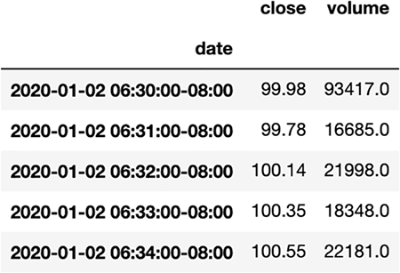
Figure 7.2 After setting our DataFrame’s index to be a datetime index and deleting the date column, this is our resulting DataFrame. Note that the date column is listed slightly below our columns to indicate it is now an index.
Now that we have a datetime index, we can plot our close column, as follows, to get a sense of the price movement at a very high level:
price_df['close'].plot()
The resulting plot (figure 7.3) shows the price of TWLO over the course of nearly 2 years, starting from January 2020 to July 2021.
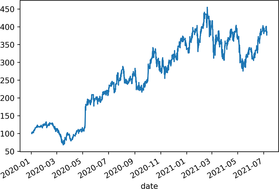
Figure 7.3 Plot of TWLO price from January 2020 to July 2021. This will be the time frame we will work in.
As mentioned previously, we don’t have a real response variable yet. Let’s talk about how to set up the problem we want to solve, so we can dive into time series-specific feature engineering techniques.
7.1.1 The problem statement
Our data are considered a multivariate time series, meaning we have multiple (usually scalar) variables recorded sequentially over time increments of equal size. The two variables in our case are close and volume. By contrast, a univariate time series problem would have a single value at each time period. If we had only close or had only volume but not the other, then we would have a univariate problem on our hands.
To keep our problem simple, let’s generate a response variable using only our close column. This is because the more interesting question we want to solve is, can we predict the future close value in a given minute? The calculation will be quite simple—for every minute, calculate the percent change between the current price and the price at the end of the day. Our pipeline will then be a binary classifier; was the percent change positive or negative?
The code in listing 7.3 does the following:
-
Grabs the last price of the day and calculates the percent change between the current timestamp and the final price.
-
Transforms that percent change into a binary response variable. If the change is positive, we consider the row bullish (financial term for rising stock price) or bearish (financial term for a falling stock price).
Listing 7.3 Setting a time index in pandas
last_price_of_the_day = price_df.groupby(
    price_df.index.date).tail(1)['close'].rename(  ❶
        'day_close_price')                         ❶
last_price_of_the_day.index =                     ❶
last_price_of_the_day.index.date                   ❶

price_df['day'] = price_df.index.date              ❷

price_df = price_df.merge(
    last_price_of_the_day, left_on='day',
right_index=True)                                  ❸

price_df['pct_change_eod'] = (
    price_df['day_close_price'] - price_df['close'])
    / price_df['close']                            ❹

price_df['stock_price_rose'] =
price_df['pct_change_eod'] > 0                     ❺

price_df.head()
❶ Calculate the ending price of TWLO for each day.
❷ Add a column to our price DataFrame to represent the date.
❸ Merge the ending prices into our granular DataFrame.
❹ The percent change from now until the end of the day
❺ Create our response column—a binary response.
Figure 7.4 shows our DataFrame as it stands with our new binary response variable.

Figure 7.4 We now have a binary response variable, stock_price_rose, to give our ML pipeline something to target. All that’s left is to construct some features to predict the target.
NOTE Finally, this guy has cracked automated day trading. I can give up everything and rely on his wisdom. Please do not do that. Obtaining consistent gains through automated trading is extremely risky and difficult, and we would not recommend anyone get into this if they do not have the proper risk tolerance and spending capital.
OK, we have a response variable, but we have no features to provide a signal to predict it. The same way we used our close column to create our response, let’s also use the close/volume columns to create some features to give our ML pipeline something to predict with.
7.2 Feature construction
When it comes to constructing features for time series data, it usually falls into one of four categories:
Each of these categories represents a different way of interpreting our initial close/volume columns, and each has pros and cons because ... well, because pretty much everything in life has pros and cons. We will be constructing features in each of these categories, so let’s get started!
7.2.1 Date/time features
Date/time features are features that are constructed using each row’s time value and, crucially, without using any other row’s time value. This often takes the form of an ordinal feature or some Boolean flagging what time of day the value is occurring.
Let’s create two date/time features:
-
dayofweek will be an ordinal feature, representing the day of the week. We could map these to strings to make them more human readable, but it is better to keep ordinal columns as numbers to make them machine readable.
-
morning will be a nominal binary feature that is true if the data point corresponds to a datetime before noon Pacific and false otherwise.
The following listing will create our first two features for our pipeline.
Listing 7.4 Creating date/time features
price_df['feature__dayofweek'] =
price_df.index.dayofweek                                 ❶
price_df['feature__morning'] = price_df.index.hour < 12  ❷
❶ An ordinal feature representing the day of the week
❷ A binary feature for whether it is before noon or not
Figure 7.5 depicts two graphs:
-
On the top we have the number of datapoints by the day of the week. Note that Monday and Friday (0 and 4) have fewer, mostly because most holidays on which the market is closed fall on one of those days.
-
On the bottom we have the number of datapoints before and after noon. Adjusted for Pacific Time—as our DataFrame is—most datapoints are in the morning, as the market generally opens at 6:30 a.m. Pacific Time.
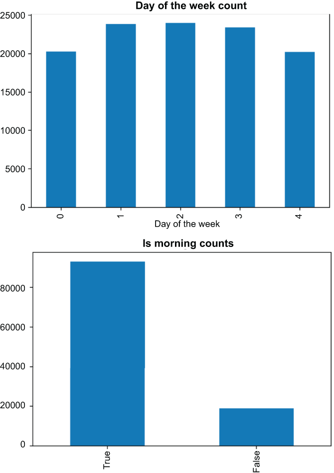
Figure 7.5 Our two date/time features give us a likely small but potentially useful signal in the way of assuming there is some relationship between stock movement and the day of the week (Monday vs. Friday) or between movement and the time of day (morning or not).
7.2.2 Lag features
Time series data give us a unique chance to use features from past rows as features in the present. Features that take advantage of this opportunity are called lag features. Put another way, at time t, a lag feature uses information from a previous time step (t-1, t-2, and so on). It is easy to construct lag features in Python using the pandas shift feature, which shifts a series/column forward or backward. We will also use the optional parameter freq to tell the shift method how much to move forward or backward.
Let’s construct two lag features (listing 7.5):
-
The features 30_min_ago_price will be the price 30 minutes ago. We will use the freq T, which represents minutes.
-
The features 7_day_ago_price will be the price 7 days ago. We will use the freq D, which represents days.
Listing 7.5 Constructing lag features
price_df['feature__lag_30_min_ago_price'] =
price_df['close'].shift(30, freq='T')
price_df['feature__lag_7_day_ago_price'] =
price_df['close'].shift(7, freq='D')

price_df['feature__lag_7_day_ago_price'].plot(figsize=(20,10))
price_df['close'].plot()
When we plot our 30-minutes-ago lag feature (figure 7.6), we see something similar to one of those red/blue 3D glasses images. In reality, the line that is slightly to the right is simply the price 30 minutes ago, so it looks like the entire line on the left (the original price) shifted slightly forward.

Figure 7.6 Our lag feature is just the close price some time in the past.
7.2.3 Rolling/expanding window features
Lag features give us insight into what is happening in the past, as do our next two types of time series features: rolling-window features and expanding-window features.
Rolling-window features are similar to lag features in that they use values at previous timestamps as their source of information. The main difference is that rolling-window features use a chunk of data in the past in a static window—time frame—to calculate a statistic that is used as a feature at the current timestamp. Put another way, a 30-minute-lag feature will simply grab a value from 30 minutes ago and use it as a feature, whereas a 30-minute rolling-window feature will take all values in the last 30 minutes and apply some—generally, simple—function to the values and use the result as a feature. Oftentimes, this function is something like a mean or a median.
As we calculate a rolling-window feature for all of our timestamps, the window moves along with the timestamp (figure 7.7). This way the rolling-window feature forgets what happened before the fixed window size. This gives a rolling-window feature the ability to stay in the moment, but it loses the ability to remember long-term trends.
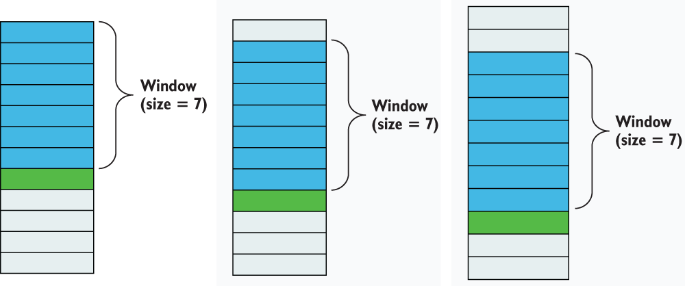
Figure 7.7 Rolling-window features use values from previous rows in a given fixed window. For any given row (just below the darkest shaded rows) we are only using the past n values (n being our windows shown in the darkest shaded rows) to calculate our rolling window feature.
In our case, we will make four rolling-window features (listing 7.6):
-
rolling_close_mean_60 is a rolling 60-minute average price. This is also known as a moving average.
-
rolling_close_std_60 is a rolling 60-minute standard deviation of price. This will give us some sense of volatility in the past hour.
-
rolling_volume_mean_60 is a rolling 60-minute average of volume. This will give us a sense of how much activity there has been in the past hour.
-
rolling_volume_std_60 is a rolling 60-minute standard deviation of volume. This will give us a sense of volatility in the amount of trades in the past hour.
Listing 7.6 Creating rolling-window features
price_df['feature__rolling_close_mean_60'] =
price_df['close'].rolling('60min').mean()           ❶
price_df['feature__rolling_close_std_60'] =
price_df['close'].rolling('60min').std()            ❷
price_df['feature__rolling_volume_mean_60'] =
price_df['volume'].rolling('60min').mean()          ❸
price_df['feature__rolling_volume_std_60'] =
price_df['volume'].rolling('60min').std()           ❹

price_df.dropna(inplace=True)

price_df['feature__rolling_close_mean_60'].plot(
    figsize=(20, 10), title='Rolling 60min Close')
plt.xlabel('Time')
plt.ylabel('Price')
❶ Rolling 60-minute average price
❷ Rolling 60-minute standard deviation of price
❸ Rolling 60-minute average volume
❹ Rolling 60-minute standard deviation of volume
In figure 7.8 we can see the resulting graph showing the rolling 60-minute average close price. It is common to plot the rolling average of a time series variable, as opposed to the raw value, as a rolling average tends to produce a much smoother graph and makes it more parsable for the masses.

Figure 7.8 Our rolling-close feature uses a window size of 60 minutes and takes the average value in the past 60 minutes as a feature.
Exercise 7.1 Calculate the rolling 2.5-hour average closing price, and plot that value over the entirety of the training set.
Like rolling-window features, expanding-window features use a window in the past to calculate a statistic for the current timestamp. The main difference is that where the rolling-window feature uses a fixed window in the past and moves along with the timestamp, the expanding-window feature uses an ever-growing window from a fixed starting point. The window’s expanding nature allows it to remember longer-term trends, unlike rolling-window features. Figure 7.9 shows a visualization of how windows are selected for expanding-window features.
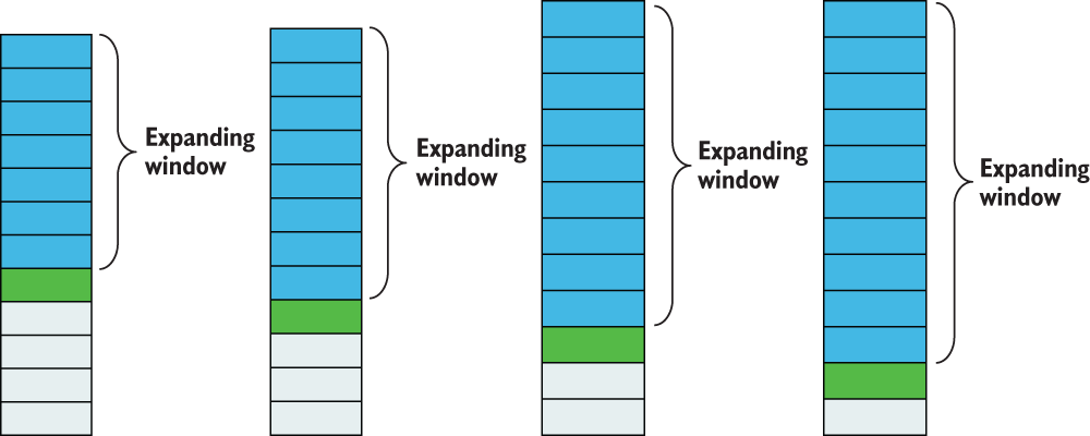
Figure 7.9 Expanding-window features use values from previous rows in an expanding window that starts from the beginning. For any given row (just below the darkest shaded rows), we use all past values (the darkest shaded rows) to calculate our expanding-window feature.
We will create two expanding-window features in listing 7.7:
Listing 7.7 Creating expanding-window features
price_df['feature__expanding_close_mean'] =
price_df['close'].expanding(200).mean()
price_df['feature__expanding_volume_mean'] =
price_df['volume'].expanding(200).mean()

price_df.dropna(inplace=True)

price_df['feature__expanding_close_mean'].plot(
    figsize=(20, 10), title='Expanding Window Close')    ❶

plt.xlabel('Time')
plt.ylabel('Price')
price_df['feature__expanding_volume_mean'].plot(
    figsize=(20, 10), title='Expanding Window Volume')   ❶

plt.xlabel('Time')
plt.ylabel('Shares')
❶ Plot our expanding- window features.
Figure 7.10 shows off these two expanding-window features in a graph. The top graph depicts the expanding average for close, and the bottom graph shows the expanding average for volume. We hope that including both rolling- and expanding-window features will give our pipeline a sense of short-term trends (through our rolling-window features) and long-term trends (from our expanding-window features).

Figure 7.10 Our two new expanding-window features for close (top) and volume (bottom)
OK, we have constructed a handful of features; let’s take some time to create our baseline model based on our date/time, lag, rolling-window, and expanding-window features (listing 7.8). Our pipeline shouldn’t look so strange at this point. We will be grid searching a RandomForest on our time series data and using our StandardScalar to scale our data, as they are definitely on different scales. How do I know they are on different scales? For one, we used both close and volume to construct features, and volume is often in the thousands, while close is in the hundreds.
Listing 7.8 Setting up our baseline model parameters
from sklearn.pipeline import Pipeline               ❶
from sklearn.ensemble import RandomForestClassifier
from sklearn.preprocessing import StandardScaler

clf = RandomForestClassifier(random_state=0)

ml_pipeline = Pipeline([                            ❷
    ('scale', StandardScaler()),
    ('classifier', clf)
])

params = {                                          ❸
    'classifier__criterion': ['gini', 'entropy'],
    'classifier__min_samples_split': [2, 3, 5],

    'classifier__max_depth': [10, None],
    'classifier__max_features': [None, 'auto']
}
❶ Import the scikit-learn Pipeline object.
❷ Create a pipeline with feature scaling and our classifier.
❸ Create the base grid search parameters.
With our baseline pipeline set up, it’s time to run some cross-validated gridsearches. But before we can do that, we have to address another oddity with time series data: normal cross-validation doesn’t quite make sense when data points are linked to time. Let me explain.
Time series cross-validation splitting
Normal cross-validation involves taking random splits of data to create multiple training/testing subsets with which we can aggregate model performance. With time series, we want to alter that thinking a bit. Instead of splitting into random training and testing splits, we want to ensure the training set has data only from before the testing set. This makes the ML pipeline’s metrics more believable by simulating how the training is done in the real world. We would never expect our model to train on data in the future to predict values in the past! So here is how we split data up for time series cross validation:
-
We choose a number of splits we want to make. Let’s say n = 5.
-
We break up our data into n + 1 (6 in our example) equal splits.
-
Our first iteration uses the first split as the training set and the second split as the testing set. Remember, we are not shuffling our data, so we are guaranteed that the second split only has data that came after the first split.
-
Our second iteration will use the first two splits as training data and the third split as the testing set.
-
This will continue until we have five iterations worth of data to train on.
Let’s instantiate an instance of the TimeSeriesSplit object from scikit-learn, as shown in the following listing.
Listing 7.9 Instantiating our time series CV split
from sklearn.model_selection import TimeSeriesSplit  ❶
tscv = TimeSeriesSplit(n_splits=2)                   ❶
❶ This splitter will give us train/test splits optimized for time data.
As an example, let’s create five splits on our data and check the time ranges used for the training and testing sets. This can be seen in the following listing and the resulting figure 7.11.
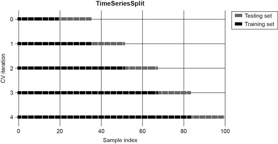
Figure 7.11 Our time series splitter visualized with five splits. The first split on the top uses a testing index in gray and a training index in black. The second split converts the first split’s testing index into training and uses the next date range as a testing set.
Listing 7.10 Example of time series CV splits
for i, (train_index, test_index) in enumerate(tscv.split(price_df)):
    train_times, test_times =
    price_df.iloc[train_index].index,
    price_df.iloc[test_index].index

    print(f'Iteration {i}
-------------')

    print(f'''Training between {train_times.min().date()}
and {train_times.max().date()}.
Testing between {test_times.min().date()} and {test_times.max().date()}
'''
    )

Iteration 0
-------------
Training between 2020-01-09 and 2020-07-01.
Testing between 2020-07-01 and 2020-12-22

Iteration 1
-------------
Training between 2020-01-09 and 2020-12-22.
Testing between 2020-12-22 and 2021-07-08
Now that we know how to split our data into training and testing sets during cross-validation, let’s create a helper function that will take in our price DataFrame and do a few things:
-
Create a smaller DataFrame by filtering out only rows on the hour (8 a.m., 9 a.m., and so on).
-
Use the data until June 2021 as our training data and data from June 1, 2021 onwards as a validation set. This means we will run our grid searches on the training set (up until June 2021) and judge our pipelines’ performances on the validation set (June and July 2021).
In figure 7.12 we can see how we will be splitting our data up into a training and validation (testing) set.
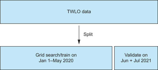
Figure 7.12 We will split our overall data into a training and validation set. We will cross-validate on data before June 2021 and validate the pipeline (generate metrics) on the unseen validation data (June and July 2021).
Listing 7.11 is a big one, but let’s break it down step by step first. We will make a split_data function that will
-
Only keep datapoints where the minute value of the datetime object is 0. These are points on the hour.
-
Split our price data into a training set on or before May 31, 2021, and a testing set from June 1, 2021, onward.
Listing 7.11 A helper function to filter and split our price data
def split_data(price_df):
    ''' This function takes in our price dataframe
        and splits it into a training and validation set
    as well as filtering our rows to only use rows that are on the hour
    '''
    downsized_price_df = price_df[(price_df
.index.minute == 0)]                             ❶

    train_df, test_df =
    downsized_price_df[:'2021-05-31'],
    downsized_price_df['2021-06-01':]            ❷

    train_X, test_X =
    train_df.filter(
        regex='feature'), test_df.filter
(regex='feature')                                ❸

    train_y, test_y =
    train_df['stock_price_rose'],
    test_df['stock_price_rose']                  ❹
    return train_df, test_df, train_X, train_y, test_X, test_y
❶ Limit our data to only make trades at the 0-minute mark. Usually 6-7 times a day.
❷ Split our DataFrame into training and validation (before and after June 2021).
❸ Use the pandas filter method to select the features based on the prefix feature__ we have been adding.
❹ Split our target variable based on our June 2021 split.
As we add features to our DataFrame, this helper function will save us from rewriting some code to do these splits again and again. And now, let’s finally run our first baseline model, using date features, time features, rolling-window features, lag features, and expanding-window features as shown in listing 7.12.
NOTE Fitting models in this chapter may take some time to run. For my 2021 MacBook Pro, some of these code segments took over an hour to complete the grid search
Listing 7.12 Running our first baseline model
train_df, test_df, train_X, train_y, test_X, test_y = split_data(price_df)

print("Date-time/Lag/Window features +
Random Forest
==========================")
best_model, test_preds, test_probas = advanced_grid_search(
    train_X, train_y,
    test_X, test_y,
    ml_pipeline, params,
    cv=tscv, include_probas=True
)
Let’s also take a look at our classification report (figure 7.13) to see how well our model is performing.

Figure 7.13 Results from our baseline model give us an accuracy to beat of 48%. This is not better than randomly guessing and being correct 51% of the time.
Our output, at a first glance, is not that amazing, with an accuracy of 48% on our validation data, which, remember, comprise June and July of 2021, but let’s dig a bit deeper:
-
Accuracy is 48%, but what is our null accuracy? We can calculate our validation null accuracy by running the following:
-
test_y.value_counts(normalize=True)
False    0.510638
True     0.489362
And seeing that, if we guessed that the price was going down, we’d be correct 51% of the time. We aren’t beating our null accuracy yet. Not ideal.
-
Our precisions and recalls are all over the place. Bearish recall (class False) is a high 82%, while bullish recall (class True) is only 13%. For this reason, let’s focus on both the accuracy and the F-1 measure on the classification report together. Focusing on both of these metrics should give us a better overall measure of how well the pipeline is doing
Accuracy and F-1 are wonderful for measuring the performance of a classifier, but this is stock price data! It would be fantastic also to consider how much money we would have made if we had listened to the model’s predictions! To do this, let’s make yet another helper function (I promise this is the last one) to take in the results from our validation pipeline and do the following:
We will focus on the total gains for all predictions, as this is the most realistic estimation of cumulative gains for our pipeline. Let’s create this function in the following listing.
Listing 7.13 Plotting gains on the first prediction each day
def plot_gains(df, response, predictions):
    ''' A simulation of acting on the First prediction of the day '''
    df['predictions'] =  predictions
    df['movement_correct_multiplier'] =
    (predictions == response).map({True: 1, False: -1})
    df['gain'] = df['movement_correct_multiplier'] *
    df['pct_change_eod'].abs()


    bullish = df[predictions == True]
    bullish_gains = bullish.sort_index().groupby(
        bullish.index.date).head(1)['gain']
    bullish_gains.cumsum().plot(label='Bullish Only', legend=True)
    print(f'Percantage of time with profit for bullish only:
{(bullish_gains.cumsum() > 0).mean():.3f}')
    print(f'Total Gains for bullish is {bullish_gains.sum():.3f}')

    bearish = df[predictions == False]
    bearish_gains = bearish.sort_index(
        ).groupby(bearish.index.date).head(1)['gain']
    bearish_gains.cumsum().plot(label='Bearish Only', legend=True)
    print(f'Percantage of time with profit for bearish only:
{(bearish_gains.cumsum() > 0).mean():.3f}')
    print(f'Total Gains for bearish is {bearish_gains.sum():.3f}')

    gains = df.sort_index().groupby(df.index.date).head(1)['gain']
    gains.cumsum().plot(label='All Predictions', legend=True)
    print(f'Percentage of time with profit for all predictions: {(gains.cumsum() > 0).mean():.3f}')
    print(f'Total Gains for all predictions is {gains.sum():.3f}')

    plt.title('Gains')
    plt.xlabel('Time')
    plt.ylabel('Cumulative Gains')

plot_gains(test_df.copy(), test_y, test_preds)
The plot_gains function will print out a few stats for us to help interpret how our model is doing. The first two print statements tell us how often we would have had profit (more money than when we started) if we only listened to the model when it predicted bullish (the price will go up) as well as the total gains from listening to the bullish predictions. The next two print statements tell us how often we would have had profit if we only listened to the model when it predicted bearish (the price will go down). The final two print statements give us the same info if we listen to all predictions (bearish and bullish):
Our results (visually shown in figure 7.14) show that if we listened to the first prediction every day, no matter if it was bullish or bearish (in the line with an arrow pointing to it) we would have accumulated 2.1% of gains, meaning we would have lost money. Not great.
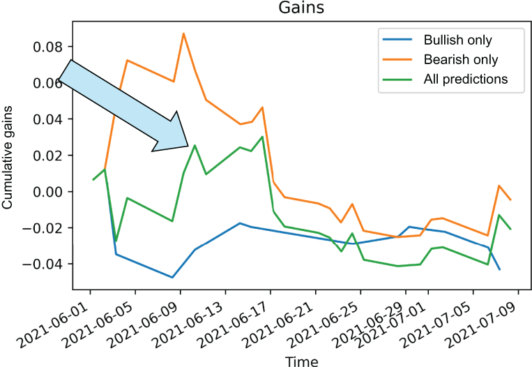
Figure 7.14 Our basic time series features are not giving profit in our validation set. This makes sense, considering we couldn’t even beat our null accuracy.
Feature-wise, we made some good progress. We have created several date/time features out of our original close/volume columns, such as day-of-week, expanding features, rolling features, and lag features. We could spend all day coming up with more rolling and expanding features, but at the end of the day, most day traders (who are domain experts in this case) will tell you that that isn’t enough. To have even a chance of predicting stock price movements you need to bring in some domain-specific features.
7.2.4 Domain-specific features
Date/time features are an excellent start to any time series case study, but they come with a big problem: they often do not have enough signal to make predictions about future values. More often than not, when dealing with time series data, we have to bring in some domain-specific features, which are features that are derived from having knowledge about the specific use case of the data.
In our case, in this chapter, domain-specific features would come from having knowledge about the stock market, finance, and intraday trading. The next few sections will highlight some features that are believed to have some impact on intraday trading.
Our first set of domain features is based on the closing price that we have access to. Our strategy here is to calculate some statistics about the price on a larger scale:
-
The market is open for most people during specific hours of the day. But the price does move outside of this window. We will calculate overnight_change_ close to be the percentage difference between today’s opening price and the previous day’s closing price.
-
We will want to know how the opening price compares to previous opening prices. We will calculate monthly_pct_change_close to represent the percentage change between today’s opening price and last month’s opening price.
-
Let’s keep track of an expanding-average opening price with a feature called expanding_average_close to potentially give signal on the current price compared to a running-average opening price.
Let’s go ahead and create these features in the following listing.
Listing 7.14 Calculating daily price features
daily_features = pd.DataFrame()                                ❶

daily_features['first_5_min_avg_close'] = price_df.groupby(    ❷
    price_df.index.date                                        ❷
)['close'].apply(lambda x: x.head().mean())                    ❷
daily_features['last_5_min_avg_close'] = price_df.groupby(     ❷
    price_df.index.date                                        ❷
)['close'].apply(lambda x: x.tail().mean())                    ❷


daily_features['feature__overnight_change_close'] =
    (daily_features['first_5_min_avg_close'] -
     daily_features['last_5_min_avg_close'].shift(1)) /
     daily_features['last_5_min_avg_close'].shift(1)           ❸
daily_features['feature__monthly_pct_change_close'] =
daily_features['first_5_min_avg_close'].pct_change(
    periods=31)                                                ❹
daily_features['feature__expanding_average_close'] =
daily_features['first_5_min_avg_close'].expanding(
    31).mean()                                                 ❺
❶ Make a DataFrame to hold stats about the day itself.
❷ Average the first and last 5 minutes of the day to get opening and closing prices.
❸ The overnight change (percent change from the previous closing price to the current opening price)
❹ A rolling-percent change of opening price (window of 31 datapoints)
❺ An expanding-window function of average opening price (omitting the first 31 datapoints for stability)
Our first batch of features focused on smaller, short-term movements, while these new features are constructed with a larger field of view. In conjunction with the features we have already built, the hope is that these features will provide more signals for our pipeline.
But we aren’t done! Let’s look at a financial indicator often used in day trading: the moving-average convergence divergence.
Moving-average convergence divergence
The moving-average convergence divergence (MACD) is an indicator that highlights the relationship between two rolling averages of a security’s price. To calculate MACD, we need to calculate the 26-period exponential moving average and subtract it from the 12-period EMA. The signal line we will use at the end is the 9-period EMA of the MACD line.
The exponential moving average (EMA) is an indicator that tracks a value (in this case, the price of TWLO) over time. The EMA gives more weight/importance to recent price data than a simple rolling average, which does not give weight to past/future values. We can calculate the MACD of daily prices with the code in the following listing.
def macd(ticker):                                  ❶
    exp1 = ticker.ewm(span=12, adjust=False).mean()
    exp2 = ticker.ewm(span=26, adjust=False).mean()
    macd = exp1 - exp2
    return macd.ewm(span=9, adjust=False).mean()

daily_features['feature__macd'] =
macd(daily_features['first_5_min_avg_close'])      ❷

price_df = price_df.merge(daily_features,
left_on=price_df.index.date, right_index=True)     ❸
price_df.dropna(inplace=True)
❷ Calculate MACD, using the opening prices.
❸ Merge the daily features into the main price DataFrame.
We have made six new, domain-specific features so far. Surely, these are enough domain features, right? Perhaps, but let’s look at another class of features from everyone’s favorite black hole: social media!
I was a lecturer at Johns Hopkins in a past life, and one of my good friends, Dr. Jim Liew, was working on research denoting social media data, Twitter in particular, as a sixth factor in determining the behavior of stock on a given day (https://jpm.pm-research.com/content/43/3/102). Since then, I have adopted this mentality in my own day trading, and I believe it is interesting to talk about here. The work focused specifically on tweet sentiment. In this case study, we will take inspiration from this team and use social media statistics to help us predict stock market movements. But where will we get Twitter data?
Not to worry! I have been monitoring tweets about certain companies for years now, and I am happy to share this data with you (listing 7.16). Specifically, the following DataFrame we are about to ingest is every tweet that mentions the cashtag of Twilio. This means every tweet should have the word $TWLO, which signifies the tweet is meant to be about Twilio.
Listing 7.16 Ingesting Twitter data
tweet_df = pd.read_csv(f"../data/twlo_tweets.csv", encoding='ISO-8859-1')

tweet_df.index = pd.to_datetime(tweet_df['date_tweeted'])
tweet_df.index = tweet_df.index.tz_convert('US/Pacific')
del tweet_df['date_tweeted']

tweet_df.sort_index(inplace=True)
tweet_df.dropna(inplace=True)

tweet_df.head()
The DataFrame (seen in figure 7.15) has the following columns:
-
Date_tweeted (DateTime)—The date that the tweet went out to the world
-
Author_verified (Boolean)—Whether or not the author was verified at the time of posting
-
Num_followers (numerical)—The number of followers the author had at the time of posting
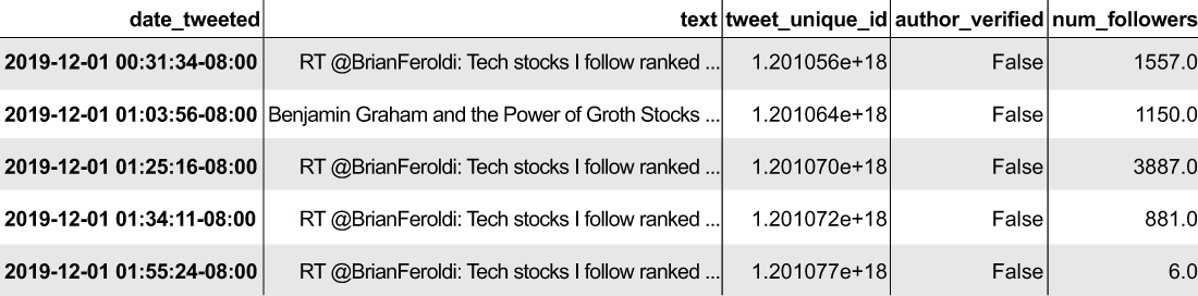
Figure 7.15 Twitter data mentioning the cashtag $TWLO to give us a sense of what people are saying about the stock
Let’s create two new features (listing 7.17):
Listing 7.17 Rolling tweet count
rolling_7_day_total_tweets = tweet_df.resample(
    '1T')['tweet_unique_id'].count().rolling('7D').sum()

rolling_7_day_total_tweets.plot(title='Weekly Rolling Count of Tweets')
plt.xlabel('Time')
plt.ylabel('Number of Tweets')

rolling_1_day_verified_count = tweet_df.resample(
    '1T')['author_verified'].sum().rolling('1D').sum()

rolling_1_day_verified_count.plot(
    title='Daily Rolling Count of Verified Tweets')
plt.xlabel('Time')
plt.ylabel('Number of Verified Tweets')
Listing 7.18 will merge the statistics we calculated from our Twitter data with the original price DataFrame. To do this we will
-
Create a new DataFrame with the two features we want to incorporate: the rolling 7-day count of tweets and the rolling 1-day count of verified tweets. Figure 7.16 shows what these two new features look like when plotted over time.
-
Set the index of the new DataFrame to be a datetime to make merging possible.
Listing 7.18 Merging Twitter stats into the price DataFrame
twitter_stats = pd.DataFrame({
    'feature__rolling_7_day_total_tweets': rolling_7_day_total_tweets,
    'feature__rolling_1_day_verified_count': rolling_1_day_verified_count
})                                                      ❶

twitter_stats.index = pd.to_datetime(                   ❷
    twitter_stats.index)                                ❷
twitter_stats.index = twitter_stats.index.tz_convert(   ❷
    'US/Pacific')                                       ❷

price_df = price_df.merge(
    twitter_stats, left_index=True, right_index=True)   ❸
❶ Create a DataFrame with the twitter stats.
❷ Standardize the index to make the following merge easier.
❸ Merge Twitter stats into our price DataFrame.
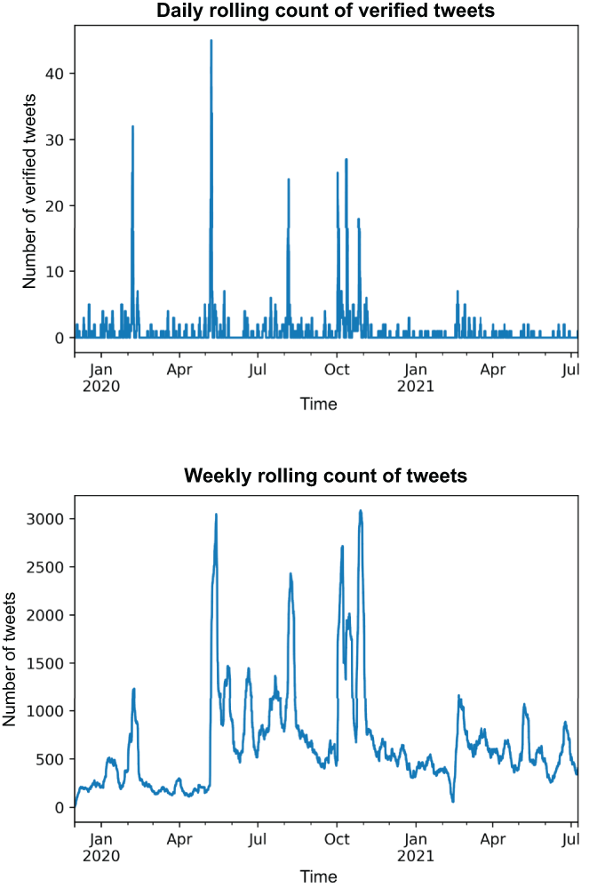
Figure 7.16 Our two Twitter-based features will help the model understand how the Twitterverse is thinking about TWLO.
OK, phew! We now have a bunch of new features. I think it’s time to see how these new features work out!
Exercise 7.2 In preparation for running our pipeline again, find the Pearson correlation coefficient between our response variable and our two new Twitter features on the training set. Compare that to the correlation between the other features. What insights can you glean from that information?
We’ve spent a good amount of time creating a handful of domain-specific features based on our knowledge about the stock market and how people talk about the stock market on Twitter. Let’s pause and run our pipeline again with our new features to see if we’ve successfully added any new signal to our pipeline in the following listing.
Listing 7.19 Running our pipeline with domain-specific features
train_df, test_df, train_X, train_y, test_X, test_y = split_data(price_df)

print("Add Domain Features
==========================")
best_model, test_preds, test_probas = advanced_grid_search(
    train_X, train_y,
    test_X, test_y,
    ml_pipeline, params,
    cv=tscv, include_probas=True
)
Let’s take another look at our resulting classification report in figure 7.17.

Figure 7.17 Results from adding domain-specific features like MACD and our Twitter features gave us a bump in accuracy to 54%, which beats our null accuracy!
OK! Our accuracy and weighted F-1 score have increased from 48% to 54% and from 41% to 46%. This is a big boost! Let’s see how we would have performed, listening to this pipeline on our validation data. We can do this by running our plot_gains function on our test data:
plot_gains(test_df.copy(), test_y, test_preds)
The results, as before, will show us how much our model has improved. We will be most concerned with the “total gains for all predictions” number, which represents the total amount of gains we could have seen had we listened to our model:
Wow! Cumulative gains of 15%! This is definitely a huge increase in quality. Let’s take a look at our gains graph (figure 7.18), and our total gains line—the one with an arrow—is definitely looking positive!

Figure 7.18 Our latest model taking MACD and Twitter features is showing massive improvement!
OK, we have made some significant progress, but let’s take a step back and think about how many features we’ve constructed. With all of these features, it would be wise to at least test out a few feature selection techniques.
7.3 Feature selection
In chapter 3, we began our journey in feature selection by relying on the SelectFromModel module from scikit-learn to use ML to select features for us. Let’s bring back that thinking and see if there is any noise we can remove from our dataset to boost our performance at all.
7.3.1 Selecting features using ML
SelectFromModel is a meta-transformer that requires an estimator to rank features. Any feature that falls below a given threshold, which is denoted by comparing the importance to the mean or median rank, is eliminated as potential noise. Let’s use SelectFromModel as a feature selector, and let it try both logistic regression and another random forest classifier as the estimator.
The main parameter we have to be concerned with is threshold. Features with importance determined by the estimator as greater than or equal to the threshold are kept, while the other features are discarded. We can set hard thresholds with floats, or we can set thresholds to be dynamic. For example, we could set the threshold value as median, then the threshold would be set to the median of the calculated feature importances. We may also introduce a scaling factor to scale dynamic values. For example, we could set the threshold to be 0.5*mean, where the threshold would be half of the average feature importance. Let’s use the SelectFromModel object to try and remove noise from our dataset in the following listing.
Listing 7.20 Using SelectFromModel to restrict features
from sklearn.feature_selection import SelectFromModel
from sklearn.linear_model import LogisticRegression

rf = RandomForestClassifier(
    n_estimators=20, max_depth=None, random_state=0)    ❶
lr = LogisticRegression(random_state=0)

ml_pipeline = Pipeline([
    ('scale', StandardScaler()),
    ('select_from_model', SelectFromModel(estimator=rf)),
    ('classifier', clf)
])

params.update({
    'select_from_model__threshold': [
        '0.5 * mean', 'mean', '0.5 * median', 'median'  ❷
    ],
    'select_from_model__estimator':  [rf, lr]
})

print("Feature Selection (SFM)
==========================")
best_model, test_preds, test_probas = advanced_grid_search(
    train_X, train_y,
    test_X, test_y,
    ml_pipeline, params,
    cv=tscv, include_probas=True
)
❶ The feature importances in this random forest will dictate which features to select.
❷ Set a few different potential thresholds, using our scaled dynamic threshold options.
Our latest classification report (figure 7.19) is not very promising. Overall accuracy dropped to below 50%.
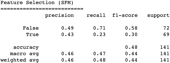
Figure 7.19 Our results after applying the SelectFromModel feature selection algorithm are showing a drop in performance to 48% accuracy. This implies that most features the algorithm tried to throw away were, in fact, useful to the pipeline.
Our performance definitely got worse. Both accuracy and weighted F-1 have decreased from our last run. Hmmm ... perhaps, we can try another feature selector that is a bit pickier and deliberative in how it selects features.
7.3.2 Recursive feature elimination
Recursive feature elimination (RFE) is a popular feature selection technique. RFE is another meta feature selection technique, just like SelectFromModel. RFE similarly uses an ML algorithm to select features. Rather than ranking features like SelectFromModel and removing them in bulk, RFE works iteratively, removing a few columns at a time. The process can be generally described as follows:
-
The estimator (random forest in this case) fits the features to our response variable.
-
The estimator calculates the least useful features and removes them from consideration for the next round.
-
This process continues until we reach the desired number of features to select (by default scikit-learn tries to choose half of our features, but this is grid searchable).
The following listing and the resulting figure 7.20 show how we can use RFE to also try to remove noise from our features.
Listing 7.21 Using RFE to restrict features
from sklearn.feature_selection import RFE

ml_pipeline = Pipeline([
    ('scale', StandardScaler()),
    ('rfe', RFE(estimator=rf)),
    ('classifier', clf)
])

params.update({
    'rfe__n_features_to_select': [0.6, 0.7, 0.8, 0.9],
    'rfe__estimator':  [rf, lr]
})

print("Feature Selection (RFE)
==========================")
best_model, test_preds, test_probas = advanced_grid_search(
    train_X, train_y,
    test_X, test_y,
    ml_pipeline, params,
    cv=tscv, include_probas=True
)
del params['rfe__n_features_to_select']
del params['rfe__estimator']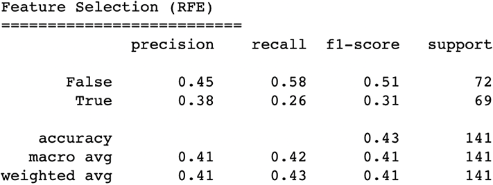
Figure 7.20 Results from using recursive feature elimination show an even bigger drop in performance to 43%. This is our worst performing pipeline yet. But the night is often darkest before dawn.
plot_gains(test_df.copy(), test_y, test_preds)
Taking a look at our results reveals a not-so-bright picture:
Our gains graph (figure 7.21) confirms that our models took a serious dip in performance.

Figure 7.21 RFE is definitely removing too much signal as well.
Both of our feature selectors are removing too much signal from our pipelines and really hurting our models. This is signaling two things, as follows:
Let’s try one more thing here to see if we can put those feature selectors to work without having them get confused from a small feature set size. Let’s try extracting some brand new features from the ones we’ve just constructed.
7.4 Feature extraction
As we’ve been creating features, our goal has been to provide as much signal as possible for our ML pipeline to allow it to accurately predict intraday stock price movement. Our classifier (a random forest model, in this case) is tasked with using all of the available features to predict the response, and importantly, it uses multiple features at a time to make this prediction.
When it comes to ML, it is about how features interact with one another. Right now we have about a dozen features, but what if we wanted to combine them to construct even more, potentially more useful signals? For example, what if MACD multiplied by the rolling verified tweet count provides a more powerful signal than either of the original two features? I suppose we could manually try each combination, but there is an automated way to help us, and of course, it is implemented in scikit-learn.
7.4.1 Polynomial feature extraction
Scikit-learn has a module called PolynomialFeatures, which automatically generates interactions between our original features. For example, let’s, for a minute, assume that our only features were
As an exercise, let’s extract third- or lower-degree polynomial (PolynomialFeatures (degree=3)) features for our three original columns. This means we would want all possible features’ first-, second-, and third-order interactions (multiplications). For example, this would include the raw feature morning as well as morning cubed. A complete list of features in order would be as follows:
-
A feature of all 1s (representing the constant bias in a polynomial)
-
rolling_close_mean_60 × rolling_7_day_total_tweets × morning
The following listing contains a code sample for doing the above extraction.
Listing 7.22 Polynomial feature extraction example
from sklearn.preprocessing import PolynomialFeatures

p = PolynomialFeatures(3)
small_poly_features = p.fit_transform(
    price_df[['feature__rolling_close_mean_60',
    'feature__rolling_7_day_total_tweets',
    'feature__morning']])

pd.DataFrame(small_poly_features, columns=p.get_feature_names())
The resulting DataFrame (figure 7.22) shows a snippet of the many features created.
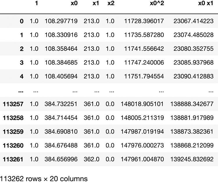
Figure 7.22 Polynomial features extract automatic interactions between features to generate more signals hidden in the combination of our originally constructed features.
Now, a lot of these features are likely a lot of noise (e.g., morning ^ 2), so let’s build a final pipeline in listing 7.23 that extracts only up to second-degree features (which will generate 152 new features), excluding the bias (the all 1s feature) and relies on the SelectFromModel module to filter out the noise. Fingers crossed.
Listing 7.23 Polynomial features + SelectFromModel
from sklearn.preprocessing import PolynomialFeatures

ml_pipeline = Pipeline([
    ('poly', PolynomialFeatures(1, include_bias=False)),
    ('scale', StandardScaler()),
    ('select_from_model', SelectFromModel
(estimator=rf)),                           ❶
    ('classifier', clf)
])

params.update({
    'select_from_model__threshold': [
        '0.5 * mean', 'mean', '0.5 * median', 'median'],
    'select_from_model__estimator':  [rf, lr],
    'poly__degree': [2],
})

print("Polynomial Features
==========================")
best_model, test_preds, test_probas = advanced_grid_search(
    train_X, train_y,
    test_X, test_y,
    ml_pipeline, params,
    cv=tscv, include_probas=True
)
❶ Adding in SelectFromModel into our pipeline
The classification report (figure 7.23) reveals a model with an accuracy on par with where we’d want it to be with the highest weighted F-1-score of any model so far.
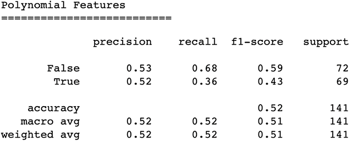
Figure 7.23 Introducing polynomial features and relying on the SelectFromModel feature selector has put us back to an accuracy above our null accuracy, but it is not the strongest accuracy we have seen. However, it does have the highest weighted F-1 score of any of our pipelines.
OK! Now we are talking. Let’s take a look at our estimated gains, using this new pipeline:
plot_gains(test_df.copy(), test_y, test_preds)
This is excellent! It may only be a small boost in gains, but our model is performing much better. Once again, the line with the arrow pointing to it represents our overall model’s performance by way of cumulative gains in our latest gains graph (figure 7.24).
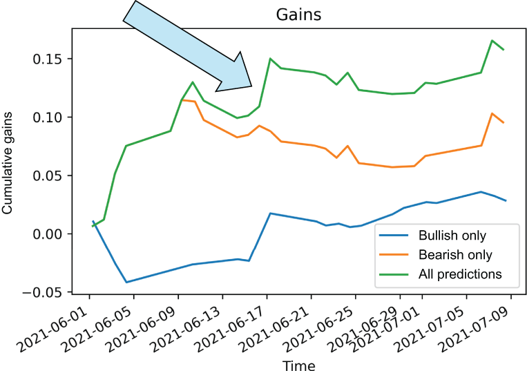
Figure 7.24 Our best pipeline yet extracts a large set of features and relies on SelectFromModel to remove the noise for us.
It looks like we were able to boost our trading performance after all! All it took was coupling a feature extraction technique with a feature selection technique. Let’s take a step back and look at the final feature engineering pipeline we’ve constructed to perform this tricky task. Figure 7.25 visualizes the pipeline from our latest run, showing how we manipulated our raw data and merged them with Twitter and the MACD. It then shows how we took our features and ran them through an automatic feature extractor and, finally, a feature selector to filter out any noise.
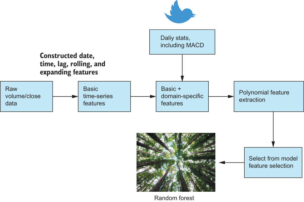
Figure 7.25 Our best pipeline represented as a series of steps from our initial date/time feature construction to the introduction of domain features from Twitter all the way to our feature extraction and selection modules
7.5 Conclusion
Time series data present a whole new world of options for data scientists. We can generate our own response variables, construct our features from scratch, and interpret our results in a more creative way! Let’s take a look in table 7.1 at what we did in this chapter.
Table 7.1 An overview of the many attempts we’ve made to predict stock price movement
When dealing with your time series dataset, it can be very ephemeral. We don’t have clear features, and we, often, don’t have a clear response variable. We can, however, think about five key considerations:
-
What is the response variable going to be? What will our ML pipeline be trying to predict? This is usually some variation of trying to predict a future value of a system like the stock market.
-
How can we construct basic date/time features from our raw data, using techniques like expanding windows and lag features?
-
What domain-specific features can we construct? MACD is an example of a feature that is specific to day trading.
-
Are there any other sources of data we could bring in? In our case, we brought in Twitter data to augment our pipeline.
-
Can we automatically extract feature interactions and select the ones that improve our model the most?
These five thoughts should be at the forefront of our mind when dealing with time series data, and if we can answer all five of them, then we have a great chance of being successful with our time series data.
7.6 Answers to exercises
Calculate the rolling 2.5-hour average closing price, and plot that value over the entirety of the training set.
price_df['feature__rolling_close_mean_150'] =
➥ price_df['close'].rolling('150min').mean()
price_df['feature__rolling_close_mean_150'].plot(
    figsize=(20, 10), title='Rolling 150min Close')

plt.xlabel('Time')
plt.ylabel('Price')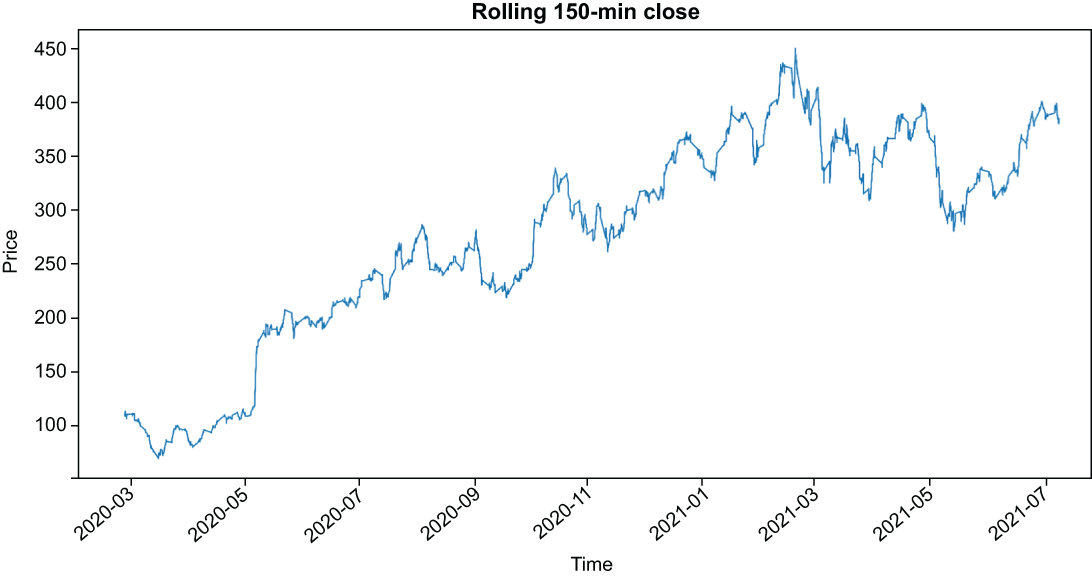
In preparation of running our pipeline again, find the Pearson correlation coefficient between our response variable and our two new Twitter features on the training set. Compare that to the correlation between the other features. What insights can you glean from that information?
If we run the following code, we can get the correlation coefficients between the response and the current set of features:
price_df.filter(
    regex='feature__'
).corrwith(
    price_df['stock_price_rose']
).sort_values()

feature__rolling_7_day_total_tweets     -0.030404
feature__dayofweek                      -0.002365
feature__expanding_volume_mean          -0.000644
feature__monthly_pct_change_close        0.001672
feature__rolling_1_day_verified_count    0.005921
feature__rolling_volume_mean_60          0.007773
feature__rolling_volume_std_60           0.010038
feature__expanding_close_mean            0.024770
feature__expanding_average_close         0.024801
feature__morning                         0.025106
feature__rolling_close_mean_60           0.030839
feature__lag_30_min_ago_price            0.030878
feature__lag_7_day_ago_price             0.031859
feature__macd                            0.037216
feature__overnight_change_close          0.045098
feature__rolling_close_std_60            0.051801
Our rolling verified count (feature__rolling_1_day_verified_count) has a pretty weak correlation coefficient of .005, but the rolling count of tweets (feature__ rolling_7_day_ total_tweets) has a pretty high value of .03. This implies that these features—at least the rolling 7-day tweet count—have a pretty good chance of adding some signal to our model.
Summary
-
Time series data allow us to be creative and construct both features and response variables for our ML pipeline.
-
All time series data can have constructed date, time, lag, rolling-window, and expanding-window features to provide insight on past periods.
-
Domain-specific features, like MACD or social media statistics, tend to enhance ML pipeline performance over just using basic time series features.
-
Feature selection does not always lead to a performance boost, especially when all of our features are hand-constructed thoughtfully.
-
Feature extraction techniques like polynomial feature extraction can add a boost to overall performance—but not always!
-
Combining extraction and selection techniques can be the best of both worlds; the extraction technique will give us potential new signals, while the selection criteria will help prune the noise from the pipeline.