
3 Healthcare: Diagnosing COVID-19
- Analyzing tabular data to judge which feature engineering techniques are going to help
- Implementing feature improvement, construction, and selection techniques on tabular data
- Using scikit-learn’s Pipeline and FeatureUnion classes to make reproducible feature engineering pipelines
- Interpreting ML metrics in the context of our problem domain to evaluate our feature engineering pipeline
In our first case study, we will focus on the more classic feature engineering techniques that can be applied to virtually any tabular data (data in a classic row and column structure), such as value imputation, categorical data dummification, and feature selection via hypothesis testing. Tabular datasets (figure 3.1) are common, and no doubt, any data scientist will have to deal with tabular data at some point in their careers. There are many benefits to working with tabular data:
-
It is an interpretable format. Rows are observations, and columns are features.
-
Tabular data are easy to understand by most professionals, not just data scientists. It is easy to distribute a spreadsheet of rows and columns that can be understood by a breadth of people.
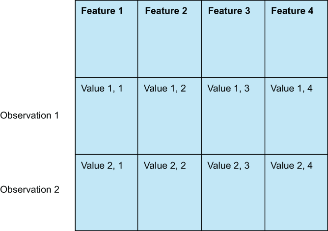
Figure 3.1 Tabular data consist of rows (also known as observations or samples) and columns (which we will often refer to as features).
There are also downsides to working with tabular data. The main downside is that there are virtually unlimited feature engineering techniques that apply to tabular data. No book can reasonably cover every single feature engineering technique that can be feasibly applied to tabular data. Our goal in this chapter is to showcase a handful of common and useful techniques, including end-of-tail imputations, Box-Cox transformations, and feature selection, and provide enough intuition and code samples to have the reader be able to understand and apply techniques as they see fit.
We will begin the chapter by performing an exploratory data analysis on our dataset. We will be looking to understand each one of our features and assign them to one of our four levels of data. We will also do some visualizations to get a better sense of what we are working with. Once we have a good idea of our data, we will move on to improving the features in our dataset, so they are more useful in our ML pipeline. Once we’ve improved our features, we will turn to constructing new ones that add even more signal for our ML pipeline. Finally, we will take a step back and look at some feature selection procedures to see if we can remove any extraneous features that are not helping in the hopes of speeding up our ML pipeline and improving performance. Finally, we will summarize our findings and land on a feature engineering pipeline that works best for our task.
By following this procedure, I hope that you will be able to see and follow an end-to-end workflow for dealing with tabular data in Python. I hope this will provide a framework for thinking about other tabular data that the reader may encounter. Let’s get started by looking at our first dataset.
3.1 The COVID flu diagnostic dataset
The dataset for this case study consists of observations that represent patients who came into a doctor presenting with an illness. Features represent information about the patient as well as symptoms they are presenting. The data are sourced from various publications from well-known sources, including the New England Journal of Medicine.
As for our response variable, we have two classes to choose from. We can diagnose either:
Of course, this dataset is not a perfect diagnostic dataset, but for our purposes this is OK. Our assumption about this data is that a patient has come in presenting symptoms of an illness, and our model should be able to provide a recommendation.
Our plan for our projects will generally follow these steps:
-
First we will download/ingest our data and do initial preparations, such as renaming any columns, etc.
-
Perform some exploratory data analysis to understand what data columns we have and assign data levels to each column.
-
Split our data into train and test sets, so we can train our models on the training set and get a less biased set of metrics by evaluating our model on the test set.
-
Set up an ML pipeline with our feature engineering algorithms along with a learning algorithm, such as logistic regression, random forest, etc.
-
Perform cross-validation on our training set to find the best set of parameters for our pipeline.
-
Fit our best model on the entire training set, evaluate it on our testing set, and print our ML pipeline’s performance metrics.
-
Repeat steps 4-6 using different feature engineering techniques to see how well our feature engineering efforts are paying off.
Note It should be noted explicitly that this case study is not presuming to be a diagnostic tool for COVID-19. Our goal is to showcase feature engineering tools and how they can be used on a binary classification task where the features are healthcare oriented.
3.1.1 The problem statement and defining success
With all of our datasets, it is crucial that we define what it is we are trying to accomplish. If we blindly dive into the data and start applying transformations with no eye for what we consider success, we run the risk of altering our data and worsening our situation.
In our case of using ML to diagnose illnesses, we only have two options to choose from: COVID-19 or H1N1. We have a binary classification problem on our hands.
We could simply define our problem as doing whatever we need to do to raise our ML model’s accuracy in diagnosis. This seems innocuous enough until we eventually learn (as we will see in our exploratory data analysis phase) that nearly 3/4 of our dataset consists of samples with an H1N1 diagnosis. Accuracy as an aggregated metric of success is unreliable for imbalanced datasets and will weigh accuracy on H1N1 samples higher than accuracy on COVID-19 cases, as it will correspond to an overall higher accuracy of our dataset, but we will need to be a bit more granular than that. For example, we’d want to understand our ML model’s performance broken down by our two categories to understand how well our model is doing at predicting each class individually instead of just looking at the aggregated accuracy metric.
To that end, let’s write a function that takes in training and test data (listing 3.1), along with a feature engineering pipeline that we will assume will be a the scikit-learn Pipeline object that will do a few things:
-
Instantiate an ExtraTreesClassifier model and a GridSearchCV instance.
-
Do a quick hyperparameter search to find the set of parameters that gives us the best accuracy on our test set.
-
Calculate a classification report on the testing data to see granular performance.
Listing 3.1 Base grid search code
def simple_grid_search(
    x_train, y_train, x_test, y_test, feature_engineering_pipeline):
    '''
    simple helper function to grid search an
    ExtraTreesClassifier model and print out a classification report
    for the best model where best here is defined as having
    the best cross-validated accuracy on the training set
    '''

    params = {  # some simple parameters to grid search
        'max_depth': [10, None],
        'n_estimators': [10, 50, 100, 500],
        'criterion': ['gini', 'entropy']
    }

    base_model = ExtraTreesClassifier()

    model_grid_search = GridSearchCV(base_model, param_grid=params, cv=3)
    start_time = time.time()  # capture the start time
    # fit FE pipeline to training data and use it to transform test data
    if feature_engineering_pipeline:
        parsed_x_train = feature_engineering_pipeline.fit_transform(
            x_train, y_train)
        parsed_x_test = feature_engineering_pipeline.transform(x_test)
    else:
        parsed_x_train = x_train
        parsed_x_test = x_test

    parse_time = time.time()
    print(f"Parsing took {(parse_time - start_time):.2f} seconds")

    model_grid_search.fit(parsed_x_train, y_train)
    fit_time = time.time()
    print(f"Training took {(fit_time - start_time):.2f} seconds")

    best_model = model_grid_search.best_estimator_

    print(classification_report(
        y_true=y_test, y_pred=best_model.predict(parsed_x_test)))
    end_time = time.time()
    print(f"Overall took {(end_time - start_time):.2f} seconds")

    return best_model
With this function defined, we have an easy-to-use helper function, where we can pass in training and test data along with a feature engineering pipeline and quickly get a sense of how well that pipeline is working for us. More importantly, it will help drive the point that our goal is not to perform long and tedious hyperparameter searches on models but, rather, to see the effects of manipulating data on our machine learning performance.
We are almost ready to start digging into our first case study! First, we need to talk about how we will be defining success. For every chapter, we will take some time to talk about how we want to define success in our work. Just like a statistical test, it is crucial that we define success before we look at any data, so we can prevent biasing ourselves. For the most part, success will come in the form of measuring a certain metric and, in some cases, an aggregation of several metrics.
As is the case with most health diagnostic models, we will want to look beyond simple measures, like accuracy, to truly understand our ML model’s performance. For our purposes, we will focus on each class’s precision—the percentage of correctly labeled diagnoses in the class/attempted diagnoses of the class—and our recall—the percentage of correctly labeled diagnoses in the class/all observations in the class.
It’s worth taking a quick refresher on precision and recall. In a binary classification task, the precision (i.e., the positive predictive value), as defined for a specific class, is defined as being
True Positives / Predicted Positives
Our precision will tell us how confident we should be of our model; if the COVID-19 model has a precision of 91%, then in our test set, of all the times the model predicted COVID-19, it was correct 91% of the time, and the other 9% we misdiagnosed H1N1 as COVID-19.
Recall (i.e., sensitivity) is also defined for individual classes, and its formula is
True Positives / All Positive Cases
Our recall tells us how many cases of COVID-19 our model was able to catch. If the COVID-19 model has a recall of 85%, that means that in our test, of the true instances of actual COVID-19, our model correctly classified 85% of them as COVID-19 and the other 15% incorrectly as H1N1.
3.2 Exploratory data analysis
Before we dive into our feature engineering techniques, let’s ingest our data, using the popular data manipulation tool pandas, and perform a bit of exploratory data analysis (EDA) to get a sense of what our data look like (figure 3.2). For all of our case studies, we will rely on the power and ease of pandas to wrangle our data. If you are unfamiliar with pandas,
import pandas as pd
covid_flu = pd.read_csv('../data/covid_flu.csv')
covid_flu.head()  # take a look at the first 5 rows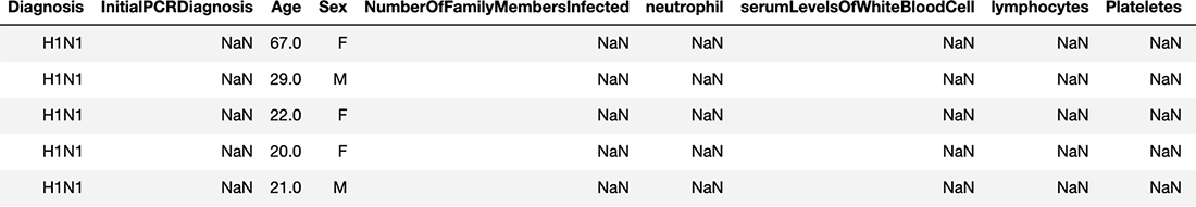
Figure 3.2 A look at the first five rows of our covid_flu dataset
Something that stands out immediately is the number of NaN (not a number) values in our data, which indicate values that are missing. That will be the first thing we deal with. Let’s see what percent of values are missing for each feature:
covid_flu.isnull().mean()  # percent of missing data in each column

Diagnosis                      0.000000
InitialPCRDiagnosis            0.929825
Age                            0.018893
Sex                            0.051282
neutrophil                     0.930499
serumLevelsOfWhiteBloodCell    0.898111
lymphocytes                    0.894737
CReactiveProteinLevels         0.907557
DurationOfIllness              0.941296
CTscanResults                  0.892713
RiskFactors                    0.858974
GroundGlassOpacity             0.937247
Diarrhea                       0.696356
Fever                          0.377193
Coughing                       0.420378
ShortnessOfBreath              0.949393
SoreThroat                     0.547908
NauseaVomiting                 0.715924
Temperature                    0.576248
Fatigue                        0.641700
We can see that we have our work cut out for us. Every single feature in our model has some missing data, with some features missing over 90% of their values! Most ML models are unable to deal with missing values. Our first section of feature improvement will begin to deal immediately with these missing values by talking about ways to fill in these missing values to make them usable for our ML model.
The only column that doesn’t have any missing data is the Diagnosis column because this is our response variable. Let’s see a percent breakdown of our categories:
covid_flu['Diagnosis'].value_counts(normalize=True)  # percent breakdown of
➥ response variable

H1N1       0.723347
COVID19    0.276653
Our most common category is H1N1, with just over 72% of our response variable belonging to that category. Our null accuracy is 72%—the accuracy of a classification model that just guesses the most common category over and over again. Our absolute baseline for our machine learning pipeline will have to be beating the null accuracy. If our model just guessed H1N1 for every person coming in, technically, that model would be accurate 72% of the time, even though it isn’t really doing anything. But hey, even a guessing ML model is right 72% of the time.
NOTE If our classification ML model cannot beat the null accuracy, our model is no better than just guessing the most common response value.
Last, and certainly not least, we will want to get a sense of which columns are quantitative and which are qualitative. We will want to do this for virtually every tabular dataset we investigate for ML because this will help us better understand which feature engineering techniques we can and should apply to which columns, as shown in the following listing.
Listing 3.2 Checking data types of our dataset
covid_flu.info()

RangeIndex: 1482 entries, 0 to 1481
Data columns (total 20 columns):
 #   Column                       Non-Null Count  Dtype
---  ------                       --------------  -----
 0   Diagnosis                    1482 non-null   object
 1   InitialPCRDiagnosis          104 non-null    object
 2   Age                          1454 non-null   float64
 3   Sex                          1406 non-null   object
 4   neutrophil                   103 non-null    float64
 5   serumLevelsOfWhiteBloodCell  151 non-null    float64
 6   lymphocytes                  156 non-null    float64
 7   CReactiveProteinLevels       137 non-null    object
 8   DurationOfIllness            87 non-null     float64
 9   CTscanResults                159 non-null    object
 10  RiskFactors                  209 non-null    object
 11  GroundGlassOpacity           93 non-null     object
 12  Diarrhea                     450 non-null    object
 13  Fever                        923 non-null    object
 14  Coughing                     859 non-null    object
 15  ShortnessOfBreath            75 non-null     object
 16  SoreThroat                   670 non-null    object
 17  NauseaVomitting              421 non-null    object
 18  Temperature                  628 non-null    float64
 19  Fatigue                      531 non-null    object
dtypes: float64(6), object(14)
memory usage: 231.7+ KB
The info method reveals a breakdown of which columns have been cast as an object, pandas’ recognition of a qualitative column and which are float64 types, which are quantitative. Now that we have more of a sense of our data, let’s move into our feature engineering efforts.
Note Pandas will make assumptions about data based on the values it finds within the dataset. It’s possible that pandas could ingest a column that has been cast as quantitative but, in fact, may be qualitative, based solely on its values (e.g., phone numbers or ZIP codes).
3.3 Feature improvement
As we saw previously, we have a lot of missing values in our feature columns. In fact, every single feature has missing data that we will need to fill in to use a vast majority of ML models. We will see two forms of feature improvement in this case study:
-
Imputing data—This is the most common way to improve features. We will look at a few ways to impute data, or fill in missing values, for both qualitative and quantitative data.
-
Value normalizing—This involves mapping values from a perceived value to a hard value. For our dataset, we will see that the binary features are conveying values through strings like Yes and No. We will want to map those to being True and False values, so our ML model can use them.
3.3.1 Imputing missing quantitative data
As we saw in our EDA, we have a lot of missing data to account for. We have two options for dealing with missing values:
-
We can remove observations and rows that have missing data in them, but this can be a great way to throw out a lot of useful data.
-
We can impute the values that are missing, so we don’t have to throw away the entire observation or row.
Let’s now learn how to impute the missing values using scikit-learn, and we will start with the quantitative data. Let’s grab the numerical columns and put them in a list:
numeric_types = ['float16', 'float32', 'float64', 'int16', 'int32', 'int64']
➥ # the numeric types in Pandas
numerical_columns =
➥ covid_flu.select_dtypes(include=numeric_types).columns.tolist()
Now, we should have a list with the following elements in it:
['Age',
 'neutrophil',
 'serumLevelsOfWhiteBloodCell',
 'lymphocytes',
 'DurationOfIllness',
 'Temperature']
We can make use of the SimpleImputer class in scikit-learn to fill in most of the missing values we have. Let’s take a look at a few ways we could handle this.
Our first option for numerical data imputation is to fill in all missing values with the mean or the median of the feature. To see this using scikit-learn, we can use the SimpleImputer:
from sklearn.impute import SimpleImputer                          ❶
num_impute = SimpleImputer(strategy='mean')                       ❷
print(covid_flu['lymphocytes'].head())                            ❸
print(f"

Mean of Lymphocytes column is
     {covid_flu['lymphocytes'].mean()}

")
print(num_impute.fit_transform(covid_flu[['lymphocytes']])[:5])   ❹
0   NaN
1   NaN
2   NaN
3   NaN
4   NaN
Name: lymphocytes, dtype: float64

Mean of Lymphocytes column is 1.8501538461538463

[[1.85015385]
 [1.85015385]
 [1.85015385]
 [1.85015385]
 [1.85015385]]
❶ Sklearn class to impute missing data
❷ Could be mean or median for numerical values
❸ Shows the first five values before imputing
❹ Transforming turns the column into a NumPy array.
So we can see that our missing values have been replaced with the mean of the column.
Arbitrary value imputation consists of replacing missing values with a constant value that indicates that this value is not missing at random. Generally, for numerical features we can use values like -1, 0, 99, 999. These values are not technically arbitrary, but they appear arbitrary to the ML model and indicate that this value may not be missing by accident; there may be a reason why it is missing. When choosing an arbitrary value, the only real rule is pick a value that cannot reasonably be among the non-missing values. For example, if the temperature values range from 90-110, then the value 99 isn’t quite arbitrary. A better choice for this would be 999.
The goal of arbitrary imputation is to highlight the missing values by making them look like they don’t belong to the non-missing values. When performing arbitrary value imputation, best practice tells us not to impute values that may seem like they belong in the distribution.
Arbitrary value imputations for both numerical and categorical variables are useful in that they help give meaning to missing values by giving meaning to the concept of, “Why is this value missing?” It also has the benefit of being very easy to implement in scikit-learn through our SimpleImputer:
arbitrary_imputer = SimpleImputer(strategy='constant', fill_value=999)
arbitrary_imputer.fit_transform(covid_flu[numerical_features])
End-of-tail imputation is a special type of arbitrary imputation in which the constant value we use to fill in missing values is based on the distribution of the feature. The value is at the end of the distribution. This method still has the benefit of calling out missing values as being different from the rest of the values (which is what imputing with the mean/median does) but also has the added benefit of making the values that we pick more automatically generated and easier to impute (figure 3.3):
-
If our variable is normally distributed, our arbitrary value is the mean + 3 × the standard deviation. Using 3 as a multiplier is common but also can be changed at the data scientist’s discretion.
-
If our data are skewed, then we can use the IQR (interquartile range) rule to place values at either end of the distribution by adding 1.5 times the IQR (which is the 75th percentile minus the 25th percentile) to the 75th or subtracting 1.5 times the IQR from the 25th percentile.
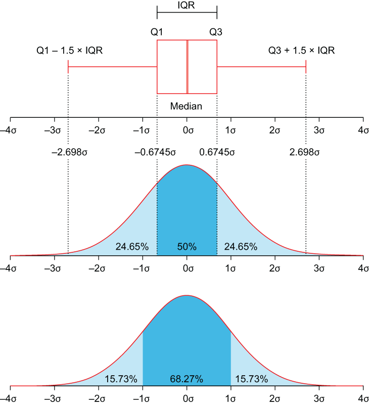
Figure 3.3 The IQR visualized. For skewed data, we want to place missing values at either Q1 - 1.5 × IQR or Q3 + 1.5 × IQR.
To implement this, we will use a third-party package called feature-engine, which has an implementation of end-of-tail imputation that fits into our scikit-learn pipeline well. Let’s begin by taking a look at the original histogram of the lymphocytes feature (figure 3.4):
covid_flu['lymphocytes'].plot(
    title='Lymphocytes', kind='hist', xlabel='cells/μL'
)
Figure 3.4 The lymphocytes feature before applying end-of-tail imputation
The original data show a right-skewed distribution with a bump on the left side of the distribution and a tail on the right-hand side. Let’s import the EndOfTailImputer (figure 3.5) class now and impute values into the feature, using the default Gaussian method, which is computed by the following formula:
arithmetic mean + 3 * standard deviation                             ❶


from feature_engine.imputation import EndOfTailImputer               ❷

EndOfTailImputer().fit_transform(covid_flu[['lymphocytes']]).plot(
    title='Lymphocytes (Imputed)', kind='hist', xlabel='cells/μL'
)                                                                    ❸
❶ For more info, see https://feature-engine.readthedocs.io.
❷ Import our end-of-tail imputer.
❸ Apply the end-of-tail imputer to the lymphocytes feature, and plot the histogram.

Figure 3.5 The lymphocytes feature after applying end-of-tail imputation
Our imputer has filled in values, and we now can see a large bar at around the value of 14. These are our imputed values. If we wanted to calculate how this happens, our arithmetic mean of the feature is 1.850154, and our standard deviation is 3.956668. So our imputer is imputing the following value:
1.850154 + (3 * 3.956668) = 13.720158
This lines up with the bump we see in our histogram.
Exercise 3.1 If our arithmetic mean was 8.34 and our standard deviation was 2.35, what would the EndOfTailImputer fill in missing values with?
We have many options when filling in quantitative data, but we also need to talk about how to impute values for qualitative data. This is because the techniques to do so, while familiar, are different.
3.3.2 Imputing missing qualitative data
Let’s turn our focus on our qualitative data, so we can start building our feature engineering pipelines. Let’s begin by grabbing our categorical columns and putting them in a list, as shown in the following listing.
Listing 3.3 Counting values of qualitative features
categorical_types = ['O']  # The "object" type in pandas
categorical_columns = covid_flu.select_dtypes(
    include=categorical_types).columns.tolist()
categorical_columns.remove('Diagnosis')             ❶
for categorical_column in categorical_columns:
    print('=======')
    print(categorical_column)
    print('=======')
    print(covid_flu[categorical_column].value_counts(dropna=False))

=======
InitialPCRDiagnosis
=======
NaN    1378
Yes     100
No        4
Name: InitialPCRDiagnosis, dtype: int64
=======
Sex
=======
M      748
F      658
NaN     76
Name: Sex, dtype: int64
...
=======
RiskFactors
=======
NaN                          1273
asthma                         36
pneumonia                      21
immuno                         21
diabetes                       16
                             ...
HepB                            1
pneumonia                       1
Hypertension and COPD           1
asthma, chronic, diabetes       1
Pre-eclampsia                   1
Name: RiskFactors, Length: 64, dtype: int64
❶ We want to remove our response variable from this list because it is not a feature in our ML model.
It looks like all of our categorical columns are binary except for RiskFactors, which looks to be a pretty dirty, comma-separated list of factors. Before we attempt to deal with RiskFactors, let’s clean up our binary features.
Let’s start by turning the Sex column into a true/false binary column and then mapping all instances of Yes to True and No to False in our DataFrame. This will allow these values to be machine readable, as Booleans are treated as 0s and 1s in Python. The following code snippet performs both of these functions for us. The code will
-
Create a new column called Female, which will be True if the Sex column indicated Female and False, otherwise.
-
Use the replace feature in pandas to replace Yes with True and No with False everywhere in our dataset.
covid_flu['Female'] = covid_flu['Sex'] == 'F'
del covid_flu['Sex']                                        ❶

covid_flu = covid_flu.replace({'Yes': True, 'No': False})   ❷
❶ Turn our Sex column into a binary column.
❷ Replace Yes and No with True and False.
Most-frequent category imputation
As with numerical data, there are many ways we can impute missing categorical data. One such method is called the most-frequent category imputation or mode imputation. As the name suggests, we simply replace missing values with the most common non-missing value:
cat_impute = SimpleImputer(strategy='most_frequent')   ❶

print(covid_flu['Coughing'].head())

print(cat_impute.fit_transform(
    covid_flu[['Coughing']])[:5])                      ❷
0    Yes
1    NaN
2    NaN
3    Yes
4    NaN
Name: Coughing, dtype: object
[['Yes']
 ['Yes']
 ['Yes']
 ['Yes']
 ['Yes']]
❶ Could be most_frequent or constant (arbitrary) for categorical values
❷ Transforming turns the column into a NumPy array.
With our data, I believe we can make an assumption that allows us to use another kind of imputation.
Similar to arbitrary value imputation for numerical values, we can apply this to categorical values by either creating a new category, called Missing or Unknown, that the machine learning algorithm will have to learn about or by making an assumption about the missing values and filling in the values based on that assumption.
For our purposes, let’s make an assumption about missing categorical data and say that if a categorical value (which, in our data, represents a symptom) is missing, the doctor in charge of writing this down did not think they were presenting this symptom, so it is more likely than not that they did not have this symptom. Basically, we will replace all missing categorical values with False.
This is done pretty simply with our SimpleImputer:
fill_with_false = SimpleImputer(strategy='constant', fill_value=False)
fill_with_false.fit_transform(covid_flu[binary_features])
3.4 Feature construction
Just like we talked about in the last chapter, feature construction is the manual creation of new features by directly transforming existing features, and we are going to do just that. In this section, we are going to take a look at our features and make transformations to them based on their data level (e.g., ordinal, nominal, etc).
3.4.1 Numerical feature transformations
In this section, we are going to go over some ways of creating new features from the ones we started with. Our goal is to create new, more useful features than the ones we started with. Let’s begin by applying some mathematical transformations to our features.
Log transforms are probably the most common feature transformation technique that replaces each value in a column x with the value log(1 + x). Why 1 + x and not just x? One reason is that we want to be able to handle 0 values, and log(0) is undefined. In fact, the log transform only works on strictly positive data.
The log transform’s overall purpose is to make the data look more normal. This is preferred in many cases, mostly because data being normal is one of the most overlooked assumptions in data science. Many underlying tests and algorithms assume that data are normally distributed, including chi-squared tests and logistic regressions. Another reason we would prefer to transform our skewed data into normally distributed data is that the transformation tends to leave behind fewer outliers, and machine learning algorithms don’t tend to work well with outliers.
Luckily, in NumPy, we have an easy way to do the log transformation (figures 3.6 and 3.7 show the before and after of a log transformation):
covid_flu['lymphocytes'].plot(
    title='Lymphocytes', kind='hist', xlabel='cells/μL'
)                                                          ❶
covid_flu['lymphocytes'].map(np.log1p).plot(
    title='Lymphocytes (Log Transformed)', kind='hist', xlabel='cells/μL'
) ❷❷ Log transform of lymphocytes
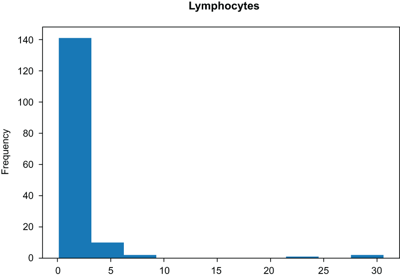
Figure 3.6 Histogram of the lymphocytes columns before applying a log transform
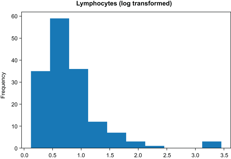
Figure 3.7 Histogram of the lymphocytes columns after applying a log transform. The data are much more normal.
Our data look much more normal after applying the log transform (figure 3.7). However, we do have a way of taking this transformation even further, using another kind of feature transformation.
A less common, but oftentimes more useful transformation, is the Box-Cox transformation. The Box-Cox transformation is a transformation parameterized by a parameter lambda that will shift the shape of our data to be more normal.
The formula for Box-Cox is as follows:
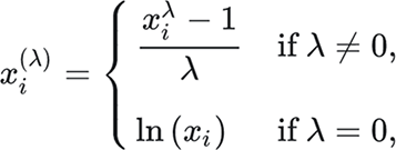
Lambda is a parameter here that is chosen to make the data look the most normal. It’s also worth noting that the Box-Cox transform only works on strictly positive data.
It is not crucial to fully internalize the formula for Box-Cox, but it is worth seeing it for reference. For our purposes, we can use the PowerTransformer class in scikit-learn to perform the Box-Cox transformation (figures 3.8 and 3.9 show the before and after of a Box-Cox transformation).

Figure 3.8 Histograms of quantitative features before applying the Box-Cox transformation

Figure 3.9 Histograms of quantitative features after applying Box-Cox look much more normal than the original features.
First, let’s deal with the fact that our Age column has some zeros in it, making it not strictly positive:
covid_flu[covid_flu['Age']==0].head(3)            ❶

covid_flu['Age'] = covid_flu['Age'] + 0.01        ❷
pd.DataFrame(covid_flu[numerical_columns]).hist(figsize=(10, 10))
❶ It looks like Age may have some zeros in it, which won’t work with Box-Cox.
❷ To make Age strictly positive
Now, we can apply our transformation:
from sklearn.preprocessing import PowerTransformer

boxcox_transformer = PowerTransformer(method='Box-Cox', standardize=False)
pd.DataFrame(
    boxcox_transformer.fit_transform(covid_flu[numerical_columns]),
    columns=numerical_columns
).hist(figsize=(10, 10))
We can even take a look at the lambdas that were chosen to make our data more normal (figure 3.9). A lambda value of 1 would not change the shape of our distribution, so if we see a value very close to 1, our data were already close to normally distributed:
boxcox_transformer.lambdas_

array([ 0.41035252, -0.22261792,  0.12473207,
       -0.24415703,  0.36376996, -7.01162857])
Normalizing negative data The PowerTransformer class also supports the Yeo-Johnson transformation, which also attempts to distort distributions to be more normal but has a modification in it that allows it to be utilized on negative data. Our data do not have any negatives in them, so we did not need to use it.
Feature transformations seem like they are a great catchall for forcing our data to be normal, but there are disadvantages to using the log and Box-Cox transformations:
-
We are distorting the original variable distribution, which may lead to decreased performance.
-
We are also changing various statistical measures, including the covariance between variables. This may become an issue when relying on techniques that use the covariance, like PCA.
-
Transformations run the risk of hiding outliers in our data, which may sound good at first but means that we lose control over dealing with outliers manually if we rely entirely on these transformations.
We will be applying the Box-Cox transformation later in this chapter in our feature engineering. In general, if the goal is to enforce normally distributed data, I recommend using the Box-Cox transformation, as the log transform is a special case of the Box-Cox transformation.
In most datasets with numerical features, we run into the issue that the scales of the data are vastly different from one another, and some scales are just too big to be efficient. This can be an issue for algorithms where the distance between points is important, like in k-nearest neighbors (k-NN), k-means, or algorithms that rely on a gradient descent, like neural networks and SVMs.
Moving forward, we will talk about two kinds of standardization: min-max standardization and z-score standardization. Min-max standardization scales values in a feature to be between 0 and 1, while z-score standardization scales values to have a mean of 0 and a variance of 1, allowing for negative values. While min-max standardization ensures that each feature is on the same scale (from 0 to 1), z-score standardization ensures that outliers are handled more properly but will not guarantee that the data will end up on the exact same scale.
Both transformations do not affect the distribution of the feature like the log and Box-Cox transformations, and they both help deal with the effects of outliers on our models. Min-max standardization has a harder time dealing with outliers, so if our data have many outliers, it is generally better to stick with z-score standardization. Let’s see this in action by first looking at our data before applying any transformations (figure 3.10):
covid_flu[numerical_columns].describe() ❶❶ Before any transformations, scales are all over the place, as are means and standard deviations.
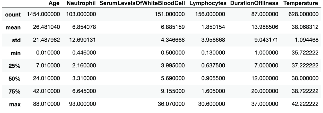
Figure 3.10 Descriptive statistics of our quantitative features
We can see that our scales, mins, maxes, standard deviations, and means are all over the place (figure 3.11)!
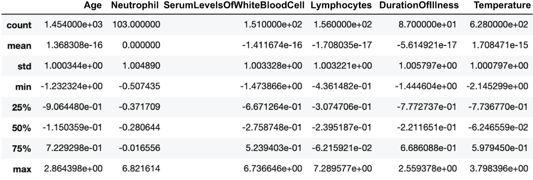
Figure 3.11 Descriptive statistics of our quantitative features after applying z-score standardization
Let’s start by applying the StandardScalar class from scikit-learn to standardize our data:
from sklearn.preprocessing import StandardScaler, MinMaxScaler

pd.DataFrame(  # mean of 0 and std of 1 but ranges are different (see min and max)
    StandardScaler().fit_transform(covid_flu[numerical_columns]),
    columns=numerical_columns
).describe()
We can see that all features now have a mean of 0 and a standard deviation (and therefore variance) of 1, but the ranges are different if we look at the min and max of the features (figure 3.12). Let’s see this now for min-max standardization:
pd.DataFrame(  # mean and std are different but min and max are 0s and 1s
    MinMaxScaler().fit_transform(covid_flu[numerical_columns]),
    columns=numerical_columns
).describe()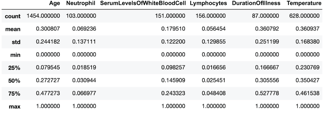
Figure 3.12 Descriptive statistics of our quantitative features after applying min-max standardization
Now, our scales are spot on with all features having a min of 0 and a max of 1, but our standard deviations and means are no longer identical.
3.4.2 Constructing categorical data
Constructing quantitative features generally involves transforming original features, using methods like Box-Cox and log transforms. When constructing qualitative data, however, we only have a few options to extract as much signal as possible from our features. Of those methods, binning transforms quantitative data into qualitative data.
Binning refers to the act of creating a new categorical (usually ordinal) feature from a numerical or categorical feature. The most common way to bin data is to group numerical data into bins based on threshold cutoffs, similar to how a histogram is created.
The main goal of binning is to decrease our model’s chance of overfitting the data. Usually, this will come at the cost of performance, as we are losing granularity in the feature that we are binning.
In scikit-learn, we have access to the KBinsDiscretizer class, which can bin data for us using three methods:
from sklearn.preprocessing import KBinsDiscretizer              ❶

binner = KBinsDiscretizer(n_bins=3, encode='ordinal', strategy='uniform')
binned_data = binner.fit_transform(covid_flu[['Age']].dropna())
pd.Series(binned_data.reshape(-1,)).plot(
    title='Age (Uniform Binning)', kind='hist', xlabel='Age'    ❷
)
❶ We will use this module for binning our data.
❷ The uniform strategy will create bins of equal width.
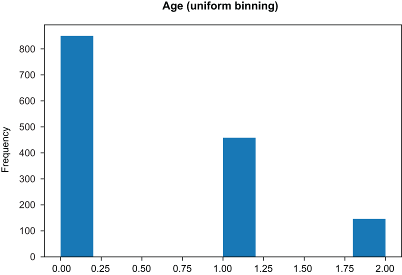
Figure 3.13 Uniform binning yields bins of equal width.
binner = KBinsDiscretizer(n_bins=3, encode='ordinal', strategy='quantile')
binned_data = binner.fit_transform(covid_flu[['Age']].dropna())
pd.Series(binned_data.reshape(-1,)).hist()          ❶
❶ Quantile will create bins of roughly equal height.
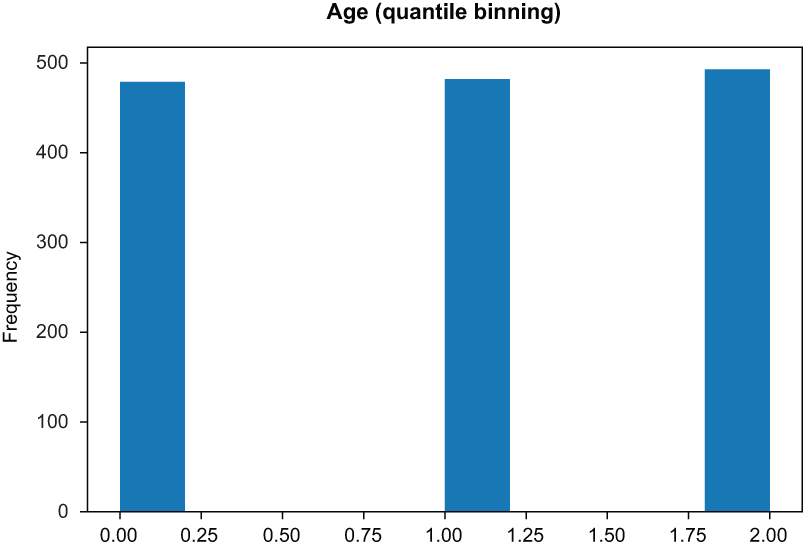
Figure 3.14 Quantile binning yields bins of equal height.
-
K-means bins are chosen by assigning them to the nearest cluster on a one-dimensional k-means algorithm outcome (figure 3.15):
binner = KBinsDiscretizer(n_bins=3, encode='ordinal', strategy='kmeans')
binned_data = binner.fit_transform(covid_flu[['Age']].dropna())
pd.Series(binned_data.reshape(-1,)).plot(
    title='Age (KMeans Binning)', kind='hist', xlabel='Age'     ❶
)
❶ KMeans will run a k-means cluster on each feature independently.
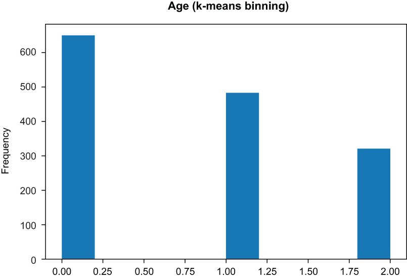
Figure 3.15 K-means binning yields bins based on a k-means run, with k set to the number of desired bins.
The RiskFactors feature is a bit of a mess and will require us to get our hands dirty and create a custom feature transformer that will work in our machine learning pipeline. Our goal is to transform a feature on the nominal level and create a one-hot encoding matrix, where each feature represents a distinct category, and the value is either 1 or 0, representing the presence of that value in the original observation (figure 3.16).
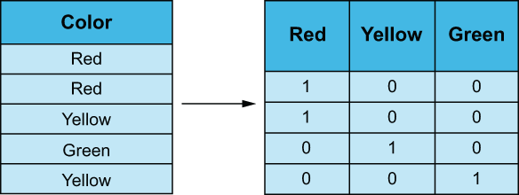
Figure 3.16 One-hot encoding a categorical variable, turning it into a matrix of binary values
We will need to create a custom scikit-learn transformer that will split the RiskFactors columns’ values by comma and then dummify them into a matrix, where each column represents a risk factor, and the value is either 0 (for the patient either not presenting the symptom or the value being null) or 1 (where the patient is presenting that risk factor). This is shown in the following listing.
Listing 3.4 Custom transformer for RiskFactors
   from sklearn.base import BaseEstimator, TransformerMixin
   from sklearn.preprocessing import MultiLabelBinarizer

class DummifyRiskFactor(BaseEstimator,TransformerMixin):              ❶
    def __init__(self):
        self.label_binarizer = None

    def parse_risk_factors(self, comma_sep_factors):
        ''' asthma,heart disease -> ['asthma', 'heart disease'] '''
        try:
            return [s.strip().lower() for s in comma_sep_factors.split(',')]
        except:
            return []

    def fit(self, X, y=None):
        self.label_binarizer = MultiLabelBinarizer()                  ❷
        self.label_binarizer.fit(X.apply(self.parse_risk_factors))    ❸
        return self

    def transform(self, X, y=None):
        return self.label_binarizer.transform(X.apply(self.parse_risk_factors))
❶ A custom data transformer to deal with our messy RiskFactors column
❷ Class to help make dummy variables
❸ Creates a dummy variable for each risk factor
Our DummifyRiskFactor transformer works by first applying the fit method to data. The fit method will
-
Apply the MultiLabelBinarizer class from scikit-learn to create dummy variables for each risk factor
We can then use the transform method in our custom transformer to map a list of messy risk factor strings to a neat matrix of risk factors! Let’s use our transformer just like any other scikit-learn transformer, as shown in the following listing.
Listing 3.5 Dummifying risk factors
drf = DummifyRiskFactor()
risks = drf.fit_transform(covid_flu['RiskFactors'])
print(risks.shape)
pd.DataFrame(risks, columns=drf.label_binarizer.classes_)
We can see the resulting DataFrame in figure 3.17.
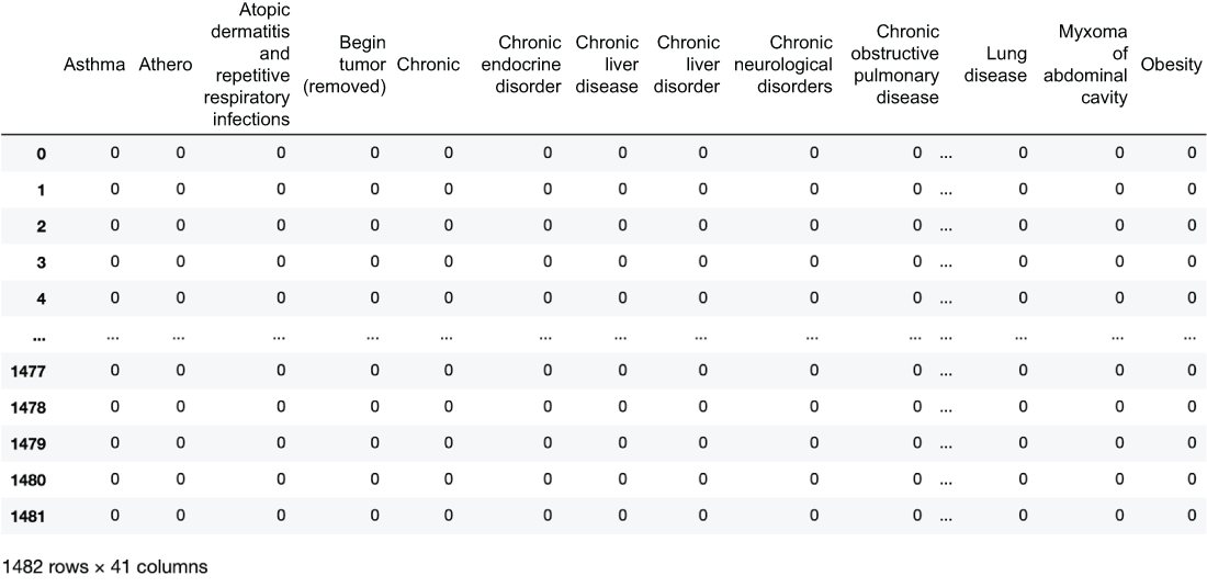
Figure 3.17 One-hot encoded risk factors with one row for every row in our original dataset and 41 columns representing the 41 risk factors we have parsed out
We can see that our transformer turns our single RiskFactors column into a brand-new matrix with 41 columns. We can also pretty quickly notice that this matrix will be pretty sparse. When we get to our feature selection portion of this chapter, we will attempt to remove unnecessary features to try and reduce sparsity.
It is important to note that when we fit our custom transformer to data, it will learn the risk factors in the training set and only apply those factors to the test set. This means that if a risk factor appears in our test set that was not in the training set, then our transformer will throw away that risk factor and forget it ever even existed.
Domain-specific feature construction
In different domains, data scientists have the option of applying domain-specific knowledge to create new features that they believe will be relevant. We will attempt to do this at least once per case study. In this study, let’s create a new column called FluSymptoms, which will be another Boolean feature that will be True if the patient is presenting with at least two symptoms and False otherwise:
covid_flu['FluSymptoms'] = covid_flu[
    ['Diarrhea', 'Fever', 'Coughing', 'SoreThroat',
     'NauseaVomitting', 'Fatigue']].sum(axis=1) >= 2   ❶

print(covid_flu['FluSymptoms'].value_counts())
False    753
True     729


print(covid_flu['FluSymptoms'].isnull().sum())         ❷
0

binary_features = [                                    ❸
    'Female', 'GroundGlassOpacity', 'CTscanResults',
    'Diarrhea', 'Fever', 'FluSymptoms',
    'Coughing', 'SoreThroat', 'NauseaVomitting',
    'Fatigue', 'InitialPCRDiagnosis'
]
❶ Construct a new categorical column that is an amalgamation of several flu symptoms.
❸ Aggregate all binary columns in a list.
Exercise 3.2 If we instead decided to define the FLuSymptoms feature as having at least one of the symptoms in that list, what would the distribution be between Trues and Falses?
We highly encourage all data scientists to think about constructing new domain-specific features, as they tend to lead to more interpretable and useful features. Some other features we could have created include
-
Number of risk factors (count of risk factors noted in the dataset)
-
Bucketing numerical values, using research-driven thresholds, rather than relying on k-means or a uniform distribution
For now, let’s move into building our feature engineering pipeline in scikit-learn, so we can start to see these techniques in action.
3.5 Building our feature engineering pipeline
Now that we’ve seen a few examples of feature engineering, let’s put them to the test. Let’s set up our dataset for machine learning by splitting our data into training and testing sets.
3.5.1 Train/test splits
To effectively train an ML pipeline that can generalize well to unseen data is to follow the train/test split paradigm (figure 3.18). The steps we will take are
-
Split our entire dataset into a training set (80% of the data) and a testing set (20% of the data).
-
Use the training dataset to train our ML pipeline and perform a cross-validated grid search to choose from a small set of potential parameter values.
-
Take the best set of parameters and use that to train the ML pipeline on the entire training set.
-
Output a classification report using scikit-learn by testing our ML pipeline on the testing set, which, as of now, we haven’t touched.
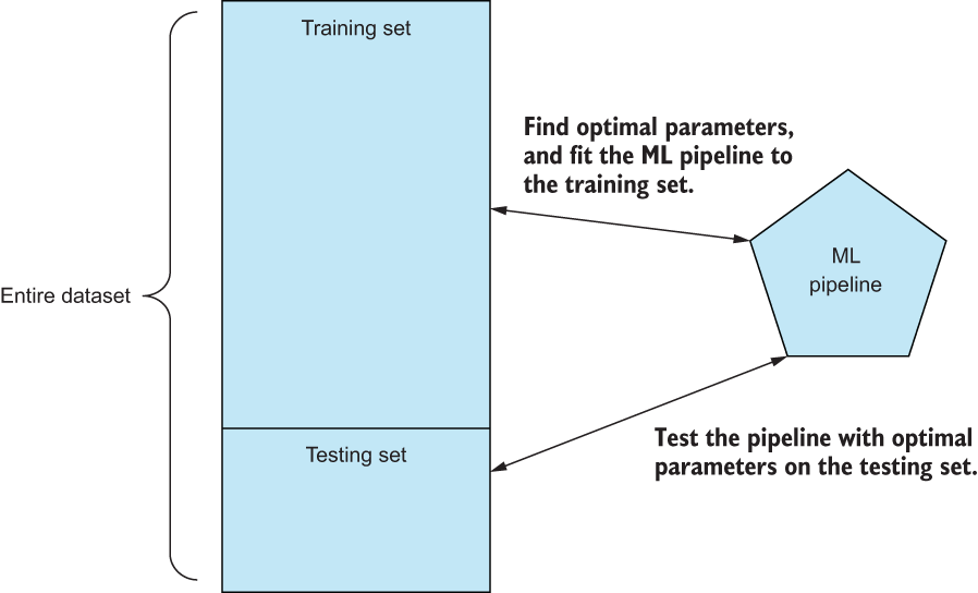
Figure 3.18 By splitting up our entire dataset into training and testing sets, we can use the training data to find optimal parameter values for our pipeline and use the testing set to output a classification report to give us a sense of how well our pipeline predicts data it hasn’t seen yet.
This procedure will give us a good sense of how well our pipeline does at predicting data that it did not see during the training phase and, therefore, how our pipeline generalizes to the problem we are trying to model. We will take this approach in virtually all of our case studies in this book to make sure that our feature engineering techniques are leading to generalizable ML pipelines.
from sklearn.model_selection import train_test_split
X, y = covid_flu.drop(['Diagnosis'], axis=1), covid_flu['Diagnosis']
x_train, x_test, y_train, y_test = train_test_split(
    X, y, stratify=y, random_state=0, test_size=.2
)
We can rely on scikit-learn’s train_test_split to perform this split for us.
Note that we want to stratify our train/test splits, so our training and test sets resemble the response split of the original dataset as closely as possible. We will rely heavily on scikit-learn’s FeatureUnion and Pipeline classes to create flexible chains of feature engineering techniques that we can pass into our grid search function, as shown in the following listing.
Listing 3.6 Creating feature engineering pipelines
from sklearn.preprocessing import FunctionTransformer
from sklearn.pipeline import Pipeline, FeatureUnion


risk_factor_pipeline = Pipeline(                                          ❶
    [
        ('select_and_parse_risk_factor', FunctionTransformer(lambda df:
df['RiskFactors'])),
        ('dummify', DummifyRiskFactor())                                  ❷
    ]
)

# deal with binary columns

binary_pipeline = Pipeline(
    [
        ('select_categorical_features', FunctionTransformer(lambda df:
df[binary_features])),
        ('fillna', SimpleImputer(strategy='constant', fill_value=False))  ❸
    ]
)

# deal with numerical columns

numerical_pipeline = Pipeline(
    [
        ('select_numerical_features', FunctionTransformer(lambda df:
df[numerical_columns])),
        ('impute', SimpleImputer(strategy='median')),
    ]
)
❷ Using our custom risk factor transformer to parse risk factors
❸ Assume missing values are not present.
We have three very simple feature engineering pipelines to give ourselves a baseline metric:
-
The risk_factor_pipeline selects the RiskFactors column and then applies our custom transformer to it (figure 3.20).
-
The binary_pipeline selects the binary columns and then imputes missing values in each column with False (making the assumption that if the dataset didn’t explicitly say the patient was presenting this symptom, they don’t have it; figure 3.21).
-
The numerical_pipeline selects the numerical columns and then imputes missing values with the median of each feature (figure 3.19).

Figure 3.19 Results after using only our numerical feature engineering pipeline

Figure 3.20 Results after using only our risk factor feature engineering pipeline. Barely beats the null accuracy with 74%.

Figure 3.21 Results after using only our binary features
Let’s see how each pipeline alone does by passing them into our helper function:
simple_grid_search(x_train, y_train, x_test, y_test,
numerical_pipeline)                                   ❶
simple_grid_search(x_train, y_train, x_test, y_test,
risk_factor_pipeline)                                 ❷
simple_grid_search(x_train, y_train, x_test, y_test,
binary_pipeline)                                      ❸
❶ Only using numerical values has a good precision on the COVID class but awful recall.
❷ Only using risk factors has a horrible recall and accuracy is barely higher than the null accuracy.
❸ Only using binary columns is also not performing well.
Let’s now get our first real baseline metric by concatenating all three of these pipelines together into one dataset and passing that into our helper function (figure 3.22).
simple_fe = FeatureUnion([                        ❶
    ('risk_factors', risk_factor_pipeline),
    ('binary_pipeline', binary_pipeline),
    ('numerical_pipeline', numerical_pipeline)
])

simple_fe.fit_transform(x_train, y_train).shape
best_model = simple_grid_search(x_train, y_train, x_test, y_test, simple_fe)
❶ Put all of our features together.
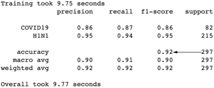
Figure 3.22 The results after concatenating our three feature engineering pipelines show that we’ve already boosted our performance up to 92% accuracy. We can see the benefit of joining together our feature engineering efforts.
That’s a big increase in performance! Accuracy has shot up to 92%, and our precision and recall for COVID-19 is looking much better. But let’s see if we can’t make it even better. Let’s try altering our numerical pipeline to impute the mean as well as scale the data (figure 3.23):
numerical_pipeline = Pipeline(
    [
        ('select_numerical_features', FunctionTransformer(lambda df:
df[numerical_columns])),
        ('impute', SimpleImputer(strategy='mean')),            ❶
        ('scale', StandardScaler())  # scale our numerical features
    ]
)

simple_fe = FeatureUnion([
    ('risk_factors', risk_factor_pipeline),
    ('binary_pipeline', binary_pipeline),
    ('numerical_pipeline', numerical_pipeline)
])

best_model = simple_grid_search(x_train, y_train, x_test, y_test, simple_fe)
Figure 3.23 Performance is worse all around after attempting to impute values with the mean.
Our model got slower, and performance is not as good. Looks like this isn’t the way to go here. How about imputing our missing values with an arbitrary 999 (figure 3.24) and then applying a scaling to reduce the impact of the outliers we are introducing?
numerical_pipeline = Pipeline(
    [
        ('select_numerical_features', FunctionTransformer(lambda df:
df[numerical_columns])),
        ('impute', SimpleImputer(strategy='constant', fill_value=999)),  ❶
        ('scale', StandardScaler())
    ]
)

simple_fe = FeatureUnion([
    ('risk_factors', risk_factor_pipeline),
    ('binary_pipeline', binary_ipeline),
    ('numerical_pipeline', numerical_pipeline)
])                                                                       ❷

best_model = simple_grid_search(x_train, y_train, x_test, y_test, simple_fe)❷ Gained some precision for the COVID class
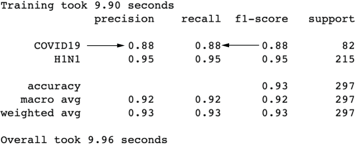
Figure 3.24 Results after applying arbitrary imputation, showing a boost in precision/ recall for COVID-19
We are getting somewhere! Looks like arbitrary imputation is helpful. Let’s go a step further and try end-of-tail imputation (figure 3.25), which we know is a type of arbitrary imputation. Let’s apply the Box-Cox transformation on our numerical features to make them normal and then apply a Gaussian end-of-tail imputation, which will replace missing values with the mean of the data (which, after scaling, would be 0) + 3 times the standard deviation (the standard deviation is 1 after scaling, so that would be 3).
numerical_pipeline = Pipeline(
    [
        ('select_numerical_features', FunctionTransformer(lambda df:
          ➥ df[numerical_columns])),
        ('Box-Cox', PowerTransformer(
         method='Box-Cox', standardize=True)),                  ❶
        ('turn_into_df', FunctionTransformer(lambda matrix:
          ➥ pd.DataFrame(matrix))),  # turn back into dataframe
        ('end_of_tail', EndOfTailImputer(imputation_method='gaussian'))

    ]
)

simple_fe = FeatureUnion([
    ('risk_factors', risk_factor_pipeline),
    ('binary_pipeline', binary_pipeline),
    ('numerical_pipeline', numerical_pipeline)
])

best_model = simple_grid_search(x_train, y_train, x_test, y_test, simple_fe)
❶ Apply Box-Cox transformation after scaling data and impute using Gaussian end of tail.
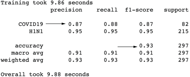
Figure 3.25 Results after using the end-of-tail imputer show a slightly better overall accuracy but a slightly worse precision for COVID-19.
Just about as good as imputing with a simple 999, but let’s keep the pipeline with the end-of-tail imputation. Let’s apply binning to our pipeline to see its effect on performance:
numerical_pipeline = Pipeline(                                              ❶
    [
        ('select_numerical_features', FunctionTransformer(lambda df:
          ➥ df[numerical_columns])),
        ('Box-Cox', PowerTransformer(method='Box-Cox', standardize=True)),
        ('turn_into_df', FunctionTransformer(lambda matrix:
          ➥ pd.DataFrame(matrix))),                                        ❷
        ('end_of_tail', EndOfTailImputer(imputation_method='gaussian')),
        ('ordinal_bins', KBinsDiscretizer(n_bins=10, encode='ordinal', strategy='kmeans'))
    ]
)

simple_fe = FeatureUnion([
    ('risk_factors', risk_factor_pipeline),
    ('binary_pipeline', binary_pipeline),
    ('numerical_pipeline', numerical_pipeline)
])

best_model = simple_grid_search(x_train, y_train, x_test, y_test, simple_fe)❸
❶ Bin data after scaling and imputing.
❸ So far, this is one of our best sets of results!
This is actually one of our best results so far (figure 3.26)! Binning seems to have helped our model’s precision at the cost of a bit of recall. We’ve had success creating and transforming features, but let’s move into how we might improve our pipeline with some feature selection.
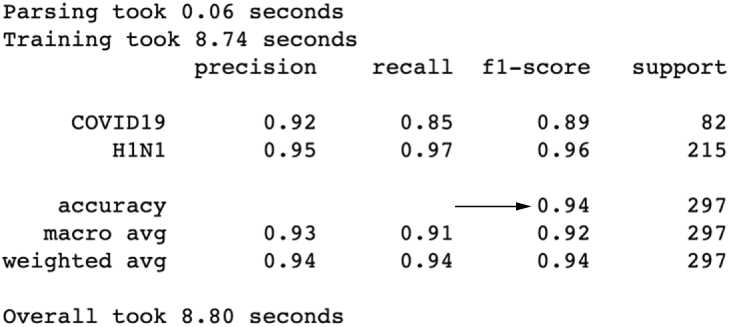
Figure 3.26 Results after binning our quantitative features show one of our best results overall.
3.6 Feature selection
Over the last few sections, we have made it a point to add features and improve them to make our model more effective. However, we ended up with dozens of features, many of which likely do not hold a lot of predictive power. Let’s apply a few feature selection techniques to reduce our dataset’s dimension.
3.6.1 Mutual information
Mutual information is a measure between two variables that measure the reduction in uncertainty of the first variable given that you know the second variable. Put another way, it measures dependence between two variables. When we apply this to feature engineering, we want to keep the features that have the highest mutual information with our response, meaning that the uncertainty in knowing the response is minimized given that we know the useful feature. We then throw out the bottom features that aren’t in the top n features.
Let’s apply this concept to our risk factor pipeline because it is by far the biggest subset of features (figure 3.27):
from sklearn.feature_selection import SelectKBest
from sklearn.feature_selection import mutual_info_classif
risk_factor_pipeline = Pipeline(                                   ❶
    [
        ('select_risk_factor', FunctionTransformer(
                               lambda df: df['RiskFactors'])),
        ('dummify', DummifyRiskFactor()),
        ('mutual_info', SelectKBest(mutual_info_classif, k=20)),   ❷
    ]
)


simple_fe = FeatureUnion([
    ('risk_factors', risk_factor_pipeline),
    ('binary_pipeline', binary_pipeline),
    ('numerical_pipeline', numerical_pipeline)
])

best_model = simple_grid_search(x_train, y_train, x_test, y_test, simple_fe)
❷ Feature selection based on mutual information

Figure 3.27 Feature selection via mutual information did not show a boost in performance.
We lost a bit of performance here, so we could increase the number of features to select or try our next technique.
3.6.2 Hypothesis testing
Another method for feature selection is to utilize the chi-squared test, which is a statistical test that works only on categorical data and is used to test for independence between two variables. In ML, we can use the chi-squared test to select features that the test deems the most dependent on the response, implying that it is useful in predicting the response variable. Let’s apply the chi-squared test to the risk factors (figure 3.28):
from sklearn.feature_selection import chi2

risk_factor_pipeline = Pipeline(               ❶
    [
        ('select_risk_factor', FunctionTransformer(
                               lambda df: df['RiskFactors'])),
        ('dummify', DummifyRiskFactor()),
        ('chi2', SelectKBest(chi2, k=20))      ❷
    ]
)


simple_fe = FeatureUnion([
    ('risk_factors', risk_factor_pipeline),
    ('binary_pipeline', binary_pipeline),
    ('numerical_pipeline', numerical_pipeline)
])

best_model = simple_grid_search(x_train, y_train, x_test, y_test, simple_fe)
❷ Use chi2 to select features.
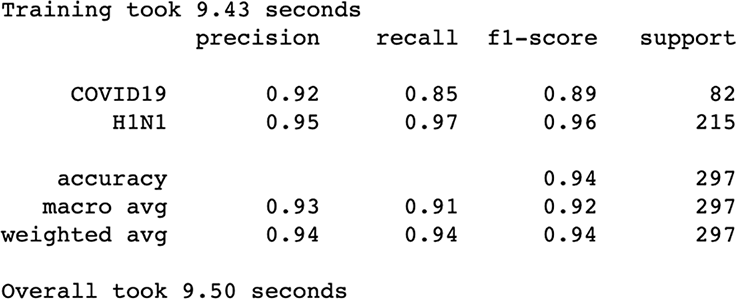
Figure 3.28 Results after feature selection via chi-squared are showing results on par with previous results but using fewer features.
Performance is pretty much the same as our mutual information run.
3.6.3 Using machine learning
The last two feature selection methods had something in common that may have been holding us back. They operate independently on each feature. This means that they don’t take into account any interdependence between the features themselves. One method we can use to take feature correlation into account is to use a secondary ML model that has either the feature_importances or the coef attribute and uses those values to select features (figure 3.29).
from sklearn.feature_selection import SelectFromModel
from sklearn.tree import DecisionTreeClassifier

risk_factor_pipeline = Pipeline(
    [
        ('select_risk_factor', FunctionTransformer(
                               lambda df: df['RiskFactors'])),
        ('dummify', DummifyRiskFactor()),
        ('tree_selector', SelectFromModel(
                 max_features=20, estimator=DecisionTreeClassifier()))      ❶
    ]
)

simple_fe = FeatureUnion([
    ('risk_factors', risk_factor_pipeline),
    ('binary_pipeline', binary_pipeline),
    ('numerical_pipeline', numerical_pipeline)
])

best_model = simple_grid_search(x_train, y_train, x_test, y_test, simple_fe)❷
❶ Use a decision tree classifier to select features.
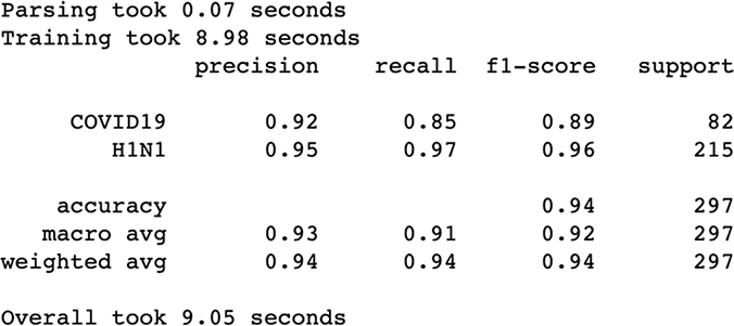
Figure 3.29 Results after using a decision tree’s important feature attribute to select features
It looks like we may be bumping up against the peak performance of our chosen model (figure 3.26). Let’s stop here and assess our findings.
As a final step, let’s take a look at our feature engineering pipeline as it stands:
simple_fe.transformer_list
[('risk_factors',
  Pipeline(steps=[('select_risk_factor',
                   FunctionTransformer(func=<function <lambda>)),
                  ('dummify', DummifyRiskFactor()),
                  ('tree_selector',
                   SelectFromModel(estimator=DecisionTreeClassifier(),
                                   max_features=20))])),
 ('binary_pipeline',
  Pipeline(steps=[('select_categorical_features',
                   FunctionTransformer(func=<function <lambda>)),
                  ('fillna',
                   SimpleImputer(fill_value=False, strategy='constant'))])),
 ('numerical_pipeline',
  Pipeline(steps=[('select_numerical_features',
                   FunctionTransformer(func=<function <lambda>)),
                  ('Box-Cox', PowerTransformer(method='Box-Cox')),
                  ('turn_into_df',
                   FunctionTransformer(func=<function <lambda>)),
                  ('end_of_tail', EndOfTailImputer(variables=[0, 1, 2, 3, 4,
                    ➥ 5])),
                  ('ordinal_bins',
                   KBinsDiscretizer(encode='ordinal', n_bins=10,
                                    strategy='kmeans'))]))]
If we were to visualize this, it would look like figure 3.30.

Figure 3.30 Our final feature engineering pipeline
When working with tabular data, there is a universe of feature engineering techniques to choose from. This case study only scratches the surface of our options and, hopefully, provides a framework for how to work with tabular data end to end. Our overall goal is to
-
Assign features to a level of data to maximize understanding them.
-
Apply feature construction and selection to fine-tune our data.
-
Apply an ML model to the engineered features to test how well our feature engineering efforts are working.
3.7 Answers to exercises
If our arithmetic mean was 8.34 and our standard deviation was 2.35, what would the EndOfTailImputer fill in missing values with?
The following code will calculate the value:
8.34 + (3 * 2.35) = 15.39
If we, instead, decided to define the FluSymptoms feature as having at least one of the symptoms in that list, what would the distribution be between Trues and Falses?
covid_flu['FluSymptoms'] = covid_flu[['Diarrhea', 'Fever', 'Coughing',
➥ 'SoreThroat', 'NauseaVomitting', 'Fatigue']].sum(axis=1) >= 1

print(covid_flu['FluSymptoms'].value_counts())

True     930
False    552
Summary
-
By looking at qualitative and quantitative features separately and applying appropriate feature engineering techniques to each type, we were able to see improvements in our model up until we were in the low- to mid-90s for precision/ accuracy.
-
Quantitative features were imputed, transformed, and binned to achieve our peak performance.
-
Engineering our qualitative features, such as dummifying our risk factors, helps keep up recall.
-
Feature selection did not provide a boost in performance for us, most likely due to the fact that the classifier we chose (the extra trees classifier) was doing its own version of feature selection by applying low importance scores to features.