
Remember, at the interval level, we have addition and subtraction to work with. This is a real game-changer. With the ability to add values together, we may introduce two familiar concepts, the arithmetic mean (referred to simply as the mean) and standard deviation. At the interval level, both of these are available to us. To see a great example of this, let's pull in a new dataset, one about climate change:
# load in the data set
climate = pd.read_csv('../data/GlobalLandTemperaturesByCity.csv')
climate.head()
Let us have a look at the following table for a better understanding:
|
dt |
AverageTemperature |
AverageTemperatureUncertainty |
City |
Country |
Latitude |
Longitude |
|
|
0 |
1743-11-01 |
6.068 |
1.737 |
Århus |
Denmark |
57.05N |
10.33E |
|
1 |
1743-12-01 |
NaN |
NaN |
Århus |
Denmark |
57.05N |
10.33E |
|
2 |
1744-01-01 |
NaN |
NaN |
Århus |
Denmark |
57.05N |
10.33E |
|
3 |
1744-02-01 |
NaN |
NaN |
Århus |
Denmark |
57.05N |
10.33E |
|
4 |
1744-03-01 |
NaN |
NaN |
Århus |
Denmark |
57.05N |
10.33E |
This dataset has 8.6 million rows, where each row quantifies the average temperature of cities around the world by the month, going back to the 18th century. Note that just by looking at the first five rows, we already have some missing values. Let's remove them for now in order to get a better look:
# remove missing values
climate.dropna(axis=0, inplace=True)

climate.head() . # check to see that missing values are gone
The following table gives us a better understanding here:
|
dt |
AverageTemperature |
AverageTemperatureUncertainty |
City |
Country |
Latitude |
Longitude |
|
|
0 |
1743-11-01 |
6.068 |
1.737 |
Århus |
Denmark |
57.05N |
10.33E |
|
5 |
1744-04-01 |
5.788 |
3.624 |
Århus |
Denmark |
57.05N |
10.33E |
|
6 |
1744-05-01 |
10.644 |
1.283 |
Århus |
Denmark |
57.05N |
10.33E |
|
7 |
1744-06-01 |
14.051 |
1.347 |
Århus |
Denmark |
57.05N |
10.33E |
|
8 |
1744-07-01 |
16.082 |
1.396 |
Århus |
Denmark |
57.05N |
10.33E |
Let's see if we have any missing values with the following line of code:
climate.isnull().sum()

dt                               0
AverageTemperature               0
AverageTemperatureUncertainty    0
City                             0
Country                          0
Latitude                         0
Longitude                        0
year                             0
dtype: int64

# All good
The column in question is called AverageTemperature. One quality of data at the interval level, which temperature is, is that we cannot use a bar/pie chart here because we have too many values:
# show us the number of unique items
climate['AverageTemperature'].nunique()

 111994
111,994 values is absurd to plot, and also absurd because we know that the data is quantitative. Likely, the most common graph to utilize starting at this level would be the histogram. This graph is a cousin of the bar graph, and visualizes buckets of quantities and shows frequencies of these buckets.
Let's see a histogram for the AverageTemperature around the world, to see the distribution of temperatures in a very holistic view:
climate['AverageTemperature'].hist()
The following is the output of the preceding code:

Here, we can see that we have an average value of 20°C. Let's confirm this:
climate['AverageTemperature'].describe()

 count 8.235082e+06 mean 1.672743e+01 std 1.035344e+01 min -4.270400e+01 25% 1.029900e+01 50% 1.883100e+01 75% 2.521000e+01 max 3.965100e+01 Name: AverageTemperature, dtype: float64
We were close. The mean seems to be around 17°. Let's make this a bit more fun and add new columns called year and century, and also subset the data to only be the temperatures recorded in the US:
# Convert the dt column to datetime and extract the year
 climate['dt'] = pd.to_datetime(climate['dt'])
 climate['year'] = climate['dt'].map(lambda value: value.year)

 climate_sub_us['century'] = climate_sub_us['year'].map(lambda x: x/100+1)
 # 1983 would become 20
 # 1750 would become 18

 # A subset the data to just the US
 climate_sub_us = climate.loc[climate['Country'] == 'United States']
With the new column century, let's plot four histograms of temperature, one for each century:
climate_sub_us['AverageTemperature'].hist(by=climate_sub_us['century'],
 sharex=True, sharey=True,
 figsize=(10, 10),
 bins=20)
The following is the output of the preceding code:

Here, we have our four histograms, showing that the AverageTemperature is going up slightly. Let's confirm this:
climate_sub_us.groupby('century')['AverageTemperature'].mean().plot(kind='line')
The following is the output of the preceding code:
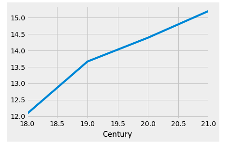
Interesting! And because differences are significant at this level, we can answer the question of how much, on average, the temperature has risen since the 18th century in the US. Let's store the changes over the centuries as its own pandas Series object first:
century_changes = climate_sub_us.groupby('century')['AverageTemperature'].mean()

century_changes

century 18 12.073243 19 13.662870 20 14.386622 21 15.197692 Name: AverageTemperature, dtype: float64
And now, let's use the indices in the Series to subtract the value in the 21st century minus the value in the 18th century, to get the difference in temperature:
# 21st century average temp in US minus 18th century average temp in US
 century_changes[21] - century_changes[18]

 # average difference in monthly recorded temperature in the US since the 18th century
 3.12444911546