
At the ratio level, we may multiply and divide values together. This may not seem like a big deal, but it does allow us to make unique observations about data at this level that we cannot do at lower levels. Let's jump into a few examples to see exactly what this means.
Example:
When working with financial data, we almost always have to work with some monetary value. Money is at the ratio level because we have a concept of having "zero money". For this reason, we may make statements such as:
-
$100 is twice as much as $50 because 100/50 = 2
-
10mg of penicillin is half as much as 20mg of penicillin because 10/20 = .5
It is because of the existence of zero that ratios have meaning at this level.
Non-example:
We generally consider temperature to be at the interval level and not the ratio level, because it doesn't make sense to say something like 100 degree is twice as hot as 50 degree. That doesn't quite make sense. Temperature is quite subjective and this is not objectively correct.
It can be argued that Celsius and Fahrenheit have a starting point mainly because we can convert them into Kelvin, which does boast a true zero. In reality, because Celsius and Fahrenheit allow negative values, while Kelvin does not; both Celsius and Fahrenheit do not have a real true zero, while Kelvin does.
Going back to the salary data from San Francisco, we now see that the salary weekly rate is at the ratio level, and there we can start making new observations. Let's begin by looking at the highest paid salaries:
# Which Grade has the highest Biweekly high rate
# What is the average rate across all of the Grades
fig = plt.figure(figsize=(15,5))
ax = fig.gca()

salary_ranges.groupby('Grade')[['Biweekly High Rate']].mean().sort_values(
 'Biweekly High Rate', ascending=False).head(20).plot.bar(stacked=False, ax=ax, color='darkorange')
ax.set_title('Top 20 Grade by Mean Biweekly High Rate')
The following is the output of the preceding code:

If we look up the highest-paid salary in a San Francisco public record found at:
We see that it is the General Manager, Public Transportation Dept.. Let's take a look at the lowest-paid jobs by employing a similar strategy:
# Which Grade has the lowest Biweekly high rate
 fig = plt.figure(figsize=(15,5))
 ax = fig.gca()

 salary_ranges.groupby('Grade')[['Biweekly High Rate']].mean().sort_values(
 'Biweekly High Rate', ascending=False).tail(20).plot.bar(stacked=False, ax=ax, color='darkorange')
 ax.set_title('Bottom 20 Grade by Mean Biweekly High Rate')
The following is the output of the preceding code:
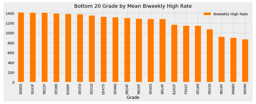
Again, looking up the lowest-paid job, we see that it is a Camp Assistant.
Because money is at the ratio level, we can also find the ratio of the highest-paid employee to the lowest-paid employee:
sorted_df = salary_ranges.groupby('Grade')[['Biweekly High Rate']].mean().sort_values(
 'Biweekly High Rate', ascending=False)
 sorted_df.iloc[0][0] / sorted_df.iloc[-1][0]

 13.931919540229886
The highest-paid employee makes 14x the lowest city employee. Thanks, ratio level!