As of version 6.5, the Adobe Title Designer replaced what had historically been a dependable, but basic, title tool. Anyone who has had any exposure to Premiere 6.5 or a later version through one of my seminars or tradeshow presentations knows this is one of my favorite parts of the software. Using it is fun and easy, and it comes with design templates that make creating professional-looking titles inside your Premiere Pro software faster than ever.
The first critical concept to understand is that the files created by the Title Designer are not somehow embedded in the project file. Although they will stay in your Project window like your other project media, they must be saved as separate files and used in your project like any other video, audio, or graphic clip. This also means that you can use them in more than one project if you wish.
My personal system is to save the Title Designer files inside the same folder as the rest of the media or graphics for any given project. That way all the components of a project can be found in one place and easily archived—or at least accessed by that replacement editor who has to come in and work on the project if I’m not available.
Creating a New Title Document
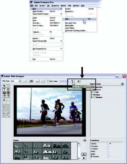
Choose File ![]() New
New ![]() Title to open Title Designer with a new, blank document. To do this from the keyboard, the default shortcut key is F9.
Title to open Title Designer with a new, blank document. To do this from the keyboard, the default shortcut key is F9.
To save the title when you’ve composed it, select Save As from the File pulldown menu. Title Designer files save with the extension .prtl. You can open title files from v6.0 and earlier versions of Premiere, but Title Designer will immediately prompt you to resave it with a .prtl extension and update the file.
The default arrangement for composing in Title Designer is to open ready to create a superimposed title. This is a title that is transparent through to the video in the background, except for the foreground elements such as text and graphics. When the window opens, you will see whatever video frame your CTI is resting on in the background. If you do not want the video to show in the background, uncheck the Show Video checkbox above the composition area.
File ![]() New
New ![]() Title opens the Title Designer. The Sync to Timeline Timecode button will update the video background to display the current frame under the CTI.
Title opens the Title Designer. The Sync to Timeline Timecode button will update the video background to display the current frame under the CTI.
Title Designer can be used to create a variety of text and graphic elements. Any vector font that is on your system, including True Type, Type 1, and Open Type, will work with Title Designer.
To type text into the window, follow these steps:
1 Choose either the Horizontal or the Vertical Type tool (the buttons with the letter T in the second row down along the left side of the composition area).
2 Click into the drawing area where the text should begin.
3 After you finish typing, click on the Select tool (the black arrow in the top row of tools), then click outside your new text object to deselect it.
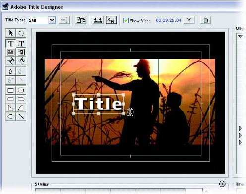
Click on a Type tool, then click in the composition window and start typing.
To move or rearrange text objects, simply click and drag them with the Select tool. The Select tool can also be used to scale and rotate the text object. Vertical and horizontal scaling can be done by clicking and dragging the corner points (holding down Shift locks the aspect and scales each equally). The side points can scale either vertically or horizontally. The corner points can also be used to rotate the object by moving the cursor slightly outside the corner point, where it changes to a rotate icon.
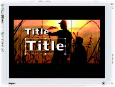
Scale text objects by dragging the handles.
A titler is not a word processor, so it does not automatically “wrap” text at the end of a line when space runs out. Because we are arranging type visually, using the Enter key to wrap or to start a new line is the standard method with the Horizontal and Vertical Type tools. Adobe Title Designer does have a word wrap option, which you can turn on by choosing Title ![]() Word Wrap.
Word Wrap.
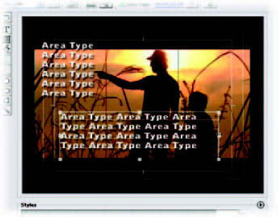
You can restrict the type to the predefined area of the text object box and have some automatic wrapping behavior by selecting the Horizontal Area Type tool or Vertical Area Type tool (just below the standard type tools). In the case of a text object created with the Area Type tools, scaling the text object will only affect the size of the text box. Unless you’ve typed in returns, the text will wrap to fill the new space.
An area type object can be resized with the object handles, but the text will redistribute itself into the new space rather than resize with the object.
Typing on a Path
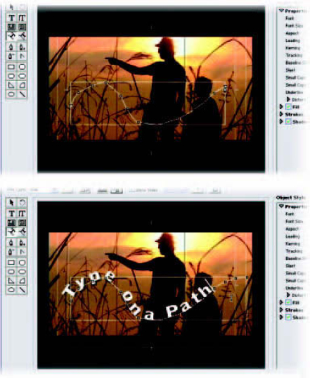
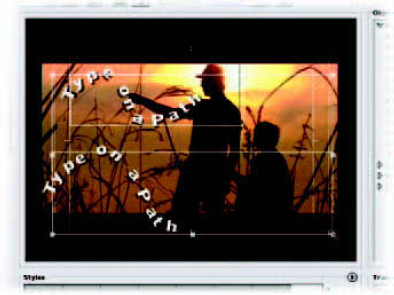
The Path Type tools are located below the Area Type tools. Like the Type and Area Type tools, the Path Type tools are available in a horizontal or a vertical version. The Path Type tools allow you to form an irregular path in the form of a curve—or just about any path shape you can think of—and simply type in characters along that path.
To create type on a path, follow these steps:
1 Click on a Path Type tool.
2 The cursor will turn into a Pen tool; use it to draw a path, clicking to create points as you go.
3 When your path is complete, simply start typing.
Once the text is on the path, the text object itself can be resized using the object handles. Scaling with the object handles will scale the path. The text will remain the same size and redistribute itself along the path.
Create a path by clicking on points that form a path, then type in your text.
To resize the text, change the font size in the Object Style menu under the Properties heading, to the right of the Composition window. The text will redistribute itself to fit along the path.
To change the shape of the path, use the Pen tools (described in the next section) to move, add, or remove points on the path.
Resize a path text path with the object handles. You can resize the text itself only from Object Style menu.
Pen Tools
Directly below the Type tools, you will see the Pen tools. These tools can be used to draw lines in your composition. After your lines have been included in your composition, you can select any number of attributes for text, such as gradients, textures, and shadows.
To create a line or path object, do the following:
1 Select the Pen tool.
2 In your composition area, click several times, moving as you click to create a line.
3 When the line is drawn, you can click and drag the points along the path to change the route of the path and change the shape of the line object.
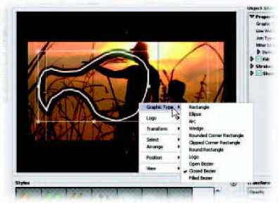
Once your graphic object is in your composition, you can right-click on it and use the Graphic Type menu to change the characteristics of the line object—or even change the line object to one of the shape choices.
After a path object has been created, right-click on it and select Graphic Type to select another graphic choice from the context menu.
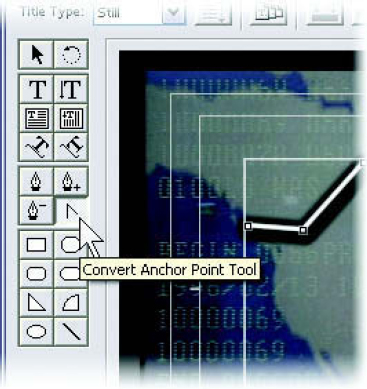
The Convert Anchor Point tool.
The tool that doesn’t look like a pen, but more like a simple, upward-pointing arrow, is the Convert Anchor Point tool. This tool changes the behavior of a point from a simple point to a bezier (pronounced bezee-ay) adjustable point. Bezier refers to the type of curve tension adjustment that is available via handles created when you convert a simple point.
If you drag slightly (or even a lot) during each click when you are creating a path object, you will see the bezier handles appear and you will get a feel for the adjustment capability. Don’t be afraid to experiment. Creating the bezier handles when you create the point will save you the step of using the Convert Anchor Point tool later.
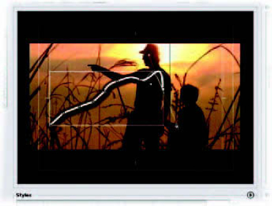
By clicking and dragging when you are creating a point, you will create bezier handles for that point immediately, eliminating the need to convert the point later.
Working with Graphic Elements
You can also create shapes for building graphics from within the Title Designer. Several shapes are available in the lower section of the toolbox.
Here’s how to create a shape in your title:
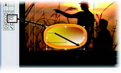
1 Select a shape from the toolbox by clicking on it.
2 Click and drag in the composition area to create the shape as a graphic element.
3 The shape can be dragged into position and scaled, as well as given text attributes, just like type.
Select a graphic shape and drag out a box in the frame to create a graphic element.
Your shapes can also be edited if you right-click on them and select Graphic Type ![]() Open (or Closed, or Filled) Bezier from the list. Use the Convert Anchor Point tool to create bezier handles on the shape’s points, and adjust to your heart’s content.
Open (or Closed, or Filled) Bezier from the list. Use the Convert Anchor Point tool to create bezier handles on the shape’s points, and adjust to your heart’s content.
Note: You can make a title with a background that isn’t transparent by dragging a rectangle the size of the frame and choosing a solid color, gradient, or texture for the rectangle. This creates an opaque background.
Object Styles
Along the right side of the composition window are the Object Style settings. Click on the triangle to the left of the word Properties to expand the menu.
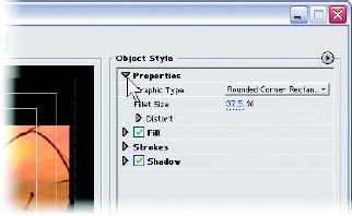
The Object Style settings.
Before we go through the properties list, we need to create a text object. Follow the instructions for creating type to create a type object in the composition area.
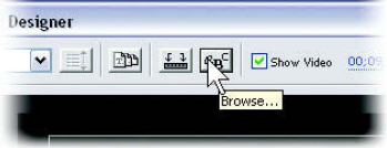
The Font Browse button.
Starting at the top of the list, you will notice the font is listed. By clicking on the name of the font, you will call up a menu that includes the fonts on your system, so that you can choose and apply one to your text object. The only problem is that most of us have very little idea about the appearance of anything but the most familiar font names.
You can solve that problem by browsing the list visually:
1 Make sure you have a text object in the composition area and that it is selected.
2 Click on the Font Browse button above the composition area.
The Font Browser will open. Move it so you can see the type in your composition.
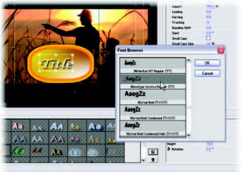
The Font Browser.
As you click or move the cursor down through different fonts, you will see your selected type object change font, while maintaining its other style attributes.
When you see a font that you like, simply click OK in the Font Browser.
Note: You can also reach the font listing by right-clicking on the type object and choosing Font ![]() Browse.
Browse.
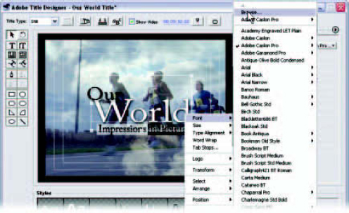
You can also access the Font Browser via a right-click on your text object and the context menu.
Font Size
No hidden meanings here—this is how you size your type. The size of the type is listed in scan lines. You can size a whole object if the object itself is selected. You can also size individual characters by dragging the I-beam over them and selecting them as you would in a word processor. Then you can alter the settings for those words or characters selected within an object.
Aspect
Aspect only sizes the type object or type horizontally. The setting value is telling you the percentage of the original width of the font you’ve selected.
Leading (pronounced led-ing) is the spacing between lines. Use leading when letters start to overlap with the line above or below and you want to add space.
Kerning
Kerning is the spacing between specific character pairs. There are times when the spacing between two letters just looks wrong. With fonts being created by so many people who may or may not be experienced typographers, kerning is almost a lost art these days.
To adjust kerning, you need a type object in the composition area. Then, follow these steps:
1 Select the Type tool.
2 Click between the two characters you want to adjust to make the flashing cursor appear there.
3 Click and drag on the kerning hot text adjustment to change the spacing between the two letters.
You can also kern an entire text object by selecting it and adjusting with the kerning hot text.
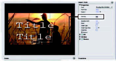
Adjust kerning by positioning the cursor and clicking and dragging over the hot text or by clicking on the hot text and typing a value.
Tracking
Tracking is like kerning, except that it is designed to work proportionately across an entire line of type. Tracking adjustment is based on the justification of the type. The character spacing will expand and contract from the justification point. Left-justified type will expand to the right, and center-justified text will expand from the center.
Baseline Shift
By shifting the baseline of your type, you can reposition it vertically in relationship to its adjacent characters.
The best way I know to demonstrate the utility of shifting type baselines is to make a price, like one might see in the North American television commercials, for which the dollars are large and the cents are smaller, but they are all semi-top justified:
1 Create a text object and type in a price such as $99.99.
2 Using the Type tool, drag-select the first 99 only, making sure that the rest of the text is not selected.
3 Use the Font Size setting to make those particular characters larger. The characters will remain bottom-justified, but we want them top-justified.
4 Keeping only those two characters selected, click on the hot text for Baseline Shift and drag to the right, until the position looks correct to you.
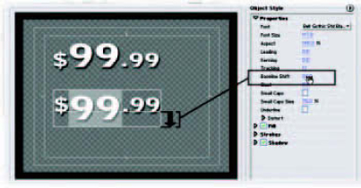
Use Baseline Shift with specific text selected to move characters vertically, separately from the rest of the text object.
Important note: After you have multiple settings for one attribute within a text object (as we just did for both Font Size and Baseline Shift), the hot text for that attribute will not display a number when the entire object is selected. If you use the hot text for an attribute with multiple settings, the entire text object will “snap” to one uniform setting, based on whatever adjustment you’ve made. You can adjust the size of the text object with the handles, however, while retaining all of your adjustments.
Slant
Think italics, adjusted by you in one-degree increments of tilt.
Small Caps
Small Caps converts lower-case letters to capital letters, with the value being the percentage of the size of the full-sized capital letters. You should enter a value for this attribute before checking the box; the default value setting is 1%, and if you don’t realize this, your first experience with Small Caps will be microscopic!
Underline
Typical underlined text—not much explanation needed. This is not available for text on a path.
Distort
Distort offers another way to customize a look if you just can’t find a font that’s odd enough for your needs by itself. The X and Y values indicate the axis that you’re distorting. This one is best experimented with to accommodate your personal taste.
Fill
The Fill settings adjust how you will present the main surface of your text. Fill is divided into three sections: Fill Type, Sheen, and Texture. Click on the arrow next to the word Fill to reveal the settings.
You have several choices you can access by clicking on the text field to the right of the words Fill Type. These range from Solid, which is simply a solid color, to a four-color gradient.
The eyedropper positioned below the Fill Type item can be used to pick colors from your video shot showing through in the composition window or from anything that is included in the interface. The eyedropper can pick colors for solids or gradients.
Sheen
Sheen refers to that glare you might see on something metallic and reflective. For sheen to work well, you should have a color chosen in the box that is significantly brighter than the Fill Type color(s). White or a very nonsaturated color works best for simulating metallic looks. Be aware that this setting defaults at a size value of zero, so you’ll need to enter a value before you can see the effect. I’d recommend starting out with a value of 35 to see instantly what the effect does, then adjust from there.
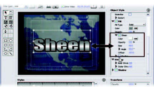
An example of sheen used to give type a reflective, metallic look.
You can load a picture or graphic as a texture on your type or your graphic objects. Here’s how:
1 Have a text object selected.
2 Click the Texture check box.
3 Click on the blank square to the right, which will open a Load dialogue.
4 Browse to the graphic you would like to load, then select it.
There are extensive adjustments available for rotation, scaling, blending, and tiling behaviors.
Strokes
If you’re familiar with Photoshop’s layer styles, these strokes are exactly the same thing. If you aren’t a Photoshop user, the Strokes attribute is for creating outlines. Inner strokes happen inside the area taken up by the character; outer Strokes add mass to the character.
Shadow
Using shadows (also called drop shadows) has been a standard technique in video type for years. Shadows are useful for setting type off a background, making it more readable without having to outline. Shadows can also give the feel of some Z-axis depth to your video type.
The color is selectable; again, you’ll notice the eyedropper. The Angle attribute controls where the light is coming from and therefore in what direction the shadow is falling. Distance controls how far offset the shadow is from the text. Size simply scales the shadow, and Spread controls how soft and diffused the shadow appears.
For a glow effect, try picking a very bright color for the shadow and cutting the Distance value to zero while increasing size and spread.
The Transform settings listing is useful for viewing the status of your object’s position, rotation, and opacity. The hot text can be used to adjust these properties. You may notice that many of these controls are redundant, with controls elsewhere in the Title Designer window.
Type Styles
Below the composition area, you will notice a selection of text styles in the Style Swatch Display. You can apply these text styles to a text object by selecting the object and simply clicking on the swatch that represents the style you would like to apply. After you’ve applied the style, you can edit it with the Object Style settings.
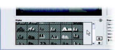
Style swatches in the Style Library.
Saving Object Styles
After you’ve created an object style you’re happy with, you may wish to save it for later use. (They’re called object styles because you can apply them to any object, not just type.) To save an object style into the Style Swatch Display, click on the New Style button to the right of the Style Swatch Display, just above the trash can. A dialogue will open, giving you an opportunity to name the style. When you click OK, the style will appear as an additional swatch.
Style Libraries
Premiere Pro has several optional Style Libraries that are on your system and available to you. Go to the Style menu by clicking on the arrow in the upper left area of the Style Swatch Display, and select Load Style Library. Select the library you would like to load, and it will appear as additional swatches. If the load dialogue doesn’t open to the proper directory, you should find your style libraries in C: ![]() Program Files Adobe
Program Files Adobe ![]() Premiere Pro
Premiere Pro ![]() Presets
Presets ![]() Styles.
Styles.
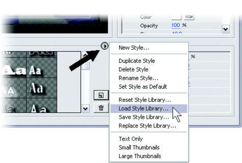
The Style menu.
It is possible to load all the Style Libraries at once. However, Premiere Pro remembers what you have in the Swatch Display and reloads the last settings when you open it. The more style swatches you have loaded, the longer it will take for the Title Designer window to open the next time.
To delete a style swatch, select it and click on the trash can or press the Delete key. Either way, you will be asked to confirm the deletion of the style.
You can save a Style Library of your own based on the swatches you have loaded. From the Style menu, select Save Style Library and name your library for later use.
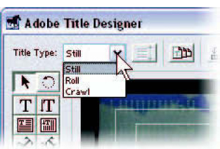
To create a roll document, as you might see used for credits at the end of a show, or a crawl document, as you might see scrolling across the bottom of a news channel screen, you must designate the proper choice for Title Type in the top left corner of the Title Designer window. This will default to Still. Click on the arrow and you can see the choices available.
Roll and crawl documents differ from a still document in that they allow you to type into an expanding window that can stretch out far beyond normal screen size. A roll will extend the text object vertically, and the crawl setting will expand horizontally.
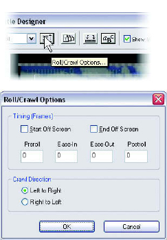
Roll and crawl options.
The speed of the movement will depend on how long you stretch the clip on the timeline. If you place a Title Designer roll document on the timeline and make it 10 seconds, then you drag that exact same document to the timeline again and drag it out to 20 seconds, the text of the 20-second version will move half as fast as the other.
The button immediately to the right of the Title Type menu is the Roll/Crawl Options button. This will bring up a menu that has several choices for motion start and end and that gives you a choice of direction for crawls. You can choose to have a roll or crawl start on-screen or off-screen and end on-screen or off-screen by checking the appropriate box. Preroll and Postroll refer to how long the file will wait to start moving the text and how long it will hold it at the end. We’ve all seen credit rolls that start with a very important bit of text, which is static for a time and then starts to roll. We’ve also all seen a credit roll stop and park for a while on the final credit. Ease-In and Ease-Out values will indicate how many frames you want the roll or crawl to use to accelerate to full speed and/or decelerate to a stop.
Working with Templates
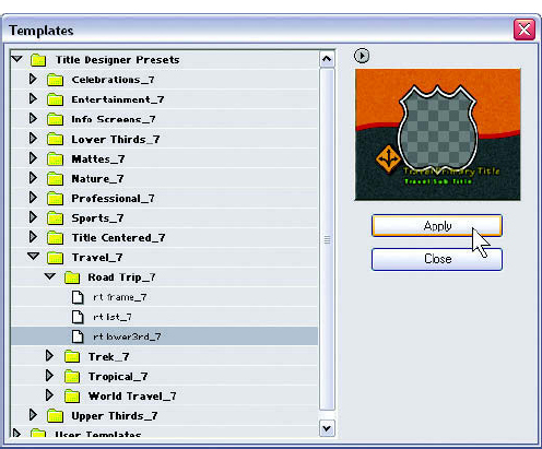
Premiere Pro comes with a library of templates for you to use as inspiration and raw material for your title graphics. The button to access the templates dialogue is just to the right of the Roll/Crawl Options button. When the dialogue is open, click on the triangles to expand folders until you see files. You will notice that when you click once on a file, it previews for you in the window on the right side of the dialogue. This is very helpful for getting a visual idea of what you are loading. Checkerboard areas will look familiar to Photoshop users as alpha transparent areas, or areas where the video layer below shows through.
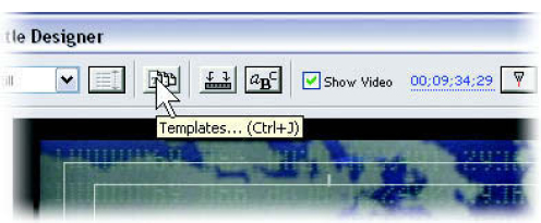
When you load a template, you will find that its components can be edited. You can drag, retype, change styles, and otherwise mold almost every setting and attribute available. If you want to save a document as a template for future use, click on the Templates button above the preview screen in the dialogue, then select Save (File Name) as Template.
The Template dialogue.
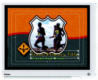
You can select and change parts of a template.
There are several ways to load a logo or other graphic into Title Designer compositions. Most types of graphics from popular paint and drawing programs can be imported and given attributes, just as you would treat text.
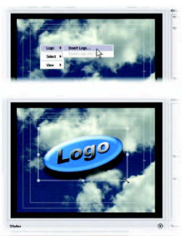
Right-click in empty composition space and select Logo ![]() Insert Logo
Insert Logo
Here’s how to import a logo:
1 Right-click in the composition and choose Logo ![]() Insert Logo or go to the Title pulldown menu and choose Logo
Insert Logo or go to the Title pulldown menu and choose Logo ![]() Insert Logo.
Insert Logo.
2 Select the graphic file you wish to load, which will be loaded at the size it was created.
3 You can now drag, size, and otherwise enhance the logo using the same tools you would use for text.
Previewing
You can preview to an external NTSC or PAL video monitor, if your system has one attached, by clicking on the Send Frame to External Monitor button.
The Send Frame to External Monitor button.
If you have footage that is changing over time and you would like to visualize the title over several places on a clip, or even over several clips, you can drag the cursor over the hot text in the top of the Title Designer window to change the frame that is feeding through the background. You can also double-click directly on the hot text and type in the timecode numbers directly.
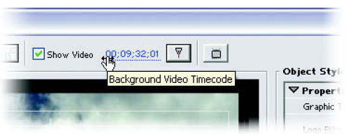
Use the hot text to change the frame from the timeline that is displayed behind your title.

