9
Brush Studio Settings – Editing and Combining Brushes
Every Procreate brushis, at it's core, is editable. In the last chapter, we learned how brushes have 11 attributes that can be tweaked to achieve desired effects. The Brush Studio is the tool that is used to do so. In this chapter, we will delve deeper into the myriad of settings it has to offer.
While the Brush Studio can be used to create and edit a wide variety of brushes, it also lets you configure how two brushes can be combined. This feature is called Dual Brushes, which you will also learn about.
We’re going to cover the following broad topics in this chapter:
- Exploring the Brush Studio settings
- Dual Brushes
Exploring Brush Studio settings
In this section, you’ll be introduced to the settings available under each attribute in detail. It’s highly recommended that you apply these edits to your own brushes as you read, to see the changes in action. Some settings are more visible when observed in person.
Stroke path
To understand this attribute, you need to understand how digital brushes work. Each brush has a shape associated with it, just like traditional paintbrushes can be round, flat, or pointy. Digital brushes create the effect of a stroke by placing their shape multiple times in quick succession along a specific path. This path is the stroke made by your finger or pencil.
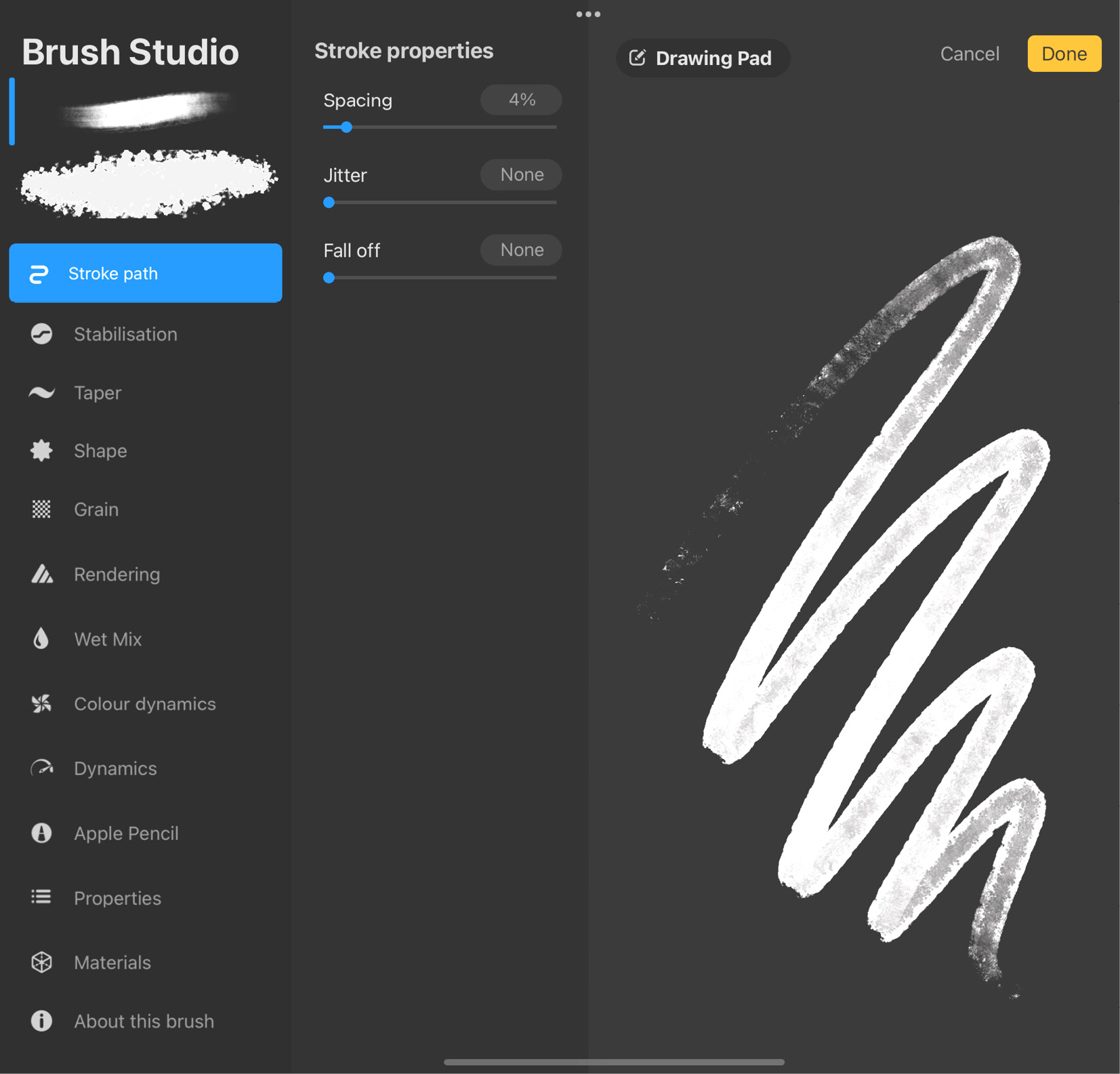
Figure 9.1: Stroke path
For convenience, let’s call each instance of the brush shape a stamp, and the line on which stamps rest the stroke path. There are three adjustable settings under Stroke path:
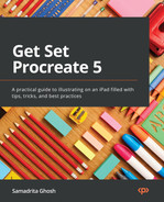
- Spacing: This is the first slider. It lets you adjust the spacing between each stamp. The more you increase it, the more you’ll see the brush stroke separate into its component shapes, as shown in the following screenshot:
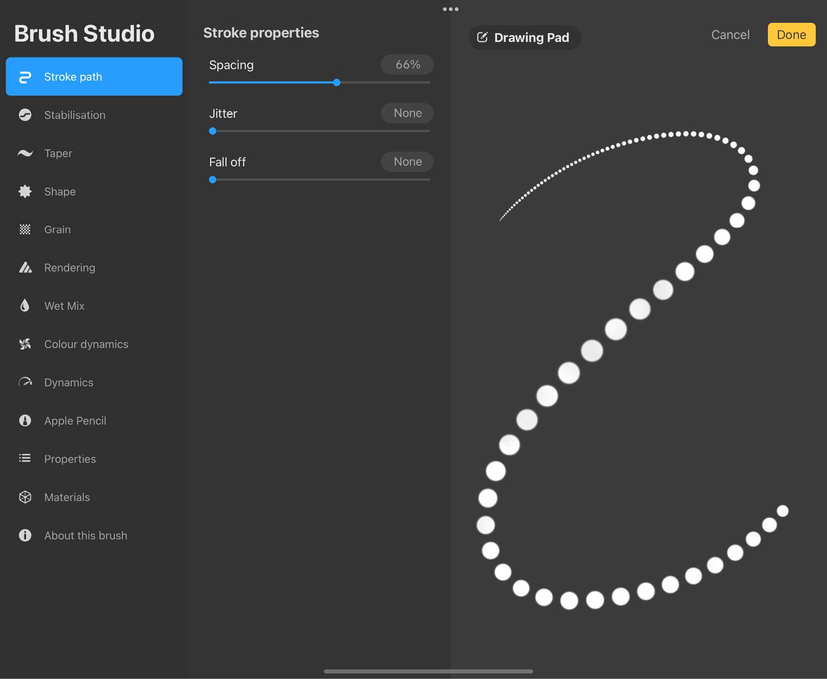
Figure 9.2: Spacing
Similarly, as you reduce spacing, the shapes will gradually merge to give rise to a single solid stroke.
- Jitter: This is a setting that offsets each stamp from the stroke path by a random amount. This gives the edges of your stroke a jagged look, as shown in the following screenshot:
Figure 9.3: Jitter
As you increase the jitter, your stroke will go from slightly jagged to scattered around the stroke path. A high-jitter brush is great for making brushes with random features, such as particle effects, scattered leaves, and so on.
- Fall off: This setting gradually lowers the opacity of a stroke toward its end, until it completely disappears. With a high Fall off value, a stroke will start fading out sooner, and vice versa. The effects of Fall off are demonstrated in the following screenshot:
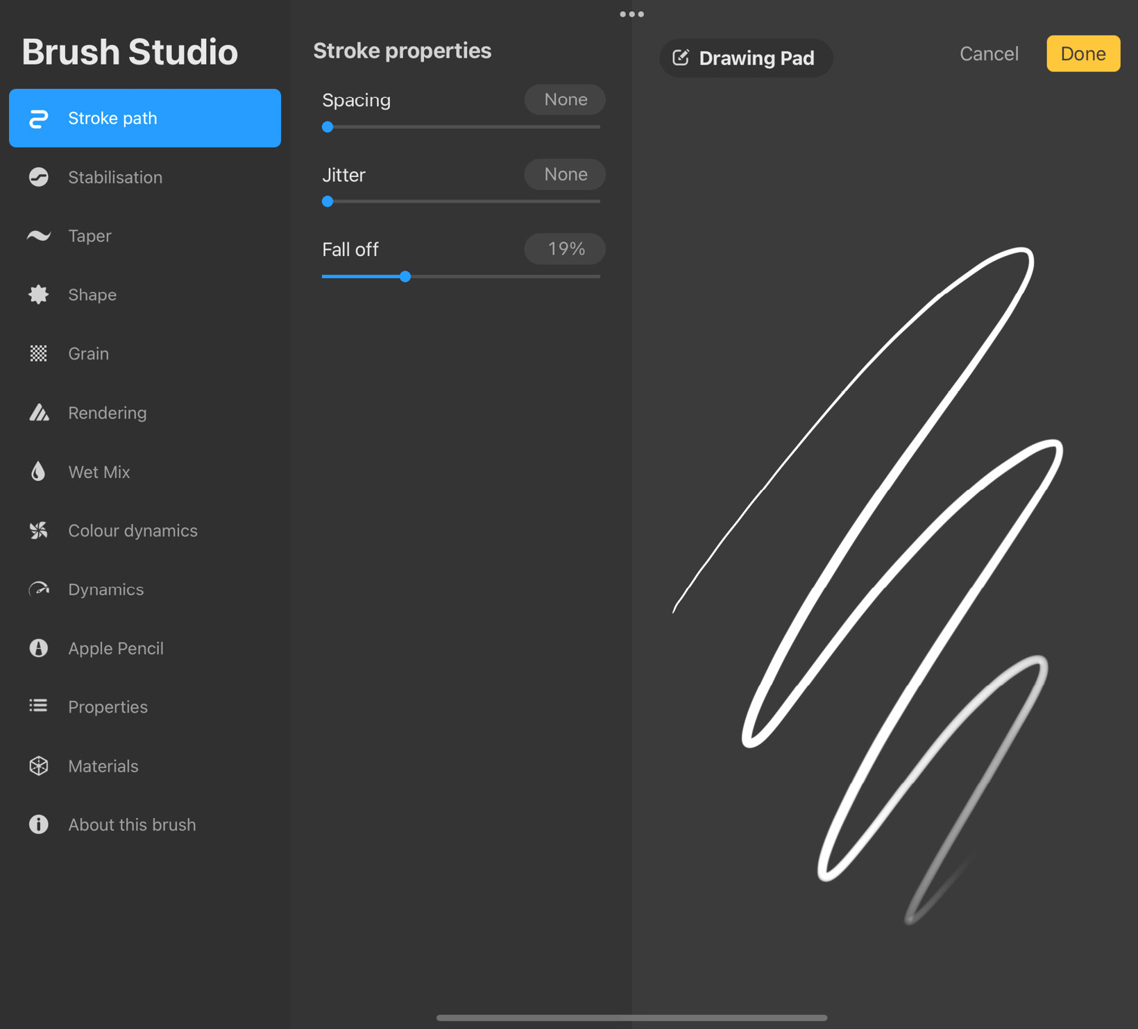
Figure 9.4: Fall off
Stabilisation
Stabilisation imparts a smoothing effect on your stroke by omitting the extremities of a shaky stroke, to give rise to a fluid, averaged-out stroke. The settings panel for this attribute looks like this:
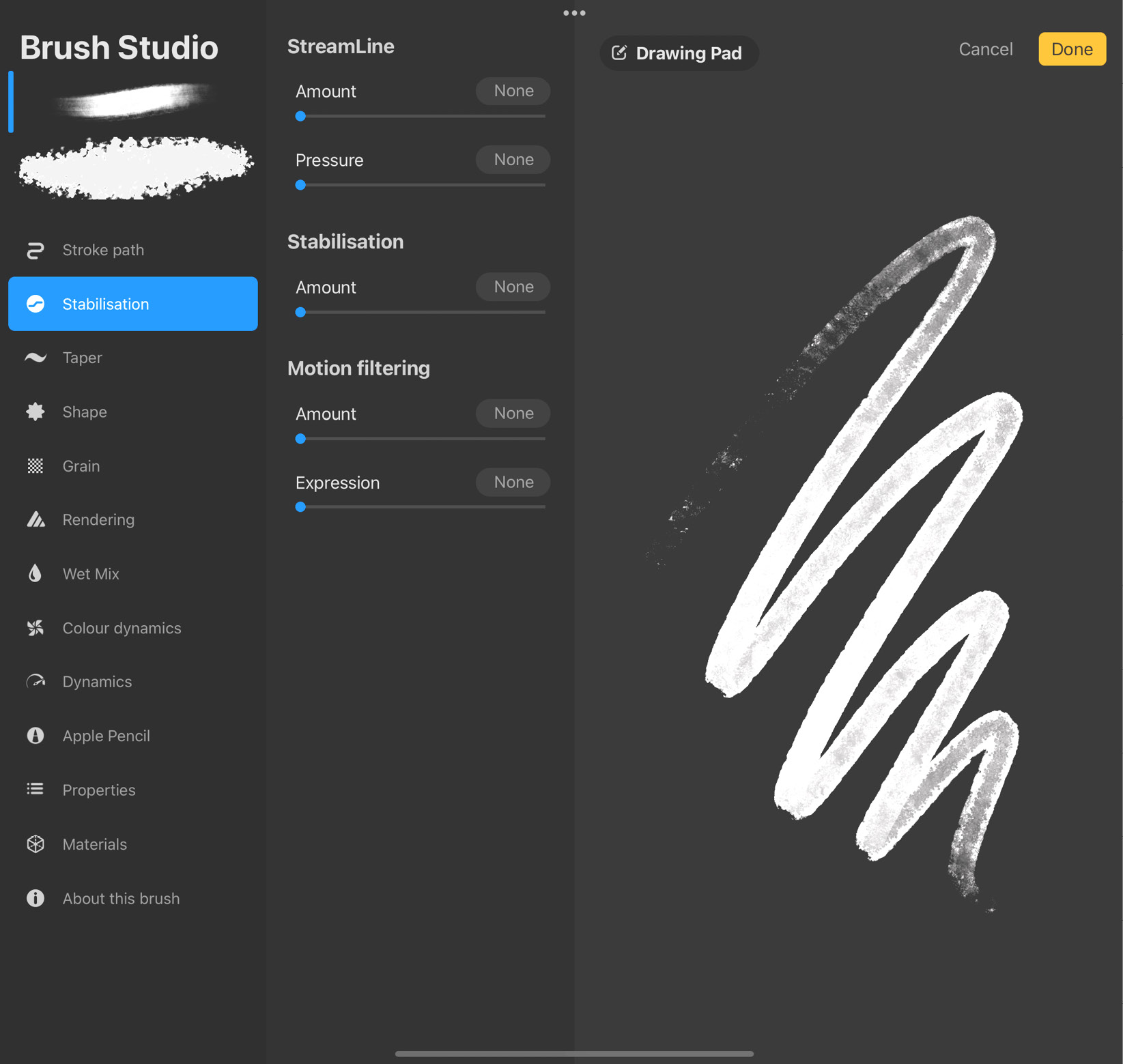
Figure 9.5: Stabilisation settings
To understand the difference between a non-stabilised and a stabilised stroke, refer to the following screenshots:

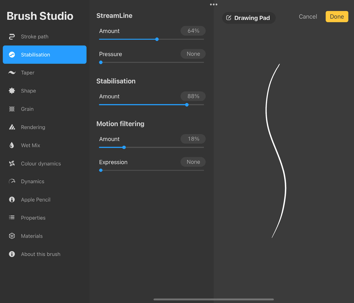
Figure 9.6: Non-stabilized stroke (top); stabilized stroke (bottom)
There are three settings under Stabilisation:
- StreamLine: StreamLine helps smooth out any wobbliness in your lines. This is especially useful in getting smooth strokes while inking and lettering. There are two sliders under this setting:
- Amount: This controls the degree of stabilization applied to the strokes.
- Pressure: This can be used to adjust how fast pressure sets in while drawing with the brush. When increased, pressure is applied to a stroke gradually and smoothly. If the slider is set lower, changes in pressure are registered quickly.
- Stabilisation: This setting also smoothes out your strokes. It does so by considering the average between the start and end points of the stroke and bringing the entire stroke closer to it. This results in overall straighter lines. Stabilisation is speed-sensitive, meaning the faster a stroke is drawn, the more stabilized it will be. Use the slider to determine how much stabilization to apply to your strokes.
- Motion filtering: This is Procreate’s own way of interpreting stroke stabilization. While traditional stabilization squashes the extremities of a stroke toward the stroke path, Motion filtering gets rid of those extremities entirely, without any squashing. Unlike Stabilisation, Motion filtering works irrespective of the speed at which a stroke is drawn. There are two sliders used to adjust this setting:
- Use Amount to control how much motion filtering is applied. Take note of how the strokes on the Drawing Pad change with the slider.
- Expression is used to cancel out some of the effects of motion filtering, which can result in lines that are too smooth and lacking in character. Expression brings back some of the stroke’s flavor. This slider is only active if Motion filtering is active and produces less noticeable effects the higher the filtering amount.
Taper
The next attribute on the list is Taper. It determines whether the start and end points of a stroke taper off to a pointy end like traditional paintbrushes. There are separate controls for adjusting the taper for the Apple Pencil and for touch. That means you will see two groups of similar settings titled Pressure taper (for Apple Pencil) and Touch taper (for dumb styluses and finger touch). The settings under this attribute are shown in the following screenshot:
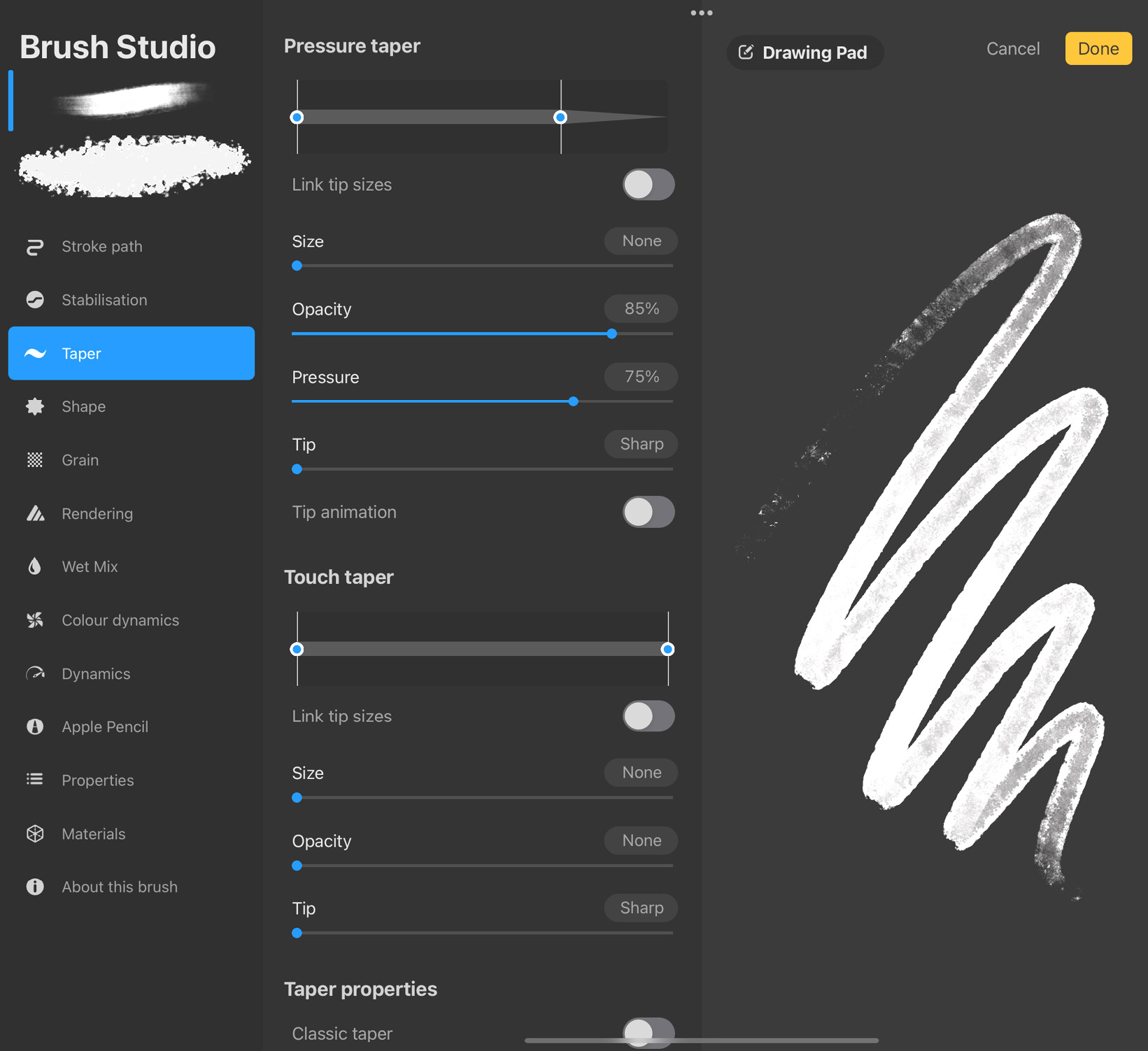
Figure 9.7: Taper settings
There are two main types of taper available on Procreate:
- Pressure taper: The Apple Pencil and other pressure-sensitive styluses apply taper by registering drawing pressure. These settings help you adjust how your strokes will be tapered when drawing with any such smart stylus.
The Pressure taper slider gives you a visual representation of how strokes are tapered at both ends. The following are the settings under Pressure taper:
- Toggle on Link tip sizes to make sure both sliders move together, ensuring equal taper at both ends of a stroke.
- The Size slider helps adjust how much the brush size is affected by the taper. A higher value results in more variation in size during tapering.
- The Opacity slider controls the transparency of the taper at the end of the stroke.
- The Pressure slider uses the pressure sensitivity of the Apple Pencil to apply a further tapering effect for a smoother, natural-looking transition.
- Tip lets you mimic painting with a brush whose own thickness affects the stroke. At low values, strokes appear as though they’ve been drawn using a fine-tipped brush. At higher values, strokes appear to have been drawn by a thick-tipped brush.
- Tip animation can be toggled on if you want to see taper effects applied to your strokes in real time as you draw. This purely depends on your preference.
- Touch taper: The second group of settings titled Touch taper affects strokes drawn with an instrument that is not pressure-sensitive, such as a finger or a regular stylus.
The Touch taper slider works the same way as the Pressure taper slider. It gives you a visual representation of how strokes are tapered at both ends. The following are the settings under this option:
- Toggle on Link tip sizes to make sure both sliders move together, ensuring equal taper at both ends of a stroke.
- The Size slider helps adjust how much the brush size is affected by the taper. A higher value results in more variation in size during tapering.
- The Opacity slider controls the transparency of the taper at the end of the stroke.
- Tip lets you mimic painting with a brush whose own thickness affects the stroke. At low values, strokes appear as though they’ve been drawn using a fine-tipped brush. At higher values, strokes appear to have been drawn by a thick-tipped brush.
- Classic taper: The Classic taper toggle is the last heading under this attribute. It lets you switch back to Procreate’s older style of taper.
Important Note
There’s no Pressure slider under Touch taper since these settings are meant for styluses with no pressure sensitivity, and hence no pressure feedback.
Shape
The next attribute we will discuss is Shape. As mentioned earlier, every brush has a shape associated with it, which is stamped along a path to create a stroke. These settings, as shown in the following screenshot, help you control how this shape behaves for each brush:
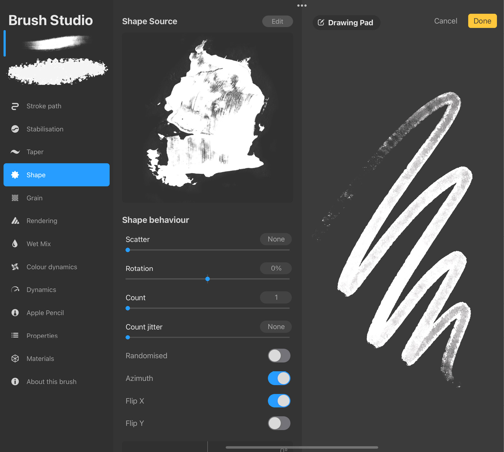
Figure 9.8: Shape settings
The settings under Shape are divided into the following subcategories:
- Shape Source: This is the original shape of your brush when stamped just once. It’s displayed at the very top. You can, however, edit Shape Source by tapping on Edit, at the top-right corner of the settings panel. This will take you to Shape Editor, as shown in the following screenshot:
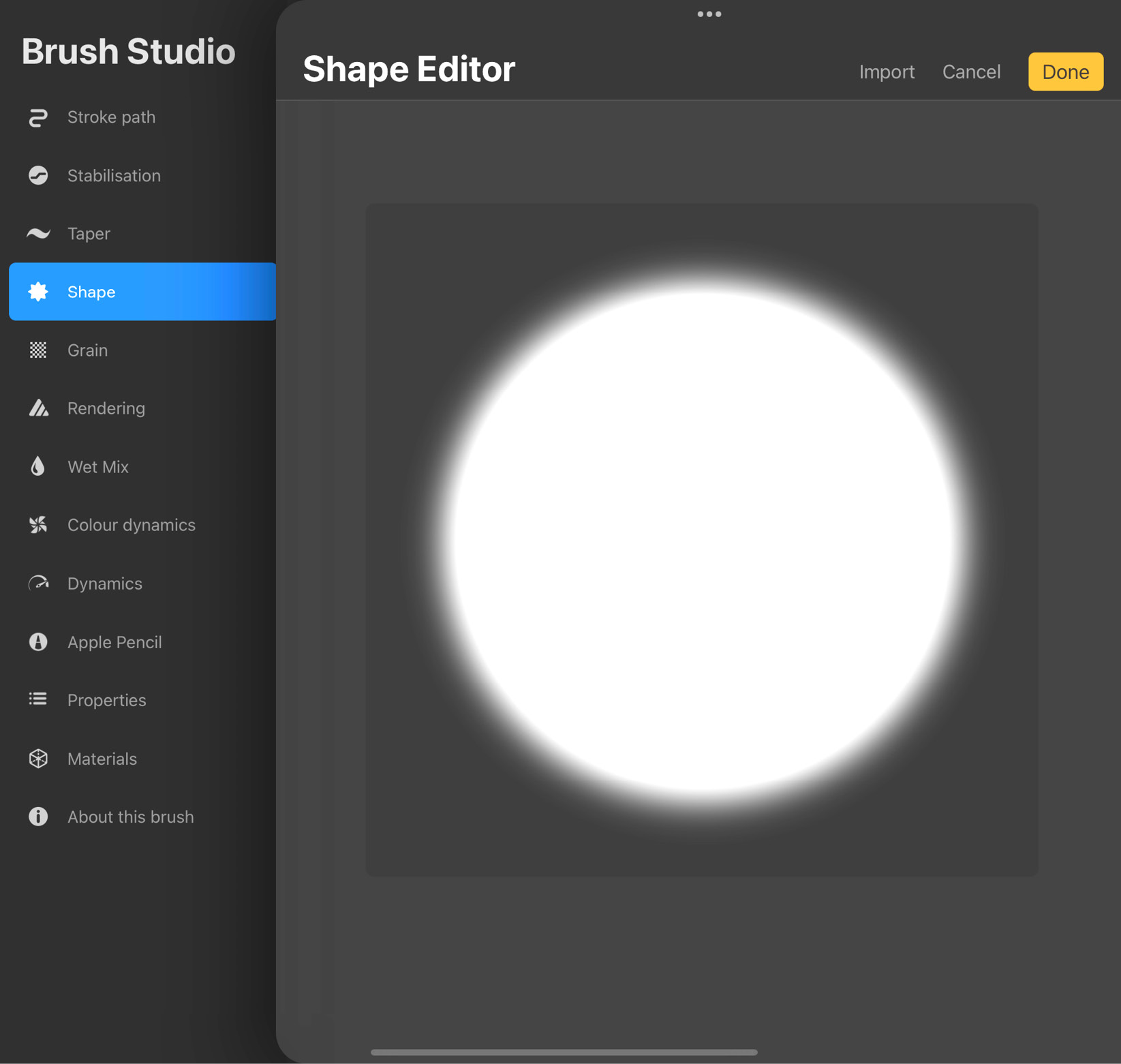
Figure 9.9: Shape Editor
Tap on Import in the top-right corner of the screen to bring up the menu shown in the following screenshot:
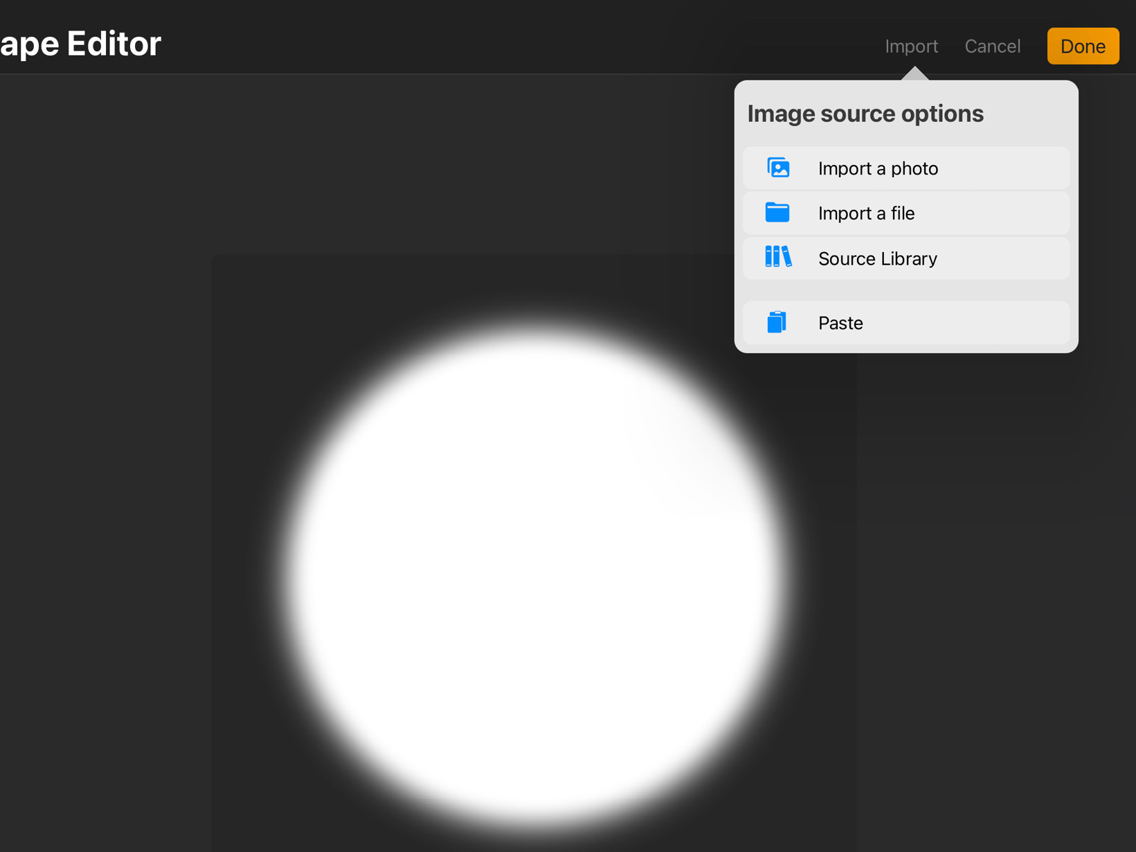
Figure 9.10: Import shape
As you can see, there are four options under Import:
- Import a photo lets you choose a new shape source from the Photos app.
- Import a file lets you choose a shape from the Files app.
- Source Library lets you access Procreate’s own collection of shapes, shown in the following screenshot:
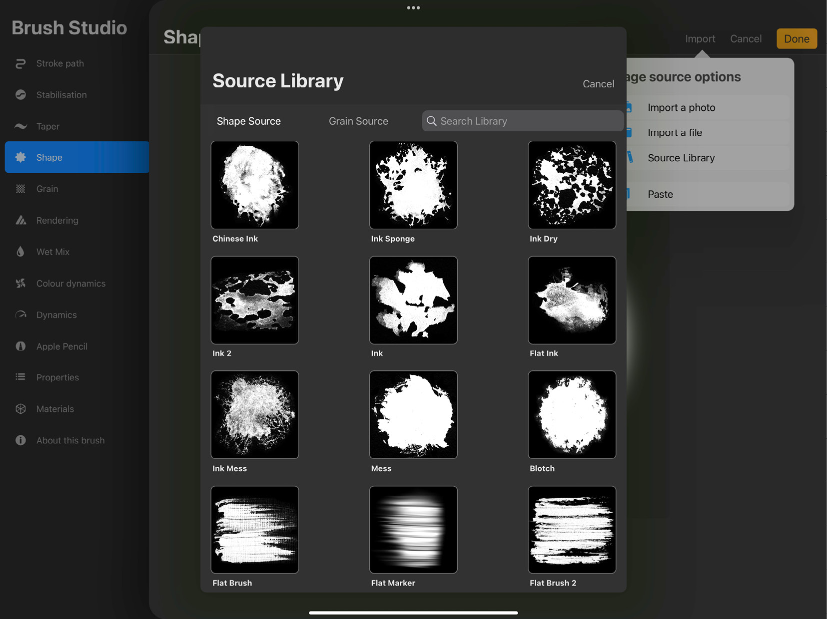
Figure 9.11: Source Library
Important Note
Any image can be a shape source, which means you can draw custom shapes for your own brushes on Procreate itself. Remember that the luminosity information of the image will translate to transparency in the brush. The black parts of the image source will give rise to transparent areas and the white parts will result in opaque areas. So, if you prefer to draw the shape in black, import it into Shape Editor and double-finger tap it to invert its colors.
- Shape behaviour: The next set of controls is used to adjust specific behaviors of the shape, which we’ll look into here:
- The first slider in this section is titled Scatter. It makes each stamp rotate by a random amount, as shown in the following screenshots:
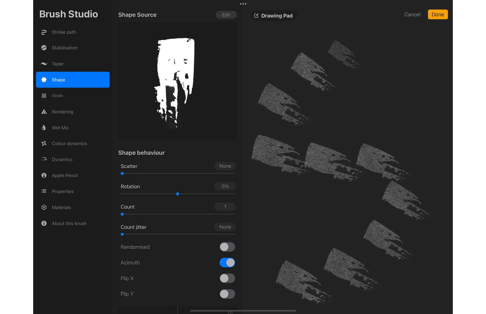
- The first slider in this section is titled Scatter. It makes each stamp rotate by a random amount, as shown in the following screenshots:
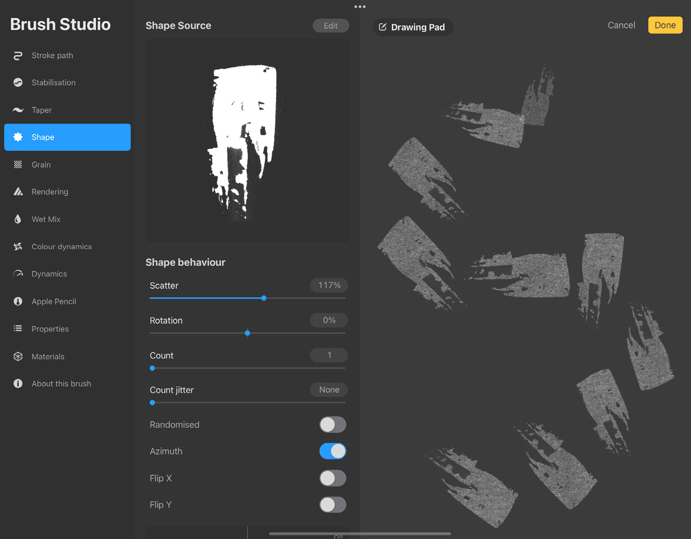
Figure 9.12: (Top) no scatter; (bottom) with scatter
The direction of rotation is independent of the stroke direction.
- Rotation lets you control the shape’s rotation with respect to stroke direction. When turned up to 100, it makes the stamp follow the direction of the stroke, as shown in the following screenshots:
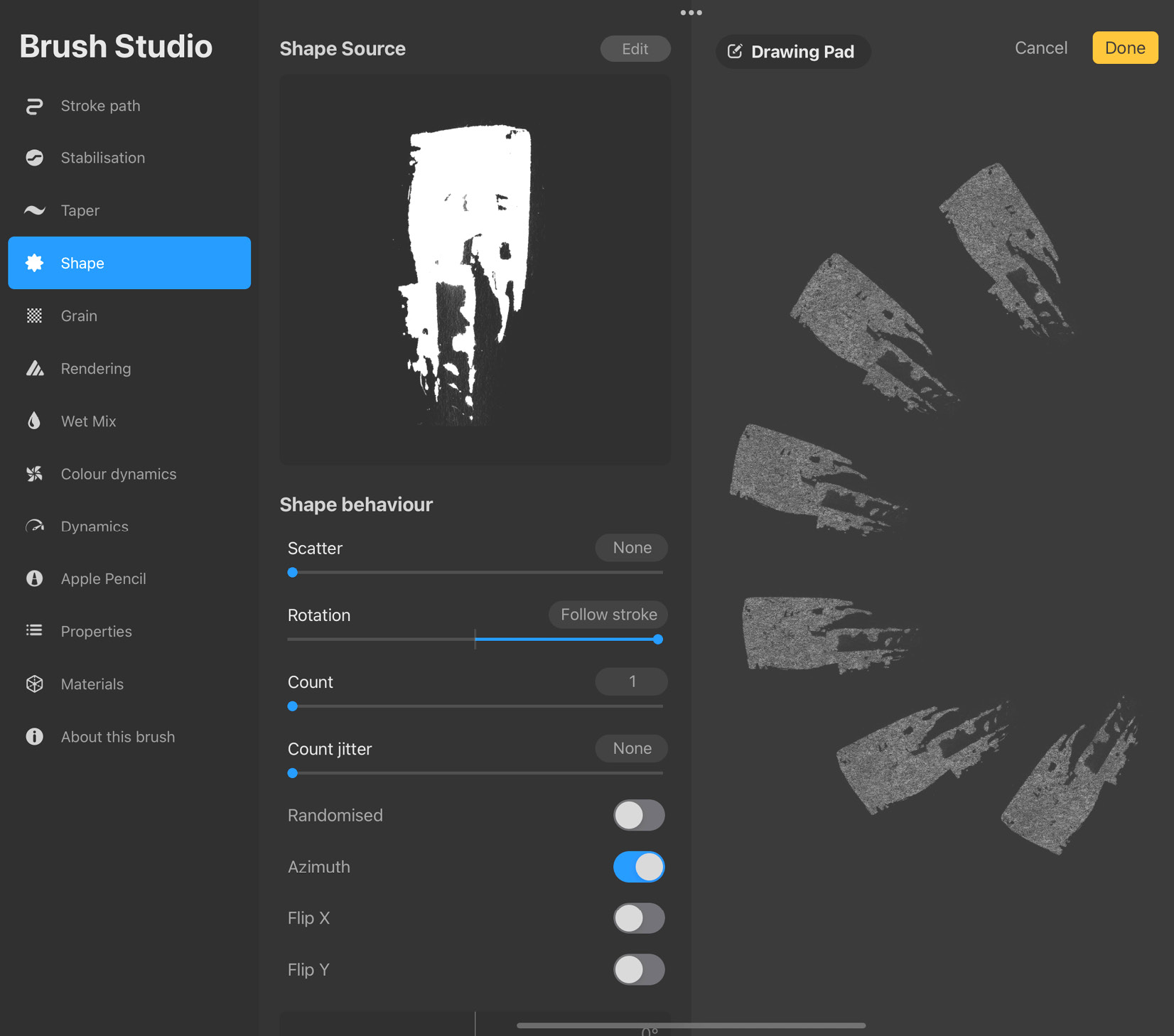
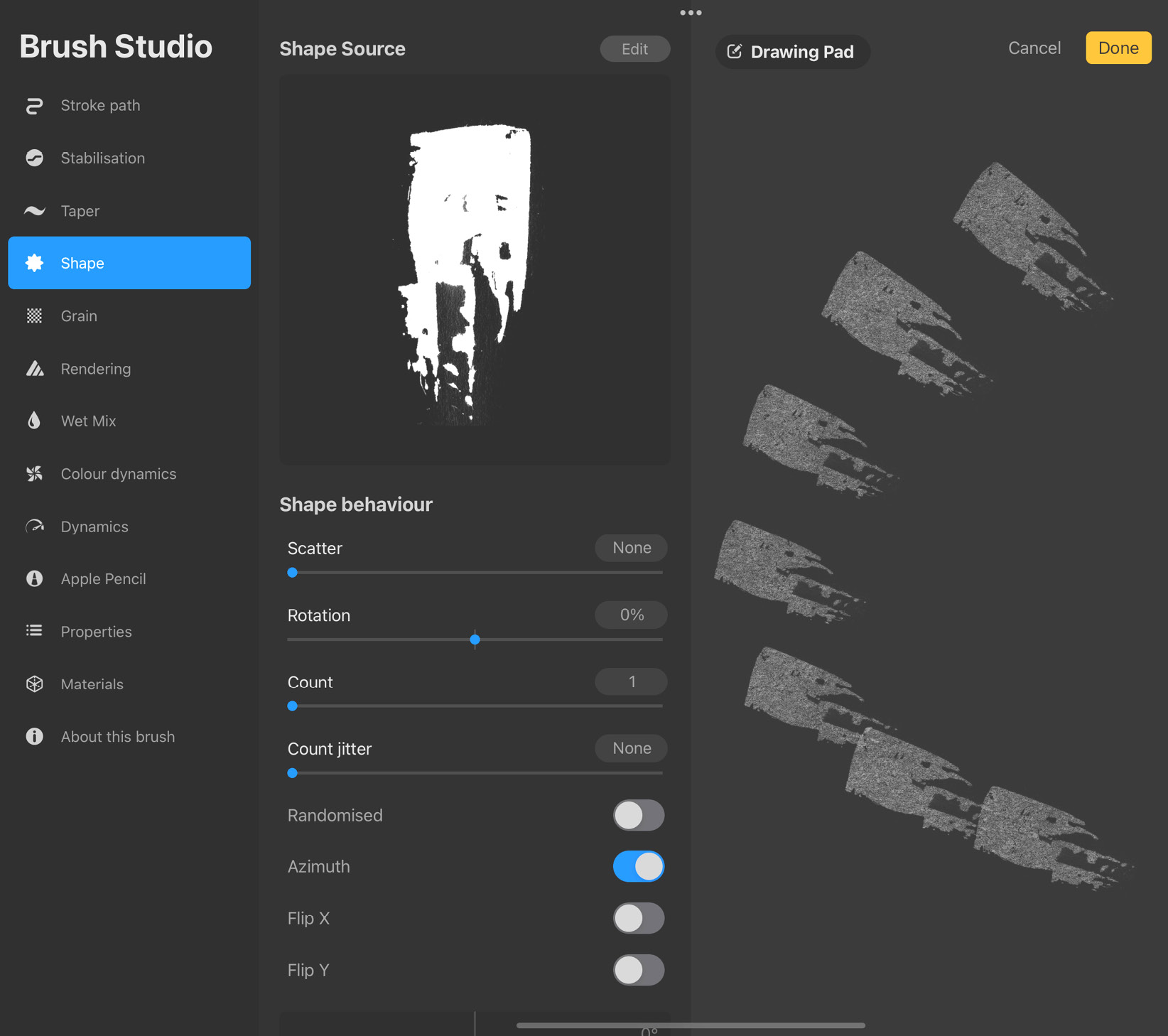
Figure 9.13: Shape follows stroke (top); shape doesn’t rotate (bottom)
At 0, the stamp doesn’t rotate in relation to the stroke. When the slider is set to -100 at the extreme left of the slider, it makes the stamp rotate in the direction opposite to the stroke.
- Count lets you decide how many times a shape stamps at once. You can adjust the count to lie between 1 and 16 times. It’s useful when you want a brush to have a more solid stroke or vice versa. Note that functions such as Scatter will still treat each individual stamp as a separate unit, even if they occur at the same point. This can give rise to some interesting effects.
- Count jitter randomly varies the count of the stamps at each point. Set the slider to the highest count you want to allow, say 10. You will now get anywhere between 1 and 10 stamps in any instance.
- Randomised is used to randomly rotate the shape for each stroke. This gives an organic feel to your brush.
- Azimuth works with tilt feedback from your Apple Pencil to affect the rotation of the stamps. It overrides the Rotation setting, but only while using the Apple Pencil.
- Flip X/Y can be used when you want to flip the base shape horizontally or vertically.
- The Brush Roundness Graph is a handy tool to transform your base shape easily. It’s shown in the following screenshot:
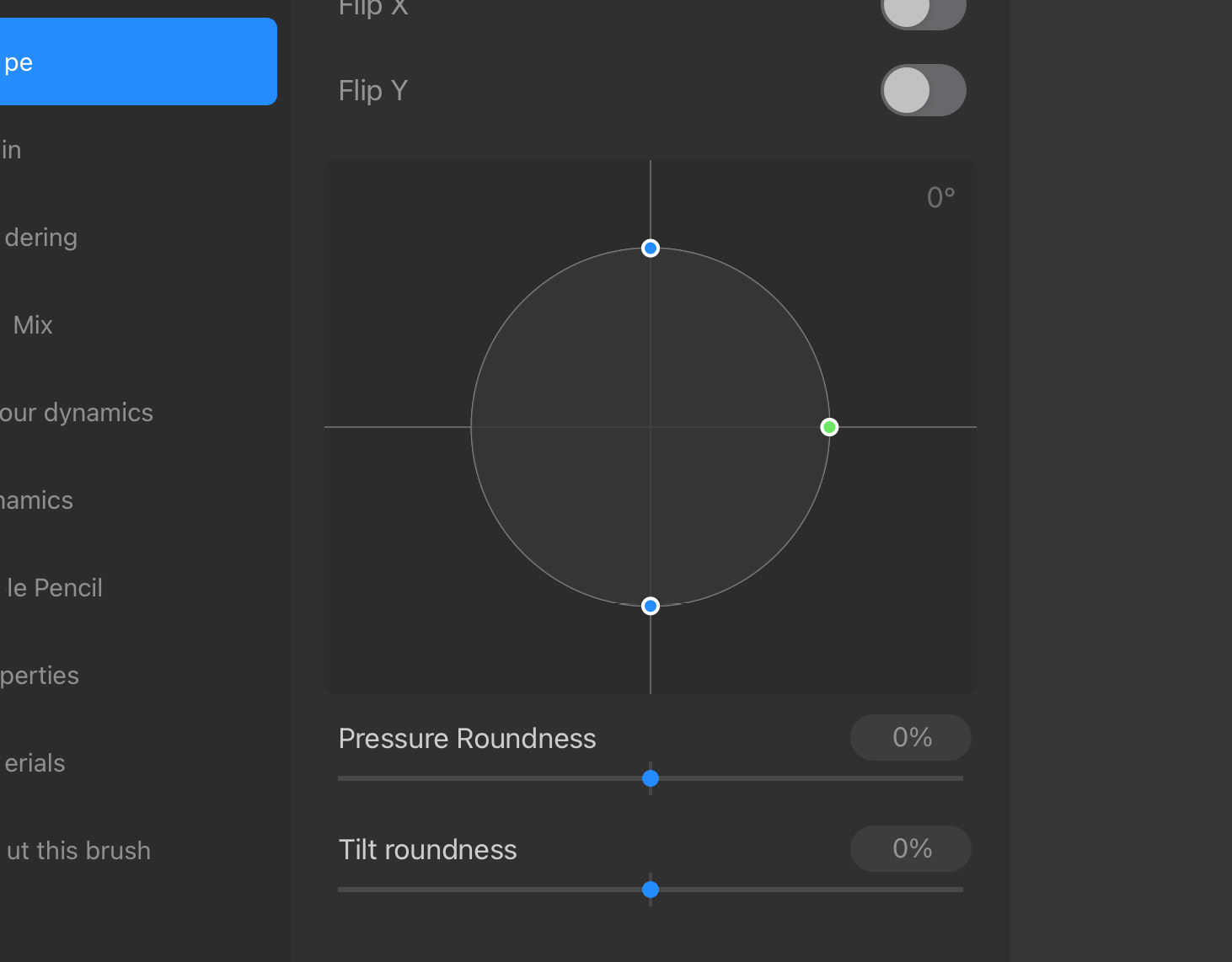
Figure 9.14: Brush Roundness Graph
The green node rotates the shape and the blue nodes squash it.
- Pressure Roundness correlates the Apple Pencil pressure with how squashed the shape will be. The higher the value, the more squashed stamps become when drawn with low pressure, as shown in the following screenshots:
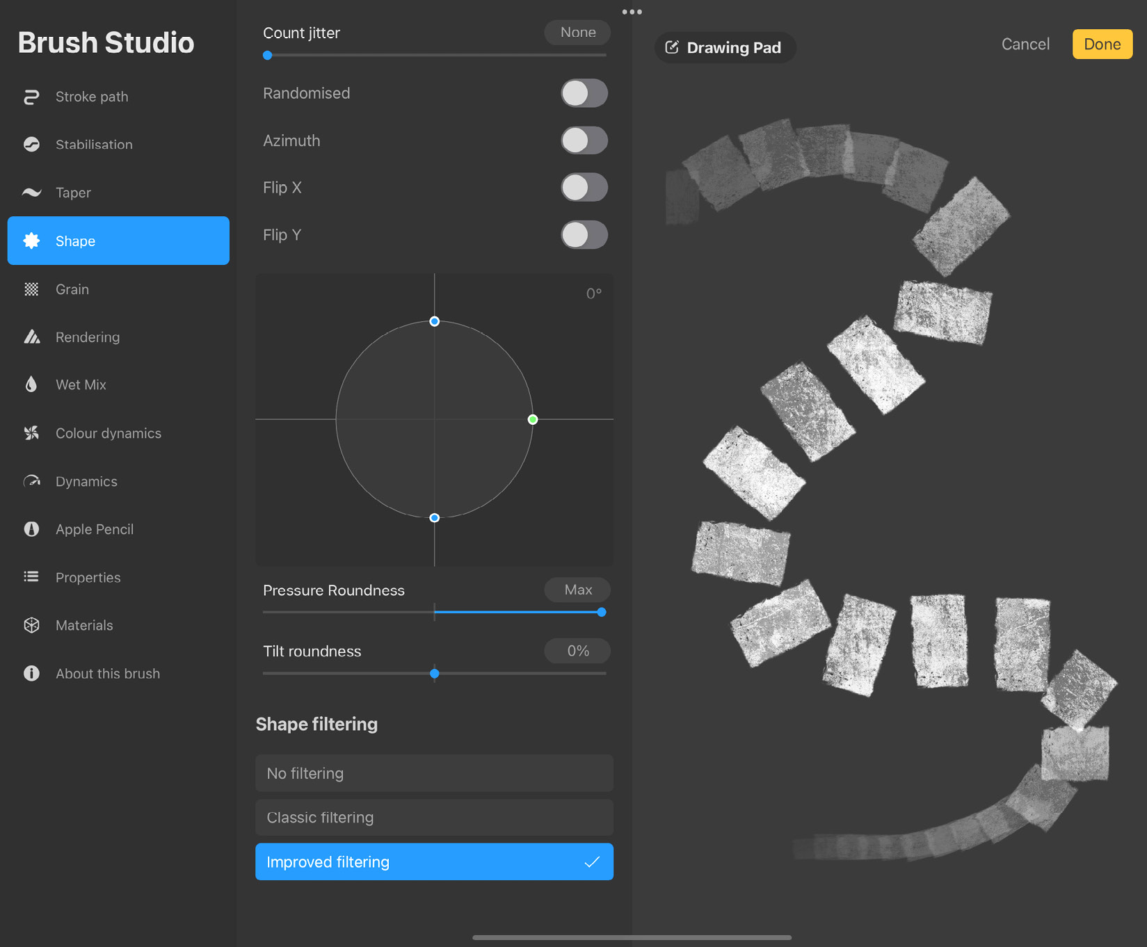
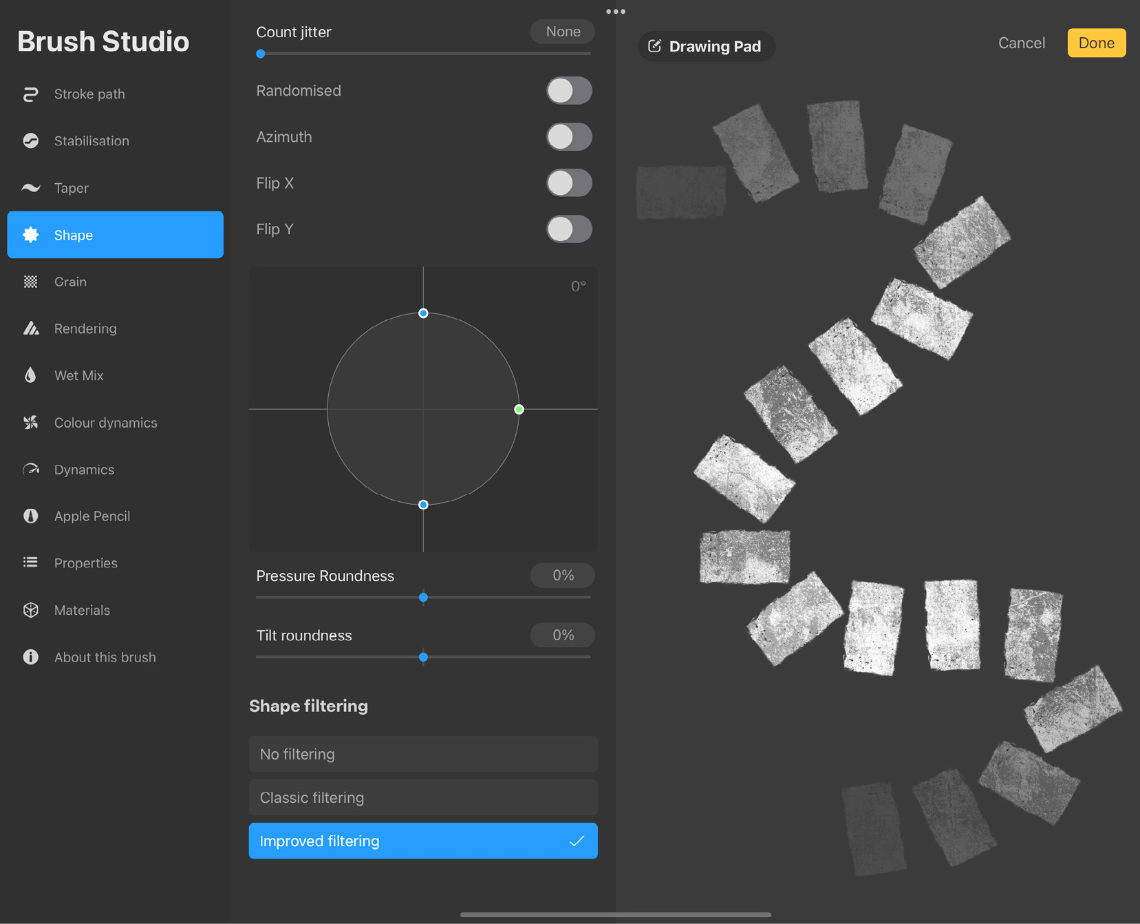
Figure 9.15: (Top) with Pressure roundness; (bottom) no Pressure roundness
- Tilt roundness correlates the Apple Pencil tilt with how squashed the shape will be. The higher the value, the more squashed stamps become when drawn with a low tilt angle, as shown in the following screenshots:
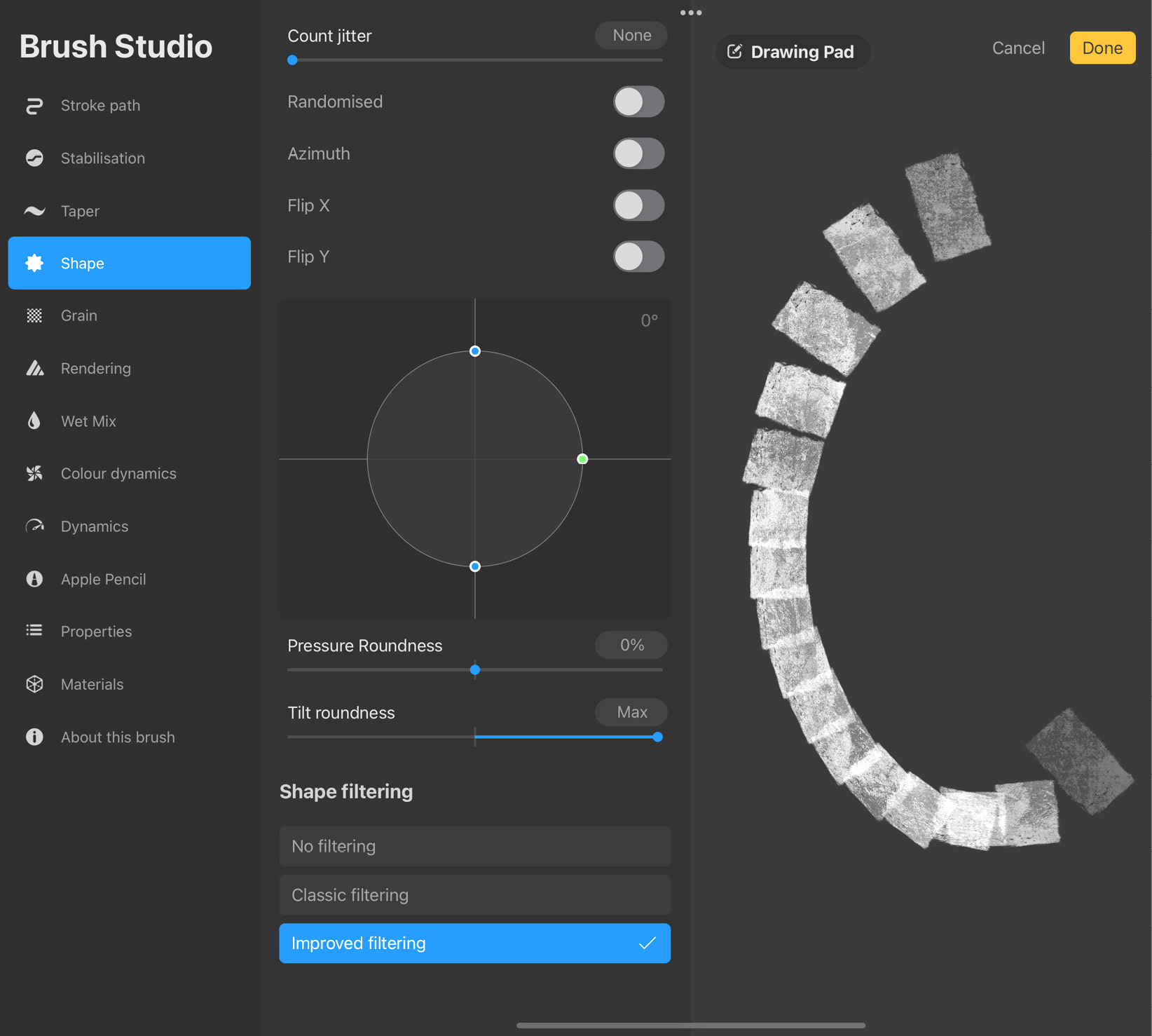
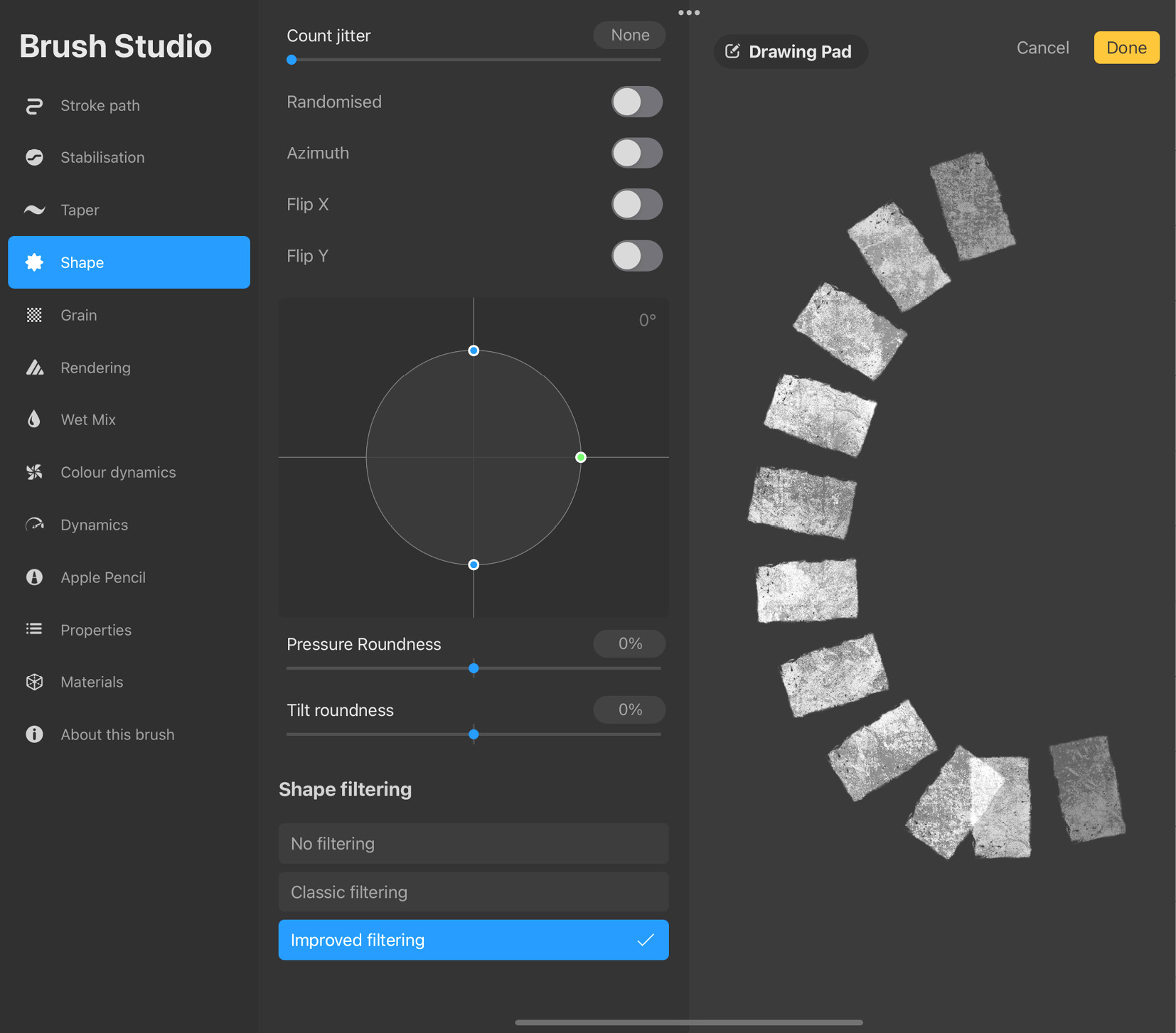
Figure 9.16: (Top) with Tilt roundness; (bottom) no Tilt roundness
- Shape filtering: Filtering controls how sharp the edges of a shape will appear. This is also known as anti-aliasing. The following are the settings under this option:
- No filtering makes the brush retain the sharpness of the shape without any loss of information.
- Classic filtering uses Procreate’s older filtering method. This makes the edges of the brush appear less jagged.
- Improved filtering uses a more advanced form of filtering, compatible with recent versions of Procreate.
Grain
Every brush consists of a shape, as we have learned in the previous sections. A brush has another associated attribute called Grain. This is the texture that is overlaid onto the shape. The grain, just like Shape, is one of the building blocks of a brush. The Grain settings allow us to control how the grain behaves. The settings panel is shown in the following screenshot:
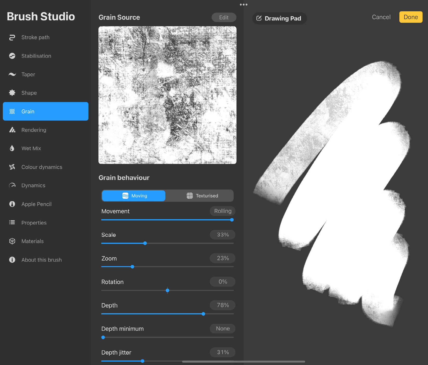
Figure 9.17: Grain settings
The settings under Grain are divided into the following subcategories:
- Grain Source: Just like Shape Source, Grain Source is an image containing the texture that is overlaid onto the brush. It is displayed at the top of the settings panel. For textureless brushes, the grain is a plain white image.
Edit the grain source by tapping on Edit, in the top-right corner of the settings panel. This will take you to Grain Editor, shown in the following screenshot:
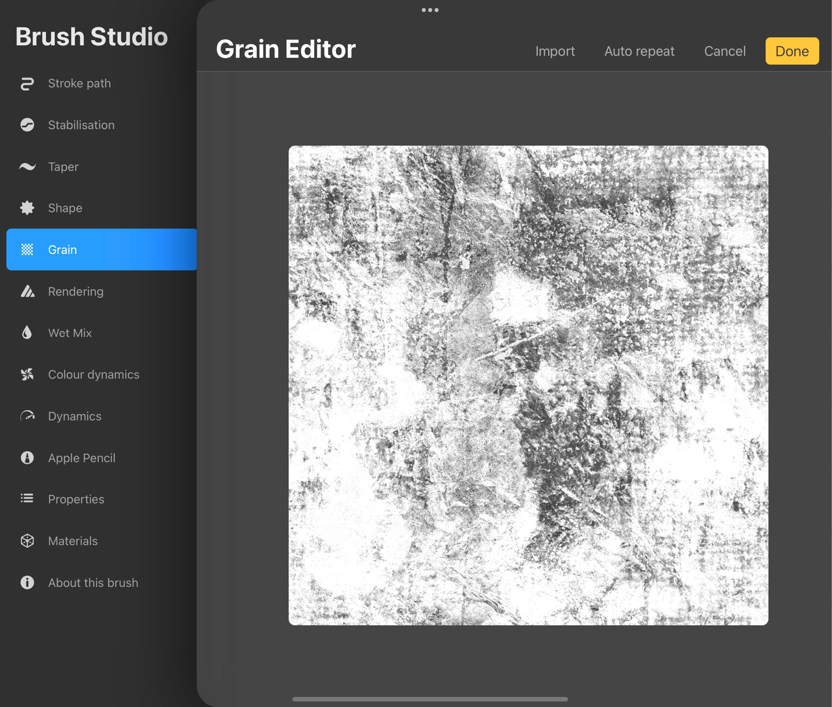
Figure 9.18: Grain Editor
Tap on Import in the top-right corner of the screen to bring up the menu shown in the following screenshot:
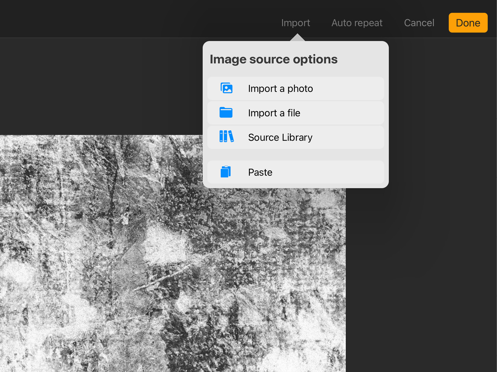
Figure 9.19: Import grain
It has the same four options that we saw in the Shape section previously:
- Import a photo lets you choose a new grain source from the Photos app.
- Import a file lets you choose a grain from the Files app.
- Source Library lets you access Procreate’s own collection of grains, shown in the following screenshot:
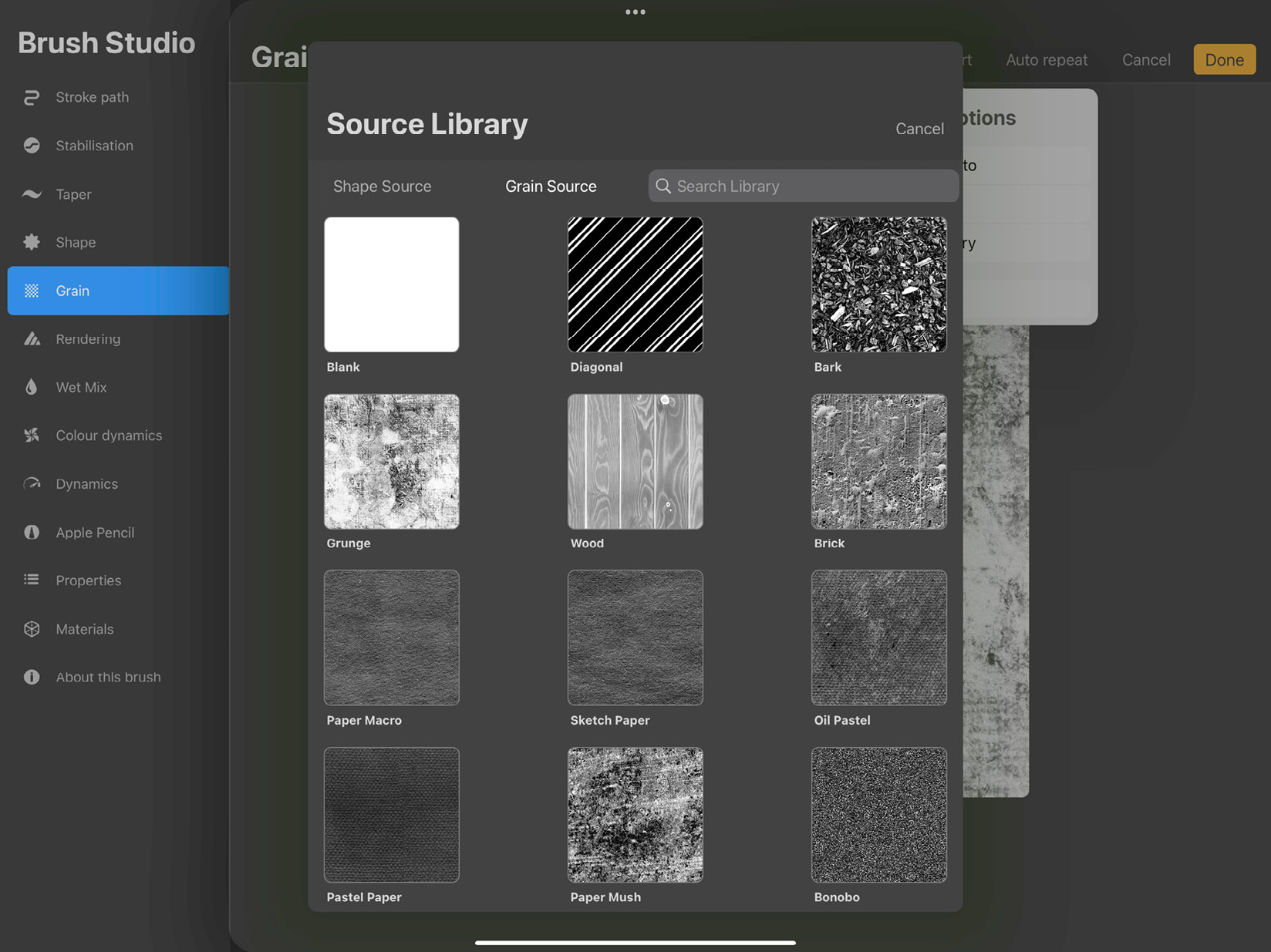
Figure 9.20: Source Library
- Tap on Paste if you have the new grain source already copied to your clipboard.
Right next to Import, there’s an option named Auto repeat that allows you to tweak how the grain image will be tiled to seamlessly cover larger areas. Grain Editor is explained in more detail later in this chapter.
- Grain behaviour: As the name suggests, this group of settings controls how the grain behaves. There are two ways a grain is applied to a brush—Moving and Texturised:
- Moving and the settings under it make the grain drag along the brush stroke. Imagine this to be like painting by rubbing with a crumpled paper. It results in a streaky effect that is more organic.
- Texturised and the settings under it apply the grain “under” the painted strokes as a continuous rolling texture. The results are similar to applying textured paper using a stencil. Use this for a uniform look.
We will go through the settings under these options in the following points:
- The Movement slider is only available when the grain is set to Moving. It’s used to adjust how much the grain will drag along the stroke. At high values, it has an effect similar to texturized grain, while at low values the streaky dragging effect becomes more pronounced.
- The Scale slider adjusts the size of the texture.
- Zoom lets you decide whether the scale of the grain will change with brush size. At the highest value, labeled Cropped, the grain size stays constant at all brush sizes. At the lowest value, labeled Follow Size, the grain size scales proportionally with the brush size.
- The Rotation slider is available only under Moving. It’s used to adjust the rotation of the grain in relation to the stroke direction. At the maximum value, the grain follows the stroke direction; at 0, the grain doesn’t rotate at all, while at -100 the grain rotates in the opposite direction to the stroke to the stroke.
- Depth controls how strongly the grain is applied. You might want to make it completely disappear by setting the slider to the minimum or to increase its definition by upping the value. When the grain is set to Moving, the depth can vary with pressure.
- Depth minimum can be used to set the minimum depth of the grain, below which you can’t go, even at the lowest pressure. This setting only works when Depth jitter is set to more than zero.
- Depth jitter randomly varies the depth of the grain at each individual stamp, ranging between the maximum and minimum depth values.
- Offset jitter, when toggled on, will offset the position of the grain itself with every individual stroke.
- Blend mode decides how the grain will blend with the underlying color of the brush.
- The Brightness and Contrast sliders are used to adjust the lightness and sharpness of the grain image. These sliders are available for both Moving and Texturised grains.
- Grain Filtering: Like Shape Filtering, this controls the anti-aliasing of the grain. The following are the settings under this option:
- 3D Grain Behavior: This setting consists of a toggle labeled Grain follows camera. This controls how the grain behaves on a 3D model.
When toggled off, the grain remains static no matter which direction the camera is pointing.
When toggled on, the grain shifts to face the direction of the camera.
Before we move on to the next attribute, we should learn more about Grain Editor, which has a slew of useful functions. The interface of the editor is shown in the following screenshot:
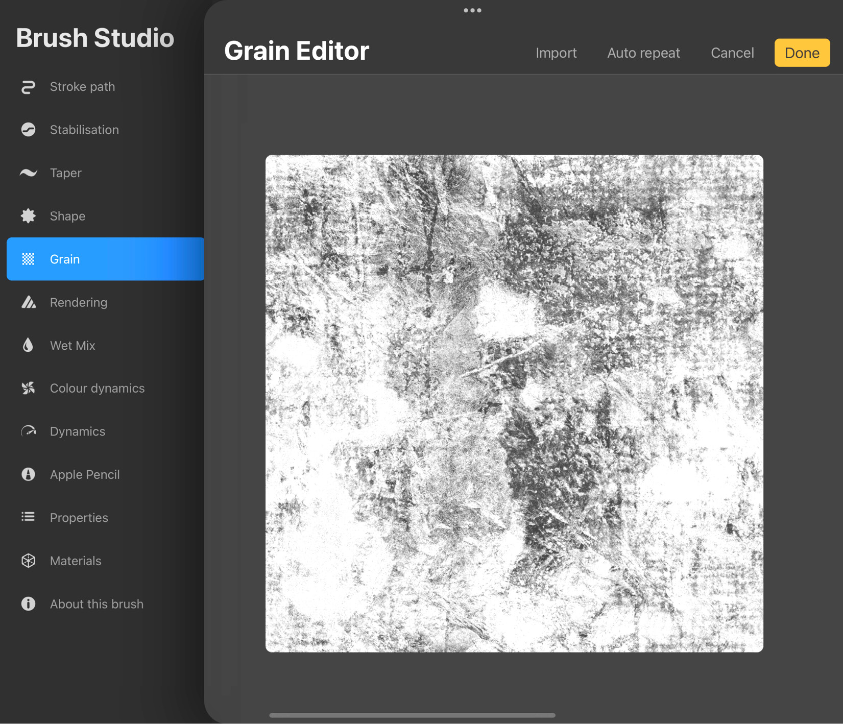
Figure 9.21: Grain Editor
To use Grain Editor, follow these steps:
- The first step is to use the Import button, and import a source image from Photos, Files, Procreate’s Source Library, or your clipboard. Ideally, it should be a square image, otherwise, it can appear squashed. This image will act as the grain texture, as shown in the following screenshot:
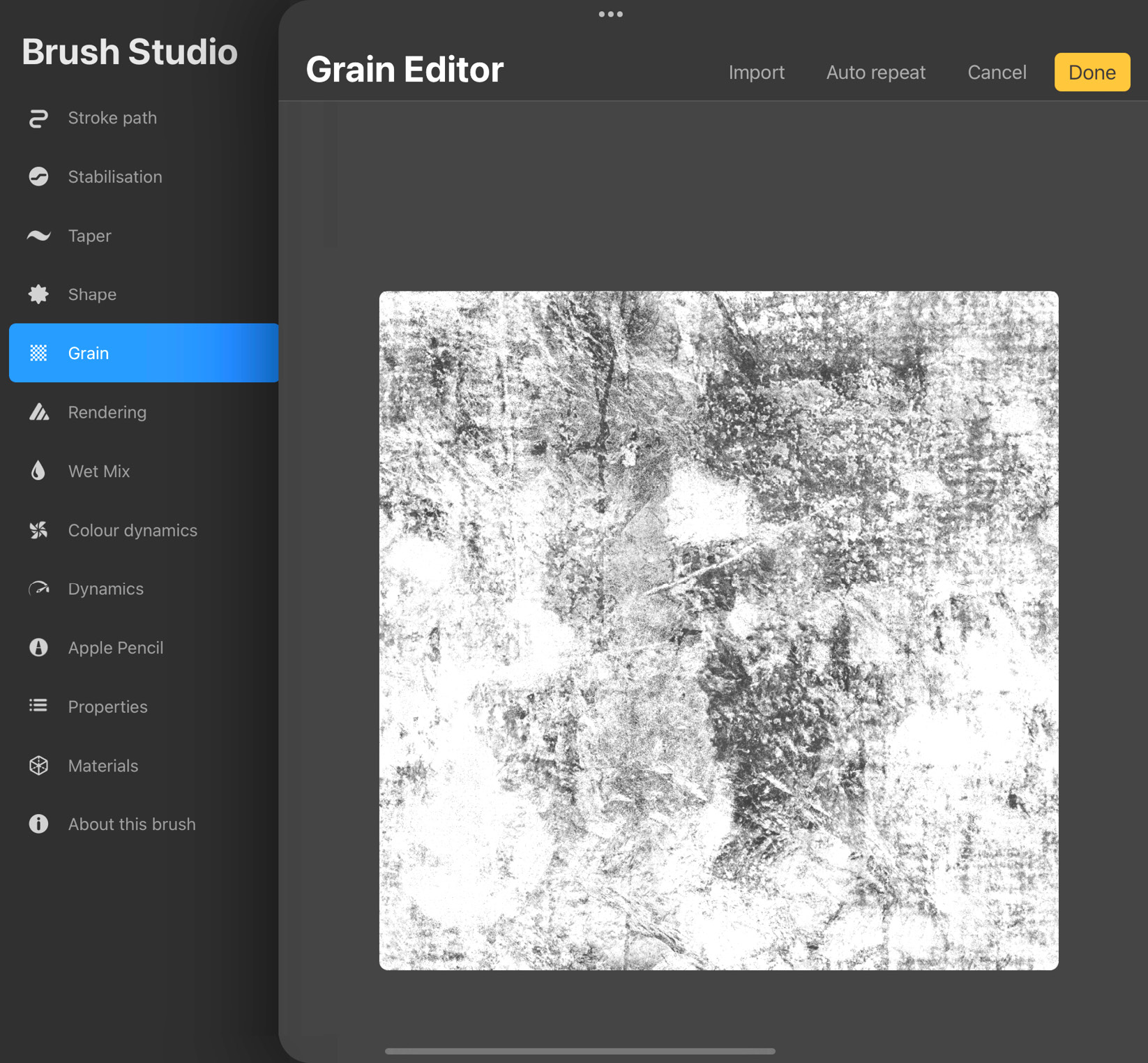
Figure 9.22: Grain Source
- Use two fingers to rotate it at right angles to suit your preferred orientation. A two-finger tap will invert the colors in the image, if you want dark and light colors to be switched.
- Tap on the Auto repeat button in the top-right corner. This will take you to the interface shown in the following screenshot:
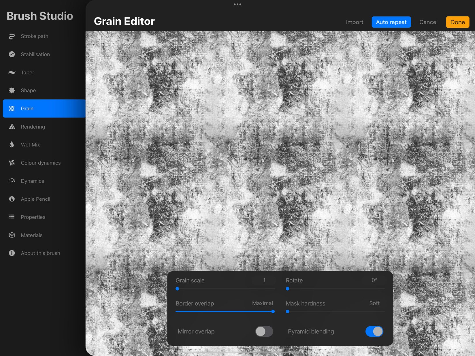
Figure 9.23: Auto repeat
These controls help you adjust how the grain source will be tiled over a continuous surface and provide a real-time visual of how seamlessly one tile blends into another. Here’s what each control does:
- Grain scale is used to resize the scale of each tile.
- Rotate applies rotation to the grain.
- Border overlap dictates how much of a tile’s edge overlaps with the next.
- Mask hardness is used to adjust how sharp the mask of the overlapping tiles should be.
- Mirror overlap, when toggled on, symmetrically mirrors the grain at the overlap, so the transition between tiles is seamless.
- Pyramid blending is used for extra refinement, especially while dealing with irregular textures. It doesn’t work as well with defined geometric patterns.
- Once you are happy with the changes, tap on Done in the top-right corner. If you’d like to discard all your changes instead, tap on Cancel. This will take you back to the Brush Studio.
Rendering
This attribute is responsible for how your brush strokes interact with the canvas, and how individual brush strokes behave with each other. The settings panel for this attribute is shown in the following screenshot:
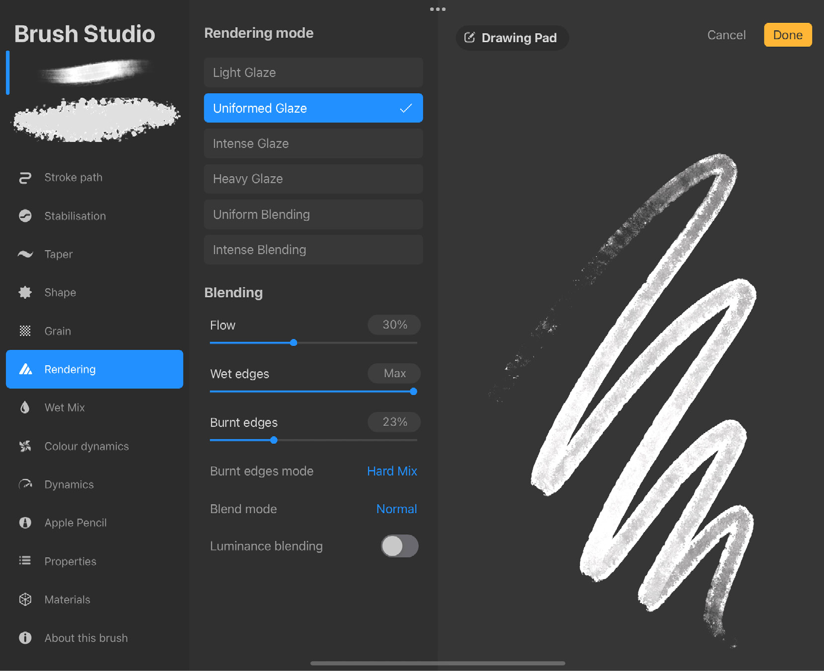
Figure 9.24: Rendering settings
The settings for Rendering are grouped into two sets:
- Rendering mode: The first section consists of options that let you choose the rendering style of each individual brush stroke. This is similar to working with diluted paint, all the way up to thickly applied paint. There are six types of rendering modes available:
- Light Glaze is the lightest rendering mode. It’s akin to using diluted paint.
- Uniformed Glaze is stronger, made to imitate the rendering used in Adobe® Photoshop® software.
- Intense Glaze is a heavier type of rendering that is like laying down slightly thicker paint.
- Heavy Glaze has a deeper rendering style. It preserves the opacity of the paint while mixing.
- Uniform Blending combines Uniformed Glaze with sharper rendering to create a thick, intense effect.
- Intense Blending is the heaviest rendering mode. This makes brush strokes and colors blend together while painting.
- Blending: The next set of sliders controls how brush strokes behave. The following are the various options available under this option:
- Flow controls how much paint is laid down by the brush.
- Wet edges blurs and dissolves the ends of a stroke to give the impression of wet paint bleeding into the canvas.
- Burnt edges applies a fringe-like burn effect to the edges of a stroke, especially when strokes overlap, as shown in the following screenshot:

Figure 9.25: Burnt edges
- Burnt edges mode decides the blend mode of the burnt edge effect.
- Blend mode pertains to the mode individual strokes will use to blend with each other.
- Luminance blending can be toggled on if you want the brush to consider only lightness and not color when applying blend modes.
Wet mix
This attribute is used to configure how and whether a brush will behave like it’s using wet paint. This includes dilution effects, blending colors, as well as wet paint-specific behaviors, such as how much “paint” is loaded onto a brush and how quickly it runs out. The interface for the Wet mix settings is shown in the following screenshot:
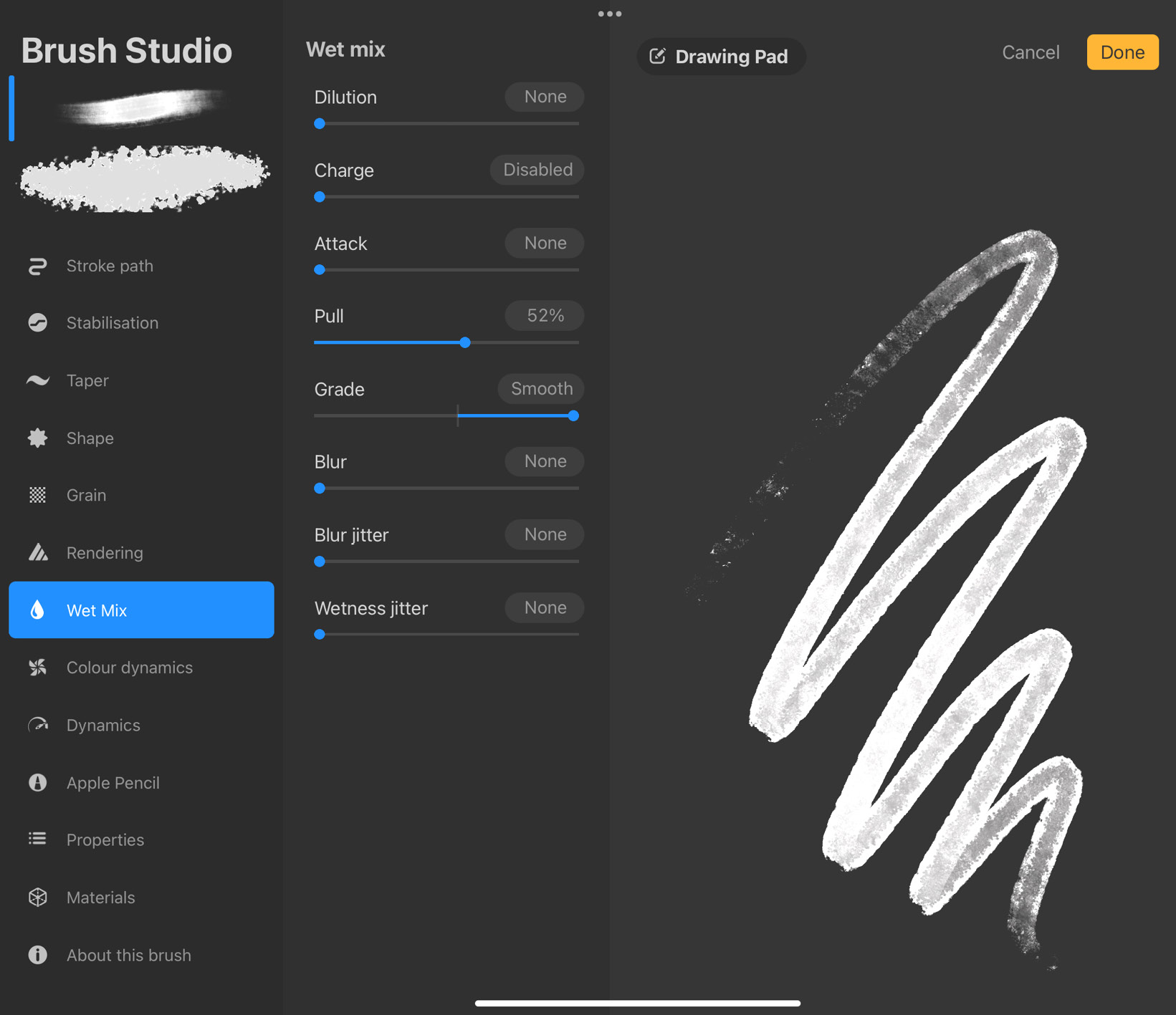
Figure 9.26: Wet mix settings
These are the settings available under this attribute:
- Dilution: As the name suggests, this slider controls how diluted your strokes will look. Increasing the value adds more “water” to the paint.
- Charge: Charge refers to how much paint your brush is charged with at the beginning of each stroke. As a stroke gets longer, paint begins to run out and gradually disappears. Lift your pencil to recharge your brush with fresh paint. This gives you the experience of dipping your brush into paint before each stroke. The more the dilution, the more visible the effects of Charge are.
- Attack: Adjust how much paint the canvas catches from your brush. The more Attack, the thicker, more evenly applied the paint will be.
- Pull: This setting lets you control how much one stroke will be able to drag around the color from its surroundings. Visualize this like drawing on wet oil paint, so that your brush can still pull the previously applied paint with its current stroke.
- Grade: Every brush has a grade, which is how thickly it applies its own texture. Adjust the grade of your brush using this slider.
- Blur: This setting allows you to blur your brush strokes as much as you’d like.
- Blur jitter: Randomly vary the blurriness of the brush.
- Wetness jitter: Randomize the water content of your stroke. This works well when the dilution is set to high.
Color dynamics
This attribute affects how color behaves on your brush. One of the many advantages of digital paint is that you don’t have to stick to one color in one stroke or even between strokes. Color dynamics is responsible for applying variations to the color of your brush while you draw. The settings under this attribute are shown in the following screenshot:
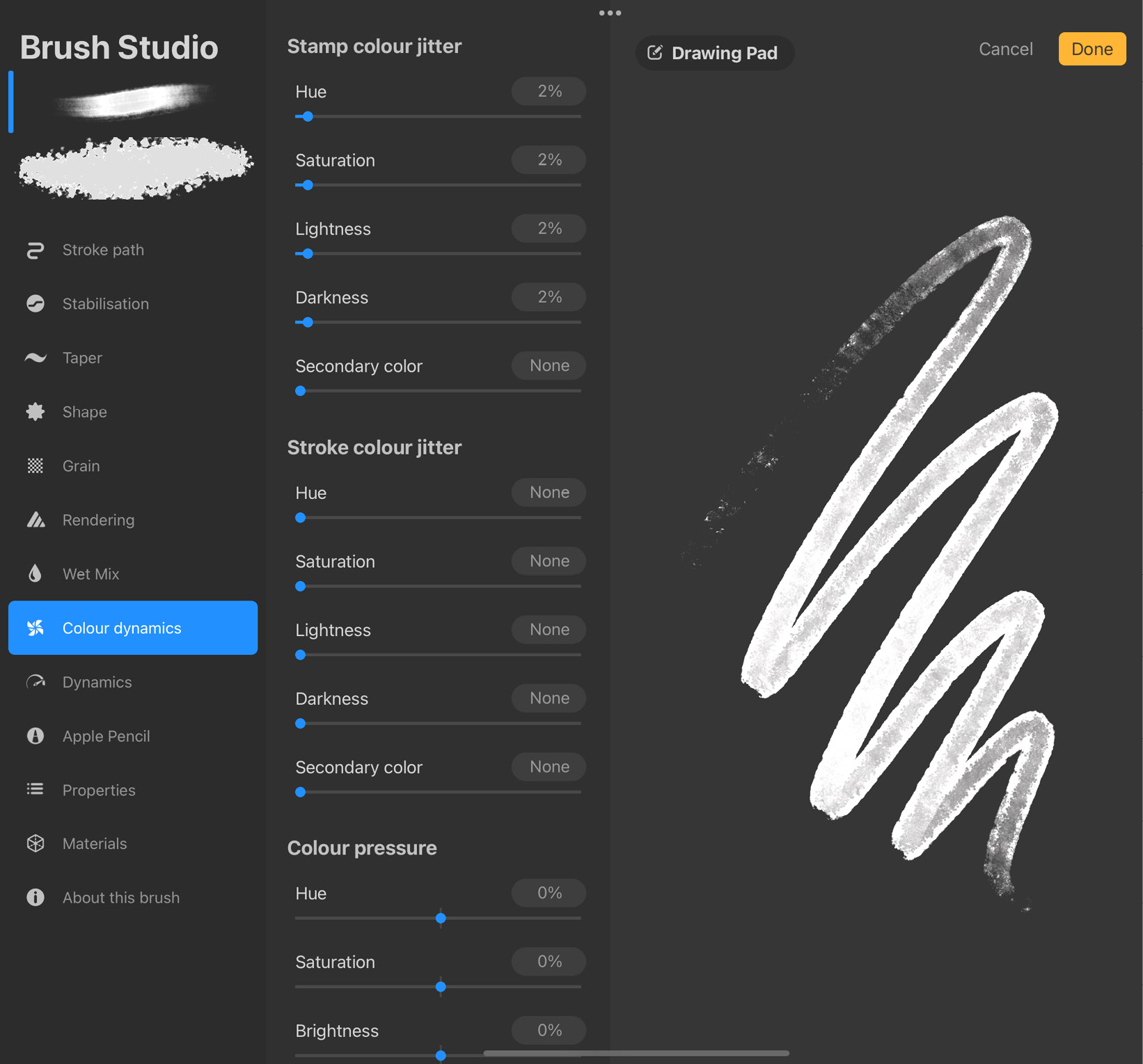
Figure 9.27: Color dynamics settings
These settings are divided into four sections:
- Stamp color jitter: This introduces variation in a stroke by randomly varying the color of each individual stamp. It’ll result in every stroke having color differences within it. This jitter acts on any of the five properties of a color. Under this, we have the following settings:
- Hue lets you adjust the degree of variation in hue that can happen between stamps. A low value makes the brush jitter between a small spectrum of colors, while a high value makes the colors swing through a large range.
- Saturation works the same way as Hue, except it makes the saturation of each stamp jitter randomly within the specified range.
- Lightness is used if you want your stamps to randomly jump to lighter colors, and Darkness makes them jump to darker colors.
- Secondary color lets you adjust how frequently stamps will jitter between the current color and the secondary color. You can set the secondary color from the Colors panel.
- Stroke color jitter: This set of sliders introduces variation in color by changing the color of each stroke randomly within the specified settings. This will result in strokes that have the same color individually, but where each stroke is of a different color. This setting has the same five sliders under it as Stamp color jitter, and they function identically. The only difference is that they affect strokes as a whole, instead of each individual stamp.
- Color pressure: Use these settings to make brush color vary with pen pressure. It contains four sliders labeled Hue, Saturation, Brightness, and Secondary color. These sliders control how widely the respective color properties will vary with pressure.
- Color tilt: Use these settings to make brush color vary with pen tilt. This section, too, contains four sliders labeled Hue, Saturation, Brightness, and Secondary color. These sliders control how widely the respective color properties will vary with tilt.
Dynamics
Brush dynamics add flavor and character to your brush by making it respond to speed and supplying jitter settings. The settings panel for this attribute is shown in the following screenshot:
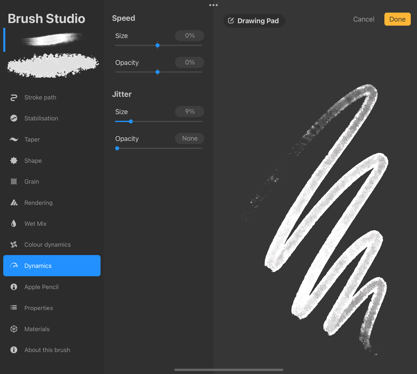
Figure 9.28: Dynamics settings
The controls are divided into two sections:
- Speed: Make your brush sensitive to the speed at which a stroke is made. We have the following two options under this:
- Size lets you control how much the brush size will be affected by speed.
- Opacity helps you adjust how much the brush opacity will be affected by speed.
- Jitter: Add jitter to brush properties using these settings. We have the following two options under this:
- Size is used to make the brush size randomly change while making a stroke, within the limit on the slider.
- Opacity works the same way, by randomly changing the brush opacity between the set limit.
Neither of these settings is affected by stroke speed, so they are a good way to introduce dynamism while drawing with your finger or other styluses that can’t register speed.
Apple Pencil
This attribute pertains to how different aspects of your brush change in response to feedback from your Apple Pencil. This feedback comes in two types, Pressure and Tilt. The settings for the Apple Pencil are shown in the following screenshot:
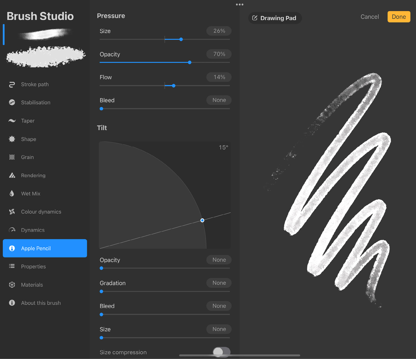
Figure 9.29: Apple Pencil settings
The sections under this attribute are separated for Pressure and Tilt, as follows:
- Pressure: Controls how the brush responds to changes in pencil pressure. Pressure can affect these four brush properties:
- Size lets you adjust how much variation in brush size will occur with a change in pressure.
- Opacity works similarly, helping you control how and whether pencil pressure will affect brush opacity.
- Flow controls how much paint flows through your brush, in relation to pressure.
- Bleed lets you adjust how much paint will spill around the edges of the brush with changes in pencil pressure.
- Tilt: This next section works similarly to the previous but in relation to the tilt of your Apple Pencil. You have the following settings under this:
- The tilt graph used for adjusting the tilt angle is displayed first. It’s a quarter circle with a straight line intersecting it, and a blue node where they intersect. Use this node to change the tilt angle. By default, it rests at 9°.
- Opacity helps you control how and whether tilt will affect brush opacity.
- Gradation lets you recreate the effect of tilting a graphite pencil while shading.
- Bleed lets you adjust how much paint will spill around the edges of the brush with a change in pencil tilt.
- Size lets you adjust how much variation in brush size will occur with tilt.
- Size compression: Toggle this button on if you want to prevent the texture inside your brush from stretching out along with the brush size.
Properties
This section contains a bunch of properties that affect how a brush is displayed in the preview and how it behaves with respect to the canvas. The following screenshot shows the settings under this attribute:
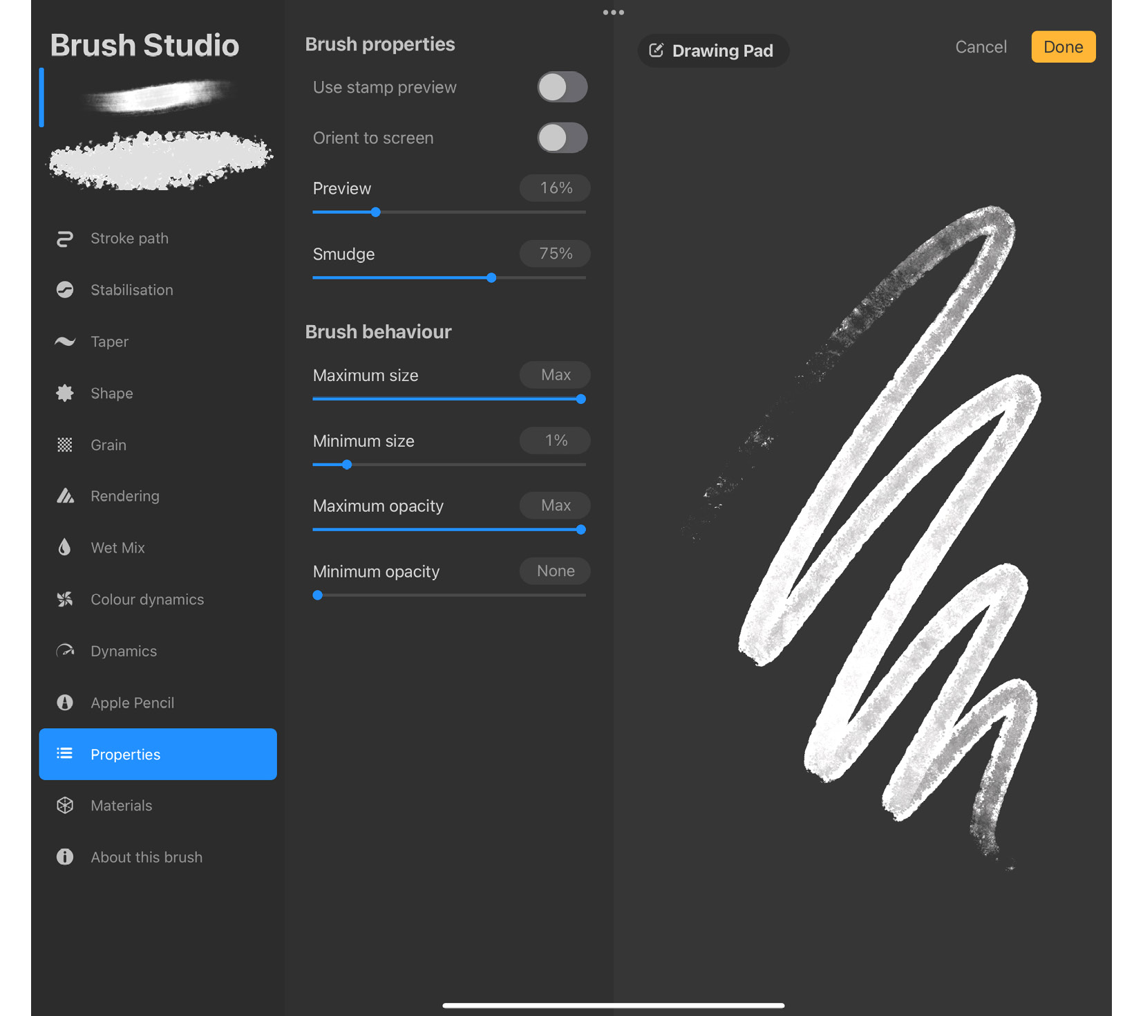
Figure 9.30: Properties settings
The controls are split into two sub-headings:
- Brush properties: The following are the settings under this option:
- Use stamp preview decides how the brush preview will appear in the Brush Library. Usually, the preview is a stroke, but this toggle can be turned on to show the stamp instead.
- Orient to screen: This setting produces the most noticeable change when the brush has an asymmetrical shape, which has different results depending on its orientation to the canvas. When it’s toggled off, the orientation of the brush is locked to the canvas. When toggled on, it’s locked to the orientation of the device.
- Preview is a slider that can adjust the size of the stroke or stamp in the preview of the brush in Brush Library.
- Smudge allows you to set a base value for how much the brush smudges when used as the Smudge tool.
- Brush behaviour: The settings under this section allow you to set some bounding limits for brush size and opacity:
- Maximum size lets you set the largest size your brush can be. After you exit the Brush Studio, this will be the size you get when you turn up the brush size slider all the way to the top. Similarly, Minimum size pertains to the smallest a brush can get. If both these sliders are set to the same value, you will have a brush that has a fixed size.
- Maximum opacity and Minimum opacity work the same way, by letting you set the highest and lowest opacity value for the brush.
Materials
By using this attribute, you can decide what kind of material texture your brush will have when painting on a 3D model. The settings panel for it looks like this:
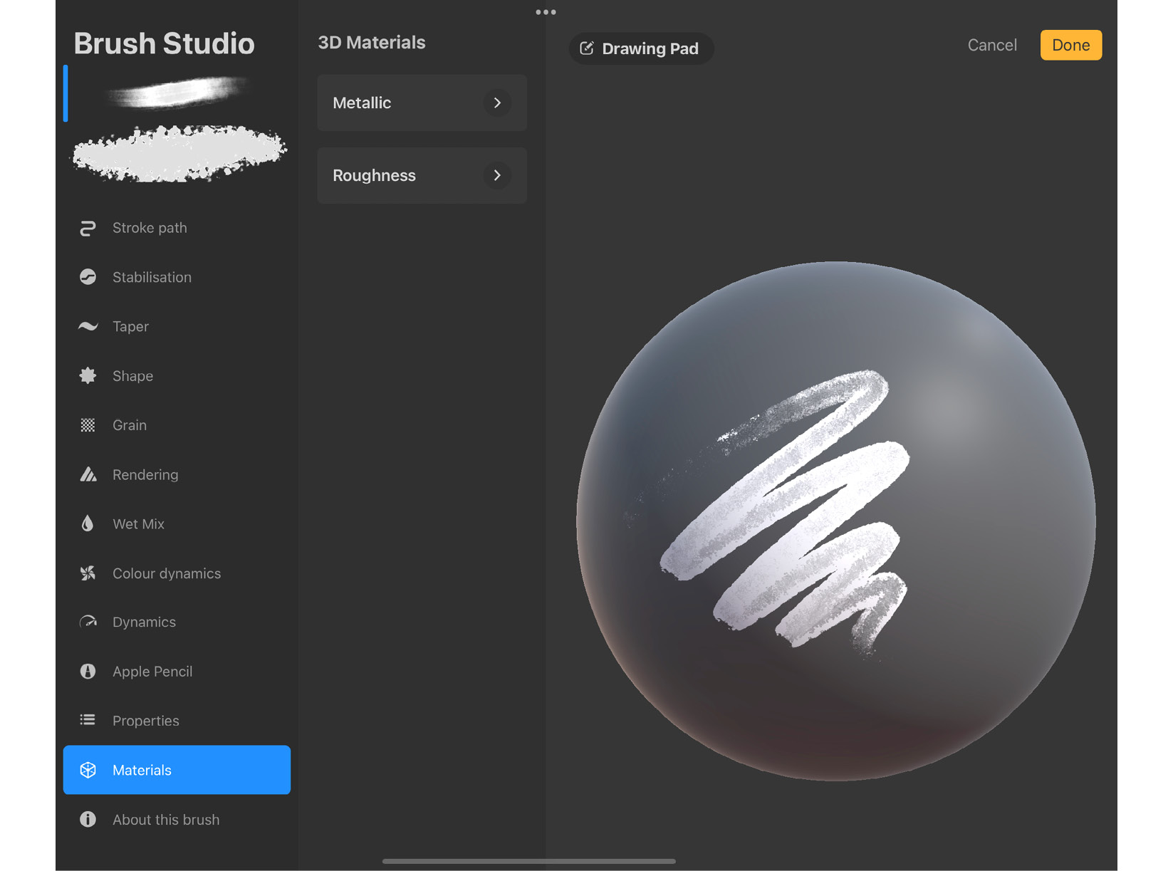
Figure 9.31: Materials settings
In Procreate, every material has two aspects – Metallic and Roughness, which we will talk about here:
- Metallic: This property of a material brush determines how metallic the brush will look when painting in 3D. We have the following options under this:
- Use the Amount slider to set the degree of metallic appearance from 0 (non-metallic) to 100 (metallic).
- Metallic source acts almost the same way as Grain Source, mentioned in the previous sections. You can import a grayscale image into this editor. The white parts of the source will show the metallic properties of the brush, while the black areas will block it out.
- Scale is used to size the metallic source image up or down.
- Roughness: This setting controls how matte or shiny your brush will appear on 3D models. We have the following options under this:
- Use the Amount slider to set the degree of roughness from 0 (smooth) to 100 (rough).
- Roughness source acts the same as Metallic source, mentioned in the previous point. You can import a grayscale image into this editor. The white parts of the source will show the roughness of the brush, while the black areas will block it out.
About this brush
The last section in the Brush Studio contains information about the brush, which is shown in the following screenshot:
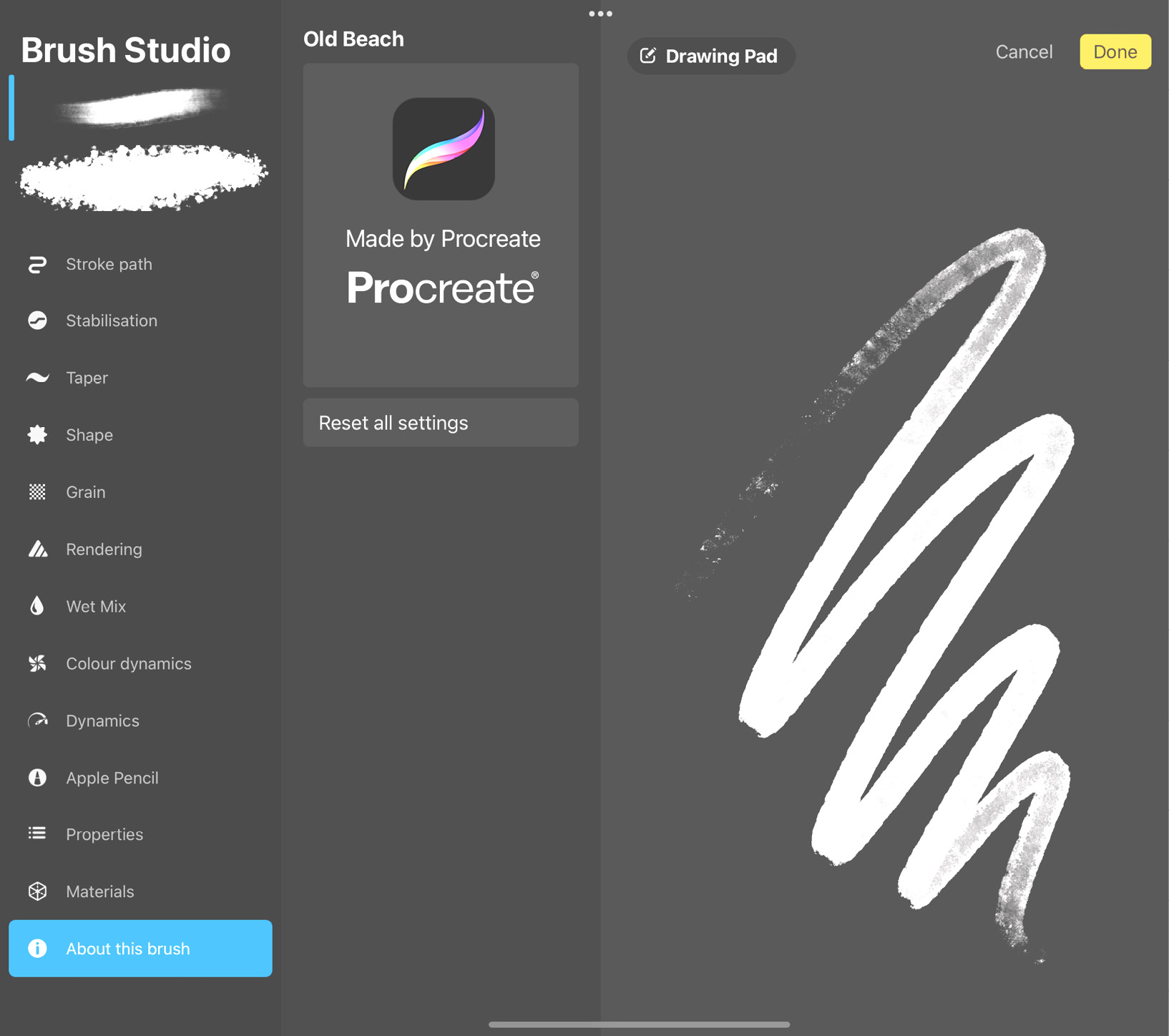
Figure 9.32: About this brush
The first section shows details about the brush such as the name of the brush, who it’s created by, and its date of creation. When a brush is the default in Procreate, this section says Made by Procreate. For custom brushes, you can easily edit the details.
Tap on the name of the brush to bring up the keyboard, to edit its name.
You can also add your own name, photo, and signature to your original brushes by following these steps:
- Tap on the gray human icon to add an image representing the creator of the brush:
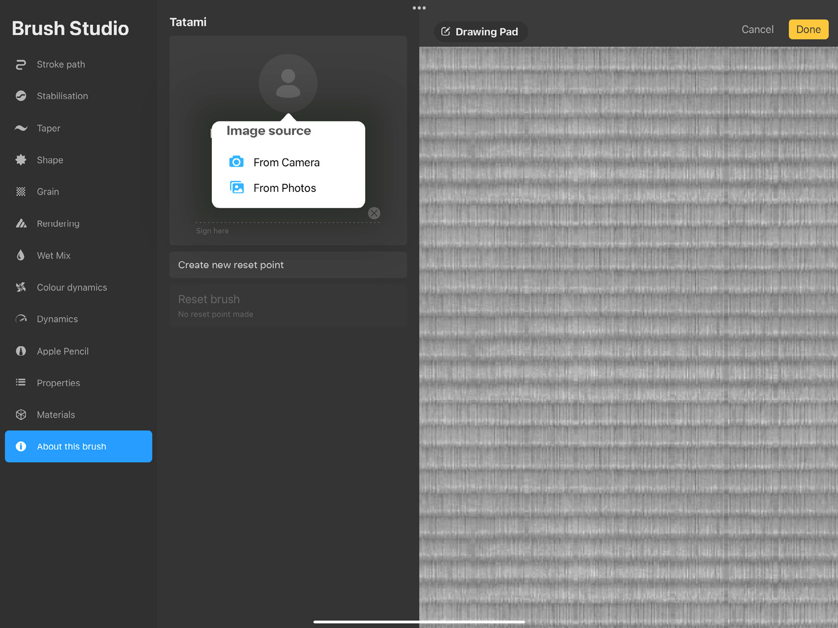
Figure 9.33: Creator image
- Tap on the faded gray text that says Name to bring up the keyboard, which will allow you to input your own name:
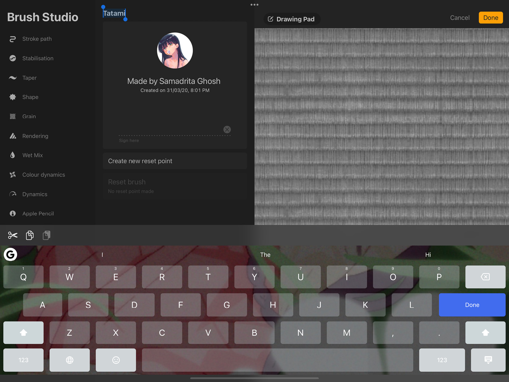
Figure 9.34: Edit brush name
- Next, using your Apple Pencil or finger, draw your signature on the dotted line:
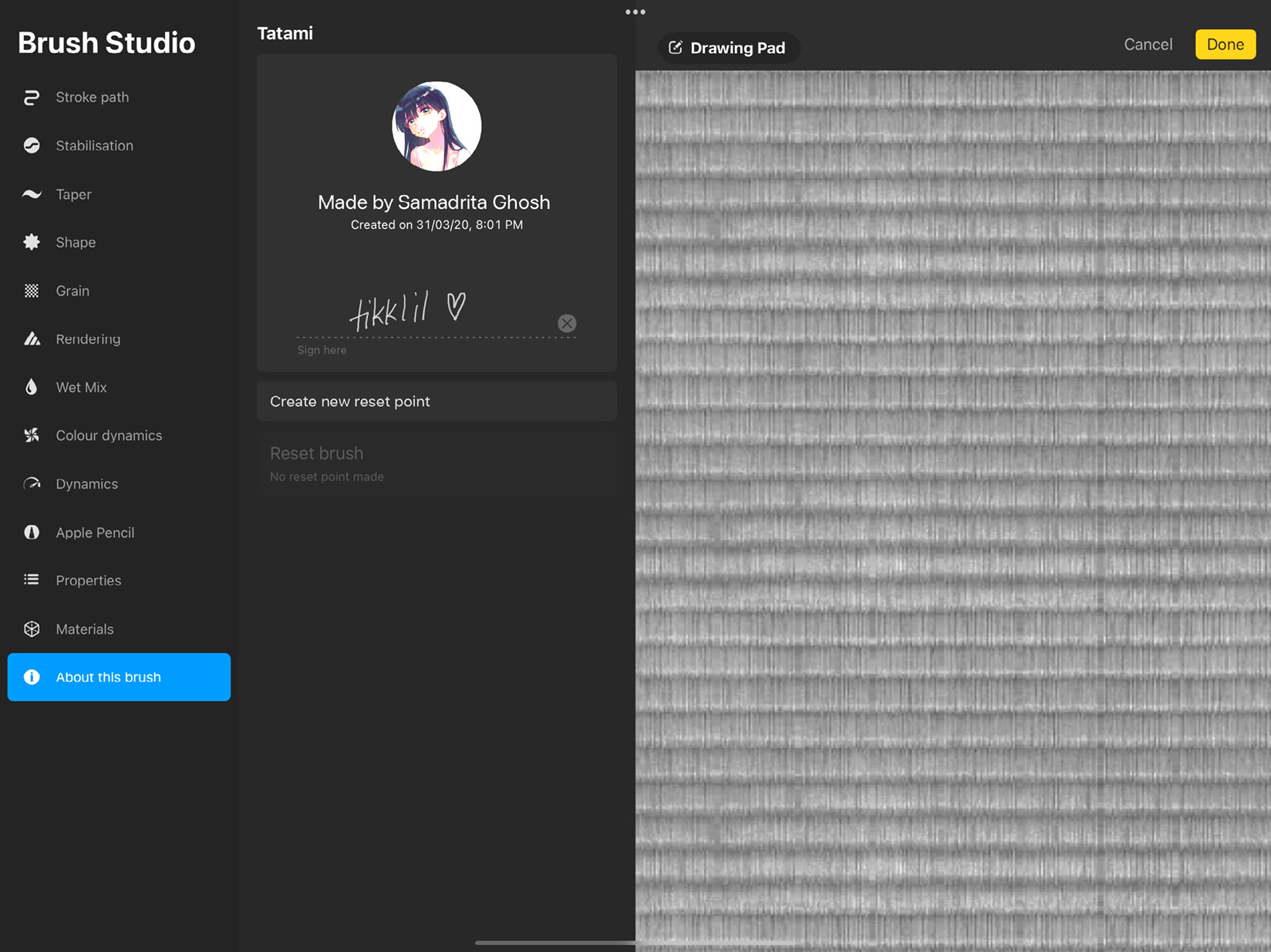
Figure 9.35: Creator signature
The next option lets you reset the brush to its original settings. For a default Procreate brush, there is a single button that says Reset all settings. This will reverse any changes you made to the brush and restore its original settings.
For an imported/original brush, you will see a button called Create new reset point. This will add a button underneath with the date and time when this reset point was created, as shown in this screenshot:

Figure 9.36: New reset point
Save a reset point to continue editing your brushes freely. If you’re not happy with the edits you make, you can always jump back to a preferred reset point. You can create multiple reset points like this.
We have now covered the Brush Studio settings in detail. The Brush Studio is packed with features, all of which require practice to get used to. It’s recommended that you spend time testing out these settings on different brushes, since their effects may vary depending on the brush. In the next section, we will look at the last important feature of brushes in Procreate – Dual Brushes.
Dual Brushes
Procreate brushes have a unique feature, where it’s possible to combine the properties of two brushes into one composite brush. In this section, you will be introduced to dual brushes. We will learn how to create and edit dual brushes, as well as combining and uncombining brushes.
Creating a Dual Brush
To create a new Dual Brush, you need to select two brushes and combine them. To do so, follow these steps:
- Select a brush by tapping it. This is your primary brush. Select another brush you want to combine it with, by swiping right on it. This is your secondary brush.
- As soon as you have two brushes selected, you will see a button called Combine appear in the top-right corner of the Brush Library popover, as shown in the following screenshot:
Figure 9.37: Combine button
- Tap this button to create a new Dual Brush with these brushes.
Important Note
Procreate’s default brushes can’t be combined with other brushes. However, you may duplicate a default brush and combine the copy. Additionally, more than two brushes can’t be combined.
- Tap on this new Dual Brush to open it in the Brush Studio. The Dual Brush, by default, takes on the name of the primary brush. To change the name, go to the About this brush section.
- Tap on the name of the brush to bring up the keyboard and rename your brush.
Editing a Dual Brush
When a Dual Brush is opened in the Brush Studio, it appears in the top-left corner of the screen as two brushes layered on top of each other, as shown in the following screenshot:
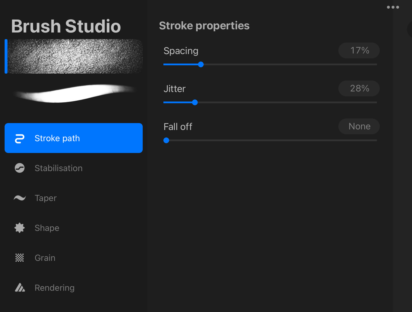
Figure 9.38: A Dual Brush
The primary brush lies on top of the secondary brush. Select the brush you want to edit by tapping on it, which makes a blue line appear to its left.
Each brush can be separately edited in Brush Studio.
Combine Mode
Dual Brushes use blend modes such as layers to combine with each other and create a composite effect. You can change how the brushes blend to get your desired effect.
Follow these steps to select Combine Mode:
- Open the Dual Brush in the Brush Studio.
- From the brush preview in the top-left corner, tap on the selected brush to expand the preview and reveal Combine Mode, as shown in the following screenshot:
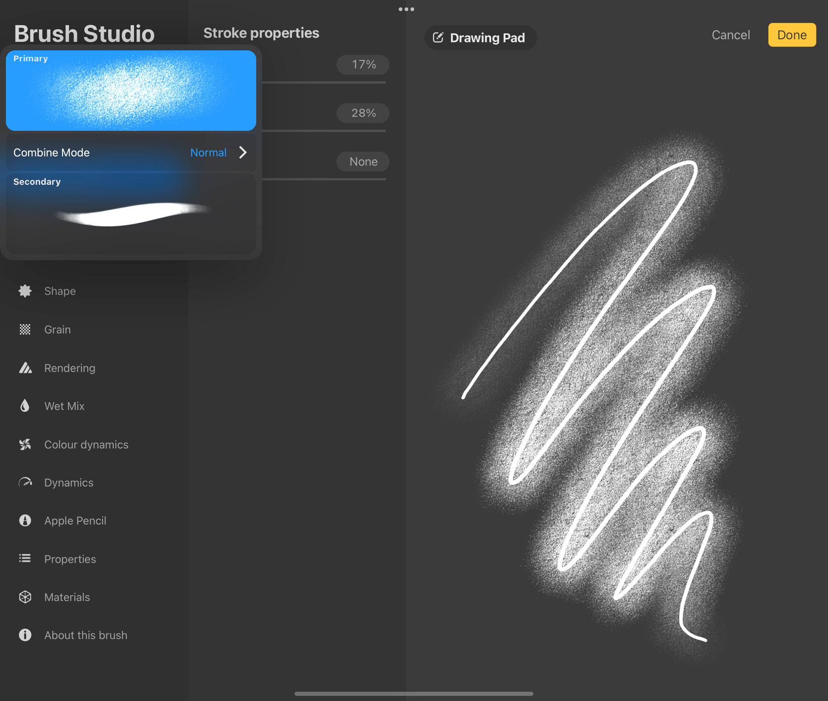
Figure 9.39: Combine Mode
- Tap on Combine Mode to open the blend modes menu, as shown in the following screenshot:
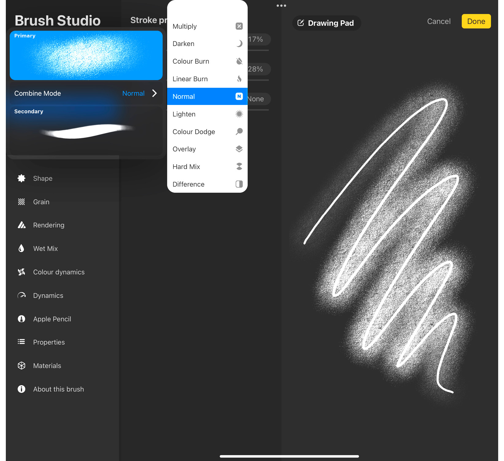
Figure 9.40: Blend modes menu
- Choose your preferred combine mode, and watch the effects it has on the brush stroke on the Drawing Pad in real time.
Uncombine
To re-separate the component brushes of a Dual Brush, follow these steps:
- Open the Dual Brush in the Brush Studio.
- From the brush preview in the top-left corner, tap on the selected brush to expand the preview.
- Tap on the secondary brush to select it.
- Tap on it again to bring up a popup saying Uncombine, as shown in the following screenshot:
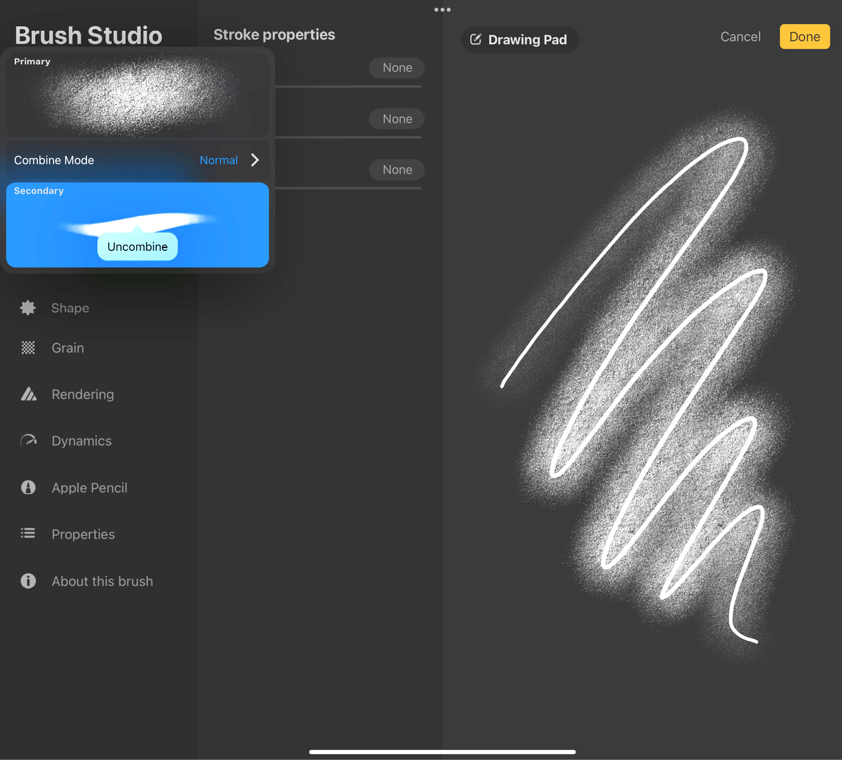
Figure 9.41: Uncombine
We have now exhaustively covered the Brush Studio and all its features. Let’s summarize this chapter.
Summary
The chapter did a deep dive into the Brush Studio, where it introduced all the editable attributes of a brush and how to adjust each of them. We now understand how brushes work as shapes stamped along a stroke and how each stamp has its own shape and grain. We covered how the pressure and tilt of the Apple Pencil plays a part in brush behavior. Overall, you have learned how to edit these attributes to create new, interesting brushes or simply reconfigure existing brushes.
Additionally, we discussed Procreate’s unique feature, which lets you combine the features of two brushes into one Dual Brush.
The next chapter will introduce you to how colors work in Procreate.