
16
Rendering Objects Using Blend Modes
If you are reading this chapter, congratulations! You have made it through all the features of Procreate, tinkered with them by yourself, and hopefully, you’re now getting the hang of it. There is a lot to this app that makes it a versatile and useful tool. In this final chapter, we will get hands-on practice and make a finished artwork using this knowledge.
If you remember Chapter 7, Organizing Your Layers, it introduced the concept of blend modes. Blend modes can add extra personality to your layers and make them useful for a variety of artistic effects. In this chapter, we are going to look at how to use common blend modes to render an object from scratch. For this tutorial, let’s use this cute little alarm clock:
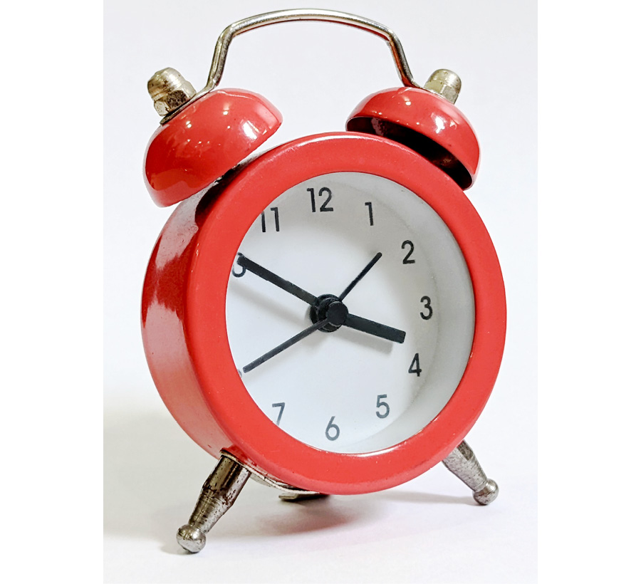
Figure 16.1: A reference photograph of an alarm clock
This clock is perfect for demonstration purposes since it sports different kinds of materials to render. The final goal is a stylized study of the clock, as shown in the following diagram:

Figure 16.2: The goal of the stylized study
In this chapter, we’re going to break the clock down into its components, under the following broad topics:
- Clock body
- Clock face
- Metal parts
- Finishing touches
Clock body
Before we can start rendering our clock, we need to have it flat filled and prepared, as follows:

Figure 16.3: Flat filling
In this artwork, the glossy red clock body is the main attention grabber. It needs the most time and care to render. The body is made of painted stainless steel. We are aiming for a shiny, yet non-metallic finish, just like the reference photograph. Let’s begin with the shading.
Shading using Multiply mode
Multiply mode is commonly used to shade objects. The blend layer in Multiply darkens the base layer; the results vary depending on the colors of the involved layers. To begin, create a layer on top of the flat fill layer, create a clipping mask, and set its blend mode to Multiply, as follows:

Figure 16.4: New Multiply layer
In this case, we will be using purple for the blend layer, to lay down the basic shading, as shown in the following figure:
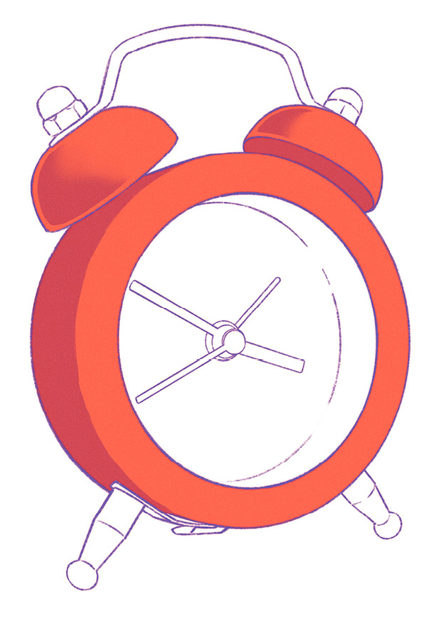
Figure 16.5: Basic shading using Multiply
Notice how the base color (red) and the blend color (purple) both affect the resulting color of the shading. Play around with the colors in the Multiply layer to observe how your painting changes character.
In the next step, let’s push the shading one step further by adding some more detail. In the same Multiply layer, we are now using a lighter purple to enhance the three-dimensional appeal of our clock, as follows:
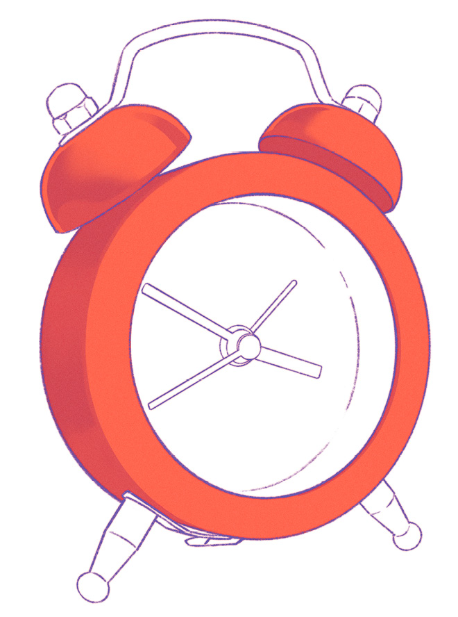
Figure 16.6: Adding detail using Multiply
Notice how using a lighter blend color has also resulted in lighter shading. This effect is especially obvious around the bells, as shown in the following image:

Figure 16.7: Details of shading near the alarm bells
Switching up values while shading can be very useful when you’re aiming for a three-dimensional look. For reference, if the Multiply layer was set to Normal instead, it would appear as follows:
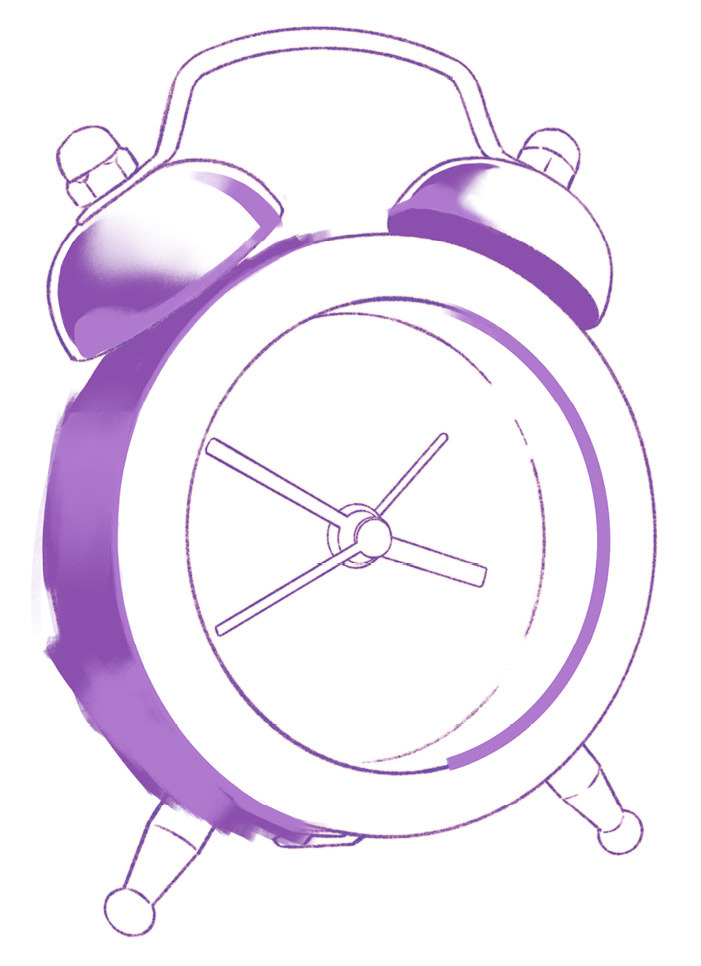
Figure 16.8: Shading viewed in Normal mode
It’s fascinating to observe how blend and base colors interact to produce the final effect. In the next section, we will be adding light to the object.
Adding light using Screen mode
Just as Multiply darkens the base layer, Screen has the opposite effect and is an essential blend mode for adding light. For this step, we will create a new layer on top of the previous one, clip it, and set it to Screen, as follows:
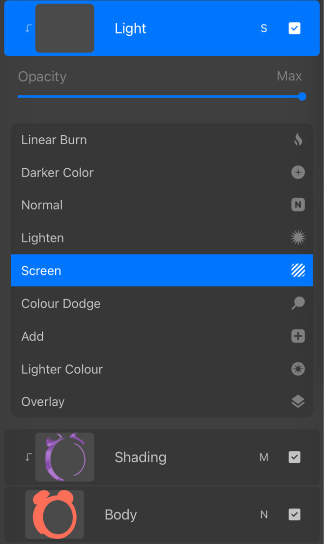
Figure 16.9: New Screen layer
This layer will be used to draw the reflection of the white background on the clock body. Since the background has a cool hue, we will use a medium value sky blue to paint on the Screen layer, as follows:
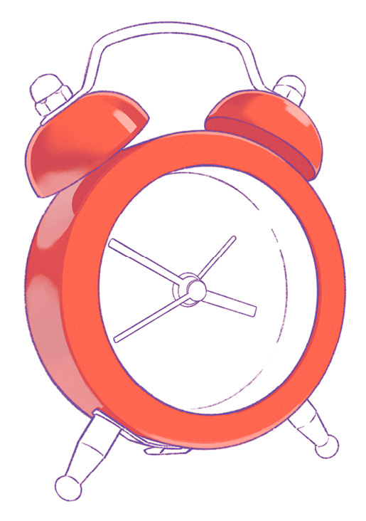
Figure 16.10: Adding light using Screen
Notice how the Screen layer affects both the base layer and the Multiply layer under it. The sky blue of the Screen layer and the purple of the Multiply layer create a composite bluish effect on the clock body. Blend modes interact with all layers underneath, so combining different modes can create a variety of interesting effects.
For reference, if the Screen layer was set to Normal, it would appear as follows:
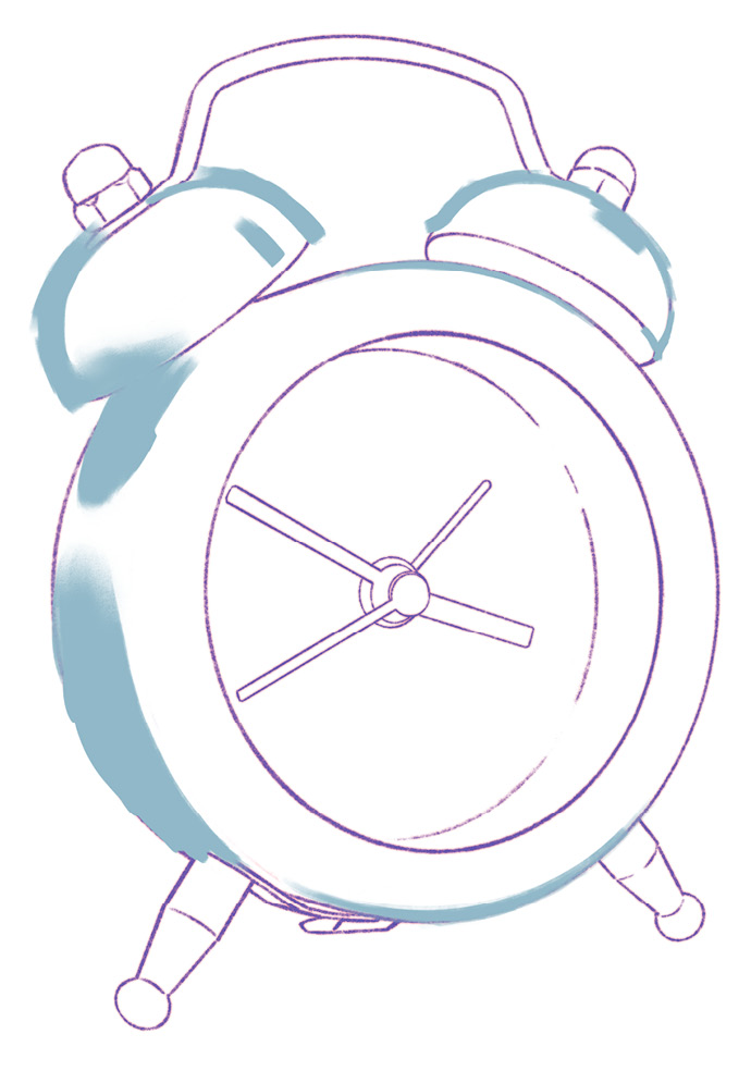
Figure 16.11: Light reflections viewed in Normal mode
Important Note
Even though we are painting lighter areas, notice the use of a medium value color such as this sky blue. Screen has a lightening effect in itself, so using an already light color in Screen mode would be too bright for this artwork. While using blend modes, it’s a good practice to be deliberate with your choice of blend colors.
With the basics in place, we can now add the shine factor to our artwork.
Drawing specular reflections using Add mode
When a light source directly reflects on a surface, it’s called specular reflection. These are the brightest of all and are commonly called “highlights.” Add is a blend mode that is the most appropriate when it comes to drawing these reflections.
As usual, we’ll create a new Add layer and clip it to our base layer, as follows:
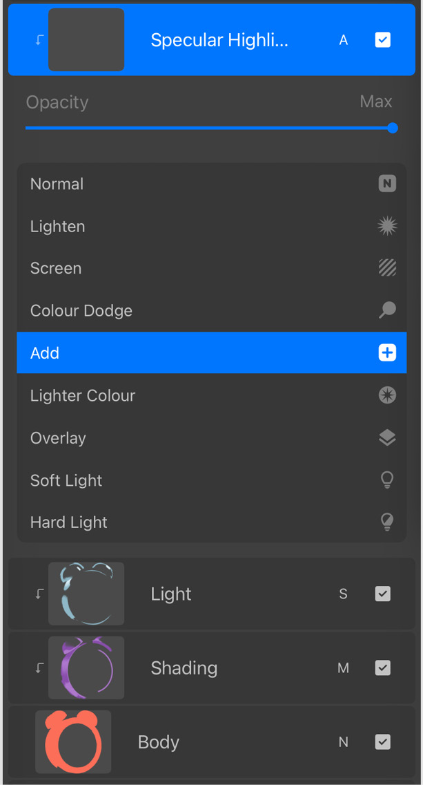
Figure 16.12: New Add layer
We can then paint the specular reflections, as follows:
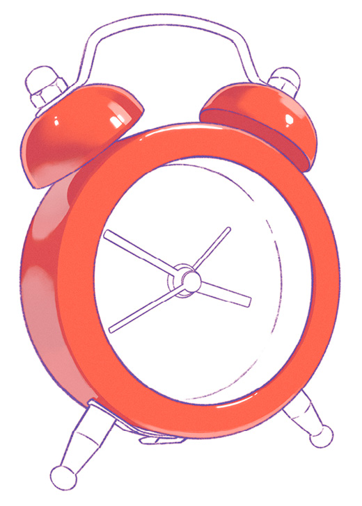
Figure 16.13: Specular reflections using Add
These highlights were painted using a light blue to stay true to the cool light used in the photograph, as shown in the following image:

Figure 16.14: Specular reflections viewed in Normal mode
However, since we are aiming for an almost white shine, any light color used in Add mode will do the trick. In some cases, an artwork might need a specific color of specular reflections, where the color choice is more important.
In the next section, we’ll give the artwork a contrast boost.
Drawing dark shadows using Multiply mode
This is a simple step where we fill in the areas of dark shadow with a dark color in Multiply mode. Create a new Multiply layer, as follows:
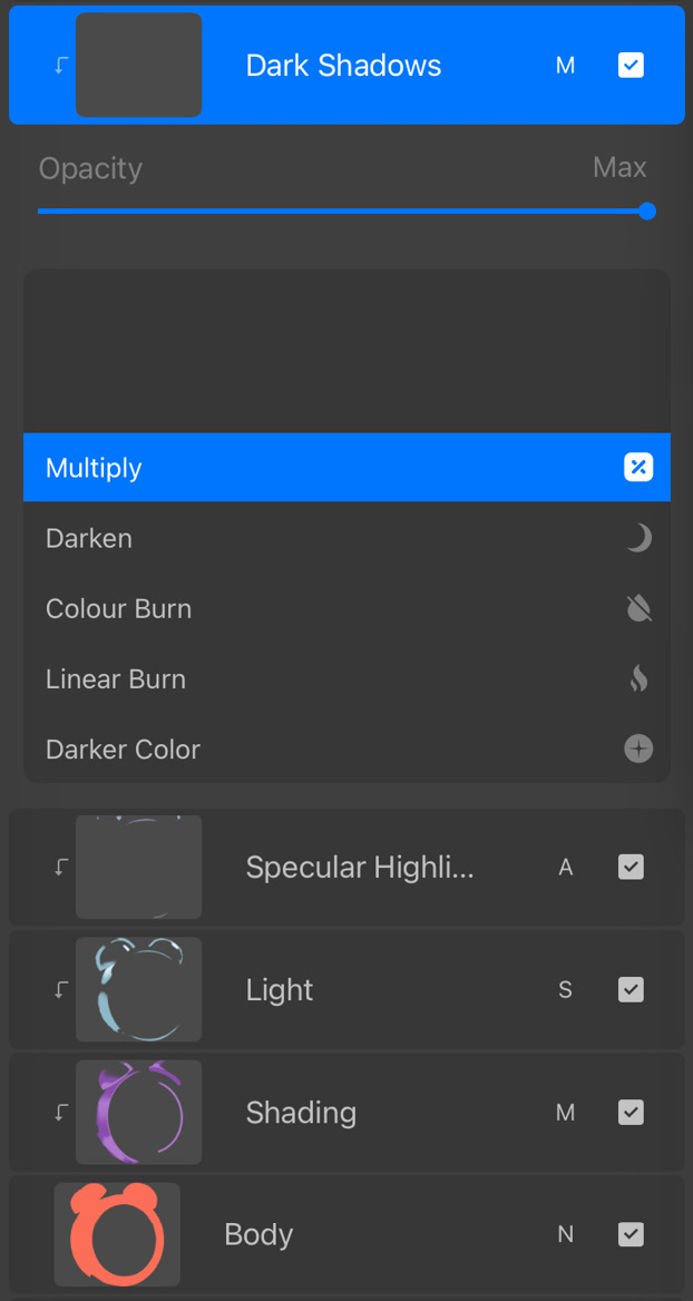
Figure 16.15: New Multiply layer
In this artwork, dark shadows occur on the undersides of the bells, which we’ll block in with a dark purple in Multiply, as follows:
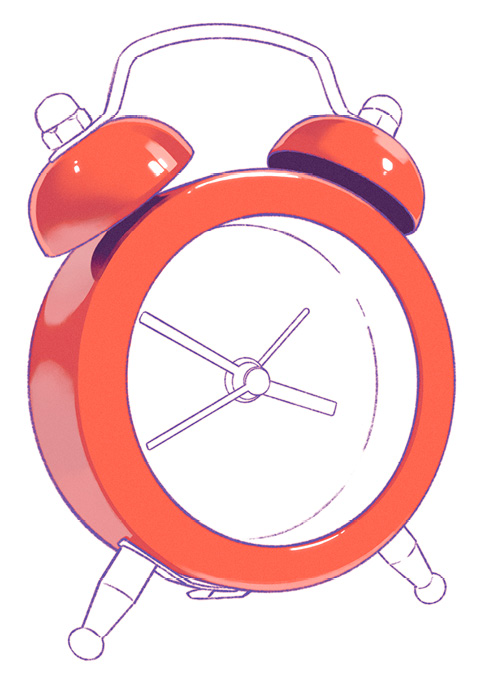
Figure 16.16: Dark shadows using Multiply
In Normal mode, this layer would appear as follows:
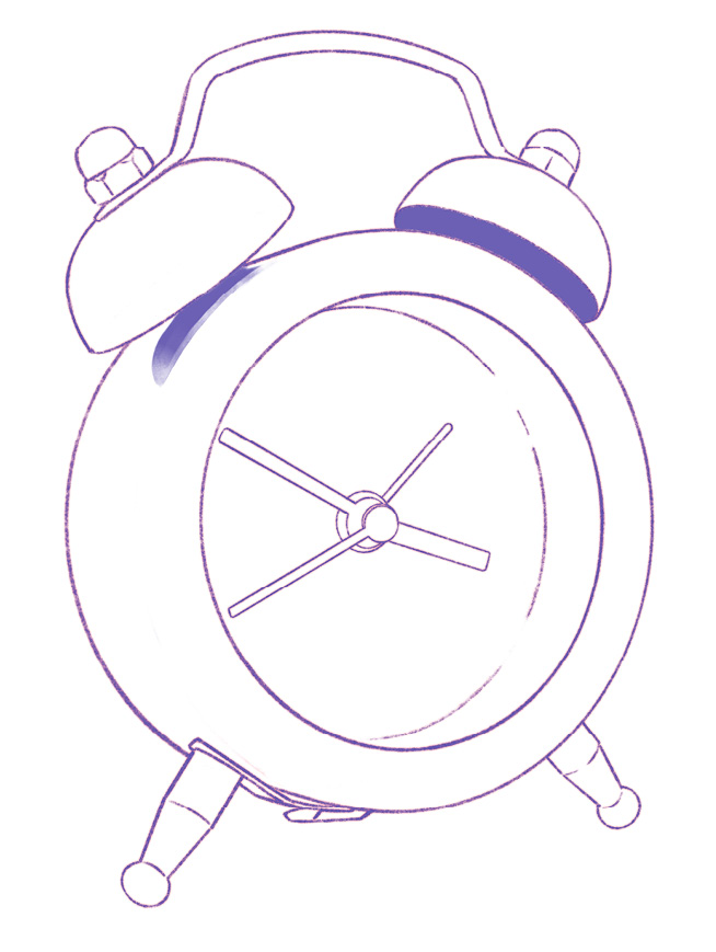
Figure 16.17: Dark shadows viewed in Normal mode
In the next section, we will start getting creative.
Adding color effects using Hard Light mode
Though the reference photograph has no warm lighting, we are attempting to do a stylized study, not necessarily a realistic one. This section will demonstrate how you can add some more visual richness to a study.
To do so, follow these steps:
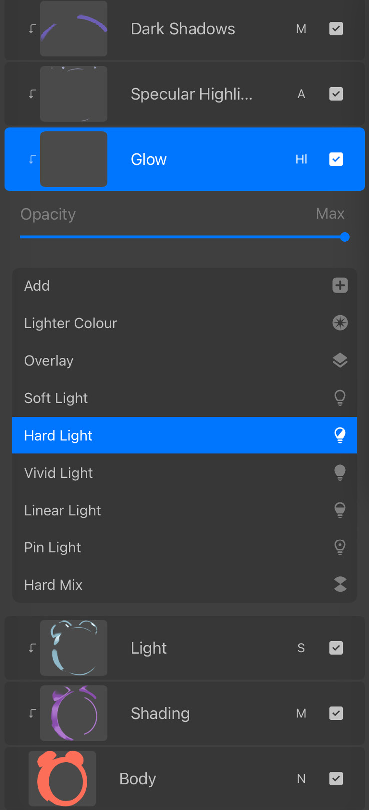
Figure 16.18: New Hard Light layer
- Using a soft brush and a light yellow, we will add a soft warm glow to some parts of the clock body, as follows:
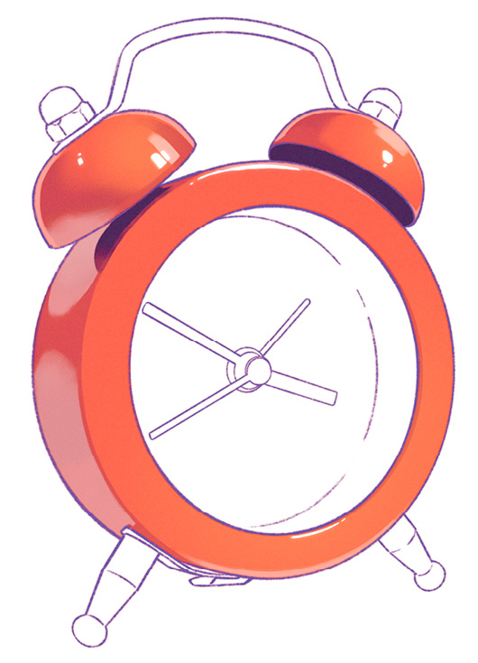
Figure 16.19: Warm glow using Hard Light
The difference might not be obvious at first glance, but when compared to the last step, it becomes clearer, as shown in the following images:
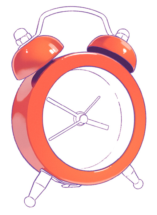
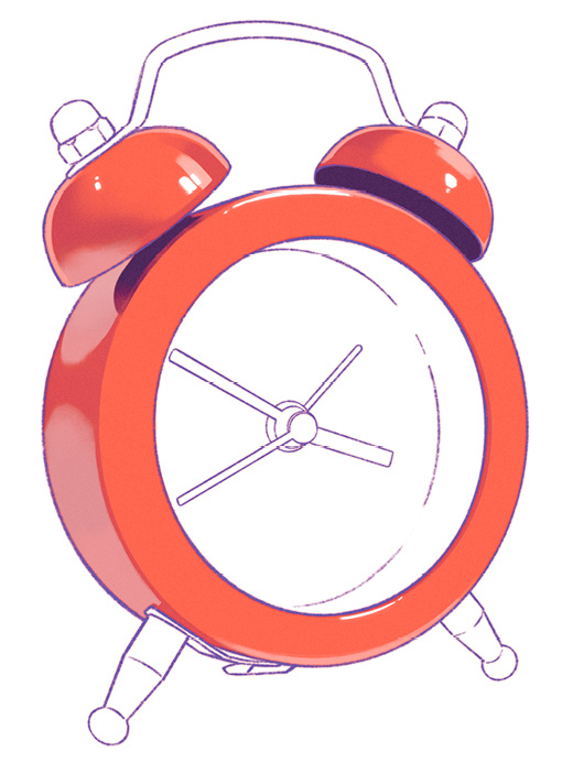
Figure 16.20 (a): Before the warm glow; (b) After the warm glow
This step isn’t essential, but it lends a subtle personality boost to the artwork, as we wrap up the rendering of the body. For reference, this layer will look like the following in Normal mode:
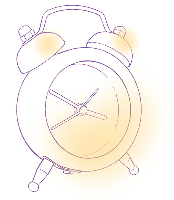
Figure 16.21: Warm glow viewed in Normal mode
In the next section, we’ll focus on the clock face.
Clock face
In this section, we’ll tackle a different kind of material. The clock face has a matte white finish that can be rendered simply using the Multiply and Screen modes.
Adding cast shadow using Multiply mode
The clock is lit with direct light from the upper-right corner, which makes the body cast a shadow over the clock face. Additionally, the hands of the clock cast their own shadows. The shadows will be painted on a Multiply layer on top of the clock face, as follows:
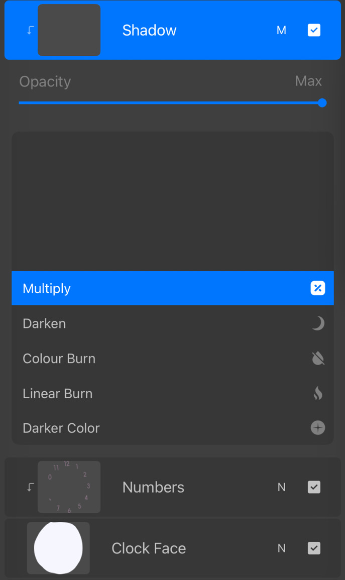
Figure 16.22: New Multiply layer
We will paint the shadows blue, as follows:

Figure 16.23: Casting a shadow using Multiply
Next, using a lighter blue, we can add finer details to the variations within the shadow, as follows:
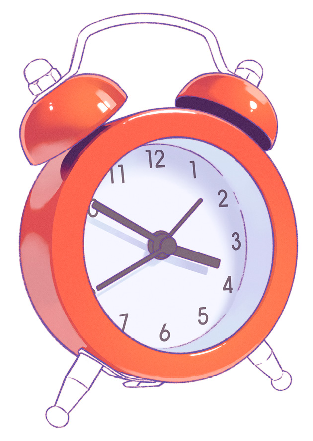
Figure 16.24: Detailed shading using Multiply
In Normal mode, this shading will look as follows:

Figure 16.25: Shading viewed in Normal mode
You might be concerned that the shading is spilling over the edges. However, it’s clipped to the base layer of the clock face, so the final result looks clean.
In the next section, we will proceed to add a hint of light to the clock face.
Adding light using Screen mode
In the previous step, you might have noticed that the numbers printed on the clock face look disjointed, as though they’re not part of the same surface. This happens because the color of the print is dark enough that the Multiply layer fails to cause a noticeable change. This makes it look like the lighting doesn’t affect the print.
This issue can be simply solved by subtly lightening the rest of the clock face further using a Screen layer, as follows:
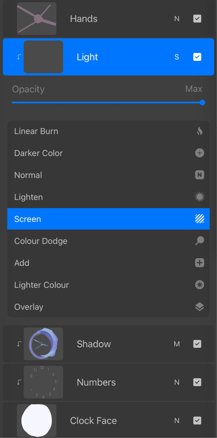
Figure 16.26: New Screen layer
Since Screen affects dark colors more noticeably, brightening the non-shadow areas can help unify the print with the surface of the clock face. This effect is shown in the following image:

Figure 16.27: Brightening the non-shadow areas using Screen
This Screen layer will look like the following in Normal mode:
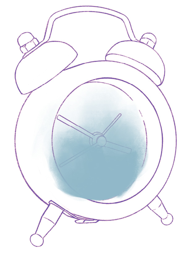
Figure 16.28: Brightened area viewed in Normal mode
This brings us to the end of rendering the clock face. Note how there are no speculars here since it’s a matte surface.
In the next section, we’ll get into the last material making up this object.
Metal parts
The tiny stainless steel parts provide a fair bit of visual appeal to the clock. They enhance the contrast between the different materials and textures composing the object. To render these bits, we will be aiming for a shiny metallic finish. The first step is to add the shading.
Shading using Multiply mode
Metal surfaces are highly reflective, so they tend to show contrasting dark and light “bands.” However, for the purpose of our artwork, we want to focus more of our attention on the clock body, so we can downplay the contrast on the metal a little.
Create a clipped Multiply layer on top of the base, as follows:
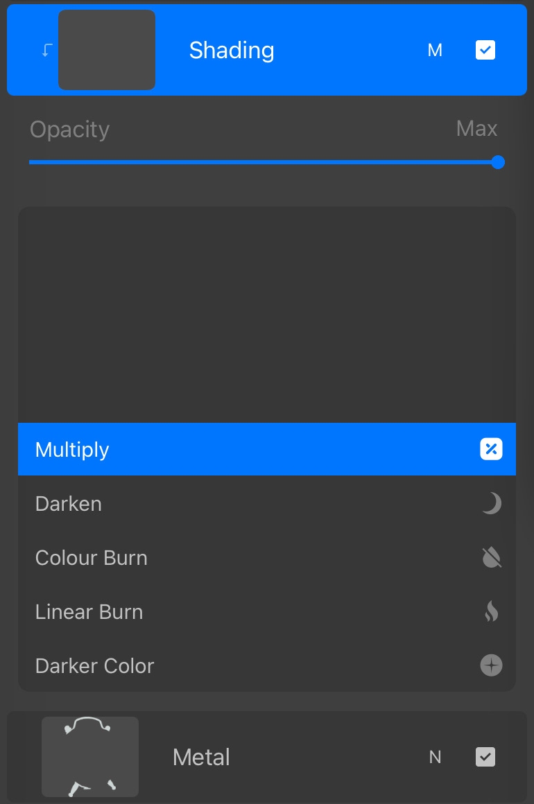
Figure 16.29: New Multiply layer
Next, block in the shading with blue, as follows:

Figure 16.30: Basic shading using Multiply
At this stage, the finish looks relatively matte, so we can create some of those finer reflections within the shadow area using a lighter blue, as follows:

Figure 16.31: Detailed shading using Multiply
Now that the “bands” are clearer, the surfaces are starting to appear more metallic. The shading layer in Normal mode would appear as follows:
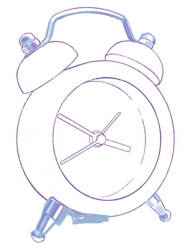
Figure 16.32: Shading viewed in Normal mode
The shininess of the steel will be played up further in the next subsection.
Adding light using Add mode
Metallic surfaces tend to show super bright reflections, so instead of using Screen like the previous sections, we’re going to use an Add layer to paint them, as follows:
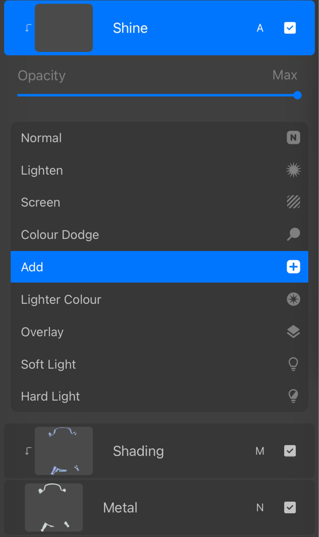
Figure 16.33: New Add layer
Using a light blue in the Add layer, we’ll draw in the reflections as follows:
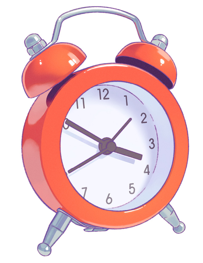
Figure 16.34: Reflections using Add
This Add layer in Normal mode appears as follows:

Figure 16.35: Reflections viewed in Normal mode
In the next section, we’ll give the artwork an additional bit of visual information to give it a proper finished look.
Finishing touches
We have finally arrived at the very last stage of the study. In the previous steps, we carefully rendered the individual materials and “built up” the clock. In this last section, we’re ready to give it the final push to make it a complete, appealing study.
Adding reflection using Screen mode
The first thing we have to consider is the glass covering the clock face, which we haven’t paid attention to up until this point. The presence of a transparent surface can be easily suggested by adding a reflection.
For this, create a Screen layer just underneath the clock body layers, as follows:
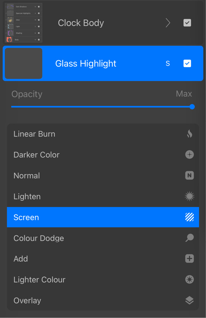
Figure 16.36: New Screen layer
In this layer, using sky blue, draw in a reflection on the upper-right side of the face, as follows:

Figure 16.37: Glass reflection using Screen
Note how doing so immediately suggests the presence of a transparent sheet in front of the clock face. In Normal mode, this layer appears as follows:
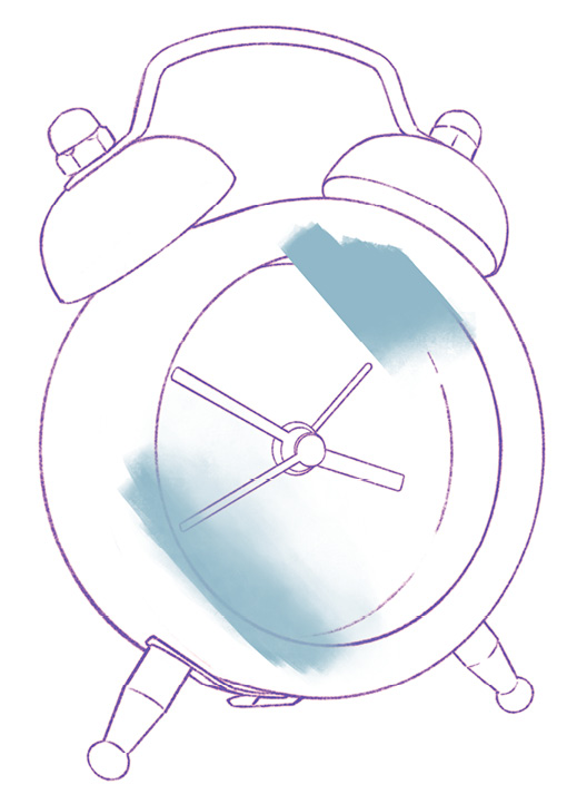
Figure 16.38: Glass reflection viewed in Normal mode
Even though this reflection isn’t present in the reference, it adds believability to our study. When doing a stylized study, it’s always fun to experiment with creative liberties and observe how it affects the art.
Next, we’ll up the presence of this reflection a bit more dramatically. To do so, duplicate the Screen layer and move it to the very top, above the line art, as follows:
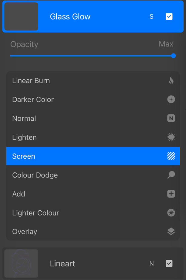
Figure 16.39: A duplicate Screen layer
Your artwork will now look like this:
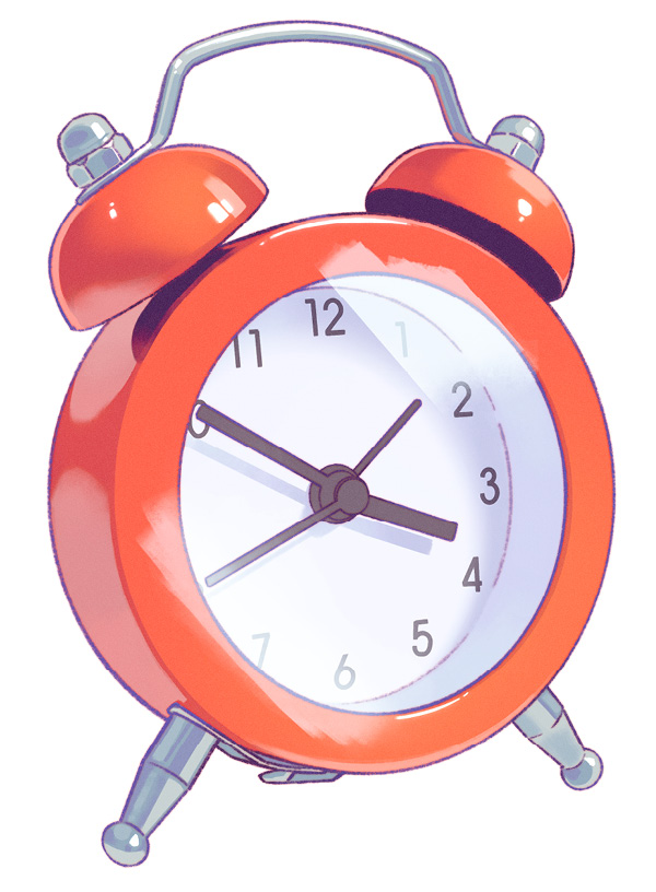
Figure 16.40: Screen layer copied
This layer is not clipped or hidden by anything, so we need to trim it down to match the shape of the clock face, as follows:
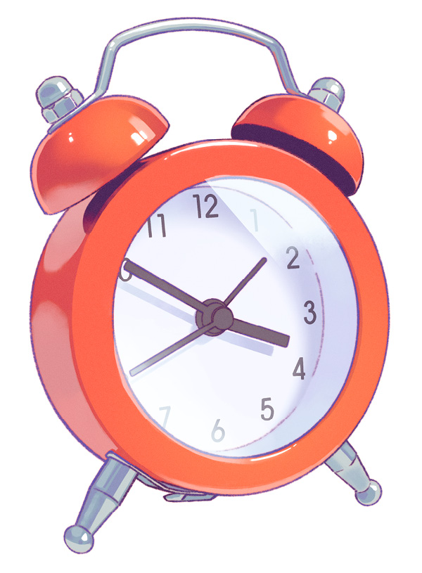
Figure 16.41: Trimming the Screen layer
It doesn’t have to be super clean because now we’re going to blur it slightly to achieve a glowing effect, as follows:

Figure 16.42: Glow using a blurred Screen layer
Notice how this alone adds so much personality to the little clock. It’s now the main character of the canvas.
To finish off, we can add a simple shadow, as follows, and our study is now complete:

Figure 16.43: The complete artwork
Now that we have completed the artwork, let’s summarize the chapter.
Summary
In this chapter, we focused on three commonly used modes, namely Multiply, Screen, and Add, as well as a brief mention of Hard Light mode. These were used to render different types of surfaces in different ways. Usually, Multiply is used to darken the base layer, while Screen is used to lighten, and Add is used when we want bright specs of light. In this specific study, we also used Hard Light to add a soft warm glow to the clock body.
If you have been following along on your own, you will have hopefully started to grasp the uses of blend modes. You’ll realize that these techniques can be applied to a wide variety of contexts, be it characters, landscapes, or any other subject. Procreate offers a variety of other blend modes, each with its unique effects. Based on your knowledge from this chapter, you will now be able to explore all of these modes in many different contexts.