10
Using Colour Tools
Working with colours is an essential part of using any digital painting software. Procreate offers a variety of ways to use and experiment with colours. In this chapter, you will learn how colour tools are organized in the Procreate app. These tools help you choose, edit, and save colours.
There are several types of colour interfaces to aid your unique style of working. Each of them has its own qualities and special functions, which will be introduced as you read further.
We’re going to cover the following broad topics in this chapter:
- Colour terms
- The interface
- Disc
- Classic
- Harmony
- Value
- Palettes
Colour terms
Before we dive into the interface, there are a few basic terms you should be familiar with that will help you navigate colour in a digital space. These terms are used to describe certain properties of colour and can be altered to create other colours. If you’re already an artist with some experience, you may be familiar with these terms. However, when starting out with digital art or art in general, it’s essential that you have a working knowledge of these words. These terms are hue, saturation, and value. Let’s look at them one by one.
Hue
Hue refers to the basic pigment making up the colour. For instance, the dark blue and light blue in the following figure both contain the same type of blue, hence their hue is the same:

Figure 10.1: Two colours of the same hue
However, when you look at the new pair of blues shown in the following figure, you’ll notice that the pigment differs between the two. In other words, their hues are different:

Figure 10.2: Two colours of different hues
Saturation
Saturation pertains to the intensity of pigment in a colour. In informal terms, this is what we mean when using the terms “bright” or “dull” to describe colours.
The following figure shows two yellow colours of the same hue, but one has high saturation, while the other low:

Figure 10.3: Two colours of the same hue but different saturation
At the lowest saturation, every colour turns into a neutral gray with no associated hue. However, in the real world, there are hardly any colours with zero saturation, which gives rise to “warm” and “cool” grays. Warm hues (such as red, orange, and yellow) at low saturation produce warm grays, as shown in the following figure:
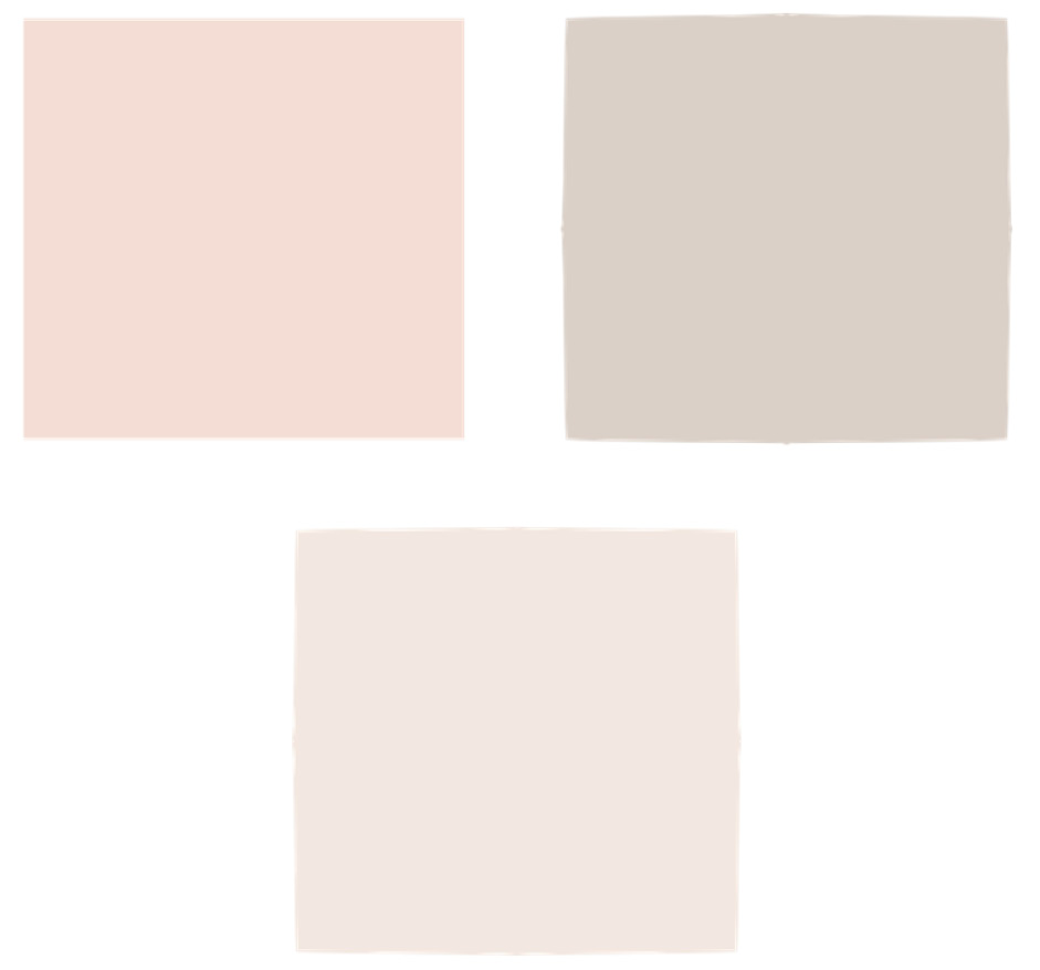
Figure 10.4: Warm grays
Similarly, cool colours (such as blue, violet, and green) produce cool grays, as shown in the following figure:
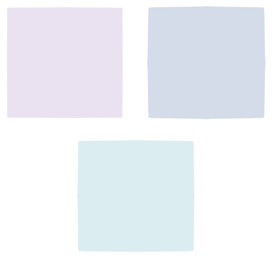
Figure 10.5: Cool grays
Value
The lightness or darkness of a colour is called its value. The value of a colour can be changed by pushing it towards black or white.
When a hue at maximum saturation is pushed towards black, its value decreases, giving rise to darker colours. This is demonstrated in the following figure:
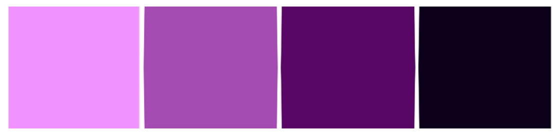
Figure 10.6: Values moving towards black
When a hue at maximum saturation is pushed towards white, its value increases, creating lighter colours, as shown in the following figure:
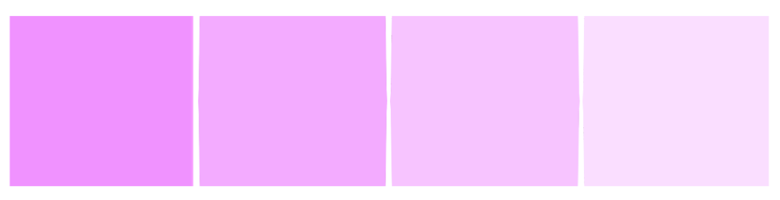
Figure 10.7: Values moving towards white
In the next section, we’ll jump right into the different tools Procreate offers you for working with colours.
The interface
When working with colours on Procreate, the interface plays a big role. This section will introduce the controls available to you that will allow you to explore the colour tools.
The Colours panel
The Colours panel is the window where all colour tools are available. It can be invoked by tapping on the coloured circle in the top-right corner of the screen, called the colour button. It is shown in the following figure
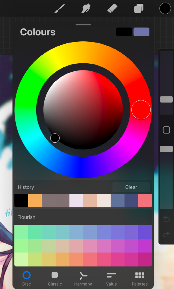
Figure 10.8: The Colours panel
The Colours panel has the following tools:
- Active colour: The colour displayed on the colour button is called the active colour. It’s the currently selected colour and shows you what you’re working with.
- Primary colour: In the top-right corner of the Colours panel, you will notice two coloured rectangles. The one on the left is called the primary colour. Usually, the primary colour is also the active colour.
- Secondary colour: The coloured rectangle to the right is the secondary colour. Just like the primary colour, it can be changed to any colour. However, if you close the Colours panel with the secondary colour selected, when you open it back up, the secondary colour will have switched positions with the primary colour.
Primary and secondary colours are useful when working with brushes that switch back and forth between the two. Learn more about using a secondary colour in brushes in Chapter 9, Brush Studio Settings – Editing and Combining Brushes.
- Reticle: When selecting colours from the Colours panel, a transparent circle sits on the colour wheel, highlighting the active colour. This is the reticle. It can be dragged around on the colour wheel to pick another colour. When dragged, it expands and shows a split view of the previous colour and the current one. This helps you see how these colours look in relation to each other.
- History: This section shows the last 10 colours used. It’s constantly updating, which means with every new colour picked, the oldest one at the end disappears.
Each new canvas comes with a clear history, but you can use the Clear button to get rid of it on your current canvas, too.
This section is available on iPad and iPad Pro models with a screen larger than 10.2 inches.
- Default palette: You can choose any palette from the Palettes section to be your default palette, that is, the colour palette that will be displayed in the Colours panel by default on every canvas. The default palette allows you to keep a commonly used palette at hand, so you can jump to specific colours easily.
- Colour selection interface: Procreate offers you five different ways to select and adjust colours – Disc, Classic, Harmony, Value, and Palettes. Depending on which of these you select, your colour selection interface will vary. We will talk about each of these tools in detail further in this chapter.
The Colours panel can be transformed into a floating window called Colour Companion. It is a feature that helps you keep the Colours panel within easy reach while you work. To invoke it, use the following steps:
- Open the Colours panel.
- Place your finger on the light gray bar at the top of the panel and drag.
- This will make the Colours panel pop out as a miniature floating window, called Colour Companion, as shown in the following figure:
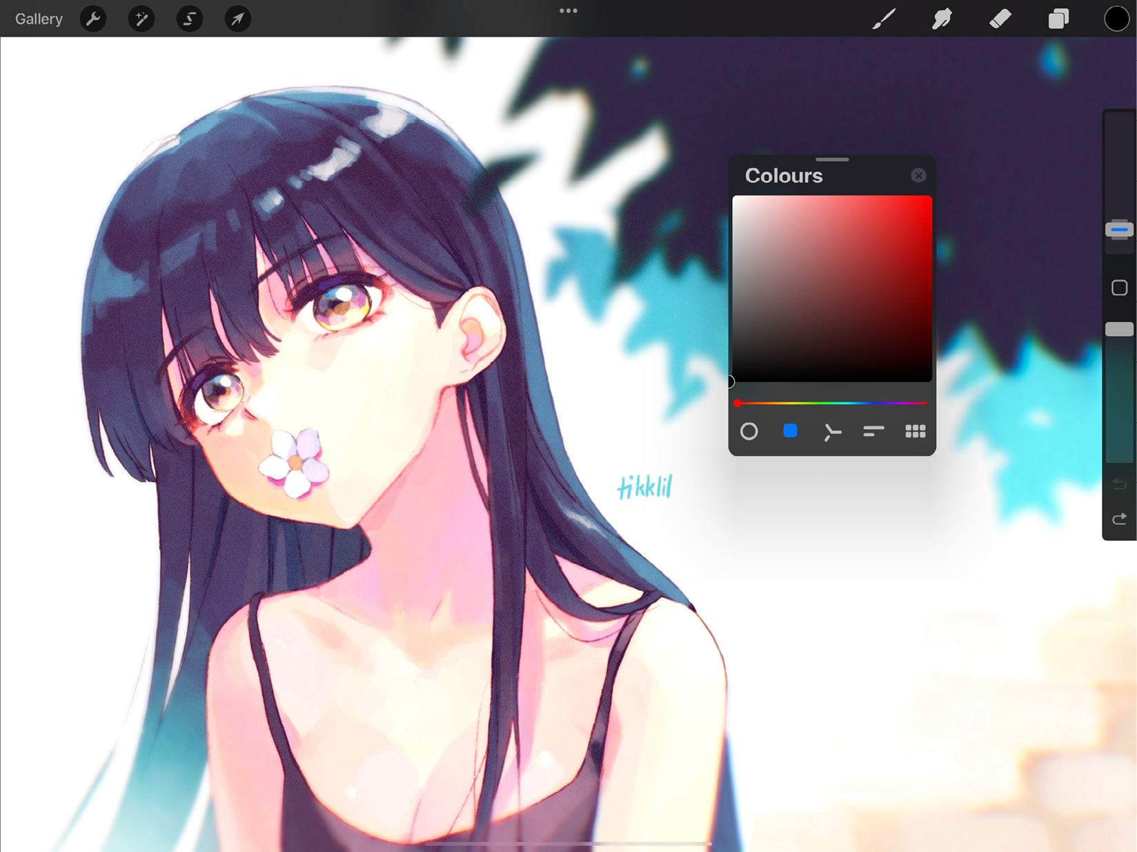
Figure 10.9: Colour Companion
- To close it, tap the x in the top-right corner of the window.
The next element of the Colours panel is the active colour.
Active colour
The colour button in the top-right corner of the screen shows the active colour. It primarily has two functions:
- Previous colour: Press and hold the active colour to switch to the previously selected colour.
- ColourDrop: This is Procreate’s version of colour filling. Simply drag the active colour over to any area of the canvas and release it to fill said area with the active colour. This gesture is demonstrated in the following figure:
Figure 10.10: ColourDrop
The next subsection will elaborate more on ColourDrop.
ColourDrop
ColourDrop helps you flood fill areas of the canvas, such as colouring line art, filling in shapes, and creating mono-colour layers. This is done by dragging the active colour over to the desired area and releasing it to fill it in.
An important feature of this tool is ColourDrop Threshold. This dictates how much area will be filled by ColourDrop. At low threshold values, the colour fill will stay confined to smaller spaces. At higher values, it will spill over the edges and cover more area by breaking colour or transparency boundaries. To activate the ColourDrop threshold, follow these steps:
- Drag the active colour to the area you want to fill, but don’t release your finger.
- A blue slider bar will appear at the top of your screen. This shows the threshold.
- Without lifting your finger, slide it toward the left or right to change the threshold value. At this point, another dropdown will appear above the slider bar, displaying the threshold value, as shown in the following figure:
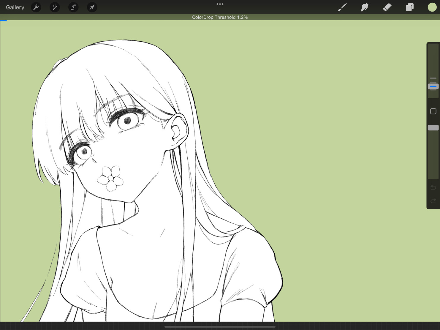
Figure 10.11: ColourDrop Threshold
- As you slide your finger to the left, you will see the threshold value decreasing and the colour fill receding to take up less space. Similarly, slide to the right, and the threshold value will increase to make the colour fill expand and break out of the edges.
- When you’re happy with the fill, release your finger. Procreate will remember your chosen threshold value and auto-apply it the next time you use ColourDrop. You can, however, change the threshold every single time.
The next feature of ColourDrop is also especially useful when used in conjunction with the threshold. It’s called Recolour, and it helps you fill colour multiple times in quick succession, without having to drag and drop the active colour over and over. To use Recolour, follow these steps:
- Use ColourDrop once. As soon as you lift your finger, you will see a drop-down message at the top of the screen that says Continue Filling with Recolour, as shown in the following figure:
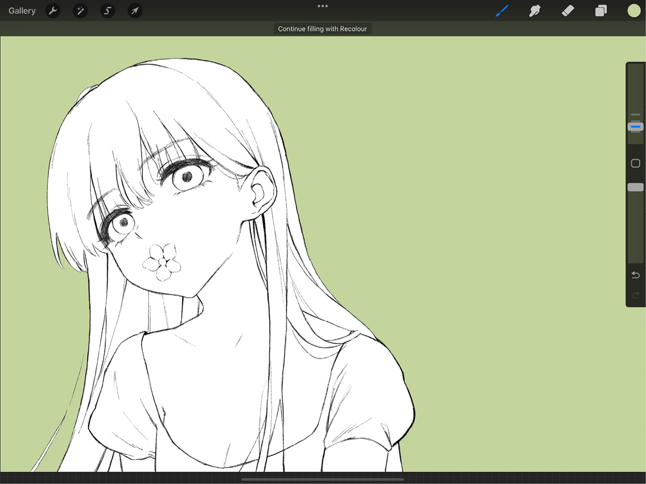
Figure 10.12: Continue Filling with Recolour
- Tap it to activate Recolour. A crosshair will appear at the center of the screen. Drag it anywhere to instantly fill it with the active colour. The crosshair is shown in the following figure:
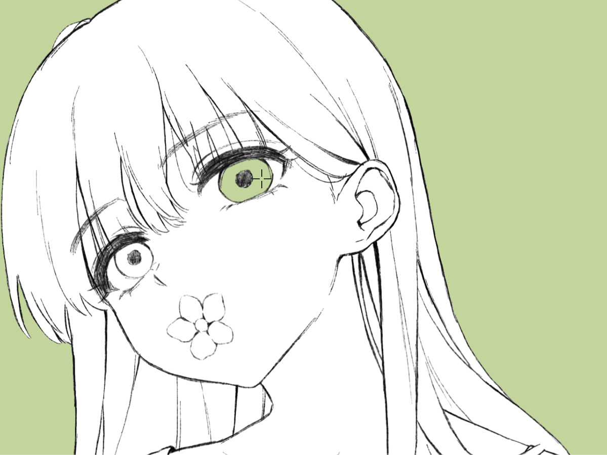
Figure 10.13: Recolour in action
- You can now simply tap on areas to continue filling them.
- A separate Flood slider will also appear at the bottom of the screen as soon as Recolour is activated. Use this to configure the fill threshold every time you fill a space:
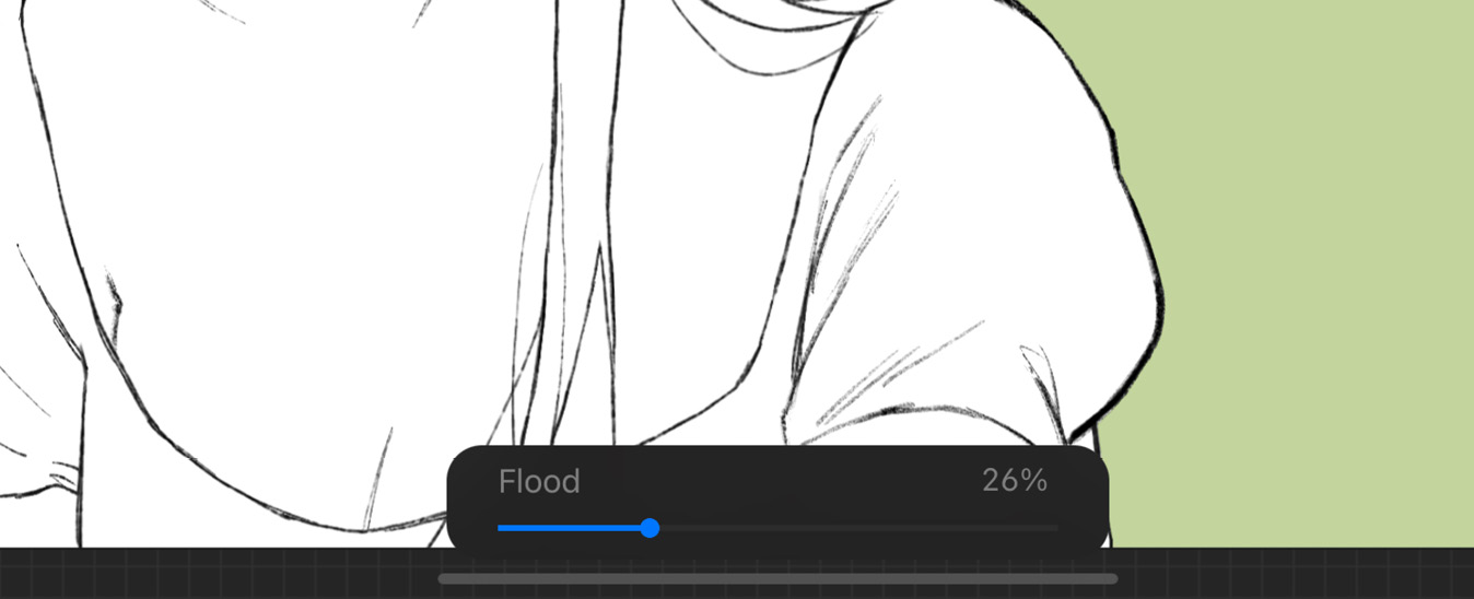
Figure 10.14: Flood slider
- Recolour lets you change the active colour between individual fills, so you can switch between several colours within a single use of Recolour.
- To exit Recolour and commit, simply tap any other tool and continue drawing normally.
The next subsection will introduce SwatchDrop, which is a feature similar to ColourDrop.
SwatchDrop
SwatchDrop lets you fill colours directly from a palette into your canvas. It works the same way as ColourDrop. The only difference is that instead of dragging the active colour, you drag a colour from a palette.
To access the palettes, follow these steps:
- Tap on the active colour to bring up the Colours panel.
- At the bottom, you’ll find five options, as shown in the following figure:
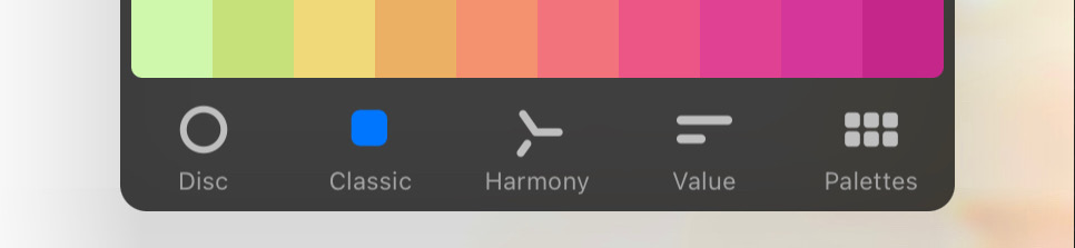
Figure 10.15: Colour interface options
- Select Palettes. This will reveal the colour palettes available, as shown in the following figure:

Figure 10.16: Palettes
- Drag and drop any colour directly from the palettes onto the canvas to colour fill it.
SwatchDrop works exactly like ColourDrop, including Drop Threshold and Recolour, so the previous section has all the information you’ll need for this.
In the next subsection, you will learn how to sample colours from your artwork using the Eyedropper.
Eyedropper
Pick a colour from any area of the canvas to make it your active colour, using the Eyedropper tool. There are several ways to use this tool.
The first way to invoke the Eyedropper is by tapping and holding. Touch the point on the canvas that you want to sample and hold it until a disc pops up there. The upper half of this disc shows the colour you are currently sampling, and the bottom half shows the last active colour, as in the following figure:
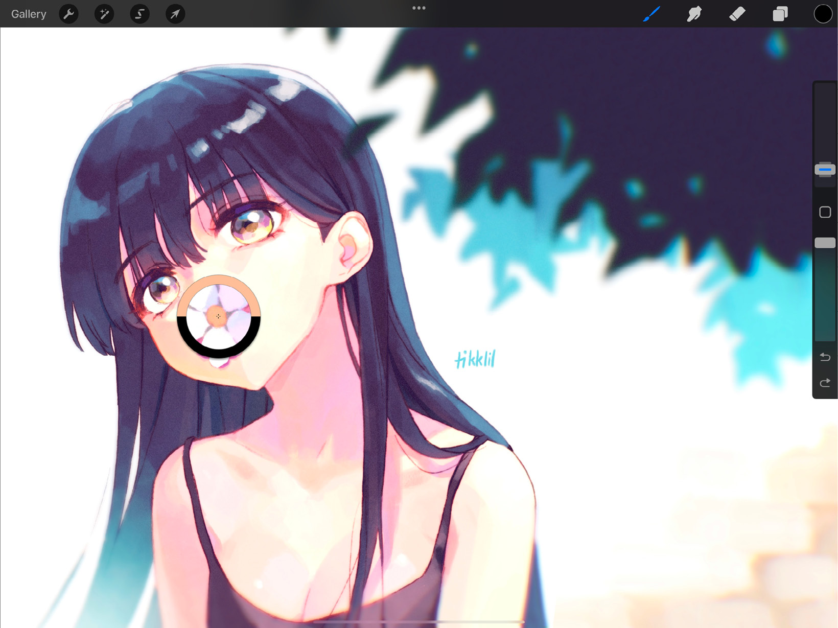
Figure 10.17: Eyedropper
You can sample colour throughout the canvas by just dragging your finger across the screen with Eyedropper activated. The disc will show you the picked colours in real time. In the center of the disc, you’ll see a zoomed-in section of the artwork from where you’re picking the colour.
The second way to use the Eyedropper is by using the Modify button. This is the square-shaped button found between the brush size and brush opacity sliders, shown in the following figure:
Figure 10.18: Modify button
The Modify button can be used to colour pick in either of these two ways:
- Tap and hold the Modify button, and with your other hand, touch the point on the canvas that you want to pick a colour from.
- The second option is a one-handed version of the last one. Tap the Modify button to invoke a floating Eyedropper tool, which will stay until you tap on the screen to pick a colour.
You can edit how the Modify button behaves using Gesture Controls. To learn more about gestures, refer to Chapter 6, Using Gestures and Shortcuts.
In the next few sections, we will learn about the five different interfaces that let you pick colours using the Colours panel.
Disc
The color disc is a versatile way to choose colours, by giving you control of the hue and saturation separately. Tap on the active colour and choose Disc from the options at the bottom, which will show you the disc interface, shown in the following figure:
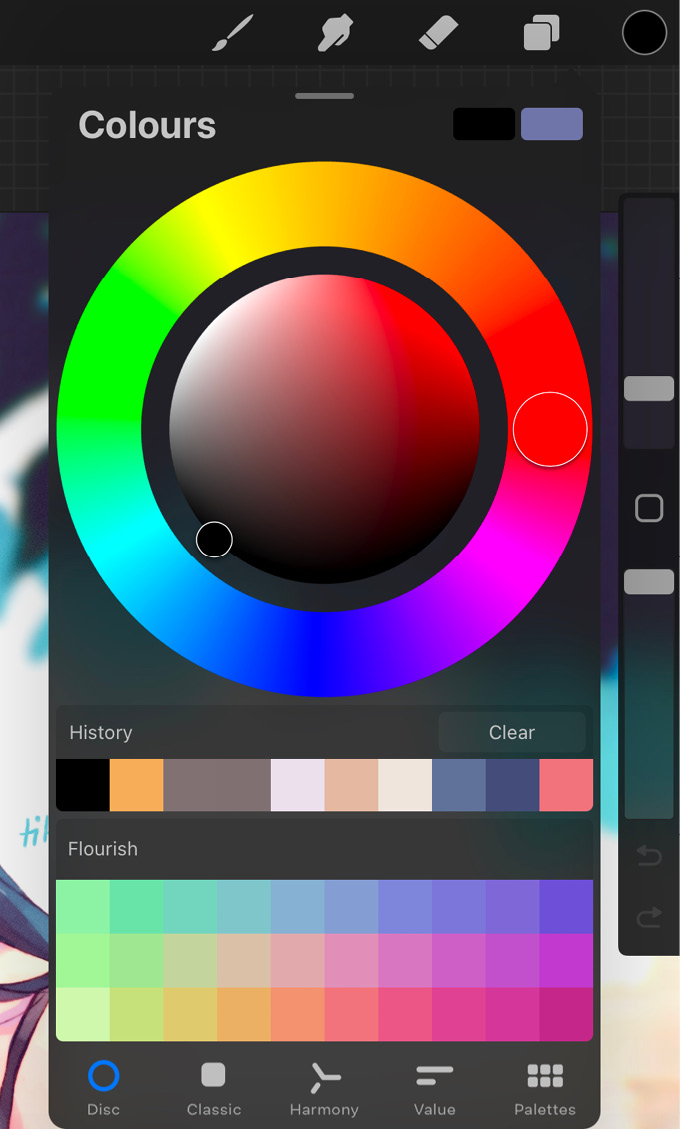
Figure 10.19: Disc
Let’s take a closer look at these controls.
Interface
The color disc allows you separate control over hue and saturation. The outer ring is a colour wheel from which you can choose a hue. The disc in the middle displays the saturation and value range for the chosen hue, from which you can pick your preferred colour.
Saturation disc controls
The saturation disc is quite small, which may make it difficult to make finer adjustments. To remedy this, it can act as a separate unit when certain gestures are used.
These gestures help you use the saturation disc more conveniently:
- Zoom: Perform a pinch-out gesture on the saturation disc to temporarily make it larger, as shown in the following figure:
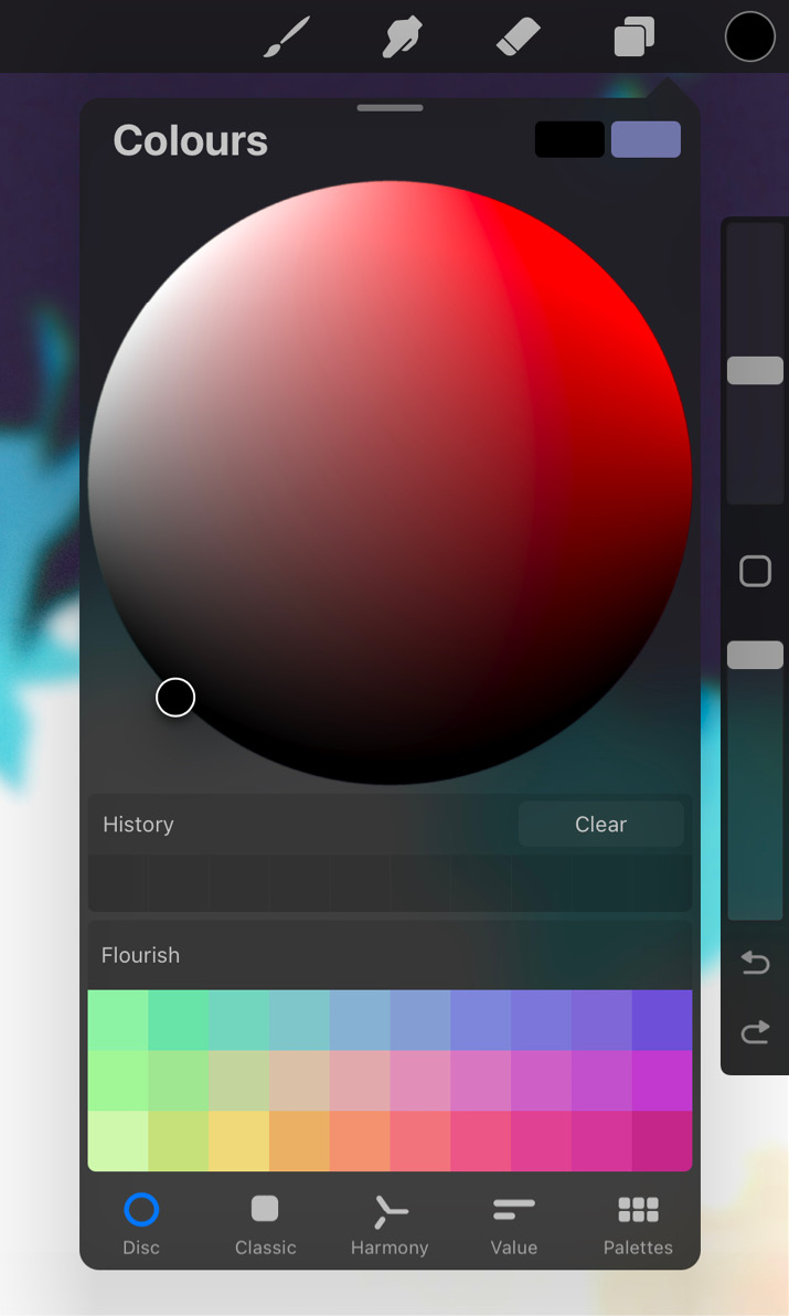
Figure 10.20: Saturation disc
This makes the hue ring disappear and gives you a bigger area to work with. Once you close the Colours panel, the disc goes back to normal.
- Snap: Double-tap on the reticle to snap to the closest perfect value. These values include pure white/black, half-saturation, full saturation, and 50% gray. Snap can be used on both the default size and the zoomed-in saturation disc.
Classic
For experienced digital illustrators looking for a more traditional approach to colours, the Classic interface is ideal. Tap on the active colour and select Classic to switch to this style colour selection. It is shown in the following figure:
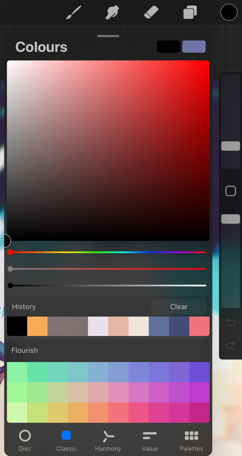
Figure 10.21: Classic
Let’s take a closer look at these controls.
Interface
The Classic interface has two major elements. The Classic colour window displays the saturation and value range of the selected hue, similar to the saturation disc in the previous section. It also has a reticle to let you choose colours.
Below that are three sliders pertaining to hue, saturation, and value. These sliders allow for finer control over all aspects of a chosen colour.
Harmony
The next option is a great way to pick colours that work well with each other to create harmonious combinations. Tap on the active colour and choose Harmony to use this tool, as shown in the following figure:
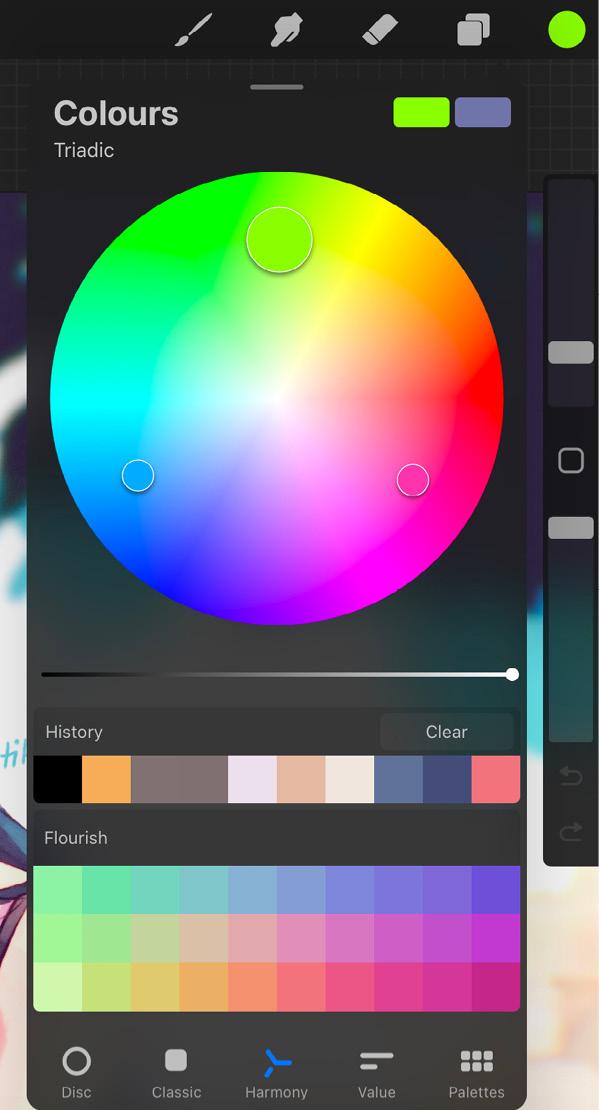
Figure 10.22: Harmony
Let’s take a closer look at these controls.
Interface
The interface of Harmony consists of a hue and saturation disc, with a separate slider for value. Changing the value slider makes the colour disc uniformly darker and lighter.
Reticles
The hue-saturation disc can have one or more reticles, depending on the harmony mode. These reticles rest on harmonious colour combinations. The larger reticle is called the primary, and the smaller ones are called the secondary reticles. When one is moved, the others move along with it, still maintaining their interrelationships.
Modes
Modes let you choose the type of colour relationships that will be selected by Harmony. Modes can be chosen from a menu in the top-left corner of the Colours panel, as shown here:
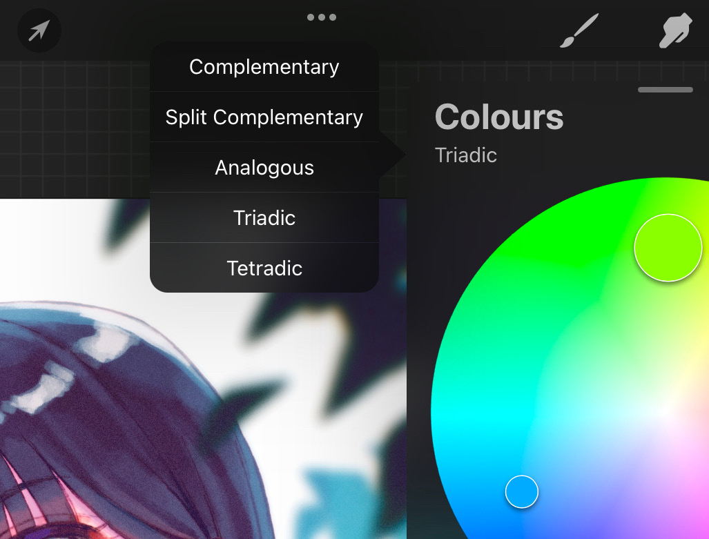
Figure 10.23: Harmony modes
There are the following types of harmony modes:
- Complementary: This mode offers two reticles that rest on diametrically opposite sides of the colour disc, that is, on complementary colours. The colours in such combinations produce very high contrast. So, it’s advised to be careful while using them together.
- Split Complementary: This mode has three reticles arranged in a narrow triangle shape. Aside from the primary reticle colour, it picks two colours on symmetrically opposite sides of its complementary colour. This gives rise to a subtler contrast than the last option. When using split complementary colours, it’s recommended to use the colour at the far end of the triangle as a base, with the other two used sparingly as shades and accents.
- Analogous: Analogous colours lie in the same area on the hue-saturation disc. This is a low-contrast mode that offers you three reticles to work with; they rest close to one another for subtle hue and saturation variation in colours.
- Triadic: This mode places three reticles in an equilateral triangle formation. Doing so creates a powerful combination of colours, each of which is equally impactful.
- Tetradic: This mode helps you choose colours using four reticles placed in a square formation. So, you get colours from diagonally opposite ends of the disc. Like the previous mode, this mode also places equal importance on all the colours with no clear hierarchy, so it can get tricky when balancing them together.
Choosing colors
When Harmony is activated, you can switch between colours by simply tapping any of the reticles.
You can also save your favorite colour combinations into a blank palette for future use. To do so, select the colour you want to save, and then tap on an empty swatch in your current default palette. This will create a new swatch of that colour in the palette. We’ll learn more about palettes in the Palettes section later in this chapter.
Value
Sometimes you may be working on a project that needs you to work with precise, accurate colours. Value is designed to help you with such requirements. It has precision sliders that help replicate colours and create exact shades. The interface of this tool is shown in the following figure:
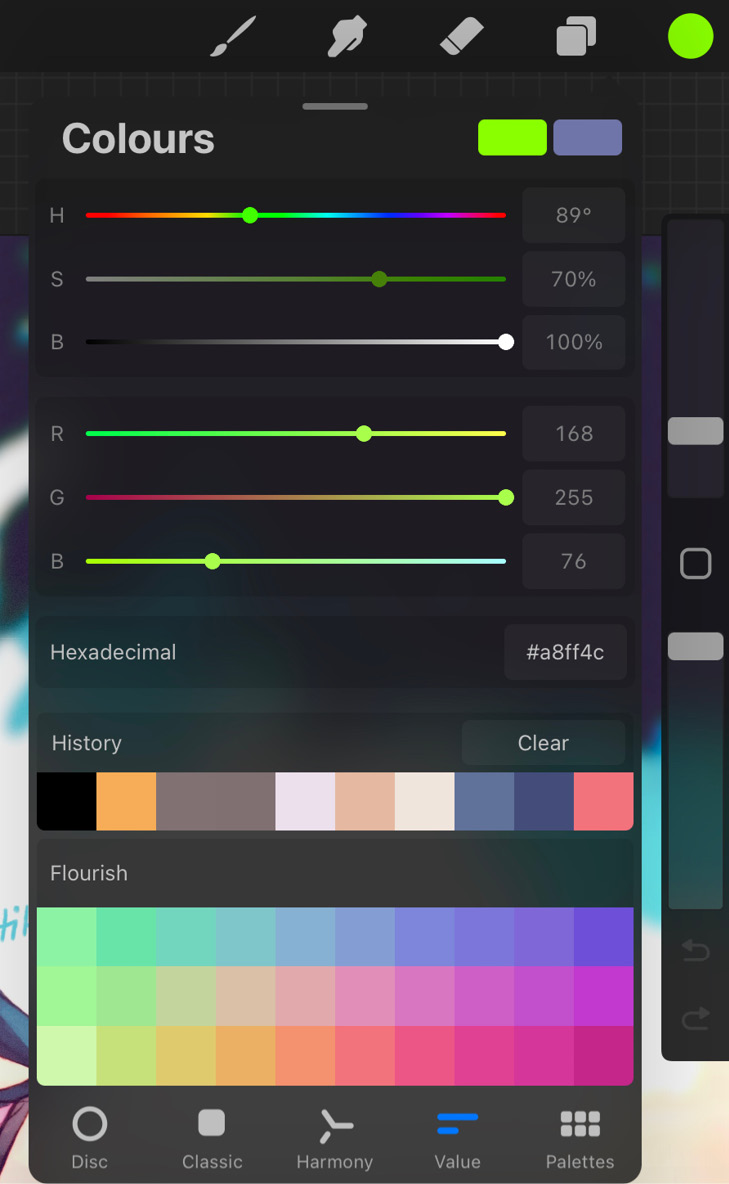
Figure 10.24: Value
Let’s take a closer look at these controls.
Interface
The interface of Value consists of six sliders and one text input box, as follows:
- Hue/Saturation/Brightness sliders: The first three sliders are labelled H (hue), S (saturation), and B (brightness or value). These work the same way as the sliders in Classic, affecting the hue, saturation, and value of the colour. Additionally, each slider has an input box next to it, which allows you to set its value manually. This gives you more precise control.
The Hue slider can have values ranging from 0-360° since this slider is essentially the circular colour wheel straightened out into a line. It starts at red, becomes green at 180°, and ends in red again at 360°.
The Saturation slider has values ranging from 0-100%, where 0% means no saturation, and 100% means the highest saturation.
The Brightness slider works the same way, where 0% is black and 100% is the brightest point of the colour.
- Red/Green/Blue sliders: Digital colour is made up of varying levels of red, green, and blue light emitted from the screen. These three sliders let you control the amount of each to create the colour you’re looking for. Each slider runs from 0 to 255. Turning all of them up to full value will give you white, and setting all of them to 0 will result in black.
Turn up Red to 255 and the other sliders to 0 to get pure red. This works the same way for pure green and blue. The following table shows some combinations of red, green, and blue:
|
RGB Values |
Result | ||
|
Red: 255 |
Green: 255 |
Blue: 255 |
White |
|
Red: 255 |
Green: 0 |
Blue: 0 |
Red |
|
Red: 0 |
Green: 255 |
Blue: 0 |
Green |
|
Red: 0 |
Green: 0 |
Blue: 255 |
Blue |
|
Red: 255 |
Green: 255 |
Blue: 0 |
Yellow |
|
Red: 255 |
Green: 0 |
Blue: 255 |
Magenta |
|
Red: 0 |
Green: 255 |
Blue: 255 |
Cyan |
|
Red: 0 |
Green: 0 |
Blue: 0 |
Black |
Hexadecimal: Every digital colour has a unique six-character code that represents it. These codes are written after a # symbol and are called hexadecimal (hex) codes. Procreate lets you input the hex code of your required colour into this text input box. This will let you maintain consistent colour schemes when working on projects that have such requirements.
Palettes
The last option in the Colours panel is Palettes. As the name suggests, this mode allows you to create and save colour schemes for ready use. Additionally, it also helps turn images into colour palettes. The interface of Palettes is shown in the following figure:

Figure 10.25: Palettes
Let’s look into the features of this colour tool in more detail.
Swatches
Swatches are the building blocks of a palette. Each individual colour in a palette, represented as a coloured square, is called a swatch. There are two ways that swatches are represented in Procreate:
- Compact: This is the more traditional view of colour palettes, with the swatches represented as small coloured boxes arranged in rows of 10, as shown in the following figure:
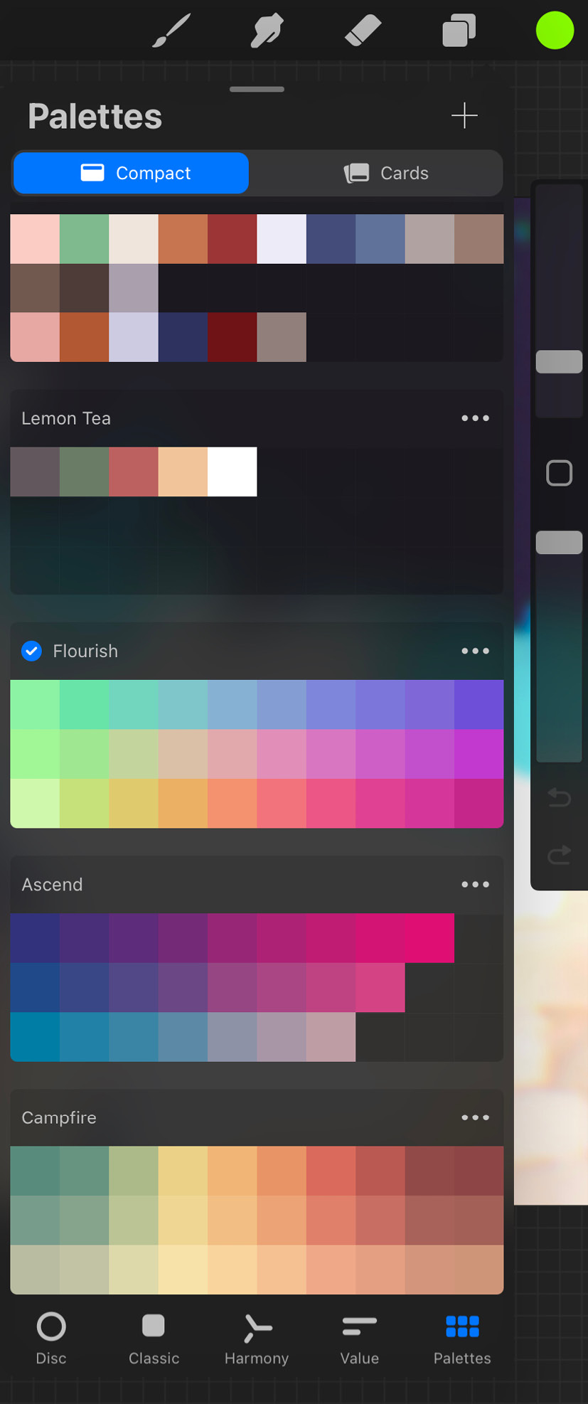
Figure 10.26: Compact view
- Cards: This is a new feature rolled out in Procreate 5.2, which displays each swatch as a much larger box in rows of three. Each swatch also has an auto-generated name to describe its colour, making it a great accessibility tool. Colour cards are shown in the following figure:
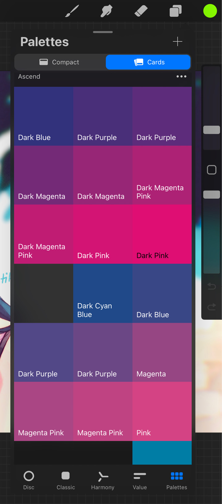
Figure 10.27: Cards view
To rename a card, tap on the name to invoke the keyboard, and minimize it to commit.
Next, let’s introduce some actions you can perform with swatches:
- Create a swatch: To create a new swatch, tap on any empty spot on a palette and assign it your active colour.
Alternatively, you could even create a fresh palette to give yourself more space to make your own swatches. Find more information about creating a palette in the Palette library section later in this chapter.
- SwatchDrop: This feature lets you drag and drop a swatch to fill colour into your canvas.
- Reorder swatches: To change the order in which swatches appear on a palette, simply tap and drag it to your desired position.
- Set swatch to current colour: Using this feature, you can change the colour of any swatch into your active/current colour. Tap and hold a swatch to make the following menu appear:
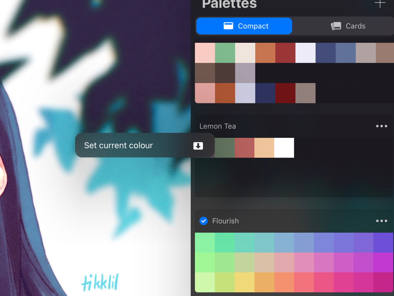
Figure 10.28: Set swatch to current colour
Then, tap Set current colour.
- Delete a swatch: To delete a swatch, tap and hold it to make the swatch menu appear. Then, tap Delete swatch.
In the next subsection, we will discuss the palette library, which is where all your palettes are stored.
Palette library
The palette library houses and displays all your palettes. This is essentially the interface you see when you select Palettes. From here, you can create, edit, import, and share palettes.
We will discuss the features of the palette library as follows:
- Create a palette: To create a blank palette, follow these steps:
- Tap on the + icon in the top-right corner of the library. This will bring up a menu, as shown in the following figure:
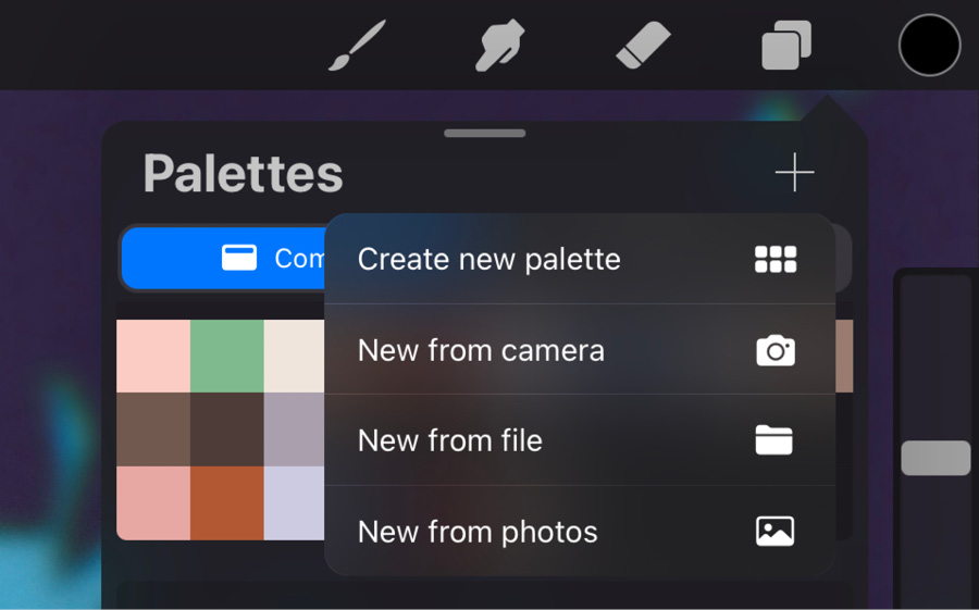
Figure 10.29: New palette menu
- From here, select Create new palette. This will make a new palette, comprising three rows of 10 swatches each.
- By default, a new palette is named Untitled Palette. Tap on this name to edit it.
- Set as default: A default palette is the one that appears at the bottom of the Colours panel when the Disc, Classic, or Harmony modes are active.
To set a palette as your default, tap on the three dots icon in the top-right corner of the palette. The following menu appears:
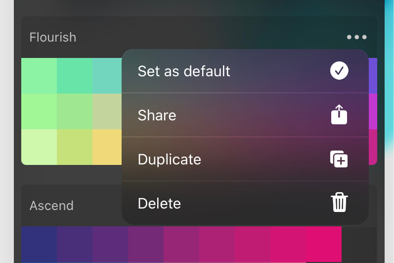
Figure 10.30: Palette menu
Select Set as default.
Important Note
From Palettes, simply select a swatch from any palette to automatically set said palette as the default.
- Share a palette: The Palettes menu also has an option called Share, which lets you share a palette to any external location. Alternatively, you can share a palette using drag-and-drop. More information on that can be found later in the Importing and sharing palettes section.
- Duplicate a palette: Create a copy of any palette using the Duplicate option in the Palettes menu.
- Reorder palettes: Hold and drag a palette to reposition it within the palette library. This method works for both the Compact and Cards views.
- Delete a palette: Bring up the Palettes menu using the three dots icon, and tap Delete to remove a palette. Be careful since this is a permanent action and can’t be undone.
The following subsection will introduce Palette Capture, a handy way to convert images into palettes.
Palette Capture
Palette Capture is an extremely useful feature that allows you to extract colour palettes from images as well as the camera.
There are two types of Palette Capture:
- Palette Capture from the camera: This type of Palette Capture uses the camera to create a colour palette with the colours captured by it.
To use it, follow these steps:
- Open Palettes in the Colours panel.
- Tap the + icon in the top right-hand corner of the window.
- From the menu, tap New from Camera. This will open up your iPad’s camera, with a palette of swatches in its center. This palette will change depending on what your camera sees at any given moment. The interface is shown in the following figure:
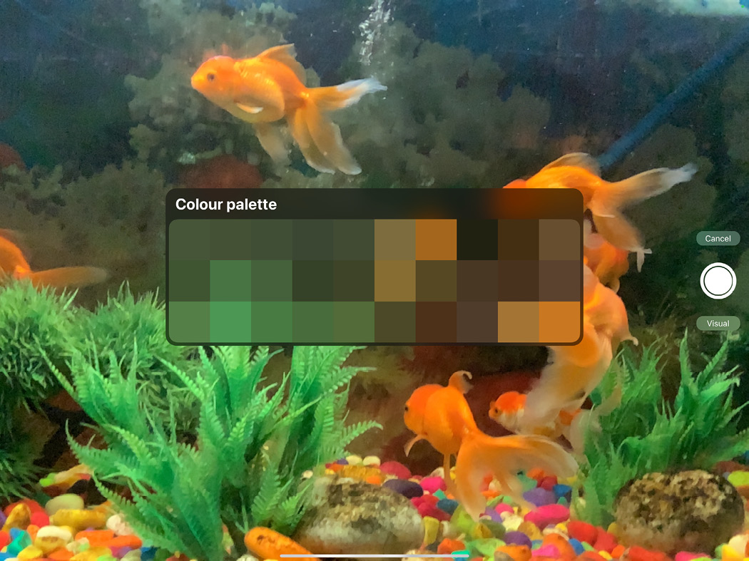
Figure 10.31: Palette Capture using the camera
Visual and Indexed are two modes that process the camera’s visual information in two different ways.
Visual considers only the section of the image right behind the floating palette in the center while creating a palette. This gives you a more limited set of swatches, as you can point the box at a specific place that you’d like to pick colours from.
Indexed considers the full field of the camera’s view and provides palettes sampled from all parts of the visible scene.
To use it, follow these steps:
- Open Palettes in the Colours panel.
- Tap the + icon in the top right-hand corner of the window.
- From the menu, tap New from File. This will take you to the Files app.
- From here, you can choose any JPG or PNG file, and the resulting palette will be sampled from the colours available on the chosen file.
To use it, follow these steps:
- Open Palettes in the Colours panel.
- Tap the + icon in the top right-hand corner of the window.
- From the menu, tap New from Photos. This will take you to the Photos app.
- From here, you can choose any image you have saved on the device, and the resulting palette will be sampled from the colours available on the chosen image.
Important Note
For a quicker import, simply drag and drop an image into the Palettes window to instantly create a new palette from the image.
In the next subsection, we will look at importing and sharing palettes.
Importing and sharing palettes
Procreate saves palettes with the .swatches extension. In this section, we’ll learn about the different ways in which you can import pre-existing palettes into your workspaces, as well as how to share your colour schemes to external locations.
To import a palette, follow these steps:
- Open Palettes in the Colours panel.
- Tap the + icon in the top right-hand corner of the window.
- From the menu, tap New from File. This will take you to the Files app.
- From here, choose any .swatches file to import the Procreate palette directly into your app.
Procreate palettes also support file extensions such as .ASE (Adobe® Swatch Exchange) and .ACO (Adobe® Colour).
Alternatively, you can also drag and drop a .swatches file from Files into Palettes.
To share a palette as a .swatches file, follow these steps:
- Open Palettes in the Colours panel.
- Go to the palette you want to export and tap the three dots icon in its top-right corner. A menu will appear, as shown in the following figure:
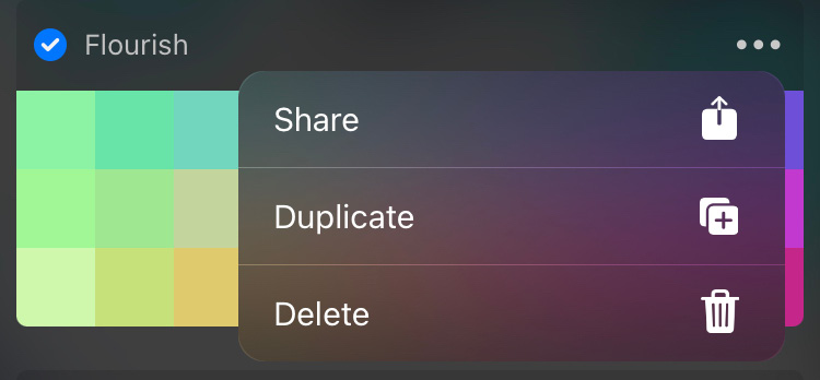
Figure 10.32: Palette menu
- From here, select Share.
- This will bring up the iOS file sharing interface, where you can pick a destination for this palette file.
Just like importing, you can also share a palette by dragging and dropping it into any compatible location (such as Files). Select multiple palettes to export them in bulk.
This chapter has covered all the colour tools available on Procreate. We can now summarize our knowledge.
Summary
Colours play a significant part in digital painting, and Procreate offers a range of useful tools to facilitate working with them. In this chapter, we’ve learned about the technical terms associated with colours. Then we detailed the app’s colour tools interface and gestures such as ColourDrop and SwatchDrop.
We learned about the Colours panel, which is the interface essential to working with all the different colour selection tools, namely Disc, Classic, Harmony, Value, and Palettes. This chapter discussed how each of these interfaces has a unique way of handling colour, and how to use them to suit your needs.
This chapter should help you explore digital colours further, and apply your knowledge to your own workflow.
In the next chapter, we’ll learn about the Adjustments menu, a handy set of image editing tools on Procreate.