8 Machine learning
-
Solving problems with machine learning algorithms
-
Grasping a machine learning life cycle, preparing data, and selecting algorithms
-
Understanding and implementing a linear-regression algorithm for predictions
-
Understanding and implementing a decision-tree learning algorithm for classification
-
Gaining intuition about other machine learning algorithms and their usefulness
What is machine learning?
Machine learning can seem like a daunting concept to learn and apply, but with the right framing and understanding of the process and algorithms, it can be interesting and fun.
Suppose that you’re looking for a new apartment. You speak to friends and family, and do some online searches for apartments in the city. You notice that apartments in different areas are priced differently. Here are some of your observations from all your research:
-
A one-bedroom apartment in the city center (close to work) costs $5,000 per month.
-
A two-bedroom apartment in the city center costs $7,000 per month.
-
A one-bedroom apartment in the city center with a garage costs $6,000 per month.
-
A one-bedroom apartment outside the city center, where you will need to travel to work, costs $3,000 per month.
-
A two-bedroom apartment outside the city center costs $4,500 per month.
-
A one-bedroom apartment outside the city center with a garage costs $3,800 per month.
You notice some patterns. Apartments in the city center are most expensive and are usually between $5,000 and $7,000 per month. Apartments outside the city are cheaper. Increasing the number of rooms adds between $1,500 and $2,000 per month, and access to a garage adds between $800 and $1,000 per month (figure 8.1).
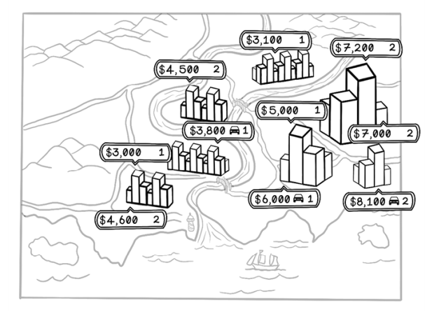
Figure 8.1 An illustration of property prices and features in different regions
This example shows how we use data to find patterns and make decisions. If you encounter a two-bedroom apartment in the city center with a garage, it’s reasonable to assume that the price would be approximately $8,000 per month.
Machine learning aims to find patterns in data for useful applications in the real world. We could spot the pattern in this small dataset, but machine learning spots them for us in large, complex datasets. Figure 8.2 depicts the relationships among different attributes of the data. Each dot represents an individual property.
Notice that there are more dots closer to the city center and that there is a clear pattern related to price per month: the price gradually drops as distance to the city center increases. There is also a pattern in the price per month related to the number of rooms; the gap between the bottom cluster of dots and the top cluster shows that the price jumps significantly. We could naïvely assume that this effect may be related to the distance from the city center. Machine learning algorithms can help us validate or invalidate this assumption. We dive into how this process works throughout this chapter.

Figure 8.2 Example visualization of relationships among data
Typically, data is represented in tables. The columns are referred to as features of the data, and the rows are referred to as examples. When we compare two features, the feature being measured is sometimes represented as y, and the features being changed are grouped as x. We will gain a better intuition for this terminology as we work through some problems.
Problems applicable to machine learning
Machine learning is useful only if you have data and have questions to ask that the data might answer. Machine learning algorithms find patterns in data but cannot do useful things magically. Different categories of machine learning algorithms use different approaches for different scenarios to answer different questions. These broad categories are supervised learning, unsupervised learning, and reinforcement learning (figure 8.3).
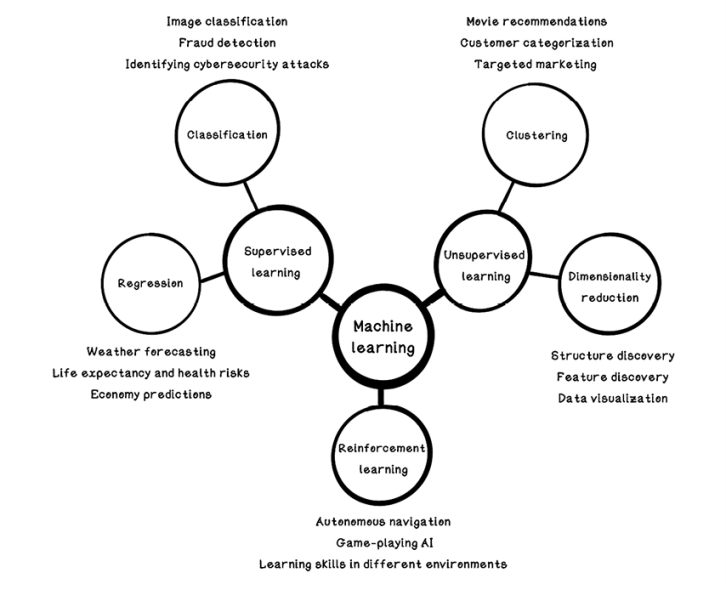
Figure 8.3 Categorization of machine learning and uses
Supervised learning
One of the most common techniques in traditional machine learning is supervised learning. We want to look at data, understand the patterns and relationships among the data, and predict the results if we are given new examples of different data in the same format. The apartment-finding problem is an example of supervised learning to find the pattern. We also see this example in action when we type a search that autocompletes or when music applications suggest new songs to listen to based on our activity and preference. Supervised learning has two subcategories: regression and classification.
Regression involves drawing a line through a set of data points to most closely fit the overall shape of the data. Regression can be used for applications such as trends between marketing initiatives and sales. (Is there a direct relationship between marketing through online ads and actual sales of a product?) It can also be used to determine factors that affect something. (Is there a direct relationship between time and the value of cryptocurrency, and will cryptocurrency increase exponentially in value as time passes?)
Classification aims to predict categories of examples based on their features. (Can we determine whether something is a car or a truck based on its number of wheels, weight, and top speed?)
Unsupervised learning
Unsupervised learning involves finding underlying patterns in data that may be difficult to find by inspecting the data manually. Unsupervised learning is useful for clustering data that has similar features and uncovering features that are important in the data. On an e-commerce site, for example, products might be clustered based on customer purchase behavior. If many customers purchase soap, sponges, and towels together, it is likely that more customers would want that combination of products, so soap, sponges, and towels would be clustered and recommended to new customers.
Reinforcement learning
Reinforcement learning is inspired by behavioral psychology and operates by rewarding or punishing an algorithm based on its actions in an environment. It has similarities to supervised learning and unsupervised learning, as well as many differences. Reinforcement learning aims to train an agent in an environment based on rewards and penalties. Imagine rewarding a pet for good behavior with treats; the more it is rewarded for a specific behavior, the more it will exhibit that behavior. We discuss reinforcement learning in chapter 10.
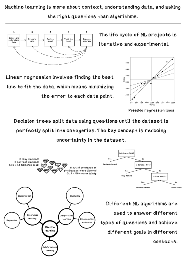
A machine learning workflow
Machine learning isn’t just about algorithms. In fact, it is often about the context of the data, the preparation of the data, and the questions that are asked.
We can find questions in two ways:
-
A problem can be solved with machine learning, and the right data needs to be collected to help solve it. Suppose that a bank has a vast amount of transaction data for legitimate and fraudulent transactions, and it wants to train a model with this question: “Can we detect fraudulent transactions in real time?”
-
We have data in a specific context and want to determine how it can be used to solve several problems. An agriculture company, for example, might have data about the weather in different locations, nutrition required for different plants, and the soil content in different locations. The question might be “What correlations and relationships can we find among the different types of data?” These relationships may inform a more concrete question, such as “Can we determine the best location for growing a specific plant based on the weather and soil in that location?”
Figure 8.4 is a simplified view of the steps involved in a typical machine learning endeavor.
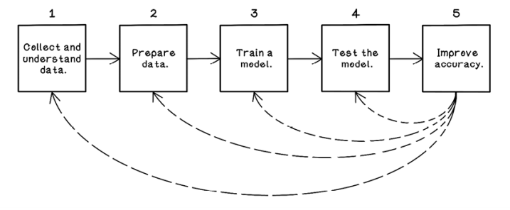
Figure 8.4 A workflow for machine learning experiments and projects
Collecting and understanding data: Know your context
Collecting and understanding the data you’re working with is paramount to a successful machine learning endeavor. If you’re working in a specific area in the finance industry, knowledge of the terminology and workings of the processes and data in that area is important for sourcing the data that is best to help answer questions for the goal you’re trying to achieve. If you want to build a fraud detection system, understanding what data is stored about transactions and what it means is critical to identifying fraudulent transactions. Data may also need to be sourced from various systems and combined to be effective. Sometimes, the data we use is augmented with data from outside the organization to enhance accuracy. In this section, we use an example dataset about diamond measurements to understand the machine learning workflow and explore various algorithms (figure 8.5).

Figure 8.5 Terminology of diamond measurements
Table 8.1 describes several diamonds and their properties. X, Y, and Z describe the size of a diamond in the three spatial dimensions. Only a subset of data is used in the examples.
|
Carat |
Cut |
Color |
Clarity |
Depth |
Table |
Price |
X |
Y |
Z |
|
|
1 |
0.30 |
Good |
J |
SI1 |
64.0 |
55 |
339 |
4.25 |
4.28 |
2.73 |
|
2 |
0.41 |
Ideal |
I |
SI1 |
61.7 |
55 |
561 |
4.77 |
4.80 |
2.95 |
|
3 |
0.75 |
Very Good |
D |
SI1 |
63.2 |
56 |
2,760 |
5.80 |
5.75 |
3.65 |
|
4 |
0.91 |
Fair |
H |
SI2 |
65.7 |
60 |
2,763 |
6.03 |
5.99 |
3.95 |
|
5 |
1.20 |
Fair |
F |
I1 |
64.6 |
56 |
2,809 |
6.73 |
6.66 |
4.33 |
|
6 |
1.31 |
Premium |
J |
SI2 |
59.7 |
59 |
3,697 |
7.06 |
7.01 |
4.20 |
|
7 |
1.50 |
Premium |
H |
I1 |
62.9 |
60 |
4,022 |
7.31 |
7.22 |
4.57 |
|
8 |
1.74 |
Very Good |
H |
I1 |
63.2 |
55 |
4,677 |
7.62 |
7.59 |
4.80 |
|
9 |
1.96 |
Fair |
I |
I1 |
66.8 |
55 |
6,147 |
7.62 |
7.60 |
5.08 |
|
10 |
2.21 |
Premium |
H |
I1 |
62.2 |
58 |
6,535 |
8.31 |
8.27 |
5.16 |
The diamond dataset consists of 10 columns of data, which are referred to as features. The full dataset has more than 50,000 rows. Here’s what each feature means:
-
Carat—The weight of the diamond. Out of interest: 1 carat equals 200 mg.
-
Cut—The quality of the diamond, by increasing quality: fair, good, very good, premium, and ideal.
-
Color—The color of the diamond, ranging from D to J, where D is the best color and J is the worst color. D indicates a clear diamond, and J indicates a foggy one.
-
Clarity—The imperfections of the diamond, by decreasing quality: FL, IF, VVS1, VVS2, VS1, VS2, SI1, SI2, I1, I2, and I3. (Don’t worry about understanding these code names; they simply represent different levels of perfection.)
-
Depth—The percentage of depth, which is measured from the culet to the table of the diamond. Typically, the table-to-depth ratio is important for the “sparkle” aesthetic of a diamond.
-
Table—The percentage of the flat end of the diamond relative to the X dimension.
-
Price—The price of the diamond when it was sold.
-
X—The x dimension of the diamond, in millimeters.
-
Y—The y dimension of the diamond, in millimeters.
-
Z—The z dimension of the diamond, in millimeters.
Keep this dataset in mind; we will be using it to see how data is prepared and processed by machine learning algorithms.
Preparing data: Clean and wrangle
Real-world data is never ideal to work with. Data might be sourced from different systems and different organizations, which may have different standards and rules for data integrity. There are always missing data, inconsistent data, and data in a format that is difficult to work with for the algorithms that we want to use.
In the sample diamond dataset in table 8.2, again, it is important to understand that the columns are referred to as the features of the data and that each row is an example.
Table 8.2 The diamond dataset with missing data
|
Carat |
Cut |
Color |
Clarity |
Depth |
Table |
Price |
X |
Y |
Z |
|
|
1 |
0.30 |
Good |
J |
SI1 |
64.0 |
55 |
339 |
4.25 |
4.28 |
2.73 |
|
2 |
0.41 |
Ideal |
I |
si1 |
61.7 |
55 |
561 |
4.77 |
4.80 |
2.95 |
|
3 |
0.75 |
Very Good |
D |
SI1 |
63.2 |
56 |
2,760 |
5.80 |
5.75 |
3.65 |
|
4 |
0.91 |
- |
H |
SI2 |
- |
60 |
2,763 |
6.03 |
5.99 |
3.95 |
|
5 |
1.20 |
Fair |
F |
I1 |
64.6 |
56 |
2,809 |
6.73 |
6.66 |
4.33 |
|
6 |
1.21 |
Good |
E |
I1 |
57.2 |
62 |
3,144 |
7.01 |
6.96 |
3.99 |
|
7 |
1.31 |
Premium |
J |
SI2 |
59.7 |
59 |
3,697 |
7.06 |
7.01 |
4.20 |
|
8 |
1.50 |
Premium |
H |
I1 |
62.9 |
60 |
4,022 |
7.31 |
7.22 |
4.57 |
|
9 |
1.74 |
Very Good |
H |
i1 |
63.2 |
55 |
4,677 |
7.62 |
7.59 |
4.80 |
|
10 |
1.83 |
fair |
J |
I1 |
70.0 |
58 |
5,083 |
7.34 |
7.28 |
5.12 |
|
11 |
1.96 |
Fair |
I |
I1 |
66.8 |
55 |
6,147 |
7.62 |
7.60 |
5.08 |
|
12 |
- |
Premium |
H |
i1 |
62.2 |
- |
6,535 |
8.31 |
- |
5.16 |
Missing data
In table 8.2, example 4 is missing values for the Cut and Depth features, and example 12 is missing values for Carat, Table, and Y. To compare examples, we need complete understanding of the data, and missing values make this difficult. A goal for a machine learning project might be to estimate these values; we cover estimations in the upcoming material. Assume that missing data will be problematic in our goal to use it for something useful. Here are some ways to deal with missing data:
-
Remove—Remove the examples that have missing values for features—in this case, examples 4 and 12 (table 8.3). The benefit of this approach is that the data is more reliable because nothing is assumed; however, the removed examples may have been important to the goal we’re trying to achieve.
Table 8.3 The diamond dataset with missing data: removing examples
|
Carat |
Cut |
Color |
Clarity |
Depth |
Table |
Price |
X |
Y |
Z |
|
|
1 |
0.30 |
Good |
J |
SI1 |
64.0 |
55 |
339 |
4.25 |
4.28 |
2.73 |
|
2 |
0.41 |
Ideal |
I |
si1 |
61.7 |
55 |
561 |
4.77 |
4.80 |
2.95 |
|
3 |
0.75 |
Very Good |
D |
SI1 |
63.2 |
56 |
2,760 |
5.80 |
5.75 |
3.65 |
|
4 |
0.91 |
- |
H |
SI2 |
- |
60 |
2,763 |
6.03 |
5.99 |
3.95 |
|
5 |
1.20 |
Fair |
F |
I1 |
64.6 |
56 |
2,809 |
6.73 |
6.66 |
4.33 |
|
6 |
1.21 |
Good |
E |
I1 |
57.2 |
62 |
3,144 |
7.01 |
6.96 |
3.99 |
|
7 |
1.31 |
Premium |
J |
SI2 |
59.7 |
59 |
3,697 |
7.06 |
7.01 |
4.20 |
|
8 |
1.50 |
Premium |
H |
I1 |
62.9 |
60 |
4,022 |
7.31 |
7.22 |
4.57 |
|
9 |
1.74 |
Very Good |
H |
i1 |
63.2 |
55 |
4,677 |
7.62 |
7.59 |
4.80 |
|
10 |
1.83 |
fair |
J |
I1 |
70.0 |
58 |
5,083 |
7.34 |
7.28 |
5.12 |
|
11 |
1.96 |
Fair |
I |
I1 |
66.8 |
55 |
6,147 |
7.62 |
7.60 |
5.08 |
|
12 |
- |
Premium |
H |
i1 |
62.2 |
- |
6,535 |
8.31 |
- |
5.16 |
-
Mean or median—Another option is to replace the missing values with the mean or median for the respective feature.
The mean is the average calculated by adding all the values and dividing by the number of examples. The median is calculated by ordering the examples by value ascending and choosing the value in the middle.
Using the mean is easy and efficient to do but doesn’t take into account possible correlations between features. This approach cannot be used with categorical features such as the Cut, Clarity, and Depth features in the diamond dataset (table 8.4).
Table 8.4 The diamond dataset with missing data: using mean values
|
Carat |
Cut |
Color |
Clarity |
Depth |
Table |
Price |
X |
Y |
Z |
|
|
1 |
0.30 |
Good |
J |
SI1 |
64.0 |
55 |
339 |
4.25 |
4.28 |
2.73 |
|
2 |
0.41 |
Ideal |
I |
si1 |
61.7 |
55 |
561 |
4.77 |
4.80 |
2.95 |
|
3 |
0.75 |
Very Good |
D |
SI1 |
63.2 |
56 |
2,760 |
5.80 |
5.75 |
3.65 |
|
4 |
0.91 |
- |
H |
SI2 |
- |
60 |
2,763 |
6.03 |
5.99 |
3.95 |
|
5 |
1.20 |
Fair |
F |
I1 |
64.6 |
56 |
2,809 |
6.73 |
6.66 |
4.33 |
|
6 |
1.21 |
Good |
E |
I1 |
57.2 |
62 |
3,144 |
7.01 |
6.96 |
3.99 |
|
7 |
1.31 |
Premium |
J |
SI2 |
59.7 |
59 |
3,697 |
7.06 |
7.01 |
4.20 |
|
8 |
1.50 |
Premium |
H |
I1 |
62.9 |
60 |
4,022 |
7.31 |
7.22 |
4.57 |
|
9 |
1.74 |
Very Good |
H |
i1 |
63.2 |
55 |
4,677 |
7.62 |
7.59 |
4.80 |
|
10 |
1.83 |
fair |
J |
I1 |
70.0 |
58 |
5,083 |
7.34 |
7.28 |
5.12 |
|
11 |
1.96 |
Fair |
I |
I1 |
66.8 |
55 |
6,147 |
7.62 |
7.60 |
5.08 |
|
12 |
1.19 |
Premium |
H |
i1 |
62.2 |
57 |
6,535 |
8.31 |
- |
5.16 |
To calculate the mean of the Table feature, we add every available value and divide the total by the number of values used:
Using the Table mean for the missing values seems to make sense, because the table size doesn’t seem to differ radically among different examples of data. But there could be correlations that we do not see, such as the relationship between the table size and the width of the diamond (X dimension).
On the other hand, using the Carat mean does not make sense, because we can see a correlation between the Carat feature and the Price feature if we plot the data on a graph. The price seems to increase as the Carat value increases.
-
Most frequent—Replace the missing values with the value that occurs most often for that feature, which is known as the mode of the data. This approach works well with categorical features but doesn’t take into account possible correlations among features, and it can introduce bias by using the most frequent values.
-
(Advanced) Statistical approaches—Use k-nearest neighbor, or neural networks. K-nearest neighbor uses many features of the data to find an estimated value. Similar to k-nearest neighbor, a neural network can predict the missing values accurately, given enough data. Both algorithms are computationally expensive for the purpose of handling missing data.
-
(Advanced) Do nothing—Some algorithms handle missing data without any preparation, such as XGBoost, but the algorithms that we will be exploring will fail.
Ambiguous values
Another problem is values that mean the same thing but are represented differently. Examples in the diamond dataset are rows 2, 9, 10, and 12. The values for the Cut and Clarity features are lowercase instead of uppercase. Note that we know this only because we understand these features and the possible values for them. Without this knowledge, we might see Fair and fair as different categories. To fix this problem, we can standardize these values to uppercase or lowercase to maintain consistency (table 8.5).
Table 8.5 The diamond dataset with ambiguous data: standardizing values
|
Carat |
Cut |
Color |
Clarity |
Depth |
Table |
Price |
X |
Y |
Z |
|
|
1 |
0.30 |
Good |
J |
SI1 |
64.0 |
55 |
339 |
4.25 |
4.28 |
2.73 |
|
2 |
0.41 |
Ideal |
I |
si1 |
61.7 |
55 |
561 |
4.77 |
4.80 |
2.95 |
|
3 |
0.75 |
Very Good |
D |
SI1 |
63.2 |
56 |
2,760 |
5.80 |
5.75 |
3.65 |
|
4 |
0.91 |
- |
H |
SI2 |
- |
60 |
2,763 |
6.03 |
5.99 |
3.95 |
|
5 |
1.20 |
Fair |
F |
I1 |
64.6 |
56 |
2,809 |
6.73 |
6.66 |
4.33 |
|
6 |
1.21 |
Good |
E |
I1 |
57.2 |
62 |
3,144 |
7.01 |
6.96 |
3.99 |
|
7 |
1.31 |
Premium |
J |
SI2 |
59.7 |
59 |
3,697 |
7.06 |
7.01 |
4.20 |
|
8 |
1.50 |
Premium |
H |
I1 |
62.9 |
60 |
4,022 |
7.31 |
7.22 |
4.57 |
|
9 |
1.74 |
Very Good |
H |
i1 |
63.2 |
55 |
4,677 |
7.62 |
7.59 |
4.80 |
|
10 |
1.83 |
fair |
J |
I1 |
70.0 |
58 |
5,083 |
7.34 |
7.28 |
5.12 |
|
11 |
1.96 |
Fair |
I |
I1 |
66.8 |
55 |
6,147 |
7.62 |
7.60 |
5.08 |
|
12 |
1.19 |
Premium |
H |
i1 |
62.2 |
57 |
6,535 |
8.31 |
- |
5.16 |
Encoding categorical data
Because computers and statistical models work with numeric values, there will be a problem with modeling string values and categorical values such as Fair, Good, SI1, and I1. We need to represent these categorical values as numerical values. Here are ways to accomplish this task:
-
One-hot encoding—Think about one-hot encoding as switches, all of which are off except one. The one that is on represents the presence of the feature at that position. If we were to represent Cut with one-hot encoding, the Cut feature becomes five different features, and each value is 0 except for the one that represents the Cut value for each respective example. Note that the other features have been removed in the interest of space in table 8.6.
Table 8.6 The diamond dataset with encoded values
|
Carat |
Cut: Fair |
Cut: Good |
Cut: Very Good |
Cut: Premium |
Cut: Ideal |
|
|
1 |
0.30 |
0 |
1 |
0 |
0 |
0 |
|
2 |
0.41 |
0 |
0 |
0 |
0 |
1 |
|
3 |
0.75 |
0 |
0 |
1 |
0 |
0 |
|
4 |
0.91 |
0 |
0 |
0 |
0 |
0 |
|
5 |
1.20 |
1 |
0 |
0 |
0 |
0 |
|
6 |
1.21 |
0 |
1 |
0 |
0 |
0 |
|
7 |
1.31 |
0 |
0 |
0 |
1 |
0 |
|
8 |
1.50 |
0 |
0 |
0 |
1 |
0 |
|
9 |
1.74 |
0 |
0 |
1 |
0 |
0 |
|
10 |
1.83 |
1 |
0 |
0 |
0 |
0 |
|
11 |
1.96 |
1 |
0 |
0 |
0 |
0 |
|
12 |
1.19 |
0 |
0 |
0 |
1 |
0 |
-
Label encoding—Represent each category as a number between 0 and the number of categories. This approach should be used only for ratings or rating-related labels; otherwise, the model that we will be training will assume that the number carries weight for the example and can introduce unintended bias.
Exercise: Identify and fix the problem data in this example
Decide which data preparation techniques can be used to fix the following dataset. Decide which rows to delete, what values to use the mean for, and how categorical values will be encoded. Note that the dataset is slightly different from what we’ve been working with thus far.
|
Carat |
Origin |
Depth |
Table |
Price |
X |
Y |
Z |
|
|
1 |
0.35 |
South Africa |
64.0 |
55 |
450 |
4.25 |
2.73 |
|
|
2 |
0.42 |
Canada |
61.7 |
55 |
680 |
4.80 |
2.95 |
|
|
3 |
0.87 |
Canada |
63.2 |
56 |
2,689 |
5.80 |
5.75 |
3.65 |
|
4 |
0.99 |
Botswana |
65.7 |
2,734 |
6.03 |
5.99 |
3.95 |
|
|
5 |
1.34 |
Botswana |
64.6 |
56 |
2,901 |
6.73 |
6.66 |
|
|
6 |
1.45 |
South Africa |
59.7 |
59 |
3,723 |
7.06 |
7.01 |
4.20 |
|
7 |
1.65 |
Botswana |
62.9 |
60 |
4,245 |
7.31 |
7.22 |
4.57 |
|
8 |
1.79 |
63.2 |
55 |
4,734 |
7.62 |
7.59 |
4.80 |
|
|
9 |
1.81 |
Botswana |
66.8 |
55 |
6,093 |
7.62 |
7.60 |
5.08 |
|
10 |
2.01 |
South Africa |
62.2 |
58 |
7,452 |
8.31 |
8.27 |
5.16 |
Solution: Identify and fix the problem data in this example
One approach for fixing this dataset involves the following three tasks:
- Remove row 8 due to missing Origin. We don’t know what the dataset will be used for. If the Origin feature is important, this row will be missing and it may cause issues. Alternatively, the value for this feature could be estimated if it has a relationship with other features.
- Use one-hot encoding to encode the Origin column value. In the example explored thus far in the chapter, we used label encoding to convert string values to numeric values. This approach worked because the values indicated more superior cut, clarity, or color. In the case of Origin, the value identifies where the diamond was sourced. By using label encoding, we introduce bias to the dataset, because no Origin location is better than another in this dataset.
- Find the mean for missing values. Row 1, 2, 4, and 5 are missing values for Y, X, Table, and Z, respectively. Using a mean value should be a good technique because, as we know about diamonds, the dimensions and table features are related.
Testing and training data
Before we jump into training a linear regression model, we need to ensure that we have data to teach (or train) the model, as well as some data to test how well it does in predicting new examples. Think back to the property-price example. After gaining a feel for the attributes that affect price, we could make a price prediction by looking at the distance and number of rooms. For this example, we will use table 8.7 as the training data because we have more real-world data to use for training later.
Training a model: Predict with linear regression
Choosing an algorithm to use is based largely on two factors: the question that is being asked and the nature of the data that is available. If the question is to make a prediction about the price of a diamond with a specific carat weight, regression algorithms can be useful. The algorithm choice also depends on the number of features in the dataset and the relationships among those features. If the data has many dimensions (there are many features to consider to make a prediction), we can consider several algorithms and approaches.
Regression means predicting a continuous value, such as the price or carat of the diamond. Continuous means that the values can be any number in a range. The price of $2,271, for example, is a continuous value between 0 and the maximum price of any diamond that regression can help predict.
Linear regression is one of the simplest machine learning algorithms; it finds relationships between two variables and allows us to predict one variable given the other. An example is predicting the price of a diamond based on its carat value. By looking at many examples of known diamonds, including their price and carat values, we can teach a model the relationship and ask it to estimate predictions.
Fitting a line to the data
Let’s start trying to find a trend in the data and attempt to make some predictions. For exploring linear regression, the question we’re asking is “Is there a correlation between the carats of a diamond and its price, and if there is, can we make accurate predictions?”
We start by isolating the carat and price features and plotting the data on a graph. Because we want to find the price based on carat value, we will treat carats as x and price as y. Why did we choose this approach?
-
Carat as the independent variable (x)—An independent variable is one that is changed in an experiment to determine the effect on a dependent variable. In this example, the value for carats will be adjusted to determine the price of a diamond with that value.
-
Price as the dependent variable (y)—A dependent variable is one that is being tested. It is affected by the independent variable and changes based on the independent variable value changes. In our example, we are interested in the price given a specific carat value.
Figure 8.6 shows the carat and price data plotted on a graph, and table 8.7 describes the actual data.
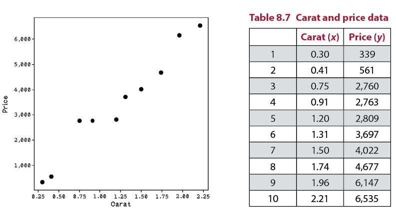
Figure 8.6 A scatterplot of carat and price data
Notice that compared with Price, the Carat values are tiny. The price goes into the thousands, and carats are in the range of decimals. To make the calculations easier to understand for the purposes of learning in this chapter, we can scale the Carat values to be comparable to the Price values. By multiplying every Carat value by 1,000, we get numbers that are easier to compute by hand in the upcoming walkthroughs. Note that by scaling all the rows, we are not affecting the relationships in the data, because every example has the same operation applied to it. The resulting data (figure 8.7) is represented in table 8.8.
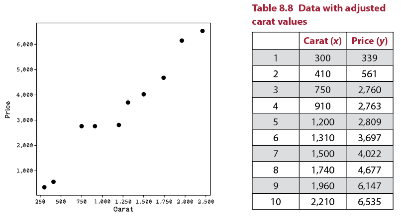
Figure 8.7 A scatterplot of carat and price data
Finding the mean of the features
The first thing we need to do to find a regression line is find the mean for each feature. The mean is the sum of all values divided by the number of values. The mean is 1,229 for carats, represented by the vertical line on the x axis. The mean is $3,431 for price, represented by the horizontal line on the y axis (figure 8.8).
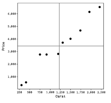
Figure 8.8 The means of x and y represented by vertical and horizontal lines
The mean is important because mathematically, any regression line we find will pass through the intersection of the mean of x and the mean of y. Many lines may pass through this point. Some regression lines might be better than others at fitting the data. The method of least squares aims to create a line that minimizes the distances between the line and among all the points in the dataset. The method of least squares is a popular method for finding regression lines. Figure 8.9 illustrates examples of regression lines.
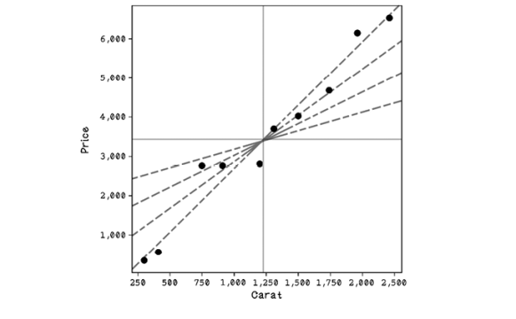
Figure 8.9 Possible regression lines
Finding regression lines with the least-squares method
But what is the regression line’s purpose? Suppose that we’re building a subway that tries to be as close as possible to all major office buildings. It will not be feasible to have a subway line that visits every building; there will be too many stations and it will cost a lot. So, we will try to create a straight-line route that minimizes the distance to each building. Some commuters may have to walk farther than others, but the straight line is optimized for everyone’s office. This goal is exactly what a regression line aims to achieve; the buildings are data points, and the line is the straight subway path (figure 8.10).
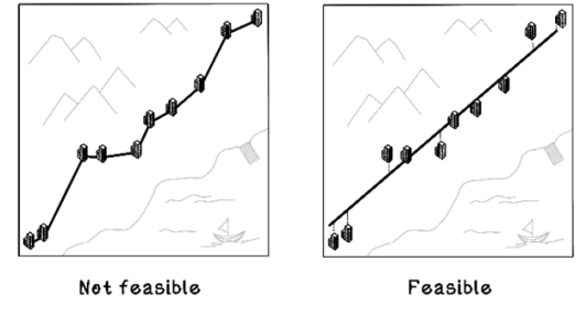
Figure 8.10 Intuition of regression lines
Linear regression will always find a straight line that fits the data to minimize distance among points overall. Understanding the equation for a line is important because we will be learning how to find the values for the variables that describe a line.
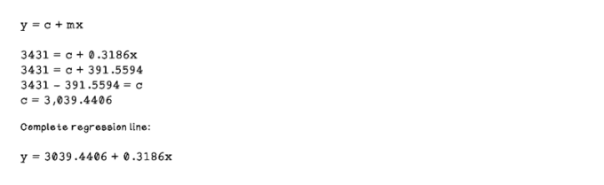
A straight line is represented by the equation y = c + mx (figure 8.11):
-
y: The dependent variable
-
m: The slope of the line
-
c: The y-value where the line intercepts the y axis
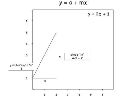
Figure 8.11 Intuition of the equation that represents a line
The method of least squares is used to find the regression line. At a high level, the process involves the steps depicted in figure 8.12. To find the line that’s closest to the data, we find the difference between the actual data values and the predicted data values. The differences for data points will vary. Some differences will be large, and some will be small. Some differences will be negative values, and some will be positive values. By squaring the differences and summing them, we take into consideration all differences for all data points. Minimizing the total difference is getting the least square difference to achieve a good regression line. Don’t worry if figure 8.12 looks a bit daunting; we will work through each step.
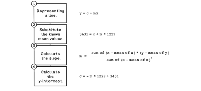
Figure 8.12 The basic workflow for calculating a regression line
Thus far, our line has some known variables. We know that an x value is 1,229 and a y value is 3,431, as shown in step 2.
Next, we calculate the difference between every Carat value and the Carat mean, as well as the difference between every Price value and the Price mean, to find (x – mean of x) and (y – mean of y), which is used in step 3 (table 8.9).
Table 8.9 The diamond dataset and calculations
|
Carat (x) |
Price (y) |
x – mean of x |
y – mean of y |
|||
|
1 |
300 |
339 |
300 – 1,229 |
-929 |
339 – 3,431 |
-3,092 |
|
2 |
410 |
561 |
410 – 1,229 |
-819 |
561 – 3,431 |
-2,870 |
|
3 |
750 |
2,760 |
750 – 1,229 |
-479 |
2,760 – 3,431 |
-671 |
|
4 |
910 |
2,763 |
910 – 1,229 |
-319 |
2,763 – 3,431 |
-668 |
|
5 |
1,200 |
2,809 |
2,100 – 1,229 |
-29 |
2,809 – 3,431 |
-622 |
|
6 |
1,310 |
3,697 |
1,310 – 1,229 |
81 |
3,697 – 3,431 |
266 |
|
7 |
1,500 |
4,022 |
1,500 – 1,229 |
271 |
4,022 – 3,431 |
591 |
|
8 |
1,740 |
4,677 |
1,740 – 1,229 |
511 |
4,677 – 3,431 |
1,246 |
|
9 |
1,960 |
6,147 |
1,960 – 1,229 |
731 |
6,147 – 3,431 |
2,716 |
|
10 |
2,210 |
6,535 |
2,210 – 1,229 |
981 |
6,535 – 3,431 |
3,104 |
|
1,229 |
3,431 |
|||||
|
Means |
For step 3, we also need to calculate the square of the difference between every carat and the carat mean to find (x – mean of x)^2. We also need to sum these values to minimize, which equals 3,703,690 (table 8.10).
Table 8.10 The diamond dataset and calculations, part 2
|
Carat (x) |
Price (y) |
x – mean of x |
y – mean of y |
(x – mean of x)^2 |
|||
|
1 |
300 |
339 |
300 – 1,229 |
-929 |
339 – 3,431 |
-3,092 |
863,041 |
|
2 |
410 |
561 |
410 – 1,229 |
-819 |
561 – 3,431 |
-2,870 |
670,761 |
|
3 |
750 |
2,760 |
750 – 1,229 |
-479 |
2,760 – 3,431 |
-671 |
229,441 |
|
4 |
910 |
2,763 |
910 – 1,229 |
-319 |
2,763 – 3,431 |
-668 |
101,761 |
|
5 |
1,200 |
2,809 |
2,100 – 1,229 |
-29 |
2,809 – 3,431 |
-622 |
841 |
|
6 |
1,310 |
3,697 |
1,310 – 1,229 |
81 |
3,697 – 3,431 |
266 |
6,561 |
|
7 |
1,500 |
4,022 |
1,500 – 1,229 |
271 |
4,022 – 3,431 |
591 |
73,441 |
|
8 |
1,740 |
4,677 |
1,740 – 1,229 |
511 |
4,677 – 3,431 |
1,246 |
261,121 |
|
9 |
1,960 |
6,147 |
1,960 – 1,229 |
731 |
6,147 – 3,431 |
2,716 |
534,361 |
|
10 |
2,210 |
6,535 |
2,210 – 1,229 |
981 |
6,535 – 3,431 |
3,104 |
962,361 |
|
1,229 |
3,431 |
3,703,690 |
|||||
|
Means |
Sums |
||||||
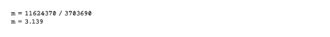
The last missing value for the equation in step 3 is the value for (x – mean of x) * (y – mean of y). Again, the sum of the values is required. The sum equals 11,624,370 (table 8.11).
Table 8.11 The diamond dataset and calculations, part 3
|
Carat (x) |
Price (y) |
x – mean of x |
y – mean of y |
(x – mean of x)^2 |
(x – mean of x) * (y – mean of y) |
|||
|
1 |
300 |
339 |
300 – 1,229 |
-929 |
339 – 3,431 |
-3,092 |
863,041 |
2,872,468 |
|
2 |
410 |
561 |
410 – 1,229 |
-819 |
561 – 3,431 |
-2,870 |
670,761 |
2,350,530 |
|
3 |
750 |
2,760 |
750 – 1,229 |
-479 |
2,760 – 3,431 |
-671 |
229,441 |
321,409 |
|
4 |
910 |
2,763 |
910 – 1,229 |
-319 |
2,763 – 3,431 |
-668 |
101,761 |
213,092 |
|
5 |
1,200 |
2,809 |
2,100 – 1,229 |
-29 |
2,809 – 3,431 |
-622 |
841 |
18,038 |
|
6 |
1,310 |
3,697 |
1,310 – 1,229 |
81 |
3,697 – 3,431 |
266 |
6,561 |
21,546 |
|
7 |
1,500 |
4,022 |
1,500 – 1,229 |
271 |
4,022 – 3,431 |
591 |
73,441 |
160,161 |
|
8 |
1,740 |
4,677 |
1,740 – 1,229 |
511 |
4,677 – 3,431 |
1,246 |
261,121 |
636,706 |
|
9 |
1,960 |
6,147 |
1,960 – 1,229 |
731 |
6,147 – 3,431 |
2,716 |
534,361 |
1,985,396 |
|
10 |
2,210 |
6,535 |
2,210 – 1,229 |
981 |
6,535 – 3,431 |
3,104 |
962,361 |
3,045,024 |
|
1,229 |
3,431 |
3,703,690 |
11,624,370 |
|||||
|
Means |
Sums |
|||||||
Now we can plug in the calculated values to the least-squares equation to calculate m:
Now that we have a value for m, we can calculate c by substituting the mean values for x and y. Remember that all regression lines will pass this point, so it is a known point within the regression line:
Finally, we can plot the line by generating some values for carats between the minimum value and maximum value, plugging them into the equation that represents the regression line, and then plotting it (figure 8.13):
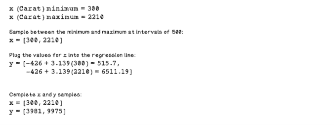
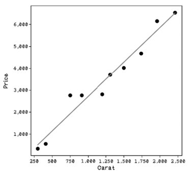
Figure 8.13 A regression line plotted with the data points
We’ve trained a linear regression line based on our dataset that accurately fits the data, so we’ve done some machine learning by hand.
Exercise: Calculate a regression line using the least-squares method
Following the steps described and using the following dataset, calculate the regression line with the least-squares method.
|
Carat (x) |
Price (y) |
|
|
1 |
320 |
350 |
|
2 |
460 |
560 |
|
3 |
800 |
2,760 |
|
4 |
910 |
2,800 |
|
5 |
1,350 |
2,900 |
|
6 |
1,390 |
3,600 |
|
7 |
1,650 |
4,000 |
|
8 |
1,700 |
4,650 |
|
9 |
1,950 |
6,100 |
|
10 |
2,000 |
6,500 |
Solution: Calculate a regression line using the least-squares method
The means for each dimension need to be calculated. The means are 1,253 for x and 3,422 for y. The next step is calculating the difference between each value and its mean. Next, the square of the difference between x and the mean of x is calculated and summed, which results in 3,251,610. Finally, the difference between x and the mean of x is multiplied by the difference between y and the mean of y and summed, resulting in 10,566,940.
|
Carat (x) |
Price (y) |
x – mean of x |
y – mean of y |
(x – mean of x)^2 |
(x – mean of x) * (y – mean of y) |
|
|
1 |
320 |
350 |
-933 |
-3,072 |
870,489 |
2,866,176 |
|
2 |
460 |
560 |
-793 |
-2,862 |
628,849 |
2,269,566 |
|
3 |
800 |
2,760 |
-453 |
-662 |
205,209 |
299,886 |
|
4 |
910 |
2,800 |
-343 |
-622 |
117,649 |
213,346 |
|
5 |
1,350 |
2,900 |
97 |
-522 |
9,409 |
-50,634 |
|
6 |
1,390 |
3,600 |
137 |
178 |
18,769 |
24,386 |
|
7 |
1,650 |
4,000 |
397 |
578 |
157,609 |
229,466 |
|
8 |
1,700 |
4,650 |
447 |
1,228 |
199,809 |
548,916 |
|
9 |
1,950 |
6,100 |
697 |
2,678 |
485,809 |
1,866,566 |
|
10 |
2,000 |
6,500 |
747 |
3,078 |
558,009 |
2,299,266 |
|
1,253 |
3,422 |
3,251,610 |
10,566,940 |
The values can be used to calculate the slope, m:
m = 10566940 / 3251610
m = 3.25
Remember the equation for a line:
y = c + mx
Substitute the mean values for x and y and the newly calculated m:
3422 = c + 3.35 * 1253
c = -775.55
Substitute the minimum and maximum values for x to calculate points to plot a line:
Point 1, we use the minimum value for Carat: x = 320
y = 775.55 + 3.25 * 320
y = 1 815.55
Point 2, we use the maximum value for Carat: x = 2000
y = 775.55 + 3.25 * 2000
y = 7 275.55
Now that we have an intuition about how to use linear regression and how regression lines are calculated, let’s take a look at the pseudocode.
Pseudocode
The code is similar to the steps that we walked through. The only interesting aspects are the two for loops used to calculate summed values by iterating over every element in the dataset:
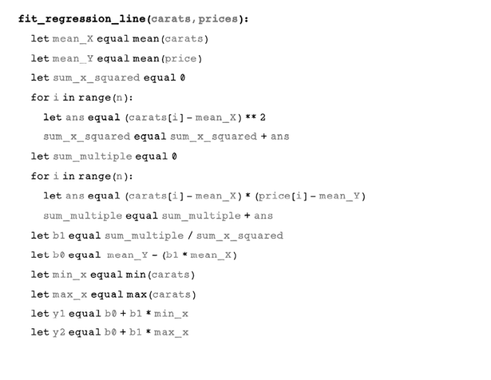
Testing the model: Determine the accuracy of the model
Now that we have determined a regression line, we can use it to make price predictions for other Carat values. We can measure the performance of the regression line with new examples in which we know the actual price and determine how accurate the linear regression model is.
We can’t test the model with the same data that we used to train it. This approach would result in high accuracy and be meaningless. The trained model must be tested with real data that it hasn’t been trained with.
Separating training and testing data
Training and testing data are usually split 80/20, with 80% of the available data used as training data and 20% used to test the model. Percentages are used because the number of examples needed to train a model accurately is difficult to know; different contexts and questions being asked may need more or less data.
Figure 8.14 and table 8.12 represent a set of testing data for the diamond example. Remember that we scaled the Carat values to be similar-size numbers to the Price values (all Carat values have been multiplied by 1,000) to make them easier to read and work with. The dots represent the testing data points, and the line represents the trained regression line.
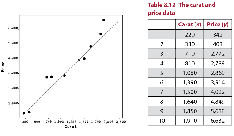
Figure 8.14 A regression line plotted with the data points
Testing a model involves making predictions with unseen training data and then comparing the accuracy of the model’s prediction with the actual values. In the diamond example, we have the actual Price values, so we will determine what the model predicts and compare the difference.
Measuring the performance of the line
In linear regression, a common method of measuring the accuracy of the model is calculating R2 (R squared). R2 is used to determine the variance between the actual value and a predicted value. The following equation is used to calculate the R2 score:

The first things we need to do, similar to the training step, are calculate the mean of the actual Price values, calculate the distances between the actual Price values and the mean of the prices, and then calculate the square of those values. We are using the values plotted as dots in figure 8.14 (table 8.13).
Table 8.13 The diamond dataset and calculations
|
Carat (x) |
Price (y) |
y – mean of y |
(y – mean of y)^2 |
|
|
1 |
220 |
342 |
-3,086 |
9,523,396 |
|
2 |
330 |
403 |
-3,025 |
9,150,625 |
|
3 |
710 |
2,772 |
-656 |
430,336 |
|
4 |
810 |
2,789 |
-639 |
408,321 |
|
5 |
1,080 |
2,869 |
-559 |
312,481 |
|
6 |
1,390 |
3,914 |
486 |
236,196 |
|
7 |
1,500 |
4,022 |
594 |
352,836 |
|
8 |
1,640 |
4,849 |
1,421 |
2,019,241 |
|
9 |
1,850 |
5,688 |
2,260 |
5,107,600 |
|
10 |
1,910 |
6,632 |
3,204 |
10,265,616 |
|
3,428 |
37,806,648 |
|||
|
Mean |
Sum |
The next step is calculating the predicted Price value for every Carat value, squaring the values, and calculating the sum of all those values (table 8.14).
Table 8.14 The diamond dataset and calculations, part 2
|
Carat (x) |
Price (y) |
y – mean of y |
(y – mean of y)^2 |
Predicted y |
Predicted y – mean of y |
(Predicted y – mean of y)^2 |
|
|
1 |
220 |
342 |
-3,086 |
9,523,396 |
264 |
-3,164 |
10,009,876 |
|
2 |
330 |
403 |
-3,025 |
9,150,625 |
609 |
-2,819 |
7,944,471 |
|
3 |
710 |
2,772 |
-656 |
430,336 |
1,802 |
-1,626 |
2,643,645 |
|
4 |
810 |
2,789 |
-639 |
408,321 |
2,116 |
-1,312 |
1,721,527 |
|
5 |
1,080 |
2,869 |
-559 |
312,481 |
2,963 |
-465 |
215,900 |
|
6 |
1,390 |
3,914 |
486 |
236,196 |
3,936 |
508 |
258,382 |
|
7 |
1,500 |
4,022 |
594 |
352,836 |
4,282 |
854 |
728,562 |
|
8 |
1,640 |
4,849 |
1,421 |
2,019,241 |
4,721 |
1,293 |
1,671,748 |
|
9 |
1,850 |
5,688 |
2,260 |
5,107,600 |
5,380 |
1,952 |
3,810,559 |
|
10 |
1,910 |
6,632 |
3,204 |
10,265,616 |
5,568 |
2,140 |
4,581,230 |
|
3,428 |
3,7806,648 |
33,585,901 |
|||||
|
Mean |
Sum |
Sum |
Using the sum of the square of the difference between the predicted price and mean, and the sum of the square of the difference between the actual price and mean, we can calculate the R2 score:

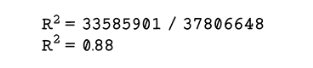
The result—0.88—means that the model is 88% accurate to the new unseen data. This result is a fairly good one, showing that the linear regression model is fairly accurate. For the diamond example, this result is satisfactory. Determining whether the accuracy is satisfactory for the problem we’re trying to solve depends on the domain of the problem. We will be exploring performance of machine learning models in the next section.
Additional information: For a gentle introduction to fitting lines to data, reference http://mng.bz/Ed5q —a chapter from Math for Programmers by Manning Publications. Linear regression can be applied to more dimensions. We can determine the relationship among Carat values, prices, and cut of diamonds, for example, through a process called multiple regression. This process adds some complexity to the calculations, but the fundamental principles remain the same.
Improving accuracy
After training a model on data and measuring how well it performs on new testing data, we have an idea of how well the model performs. Often, models don’t perform as well as desired, and additional work needs to be done to improve the model, if possible. This improvement involves iterating on the various steps in the machine learning life cycle (figure 8.15).

Figure 8.15 A refresher on the machine learning life cycle
The results may require us to pay attention to one or more of the following areas. Machine learning is experimental work in which different tactics at different stages are tested before settling on the best-performing approach. In the diamond example, if the model that used Carat values to predict Price performed poorly, we might use the dimensions of the diamond that indicate size, coupled with the Carat value, to try to predict the price more accurately. Here are some ways to improve the accuracy of the model:
-
Collect more data. One solution may be to collect more data related to the dataset that is being explored, perhaps augmenting the data with relevant external data or including data that previously was not considered.
-
Prepare the data differently. The data used for training may need to be prepared in a different way. Referring to the techniques used to fix data earlier in this chapter, there may be errors in the approach. We may need to use different techniques to find values for missing data, replace ambiguous data, and encode categorical data.
-
Choose different features in the data. Other features in the dataset may be better suited to predicting the dependent variable. The X dimension value might be a good choice to predict the Table value, for example, because it has a physical relationship with it, as shown in the diamond terminology figure (figure 8.5), whereas predicting Clarity with the X dimension is meaningless.
-
Use a different algorithm to train the model. Sometimes, the selected algorithm is not suited to the problem being solved or the nature of the data. We can use a different algorithm to accomplish different goals, as discussed in the next section.
-
Dealing with false-positive tests. Tests can be deceiving. A good test score may show that the model performs well, but when the model is presented with unseen data, it might perform poorly. This problem can be due to overfitting the data. Overfitting is when the model is too closely aligned with the training data and is not flexible for dealing with new data with more variance. This approach is usually applicable to classification problems, which we also dive into in the next section.
If linear regression didn’t provide useful results, or if we have a different question to ask, we can try a range of other algorithms. The next two sections will explore algorithms to use when the question is different in its nature.
Classification with decision trees
Simply put, classification problems involve assigning a label to an example based on its attributes. These problems are different from regression, in which a value is estimated. Let’s dive into classification problems and see how to solve them.
Classification problems: Either this or that
We have learned that regression involves predicting a value based on one or more other variables, such as predicting the price of a diamond given its Carat value. Classification is similar in that it aims to predict a value but predicts discrete classes instead of continuous values. Discrete values are categorical features of a dataset such as Cut, Color, or Clarity in the diamond dataset, as opposed to continuous values such as Price or Depth.
Here’s another example. Suppose that we have several vehicles that are cars and trucks. We will measure the weight of each vehicle and the number of wheels of each vehicle. We also forget for now that cars and trucks look different. Almost all cars have four wheels, and many large trucks have more than four wheels. Trucks are usually heavier than cars, but a large sport-utility vehicle may be as heavy as a small truck. We could find relationships between the weight and number of wheels of vehicles to predict whether a vehicle is a car or a truck (figure 8.16).
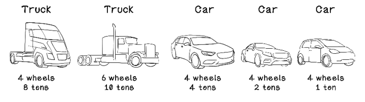
Figure 8.16 Example vehicles for potential classification based on the number of wheels and weight
Exercise: Regression vs. Classification
Consider the following scenarios, and determine whether each one is a regression or classification problem:
- Based on data about rats, we have a life-expectancy feature and an obesity feature. We’re trying to find a correlation between the two features.
- Based on data about animals, we have the weight of each animal and whether or not it has wings. We’re trying to determine which animals are birds.
- Based on data about computing devices, we have the screen size, weight, and operating system of several devices. We want to determine which devices are tablets, laptops, or phones.
- Based on data about weather, we have the amount of rainfall and a humidity value. We want to determine the humidity in different rainfall seasons.
Solution: Regression vs. Classification
- Regression—The relationship between two variables is being explored. Life expectancy is the dependent variable, and obesity is the independent variable.
- Classification—We are classifying an example as a bird or not a bird, using the weight and the wing characteristic of the examples.
- Classification—An example is being classified as a tablet, laptop, or phone by using its other characteristics.
- Regression—The relationship between rainfall and humidity is being explored. Humidity is the dependent variable, and rainfall is the independent variable.
The basics of decision trees
Different algorithms are used for regression and classification problems. Some popular algorithms include support vector machines, decision trees, and random forests. In this section, we will be looking at a decision-tree algorithm to learn classification.
Decision trees are structures that describe a series of decisions that are made to find a solution to a problem (figure 8.17). If we’re deciding whether to wear shorts for the day, we might make a series of decisions to inform the outcome. Will it be cold during the day? If not, will we be out late in the evening, when it does get cold? We might decide to wear shorts on a warm day, but not if we will be out when it gets cold.
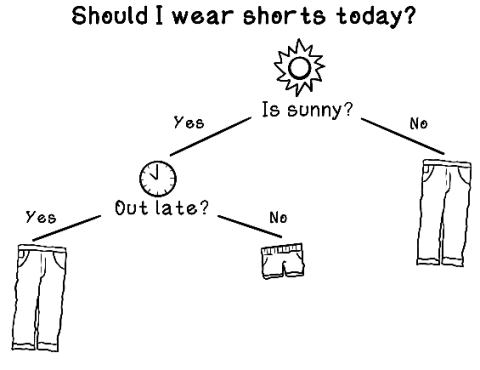
Figure 8.17 Example of a basic decision tree
For the diamond example, we will try to predict the cut of a diamond based on the Carat and Price values by using a decision tree. To simplify this example, assume that we’re a diamond dealer who doesn’t care about each specific cut. We will group the different cuts into two broader categories. Fair and Good cuts will be grouped into a category called Okay, and Very Good, Premium, and Ideal cuts will be grouped into a category called Perfect.
|
1 |
Fair |
1 |
Okay |
|
2 |
Good |
||
|
3 |
Very Good |
2 |
Perfect |
|
4 |
Premium |
||
|
5 |
Ideal |
Our sample dataset now looks like table 8.15.
Table 8.15 The dataset used for the classification example
|
Carat |
Price |
Cut |
|
|
1 |
0.21 |
327 |
Okay |
|
2 |
0.39 |
897 |
Perfect |
|
3 |
0.50 |
1,122 |
Perfect |
|
4 |
0.76 |
907 |
Okay |
|
5 |
0.87 |
2,757 |
Okay |
|
6 |
0.98 |
2,865 |
Okay |
|
7 |
1.13 |
3,045 |
Perfect |
|
8 |
1.34 |
3,914 |
Perfect |
|
9 |
1.67 |
4,849 |
Perfect |
|
10 |
1.81 |
5,688 |
Perfect |
By looking at the values in this small example and intuitively looking for patterns, we might notice something. The price seems to spike significantly after 0.98 carats, and the increased price seems to correlate with the diamonds that are Perfect, whereas diamonds with smaller Carat values tend to be Average. But example 3, which is Perfect, has a small Carat value. Figure 8.18 shows what would happen if we were to create questions to filter the data and categorize it by hand. Notice that decision nodes contain our questions, and leaf nodes contain examples that have been categorized.
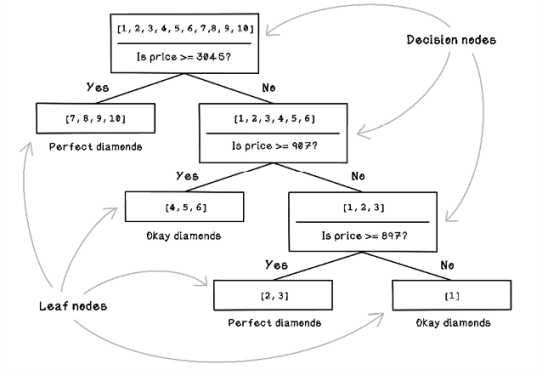
Figure 8.18 Example of a decision tree designed through human intuition
With the small dataset, we could easily categorize the diamonds by hand. In real-world datasets, however, there are thousands of examples to work through, with possibly thousands of features, making it close to impossible for a person to create a decision tree by hand. This is where decision tree algorithms come in. Decision trees can create the questions that filter the examples. A decision tree finds the patterns that we might miss and is more accurate in its filtering.
Training decision trees
To create a tree that is intelligent in making the right decisions to classify diamonds, we need a training algorithm to learn from the data. There is a family of algorithms for decision tree learning, and we will use a specific one named CART (Classification and Regression Tree). The foundation of CART and the other tree learning algorithms is this: decide what questions to ask and when to ask those questions to best filter the examples into their respective categories. In the diamond example, the algorithm must learn the best questions to ask about the Carat and Price values, and when to ask them, to best segment Average and Perfect diamonds.
Data structures for decision trees
To help us understand how the decisions of the tree will be structured, we can review the following data structures, which organize logic and data in a way that’s suitable for the decision tree learning algorithm:
-
Map of classes/label groupings—A map is a key-value pair of elements that cannot have two keys that are the same. This structure is useful for storing the number of examples that match a specific label and will be useful to store the values required for calculating entropy, also known as uncertainty. We’ll learn about entropy soon.
-
Tree of nodes—As depicted in the previous tree figure (figure 8.18), several nodes are linked to compose a tree. This example may be familiar from some of the earlier chapters. The nodes in the tree are important for filtering/partitioning the examples into categories:
-
Decision node—A node in which the dataset is being split or filtered.
- Question: What question is being asked? (See the Question point coming up).
- True examples: The examples that satisfy the question.
- False examples: The examples that don’t satisfy the question.
- Examples node/leaf node—A node containing a list of examples only. All examples in this list would have been categorized correctly.
-
Decision node—A node in which the dataset is being split or filtered.
- Question—A question can be represented differently depending on how flexible it can be. We could ask, “Is the Carat value > 0.5 and < 1.13?” To keep this example simple to understand, the question is a variable feature, a variable value, and the >= operator: “Is Carat >= 0.5?” or “Is Price >=3,045?”
Decision-tree learning life cycle
This section discusses how a decision-tree algorithm filters data with decisions to classify a dataset correctly. Figure 8.19 shows the steps involved in training a decision tree. The flow described in figure 8.19 is covered throughout the rest of this section.
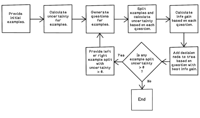
Figure 8.19 A basic flow for building a decision tree
In building a decision tree, we test all possible questions to determine which one is the best question to ask at a specific point in the decision tree. To test a question, we use the concept of entropy—the measurement of uncertainty of a dataset. If we had 5 Perfect diamonds and 5 Okay diamonds, and tried to pick a Perfect diamond by randomly selecting a diamond from the 10, what are the chances that the diamond would be Perfect (figure 8.20)?
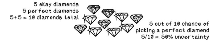
Figure 8.20 Example of uncertainty
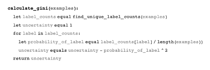
Given an initial dataset of diamonds with the Carat, Price, and Cut features, we can determine the uncertainty of the dataset by using the Gini index. A Gini index of 0 means that the dataset has no uncertainty and is pure; it might have 10 Perfect diamonds, for example. Figure 8.21 describes how the Gini index is calculated.
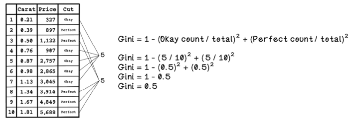
Figure 8.21 The Gini index calculation
The Gini index is 0.5, so there’s a 50% chance of choosing an incorrectly labeled example if one is randomly selected, as shown in figure 8.20 earlier.
The next step is creating a decision node to split the data. The decision node includes a question that can be used to split the data in a sensible way and decrease the uncertainty. Remember that 0 means no uncertainty. We aim to partition the dataset into subsets with zero uncertainty.
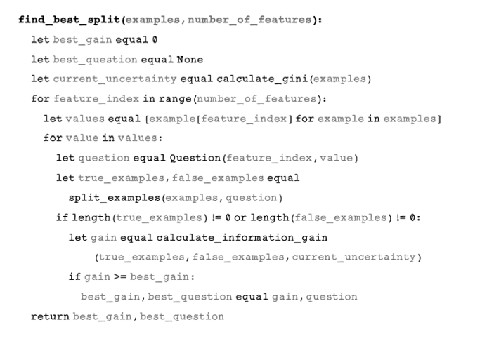
Many questions are generated based on every feature of each example to split the data and determine the best split outcome. Because we have 2 features and 10 examples, the total number of questions generated would be 20. Figure 8.22 depicts some of the questions asked—simple questions about whether the value of a feature is greater than or equal to a specific value.
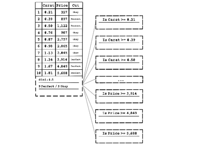
Figure 8.22 An example of questions asked to split the data with a decision node
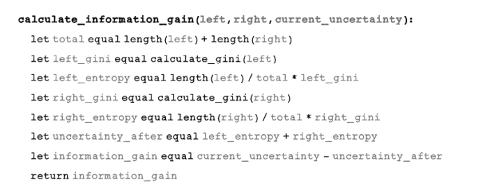
Uncertainty in a dataset is determined by the Gini index, and questions aim to reduce uncertainty. Entropy is another concept that measures disorder using the Gini index for a specific split of data based on a question asked. We must have a way to determine how well a question reduced uncertainty, and we accomplish this task by measuring information gain. Information gain describes the amount of information gained by asking a specific question. If a lot of information is gained, the uncertainty is smaller.
Information gain is calculated by the subtracting entropy before the question is asked by the entropy after the question is asked, following these steps:
-
Split the dataset by asking a question.
-
Measure the entropy for the left split compared with the dataset before the split.
-
Measure the Gini index for the right split.
-
Measure the entropy for the right split compared with the dataset before the split.
-
Calculate the total entropy after by adding the left entropy and right entropy.
-
Calculate the information gain by subtracting the total entropy after from the total entropy before.
Figure 8.23 illustrates the data split and information gain for the question “Is Price >= 3914?”
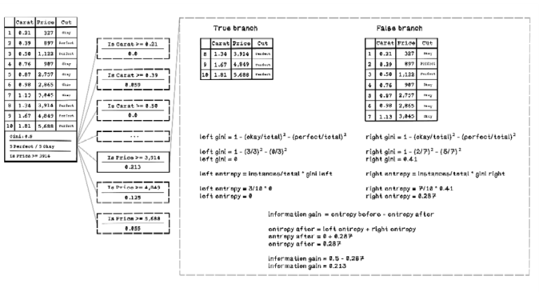
Figure 8.23 Illustration of data split and information gain based on a question
In the example in figure 8.23, the information gain for all questions is calculated, and the question with the highest information gain is selected as the best question to ask at that point in the tree. Then the original dataset is split based on the decision node with the question “Is Price >= 3,914?” A decision node containing this question is added to the decision tree, and the left and right splits stem from that node.
In figure 8.24, after the dataset is split, the left side contains a pure dataset of Perfect diamonds only, and the right side contains a dataset with mixed diamond classifications, including two Perfect diamonds and five Okay diamonds. Another question must be asked on the right side of the dataset to split the dataset further. Again, several questions are generated by using the features of each example in the dataset.
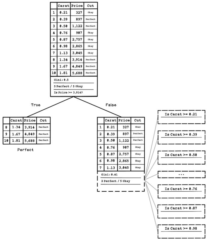
Figure 8.24 The resulting decision tree after the first decision node and possible questions
Exercise: Calculating uncertainty and information gain for a question
Using the knowledge gained and figure 8.23 as a guide, calculate the information gain for the question “Is Carat >= 0.76?”
Solution: Calculating uncertainty and information gain for a question
The solution depicted in figure 8.25 highlights the reuse of the pattern of calculations that determine the entropy and information gain, given a question. Feel free to practice more questions and compare the results with the information-gain values in the figure.
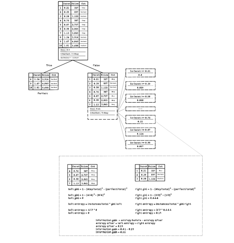
Figure 8.25 Illustration of data split and information gain based on a question at the second level
The process of splitting, generating questions, and determining information gained happens recursively until the dataset is completely categorized by questions. Figure 8.26 shows the complete decision tree, including all the questions asked and the resulting splits.
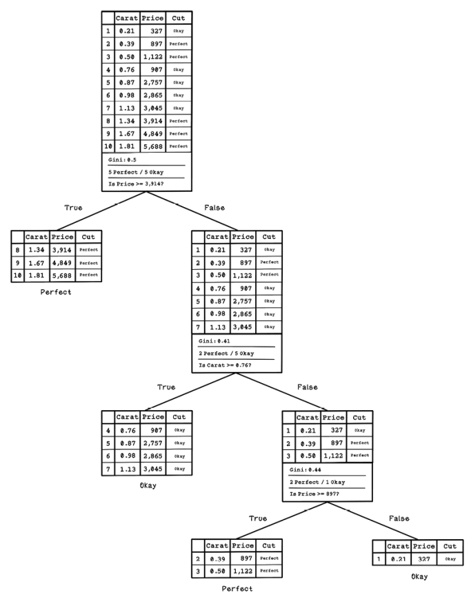
Figure 8.26 The complete trained decision tree
It is important to note that decision trees are usually trained with a much larger sample of data. The questions asked need to be more general to accommodate a wider variety of data and, thus, would need a variety of examples to learn from.
Pseudocode
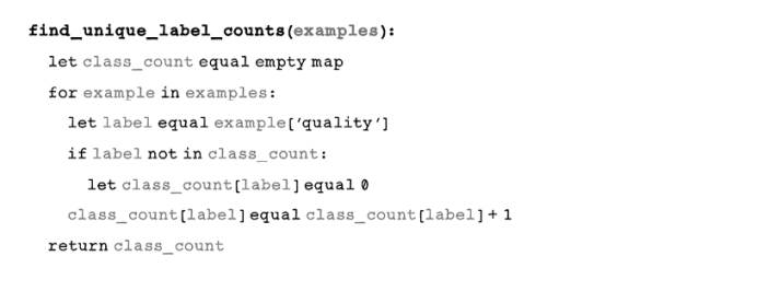
When programming a decision tree from scratch, the first step is counting the number of examples of each class—in this case, the number of Okay diamonds and the number of Perfect diamonds:
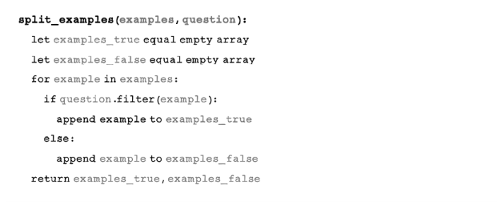
Next, examples are split based on a question. Examples that satisfy the question are stored in examples_true, and the rest are stored in examples_false:
We need a function that calculates the Gini index for a set of examples. The next function calculates the Gini index by using the method described in figure 8.23:
information_gain uses the left and right splits and the current uncertainty to determine the information gain:
The next function may look daunting, but it’s iterating over all the features and their values in the dataset, and finding the best information gain to determine the best question to ask:
The next function ties everything together, using the functions defined previously to build a decision tree:
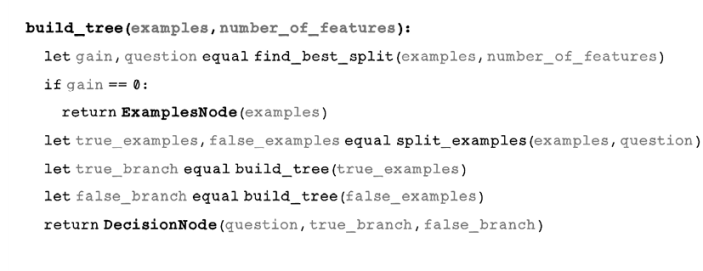
Note that this function is recursive. It splits the data and recursively splits the resulting dataset until there is no information gain, indicating that the examples cannot be split any further. As a reminder, decision nodes are used to split the examples, and example nodes are used to store split sets of examples.
We’ve now learned how to build a decision-tree classifier. Remember that the trained decision-tree model will be tested with unseen data, similar to the linear regression approach explored earlier.
One problem with decision trees is overfitting, which occurs when the model is trained too well on several examples but performs poorly for new examples. Overfitting happens when the model learns the patterns of the training data but new real-world data is slightly different and doesn’t meet the splitting criteria of the trained model. A model with 100% accuracy is usually overfitted to the data. Some examples are classified incorrectly in an ideal model as a consequence of the model being more general to support different cases. Overfitting can happen with any machine learning model, not just decision trees.
Figure 8.27 illustrates the concept of overfitting. Underfitting includes too many incorrect classifications, and overfitting includes too few or no incorrect classifications; the ideal is somewhere in between.
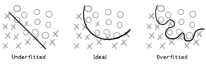
Figure 8.27 Underfitting, ideal, and overfitting
Classifying examples with decision trees
Now that a decision tree has been trained and the right questions have been determined, we can test it by providing it new data to classify. The model that we’re referring to is the decision tree of questions that was created by the training step.
To test the model, we provide several new examples of data and measure whether they have been classified correctly, so we need to know the labeling of the testing data. In the diamond example, we need more diamond data, including the Cut feature, to test the decision tree (table 8.16).
Table 8.16 The diamond dataset for classification
|
Carat |
Price |
Cut |
|
|
1 |
0.26 |
689 |
Perfect |
|
2 |
0.41 |
967 |
Perfect |
|
3 |
0.52 |
1,012 |
Perfect |
|
4 |
0.76 |
907 |
Okay |
|
5 |
0.81 |
2,650 |
Okay |
|
6 |
0.90 |
2,634 |
Okay |
|
7 |
1.24 |
2,999 |
Perfect |
|
8 |
1.42 |
3850 |
Perfect |
|
9 |
1.61 |
4,345 |
Perfect |
|
10 |
1.78 |
3,100 |
Okay |
Figure 8.28 illustrates the decision-tree model that we trained, which will be used to process the new examples. Each example is fed through the tree and classified.
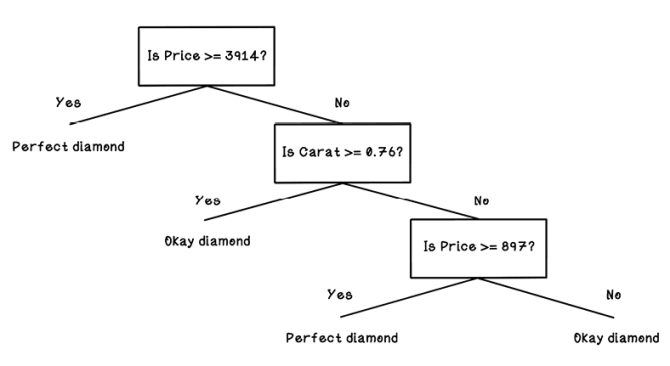
Figure 8.28 The decision tree model that will process new examples
The resulting predicted classifications are detailed in table 8.17. Assume that we’re trying to predict Okay diamonds. Notice that three examples are incorrect. That result is 3 of 10, which means that the model predicted 7 of 10, or 70% of the testing data correctly. This performance isn’t terrible, but it illustrates how examples can be misclassified.
Table 8.17 The diamond dataset for classification and predictions
|
Carat |
Price |
Cut |
Prediction |
||
|
1 |
0.26 |
689 |
Okay |
Okay |
✓ |
|
2 |
0.41 |
880 |
Perfect |
Perfect |
✓ |
|
3 |
0.52 |
1,012 |
Perfect |
Perfect |
✓ |
|
4 |
0.76 |
907 |
Okay |
Okay |
✓ |
|
5 |
0.81 |
2,650 |
Okay |
Okay |
✓ |
|
6 |
0.90 |
2,634 |
Okay |
Okay |
✓ |
|
7 |
1.24 |
2,999 |
Perfect |
Okay |
† |
|
8 |
1.42 |
3,850 |
Perfect |
Okay |
† |
|
9 |
1.61 |
4,345 |
Perfect |
Perfect |
✓ |
|
10 |
1.78 |
3,100 |
Okay |
Perfect |
† |
A confusion matrix is often used to measure the performance of a model with testing data. A confusion matrix describes the performance using the following metrics (figure 8.29):
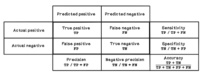
Figure 8.29 A confusion matrix
The outcomes of testing the model with unseen examples can be used to deduce several measurements:
-
Negative precision—How often Perfect examples are classified correctly
-
Sensitivity or recall—Also known as the true-positive rate; the ratio of correctly classified Okay diamonds to all the actual Okay diamonds in the training set
-
Specificity—Also known as the true-negative rate; the ratio of correctly classified Perfect diamonds to all actual Perfect diamonds in the training set
-
Accuracy—How often the classifier is correct overall between classes
Figure 8.30 shows the resulting confusion matrix, with the results of the diamond example listed as input. Accuracy is important, but the other measurements can unveil additional useful information about the model’s performance.
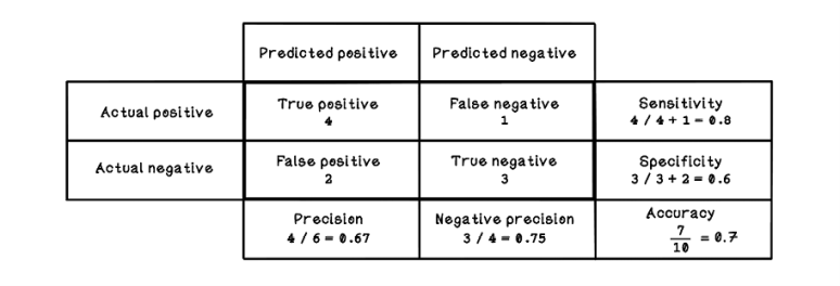
Figure 8.30 Confusion matrix for the diamond test example
By using these measurements, we can make more-informed decisions in a machine learning life cycle to improve the performance of the model. As mentioned throughout this chapter, machine learning is an experimental exercise involving some trial and error. These metrics are guides in this process.
Other popular machine learning algorithms
This chapter explores two popular and fundamental machine learning algorithms. The linear-regression algorithm is used for regression problems in which the relationships between features are discovered. The decision-tree algorithm is used for classification problems in which the relationships between features and categories of examples are discovered. But many other machine learning algorithms are suitable in different contexts and for solving different problems. Figure 8.31 illustrates some popular algorithms and shows how they fit into the machine learning landscape.
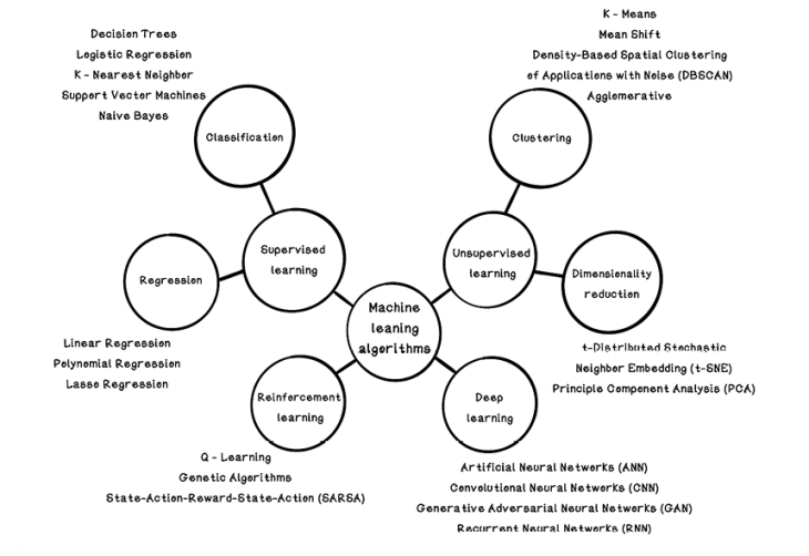
Figure 8.31 A map of popular machine learning algorithms
The classification and regression algorithms satisfy problems similar to the ones explored in this chapter. Unsupervised learning contains algorithms that can help with some of the data preparation steps, find hidden underlying relationships in data, and inform what questions can be asked in a machine learning experiment.
Notice the introduction of deep learning in figure 8.31. Chapter 9 covers artificial neural networks—a key concept in deep learning. This chapter will give us a better understanding of the types of problems that can be solved with these approaches and how the algorithms are implemented.
Use cases for machine learning algorithms
Machine learning can be applied in almost every industry to solve a plethora of problems in different domains. Given the right data and the right questions, the possibilities are potentially endless. We have all interacted with a product or service that uses some aspect of machine learning and data modeling in our everyday lives. This section highlights some of the popular ways machine learning can be used to solve real-world problems at scale:
-
Fraud and threat detection—Machine learning has been used to detect and prevent fraudulent transactions in the finance industry. Financial institutions have gained a wealth of transactional information over the years, including fraudulent transaction reports from their customers. These fraud reports are an input to labeling and characterizing fraudulent transactions. The models might consider the location of the transaction, the amount, the merchant, and so on to classify transactions, saving consumers from potential losses and the financial institution from insurance losses. The same model can be applied to network threat detection to detect and prevent attacks based on known network use and reported unusual behavior.
-
Product and content recommendations—Many of us use e-commerce sites to purchase goods or media streaming services for audio and video consumption. Products may be recommended to us based on what we’re purchasing, or content may be recommended based on our interests. This functionality is usually enabled by machine learning, in which patterns in purchase or viewing behavior is derived from people’s interactions. Recommender systems are being used in more and more industries and applications to enable more sales or provide a better user experience.
-
Dynamic product and service pricing—Products and services are often priced based on what someone is willing to pay for them or based on risk. For a ride-sharing system, it might make sense to hike the price if there are fewer available cars than the demand for a ride, sometimes referred to as surge pricing. In the insurance industry, a price might be hiked if a person is categorized as high-risk. Machine learning is used to find the attributes and relationships between the attributes that influence pricing based on dynamic conditions and details about a unique individual.
-
Health-condition risk prediction—The medical industry requires health professionals to acquire an abundance of knowledge so that they can diagnose and treat patients. Over the years, they have gained a vast amount of data about patients: blood types, DNA, family-illness history, geographic location, lifestyle, and more. This data can be used to find potential patterns that can guide the diagnosis of illness. The power of using data to find diagnoses is that we can treat conditions before they mature. Additionally, by feeding the outcomes back into the machine learning system, we can strengthen its reliability in making predictions.
Summary of machine learning