
Hour 9. Using Tables and Columns
What You’ll Learn in This Hour:
 How to create simple tables
How to control the size of tables
How to align content and span rows and columns within tables
How to use CSS columns
In this hour, you learn how to build HTML tables that you can use to control the spacing, layout, and appearance of tabular data in your web content. Although you can achieve similar results using CSS, there are definitely times when a table is the best way to present information in rows and columns. You also see in this hour how designers had to use tables for page layout in the past—and how to avoid ever doing that in the future. Finally, you’ll learn the basics of using CSS to create columns for layout purposes.
Before we begin, remember that a table is simply an orderly arrangement of content into vertical columns and horizontal rows.
Creating a Simple Table
A table consists of rows of information with individual cells inside. To make tables, you have to start with a <table> tag. Of course, you end your tables with the </table> tag. CSS contains numerous properties that enable you to modify the table itself, such as the various border properties you learned about in previous chapters.
Tip
As you follow this lesson, think about how arranging text into tables or columns could benefit your web content. The following are some specific ideas to keep in mind:
• The most obvious application of tables is to organize tabular information, such as a multicolumn list of names and numbers, much like a spreadsheet.
• Whenever you need multiple columns of text or images, such as in a traditional newspaper in print, think about using CSS columns.
With the <table> tag in place, you next need the <tr> tag. The <tr> tag creates a table row, which contains one or more cells of information before the closing </tr>. To create these individual cells, use the <td> tag (<td> stands for table data). Place the table information between the <td> and </td> tags. A cell is a rectangular region that can contain any text, images, and HTML tags. Each row in a table consists of at least one cell. Multiple cells within a row form columns in a table.
One more basic tag is involved in building tables. The <th> tag works exactly like a <td> tag, except that <th> indicates that the cell is part of the heading of the table. Most web browsers automatically render the text in <th> cells as centered and boldface, as you can see with Chrome in Figure 9.1. However, if your browser does not automatically render this element with a built-in style, you have an element that you can style using CSS without using a class to differentiate among types of table data elements.
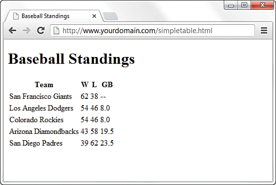
You can create as many cells as you want, but each row in a table should have the same number of columns as the other rows. The HTML code in Listing 9.1 creates a simple table using only the four table tags I’ve mentioned thus far. Figure 9.1 shows the resulting page as viewed in a web browser.
LISTING 9.1 Creating Tables with the <table>, <tr>, <td>, and <th> Tags
<!DOCTYPE html>
<html lang="en">
<head>
<title>Baseball Standings</title>
</head>
<body>
<h1>Baseball Standings</h1>
<table>
<tr>
<th>Team</th>
<th>W</th>
<th>L</th>
<th>GB</th>
</tr>
<td>San Francisco Giants</td>
<td>54</td>
<td>46</td>
<td>8.0</td>
</tr>
<tr>
<td>Los Angeles Dodgers</td>
<td>62</td>
<td>38</td>
<td>—</td>
</tr>
<tr>
<tr>
<td>Colorado Rockies</td>
<td>54</td>
<td>46</td>
<td>8.0</td>
</tr>
<tr>
<td>Arizona Diamondbacks</td>
<td>43</td>
<td>58</td>
<td>19.5</td>
</tr>
<tr>
<td>San Diego Padres</td>
<td>39</td>
<td>62</td>
<td>23.5</td>
</tr>
</table>
</body>
</html>
The table in the example contains baseball standings, which are perfect for arranging in rows and columns—but they’re a little plain. For instance, this example doesn’t even have any borders! You’ll learn to jazz things up a bit in just a moment. The headings in the table show the Team, Wins (W), Losses (L), and Games Behind (GB) in the standings.
Tip
You might find your HTML tables easier to read (and less prone to time-wasting errors) if you use spaces to indent <tr> and <td> tags, as I did in Listing 9.1. Remember, browsers ignore spaces when rendering HTML, so the layout of your code has no effect on the layout of the table that people will see.
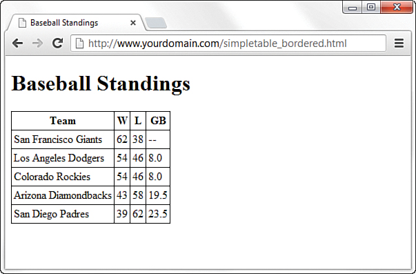
Adding the following stylesheet entries takes care of adding a basic border around the table and its cells:
table, tr, th, td {
border: 1px solid black;
border-collapse: collapse;
padding: 3px;
}
You might wonder why you have to specify these styles for all four elements used to create the table instead of just the overall table element itself. Basically, this is because a table is made up of its elements, and each element can have these styles applied. The following figures demonstrate how the table would look with various elements styles or unstyled, to emphasize this point.
Figure 9.2 shows the output of the styles just listed. The border-collapse property, with a value of collapse, makes all the borders of the <table>, <tr>, and <th> or <td> elements collapse into one shared border. The padding adds a little breathing room to the content of the cells.
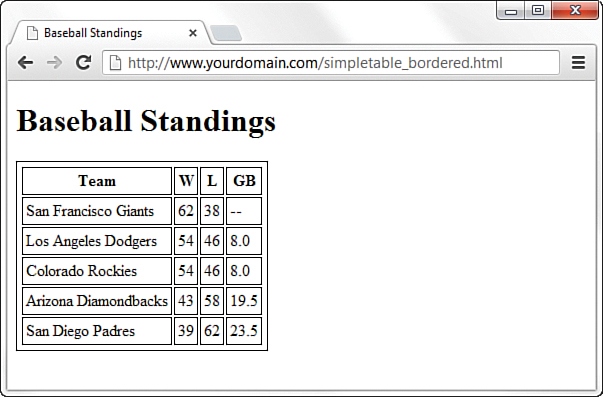
In Figure 9.3, you can see what the table would look like without the border-collapse property specified (the default value then takes effect, which is separate, for separate borders).
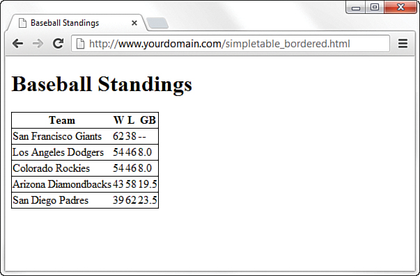
In Figure 9.4, you can see what the table would look like without specifying any of the previous styles for the <th> and <td> elements—note the lack of border denoting the columns.
Controlling Table Sizes
When a table width is not specified, the size of a table and its individual cells automatically expand to fit the data you place into it. However, you can control the width of the entire table by defining the width CSS property for the <table> element; you can also define the width of each cell through the width CSS property assigned to the <td> elements. The width property can be specified as either pixels, ems, or percentages.
Tip
You can employ three other useful but not required table-related tags when creating simple tables:
• <thead></thead>—Wrap your header rows in this element to add more meaning to the grouping and also allow these header rows to be printed across all pages (if your table is that long). You can then style the <thead> element instead of individual <th> cells.
• <tbody></tbody>—Wrap the rows that make up the “body” of this table (everything besides the header and the footer rows) in this element, to add more meaning to the grouping; you can then also style the <tbody> element as a whole instead of styling individual <td> cells.
• <tfoot></tfoot>—Much like the <thead> element, use this to wrap your footer rows (if you have any) in this element, to add more meaning to the grouping and style it as a whole. An example of a footer row might be a summation of the data presented in the columns, such as financial totals.
To make the first cell of a table 20 percent of the total table width and the second cell 80 percent of the table width, you use the following property definitions:
<table style="width:100%">
<tr>
<td style="width:20%">skinny cell</td>
<td style="width:80%">fat cell</td>
</tr>
</table>
Notice that the table is sized to 100 percent, which ensures that it fills the entire width of the browser window. When you use percentages instead of fixed pixel sizes, the table resizes automatically to fit any size browser window while maintaining the aesthetic balance you’re seeking. In this case, the two cells within the table are automatically resized to 20 percent and 80 percent of the total table width, respectively.
In Listing 9.2, the simple table from Listing 9.1 (plus the border-related styles) is expanded to show very precise control over table cell widths (plus, the border-related styles have been added).
LISTING 9.2 Specifying Table Cell Widths
<!DOCTYPE html>
<html lang="en">
<head>
<title>Baseball Standings</title>
<style type="text/css">
table, tr, th, td {
border: 1px solid black;
border-collapse: collapse;
padding: 3px;
}
</style>
</head>
<body>
<h1>Baseball Standings</h1>
<table>
<tr>
<th style="width:200px;">Team</th>
<th style="width:25px;">W</th>
<th style="width:25px;">L</th>
<th style="width:25px;">GB</th>
</tr>
<tr>
<td>San Francisco Giants</td>
<td>62</td>
<td>38</td>
<td>--</td>
</tr>
<tr>
<td>Los Angeles Dodgers</td>
<td>54</td>
<td>46</td>
<td>8.0</td>
</tr>
<tr>
<td>Colorado Rockies</td>
<td>54</td>
<td>46</td>
<td>8.0</td>
</tr>
<tr>
<td>Arizona Diamondbacks</td>
<td>43</td>
<td>58</td>
<td>19.5</td>
</tr>
<tr>
<td>San Diego Padres</td>
<td>39</td>
<td>62</td>
<td>23.5</td>
</tr>
</table>
</body>
</html>
You can see the consistent column widths in Figure 9.5.
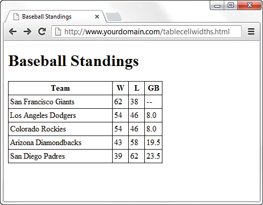
FIGURE 9.5 The code in Listing 9.2 creates a table with six rows and four columns, with specific widths used for each column.
The addition of specific width style for each <th> element in the first row defines the widths of the columns. The first column is defined as 200px wide, and the second, third, and fourth columns are each 25px wide. In Figure 9.5, you can see whitespace after the text in the first column, indicating that the specified width is indeed greater than the column width would have been, had the table been allowed to render without explicit width indicators.
Also note that these widths are not repeated in the <td> elements in subsequent rows. Technically, you need to define the widths in only the first row; the remaining rows will follow suit because they are all part of the same table. However, if you’d used another formatting style (such as a style to change font size or color), you would’ve had to repeat that style for each element that should have those display properties.
Alignment and Spanning Within Tables
By default, anything you place inside a table cell is aligned to the left and vertically centered. All the figures so far in this lesson have shown this default alignment. However, you can align the contents of table cells both horizontally and vertically with the text-align and vertical-align style properties.
You can apply these alignment attributes to any <tr>, <td>, or <th> tag. Alignment attributes assigned to a <tr> tag apply to all cells in that row. Depending on the size of your table, you can save yourself some time and effort by applying these attributes at the <tr> level and not in each <td> or <th> tag.
The HTML code in Listing 9.3 uses a combination of text alignment styles to apply a default alignment to a row, but it is overridden in a few individual cells. Figure 9.6 shows the result of the code in Listing 9.3.
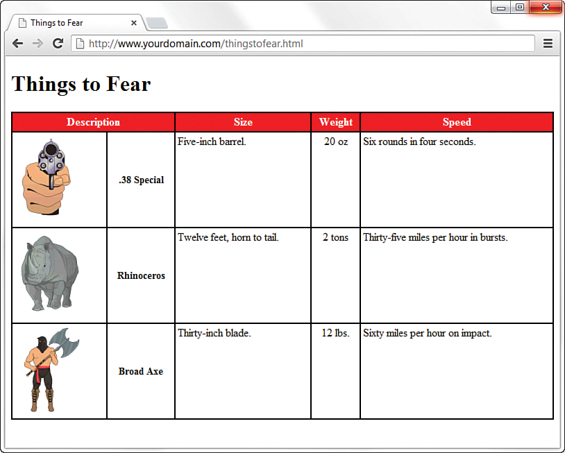
FIGURE 9.6 The code in Listing 9.3 shows the use of the colspan attribute and some alignment styles.
Following are some of the more commonly used vertical-align style property values: top, middle, bottom, text-top, text-bottom, and baseline (for text). These property values give you plenty of flexibility in aligning table data vertically.
LISTING 9.3 Alignment, Cell Spacing, Borders, and Background Colors in Tables
<!DOCTYPE html>
<html lang="en">
<head>
<title>Things to Fear</title>
<style type="text/css">
table {
border: 2px solid black;
border-collapse: collapse;
padding: 3px;
width: 100%
}
tr, th, td {
border: 2px solid black;
border-collapse: collapse;
padding: 3px;
}
thead {
background-color: #ff0000;
color: #ffffff;
}
.aligntop {
vertical-align:top;
}
.description {
font-size: 14px;
font-weight:bold;
vertical-align:middle;
text-align:center;
}
.weight {
text-align:center;
}
</style>
</head>
<body>
<h1>Things to Fear</h1>
<table>
<thead>
<tr>
<th colspan="2">Description</th>
<th>Size</th>
<th>Weight</th>
<th>Speed</th>
</tr>
</thead>
<tr class="aligntop">
<td><img src="handgun.gif" alt=".38 Special"/></td>
<td class="description">.38 Special</td>
<td>Five-inch barrel.</td>
<td class="weight">20 oz.</td>
<td>Six rounds in four seconds.</td>
</tr>
<tr class="aligntop">
<td><img src="rhino.gif" alt="Rhinoceros" /></td>
<td class="description">Rhinoceros</td>
<td>Twelve feet, horn to tail.</td>
<td class="weight">2 tons</td>
<td>Thirty-five miles per hour in bursts.</td>
</tr>
<tr class="aligntop">
<td><img src="axeman.gif" alt="Broad Axe" /></td>
<td class="description">Broad Axe</td>
<td>Thirty-inch blade.</td>
<td class="weight">12 lbs.</td>
<td>Sixty miles per hour on impact.</td>
</tr>
</table>
</body>
</html>
At the top of Figure 9.6, a single cell (Description) spans two columns. This is accomplished with the colspan attribute in the <th> tag for that cell. As you might guess, you can also use the rowspan attribute to create a cell that spans more than one row.
Spanning is the process of forcing a cell to stretch across more than one row or column of a table. The colspan attribute causes a cell to span across multiple columns; rowspan has the same effect on rows.
Tip
Keeping the structure of rows and columns organized in your mind can be the most difficult part of creating tables with cells that span multiple columns or rows. The tiniest error can often throw the whole thing into disarray. You can save yourself time and frustration by sketching complicated tables on paper before you start writing the HTML to implement them.
Additionally, text styles are defined in the stylesheet and applied to the cells in the Description column to create bold text that is both vertically aligned to the middle and horizontally aligned to the center of the cell.
A few tricks in Listing 9.3 haven’t been explained yet. You can give an entire table—and each individual row or cell in a table—its own background, distinct from any background you might use on the web page itself. You can do this by placing the background-color or background-image style in the <table>, <tr>, <td>, <th>, <thead>, <tbody>, or <tfooter> tags (or assigning the value in the stylesheet for these elements), exactly as you would in the <body> tag. In Listing 9.3, only the top row has a background color; the stylesheet defines the <thead> element as one with a red background and white text in the cells in that row.
Similar to the background-color style property is the background-image property (not shown in this example), which is used to set an image for a table background. If you wanted to set the image leaves.gif as the background for a table, you would use background-image:url(leaves.gif)" in the stylesheet entry for the <table> element. Notice that the image file is placed within parentheses and preceded by the word url, which indicates that you are describing where the image file is located.
Note
You often see alternating row colors in a table. For instance, one row might have a gray background, and the next row might have a white background. Alternating row colors helps users read the content of your table more clearly, especially if the table is large.
Tweaking tables goes beyond just using style properties. As Listing 9.3 shows, you can control the space around the content of the cell, within its borders by applying some padding to the cell. If you want to add some space between the borders of the cells themselves, you can use the border-spacing CSS property, which enables you to define the horizontal and vertical spacing like so:
border-spacing: 2px 4px;
In the example, spacing is defined as 2 pixels of space between the horizontal borders, and 4 pixels of space between the vertical borders. If you use only one value, the value is applied to all four borders.
Page Layout with Tables
At the beginning of this chapter, I indicated that designers have used tables for page layout, as well as to display tabular information. You will still find many examples of table-based layouts if you peek at another designer’s source code. This method of design grew out of inconsistencies in browser support for CSS in the mid-1990s to early 2000s. Because all browsers supported tables and in generally the same way, web designers latched on to the table-based method of content layout to achieve the same visual page display across all browsers. However, now that support for CSS is relatively similar across all major browsers, designers can follow the long-standing standards-based recommendation not to use tables for page layout.
The World Wide Web Consortium (W3C), the standards body that oversees the future of the web, has long promoted stylesheets as the proper way to lay out pages (instead of using tables). Stylesheets are ultimately much more powerful than tables, which is why the bulk of this book teaches you how to use stylesheets for page layout.
The main reasons for avoiding using tables for layout include these:
Mixing presentation with content—One goal of CSS and standards-compliant web design is to separate the presentation layer from the content layer.
Creating unnecessarily difficult redesigns—To change a table-based layout, you have to change the table-based layout on every single page of your site (unless it is part of a complicated, dynamically driven site, in which case you have to undo all the dynamic pieces and remake them).
Addressing accessibility issues—Screen reading software looks to tables for content and often tries to read layout tables as content tables.
Rendering on mobile devices—Table layouts are often not flexible enough to scale downward to small screens (see Hour 15, “Creating Fixed or Liquid Layouts”).
These are but a few of the issues in table-based web design. For a closer look at some of these issues, see the popular presentation “Why Tables for Layout is Stupid,” at http://www.hotdesign.com/seybold/everything.html.
Using CSS Columns
If you have a large amount of text-only information, you might want to present it much like a physical newspaper does: in columns. Over a hundred years of research have shown a correlation between the length of a line and reading speed, and indicated a “sweet spot,” or optimum length of a line that allows for both a quick and enjoyable reading experience. The continued presence of this sweet spot—lines that are around 4 inches long—is why physical newspapers still present information in columns.
If you have a lot of information to present to readers, or if you simply want to mimic the aesthetic of a newspaper layout, you can use CSS columns. True, you could also use a table, because tables are made of rows and columns, but the previous section explained some of the reasons to avoid a table-based layout. Also, columns aren’t just for text; you can put anything you want into defined columns, such as advertisements or related text in a sidebar.
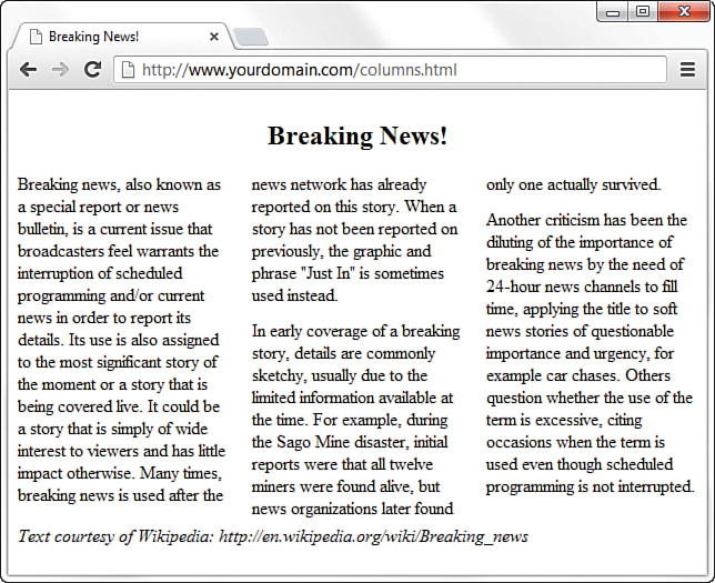
In Figure 9.7, you can see a basic use of CSS columns, to define a traditional newspaper-type layout.
LISTING 9.4 Alignment, Cell Spacing, Borders, and Background Colors in Tables
<!DOCTYPE html>
<html lang="en">
<head>
<title>Breaking News!</title>
<style type="text/css">
article {
-webkit-column-count: 3;
-webkit-column-gap: 21px;
-moz-column-count: 3;
-moz-column-gap: 21px;
column-count: 3;
column-gap: 21px;
}
h1 {
text-align: center;
-webkit-column-span: all;
-moz-column-span: all;
column-span: all;
}
p {
margin-top: 0px;
margin-bottom: 12px;
}
footer {
-webkit-column-span: all;
-moz-column-span: all;
column-span: all;
}
</style>
</head>
<body>
<article>
<header>
<h1>Breaking News!</h1>
</header>
<p>Breaking news, also known as a special report or news bulletin,
is a current issue that broadcasters feel warrants the interruption
of scheduled programming and/or current news in order to report its
details. Its use is also assigned to the most significant story of
the moment or a story that is being covered live. It could be a
story that is simply of wide interest to viewers and has little
impact otherwise. Many times, breaking news is used after the news
network has already reported on this story. When a story has not
been reported on previously, the graphic and phrase "Just In" is
sometimes used instead.</p>
<p>In early coverage of a breaking story, details are commonly
sketchy, usually due to the limited information available at the
time. For example, during the Sago Mine disaster, initial reports
were that all twelve miners were found alive, but news
organizations later found only one actually survived.</p>
<p>Another criticism has been the diluting of the importance of
breaking news by the need of 24-hour news channels to fill time,
applying the title to soft news stories of questionable importance
and urgency, for example car chases. Others question whether the
use of the term is excessive, citing occasions when the term is
used even though scheduled programming is not interrupted.</p>
<footer>
<em>Text courtesy of Wikipedia:
http://en.wikipedia.org/wiki/Breaking_news</em>
</footer>
</article>
</body>
</html>
The code in Listing 9.4 is from a fake news article, so I’ve used the <article> element to hold all the content. Inside the <article> element is a <header> element that contains the “Breaking News!” heading (at the <h1> level), followed by three paragraphs of text and a <footer> element. All the styling is handled in the stylesheet at the beginning of the listing; styles are provided for four of the elements just named: <article>, <h1>, <p>, and <footer>.
In the stylesheet, I’m applying the primary definition of the columns within the <article> element. I’ve used column-count to define three columns, and I’ve used column-gap to define the space between the columns as 21 pixels wide. Next, I’ve added a definition for the <h1> element, first to make the text align in the center of the page, and second to ensure that the text spans across all the columns. I applied the same column-span property to the entry for the <footer> element, for the same reason.
Note
In the stylesheet, note that, for each column-related property in the stylesheet, I’ve added two additional entries with -webkit and -moz prefixes. Because browser support for column-related CSS is still a bit inconsistent, using the properties with these prefixes ensures that the properties will work in all browsers.
After the entry for the <h1> element, I added some specific margins to the <p> element, namely a top margin of 0 pixels and a bottom margin of 12 pixels. I could have left well enough alone and just allowed the <p> elements to display as the default style, but that would have created a margin at the top of each paragraph. “What’s the big deal?” you might ask, because it looks like I’ve manually added space between the paragraphs anyway—and that’s true. However, I added the space after each paragraph and took away the space before each paragraph so that the first column doesn’t begin with a space and thus misalign the tops of each of the three columns.
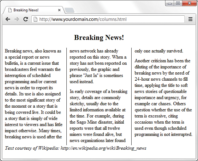
You can even add vertical lines between columns, as shown in Figure 9.8. The stylesheet entries I added to achieve this appearance are shown here; note that they look remarkably similar to how you define borders (as you learned in Hour 7).
-webkit-column-rule-width: 1px;
-moz-column-rule-width: 1px;
column-rule-width: 1px;
-webkit-column-rule-style: solid;
-moz-column-rule-style: solid;
column-rule-style: solid;
-webkit-column-rule-color: #000;
-moz-column-rule-color: #000;
column-rule-color: #000;
Summary
In this brief chapter, you learned to arrange text and images into organized rows and columns called tables. You learned the basic tags for creating tables and several CSS properties for controlling the alignment, spacing, and appearance of tables. You also learned that tables are never to be used for layout purposes, but that you can achieve a multicolumn layout using CSS columns.
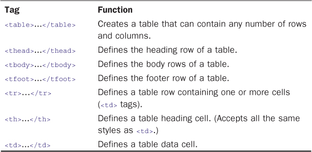
Table 9.1 summarizes the tags covered in this hour.
Q&A
Q. I made a big table, and when I load the page, nothing appears on the page for a long time. Why the wait?
A. Complex tables can take a while to appear on the screen. The web browser has to figure out the size of everything in the table before it can display any part of it. You can speed things up a bit by always including width and height attributes for every graphics image within a table. Defining specific widths for both the <table> and <td> elements also helps.
Q. Can I use CSS columns for layout beyond the “newspaper” look?
A. Yes, you can use CSS columns to create a column-based layout for your entire website, if you so desire. For example, a column for navigation next to a wider column for the body text, next to a third column for advertisements or other secondary content is a common template design.
Workshop
The Workshop contains quiz questions and exercises to help you solidify your understanding of the material covered. Try to answer all questions before looking at the “Answers” section that follows.
Quiz
1. How can you create a simple two-row, two-column table with a single-pixel black border to outline the table?
2. Expanding on Question 1, how can you add 9 pixels of space around the content within each cell?
3. How do you make the contents of an element span multiple columns?
Answers
1. Use the following HTML:
<table style="border: 1px solid #000000; border-collapse:
collapse;">
<tr>
<td>Top left...</td>
<td>Top right...</td>
</tr>
<tr>
<td>Bottom left...</td>
<td>Bottom right...</td>
</tr>
</table>
2. Add padding: 9px to the style declaration.
3. Apply the column-span property to the element, with a value of all.
Exercises
Do you have any pages that have information visitors might be interested in viewing as lists or tables? Use a table to present some tabular information. Make sure each column has its own heading (or perhaps its own graphic). Play around with the various types of alignment and spacing that you learned in this chapter.
You often see alternating row colors in a table, with one row having a gray background and the next a white background. The goal of alternating colors in table rows is so that the individual rows are easier to discern when looking quickly at the table full of data. Create a table with alternating row colors and text colors (if necessary).