
Hour 15. Creating Fixed or Liquid Layouts
What You’ll Learn in This Hour:
 How fixed layouts work
How liquid layouts work
How to create a fixed/liquid hybrid layout
How to think about and begin to implement a responsive design
So far, you’ve learned a lot about styling web content, from font sizes and colors to images, block elements, lists, and more. But what we haven’t yet discussed is a high-level overview of page layout. In general, there are two types of layouts—fixed and liquid. But it’s also possible to use a combination of the two, with some elements fixed and others liquid.
In this hour, you first learn about the characteristics of these two types of layouts and see a few examples of websites that use them. At the end of the chapter, you see a basic template that combines elements of both types of layouts. Ultimately, the type of layout you choose is up to you—it’s hard to go wrong as long as your sites follow HTML and CSS standards.
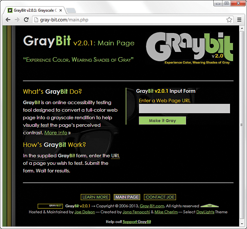
Understanding Fixed Layouts
A fixed layout, or fixed-width layout, is just that: a layout in which the body of the page is set to a specific width. That width is typically controlled by a master “wrapper” element that contains all the content. The width property of a wrapper element, such as a <div>, is set in the stylesheet entry if the <div> was given an ID value such as main or wrapper (although the name is up to you).
When creating a fixed-width layout, the most important decision is determining the minimum screen resolution you want to accommodate. For many years, 800×600 has been the “lowest common denominator” for web designers, resulting in a typical fixed width of approximately 760 pixels. However, the number of people using 800×600 screen resolution for nonmobile browsers is now less than 4%. Given that, many web designers consider 1,024×768 the current minimum screen resolution, so if they create fixed-width layouts, the fixed width typically is somewhere between 800 and 1,000 pixels wide.
Caution
Remember, the web browser window contains nonviewable areas, including the scrollbar. So if you are targeting a 1,024-pixel-wide screen resolution, you really can’t use all 1,024 of those pixels.
A main reason for creating a fixed-width layout is so that you can have precise control over the appearance of the content area. However, if users visit your fixed-width site with smaller or much larger screen resolutions than the resolution you had in mind while you designed it, they will encounter scrollbars (if their resolution is smaller) or a large amount of empty space (if their resolution is greater). Finding fixed-width layouts is difficult among the most popular websites these days because site designers know they need to cater to the largest possible audience (and therefore make no assumptions about browser size). However, fixed-width layouts still have wide adoption, especially by site administrators using a content management system with a strict template.
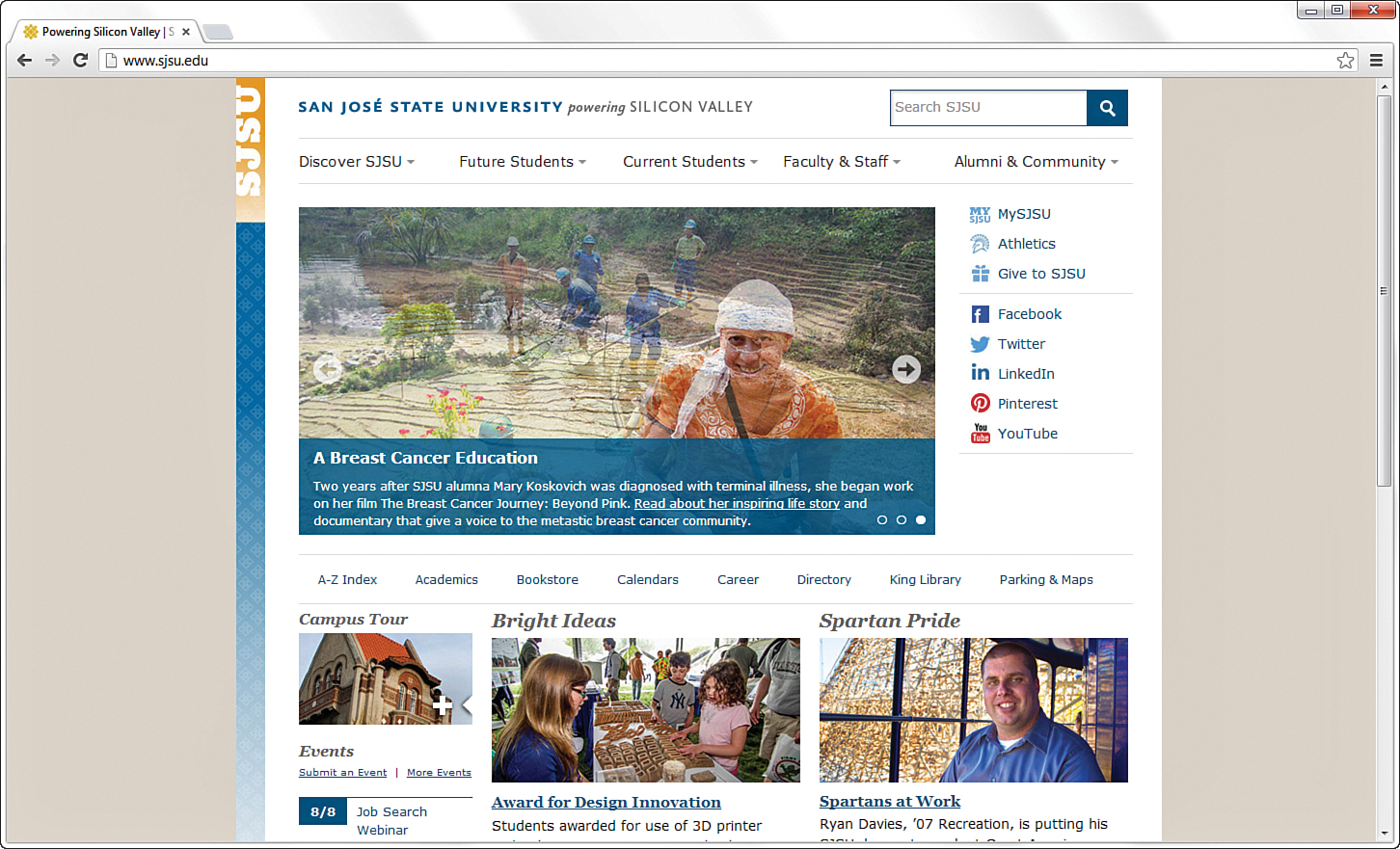
The following figures show one such site, for San Jose State University (university websites commonly use a strict template and content management system, so this was an easy example to find); it has a wrapper element fixed at 960 pixels wide. In Figure 15.1, the browser window is a shade under 900 pixels wide. On the right side of the image, important content is cut off (and at the bottom of the figure, a horizontal scrollbar displays in the browser).

However, Figure 15.2 shows how this site looks when the browser window is more than 1,400 pixels wide: You see a lot of empty space (or “real estate”) on both sides of the main body content, which some consider aesthetically displeasing.
Besides the decision to create a fixed-width layout in the first place is determining whether to place the fixed-width content flush left or whether to center it. Placing the content flush left produces extra space on the right side only; centering the content area creates extra space on both sides. However, centering at least provides balance, whereas a flush-left design could end up looking like a small rectangle shoved in the corner of the browser, depending on the size and resolution of a user’s monitor.
Understanding Liquid Layouts
A liquid layout—also called a fluid layout—is one in which the body of the page does not use a specified width in pixels, although it might be enclosed in a master “wrapper” element that uses a percentage width. The idea behind the liquid layout is that it can be perfectly usable and still retain the overall design aesthetic even if the user has a very small or very wide screen.
Figures 15.3, 15.4, and 15.5 show three examples of a liquid layout in action.
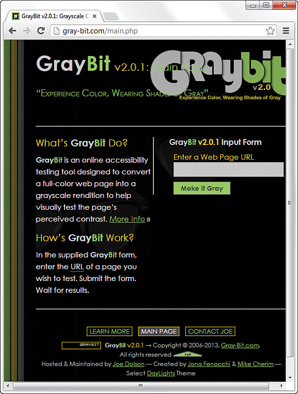
In Figure 15.3, the browser window is approximately 770 pixels wide. This example shows a reasonable minimum screen width before a horizontal scrollbar appears. In fact, the scrollbar does not appear until the browser is 735 pixels wide. On the other hand, Figure 15.4 shows a very small browser window (less than 600 pixels wide).
In Figure 15.4, you can see a horizontal scrollbar; in the header area of the page content, the logo graphic is beginning to take over the text and appear on top of it. But the bulk of the page is still quite usable. The informational content on the left side of the page is still legible and is sharing the available space with the input form on the right side.
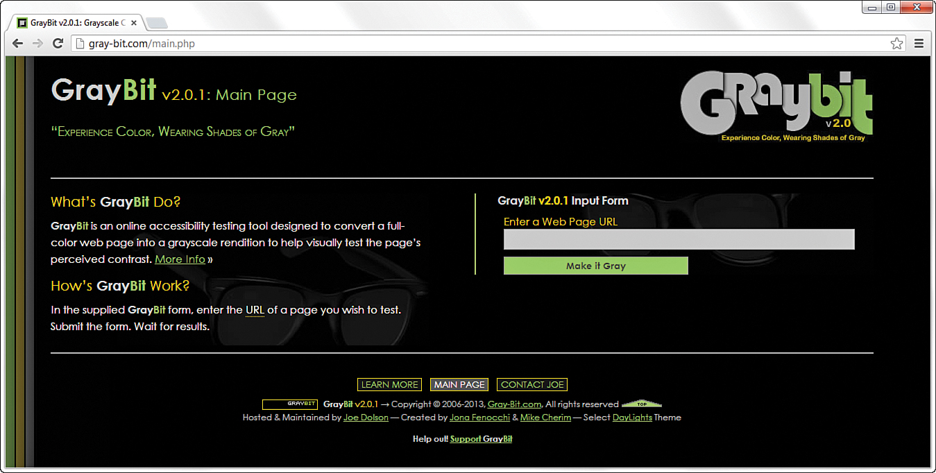
Figure 15.5 shows how this same page looks in a very wide screen. In Figure 15.5, the browser window is approximately 1,330 pixels wide. There is plenty of room for all the content on the page to spread out. This liquid layout is achieved because all the design elements have a percentage width specified (instead of a fixed width). In doing so, the layout makes use of all the available browser real estate.
The liquid layout approach might seem like the best approach at first glance—after all, who wouldn’t want to take advantage of all the screen real estate available? But there’s a fine line between taking advantage of space and not allowing the content to breathe. Too much content is overwhelming; not enough content in an open space is underwhelming.
The pure liquid layout can be quite impressive, but it requires a significant amount of testing to ensure that it is usable in a wide range of browsers at varying screen resolutions. You might not have the time and effort to produce such a design; in that case, a reasonable compromise is the fixed/liquid hybrid layout, or a fully responsive design, as you learn about later in this hour.
Creating a Fixed/Liquid Hybrid Layout
A fixed/liquid hybrid layout is one that contains elements of both types of layouts. For example, you could have a fluid layout that includes fixed-width content areas either within the body area or as anchor elements (such as a left-side column or as a top navigation strip). You can even create a fixed content area that acts like a frame, in which a content area remains fixed even as users scroll through the content.
Starting with a Basic Layout Structure
In this example, you learn to create a template that is liquid but with two fixed-width columns on either side of the main body area (which is a third column, if you think about it, only much wider than the others). The template also has a delineated header and footer area. Listing 15.1 shows the basic HTML structure for this layout.
LISTING 15.1 Basic Fixed/Liquid Hybrid Layout Structure
<!DOCTYPE html>
<html lang="en">
<head>
<title>Sample Layout</title>
<link href="layout.css" rel="stylesheet" type="text/css" />
</head>
<body>
<header>HEADER</header>
<div id="wrapper">
<div id="content_area">CONTENT</div>
<div id="left_side">LEFT SIDE</div>
<div id="right_side">RIGHT SIDE</div>
</div>
<footer>FOOTER</footer>
</body>
</html>
First, note that the stylesheet for this layout is linked to with the <link> tag instead of included in the template. Because a template is used for more than one page, you want to be able to control the display elements of the template in the most organized way possible. This means you need to change the definitions of those elements in only one place—the stylesheet.
Next, notice that the basic HTML is just that: extremely basic. Truth be told, this basic HTML structure can be used for a fixed layout, a liquid layout, or the fixed/liquid hybrid you see here because all the actual styling that makes a layout fixed, liquid, or hybrid happens in the stylesheet.
Note
I am using elements with named identifiers in this example instead of the semantic elements such as <section> or <nav> because I’m illustrating the point in the simplest way possible without being prescriptive to the content itself. However, if you know that the <div> on the left side is going to hold navigation, you should use the <nav> tag instead of a <div> element with an id of left_side.
With the HTML structure in Listing 15.1, you actually have an identification of the content areas you want to include in your site. This planning is crucial to any development; you have to know what you want to include before you even think about the type of layout you are going to use, let alone the specific styles that will be applied to that layout.
At this stage, the layout.css file includes only this entry:
body {
margin:0;
padding:0;
}
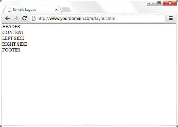
If you look at the HTML in Listing 15.1 and say to yourself, “But those <div> elements will just stack on top of each other without any styles,” you are correct. As shown in Figure 15.6, there is no layout to speak of.
Defining Two Columns in a Fixed/Liquid Hybrid Layout
We can start with the easy things. Because this layout is supposed to be liquid, we know that whatever we put in the header and footer areas will extend the width of the browser window, regardless of how narrow or wide the window might be.
Adding the following code to the stylesheet gives the header and footer area each a width of 100% as well as the same background color and text color:
header, footer {
float: left;
width: 100%;
background-color: #7152f4;
color: #ffffff;
}
Now things get a little trickier. We have to define the two fixed columns on either side of the page, plus the column in the middle. In the HTML we’re using here, note that a <div> element, called wrapper, surrounds both. This element is defined in the stylesheet as follows:
#wrapper {
float: left;
padding-left: 200px;
padding-right: 125px;
}
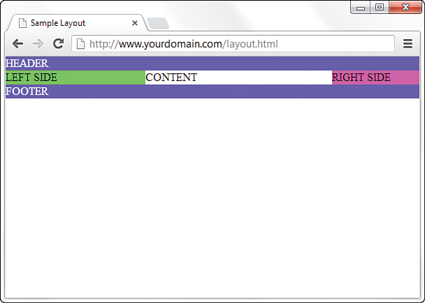
The two padding definitions essentially reserve space for the two fixed-width columns on the left and right of the page. The column on the left will be 200 pixels wide, the column on the right will be 125 pixels wide, and each will have a different background color. But we also have to position the items relative to where they would be placed if the HTML remained unstyled (see Figure 15.6). This means adding position: relative to the stylesheet entries for each of these columns. Additionally, we indicate that the <div> elements should float to the left.
But in the case of the left_side <div>, we also indicate that we want the rightmost margin edge to be 200 pixels in from the edge (this is in addition to the column being defined as 200 pixels wide). We also want the margin on the left side to be a full negative margin; this will pull it into place (as you will soon see). The right_side <div> does not include a value for right, but it does include a negative margin on the right side:
#left_side {
position: relative;
float: left;
width: 200px;
background-color: #52f471;
right: 200px;
margin-left: -100%;
}
#right_side {
position: relative;
float: left;
width: 125px;
background-color: #f452d5;
margin-right: -125px;
}
At this point, let’s also define the content area so that it has a white background, takes up 100% of the available area, and floats to the left relative to its position:
#content_area {
position: relative;
float: left;
background-color: #ffffff;
width: 100%;
}
At this point, the basic layout should look something like Figure 15.7, with the areas clearly delineated.
However, there’s a problem with this template if the window is resized below a certain width. Because the left column is 200 pixels wide and the right column is 125 pixels wide, and you want at least some text in the content area, you can imagine that this page will break if the window is only 350 to 400 pixels wide. We address this issue in the next section.
Setting the Minimum Width of a Layout
Although users won’t likely visit your site with a desktop browser that displays less than 400 pixels wide, the example serves its purpose within the confines of this lesson. You can extrapolate and apply this information broadly: Even in fixed/liquid hybrid sites, at some point, your layout will break down unless you do something about it.
One of those “somethings” is to use the min-width CSS property. The min-width property sets the minimum width of an element, not including padding, borders, or margins. Figure 15.8 shows what happens when min-width is applied to the <body> element.
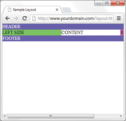
Figure 15.8 shows a small portion of the right column after scrolling to the right, but the point is that the layout does not break apart when resized below a minimum width. In this case, the minimum width is 525 pixels:
body {
margin: 0;
padding: 0;
min-width: 525px;
}
The horizontal scrollbar appears in this example because the browser window itself is less than 500 pixels wide. The scrollbar disappears when the window is slightly larger than 525 pixels wide.
Handling Column Height in a Fixed/Liquid Hybrid Layout
This example is all well and good except for one problem: It has no content. When content is added to the various elements, more problems arise. As Figure 15.9 shows, the columns become as tall as necessary for the content they contain.
Because you cannot count on a user’s browser being a specific height, or the content always being the same length, you might think this poses a problem with the fixed/liquid hybrid layout. Not so. If you think a little outside the box, you can apply a few more styles to bring all the pieces together.
Note
Because we have moved beyond the basic layout example, I also took the liberty to remove the background and text color properties for the header and footer, which is why the example no longer shows white text on a very dark background. Additionally, I’ve centered the text in the <footer> element, which now has a light gray background.
First, add the following declarations in the stylesheet entries for the left_side, right_side, and content_area ids:
margin-bottom: -2000px;
padding-bottom: 2000px;
These declarations add a ridiculous amount of padding and assign a too-large margin to the bottom of all three elements. You must also add position:relative to the footer element definitions in the stylesheet so that the footer is visible despite this padding.
At this point, the page looks like Figure 15.10—still not what we want, but closer.
To clip off all that extra color, add the following to the stylesheet for the wrapper ID:
overflow: hidden;
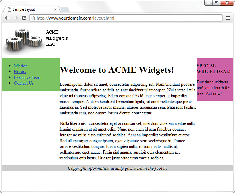
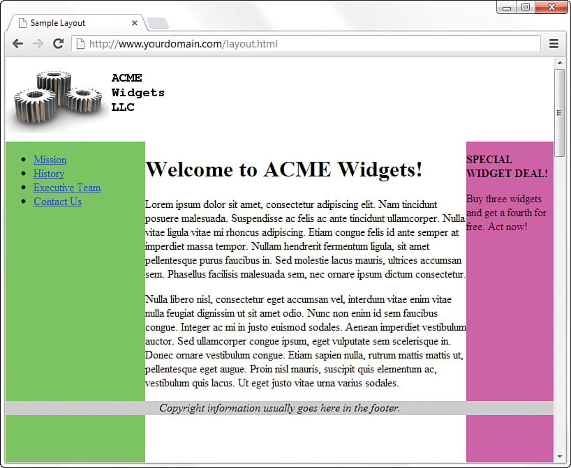
Figure 15.11 shows the final result: a fixed-width/liquid hybrid layout with the necessary column spacing. I also took the liberty of styling the navigational links and adjusting the margin around the welcome message; you can see the complete stylesheet in Listing 15.3.
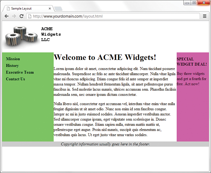
FIGURE 15.11 Congratulations! It’s a fixed-width/liquid hybrid layout (although you’ll want to do something about those colors!).
The full HTML code appears in Listing 15.2, and Listing 15.3 shows the final stylesheet.
LISTING 15.2 Basic Fixed/Liquid Hybrid Layout Structure (with Content)
<!DOCTYPE html>
<html lang="en">
<head>
<title>Sample Layout</title>
<link href="layout.css" rel="stylesheet" type="text/css" />
</head>
<body>
<header><img src="acmewidgets.jpg" alt="ACME Widgets
LLC"/></header>
<div id="wrapper">
<div id="content_area">
<h1>Welcome to ACME Widgets!</h1>
<p>Lorem ipsum dolor sit amet, consectetur adipiscing elit.
Nam tincidunt posuere malesuada. Suspendisse ac felis ac ante
tincidunt ullamcorper. Nulla vitae ligula vitae mi rhoncus
adipiscing. Etiam congue felis id ante semper at imperdiet
massa tempor. Nullam hendrerit fermentum ligula, sit amet
pellentesque purus faucibus in. Sed molestie lacus mauris,
ultrices accumsan sem. Phasellus facilisis malesuada sem, nec
ornare ipsum dictum consectetur.</p>
<p>Nulla libero nisl, consectetur eget accumsan vel, interdum
vitae enim vitae nulla feugiat dignissim ut sit amet odio.
Nunc non enim id sem faucibus congue. Integer ac mi in justo
euismod sodales. Aenean imperdiet vestibulum auctor. Sed
ullamcorper congue ipsum, eget vulputate sem scelerisque in.
Donec ornare vestibulum congue. Etiam sapien nulla, rutrum
mattis mattis ut, pellentesque eget augue. Proin nisl mauris,
suscipit quis elementum ac, vestibulum quis lacus. Ut eget
justo vitae urna varius sodales. </p>
</div>
<div id="left_side">
<ul>
<li><a href="#">Mission</a></li>
<li><a href="#">History</a></li>
<li><a href="#">Executive Team</a></li>
<li><a href="#">Contact Us</a></li>
</ul>
</div>
<div id="right_side">
<p><strong>SPECIAL WIDGET DEAL!</strong></p>
<p>Buy three widgets and get a fourth for free. Act now!</p>
</div>
</div>
<footer>
Copyright information usually goes here in the footer.
</footer>
</body>
</html>
LISTING 15.3 Full Stylesheet for Fixed/Liquid Hybrid Layout
body {
margin:0;
padding:0;
min-width: 525px;
}
header {
float: left;
width: 100%;
}
footer {
position:relative;
float: left;
width: 100%;
background-color: #cccccc;
text-align:center;
font-style: italic;
}
#wrapper {
float: left;
padding-left: 200px;
padding-right: 125px;
overflow: hidden;
}
#left_side {
position: relative;
float: left;
width: 200px;
background-color: #52f471;
right: 200px;
margin-left: -100%;
margin-bottom: -2000px;
padding-bottom: 2000px;
}
#right_side {
position: relative;
float: left;
width: 125px;
background-color: #f452d5;
margin-right: -125px;
margin-bottom: -2000px;
padding-bottom: 2000px;
}
#content_area {
position: relative;
float: left;
background-color: #ffffff;
width: 100%;
margin-bottom: -2000px;
padding-bottom: 2000px;
}
h1 {
margin: 0;
}
#left_side ul {
list-style: none;
margin: 12px 0px 0px 12px;
padding: 0px;
}
#left_side li a:link, #nav li a:visited {
font-size: 12pt;
font-weight: bold;
padding: 3px 0px 3px 3px;
color: #000000;
text-decoration: none;
display: block;
}
#left_side li a:hover, #nav li a:active {
font-size: 12pt;
font-weight: bold;
padding: 3px 0px 3px 3px;
color: #ffffff;
text-decoration: none;
display: block;
}
Considering a Responsive Web Design
In 2010, web designer Ethan Marcotte coined the term responsive web design to refer to a web design approach that builds on the basics of fluid design you just learned a bit about. The goal of a responsive web design is that content is easy to view, read, and navigate, regardless of the device type and size on which you are viewing it. In other words, a designer who sets out to create a responsive website is doing so to ensure that the site is similarly enjoyable to and usable by audience members viewing on a large desktop display, a small smartphone, or a medium-size tablet.
Responsive design is based on fluid (liquid) grid layouts, much like you learned about earlier in this hour, but with a few modifications and additions. First, those grid layouts should always be in relative units rather than absolute ones. In other words, designers should use percentages rather than pixels to define container elements.
Second—and this is something we have not discussed in previous lessons—all images should be flexible. By this, I mean that instead of using a specific height and width for each image, relative percentages are used so that the images always display within the (relatively sized) element that contains them.
Finally, spend some time developing specific stylesheets for each media type, and use media queries to employ these different rules based on the type. You learn more about media-specific stylesheets in Hour 20, “Creating Print-Friendly Web Pages,” but in general, know that you can specify a link to a stylesheet like the following:
<link rel="stylesheet" type="text/css"
media="screen and (max-device-width: 480px)"
href="wee.css" />
In this example, the media attribute contains a type and a query: The type is screen and the query portion is (max-device-width: 480px). This means that if the device attempting to render the display is one with a screen (as opposed to, say, a printer, which you see in Hour 20) and the horizontal resolution (device width) is less than 480 pixels wide—as with a smartphone—then load the stylesheet called wee.css and render the display using the rules found within it.
Of course, a few short paragraphs in this book cannot do justice to the entirety of responsive web design. I highly recommend reading Marcotte’s book Responsive Web Design (http://www.abookapart.com/products/responsive-web-design) after you have firmly grounded yourself in the basics of HTML5 and CSS3 that this book is teaching you. Additionally, several of the HTML and CSS frameworks discussed in Hour 23, “Organizing and Managing a Website,” take advantage of principles of responsive design, and that makes a great starting point for building up a responsive site and tinkering with the fluid grid, image resizing, and media queries that make it so.
Summary
In this hour, you saw some practical examples of the three main types of layouts: fixed, liquid, and a fixed/liquid hybrid. In the third section of the lesson, you saw an extended example that walked you through the process of creating a fixed/liquid hybrid layout in which the HTML and CSS all validate properly. Remember, the most important part of creating a layout is figuring out the sections of content you think you might need to account for in the design.
Finally, you were introduced to the concept of responsive web design, which itself is a book-length topic. Given the brief information you learned here, such as using a fluid grid layout, responsive images, and media queries, you have some basic concepts to begin testing on your own.
Q&A
Q. I’ve heard about something called an elastic layout. How does that differ from the liquid layout?
A. An elastic layout is a layout whose content areas resize when the user resizes the text. Elastic layouts use ems, which are inherently proportional to text and font size. An em is a typographical unit of measurement equal to the point size of the current font. When ems are used in an elastic layout, if a user forces the text size to increase or decrease in size using Ctrl and the mouse scroll wheel, the areas containing the text increase or decrease proportionally. Elastic layouts are often quite difficult to achieve.
Q. You’ve spent a lot of time talking about liquid layouts and hybrid layouts—are they better than a purely fixed layout?
A. Better is a subjective term; in this book, the concern is with standards-compliant code. Most designers will tell you that liquid layouts take longer to create (and perfect), but the usability enhancements are worth it, especially when it leads to a responsive design. When might the time not be worth it? If your client does not have an opinion and is paying you a flat rate instead of an hourly rate. In that case, you are working only to showcase your own skills (that might be worth it to you, however).
Workshop
The Workshop contains quiz questions and activities to help you solidify your understanding of the material covered. Try to answer all questions before looking at the “Answers” section that follows.
Quiz
1. Which is the best layout to use, in general: fixed, liquid, or a hybrid?
2. Can you position a fixed layout anywhere on the page?
3. What does min-width do?
Answers
1. This was a trick question; there is no “best” layout. It depends on your content and the needs of your audience. (Note that the author ultimately leans toward liquid and then responsive layouts as the “best,” however, if you have the time and resources to do so.)
2. Sure. Although most fixed layouts are flush left or centered, you can assign a fixed position on an xy-axis where you could place a <div> that contains all the other layout <div>s.
3. The min-width property sets the minimum width of an element, not including padding, borders, or margins.
Exercises
Figure 15.11 shows the finished fixed/liquid hybrid layout, but notice a few areas for improvement: There isn’t any space around the text in the right-side column, there aren’t any margins between the body text and either column; in addition, the footer strip is a little sparse, and so on. Take some time to fix these design elements.
Using the code you fixed in the previous exercise, try to make it responsive, using only the brief information you learned in this hour. Just converting container elements to relative sizes should go a long way toward making the template viewable on your smartphone or other small device, but a media query and alternate stylesheet certainly wouldn’t hurt, either.