
Chapter 12. Enhancing the User Experience
In This Chapter
• Compact Sections of Fields/Controls
• Make Screen Tips Informative for Validation
• Notify the User of Successful Submission
This chapter demonstrates ways to improve the user experience with your forms by leveraging InfoPath controls, functionality, and settings. Designing intuitive and easy-to-use forms facilitates their acceptance within an organization.
Display a Read-Only Value
When a read-only field is displayed in a text box, you obviously do not want the user to edit that field. You also do not want the user to think that they can edit that field. Therefore, it’s best to modify the text box properties accordingly.
To display a read-only value, follow these steps:
- Right-click the text box that contains the read-only field on your form and select Text Box Properties, as shown in Figure 12.1, to display the properties dialog.
Figure 12.1. Selecting Text Box Properties displays the Properties dialog.

- Click the Display tab and check the Read-Only box, as shown in Figure 12.2, to make the text box read-only. Click OK.
Figure 12.2. Checking the Read-Only box makes the text box read-only.

- Right-click the text box again and select Borders and Shading, as shown in Figure 12.3, to modify the borders and shading properties.
Figure 12.3. Selecting Borders and Shading allows you to modify the borders and shading properties.

- On the Borders tab, click the None button to remove the borders from the text box, as shown in Figure 12.4.
Figure 12.4. Clicking the None button removes the borders from the text box.

- Click the Shading tab and select No Color to remove any shading from the text box, as shown in Figure 12.5. Click OK.
Figure 12.5. Select No Color removes the shading from the text box.

Previewing or rendering your form displays the field as read-only, as shown in Figure 12.6.
Figure 12.6. Rendering the form displays the field as read-only.
Compact Sections of Fields/Controls
When you have sections of similar fields on your form, it is a recommended best practice to use one of the four-column table layouts. To use a four-column table layout in your form or section, select the Tables menu on the Insert ribbon bar and select one of the four-column layouts, as shown in Figure 12.7.
Figure 12.7. Selecting a table layout inserts the table into your form or section.

Configure Dynamic Sections
Hiding or showing sections is another recommended method to enhance the user experience. Optional or conditional fields should only be shown if needed. Although this can be implemented by using optional section controls, it is more aesthetic to use a check box to control the visibility of the optional section.
To do this, follow these steps:
- On your form, add a check box control and a section control, as shown in Figure 12.8. (Optionally, you may add fields within the section, but that is not necessary to wire up the rule.) The check box will control the visibility of the section.
Figure 12.8. Adding a check box and a section to your form allows you to control the dynamic section.

- Select the section on your form and click Manage Rules on the Home ribbon bar. The Rules pane appears.
- In the Rules pane, click New and select Formatting, as shown in Figure 12.9, to add a new visibility rule.
Figure 12.9. Selecting Formatting allows you to create a visibility rule.

- Enter a rule name and click None in the Condition section. The Condition dialog appears.
- In the Condition dialog, enter the condition such that the value of the check box is not equal to True, as shown in Figure 12.10, to determine when the section control will be hidden. Click OK.
Figure 12.10. Setting the condition determines when the section control will be hidden.

- In the Rules pane, click the Hide This Control check box to set the formatting action of the rule, as shown in Figure 12.11.
Figure 12.11. Checking Hide This Control configures the formatting action of the rule.

- Preview your form to test the rule. Initially, the section is not visible, but if you check the check box, the conditional section appears, as shown in Figure 12.12.
Figure 12.12. Checking the check box displays the conditional section.

Make Screen Tips Informative for Validation
When using validation rules (see Chapter 4, “SharePoint Form Rules,” for creating rules), the entered values must conform to the configured pattern. If users do not know the format expected, they can become frustrated, and you don’t want to leave them guessing.
Therefore, it is a recommended best practice to include the required format (of the value) within the screen tip to provide the user with the expected entry pattern, as shown in Figure 12.13.
Figure 12.13. Including the required format of the value provides the user with expected entry pattern.

Notify the User of Successful Submission
After submitting a form, the user may or may not know that the information has been successfully received by SharePoint. Therefore, it is a best practice to create a confirmation view that is displayed after form submission.
The first steps required to create and configure a confirmation view is to set up the submit options:
- On the Data ribbon bar, click Submit Options. The Submit Options dialog appears.
- In the Submit Options dialog, select the Perform Custom Actions Using Rules option, as shown in Figure 12.14, to configure the submission of the form.
Figure 12.14. Submit options allow you to configure the submission of the form.

- For this example, click the Advanced button and change the After Submit to Leave the Form Open, as shown in Figure 12.15, to configure what occurs after submission.
Figure 12.15. The After Submit option configures what occurs after submission.

- Click OK.
That takes care of the submit options, but now you need to configure the form submit rule. For this example, you will need to create a new view (see Chapter 6, “SharePoint Form Page Design and Views”) named Confirmation View, which should contain a submit confirmation message and a button that closes the form.
To enter the submit rule, follow these steps:
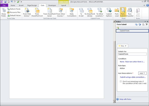
- On the Data ribbon bar, click Form Submit in the Rules section. The Rules pane appears.
- Click New and select Action.
- Enter Submit Form as the name of the rule.
- Click Add and select Submit Data. The Rule Details dialog appears, as shown in Figure 12.16, which allows you to configure the connection.
Figure 12.16. Configuring the connection determines where it will be submitted.

- Select the data connection to submit the form. (If you don’t have a data connection configured, see Chapter 2, “Creating a SharePoint Form with InfoPath Designer,” for an example.) Click OK. Your submit rule should look similar to Figure 12.17, which ensures the form will be submitted.
Figure 12.17. Configuring one rule to submit the form ensures it will be submitted.
- Click Add again to add another action. Select Switch Views. In the Rules Details dialog, change the view to the Confirmation View, as shown in Figure 12.18, to determine which view to be displayed. Click OK. Your form submit rule should now look similar to Figure 12.19, which implements two actions upon form submission.
Figure 12.18. Selecting a view determines which one will be displayed.
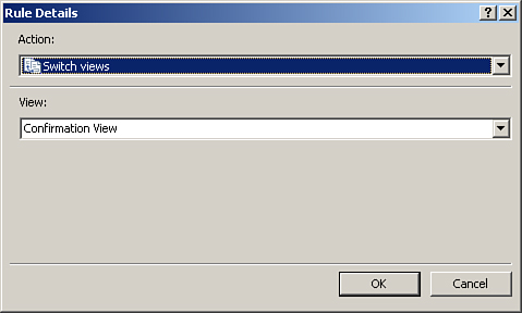
Figure 12.19. The form submit rule implements two actions upon form submission.

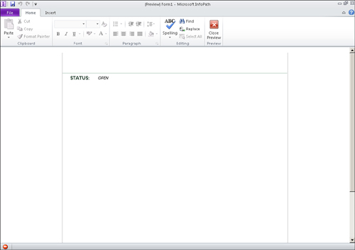
- Save and Publish your form to SharePoint. Once your form is published to SharePoint, you may create a new instance and test the rules. Submitting the form displays the confirmation view, as shown in Figure 12.20.
Figure 12.20. Submitting the form displays the confirmation view.

Create a Tabbed Navigation in Your Form
When there are many different groups of unrelated entries in your form, it is recommended to create separate views to handle the display and entry of each group of fields. An aesthetically pleasing way to handle the switching between the views is through a tabbed navigation.
The initial setup of the tabbed navigation requires the following:
- Create a view in your form for each tab you will have.
- Create two image files for each tab, one for when the tab is selected and one when it is not selected. The selected version will also be used for the hover picture.
- Drag a picture button for each tab you will have onto your first view.
- Configure the first button to use the selected version of the first tab image.
- Configure the other buttons to use the nonselected version of the images as the picture and the selected versions of the images as the hover picture. The initial setup should look similar to Figure 12.21
Figure 12.21. Adding and configuring the picture buttons provides the basis for the tabbed navigation.

- Copy and paste the picture buttons from the main view onto the other views.
- Reconfigure the buttons on each view such that the current view tab has the selected picture with no hover picture. The first button needs to be configured back to the unselected image as the main picture and the selected image as the hover picture, as shown in Figure 12.22, to provide the selection experience.
Figure 12.22. Configuring the picture buttons on each view provides the selection experience.

Tip
Set all margins on the picture buttons to zero (0) so that they can be placed together without any gaps of whitespace between them.
Now that the buttons and views have been configured, we now need to hook up the rules to provide the navigation actions to the tab. You can add the necessary fields to the other views, but that is not required to implement the tabbed navigation.
To implement the navigation, follow these steps:
- On the first view, select the second button.
- Click Manage Rules on the Home ribbon bar.
- In the Rules pane, click New, Action to create a new action rule.
- In the Run These Actions section, click Add and select Switch Views to create a switch view action, as shown in Figure 12.23.
Figure 12.23. Selecting Switch Views creates a switch view action.

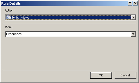
- In the Rule Details dialog, select the view that corresponds to the button, as shown in Figure 12.24, such that when the button is clicked, the appropriate view is displayed. Click OK.
Figure 12.24. Selecting the view determines which view is displayed when the button is clicked.
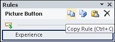
- Use the copy/paste buttons in the Rules pane (Figure 12.25) to copy the rule you just created.
Figure 12.25. Using the copy/paste buttons allows you to easily copy rules to other controls.
- Select the next picture button and click the paste button in the Rules pane to paste a copy of the rule.
- Correct the name of the rule and click the Switch to View action link to change the view to the current button view.
- Switch to the other views of the form and paste the rule on the nonselected buttons. Change the rule names and actions accordingly.
That’s it! Preview your form and click the buttons. The corresponding views display based on the button you click.
Tip
Use the button properties to make each button the same height and width. This provides a smoother transition between views.
Use Pictures as Choices
Using picture buttons as options is a great way to jazz up your form and provide a great user experience. This can be implemented using a picture button for each option within small sections that are configured to display based on the selected option.
To set this up, follow these steps:
- First, add the field that will be the option and store the selected value. For example purposes, I am adding a PhoneType field with a default value of Home, as shown in Figure 12.26.
Figure 12.26. Adding a field allows you to store the selected value.

- The next step is to create image files for each option along with a selected version of the image (similar to the tabbed navigation scenario). For this example, I will use a home and a cell phone image.
- For each option, create a new section in your form to house the picture buttons as shown in Figure 12.27. In my example, I created a sectionHomePhone and a sectionCellPhone.
Figure 12.27. Creating new sections for each option provides the housing of the picture buttons.

- Create picture buttons inside each section using the selected version of the image for the corresponding section as shown in Figure 12.28. This provides the selected appearance. In my example, the selected home image is in the sectionHomePhone section and the selected cell phone image is in the sectionCellPhone section.
Figure 12.28. Placing the selected images within the corresponding section provides the selected appearance.

Now you need to set the actions of the picture buttons by adding the appropriate rules:
- In the first section, select a non-elected picture button. For my example, I selected the cell phone image.
- Add a rule to the button with the Set a Field’s Value action and set the field for your choice to the appropriate value, as shown in Figure 12.29. This is the value that will be set when the picture button is clicked. For my example, I am setting the PhoneType to Cell.
Figure 12.29. Setting the field’s value changes the value when the button is clicked.

- Repeat steps 1-2 for any other nonselected picture buttons in the first section.
- Repeat steps 1-3 for each additional section. In my sectionCellPhone section, I selected the home button and added the appropriate rule to set the PhoneType to Home.
The final set of steps involve creating formatting rules on each section as follows:
- Select the first section and add a new formatting rule.
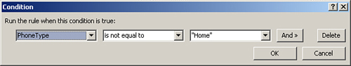
- Add a condition for the rule such that the field is not equal to the value that the section represents, as shown in Figure 12.30, because we are going to hide the section. In my example, for sectionHomePhone, the condition is the PhoneType is not equal to Home.
Figure 12.30. Setting the condition hides the section when the field is not equal to the value.
- Check the Hide This Control option in the rule under the Formatting section.
- Repeat steps 1-3 for each additional section.
Preview the form the test the implementation. Clicking a nonselected picture changes that button to the selected option, as shown in Figure 12.31.
Figure 12.31. Clicking a nonselected picture changes that button to the selected option.

Tip
Use a read-only text box to change the label of any dependent fields based on the selected option. In Figure 12.31, notice that the phone label now states Cell Phone.