APPENDIX A
ADDITIONAL SIGNS OF SECULAR TURNING POINTS FOR EQUITIES
In this appendix we build on the material from Chapter 3 and consider some additional concepts that can help you identify secular turning points in equity markets. In this way it will be possible to paint a broader picture of what these important juncture points should look like. After all, the greater the number of pieces of the puzzle that come our way, the greater the odds that we will be able to spot the end of our current secular bear. Let’s start off with a couple of additional measurements of value, which, as we noted in Chapter 3, should really be thought of as gauges of sentiment.
The Inverted Dividend Yield
Dividends are the actual returns that investors get for holding stocks, so their yield, like their P/E, also reflects the level of optimism or pessimism felt by market participants. If the yield is low, it indicates confidence that prices are likely to move higher. Why? Because the ultimate total return from a stock is a combination of current return (i.e., the dividend yield) and capital appreciation. If expectations are for higher prices, it means that investors are willing to settle for a low yield. On the other hand, at market lows, when prices have been falling for an extended period, yields are typically very high. This is because investors, having seen prices collapse, expect more of the same and need to be compensated for their perceived elevated risk in the form of a higher dividend yield. After all, if investors thought that stocks were going to explode in price, they would require no current yield at all.
High yields at secular lows also arise because one common cause of weaker stock markets is higher interest rates as the Fed seeks to cool the economy from end-of-the-cycle inflationary pressures. In order to compete with higher-yielding bonds, therefore, equity yields also need to rise. Since yields move inversely to prices, the dividend yield series in Chart A-1 is plotted in that way.
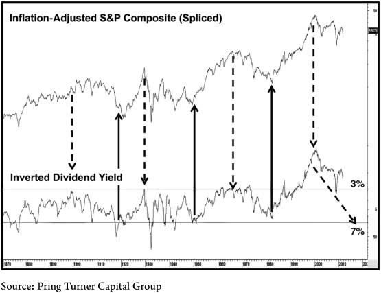
CHART A-1 Deflated U.S. Stock Prices Versus the Inverted S&P Composite Dividend Yield
This chart shows how dividend yields fluctuate from a buying zone low at the lower horizontal line at 7 percent to a very optimistic 3 percent at the upper horizontal line.
The secular swings are not as obvious as those of the P/E in Chapter 3, but the turning points are all associated with extremes in valuation. When investors are optimistic, they are willing to settle for a paltry 2 to 3 percent yield. But when it comes to a secular low, they require a much more generous payout in the 6 to 7 percent range. The reading at the start of 2012 was just slightly more than 2 percent, clearly a long way from the average at secular lows of 6 to 7 percent.
While a high reading was attained at every secular low, it was not necessarily a sufficient condition. For example, in the mid–1870s the inverted yield moved to a very overextended reading only to see a bounce and a drop back to an even more extreme one. We see a similar setup in the 1900s and 1930s.
However, we can say that every secular bull market has been unable to get underway until a swing in the yield has taken it from a very overextended bull market reading to the 6 to 7 percent level. Thus, if the 2000–20?? secular bear ended in March 2009, it would have terminated at a dividend yield reading that was more akin to a secular top than a secular bottom. More likely, another decade of subpar stock market returns and rising dividend payouts could take us closer to the ultimate valuation level required for an end to the bear and the beginning of a new secular bull market.
Tobin’s Q Ratio
Another method of measuring value was created by Yale economics professor and Nobel laureate James Tobin—hence the name Tobin’s Q ratio. The Q ratio is the total market value of the stock market divided by the replacement cost of all the underlying companies. A value greater than one indicates that stock prices sell above their replacement cost and are therefore expensive, while a reading below one tells us that the market can theoretically be bought for less than replacement cost. If an individual corporation sells for less than one, this means that it is cheaper to buy it than build it. Chart A-2 offers a good understanding of value, information about current risk levels, and a method to assess probable returns for the long term.
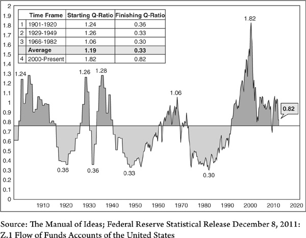
CHART A-2 Tobin’s Q Ratio, 1900–2011
The Q ratio measures the replacement value of all listed stocks and is normally well above that level at secular peaks and at a 30 to 40 percent discount at secular lows.
Secular bear markets generally bottom when the ratio declines to a bargain level of less than 0.4, or when stock prices sell for just 40 percent of replacement value. The reading at the end of 2011, at 0.82, was considerably higher than that seen at the average secular low of 0.32.
The Response of Equities to Changes in the Money Supply
A final view of the secular trend comes with a comparison of real stock prices with the ratio between the S&P and money supply (M2) as shown in Chart A-3. This arrangement probably sets the scene better than any in that it offers the perspective of the secular trend overlaid on the cyclical trend. The concept behind this relationship is that an increase in the money supply at some point feeds back into improved economic activity and vice versa.
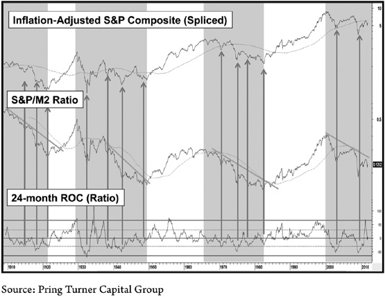
CHART A-3 CPI-Adjusted Stocks and the Equity/Money Supply Ratio
Shaded areas represent secular bear markets. Arrows show cyclical reversals from oversold levels in secular bear markets.
Until the market, in the form of the S&P 500, senses that this additional liquidity is actually going to have a positive effect, the ratio declines. When the ratio finally responds to this injection of liquidity by rising, it signals the birth of a new cyclical or, at the end of a very long-term decline, secular bull market. A declining ratio means that the market is sensing that insufficient liquidity is being pumped into the system in order to maintain a positive economy. In reality the lead between the time when monetary expansion begins and the economy responds is a varied one. This observation also applies to the M2/stock relationship. That’s why we look to changes in the direction of the ratio’s trend to tell us when the market senses that the new money supply trend is going to have an effect. It is the reason why it often reverses direction relatively closely to major turning points in inflation-adjusted equity prices.
Note that the post–1929 low in the ratio developed in 1949, many years after the absolute price low that was established in 1932 (see Chart 2-1), or even the CPI-adjusted series in the upper panel of Chart A-3. The same thing happened during the next secular bear where the actual bottom in absolute prices formed in 1974, but the ratio continued declining into 1982. The CPI-adjusted series also bottomed in 1982.
The shaded areas flag secular bear markets since 1910. In the past their termination has been signaled in a timely and reliable fashion from a combination of the ratio crossing above its 96-month moving average (MA) and a violation of the then prevailing secular down trendline. The MA is represented by the dashed line. In this case the 96 months represent eight years or just over two business cycles worth of data. When it has been possible to construct a meaningful trendline and this has also been violated, another reasonably timely signal of an emerging secular bull is given. Of course this is not precise timing, but, after all, we are trying to identify a secular trend reversal that will probably last 18 to 20 years, so a few years here or there is not that material.
Since the year 2000 it has been possible to construct a fourth down trendline, which was actually intersecting with the 96-month MA at the start of 2012. This convergence of resistance points offers a very significant benchmark from which the next secular reversal can be identified. Two other useful benchmarks that will help to isolate a long-term reversal are the secular down trendline for the deflated S&P and its 180-month or 15-year MA.
From a primary trend aspect, the arrows show that most business-cycle associated bottoms during secular bear markets have developed when the rate of change of the S&P/M2 has reversed from a position close to or below the dashed oversold line. At the start of 2012 this momentum series clearly had some way to go before it would provide a positive signal. In this respect, it’s important to note that while the vast majority of cyclical bulls that develop under the context of a secular bear are signaled in this way, there are some that are not.
While it is important to note the huge increase in liquidity that took place in the opening part of the decade, we also need to be aware of how that liquidity is being used. If, for example, money supply expands but people park this new money in a bank account or under the bed, it has no stimulatory effect. On the other hand, if they start to use it and production does not rise in proportion, prices will. That’s the idea behind Chart A-4, which features on 18-month ROC of the velocity of M2. As you can see, this series lines up very well with the peaks and troughs in the CRB Spot Raw Industrials. The dashed arrows show when this normally consistent relationship has failed. If the increase in money supply is offset by a decline in its velocity (defined as GDP/M2), the oscillator will fall, and vice versa. As of the close of 2012, the oscillator is very overstretched on the downside but still falling. As long as this trend continues there are no inflationary consequences. However, when it starts to pick up again, implying that M2 velocity has picked up, that will be the time to expect a resumption of the secular uptrend in commodity prices, provided it has not been negated in the meantime.
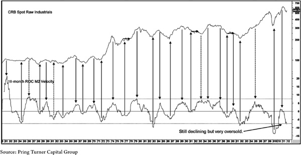
CHART A-4 CRB Spot Raw Industrials Versus Velocity of Money
This chart shows the connection between business cycle–associated changes in commodity prices with the momentum of M2. Its low reading in February 2012 hints at a reversal sometime later that year or early 2013.
The Role of Unstable Commodity Price Trends
In Chapter 3 we established that the nature of the long-term trend of commodity prices has an enormous effect on the direction of the secular trend of CPI-adjusted stock prices. We concluded that gently rising, flat, or falling prices offered a benign environment in which stocks could flourish. However, when they become unstable in either direction for an extended period, this is a formula for a long-term decline in inflation-adjusted prices. Alternatively, it could result in a trading range for equities in absolute price terms.
We stated in earlier chapters that we expect the commodity secular bull market dating from 2001 to extend, principally because of its below-average duration at the end of 2011. By way of further justification for an inflationary view, the default policy of central banks is to resort to monetary expansion at the slightest sign of trouble. This means that commodity price volatility is usually experienced on the upside. However, there have been instances when downside instability in commodity prices has been responsible for specific phases of secular bear markets.
So what if we are wrong in our secular commodity uptrend assumption? What if the debt overhang has the effect that it normally does of cramping growth and offsetting the monetary printing presses with a consequential deflationary outcome, à la 1929 and 1932? How would we know? Well that’s where the next two charts come in.
Chart A-5 compares real stock prices to a momentum measurement for commodity prices and further supports the idea that rapidly moving commodity prices in either direction are bearish for stocks.
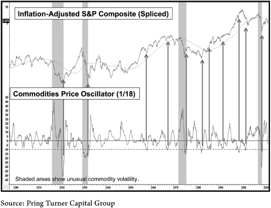
CHART A-5 Real Stock Prices Versus Commodity Momentum
Unusual commodity volatility on both the upside and downside usually results in sharply lower equity prices. The arrows indicate that oversold reversals in the commodity oscillator offer great buying opportunities for stocks.
The indicator itself expresses how each monthly level in the commodity index deviates from its 18-month MA, so it is more of a business cycle–associated barometer for equity prices than a secular one. A high reading indicates when the index is substantially above its 18-month MA and vice versa. This relationship demonstrates that sharp commodity momentum rallies that develop from an extremely oversold condition are actually bullish for equities, because they signify a recovery coming out of a deep recession. Other than that, unusually large swings in commodity prices adversely affect equities. The shaded areas point up the greatest fluctuations, which have also been associated with the worst equity bear markets in the last 100 years or so. The arrows indicate when the oscillator comes close to or briefly touches the −10 percent level and reverses to the upside. You can see that these events are usually associated with a bear market low or a quick but nasty shakeout such as the one that developed in 1998. If you never appreciated the fact that equity prices generally abhor instability, this chart brings you up to speed!
Quantifying Dangerous Commodity Instability
We have already established the broad connection between real stock price declines and unstable commodity prices. However, the missing ingredient is a more precise approach that we could use to identify positive and negative equity environments during the course of the business cycle.
Chart A-6, for instance, takes a slightly different tack because it actually measures environments of cyclical equity risk for inflation-adjusted equities and flags them with the light highlights. These periods were determined by our commodity instability model, which is described below. This is useful as a tactical device for allocating assets over the course of the business cycle. In addition it quantifies the type of commodity instability being experienced and therefore aids us in our quest to better appreciate whether the environment is approaching a destabilizing commodity rally or a disrupting decline.
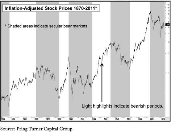
CHART A-6 Real Stock Prices Versus the Stock/Commodity Model
This model effectively identifies cyclical bear markets for stocks, which are more pronounced in secular bear periods.
The model takes three factors into consideration and also defines them. They are:
1. Dangerous periods of upside commodity volatility
2. Treacherous environments of declining commodity prices
3. A form of trend measurement that confirms whether equities are responding in a negative way to the defined environment
When either volatility condition is confirmed by the trend measure or the trend measure on its own is negative, it is assumed that equities are risky and should be avoided. By the same token if the trend is positive and neither volatility condition is in force, this is the all-clear sign to invest in equities.
The ingredients for the actual model are featured in Charts A-7 and A-8. Chart A-7 covers the bulk of the period since 1870, and Chart A-8 embraces more recent price action. Light highlights again indicate when bearish periods are identified in the model.
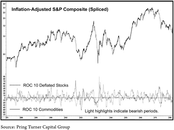
CHART A-7 Real Stock Prices Versus the Stock/Commodity Model, 1870–1982
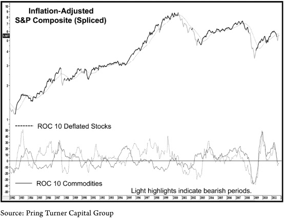
CHART A-8 Real Stock Prices Versus the Stock/Commodity Model, 1982–2011
In Chart A-7, the negative signals for inflation-adjusted stocks develop when two of three conditions are in force. First when the 9-month ROC (rate of change) for deflated equities and commodities are both below zero. In this case negative commodity momentum indicates a weak economy, and the bearish negative equity velocity confirms that stock prices are responding to it. It’s also a way of showing that downside commodity instability is sufficient to have an adverse effect on stocks. If it weren’t, then stocks would not be experiencing negative momentum.
Our second condition (Chart A-8) attempts to monitor situations when upside commodity momentum is excessive and therefore likely to harm stocks. For example, we know that a gentle rise in commodity prices is positive for equities because it reflects the fact that the economy is growing, but not in an overheated way. However, when commodity prices accelerate to the upside and stocks fail to respond, it is a signal that equities have started to factor in these inflationary pressures in a negative way. Stocks are a forward-looking indicator, so their reluctance to follow commodity prices higher means that they are anticipating that these end-of-cycle pressures will soon end in an economic contraction.
Our model measures this condition by subtracting a specified rate of change for inflation-adjusted equities from that of commodities. When the differential exceeds a specified amount, the second unstable commodity condition is met. It remains in force until a reading below the triggering level materializes.
The final model ingredient is that the deflated stock series must confirm the condition being signaled by its other two components. In other words, if either of the conditions is bearish, then deflated equities must also be below their 9-month moving average.
We can use the model from two points of view. First, the shaded areas in Chart A-6 show the secular bear markets that have evolved since the mid-nineteenth century. The light highlights indicate when the model was bearish, and it is fairly obvious that the indicated setbacks, for the most part, were pretty severe. The good news is that the model caught most of these declines. Secular bulls also experience primary trend declines, but these are far more benign.
The model catches most of them, but because of their ephemeral nature, the model is usually a bit late in signaling the all clear. The moral of the story is that if a secular bull is in force, investors are quickly bailed out, so the model does not deserve as much respect when on a sell signal. On the other hand, in a secular bear, sell signals indicate a much more risky environment, so those who ignore it do so at their peril.
This approach can also be used to help form a cyclical allocation strategy. By and large, an overweight position in equities would be appropriate when the model is bullish, whereas a trimmed down position would make more sense when it is negative.
The upper portion of Chart A-9 shows the equity line for the system using a fully invested position when the model is bullish (dark highlight) and there is no exposure during bearish periods (light highlight).
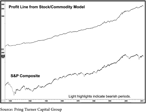
CHART A-9 S&P Composite Versus the Equity Line for the Stock/Commodity Model
An original investment of $1,000 would have returned over $250,000 over the 130 years of the model. This assumes the receipt of a paltry 3 percent interest rate when out of the market (the average was 4.4 percent), but makes no allowance for commissions or slippage for the 104 trades. A buy-and-hold approach during the same period returned a $125,000 gain with far greater risk exposure. When using the CPI-adjusted series, the profits were, of course, much less at $67,000. However, the comparisons against the $13,000 buy-and-hold approach were far superior—an approximate quintuple in the difference between the two results compared to a doubling for the absolute comparison. The reason was that during bear markets, when the system was largely in cash, the inflation-adjusted losses were much greater.