APPENDIX C
GLOBAL ASPECTS TO THE SECULAR BEAR MARKET IN STOCKS
Our attention so far has been focused on the secular equity bear market in the United States, but this same phenomenon can be identified in other countries—mostly the developed ones.
What Is the Direction of the Global Secular Trend?
Since the early 1990s, the overall trend of the correlation between individual countries, as we might expect, is one of a closer-knit global financial community as markets around the world are gradually becoming more and more correlated. This arises not only because of institutional changes, such as the advent of 24-hour trading, increased international listings, international ETFs (which permit instant trading in international markets), and so on. Also important is the fact that companies are diversifying their operations globally. This means that, although they may be associated with the country in which they are domiciled, the bulk of their earnings comes from outside that domicile. Since the world is becoming more and more integrated, it is worth addressing whether the U.S. secular bear stands alone or is replicated in other countries.
The first place to start would be a CPI-adjusted measure for global equities. This is shown in Chart C-1 for the Morgan Stanley Capital International (MSCI) World Stock ETF, which has been spliced to its tracking index. This series has also been deflated by a global CPI, as published by the OECD (Organisation for Economic Co-operation and Development). As you can see, global equities come into the chart in a secular downtrend and remain there until 1982. A subsequent rally takes the index to a secular high in 2000 after which it begins a secular bear market. We conclude that it is a secular bear because the primary trend peaks and troughs since 2000 have been moving in a sequentially lower pattern. As you can see, there is a fairly close tie-in with U.S. experience between the global and U.S. series. We have to be a bit careful though, because in the early years the U.S. market represented a huge weighting in the world series. To some extent it could be argued that we were comparing oranges to oranges. The U.S. weighting is still significant but has definitely shrunk as emerging countries have come to the fore.
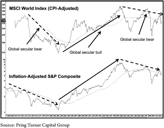
CHART C-1 MSCI World ETF (CPI-Adjusted) Versus the S&P Composite (CPI-Adjusted), 1967–2012
This chart shows that global markets like the United States have been in a secular market since the start of the century.
Chart C-2 compares the performance of the CPI-adjusted global series to the German DAX deflated by the German CPI. The experience is very similar, though in earlier years the trajectories did differ for a while as flagged by the arrows. Since the current secular bear began in 2000, the trajectories have been much closer thus indicating the stronger link between markets around the globe. Needless to say, our analysis of real German equities leads us to a draw a secularly bearish conclusion.

CHART C-2 MSCI World ETF (CPI-Adjusted) Versus the German DAX (CPI-Adjusted), 1969–2012
Germany and the World Index are closely correlated.
Japan: A Leading Indicator in Secular Bears
In the current cycle, the leading indicator of secular bear markets is Japan. Chart C-3 indicates that it has met the average U.S. magnitude (82 percent inflation-adjusted) and duration (approximately 20 years) standards.

CHART C-3 Nikkei (CPI-Adjusted) and Price Swings in Excess of 25 Percent, 1975–2012
This chart shows the devastation wreaked on Japanese equities since 1989.
You can also see that if 25 percent price swings are considered, the market has experienced nine waves which is far more than any U.S. secular bear experience. Indeed, by way of showing how poor the Japanese performance has been, current CPI-adjusted prices for the Nikkei at the end of 2011 were not far above 1963 levels.
Chart C-4 compares this CPI-adjusted Nikkei with that of the S&P. In this case the S&P data have been lagged by 126 months so that the two secular peaks coincide. The date scale on the X axis is for Japan. The waves in the lower panel compare the progress of these two series in a more simplistic way. Obviously they are not identical, but what is striking is that the two trading patterns are so close, thereby demonstrating that trends in mass psychology are similar both in terms of time and geography. When first viewed, the overlay for the U.S. 2000–2011 experience looks to be very similar to that of Japan. However, while the turning points are fairly near in terms of time, the price action in between can differ considerably. Some of this action has been flagged with the dashed arrows. The shaded areas are there to remind us that while the turning points of the major waves are reasonably close, they have differed by as much as 11 months. In effect, while interesting, this overlay chart should in no way be used for forecasting the future course of U.S. equities but more as a guideline to demonstrate the common underlying psychology applicable to secular bear trends. Down the road the U.S. market may experience some of the characteristics previously seen at secular turning points. If it does, it may also be possible to confirm that a reversal in Japanese fortunes had already taken place. In that way Japanese price action could be used as supplementary evidence for a U.S. turn. Consequently, we think that Japanese progress should be closely monitored in the future for it could well prove to be a very early leader for the next U.S. secular bull market.

CHART C-4 Real Japanese Versus Real U.S. Stock Prices, 1984–2011
In a broad way, inflation-adjusted U.S. equity prices are following their Japanese counterparts.
Other Countries and the Global Secular Bear
Many may be wondering about China and the great promise it holds. After all, this market peaked in 2007 several years after the United States. In that respect, Chart C-5 shows that the Shanghai Index experienced a bubble of its own. This is evidenced by the extremely high reading in the 18-month rate of change in the lower panel. To put this elevated level into perspective, two other bubble peak readings are also shown. These are the historic 1980 gold peak and the Nasdaq peak in 2000. As you can see, the 2007 reading for the Shanghai composite reached a higher level than either of them. Momentum, it should be understood, is a way of statistically reflecting swings in sentiment in any market. We know from the experience of looking at other time periods and markets that a reading in the 18-month ROC in excess of 200 percent is very unusual. The reason is that it takes an immense amount of bullish sentiment to double the price of any security in such a relatively short time span. Usually, when people elevate prices that much and that quickly, it means that they are getting way ahead of the emerging fundamentals. Consequently, decisions being made are careless, and a lengthy period of ranging action or actual price erosion is almost always required to bring the situation back into balance.
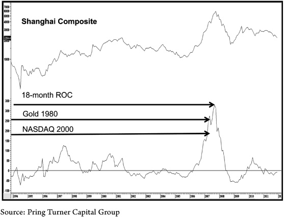
CHART C-5 Shanghai Composite and an 18-Month ROC, 1994–2012
This chart demonstrates that the Chinese equity market in 2007 had reached a higher level of euphoria than gold in 1980 or the Nasdaq in 2000.
There have been exceptions to this rule, but they are few and far between. In this respect Table C-1 shows all the 18-month ROC readings in excess of 200 percent that we have observed in our extensive database. To put this in perspective, the highest 18-month reading ever seen was 124 percent for the S&P Composite in 1844. It barely rose above 100 percent at the 1929 peak! The final column in the table shows how long it has taken to surpass the market reading registered at the ROC high. This is a far from precise approach because of the varying nature of the price action. Those labeled N/A in the fourth column mean that at the start of 2012 the high referred to had never been surpassed. The blanks in the fifth column mean that too little time has elapsed to offer meaningful results since the ROC peaked very recently in 2010 or 2011. It’s obviously far too early to appreciate the effects of these overstretched reversals. The bottom line from all this is the suggestion that the 15-year average period needed to reach a recovery high should be taken with a grain of salt. Nevertheless, the implication from a +200 percent reversal in an 18-month ROC raises the odds that prices will decline sharply and/or experience a major trading range extending for more than five years and probably much longer. This is because it takes time and usually a lot of it to work off the excessive bullish psychology associated with the ROC peak. The point of the exercise then is to underscore the fact that the Chinese market in all probability began some kind of secular trading range or actual bear in CPI-adjusted terms in 2007.

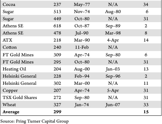
TABLE C-1 Recovery Time Following an 18-Month ROC Reading Above 200 Percent
This table shows that when a market reverses from a gain in excess of 200 percent achieved in an 18-month period, it usually results in a secular peak.
Finally, we take a look at the Italian and Indian markets as adjusted by their respective CPIs as published by the OECD. They are shown in Chart C-6. Note that the Italian market peaked in real terms in 1966. Since then it has undergone a secular bear and bull and has, since 2000, experienced another secular bear. The 2011 violation of the light up trendline dating from 1980 does not argue well for its future.

CHART C-6 Inflation-Adjusted Italian and Indian Markets, 1964–2012
This chart compares the secular experience of two countries with different population pyramids.
The inflation-adjusted Indian market, on the other hand, remains in a long-term secular bull. If the 2009 low is taken out, that would set up a series of declining primary trend peaks and troughs and that would suggest to us that India had entered the global secular bear. Until then it is wiser to assume that the secular uptrend was still intact.
Two Structural Factors That Appear to Influence Secular Trends
By way of an aside, it would appear that the food for secular bears in individual countries comes from long-term structural imbalances in both debt structures and population pyramids. Figure C-1, for example, compares the population pyramids for Italy and India.


FIGURE C-1 Population Pyramids for Italy and India
The lower the step, the younger the age. India has a favorable pyramid because a large number of young people are supporting a small number of senior citizens, a perfect setup for a long-term bull market. In Italy, we see the opposite structure.
Ideally, a population pyramid set for growth has a very large base relative to its top. This means that a substantial part of the population is in a productive age bracket and that the smaller number at the top means relatively few dependents. Senior citizens as a group act as a drag since they are net consumers of resources.
If you recall, Italy has been in a severe secular bear, but India has so far escaped. Not surprisingly, India’s population pyramid has a very wide base relative to its top. Compare that to Italy, where we see a trend toward top heaviness. Little wonder that Italy has been struggling.
A good population pyramid is not a guarantee that a country will avoid a secular bear market because other factors obviously come into play. Other things being equal, spotting a country with a favorable population pyramid offers a good starting point. In that respect Figure C-2 shows two countries with two potentially bullish long-term factors, a positive population pyramid and abundant resources. If we are correct in our assumption of a long-term bull market in commodity prices these two, Brazil and South Africa, should do very well.


FIGURE C-2 Population Pyramids for Brazil and South Africa
Brazil and South Africa are well structured population-wise to develop economically.
Our second broad point concerning structural problems has to do with debt. An excess of dependent senior citizens is a kind of tax on growth, but just as important, it is an excess of debt. That’s because the servicing of that debt robs society of valuable resources that could otherwise be used for investment. Countries with a population pyramid problem and overindebtedness are receiving a double hit. In that respect Table C-2 shows that two of the worst-performing markets in recent decades, Japan and Italy, are at the top of the government net debt as a percentage of GDP.

TABLE C-2 Country Debt as a Percent of GDP
By the same token other countries cited as potential secular bear escapees have a significantly lower debt-to-GDP ratio. Most notable are South Africa (34 percent) and Indonesia (27 percent). We did not mention earlier that Indonesia also has a very favorable population pyramid. This seems to be an optimistic note on which to end this appendix.