CHAPTER 4
RULE 1: ALWAYS THINK ABOUT CON-TEXT (IT'S A CON WHEN THERE'S TOO MUCH TEXT)

Source: Nielsen, “How Little Do Users Read?”
When faced with more than six hundred words of copy, the average person only reads 20 percent of the text placed in front of them (Figure 4.1). That's only 120 words, the length of about two tweets. In a world where content can make or break your brand, the ways in which you respond to this fact will determine how successful your content is.
To put this into perspective, consider how you would react to a similar scenario. If you only had fifteen minutes to consume content, would you opt to read a well-written article about your topic of interest or would you prefer to watch a video on the same topic instead (Figure 4.2)? This question was posed to a diverse set of respondents, and 66 percent opted to watch a video rather than read a lengthy article.
With only 15 minutes to consume content, audiences prefer to ...
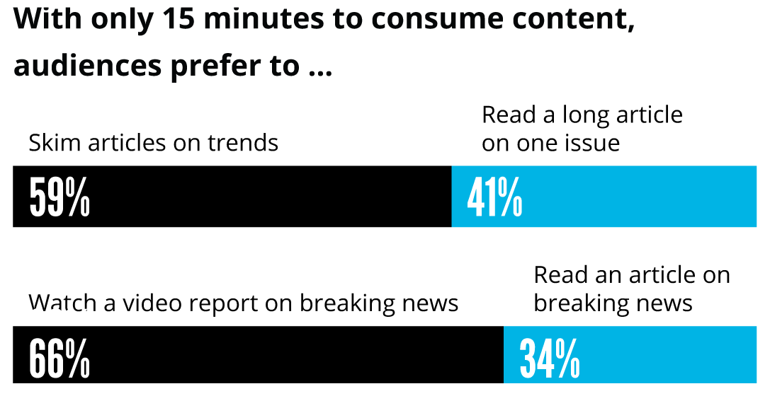
Source: Adobe, “The State of Content: Expectations on the Rise.”
Today's consumers balk at reading assignments and demand visual content instead—as part 1 of this book has shown. Despite this, brands continue to deliver “visual communication” that combines long-form text with illustrations and iconography in the hopes of satisfying audiences' voracious appetite for visual media. But when the text outweighs the iconography and illustrations, the resulting content is far less engaging and won't garner the same attention as a piece that truly leads with visual communication as its foundation.
For example, how often have you seen an “infographic” executed like the one in Figure 4.3?
This example shows a fairly typical execution of a “quick reference” slide or guide and is in line with what many would consider an “infographic.” It is meant to summarize key findings and ensure they are easy to digest. But with this much text and no data visualization, it's really not at all easy to digest—not for audiences who already read just one-fifth of the text on most web pages. As a result, this isn't true visual communication; it is instead a reading assignment with subtle visual cues.
The example breaks one of the most important rules of visual communication. Always think about con-text: it's a con when there's too much text.
EXERCISE: HOW LONG WILL COMPREHENSION TAKE?
To best exemplify this rule, imagine all of the supporting text shown in Figure 4.3 disappeared and all that remained were the visualizations and headlines. To see what that looks like, view our next “infographic” example in Figure 4.4.
As you look at the design in Figure 4.4, take a moment to ask yourself the questions on the next page as quickly as you can.
- What is the main topic of the piece?
- What is at least one key takeaway from the piece?
- What do the numbers mean?
Now look back at the version in Figure 4.3. Read through it and time yourself as you do.
- How long did it take?
- Did you give up reading and jump back into this book?
- If so, how long did it take before you gave up?
According to three studies outlined in the journal Behaviour & Information Technology, the average person only takes fifty milliseconds to form an opinion of the content they view. This doesn't mean that it takes fifty milliseconds to discern meaning from visual content; it only suggests that this is the time required to judge that content.
But how quickly can our brains truly derive meaning from a single image? Mary Potter, an MIT professor of brain and cognitive sciences, sought to answer this question, as an article in MIT News explains. Working with a computer to process images at rapid-fire speeds, Potter and fellow colleagues presented a series of visuals to their test subjects.
It quickly became clear that subjects easily processed images after viewing them for only eighty milliseconds, so the MIT team decided to keep pushing the limits of the test. They tried fifty-three milliseconds, then forty, then twenty-seven, and finally concluded the study at thirteen milliseconds simply because it was the fastest rate the computer monitor could display images to a viewer.
While subjects did not perform as well when viewing images at thirteen milliseconds when compared to eighty, they were still able to extract a clear meaning from the images they saw. Potter concluded that, in just thirteen milliseconds, “what vision does is find concepts. That's what the brain is doing all day long—trying to understand what we're looking at.”
In comparison, our brains take far longer to infer meaning from text. The average adult reads 238 words per minute, according to a 2019 meta-analysis. This breaks down to less than 4 words per second. There are very few sentences that—unaccompanied by visual content—drive significant meaning in four words or fewer, so it's best to assume that it takes at least two seconds for the brain to take in a full sentence. And that doesn't even consider the length of time needed to process and store the information contained within that sentence.
Clearly, leading with too much text can negate the purpose of visual communication, because text is simply less efficient. When the preceding “infographic” is stripped of its text and left with just visuals, it is impossible to make any sense of it. Because the text must be read to understand what the visuals are trying to communicate, we can conclude that it's not true visual communication.