CHAPTER 10
RULE 7: USE PROPER DATA VIZ THROUGHOUT
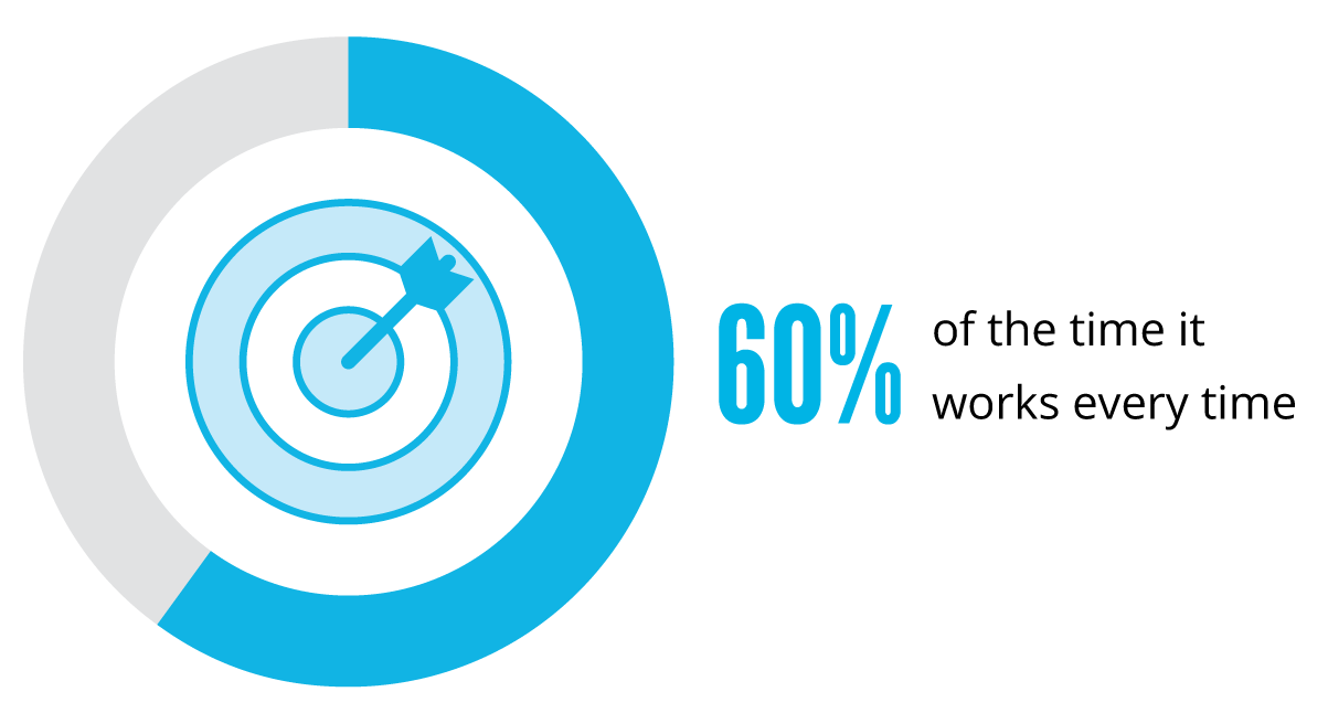
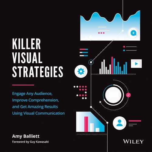
Figure 10.1
—Brian Fantana “Anchorman: The Legend of Ron Burgundy”
Whether in school or in the workplace, the majority of us have had to either read or create charts and graphs at some point in our lives. This graphic representation of data, called “data visualization” or “data viz,” has been our go-to method for understanding how numbers correlate to one another for centuries. In fact, the first-ever line and bar graphs were developed as early as 1786, when William Playfair released The Commercial and Political Atlas.
Playfair wanted to compare the total amount of exports to the total amount of imports in Scotland over a single-year period (from 1780 to 1781), broken down by source/destination. To chart total numbers, identify locations, and differentiate imports from exports, he realized that a combination of bars and scales would do the trick. The result was the first recorded bar graph in history, pictured in Figure 10.2.

Figure 10.2 []
At the time, Playfair was navigating uncharted waters, but today, charts and graphs are extremely commonplace. Over the years, tools such as Excel, Tableau, and PowerPoint have made it extremely easy for us to quickly visualize data sets and share them widely.
Given this, you might be surprised to learn that mistakes in data visualizations run rampant in the world of visual content. For instance, it's common to assume that comparing numbers to one another always requires a bar chart, while showing percentages always requires a pie chart. Or sometimes it's assumed that a bar chart can have multiple scales, or worse, no scale at all.
We have taken charts and graphs for granted. Because they're so easy to produce, we automatically assume they're accurate. But tools such as Excel and PowerPoint just visualize the numbers we input; they don't consider the context of those numbers to determine their best graphical representation.
To identify the right visualization to use, we must first consider the story we are trying to tell, just as Playfair did. We must consider how the associated numbers correlate to one another and to the context in which the data was collected. Without this information, the potential that the data will be improperly visualized grows exponentially—an issue that can greatly hinder the success of any visual content strategy and the reputation of the brand that publishes that incorrect data viz.
CASE IN POINT: DON'T SKIP THE SCALE
During the heated debate over the Affordable Care Act (ACA) in 2014, a Fox News broadcast displayed a data visualization suggesting that the demand for health care under the ACA was lower than expected, with the implication that the ACA was not successful. Figure 10.3 shows a screenshot from that broadcast.

After an initial glance at this image, we might quickly agree with the assertions noted in the broadcast. But upon closer inspection, we can see that the scales are completely off. By starting the x-axis at approximately 5,250,000 and not labeling it as such, the March 27 data appears to total just 30 percent of the 7,066,000 goal. This disparity signals to a viewer that there is a very long way to go to reach the end goal, with only days left.
But in reality, 6,000,000 is 85 percent of the end goal. That's a significant difference. In fact, there was plenty of time left to achieve the Obama administration's goal of more than seven million enrollees.
For comparison, check out Figure 10.4 to see how this data should have been visualized.
Source: United States Department of Health and Human Services.
When visualizing data, it's very important to give viewers all relevant context to they can draw their own conclusions from unbiased visualizations. Manipulating scales, start points, and layout can lead to incorrect data interpretation. At best, this is an unintentional misrepresentation of information; at worst, it can deliberately mislead the audience in order to further a particular agenda.
ADHERE TO THE COMMON LANGUAGE OF DATA VIZ
When it comes to data visualization, we share a common visual language that ensures fluency in communication and understanding. Pie charts always add up to 100 percent. Horizontal timelines show past on the left and the future to the right. The list goes on.
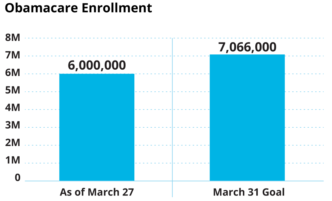
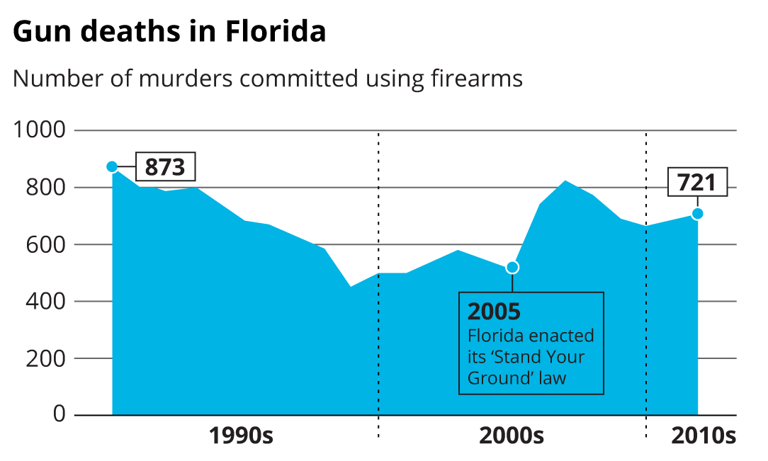
Designing contrary to this visual vernacular will only cause confusion. As an example, check out the line graph in Figure 10.5, which was released by Reuters in 2014 and quickly incited political debate.
Source: Florida Department of Law Enforcement.
Remember the phrase we all learned in school to best differentiate the y-axis from the x-axis? “Y to the sky!” Inherent in the phrase is the assumption that the bottom of the y-axis symbolizes the lowest number in the data set, while the highest number in the set lives at the top of that axis. In other words, up means up and down means down. If you were to strip away all the labels from any line or bar graph, you would still be able to identify trends because of this standard expectation.
The Reuters graphic, however, inverted this rule by flipping the y-axis. Instead of seeing the passage of the “Stand Your Ground” legislation as a potential catalyst for the marked increase in gun deaths in the early 2000s, the viewer is led to mistakenly conclude that this law coincided with an immediate decrease in gun deaths.
Figure 10.6 shows how this graph should have been visualized instead.
Source: Florida Department of Law Enforcement.
With the Reuters example, it's not clear if the graph choice was made because they wanted to add a unique spin on their data visualizations or because of an attempt to lead the viewer to incorrect conclusions. That uncertainty hurts the Reuters brand and provides a perfect example of why properly visualizing data is imperative to any visual strategy.
DRESSED-UP DATA VIZ CAN DO MORE HARM THAN GOOD
But what if it's clear that your intent was not to mislead viewers? Are mistaken representations of data forgivable? One of the biggest temptations many face when first setting out to visualize data is trying to dress up the visualization so that it doesn't feel “boring.” There is often a fear that traditional charts or graphs won't engage a viewer. In reality, there are many ways to improve the aesthetics of a pie chart or bar graph without it feeling boring at all. The line chart in Figure 10.6, for example, shows this through its clean, stylized look and attention-grabbing call-out boxes.
While it's a good practice to ensure your charts and graphs don't look like products of Excel, avoiding a traditional bar graph or pie chart is often a lost opportunity. Data visualization has been around for centuries. Charts and graphs speak a universal language, and dressing them up unnecessarily just prevents us from creating true visual communication.
As an example, take a look at Figure 10.7, which shows an area graph from the NBC Nightly News.
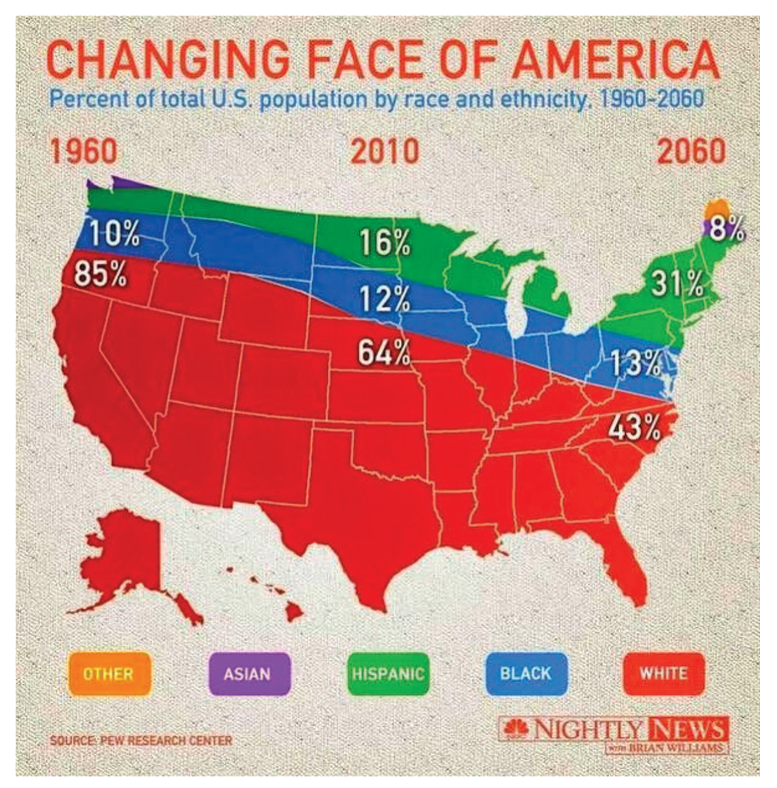
The designer clearly aimed to make this data more hard-hitting with the integration of a US map. But a map is, in itself, a visualization of information and data. Combining the map with the area graph changes the entire meaning of the graph. Here is a breakdown of the problems this choice causes:
- It's just plain difficult to read. Too many visuals are packed together, confusing the viewer.
- Whenever you layer red and blue over a map of the United States, your viewers will immediately think the image is about politics.
- The West Coast appears stuck in 1960, while the East Coast has time-traveled to 2060.
- Asian Americans only appear to live in Maine and Washington State; African Americans live exclusively across a thin band in the North, and so forth.
- The scale is incorrect. By not sticking to a standard graph shape, percentages do not match up with the amount of space filled.
There are quite a few different approaches the designer could have taken to avoid these issues. Figure 10.8 shows just one possible execution.

Issues like these have occurred throughout the news cycle for generations, but they have skyrocketed since consumer demand for visual content has brought new value to data visualizations. In his book, How Charts Lie: Getting Smarter about Visual Information, author and data visualization expert Alberto Cairo draws attention to this trend by presenting myriad charts and graphs that were either misunderstood by the designer or wholly misrepresented by the publisher.
Cairo addresses multiple types of data visualization mistakes that publishers should avoid, but also warns audiences of the need to improve their own literacy, or graphicacy, on the topic. Graphicacy, he notes, “is the ability to interpret visuals.” He warns that today's audiences find charts and graphs persuasive because they expect data visualizations to be objective. Unfortunately, he continues, “charts may lie in multiple ways: by displaying the wrong data, by including an inappropriate amount of data, by being badly designed—or, even if they are professionally done, they end up lying to us because we read too much into them or see in them what we want to believe.”
As data visualization mistakes persist, the brands that publish and share them become less reliable and audiences begin to lower their expectations. What's worse, some audiences choose to trust the data visualizations without question, which can further the spread of misinformation. You can spend weeks planning your visual strategy, but if you don't focus on visualizing data correctly at all times, that strategy won't matter.
EXERCISE: TOP DATA VISUALIZATION MISTAKES TO AVOID
For this exercise, we'll take a look at the most common data visualization mistakes or flaws out there. To be fair, these don't include any of the issues already mentioned in this chapter. In some scenarios, there may be clear mistakes in how the data is depicted. In others, you may find that the visualization properly displays the data, but might not adhere to all best practices. As you view the visualizations that follow, try to identify why they are wrong. Once you've reviewed, flip to the Exercise Results section in this chapter to see how these visualizations should have been presented.
Lucy's Chart
Lucy is ready to report to her CEO about her team's success over the past quarter. Through new initiatives, they saw a 28-percent year-over-year increase in sales. In her presentation, she has chosen to show her success using the visualization in Figure 10.9. Can you identify what's wrong with her choice?

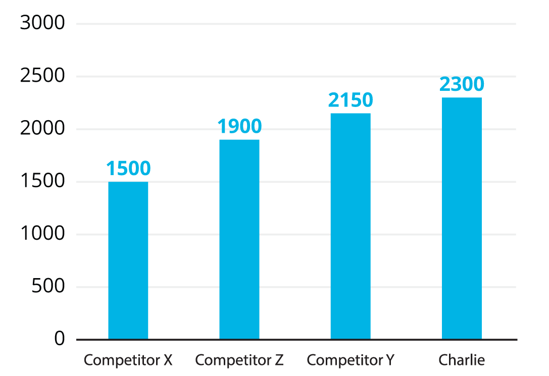
Charlie's Bar Graph
Charlie wants to show the value of his search-engine optimization (SEO) services so he can market his agency to new clients. His goal is to land more clients that are looking for link-building services, so he wants to show comparative data depicting his average backlinks versus his competitors'. Through some sleuthing, he's learned that competitor X averages 1,500 backlinks per client campaign. That's far less than Charlie's average of 2,300 backlinks. Competitor Y averages 2,150 backlinks per client and competitor Z averages 1,900 backlinks per client. Figure 10.10 shows how he visualized this information. What is his mistake?

Josh's Survey
Josh has the results of a survey that he'd like to publish in order to help grow his company's thought leadership. And one data set stands out from the rest. When his core customers were asked about their upcoming challenges for the new quarter, their responses all suggested that his IT consulting services were in demand. Of 2,000 respondents who were asked to identify all answers that applied to them, he found the following:
- 42% felt their IT team needed an overhaul.
- 56% felt that their cybersecurity needs were being ignored.
- 17% stated that they were uncertain about the future of IT in their company.
- 34% said that they had ample budgets, but needed a trusted partner to use that budget with.
To show off these results, he created the data visualization in Figure 10.11. What is wrong with this graph?

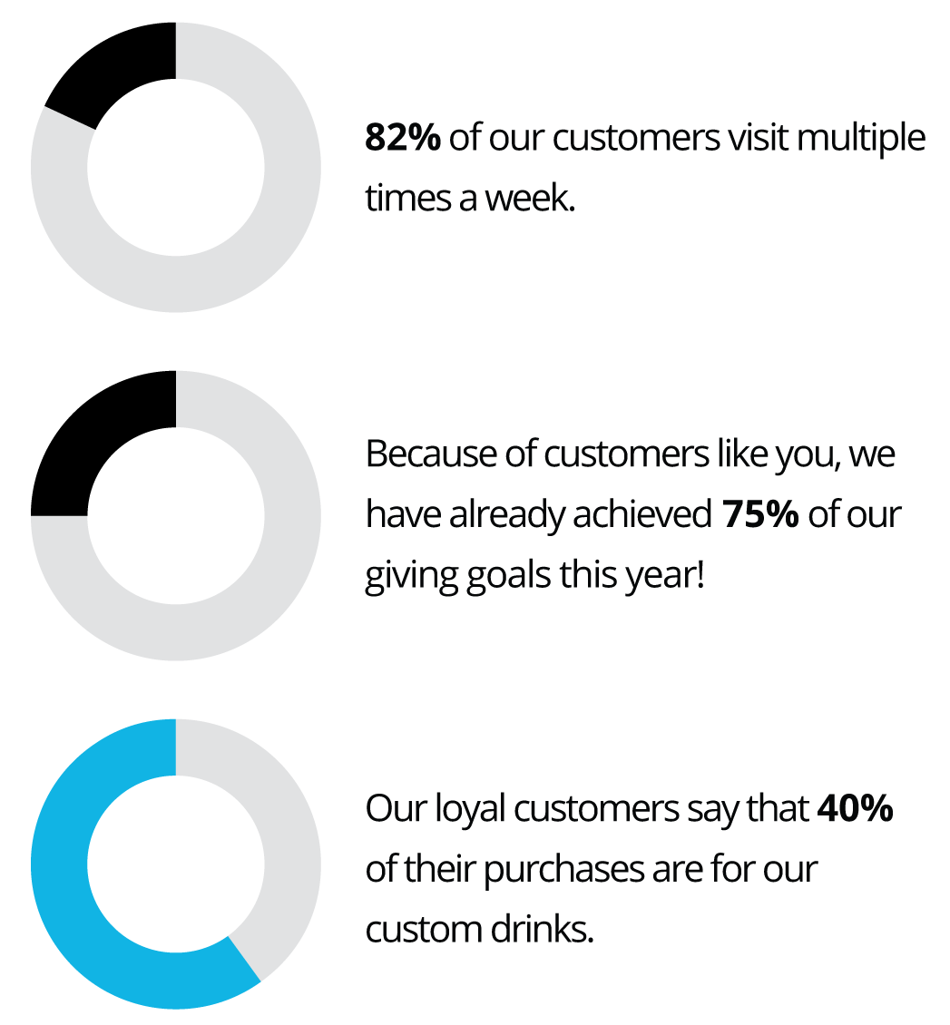
Marli's Coffee Shop
Marli has just finished designing an informational asset to share in an email marketing campaign for her coffee shop. The campaign has been set up to target current customers by showing how they have positively impacted her coffee shop throughout the year. Because current customers are the primary audience, the design incorporates her brand colors for ease of brand recognition. The data she decided to share includes:
- Because of customers like you, we've already achieved 75% of our giving goals this year!
- Our loyal customers say that 40% of their purchases are for our custom drinks.
- 82% of our customers visit multiple times per week.
Take a look at Figure 10.12 to see the final piece Marli designed. What seems off to you?
Andrew's Quantagram
While working on a trifold brochure for a client of his, Andrew was asked to show the client's large fleet of trucks serving customers around the country. With more than 2,500 trucks on the road in any given day, his client could easily outperform competitors, and he wanted to make sure this was shown in a compelling way.
A common way of showing off a large quantity of a single item is the quantagram. A quantagram uses icons (or pictograms) and displays them in a repeated pattern to signal a quantity of something. Quantity + Pictogram = Quantagram. Excited to show off his client's fleet, Andrew quickly created the quantagram in Figure 10.13. What was his mistake?

EXERCISE RESULTS: HOW TO CORRECT DATA VISUALIZATION MISTAKES
Lucy's Chart
More often than not, when we need to visualize a percentage, a pie chart is the best way to do so—and this would have been a great choice if the data Lucy wanted to represent was a portion of 100 percent. But Lucy is trying to show that her team's sales grew by 28 percent. By representing this as a pie chart, it implies that Lucy's sales were a portion of a larger whole—but they're not.
To best represent this data, Lucy needs to first show where sales were during the same time period in the previous year, then compare that number to sales in the current year. Figure 10.14 shows how to best represent this data.

When it comes to a percentage as a data point, it should always be visualized. In fact, this is one of the easiest forms of data to show rather than to represent through typography. When showing a percentage increase or decrease, though, never use a pie chart. Instead, always choose a bar graph that compares the increased or decreased number to the original amount from which the growth or decline stemmed.
Charlie's Bar Graph
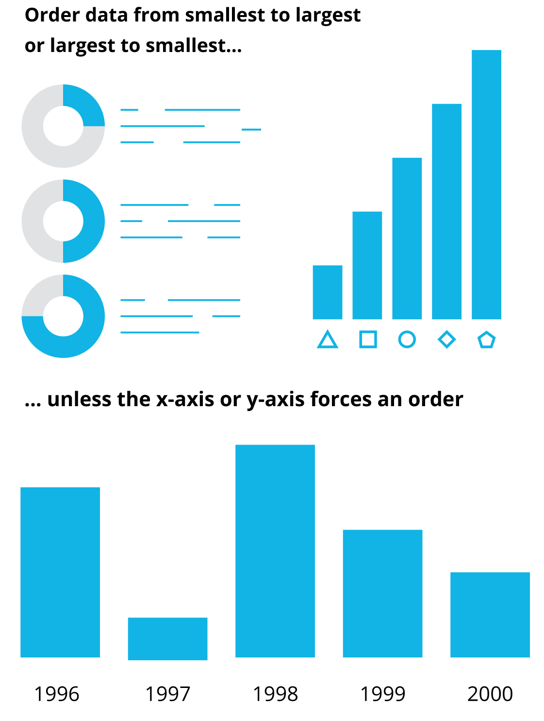
While Charlie was right in producing a bar chart to showcase this data, he missed a clear opportunity to further his story and truly shed light on his value. Bar charts are made to be read from left to right, making the first and the final bars the most dynamic points that our eyes settle on. Since Charlie wants to show that he dominates his competition, he should order the pie chart from lowest to highest (Figure 10.15; see also Figure 10.16).
Josh's Survey
Josh was correct that pie charts should be used to show these percentages. But his respondents were given the opportunity to choose as many options as they wanted, rather than just one. Because of this, the answers add up to more than 100 percent, and a pie chart should never exceed 100 percent. The proper execution of this data would instead be to show four pie charts, preferably in order of largest to smallest or smallest to largest, as in Figure 10.17.
What if Josh had asked his respondents to choose just one answer out of a list of options? In that case, he could visualize the results in a single pie chart. With only four answers, that would be fine, but if a pie chart has more than seven slices, it becomes very confusing to the eye. So be sure to keep your pie charts under seven slices.
And when filling in each slice, pretend the chart is a clock and start at twelve o'clock. Then order your slices from largest to smallest or smallest to largest (Figure 10.18).


Marli's Coffee Shop
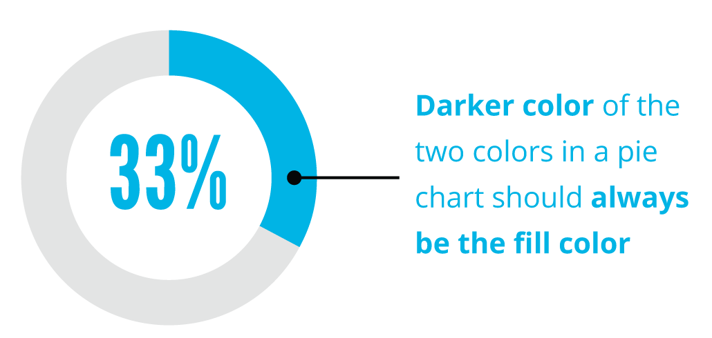
Marli made some good choices with her pie charts. She ensured that they were three separate charts, put them in proper order, and started at twelve o'clock on her fill. But by using a lighter color as the fill color, it's not always clear which slice of the pie she's trying to represent. For example, when looking at the 75-percent chart, one might think that it's meant to represent 25 percent simply because the darker color is representing 25 percent.
While this is a subtle mistake, remember rule 2: small visual cues have a large impact. When you fill a glass with coffee, you can immediately see what part of that glass is “filled” with that coffee. These patterns in life should persist in design. By always choosing a darker color in your palette as the “fill” color for your data visualizations, you'll ensure that your audience will comprehend your information more easily (Figure 10.19). See the corrected visualization in Figure 10.20.
Additionally, in an attempt to get every brand color into the design, Marli changed fill colors for one of the pie charts. This disrupts the viewer and forces them to reset their expectations. When done in a singular piece of content, a change like this can impact ease of comprehension and should be avoided whenever possible.

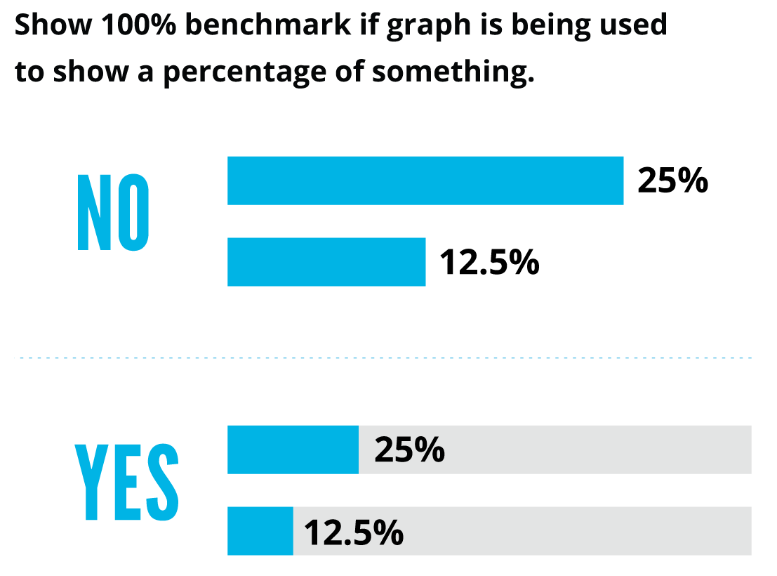
In both Josh's and Marli's cases, they could have also chosen to show their data in a single bar graph. This is often a solution when too many pie charts feel redundant or when the information deserves equal visual weight. If this is ever a consideration, keep in mind that it's still important to show a 100-percent scale to compare the data points to, as shown in Figure 10.21.
Andrew's Quantagram
Quantagrams have become an overused and almost dated form of data visualization, but they have their place. They can often be used to show volume when no other data representation will do, but they should be used sparingly and only in situations where you can show a one-to-one ratio.
In the case of Andrew's quantagram, he would have had to include 2,500 truck icons on a single page to show a true one-to-one ratio. Because he was designing a trifold brochure, this would certainly have hindered the overall design, giving far too much visual weight to a single data point. If this were the most important data point, then providing more visual weight is a good decision, but asking viewers to count every truck in the design just to glean this data is not realistic. While Andrew tried to solve this problem by showing only twenty-five truck icons with a key, that still puts the onus on the viewer to do extra math. Quantagrams should be used sparingly, and only when there isn't an alternative solution to visualize the information. If the number is greater than one hundred and a quantagram is still the only way to visualize it, then use typography to showcase the data point instead (Figure 10.22). This is one of the few times when typography is a better option than traditional forms of visualizing data.
