CHAPTER 6
RULE 3: THERE'S NO GOLD AT THE END OF THAT RAINBOW
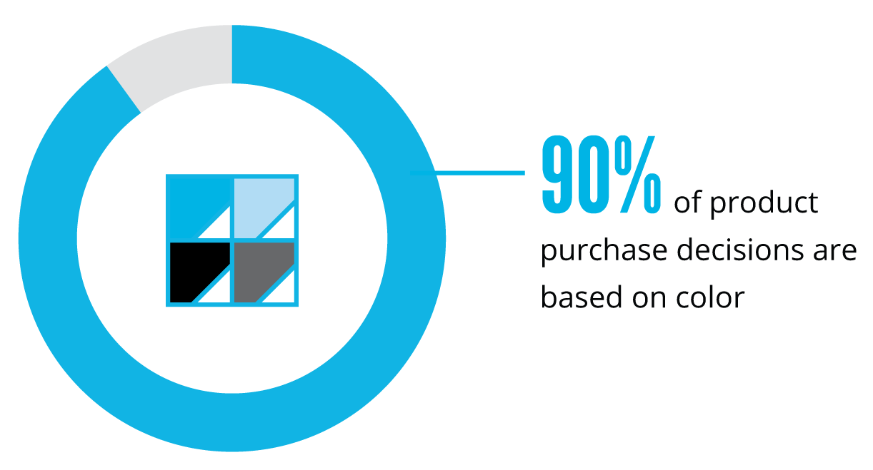
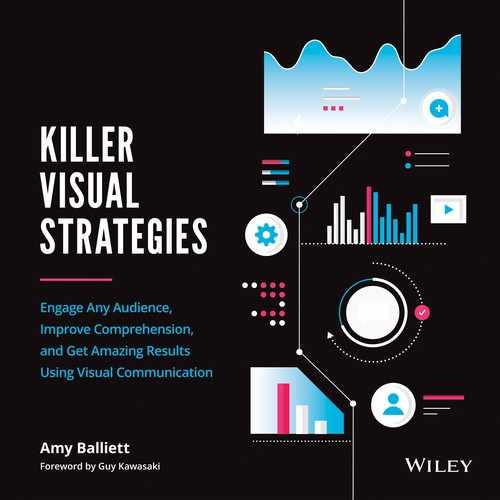
Figure 6.1
Source: Singh, “Impact of Color on Marketing.”
A simple search on color theory will yield nearly one billion results on Google. You'll find theorists, marketers, designers, and others sharing their opinions and studies on how color impacts consumer behavior.
Many will argue that shifting a button from green to red will guarantee a boost in conversion rates on your website, or that you consider a different color palette depending on the gender of your target audience. And you can't go down the color-psychology rabbit hole without seeing at least one reference to Robert Plutchick's wheel of emotions (Figure 6.2), which seeks to simplify the correlation between color and feeling with a very specific set of guidelines.
But the concept of color driving emotional responses has been widely criticized by psychologists over the years. While, yes, changing the color of a button on a website may help increase sales, this often happens because the new color choice is bright and stands out in the context of the site's broader design structure. And while a color like red may imply anger or rage, it doesn't seem to inspire a negative reaction when used as the primary brand color for such successful companies as Netflix, Kellogg's, Target, McDonald's, Adobe, and TIME.
CHOOSING THE RIGHT COLORS FOR YOUR VISUAL CONTENT
Your color choices should not be made based on stereotypical associations of colors with emotions. In fact, how color impacts any one individual will greatly depend on their own personal preferences, upbringing, culture, context, and other factors. There simply isn't a one-size-fits-all approach to deriving specific meaning from colors in the way that iconography can send very specific messages to your end audience.
Despite this, the colors you choose and the ways in which you deploy them have the power to engage your audience, further your message, and inspire action. When delivering successful visual content, it's important that you choose your colors wisely. Using too many colors at once will only lead to clutter and cause confusion for your audiences.
Oftentimes, organizations will default to their own brand guidelines to determine the color palette for their content, but this can sometimes be a disservice to the viewer. Studies on marketing theory and the use of color, including an article by Paul A. Bottomley and John R. Doyle in Marketing Theory, suggest that brand colors should be used only when the color choice is appropriate to the content or the product being sold. Audiences will judge companies on whether their brand use is appropriate to the information being shared.
So what, then, should marketers and designers do when faced with the need to plan a color palette around their content? Only the most skilled designers can use a rainbow of colors without distracting the viewer (more on this in the final chapter of part 2). For the most part, though, it's best to take a cue from interior designers, who follow the 60-30-10 rule of design.
The concept is simple: choose three principal colors to drive your design. This doesn't mean that you are restricted to only three colors. Instead, if you need to add to your color palette, choose shades of your three main colors to complement the design. One color should act as your dominant hue and should be used 60 percent of the time. Your secondary color should be used 30 percent of the time, while your third color should act as an accent color. Use your third color 10 percent of the time, reserving it for important conclusions, a call-to-action, or to draw the eye to key data points.
If your visual content is lengthy, adhering to the three-color rule is even more important. A viewer will subconsciously recognize when a color is being used for consistency versus to drive meaning or attention. This is especially true in data visualizations, where your secondary color could be used as the main “fill” color for your pie charts and other numbers, while your primary color sets a base that the eye can skim past.
If you use your third color sparingly, it will stand out to your audience as a key indicator of valuable information. In psychology, this concept is called the isolation effect, and it suggests that the brain is more likely to respond to and recall visual cues that stick out as different from the rest. This is often why marketers see an increase in online sales when they treat buttons on their websites with a color that isn't used elsewhere in the design. This is also why you won't find gold at the end of a rainbow of colors.
EXERCISE: DO THESE COLORS MATTER?
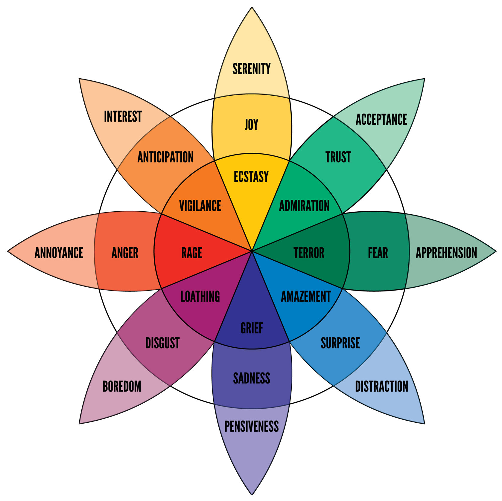
To better exemplify this rule, on the next page you'll see two designs. With your hand or a piece of paper, cover up the black and white one (Figure 6.4) and only look at the colorful one (Figure 6.3). The text has been purposely replaced with lorem ipsum copy to ensure you are only considering the visual implications of the content.
With the design in front of you, ask yourself the following questions:
- What is the topic of this piece?
- What do the colors signify?
- What did you learn?
- How does it make you feel?
Now, take a look at Figure 6.4, which shows the same design but with the full text visible and the colors shifted to grayscale. You'll likely notice that the colors didn't actually hold any real significance in the full-color version, beyond differentiating the segments in the data visualization. They didn't forward the message in any way but instead created a cluttered aesthetic for the viewer.

We look for meaning in all forms of visual communication, especially when multiple colors are applied to single data visualizations. Rather than using color intentionally to deliver meaning, Figure 6.3 uses colors only as an aesthetic choice. There isn't a pattern in the usage, so it confuses the viewer rather than making the information easy to digest.
While colors do not inherently inspire emotion, how you apply your color palette should be intentional at all times. Figure 6.5 offers another example to consider. You'll see that the colors chosen are minimal and applied in a way that doesn't feel cluttered or overwhelming. Just like the last example, this one purposely has lorem ipsum copy in place of the original content.

For this design, ask yourself the following:
- What is the topic of this piece?
- How does it make you feel?
- What do the colors signify?
- What did you learn?
Now it's time to see what this infographic is actually about. In Figure 6.6, you'll see the design in full, without any alteration. Review it for up to thirty seconds and then answer the same questions again.
If you're like most people, you likely have different answers after viewing the design within the context of the copy. Before we go on, take a moment to consider the following questions:
- Prior to reading, what made you think the topic you listed in response to Figure 6.5 was correct?
- Prior to reading, what made you feel the emotional response that you listed in response to Figure 6.5?
- Prior to reading, what made you draw conclusions about what you learned in response to Figure 6.5?
It might seem odd that the preceding three questions had to start with “prior to reading,” since the bulk of this design leads with visuals over text. Unfortunately, though, the color palette implies a very different meaning than the actual topic. By choosing a clean color palette in combination with a visual depicting water droplets, one would expect that the data shows who is washing their hands, versus the very alarming data on how many people are not washing their hands.
While specific colors on their own may not actually inspire an emotional response, how those colors are used within the context of illustrations and iconography will drive meaning. By combining a clean color palette with a similarly clean-looking illustration, this piece delivers a far different visual meaning than the information actually being shared.

Author Note: The above example was recreated for the purpose of this book. While we altered the colors, we chose to keep the font choices and data visualizations intact. Not only has this design lead with the wrong color palette for the topic, but it also incorrectly represents the data with both overlapping data visualizations and discrepancies in water droplet sizes used to depict percentages. Avoid using the size of like elements to represent a percentage as this method is not an accurate way of visualizing data. In addition to this, the above design breaks the fourth rule of visual communication, which you will learn more about in the next chapter.