CHAPTER 11
RULE 8: COMMIT TO THE TRUTH AND PROVE IT
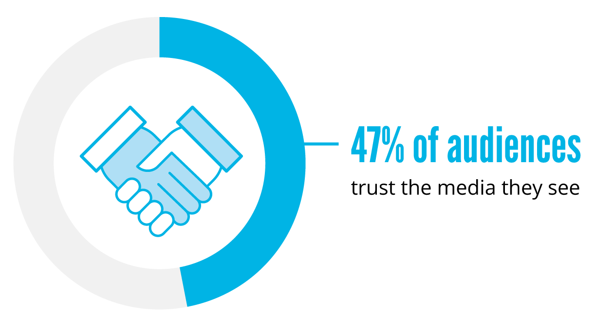
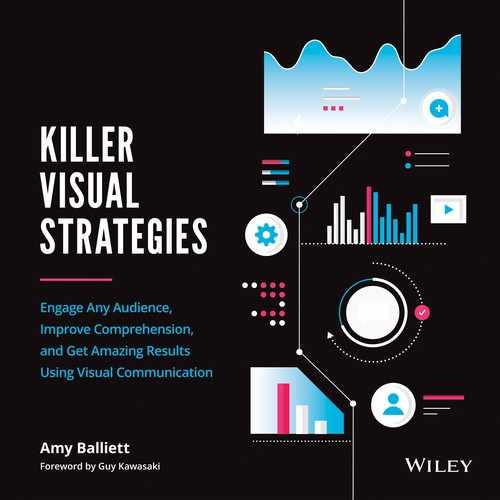
Figure 11.1
Source: Edelman, “2019 Edelman Trust Barometer Special Report.”
During the 2016 United States presidential election, the term “fake news” entered the vernacular of citizens throughout the country and around the world. While fake news has been around for centuries, it exploded during the election and was weaponized in ways that few could have predicted. The combination of a divisive campaign, ease of access to news via social-media channels, and our voracious demand for visual content created the perfect storm for fake news to flourish.
Prior to 2016, many of us were not prone to question the veracity of the visual content we were exposed to. If a photo appeared with a quote next to it, people rarely debated whether the quotation could really be attributed to the person in the photo. Instead, the visual was trusted and shared widely.
In the same vein, many believed that they would be able to spot a fake video from a mile away. Live-action video was considered a true representation of reality—unless labeled otherwise, of course. The concept of a “deepfake”—wherein artificial neural networks are used to map the likeness of another person onto an existing video, co-opting the words and facial movements from that original video in the process—was unknown to most.
But during the 2016 election, Cambridge Analytica, the Russian government, and other political actors and organizations took advantage of our blind faith in visual content. Over the course of a few short months, hundreds of thousands of fake ads were released online, inciting viral outrage among some and widespread approval among others.
The same held true for news stories. Headlines created to attract clicks often appeared alongside photos that pushed the narrative forward. This happened regardless of the true context behind said photos. Meanwhile, headlines often failed to reflect the content of the articles to which they were attached. This led to the spread of misinformation, with people only skimming headlines before moving onto their next bite-sized piece of visual content.
Beyond the headlines, memes devoured Facebook feeds. False quotes were attributed to political rivals, placed on top of unflattering photos, and trusted without question. Somehow, the simple combination of a real photo with false text made the information entirely believable. Incorrect statistics were shared widely, even as people ignored the source of that information. For those who had already decided which candidate they were going to support, these images fueled their own confirmation bias, rooting them in their choice.
To encourage distrust in the US political system, fake videos showing faulty voting machines spread across the internet like wildfire. To incite mutual fear across the political aisle, stock footage of riots was cut together with real footage of protests, suggesting that both sides were violent and unhinged. And because it was live-action video, people believed it.
Behind all of this content, multiple powers were at play, but it has been widely confirmed that Russian-government actors and the now-defunct political consultancy, Cambridge Analytica, helped to lead the charge. While Russia seemingly worked on its own, Cambridge Analytica was hired by Donald Trump's campaign to help get him elected president.
Reports show that Cambridge Analytica had access to years' worth of Facebook user data, which allowed them to build psychological profiles on potential voters, called “psychographic” profiles. By applying the rule of standing out at the cocktail party, the team at Cambridge Analytica got to know their audience very well. From there, they created hundreds of thousands of ads, memes, videos, and online experiences for several political campaigns that were uniquely catered to each individual voter profile. For instance, during the 2014 campaign to elect Thom Tillis of North Carolina, if Cambridge Analytica had identified you as “neurotic,” you would see a very different ad than if they had concluded you were “open” or “agreeable,” as business publication Quartz explains. If they could tell that someone was a single-issue voter, they delivered memes and data visualizations surrounding only that issue while implying that it was equally important to their candidate.
According to the Trump campaign, Cambridge Analytica was only used only to connect with their base and ensure they were listening to their constituents. They assert that psychographics were not a part of their tactics, the New York Times reports. This chapter is not intended to be an argument for or against this statement. Whether the targeted content was delivered by Cambridge Analytica or Russia doesn't matter when considering the lessons of this chapter. What matters instead is how the content was used and how well it worked.
Visual content has an immense power to persuade and dissuade audiences. When used irresponsibly, it easily rivals any propaganda published during the two world wars. We have come to rely on visual content to make information easier to comprehend and share, but the 2016 election showed the world what a volatile atmosphere visual media can help to create. And in the years since, a divide has grown between those whom global communications firm Edelman has defined as the “informed public” when compared to the mass population (see Figure 11.2).

Source: Edelman, “2019 Edelman Trust Barometer.”
Distrust in information sources has driven a deep divide between communities on a global scale, and the term “fake news” is now commonplace for us all. As a result, many organizations are feeling the sting. As citizens lose trust and faith in their government and news sources, they are putting the same microscope on brands.
TRUST IN BRANDS CONTINUES TO DECLINE
Today, businesses of all sizes are losing the faith of their customers. For example, consumers are more apt to believe their friends than they are a brand when researching a product or service. In fact, findings from Nielsen's Harris Poll Online suggest that 82 percent of consumers ask for recommendations from family and friends when they're looking to purchase a product or service. And two-thirds of consumers say they're more likely to make a purchase after a recommendation via email or social media.
Source: Edelman, “Edelman Trust Barometer Special Report.”
As today's consumers reconsider brand loyalty, an organization's commitment to the truth should be a top priority. In Edelman's 2019 trust barometer report, 67 percent of respondents agreed with the statement: “A good reputation may get me to try a product, but unless I come to trust the company behind the product, I will soon stop buying it.”
In addition, with 81 percent of buyers saying that they need to trust a brand to do what's right (Figure 11.3), it's become clear that today's audiences are moved by a brand's societal impact. And with only 34 percent of consumers saying they actually trust most of the brands they use or purchase from to meet their expectations, it's clear that many organizations have a long way to go.
With this shroud of doubt surrounding many organizations, it still amazes me when visual content is released without the inclusion of a source list. Often, visual marketers and designers focus so much on creating a great piece of visual content that they feel that including references to sources would hinder the content's aesthetic success. But organizations have an uphill battle in front of them, and all media is now under scrutiny. To succeed in the age of fake news, brands must commit to always delivering the truth as well as correctly sourcing their content so they can lead with transparency.
EXERCISE: PROPERLY SOURCING INFORMATION
When I'm asked about the role each team member plays in creating great visual content, people are often surprised to hear that the designer should not also have the responsibility of researching or writing the content for the pieces they produce. Instead, great visual content requires the involvement of at least two individuals: a designer who can execute with visual communication as their foundation and a writer who can research primary sources while developing a narrative relevant to the brand and target audience.
This isn't at all to suggest that some designers aren't capable of doing both, but when working to deliver something accurate and high-quality, it's best to keep these roles separate. There are multiple reasons for this. For example, sometimes designers tasked with research will seek out data points that are easier to visualize, but that may not be the most impactful for the end audience. Other times, if designers are asked to research content, they may favor a narrative that allows for certain design elements without even realizing their bias.
By having a writer with a background in research and creative writing build the narrative for any piece of visual content, they act as the gatekeeper of truth. Great writers take pride in delivering content that can't be debunked. They seek out original, trustworthy sources and provide important context that will guide designers. When a writer works in tandem with a designer, the narrative takes equal priority to design, ensuring that no corners will be cut to get to a final deliverable.
Anyone producing visual content, whether it be the writer, designer, marketer, etc., needs to appreciate the value of a well-sourced and accurate storyline. Because of this, exploring how to research and source your narrative is something everyone should do, no matter what role they play in producing visual content.
A great deal of successful visual content relies on data to hook audiences and justify claims. While visualizing data correctly is extremely important for maintaining viewer confidence, properly sourcing that data is equally important. But if you're not used to researching content, you might not realize the effort required to do this correctly.
For this exercise, you will be tasked with building a narrative around the topic of coffee and tea consumption in the United States. Imagine you have a client that wants to pit coffee and tea against each other in an ultimate showdown. They own a large chain of coffee and tea shops around the country and have found that their customers are either coffee or tea enthusiasts, but rarely both. Knowing that they can inspire conversation around the differences between these two drinks, they want to create a poster for their stores and on social media. They don't want the poster to be divisive and don't want to come across like they themselves have a preference for coffee or tea.
Step 1: Determine How Client Needs Impact the Story You'll Tell
Now that these priorities have been identified, take a moment to consider how they impact the narrative. Here are a few key considerations that should drive your research:
- Since the coffee shop doesn't want a divisive piece, it's important for the content to provide information on coffee and tea equally. It's also important to end the piece without a conclusive statement of preference.
- Since this piece will be used on social media and as a poster, you'll need to keep it short and to the point. Customers won't have a lot of time to spend reviewing the poster while in line for a drink, and attention spans are short on social media. Developing a piece of content that has quick takeaways will be key.
- To ensure the coffee shop doesn't come across as preferential, only the facts should be provided. This means that the narrative should focus primarily on delivering data points.
Step 2: Develop an Outline Driven by Curiosity
Once these factors are considered, you will want to make an outline for your research. To do this, consider what questions matter most to you on the topic. If you were the target audience, what information would be most appealing to you? Some examples may include:
- How many people buy coffee in the United States and how many buy tea?
- What are the health benefits of coffee versus tea?
- What is the breakdown of those who drink their coffee or tea with cream versus those who don't?
- How many people prefer their coffee or tea iced?
Step 3: Find Answers to Your Questions
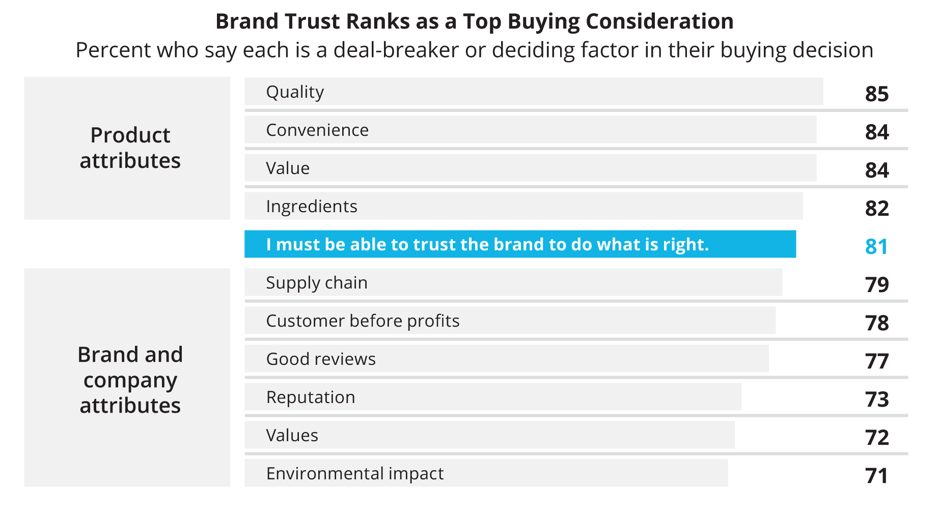
Once you have your list of questions, it's time to start researching answers. To do this, use some Google search tricks. Let's start with the first question, asking how many people buy coffee versus tea in the United States. At the time of this publication, a simple search with the phrase “coffee vs tea consumption in the US” yields more than forty-seven million results. The first result, however, seems quite promising (Figure 11.4).

Upon clicking on the CafeDeColumbia.com link, though, it quickly becomes clear that the data is from 2014. Leading with older data is OK, if there isn't anything more current that exists. But before settling on this source, it's important to ensure there isn't anything more recent out there, since it could also be more accurate. To narrow your search, navigate to the “Tools” link under the Google search bar. An option called “Any time” appears, along with a dropdown menu from which you can choose a timeframe that will narrow down the results (Figure 11.5). I often choose “Past year” when doing research.
By changing the results to the past year, more accurate information may be at your fingertips. As an example, when I filter the results down to only content released in the past twelve months, I find links from better-known sources answering more than one of the questions I previously identified (Figure 11.6). Of course, just because a source is better-known doesn't mean they're reputable. It's still important to dig into a source to get more context.
Step 4: Find Primary Sources of Information Only
In the results I found, you'll see that a coffee-versus-tea consumption study was reported on by the New York Post. When diving into the Post article, it becomes clear that the study speaks to personality differences between coffee and tea drinkers. This data could serve to add humor to the narrative, but it's risky to use. The article doesn't include a link to the original source data, but does include an infographic from Chinet, the company that commissioned the study.

Since the topic for this narrative is innocent in nature, it is likely OK to report the findings of this study in the poster being produced. If this were a more hard-hitting topic, though, it would be best to seek out the original data sets and consider whether the sample size is enough to drive meaningful insights.
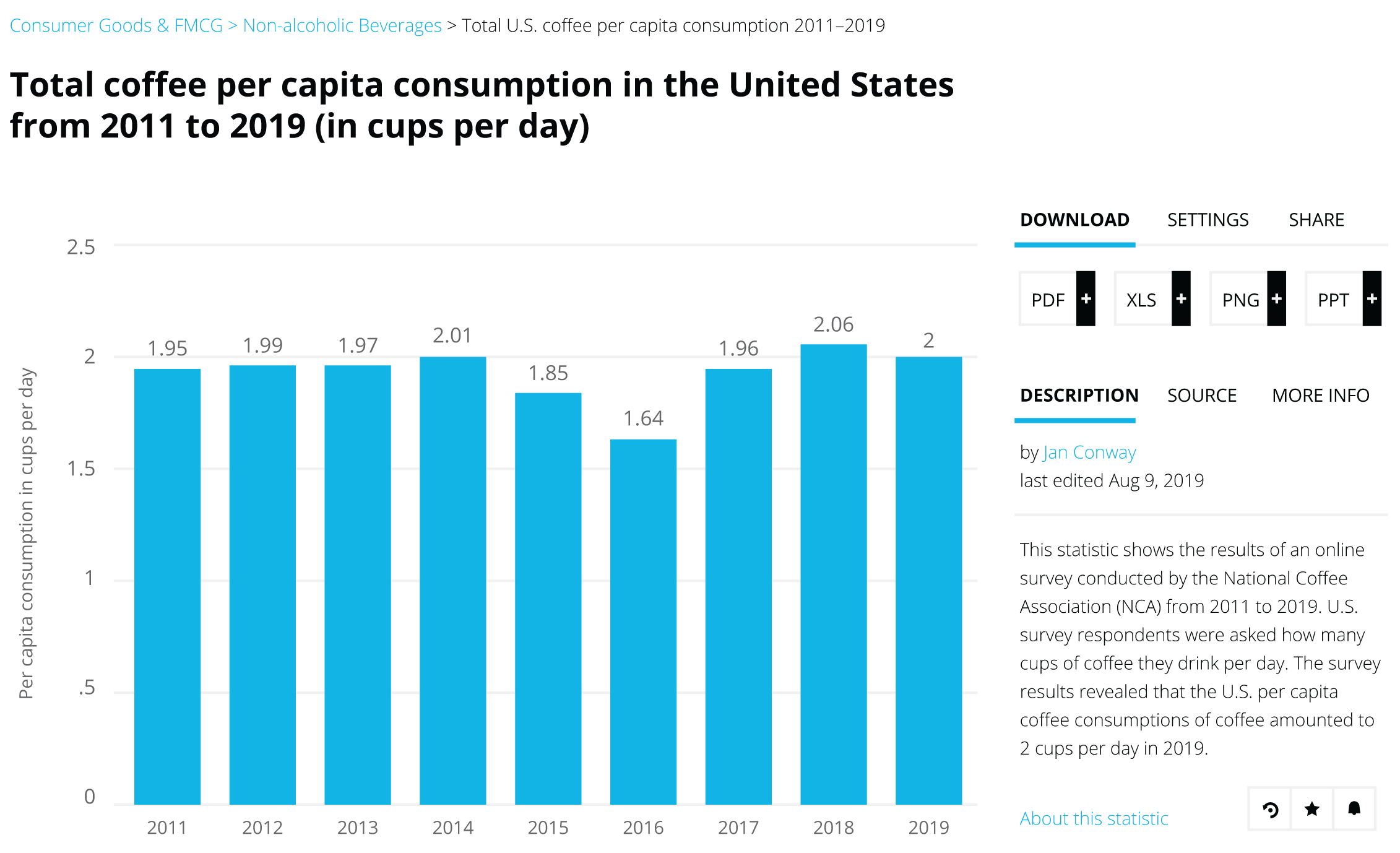
Luckily, there's a second result on the search engine results page that links to Statista, a great resource for gathering up-to-date data on myriad topics that always links to the primary source of information. It's important to note, though, that you have to pay for a premium account with Statista to access primary sources. If you plan to create a lot of data-driven visual content, then this investment is well worth it. When navigating to the Statista link, I'm presented with year-over-year coffee-consumption trends (Figure 11.7), and with a few clicks, I can find the original source to ensure the data is reputable.

As you dive into research like this, you'll find that some searches will deliver only partial answers. This doesn't mean that the information doesn't exist—it means that you have to get creative with your search phrases to continually uncover new data and information.
Sometimes you may luck out with a listicle of data points to help you navigate the plethora of information sources out there. In the case of my “Past year” search results, there is an article from Food Truck Empire called “57 Global Coffee Industry Statistics and Consumption Trends.” The article consists of compelling data points and, more importantly, links to the original sources of those data points.
When presented with content like this, it's natural to trust the article and start building your narrative from it, but try to avoid that instinct. Often, listicles may be timely, but the data may not be. Be sure to check each source to ensure that the data is truly recent and that the listicle creator presented it in the proper context.
Step 5: Always Use Reputable Sources
Taking data at face value from a secondary or tertiary source can be very risky. Just like the game of telephone, where information gets less and less accurate as it passes from one person to the next, secondary and tertiary sources don't always deliver data accurately. By finding the original source, you'll be able to understand the relevance of the information as well as how any data was gathered. This will help you get to the truth rather than furthering misinformation.
As you write your narrative, be sure to include sources for each data point you use throughout. Sources like Wikipedia and other publications that rely on the masses to self-report should be avoided. Some of the best sources include websites that end in “.gov,” trusted news sources, established brands with a history of running their own studies, and peer-reviewed publications. If there's any potential that the source of information could simply be a teenager blogging in his basement, then avoid quoting that source, no matter how compelling the data is.
Step 6: Proudly Share Your Sources
Continue the steps above until you've answered all of your questions and you are confident your information sources are legitimate. This confidence is key because successful visual content always provides a list of sources for each statement of fact. Ensure your designer includes a list of sources at the bottom of any design, similar to the “Resources” section of this book. By doing so, you are displaying a commitment to the truth, which will go a long way in today's fake-news environment.