CHAPTER 9
RULE 6: STAND OUT AT THE COCKTAIL PARTY

Figure 9.1
Source: Marketo, “The State of Engagement.”
In his bestselling book, How to Win Friends and Influence People, author Dale Carnegie writes, “Remember that a person's name is, to that person, the sweetest and most important sound in any language.”
This notion was proven true in a 2006 study called “Brain Activation When Hearing One's Own and Others' Names,” for which psychologists Dennis P. Carmody and Michael Lewis used functional magnetic resonance imaging to study the brain-activation patterns of respondents when hearing a list of names. Within the list was always the respondent's own name. The results concluded that our brains light up more aggressively when hearing our own name in comparison to those of others.
This concept is also considered “the cocktail party effect.” Imagine you are at a loud, crowded cocktail party with a healthy mix of friends and complete strangers. Conversations are happening all around you, and you're in the middle of an engaging one yourself. Suddenly, you overhear your name come up in conversation in another room entirely. Immediately, your ears perk up and your attention suddenly shifts from your friend's story about their overwhelming workweek to whatever must be going on in that room.
Our brains consistently process information all around us, even if we are not consciously giving the entire surrounding environment our full attention, explains Dr. Rachna Jain in an article for Social Media Examiner. This process happens through the reticular activating system (RAS), which helps to determine what we pay attention to and when. In the simplest of terms, the RAS selectively drives our attention to ideas and information that matter most to us, while letting all other information fade away like background noise at a party.
YOUR AUDIENCE WANTS CUSTOM, PERSONALIZED CONTENT
In today's world of information overload, we live in a never-ending cocktail party—one that seems to be getting louder and louder. As a result, brands continue to experiment with personalized content experiences to gain and maintain the attention of their audiences. This comes in many forms: just take a look at Spotify's “Discover Weekly” playlist, which recommends music to listeners based on past preferences; or streaming-media providers that advertise new shows and movies to viewers based on what they watched previously; or sites such as Amazon that tell shoppers what products other, like-minded shoppers also considered. The list goes on.
As brands compete for their audiences' attention, it's the content that feels customized and catered precisely to individual consumers that breaks through the noise. This fact holds true in the world of visual strategy as well. Visual communication is not just about speaking with a universal visual language; if you have a target audience to reach, you must speak their visual language.

Source: IKEA.
When considering the visual language of your target audience, you must also consider their cultural context. For example, have you ever looked at the instructions for putting an IKEA product together? While most would agree that IKEA's directions are not as straightforward as we would hope, their designs go a long way toward inclusive customer representation.
That's because IKEA uses an amorphous character known as the IKEA Man (shown in Figure 9.2) to depict any customer going about construction.
Imagine if this character wore a cowboy hat and boots. Would customers in IKEA's home country of Sweden recognize themselves in him? What if the character were more realistically proportioned and wearing a suit and tie? Would a mother-to-be trying to build her new crib see herself in the illustration? Because IKEA has to relate to everyone equally, they chose a character illustration that doesn't discriminate. Not only is the illustration purposely simple, but the character is disproportionate, thus furthering the notion that he represents a universal symbol rather than a specific demographic.
When speaking to a broad audience, utilizing vague imagery is sometimes important. But it's not too different than trying to make a big announcement at a cocktail party. Some people will listen, while others will be a few drinks in and won't be as eager to give you their attention. Instead, you'll find far more success making visual and narrative choices that speak directly to your target audience.
When developing visual content with a target audience in mind, follow these directives:
- Build your content around a narrative that appeals to your target audience. For example, are you trying to connect with recent college grads? Appeal to their sense of excitement surrounding the opportunities that lie ahead. Speak to the common problems they may face while entering the workforce or paying off student loans.
- Choose fonts, colors, and an illustration style that best represent the information and appeal to your target audience. Let's say you're trying to connect with expectant parents. Consider softer blues and pinks, which are often associated with babies. Try a script font for headlines, as these are often used in birth announcements. And choose an illustration style that is playful rather than one that is sleek or technical.
- Use imagery that speaks to the topic and your target audience equally. For example, what if you're trying to advertise a new, high-performing motor oil? Consider using racing imagery like a checkered flag or banner, a raceway, or sports cars.
- Follow the rule of subtle visual cues. Imagine you're looking to connect with Harry Potter fans. While you can include familiar imagery such as a wand or a Gryffindor scarf, you should also include visuals that only true fans would recognize—for instance, by writing the words “I open at the close” on an illustration of the Golden Snitch.
- Meet your audience on their preferred channel. Don't just create visual content for your website and hope that your audience will find it. Instead, identify the most trafficked channels where your audience is already engaging. Design content that is sized for ease of viewing on those channels first and foremost. If your narrative is too long for a short-form channel like Twitter, that's perfectly fine. Develop some teaser content that includes a call-to-action to drive your audience to the long-form iteration.
- Design with cultural context in mind. If you are trying to appeal to a certain demographic, make sure you positively represent them throughout your design. For example, while an ad for a vacuum featuring an overly enthusiastic housewife might have worked in the 1950s, a brand might lose their shirt over similar advertising today.
Visual information has the power to make a very strong impact on its audience. But if that audience isn't considered in the design from the beginning, the visual content you produce may end up being a waste of resources, and could just as easily alienate your audience altogether.
EXERCISE: WHICH APPLE APPEALS MOST TO YOU?
On the next page you'll see two infographics showing roughly the same information yet visualized in two very different ways. One design, entitled “The Insanely Great History of Apple” and shown in Figure 9.3, was initially created by Pop Chart (then called Pop Chart Lab) in 2011. Pop Chart has since updated the design multiple times to incorporate new additions to the Apple family of products. The second design (Figure 9.4), which depicts thirty-five years of Apple product history under the title “The Apple Tree,” was created by Mashable, also in 2011. For the sake of this exercise, Pop Chart's 2011 version of the design is being used since it's the closest apples-to-apples (pun intended) narrative for comparison.
Take a moment to look at the first infographic, then the second. After you've reviewed them both, ask yourself the following:
- Which one is your favorite?
- What makes it your favorite?
- What don't you like about the other one?

Figure 9.3 []
Source: Pop Chart.
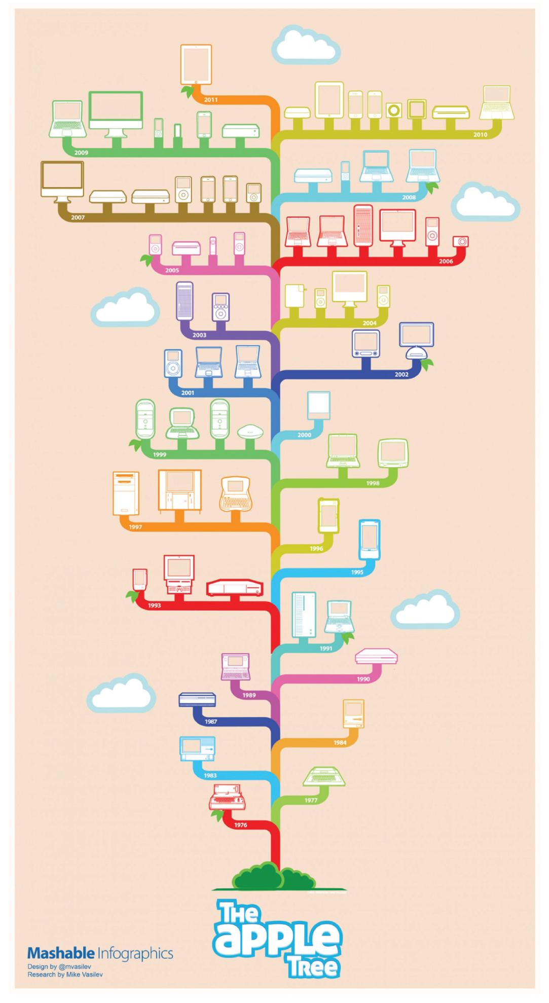
Figure 9.4 []
Source: Mashable.
Since the launch of these designs in 2011, I have been pitting them against each other in a battle over popularity. In every class I teach and at nearly every conference where I've presented, I've asked the audience to tell me which design appeals most to them. Before reading on, take a moment to show both designs to your colleagues, family, or friends. Ask them the same questions that you've answered, and tally the responses.
In my experience, the vast majority (roughly 80 percent) of audiences prefer Mashable's depiction of this information over Pop Chart's. Of course, since this question is always asked in groups, I'm willing to bet that more than 20 percent of respondents would select Pop Chart's design—they just might not want to admit they're in the minority in front of a crowd. For the sake of argument, let's assume the margin of error is 10 percent. That would still be a 70–30 split, making the Mashable design the clear winner.
Why, then, is Pop Chart's design so popular that it has been updated regularly and still sometimes shows as a bestseller on their storefront? The answer is simple: Pop Chart isn't catering to the Everyman—they're catering to a very specific type of Apple fan.
When Pop Chart created “The Insanely Great History of Apple,” it did so with the intention of selling a poster online. Mashable, meanwhile, was focused on social engagement and shareability only.
To appeal to its diverse reader base, Mashable had to cast a very wide net with its design. The execution is colorful, but the colors don't carry forward any meaning. In fact, product categories aren't even broken down by color. This is a flaw in the execution, because even online critiques of the piece show that viewers spent quite some time trying to determine what the different colors meant.
In Mashable's piece, the illustrations are tame and simplistic. The font choice is playful and trendy for the time, almost as if it were intended as a nod to Twitter's font. When looking to attract social shares, choosing a font that felt like iconic social brands of the time likely helped drive success.
Both designs break the rule of rainbows, but this is a time when that rule can be broken. Good designers can properly execute a very colorful design, and, in this case, using these colors was a clear decision to carry the Apple brand forward. But it appears that this is where the intentional design choices stopped for Mashable's infographic—and where they were just beginning for Pop Chart.
You see, the team at Pop Chart designed with their target audience in mind. They weren't trying to grow readership or social engagement with their design in the way Mashable was. They didn't need to cast a wide net. Instead, they understood that getting someone to hit “like” on an image is easy. Getting someone to purchase and frame that image, on the other hand, requires delivering value beyond the quick dose of endorphins one might get from looking at a pretty image.
To deliver a product worth buying, Pop Chart had to consider exactly who the information would appeal to in the first place. More importantly, they had to consider who would want an artful representation of that information hanging in their living rooms. The answer was simple: Apple fanatics.
Apple fanatics are a special breed of tech fan. They know the whole history of Apple, refer to Steve Jobs simply as “Jobs,” and are always the first in line to buy the latest release of the iThis or iThat. They are experts, and experts can spot fluff from a mile away. Luckily, the team at Pop Chart considered every detail, creating an image that was filled with visual cues only an Apple fan would truly appreciate.
Consider the following details that Pop Chart prioritized:
- Layout: The entire design is framed by a Mac OS 8 Finder window motif. Anyone who uses an Apple desktop or laptop views this window multiple times in a given work session. Meanwhile, to bring attention to the historical aspect of the piece, a timeline of dates appears where a scroll bar normally would.
- Product key: Apple users naturally look for file names within a document window. In the location their eyes would naturally travel (along the top) lives a key that corresponds to the colors in the infographic title and reveals what each colored column represents.
- Colors: The colors hearken back to the original Apple logo.
- Illustration style: In the same way that Apple products rely on a clean, minimalist design, the chosen illustration style is minimalist and clean as well. This allows for important details to shine through and showcases the difference between closely linked models. In addition to this, the team at Pop Chart went out of their way to ensure every product was drawn to scale. Pop Chart's cofounder Patrick Mulligan explained this design choice in a Fast Company feature: “We needed to figure out exactly how large these machines were, so they could be depicted in the correct relation to one another. We scoured the web to find the dimensions of all these machines, compiling them into an Excel document and applying a 1:20 scale.”
- Easter eggs: Apple has a rich history of incorporating “Easter eggs” (tiny details or experiences hidden within a design, software, and more) into its product design. The team at Pop Chart knew this and included their own in the infographic. The most notable in this version are the number of used and available bytes, which correspond to the birth and death dates of Jobs himself.
While the varying shapes of each column were a decision driven largely by the information being shown, it had an unintended result as well. Many have read into the design choice, assuming that it was a premeditated visual metaphor referencing the legendary moment that Steve Jobs first dreamt up Apple. As the story goes, Jobs was running through a field on an acid trip when the idea for Apple first came to him.
Knowing all of this, has your opinion of which design is the best changed or remained the same?