
A layout turns your forms, grids, and other widgets into a true web application. The most widely-used layout styles can be found in operating systems such as Microsoft's Windows, which uses border layouts, resizable regions, accordions, tabs, and just about everything else you can think of.
To keep looks consistent between browsers, and to provide common user interface features, Ext JS has a powerful layout management system. The sections are manageable, and can be moved or hidden, and they can appear at the click of a button, right when and where you need them to.
In this chapter you will learn to:
Lay out an application style screen
Create tabbed sections
Manage Ext widgets within a layout
Learn advanced and nested layouts
Ext uses Panels, which are the basis of most layouts. We have used some of these, such as FormPanel and GridPanel, already. A viewport is a special panel-like component that encloses the entire layout, fitting it into the whole visible area of our browser. For our first example, we are going to use a viewport with a border layout that will encapsulate many panels.
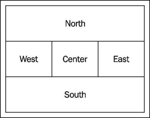
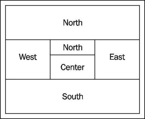
A viewport has regions that are laid out in the same way as a compass, with North, South, East and West regions—the Center region represents what's left over in the middle. These directions tell the panels where to align themselves within the viewport and, if you use them, where the resizable borders are to be placed:
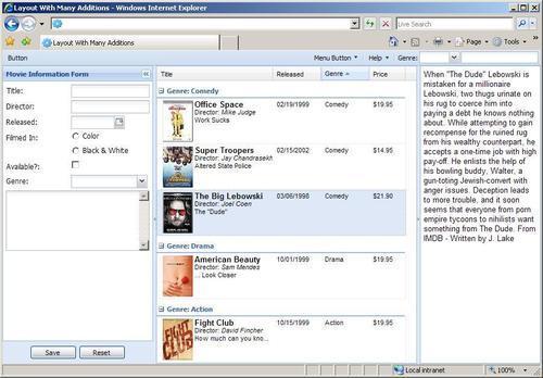
The example we're creating will look like the following image, and combines many of the previous examples we have created:
This layout is what's called a 'border' layout, which means that each region is separated by a somewhat three dimensional border bar that can be dragged to resize the regions. This example contains four panel regions:
Note that there is no 'South' panel in this example—not every region needs to be used in every layout.
Before we create our layout that uses only four regions let's go ahead and create a layout that utilizes all the regions, and then remove the South panel. We are going to create all of the regions as 'panels', which can be thought of as blank canvases to which we will add text, HTML, images, or even Ext JS widgets.
var viewport = new Ext.Viewport({
layout: 'border',
renderTo: Ext.getBody(),
items: [{
region: 'north',
xtype: 'panel',
html: 'North'
},{
region: 'west',
xtype: 'panel',
split: true,
width: 200,
html: 'West'
},{
region: 'center',
xtype: 'panel',
html: 'Center'
},{
region: 'east',
xtype: 'panel',
split: true,
width: 200,
html: 'East'
},{
region: 'south',
xtype: 'panel',
html: 'South'
}]
});
Each region is defined as one of the four compass directions—East, West, North, and South. The remainder in the middle is called the center region, which will expand to fill all of the remaining space. Just to take up some blank space in each region and to give a visual indicator as to where the panels are, we defined an 'HTML' config that has just text. (This could also contain complex HTML if needed, but there are better ways to set the contents of panels which we will learn about soon.)
Note
Ext JS provides an easy, cross-browser compatible, speedy way to get a reference to the body element, by using Ext.getBody().
If everything works out ok, you should see a browser that looks like this:

Now we have a layout with all five regions defined. These regions can have other text widgets added into them, seamlessly, by using the xtype config. Alternatively they can be divided up separately into more nested regions—for instance, the center could be split horizontally to have its own South section.
The dividers are set up for each panel by setting the split flag—the positioning of the dividers is determined automatically based on the region the panel is in.
split: true
For this page, we have set the West and East regions as 'split' regions. This, by default, makes the border into a resizing element for the user to change the size of that panel.
Typically, when a split is used, it's combined with a few other options that make the section more useful, such as width, minSize, and collapseMode.
Here are some of the more commonly-used options:
|
Option |
Value |
Description |
|---|---|---|
|
|
|
Boolean value that places a resizable bar between the sections |
|
|
|
Boolean value that adds a button to the title bar which lets the user collapse the region with a single click |
|
|
Only option is |
When set to 'mini', this adds a smaller collapse button that's located on the divider bar, in addition to the larger collapse button on title bar; the panel also collapses into a smaller space |
|
|
|
Title string placed in the title bar |
|
|
CSS |
CSS styles applied to the body element of the panel. |
|
|
Pixels, ie: 200 |
The smallest size that the user can drag this panel to |
|
|
Pixels, ie: 250 |
The largest size that the user can drag this panel to |
|
|
In pixels: top, right, bottom, left, i.e.,: 3 0 3 3 |
Can be used to space the panel away from the edges or away from other panels; spacing is applied outside of the body of the panel |
|
|
In pixels: top, right, bottom, left, i.e.,: 3 0 3 3 |
Same idea as margins, but applies only when the panel is collapsed |
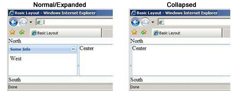
Let's add a couple of these options to our west panel:
{
region: 'west',
xtype: 'panel',
split: true,
collapsible: true,
collapseMode: 'mini',
title: 'Some Info',
bodyStyle:'padding:5px;',
width: 200,
minSize: 200,
html: 'West'
}
Adding these config options to our west panel would give us the following look:
With Ext JS, tab panels are also referred to as a "card" layout because they work much like a deck of cards where each card is layered directly above or below the others and can be moved to the top of the deck, to be visible. We also get pretty much the same functionality in our tab panel as a regular panel, including a title, toolbars, and all the other usual suspects (excluding tools).
If the Ext JS component is a panel type component, for instance GridPanel and FormPanel, then we can add it directly to the layout using its xtype. Let's start by creating a tabPanel:
{
layoutstab panelregion: 'center',
xtype: 'tabpanel',
items: [{
title: 'Movie Grid',
html: 'Center'
}]
}
The items config is an array of objects that defines each of the tabs contained in this tabpanel. The title is the only option that's actually needed to give us a tab, and right now html is just being used as a placeholder, to give our empty tab some content.
We will also need to add an activeTab config that is set to zero to our tab panel. This is the index of the tabs in the panel left to right starting with zero and counting up for each tab. This tells the tab panel at position zero to make itself active by default, otherwise, we would have no tabs displayed, resulting in a blank section until the user clicked a tab.
{
region: 'center',
xtype: 'tabpanel',
activeTab: 0,
items: [{
title: 'Movie Grid',
html: 'Center'
}]
}
If we take a look at this in a browser, we should see a tab panel in the center section of our layout.
Adding more tabs is as easy as adding more items into the items array. Each tab item is basically its own panel, which is shown or hidden, based on the tab title that has been clicked on the tab panel.
{
region: 'center',
xtype: 'tabpanel',
activeTab: 0,
items: [{
title: 'Movie Grid',
html: 'Center'
},{
title: 'Movie Descriptions',
html: 'Movie Info'
}]
}
Both the
Movie Grid
and
Movie Descriptionstabs are just plain panels right now. So let's add some more configuration options and widgets to them.
Earlier, I mentioned that any type of panel widget could be added directly to a layout, just as we had done with the tabs. Let's explore this by adding another widget to our layout—the grid.
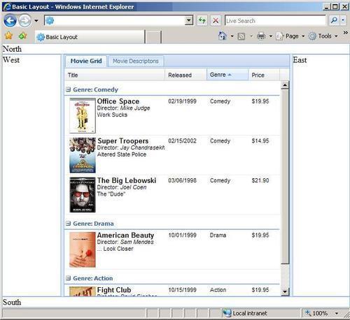
As we now have these tabs as part of our layout, let's start by adding a grid panel to one of the tabs. Adding the xtype config option to the grid config code you created in Chapter 5, will produce a grid that fills one entire tab:
{
region: 'center',
xtype: 'tabpanel',
activeTab: 0,
items: [{
title: 'Movie Grid',
xtype: 'gridpanel',
store: store,
autoExpandColumn: 'title',
columns: // add column model //,
view: // add grid view spec //
},{
title: 'Movie Descriptions',
html: 'Movie Info'
}]
}
Note
xtypes offer a quick way to instantiate a new component with minimal typing. This is sometimes referred to as 'lazy rendering' because the components sit around waiting to be displayed before they actually execute any code. This method can help conserve memory in your web application.
As we are adding this grid to a tab—which is essentially just a panel—there are some things that we no longer need (like the renderTo option, width, height, and a frame). The size, title, and border for the grid are now handled by our tab panel.
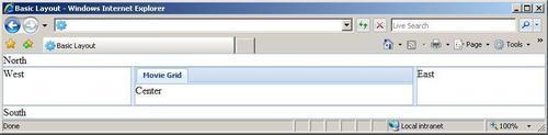
Now we should have a layout that looks like this:
The accordion is a very useful layout that works somewhat like a tab panel, where we have multiple sections occupying the same space, with only one showing at a time. This type of layout is commonly used when we're lacking the horizontal space needed for a tab panel, but instead have more vertical space available. When one of the accordion panels is expanded, the others will collapse. Expanding and collapsing the panels can be done either by clicking the panel's title bar or by clicking the plus/minus icons along the rightmost side of the panel.
We can nest a layout within a panel to create a more complex layout. For this example, we will nest an accordion panel within one of our tabs.
By setting the layout to 'accordion' and adding three items, we will end up with three panels in our accordion.
{
title: 'Movie Descriptions',
layout: 'accordion',
items: [{
title: 'Office Space',
autoLoad: 'html/1.txt'
},{
title: 'Super Troopers',
autoLoad: 'html/3.txt'
},{
title: 'American Beauty',
autoLoad: 'html/4.txt'
}]
}
This gives us a tab that has within it three accordion panels, which will load text files into their body sections. Note that the config on this is very similar to a tab panel—the consistency between widgets in Ext JS makes it easy to set up different types of widgets without having to look at the API reference for each one.
Now we should have a layout that looks like, this when we switch to the Movie Descriptionstab:
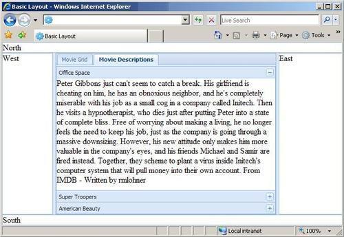
Each panel now has a description of the movie, which was loaded from a text file on the web server. Let's take a closer look at that.
autoLoad: 'html/1.txt'
This loads the file from the URL specified into the body section of the panel. The file loaded can contain any type of HTML, which will show up just as if it were in a browser by itself. As this is done via AJAX, if you're running the examples from your file system instead of a local web server they will not load.
Next, let's add a toolbar to the North section of our layout. We can use the toolbar for menus, buttons, and a couple of form fields, or maybe just a blinking marquee with our name scrolling across it. We can change these easily later.
Let's take our toolbar items we used in the example code in: Chapter 4—Buttons, Menus, and Toolbar—and add them to this toolbar. We should also copy over the Movies class we created in the toolbar chapter, if we want the buttons to work.
By changing the xtype
to
toolbar and copying the array of toolbar items over, we will end up with a snazzy menu bar at the top of the screen.
{
region: "north",
xtype: 'toolbar',
items: [{
xtype: 'tbspacer'
},{
xtype: 'tbbutton',
text: 'Button',
handler: function(btn){
btn.disable();
}
},{
xtype: 'tbfill'
},
// more toolbar items here //]
}
This gives us a toolbar that fits nicely into the top of our layout—like an application toolbar or menu bar that you would typically see in desktop applications.
You should end up with something that looks like this:
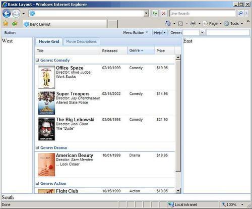
Even though this toolbar does not contain a blinking marquee with my name in it, it will be quite useful for our application. All of the navigation for your application can be placed in it, which might trigger new tabs to be added to the center region, or be used used to search for movie titles, or whatever else that is needed.
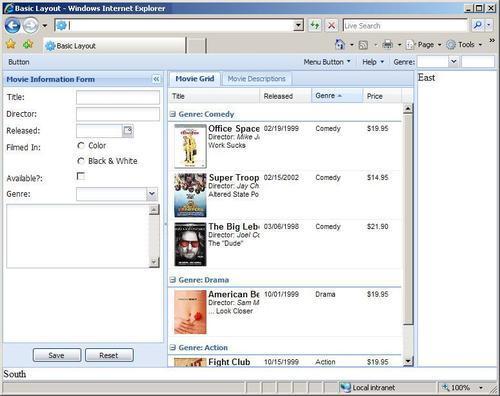
A form panel will fit nicely into that currently-empty West region, and since it's a panel type component, it can be added directly to our layout. Let's add the movie form that we used in the forms chapter to the West section. But instead of instantiating it, let's use the
xtypeconfig to perform lazy instantiation for the entire form panel.
{
region: 'west',
xtype: 'form',
items: // form fields //
buttons: // form panel buttons //
}
The
itemsconfig holds all of our form fields:
items: [{
xtype: 'textfield',
fieldLabel: 'Director',
name: 'director',
anchor: '100%',
vtype: 'name'
},{
xtype: 'datefield',
fieldLabel: 'Released',
name: 'released',
disabledDays: [1,2,3,4,5]
},{
xtype: 'radio',
fieldLabel: 'Filmed In',
name: 'filmed_in',
boxLabel: 'Color'
}, // more fields go here //]
Note
Many xtypes exist, and the names are not exactly what you would guess—for a full reference, look under the Component section in the API reference.
After adding the form items and buttons, our layout should look like this:
Some of the more complex web applications will need to do things that are not as simple as setting a few configuration values, for example nesting one layout within another layout, or adding icons to your tabs. But with Ext JS these kinds of things are made easy.
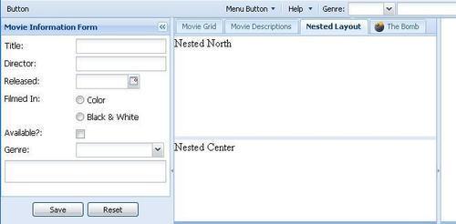
When we nest one layout within another layouts region, we will occupy that entire region's body so it cannot be used any more. Instead, the nested layout regions are used for content.
For example, if we wanted the center region split into two horizontal regions, we could add a nested layout with center and North regions. This is typical of an application where you have a data panel (Center) to list email messages and a reader panel (South) to preview the entire email when it's selected in the list in the North panel.
A couple of things are needed for a nested layout—the layout type must be set, and in this case, we are turning off the border so we don't get a doubled-up border, as the container has its own border. Each of the items represents one of our nested regions:
{
title: 'Nested Layout',
layout: 'border',
border: false,
items: [{
region: 'north',
height: 100,
split: true,
html: 'Nested North'
},{
region: 'center',
html: 'Nested Center'
}]
}
This produces a layout that would look like this:
Don't you just love it when you can have a visual indicator to show which tab does what? That's where icons come into play. The icons on tabs work much like the icons we added to the buttons in an earlier chapter. All we need to do is create a style with the icon and add that style to our tabs configuration.
The style would look like this:
bomb {
background-image:url(images/bomb.png) !important;
}
The tab config will need to have the
iconClsproperty set to the style we've
just created:
{
title: 'The Bomb',
iconCls: 'bomb',
html: 'Boom!'
}
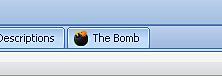
Don't click on that tab too quickly, it might go off!
We have the ability to modify just about anything, after the layout has been rendered. For example, we can, like add new tabs, hide, and display panels and change the content of any of the panels. Let's experiment with a couple of different things we can do.
Expanding and collapsing sections of your layout programmatically is a requirement in most applications. So it should be no surprise by now that this can be done in Ext JS as well.
The first thing we need to do is give our panel and viewport ids, so that we can locate them. We can do this by setting the id config option in our layout and panel configurations:
var viewport = new Ext.Viewport({
layout: 'border',
id: 'movieview',
renderTo: document.body,
items: [{
// extra code removed //
region: 'east',
xtype: 'panel',
id: 'moreinfo'
// extra code removed //
}
});
Now that both the layout and the panel have been given unique ids, we can use the ids to interact with these components by using getCmp.
var moreinfo = Ext.getCmp('movieview').findById('moreinfo'),
if (!moreinfo.isVisible()){
moreinfo.expand();
}
This little bit of code will check to see if the panel is visible (expanded), and if its not will expand it.
Adding a tab is as easy as creating a single tab. We first need to locate the tab panel within our layout. Luckily we just need to add an id config to our tab panel so that we can easily locate it.
{
region: 'center',
xtype: 'tabpanel',
id: ' movietabs',
activeTab: 0,
items: [{
title: 'Movie Grid',
// extra code removed //
},{
title: 'Movie Descriptions',
html: 'Movie Info'
}]
}
Then we can call the add handler for our tab panel and pass a basic config into it:
Ext.getCmp('movieview').findById('movietabs').add({
title: 'Office Space',
html: 'Movie Info'
});
This will add a tab that is titled Office Space to the movietabs tab panel.
The add function is a way to add new items to a layout or a widget. Typically, anything that you can pass into the items config of a component can also be passed to the add handler.
In this chapter, we have been able to use many of the components outlined in the previous chapters, within a layout. The layout really takes the various components of Ext JS and uses them to create a true web application. We have seen that the layout can integrate the different components of Ext JS into one fluid application. We also learned how to change the state of panels, create nested layouts, and load content dynamically.