
The unsung heroes of every application are the simple things like buttons, menus, and toolbars. In this chapter, we will cover how to add these items to our applications.
Our example will contain a few different types of buttons, both with and without menus. A button can simply be an icon, or text, or both. Toolbars also have some mechanical elements such as spacers and dividers that can help to organize the buttons on your toolbars items.
We will also cover how to make these elements react to user interaction.
Just about every Ext component—panels, windows, grids can accept a toolbar on either the top or the bottom. The option is also available to render the toolbar standalone into any DOM element in our document. The toolbar is an extremely flexible and useful component that will no doubt be used in every application.
Ext.Toolbar:The main container for the buttonsExt.Button:The primary handler for button creation and interactionExt.menu:A menu
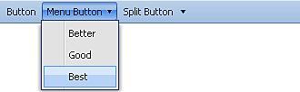
Our first toolbar is going to be rendered standalone in the body of our document. We will add one of each of the main button types, so we can experiment with each:
Button—
tbbutton: This is the standard button that we are all familiar with.Split Button—
tbsplit: A split button is where you have a default button action and an optional menu. These are used in cases where you need to have many options in the same category as your button, of which there is a most commonly used default option.Menu—
tbbutton+menu: A menu is just a button with the menu config filled in with options.Ext.onReady(function(){ new Ext.Toolbar({ renderTo: document.body, items: [{ xtype: 'tbbutton', text: 'Button' },{ xtype: 'tbbutton', text: 'Menu Button', menu: [{ text: 'Better' },{ text: 'Good' },{ text: 'Best' }] },{ xtype: 'tbsplit', text: 'Split Button', menu: [{ text: 'Item One' },{ text: 'Item Two' },{ text: 'Item Three' }] }] }); });
As usual, everything is inside our onReady event handler. The items config holds all of our toolbars elements—I say elements and not buttons because the toolbar can accept many different types of Ext components including form fields—which we will be implementing later on in this chapter.
Note
The default xtype for each element in the items config is tbbutton. We can leave out the xtype config element if tbbutton is the type we want, but I like to include it just to help me keep track.
Creating a button is fairly straightforward; the main config option is the text that is displayed on the button. We can also add an icon to be used alongside the text if we want to.
Here is a stripped-down button:
{
xtype: 'tbbutton',
text: 'Button'
}
A menu is just a button with the menu config populated—it's that simple. The menu items work along the same principles as the buttons. They can have icons, classes, and handlers assigned to them. The menu items could also be grouped together to form a set of option buttons, but first let's create a standard menu.
This is the config for a typical menu config:
{
xtype: 'tbbutton',
text: 'Button',
menu: [{
text: 'Better'
},{
text: 'Good'
},{
text: 'Best'
}]
}
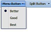
As we can see, once the menu array config is populated, the menu comes to life. To group these menu items together, we would need to set the group config and the boolean checked value for each item:
menu: [{
toolbarsmenutext: 'Better',
checked: true,
group: 'quality'
}, {
text: 'Good',
checked: false,
group: 'quality'
}, {
text: 'Best',
checked: false,
group: 'quality'
}]
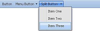
The split button sounds like a complex component, but it's just like a button and a menu combined, with a slight twist. By using this type of button, you get to use the functionality of a button while adding the option to select an item from the attached menu. Clicking the left portion of the button that contains the text triggers the button action. However, clicking the right side of the button, which contains a small down arrow, triggers the menu.
{
xtype: 'tbsplit',
toolbarssplit buttontext: 'Split Button',
menu: [{
text: 'Item One'
},{
text: 'Item Two'
},{
text: 'Item Three'
}]
}
By default, every toolbar aligns elements to the leftmost side. There is no alignment config for a toolbar, so if we want to align all of the toolbar buttons to the rightmost side, we need to add a fill as the first item in the toolbar. If we want to have items split up between both the left and right sides, we can also use a fill:
{
xtype: 'tbfill'
}
Pop this little guy in a tool-bar wherever you want to add space and he will push items on either side of the fill to the ends of the tool bar, as shown below:
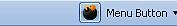
We also have elements that can add space or vertical dividers, like the one used between the Menu Button and the Split Button.
The spacer adds a few pixels of empty space that can be used to space out buttons, or move elements away from the edge of the toolbar:
{
xtype: 'tbspacer'
}
A divider can be added in the same way:
{
xtype: 'tbseparator'
}
Ext has many shortcuts that can be used to make coding faster. Shortcuts are a character or two that can be used in place of a configuration object. For example, consider the standard toolbar filler configuration:
{
xtype: 'tbfill'
}
The shortcut for a toolbar filler is a hyphen and a greater than symbol:
'->'
Not all of these shortcuts are documented. So be adventurous, poke around the source code, and see what you can find. Here is a list of the commonly-used shortcuts:
|
Component |
Shortcut |
Description |
|---|---|---|
|
Fill |
'->' |
The fill that is used to push items to the right side of the toolbar. |
|
Separator |
'-' or 'separator' |
A vertical bar used to visually separate items. |
|
Spacer |
' ' |
Empty space used to separate items visually. The space is two pixels wide, but can be changed by overriding the |
|
TextItem |
'Your Text' |
Add any text or HTML directly to a toolbar by simply placing it within quotes. |
The standard button can act as an icon button like the ones you see used in text editors to make text bold or italic. Two steps need to be taken to make an icon button—defining an image to be used as the icon and applying the appropriate class to the button.
{
xtype: 'tbbutton',
cls: 'x-btn-icon',
icon: 'images/bomb.png'
}
This could just as easily be an icon beside text by changing the style class and adding the text config.
{
xtype: 'tbbutton',
cls: 'x-btn-text-icon',
icon: 'images/bomb.png',
text: 'Tha Bomb'
}
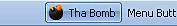
A button needs to do more than just look pretty—it needs to react to the user. This is where handlers come in. A handler is a function that is executed when a button or menu item is clicked.
The handler config is where we add our function:
{
xtype: 'tbbutton',
text: 'Button',
handler: function(){
Ext.Msg.alert('Boo', 'Here I am'),
}
}
This code will pop up an alert message when the button is clicked. Sometimes, we need to make changes to the button when it's clicked, so each button handler passes a reference to itself for this purpose. The first argument of our handler is a reference to the component that triggered the event.
{
xtype: 'tbbutton',
text: 'Button',
handler: function(f){
f.disable();
}
}
We can take this reference to the button—a reference to itself—and access all of the properties and functions of that button. For this sample, we have called the disable function which grays out the button and makes it unselectable.
We can have more fun than just disabling a button. Why don't we try something more useful?
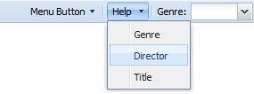
Lets take our button click and do something more useful with it. For this example, we are going to add a config option to each menu item that will be used to determine what content file to load in the body of our page:
{
xtype: 'tbsplit',
text: 'Help',
menu: [{
text: 'Genre',
helpfile: 'genre',
handler: Movies.showHelp
},{
text: 'Director',
helpfile: 'director',
handler: Movies.showHelp
},{
text: 'Title',
helpfile: 'title',
handler: Movies.showHelp
}]
}
Note the helpfile config option that we have added to each of the menu items config. We have made this config property up so that we have a way to store a variable that is unique to each menu item. This is possible because config properties can be anything we need them to be, and can be created on the fly. In this case, we are using a config property as a variable that holds the name of the file we want to load.
The other new thing we are doing is creating a collection of functions to handle the menu item click. These functions are all organized into a Movies class.
var Movies = function() {
return {
showHelp : function(btn){
var helpbody = Ext.get('helpbody'),
if (!helpbody) {
Ext.DomHelper.append(Ext.getBody(), {
tag:'div',
id:'helpbody'
});
}
Movies.doLoad(btn.helpfile);
},
doLoad : function(file){
Ext.get('helpbody').load({
url: 'html/' + file + '.txt'
});
}
};
}();
I don't want to get bogged down with too much detail about this Movies class just yet, but essentially all it does is handle our menu item clicks. This class will load a text file into the body of our web page via an AJAX request—which text file it loads is related to which menu item is clicked. So once this Movies class is in place in our page, we will be able to bring up this page in our browser and click on each menu item to load the relevant help file into the body of the page.
Next, we will try using a text field to perform this same type of action.
Like most things in Ext, a tool bar can accept just about any Ext component. Naturally, form fields and combo boxes are very useful items to have on a toolbar.
{
xtype: 'textfield'
}
In the same way as we created form fields in the last chapter, we have added the form fields to the items array, which will place the form fields within the toolbar. Now let's make the form field do something useful, by having it perform the same functionality as our help menu, but in a more dynamic way.
{
xtype: 'textfield',
listeners: {
specialkey: Movies.doSearch
}
}
This listener is added directly to the form field's config. For this, we are using a specialkey listener, which we used in the previous chapter. This is the listener that is used to capture edit keystrokes, such as Enter and Delete among others. The handler function will be added to our small Movies class created earlier:
doSearch : function(frm,evt){
if (evt.getKey() == evt.ENTER) {
Movies.doLoad(frm.getValue());
}
}
Now we have a text field in our toolbar that enables us to type in the name of the text file to load. Try some of the samples used in our menu, such as director or title.
All of the toolbars we have been working with have an items config. If we want to place one of these toolbars into another Ext component, such as a panel or a window, we can simply take the contents of the items config for a toolbar, and place it within one of the two pre-set containers that exist for panel-type components.
Panel-type components, such as the window and the grid, have a top and bottom toolbar config:
tbar:The top toolbarbbar:The bottom toolbar
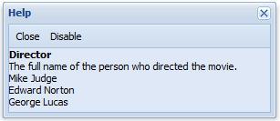
If we wanted to place a toolbar at the top of a window, filling the tbar config with an array of toolbar items would give us what we wanted:
new Ext.Window({
title: 'Help',
id: 'helpwin',
width: 300,
height: 300,
tbar: [{
text: 'Close',
handler: function(){
Ext.getCmp('helpwin').close();
}
},{
text: 'Disable',
handler: function(t){
t.disable();
}
}],
autoLoad: 'html/' + btn.helpfile + '.txt'
}).show();
Ext also has a custom toolbar for paged grids that contains all of the buttons for moving through pages of results. We will cover this special toolbar in the grid chapter later in this book.
In this chapter, we had the chance to play with a couple of different ways to create toolbar items, including using a config object or its shortcut. The many options available for toolbars make them a useful component for everything from the simplest button bar, to a complex combination of buttons, menus, and form fields. Interacting with the buttons, menus and form fields is easy using the built-in handlers.