
The easiest thing to do when writing a software application is to switch into programmer mode—to focus on the code, and not on the end user experience. The architecture of a system is extremely important, but if the user is not satisfied with their interactions with the system, then the project can only be seen as a failure.
Ext JS contributes to solving this issue by providing many slick components that react well to user input and maintain a consistent look and feel across the entire framework. "Feel" is a very fuzzy word when it comes to software design; the way a link acts when you hover over it or the way in which a window appears onscreen can be the difference between a pleasurable experience and a confusing one.
Many of Ext JS's components have transitional animations built in by default, allowing you to smoothly expand a treenode rather than suddenly pop it open, or to shrink down a window to a specified button that can be used to re-activate it later.
Features like this aren't just an added layer on top of the rest of the Ext framework; they're baked in at a low level to provide a consistent experience for both the developer and the end user.
The Ext.Element underlies many of the feature-rich widgets in Ext JS; indeed the Ext.Component.getEl method reflects the fact that widgets such as windows form fields and toolbars are supported by this fundamental building block.
Ext.Element mixes many methods from Ext.Fx, the class that is designed to provide slick transitions and animations for HTML elements and components alike. We're going to discuss the exciting possibilities that Ext.Fx provides, and also talk about the way in which it works together with Ext.Element.
As well as the building blocks of animation, we're going to examine various pieces of eye candy that you can find dotted around the Ext framework. There are a number of classes that provide added functionality to give your users feedback or assistance when they're using your application, and many components support these features straight out of the box. We can also use them in a standalone manner to create rich tooltips, mask items that are in the process of loading new data, or highlight individual parts of the screen to draw the user's attention to them.
In truth, many of the functions we're going to cover in this chapter are superficial in nature. They add some whizz-bang transitions that are not strictly essential. There are two lines of defense for criticism. Firstly, a good developer understands that users are not machines—they're people—and a little bit of whizz-bang is good for everyone. Secondly, and perhaps more scientifically, it's much better to have a transition to signify a change than simply have something appear. A transition draws the eye and gives the user the opportunity to consume the visual cue that was presented.
A sudden change on screen results in a "what happened" response; a smooth transition provides a hint as to what's going on. As we tour the various features of Ext.Fx, bear in mind that they can be used for more than just eye-candy; they're great for adding value to your user experience.
Ext.Fx is presented as a standalone class, architecturally independent of Ext.Element, but in reality it cannot be used on its own. Instead, it is automatically mixed into the methods and properties of the Ext.Element class, so that each action from Ext.Fx is available for each Ext.Element instance. The examples that follow will illustrate this point.
As mentioned earlier, Ext.Fx has a range of methods that are called upon to perform the magic. Each of these methods is available for Ext.Element instances. So in the examples that follow, we're going to assume that you have a div element with an ID of "target" on your ready-to-go HTML page.
The term "fading" is used in Ext.Fx to refer to a change in opacity—from 100% opaque to 0%(fade out) and vice versa(fade in). In other words, we're making something disappear and reappear—but as this is the Effects chapter, the transition is animated. The two methods that perform these transitions are Ext.Fx.fadeOut and Ext.Fx.fadeIn, and both support simple zero-argument usage:
Ext.get('target').fadeOut();
window.setTimeout(function() {
Ext.get('target').fadeIn();
}, 3000);
This usage will cause the target element to fade away slowly until it is completely invisible. The timeout happens three seconds later and causes the target to slowly re-appear, or fade in, until it is fully visible again.
You can tweak the behavior of these methods using the endOpacity configuration option. In theory, this allows you to specify that the element will not fade out to complete invisibility, which can be useful if you simply want to indicate that an item is now less important. Alternatively, you can use it to dictate that an item will not return to total solidity:
Ext.get('target').fadeOut({endOpacity:0.25});
window.setTimeout(function() {
Ext.get('target').fadeIn({endOpacity: 0.75});
}, 3000);
Note that I say "in theory"; actually, a limitation in Ext JS 2.2 means that the item in question will actually just vanish after reaching the endOpacity. I'd expect this to be fixed in the next release of the framework.
In the example just given, the initially-solid item is supposed to fade out to one quarter opacity before being restored after three seconds to only three quarters opacity.
In addition to the configuration options such as endOpacity that are specific to individual effects methods, there are also a number of common options shared by all Ext.Fx methods. These allow you to tweak the behavior of your effects even further. We'll discuss these later in this chapter.
Framing is reminiscent of a video game radar "ping". It radiates out from the point of origin, fading away with distance. A great use of this feature is to highlight a particular element on the screen—and the Ext.Fx.frame method also allows us to ensure that the user's attention is drawn by using multiple "pings". The simplest way of using it is without arguments:
Ext.get('target').frame();
This causes the target element to radiate a single light blue ping to draw attention to the element, which may be useful in some scenarios. However, to make sure that the user knows about a more important event, we could use something like this:
Ext.get('target').frame('ff0000', 3);
The first argument is the hexadecimal color of the framing effect, in this case, an angry red. The second argument specifies the number of times the ping is to be repeated. So here, we're using three red pulses to indicate that something pretty bad is about to happen.
These are the real strengths of the frame method: repetition, and the ability to use different colors to represent different situations and priorities.
Ghosts!-or rather ghosting—this is the term Ext JS gives to fading an element while it moves in a specified direction. This effect is used to give the impression that an element is transitioning from one area to another, for example the act of paging through a number of images could trigger ghosting when the next or previous link is selected. The default usage of ghost causes the element to drop down while fading out.
Ext.get('target').ghost();
The default settings could be used to discard elements that are no longer needed—perhaps deletion events could be signified with a call to Ext.Fx.ghost. As mentioned previously, we can also cater for other situations by specifying different direction for the ghosting depending on the situation. The standard Ext.Fx anchor points, used in animation and alignment, can also be used with the ghost method:
Ext.get('target').ghost('tr'),
Here, we indicate that the target will ghost out in the direction of its upper-right corner, but any anchor point is accepted. We'll talk more about anchoring later in the chapter. But it is this parameter that would allow us to replicate the paging functionality which was described earlier, that is, we can use left and right anchor points to move the ghost in the relevant directions.
If you're familiar with the term "Web 2.0", then you may also have heard of the "yellow fade technique". A quick web search will turn up numerous references to this JavaScript feature, which became popular when Web 2.0 was first becoming a buzzword. Typically used when an action has been completed and the user has been redirected to a new page, this effect causes a portion of the page—often an error message—to have its background highlighted in a different color. The highlight slowly fades away over a few seconds. Traditionally, the highlighted color has been a friendly yellow, but for error messages, we might favor something stronger. Having said that, yellow is the default for Ext.Fx.highlight:

This is triggered by the following basic code:
Ext.get('target').highlight();
Ext JS takes highlighting to the next level. While the standard usage affects the CSS background color of the target element, you can choose any CSS property, such as the color or border color. You can also specify the endColor of the highlight. In our second and more complex example, we can cause the text itself to start out white and end up green:
Ext.get('target').highlight('ffffff',{
attr: 'color',
endColor: '00ff00'
});
This is an extremely flexible method that can be used to highlight large portions of a page—perhaps a fieldset in a form, or just a block of text—perhaps in an online spellchecker. The point to be noted is that we can use it to respond and react to user input, and use its flexibility to indicate the state of our system in a noticeable manner.
Ext.Fx's puff method tries to replicate the look of a puff of smoke slowly dissipating into the air. While some of the Ext.Fx effects are used to highlight areas, puff is used to transition an element off the screen. To do this, the element expands while becoming more transparent, eventually fading away completely. Puff doesn't have any special options of its own, so the default usage is pretty obvious:
Ext.get('target').puff();
Puff could be used with a quick transition to dismiss a window from the workspace, or a slower transition could illustrate the removal of an element, maybe an image from a gallery. However, there is one important point to note about this method: when used within the document flow, it will affect the position of the elements around it.
Although absolutely-positioned windows will not affect their surroundings, in our gallery example, it is possible that when you use puff, you'll get unexpected results as the expanding dimensions push your other images out of the way.
Developers who are aware of the potential side effects of using Ext.Fx.puff can add it to their toolkit, providing another interesting method of creating dynamic transitions in their applications.
Scaling is one of the few Ext JS effects that has a specific use, rather than simply being an overlay on top of another action. It changes the dimensions of an element using a smooth transition, which has numerous applications. We can expand text areas to give more space for user input; we can replicate maximize and restore effects seen in the windowing applications; we can change the focus of a workspace by shrinking one portion and expanding another. The basic usage of Ext.Fx.scale looks like this:
Ext.get('target').scale(50, 150);
In this example, the target element will be smoothly-scaled to a width of 50 pixels and a height of 150 pixels. Both of these options also accept null values, which indicate that they should not be changed. This is useful if you want to restrict the scale to only horizontally or vertically.
Within Ext JS, sliding refers to the transition of an element into or out of view. This is the same effect used in the Ext.Fx.ghost method, so we've seen it in action already. But in reality, there are two methods that fall under this heading—:Ext.Fx.slideIn and Ext.Fx.slideOut.
We can use these methods to either drop out an element that is no longer required, or introduce a new element onto the screen. An obvious application for this would be addition and deletion of records, where new items slideIn to the list and deleted items slideOut.
Ext.get('target').slideOut();
window.setTimeout(function() {
Ext.get('target').slideIn();
}, 3000);
In the above example, we move the target out of view, and three seconds later bring it back in. By default, elements will slideIn and slideOut from their top edge, but the first argument to both functions allows you to use anchors to specify the direction of the movement:
Ext.get('target').slideOut('tr'),
Here, we dictate that the target will slideOut to the top right. As with Ext.Fx.puff, you must be aware of the elements that surround the item you're sliding; text and other non-absolutely-positioned elements may be pushed around during the slide.
The switchOff method is another means of removing an element from the screen. This one combines two actions: firstly a the element fades slightly to acknowledge the start of the effect, and then the element slowly collapses from the top and the bottom until it disappears. This two-stage effect means it can be used to draw the user's eye before the real vanishing act takes place. We can use Ext.Fx.switchOff in the following way:
Ext.get('target').switchOff();
As you can see, there are no unique arguments for this method, so it would seem that you're stuck with the default effect. But later we'll discuss the configuration options that are available for all of the Ext.Fx methods—the secret to complete control over your effects.
SwitchOff comes in pretty handy in situations where you'd like to cause an element to vanish without user interaction. For example, you might have some kind of monitoring screen on your website that displays the current visitors to your site, and tracks them as they move between pages. When their session expires, they will be removed from the list. Rather than simply transitioning off the screen you can highlight to the user that this is about to happen using switchOff: a quick flash to indicate that the action is about to occur, and then the actual collapse transition.
The Ext.Fx.shift method may sound like a function in the same vein as ghost and slideOut, but in actual fact it's a little different. There's no default behavior associated with the method, so simply call it in this fashion:
Ext.get('target').shift();
This will have no effect. Instead, shift must be supplied with a literal containing one or more values from the following:
widthheightxy
By setting one of these values and passing it to shift, we can cause the target element to move to the x,y coordinates and resize to the width, height dimensions—in the smooth manner which we've come to expect of Ext.Fx. Here's an example:
Ext.get('target').shift({
x: 5,
y: 300,
width: 300,
height: 200
});
In this example, our target element will move to a position of 5 pixels from the left and 300 from the top of the viewport, and will resize to 300x200 pixels. These changes happen simultaneously, with the element resizing as it moves.
Effectively, shift is a version of Ext.Fx.scale that adds the ability to reposition the element. This is a great mechanism for re-organizing a workspace—shifting panels of data from a place of prominence to a place more unobtrusive, and doing so in a smooth, dynamic manner.
All of the methods that we've just covered have some broad similarities. But each of them has certain distinct differences which make them applicable as solutions for a range of very different problems. We're now going to discuss how an extra feature of Ext.Fx can tweak and tailor the effects we've already reviewed.
In many of the above examples, the functionality on offer is slightly limited. What's been glossed over until now is that each of the methods we've discussesd also accepts a standard configuration object that provides a host of common options to bring their full functionality to your fingertips.
We've briefly touched upon the way in which anchoring options are used within Ext.Fx, for example, methods such as a ghost accepting a string representing the direction in which to move. Over the next few pages, we'll not only discuss this in detail, but we'll also go over the numerous configuration options that are common to all of the Ext.Fx methods.
Specifying directions, anchors, alignment, and more is all based around a scheme of anchor positions. These are used by Ext JS's animation system to determine the direction of movement, and they have a pretty simple naming convention:
|
Anchor Position String |
Description |
|---|---|
|
tl |
Top left corner |
|
t |
Center of the top edge |
|
tr |
Top right corner |
|
l |
Center of the left edge |
|
r |
Center of the right edge |
|
bl |
Bottom left corner |
|
b |
Center of the bottom edge |
|
br |
Bottom right corner |
These options allow eight-way movement when using methods such as Ext.Fx.ghost. But the same concept is seen in methods such as Ext.Element.alignTo and Ext.Element.anchorTo, where two anchor points can be combined, and the "?" character can be used to dictate that the alignment will be constrained to the viewpoint.
In short, it pays to familiarize yourself with the Ext JS anchor positions, as you'll almost certainly use them in your application—either to move elements or to just bend them to suit your many needs. More than that, Ext.Components have underlying elements. So you'll most likely use these features when developing a solution with rich widgets.
Now, back to the topic at hand—taming the Ext.Fx class.
As mentioned earlier, each of the Ext.Fx methods we've covered can take an optional configuration literal as its last parameter, which provides 11 settings for tweaking your effects. The simplest is probably duration, which specifies how long the effect should last. This is useful for ensuring that your transitions last long enough for your users to catch them. Although the default durations of each effect are usually pretty sensible, there are many use-cases for overriding this value. Here's an example of using duration, and indeed the configuration option argument in general:
Ext.get('target').switchOff({
duration: 10
});
In this example, we pass a standard object literal to the switchOff method, and the duration property is set to 10, indicating that the switchOff should take place over ten seconds.
With the default behavior of some of the Ext.Fx methods, you end up with some sub-optimal transitions. For example, many of the effects that cause an element to vanish will actually just leave a big gap where the element used to be. This is because they complete the transition by setting the visibility of the element to hidden, rather than removing it from the DOM or from the document flow. We can rectify this using two more configuration options: remove and useDisplay.
The first, remove, signifies that we'd like to completely destroy the element when the transition has completed. The second, useDisplay, means that the element will be hidden using display:none rather than visibility:hidden, so that it will no longer affect the nodes around it. Using remove and useDisplay together is redundant. If the node is completely removed, it makes no difference how it's hidden. If you're planning on re-using or re-showing the element in question, then stick with useDisplay; otherwise you may as well be tidy (and avoid potential memory leaks) and use remove.
The configuration options also allow us to dictate what else happens when the effect has completed. We have two options that control the look of our element: afterCls and afterStyle, which allow a CSS class or raw CSS rules to be applied to the element at the end of our transition. This can be used to add a permanent change to the element in question, perhaps highlighting it as a newly-introduced item.
We have two more options that give us the power to perform further actions when the effect has completed: callback, which allows us to specify a function to be called at the end of the transition, and scope, which is the scope of the callback function. For example:
Ext.get('target').switchOff({
callback: function() {
alert('Effect complete!'),
}
});
The Ext.Fx class handles the queuing of effects automatically, so don't use this to trigger another effect. Instead, use it to trigger actions associated with the animation.
Our next configuration option is easing. In animation terminology, easing refers to the means by which the transition eases from a stop to movement and back to a stop again. By default, Ext JS effects will abruptly start and stop, but by using the easing option, we can specify how it will accelerate and decelerate at the start and end of the effect respectively.
Note
The easing effects supported by Ext JS vary depending on which adapter you're using. If you're using the Ext JS Base adapter, then you'll get the full works.
A basic example of this in action is the easeBoth value. This causes the animation to gradually speed up and then slow down in order to provide a smooth-looking transition:
Ext.get('target').scale(50, 150, {easing: 'easeBoth'});
Here, we're applying the easing option to the scale effect, and by using easeBoth, we can have a less jarring movement as it progresses. There are many more easing options:
easeNoneeaseIneaseOuteaseBotheaseInStrongeaseOutStrongeaseBothStrongelasticInelasticOutelasticBothbackInbackOutbackBothbounceInbounceOutbounceBoth
That's a list of the options supported by Ext JS Base. Ones like bounceIn provide a bit of a spring to the effect, which is perhaps more useful in a gaming application than in data entry, but the beauty of having such a wide choice is that you are likely to find something that fits your requirements.
The final few configuration options apply to the way your current effect interacts with other effects that may occur within its lifetime. For example, block will specify that no other effects are queued up while this one is running, which is useful in scenarios where triggering further changes could adversely affect your application's state. The block option tells all other effects to "bide your time" until things have calmed down.
Ext.get('target').shift({
x: 5,
y: 300,
width: 300,
height: 200,
block: true
});
Here, we see an interesting usage of the Ext.Fx.shift method, in which the shift-specific configuration options are augmented by the common Fx ones.
We also have the stopFx and concurrent options. stopFx allows us to cancel all effects that get triggered after this one, while concurrent specifies whether subsequent effects will run in parallel with this one, or will be queued up until after this one has completed. By default, they'll queue up and run in sequence, but there are situations in which you will be able to apply multiple effects at a time, and we'll talk more about that in the next few sections.
Most of the time, you'll use effects one at a time on different elements to achieve the look you're after, but in some circumstances, it can be useful to use multiple effects. There are a few different ways of handling this scenario, and in the next few sections, we're going to review these ways. We're also going to see how we can influence any running effects from our code.
An easy way to set up a second effect to run after your first is completed, is to use method chaining. Because each of the main Ext.Fx methods returns the Ext.Element that was the target of the effect, you can then call further Ext.Element methods, including those provided by Ext.Fx:
Ext.get('target').slideIn().highlight();
As you can see from this example, we're calling slideIn followed by highlight, which indicates that highlight will be added to the effects queue to run after slideIn completes.
Queuing is the default behavior for effects set up either by method chaining, or by multiple calls. The following code sample is functionally-identical to our previous example:
Ext.get('target').slideIn();
Ext.get('target').highlight();
In both cases, the highlight effect will be queued up behind slideIn. This negates the need for any complicated timing or callback-based set-ups to trigger effects that run sequentially.
Although queuing is the default, we also have the option of running effects in parallel by using the previously-discussed concurrent configuration option. This gives us the opportunity to combine effects—for example, we could highlight an element as it scales up:
Ext.get('target').scale(300, 200 ,{
concurrent:true
}).highlight();
This provides a very powerful capacity for customization.
There are a number of extra methods within the Ext.Fx class that aren't directly responsible for creating effects. Instead, they can be used to manage and monitor effects that are already in the queue. A great example of this is the stopFx method, which is as simple as it sounds—we can call it to cancel any animations that are currently running. It also clears the effects queue, and primes the element for user interaction or further manipulation.
Interestingly, stopFx returns the target Ext.Element, allowing the developer to chain up further methods. Perhaps you have set up a slideIn that is subsequently canceled and replaced with slideOut:
Ext.get('target').stopFx().slideOut();
Such code is useful if we need to interrupt an animation to give control back to the user—an ability that can be crucial in giving the user the responsiveness they require. However, in other circumstances you may want to prevent the user from interfering with the current state of the application, and if that's the case, we have the hasFxBlock method. Typically, this is used to make sure that the user can't queue up the same effect many times—we can prevent additional effect calls to the element if hasFxBlock returns true.
As we've seen, the Ext.Element is the key to using Ext.Fx. It's important that, when rolling your own custom versions of Ext JS, you make sure that you include Ext.Fx if you want to be able to use its methods for Ext.Element. However, even when used stand-alone, Ext.Element has a number of methods all of its own that can provide some interesting possibilities for animation.
There are many methods on Ext.Element that can be used to manipulate a target element, but some of them have a free extra. Pass in a true value as the last parameter, and the manipulation will be animated.
Ext.get('target').moveTo(300, 500, true);
In this case, the target element will move to a location 300 pixels from the left and 500 from the top of the viewport. But, because of this last parameter, it will not simply jump to that location, but will smoothly transition to the specified point.
In addition to simply passing in true as the third parameter, we can pass in a full configuration object instead. This uses the same animation options for Ext.Fx that we discussed earlier in the chapter.
Note
Ext.Element animations can be used at the same time as the ones from Ext.Fx, but they are not guaranteed to support the queuing features that are always available with the Ext.Fx methods.
There are many methods, such as setOpacity and scroll, that can be used in this fashion to provide the means for adding simple transitions. This is a good foundation, which Ext.Fx builds upon.
There's another piece of the animation puzzle that we're yet to touch upon: Ext.Element.animate. This is the generic means of applying animations to an element, and is a shortcut to the same underlying methods that are used by all of the Ext.Element methods that support animation.
Advanced applications of this method involve using the Ext.lib.anim entries that register all of the stock animation types available to Ext JS, and adding new registered animation handlers to support custom scenarios. In most cases, using the stock Ext.Element methods or the Ext.Fx methods will be sufficient, even for advanced cases.
The animations which are available on Ext.Element are particularly interesting when you consider that many Ext.Components, such as the Window or FormPanel, have an underlying Element as their container. This means that you can apply these effects to full components as well as to standard elements, providing an added utility for these methods.
We've covered Ext.Fx and the other animation techniques that Ext JS offers in depth, now. But we've still got a few more features to cover when it comes to showing off with the framework. There are a number of Ext classes that provide a little extra sparkle to the top of the standard solutions. We've got LoadMask that allows you to mask off a portion of the screen while it's being refreshed, and QuickTip that offers a rich, configurable tooltip system.
These classes open up a new range of options when it comes to creating compelling user-experiences, and we're going to examine them in detail over the next few pages. A key feature of each is that they are reasonably simple to use, which is partly the reason why you'll want use them in many of your Ext JS applications.
The Ext.LoadMask class has a couple of different use cases. We can use it to simply display a message that keeps the user informed, or we can use it to prevent interaction with a component that is being refreshed.
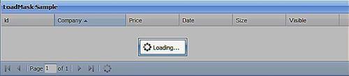
Let's look at the first scenario-that is, using an Ext.LoadMask to simply overlay an element with a message.
var target = Ext.get('target'),
var mask = new Ext.LoadMask(target);
mask.show();
In the above example, once we obtain an element using Ext.get, we pass it into the Ext.LoadMask constructor and call the show method on the LoadMask instance. There is also an optional second parameter for the Ext.LoadMask constructor: a configuration object with four properties:
|
Property Name |
Description |
|---|---|
|
msg |
The loading message to be displayed in the center of the mask |
|
msgCls |
The CSS class to use for the loading message container |
|
removeMask |
Boolean; set to True to destroy the mask after the load is complete |
|
store |
Discussed later |
When creating a load mask in this way, we can dismiss it by calling the mask.hide method. Although this masking approach is pretty straightforward, it's also a little verbose. So in some cases, it's better to use the shortcut method that Ext.Element provides:
Ext.get('target').mask('Loading...', 'x-mask-loading'),
In this example, we're explicitly passing the message text and message CSS class as the first and second arguments respectively. This allows us to replicate the functionality provided by a basic Ext.LoadMask call, as shown in the first example, but they're both optional. When you're done with the mask, you can hide it by calling the unmask method of your Ext.Element instance. If you have stored a reference to the mask, you can call the hide method of that instance instead.
Although it initially seems that the Ext.Element approach is better, there are actually a few compelling reasons for using the full LoadMask. The most interesting reason is that it can be tied to a specified Ext.data.Store instance, allowing you to automatically mask and unmask your element based on when the store is loading. This cuts down on your code when showing the mask, but it also negates the need to hook up an event listener for your load complete events. Let's take a look at how this feature can be used:
var slowStore = GetSlowStore();
var mask = new Ext.LoadMask(Ext.get('target'), {
store:slowStore
});
slowStore.load();
We're not interested in how to create a store, so that's been hidden away in a function call. All we care is that our example store is going to take a couple of seconds to finish loading. We instantiate a new LoadMask with an element as the first constructor parameter, and a configuration literal as the second one. The store property accepts our slowStore as its value.
Now that everything's set up, we simply call the load method of the store. This will mask over our target element, and in a few seconds when it has finished loading, the mask will automatically be dismissed.
As we've seen, there are a number of ways of manually masking elements, and you could use any of these approaches to the Ext.Elements that under-lie many Ext.Components. However, it's important to note that some components provide this functionality for you, cutting down on the code that you need to write in order to enable this feature in your applications. For example, the Ext.grid.GridPanel has a boolean loadMask configuration option, which not only masks the panel but also automatically ties in to the datasource that is feeding the GridPanel.
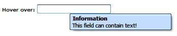
It's often very useful to be able to supply further information for a button or form field, just in case your users are unclear as to its purpose. In many cases, it's impractical to put this information inline, next to the item in question, simply because it would make the interface highly cluttered. In this situation, tooltips are a great alternative to inline information, and with Ext JS these little pop-up snippets can contain any HTML that you'd like to show.
The Ext.QuickTips class is a singleton that provides a very easy method of creating rich tooltips. It allows you to put your QuickTip setup information directly into the markup of your page—a great method for reducing the configuration required. In many cases, having the description text within your main HTML makes the most sense. This approach is supported by the use of a number of extra attributes for any HTML element that you'd like to tie the QuickTip to, with ext:qwidth, ext:qtitle and ext:qtip being the most commonly-used:
<input type="text" ext:qtitle="Information" ext:qtip= "This field can contain text!" ext:qwidth="200" />
We need to activate the global QuickTips handler before this will start working:
Ext.QuickTips.init();
It's also worth mentioning that nonstandard attributes will cause After completing these two steps, you'll end up with the tooltip you see here:
As well as using markup-based tooltips, we can also programmatically create more customizable ones with the Ext.ToolTip class. This provides a range of configuration options to change the behavior and appearance of the tooltips, and also allows you to pull tooltip data from an external source, by using the power of AJAX.
The simplest usage of this class is as follows:
new Ext.ToolTip({
target: 'tipTarget',
html: 'This is where our information goes!'
});
The constructor for Ext.ToolTip accepts a configuration literal as its only argument, and here we're using the mandatory target property to specify which element will trigger the tooltip; in this case it will be the one with the ID tipTarget. Note that we're using a string to refer to the ID, but in fact you can pass in an Ext.Element reference or a standard HTML node. We're then setting the html property to the text that we'd like to show in the tooltip. As the name of the property indicates, you can add any extra markup you like—even images.
Ext.ToolTip has a number of other interesting options, such as the ability to tweak the time it takes for the tooltip to appear and then vanish, by using the showDelay and hideDelay configuration properties. This can be useful if you need the tooltip to appear promptly when the user hovers over its associated element, or if you want to make sure that the information is on-screen long enough to be taken in.
We've also got the ability to set the title of the tooltip in the same way as we did with the markup-based solution, that is, by using the title option. In fact, many of the options, such as title, come from the fact that Ext.ToolTip is a subclass of Ext.Panel. This means that we can use features such as the autoLoad configuration option to grab content from a URL, or use the closable option, to force the user to dismiss the tooltip using a close widget.
QuickTips and ToolTips are great examples of Ext JS classes that aren't essential to an application, but that provide a layer of functionality that can take your solution from something ordinary to something highly usable.
There's a fine line between visual cues and annoying effects. Although we've reviewed many of the Ext JS features that allow you to gear your application towards either extreme, this chapter has only been about the tools—not how you should use them.
That said, we've also looked at a couple of examples that illustrate just how useful eye candy can be when helping out your users. By providing a little something extra when you're deleting a record or closing a data display, you can turn a potentially-confusing experience into one that is supported by gradual changes in visual state, rather than immediate shifts from one click to another.
The key is to ensure that those gradual changes aren't too gradual, that your animations aren't in-your-face, and that they aren't triggered every time the user presses a button. Software applications are about getting things done, and having portions of the page whizzing around the screen isn't likely to help with that.
Ext JS isn't just about these fancy effects, though. We've demonstrated a couple of classes that are utility tools with style. ToolTips and LoadMasks are genuinely useful in many scenarios, and could rarely be used in an "in your face" manner.
Using ToolTips can add a lot of value to a busy application, removing clutter by moving inline text into pop ups, and providing unified and attractive assistance to your users. Images, and even HTML links, can provide more information than could possibly be shown next to a form field.
The second of the classes we covered, LoadMask, can form a critical part of a system, ensuring not only that your users are prevented from interrupting a load operation, but also that the mask that appears is attractive, consistent, and can contain customized information that keeps the users informed.
In the next chapter, we're going to take a look at one of the most typical examples of Web 2.0 glitz: drag-and-drop. In a typical Ext JS manner, we're going to see how it's not only simple to use, but also powerful in its functionality.