
Chapter 12. Managing and Reusing Your System’s Parts: Component Diagrams
When designing a software system, it’s rare to jump directly from requirements to defining the classes in your system. With all but the most trivial systems, it’s helpful to plan out the high-level pieces of your system to establish the architecture and manage complexity and dependencies among the parts. Components are used to organize a system into manageable, reusable, and swappable pieces of software.
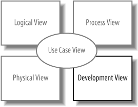
UML component diagrams model the components in your system and as such form part of the development view , as shown in Figure 12-1. The development view describes how your system’s parts are organized into modules and components and is great at helping you manage layers within your system’s architecture.
What Is a Component?
A component is an encapsulated, reusable, and replaceable part of your software. You can think of components as building blocks: you combine them to fit together (possibly building successively larger components) to form your software. Because of this, components can range in size from relatively small, about the size of a class, up to a large subsystem.
Good candidates for components are items that perform a key functionality and will be used frequently throughout your system. Software, such as loggers, XML parsers, or online shopping carts, are components you may already be using. These happen to be examples of common third-party components, but the same principles apply to components you create yourself.
In your own system, you might create a component that provides services or access to data. For example, in a CMS you could have a conversion management component that converts blogs to different formats, such as RSS feeds. RSS feeds are commonly used to provide XML-formatted updates to online content (such as blogs).
In UML, a component can do the same things a class can do: generalize and associate with other classes and components, implement interfaces, have operations, and so on. Furthermore, as with composite structures (see Chapter 11), they can have ports and show internal structure. The main difference between a class and a component is that a component generally has bigger responsibilities than a class. For example, you might create a user information class that contains a user’s contact information (her name and email address) and a user management component that allows user accounts to be created and checked for authenticity. Furthermore, it’s common for a component to contain and use other classes or components to do its job.
Since components are major players in your software design, it’s important that they are loosely coupled so that changes to a component do not affect the rest of your system. To promote loose coupling and encapsulation, components are accessed through interfaces. Recall from Chapter 5 that interfaces separate a behavior from its implementation. By allowing components to access each other through interfaces, you can reduce the chance that a change in one component will cause a ripple of breaks throughout your system. Refer back to Chapter 5 for a review of interfaces.
A Basic Component in UML
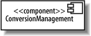
A component is drawn as a rectangle with the <<component>> stereotype and an optional tabbed rectangle icon in the upper righthand corner. Figure 12-2 shows a ConversionManagement component used in the CMS that converts blogs to different formats and provides feeds such as RSS feeds.
In earlier versions of UML, the component symbol was a larger version of the tabbed rectangle icon, so don’t be surprised if your UML tool still shows that symbol.
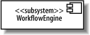
You can show that a component is actually a subsystem of a very large system by replacing <<component>> with <<subsystem>>, as shown in Figure 12-3. A subsystem is a secondary or subordinate system that’s part of a larger system. UML considers a subsystem a special kind of component and is flexible about how you use this stereotype, but it’s best to reserve it for the largest pieces in your overall system, such as a legacy system that provides data or a workflow engine in the CMS.
Provided and Required Interfaces of a Component
Components need to be loosely coupled so that they can be changed without forcing changes on other parts of the system—this is where interfaces come in. Components interact with each other through provided and required interfaces to control dependencies between components and to make components swappable.
A provided interface of a component is an interface that the component realizes. Other components and classes interact with a component through its provided interfaces . A component’s provided interface describes the services provided by the component.
A required interface of a component is an interface that the component needs to function. More precisely, the component needs another class or component that realizes that interface to function. But to stick with the goal of loose coupling, it accesses the class or component through the required interface. A required interface declares the services a component will need.
There are three standard ways to show provided and required interfaces in UML: ball and socket symbols, stereotype notation, and text listings.
Ball and Socket Notation for Interfaces
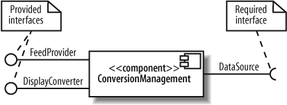
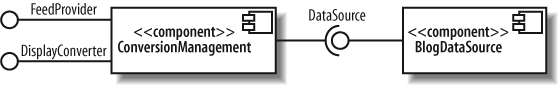
You can show a provided interface of a component using the ball symbol introduced in Chapter 5. A required interface is shown using the counterpart of the ball—the socket symbol—drawn as a semicircle extending from a line. Write the name of the interface near the symbols.
Figure 12-4 shows that the ConversionManagement component provides the FeedProvider and DisplayConverter interfaces and requires the DataSource interface.
The ball and socket notation is the most common way to show a component’s interfaces, compared with the following techniques.
Stereotype Notation for Interfaces
You can also show a component’s required and provided interfaces by drawing the interfaces with the stereotyped class notation (introduced in Chapter 5). If a component realizes an interface, draw a realization arrow from the component to the interface. If a component requires an interface, draw a dependency arrow from the component to the interface, as shown in Figure 12-5.

This notation is helpful if you want to show the operations of interfaces. If not, it’s best to use the ball and socket notation, since it shows the same information more compactly.
Listing Component Interfaces
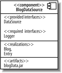
The most compact way of showing required and provided interfaces is to list them inside the component. Provided and required interfaces are listed separately, as shown in Figure 12-6.
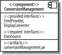
This notation additionally has an <<artifacts>> section listing the artifacts, or physical files, manifesting this component. Since artifacts are concerned with how your system is deployed, they are discussed in deployment diagrams (see Chapter 15). Listing the artifacts within the component is an alternative to the techniques shown in Chapter 15 for showing that artifacts manifest components.
Deciding when to use which notation for required and provided interfaces depends on what you’re trying to communicate. This question can be answered more fully when examining components working together.
Showing Components Working Together
If a component has a required interface, then it needs another class or component in the system to provide it. To show that a component with a required interface depends on another component that provides it, draw a dependency arrow from the dependent component’s socket symbol to the providing component’s ball symbol, as shown in Figure 12-7.

As a presentation option for Figure 12-7, your UML tool may let you get away with snapping the ball and socket together (omitting the dependency arrow), as shown in Figure 12-8. This is actually the assembly connector notation, which is introduced later in this chapter.
You can also omit the interface and draw the dependency relationship directly between the components, as shown in Figure 12-9.

The second notation (omitting the interface, shown in Figure 12-9) is simpler than the first (including the interface, shown in Figure 12-7), so you may be tempted to use that as a shorthand, but keep in mind a few factors when choosing how to draw component dependencies.
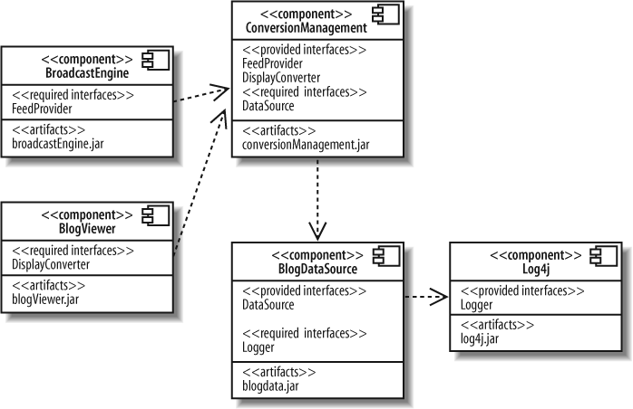
Remember that interfaces help components stay loosely coupled, so they are an important factor in your component architecture. Showing the key components in your system and their interconnections through interfaces is a great way to describe the architecture of your system, and this is what the first notation is good at, as shown in Figure 12-10.

The second notation is good at showing simplified higher level views of component dependencies. This can be useful for understanding a system’s configuration management or deployment concerns because emphasizing component dependencies and listing the manifesting artifacts allows you to clearly see which components and related files are required during deployment, as shown in Figure 12-11.
Classes That Realize a Component
A component often contains and uses other classes to implement its functionality. Such classes are said to realize a component—they help the component do its job.
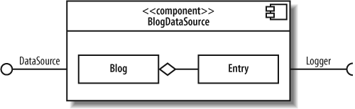
You can show realizing classes by drawing them (and their relationships) inside the component. Figure 12-12 shows that the BlogDataSource component contains the Blog and Entry classes. It also shows the aggregation relationship between the two classes.
You can also show a component’s realizing classes by drawing them outside the component with a dependency arrow from the realizing class to the component, as shown in Figure 12-13.

The final way to show realizing classes is to list them in a <<realizations>> compartment inside the component, as shown in Figure 12-14.
How do you decide which notation to use to show the classes that realize a component? You may be limited by your UML tool, but if you have the choice, many modelers prefer the first notation (drawing the realizing classes inside) rather than drawing them outside since drawing them inside visually emphasizes that the classes make up a component to achieve its functionality. Listing the realizing classes may be helpful if you want something compact, but keep in mind that it can’t show relationships between the realizing classes, whereas the first two notations can.
Ports and Internal Structure
Chapter 11 introduced ports and internal structure of
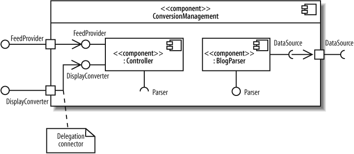
a class. Components can also have ports and internal structure.You can use ports to model distinct ways that a component can be used with related interfaces attached to the port. In Figure 12-15, the ConversionManagement component has a Formatting and a Data port, each with their associated interfaces.

You can show the internal structure of a component to model its parts, properties, and connectors (see Chapter 11 for a review of internal structure). Figure 12-16 shows the internal structure of a BlogDataSource component.

Components have their own unique constructs when showing ports and internal structure—called delegation connectors and assembly connectors. These are used to show how a component’s interfaces match up with its internal parts and how the internal parts work together.
Delegation Connectors
A component’s provided interface can be realized by one of its internal parts. Similarly, a component’s required interface can be required by one of its parts. In these cases, you can use delegation connectors to show that internal parts realize or use the component’s interfaces.
Delegation connectors are drawn with arrows pointing in the “direction of traffic,” connecting the port attached to the interface with the internal part. If the part realizes a provided interface, then the arrow points from the port to the internal part.
If the part uses a required interface, then the arrow points from the internal part to the port. Figure 12-17 shows the use of delegation connectors to connect interfaces with internal parts.
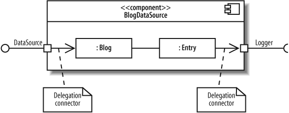
You can think of the delegation connectors as follows: the port represents an opening into a component through which communications pass, and delegation connectors point in the direction of communication. So, a delegation connector pointing from a port to an internal part represents messages being passed to the part that will handle it.
If you’re showing the interfaces of the internal parts, you can connect delegation connectors to the interface instead of directly to the part. This is commonly used when showing a component that contains other components. Figure 12-19 demonstrates this notation. The ConversionManagement component has a Controller and a BlogParser component. The ConversionManagement component provides the FeedProvider interface, but this is actually realized internally by the Controller part.
Assembly Connectors
Assembly connectors show that a component requires an interface that another component provides. Assembly connectors snap together the ball and socket symbols that represent required and provided interfaces.
Figure 12-19 shows the assembly connector notation connecting the Controller component to the BlogParser component.
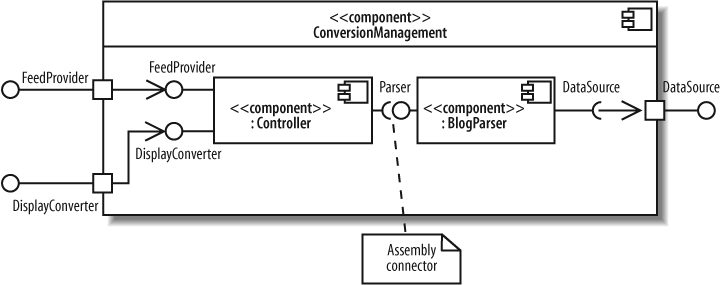
Assembly connectors are special kinds of connectors that are defined for use when showing composite structure of components. Notice that Controller and BlogParser use the roleName:className notation introduced in composite structures and help form the internal structure of ConversionManagement. But assembly connectors are also sometimes used as a presentation option for component dependency through interfaces in general, as shown earlier in Figure 12-8.
Black-Box and White-Box Component Views
There are two views of components in UML: a black-boxview and a white-box view. The black-box view shows how a component looks from the outside, including its required interfaces, its provided interfaces, and how it relates to other components. A black-box view specifies nothing about the internal implementation of a component. The white-box view, on the other hand, shows which classes, interfaces, and other components help a component achieve its functionality.
In this chapter, you’ve seen both black-box and white-box views. So, what’s the difference in practical terms? A white-box view is one that shows parts inside a component, whereas a black-box view doesn’t, as shown in Figure 12-20.

When modeling your system, it’s best to use black-box views to focus on large-scale architectural concerns. Black-box views are good at showing the key components in your system and how they’re connected. White-box views, on the other hand, are useful for showing how a component achieves its functionality through the classes it uses.
Black-box views usually contain more than one component, whereas in a white-box view, it’s common to focus on the contents of one component.
What’s Next?
Now that you know how to model the components in your system, you may want to look at how your components are deployed to hardware in deployment diagrams. Deployment diagrams are covered in Chapter 15.
There is heavy overlap between certain topics in component diagrams and composite structures. The ability to have ports and internal structure is defined for classes in composite structures. Components inherit this capability and introduce some of their own features, such as delegation and assembly connectors. Refer back to Chapter 11 to refresh your memory about a class’s internal structure and ports.