
6. Evaluating Classifiers
In [1]:
# setup
from mlwpy import *
%matplotlib inline

iris = datasets.load_iris()

tts = skms.train_test_split(iris.data, iris.target,
                            test_size=.33, random_state=21)

(iris_train_ftrs, iris_test_ftrs,
 iris_train_tgt, iris_test_tgt) = tts
In the previous chapter, we discussed evaluation issues that pertain to both classifiers and regressors. Now, I’m going to turn our attention to evaluation techniques that are appropriate for classifiers. We’ll start by examining baseline models as a standard of comparison. We will then progress to different metrics that help identify different types of mistakes that classifiers make. We’ll also look at some graphical methods for evaluating and comparing classifiers. Last, we’ll apply these evaluations on a new dataset.
6.1 Baseline Classifiers
I’ve emphasized—and the entire previous chapter reinforces—the notion that we must not lie to ourselves when we evaluate our learning systems. We discussed fair evaluation of single models and comparing two or more alternative models. These steps are great. Unfortunately, they miss an important point—it’s an easy one to miss.
Once we’ve invested time in making a fancy—new and improved, folks!—learning system, we are going to feel some obligation to use it. That obligation may be to our boss, or our investors who paid for it, or to ourselves for the time and creativity we invested in it. However, rolling a learner into production use presumes that the shiny, new, improved system is needed. It might not be. Sometimes, simple old-fashioned technology is more effective, and more cost-effective, than a fancy new product.
How do we know whether we need a campfire or an industrial stovetop? We figure that out by comparing against the simplest ideas we can come up with: baseline methods. sklearn calls these dummy methods.
We can imagine four levels of learning systems:
Baseline methods—prediction based on simple statistics or random guesses,
Simple off-the-shelf learning methods—predictors that are generally less resource-intensive,
Complex off-the-shelf learning methods—predictors that are generally more resource-intensive, and
Customized, boutique learning methods.
Most of the methods in this book fall into the second category. They are simple, off-the-shelf systems. We’ll glance at more complex systems in Chapter 15. If you need boutique solutions, you should hire someone who has taken a deeper dive into the world of machine learning and statistics—like your humble author. The most basic, baseline systems help us decide if we need a complicated system and if that system is better than something primitive. If our fancy systems are no better than the baseline, we may need to revisit some of our fundamental assumptions. We may need to gather more data or change how we are representing our data. We’ll talk about adjusting our representation in Chapters 10 and 13.
In sklearn, there are four baseline classification methods. We’ll actually show code for five, but two are duplicates. Each of the methods makes a prediction when given a test example. Two baseline methods are random; they flip coins to make a prediction for the example. Two methods return a constant value; they always predict the same thing. The random methods are (1) uniform: choose evenly among the target classes based on the number of classes and (2) stratified: choose evenly among the target classes based on frequency of those classes. The two constant methods are (1) constant (surprise?): return one target class that we’ve picked out and (2) most_frequent: return the single most likely class. most_frequent is also available under the name prior.
The two random methods will behave differently when a dataset has rare occurrences, like a rare disease. Then, with two classes—plentiful healthy people and rare sick people—the uniform method picks evenly, 50%–50%, between sick and healthy. It ends up picking way more sick people than there are in reality. For the stratified method, we pick in a manner similar to stratified sampling. It picks healthy or sick as the target based on the percents of healthy and sick people in the data. If there are 5% of sick people, it would pick sick around 5% of the time and healthy 95% of the time.
Here’s a simple use of a most_frequent baseline method:
In [2]:
# normal usage: build-fit-predict-evaluate
baseline = dummy.DummyClassifier(strategy="most_frequent")
baseline.fit(iris_train_ftrs, iris_train_tgt)
base_preds = baseline.predict(iris_test_ftrs)

base_acc = metrics.accuracy_score(base_preds, iris_test_tgt)
print(base_acc)
0.3
Let’s compare the performance of these simple baseline strategies against each other:
In [3]:
strategies = ['constant', 'uniform', 'stratified',
              'prior', 'most_frequent']

# set up args to create different DummyClassifier strategies
baseline_args = [{'strategy':s} for s in strategies]
baseline_args[0]['constant'] = 0 # class 0 is setosa

accuracies = []
for bla in baseline_args:
    baseline = dummy.DummyClassifier(**bla)
    baseline.fit(iris_train_ftrs, iris_train_tgt)
    base_preds = baseline.predict(iris_test_ftrs)
    accuracies.append(metrics.accuracy_score(base_preds, iris_test_tgt))

display(pd.DataFrame({'accuracy':accuracies}, index=strategies))
|
accuracy |
|---|---|
constant |
0.3600 |
uniform |
0.3800 |
stratified |
0.3400 |
prior |
0.3000 |
most_frequent |
0.3000 |
uniform and stratified will return different results when rerun multiple times on a fixed train-test split because they are randomized methods. The other strategies will always return the same values for a fixed train-test split.
6.2 Beyond Accuracy: Metrics for Classification
We’ve discussed a grand total of two metrics so far: accuracy for classification and root-mean-squared-error (RMSE) for regression. sklearn has a plethora of alternatives:
In [4]:
# helpful stdlib tool for cleaning up printouts
import textwrap
print(textwrap.fill(str(sorted(metrics.SCORERS.keys())),
                    width=70))
['accuracy', 'adjusted_mutual_info_score', 'adjusted_rand_score',
'average_precision', 'balanced_accuracy', 'brier_score_loss',
'completeness_score', 'explained_variance', 'f1', 'f1_macro',
'f1_micro', 'f1_samples', 'f1_weighted', 'fowlkes_mallows_score',
'homogeneity_score', 'mutual_info_score', 'neg_log_loss',
'neg_mean_absolute_error', 'neg_mean_squared_error',
'neg_mean_squared_log_error', 'neg_median_absolute_error',
'normalized_mutual_info_score', 'precision', 'precision_macro',
'precision_micro', 'precision_samples', 'precision_weighted', 'r2',
'recall', 'recall_macro', 'recall_micro', 'recall_samples',
'recall_weighted', 'roc_auc', 'v_measure_score']
Not all of these are designed for classifiers and we’re not going to discuss all of them. But, to a slightly different question, how can we identify the scorer used for a particular classifier—say, k-NN? It’s not too difficult, although the answer is a bit verbose. You can see the whole output with help(knn.score), but I’ll trim it down to the good bits:
In [5]:
knn = neighbors.KNeighborsClassifier()

# help(knn.score) # verbose, but complete

print(knn.score.__doc__.splitlines()[0])
print('
---and---
')
print("
".join(knn.score.__doc__.splitlines()[-6:]))
Returns the mean accuracy on the given test data and labels.
---and---

        Returns
        -------
        score : float
            Mean accuracy of self.predict(X) wrt. y.
The punch line is that the default evaluation for k-NN is mean accuracy. Accuracy has some fundamental limits and we are going to move into discussing precision, recall, roc_auc, and f1 from the extensive list of metrics we just saw. Why discuss these metrics and what’s wrong with accuracy? Is it not accurate? I’m glad you asked. Let’s get right to answering your questions.
Here’s a quick example of the issue with accuracy. Remember, accuracy is basically a count of how often we are right. Let’s imagine a dataset where we have 100 patients and a rare disease. We’re happy the disease is rare, because it is very deadly. In our dataset, we have 98 healthy people and 2 sick people. Let’s take a simple baseline strategy and predict everyone is healthy. Our accuracy is 98%. That’s really good, right? Well, not really. In fact, on the people that we need to identify—so they can get proper medical care—we find exactly zero of them. That’s a very real problem. If we had a more complex learning system that failed in the same way, we’d be very unhappy with its performance.
6.2.1 Eliminating Confusion from the Confusion Matrix
When we have a dataset and we make a classifier that predicts a target from features, we have our prediction and reality. As any of you with young children know, beliefs and reality don’t always line up. Children—and adults too, let’s be honest—love to interpret things around them in a self-serving way. The current metric we have for assessing how well our guess or prediction matches with reality is accuracy: where are they the same? If I were predicting the outcome of a hockey game and I said “My team will win” and they lost, then we have an error—no accuracy points for me.
We can break down our errors in two ways. Here’s an example. I see a pot on the stove and it has metal handles. If it’s hot and I grab it, I’m going to get a nasty surprise. That’s a painful mistake. But, if the pot is cold and I leave it there—and don’t clean it like my significant other asked me—I’m going to get in trouble. Another mistake. “But sweetie, I thought it was hot” is going to sound a lot like an excuse. These two types of errors show up in many different guises: guessing that it’s hot when it is cold and guessing that it’s cold when it is hot. Both mistakes can get us in trouble.
When we talk about abstract problems in learning, hot and cold become positive and negative outcomes. These terms aren’t necessarily moral judgments. Often, what we call positive is either (1) the more risky, (2) the less likely, or (3) the more interesting outcome. For an example in medicine, when a test comes back positive, it means that something interesting is happening. That could be a good or bad outcome. The ambiguity is the source of many medical jokes. “Oh no, the test is negative. I’m going to an early grave.” Cue Mark fainting. “No Mark, we wanted the test to be negative, you don’t have the disease!” Phew.
Let’s turn back to the example of the hot and cold pot. We get to pick which outcome we consider positive. While I don’t want to get in trouble with my significant other, I’m more concerned about burning my hands. So, I’m going to say that the hot pot is positive. Just like in the medical case, I don’t want a test indicating a bad medical condition.
6.2.2 Ways of Being Wrong
So, here are the ways I can be right and wrong:
|
I think: pot is hot |
I think: pot is cold |
|---|---|---|
pot is hot |
I thought hot it is hot I’m right |
I thought cold it isn’t cold I’m wrong |
pot is cold |
I thought hot it isn’t hot I’m wrong |
I thought cold it is cold I’m right |
Now, we’re going to replace those pot-specific terms with some general terms. We’re going to replace right/wrong with True/False. True means you did good, you got it right, you matched the real state of the world. False means :sadface:, you made a mistake. We’re also going to introduce the terms Positive and Negative. Remember, we said that hot pot—the pot being hot—was our Positive. So, we are going to say that my positive claim, “I thought hot,” is going to be filled with the word “Positive”. Here goes:
|
I think: pot is hot (Positive) |
I think: pot is cold (Negative) |
|---|---|---|
pot is hot |
True (predicted) Positive |
False (predicted) Negative |
pot is cold |
False (predicted) Positive |
True (predicted) Negative |
To pick this apart: the top left corner, True Positive, means that (1) I was correct (True) when (2) I claimed the pot was hot (Positive). Likewise, True Negative means that I was correct—the True part—when I claimed the pot was cold—the Negative part. In the top right corner, False Negative means I was wrong (False) when I claimed the pot was cold (Negative).
Now, let’s remove all of our training wheels and create a general table, called a confusion matrix, that will fit any binary classification problem:
|
Predicted Positive (PredP) |
Predicted Negative (PredN) |
|---|---|---|
Real Positive (RealP) |
True Positive (TP) |
False Negative (FN) |
Real Negative (RealN) |
False Positive (FP) |
True Negative (TN) |
Comparing with the previous table, T, F, P, N stand for True, False, Positive, and Negative. There are a few mathematical relationships here. The state of the real world is captured in the rows. For example, when the real world is Positive, we are dealing with cases in the top row. In real-world terms, we have: RealP = TP + FN and RealN = FP + TN. The columns represent the breakdown with respect to our predictions. For example, the first column captures how we do when we predict a positive example. In terms of our predictions, we have: PredP = TP + FP and PredN = FN + TN.
6.2.3 Metrics from the Confusion Matrix
We can ask and answer questions from the confusion matrix. For example, if we are doctors, we care how well we’re able to find people who are, in reality, sick. Since we defined sick as our positive case, these are people in the first row. We are asking how well do we do on RealP: how many, within the actual real-world sick people, do we correctly detect: . The term for this is sensitivity. You can think of it as “how well dialed-in is this test to finding sick folks”—where the emphasis is on the sick people. It is also called recall by folks coming from the information retrieval community.
Different communities came up with this idea independently, so they gave it different names. As a way to think about recall, consider getting hits from a web search. Of the really valuable or interesting hits, RealP, how many did we find, or recall, correctly? Again, for sensitivity and recall we care about correctness in the real-world positive, or interesting, cases. Sensitivity has one other common synonym: the true positive rate (TPR). Don’t scramble for your pencils to write that down, I’ll give you a table of terms in a minute. The TPR is the true positive rate with respect to reality.
There’s a complement to caring about the sick or interesting cases we got right: the sick folks we got wrong. This error is called a false negative. With our abbreviations, the sick people we got wrong is . We can add up the sick people we got right and the sick people we got wrong to get all of the sick people total. Mathematically, that looks like . These equations say that I can break up all 100% of the sick people into (1) sick people that I think are sick and (2) sick people that I think are healthy.
We can also ask, “How well do we do on healthy people?” Our focus is now on the second row, RealN. If we are doctors, we want to know what the value of our test is when people are healthy. While the risk is different, there is still risk in misdiagnosing healthy people. We—playing doctors, for a second—don’t want to be telling people they are sick when they are healthy. Not only do we give them a scare and a worry, we might end up treating them with surgery or drugs they don’t need! This mistake is a case of a false positive (FP). We can evaluate it by looking at how correct we are on healthy people: . The diagnostic term for this is the specificity of the test: does the test only raise a flag in the specific cases we want it to. Specificity is also known as the true negative rate (TNR). Indeed, it’s the true negative rate with respect to reality.
One last combination of confusion matrix cells takes the prediction as the primary part and reality as the secondary part. I think of it as answering “What is the value of our test when it comes back positive?” or, more briefly, “What’s the value of a hit?” Well, hits are the PredP. Inside PredP, we’ll count the number correct: TP. We then have , which is called precision. Try saying, “How precise are our positive predictions?” ten times quickly.
Figure 6.1 shows the confusion matrix along with our metrics for assessing it.

Figure 6.1 The confusion matrix of correct and incorrect predictions.
One last comment on the confusion matrix. When reading about it, you may notice that some authors swap the axes: they’ll put reality on the columns and the predictions in the rows. Then, TP and TN will be the same boxes, but FP and FN will be flipped. The unsuspecting reader may end up very, very perplexed. Consider yourself warned when you read other discussions of the confusion matrix.
6.2.4 Coding the Confusion Matrix
Let’s see how these evaluations work in sklearn. We’ll return to our trusty iris dataset and do a simple train-test split to remove some complication. As an alternative, you could wrap these calculations up in a cross-validation to get estimates that are less dependent on the specific train-test split. We’ll see that shortly.
If you haven’t seen method chaining formatted like I’m doing in lines 1–3 below, it may look a bit jarring at first. However, it is my preferred method for long, chained method calls. Using it requires that we add parentheses around the whole expression to make Python happy with the internal line breaks. When I write chained method calls like this, I prefer to indent to the method access dots ., because it allows me to visually connect method 1 to method 2 and so on. Below, we can quickly read that we move from neighbors to KNeighborsClassifiers to fit to predict. We could rewrite this with several temporary variable assignments and achieve the same result. However, method chaining without unnecessary variables is becoming a common style of coding in the Python community. Stylistic comments aside, here goes:
In [6]:
tgt_preds = (neighbors.KNeighborsClassifier()
                      .fit(iris_train_ftrs, iris_train_tgt)
                      .predict(iris_test_ftrs))

print("accuracy:", metrics.accuracy_score(iris_test_tgt,
                                          tgt_preds))

cm = metrics.confusion_matrix(iris_test_tgt,
                              tgt_preds)
print("confusion matrix:", cm, sep="
")
accuracy: 0.94
confusion matrix:
[[18  0  0]
 [ 0 16  1]
 [ 0  2 13]]
Yes, the confusion matrix is really a table. Let’s make it a pretty table:
In [7]:
fig, ax = plt.subplots(1, 1, figsize=(4, 4))
cm = metrics.confusion_matrix(iris_test_tgt, tgt_preds)
ax = sns.heatmap(cm, annot=True, square=True,
                 xticklabels=iris.target_names,
                 yticklabels=iris.target_names)
ax.set_xlabel('Predicted')
ax.set_ylabel('Actual');

Now we can literally see what’s going on. In some respects setosa is easy. We get it 100% right. We have some mixed signals on versicolor and virginica, but we don’t do too badly there either. Also, the errors with versicolor and virginica are confined to misclassifying between those two classes. We don’t get any cross-classification back into setosa. We can think about setosa as being a clean category of its own. The two v species have some overlap that is harder to sort out.
6.2.5 Dealing with Multiple Classes: Multiclass Averaging
With all that prettiness, you might be forgiven if you forgot about precision and recall. But if you do remember about them, you might have gone all wide-eyed by now. We don’t have two classes. This means our dichotomous, two-tone formulas break down, fall flat on their face, and leave us with a problem. How do we compress the rich information in a many-values confusion matrix into simpler values?
We made three mistakes in our classification. We predicted one versicolor as virginica and we predicted two virginica as versicolor. Let’s think in terms of value of a prediction for a moment. In our two-class metrics, it was the job of precision to draw out information from the positive prediction column. When we predict versicolor, we are correct 16 times and wrong 2. If we consider versicolor on one side and everyone else on the other side, we can calculate something very much like precision. This gives us ≈ .89 for a one-versus-rest—me-against-the-world—precision for versicolor. Likewise, we get ≈ .93 for our one-versus-rest precision for virginica.
Those breakdowns don’t seem too bad, but how do we combine them into a single value? We’ve talked about a few options for summarizing data; let’s go with the mean. Since we’re perfect when we predict setosa, that contributes 1.0. So, the mean of is about .9392. This method of summarizing the predictions is called macro by sklearn. We can calculate the macro precision by computing a value for each column and then dividing by the number of columns. To compute the value for one column, we take the diagonal entry in the column—where we are correct—and divide by the sum of all values in the column.
In [8]:
macro_prec = metrics.precision_score(iris_test_tgt,
                                     tgt_preds,
                                     average='macro')

print("macro:", macro_prec)

cm = metrics.confusion_matrix(iris_test_tgt, tgt_preds)
n_labels = len(iris.target_names)
print("should equal 'macro avg':",
      # correct           column              # columns
      (np.diag(cm) / cm.sum(axis=0)).sum() / n_labels)
macro: 0.9391534391534391
should equal 'macro avg': 0.9391534391534391
Since that method is called the macro average, you’re probably chomping at the bit to find out about the micro average. I actually find the name micro a bit counterintuitive. Even the sklearn docs say that micro “calculates metrics globally”! That doesn’t sound micro to me. Regardless, the micro is a broader look at the results. micro takes all the correct predictions and divides by all the predictions we made. These come from (1) the sum of the values on the diagonal of the confusion matrix and (2) the sum of all values in the confusion matrix:
In [9]:
print("micro:", metrics.precision_score(iris_test_tgt,
                                        tgt_preds,
                                        average='micro'))

cm = metrics.confusion_matrix(iris_test_tgt, tgt_preds)
print("should equal avg='micro':",
      # TP.sum()        / (TP&FP).sum() -->
      # all correct     / all preds
      np.diag(cm).sum() / cm.sum())
micro: 0.94
should equal avg='micro': 0.94
classification_report wraps several of these pieces together. It computes the one-versus-all statistics and then computes a weighted average of the values—like macro except with different weights. The weights come from the support. In learning context, the support of a classification rule—if x is a cat and x is striped and x is big, then x is a tiger—is the count of the examples where that rule applies. So, if 45 out of 100 examples meet the constraints on the left-hand side of the if, then the support is 45. In classification_report, it is the “support in reality” of our examples. So, it’s equivalent to the total counts in each row of the confusion matrix.
In [10]:
print(metrics.classification_report(iris_test_tgt,
                                    tgt_preds))
# average is a weighted macro average (see text)

# verify sums-across-rows
cm = metrics.confusion_matrix(iris_test_tgt, tgt_preds)
print("row counts equal support:", cm.sum(axis=1))
              precision     recall     f1-score     support

           0       1.00       1.00         1.00          18
           1       0.89       0.94         0.91          17
           2       0.93       0.87         0.90          15

   micro avg       0.94       0.94         0.94          50
   macro avg       0.94       0.94         0.94          50
weighted avg       0.94       0.94         0.94          50

row counts equal support: [18 17 15]
We see and confirm several of the values that we calculated by hand.
6.2.6 F1
I didn’t discuss the f1-score column of the classification report. F1 computes a different kind of average from the confusion matrix entries. By average, I mean a measure of center. You know about the mean (arithmetic average or arithmetic mean) and median (the middle-most of sorted values). There are other types of averages out there. The ancient Greeks actually cared about three averages or means: the arithmetic mean, the geometric mean, and the harmonic mean. If you google these, you’ll find geometric diagrams with circles and triangles. That is singularly unhelpful for understanding these from our point of view. In part, the difficulty is because the Greeks had yet to connect geometry and algebra. That connection was left for Descartes to discover (or create, depending on your view of mathematical progress) centuries later.
A more helpful view for us is that the special means—the geometric mean and the harmonic mean—are just wrappers around a converted arithmetic mean. In the case of the geometric mean, it is computed by taking the arithmetic mean of the logarithms of the values and then exponentiating the value. Now you know why it has a special name—that’s a mouthful. Since we’re concerned with the harmonic mean here, the equivalent computation is (1) take the arithmetic mean of the reciprocals and then (2) take the reciprocal of that. The harmonic mean is very useful when we need to summarize rates like speed or compare different fractions.
F1 is a harmonic mean with a slight tweak. It has a constant in front—but don’t let that fool you. We’re just doing a harmonic mean. It plays out as
If we apply some algebra by taking common denominators and doing an invert-and-multiply, we get the usual textbook formula for F1:
The formula represents an equal tradeoff between precision and recall. In English, that means we want to be equally right in the value of our predictions and with respect to the real world. We can make other tradeoffs: see the End-of-Chapter Notes on Fβ.
6.3 ROC Curves
We haven’t talked about it explicitly, but our classification methods can do more than just slap a label on an example. They can give a probability to each prediction—or some score for how certain they are that a cat is, really, a cat. Imagine that after training, a classifier comes up with scores for ten individuals who might have the disease. These scores are .05, .15, ..., .95. Based on training, it is determined that .7 is the best break point between folks that have the disease (higher scores) and folks that are healthy (lower scores). This is illustrated in Figure 6.2.

Figure 6.2 A medium-high threshold produces a low number of claimed hits (diseases).
What happens if I move my bar to the left (Figure 6.3)? Am I claiming more people are sick or healthy?

Figure 6.3 A lower threshold—an easier bar to clear—leads to more claimed hits (diseases).
Moving the bar left—lowering the numerical break point—increases the number of hits (sick claims) I’m making. As of right now, we haven’t said anything about whether these people are really sick or healthy. Let’s augment that scenario by adding some truth. The entries in the table are the scores of individuals from our classifier.
|
PredP |
PredN |
|---|---|---|
RealP |
.05 .15 .25 |
.55 .65 |
RealN |
.35 .45 |
.75 .85 .95 |
Take a moment to think back to the confusion matrix. Imagine that we can move the bar between predicted positives PredP and predicted negatives PredN to the left or right. I’ll call that bar the PredictionBar. The PredictionBar separates PredP from PredN: PredP are to the left and PredN are to the right. If we move the PredictionBar far enough to the right, we can push examples that fell on the right of the bar to the left of the bar. The flow of examples changes predicted negatives to predicted positives. If we slam the PredictionBar all the way to the right, we are saying that we predict everything as a PredP. As a side effect, there would be no PredN. This is great! We have absolutely no false negatives.
Here’s a reminder of the confusion matrix entries:
|
PredP |
PredN |
|---|---|---|
RealP |
TP |
FN |
RealN |
FP |
TN |
Hopefully, some of you are raising an eyebrow. You might recall the old adages, “There’s no such thing as a free lunch,” or “You get what you pay for,” or “You don’t get something for nothing.” In fact, if you raised an eyebrow, you were wise to be skeptical. Take a closer look at the bottom row of the confusion matrix. The row has the examples which are real negatives. By moving the prediction bar all the way to the right, we’ve emptied out the true negative bucket by pushing all of its contents to the false positive bucket. Every real negative is now a false positive! By predicting everything PredP, we do great on real positives and horrible on real negatives.
You can imagine a corresponding scenario by moving the PredictionBar all the way to the left. Now, there are no PredP. Everything is a predicted negative. For the top row—real positives—it is a disaster! At least things are looking better in the bottom row: all of those real negatives are correctly predicted negative—they are true negatives. You might be wondering: what is an equivalent setup with a horizontal bar between real positives and real negatives? It’s sort of a trick question—there isn’t one. For the sorts of data we are discussing, a particular example can’t go from being real positive to real negative. Real cats can’t become real dogs. Our predictions can change; reality can’t. So, it doesn’t make sense to talk about moving that line.
You may be sensing a pattern by now. In learning systems, there are often tradeoffs that must be made. Here, the tradeoff is between how many false positives we will tolerate versus how many false negatives we will tolerate. We can control this tradeoff by moving our prediction bar, by setting a threshold. We can be hyper-risk-averse and label everyone sick so we don’t miss catching a sick person. Or, we can be penny-pinchers and label everyone healthy, so we don’t have to treat anyone. Either way, there are two questions:
How do we evaluate and select our threshold? How do we pick a specific tradeoffs between false positives and false negatives?
How do we compare two different classification systems, both of which have a whole range of possible tradeoffs?
Fortunately, there is a nice graphical tool that lets us answer these questions: the ROC curve. The ROC curve—or, with its very, very long-winded name, the Receiver Operating Characteristic curve—has a long history in classification. It was originally used to quantify radar tracking of bombers headed towards England during World War II. This task was, perhaps, slightly more important than our classification of irises. Regardless, they needed to determine whether a blip on the radar screen was a real threat (a bomber) or not (a ghosted echo of a plane or a bird): to tell true positives from false positives.
ROC curves are normally drawn in terms of sensitivity (also called true positive rate, TPR). 1 – specificity is called the false positive rate (FPR). Remember, these both measure performance with respect to the breakdown in the real world. That is, they care how we do based on what is out there in reality. We want to have a high TPR: 1.0 is perfect. We want a low FPR: 0.0 is great. We’ve already seen that we can game the system and guarantee a high TPR by making the prediction bar so low that we say everyone is positive. But what does that do to our FPR? Exactly! It sends it up to one: fail. The opposite case—cheating towards saying no one is sick—gets us a great FPR of zero. There are no false claims of sickness, but our TPR is no good. It’s also zero, while we wanted that value to be near 1.0.
6.3.1 Patterns in the ROC
In Figure 6.4 we have an abstract diagram of an ROC curve. The bottom-left corner of the graph represents a FPR of zero and a TPR of zero. The top-right corner represents TPR and FPR both equal to one. Neither of these cases are ideal. The top-left corner represents an FPR of 0 and a TPR of 1—perfection. In sklearn, a low threshold means moving the PredictionBar all the way to the right of the confusion matrix: we make everything positive. This occurs in the top-right corner of the ROC graph. A high threshold means we make many things negative—our PredictionBar is slammed all the way left in the confusion matrix. It’s hard to get over a high bar to be a positive. This is what happens in the bottom-left corner of the ROC graph. We have no false positives because we have no positives at all! As the threshold decreases, it gets easier to say something is positive. We move across the graph from bottom-left to top-right.

Figure 6.4 An abstract look at an ROC curve.
Four things stand out in the ROC graph.
The y = x line from the bottom-left corner to the top-right corner represents coin flipping: randomly guessing the target class. Any decent classifier should do better than this. Better means pushing towards the top-left of the diagram.
A perfect classifier lines up with the left side and the top of the box.
Classifier A does strictly better than B and C. A is more to the top-left than B and C, everywhere.
B and C flip-flop. At the higher thresholds B is better; at lower thresholds C is better.
The second point (about a perfect classifier) is a bit confusing. As we move the threshold, don’t some predictions go from right to wrong? Ever? Well, in fact, remember that a threshold of zero is nice because everything is positive. Of the real positives, we get all of them correct even though we get all the real negatives wrong. A threshold of one has some benefit because everything is predicted negative. Of the real negatives, we get them all, even though we get all the real positives wrong. Those errors are due to the extreme thresholds—not our classifier. Any classifier would suffer under the thumb of these authoritarian thresholds. They are just “fixed points” on every ROC graph.
Let’s walk across the ROC curve for our perfect classifier. If our threshold is at one, even if we give something a correct score, it is going to get thrown in as negative, regardless of the score. We are stuck at the bottom-left corner of the ROC curve. If we slide our threshold down a bit, some examples can become positives. However, since we’re perfect, none of them are false positives. Our TPR is going to creep up, while our FPR stays 0: we are climbing the left side of the ROC box. Eventually, we’ll be at the ideal threshold that balances our FPR of zero and achieves a TPR of 1. This balance point is the correct threshold for our perfect classifier. If we move beyond this threshold, again, the threshold itself becomes the problem (it’s you, not me!). Now, the TPR will stay constant at 1, but the FPR will increase—we’re moving along the top of the ROC box now—because our threshold is forcing us to claim more things as positive regardless of their reality.
6.3.2 Binary ROC
OK, with conceptual discussion out of the way, how do we make ROC work? There’s a nice single call, metrics.roc_curve, to do the heavy lifting after we do a couple of setup steps. But we need to do a couple of setup steps. First, we’re going to convert the iris problem into a binary classification task to simplify the interpretation of the results. We’ll do that by converting the target class from the standard three-species problem to a binary yes/no question. The three species question asks, “Is it virginica, setosa, or versicolor?” The answer is one of the three species. The binary question asks, “Is it versicolor?” The answer is yes or no.
Second, we need to invoke the classification scoring mechanism of our classifier so we can tell who is on which side of our prediction bar. Instead of outputting a class like versicolor, we need to know some score or probability, such as a .7 likelihood of versicolor. We do that by using predict_proba instead of our typical predict. predict_proba comes back with probabilities for False and True in two columns. We need the probability from the True column.
In [11]:
# warning: this is 1 "one" not l "ell"
is_versicolor = iris.target == 1

tts_1c = skms.train_test_split(iris.data, is_versicolor,
                               test_size=.33, random_state = 21)
(iris_1c_train_ftrs, iris_1c_test_ftrs,
(iris_1c_train_ftrs, iris_1c_test_ftrs,
 iris_1c_train_tgt,  iris_1c_test_tgt) = tts_1c

# build, fit, predict (probability scores) for NB model
gnb = naive_bayes.GaussianNB()
prob_true = (gnb.fit(iris_1c_train_ftrs, iris_1c_train_tgt)
                .predict_proba(iris_1c_test_ftrs)[:, 1]) # [:, 1]=="True"
With the setup done, we can do the calculations for the ROC curve and display it. Don’t get distracted by the auc. We’ll come back to that in a minute.
In [12]:
fpr, tpr, thresh = metrics.roc_curve(iris_1c_test_tgt,
                                     prob_true)
auc = metrics.auc(fpr, tpr)
print("FPR : {}".format(fpr),
      "TPR : {}".format(tpr), sep='
')

# create the main graph
fig, ax = plt.subplots(figsize=(8, 4))
ax.plot(fpr, tpr, 'o--')
ax.set_title("1-Class Iris ROC CurvenAUC:{:.3f}".format(auc))
ax.set_xlabel("FPR")
ax.set_ylabel("TPR");

# do a bit of work to label some points with their
# respective thresholds
investigate = np.array([1, 3, 5])
for idx in investigate:
    th, f, t = thresh[idx], fpr[idx], tpr[idx]
    ax.annotate('thresh = {:.3f}'.format(th),
                xy=(f+.01, t-.01), xytext=(f+.1, t),
                arrowprops = {'arrowstyle':'->'})
FPR : [0.     0.     0.     0.0606 0.0606 0.1212 0.1212 0.1818 1.    ]
TPR : [0.     0.0588 0.8824 0.8824 0.9412 0.9412 1.     1.     1.    ]

Notice that most of the FPR values are between 0.0 and 0.2, while the TPR values quickly jump into the range of 0.9 to 1.0. Let’s dive into the calculation of those values. Remember, each point represents a different confusion matrix based on its own unique threshold. Here are the confusion matrices for the second, fourth, and sixth thresholds which are also labeled in the prior graph. Thanks to zero-based indexing, these occur at indices 1, 3, and 5 which I assigned to the variable investigate in the previous cell. We could have picked any of the eight thresholds that sklearn found. Verbally, we can call these a high, middle, and low bar for being sick—or, in this case, for our positive class of is_versicolor (predicted true).
Bar |
Medical Claim |
Prediction |
|---|---|---|
Low |
Easy to call sick |
Easy to predict True |
Mid |
|
|
High |
Hard to call sick |
Hard to predict False |
Let’s look at these values.
In [13]:
title_fmt = "Threshold {}
~{:5.3f}
TPR : {:.3f}
FPR : {:.3f}"

pn = ['Positive', 'Negative']
add_args = {'xticklabels': pn,
            'yticklabels': pn,
            'square':True}

fig, axes = plt.subplots(1, 3, sharey = True, figsize=(12, 4))
for ax, thresh_idx in zip(axes.flat, investigate):
    preds_at_th = prob_true < thresh[thresh_idx]
    cm = metrics.confusion_matrix(1-iris_1c_test_tgt, preds_at_th)
    sns.heatmap(cm, annot=True, cbar=False,  ax=ax,
                **add_args)

    ax.set_xlabel('Predicted')
    ax.set_title(title_fmt.format(thresh_idx,
                                  thresh[thresh_idx],
                                  tpr[thresh_idx],
                                  fpr[thresh_idx]))

axes[0].set_ylabel('Actual');
# note: e.g. for threshold 3
# FPR = 1-spec = 1 - 31/(31+2) = 1 - 31/33 = 0.0606...

Getting these values lined up takes a bit of trickery. When prob_true is below threshold, we are predicting a not-versicolor. So, we have to negate our target class using 1-iris_1c_test_tgt to get the proper alignment. We also hand-label the axes so we don’t have 0 as the positive class. It simply looks too weird for me. Notice that as we lower our threshold—move PredictionBar to the right—there is a flow of predictions from the right of the confusion matrix to the left. We predict more things as positive as we lower the threshold. You can think of examples as spilling over the prediction bar. That happens in the order given to the examples by the probas.
6.3.3 AUC: Area-Under-the-(ROC)-Curve
Once again, I’ve left a stone unturned. You’ll notice that we calculated metrics.auc and printed out its values in the graph titles above. What am I hiding now? We humans have an insatiable appetite to simplify—that is partially why means and measures of center are so (ab)used. Here, we want to simplify by asking, “How can we summarize an ROC curve as a single value?” We answer by calculating the area under the curve (AUC) that we’ve just drawn.
Recall that the perfect ROC curve is mostly just a point in the top-left. If we include the extreme thresholds, we also get the bottom-left and top-right points. These points trace the left and upper perimeter of the box. The area under the lines connecting these points is 1.0—because they surround a square with side lengths equal to 1. As we cover less of the whole TPR/FPR square, our area decreases. We can think of the uncovered parts of the square as defects. If our classifier gets as bad as random coin flipping, the line from bottom-left to top-right will cover half of the square. So, our reasonable range of values for AUC goes from 0.5 to 1.0. I said reasonable because we could see a classifier that is reliably worse than coin flipping. Think about what a constant prediction of a low-occurrence target class—always predicting sick in the case of a rare disease—would do.
The AUC is an overall measure of classifier performance at a series of thresholds. It summarizes a lot of information and subtlety into one number. As such, it should be approached with caution. We saw in the abstract ROC diagram that the behavior and rank order of classifiers may change at different thresholds. The scenario is like a race between two runners: the lead can go back and forth. Hare is fast out of the gate but tires. Slow-and-steady Tortoise comes along, passes Hare, and wins the race. On the other hand, the benefit of single-value summaries is that we can very easily compute other statistics on them and summarize them graphically. For example, here are several cross-validated AUCs displayed simultaneously on a strip plot.
In [14]:
fig,ax = plt.subplots(1, 1, figsize=(3, 3))
model = neighbors.KNeighborsClassifier(3)
cv_auc = skms.cross_val_score(model, iris.data, iris.target==1,
                              scoring='roc_auc', cv=10)
ax = sns.swarmplot(cv_auc, orient='v')
ax.set_title('10-Fold AUCs');

Many of the folds have perfect results.
6.3.4 Multiclass Learners, One-versus-Rest, and ROC
metrics.roc_curve is ill-equipped to deal with multiclass problems: it yells at us if we try. We can work around it by recoding our tri-class problem into a series of me-versus-the-world or one-versus-rest (OvR) alternatives. OvR means we want to compare each of the following binary problems: 0 versus [1, 2], 1 versus [0, 2], and 2 versus [0, 1]. Verbally, it is one target class versus all of the others. It is similar to what we did above in Section 6.3.2 by pitting versicolor against all other species: 1 versus [0, 2]. The difference here is that we’ll do it for all three possibilities. Our basic tool to encode these comparisons into our data is label_binarize. Let’s look at examples 0, 50, and 100 from the original multiclass data.
In [15]:
checkout = [0, 50, 100]
print("Original Encoding")
print(iris.target[checkout])
Original Encoding
[0 1 2]
So, examples 0, 50, and 100 correspond to classes 0, 1, and 2. When we binarize, the classes become:
In [16]:
print("'Multi-label' Encoding")
print(skpre.label_binarize(iris.target, [0, 1, 2])[checkout])
'Multi-label' Encoding
[[1 0 0]
 [0 1 0]
 [0 0 1]]
You can interpret the new encoding as columns of Boolean flags—yes/no or true/false—for “Is it class x?” The first column answers, “Is it class 0?” For the first row (example 0), the answers are yes, no, and no. It is a really complicated way to break down the statement “I am class 0” into three questions. “Am I class 0?” Yes. “Am I class 1?” No. “Am I class 2?” No. Now, we add a layer of complexity to our classifier. Instead of a single classifier, we are going to make one classifier for each target class—that is, one for each of the three new target columns. These become (1) a classifier for class 0 versus rest, (2) a classifier for class 1 versus rest, and (3) a classifier for class 2 versus rest. Then, we can look at the individual performance of those three classifiers.
In [17]:
iris_multi_tgt = skpre.label_binarize(iris.target, [0,1,2])

# im --> "iris multi"

(im_train_ftrs, im_test_ftrs,
 im_train_tgt,  im_test_tgt) = skms.train_test_split(iris.data,
                                                     iris_multi_tgt,
                                                     test_size=.33,
                                                     random_state=21)

# knn wrapped up in one-versus-rest (3 classifiers)
knn        = neighbors.KNeighborsClassifier(n_neighbors=5)
ovr_knn    = skmulti.OneVsRestClassifier(knn)
pred_probs = (ovr_knn.fit(im_train_ftrs, im_train_tgt)
                     .predict_proba(im_test_ftrs))

# make ROC plots
lbl_fmt = "Class {} vs Rest (AUC = {:.2f})"
fig,ax = plt.subplots(figsize=(8, 4))
for cls in [0, 1, 2]:
    fpr, tpr, _ = metrics.roc_curve(im_test_tgt[:,cls],
                                    pred_probs[:,cls])
    label = lbl_fmt.format(cls, metrics.auc(fpr,tpr))
    ax.plot(fpr, tpr, 'o--', label=label)
ax.legend()
ax.set_xlabel("FPR")
ax.set_ylabel("TPR");
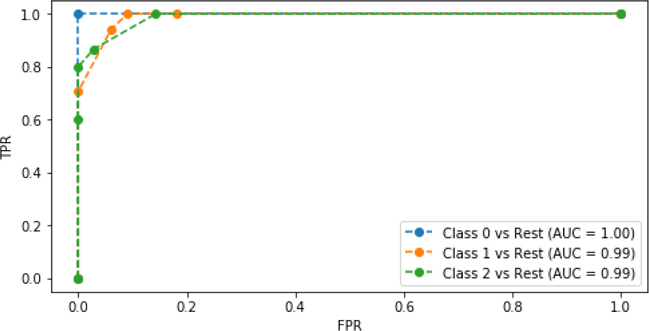
All three of these classifiers are pretty respectable: they have few defects compared to a perfect classifier that follows the graph borders. We saw earlier that Class 0 (setosa) was fairly easy to separate, so we aren’t too surprised at it doing well here. Each of the other classifiers get very good TPR rates at pretty minimal FPR rates (below .18 or so). Incidentally, this analysis is the exact strategy we can use to pick a threshold. We can identify an acceptable TPR and then choose the threshold that gets us the best FPR for that TPR. We can also work the other way around if we care more about FPR than TPR. For example, we may only want to identify people that are suitably likely to be sick to prevent unnecessary, invasive, and costly medical procedures.
6.4 Another Take on Multiclass: One-versus-One
There’s another approach to dealing with the sometimes negative interaction between multiclass problems and learning systems. In one-versus-rest, we chunk off apples against all other fruit in one grand binary problem. For apples, we create one one-versus-rest classifier.
An alternative is to chuck off apple-versus-banana, apple-versus-orange, apple-versus-pineapple, and so forth. Instead of one grand Boolean comparison for apples, we make n – 1 of them where n is the number of classes we have. We call this alternative one-versus-one. How do we wrap those one-versus-one winners into a grand winner for making a single prediction? A simple answer is to take the sums of the individual wins as we would in a round-robin competition. sklearn does some normalization on this, so it is a little hard to see—but the punch line is that the class with the biggest number of wins is the class we predict.
The one-versus-one wrapper gives us classification scores for each individual class. These values are not probabilities. We can take the index of the maximum classification score to find the single best-predicted class.
In [18]:
knn         = neighbors.KNeighborsClassifier(n_neighbors=5)
ovo_knn     = skmulti.OneVsOneClassifier(knn)
pred_scores = (ovo_knn.fit(iris_train_ftrs, iris_train_tgt)
                      .decision_function(iris_test_ftrs))
df = pd.DataFrame(pred_scores)
df['class'] = df.values.argmax(axis=1)
display(df.head())
|
0 |
1 |
2 |
class |
|---|---|---|---|---|
0 |
-0.5000 |
2.2500 |
1.2500 |
1 |
1 |
2.0000 |
1.0000 |
0.0000 |
0 |
2 |
2.0000 |
1.0000 |
0.0000 |
0 |
3 |
2.0000 |
1.0000 |
0.0000 |
0 |
4 |
-0.5000 |
2.2500 |
1.2500 |
1 |
To see how the predictions line up with the votes, we can put the actual classes beside the one-versus-one classification scores:
In [19]:
# note: ugly to make column headers
mi = pd.MultiIndex([['Class Indicator', 'Vote'], [0, 1, 2]],
                    [[0]*3+[1]*3,list(range(3)) * 2])
df = pd.DataFrame(np.c_[im_test_tgt, pred_scores],
                  columns=mi)
display(df.head())
|
Class Indicator |
Vote |
|
|
|
||
|---|---|---|---|---|---|---|---|
|
0 |
1 |
2 |
0 |
1 |
2 |
|
0 |
0.0000 |
1.0000 |
0.0000 |
-0.5000 |
2.2500 |
1.2500 |
|
1 |
1.0000 |
0.0000 |
0.0000 |
2.0000 |
1.0000 |
0.0000 |
|
2 |
1.0000 |
0.0000 |
0.0000 |
2.0000 |
1.0000 |
0.0000 |
|
3 |
1.0000 |
0.0000 |
0.0000 |
2.0000 |
1.0000 |
0.0000 |
|
4 |
0.0000 |
1.0000 |
0.0000 |
-0.5000 |
2.2500 |
1.2500 |
|
You might be wondering why there were three classifiers for both one-versus-rest and one-versus-one. If we have n classes, for one-versus-rest we will have n classifiers—one for each class against everyone else; that’s why there are 3 there. For one-versus-one, we have a classifier for each pair of classes. The formula for the number of pairs of n things is . For three classes, this is . You can think of the formula this way: pick a person (n), pick all their possible dance partners (n – 1, no dancing with yourself), and then remove duplicates (divide by two) because Chris dancing with Sam is the same as Sam with Chris.
6.4.1 Multiclass AUC Part Two: The Quest for a Single Value
We can make use of the one-versus-one idea in a slightly different way. Instead of different classifiers competing in one-versus-one, Karate Kid style tournament, we’ll have a single classifier apply itself to the whole dataset. Then, we’ll pick out pairs of targets and see how the single classifier does on each possible pairing. So, we compute a series of mini-confusion matrices for pairs of classes with a class i serving as Positive and another class j serving as Negative. Then, we can calculate an AUC from that. We’ll do that both ways—each of the pair serving as positive and negative—and take the average of all of those AUCs. Basically, AUC is used to quantify the chances of a true cat being less likely to be called a dog than a random dog. Full details of the logic behind this technique—I’ll call it the Hand and Till M—are available in a reference at the end of the chapter.
The code itself is a bit tricky, but here’s some pseudocode to give you an overall idea of what is happening:
Train a model.
Get classification scores for each example.
Create a blank table for each pairing of classes.
For each pair of classes c1 and c2:
(1) Find AUC of c1 against c2.
(2) Find AUC of c2 against c1.
(3) Entry for c1, c2 is the average of these AUCs.
Overall value is the average of the entries in the table.
The trickiest bit of code is selecting out just those examples where the two classes of interest interact. For one iteration of the control loop, we need to generate an ROC curve for those two classes. So, we need the examples where either of them occurs. We track these down by doing a label_binarize to get indicator values, 1s and 0s, and then we pull out the particular columns we need from there.
In [20]:
def hand_and_till_M_statistic(test_tgt, test_probs, weighted=False):
def auc_helper(truth, probs):
    fpr, tpr, _ = metrics.roc_curve(truth, probs)
    return metrics.auc(fpr, tpr)

classes   = np.unique(test_tgt)
n_classes = len(classes)

indicator = skpre.label_binarize(test_tgt, classes)
avg_auc_sum = 0.0

# comparing class i and class j
for ij in it.combinations(classes, 2):
    # use use sum to act like a logical OR
    ij_indicator = indicator[:,ij].sum(axis=1,
                                       dtype=np.bool)

    # slightly ugly, can't broadcast these as indexes
    # use .ix_ to save the day

    ij_probs = test_probs[np.ix_(ij_indicator, ij)]
    ij_test_tgt = test_tgt[ij_indicator]

    i,j = ij
    auc_ij = auc_helper(ij_test_tgt==i, ij_probs[:, 0])
    auc_ji = auc_helper(ij_test_tgt==j, ij_probs[:, 1])

    # compared to Hand and Till reference
    # no / 2 ... factor is out since it will cancel
    avg_auc_ij = (auc_ij + auc_ji)

    if weighted:
        avg_auc_ij *= ij_indicator.sum() / len(test_tgt)
    avg_auc_sum += avg_auc_ij

# compared to Hand and Till reference
# no * 2 ... factored out above and they cancel
M = avg_auc_sum / (n_classes * (n_classes-1))
return M
To use the Hand and Till method we’ve defined, we need to pull out the scoring/ordering/probaing trick. We send the actual targets and our scoring of the classes into hand_and_till_M_statistic and we get back a value.
In [21]:
knn = neighbors.KNeighborsClassifier()
knn.fit(iris_train_ftrs, iris_train_tgt)
test_probs = knn.predict_proba(iris_test_ftrs)
hand_and_till_M_statistic(iris_test_tgt, test_probs)
Out[21]:
0.9915032679738562
There’s a great benefit to writing hand_and_till_M_statistic the way we did. We can use a helper routine from sklearn to turn our Hand and Till code into a scoring function that plays nicely with sklearn cross-validation routines. Then, doing things like a 10-fold CV with our new evaluation metric is just a stroll in the park:
In [22]:
fig,ax = plt.subplots(1, 1, figsize=(3, 3))
htm_scorer = metrics.make_scorer(hand_and_till_M_statistic,
                                 needs_proba=True)
cv_auc = skms.cross_val_score(model,
                              iris.data, iris.target,
                              scoring=htm_scorer, cv=10)
sns.swarmplot(cv_auc, orient='v')
ax.set_title('10-Fold H&T Ms');

We’ll also use make_scorer when we want to pass a scoring argument that isn’t using sklearn’s predefined default values. We’ll see examples of that shortly.
Since Hand and Till M method uses one, and only one, classifier for evaluation, we have a direct connection between the performance of the classifier and the classifier itself. When we use a one-versus-rest wrapper around a classifier, we lose the direct connection; instead we see how classifiers like the one we are interested in behave in a similar scenarios on a shared dataset. In short, the M method here has a stronger relationship to a multiclass prediction use case. On the other hand, some learning methods cannot be used directly on multiclass problems. These methods need one-versus-rest or one-versus-one classifiers to do multiclass prediction. In that case, the one-versus setups give us finer details of the pairwise performance of the classifier.
6.5 Precision-Recall Curves
Just as we can look at the tradeoffs between sensitivity and specificity with ROC curves, we can evaluate the tradeoffs between precision and recall. Remember from Section 6.2.3 that precision is the value of a positive prediction and recall is how effective we are on examples that are positive in reality. You can chant the following phrases: “precision positive prediction” and “recall positive reality.”
6.5.1 A Note on Precision-Recall Tradeoff
There is a very important difference between the sensitivity-specificity curve and the precision-recall curve. With sensitivity-specificity, the two values represent portions of the row totals. The tradeoff is between performance on real-world positives and negatives. With precision-recall, we are dealing a column piece and a row piece out of the confusion matrix. So, they can vary more independently of each other. More importantly, an increasing precision does not imply an increasing recall. Note, sensitivity and 1 – specificity are traded off: as we draw our ROC curve from the bottom left, we can move up or to the right. We never move down or left. A precision-recall curve can regress: it might take a step down instead of up.
Here’s a concrete example. From this initial state with a precision of 5/10 and a recall of 5/10:
|
PredP |
PredN |
|---|---|---|
RealP |
5 |
5 |
RealN |
5 |
5 |
consider what happens when we raise the threshold for calling an example a positive. Suppose that two from each of the predicted positive examples—two of the actually positive and two of the predicted positive, actually negative—move to predicted negative:
|
PredP |
PredN |
|---|---|---|
RealP |
3 |
7 |
RealN |
3 |
7 |
Our precision is now 3/6 = .5—the same—but our recall has gone to 3/10 which is less than .5. It got worse.
For comparison, here we raise the threshold so that only one case moves from TP to FN.
|
PredP |
PredN |
|---|---|---|
RealP |
4 |
6 |
RealN |
5 |
5 |
Our precision becomes 4/9, which is about .44. The recall is 4/10 = .4. So, both are less than the original example.
Probably the easiest way to visualize this behavior is by thinking what happens when you move the prediction bar. Very importantly, moving the prediction bar does not affect the state of reality at all. No examples move up or down between rows. However, moving the prediction bar may—by definition!—move the predictions: things may move between columns.
6.5.2 Constructing a Precision-Recall Curve
Those details aside, the technique for calculating and displaying a PR curve (PRC) is very similar to the ROC curve. One substantial difference is that both precision and recall should be high—near 1.0. So, a point at the top right of the PRC is perfect for us. Visually, if one classifier is better than another, it will be pushed more towards the top-right corner.
In [23]:
fig,ax = plt.subplots(figsize=(6, 3))
for cls in [0, 1, 2]:
    prc = metrics.precision_recall_curve
    precision, recall, _ = prc(im_test_tgt[:,cls],
                               pred_probs[:,cls])
    prc_auc = metrics.auc(recall, precision)
    label = "Class {} vs Rest (AUC) = {:.2f})".format(cls, prc_auc)
    ax.plot(recall, precision, 'o--', label=label)
ax.legend()
ax.set_xlabel('Recall')
ax.set_ylabel('Precision');

The PRC for class 0, setosa, versus the rest is perfect.
6.6 Cumulative Response and Lift Curves
So far, we’ve examined performance metrics in a fairly isolated setting. What happens when the real world encroaches on our ivory tower? One of the biggest real-world factors is limited resources, particularly of the noncomputational variety. When we deploy a system into the real world, we often can’t do everything the system might recommend to us. For example, if we decide to treat all folks predicted to be sick with a probability greater than 20%, we might overwhelm certain health care facilities. There might be too many patients to treat or too many opportunities to pursue. How can we choose? Cumulative response and lift curves give us a nice visual way to make these decisions. I’m going to hold off on verbally describing these because words don’t do them justice. The code that we’ll see in a second is a far more precise, compact definition.
The code to make these graphs is surprisingly short. We basically compute our classification scores and order our predictions by those scores. That is, we want the most likely cat to be the first thing we call a cat. We’ll discuss that more in a moment. To make this work, we (1) find our preferred order of the test examples, starting from the one with the highest proba and moving down the line, then (2) use that order to rank our known, real outcomes, and (3) keep a running total of how well we are doing with respect to those real values. We are comparing a running total of our predictions, ordered by score, against the real world. We graph our running percent of success against the total amount of data we used up to that point. One other trick is that we treat the known targets as zero-one values and add them up. That gets us a running count as we incorporate more and more examples. We convert the count to a percent by dividing by the final, total sum. Voilà, we have a running percent. Here goes:
In [24]:
# negate b/c we want big values first
myorder = np.argsort(-prob_true)

# cumulative sum then to percent (last value is total)
realpct_myorder = iris_1c_test_tgt[myorder].cumsum()
realpct_myorder = realpct_myorder / realpct_myorder[-1]

# convert counts of data into percents
N = iris_1c_test_tgt.size
xs = np.linspace(1/N, 1, N)

print(myorder[:3])
[ 0 28 43]
This says that the first three examples I would pick to classify as hits are 0, 28, and 43.
In [25]:
fig, (ax1, ax2) = plt.subplots(1, 2, figsize=(8, 4))
fig.tight_layout()

# cumulative response
ax1.plot(xs, realpct_myorder, 'r.')
ax1.plot(xs, xs, 'b-')
ax1.axes.set_aspect('equal')

ax1.set_title("Cumulative Response")
ax1.set_ylabel("Percent of Actual Hits")
ax1.set_xlabel("Percent Of Population
" +
               "Starting with Highest Predicted Hits")
# lift
# replace divide by zero with 1.0
ax2.plot(xs, realpct_myorder / np.where(xs > 0, xs, 1))

ax2.set_title("Lift Versus Random")
ax2.set_ylabel("X-Fold Improvement") # not cross-fold!
ax2.set_xlabel("Percent Of Population
" +
               "Starting with Highest Predicted Hits")
ax2.yaxis.tick_right()
ax2.yaxis.set_label_position('right');

First, let’s discuss the Cumulative Response curve. The y-axis is effectively our true positive rate: how well we are doing with respect to reality. The x-axis is a bit more complicated to read. At a given point on the x-axis, we are targeting the “predicted best” x% of the population and asking how well we did. For example, we can see that when we are allowed to use the first 40% of the population (our top 40% predictions), we get 100% of the hits. That can represent a tremendous real-world savings.
Imagine that we are running a fundraising campaign and sending letters to potential donors. Some recipients will read our letter and throw it in the trash. Others will read our letter and respond with a sizable and appreciated check or PayPal donation. If our mailing had a predictive model as good as our model here, we could save quite a bit on postage stamps. Instead of spending $10,000.00 on postage for everyone, we could spend $4,000.00 and target just that predicted-best 40%. If the model is really that good, we’d still hit all of our target donors who would contribute.
The Lift Versus Random curve—sometimes called a lift curve or a gain curve—simply divides the performance of our smart classifier against the performance of a baseline random classifier. You can think of it as taking a vertical slice up and down from the Cumulative Response graph, grabbing the red-dot value, and dividing it by the blue-line value. It is reassuring to see that when we start out, we are doing far better than random. As we bring in more of the population—we commit to spending more on postage—it gets harder to win by much over random. After we’ve targeted all of the actual hits, we can only lose ground. In reality, we should probably stop sending out more requests.
6.7 More Sophisticated Evaluation of Classifiers: Take Two
We’ve come a long way now. Let’s apply what we’ve learned by taking the binary iris problem and seeing how our current basket of classifiers performs on it with our more sophisticated evaluation techniques. Then, we’ll turn to a different dataset.
6.7.1 Binary
In [26]:
classifiers = {'base'  : baseline,
               'gnb'   : naive_bayes.GaussianNB(),
               '3-NN'  : neighbors.KNeighborsClassifier(n_neighbors=10),
               '10-NN' : neighbors.KNeighborsClassifier(n_neighbors=3)}
In [27]:
# define the one_class iris problem so we don't have random ==1 around
iris_onec_ftrs = iris.data
iris_onec_tgt  = iris.target==1
In [28]:
msrs = ['accuracy', 'average_precision', 'roc_auc']

fig, axes = plt.subplots(len(msrs), 1, figsize=(6, 2*len(msrs)))
fig.tight_layout()

for mod_name, model in classifiers.items():
    # abbreviate
    cvs = skms.cross_val_score
    cv_results = {msr:cvs(model, iris_onec_ftrs, iris_onec_tgt,
                          scoring=msr, cv=10) for msr in msrs}

    for ax, msr in zip(axes, msrs):
        msr_results = cv_results[msr]
        my_lbl = "{:12s} {:.3f} {:.2f}".format(mod_name,
                                               msr_results.mean(),
                                               msr_results.std())

        ax.plot(msr_results, 'o--', label=my_lbl)
        ax.set_title(msr)
        ax.legend(loc='lower center', ncol=2)

Here, we’ve jumped right to summaries. It’s heartening that our coin-flipping baseline method gets 50% on the AUC measure. Not much else is super interesting here, but we do see that there’s one CV-fold where Naive Bayes does really poorly.
To see more details on where the precision comes from or what the ROC curves look like, we need to peel back a few layers.
In [29]:
fig, axes = plt.subplots(2, 2, figsize=(4, 4), sharex=True, sharey=True)
fig.tight_layout()
for ax, (mod_name, model) in zip(axes.flat, classifiers.items()):
    preds = skms.cross_val_predict(model,
                                   iris_onec_ftrs, iris_onec_tgt,
                                   cv=10)

    cm = metrics.confusion_matrix(iris.target==1, preds)
    sns.heatmap(cm, annot=True, ax=ax,
                cbar=False, square=True, fmt="d")

    ax.set_title(mod_name)

axes[1, 0].set_xlabel('Predicted')
axes[1, 1].set_xlabel('Predicted')
axes[0, 0].set_ylabel('Actual')
axes[1, 0].set_ylabel('Actual');

To dive into the ROC curves, we can make use of an argument to cross_val_predict that lets us extract the classification scores directly from the aggregate cross-validation classifiers. We do that with method='predict_proba' below. Instead of returning a single class, we get back the class scores.
In [30]:
fig, ax = plt.subplots(1, 1, figsize=(6, 4))

cv_prob_true = {}
for mod_name, model in classifiers.items():
    cv_probs = skms.cross_val_predict(model,
                                      iris_onec_ftrs, iris_onec_tgt,
                                      cv=10, method='predict_proba')
    cv_prob_true[mod_name] = cv_probs[:, 1]

    fpr, tpr, thresh = metrics.roc_curve(iris_onec_tgt,
                                         cv_prob_true[mod_name])

    auc = metrics.auc(fpr, tpr)
    ax.plot(fpr, tpr, 'o--', label="{}:{}".format(mod_name, auc))

ax.set_title('ROC Curves')
ax.legend();
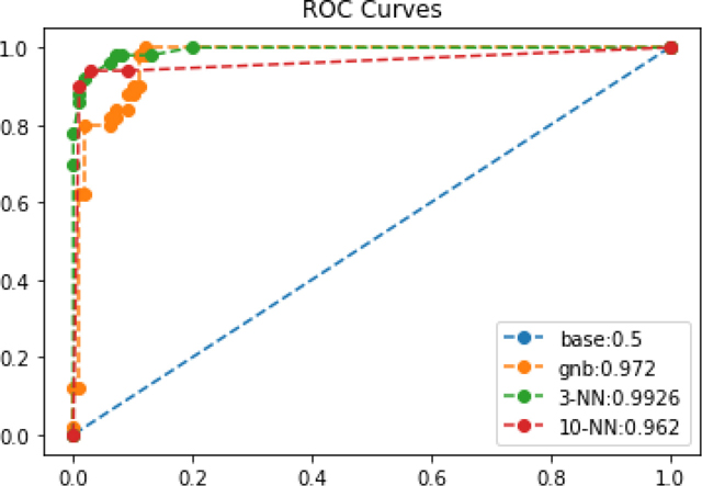
Based on the ROC graph, we are probably most interested in our 3-NN model right now because of its slightly better AUC. We’ll make use of the cv_prob_trues from last example to create our lift curve:
In [31]:
fig, (ax1,ax2) = plt.subplots(1, 2, figsize=(10, 5))

N = len(iris_onec_tgt)
xs = np.linspace(1/N, 1, N)

ax1.plot(xs, xs, 'b-')

for mod_name in classifiers:
    # negate so big values come first
    myorder = np.argsort(-cv_prob_true[mod_name])

    # cumulative sum then to percent (last value is total)
    realpct_myorder = iris_onec_tgt[myorder].cumsum()
    realpct_myorder = realpct_myorder / realpct_myorder[-1]

    ax1.plot(xs, realpct_myorder, '.', label=mod_name)

    ax2.plot(xs,
             realpct_myorder / np.where(xs > 0, xs, 1),
             label=mod_name)
ax1.legend()
ax2.legend()

ax1.set_title("Cumulative Response")
ax2.set_title("Lift versus Random");

Here, we see gains similar to what we saw in the earlier lift chart. After targeting about 40% of the population, we can probably stop trying to find more veritosa. We have some different leaders at different times: GNB falls off and then surpasses 10-NN. GNB and 3-NN both peak out when targeting 40% of the population. 10-NN seems to hit a lull and doesn’t hit 100% success (y-axis) success until a near-100% targeting rate on the x axis.
6.7.2 A Novel Multiclass Problem
Let’s turn our attention to a new problem and, while we’re at it, deal with—instead of ignoring—the issues with multiclass problems. Our dataset was gathered by Cortez and Silva (see the End-of-Chapter Notes for the full reference) and I downloaded it from the UCI data repository here: https://archive.ics.uci.edu/ml/datasets/student+performance.
The data measures the student achievement in two secondary education subjects: math and language. The two subjects are described in different CSV files; we are only going to look at the math data. The data attributes include student grades, demographic, social, and school-related features collected by using school reports and questionnaires. For our example here, I preprocessed the data to (1) remove non-numerical features and (2) produce a discrete target class for classification. The code to reproduce my preprocessing is shown at the end of the chapter.
In [32]:
student_df = pd.read_csv('data/portugese_student_numeric_discrete.csv')
student_df['grade'] = pd.Categorical(student_df['grade'],
                                     categories=['low', 'mid', 'high'],
                                     ordered=True)
In [33]:
student_ftrs = student_df[student_df.columns[:-1]]
student_tgt  = student_df['grade'].cat.codes
We’ll start things off gently with a simple 3-NN classifier evaluated with accuracy. We’ve discussed its limitations—but it is still a simple method and metric to get us started. If the target classes aren’t too unbalanced, we might be OK with accuracy.
In [34]:
fig,ax = plt.subplots(1, 1, figsize=(3, 3))
model = neighbors.KNeighborsClassifier(3)
cv_auc = skms.cross_val_score(model,
                              student_ftrs, student_tgt,
                              scoring='accuracy', cv=10)
ax = sns.swarmplot(cv_auc, orient='v')
ax.set_title('10-Fold Accuracy');

Now, if we want to move on to precision, we have to go beyond the simple scoring="average_precision" argument to cross_val_score interface that sklearn provides. That average is really an average for a binary classification problem. If we have multiple target classes, we need to specify how we want to average the results. We discussed macro and micro strategies earlier in the chapter. We’ll use macro here and pass it as an argument to a make_scorer call.
In [35]:
model = neighbors.KNeighborsClassifier(3)
my_scorer = metrics.make_scorer(metrics.precision_score,
                                average='macro')
cv_auc = skms.cross_val_score(model,
                              student_ftrs, student_tgt,
                              scoring=my_scorer, cv=10)
fig,ax = plt.subplots(1, 1, figsize=(3, 3))
sns.swarmplot(cv_auc, orient='v')
ax.set_title('10-Fold Macro Precision');

Following a very similar strategy, we can use our Hand and Till M evaluator.
In [36]:
htm_scorer = metrics.make_scorer(hand_and_till_M_statistic,
                                 needs_proba=True)
cv_auc = skms.cross_val_score(model,
                              student_ftrs, student_tgt,
                              scoring=htm_scorer, cv=10)

fig,ax = plt.subplots(1, 1, figsize=(3, 3))
sns.swarmplot(cv_auc, orient='v')
ax.set_title('10-Fold H&T Ms');

Now, we can compare a few different classifiers with a few different metrics.
In [37]:
classifiers = {'base'  : dummy.DummyClassifier(strategy="most_frequent"),
               'gnb'   : naive_bayes.GaussianNB(),
               '3-NN'  : neighbors.KNeighborsClassifier(n_neighbors=10),
               '10-NN' : neighbors.KNeighborsClassifier(n_neighbors=3)}
In [38]:
macro_precision = metrics.make_scorer(metrics.precision_score,
                                      average='macro')
macro_recall    = metrics.make_scorer(metrics.recall_score,
                                      average='macro')
htm_scorer = metrics.make_scorer(hand_and_till_M_statistic,
                                 needs_proba=True)

msrs = ['accuracy', macro_precision,
        macro_recall, htm_scorer]

fig, axes = plt.subplots(len(msrs), 1, figsize=(6, 2*len(msrs)))
fig.tight_layout()

for mod_name, model in classifiers.items():
    # abbreviate
    cvs = skms.cross_val_score
    cv_results = {msr:cvs(model, student_ftrs, student_tgt,
                          scoring=msr, cv=10) for msr in msrs}

    for ax, msr in zip(axes, msrs):
        msr_results = cv_results[msr]
        my_lbl = "{:12s} {:.3f} {:.2f}".format(mod_name,
                                               msr_results.mean(),
                                               msr_results.std())
    ax.plot(msr_results, 'o--')
    ax.set_title(msr)
    # uncomment to see summary stats (clutters plots)
    #ax.legend(loc='lower center')

It appears we made a pretty hard problem for ourselves. Accuracy, precision, and recall all seem to be pretty downright awful. That cautions us in our interpretation of the Hand and Till M values. A few folds of GNB have some values that aren’t awful, but half of the fold values for GNB end up near 0.6. Remember the preprocessing we did? By throwing out features and discretizing, we’ve turned this into a very hard problem.
We know things aren’t good, but there is a glimmer of hope—maybe we do well on some classes, but just poorly overall?
In [39]:
fig, axes = plt.subplots(2, 2, figsize=(5, 5), sharex=True, sharey=True)
fig.tight_layout()

for ax, (mod_name, model) in zip(axes.flat,
                                 classifiers.items()):
    preds = skms.cross_val_predict(model,
                                   student_ftrs, student_tgt,
                                   cv=10)

    cm = metrics.confusion_matrix(student_tgt, preds)
    sns.heatmap(cm, annot=True, ax=ax,
                cbar=False, square=True, fmt="d",
                xticklabels=['low', 'med', 'high'],
                yticklabels=['low', 'med', 'high'])

    ax.set_title(mod_name)
axes[1, 0].set_xlabel('Predicted')
axes[1, 1].set_xlabel('Predicted')
axes[0, 0].set_ylabel('Actual')
axes[1, 0].set_ylabel('Actual');

Not so much. A large part of our problem is that we’re simply predicting the low class (even with our nonbaseline methods) an awful lot of the time. We need more information to tease apart the distinguishing characteristics of the target classes.
6.8 EOC
6.8.1 Summary
We’ve added many techniques to our quiver of classification evaluation tools. We can now account for unbalanced numbers of target classes, assess our learners with respect to reality and predictions (separately and jointly), and we can dive into specific class-by-class failures. We can also determine the overall benefit that a classification system gets us over guessing a random target.
6.8.2 Notes
If you need an academic reference on ROC curves, check out:
Fawcett, Tom (2004). “ROC Graphs: Notes and Practical Considerations for Researchers.” Pattern Recognition Letters 27 (8): 882–891.
AUC has some direct relationships to well-known statistical measures. In particular, the Gini index—which measures the difference of two ranges of outcomes—and AUC are related by Gini + 1 = 2 × AUC. The Mann-Whitney U statistic is related to AUC as = AUC where ni is the number of elements in class i. If you aren’t a stats guru, don’t worry about these.
We discussed F1 and said it was an evenly balanced way to combine precision and recall. There are a range of alternatives called Fβ that can weight precision more or less depending on whether you care more about performance with respect to reality or more about the performance of a prediction.
Here are two crazy facts. (1) A learning method called boosting can take any learner that is minutely better than coin flipping and make it arbitrarily good—if we have enough good data. (2) If a learner for a Boolean problem is reliably bad—reliably worse than coin flipping—we can make it reliably good by flipping its predictions. Putting these together, we can take any consistent initial learning system and make it as good as we want. In reality, there are mathematical caveats here—but the existence of this possibility is pretty mind-blowing. We’ll discuss some practical uses of boosting in Section 12.4.
Some classifier methods don’t play well with multiple target classes. These require that we do one-versus-one or one-versus-rest to wrap up their predictions to work in multiclass scenarios. Support vector classifiers are an important example which we will discuss in Section 8.3.
The Hand and Till M is defined in:
Hand, David J. and Till, Robert J. (2001). “A Simple Generalisation of the Area Under the ROC Curve for Multiple Class Classification Problems.” Machine Learning 45 (2): 171–186.
Although, as is often the case when you want to use a research method, I had to dig into an implementation of it to resolve a few ambiguities. It seems likely that the same technique could be used with precision-recall curves. If you happen to be looking for a master’s thesis, fame, or just glory and honor, run it past your advisor or manager.
We saw that accuracy was the default metric for k-NN. In fact, accuracy is the default metric for all sklearn classifiers. As is often the case, there’s an asterisk here: if the classifier inherits from the ClassifierMixin class, then they use mean accuracy. If not, they could use something else. ClassifierMixin is an internal sklearn class that defines the basic, shared functionality of sklearn’s classifiers. Inheriting—a concept from object-oriented programming (OOP)—shares that behavior with other classes. The sklearn documentation doesn’t have a literal table of classifiers and scorers.
The school data we used came from:
Cortez, P. and Silva, A. “Using Data Mining to Predict Secondary School Student Performance.” In: A. Brito and J. Teixeira (eds), Proceedings of 5th FUture BUsiness TEChnology Conference (FUBUTEC 2008), pp. 5-12, Porto, Portugal, April, 2008, EUROSIS.
Here’s the code to download and preprocess it into the form used in this chapter:
In [40]:
student_url = ('https://archive.ics.uci.edu/' +
               'ml/machine-learning-databases/00320/student.zip')
def grab_student_numeric_discrete():
    # download zip file and unzip
    # unzipping unknown files can be a security hazard
    import urllib.request, zipfile
    urllib.request.urlretrieve(student_url,
                               'port_student.zip')
    zipfile.ZipFile('port_student.zip').extract('student-mat.csv')

    # preprocessing
    df = pd.read_csv('student-mat.csv', sep=';')

    # g1 & g2 are highly correlated with g3;
    # dropping them makes the problem significantly harder
    # we also remove all non-numeric columns
    # and discretize the final grade by 0-50-75-100 percentile
    # which were determined by hand
    df = df.drop(columns=['G1', 'G2']).select_dtypes(include=['number'])
    df['grade'] = pd.cut(df['G3'], [0, 11, 14, 20],
                         labels=['low', 'mid', 'high'],
                         include_lowest=True)
    df.drop(columns=['G3'], inplace=True)

    # save as
    df.to_csv('portugese_student_numeric_discrete.csv', index=False)
6.8.3 Exercises
Try applying our classification evaluation techniques against the wine or breast cancer datasets which you can pull in with datasets.load_wine and datasets.load_breast_cancer.