
8. More Classification Methods
In [1]:
# setup
from mlwpy import *
%matplotlib inline

iris = datasets.load_iris()

# standard iris dataset
tts = skms.train_test_split(iris.data, iris.target,
                            test_size=.33, random_state=21)
(iris_train_ftrs, iris_test_ftrs,
 iris_train_tgt,  iris_test_tgt) = tts

# one-class variation
useclass = 1
tts_1c = skms.train_test_split(iris.data, iris.target==useclass,
                               test_size=.33, random_state = 21)
(iris_1c_train_ftrs, iris_1c_test_ftrs,
 iris_1c_train_tgt,  iris_1c_test_tgt) = tts_1c
8.1 Revisiting Classification
So far, we’ve discussed two classifiers: Naive Bayes (NB) and k-Nearest Neighbors (k-NN). I want to add to our classification toolkit—but first, I want to revisit what is happening when we classify data. In some ways, classification is easy. What? If it is so easy, why on Earth are there hundreds of books and thousands of research articles written on it? Why am I writing about it now? OK, you raise some fair points. Let me be a bit more specific about what I mean by easy. If I asked my son Ethan—currently a 12-year-old—to draw some circles, lines, or boxes that separated some Xs and Os in diagram, he could do it as in Figure 8.1. If a 12-year-old can do it, it must be easy. Q.E.D.—quod erat demonstrandum—thus it has been shown that classification is easy. Or, perhaps not. What details am I glossing over?

Figure 8.1 Separating shapes in space.
There are a number of pieces that we need to specify in the separating process. We can talk about them as instructions to Ethan:
What rules do I give Ethan when he starts drawing? Can he use straight lines? Can he use more than one line? Do they have to be parallel to the edges of the paper? Can he use curves? If so, how curvy can they be? Can he pick up his pencil or must he make one, and only one, continuous boundary before he stops?
When I say, “Good job, Ethan!” what do I mean by good job? How do I evaluate the separation that he’s made? If Xs and Os show up in the same region—apparently a flaw in his drawing—is that fundamentally because of the rules I gave Ethan, or because of the nature of the Xs and Os, or both?
Classification methods differ in two fundamental ways: (1) they have different constraints on how to draw their boundaries and (2) they have different ways to evaluate those boundaries. These differences are side effects of the underlying mathematics of the methods. In reality, a mathematical alchemist, creating a new method, makes some assumptions or constraints about what is happening with the data and how we will separate it. Then, she works through some more or less complicated mathematics. Eventually, out pops some equation that defines a separating boundary. In turn, the boundary lets us classify an example as X or O. Since the nice connection between algebra and geometry lets us turn equations and examples into geometric, drawable objects, we can skip right to discussing these methods in terms of geometric pictures. There are some wonderful mathematical ways to talk about the relationships among these methods. As I’ve said, I want to avoid relying on those mathematics in describing the methods to you—but if you are interested, I’ll give you a taste of it in Chapter 15.
Once we’ve drawn our good boundaries—you could think of them as fences separating sheep from unruly cows—we can ask simple questions to figure out the class of a new example: “Are we inside or outside the fenced area?” or “Which side of a very long fence are we on?” These questions can be simple, mathematical comparisons between a value computed from an example and a constant:
Which side of a fence are we on? Is some value greater than 0?
Which of the two possibilities is the answer? Is some value 0 or 1? Is some value –1 or 1?
Is one event the more likely of two? Is some value greater than ?
Am I the most likely of several alternatives? Is some value the greatest in a set of values?
The first two questions are very similar. Often, the choice has to do with simplifying the underlying mathematics that we are setting aside for now. The third is a bit more general—not only can we say which outcome we prefer, but we can say by how much we prefer it. If we don’t have strict probabilities (instead we have generic scores), we might have a different threshold than one-half. The fourth comes into play when we select between more than two classes. These questions are in their simplest forms. Sometimes we do a bit of additional processing before asking them.
In this chapter, we will look at four different methods for classification: decision trees, support vector classifiers, logistic regression, and discriminant analysis. In that order, these methods introduce increasing numbers of assumptions. As we saw with Naive Bayes, the assumptions don’t prevent us from applying a method: we are free to use any method with any data. Often, we won’t know what assumptions are met before we apply the method. The better the alignment between the assumptions of a method and the patterns in the data, the better we expect a method to perform. Since we don’t know, we may try multiple methods, cross-validate, and use the method with the best cross-validated results as our final tool.
8.2 Decision Trees
Did you know that retired spies like to play tennis? I didn’t know that either. But they do. As much as they might like to keep their personal security—PerSec, to those in the know—under tight control, they still prefer to play outdoors and outdoor sports are subject to weather. Since old spies can be hard to find, information about when a former spy will be playing a few sets is quite valuable to both friends and foes. Suppose a ball-fetcher—we’ll call her Belle—at a tennis club were to overhear a spy talking about an old war story. She decides to be sleuthy herself and to predict when the spy will show up to play tennis. Belle starts recording whether the spy played tennis on a given day and the weather. From the weather, we predict tennis play. This classification example, without the James Bond backstory, is due to Ross Quinlan. He developed one of the two main branches of decision tree learning systems.
Our intrepid spy recorded values for Cloudy, Precip(itation), Windy, Temp(erature), and Play(edTennis). Here is some of the data that Belle recorded:
Cloudy |
Precip |
Windy |
Temp |
Play |
|---|---|---|---|---|
Yes |
Yes |
Yes |
45 |
No |
Yes |
No |
No |
75 |
Yes |
No |
No |
No |
30 |
No |
No |
No |
Yes |
85 |
Yes |
No |
No |
No |
85 |
No |
No |
No |
No |
65 |
Yes |
After recording the data for a while, Belle noticed that the most important single predictor of whether James Bond—I mean Jeffrey Billings—was playing tennis was whether it was sunny out (Cloudy = No); everything else seemed to matter less. Then there were other similar patterns that emerged after breaking the data up into sunny and non-sunny days. Belle recorded sequences of questions that led to whether James . . . err, Jeffrey . . . was playing tennis. The result looked like Figure 8.2.

Figure 8.2 A simple decision tree.
What do we make of this diagram? For starters, it is called a decision tree (DT). Yes, it is upside down: it grows from the top down. I do apologize—academics are nothing if not counterintuitive. But just think of the hanging planter at grandma and grandpa’s house with the plant growing downwards over the sides. I guess Decision Shrubs didn’t catch on as a name.
The single question at the top, Cloudy?, is called the root of the tree. The scattered nodes at the bottom are called the leaves. At each leaf, we have some—possibly mixed—set of outcomes. Imagine that Belle recorded 30 cases of playing, and 5 cases of not playing, when the recorded data indicated sunny, the temperature between 60 and 75, no rain, and no wind. I’m told that those conditions are nearly ideal for playing tennis. On the flip side, weather of Cloudy, Temp < 60, Precip, Windy had 0 cases of playing and 20 cases of not playing. Some might call those the worst conditions where you could play tennis, but you would never want to. When it’s even colder or more windy, the club shuts down the courts and everyone goes to the tiki lounge.
If you look at most of the leaves in the tree, the outcomes are mixed: there are examples of playing and not playing. We can get conflicting results for several reasons:
The actual decision to play tennis has some inherent randomness. Even on two days that are in all observable ways the same, the decision might be left to chance.
There may be observable features that we could measure but we didn’t. For example, if we had a history of how many days of tennis were played in the last week, we might see that above some threshold our spy gets tired and prefers to rest. Or, on days with a doctor’s appointment, tennis just doesn’t happen.
There could be errors in our measurements. Belle may have made mistakes in recording the weather. Mistakes could have a relatively large effect if bad handwriting translated a cloudy day to a sunny day. Mistakes could also be relatively minor if a temperature of 67 degrees was recorded as 66.
Here’s one other interesting phenomenon that occurs in several different learning methods, but it shows up very prominently with decision trees. Imagine we had a column that identified the day Belle recorded the weather. It has a sequence of increasing values: 1, 2, 3, 4, ..., 100. We could use this identifier to perfectly learn the training data. Simply make splits in the tree that lead to leaf nodes for every uniquely numbered day. Now, we have a lookup table encoded in a tree (see Figure 8.3). Day 17, Didn’t Play. Done.

Figure 8.3 A decision tree that has memorized a table.
Think for a moment about how well this generalizes to future days. Unique identifiers are just that: unique. They don’t tell us anything about the nature of a different example. Would a unique identifying column be of any help when we need to predict a new day identified with the value 101? Always be careful with labels—which don’t represent measurements—in your data. If you could swap the values in a column with your favorite list of unique names—Fido, Lassie, etc.—and not add or lose any information, you should consider excluding the column from your training data.
Incidentally, the reason trees are particularly vulnerable to unique identifiers is that they have very high capacity and very low bias. The consequence is that they are prone to overfitting. We reduce this tendency primarily by limiting the depth to which a tree can grow.
8.2.1 Tree-Building Algorithms
Tree-building methods result in a model that can be thought of as a patchwork of constant predictors. The differences among decision tree (DT) methods revolve around (1) how they break down the entire space of the data into smaller and smaller regions and (2) when they stop the breakdown. Here’s how a decision tree classifier (DTC) breaks down the iris data when it only considers the first two features (sepal length and sepal width):
In [2]:
tree_classifiers = {'DTC' : tree.DecisionTreeClassifier(max_depth=3)}

fig, ax = plt.subplots(1,1,figsize=(4,3))
for name, mod in tree_classifiers.items():
    # plot_boundary only uses specified columns
    # [0,1] [sepal len/width] to predict and graph
    plot_boundary(ax, iris.data, iris.target, mod, [0,1])
    ax.set_title(name)
plt.tight_layout()

The red region (on the right) is setosa. The blue (top left) and gray (lower center) are the two v classes. Note that the boundaries are all made with lines that are parallel to the x or y axes. Also, I’m sneaking in a max_depth=3 argument to the DT constructor. We’ll go into more detail on that shortly. For now, max_depth is simply the maximum number of questions I can ask of any example before I classify it. You might remember playing a game called Twenty Questions. That’s a bit like a max_depth=20 constraint.
Breaking up the whole space creates a partition. We predict the class of an example based on the color of the region the example falls into. Mathematically, we can write
That equation is a bit of symbol-soup. I would apologize for showing it, but I want to take a few sentences to convince you that it is a very odd-looking dot product. Here goes. Let’s start by defining the letters. R is a region of our graph; P is the group of all of the regions. Summing over all of the R ∊ P means that we add up some values over the whole graph. cR is the predicted class for the region R: for example, one of the types of irises. I is an indicator function which gives us a value of one if an example is in R and zero otherwise. Taken together, cR and I(example ∊ R) give us cR when an example is in R and give us zero everywhere else. Together, these pieces look like ΣcRI which is exactly a pretty convoluted dot product.
Trees create blocky—think Legos or Tetris—regions of colored space from our features. The partition—the shapes of the regions—is pretty constrained from one point of view. It is made of overlaid rectangles where only the topmost rectangle counts. Overlaying cards as in Figure 8.4 gives us boundaries like those in Figure 8.5. You can imagine neatly spreading out a few decks of cards on a rectangular table. The cards are of different sizes and they must be horizontally and vertically aligned with the sides of the table. The cards can overlap. When cards of the same suit (clubs, hearts, diamonds, spades) are touching one another, they form a larger region for that suit. To create those regions from points in space, we create simple yes/no answers by thresholding. For example, we test a feature Temp against a value 55. Choosing the values to split on is the trickiest aspect of implementing decision trees by hand.

Figure 8.4 Decision tree boundaries form regions of overlapping rectangles.

Figure 8.5 End result of overlapping rectangles.
There are a number of major tree-building algorithms. ID3, C4.5, and C5.0 were made by Quinlan. CART was developed independently. In general, the tree-building algorithms use the following steps:
Evalute the set of features and splits and pick a “best” feature-and-split.
Add a node to the tree that represents the feature-split.
For each descendant, work with the matching data and either:
(1) If the targets are similar enough, return a predicted target.
(2) If not, return to step 1 and repeat.
Each of these steps can be implemented and limited in different ways. The DT algorithms control (1) what splits and partitions are allowed, (2) how feature-splits are evaluated, (3) what makes targets in a group similar enough to form a leaf, and (4) other limits. The other limits commonly include an absolute limit on the depth of the tree and the minimum number of examples at a leaf to make a prediction, regardless of similarity. These constraints help prevent overfitting. As with identifying labels, if we can continually break down the feature space until we have single examples in each bucket, we’ll get perfect training accuracy—but we’ll lose generalization. Unconstrained trees have very little bias, but they do suffer from high variance. We’ll see examples of this shortly.
8.2.2 Let’s Go: Decision Tree Time
We can take a quick look at how trees do on the basic iris dataset.
In [3]:
dtc = tree.DecisionTreeClassifier()
skms.cross_val_score(dtc,
                     iris.data, iris.target,
                     cv=3, scoring='accuracy') # sorry
Out[3]:
array([0.9804, 0.9216, 0.9792])
Overall, they do quite well.
If we have a fit tree, we can view it graphically using one of two different methods. The first needs an additional Python library, pydotplus, which you may not have installed on your computer. The second requires an additional command-line program, dot, which you may have to install. dot is a program for drawing diagrams specified by text files, sort of like using HTML to specify how something looks on screen. These outputs have a Gini value listed—I’ll discuss that very briefly at the end of Chapter 13. For now, just think of it as measuring how pure the class split is at that point. If there is only one class represented, the Gini value is 0.0.
We’ll use the simplified single-class iris problem here: it only results in a single split, even if we allow the tree the freedom to grow more deeply.
In [4]:
iris_1c_tree = (tree.DecisionTreeClassifier()
                    .fit(iris_1c_train_ftrs, iris_1c_train_tgt))
In [5]:
# using an additional library:
# conda install pydotplus
# pip install pydotplus
import pydotplus
dot_data = tree.export_graphviz(iris_1c_tree, out_file=None)
graph = pydotplus.graph_from_dot_data(dot_data)
graph.write_png("outputs/iris_1c.png")
Image("outputs/iris_1c.png", width=75, height=75)
Out[5]:

We can also see what a more complicated tree looks like. Here, I’ll use the other tree drawing method. We’ll specify additional arguments to export_graphviz so we can make the output a bit more presentable.
In [6]:
iris_tree = (tree.DecisionTreeClassifier()
                 .fit(iris_train_ftrs, iris_train_tgt))
In [7]:
# no added library to produce .dot file
with open("outputs/iris.dot", 'w') as f:
     dot_data = tree.export_graphviz(iris_tree, out_file=f,
                                     feature_names=iris.feature_names,
                                     class_names=iris.target_names,
                                     filled=True, rounded=True)

# the following '!' lines are "shell" commands
# uses the 'dot' program to convert dot -> png
!dot -Tpng outputs/iris.dot -o outputs/iris.png
!rm outputs/iris.dot

Image("outputs/iris.png", width=140, height=140)
Out[7]:

We can also get a feeling for what happens with increasing depth in a decision tree. Let’s take a look at the default tree from DecisionTreeClassifier and trees limited to depths 1, 2, and 3. Remember, even at a max_depth=2, we’ll have three splits: one split for the root node and one split at each of the two children. We expect to see these three splits as three cuts across our feature space. The default setting, max_depth=None, implies not constraining the depth at all, as if max_depth = ∞ (the sideways 8 means infinity).
In [8]:
fig, axes = plt.subplots(2,2,figsize=(4,4))

depths = [1, 2, 3, None]
for depth, ax in zip(depths, axes.flat):
    dtc_model = tree.DecisionTreeClassifier(max_depth=depth)
    # plot_boundary only uses specified columns [0,1]
    # so we are only predicting with sepal length and width
    plot_boundary(ax, iris.data, iris.target, dtc_model, [0,1])
    ax.set_title("DTC (max_depth={})".format(dtc_model.max_depth))

plt.tight_layout()

As a sanity check for our intuition about how the tree maps to separation in space, you can look at the top-right figure. Red is on the right, blue is in the top-left, and gray is the remainder. It has the three boundary lines—cuts or divisions—we expect: one between gray and red, one horizontally between gray and blue, and one vertically between gray and blue. The two gray-blue edges come from two different splits. Also, look at how many mini-regions there are in the bottom-right, max_depth=None, figure. Test yourself: as the max depth increases, are we moving towards overfitting or underfitting?
8.2.3 Bias and Variance in Decision Trees
If we start with a wide open, no-depth-limit tree, we’ll have a model that is very flexible and can capture any finite pattern that doesn’t have coin-flipping randomness built into it. While that might seem ideal, you’ve learned enough to know that there is a tradeoff. If we use unconstrained trees, we will likely overfit, and when we try to generalize, we’ll have poor test performance. If you need a reminder about that tradeoff, see Section 5.6. So, how can we bias our trees or place limits on them to prevent overfitting? We can take several steps.
We can limit the depth of the trees. We allow fewer questions before categorizing.
We can require more examples at leaves. This constraint forces us to group together examples that might be different. Since we aren’t allowed to separate them them, it effectively smoothes out some of our boundaries.
We can limit the number of features we consider when we ask questions of the examples. This constraint has the added benefit of speeding up our learning process.
8.3 Support Vector Classifiers
In a few minutes, we’ll see a great oddity of logistic regression classifiers: the underlying mathematics fail with perfectly separable data. If drawing a line between the Xs and Os on paper is as simple as possible, the mathematics simply fall apart. It’s a case of being in a desert and drowning in fresh water. Let’s take a closer look at the perfectly separable case. What would you do with all the data points falling neatly on either side of a set of tracks? Here are three possible lines:
In [9]:
fig, ax = plt.subplots(1,1,figsize=(4,3))

# fancy way to get cross product of points
left  = np.mgrid[1:4.0, 1:10].reshape(2, -1).T
right = np.mgrid[6:9.0, 1:10].reshape(2, -1).T

# data points
ax.scatter(left[:,0] , left[:,1] , c='b', marker='x')
ax.scatter(right[:,0], right[:,1], c='r', marker='o')

# separating lines
ax.plot([3.5, 5.5], [1,9], 'y', label='A')
ax.plot([4.5, 4.5], [1,9], 'k', label='B')
ax.plot([3.5, 5.5], [9,1], 'g', label='C')
ax.legend(loc='lower center');

We can create an infinite number of lines by gradually sweeping from the green line (pointing up-left) to the yellow line (pointing up-right). All of these lines will give us perfect results and score perfectly on various (training) evaluation metrics. We could also gradually sweep the center black line left and right a bit, while keeping it vertical: so many lines, so little time. Perhaps there is another standard—beyond simple correctness—we can use to compare the separating lines.
What line has a strong case for being the best around? Cue the soundtrack from The Karate Kid. I’m a big fan of the black line, B. Why? It does the best job of staying far away from the data. In some ways it is the most cautious line: it is always splitting the difference between the Xs and Os. You can think of the empty middle space between the classes as a no-man’s land or, perhaps, a river between two countries. The empty space has a fancy name in the machine learning community. It is the margin between the two countries—err, classes. The B line has a special name: it is the maximum margin separator between the classes because it keeps both classes as far from itself as possible.
Here’s a related point. If I change the problem slightly by keeping only those points on the borders of the two class clusters, I get something like
In [10]:
fig, ax = plt.subplots(1,1,figsize=(4,3))

# fancy way to get cross-product of points
left  = np.mgrid[1:4:2, 1:10].reshape(2, -1).T
right = np.mgrid[6:9:2, 1:10].reshape(2, -1).T
ax.scatter(left[:,0] , left[:,1] , c='b', marker='x')
ax.scatter([2,2], [1,9], c='b', marker='x')
ax.scatter(right[:,0], right[:,1], c='r', marker='o')
ax.scatter([7,7], [1,9], c='r', marker='o')
ax.set_xlim(0,9);

From a certain perspective, we haven’t lost anything. We still have the outline—often called a hull, in analogy with the hull of a ship—of our classes intact. We can continue reducing the data we need to form that max-margin separating line. Really, we don’t need the entire border of both classes. Only the boundary points facing the opposing class really matter. So, I can drop the non-facing points, as well. We are left with two opposing lines of contestants facing off before a game.
In [11]:
fig, ax = plt.subplots(1,1,figsize=(4,3))

left  = np.mgrid[3:4, 1:10].reshape(2, -1).T
right = np.mgrid[6:7, 1:10].reshape(2, -1).T

ax.scatter(left[:,0] , left[:,1] , c='b', marker='x')
ax.scatter(right[:,0], right[:,1], c='r', marker='o')
ax.set_xlim(0,9);

We’ve worked our way down to a potentially much smaller set of data points. In essence, we can throw out a lot of our data and just focus on the points that matter. The points that matter are called the support vectors. It would be great if they were called supporting examples, but alas, no one asked me. We’ll talk more about examples as vectors in Section 13.3.
We are ready to talk about Support Vector Classifiers (SVCs). The heart of a SVC is to (1) find the support vectors—the border points—and then (2) do the mathematics necessary to figure out the maximum margin separator between those points. SVCs try to balance off two competing concerns: getting the biggest margin between the example classes and minimizing the number of training errors. Our examples above had no hard training examples—everything fell on its own side of the tracks. But we’ll dive into more difficult cases in a few minutes.
Two additional notes. First, we want a big margin because—under certain assumptions—it leads to good generalization and good test set error. Second, there are really two things that drive the need for more support vectors: additional complexity in the boundary between the classes and examples that don’t play nicely with the proposed boundaries.
Our discussion, so far, is a nice conceptual introduction to SVCs and their elder siblings, Support Vector Machines (SVMs). We’ll talk about SVMs more in Section 13.2.4. While we’ve stayed out of the realm of the usual math-heavy presentation of SVCs, they do have some very nice mathematical and practical properties:
They are sparse: they focus on the hard training examples near the margin. They can adapt by storing more examples if necessary. Contrast this with k-NN which always needs to store all of the training examples to make predictions.
The form of the SVC classification boundary is simple: it’s a line. The boundary can be made more complicated in a convenient way that we’ll discuss when we talk about SVMs.
SVCs generalize well to novel test data because they try to leave as much cushioning between classes as possible—that’s the maximum-margin principle coming to the rescue.
The underlying optimization problem—finding the best line—leads to the best line given our constraints. We don’t get a suboptimal line.
8.3.1 Performing SVC
There are a few practical details that go along with using SVC:
SVCs aren’t naturally suited to multiclass classification. They are typically wrapped up in either one-versus-one (OvO) or one-versus-rest (OvR) systems. We talked about these differences in Sections 6.3.4 and 6.4. Note, you don’t have to add this capability to SVMs. It is done behind the scenes for you. As of
scikit-learnversion0.19, these methods are all standardized on using OvR. Prior to that, there was a mix of OvO and OvR.There are four ways (actually more) that we can get a SVC in
sklearn: (1) usingLinearSVC, (2) usingSVCwith a linear kernel, (3) usingSVCwith a polynomial kernel of degree 1 (a line in disguise), and (4) using aNuSVCwith a linear kernel. These four methods don’t necessarily lead to the exact same results due to mathematical, implementation, and default-argument differences. Reconciling the differences is painful; I have some notes about it at the end of the chapter. Also, we haven’t discussed kernels yet and we’ll hold off on discussion them until Section 13.2.4. For now, consider them a coding detail—although they are far more than that.
8.3.1.1 Just the Facts: Running SVCs
Here, I’ll focus on just two of these SVC options: SVC and NuSVC. I’ll get into the nu parameter in just a moment, but I selected its value of .9 to get a result close to that of the SVC.
In [12]:
sv_classifiers = {"SVC(Linear)"   : svm.SVC(kernel='linear'),
                  "NuSVC(Linear)" : svm.NuSVC(kernel='linear', nu=.9)}
In [13]:
fig, axes = plt.subplots(1,2,figsize=(6,3))
for (name, mod), ax in zip(sv_classifiers.items(), axes.flat):
    plot_boundary(ax, iris.data, iris.target, mod, [0,1])
    ax.set_title(name)
plt.tight_layout()

To a quick glance, SVC and NuSVC are pretty similar, but the precise angles of the region boundaries are not identical.
8.3.1.2 Parameters for SVCs
SVC relies on one primary parameter, C, to control its bias-variance tradeoff. C can be difficult to interpret directly. NuSVC solves the same task as SVC, but it relies on different mathematics. We bother with it because the primary parameter for NuSVC,ν—pronounced like new and written in English as nu—has a simple meaning: at least ν % of the data will be kept as a support vector. It also has a consequence on errors, but errors of a special type: margin errors. Margin errors are points that are (1) either on the wrong side of the separator (a classification error) or (2) on the correct side of the separator (correctly classified) but within the margin. So, the other effect of ν is that we tolerate at most ν% margin errors in our training data. Under certain circumstances, margin errors increase to ν and support vectors decrease to ν . Values of ν are in the range [0, 1] which we interpret as a percent from 0% to 100%. While harder to interpret, SVC has better runtime characteristics than NuSVC.
The parameters for SVCs have a bit of occultness to them: they are hidden secrets known only to the alchemists. In truth, you have to dive deeply into some heavy mathematics to see what they mean. Still, we can explore their effects on some small examples. (I said small, not easy.) Let’s look at how varying C and ν affects the boundary between classes.
In [14]:
def do_linear_svc_separators(svc_maker, pname, params, ax):
    'create svc(params) and draw seperation boundary'
    xys = (np.linspace(2,8,100),
           np.linspace(2,8,100))

    for p in params:

        kwargs = {pname:p, 'kernel':'linear'}
        svc = svc_maker(**kwargs).fit(ftrs, tgt)
        # plot_separator is in mlwpy.py
        plot_separator(svc, *xys,
                       '{}={:g}'.format(pname, p), ax=ax)
In [15]:
ftrs = np.array([[3,3],
                 [3,6],
                 [7,3],
                 [7,6],
                 [6,3]])
tgt  = np.array([0,0,1,1,0])
colors = np.array(['r', 'b'])

Cs = [.1, 1.0, 10]
nus = [.3, .4, .5]

fig, axes = plt.subplots(1,3,figsize=(12,4),
                         sharex=True, sharey=True)
for ax in axes:
    ax.scatter(ftrs[:,0], ftrs[:,1], c=colors[tgt])
ax.set_xlim(2,8); ax.set_ylim(2,7)

do_linear_svc_separators(svm.SVC,   "C",   Cs, axes[1])
do_linear_svc_separators(svm.NuSVC, "nu", nus, axes[2])

axes[0].set_title("No Boundary")
axes[1].set_title("C Boundaries")
axes[2].set_title(r"$
u$ Boundaries");

# the two right most points are blue
# the remaining three points are red

There are two take-home messages here:
A bigger ν and a smaller C have approximately the same effect. The scales of ν and C are quite different, however. We’re using orders of magnitude in C and we’re using linear, one-tenth, steps in ν.
Bigger ν and smaller C can get us a SVC that to some extent ignores misclassification.
8.3.2 Bias and Variance in SVCs
One last set of comments is appropriate here. Let’s look at how our parameters—v in NuSVC and C in SVC—relate to bias and variance. We’ll start by creating some data:
In [16]:
ftrs, tgt = datasets.make_blobs(centers=2,
                                n_features=3,
                                n_samples=200,
                                center_box = [-2.0, 2.0],
                                random_state=1099)

# note: using three features, but graphing only two dimensions
fig, ax = plt.subplots(1,1,figsize=(4,3))
ax.scatter(ftrs[:, 0], ftrs[:, 1],
           marker='o', c=tgt, s=25, edgecolor='k')
ax.axis('off');

# generally the yellow class is on top
# and the purple class is on bottom

Now, we’ll look at the effect of v:
In [17]:
nus = np.linspace(0.05, 1.0, 10)
tt = skms.validation_curve(svm.NuSVC(kernel='linear'),
                           ftrs, tgt,
                           param_name='nu',
                           param_range=nus,
                           cv=5)

fig,ax = plt.subplots(1,1,figsize=(4,3))
ax = sns.tsplot(np.array(tt).transpose(),
                time=nus,
                condition=['Train', 'Test'],
                interpolate=False)

ax.set_title('5-fold CV Performance for NuSVC')
ax.set_xlabel("
".join([r'$
u$ for $
u$-SVC']))
ax.set_ylim(.3, 1.01)
ax.legend(loc='lower center');

Here we see that a very large ν is basically awful for training and testing. We can’t capture enough of the pattern to do anything—we are too biased. On the other end, decreasing v lets us capture some pattern—but when we go to test, we simply don’t do very well. We aren’t generalizing because we have overfit the training data. Broadly speaking, a small ν is equivalent to a large C, although the scales differ.
In [18]:
cs = [0.0001, 0.001, 0.01, .1, 1.0, 10, 100, 1000]
tt = skms.validation_curve(svm.SVC(kernel='linear'),
                           ftrs, tgt,
                           param_name='C',
                           param_range=cs,
                           cv=5)

fig,ax = plt.subplots(1,1,figsize=(4,3))
ax = sns.tsplot(np.array(tt).transpose(),
                time=cs,
                condition=['Train', 'Test'],
                interpolate=False)

ax.set_title('5-fold CV Performance for SVC')
ax.set_xlabel("
".join([r'C for SVC']))
ax.set_ylim(.8, 1.01)
ax.set_xlim(.00001, 10001)
ax.set_xscale('log')

On the left, at small C values, both our training and testing performance is relatively poor. On the right, at large C, our training performance is better than our test. Putting these together, high values of C lead to overfitting and low values of C lead to underfitting. While C is harder to interpret than ν, it trades off between the complexity of our model and the errors we make. A bigger C means that we care more about errors compared to complexity. With a really big C, even the smallest errors matter a lot. So, we build a model with a lot of complexity to cover those errors. We’ll make our view of this tradeoff more concrete in Chapter 15.
8.4 Logistic Regression
To start with, let’s just point out the elephant in the room. Logistic regression is a linear classification technique. It gets worse. Logistic regression is both a regression technique and a classification technique. I can hear some of my colleagues now, “But Mark, it’s a classification technique!” In mathematics, something called a red herring might not be red and it might not even be a fish! That aside, logistic regression is a classification method that uses regression as an internal component. Logistic regression works in two stages: (1) it computes something closely related to the probabilities of being in each target class and (2) it labels an example with the highest-probability class. Step one is a regression from the predictors to the not-quite-probabilities. Taking a threshold against the not-quite-probabilities—or taking a maximum among several values—gives us a class.
We have to dive into a bit of street math to explain what is happening. Once we do, you’ll see a very tight relationship between linear regression and logistic regression. The key concept we need to bridge the two is something called the log-odds. Now, we’re not talking about betting on the outcomes at the lumberjack games—but our story will begin with a bet. The log-odds are the not-quite-probabilities I mentioned in the previous paragraph.
8.4.1 Betting Odds
My friends that like to bet—on basement poker, at the casino, or on the ponies at the racetrack—are very familiar with thinking in terms of odds. I . . . am not. So, let’s spend a couple of minutes talking about probabilities and odds. Here’s a very simple example of the relationship between probabilities and odds. Imagine our probability—we’ll say of winning—is 10%. That means if we play a game ten times, we expect to win once. We can break that down another way: of ten total attempts we expect one win and nine losses. If we create the ratio of those two numbers, we get ≈ .1111. These are the odds of winning. We’ll also write those odds as 1 : 9. Be very careful: even though this is the odds and we calculate it from a ratio, this value is not the odds-ratio—that is a different concept.
Back to odds: how can we interpret them? Why do my betting friends like to think in terms of odds? To answer that, let’s ask another question. For a given set of odds, what is a fair bet for those odds? Specifically, if the odds of winning are .1111, what amount of money do the participants need to wager so that, in the long run, the game is fair. To keep this from getting too abstract, let’s design a game that matches the 10% probability—or odds—of winning.
We’ll start by taking nine spades and one heart from a deck of cards. I’ll sit down with my friend, Andy. We’ll shuffle the cards and then my friend deals me one card. If it is the heart, I win! If not, Andy wins. This setup gives us a game with a 10% probability, or 1 : 9 odds, of MarkWins—go, me! How much money should Andy and I be willing to risk on this simple game if we want to have a fair outcome? In the long run, what is the break-even point where we both expect to win the same amount of money? Note that we talk about playing the game many times to reduce the effect of chance variability. If we only play one round, only one person will win that round—probably Andy! If we play 100 times, we expect to see something closer to a 90–10 split for Andy winning. There is no guarantee, though.
To figure out the break-even point, let’s start with some concrete numbers. Here’s an example where we both wager $10.
To compute the winnings, we took the two possible outcomes—a win and a loss—and combined (1) the two probabilities of those outcomes and (2) the two monetary results of those outcomes together with a—tada!—dot product. Writing that out mathematically gives us ∑outcome Poutcome υoutcome, where p and υ are the probabilities and the dollar-values for each outcome. This particular dot product is called the expected value of winnings when someone plays the game.
Notice that since no money disappears, we have a true zero-sum game and our total winnings must balance out to zero. So, if we both risk an equal amount of money—$10 for each of us—I, Mark, am really going to be in the hole. Let’s sanity-check that result—do the numbers make sense? Remember, my odds of winning were only 1:9. Sadly, I don’t have a very good chance of winning. To balance things out, I should stake less money than Andy because I have lower odds of winning. What is the break-even point for a bet? We could perform some algebra to calculate the answer, but let’s do it experimentally with some code. We’ll look at pairs of bets from $1 to $11 in steps of $2 and compute Mark’s winnings.
We’ll make use of two helper functions:
In [19]:
def simple_argmax(arr):
    ' helper to convert np.argmax into something usable '
    return np.array(np.unravel_index(np.argmax(arr),
                                     arr.shape))

def df_names(df, idxs):
    ' helper to convert number of index/column labels '
    r,c = idxs
    return df.index[r], df.columns[c]
Then, we’ll create a table of the outcomes for several combinations of betting:
In [20]:
base_bets = np.arange(1,12,2)
mark_bet, andy_bet = np.meshgrid(base_bets, base_bets)

mark_winnings = .1 * andy_bet + .9 * -mark_bet

df = pd.DataFrame(mark_winnings,
                  index  =base_bets,
                  columns=base_bets)
df.index.name = "Andy Bet"
df.columns.name = "Mark Bet"

print("Best Betting Scenario (for Mark) for These Values:")
print("(Andy, Mark):", df_names(df, simple_argmax(mark_winnings)))

display(df)
Best Betting Scenario (for Mark) for These Values:
(Andy, Mark): (11, 1)
Mark Bet |
1 |
3 |
5 |
7 |
9 |
11 |
|---|---|---|---|---|---|---|
Andy Bet |
|
|
|
|
|
|
1 |
-0.8000 |
-2.6000 |
-4.4000 |
-6.2000 |
-8.0000 |
-9.8000 |
3 |
-0.6000 |
-2.4000 |
-4.2000 |
-6.0000 |
-7.8000 |
-9.6000 |
5 |
-0.4000 |
-2.2000 |
-4.0000 |
-5.8000 |
-7.6000 |
-9.4000 |
7 |
-0.2000 |
-2.0000 |
-3.8000 |
-5.6000 |
-7.4000 |
-9.2000 |
9 |
0.0000 |
-1.8000 |
-3.6000 |
-5.4000 |
-7.2000 |
-9.0000 |
11 |
0.2000 |
-1.6000 |
-3.4000 |
-5.2000 |
-7.0000 |
-8.8000 |
That’s pretty interesting. Recall from our discussion above: if my overall expected winnings are zero, so are Andy’s. The best outcome for me, not surprisingly, is in the lower-left corner of that table. It occurs when I wager $1 and Andy wagers $11. That’s my lowest bet and Andy’s highest bet. Now, if Andy is willing to play a game where I bet $1 and he bets $99, things are looking very different for me. I win 10% of the time, so I’m looking at .1 × $99 + .9 × − $1 = 9. If we played this game with these bets many times, I’d start coming out ahead. Things are looking up for ol’ Marco.
What about the break-even point? That’s where the winnings for both of us are the same, $0.00. It’s close to the bottom-left corner: I wager $1 and Andy wagers $9. Compare that to my odds of winning: 1 : 9. The break-even point is the bet where the amount of money you stake is equal to your odds of winning. Andy is a 9 : 1 favorite: he bets $9 for every $1 Mark bets. I am a 1 : 9 long-shot. I’ll only bet $1 for every $9 that Andy bets.
Here’s one last take-home message from betting. If two players had an equal probability of winning, the probabilities would be .5 each. These correspond to an odds of 1 : 1 which we write as odds = 1. These values are the tipping point between winning and losing. Higher values (.75, odds 3 : 1) make one event or winner more likely and the other less likely.
8.4.2 Probabilities, Odds, and Log-Odds
Hopefully, you now have some understanding of how odds work. Earlier, I mentioned that we care about the log-odds. I’ll explain why in a minute. Let’s start by creating a table of some probability values with their corresponding odds and log-odds. The log-odds are literally just that: the mathematical logarithm applied to the odds values: log(odds).
In [21]:
tail_probs = [0.0, .001, .01, .05, .10, .25, 1.0/3.0]

lwr_probs = np.array(tail_probs)
upr_probs = 1-lwr_probs[::-1]
cent_prob = np.array([.5])

probs = np.concatenate([lwr_probs, cent_prob, upr_probs])

# much better than geterr/seterr/seterr
with np.errstate(divide='ignore'):
    odds     = probs / (1-probs)
    log_odds = np.log(odds)

index=["{:4.1f}%".format(p) for p in np.round(probs,3)*100]

polo_dict = co.OrderedDict([("Prob(E)",       probs),
                            ("Odds(E:not E)", odds),
                            ("Log-Odds",      log_odds)])
polo_df = pd.DataFrame(polo_dict, index=index)
polo_df.index.name="Pct(%)"
polo_df
Out[21]:
|
Prob(E) |
Odds(E:not E) |
Log-Odds |
|---|---|---|---|
Pct(%) |
|
|
|
0.0% |
0.0000 |
0.0000 |
-inf |
0.1% |
0.0010 |
0.0010 |
-6.9068 |
1.0% |
0.0100 |
0.0101 |
-4.5951 |
5.0% |
0.0500 |
0.0526 |
-2.9444 |
10.0% |
0.1000 |
0.1111 |
-2.1972 |
25.0% |
0.2500 |
0.3333 |
-1.0986 |
33.3% |
0.3333 |
0.5000 |
-0.6931 |
50.0% |
0.5000 |
1.0000 |
0.0000 |
66.7% |
0.6667 |
2.0000 |
0.6931 |
75.0% |
0.7500 |
3.0000 |
1.0986 |
90.0% |
0.9000 |
9.0000 |
2.1972 |
95.0% |
0.9500 |
19.0000 |
2.9444 |
99.0% |
0.9900 |
99.0000 |
4.5951 |
99.9% |
0.9990 |
999.0000 |
6.9068 |
100.0% |
1.0000 |
inf |
inf |
If you prefer a graphical view, let’s look at the relationship between probabilities and odds (expressed as fractions):
In [22]:
def helper(ax,x,y,x_name,y_name):
    ax.plot(x,y, 'r--o')
    ax.set_xlabel(x_name)
    ax.set_ylabel(y_name)

# note, we trim the values above 90% [index -5] b/c
# the scale of the plots gets too compressed
# (huh, log-scale takes care of that! funny .....)
fig, (ax0, ax1) = plt.subplots(1,2, figsize=(9,3))
helper(ax0, probs[:-5], odds[:-5], 'probability', 'odds')
helper(ax1, odds[:-5], probs[:-5], 'odds', 'probability')

and the relationship between probabilities and log-odds:
In [23]:
fig, (ax0, ax1) = plt.subplots(1,2, figsize=(9,3))
helper(ax0, probs, log_odds, 'probability', 'log-odds')
helper(ax1, log_odds, probs, 'log-odds', 'probability')

If you look at the first and last rows of the table, you can see the extreme values for each of the probabilities, odds, and log-odds. The min and max probabilities correspond with events that are either impossibilites or guarantees. Of course, we know there are rarely such things. (You can now meditate on the impossibility of impossibilities and then come back to your happy place.)
Here are the ranges of values:
In [24]:
pd.DataFrame([polo_df.min(axis=0),
              polo_df.max(axis=0)], index=['min', 'max']).T
Out[24]:
|
min |
max |
|---|---|---|
Prob(E) |
0.0000 |
1.0000 |
Odds(E:not E) |
0.0000 |
inf |
Log-Odds |
-inf |
inf |
There are a few important points here. The ranges of our values go from [0, 1] to (0,∞) to (−∞,∞) as we move from probabilities to odds to log-odds. Now, I’m ready to drop a bombshell on you. If we predict the log-odds from our input features, logistic regression and linear regression are basically doing the same thing! I do have a weasel word, basically, in there because there are a few caveats.
You might recall from Section 4.3.3 our calculation for the predicted linear regression value: predicted_value=rdot(w, x). For logistic regression, the equivalent calculation is predicted_log_odds = rdot(w, x). And now you know why logistic regression has regression in its name. The mathese way to write this is . Actually, stats with a hat for predicted or estimated values. But I’m going to leave that out.
In linear regression, we are predicting a target output value that can range anywhere from a large-magnitude negative value (–1,000,000 or less) to a large-magnitude positive value (+1,000,000 or more). Probabilities don’t do that—they go from zero to one. Odds don’t do that—they go from zero to large, positive values. But log-odds? Yes, they can do that! Log-odds are a version of probabilities that go from very small negative values to very large positive values. Log-odds are just the type of value that linear regression needs for a well-behaved target. We can leverage that for our devious logistic regression purposes.
Of course, we aren’t usually satisfied by getting the log-odds. For classification problems, we want to predict the outcome class: {cat, dog} or {False, True}. So, we need a little more machinery. Let me write out the longer form of two mathematical abbreviations we are going to use. We’re going to simplify things a bit and assume we are dealing with a binary classification problem—there are only two classes, so if something is not-a-cat it must be dog. We care about (1) the probability that an example belongs to a target class and (2) the log-odds that an example belong to a target class. We can write these as:
The probability of targethood for an example x: P(x is-a tgt) = Ptgt(x).
The log-odds of targethood for an example x: LO(x is-a tgt) = LOtgt(x).
Think about each x that follows as an example. We can get away with focusing on a single target, since if something is not that target, then it must be the other class. We’ll drop the tgt subscript and we’re left with P(x) and LO(x). Based on our discussion of betting and our table of equivalent values, we know that we’ll lean towards our chosen target when P(x) > .5 or LO(x) > 0.
The second equality comes from the definition of the log-odds: it’s the log of the odds and the odds are the inner fraction on that right-hand side. The logit is simply a name given to converting probabilities to log-odds. A probability, like P(x), goes in and its log-odds, LO(x), comes out. Since I love arrows, the logit takes . We actually used code for this above when we created the table of probabilities, odds, and log-odds. I’m sneaky like that. Here’s what it looks like as a stand-alone function:
In [25]:
def logit(probs):
    odds = probs / (1-probs)
    log_odds = np.log(odds)
    return log_odds
We can also solve for P(x) and see what happens. Note that exp and log are opposites of each other: one undoes the other. It’s a little clunky to write out exp, the exponential function, like this, but it prevents confusion from too many superscripts.
The logistic function is a special name for taking . So now we have two functions that work in opposite directions:
logit(P(x)) takes us from a probability to the log-odds
logistic(LO(x)) takes us from log-odds to a probability
Why do we care? Because we have to make a decision. If the log-odds are greater than 0, LO(x) > 0, then the odds favor tgt. That means we’re in the case when the odds are greater than one and the probability is greater than 50%. If the log-odds are less than 0, LO(x) < 0, the odds favor the other of the two targets, not-tgt or ¬ tgt. That means that when LO(x) = 0, we are at the boundary between the two. That boundary is precisely
When that left-hand sum—a dot product—is zero, we are essentially at a loss to pick between tgt and ¬ tgt.
8.4.3 Just Do It: Logistic Regression Edition
sklearn has several methods for performing logistic regression. We call them through LogisticRegression and SGDClassifier. In Section 4.4, we talked about four ways of picking a “preferred” set of parameters. The methods used by sklearn for logistic regression are smart step methods: from a starting point, make some adjustments, and repeat as necessary until the answer is good enough. SGD stands for Stochastic Gradient Descent and it is one way of performing smart steps. It makes its adjustments by looking at the errors in the current guess and using those to lower the error of the next guess. We tell SGDClassifier to use a log-loss model of the errors which gives us logistic-regression-like behavior. Other losses lead to other classification methods which we’ll see in Chapter 15. SGDClassifier can handle very large problems, but it takes multiple iterations to do so and, because of its internal use of randomness, every run may result in a different answer. With enough data and small enough error tolerance, SGDClassifier should reach, or converge to, similar answers on different runs.
The other logistic regression method we’ll use is LogisticRegression with method='saga'. I’ll save futher discussion of saga for the end notes—but briefly, saga allows us to use a full multiclass model instead of wrapping a binary classification with a one-versus-rest.
In [26]:
# Both options come with "regularization" turned ON
# we'll ignore that for now, but see Chapter 9 for more details
LogReg = linear_model.LogisticRegression
SGD    = linear_model.SGDClassifier
logreg_classifiers = {'LogReg(saga)': LogReg(solver='saga',
                                             multi_class='multinomial',
                                             max_iter=1000),
                      'LogReg(SGD)' : SGD(loss='log', max_iter=1000)}

fig, axes = plt.subplots(1,2,figsize=(12,4))
axes = axes.flat
for (name, mod), ax in zip(logreg_classifiers.items(), axes):
    plot_boundary(ax, iris.data, iris.target, mod, [0,1])
    ax.set_title(name)
plt.tight_layout()

8.4.4 A Logistic Regression: A Space Oddity
Here’s an oddity of logistic regression: if all the data falls nicely into two clusters, then there is an infinite number of lines we can draw between the clusters. Logistic regression doesn’t have a built-in answer to picking one of these infinite alternatives. Trying to solve a perfectly separable classification problem with logistic regression may lead to problematic answers. Fortunately, (1) those problems are more serious for statisticians than they are for us using logistic regression as a black-box prediction method and (2) for practical purposes in interesting problems, we will never have perfectly separable data. Still, here’s an example of the issue.
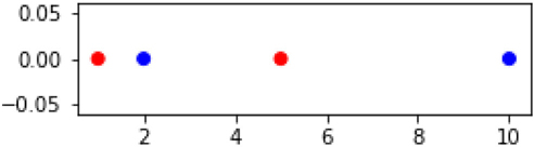
In [27]:
fig, ax = plt.subplots(1,1,figsize=(4, 1))

x = np.array([1,2,5,10]).reshape(-1, 1)
y = ['red', 'blue', 'red', 'blue']
ax.scatter(x,np.zeros_like(x), c=y);
This is a typical scenario: the two classes are intertwined. We’ll use a non-sklearn method to perform logistic regression. This method is a bit old-school, but it will expose our issue clearly.
In [28]:
import statsmodels.formula.api as sm

x = np.c_[x, np.ones_like(x)] # +1 trick
tgt = (np.array(y) == 'red')

# sm.Logit is statsmodels name for logistic regression
(sm.Logit(tgt, x, method='newton')
   .fit()
   .predict(x))  # training predictions
Optimization terminated successfully.
         Current function value: 0.595215
         Iterations 5
Out[28]:
array([0.7183, 0.6583, 0.4537, 0.1697])
Everything seems pretty well behaved, so far. Now, look what happens with a seemingly minor change to the data.
In [29]:
fig, ax = plt.subplots(1,1,figsize=(4,1))

x = np.array([1,4,6,10]).reshape(-1, 1)
y = ['red', 'red', 'blue', 'blue']
ax.scatter(x, np.zeros_like(x), c=y);

In [30]:
x = np.c_[x, np.ones_like(x)] # +1 trick
tgt = (np.array(y) == 'red')
try:
    sm.Logit(tgt, x, method='newton').fit().predict(x) # in-sample predictions
except Exception as e:
    print(e)
Perfect separation detected, results not available
Surprisingly, Logit refuses to solve the problem for us. It warns us that there was perfect separation between the classes and there are no results to use. It seems like drawing the perfect line would be easy. It isn’t. The problem is that there is an infinite number of lines that we could draw and our old-school logistic regression doesn’t have a built-in way to pick between them. In turn, some methods don’t do well with that uncertainty and can give very bad answers. Hence, Logit stops with a fail.
8.5 Discriminant Analysis
There is a group of classifiers, coming from the field of statistics, that we will broadly call discriminant analysis (DA) methods. Here, discriminant is used in the sense of “Gloria has a very discriminating palate”: she can tell subtle differences in flavors. We are hoping to find subtle differences that will allow us to classify things.
DA methods are very interesting for at least three reasons:
They have a wonderfully clear mathematical connection with Naive Bayes on continuous features (Gaussian Naive Bayes, GNB).
Like GNB, discriminant analysis methods model the features and the target together.
DA methods arise from particularly simple—or perhaps mathematically convenient—assumptions about the data. The different DA methods make slightly different assumptions.
Without going into great mathematical detail, we will discuss four different DA methods. I won’t introduce them by name, yet. Each of these methods works by making assumptions about the true nature of the data. Those assumptions could be wrong! Every method we use makes assumptions of one kind or another. However, DA methods make a specific set of stronger and stronger assumptions about the relationships between the features and their relationship to the target. We’ll talk about these as a group of friends. Suppose there are three friends: Feature One, Feature Two, and Class. They don’t always talk to each other as much as they’d like to, so they don’t know as much about each other as they’d like. Here are the sorts of assumptions these methods make:
Features One and Two talk to each other. They care what Class has to say.
Features One and Two talk to each other. They don’t care what Class has to say.
Feature One doesn’t talk to Feature Two directly. Anything Feature One knows comes from talking to Class. That knowledge, in turn, might give some information—gossip—about Feature Two.
We can combine 2 and 3: Feature One doesn’t talk directly to Feature Two nor does it care what Class has to say.
In fact, these assumptions aren’t just about the communication between Feature One and Feature Two. They are about the communication between all pairs of features: {Ftri, Ftrj}.
These assumptions lead to different models. Make no mistake: we can assume any of these scenarios and build a model of our data that relies on its assumptions. It might work out; it might not. We might have perfect knowledge that leads us to choose one of these sets of assumptions correctly. If so, we’d expect it to work better than the others. Short of omniscience, we can try each set of assumptions. Practically, that means we fit several different DA models, cross-validate, and see which performs the best. Then we assess on a hold-out set to make sure we haven’t misled ourselves.
8.5.1 Covariance
To understand the differences between the DA methods, you need to know about covariance. Covariance describes one way in which the features are related—or not—to each other. For example, if we are looking at physiological data on medical patients, our models might make good use of the fact that height and weight have a strong relationship. The covariance encodes the different ways features may metaphorically communicate with each other.
A quick point: in this section and this chapter, we are talking about the use of covariance as an internal widget of a learning machine. Different constraints on covariance lead to different learning machines. On the other hand, you might be familiar with the difficulties some models have when features are too closely related. We are not addressing those issues here; we’ll talk about it when we discuss feature selection in Section 13.1.
We’ll start our discussion by talking about variance. If you remember our discussions in Chapter 2, you’ll recall that the variance is the sum of squared errors of a model that predicts the mean value. You might even be able to come up with an equation for that. Before you scramble for pencil and paper, for a feature X that formula looks like:
Remember that is the mean of the set of data X. This formula is what I will call the common formula for variance. (Footnote: I’m ignoring the difference between variance of a random variable, variance of a population, and variance of a finite sample. If you are uneasy, take a deep breath and check out the End-of-Chapter Notes.) You might recognize a dot product in the formula for variance: var_X = dot(x-mean_X, x-mean_X) / n. If we write the variance out as code for the sum of squared errors from the mean, it might be even more familiar.
In [31]:
X = np.array([1,3,5,10,20])
n = len(X)

mean_X = sum(X) / n
errors = X - mean_X
var_X = np.dot(errors, errors) / n

fmt = "long way: {}nbuilt in: {}
 close: {}"
print(fmt.format(var_X,
                 np.var(X),
                 np.allclose(var_X, np.var(X)))) # phew
long way: 46.16
built in: 46.16
   close: True
8.5.1.1 The Classic Approach
Now, if we have two variables, we don’t get quite the same easy verbal phrasing of comparing with a mean model. Still, if I said that we take two models that predict the means for the two variables and multiply them together, you might come up with something like:
I apologize for using X and Y as two potential features. I’d use subscripts, but they are easily lost in the shuffle. I’m only going to do that in this section. In code, that turns into:
In [32]:
X = np.array([1,3,5,10,20])
Y = np.array([2,4,1,-2,12])

mean_X = sum(X) / n
mean_Y = sum(Y) / n

errors_X = X - mean_X
errors_Y = Y - mean_Y

cov_XY = np.dot(errors_X, errors_Y) / n
print("long way: {:5.2f}".format(cov_XY))
print("built in:", np.cov(X,Y,bias=True)[0,1])
# note:
# np.cov(X,Y,bias=True) gives [Cov(X,X), Cov(X,Y)
#                              Cov(Y,X), Cov(Y,Y)]
long way: 21.28
built in: 21.28
Now, what happens if we ask about the covariance of a feature with itself? That means we can set Y = X, filling in X for Y, and we get:
That’s all well and good, but we’ve gotten pretty far off the track of giving you some intuition about what happens here. Since the variance is a sum of squares, we know it is a sum of positive values because squaring individual positive or negative numbers always results in positives. Adding many positive numbers also gives us a positive number. So, the variance is always positive (strictly speaking, it can also be zero). The covariance is a bit different. The individual terms in the covariance sum will be positive if both x and y are greater than their means or if both x and y are less than their means (Figure 8.6). If they are on different sides of their means (say, and ), the sign of that term will be negative. Overall, we could have a bunch of negative terms or a bunch of positive terms or a mix of the two. The overall covariance could be positive or negative, close to zero or far away.

Figure 8.6 The quadrants around the mean are the like quadrants around (0, 0).
8.5.1.2 An Alternative Approach
What I’ve said so far isn’t too different than what you’d see in a statistics textbook. That’s not bad, but I love alternative approaches. There is a different, but equivalent, formula for the covariance. The alternative form can give us some insight into what the covariance represents. Basically, we’ll take all the unique pairs of X values, compute the difference between them, and square them. Then, we’ll add those values up. For the variance, that process looks like
In [33]:
var_x = 0
n = len(X)
for i in range(n):
    for j in range(i, n): # rest of Xs
        var_x += (X[i] - X[j])**2
print("Var(X):", var_x / n**2)
Var(X): 46.16
The value we calculated is the same as the one we got earlier. That’s great. But you might notice some ugliness in the Python code: we used indexing to access the X[i] values. We didn’t use direct iteration over X. We’ll fix that in a minute.
Here’s the equivalent snippet for covariance. We’ll take X and Y values for each pair of features and do a similar computation. We take the differences and multiply them; then we add up all of those terms.
In [34]:
cov_xy = 0
for i in range(len(X)):
    for j in range(i, len(X)): # rest of Xs, Ys
        cov_xy += (X[i] - X[j])*(Y[i]-Y[j])
print("Cov(X,Y):", cov_xy / n**2)
Cov(X,Y): 21.28
Again, we get the same answer—although the Python code is still hideously relying on
range and [i] indexing. Give me one more second on that.
Let’s look at the formulas for these alternate forms of the covariance. They assume we keep our X and Y values in order and use subscripts to access them—just like we did with the code above. This subscripting is very common in mathematics as well as in languages like C and Fortran. It is less common in well-written Python.
I wrote the Python code to most directly replicate these equations. If you look at the subscripts, you notice that they are trying to avoid each other. The purpose of j > i is to say, “I want different pairs of xs and ys.” I don’t want to double-count things. When we take that out (in the last [star]ed equation), we do double-count in the sum so we have to divide by two to get back to the correct answer. The benefit of that last form is that we can simply add up over all the pairs of xs and then fix up the result. There is a cost, though: we are adding in things we will just discard momentarily. Don’t worry, we’ll fix that too.
For the last equation, the Python code is much cleaner:
In [35]:
cov_XY = 0.0
xy_pairs = it.product(zip(X,Y), repeat=2)
for (x_i, y_i), (x_j, y_j) in xy_pairs:
    cov_XY += (x_i - x_j) * (y_i - y_j)
print("Cov(X,Y):", cov_XY / (2 * n**2))
Cov(X,Y): 21.28
We can do even better. it.product takes the complete element-by-element pairing of all the zip(X,Y) pairs. (Yes, that’s pairs of pairs.) it.combinations can ensure we use one, and only one, copy of each pair against another. Doing this saves us of the repetitions through our loop. Win! So here, we don’t have to divide by two.
In [36]:
cov_XX = 0.0
for x_i, x_j in it.combinations(X, 2):
    cov_XX += (x_i - x_j)**2
print("Cov(X,X) == Var(X):", cov_XX / (n**2))
Cov(X,X) == Var(X): 46.16
In [37]:
cov_XY = 0.0
for (x_i, y_i), (x_j,y_j) in it.combinations(zip(X,Y), 2):
    cov_XY += (x_i - x_j) * (y_i - y_j)
print("Cov(X,Y):", cov_XY / (n**2))
Cov(X,Y): 21.28
Back to the last equation: . Using this form, we get a very nice way to interpret covariance. Can you think of a simple calculation that takes xs and ys, subtracts them, and multiplies them? I’ll grab a sip of water while you think about it. Here’s a hint: subtracting values can often be interpreted as a distance: from mile marker 5 to mile marker 10 is 10 - 5 = 5 miles.
OK, time’s up. Let me rewrite the equation by ignoring the leading fraction for a moment: Cov(X,Y) = cmagic ∑ij(xi − xj)(yi − yj). If you’ve been following along, once again, we have an ever-present dot product. It has a very nice interpretation. If I have a rectangle defined by two points, {xi,yi} and {xj, yj}, I can get length = xi − xj and height = yi − yj. From these, I can get the area = length × height = (xi − xj)(yi − yj). So, if we ignore cmagic, the covariance is simply a sum of areas of rectangles or a sum product of distances. That’s not so bad, is it? The covariance is very closely related to the sum of areas created by looking at each pair of points as corners of a rectangle.
We saw cmagic earlier, so we can deal with the last pain point. Let’s rip the bandage off quickly: cmagic is . If there were n terms being added up and we had , we’d be happy talking about the average area. In fact, that’s what we have here. The squared value, , comes from the double summation. Looping i from 1 to n and j from 1 to n means we have n2 total pieces. Averaging means we need to divide by n2. The comes from not wanting to double-count rectangles.
If we include , the covariance is simply the average area of the rectangles defined by all pairs of points. The area is signed, it has a + or a -, depending on whether the line connecting the points is pointed up or down as it moves left-to-right—the same pattern we saw in Figure 8.6. If the idea of a signed area—an area with a sign attached to it—is making you scratch your head, you’re in good company. We’ll dive into this more with examples and graphics in the following section.
8.5.1.3 Visualizing Covariance
Let’s visualize what is going on with these rectangle areas and covariances. If we can think of covariance as areas of rectangles, let’s draw these rectangles. We’ll use a simple example with three data points and two features. We’ll draw the diagonal of each of the three rectangles and we’ll color in the total contributions at each region of the grid. Red indicates a positive overall covariance; blue indicates a negative covariance. Darker colors indicate more covariance in either the positive or negative direction: lighter colors, leading to white, indicate a lack of covariance. Our technique to get the coloring right is to (1) build a NumPy array with the proper values and (2) use matplotlib’s matshow, matrix show, to display that matrix.
We have a few helpers for “drawing” the rectangles. I use scare-quotes because we are really filling in values in an array. Later, we’ll use that array for the actual drawing.
In [38]:
# color coding
# -inf -> 0; 0 -> .5; inf -> 1
# slowly at the tails; quickly in the middle (near 0)
def sigmoid(x):
    return np.exp(-np.logaddexp(0, -x))

# to get the colors we need, we have to build a raw array
# with the correct values; we are really "drawing"
# inside a numpy array, not on the screen
def draw_rectangle(arr, pt1, pt2):
    (x1,y1),(x2,y2) = pt1,pt2
    delta_x, delta_y = x2-x1, y2-y1
    r,c = min(y1,y2), min(x1,x2) # x,y -> r,c
    # assign +/- 1 to each block in the rectangle.
    # total summation value equals area of rectangle (signed for up/down)
    arr[r:r+abs(delta_y),
        c:c+abs(delta_x)] += np.sign(delta_x * delta_y)
Now, we’ll create our three data points and “draw”—fill in the array—the three rectangles that the points define:
In [39]:
# our data points:
pts = [(1,1), (3,6), (6,3)]
pt_array = np.array(pts, dtype=np.float64)

# the array we are "drawing" on:
draw_arr = np.zeros((10,10))
ct = len(pts)
c_magic = 1 / ct**2 # without double counting

# we use the clever don't-double-count method
for pt1, pt2 in it.combinations(pts, 2):
    draw_rectangle(draw_arr, pt1, pt2)
draw_arr *= c_magic
In [40]:
# display the array we drew
from matplotlib import cm
fig, ax = plt.subplots(1,1,figsize=(4,3))
ax.matshow(sigmoid(draw_arr), origin='lower', cmap=cm.bwr, vmin=0, vmax=1)
fig.tight_layout()

# show a diagonal across each rectangles
# the array elements are centered in each grid square
ax.plot([ .5, 2.5],[ .5, 5.5], 'r') # from 1,1 to 3,6
ax.plot([ .5, 5.5],[ .5, 2.5], 'r') # from 1,1 to 6,3
ax.plot([2.5, 5.5],[5.5, 2.5], 'b'); # from 3,6 to 6,3

That graphic represents three datapoints defined by two features each.
In [41]:
np_cov = np.cov(pt_array[:,0], pt_array[:,1], bias=True)[0,1]
print("Cov(x,y) -   from numpy: {:4.2f}".format(np_cov))

# show the covariance, as calculated from our drawing
print("Cov(x,y) - our long way: {:4.2f}"}.format(draw_arr.sum()))
Cov(x,y) -   from numpy: 1.22
Cov(x,y) - our long way: 1.22
In the diagram, red indicates a positive relationship between two data points: as x goes up, y goes up. Note that if I flip the points and draw the line backwards, this is the same as saying as x goes down, y goes down. In either case, the sign of the terms is the same. Reds contribute to a positive covariance. On the other hand, blues indicate an opposing relationship between x and y: x up, y down or x down, y up. Finally, the intensity of the color indicates the strength of the positive or negative relationship for the two points that define that rectangle. The total covariance for the pair of points is divided equally among the squares of the rectangle. To get the final color, we add up all the contributions we’ve gotten along the way. Dark red is a big positive contribution, light blue is a small negative contribution, and pure white is a zero contribution. Finally, we divide by the number of points squared.
Here’s what the raw numbers look like. The value in a grid square is precisely what controls the color in that grid square.
In [42]:
plt.figure(figsize=(4.5,4.5))
hm = sns.heatmap(draw_arr, center=0,
                 square=True, annot=True,
                 cmap='bwr', fmt=".1f")
hm.invert_yaxis()
hm.tick_params(bottom=False, left=False)

Our discussion has been limited to the covariance between two features: X and Y . In our datasets, we might have many features—X, Y, Z, . . .—so we can have covariances between all pairs of features: Cov(X, Y), Cov(X, Z), Cov(Y, Z), and so on. Here’s an important point: the covariance formula for two features we used above relied on calculations between pairs of data points {(x1, y1), (x2, y2)} for those two features. When we talk about all the covariances, we are talking about the relationships between all pairs of features and we need to record them in a table of some sort. That table is called a covariance matrix. Don’t be scared. It is simply a table listing the covariances—the average sums of rectangle areas—between different pairs of variables. The covariance between X and Y is the same as the covariance between Y and X, so the table is going to have repeated entries.
Here’s an example that has relatively little structure in the data. What do I mean by structure? When we look at the covariance matrix, there aren’t too many patterns in it. But there is one. I’ll let you find it.
In [43]:
data = pd.DataFrame({'X':[ 1, 3, 6],
                     'Y':[ 1, 6, 3],
                     'Z':[10, 5, 1]})
data.index.name = 'examples'

# it's not critical to these examples, but Pandas' cov is
# "unbiased" and we've been working with "biased" covariance
# see EOC notes for details
display(data)
print("Covariance:")
display(data.cov())
|
X |
Y |
Z |
|---|---|---|---|
examples |
|
|
|
0 |
1 |
1 |
10 |
1 |
3 |
6 |
5 |
2 |
6 |
3 |
1 |
Covariance:
|
X |
Y |
Z |
|---|---|---|---|
X |
6.3333 |
1.8333 |
-11.1667 |
Y |
1.8333 |
6.3333 |
-5.1667 |
Z |
-11.1667 |
-5.1667 |
20.3333 |
I’ll talk about the values in that matrix with respect to the main diagonal—the 6.3, 6.3, and 20.3 values. (Yes, there are two diagonals. The “main” diagonal we care about is the one running from top-left to bottom-right.)
You may have noticed two things. First, the elements are mirrored across the main diagonal. For example, the top-right and bottom-left values are the same (–11.1667). That is not a coincidence; all covariance matrices are symmetric because, as I pointed out above, Cov(X, Y) = Cov(Y, X) for all pairs of features. Second, you may have picked up on the fact that both X and Y have the same variance. It shows up here as Cov(X, X) and Cov(Y, Y).
Now, imagine that our different features are not directionally related to each other. There’s no set pattern: as one goes up, the other can either go up or down. We might be trying to relate three measurements that we really don’t expect to be related at all: height, SAT scores, and love of abstract art. We get something like this:
In [44]:
data = pd.DataFrame({'x':[ 3, 6, 3, 4],
                     'y':[ 9, 6, 3, 0],
                     'z':[ 1, 4, 7, 0]})
data.index.name = 'examples'
display(data)
print("Covariance:")
display(data.cov()) # biased covariance, see EOC
|
x |
y |
z |
|---|---|---|---|
examples |
|
|
|
0 |
3 |
9 |
1 |
1 |
6 |
6 |
4 |
2 |
3 |
3 |
7 |
3 |
4 |
0 |
0 |
Covariance:
|
x |
y |
z |
|---|---|---|---|
x |
2.0000 |
0.0000 |
0.0000 |
y |
0.0000 |
15.0000 |
0.0000 |
z |
0.0000 |
0.0000 |
10.0000 |
The data numbers don’t look so special, but that’s a weird covariance matrix. What’s going on here? Let’s plot the data values:
In [45]:
fig, ax = plt.subplots(1,1,figsize=(4,3))
data.plot(ax=ax)
ax.vlines([0,1,2,3], 0, 10, colors=".5")

ax.legend(loc='lower center', ncol=3)

plt.box(False)
ax.set_xticks([0,1,2,3])
ax.set_ylabel("values");

We see that we never get a consistent pattern. It is not as simple as “if X goes up, Y goes up.” We also don’t see any consistency between X and Z or Y and Z—there’s no simple pattern of “you go up, I go down.” There’s always some segment where it goes the other way. For example, blue and green go up together in segment one, but work against each other in segments two and three. I constructed the data so that not only are the covariances low, they cancel out more or less exactly: all of the off-diagonal covariances in the matrix are zero. The only non-zero entries are on the diagonal of the table. We call this a diagonal covariance matrix. X, Y, and Z all have their own variance, but they have no pairwise covariance. If their own variances were zero, that would mean that the sum of rectangle sizes was zero. That only happens if all the values are the same. For example, with x1 = x2 = x3 = 42.314, the not-quite-a-rectangle we construct from these xs would be a single point with no length or width.
All of this discussion has been about one covariance matrix. In a few minutes, we’ll take about how that matrix influences our DA methods. But we can’t always rely on one matrix to carry all of the information we need. If we have multiple classes, you can imagine two scenarios: one where there is a single covariance matrix that is the same for every class—that is, one covariance is enough to describe everything. The second case is where we need a different covariance matrix for each class. We’ll ignore middle grounds and either have one matrix overall or have one for each class.
Let’s summarize what we’ve learned about the covariance. In one interpretation, the covariance simply averages the sizes of pairwise rectangles constructed from two features. Bigger rectangles mean bigger values. If the rectangle is built by moving up-and-right, its value is positive. If a pair of features moves essentially independently of each other—any coordinated increase is always offset by a corresponding decrease—their covariance is zero.
8.5.2 The Methods
Now, we are equipped to talk about the differences between the four variations of discriminant analysis (DA): QDA, LDA, GNB, and DLDA. Q stands for quadratic, L stands for linear, DL stands for diagonal linear, and GNB is our old friend Gaussian Naive Bayes . . . that’s Naive Bayes on smoothly valued features. These techniques make different assumptions about the covariances—the average rectangle sizes we dove into above.
QDA assumes that the covariances between different features are unconstrained. There can be class-wise differences between the covariance matrices.
LDA adds a constraint. It says that the covariances between features are all the same regardless of the target classes. To put it another way, LDA assumes that regardless of target class, the same covariance matrix does a good job describing the data. The entries in that single matrix are unconstrained.
GNB assumes something slightly different: it says that the covariances between distinct features—for example, Feature One and Feature Two—are all zero. The covariance matrices have entries on their main diagonal and zeros everywhere else. As a technical note, GNB really assumes that pairs of features are independent within that class—which implies, or leads to, a Feature One versus Feature Two covariance of zero. There may be different matrices for each different target class.
DLDA combines LDA and GNB: the covariances are assumed to be the same for each class—there’s only one covariance matrix—and Cov(X, Y) is zero between pairs of nonidentical features (X ≠ Y).
I really emphasized the role of the assumptions in this process. Hopefully, it is clear: it is an assumption of the method, not necessarily the state of the world that produced the data. Do you have that all straight? No? That’s OK. Here’s a faster run through of the assumptions:
QDA: possibly different covariance matrices per class,
LDA: same covariance matrix for all classes,
GNB: different diagonal covariance matrices per class, and
DLDA: same diagonal covariance matrix for all classes.
Let’s make the idea of classwise covariance matrices and different covariance matrices per class concrete. Suppose I have a simple table of data with measurements on cats and dogs. The target class is whether we have a cat or dog. The features are length and weight. You can probably come up with two different ways to calculate the variance of the weights: either calculate the variance over all of the pets at once or calculate the variance over the cats and dogs separately so we keep track of two values. Calculating over all is similar to what we do with covariance in LDA and DLDA. Calculating separately per cats and dogs is what we do with covariance QDA and GNB. That is, in LDA and DLDA we would calculate the covariance of length and weight over cats and dogs together; in QDA and GNB, we would calculate the covariances separately for each pet type.
Here’s a summary Table 8.1, with some mathese for those that are so inclined.
Table 8.1 Summary of discriminant analysis methods and assumptions. Σ is a covariance matrix (CM). Σc is a covariance matrix for a class c.
Abbreviation |
Name |
Assumptions |
Description |
|---|---|---|---|
QDA |
Quadratic Discriminant Analysis |
any Σc |
per class, arbitrary CM |
LDA |
Linear Discriminant Analysis |
Σc = Σ |
shared, arbitrary CM |
GNB |
Gaussian Naive Bayes |
Σc = diagc |
per class, diagonal CM |
DLDA |
Diagonal LDA |
Σc = diag |
shared, diagonal CM |
8.5.3 Performing DA
So, let’s look at the operation of the DA methods. We’ll do a simple train-test split and look at the confusion matrices from each of the four methods.
In [46]:
qda  = discriminant_analysis.QuadraticDiscriminantAnalysis()
lda  = discriminant_analysis.LinearDiscriminantAnalysis()
nb   = naive_bayes.GaussianNB()
dlda = DLDA() # from mlwpy.py

da_methods = [qda, lda, nb, dlda]
names = ["QDA", "LDA", "NB", "DLDA"]

fig, axes = plt.subplots(2,2, figsize=(4.5, 4.5),
                         sharex=True, sharey = True)
for ax, model, name in zip(axes.flat, da_methods, names):
    preds = (model.fit(iris_train_ftrs, iris_train_tgt)
                  .predict(iris_test_ftrs))
    cm = metrics.confusion_matrix(iris_test_tgt, preds)
    sns.heatmap(cm, annot=True, cbar=False, ax=ax)
    ax.set_title(name)

axes[0,0].set_ylabel('Actual')
axes[1,0].set_xlabel('Predicted');

We should be wary of reading too much into the differences here because they are not substantial. However, there seems to be something to LDA as a sweet spot of the assumptions—based on Occam’s razor, we make the fewest assumptions that get the job done. There’s a bit of variation in the results when you rerun with multiple train-test splits, so I would never recommend hard-selling the success of LDA here. However, in a larger problem, it would be worthwhile to explore it in more detail. Let’s look at the borders these methods create.
In [47]:
fig, axes = plt.subplots(2,2,figsize=(4.5, 4.5))
axes = axes.flat

for model, ax, name in zip(da_methods, axes, names):
    # plot boundary only uses the specified (two) dimensions to predict
    plot_boundary(ax, iris.data, iris.target, model, [0,1])
    ax.set_title(name)
plt.tight_layout()
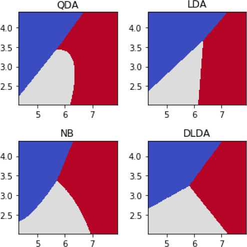
Both QDA and GNB have nonlinear boundaries—they curve a bit. LDA and DLDA both have linear borders between the classes.
8.6 Assumptions, Biases, and Classifiers
Before we get to our grand-finale comparison of classifiers, I want to pull together some thoughts on the differences between the classification methods we’ve seen so far.
One issue we haven’t discussed yet is that of linearity. That’s a technical term, but you can probably see its root: line. That means that in two dimensions, such as on a usual xy-graph, we can draw a line and break the plane of that graph into two halves: above/below or perhaps left/right of the line. The idea also applies in higher dimensions. We can split a 3D space with a 2D thing: a plane. We can repeat that same process in higher and higher dimensions—even when we can’t really draw or conceive of these things with our intuition. The line, the plane, and their higher-dimension cousins are all linear forms in a specific mathematical sense. They are simple, straight ahead, without wiggles.
What if we need wiggles? Perhaps we know we need a model with a curve, a parabola, or a circle? These forms take us to the realm of nonlinear techniques. We’ve actually seen a few nonlinear techniques, I just haven’t made a big deal about them. Nearest neighbors and decision trees can both capture relationships that are more wiggly than linear forms allow. Many, even most, other techniques can be extended naturally to deal with nonlinear data: linear regression, logistic regression, and SVCs. You are well justified if you want to run and hide when mathematicians say naturally. In this case, naturally means that we replace the notion of similarity rooted in the covariance matrix with another called a kernel. We’ll discuss kernels in detail in Section 13.2.
We moved from a very unbiased classifier—decision trees—through a variety of classifiers that make primarily linear borders (although GNB and QDA allow curved boundaries). Here’s how DTs and SVCs treat a simple example (is y > x):
In [48]:
ftrs = np.mgrid[1:10, 1:10].T.reshape(-1,2)
tgt  = ftrs[:,0] > ftrs[:,1]

fig, axes = plt.subplots(1,3,figsize=(9,3))
axes = axes.flat

svc = svm.SVC(kernel='linear')
dt_shallow = tree.DecisionTreeClassifier(max_depth=3)
dt_deep = tree.DecisionTreeClassifier()
models  = [svc, dt_shallow, dt_deep]

for model, ax in zip(models, axes):
    # plot boundary only uses the specified (two) dimensions to predict
    plot_boundary(ax, ftrs, tgt, model, [0,1])
    ax.set_title(get_model_name(model))
plt.tight_layout()

The first decision tree is hampered by the fact that we only allowed it to make a few splits in the middle pane. As we let it ask more and more questions—max_depth gets larger—it staircases its way to heaven. If we had sufficient data, that would look more and more like a straight line with the step heights getting really, really tiny.
Unlike logistic regression and the various discriminant analysis methods, SVCs don’t have any underlying notion of probability built into them. This does not make SVCs any better or any worse than DAs: it makes them different. If some data happens to fall nicely into the feature-wise independence assumption—that’s the diagonal covariance matrix—of GNB, then yes, GNB is going to be a win. Unfortunately, we almost never know ahead of time what assumptions will hold. Instead, what we do is apply a modeling method, like GNB, that comes with some assumptions; the better the assumptions line up with reality, the better the method will do on that problem. But there are just as many problems out there where those assumptions are not met. If the assumptions are met, we’d prefer GNB and we’d probably see it perform better classification. If those assumptions are not met, we can fall back to SVC. From a certain perspective, SVCs make the fewest assumptions of these three models (the DA methods, logistic regression, and SVCs), so they are the most flexible. However, that means that the other methods may do better when the assumptions are met.
As we move from SVCs to logistic regression to DA, we move from (1) minimal assumptions about the data to (2) a primitive data model that relates features and targets to (3) varying degrees of assumptions about how the features are distributed, their relationships to the target, and the base rates of the targets. Logistic regression attempts to capture the relationship between the inputs and the output. In particular, it captures the probability of the output given what we know about the inputs. However, it ignores any self-contained information from the target class. For example, it would ignore knowledge from the data that a particular disease is very, very rare. In contrast, the discriminant analysis methods model both a relationship between inputs and outputs and the base probabilities of the outputs. In particular, they capture the probability of the inputs given what we know about an output and (2) stand-alone information about the output. Weird, right? I’m intentionally being a bit vague about these relationships, but you can check the notes at the end of the chapter for some hints about what’s happening.
8.7 Comparison of Classifiers: Take Three
With significant new tools in our classification toolbox, let’s attack a problem that’s a bit more difficult than the irises.
8.7.1 Digits
Here we’re going to make use of the digits dataset that ships with sklearn.
In [49]:
digits = datasets.load_digits()
The data represents simple images of handwritten digits. For example, the first digit is
In [50]:
print("Shape:", digits.images[0].shape)
plt.figure(figsize=(3,3))
plt.imshow(digits.images[0], cmap='gray');
Shape: (8, 8)

and it has a target value of
In [51]:
digits.target[0]
Out[51]:
0
The dataset comes in two forms. One (digits.images) is appropriate for display purposes; I used it just above. The other (digits.data) is appropriate for use in learning. That form is a flattened row of the information in the square 64 × 64 images.
Now we can construct our learning problem.
In [52]:
classifier_parade =
    {'LogReg(1)' : linear_model.LogisticRegression(max_iter=1000),
     'LogReg(2)' : linear_model.SGDClassifier(loss='log',
                                              max_iter=1000),

     'QDA' : discriminant_analysis.QuadraticDiscriminantAnalysis(),
     'LDA' : discriminant_analysis.LinearDiscriminantAnalysis(),
     'GNB' : naive_bayes.GaussianNB(),

     'SVC(1)' : svm.SVC(kernel="linear"),
     'SVC(2)' : svm.LinearSVC(),

     'DTC' : tree.DecisionTreeClassifier(),
     '5NN-C' : neighbors.KNeighborsClassifier(),
     '10NN-C' : neighbors.KNeighborsClassifier(n_neighbors=10)}
baseline = dummy.DummyClassifier(strategy="uniform")

base_score = skms.cross_val_score(baseline,
                                  digits.data, digits.target==1,
                                  cv=10,
                                  scoring='average_precision',
                                  n_jobs=-1)
We evaluate our solutions with cross-validation on the digits dataset.
In [53]:
fig, ax = plt.subplots(figsize=(6,4))
ax.plot(base_score, label='base')
for name, model in classifier_parade.items():
    cv_scores = skms.cross_val_score(model,
                                     digits.data, digits.target,
                                     cv=10,
                                     scoring='f1_macro',
                                     n_jobs=-1) # all CPUs
    my_lbl = "{} {:.3f}".format(name, cv_scores.mean())
    ax.plot(cv_scores, label=my_lbl, marker=next(markers))
ax.set_ylim(0.0, 1.1)
ax.set_xlabel('Fold')
ax.set_ylabel('Accuracy')
ax.legend(loc='lower center', ncol=2);

Frankly, there is really too much going on here to easily summarize. Still, there are some overall trends. You can see that a classical method, Logistic Regression, is competing nicely with a very modern method, SVCs. And our drop-dead simple Nearest Neighbors methods are doing even better. It would be great practice to dive into comparing different classifiers on different metrics for this problem. You might also be interested in comparing the resource utilization of the different methods on digits.
8.8 EOC
8.8.1 Summary
We’ve now added a variety of methods to our classification toolbox. Decision trees are highly flexible models that find common regions of space. Logistic regression and discriminant analysis variations use different probabilistic models of the data to assign likelihoods to classes. Support Vector Classifiers look directly for a linear separation between classes. Along with Naive Bayes and nearest neighbors, we have eight different types of classifiers we can use.
How do we pick? Sometimes outside concerns drive our choice. Decision trees are generally readable by humans. Logistic regression models can be interpreted as the change in log-odds based on variable values. SVCs? SVCs don’t really do interpretation in the same way. We can use them, but they have a lot going on inside their black box. Now, even if we know that we need to use a DT for understanding, we might still fit other models to see how the DT performance stacks up to the other cool kids.
8.8.2 Notes
The idea that there is No One Method to Rule Them All (and in the darkness, bind them) is called the No Free Lunch Theorem. I’d prefer the No One Ring Theorem, but alas, they didn’t ask Tolkien or me.
Decision Trees While we’ve talked about decision trees leading to a class, we can also ask them about the probability distribution at the leaves. Then, if we wanted, we could flip coins to get a distribution similar to what we saw at each leaf. We don’t have to make a concrete decision if we don’t want to.
To answer the mid-tree quiz: “As the max depth increases, are we moving towards overfitting or underfitting?” The answer is overfitting.
There are several characteristics of trees that are not fundamental to DTs—they just happen to be the way things are. We could, for instance, allow decisions to be made on functions of the features. Among other things, this would allow non-parallel or non-perpendicular value splits. Instead of splitting on x > 5, we could split on 2x + 3 > 5: we now have an off-axis comparison. We could also allow comparisons like is color in {red, blue, green}? (no). We can capture that sort of relationship with a sequence of binary questions: is red? (no), is green? (no), is blue? (no). But that comes at the cost of subdividing regions that might be light on data to begin with. There is a tradeoff between expressiveness and verbosity that different authors have disagreed on. I’ll take a pragmatic approach: if you think you need a fancy technique, try it—and then cross-validate.
If you happen to be a more advanced reader making your way through this book, you might be interested in a recent (2015) paper: Efficient non-greedy optimization of decision trees by Norouzi and friends. The methods of tree-building I’ve described in this chapter are greedy: they take individual steps that seem to be the best. But, of course, without an overall map, individual steps can lead you astray. That paper describes a non-greedy way to build trees.
SVCs We’ll talk much more about some of the coolest aspects of SVMs in Chapter 13. Quickly, we move from a SVC to a SVM by introducing a kernel. To tide you over, I’ll mention that sklearn has an interface to liblinear which is a very powerful program for computing SVCs (linear SVMs) as well as logistic regression models. At a minimum, to run it as a standard SVC, comparable to what we used above, you’ll make a call like: svm.LinearSVC(loss='hinge'). The LinearSVC has some nice benefits when working with large datasets (greater than about 10,000 examples).
SVC and NuSVC use another program, libsvm, under the hood. libsvm is about as close to a de facto standard implementation of SVCs and SVMs as we have in the machine learning community. When talking about NuSVC, people often make the mistake of talking about ν in terms of training errors. ν is related to margin errors.ν is not directly related to training errors. If you want to see for yourself, read pages 1225–1226 of New Support Vector Algorithms by Scholkpf.
Trying to get LinearSVC and SVC and NuSVC to produce the same boundaries is quite difficult. libsvm and liblinear do slightly different things from a mathematical and computational perspective. At a minimum, LinearSVC includes the +1 trick column when it performs regularization. Furthermore, LinearSVC and SVC place their own defaults on top of the underlying defaults. If you want a comparison, be prepared to do some digging. These might get you started:
Logistic Regression
Mathematical clarity can sometimes be quite opaque. For example, the following equation leads to two quite different-looking ways of writing out a logistic function. And that, in turn, can lead to different ways of expressing logistic regression. Good luck.
The assumptions of logistic regression are strongly related to the assumptions of linear regression with the exception that the linear relationship is between the log-odds of the target classes and the input features. Otherwise, we still need the errors to be well behaved and we need to avoid redundancy in the features. See Chapter 10 for details.
We haven’t really addressed how logistic regression works. We’ve explained log-odds and built a linear-regression-like model from it, but what makes it go? A classic way to find the answer—the best coefficients—is called iteratively reweighted least squares (IRLS). Basically, it follows the same method as classic linear regression, but it has to repeat that process multiple times. This process ends up being equivalent to a Newton’s Method: if I’m up a hill, aim towards a place where I cross the x axis by pointing downhill and taking a step towards it based on the steepness of the slope. Newton’s Method is called a second-order method because we need to find an extreme point in a function—where it’s at a peak or a valley—and to do that we need to find the slope that will get us to that point. So, we sort of need the slope of a slope—hence “second order” or “second derivative” if you are familiar. The other major class of methods, called Gradient Descent, basically says: aim yourself downhill and take a small step that way.
The statsmodels method we used above uses the good old IRLS technique. We can perform logistic regression in several ways in sklearn. liblinear uses a very fancy version of Newton’s Method called Trust Region Newton’s Method. That’s the default call to LogisticRegression. SGDClassifier uses a fast version of Gradient Descent that doesn’t process all of the data at each step downhill. The saga argument to LogisticRegression uses a—surprise!—SAGA method that performs like SGD but also remembers some history of prior steps. Gradient Descent uses all the data at each step, while Stochastic Gradient Descent uses some or only one example at each step and SAGA remembers some history of steps while using only some data at each new step.
More disturbingly, you may have noticed that we didn’t discuss the role of bias and variance with logistic regression. We will revisit this in Chapter 15.
Discriminant Analysis Methods At the risk of offending my statistician friends, I dreadfully glossed over some details about variance. In reality, what we’ve discussed is either the population variance or the biased sample variance. There are a few different ways of dealing with the biasedness; the most common is to divide by n - 1 instead of n.
I have to credit a member of StackOverflow, whuber, for a comment and graphic which brought a graphical method of exploring covariance to my attention. You can see it here: https://stats.stackexchange.com/a/18200/1704. Tracking down some of those ideas led me to an article by Hayes from 2011 titled “A Geometrical Interpretation of an Alternative Formula for the Sample Covariance.”
There are many ways to relate different methods to one another. For example, a technique called Nearest Shrunken Centroids (NSC) is related to DLDA: if you center and standardize your data and then perform NSC, you should get results that are equivalent to a form of regularized (smoothed) DLDA. See Elements of Statistical Learning by Hastie and friends, second edition, page 651. As always, there may be mathematical and implementation differences that prevent you from achieving complete equivalence. As a note, sklearn’s current (as of May 2019) implementation of NearestCentroids doesn’t fully account for distance metrics and won’t quite solve this for us.
If you are familiar with Naive Bayes and are wondering why it is called a linear method, the reason is that for discrete—technically, multinomial—Naive Bayes, the boundaries created are linear. However, for continuous—technically, Gaussian—Naive Bayes, as we have seen in this chapter, the boundaries are not linear.
8.8.3 Exercises
Here are some questions to keep you up at night:
Under what scenarios would an identifying variable, such as a unique number for each day, be useful for learning a target value? How could we apply it when we need to predict truly never-seen data—beyond even a hold-out test set?
Play around with SVM boundaries and example points. Make a few positive and negative examples—you can color them red and blue if you like. Make some patterns with the examples. Now, graph and look at the resulting linear boundaries that get created when you train an SVM. How do the boundaries change as you go from well-separated classes to having outliers across the obvious separation?
Compare the runtimes of of
NuSVCandSVCunder different learning scenarios and parameters.Compare the DA methods with 20 repeated train-test splits. Use the same TTSs for each method. Count up the winners. Try with a different dataset.
You now have a bigger toolbox. Try to find better predictive models of the student data from the end of Chapter 6.
Our examples of bias and variance with SVCs were a bit weak. If you want to see very clear examples of bias-variance—overfitting and underfitting—redo those examples with a Gaussian kernel. Don’t know what that is? Stay tuned or turn to Chapter 13.