
5. Evaluating and Comparing Learners
In [1]:
# setup
from mlwpy import *
diabetes = datasets.load_diabetes()
%matplotlib inline
5.1 Evaluation and Why Less Is More
Lao Tzu: Those that know others are wise. Those that know themselves are Enlightened.
The biggest risk in developing a learning system is overestimating how well it will do when we use it. I touched on this risk in our first look at classification. Those of us that have studied for a test and thought we had a good mastery of the material, and then bombed the test, will be intimately familiar with this risk. It is very, very easy to (1) think we know a lot and will do well on an exam and (2) not do very well on the exam. On a test, we may discover we need details when we only remember a general idea. I know it happened in mid-nineteenth century, but was it 1861 or 1862!? Even worse, we might focus on some material at the expense of other material: we might miss studying some information entirely. Well, nuts: we needed to know her name but not his birth year.
In learning systems, we have two similar issues. When you study for the test, you are limited in what you can remember. Simply put, your brain gets full. You don’t have the capacity to learn each and every detail. One way around this is to remember the big picture instead of many small details. It is a great strategy—until you need one of those details! Another pain many of us have experienced is that when you’re studying for a test, your friend, spouse, child, anyone hollers at you, “I need your attention now!” Or it might be a new video game that comes out: “Oh look, a shiny bauble!” Put simply, you get distracted by noise. No one is judging, we’re all human here.
These two pitfalls—limited capacity and distraction by noise—are shared by computer learning systems. Now, typically, a learning system won’t be distracted by the latest YouTube sensation or Facebook meme. In the learning world, we call these sources of error by different names. For the impatient, they are bias for the capacity of what we can squeeze into our head and variance for how distracted we get by noise. For now, squirrel away that bit of intuition and don’t get distracted by noise.
Returning to the issue of overconfidence, what can we do to protect ourselves from . . . ourselves? Our most fundamental defense is not teaching to the test. We introduced this idea in our first look at classification (Section 3.3). To avoid teaching to the test, we use a very practical three-step recipe:
Step one: split our data into separate training and testing datasets.
Step two: learn on the training data.
Step three: evaluate on the testing data.
Not using all the data to learn may seem counterintuitive. Some folks—certainly none of my readers—could argue, “Wouldn’t building a model on more data lead to better results?” Our humble skeptic has a good point. Using more data should lead to better estimates by our learner. The learner should have better parameters—better knob settings on our factory machine. However, there’s a really big consequence of using all of the data for learning. How would we know that a more-data model is better than a less-data model? We have to evaluate both models somehow. If we teach to the test by learning and evaluating on all of the data, we are likely to overestimate our ability once we take our system into the big, scary, complex real world. The scenario is similar to studying a specific test from last year’s class—wow, multiple choice, easy!—and then being tested on this year’s exam which is all essays. Is there a doctor in the house? A student just passed out.
In this chapter, we will dive into general evaluation techniques that apply to both regression and classification. Some of these techniques will help us avoid teaching to the test. Others will give us ways of comparing and contrasting learners in very broad terms.
5.2 Terminology for Learning Phases
We need to spend a few minutes introducing some vocabulary. We need to distinguish between a few different phases in the machine learning process. We’ve hit on training and testing earlier. I want to introduce another phase called validation. Due to some historical twists and turns, I need to lay out clearly what I mean by these three terms—training, validation, and testing. Folks in different disciplines can use these terms with slight variations in meaning which can trip the unwary student. I want you to have a clear walking path.
5.2.1 Back to the Machines
I want you to return to the mental image of our factory learning machine from Section 1.3. The machine is a big black box of knobs, inputs, and outputs. I introduced that machine to give you a concrete image of what learning algorithms are doing and how we have control over them. We can continue the story. While the machine itself seems to be part of a factory, in reality, we are a business-to-business (that’s B2B to you early 2000s business students) provider. Other companies want to make use of our machine. However, they want a completely hands-off solution. We’ll build the machine, set all the knobs as in Figure 5.1, and send the machine to the customer. They won’t do anything other than feed it inputs and see what pops out the other side. This delivery model means that when we hand off the machine to our customer, it needs to be fully tuned and ready to rock-and-roll. Our challenge is to ensure the machine can perform adequately after the hand-off.

Figure 5.1 Learning algorithms literally dial-in—or optimize—a relationship between input and output.
In our prior discussion of the machine, we talked about relating inputs to outputs by setting the knobs and switches on the side of the machine. We established that relationship because we had some known outputs that we were expecting. Now, we want to avoid teaching to the test when we set the dials on our machine. We want the machine to do well for us, but more importantly, we want it to do well for our customer. Our strategy is to hold out some of the input-output pairs and save them for later. We will not use the saved data to set the knobs. We will use the saved data, after learning, to evaluate how well the knobs are set. Great! Now we’re completely set and have a good process for making machines for our customers.
You know what’s coming. Wait for it. Here it comes. Houston, we have a problem. There are many different types of machines that relate inputs to outputs. We’ve already seen two classifiers and two regressors. Our customers might have some preconceived ideas about what sort of machine they want because they heard that Fancy Silicon Valley Technologies, Inc. was using one type of machine. FSVT, Inc. might leave it entirely up to us to pick the machine. Sometimes we—or our corporate overlords—will choose between different machines based on characteristics of the inputs and outputs. Sometimes we’ll choose based on resource use. Once we select a broad class of machines (for example, we decide we need a widget maker), there may be several physical machines we can pick (for example, the Widget Works 5000 or the WidgyWidgets Deluxe Model W would both work nicely). Often, we will pick the machine we use based on its learning performance (Figure 5.2).

Figure 5.2 If we can build and optimize different machines, we select one of them for the customer.
Let me step out of the metaphor for a moment. A concrete example of a factory machine is a k-Nearest Neighbors (k-NN) classifier. For k-NN, different values of k are entirely different physical machines. k is not a knob we adjust on the machine. k is internal to the machine. No matter what inputs and outputs we see, we can’t adjust k directly on one machine (see Section 11.1 for details). It’s like looking at the transmission of a car and wanting a different gearing. That modification is at a level beyond the skillsets of most of us. But all is not lost! We can’t modify our car’s transmission, but we can buy a different car. We are free to have two different machines, say 3-NN and 10-NN. We can go further. The machines could also be completely different. We could get two sedans and one minivan. With learning models, they don’t all have to be k-NN variants. We could get a 3-NN, a 10-NN, and a Naive Bayes. To pick among them, we run our input-output pairs through the models to train them. Then, we evaluate how they perform on the held-out data to get a better—less trained on the test—idea of how our machines will perform for the customer (Figure 5.3).

Figure 5.3 Optimization (dial-setting) and selection (machine choice) as steps to create a great machine for our customer.
Hurray! We’re done. High-fives all around, it’s time for coffee, tea, soda, or beer (depending on your age and doctor’s advice).
Not so fast. We still have a problem. Just as we can teach to the test in setting the knobs on the machines, we can also teach to the test in terms of picking a machine. Imagine that we use our held-out data as the basis for picking the best machine. For k-NN that means picking the best k. We could potentially try all the values of k up to the size of our dataset. Assuming 50 examples, that’s all values of k from 1 to 50. Suppose we find that 27 is the best. That’s great, except we’ve been looking at the same held-out data every time we try a different k. We no longer have an unseen test to give us a fair evaluation of the machine we’re going to hand off to our customer. We used up our hold-out test set and fine-tuned our performance towards it. What’s the answer now?
The answer to teaching-to-the-test with knobs—tuning a given machine—was to have a separate set of held-out data that isn’t used to set the knobs. Since that worked pretty well there, let’s just do that again. We’ll have two sets of held-out data to deal with two separate steps. One set will be used to pick the machine. The second set will be used to evaluate how well the machine will work for the customer in a fair manner, without peeking at the test. Remember, we also have the non-held-out data that is used to tune the machine.
5.2.2 More Technically Speaking . . .
Let’s recap. We now have three distinct sets of data. We can break the discussion of our needs into three distinct phases. We’ll work from the outside to the inside—that is, from our final goal towards fitting the basic models.
We need to provide a single, well-tuned machine to our customer. We want to have a final, no-peeking evaluation of how that machine will do for our customer.
After applying some thought to the problem, we select a few candidate machines. With those candidate machines, we want to evaluate and compare them without peeking at the data we will use for our final evaluation.
For each of the candidate machines, we need to set the knobs to their best possible settings. We want to do that without peeking at either of the datasets used for the other phases. Once we select one machine, we are back to the basic learning step: we need to set its knobs.
5.2.2.1 Learning Phases and Training Sets
Each of these three phases has a component of evaluation in it. In turn, each different evaluation makes use of a specific set of data containing different known input-output pairs. Let’s give the phases and the datasets some useful names. Remember, the term model stands for our metaphorical factory machine. The phases are
Assessment: final, last-chance estimate of how the machine will do when operating in the wild
Selection: evaluating and comparing different machines which may represent the same broad type of machine (different k in k-NN) or completely different machines (k-NN and Naive Bayes)
Training: setting knobs to their optimal values and providing auxiliary side-tray information
The datasets used for these phases are:
Hold-out test set
Validation test set
Training set
We can relate these phases and datasets to the factory machine scenario. This time, I’ll work from the inside out.
The training set is used to adjust the knobs on the factory machine.
The validation test set is used to get a non-taught-to-the-test evaluation of that finely optimized machine and help us pick between different optimized machines.
The hold-out test set is used to make sure that the entire process of building one or more factory machines, optimizing them, evaluating them, and picking among them is evaluated fairly.
The last of these is a big responsibility: there are many ways to peek and be misled by distractions. If we train and validation-test over and over, we are building up a strong idea of what works and doesn’t work in the validation test set. It may be indirect, but we are effectively peeking at the validation test set. The hold-out test set—data we have never used before in any training or validation-testing for this problem—is necessary to protect us from this indirect peeking and to give us a fair evaluation of how our final system will do with novel data.
5.2.2.2 Terms for Test Sets
If you check out a number of books on machine learning, you’ll find the term validation set used, fairly consistently, for Selection. However, when you talk to practitioners, folks will verbally use the phrase test set for both datasets used for Selection and for Assessment. To sweep this issue under the carpet, if I’m talking about evaluation and it is either (1) clear from context or (2) doesn’t particularly matter, I’ll use the generic phrase testing for the data used in either Assessment or Selection. The most likely time that will happen is when we aren’t doing Selection of models—we are simply using a basic train-test split, training a model and then performing a held-out evaluation, Assessment, on it.
If the terms do matter, as when we’re talking about both phases together, I’ll be a bit more precise and use more specific terms. If we need to distinguish these datasets, I’ll use the terms hold-out test set (HOT) and validation set (ValS). Since Assessment is a one-and-done process—often at the end of all our hard work applying what we know about machine learning—we’ll be talking about the HOT relatively infrequently. That is not to say that the HOT is unimportant—quite the contrary. Once we use it, we can never use it as a HOT again. We’ve peeked. Strictly speaking, we’ve contaminated both ourselves and our learning system. We can delete a learning system and start from scratch, but it is very difficult to erase our own memories. If we do this repeatedly, we’d be right back into teaching to the test. The only solution for breaking the lockbox of the HOT is to gather new data. On the other hand, we are not obligated to use all of the HOT at once. We can use half of it, find we don’t like the results and go back to square one. When we develop a new system that we need to evaluate before deployment, we still have the other half the HOT for Assessment.
5.2.2.3 A Note on Dataset Sizes
A distinctly practical matter is figuring out how big each of these sets should be. It is a difficult question to answer. If we have lots of data, then all three sets can be very large and there’s no issue. If we have very little data, we have to be concerned with (1) using enough data in training to build a good model and (2) leaving enough data for the testing phases. To quote one of the highest-quality books in the field of machine and statistical learning, Elements of Statistical Learning, “It is difficult to give a general rule on how to choose the number of observations in each of the three parts.” Fortunately, Hastie and friends immediately take pity on us poor practitioners and give a generic recommendation of 50%–25%–25% for training, validation testing, and held-out testing. That’s about as good of a baseline split as we can get. With cross-validation, we could possibly consider a 75–25 split with 75% being thrown into the basket for cross-validation—which will be repeatedly split into training and validation-testing sets—and 25% saved away in a lockbox for final assessment. More on that shortly.
If we go back to the 50–25–25 split, let’s drill into that 50%. We’ll soon see evaluation tools called learning curves. These give us an indication of what happens to our validation-testing performance as we train on more and more examples. Often, at some high enough number of training examples, we will see a plateau in the performance. If that plateau happens within the 50% split size, things are looking pretty good for us. However, imagine a scenario where we need 90% of our available data to get a decent performance. Then, our 50–25–25 split is simply not going to give a sufficiently good classifier because we need more training data. We need a learner that is more efficient in its use of data.
5.2.2.4 Parameters and Hyperparameters
Now is the perfect time—I might be exaggerating—to deal with two other terms: parameters and hyperparameters. The knobs on a factory machine represent model parameters set by a learning method during the training phase. Choosing between different machines (3-NN or 10-NN) in the same overall class of machine (k-NN) is selecting a hyperparameter. Selecting hyperparameters, like selecting models, is done in the selection phase. Keep this distinction clear: parameters are set as part of the learning method in the training phase while hyperparameters are beyond the control of the learning method.
For a given run of a learning method, the available parameters (knobs) and the way they are used (internals of the factory machine) are fixed. We can only adjust the values those parameters take. Conceptually, this limitation can be a bit hard to describe. If the phases described above are talked about from outer to inner—in analogy with outer and inner loops in a computer program—the order is Assessment, Selection, Training. Then, adjusting hyperparameters means stepping out one level from adjusting the parameters—stepping out from Training to Selection. We are thinking outside the box, if you will. At the same time—from a different perspective—we are diving into the inner workings of the machine like a mechanic. As is the case with rebuilding car engines, the training phase just doesn’t go there.
With that perfect moment passed, we’re going to minimize the discussion of hyperparameters for several chapters. If you want to know more about hyperparameters right now, go to Section 11.1. Table 5.1 summarizes the pieces we’ve discussed.
Table 5.1 Phases and datasets for learning.
Phase |
Name |
Dataset Used |
Machine |
Purpose |
|---|---|---|---|---|
inner |
training |
training set |
set knobs |
optimize parameters |
middle |
selection |
validation test set |
choose machines |
select model, hyperparameters |
outer |
assessment |
hold-out test set |
evaluate performance |
assess future performance |
For the middle phase, selection, let me emphasize just how easily we can mislead ourselves. We’ve only considered two kinds of classifiers so far: NB and k-NN. While k could grow arbitrarily big, we commonly limit it to relatively small values below 20 or so. So, maybe we are considering 21 total possible models (20 k-NN variants and 1 Naive Bayes model). Still, there are many other methods. In this book, we’ll discuss about a half dozen. Several of these have almost infinite tunability. Instead of choosing between a k of 3, 10, or 20, some models have a C with any value from zero to infinity. Over many models and many tuning options, it is conceivable that we might hit the jackpot and find one combination that is perfect for our inner and middle phases. However, we’ve been indirectly peeking—homing in on the target by systematic guessing. Hopefully, it is now clear why the outer phase, assessment, is necessary to prevent ourselves from teaching to the test.
5.3 Major Tom, There’s Something Wrong: Overfitting and Underfitting
Now that we’ve laid out some terminology for the learning phases—training, selection, and assessment—I want to dive into things that can go wrong with learning. Let’s turn back to the exam scenario. Mea culpa. Suppose we take an exam and we don’t do as well as we’d like. It would be nice if we could attribute our failure to something more specific than “bad, don’t do that again.” Two distinct failures are (1) not bringing enough raw horsepower—capacity—to the exam and (2) focusing too much on irrelevant details. To align this story with our earlier discussion, number two is really just a case of being distracted by noise—but it makes us feel better about ourselves than binging on Netflix. These two sources of error have technical names: underfitting and overfitting. To investigate them, we’re going to cook up a simple practice dataset.
5.3.1 Synthetic Data and Linear Regression
Often, I prefer to use real-world datasets—even if they are small—for examples. But in this case, we’re going to use a bit of synthetic, genetically modified data. Creating synthetic data is a good tool to have in your toolbox. When we develop a learning system, we might need some data that we completely control. Creating our own data allows us to control the true underlying relationship between the inputs and the outputs and to manipulate how noise affects that relationship. We can specify both the type and amount of noise.
Here, we’ll make a trivial dataset with one feature and a target, and make a train-test split on it. Our noise is chosen uniformly (you might want to revisit our discussion of distributions in Section 2.4.4) from values between –2 and 2.
In [2]:
N = 20
ftr = np.linspace(-10, 10, num=N)                # ftr values
tgt = 2*ftr**2 - 3 + np.random.uniform(-2, 2, N) # tgt = func(ftr)

(train_ftr, test_ftr,
 train_tgt, test_tgt) = skms.train_test_split(ftr, tgt, test_size=N//2)

display(pd.DataFrame({"ftr":train_ftr,
                      "tgt":train_tgt}).T)
|
0 |
1 |
2 |
3 |
4 |
5 |
6 |
7 |
8 |
9 |
|---|---|---|---|---|---|---|---|---|---|---|
ftr, |
-1.58 |
-6.84 |
-3.68 |
1.58 |
-7.90 |
3.68 |
7.89 |
4.74 |
5.79 |
-0.53 |
tgt |
2.39 |
91.02 |
22.38 |
3.87 |
122.58 |
23.00 |
121.75 |
40.60 |
62.77 |
-1.61 |
Now we can take a look at that data visually. We have our known data points—the training set—in blue dots. The red pluses show the input feature values for the test set. We need to figure out how high up we should take each of those values.
In [3]:
plt.plot(train_ftr, train_tgt, 'bo')
plt.plot(test_ftr, np.zeros_like(test_ftr), 'r+');

The numbers are a fairly straightforward example of a regression task. We have a numerical target value that we want to predict from an input. Now, we only have a few regression tools in our toolbox at this point. So, let’s pull out linear regression (LR) and see what happens:
In [4]:
# note: sklearn *really* wants 2D inputs (a table)
# so we use rehape here.
sk_model = linear_model.LinearRegression()
sk_model.fit(train_ftr.reshape(-1, 1), train_tgt)
sk_preds = sk_model.predict(test_ftr.reshape(-1, 1))
sk_preds[:3]
Out[4]:
array([53.218 , 41.4552, 56.8374])
We’re not evaluating these predictions in any way. But at least—like our training targets—they are positive values.
5.3.2 Manually Manipulating Model Complexity
Up until now, we’ve relied entirely on sklearn to do all the heavy lifting for us. Basically, sklearn’s methods have been responsible for setting the knob values on all the machines we’ve been using for our demonstrations. But there are many other packages for finding those ideal knob values. Some of those packages are specifically geared towards machine learning. Others are geared towards specialized areas of mathematics and engineering.
One of those alternatives is the polyfit routine in NumPy. It takes input and output values, our features and a target, and a degree of polynomial to align with the data. It figures out the right knob values—actually, the coefficients of polynomials we discussed in Section 2.8—and then np.poly1d turns those coefficients into a function that can take inputs and produce outputs. Let’s explore how it works:
In [5]:
# fit-predict-evaluate a 1D polynomial (a line)
model_one = np.poly1d(np.polyfit(train_ftr, train_tgt, 1))
preds_one = model_one(test_ftr)
print(preds_one[:3])
[53.218 41.4552 56.8374]
Interesting. The first three predictions are the same as our LR model. Are all of the predictions from these inputs the same? Yes. Let’s demonstrate that and calculate the RMSE of the model:
In [6]:
# the predictions come back the same
print("all close?", np.allclose(sk_preds, preds_one))

# and we can still use sklearn to evaluate it
mse = metrics.mean_squared_error
print("RMSE:", np.sqrt(mse(test_tgt, preds_one)))
all close? True
RMSE: 86.69151817350722
Great. So, two take-home messages here. Message one: we can use alternative systems, not just sklearn, to learn models. We can even use those alternative systems with sklearn to do the evaluation. Message two: np.polyfit, as its name implies, can easily be manipulated to produce any degree of polynomial we are interested in. We have just fit a relatively simple line, but we can move beyond that to more complicated patterns. Let’s explore that now.
One way to manipulate the complexity of linear regression is to ask, “What happens if we break out of our straight jacket and allow bends?” We can start answering that by looking at what happens when we add a single bend. For the non-mathphobic, a curve with one bend in it—called a parabola—is described by a degree-two polynomial. Instead of fitting a straight line to the points and picking the line with the lowest squared error, we’re going to hold up parabolas—curves with a single bend—to the training data and find the one that fits best. The mathematics are surprisingly, or at least comfortingly, similar. As a result, our code only requires a minor tweak.
In [7]:
# fit-predict-evaluate a 2D polynomial (a parabola)
model_two = np.poly1d(np.polyfit(train_ftr, train_tgt, 2))
preds_two = model_two(test_ftr)
print("RMSE:", np.sqrt(mse(test_tgt, preds_two)))
RMSE: 1.2765992188881117
Hey, our test error improved quite a bit. Remember, error is like heat going out of your windows in the winter: we want very little of it! If one bend helped so well, maybe we just need a little more wiggle in our lives? Let’s allow up to eight bends. If one was good, eight must be great! We can get eight bends from a degree-9 polynomial. You will really impress your dinner party guests if you tell them that a degree-9 polynomial is sometimes referred to as a nonic. Here’s our degree-9 model’s MSE:
In [8]:
model_three = np.poly1d(np.polyfit(train_ftr, train_tgt, 9))
preds_three = model_three(test_ftr)
print("RMSE:", np.sqrt(mse(test_tgt, preds_three)))
RMSE: 317.3634424235501
The error is significantly higher—worse—than we saw with the parabola. That might be unexpected. Let’s investigate.
5.3.3 Goldilocks: Visualizing Overfitting, Underfitting, and “Just Right”
That didn’t exactly go as planned. We didn’t just get worse. We got utterly, terribly, horribly worse. What went wrong? We can break down what happened in the training and testing data visually:
In [9]:
fig, axes = plt.subplots(1, 2, figsize=(6, 3), sharey=True)

labels = ['line', 'parabola', 'nonic']
models = [model_one, model_two, model_three]
train = (train_ftr, train_tgt)
test  = (test_ftr, test_tgt)

for ax, (ftr, tgt) in zip(axes, [train, test]):
    ax.plot(ftr, tgt, 'k+')
    for m, lbl in zip(models, labels):
        ftr = sorted(ftr)
        ax.plot(ftr, m(ftr), '-', label=lbl)

axes[1].set_ylim(-20, 200)
axes[0].set_title("Train")
axes[1].set_title("Test");
axes[0].legend(loc='upper center');

model_one, the straight line, has great difficulty because our real model follows a curved trajectory. model_two eats that up: it follows the curve just about perfectly. model_three seems to do wonderfully when we train. It basically overlaps with both model_two and the real outputs. However, it has problems when we go to testing. It starts exploding out of control near ftr=-7. For ease of comparison, we can rerun the models and gather up the results in one table. Since it is easy to add another midway model, I’ll also throw in a degree-6 model.
In [10]:
results = []
for complexity in [1, 2, 6, 9]:
    model = np.poly1d(np.polyfit(train_ftr, train_tgt, complexity))
    train_error = np.sqrt(mse(train_tgt, model(train_ftr)))
    test_error = np.sqrt(mse(test_tgt, model(test_ftr)))
    results.append((complexity, train_error, test_error))
columns = ["Complexity", "Train Error", "Test Error"]
results_df = pd.DataFrame.from_records(results,
                                       columns=columns,
                                       index="Complexity")

results_df
Out[10]:
|
Train Error |
Test Error |
|---|---|---|
Complexity |
|
|
1 |
45.4951 |
86.6915 |
2 |
1.0828 |
1.2766 |
6 |
0.2819 |
6.1417 |
9 |
0.0000 |
317.3634 |
Let’s review what happened with each of the three models with complexity 1, 2, and 9.
Model one (Complexity 1—a straight line). Model one was completely outclassed. It brought a tricycle to a Formula One race. It was doomed from the beginning. The model doesn’t have enough raw horsepower, or capacity, to capture the complexity of a target. It is too biased towards flatness. The model is underfitting.
Model three (Complexity 9—a wiggly 9-degree polynomial). Model three certainly had enough horsepower. We see that it does very well on the training data. In fact, it gets to the point where it is perfect on the training data. But it completely falls apart when it comes to testing. Why? Because it memorized the noise—the randomness in the data. It varies too much with the data. We call this overfitting.
Model two (Complexity 2—a parabola). Here we have the Goldilocks solution: it’s not too hot, it’s not too cold, it’s just right. We have enough horsepower, but not so much that we can’t control it. We do well enough on the training data and we see that we are at the lowest testing error. If we had set up a full validation step to select between the three machines with different complexity, we would be quite happy with model two. Model two doesn’t exactly capture the training patterns because the training patterns include noise.
Let’s graph out the results on the train and test sets:
In [11]:
results_df.plot();

The key take-away from the graph is that as we ratchet up the complexity of our model, we get to a point where we can make the training error very, very small—perhaps even zero. It is a Pyrrhic victory. Where it really counts—on the test set—we get worse. Then, we get terrible. We get to give up and go home bad. To highlight the important pieces of that graph, a version with helpful labels is shown in Figure 5.4.

Figure 5.4 As complexity increases, we generally move from underfitting to just right to overfitting.
5.3.4 Simplicity
Let’s spend one more minute talking about complexity and its good friend, simplicity. We just saw a concrete example of added complexity making our performance worse. That’s because the added complexity wasn’t used for the right reasons. It was spent following the noise instead of the true pattern. We don’t really get to choose how complexity is used by our learners. They have a complexity—which can be used for good or bad. So, if we had several learners that all performed the same but had differing complexities, the potential abuse of power—by which I mean complexity—might lead us to prefer the simplest of these equal-performing models.
The underlying idea—simplicity is an important rule-of-thumb—is known throughout science and philosophy as Occam’s razor (Ockham’s razor for you historians) from a quote by William of Ockham, “Entities are not to be multiplied without necessity.” (That’s translated from Latin.) For us, the message is that we don’t want more complexity in our model unless there is a reason. Put concretely, we don’t want a higher-degree polynomial unless it pays us back in lower test error. Paraphrasing a much longer actual quote from Einstein, “Make things as simple as possible, but no simpler.” (Hey, if I’m going to name-drop, I’m not going to stop at a philosopher who lived around 1300!)
Here’s a thought that might keep you awake tonight. There is a learning method, which we will discuss later in Section 12.4, that can continue improving its test set performance even after it has apparently mastered the training set. Students of machine learning say it has driven the training error to zero but it is still improving. What’s a real-life equivalent? You might imagine smoothing out your own rough edges in a public performance. Even after you’ve completed rehearsing a scene or preparing a dish well enough for friends and family, there is more you can do before you are ready for the public. Before your opening night on stage, you want to be on point for the harshest critic. Amazingly, there’s a learning system that can transition from a friends-and-family rehearsal to a Broadway show.
5.3.5 Take-Home Notes on Overfitting
This section has a lot to consider. Here are the key points:
Underfitting: A very simple model may not be able to learn the pattern in the training data. It also does poorly on the testing data.
Overfitting: A very complex model may learn the training data perfectly. However, it does poorly on the testing data because it also learned irrelevant relationships in the training data.
Just-right: A medium-complexity model performs well on the training and testing data.
We need the right tradeoff between simplicity and complexity to find a just-right model.
5.4 From Errors to Costs
In our discussion of overfitting and underfitting, we compared model complexity and error rates. We saw that as we vary the complexity of a class of models—the degree of our polynomials—we have different training and test performance. These two aspects, error and complexity, are intimately tied together. As we wander deeper into the zoo of learning methods, we’ll see that some methods can explicitly trade off training error for complexity. In terms of our factory machine, we can consider both our success in copying the input-output relationship and the values we set on the knobs. Separating out these two aspects of “model goodness” lets us speak pretty generally about both regression and classification problems. When we progress a bit more, we’ll also be able to describe many different algorithms in terms of a just a few choices. How a method treats errors and complexity are two of those choices.
5.4.1 Loss
So, what is our breakdown? First, we’ll construct a loss function that quantifies what happens when our model is wrong on a single example. We’ll use that to build a training loss function that measures how well our model does on the entire training set. More technical write-ups call this the empirical loss. Empirical simply means “by observation” or “as seen,” so it’s a loss based on the data we’ve seen. The training loss is the sum of the losses on each example. We can write that in code as:
In [12]:
def training_loss(loss, model, training_data):
    ' total training_loss on train_data with model under loss'
    return sum(loss(model.predict(x.reshape(1, -1)), y)
                                  for x, y in training_data)
def squared_error(prediction, actual):
    ' squared error on a single example '
    return (prediction - actual)**2

# could be used like:
# my_training_loss = training_loss(squared_error, model, training_data)
A generic mathematical way to write this is:
and for the specific case of squared-error (SE) on 3-NN, where 3-NN(x) represents the prediction of 3-NN on an example x:
We can put that to use with:
In [13]:
knn = neighbors.KNeighborsRegressor(n_neighbors=3)
fit = knn.fit(diabetes.data, diabetes.target)

training_data = zip(diabetes.data, diabetes.target)

my_training_loss = training_loss(squared_error,
                                 knn,
                                 training_data)
print(my_training_loss)
[863792.3333]
If we use sklearn’s mean_squared_error and multiply it by the number of training examples—to undo the mean part—we get the same answer.
In [14]:
mse = metrics.mean_squared_error(diabetes.target,
                                 knn.predict(diabetes.data))
print(mse*len(diabetes.data))
863792.3333333333
The somewhat scary equation for TraingingLoss is a fundamental principle that underlies the evaluation calculations we use. We will also add on to that equation, literally, to deal with the problem of determining a good model complexity.
5.4.2 Cost
As we saw with overfitting, if we make our model more and more complex, we can capture any pattern—even pattern that is really noise. So, we need something that works against complexity and rewards simplicity. We do that by adding a value to the training loss to create a total notion of cost. Conceptually, cost = loss + complexity, but we have to fill in some details. The term we add to deal with complexity has several technical names: regularization, smoothing, penalization, or shrinkage. We’ll just call it complexity. In short, the total cost we pay to use a model on some data depends on (1) how well it does and (2) how complicated it is. You can think of the complexity part as a baseline investment. If we have a very high initial investment, we better not have many errors. Conversely, if we have a low initial investment, we might have some room to allow for error. All of this is because we want good performance on unseen data. The term for performance on novel, unseen data is generalization.
One last comment. We don’t have to have a fixed idea of how to trade off error and complexity. We can leave it as an open question and it will become part of the way our machine is built. In technical terms, it’s just another hyperparameter. To use a traditional naming scheme—and to help break mathphobias—I’m going to use a lower-case Greek letter, λ, pronounced “lamb-da” as in “it’s a lamb, duh.” Lambda represents that tradeoff. While it can be unnatural to phrase some learners strictly in terms of loss and complexity, it is very broadly possible. We’ll discuss that idea more in Chapter 15. We can choose a good value of λ by performing several rounds of validation testing and taking the λ that leads to the lowest cost.
In [15]:
def complexity(model):
    return model.complexity

def cost(model, training_data, loss, _lambda):
    return training_loss(m,D) + _lambda * complexity(m)
Mathematically, that looks like
That is, our cost goes up (1) if we make more mistakes and (2) if we invest resources in more expensive, but also more flexible, models. If we take λ = 2, one unit of complexity is comparable to two units of loss. If we take λ = .5, two units of complexity are comparable to one unit of loss. Shifting λ adjusts how much we care about errors and complexity.
5.4.3 Score
You will also see the term score or scoring function. Scoring functions—at least in sklearn’s lexicon—are a variation on quantifying loss where bigger values are better. For our purpose, we can consider losses and scores to be inverses: as one goes up, the other goes down. So, we generally want a high score or a low loss. It simply depends on which sort of measurement we are using; they are two different ways of saying the same thing. Another set of opposites is that we will want to minimize a loss or loss function but we will maximize a score or scoring function. To summarize:
Score: higher is better, try to maximize.
Loss, error, and cost: lower is better, try to minimize.
Once again, if we have two models, we can compare their costs. If we have many different models, we can use some combination of brute force, blind or clever search, and mathematical trickery to pick the lowest-cost models among those—we discussed these alternatives in Section 4.4. Of course, we might be wrong. There might be models we didn’t consider that have even lower cost. Our cost might not be the ideal way of evaluating the models’ performance in the real world. Our complexity measure, or our tradeoff for complexity, might be too high or too low. All of these factors are working behind the scenes when we haltingly say, “We picked the best model and hyperparameters.” Well, we did, at least up to the guesses, assumptions, and constraints we used.
We’ll discuss the practical side of picking good, or at least better, model hyperparameters in Section 11.2. As we will see, modern machine learning software such as sklearn makes it very easy to try many models and combinations of hyperparameters.
5.5 (Re)Sampling: Making More from Less
If we content ourselves with a single train-test split, that single step provides and determines both the data we can train from and our testing environment. It is a simple method, for sure. However, we might get (un)lucky and get a very good train-test split. Imagine we get very hard training data and very easy testing data. Boom—all of a sudden, we are overestimating how well we will do in the big, bad real world. If overconfidence is our real concern, we’d actually like a worst-case scenario: easy training and hard testing that would lead us to underestimate the real-world performance. Enough with single-evaluation scenarios, however. Is there a way we could do better? If we ask people to estimate the number of beans in a jar, they will individually be wrong. But if we get many, many estimates, we can get a better overall answer. Hurray for the wisdom of crowds. So, how do we generate multiple estimates for evaluation? We need multiple datasets. But we only have one dataset available. How can we turn one dataset into many?
5.5.1 Cross-Validation
The machine learning community’s basic answer to generating multiple datasets is called cross-validation. Cross-validation is like a card game where we deal out all the cards to three players, play a round of the game, and then shift our cards to the player on the right—and repeat that process until we’ve played the game with each of the three different sets of cards. To figure out our overall score, we take the individual scores from each different hand we played with and combine them, often with an average.
Let’s go directly to an example. Cross-validation takes a number of folds which is like the number of players we had above. With three players, or three folds, we get three different attempts to play the game. For 3-fold cross-validation, we’ll take an entire set of labeled data and shake it up. We’ll let the data fall randomly—as evenly as possible—into the three buckets in Figure 5.5 labeled with Roman numerals: BI, BII, and BIII.

Figure 5.5 Our setup for cross-validation splits the data into approximately equal buckets.
Now, we perform the following steps shown in Figure 5.6:
Take bucket BI and put it to the side. Put BII and BIII together and use them as our training set. Train a model—we’ll call it ModelOne—from that combined training set. Now, evaluate ModelOne on bucket BI and record the performance as EvalOne.
Take BII and put it to the side. Put buckets BI and BIII together and use them as our training set. Train ModelTwo from that combined training set. Now, evaluate ModelTwo on bucket BII and record the performance as EvalTwo.
Take bucket BIII and put it to the side. Put BI and BII together as our training set. Train ModelThree from that combined training set. Now, evaluate ModelThree on BIII and record the performance as EvalThree.

Figure 5.6 We use each cross-validation bucket, in turn, as our test data. We train on the remainder.
Now, we’ve recorded three performance values. We can do several things with the values, including graphing them and summarizing them statistically. Graphing them can help us understand how variable our performance is with respect to different training and testing datasets. It tells us something about how our model, our training sets, and our testing sets interact. If we see a very wide spread in our performance measures, we would be justified in being skeptical of any single performance score for our system. On the other hand, if the scores are all similar, we have some certainty that, regardless of the specific train-test split, our system’s performance will be similar. One caveat: our random sampling is done without replacement and the train-test splits are all dependent on each other. This breaks some of the usual assumptions we make in statistics land. If you are concerned about it, you might want to see Section 5.5.3.
What we’ve described is 3-fold cross-validation. The general name for CV techniques is k-fold cross-validation—I’ll usually abbreviate it as k-fold CV or just k-CV. The amount of cross-validation we do depends on a few factors including the amount of data we have. 3-, 5-, and 10-fold CV are commonly used and recommended. But we’re getting ahead of ourselves. Here’s a simple example of 5-fold CV with sklearn:
In [16]:
# data, model, fit & cv-score
model = neighbors.KNeighborsRegressor(10)
skms.cross_val_score(model,
                     diabetes.data,
                     diabetes.target,
                     cv=5,
                     scoring='neg_mean_squared_error')
# notes:
# defaults for cross_val_score are
# cv=3 fold, no shuffle, stratified if classifier
# model.score by default (regressors: r2, classifiers: accuracy)
Out[16]:
array([-3206.7542, -3426.4313, -3587.9422, -3039.4944, -3282.6016])
The default value for the cv argument to cross_val_score is None. To understand what that means, we have to look into the documentation for cross_val_score. Here is the relevant part, cleaned up and simplified a bit:
cv: int or None or others. Determines the cross-validation splitting strategy. Possible inputs for cv are:
None, to use the default 3-fold cross validation,
Integer, to specify the number of folds in a
(Stratified)KFold,Others.
For integer/None inputs, if the estimator is a classifier and y is either binary or multiclass, StratifiedKFold is used. In all other cases, KFold is used.
We haven’t discussed stratification yet—we’ll get to it after the next commercial break—but there are two take-home lessons: (1) by default we’re doing 3-fold CV and (2) for classification problems, sklearn uses stratification.
So, what’s up with the scoring='neg_mean_squared_error' argument? You might recall mean squared error (MSE) being a thing. You are in the right ballpark. However, we have to reconcile “error up, bad” with “score up, good.” To do that, sklearn negates the MSE to go from an error measure to a score. The scores are all negative, but a bigger score is better. Think of it as losing less money: instead of being down $100, you are only down $7.50.
One last bit on regression and scoring: the default scoring for regressors is r2 (R2 for the math folks). It is well known in statistics under the name coefficient of determination. We’ll discuss it in Section 7.2.3 but for now, let me simply say that it is very, very easy to misuse and abuse R2. You may be carrying R2 baggage with you—please leave it at the door. This is not your classic R2.
We haven’t talked about what value of k to use. The dirtiest secret of k-CV is that we need to balance three things. The first issue: how long does it take to train and test our models? A bigger k means more buckets which in turn means more training and testing phases. There are some incremental/decremental learning methods that can be implemented to minimize the amount of work necessary to train and test different models. Unfortunately, most common models are not implemented or interfaced with cross-validation routines in a way that allows this efficiency. To make matters even more interesting, training on smaller datasets is faster than training on larger datasets. So, we are comparing many small trainings (and large testings) with fewer larger trainings (and smaller testings). The run times will depend on the specific learning methods you use.
The second issue to balance is that the value of k slides up and down between two extremes. The smallest useful value is k = 2, which makes two buckets of data and two estimates of our test error. The largest value k can take is the number of data points we have, k = n. This results in each example being in its own bucket and n total models and estimates. In addition, when we have two buckets, we never train on the same data. With three buckets, we have some overlap—half the training set used to create the model tested on BI is in common with the training sets used to create the model tested on BII. Specifically, the common elements are those in BIII. With n buckets, between any two of our models, they are trained on the same n – 2 examples (see Figure 5.7). To get to the full n examples, there’s one more example for training that is different in the two CV folds and another example that is reserved for testing.

Figure 5.7 Overlap in n-fold cross-validation.
The net effect is that the data in the training folds for k = 2 is very different and the data in the training folds for k = n is almost the same. This means the estimates we get out of k = 2 will be quite different—if there is a difference to be found. The estimates out of k = n will be very similar, because they are doing almost the same thing!
The third issue is that small values of k—relatively few folds—will result in training set sizes ranging from 50% (k = 2) to 90% (k = 10) of the data. Whether this is acceptable—whether learning on that much data will be sufficient—depends on the problem at hand. We can evaluate that graphically using learning curves, as in Section 5.7.1. If the learning curve flattens out at the percent of data we are trying to learn from—if that much data is enough to get us to a sufficient performance threshold—we are probably OK using the related number of folds.
5.5.2 Stratification
Let’s turn to a quick example of cross-validation in a classification context. Here, we tell cross_val_score to use 5-fold CV.
In [17]:
iris = datasets.load_iris()
model = neighbors.KNeighborsClassifier(10)
skms.cross_val_score(model, iris.data, iris.target, cv=5)
Out[17]:
array([0.9667, 1. , 1. , 0.9333, 1. ])
As mentioned above, the cross-validation was done in a stratified manner because it is the default for classifiers in sklearn. What does that mean? Basically, stratification means that when we make our training-testing splits for cross-validation, we want to respect the proportions of the targets that are present in our data. Huh? Let’s do an example. Here’s a tiny dataset targeting cats and dogs that we’ll take two-fold training samples from:
In [18]:
# not stratified
pet = np.array(['cat', 'dog', 'cat',
                'dog', 'dog', 'dog'])
list_folds = list(skms.KFold(2).split(pet))
training_idxs = np.array(list_folds)[:, 0, :]

print(pet[training_idxs])
[['dog' 'dog' 'dog']
 ['cat' 'dog' 'cat']]
Out cat-loving readers will notice that there were no cats in the first fold. That’s not great. If that were our target, we would have no examples to learn about cats. Simply put, that can’t be good. Stratified sampling enforces fair play among the cats and dogs:
In [19]:
# stratified
# note: typically this is behind the scenes
# making StratifiedKFold produce readable output
# requires some trickery. feel free to ignore.
pet = np.array(['cat', 'dog', 'cat', 'dog', 'dog', 'dog'])
idxs = np.array(list(skms.StratifiedKFold(2)
                         .split(np.ones_like(pet), pet)))
training_idxs = idxs[:, 0, :]
print(pet[training_idxs])
[['cat' 'dog' 'dog']
 ['cat' 'dog' 'dog']]
Now, both folds have a balanced number of cats and dogs, equal to their proportion in the overall dataset. Stratification ensures that we have the same (or nearly the same, once we round off uneven splits) percent of dogs and cats in each of our training sets as we do in our entire, available population. Without stratification, we could end up having too few (or even none) of a target class—in our nonstratified example, the first training set had no cats. We don’t expect that training data to lead to a good model.
Stratification is particularly useful when (1) we have limited data overall or (2) we have classes that are poorly represented in our dataset. Poor representation might be due to rareness—if we’re talking about an uncommon disease or winning lottery tickets—or it might be due to our data collection processes. Having a limited total amount of data makes everything rare, in a sense. We will discuss more issues around rare classes in Section 6.2.
How does the default stratification apply to the iris dataset in Chapter 3? It means that when we perform the cross-validation splits, we can be sure that each of the training sets has a balanced representation from each of the three possible target flowers. What if we don’t want stratification? It’s slightly more tricky, but we can do it:
In [20]:
# running nonstratified CV
iris = datasets.load_iris()
model = neighbors.KNeighborsClassifier(10)
non_strat_kf = skms.KFold(5)
skms.cross_val_score(model,
                     iris.data,
                     iris.target,
                     cv=non_strat_kf)
Out[20]:
array([1. , 1. , 0.8667, 0.9667, 0.7667])
We can make an educated guess that the last fold probably had a bad distribution of flowers. We probably didn’t see enough of one of the species to learn patterns to identify it.
5.5.3 Repeated Train-Test Splits
Here’s another example of the train-test split with an added twist. (That’s a train-test twist, if you’re keeping track.) Our twist is that we are going to do some repeated coin flipping to generate several train-test splits. Why do we want to repeat the fundamental train-test split step? Any time we rely on randomness, we are subject to variation: several different train-test splits might give different results. Some of those might turn out wonderfully and some may turn out horribly. In some scenarios, like playing the lottery, the vast majority of outcomes are very similar—you don’t win money. In others, we don’t know ahead of time what the outcomes are. Fortunately, we have an extremely useful tool at our disposal that we can pull out when confronted with unknown randomness. Do the random thing many times and see what happens. Stand back, we’re about to try science!
In the case of train-test splits, we generally don’t know ahead of time how well we expect to perform. Maybe the problem is really easy and almost all of the train-test splits will give a good learner that performs well on the test set. Or maybe it is a very hard problem and we happen to select an easy subset of training data—we do great in training, but perform horribly in testing. We can investigate the variation due to the train-test split by making many train-test splits and looking at different results. We do that by randomly resplitting several times and evaluating the outcomes. We can even compute statistics—the mean, median, or variance—of the results if we really want to get technical. However, I am always a fan of looking at the data before we get into summarizing the data with statistics.
The multiple values—one per train-test split—get us a distribution of the results and how often they occur. Just like drawing a graph of the heights of students in a classroom gets us a distribution of those heights, repeated train-test splits get us a distribution of our evaluation measure—whether it is accuracy, root-mean-squared-error, or something else. The distribution is not over every possible source of variation. It is simply taking into account one difference due to randomness: how we picked the training and testing data. We can see how variable our result is due to the randomness of making a train-test split. Without further ado, let’s look at some results.
In [21]:
# as a reminder, these are some of the imports
# that are hidden behind: from mlwpy import *
# from sklearn import (datasets, neighbors,
#                      model_selection as skms,
#                      linear_model, metrics)
# see Appendix A for details

linreg   = linear_model.LinearRegression()
diabetes = datasets.load_diabetes()

scores = []
for r in range(10):
    tts = skms.train_test_split(diabetes.data,
                                diabetes.target,
                                test_size=.25)
    (diabetes_train_ftrs, diabetes_test_ftrs,
     diabetes_train_tgt, diabetes_test_tgt) = tts

    fit   = linreg.fit(diabetes_train_ftrs, diabetes_train_tgt)
    preds = fit.predict(diabetes_test_ftrs)

    score = metrics.mean_squared_error(diabetes_test_tgt, preds)
    scores.append(score)

scores = pd.Series(np.sqrt(sorted(scores)))
df = pd.DataFrame({'RMSE':scores})
df.index.name = 'Repeat'
display(df.T)
Repeat |
0 |
1 |
2 |
3 |
4 |
5 |
6 |
7 |
8 |
9 |
|---|---|---|---|---|---|---|---|---|---|---|
RMSE |
49.00 |
50.19 |
51.97 |
52.07 |
53.20 |
55.70 |
56.25 |
57.49 |
58.64 |
58.69 |
You can certainly take looking at the data to an extreme. A raw list is only useful for relatively few values—people don’t scale well to reading too many numbers. Let’s make a plot. swarmplot, from the Seaborn library, is very useful here. It makes a single value plot—also called a stripplot—and stacks repeated values horizontally so you get a feel for where there are clumps of values.
In [22]:
ax = plt.figure(figsize=(4, 3)).gca()
sns.swarmplot(y='RMSE', data=df, ax=ax)
ax.set_xlabel('Over RepeatednTrain-Test Splits');

In [23]:
display(df.describe().T)
|
count |
mean |
std |
min |
25% |
50% |
75% |
max |
|---|---|---|---|---|---|---|---|---|
RMSE |
10.000 |
54.322 |
3.506 |
49.003 |
51.998 |
54.451 |
57.182 |
58.694 |
When evaluating plots like this, always orient yourself to the scale of the data. At first, we might think that this data is pretty spread out, but upon further review, we see that it is clustered in the mid-to-upper 50s. Whether that is “a lot” depends on size of the RMSE values—the mean is near 55, so we are in the ballpark of ±10%. That’s large enough to warrant our attention.
As a quick Python lesson, here’s a way we can rewrite the score-computing code above with a list comprehension instead of a loop. The basic strategy is to (1) take the contents of the loop and turn it into a function and (2) use that function repeatedly in a list comprehension. This rewrite gets us a bit of performance gain—but I’m not doing it for the resource optimization. The biggest win is that we’ve given a name to our process of making a train-test split, fitting, predicting, and evaluating. As in the book of Genesis, naming is one of the most powerful things we can do in a computer program. Defining a function also gives us a single entity that we can test for resource use and reuse in other code.
In [24]:
def tts_fit_score(model, data, msr, test_size=.25):
     ' apply a train-test split to fit model on data and eval with MSR '
     tts = skms.train_test_split(data.data,
                                 data.target,
                                 test_size=test_size)

     (train_ftrs, test_ftrs, train_tgt, test_tgt) = tts

     fit = linreg.fit(train_ftrs, train_tgt)
     preds = fit.predict(test_ftrs)

     score = msr(test_tgt, preds)
     return score

linreg = linear_model.LinearRegression()
diabetes = datasets.load_diabetes()
scores = [tts_fit_score(linreg, diabetes,
                        metrics.mean_squared_error) for i in range(10)]
print(np.mean(scores))
3052.540273057884
I’ll leave you with one final comment on repeated train-test splits and cross-validation. With k-CV, we will get one, and only one, prediction for each and every example. Each example is in precisely one test bucket. The predictions for the whole dataset will be aggregated from the k models that are developed on different sets of data. With repeated train-test splits, we may completely ignore training or predicting on some examples and make repeated predictions on other examples as we see in Figure 5.8. In repeated train-test splits, it is all subject to the randomness of our selection process.

Figure 5.8 RTTS may have duplication between repeats.
5.5.4 A Better Way and Shuffling
Managing the repeated looping to make multiple train-test splits was a bit annoying. It was not heart- or back-breaking, but there are many places we could make a mistake. It would be nice if someone wrapped the process up in a single stand-alone function. Fortunately, sklearn has done that. If we pass in a ShuffleSplit data-splitter to the cv argument of cross_val_score, we get precisely the algorithm we hand-coded above.
In [25]:
linreg   = linear_model.LinearRegression()
diabetes = datasets.load_diabetes()

# nondefault cv= argument
ss = skms.ShuffleSplit(test_size=.25) # default, 10 splits
scores = skms.cross_val_score(linreg,
                              diabetes.data, diabetes.target,
                              cv=ss,
                              scoring='neg_mean_squared_error')

scores = pd.Series(np.sqrt(-scores))
df = pd.DataFrame({'RMSE':scores})
df.index.name = 'Repeat'
display(df.describe().T)

ax = sns.swarmplot(y='RMSE', data=df)
ax.set_xlabel('Over Repeated
Train-Test Splits');
|
count |
mean |
std |
min |
25% |
50% |
75% |
max |
|---|---|---|---|---|---|---|---|---|
RMSE |
10.000 |
55.439 |
3.587 |
50.190 |
52.966 |
55.397 |
58.391 |
60.543 |

The slight differences with our manual version are due to randomly selecting the train-test splits.
Now, I want to talk about another way that randomness affects us as intrepid students of machine learning. It’s the kind of randomness that the computer uses when we ask it to do random things. Here’s what’s going on behind the scenes with ShuffleSplit. Don’t worry,
I’ll explain random_state in just a second.
In [26]:
ss = skms.ShuffleSplit(test_size=.25, random_state=42)

train, test = 0, 1
next(ss.split(diabetes.data))[train][:10]
Out[26]:
array([ 16, 408, 432, 316, 3, 18, 355, 60, 398, 124])
By the way, I use next because ShuffleSplit relies on a Python generator to produce one split after another. Saying next provides me with the next data split. After fetching the next data split, I pick out the training data [train] and then the first ten examples [:10].
Good enough. Let’s try again.
In [27]:
ss = skms.ShuffleSplit(test_size=.25, random_state=42)
next(ss.split(diabetes.data))[train][:10]
Out[27]:
array([ 16, 408, 432, 316, 3, 18, 355, 60, 398, 124])
That can’t be good. Someone call—someone! We need help. The results are the same. Wasn’t this supposed to be random? The answer is yes . . . and no. Randomness on a computer is often pseudo-random. It’s a long list of numbers that, when put together, are random enough to fake their randomness. We start at some point in that list and start taking values. To an outside observer, they seem pretty random. But if you know the mechanism, you could actually know what values are coming ahead of time. Thus, (1) the values we generate will look mostly random, but (2) the process used to generate them is actually deterministic. This determinism has a nice side effect that we can take advantage of. If we specify a starting point for the sequence of pseudo-random numbers, we can get a reproducible list of the not-so-random values. When we use random_state, we are setting a starting point for ShuffleSplit to use when it asks for randomness. We’ll end up getting the same outputs. Repeatable train-test splitting is very useful for creating reproducible test cases, sharing examples with students, and eliminating some degrees of freedom when chasing down bugs.
While we’re at it, here’s another place where a similar issue comes up. Let’s do two separate runs of KFolding.
In [28]:
train, test = 0, 1
kf = skms.KFold(5)
next(kf.split(diabetes.data))[train][:10]
Out[28]:
array([89, 90, 91, 92, 93, 94, 95, 96, 97, 98])
In [29]:
kf = skms.KFold(5)
next(kf.split(diabetes.data))[train][:10]
Out[29]:
array([89, 90, 91, 92, 93, 94, 95, 96, 97, 98])
The lack of randomness, in places we want randomness, is starting to get a little old. The issue here is the default parameters to KFold:
skms.KFold(n_splits=3, shuffle=False, random_state=None)
shuffle=False, the default, means that we don’t shake up the examples before distributing them to different folds. If we want them shaken up, we need to say so. To keep the examples a bit more readable, we’ll switch back to the simple pet targets.
In [30]:
pet = np.array(['cat', 'dog', 'cat',
                'dog', 'dog', 'dog'])

kf = skms.KFold(3, shuffle=True)

train, test = 0, 1
split_1_group_1 = next(kf.split(pet))[train]
split_2_group_1 = next(kf.split(pet))[train]

print(split_1_group_1,
      split_2_group_1)
[0 1 4 5] [0 1 3 5]
If we set a random_state, it’s shared by the splitters:
In [31]:
kf = skms.KFold(3, shuffle=True, random_state=42)

split_1_group_1 = next(kf.split(pet))[train]
split_2_group_1 = next(kf.split(pet))[train]
print(split_1_group_1,
      split_2_group_1)
[2 3 4 5] [2 3 4 5]
5.5.5 Leave-One-Out Cross-Validation
I mentioned above that we could take an extreme approach to cross-validation and use as many cross-validation buckets as we have examples. So, with 20 examples, we could potentially make 20 train-test splits, do 20 training fits, do 20 testing rounds, and get 20 resulting evaluations. This version of CV is called leave-one-out cross-validation (LOOCV) and it is interesting because all of the models we generate are going to have almost all of their training data in common. With 20 examples, 90% of the data is shared between any two training runs. You might refer back to Figure 5.7 to see it visually.
In [32]:
linreg   = linear_model.LinearRegression()
diabetes = datasets.load_diabetes()

loo = skms.LeaveOneOut()
scores = skms.cross_val_score(linreg,
                              diabetes.data, diabetes.target,
                              cv=loo,
                              scoring='neg_mean_squared_error')

scores = pd.Series(np.sqrt(-scores))
df = pd.DataFrame({'RMSE':scores})
df.index.name = 'Repeat'

display(df.describe().T)

ax = sns.swarmplot(y='RMSE', data=df)
ax.set_xlabel('Over LOO
Train-Test Splits');
|
count |
mean |
std |
min |
25% |
50% |
75% |
max |
|---|---|---|---|---|---|---|---|---|
RMSE |
442.000 |
44.356 |
32.197 |
0.208 |
18.482 |
39.547 |
63.973 |
158.236 |

Curiously, there are three noticeable points with a high RMSE and there are about twenty points that form a distinct peak above the main body of the errors (RMSE > 100). That means there are about twenty points that are resistant to prediction with the model we are building using almost all of the data. It would be worthwhile to investigate any common factors in those difficult examples.
LOOCV is a deterministic evaluation method. There’s no randomness in the selection because everything is used in the same way every time we run LOOCV. This determinism can be useful for comparing and testing correctness of learning algorithms. However, it can be expensive to run LOOCV because we need to train the model once for each left-out example. Some models have mathematical tricks that can used to drastically reduce the overhead of retraining. On the evaluation side, the net effect of incorporating lots of training data—all but one example—in every CV partition is that LOOCV gives a relatively unbiased estimate of the real error rate. Because the single-example predictions are so closely related—most of the training data is shared and piped into the same learning algorithm—the estimates of our performance error on new examples can vary widely. Overall, a general recommendation is to prefer 5- or 10-fold CV to LOOCV.
5.6 Break-It-Down: Deconstructing Error into Bias and Variance
Let’s imagine that we are at a race track and we start taking some basic measurements. We see cars zooming around the track and we measure where the cars are at and how fast they are going. Let’s say we record two lap times for a total distance d = 2. We’ll also record an average speed s. If I have a table of these values and I don’t remember any high-school physics, I can start trying to relate the different columns together. For example, from the two times and the total time I might come up with the fact that t1 + t2 = ttotal. Again, imagine we forgot everything we learned in high-school physics or maybe even fourth-grade math.
Driver |
t1 |
t2 |
ttotal |
s |
d |
|---|---|---|---|---|---|
Mario, |
35 |
75 |
110 |
.018 |
2 |
Luigi |
20 |
40 |
60 |
.033 |
2 |
Yoshi |
40 |
50 |
90 |
.022 |
2 |
Let’s consider some variations in trying to relate the columns. First, are the measurements perfect or are there errors in how we recorded them? Second, what relationships—what mathematical operations—am I allowed to use to relate the columns? To keep things under control, we’ll limit ourselves to two simple operations, addition and multiplication, and see what happens with them. Lastly, we’ll consider relationships between different sets of columns as inputs and outputs.
In Table 5.2, I’ve laid out the different possibilities and some assessments of how perfectly they can describe the data and what goes wrong.
Table 5.2 Sources of errors in learning.
Inputs |
Output |
Measurement errors |
True Relationship |
Try to Relate With |
Perfect? |
Why? |
|---|---|---|---|---|---|---|
t1, t2 |
ttotal |
no |
add |
add |
yes |
|
t1, t2 |
ttotal |
yes |
add |
add |
no |
measurement errors |
ttotal, s |
d |
no |
multiply |
add |
no |
can’t get right form |
Two of these three cases are subpar. The two cases where we end up with “Perfect? No!” are equivalent to two sources of error that we must address when we develop learning systems. A third source of error is the interaction between the training data and the learner. We saw hints of this interaction when we saw the different results from training on different training sets. Together, these three examples of error give us a great foundation to break down the ways we can make mistakes in predictions. Measurement errors—the second line in Table 5.2—reduce our ability to relate values clearly, but those errors may be difficult to control. They may not even be our fault if someone else did the measuring; we’re doing the modeling. But the third line, where we have a mismatch between reality and our chosen model, is a problem of our own making.
5.6.1 Variance of the Data
When we make a mistake—when we have an incorrect class or a MSE greater than zero—there can be a few different causes. One of these causes—the actual randomness in the relationship between the input features and the output target—we have no real control over. For example, not every college graduate that majored in economics and has five years of professional work experience earns the same amount of money. There is a wide range of possibilities for their income. If we include more information, such as selectiveness of their undergrad school, we may be able to narrow down that range. However, randomness will still remain. Similarly, depending on our timing devices and user error at the race track, we may record the times more or less precisely (repeatably).
Having a range of outputs is a fundamental difference between the mathematical functions you saw in high school and random processes. Instead of one input having one-and-only-one output, a single input can have a range—that’s a distribution—of outputs. We’ve wrapped back around to rolling a die or flipping a coin: dealing with randomness. The degree to which our data is affected by randomness—either in measurement or in real-world differences—is called the variance of the data.
5.6.2 Variance of the Model
There are some sources of error we can control in a learning system, but there may be limits on our control. When we pick a single model—say, linear regression—and go through a training step, we set the values of the parameters of that model. We are setting the values on the knobs of our factory machine. If we choose our training and testing datasets at random, which we should, we lose some control over the outcome. The parameters of our model—the values of our knobs—are subject to the coin-flipping choice of training data. If we flip the coins again, we get different training data. With different training data we get a different trained model. The way models vary due to the random selection of the data we train on is called the variance of the model.
A trained model will give us different answers when we use it on test cases and in the wild. Here’s a concrete example. If we have one very bad data point, with 1-Nearest Neighbors, most of our training and testing examples will be unaffected by it. However, for anyone that is the nearest neighbor of the bad example, things will go wrong. Conversely, if we used a large number of neighbors, the effect of that example would be diluted out among many other training examples. We’ve ended up with a tradeoff: being able to account for tricky examples also leaves us exposed to following bad examples. Our racetrack example did not include an example of variance due to the model training.
5.6.3 Bias of the Model
Our last source of error is where we have the most control. When I choose between two models, one may have a fundamentally better resonance with the relationship between the inputs and outputs. We’ve already seen one example of poor resonance in Section 5.3.2: a line has great difficulty following the path of a parabola.
Let’s tie this idea to our current discussion. We’ll start by eliminating noise—the inherent randomness—we discussed a few paragraphs back. We eliminate it by considering only a best-guess output for any given input. So, while an input example made from level of education, degree program, and years post-graduation { college, economics, 5} actually has a range of possible income predictions, we’ll take one best value to represent the possible outputs. Now, we ask, “How well can model one line up with that single value?” and “How well can model two line up with that single value?” Then, we expand that process to all of our inputs—{secondary, vocational, 10}, {grad, psychology, 8}—and ask how well do the models match the single best guesses for every possible input.
Don’t worry, we’ll make these ideas more concrete in a moment.
We say that a model that cannot match the actual relationship between the inputs and outputs—after we ignore the inherent noisiness in the data—has higher bias. A highly biased model has difficulty capturing complicated patterns. A model with low bias can follow more complicated patterns. In the racetrack example, when we wanted to relate speed and time to come up with a distance, we couldn’t do it with addition because the true relationship between them is multiplication.
5.6.4 All Together Now
These three components give us a fundamental breakdown of the sources of errors in our predictions. The three components are (1) the inherent variability in our data, (2) the variability in creating our predicting model from training data, and (3) the bias of our model. The relationship between these and our overall error is called the bias-variance decomposition, written mathematically as
I’m sweeping many details of this equation under the carpet. But take heart! Even graduate-level, mathematically inclined textbooks sweep details of this particular equation under the carpet. Of course, they call it “removing unnecessary details,” but we won’t hold it against them. I’ll just say that we’re in good company. Before we look at some examples, let’s reiterate one more time. The errors in our predictions are due to randomness in the data, variability in building our model from training data, and the difference between what relationships our model can express and the actual, true relationship.
5.6.5 Examples of Bias-Variance Tradeoffs
Let’s examine a few concrete examples of the bias-variance tradeoff by looking at how it applies to k-Nearest Neighbors, Linear Regression, and Naive Bayes.
5.6.5.1 Bias-Variance for k-NN
Let’s think about what happens with k-NN as we vary the number of neighbors. Start by going to extremes. The fewest number of neighbors we could use is one. This amounts to saying, “If I’m a new example, then find who is most like me and label me with their target.” 1-NN, as a strategy, has the potential to have a very jagged or wiggly border. Every training example gets to have its own say without consulting anyone else! From the opposite perspective, once we find the closest example, we ignore what everyone else says. If there were ten training examples, once we find our closest neighbor, nothing about the other nine matters.
Now, let’s go to the opposite extreme. Let’s say we have ten examples and we do 10-NN. Our strategy becomes “I’m a new example. Find my ten closest neighbors and average their target. That’s my predicted target.” Well, with just ten total examples, every new example we come across is going to have exactly those ten nearest neighbors. So, regardless of the example, we are averaging everyone’s target value. This is equivalent to saying, “Make my predicted target the overall training mean.” Our predictions here have no border: they are all exactly the same. We predict the same value regardless of the input predictor values. The only more biased prediction would be predicting some constant—say, 42—that isn’t computed from the data at all.
Figure 5.9 summarizes the bias-variance tradeoff for k-NN. Increasing the number of neighbors increases our bias and decreases our variance. Decreasing the number of neighbors increases our variance and decreases our bias.

Figure 5.9 Bias in k-NN.
5.6.5.2 Bias-Variance for Linear Regression
What is the comparable analysis for linear regression? There are two different ways to think about it and I want to simplify both of them for now. Let’s modify a plain-vanilla linear regression in two ways:
Restricting the features that are included
Adding new pseudo-features that have a simple relationship to the original features
We’ll start with two possible linear regression models. ConstantLinear is just predicting a flat horizontal line or surface. The second model, PlainLinear, is our standard line or plane-like model that can incline and tilt. In terms of the weights we discussed in Section 4.3.2, the first model sets all weights except w0 to zero and gives the same output value regardless of input. It says, “I’m afraid of change, don’t confuse me with data.” The second model says, “It’s a party, invite everyone!” You can imagine a middle ground between these two extremes: pick and choose who to invite to the party. That is, set some of the weights to zero. So, we have four variations on the linear regression model:
Constant linear: include no features, wi = 0 for all i ≠ 0.
Few: include a few features, most wi = 0.
Many: include many features, a few wi = 0.
Plain linear: include all features, no wi = 0.
These give us a similar spectrum of complexities for our linear regression model as we saw with k-NN. As we include fewer features by setting more weights to zero, we lose our ability to distinguish between differences represented in the lost features. Put another way, our world gets flatter with respect to the missing dimensions. Think about taking a soda can and flattening it like a pancake. Any of the height information about the can has been completely lost. Even irregularities in the can—like that little lip that collects spilled out soda—are gone. Shining a light on objects (as in Figure 5.10) gives us an analogy for how differences are hidden when we lose information.

Figure 5.10 Losing features (dimensions) restricts our view of the world and increases our bias.
Knocking out some of the features completely, by setting wi’s to zero, is quite extreme. We’ll see a more gradual process of making the weights smaller, but not necessarily zero, in Section 9.1.
Now let’s turn to extending the features we include. As we saw earlier in this chapter, by adding more polynomial terms—x2, x3, and friends—we can accommodate more bends or wiggles in our data (Figure 5.11). We can use those bends to capture examples that appear to be oddities. As we also saw, that means we can be fooled by noise.
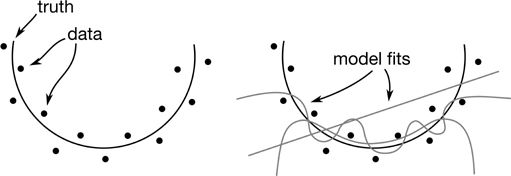
Figure 5.11 Adding complex terms lets our model wiggle more, but that variance might follow noise.
In linear regression, adding features—like polynomial terms—decreases bias but increases variance. Conversely, forcing the weights of features to zero increases bias and decreases variances.
5.6.5.3 Relating k-NN and Linear Regression
There is a nice connection between the different linear regression models and the k-NN spectrum. The constant linear model—the simplest and most biased model—predicts a single value everywhere: the mean. Similarly, a k-NN system that has k equal to the number of examples in the training dataset takes into account all of the data and summarizes it. That summary can be the mean. The most biased linear regression and nearest-neighbors models both predict the mean.
On the other end of the spectrum—the end with less bias—we get complexity in two very different ways. PlainLinear includes information from all the features, but trades off feature values, based on parameter weights, to get to a “central” predicted value. 1-NN includes information from all the features in the distance calculation, but then it only considers the closest example to get the prediction value.
It is amazingly interesting—at least to me—that consulting more examples in nearest neighbors leads to more bias, yet consulting more features in linear regression leads to less bias. An explanation is that in nearest neighbors, the only thing we do when we consult someone else is average away the differences between examples—we are smoothing out the rough edges. So, it has as much to do with our method of combining information as it does with the fact that we are consulting more examples.
5.6.5.4 Bias-Variance for Naive Bayes
There’s an elephant in the room. We’ve discussed each of the methods we introduced in Part I, except Naive Bayes (NB). So, what about the bias-variance of NB? Describing the tradeoffs with NB is a little different because Naive Bayes is more like a single point on a spectrum of assumptions. The spectrum that NB lives on has the number of conditional independence assumptions on its x axis for complexity. Naive Bayes makes almost as many of these as possible: everything is conditionally independent given the class (Figure 5.12).

Figure 5.12 Naive Bayes is one bias-variance point on a spectrum of possibilities.
If class is independent of all the features—the ultimate independence assumption—the best we can do is guess based on the distribution of the class. For a continuous target, it implies that we guess the mean. We are back to a mean-only model for our least complex, most biased, most-assumptions model within a class of models. That’s pretty convenient. Other, more complicated models that try to add complexity to NB could make fewer and fewer independence assumptions. These would come with more and more complicated claims about dependency. Eventually, we get the most complicated type of dependency: the dreaded full joint distribution. Among other problems, if we want to adequately capture the distinctions in a fully dependent joint distribution, we need an amount of data that is exponential in the number of features of the data. For each additional feature we need something like—I’m taking liberties with the values—another factor-of-10 examples. If we need 100 examples for two features, we would need 1000 for three features. Yikes. Suffice it to say, that is not good for us.
5.6.5.5 Summary Table
It might be surprising that three learning methods, each motivated by different priorities and conceptualizations of the data, all have a common starting point: in a simple enough scenario, they predict the mean. Nearest neighbors with every example? It predicts a mean, if that’s our summary calculation. Linear regression with only w0? Yup, that w0 ends up being the mean! A simpler form of Naive Bayes—Even Naiver Bayes?—is exactly the mean (or the most frequent value for a classification problem) of the output target. Each method extends that in different ways, however. Table 5.3 shows how the models have different tradeoffs in terms of bias-variance and under- and overfitting.
Table 5.3 Tradeoffs between bias and variance.
Scenario |
Example |
Good |
Bad |
Risk |
|---|---|---|---|---|
high bias & low variance |
more neighbors |
resists noise |
misses pattern |
underfit |
|
low-degree polynomial |
forced to generalize |
|
|
|
smaller or zero linear regression coefficients |
|
|
|
|
more independence assumptions |
|
|
|
low bias & high variance |
fewer neighbors |
follows complex patterns |
follows noise |
overfit |
|
high-degree polynomial |
|
memorizes training data |
|
|
bigger linear regression coefficients |
|
|
|
|
fewer independence assumptions |
|
|
|
5.7 Graphical Evaluation and Comparison
Our discussion has turned a bit towards the theoretical. You can probably tell because we haven’t seen any code for a while. I want to remedy that by going immediately to evaluating performance visually. In additional to being fun, evaluating learners visually answers important questions in ways that can be hard to boil down to a single number. Remember, single numbers—mean, median, I’m looking at you—can be highly misleading.
5.7.1 Learning Curves: How Much Data Do We Need?
One of the simplest questions we can ask about a learning system is how its learning performance increases as we give it more training examples. If the learner never gets good performance, even when we give it a lot of data, we might be barking up the wrong proverbial tree. We could also see that when we use more, or all, of our training data, we continue improving our performance. That might give us confidence to spend some real-world effort to obtain more data to train our model. Here’s some code to get us started. sklearn provides learning_curve to do the calculations we need.
In [33]:
iris = datasets.load_iris()

# 10 data set sizes: 10% - 100%
# (that much data is piped to a 5-fold CV)
train_sizes = np.linspace(.1, 1.0, 10)
nn = neighbors.KNeighborsClassifier()

(train_N,
 train_scores,
 test_scores) = skms.learning_curve(nn, iris.data, iris.target,
                                    cv=5, train_sizes=train_sizes)

# collapse across the 5 CV scores; one result for each data set size
df = pd.DataFrame(test_scores, index=(train_sizes*100).astype(np.int))
df['Mean 5-CV'] = df.mean(axis='columns')
df.index.name = "% Data Used"
display(df)
|
0 |
1 |
2 |
3 |
4 |
Mean 5-CV |
|---|---|---|---|---|---|---|
% Data Used |
|
|
|
|
|
|
10 |
0.3333 |
0.3333 |
0.3333 |
0.3333 |
0.3333 |
0.3333 |
20 |
0.3333 |
0.3333 |
0.3333 |
0.3333 |
0.3333 |
0.3333 |
30 |
0.3333 |
0.3333 |
0.3333 |
0.3333 |
0.3333 |
0.3333 |
40 |
0.6667 |
0.6667 |
0.6667 |
0.6667 |
0.6667 |
0.6667 |
50 |
0.6667 |
0.6667 |
0.6667 |
0.6667 |
0.6667 |
0.6667 |
60 |
0.6667 |
0.6667 |
0.6667 |
0.6667 |
0.6667 |
0.6667 |
70 |
0.9000 |
0.8000 |
0.8333 |
0.8667 |
0.8000 |
0.8400 |
80 |
0.9667 |
0.9333 |
0.9000 |
0.9000 |
0.9667 |
0.9333 |
90 |
0.9667 |
1.0000 |
0.9000 |
0.9667 |
1.0000 |
0.9667 |
100 |
0.9667 |
1.0000 |
0.9333 |
0.9667 |
1.0000 |
0.9733 |
learning_curve returns arrays with two dimensions: the number of training sizes by the number of cv-folds. I’ll call these (percents, folds). In the code above, the values are (10, 5). Unfortunately, turning those values—from the table immediately above—into graphs can be a bit of a headache.
Fortunately, Seaborn has—or had, it’s being deprecated—a helper we can use. We’re going to send the results to tsplot. tsplot creates multiple overlaid graphs, one for each condition, and it gives us a center and a range based on the repeated measurements we have. Remember how our college grads might have a range of possible incomes? It’s the same idea here. tsplot is geared towards plotting time series. It expects data with three components: times, conditions, and repeats. In turn, these three components become the x axis, the grouper (one line), and the repeats (the width around the line). The grouping serves to keep certain data points together; since we’re drawing multiple plots on one figure, we need to know which data belongs together in one shade. The repeats are the multiple assessments of the same scenario subject to some random variation. Do it again and you get a slightly different result. tsplot expects these components in the following order: (repeats, times, conds).
If we take the results of learning_curve and stack train_scores and test_scores on the outermost dimension, we end up with data that is structured like (train/test condition, percents, folds). We just need those dimensions turned inside out since (folds, percents, conditions) lines up with tsplot’s (repeats, times, conditions). The way we do this is with np.transpose.
In [34]:
# tsplot expects array data to have these dimensions:
# (repeats, times, conditions)
# for us, those translate to:
# (CV scores, percents, train/test)
joined = np.array([train_scores, test_scores]).transpose()

ax = sns.tsplot(joined,
                time=train_sizes,
                condition=['Train', 'Test'],
                interpolate=False)

ax.set_title("Learning Curve for 5-NN Classifier")
ax.set_xlabel("Number of Samples used for Training")
ax.set_ylabel("Accuracy");

We see some distinct steps in the testing error. Using up to about 30% of the data for training gives very poor test performance—just above 30% accuracy. Bumping the training data to 40–50% ups our test performance to 70%, a big step in the right direction. As we move from 70% to 100% of the data used for training, the test performance starts to flatten out near a respectable percent in the high 90s. What about the training side? Why does it decrease? With few enough examples, there is apparently a simple enough pattern that our 5-NN can capture all of the training data—until we get to about 60%. After that, we start losing a bit of ground on the training performance. But remember—what we really care about is the test performance.
One other takeaway: we can convert this percent into a minimum number of examples we think we need for adequate training. For example, we needed almost 100% of the joined training folds to get reasonable 5-CV testing results. That translates into needing 80% of the full dataset for training. If this was inadequate, we could consider fewer CV splits which would up the amount of training data.
5.7.2 Complexity Curves
Earlier, when we discussed under- and overfitting, we drew a graph that showed what happened to our training and testing performance as we varied the complexity of our model. Graphing that was buried deep inside some nested loops and drawing functions. We can appropriate tsplot, as we did for sample curves, to make the process fit in five logical lines of code. Since we’re not playing code-golf—not trying to minimize the number of lines of code to win a prize—I won’t literally write it in five lines.
In [35]:
num_neigh = [1, 3, 5, 10, 15, 20]
KNC = neighbors.KNeighborsClassifier
tt = skms.validation_curve(KNC(),
                           iris.data, iris.target,
                           param_name='n_neighbors',
                           param_range=num_neigh,
                           cv=5)

# stack and transpose trick (as above)
ax = sns.tsplot(np.array(tt).transpose(),
                time=num_neigh,
                condition=['Train', 'Test'],
                interpolate=False)

ax.set_title('5-fold CV Performance for k-NN')
ax.set_xlabel("
".join(['k for k-NN',
                         'lower k, more complex',
                         'higher k, less complex']))

ax.set_ylim(.9, 1.01)
ax.set_ylabel('Accuracy');

Now, I’ll leave you with a small puzzle to think about. Why does 1-NN get 100% training accuracy? Is that a good thing? When might it be a good thing? What does it mean that we seem to have the best validation test performance in the middle of the curve, near 10-NN?
I’m about to give you the answers. Look away if you want to think about them for yourself. With 1-NN, the training points are classified exactly as their own target value: they are exactly their own nearest neighbor. It’s potentially overfitting in the extreme. Now, if there is little or no noise, it might be OK. 10-NN might be a good value for our final system to deliver to our customer—it seems to make a good tradeoff between underfitting (bias) and overfitting (variance). We should assess it on a hold-out test set.
5.8 Comparing Learners with Cross-Validation
One of the benefits of CV is that we can see the variability with respect to training on different training sets. We can only do that if we keep each evaluation as a stand-alone value because we need to compare individual values against each other. That is, we need to keep each fold separated and graphically distinct. We can do that with a simple plot.
In [36]:
classifiers = {'gnb' : naive_bayes.GaussianNB(),
               '5-NN' : neighbors.KNeighborsClassifier(n_neighbors=5)}

iris = datasets.load_iris()

fig, ax = plt.subplots(figsize=(6, 4))
for name, model in classifiers.items():
    cv_scores = skms.cross_val_score(model,
                                     iris.data, iris.target,
                                     cv=10,
                                     scoring='accuracy',
                                     n_jobs=-1) # use all cores
    my_lbl = "{} {:.3f}".format(name, cv_scores.mean())
    ax.plot(cv_scores, '-o', label=my_lbl) # marker=next(markers)
ax.set_ylim(0.0, 1.1)
ax.set_xlabel('Fold')
ax.set_ylabel('Accuracy')
ax.legend(ncol=2);

We see that we have a lot of similar outcomes. 5-NN appears to win on three folds, while GNB wins on one. The others are visual ties. We would be unable to do this sort of “who won” comparison on stripplots or from calculated means. The stripplot loses the connection to the fold and the mean compresses all the comparative information in the individual folds.
5.9 EOC
5.9.1 Summary
We have become more sophisticated in the machinery we use to compare different learners: instead of single train-test splits, we make multiple splits. That’s good. We also dove into one of the fundamental theoretical issues in learning: the bias-variance tradeoff. Lastly, we’ve looked at two graphical methods learning curves, complexity curves, and comparing learners across several folds of cross-validation. However, we’re still using only a small toolbox of methods and we’re not really selecting hyperparameters for those methods in a structured way. More to come!
5.9.2 Notes
External Issues in Evaluation When we build a bridge, we want to make certain that it is safe. We want to ensure that it can handle the weight and wind—hi Tacoma Narrows!—that it will experience. Yet, before we even start construction, someone needs to ask, “Should we build a bridge?” Are there other, better alternatives? Could we build a road around a bay? Could we build a tunnel under a channel? Could we make do with daily ferries? Would it be better to do nothing now and wait until technology advances or, perhaps, more users are in need of the crossing? Each of these options may be different when measured in different ways: construction cost, durability, maintenance cost, maximum weight per vehicle, maximum throughput of vehicles, total expected lifespan, expansion cost, and travel time for the end users. There are many, many ways of comparing alternatives.
In engineering terms, these two types of assessment have specific names. When we ask “Assuming we need to build a bridge, is the bridge safe?” we are talking about verifying that the bridge is safe. When we ask “Should we build a bridge or a road or a tunnel?”, we are validating which solution we should use.
Validation: are we building the right thing to solve a problem? Should we build something else, or solve the problem a different way?
Verification: is the thing we built doing its job the right way? Does it have a low error, or make few mistakes, or not fall apart?
In this chapter, we discussed the issue of verification as it is called by engineers. Assuming that we want a learning system, how can we assess its capabilities? I hope that I’ve reminded you to think outside the box (that you’re building): maybe you would be better off seeking an alternative solution. I have one confusing footnote to add. These terms—verification and validation—come out of a specific engineering context. But within the machine learning and related communities, some of the techniques by which we verify our systems have names that include validation. For example, the machine learning evaluation technique known as cross-validation is, in the engineering terms we just introduced, verifying the operation of the system. All I can do is say, “I’m sorry.”
General Notes What we’ve referred to as training is also, under the hood, solving some sort of optimization problem. Setting the dials on our machines is really about finding some suitable best values for the dials under some constraints.
There’s an interaction between the representational power of our learning systems—our bias and variance—and the raw data we have available. For example, two points define a line. If I only have two data points, I can’t really justify anything more wiggly than a straight line. But, there are—literally!—an infinite number of ways I could generate two data points. Almost all of those are not a simple straight line.
Another interesting aspect of nearest neighbor bias is considering what happens to 1-NN when there are very many features. You may have heard that in space, no one can hear you scream. When we have many features—as the cool kids say, “When we are in high-dimensional space”—that is true. In high-dimensional space, everyone is very far from everyone else, so no one is close enough to hear you. This phenomenon is one aspect of the Curse of Dimensionality. In a learning sense, this means that no one is close enough to really know what value you should take. Our predictions don’t have enough subtlety to them: we are too biased.
There are many different ways to resample data for evaluation purposes. We discussed cross-validation and repeated train-test splitting (RTTS). RTTS is also called Monte Carlo cross-validation. When you see Monte Carlo (a famous gambling town) in a learning or statistical phrase, feel free to substitute the phrase “repeated random rolls.” Here, Monte Carlo refers to the repeated randomness of selecting train-test splits—as opposed to the one-and-done randomness of standard cross-validation. Each of the resampling evaluators is making an estimate of a target quantity. Mind-blowingly enough, this means they themselves have a bias and a variance. On dear, we’ve slipped into the meta world again! If you’d like to learn more, you can start with this mathematically dense paper by Kohavi, “A study of cross-validation and bootstrap for accuracy estimation and model selection.”
There are other, related resampling methods called the jackknife and the bootstrap. The jackknife is very similar to leave-one-out style evaluation. We’ll discuss bootstrapping in a slightly different context—essentially using repeated sampling with replacement to build models—in Section 12.3.1. When we want to account for hyperparameters, we need another level of cross-validation: nested cross-validation. We’ll discuss it in Section 11.3.
The quote from Elements of Statistical Learning (ESL) is from the first edition, page 196. Likewise, if you’d like to see the details that were swept under the carpet in the bias-variance equation, ESL has those details starting on that same page. Funny, that. Be warned, it is not easy reading. A nice answer on CrossValidated—an online statistics and machine learning community—has some useful discussion also: https://stats.stackexchange.com/a/164391/1704.
If you’re wondering why I took the time to hack through using tsplot, you can check out the sklearn docs example for making a learning curve: http://scikit-learn.org/stable/auto_examples/model_selection/plot_learning_curve.html. Drawing the graph by hand just didn’t interest me for some reason.
5.9.3 Exercises
We’ve introduced a number of evaluation techniques. We never compared them directly to each other. Can you directly compare leave-one-out with two-, three-, five-, and ten-fold cross-validation on a learning problem? Do you see any patterns as the number of folds increases?
A quick example of the variance in model estimates is the difference in training (calculating) a mean and a median from a random sample of a larger dataset. Make a small dataset with 20 random values in it. Randomly select 10 of those values and compute the mean and median of the 10 values. Repeat randomly selecting 10 values five times and compute the mean and median. How different are the 5 means? How different are the 5 medians? How do those values compare to the mean and median of the original 20 values?