
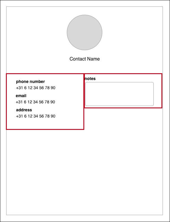
At the beginning of the chapter, you learned what adaptive layouts are and why they are important. You learned about Size Classes and trait collection briefly. In this section, we'll take a deep dive into these topics by implementing an adaptive contact detail page. You'll learn the best practices to implement a layout that will be tweaked for different Size Classes. Finally, you'll learn how to make use of Auto Layout and Size Classes in code because, sometimes, you need to change a layout at runtime. The layout we'll build is presented in the following image:
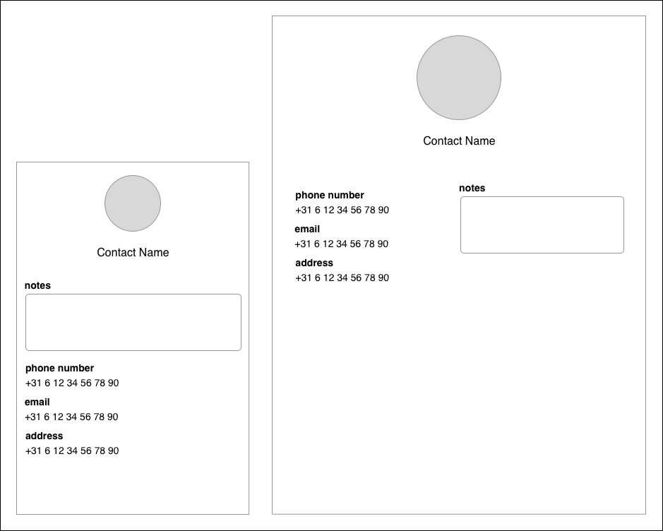
The contact detail page will contain some of the contact's information, and the user can add notes to a contact. On small screens, the layout is just a single column: the notes field at the top, and the rest follows. On larger screens, the layout will be split across two columns to make good use of the available space. Let's do this.
The strategy to build a layout like this is to begin by adding constraints that will apply to any Size Class. This allows you to specify a general layout first and tweak it for other Size Classes. By taking this approach, you will end up with the least amount of constraints needed to have an adaptive layout. Less constraints means better maintainability, and it will make your layout easier to reason about.
By default, the Interface Builder is set to apply constraints to all Size Class combinations. This could also be referred to as any width x any height constraint because it applies to any Size Class. If you want to add constraints to a specific Size Class variation, you can use the Vary for Traits button in the bottom-right corner of the device preview section. Before you press this button, you should select a device or view that has the traits you want to vary for. Try to click on it and see what happens. Make sure that you exit this mode before you continue. Start by removing the initial UILabel so you will have a clean slate to start with.
One consideration to take into account is the text input in the notes field. A keyboard will appear and in landscape orientations it might cover the input. A great way to allow the user to still see what they're doing is to contain your layout in a scroll view. Doing this proves to be quite tricky in Auto Layout, so let's tackle that first. After that, we'll lay out the rest of this screen by following these steps:
- Adding a scroll view that will contain the entire layout.
- Laying out the image and label.
- Laying out the contact image size for large screens.
- Laying out the bottom section of the contact detail page.
- Laying out the bottom section of the contact detail page for small screens.
A scroll view is a very convenient way to deal with the keyboard. Using a scroll view, the user can easily decide which part of the UI they want to see when the keyboard overlays a part of the view. However, a scroll view needs to know how large its child content is in order to enable scrolling. Doing this in Auto Layout isn't very straightforward, but it's a great exercise.
The most important aspect is that you need to make sure that the scroll view is pinned to the superview's edges, and it must have only one content view. This content view will have an equal width to the main view. Finally, the content view needs to be pinned to all the edges of the scroll view. Let's add these constraints step by step, as follows:
- Make sure that you uncheck Adjust Scroll View Insets in the Attributes Inspector for the entire view controller.
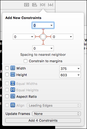
- Drag a scroll view out from the Object Library and add it to the view. Resize it so it covers the view; don't make it cover the navigation bar. Add constraints through the Pin menu, as shown in the following screenshot:
- Now, drag a regular
UIViewout to the view and make sure that it's a subview of the scroll view. Manually size it so that it covers the entire scroll view. Add the same constraints you added to the scroll view so all the edges are pinned to the superview edges. The content view also needs to be constrained to have an equal width to the main view. Select the content view you just added and press Ctrl. Now, drag it to the scroll view's parent: the main view. You can now select Equal Width to set an equal width between the content view and the main view. This is done so the scroll view knows how wide its contents will be.
A scroll view with Auto Layout uses its single-child view to determine the scroll width and height. Our app needs a width that's equal to the screen and a dynamic height based on its content. After step 3, there is an Auto Layout issue that needs to be resolved. This issue is due to the ambiguous height of the content view. We'll add some child views soon; by pinning these to the top and bottom of the content view, the content view will be able to calculate the height of its content. The scroll view will use this height as its scroll height.
This step will focus on adding the contact's image and its name label to the scroll view's content view. To do this, first drag out UIImageView and UILabel from the Object Library. Position them so that they both are horizontally centered in the view. Also, position them so they have about 10 points of spacing on the vertical axis. Don't forget to apply a nice light gray background color to the image.
You've already seen the following two ways to add constraints:
- Have Xcode add constraints for you
- Add constraints through the menu in the bottom-right corner
We'll add a third technique to that list: Ctrl + dragging. You already did this while setting up the scroll view but it also works when dragging from one view to another in your design preview.
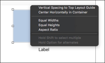
If you select the UIImageView and drag it upward while pressing Ctrl, you can add constraints that relate to the view you started dragging it from, the view you let go in, and the direction you were dragging in. Try this now; a menu such as the one in the following screenshot should appear. Press shift and select Vertical Spacing to Top Layout Guide and Center Horizontally in Container. An Add Constraints option should have appeared at the bottom of the list. Click on that to add the selected constraints. Moving forward, this will be the preferred way to add constraints:
To give the UIImageView the appropriate width and height, press Ctrl and drag on the image itself. If you drag and release in a horizontal direction, you can add a width constraint, and dragging vertically allows you to add a height constraint. You can't set the value though; the value will be set to whatever the current size is.
If you want to change the value of a constraint, go to the Size Inspector on the right-hand side of the screen and double click on a constraint. This allows you to change the Constant for a constraint. When you're setting a size constraint, the constant will refer to that size. When setting spacing, the constant will refer to the current amount of spacing. Click on the image and correct the width and height constraints so the image will be 60x60 points. Update the preview by clicking on the Update Frames option in the Resolve Auto Layout Issues menu you've used before. It's located in the bottom-right section of the window.
Now, let's add some constraints to lay out the UILabel. Position the UILabel approximately 10 points below the image and make sure that it's centered. Now, press Ctrl and drag the UILabel to the UIImageView. Press Shift and add Vertical Spacing and Center Horizontally constraints. This will set up constraints that horizontally center the UILabel relative to the UIImageView. It also adds a constraint that vertically spaces the UILabel from the UIImageView. Finally, drag downward from the UILabel to set its vertical spacing to the container view. Modify this constraint so the UILabel has a spacing of 8 to its container's bottom. This will make sure that the content view has a height, and this resolves the Auto Layout issue we had before.
Change the preview to a couple of different devices and the image and label should always appear nicely centered on every layout. The designs we saw earlier had a larger image on the iPad. This means that we need to add separate sizing constraints for this device. This is what the next step is about.
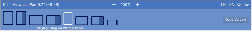
When you click on the Vary for Traits button, you are presented with two options to base your variation on. You can vary either for the width, height, or both. If you select width, any new constraints you add will apply to all viewports that match the horizontal Size Class that's currently active. So, for example, if you have the iPad view selected and you vary for width, you can see that there are eight possible viewports for your app. These are the landscape and portrait iPad and iPad Pro, and also the 2/3 width multitasking views and the landscape plus sized iPhone. You can see each possible variation that you're currently designing for in the device preview list:
To make the larger image look good, you should vary on both the width and height. If the larger image appears on an iPhone 6 plus in landscape mode, it will cover too much of the viewport so the bigger image should only be shown on devices that can accommodate it on both the horizontal and vertical axis.
Click on Vary for Traits again, and this time check the width and height boxes. You'll notice that the iPhone isn't in the list of devices anymore because a landscape iPhone 6 plus has a regular width and a compact height. On the left-hand side of the Interface Builder window, you can find the document outline. In this outline, look for your image view. You can see the constraints listed under the image view. Expand the constraints and select the width constraint. At the bottom of Attributes Inspector on the right side of the screen, you'll find a plus icon and a checkbox labeled Installed. Click on the plus symbol and navigate to Regular width | Regular height | Any gamut (current) option. After doing this, an extra checkbox will appear. Uncheck it so the width constraint is not installed for the current variation. Do the same for the image's height constraint. After doing this, the image might not be visible anymore because Auto Layout doesn't know its dimensions.
With the image view selected, go to the Size Inspector and set the image's size to 120x120. This will make the image reappear. Now, use the Ctrl + drag technique to add width and height constraints, as you have done before. If you inspect these constraints, you'll see that they have a similar setup with their installation checkboxes, except that the general one is unchecked and the specific one is checked. Great! This means you've successfully set up the constraint variations for your app. Go ahead and exit the variation mode by clicking on the Done Varying button and check out your layout on several screens. If the image size doesn't update automatically, select the entire view and update the frames from the Resolve Auto Layout Issues menu.
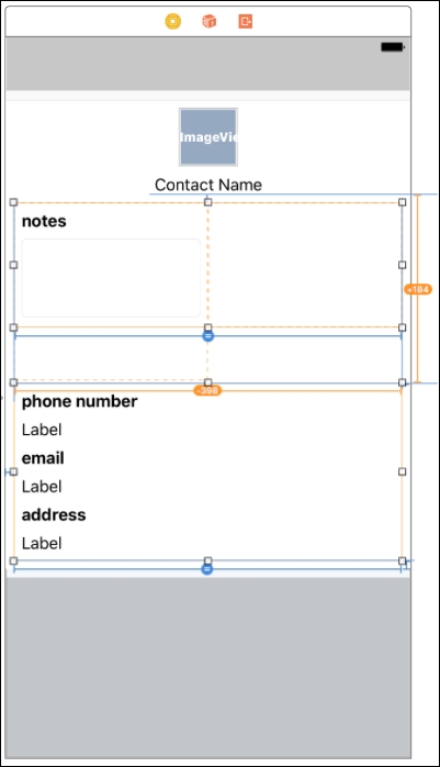
The bottom section for this page looks simple but we'll need to think very carefully about the way it's set up. On small screens, all of the elements should be displayed in a single column. Larger screens have two columns. The simplest way to do this is to wrap both of these sections in a container view as shown in the following diagram:
The challenge here is to figure out how to make sure that the content view knows its height. Previously, we added a constraint that pinned the bottom of the contact name label to the bottom of the content view. Now, we'll add this constraint to the left view since it's the highest view we need to work with.
Drag two UIViews into the content view. It will be easier to work with the views if you have some more room. In the Document Outline, find the constraint that looks like bottom = Label.bottom. This constraint currently pins the label's bottom edge to the content view's bottom edge. Select it and delete it by pressing the Delete key or cmd + Backspace.
Now, size the two UIViews so they meet approximately in the middle. They shouldn't overlap but there should be no horizontal space between them. Drag the left edge of the left view to the left side of the content view until you see the blue helper lines. Then, do the same for the right side. Position them both so they are ±40 points below the contact name label.
Select the left view, press Ctrl, and drag it to the contact name label to add a vertical spacing constraint. Then, drag it to the left side to pin this view's left side to the content view's leading edge. Now, select the right view and do the same, except, instead of dragging left you drag right to pin the right side to the content view's trailing edge. Finally, Ctrl + drag from the left view to the right view and select an equal width constraint. This should leave you with two equally sized views that don't have a height yet.
Drag six UILabels into the left view. Align them as they are in the design. Use the blue lines as guides for the margins, and make the labels wide enough to cover the view. Stop at the blue lines again; they help you to give some natural margins. Press Ctrl and drag the first label upward to pin it to the top side of the view. Press Ctrl and drag left to pin it to the left side, and press Ctrl and drag right to pin it to the right side. Then, select the second label and drag it toward the first label. While holding the Shift key, select the leading, trailing, and vertical spacing constraints. Repeat this for all other labels. The final label should be pinned to the bottom of the view.
Now, drag a label and the text field to the right-side view. Align the elements by using the blue lines again. Pin the label to the top, right, and left sides of its containing view. Drag the text field to the label and select the leading, trailing, and vertical spacing constraints. Finally, drag upward inside of the text field to add a height constraint. Modify this constraint so the text field has a height of 80. Finally, press Ctrl and drag downward to pin the bottom of the text field to the bottom of the view.
The final layout step is to press Ctrl and drag the left view down into the content view. Select the vertical spacing constraint and modify the constant so the final spacing is 8. Now, use Attributes Inspector to make the header labels a bold font and provide the appropriate text values for them. Try to run your app on an iPad; looks pretty good, right?
The layout we have so far looks pretty good on the iPad. However, it's just too cramped on the iPhone in the portrait mode. Let's create some room by changing to a single column layout. First, select an iPhone view and click on the Vary for Traits button. This time, select only the width property.
The easiest way to pull off a change this big is to rearrange the view first without modifying the constraints yet. Rearrange the views so they look as shown in the following screenshot:
Then, it's a good idea to add constraints that you know are missing. In this case, the following constraints are missing:
- Top view with notes to the left side of the content view
- Vertical spacing between the top and bottom view
- Bottom view to the right side of the content view
Add the constraints by pressing Ctrl and dragging as we have done before. You'll end up with a lot of errors and red lines. This is due to the need to clean up conflicting constraints we don't need right now. The constraints we need to remove are as follows:
- Vertical spacing between the former left view and the contact name label
- Horizontal spacing between the former left and right view
- Equal with constraint
Select the top view and look for the Leading Space to: View constraint. Double click on it and use the plus in the bottom to add an exception. Use the drop-down menu and navigate to Compact Width | Any Height | Any Gamut. This will configure the constraint for a device that has a compact width form factor, regardless of its height. Make sure that you uncheck the installation box for this variation. Do the same for the other two constraints. You can find these constraints by selecting either of the views related to the constraint you're looking for.
Finally, select the vertical spacing constraint for the top and bottom view and modify the constant to 8; this will provide a nice spacing between the two sections. You're done modifying the constraints now; no conflicts should remain and your layout should now look good on all devices. Check out the plus-sized iPhone in particular, it will switch between the single and two column layouts! Pretty cool, isn't it? If you run in landscape on other devices, you'll notice that you can nicely scroll the contents as well.
Before we deep dive into Auto Layout on the code side, there's one last thing that needs to be fixed. Whenever the keyboard appears, we want to resize the scroll view so a user can still see the entire page. To do this, we will need to create an @IBOutlet for the bottom constraint of the scroll view and then we will need to programmatically set the constant for the bottom constraint to the height of the keyboard. Define the following @IBOutlet in ContactDetailViewController.swift and connect it by dragging from the Connections Inspector to the scroll view's bottom constraint in the Document Outline:
@IBOutlet scrollViewBottomConstraint: NSLayoutConstraint!
Then, add the following lines to ContactDetailViewController.swift:
override func viewWillAppear(_ animated: Bool) {
    super.viewWillAppear(animated)

    NotificationCenter.default.addObserver(self,
        selector: #selector(self.onKeyboardAppear(notification:)),
        name: .UIKeyboardWillShow,
        object: nil)

    NotificationCenter.default.addObserver(self,
        selector: #selector(self.onKeyboardHide(notification:)),
        name: .UIKeyboardWillHide,
        object: nil)
}

override func viewWillDisappear(_ animated: Bool) {
    super.viewWillDisappear(animated)

    NotificationCenter.default.removeObserver(self)
}
The preceding code subscribes the detail page to keyboard notifications. Whenever the keyboard appears, the system posts a notification that any object can listen to. Whenever the notifications are fired, a selector is performed on the view controller. This selector points to a function in the view controller. We're adding and removing ourselves as observers when the view shows and hides to make sure that we clean up after ourselves like we should. Now, let's implement the actual handling of this notification, which is as follows:
func onKeyboardAppear(notification: NSNotification) {
    guard let userInfo = notification.userInfo,
        let keyboardFrameValue = userInfo[UIKeyboardFrameEndUserInfoKey] as?
          NSValue,
        let animationDuration = userInfo[UIKeyboardAnimationDurationUserInfoKey]
          as? Double else {
            return
    }

    scrollViewBottomConstraint.constant =
      keyboardFrameValue.cgRectValue().size.height
      UIView.animate(withDuration: TimeInterval(animationDuration), animations: {
          [weak self] in self?.view.layoutIfNeeded()
    })
}

func onKeyboardHide(notification: NSNotification) {
    guard let userInfo = notification.userInfo,
        let animationDuration = userInfo[UIKeyboardAnimationDurationUserInfoKey]
          as? Double else {
            return
    }

    scrollViewBottomConstraint.constant = 0
    UIView.animate(withDuration: TimeInterval(animationDuration), animations: {
      [weak self] in
        self?.view.layoutIfNeeded()
    })
}
The preceding methods read the userInfo dictionary of the notification and extract the keyboard's end frame and the time it takes for the keyboard to appear. After doing that, this information is used to animate the scroll view's bottom up or down view so it adjusts its size to the visible portion of the screen.
Auto Layout is a technique that is present throughout iOS, both in the Interface Builder and in code. We've created the contacts page entirely in the Interface Builder and that's very convenient. However, there are times when you might not be able to create the layout before the app runs. Let's call the moment of designing in the Interface Builder as the design time. At design time, it's possible that not all variables in your design are known. This means that you will need to dynamically add, remove, or update constraints when the app is running at runtime.
Auto Layout in code is really well supported, and even the Interface Builder understands that you can't always know everything. You can mark constraints as placeholder constraints in the Attributes Inspector. Marking a constraint as a placeholder means that it was used to create a valid layout for the Interface Builder at design time, but you'll replace that constraint at runtime.
When you use Auto Layout in code, you can dynamically update constraints by changing the constant for a constraint at runtime. It's also possible to activate or deactivate certain constraints and to add or remove them. It doesn't matter if you created the constraints you're modifying in code or the Interface Builder. Any constraints that affect a view are accessible through code.
The best way to explore this is to get started with some coding. For the sake of this exercise, we'll recreate the top part of the contact detail page in code. This means we'll set the constraints affecting the contact image and the contact name label as placeholder constraints in the Interface Builder. The constraints for these views will then be added in the ViewController, and we'll toggle some constraints' active states based on the current size class. We'll also watch for changes in the size class and update the constraints accordingly.
To get started, create a new UIViewController subclass (navigate to File | New | File...) and name it ContactDetailViewController. Assign this class to the contact detail screen's view controller in the Interface Builder. Now open the ContactDetailViewController.swift file and add two @IBOutlets: one for the contact image and one for the contact label. While you're at it, remove the unused code, except for viewDidLoad. You should end up with the following code for ContactDetailViewController:
class ContactDetailViewController: UIViewController {

    @IBOutlet var contactImage: UIImageView!
    @IBOutlet var contactNameLabel: UILabel!

    override func viewDidLoad() {
        super.viewDidLoad()

        // Do any additional setup after loading the view.
    }

}
This code shouldn't have any surprises for you. Now, open the Main.storyboard file, select your view controller, and connect the outlets in the Connections Inspector to the correct views. Now, we'll change the existing constraints that position these two views to be placeholder constraints. The constraints that we will need to change are as follows:
- Width constraints for the image (both Regular and Compact)
- Height constraints for the image (both Regular and Compact)
- Top spacing constraint for the image
- Horizontal center constraint for the image
- Spacing constraint between the label and the image
- Horizontal center constraint for the label
The vertical spacing constraint between the label and the bottom views should remain intact. To change a constraint to a placeholder, you will need to select it and check the placeholder checkbox in the Attributes Inspector. If you build and run your app after doing this, you'll end up with a completely white view. That's okay; we just removed some essential constraints that need to be re-added in code.
To get everything up and running again, we'll write some code to implement the eight constraints that were removed. One of the tools available to us is Visual Format Language (VFL). This language is an expressive, declarative way to describe Auto Layout constraints. You can describe multiple constraints that affect multiple views at once, which makes this language very powerful.
A visual format string contains the following information:
- Information regarding its orientation: This is either horizontal (H),vertical (V), or not specified. The default is horizontal.
- Leading space to superview: This is optional.
- Affected view: This is required.
- Connection to another view: This is optional.
- Trailing space to superview: This is optional.
An example of a format string looks like this:
V:|-[contactImageView(60)]-[contactNameLabel]
Let's take this string apart piece by piece to see what it does:
V:: This specifies that this format string applies to the vertical axis.|: This represents the superview.-: This applies a standard spacing of ±8 points. This is equivalent to spacing a view in the Interface Builder using the blue guidelines.[contactImageView(60)]: This places thecontactImageViewand gives it a height of 60 points. The placement will be ±8 points from the top of the superview.-: This applies another standard spacing.[contactNameLabel]: This placescontactNameLabelwith ±8 points of spacing fromcontactImageView.
This way of describing layouts takes some time getting used to, but it's a really powerful way to describe layouts. Once you get the hang of all definitions and possibilities, you'll find that a visual format string is very descriptive of the constraints it represents.
Let's dive right in and take a look at how to implement the entire layout for the top section of the contact detail page. We'll only create the constraints for the Compact Size Class for now and we'll add the Regular constraints later.
To implement the compact size layout, we'll use VFL and anchors. Anchors are fairly straight forward, so let's have a look at the implementation right away and discuss them later.
First, add the following two variables that will be used later to activate and deactivate the compact size constraints:
var compactWidthConstraint: NSLayoutConstraint!
var compactHeightConstraint: NSLayoutConstraint!
These variables will be set in viewDidLoad, and we're using implicitly unwrapped optionals for them. This means that we must set these variables before attempting to use them, otherwise the app will crash due to an unexpected nil value.
Note
You often want to avoid implicitly unwrapping optionals. Using optionals without implicit unwrapping enforces safety because you need to unwrap these values before attempting to use them. However, in some cases, you want your program to crash if a value isn't set; for instance, when there's no sensible way to recover from such a missing value. Scenarios like these are very rare, and you should use implicit unwrapping with great caution. In this example, it's used for brevity.
The following code should be added to the viewDidLoad method:
let views: [String: Any] = ["contactImage": contactImage,
                            "contactNameLabel": contactNameLabel]
var allConstraints = [NSLayoutConstraint]()

compactWidthConstraint = contactImage.widthAnchor.constraint(
                          equalToConstant: 60)

compactHeightConstraint = contactImage.heightAnchor.constraint(
                           equalToConstant: 60)

let verticalPositioningConstraints = NSLayoutConstraint.constraints(
    withVisualFormat: "V:|-[contactImage]-[contactNameLabel]",
    options: [NSLayoutFormatOptions.alignAllCenterX],
    metrics: nil,
    views: views)

allConstraints += verticalPositioningConstraints

let centerXConstraint = contactImage.centerXAnchor.constraint(
    equalTo: self.view.centerXAnchor)

allConstraints.append(centerXConstraint)
allConstraints.append(compactWidthConstraint)
allConstraints.append(compactHeightConstraint) NSLayoutConstraint.activate(allConstraints)
In the preceding code snippet, we created a dictionary of views, which is used later in VFL. We will also instantiate an empty array of constraints. This array will be used to activate all the constraints at once. The following lines assign values to the variables you added before adding this code snippet. These lines make use of the anchor technique to add constraints. You'll notice that the syntax is fairly straight forward. The constraint method is called on the anchor we wish to use, and the desired value is passed as an argument.
The vertical positioning is defined in VFL. A string is passed that vertically aligns the views with standard spacing. There's also an option passed to align all views involved on the x axis so they're centered and finally the views dictionary is passed in. This dictionary is used to map the string values in the format string to the views we want to lay out. The resulting constraints are then merged with the allConstraints array.
Next, the contact image is aligned to the main view's x axis by using the anchor technique again. Finally, the three constraints that were created using anchors are added to the list of constraints and all of the constraints get activated at once. If you test your app on an iPhone now, everything should work out as expected.
In order to implement the layout for regular size devices, the trait collection is used. As mentioned earlier, this collection contains information about the current environment your app is running in. All UIViews, UIViewControllers, UIWindows, UIPresentationConrollers, and UIScreen conform to the UITraitEnvironment. This means all these classes have a traitCollection attribute. They also implement a traitCollectionDidChange(_:) method. This method gets called whenever the traitCollection changes. We'll use the property and method to correctly adapt the layout.
First, we'll update viewDidLoad so it applies the correct layout right off the bat. Then, we'll watch for changes in the trait collection and update the constraints accordingly. Let's start by adding the following two variables in ContactDetailController.swift:
var regularWidthConstraint: NSLayoutConstraint!
var regularHeightConstraint: NSLayoutConstraint!
These variables will hold the larger width and height for the contactImage. Now, update viewDidLoad as follows; the code you will need to add or modify is highlighted:
// unchanged implementation

compactWidthConstraint = contactImage.widthAnchor.constraint(
    equalToConstant: 60)

compactHeightConstraint = contactImage.heightAnchor.constraint(
    equalToConstant: 60)

regularWidthConstraint = contactImage.widthAnchor.constraint(
equalToConstant: 120)
regularHeightConstraint = contactImage.heightAnchor.constraint(
    equalToConstant: 120)

// unchanged implementation

allConstraints.append(centerXConstraint)

if traitCollection.horizontalSizeClass == .regular &&
    traitCollection.verticalSizeClass == .regular {
    allConstraints.append(regularWidthConstraint)
    allConstraints.append(regularHeightConstraint)
} else {
    allConstraints.append(compactWidthConstraint)
    allConstraints.append(compactHeightConstraint)
}

NSLayoutConstraint.activate(allConstraints)
The first modification is to create two new anchor-based constraints. The second is to check the current traits and make sure that both the horizontal and the vertical size classes are regular. Size Classes in code work the same as they do in the Interface Builder. Previously, we only wanted to target devices that are of regular width and regular height, so this still applies. By selectively appending these constraints to all the constraints' array, we can immediately apply the correct layout.
When a user is using an iPad, your app can suddenly change from a Regular x Regular environment to a Compact x Regular environment. To adapt to the layout accordingly, you need to implement the traitCollectionDidChange(_:) method. By implementing this method, you can check the new and old traits and decide whether to activate or deactivate certain constraints.
This is exactly what we need to do to make the contact detail page adapt to the changing environment. Add the following code to ContactDetailController.swift:
override func traitCollectionDidChange(_ previousTraitCollection: UITraitCollection?) {
    super.traitCollectionDidChange(previousTraitCollection)

    guard let previousTraits = previousTraitCollection where
        previousTraits.horizontalSizeClass != traitCollection.horizontalSizeClass ||
            previousTraits.verticalSizeClass != traitCollection.verticalSizeClass else {
                return
    }

    if traitCollection.horizontalSizeClass == .regular &&
        traitCollection.verticalSizeClass == .regular {

        NSLayoutConstraint.deactivate([compactHeightConstraint, compactWidthConstraint])
        NSLayoutConstraint.activate([regularHeightConstraint, regularWidthConstraint])
    } else {
        NSLayoutConstraint.deactivate([regularHeightConstraint, regularWidthConstraint])
        NSLayoutConstraint.activate([compactHeightConstraint, compactWidthConstraint])
    }
}
The preceding code first calls the superclass implementation. This makes sure that any default work implemented in the superclass gets executed. Then, we will make sure that there is a previous trait collection and that, at least, one size class has changed. If this isn't the case, we will return early because there is no work to be done. This check prevents the constraints from being updated when the Size Classes haven't changed at all.
If there's a change in Size Class and the current Size Classes are checked, based on these new values, we will deactivate and activate the relevant constraints.
Implementing an adaptive layout in code requires more work than in the Interface Builder. However, the tools make it fairly straight forward. Most of the time, you'll find that the Interface Builder works perfectly fine, but whenever you need more control you can drop down to the code level and take it from there.