20. Working with Images and Filters
Images and image handling are central to many iOS apps. At a basic level, images are a necessary part of customizing the user interface, from custom view backgrounds to custom buttons and view elements. Beyond that, iOS 6 added sophisticated support for customizing user-provided images with the Core Image library. Previous to iOS 6, doing image manipulations required custom image-handling code using Quartz or custom C libraries. With the addition of Core Image, many complex image-editing functions demonstrated by successful apps, like Instagram, can now be handled by iOS with minimal effort.
This chapter describes basic image handling: how to load and display an image, how to handle images on devices with different capabilities, and some basic image display techniques. It also describes how to acquire an image from the device’s image library or camera. In addition, this chapter demonstrates and describes how to use the Core Image library to apply effects to user-provided images.
The Sample App
The sample app for this chapter is called ImagePlayground. It demonstrates selecting an image from the device’s photo library or acquiring an image from the camera to be used as a source image, which the app then resizes to a smaller size. The user can select and chain filters to apply to the source image to alter how it looks, with the effect of each filter displayed in a table alongside the name of each selected filter. The filter selection process demonstrates how Core Image filters are organized into categories, and enables the user to customize a selected filter and preview its effect.
Basic Image Data and Display
Some basic image-handling techniques are required to support the images displayed in the sample app. This section describes different techniques for displaying images in a view and for handling stretchable images that can be used in buttons of different sizes, and it explains the basic approach needed to acquire an image from the user’s photo library or camera.
Instantiating an Image
To use an image in an app, iOS provides a class called UIImage. This class supports many image formats:
 Portable Network Graphics (PNG):
 .png
Tagged Image File Format (TIFF): .tiff, .tif
Joint Photographic Experts Group (JPEG): .jpeg, .jpg
Graphics Interchange Format (GIF): .gif
Windows Bitmap Format (DIB): .bmp, .BMPf
Windows Icon Format: .ico
Windows Cursor: .cur
X BitMap: .xbm
When images are used for backgrounds, buttons, or other elements in the user interface, Apple recommends using the PNG format. UIImage has a class method called imageNamed: that can be used to instantiate an image. This method provides a number of advantages:
Looks for and loads the image from the app’s main bundle without needing to specify the path to the main bundle.
Automatically loads a PNG image with no file extension. So specifying myImage will load myImage.png if that exists in the app’s main bundle.
Takes into consideration the scale of the screen when loading the image, and @2x or @3x is automatically appended to the image name if the scale of the screen is greater than 1.0. In addition, it will check for ~ipad and ~iphone versions of the images and use those if available.
Supports in-memory caching. If the same image has already been loaded and is requested again, it will return the already-loaded image and not reload it. This is useful when the same image is used multiple times in the user interface.
For images that are not present in the app’s main bundle, when the imageNamed: method is not appropriate, there are several other approaches to instantiate images. A UIImage can be instantiated from a file, as in this code example, which will load myImage.png from the app’s Documents directory:
NSArray *pathForDocuments = NSSearchPathForDirectoriesInDomains(NSDocumentDirectory,
NSUserDomainMask, YES);
NSString *imagePath = [[pathForDocuments lastObject] stringByAppendingPathComponent:@"myImage.png"];
UIImage *myImage = [UIImage imageWithContentsOfFile:imagePath];
A UIImage can be instantiated from NSData, as in the next code example. NSData can be from any source; typically, it is from a file or from data pulled from a network connection.
NSData *imageData = [NSData dataWithContentsOfFile:imagePath];
UIImage *myImage2 = [UIImage imageWithData:imageData];
A UIImage can be created from Core Graphics images, as in this code example, which uses Core Graphics to take a sample rectangle from an existing image. A Core Graphics image (CGImage or CGImageRef) represents the Core Graphics image data.
CGImageRef myImage2CGImage = [myImage2 CGImage];
CGRect subRect = CGRectMake(20, 20, 120, 120);
CGImageRef cgCrop = CGImageCreateWithImageInRect(myImage2CGImage, subRect);
UIImage *imageCrop = [UIImage imageWithCGImage:cgCrop];
A UIImage can be created from Core Image images, as described in detail later in “Core Image Filters,” in the subsection “Rendering a Filtered Image.”
Displaying an Image
After an instance of UIImage is available, there are a few ways to display it in the user interface. The first is UIImageView. When an instance of UIImageView is available, it has a property called image that can be set:
[self.sourceImageView setImage:scaleImage];
UIImageView can also be instantiated with an image, which will set the bounds to the size of the image:
UIImageView *newImageView = [[UIImageView alloc] initWithImage:myImage];
For images displayed in a UIImageView, setting the contentMode can have interesting and useful effects on how the image is displayed, as shown in Figure 20.1.
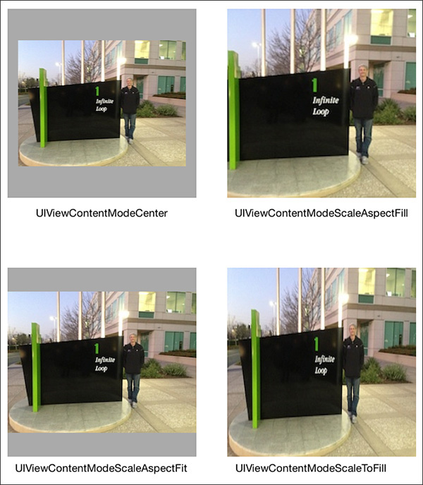
The content mode setting tells the view how to display its contents. Aspect fit and fill modes will preserve the aspect ratio of the image, whereas scale to fill mode will skew the image to fit the view. Modes such as center, top, bottom, left, and right will preserve the dimensions of the image while positioning it in the view.
Several other UIKit items support or use images, for example, UIButton. A useful technique for buttons or especially other resizable user interface elements is to utilize the resizable image capability provided by the UIImage class. This can be used to provide the same style for buttons of different sizes without warping or distorting the edges of the button image, as shown in Figure 20.2. Resizing images this way is optimized in UIKit and is quick and efficient; it can greatly reduce the number and size of assets needed in an app.

The source image for the button is only 28 pixels by 28 pixels. The resizable image used in the background is created from the original image; edge insets are specified to indicate which parts of the image should be kept static, and which parts can be stretched or tiled to fill in the additional space.
UIImage *startImage = [UIImage imageNamed:@"ch_20_stretch_button"];
CGFloat topInset = 10.0f;
CGFloat bottomInset = 10.0f;
CGFloat leftInset = 10.0f;
CGFloat rightInset = 10.0f;
UIEdgeInsets edgeInsets = UIEdgeInsetsMake(topInset, leftInset, bottomInset, rightInset);
UIImage *stretchImage = [startImage resizableImageWithCapInsets:edgeInsets];
[self.selectImageButton setBackgroundImage:stretchImage
forState:UIControlStateNormal];
[self.selectImageButton setBackgroundImage:stretchImage
forState:UIControlStateSelected];
[self.selectImageButton setBackgroundImage:stretchImage
forState:UIControlStateHighlighted];
[self.selectImageButton setBackgroundImage:stretchImage
forState:UIControlStateDisabled];
Tip
Update old projects in Xcode 5 and later to use the Asset Catalog, which can automatically support resizable images with no code. The Asset Catalog includes a visual editor to establish the image slicing, and calling imageNamed: for a sliced asset name will return a resizable image.
Using the Image Picker
It is common for apps to make use of images provided by the user. To allow an app access to the user’s photos in the camera roll and photo albums, iOS provides two approaches: the UIImagePickerController and the asset library. The UIImagePickerController provides a modal user interface to navigate through the user’s albums and photos, so it is appropriate to use when Apple’s provided styling works for the app and there are no special requirements for photo browsing and selection. The photo library provides full access to the photos and albums, so it is appropriate to use when there are specific user-interface and styling requirements for navigating and selecting images. The photo library is fully described in Chapter 24, “Accessing the Photo Library.”
To see how to use a UIImagePickerController, refer to the selectImageTouched: method in ICFViewController in the sample app. The method starts by allocating and initializing an instance of UIImagePickerController.
UIImagePickerController *imagePicker = [[UIImagePickerController alloc] init];
The method then customizes the picker. The UIImagePickerController can be customized to acquire images or videos from the camera, from the photo library, or from the saved photos album. In this case, the photo library is specified.
[imagePicker setSourceType: UIImagePickerControllerSourceTypePhotoLibrary];
A UIImagePickerController can be customized to select images, videos, or both, by specifying an array of media types. Note that the media types which can be specified are constants that are defined in the MobileCoreServices framework, so it is necessary to add that framework to the project and import it in the view controller. For the sample app, only photos are desired, so the kUTTypeImage constant is used.
[imagePicker setMediaTypes:@[(NSString*)kUTTypeImage]];
The picker can be customized to allow or prevent editing of the selected image. If editing is allowed, the user will be able to pinch and pan the image to crop it within a square provided in the user interface.
[imagePicker setAllowsEditing:YES];
Lastly, the picker receives a delegate. The delegate is informed when the user has selected an image or has cancelled image selection according to the UIImagePickerControllerDelegate protocol. The delegate is responsible for dismissing the image picker view controller.
[imagePicker setDelegate:self];
In the sample app, the image picker is presented in a popover view controller using the source image container view as its anchor view.
self.imagePopoverController = [[UIPopoverController alloc] initWithContentViewController:imagePicker];
[self.imagePopoverController presentPopoverFromRect:self.sourceImageContainer.frame inView:self.view permittedArrowDirections:UIPopoverArrowDirectionAny animated:YES];
When the user has selected an image and cropped it, the delegate method is called.
- (void)imagePickerController:(UIImagePickerController *)picker didFinishPickingMediaWithInfo:(NSDictionary *)info
{
...
}
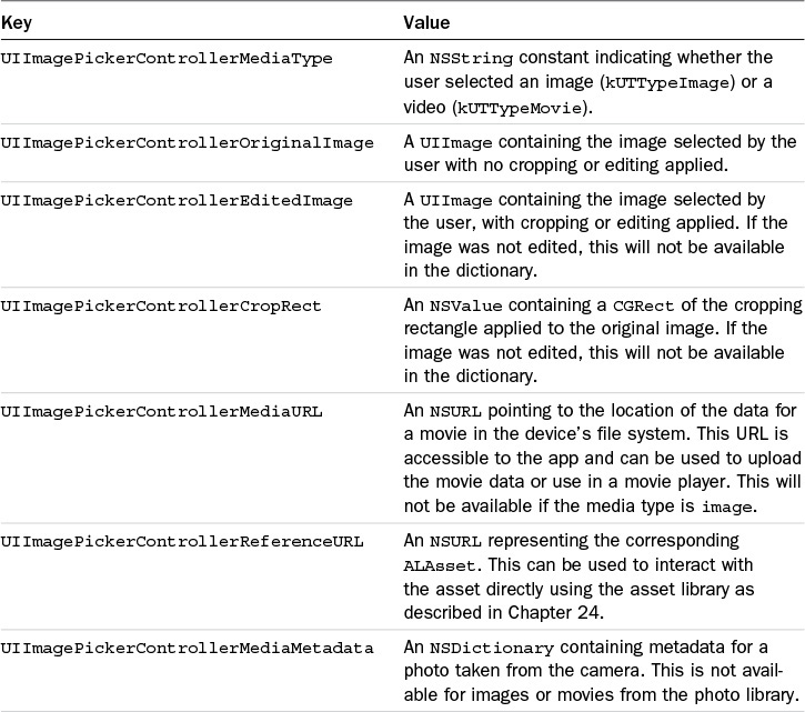
The delegate is provided with a dictionary of information about the selected media. If editing occurred during the selection process, information about the editing that the user performed is included in the dictionary. The keys and information contained in the info dictionary are described in Table 20.1.
In the sample app, the selected image is resized to 200px by 200px so that it will be easy to work with and will fit nicely in the display. First, a reference to the editing image is acquired.
UIImage *selectedImage = [info objectForKey:UIImagePickerControllerEditedImage];
Then a CGSize is created to indicate the desired size, and a scale method in a category set up for UIImage is called to resize the image. The resized image is then set as the image to display in the user interface.
CGSize scaleSize = CGSizeMake(200.0f, 200.0f);
UIImage *scaleImage = [selectedImage scaleImageToSize:scaleSize];
[self.sourceImageView setImage:scaleImage];
After the image is set, the popover with the image picker is dismissed.
Resizing an Image
When images are being displayed, it is advisable to work with the smallest image possible while still maintaining a beautiful user interface. Although the sample app certainly could use the full-size selected image, performance will be affected if a larger image is used and there will be increased memory requirements to handle a larger image. Therefore, the sample app will resize a selected image to work with the image at the exact size needed for the user interface and no larger. To scale an image in iOS, the method will need to use Core Graphics. The sample app includes a category called Scaling on UIImage (in UIImage+Scaling), with a method called scaleImageToSize:. The method accepts a CGSize parameter, which is a width and a height.
The first step in resizing an image is to create a Core Graphics context, which is a working area for images.
UIGraphicsBeginImageContextWithOptions(newSize, NO, 0.0f);
UIKit provides the convenience function UIGraphicsBeginImageContextWithOption, which will create a Core Graphics context with the options provided. The first parameter passed in is a CGSize, which specifies the size of the context; in this case, the method uses the size passed in from the caller. The second parameter is a BOOL, which tells Core Graphics whether the context and resulting image should be treated as opaque (YES) or should include an alpha channel for transparency (NO). The final parameter is the scale of the image, where 1.0f is nonretina and 2.0f is retina. Passing in 0.0f will tell the function to use the scale of the current device’s screen. After a context is available, the method draws the image into the context using the drawInRect: method.
CGFloat originX = 0.0f;
CGFloat originY = 0.0f;
CGRect destinationRect = CGRectMake(originX, originY, newSize.width, newSize.height);
[self drawInRect:destinationRect];
The drawInRect: method will draw the content of the image into the Core Graphics context, using the position and dimensions specified in the destination rectangle. If the width and height of the source image are different from the new dimensions, the drawInRect: method will resize the image to fit in the new dimensions.
Note that it is important to take the aspect ratios of the source image and destination into consideration when doing this. The aspect ratio is the ratio of the width to the height of the image. If the aspect ratios are different, the drawInRect: method will stretch or compress the image as needed to fit into the destination context, and the resulting image will appear distorted.
Next, the method creates a new UIImage from the context, ends the context since it is no longer required, and returns the newly resized image.
UIImage *newImage = UIGraphicsGetImageFromCurrentImageContext();
UIGraphicsEndImageContext();
return newImage;
Core Image Filters
The sample app enables the user to select a starting image, and select a sequence of filters to apply to that image to arrive at a final image. As a general rule, Core Image filters require an input image (except in cases in which the filter generates an image) and some parameters to customize the behavior of the filter. When requested, Core Image will process the filter against the input image to provide an output image. Core Image is efficient in the application of filters. A list of filters will be applied only when the final output image is requested, not when each filter is specified. In addition, Core Image will combine the filters mathematically wherever possible so that a minimum of calculations are performed to process the filters.
Note
To use Core Image in a project, add the Core Image framework to the project and @import CoreImage; in each class that requires it.
Filter Categories and Filters
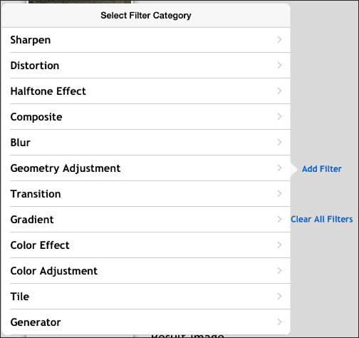
Core Image filters are organized into categories internally. A filter can belong to more than one category; for example, a color effect filter like Sepia Tone belongs to six categories, including CICategoryColorEffect, CICategoryVideo, CICategoryInterlaced, CICategoryNonSquarePixels, CICategoryStillImage, and CICategoryBuiltIn. These categories are useful to the developer to determine what Core Image filters are available for a desired task, and can be used as in the sample app to enable the user to browse and select available filters.
In the sample app, when a user taps the Add Filter button, a popover segue is initiated. This segue will initialize a UIPopoverController, a UINavigationController, and an instance of ICFFilterCategoriesViewController as the top root view controller in the navigation controller. The instance of ICFViewController implements ICFFilterProcessingDelegate and is set as the delegate so that it will be notified when a filter is selected or when the selection process is cancelled. The instance of ICFFilterCategoriesViewController sets up a dictionary of user-readable category names in the viewDidLoad method to correspond with some of Core Image’s category keys for presentation in a table.
self.categoryList = @{
@"Blur" : kCICategoryBlur,
@"Color Adjustment" : kCICategoryColorAdjustment,
@"Color Effect" : kCICategoryColorEffect,
@"Composite" : kCICategoryCompositeOperation,
@"Distortion" : kCICategoryDistortionEffect,
@"Generator" : kCICategoryGenerator,
@"Geometry Adjustment" : kCICategoryGeometryAdjustment,
@"Gradient" : kCICategoryGradient,
@"Halftone Effect" : kCICategoryHalftoneEffect,
@"Sharpen" : kCICategorySharpen,
@"Stylize" : kCICategoryStylize,
@"Tile" : kCICategoryTileEffect,
@"Transition" : kCICategoryTransition
};
self.categoryKeys = [self.categoryList allKeys];
The table looks as shown in Figure 20.3.
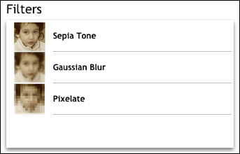
When the user selects a category, a segue is initiated. In the prepareForSegue:sender: method the destination instance of ICFFiltersViewController is updated with the Core Image constant for the selected category, and is assigned the ICFFilterProcessingDelegate delegate. In the viewDidLoad method, the ICFFiltersViewController will get a list of available filters for the filter category.
self.filterNameArray = [CIFilter filterNamesInCategory:self.selectedCategory];
The filters are displayed in a table as shown in Figure 20.4.

Core Image filters can be instantiated by name, so the tableView:cellForRowAtIndexPath: method instantiates a CIFilter, and examines the filter’s attributes to get the display name of the filter.
NSString *filterName = [self.filterNameArray objectAtIndex:indexPath.row];
CIFilter *filter = [CIFilter filterWithName:filterName];
NSDictionary *filterAttributes = [filter attributes];
NSString *categoryName = [filterAttributes valueForKey:kCIAttributeFilterDisplayName];
[cell.textLabel setText:categoryName];
When the user selects a filter, a segue is initiated. In the prepareForSegue:sender: method the destination instance of ICFFilterViewController is updated with an instance of CIFilter for the selected filter, and is assigned the ICFFilterProcessingDelegate delegate. When the ICFFilterViewController instance appears, it will display the customizable attributes for the selected filter.
Filter Attributes
Core Image filters have a flexible approach to customization. All instances of CIFilter have a dictionary property called attributes that contains information about the filter and all the customizations to the filter. Instances of CIFilter have a property called inputKeys, which lists the keys of each customizable input item, and a property called outputKeys, which lists the output items from the filter.
The sample app has specialized table cells to enable the user to see what attributes are available for a selected filter, adjust those attributes, and preview the image based on the current attribute parameters, as shown in Figure 20.5.
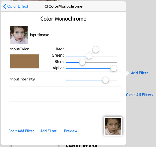
Each attribute has information that can be used to determine how to display and edit the attribute in the user interface. In ICFFilterViewController the tableView:cellForRowAt-IndexPath: method determines which attribute to look at based on the index path.
NSString *attributeName = [[self.selectedFilter inputKeys] objectAtIndex:indexPath.row];
Using the attribute name from the filter’s inputKeys property, the method can then get an NSDictionary of info about the attribute.
NSDictionary *attributeInfo = [[self.selectedFilter attributes] valueForKey:attributeName];
With the attribute info available, the method can inspect what type the attribute is and what class the filter expects the attribute information to be expressed in. With that info the method can dequeue the correct type of custom cell to use to edit the attribute. ICFInputInfoCell is a superclass with several subclasses to handle images, colors, numbers, vectors, and transforms.
NSString *cellIdentifier = [self getCellIdentifierForAttributeType:attributeInfo];
ICFInputInfoCell *cell = (ICFInputInfoCell *) [tableView dequeueReusableCellWithIdentifier:cellIdentifier
forIndexPath:indexPath];
The custom getCellIdentifierForAttributeType: method uses the attribute type and class to determine what type of cell to return. Note that the filters are not completely consistent with attribute types and classes; one filter might specify an attribute type of kCIAttribute-TypeColor, whereas another might specify an attribute class of CIColor. The method corrects for this by allowing either approach.
NSString *attributeType = @"";
if ([attributeInfo objectForKey:kCIAttributeType])
{
attributeType = [attributeInfo objectForKey:kCIAttributeType];
}
NSString *attributeClass = [attributeInfo objectForKey:kCIAttributeClass];
NSString *cellIdentifier = @"";
if ([attributeType isEqualToString:kCIAttributeTypeColor] || [attributeClass isEqualToString:@"CIColor"])
{
cellIdentifier = kICSInputColorCellIdentifier;
}
if ([attributeType isEqualToString:kCIAttributeTypeImage] || [attributeClass isEqualToString:@"CIImage"])
{
cellIdentifier = kICSInputImageCellIdentifier;
}
if ([attributeType isEqualToString:kCIAttributeTypeScalar] || [attributeType isEqualToString:kCIAttributeTypeDistance] || [attributeType isEqualToString:kCIAttributeTypeAngle] || [attributeType isEqualToString:kCIAttributeTypeTime])
{
cellIdentifier = kICSInputNumberCellIdentifier;
}
if ([attributeType isEqualToString:kCIAttributeTypePosition] || [attributeType isEqualToString:kCIAttributeTypeOffset] || [attributeType isEqualToString:kCIAttributeTypeRectangle])
{
cellIdentifier = kICSInputVectorCellIdentifier;
}
if ([attributeClass isEqualToString:@"NSValue"])
{
cellIdentifier = kICSInputTransformCellIdentifier;
}
return cellIdentifier;
Each of the cell subclasses can accept the attribute dictionary, configure the cell display with provided or default values, manage editing of the parameter values, and then return an instance of the expected class when requested.
Initializing an Image
To apply a filter to an image, Core Image requires an image to be an instance of CIImage. To get an instance of CIImage from a UIImage, a conversion to CGImage and then to CIImage is needed. If the UIImage has image data already in memory, these conversions are quick; otherwise, the image data must be loaded into memory before they can occur.
In ICFFilterViewController, the tableView:cellForRowAtIndexPath: method handles the inputImage by checking with the filter delegate to get either the starting image or the image from the previous filter. The filter delegate keeps an array of UIImages, which it will use to return the last image from the imageWithLastFilterApplied method.
If the starting image is provided, it is converted to CGImage and then used to create a CIImage. If the input image is from another filter, it is safe to assume that UIImage has an associated CIImage (asking a UIImage for a CIImage works only when the UIImage has been created from a CIImage; otherwise, it returns nil).
if ([attributeName isEqualToString:@"inputImage"])
{
UIImage *sourceImage = [self.filterDelegate imageWithLastFilterApplied];
[[(ICFInputImageTableCell *)cell inputImageView] setImage:sourceImage];
CIImage *inputImage = nil;
if ([sourceImage CIImage])
{
inputImage = [sourceImage CIImage];
}
else
{
CGImageRef inputImageRef = [sourceImage CGImage];
inputImage = [CIImage imageWithCGImage:inputImageRef];
}
[self.selectedFilter setValue:inputImage
forKey:attributeName];
}
Rendering a Filtered Image
To render a filtered image, all that is required is to request the outputImage from the filter’s attributes, and to call one of the available methods to render it to a context, an image, a bitmap, or a pixel buffer. At that point the filter operations will be applied to the inputImage and the outputImage will be produced. In the sample app, this occurs in two instances: if the user taps Preview in the filter view controller (as shown in Figure 20.5), or if the user taps Add Filter. When the user taps the Preview button in ICFFilterViewController, the preview-ButtonTouched: method is called. This method begins by initializing a Core Image context (note that the context can be initialized once as a property, but is done here to illustrate it all in one place).
CIContext *context = [CIContext contextWithOptions:nil];
The method then gets a reference to the outputImage from the filter, and sets up a rectangle that will be used to tell the context what part of the image to render. In this case the rectangle is the same size as the image and might seem superfluous; however, note that there are some filters that generate infinitely sized output images (see the Generator category of filters), so it is prudent to specify desired dimensions.
CIFilter *filter = self.selectedFilter;
CIImage *resultImage = [filter valueForKey:kCIOutputImageKey];
CGRect imageRect = CGRectMake(0.0f, 0.0f, 200.0f, 200.0f);
The method then asks the context to create a Core Graphics image using the outputImage and the rectangle.
CGImageRef resultCGImage = [context createCGImage:resultImage fromRect:imageRect];
The Core Graphics result image can then be used to create a UIImage to display on the screen.
UIImage *resultUIImage =
[UIImage imageWithCGImage:resultCGImage];
[self.previewImageView setImage:resultUIImage];
The preview image is displayed in the lower-right corner of the filter view, as shown in Figure 20.5.
Chaining Filters
Chaining filters is the process of applying more than one filter to a source image. With the combination of filters applied to a source image, interesting effects can be produced, as shown in Figure 20.6.
When a user taps Add Filter (refer to Figure 20.5), the addFilter: method of the ICFFilterProcessing protocol gets called in ICFViewController. The method checks to see whether the filter to be added is the first filter, in which case it leaves the source image as the inputImage for the filter. If it is not the first filter, the method uses the outputImage of the last filter as the inputImage for the filter to be added.
CIFilter *lastFilter = [self.filterArray lastObject];
if (lastFilter)
{
if ([[filter inputKeys] containsObject:@"inputImage"] )
{
[filter setValue:[lastFilter outputImage]
forKey:@"inputImage"];
}
}
[self.filterArray addObject:filter];
Using this technique, any number of filters can be chained together. With the last filter, the method renders the final image.
CIContext *context = [CIContext contextWithOptions:nil];
CIImage *resultImage = [filter valueForKey:kCIOutputImageKey];
CGImageRef resultCGImage = [context createCGImage:resultImage
fromRect:CGRectMake(0.0f, 0.0f, 200.0f, 200.0f)];
UIImage *resultUIImage = [UIImage imageWithCGImage:resultCGImage];
The final image is added to the list of images, and the filter list table is reloaded to display the images for each filter step.
[self.resultImageView setImage:resultUIImage];
[self.filteredImageArray addObject:self.resultImageView.image];
[self.filterList reloadData];
[self.filterPopoverController dismissPopoverAnimated:YES];
Core Image will automatically optimize the filter chain to minimize the number of calculations necessary; in other words, Core Image will not process each step in the filter individually; rather, it will combine the math operations indicated by the filters and perform the filter operation in one step.
Feature Detection
Core Image provides the capability to detect features, including faces, and facial features as of iOS 7, and QR codes and rectangles as of iOS 8, in an image or a video. Feature detection can be used for a number of useful things; for example, the standard Camera app can highlight faces in the viewfinder. Face locations and dimensions can be used in filters to make faces anonymous or highlight faces in a number of engaging ways. Rectangle dimensions can be used similarly to apply filters to specific portions of an image, opening a wide potential for creative application of filters to images. The sample app contains functionality to detect and highlight faces and face features in the source image; the same techniques can be used for QR codes and rectangles.
Setting Up a Face Detector
To use a face detector, Core Image needs an instance of CIImage as a source image to analyze. In the detectFacesTouched: method in ICFViewController, an instance of CIImage is created from the source image displayed.
UIImage *detectUIImage = [self.sourceImageView image];
CGImageRef detectCGImageRef = [detectUIImage CGImage];
CIImage *detectImage = [CIImage imageWithCGImage:detectCGImageRef];
Face detection in Core Image is provided by the CIDetector class. The class method to create a detector accepts a dictionary of options; in this case, a face detector can use either a high- or low-accuracy setting. The high-accuracy setting is more accurate but takes more time to complete, so it is appropriate for cases in which performance is not the primary consideration. The low-accuracy setting is appropriate for cases like a real-time video feed in which performance is more important than precision. A Core Image context can be provided but is not required.
NSDictionary *options = @{CIDetectorAccuracy : CIDetectorAccuracyHigh};
CIDetector *faceDetector = [CIDetector detectorOfType:CIDetectorTypeFace
context:nil
options:options];
After the detector is created, calling the featuresInImage: method will provide an array of features detected in the source image.
NSArray *features = [faceDetector featuresInImage:detectImage];
Features discovered will be returned as instances of CIFaceFeature, which is a subclass of CIFeature. Instances of CIFeature have a bounds property, which is a rectangle outlining the feature’s relative position inside the source image.
Processing Face Features
The detectFacesTouched: method in ICFViewController will iterate over the found faces, and will visually highlight them in the source image, as shown in Figure 20.7. The method will also log detailed information about each face feature to a text view in the display.

For each face, the method first gets a rectangle to position the red square around the face.
CGRect faceRect = [self adjustCoordinateSpaceForMarker:face.bounds
andHeight:detectImage.extent.size.height];
To determine where to draw the rectangle for a face, the method needs to adjust the positions provided by Core Image, which uses a different coordinate system than UIKit. Core Image’s coordinate system is flipped in the Y or vertical direction so that position zero is at the bottom of an image instead of the top. The adjustCoordinateSpaceForMarker:andHeight: method will adjust a marker rectangle by shifting the marker by the height of the image and flipping it, so the new coordinates are expressed the same way as in UIKit’s coordinate system.
CGAffineTransform scale = CGAffineTransformMakeScale(1, -1);
CGAffineTransform flip = CGAffineTransformTranslate(scale, 0, -height);
CGRect flippedRect = CGRectApplyAffineTransform(marker, flip);
return flippedRect;
With the correct coordinates, the method will add a basic view with a red border to the source image view to highlight the face.
UIView *faceMarker = [[UIView alloc] initWithFrame:faceRect];
faceMarker.layer.borderWidth = 2;
faceMarker.layer.borderColor = [[UIColor redColor] CGColor];
[self.sourceImageView addSubview:faceMarker];
The CIFaceFeature class has methods to indicate whether a face has detected a left eye, a right eye, and a mouth. As of iOS 7, it has methods to indicate whether a detected face is smiling (hasSmile), or whether either of the eyes is blinking (leftEyeClosed and rightEyeClosed).
if (face.hasLeftEyePosition)
{
...
}
If an eye or a mouth has been detected, a position will be available for that face feature expressed as a CGPoint. Since only a position is provided for each face feature (and not dimensions), the method uses a default width and height for the rectangles to indicate the location of a face feature.
CGFloat leftEyeXPos = face.leftEyePosition.x - eyeMarkerWidth/2;
CGFloat leftEyeYPos = face.leftEyePosition.y - eyeMarkerWidth/2;
CGRect leftEyeRect = CGRectMake(leftEyeXPos, leftEyeYPos, eyeMarkerWidth, eyeMarkerWidth);
CGRect flippedLeftEyeRect = [self adjustCoordinateSpaceForMarker:leftEyeRect andHeight:self.sourceImageView.bounds.size.height];
With the calculated and adjusted rectangle, the method adds a yellow square to the source image view to highlight the left eye.
UIView *leftEyeMarker = [[UIView alloc] initWithFrame:flippedLeftEyeRect];
leftEyeMarker.layer.borderWidth = 2;
leftEyeMarker.layer.borderColor = [[UIColor yellowColor] CGColor];
[self.sourceImageView addSubview:leftEyeMarker];
The same approach is repeated for the right eye and the mouth.
Summary
This chapter described basic image handling, including how to load and display an image, how to specify a content mode to adjust how an image is displayed, and how to create a stretchable image to reuse a source image for elements of different sizes. It demonstrated how to get an image from the user’s photo library or from the camera, and how to customize the image picker with options, such as which albums to use and whether to allow cropping of the selected image. It also explained how to resize an image.
Then, this chapter explained how to make use of Core Image filters, including how to get information about the available filters and filter categories, how to apply a filter to an image, and how to chain filters together to achieve interesting effects. Finally, this chapter described how to utilize Core Image’s face detection.