
Chapter 9
Supplying the Demanded Information on Supply and Demand
In This Chapter
![]() Looking at the supply curve
Looking at the supply curve
![]() Demanding to see the market demand curve
Demanding to see the market demand curve
![]() Seeing how a market equalizes supply and demand
Seeing how a market equalizes supply and demand
If anything exemplifies microeconomics, it’s the well-known model of supply and demand in a marketplace. Aspects such as constrained optimization (Chapter 6) or firm production decisions (Chapters 7 and 8) are of course important, but microeconomics really comes into its own with the supply and demand model. In many ways, it’s the most powerful tool in the microeconomist’s toolkit.
The supply and demand model is a centerpiece of economics because it adds to the understanding of the consumer and producer by letting them interact through the medium of exchange. This exchange is voluntary and, as such, benefits both parties, though not necessarily to the same extent. The supply and demand model is also the bedrock of the discussions of different types of markets covered in Chapters 10–12.
So if you — ahem — demand an explanation on supply and demand, and how the market seeks equilibrium between the two, we’re happy to — ahem, ahem! — supply one.
Producing Stuff to Sell: The Supply Curve
As you probably know by now, producers in a market are generally organizations called firms. Firms set their levels of production to be optimal in terms of costs, seeking to produce (that is, supply) up to the point where marginal revenue equals marginal cost and attempting to get their long-run average costs down to as low a level as they can. The marginal (and indeed average) costs of production are related to the technology a firm chooses to get the best level of output for the combination of inputs chosen.
 These features of production characterize the individual rational firm, which seeks to maximize its profits or minimize its costs – given the conditions in the marketplace.
But economists also want to analyze what a collection of firms does — that is, an industry — as well as the actions of just one firm. They want to aggregate the decisions of individual firms so that they can clearly see how this simple behavior at the firm level influences the prices and quantities of things made and exchanged in a market. The supply curve is a way of going from an individual firm to an entire industry provided that no one firm is able to influence the price at which the good sells in the market. Firms in this case are called perfect competitors, and the industry is perfectly competitive.
Moving from marginal costs to firm supply
You can go easily from an individual firm’s supply to industry supply by adding up, horizontally, the marginal cost curves of the individual firms in the relevant industry. This section describes how this process works.
Marginal costs
The marginal cost (abbreviated MC — see Chapter 7) of producing anything is the cost of producing only the last unit of that good; it tells you what happens to cost when adding one extra unit to production. At the margin, the firm produces up to where MC of producing a new unit equals marginal revenue (MR), the revenue gained from selling one extra unit. Thus, the rational profit-maximizing firm chooses its production so that MC = MR.
If the market in which the firm operates is perfectly competitive — the firm is a price taker that accepts the market price without being able to influence it — the MR received is just the same as the market price, p, and so price, p, equals MC.
 Another way of telling how competitive a market is in reality is by seeing whether the price at which producers can sell their product is at or close to MC. If it is, the market is very likely to be competitively supplied. If not, the market is likely to be dominated by one firm or have some other anti-competitive features. The firm in the competitive market uses this relation between MC and MR = p to solve the profit-maximization problem, so that it can set its best, or optimal, level of output given the price it can get in the market. That means maximizing the difference between total revenue and total costs.
A perfectly competitive market has an important feature: The price received by the firm isn’t related to its strategic decisions. Whatever the firm decides with respect to its output, price doesn’t change — which is another way of saying that a firm is a price taker.
We start by making the total costs of the firm a function of its output, meaning that as output changes, total cost changes. We write that function as c(q).
 In other words, total costs (c) are dependent on the output produced (q). This is called the total cost function for the firm.
Revenue side
For the revenue side, total revenue (TR) is given by the quantity produced, which is — again — q times the price of the good, p: TR = pq.
Profit equal the difference between cost and revenue, and so the firm wants to maximize: pq – c(q). Plus, it wants to do so by choosing the best level of q.
If you look at the marginal terms as described here and in Chapter 7, you can see that marginal revenue is the rate of change of revenue when output changes. If a firm increases its output by a change in q (write as Δq) then the change in revenue, ΔR, is ΔR = pΔq.
But because the firm’s supply does not affect market price, price does not change as q changes, and marginal revenue is quite simply given as ΔR/Δq = p.
The expression for MR tells you that you are evaluating the change in revenue as output changes, which is exactly, by definition, what marginal revenue expresses! And because price in this competitive market does not change in response to a firm’s decision, price equals MR.
Cost side
We write marginal cost (MC) in this case as Δc/Δq, which tells you to look at the change in costs as q changes. Doing so, you can rewrite it as MC(q).
Firm supply curve
Okay. Now that you have an expression for MR and MC, notice that if price isn’t dependent on a given firm’s output, the firm profit maximizes by producing up to the point where p = MC(q).
This relation is the foundation of the supply curve for a firm. It relates the price of a good to the marginal cost of supplying one extra unit of this good. Therefore, it expresses the firm’s decision in terms of price and quantity, which is the relationship shown in a supply curve!
In Figure 9-1 we plot the marginal cost curve for a price-taking firm as a relationship between the cost or price of a good and the quantity that the firm will make of the good: this is the firm supply curve.

© John Wiley & Sons, Inc.
Figure 9-1: The firm supply curve — marginal cost and price for a price-taking firm.
Adding up the numbers from firm to industry
Given the information in the preceding section, you now need to aggregate the decisions of all the firms in the industry.
The firm supply curve is really just its marginal cost curve given an assumption of price taking (meaning no one firm in the market can individually influence the price of a product). Therefore, if you add up all the marginal cost curves of all the firms in the relevant industry, you arrive at the industry supply curve.
 You need to add up the firm supply curves horizontally. You have to add the quantity made by each firm at a given price in order to see the relationship between price and quantity supplied.
The firms are price takers acting optimally, so marginal cost and price are the same.
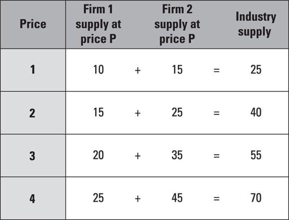
Figure 9-2 summarizes this situation. It shows two marginal cost curves added up for an industry of two firms. Figure 9-3 sets this out arithmetically for four prices.

© John Wiley & Sons, Inc.
Figure 9-2: Adding up firm supply curves (a) to get the industry supply curve (b).
© John Wiley & Sons, Inc.
Figure 9-3: Adding marginal cost curves horizontally to make the supply curve.
Giving the People What They Want: The Demand Curve
Supply decisions are important in and of themselves, especially in understanding how a firm chooses optimal production (see the earlier section “Producing Stuff to Sell: The Supply Curve”). But it takes two to tango (as all Dancing with the Stars fans know), and two sides to make a market. Markets can’t exist without customers because, of course, buyers need to exchange with someone.
The buyers in a market comprise the demand side of the market. Whereas looking at the supply side lets you see how producers produce more or less given the price that they receive for their goods, the demand side plots the relationship between the price of a good and the quantity that buyers purchase at that price. The demand curve summarizes this relationship.
When deriving a demand curve, bear in mind that the demand curve plots the relationship between price and quantity, holding other factors constant. In other words, any individual demand curve holds income, the price of other goods, and preferences constant in order to focus simply on the one relationship that matters in this model — the relationship between price and quantity. This condition also means that in contrast to the preference and choice model from Chapter 6, any given demand curve describes the relationship between price and quantity demanded of one good and not relative changes in consumption of one good with respect to another good.
Going from preferences to demand
In Chapters 2 and 4–6, all the examples involve substitution with two goods. A consumer allocates a set budget between consuming a quantity of good 1 and good 2 to achieve the best possible utility. A budget constraint sets a maximum level of consumption and the consumer chooses the consumption bundle that makes her best off in utility terms. Figure 9-4 summarizes the optimal choice given the budget constraint.

© John Wiley & Sons, Inc.
Figure 9-4: The optimal choice given a budget constraint.
The demand curve answers a slightly different question. Given that consumers behave as they do in the preceding paragraph, what’s the relationship between the price of a chosen good and the quantity of the good demanded — not usually by one consumer, but by all consumers participating in that particular market? To answer this question, you have to understand how the choices presented in Chapter 6 add up to make a demand curve. The simplest way is to consider a situation where the only thing allowed to change is the price of one good, whereas income and the price of all other goods are held constant.
Here’s an example using simple numbers: Carol has $10 and wants to allocate it to slices of pizza. We assume only one good (slices of pizza) and one sum of money allocable to buying pizza (a disposable income of $10). With no other goods, you can take anything referring to the price or quantity of anything other than the slice of pizza to be zero.
If a slice of pizza costs $1, Carol can afford ten slices (assuming non-satiation — though to some other person that much pizza may not be experienced as utility but discomfort). Table 9-1 shows this and five other per-slice prices.
Table 9-1 Pizza Slices Carol Can Buy with $10
|
Price per Slice |
Number of Slices Affordable |
|
$1 |
10 |
|
$2 |
5 |
|
$3 |
3 |
|
$4 |
2 |
|
$5 |
2 |
|
$6 |
1 |
Figure 9-5 plots Carol’s quantity demanded against price. You can see a nice, clear, though in this case not quite straight, line describing the relationship between price and quantity. As the price of a pizza slice rises, the quantity demanded falls. This relationship is Carol’s demand curve.

© John Wiley & Sons, Inc.
Figure 9-5: A demand curve, given constant income and no available substitutes.
Now we take Carol’s demand and add it to the demand of the only other patron of the pizza place, Doug. When you add up all the decisions of all the consumers in the market, holding constant their income and the price and availability of any other substitutes, you arrive at the market demand for pizza slices and you’ve derived the market demand curve (see Figure 9-6). For this, we’ve assumed that Doug has similarly well-behaved preferences, although we haven’t gone through the exercise of quantifying them in the same way as with Carol. The key point is that whatever they are, you derive market demand by adding them up.

© John Wiley & Sons, Inc.
Figure 9-6: (a) shows Doug and Carol’s individual demands for pizza slices. (b) shows market demand is the sum of individual demands.
Economists are sometimes lazy about making the distinction clear, but strictly speaking at any point on a demand curve, you’re talking about the quantity demanded at a given price, whereas the term demand for is talking about the more general relationship between price and quantity for a given good. So, this section’s example discusses the demand for pizza by looking at the quantity demanded by Carol and Doug at different prices.
Seeing what a demand curve looks like
The demand curve in the last section maps only two variables, price and quantity demanded, holding all other things, such as income and tastes and prices of other goods, as constants. Thus, the demand curve tells you that any point along the curve is a relationship between price and quantity: When price goes up, the quantity demanded of a given good goes down.
You can read price and quantity off the axes of the curve, but for some types of applications using a function to describe demand is more useful. In this approach, you use numbers to describe the price-quantity relationship.
Quite simply, a demand function is any mathematical formula that describes a demand curve. Here’s a very simple formula for a demand function: x1 = 100 – p. This expression relates the quantity consumed of a good (x1) to a price of the good and a constant (which you can interpret as income that may be allocated to the good). The key point is that the only variable that’s allowed to change is the price of the good.
Despite some reasonably rare exceptions (see the nearby sidebar “Exceptions to downwards demand curves”), demand curves slope downwards, indicating that any given point on a demand curve will have a lower quantity demanded where the price is higher. Two main interpretations follow:
- When looking at an individual consumer, a higher price means that holding income constant, an individual consumer will substitute away from the good whose price has risen and therefore consume less of it.
- When taking all the consumers in the market together, at a higher price fewer consumers are willing to pay up to that price to receive the good.
The curve shifts when anything other than price changes
When looking at demand curves, you hold absolutely everything except price constant for any given curve, meaning that price changes are movements along a demand curve. If something other than price changes, you have to analyze the change by comparing different curves. To simulate such changes, you shift the demand curve horizontally to show a change in one of the factors that was held constant. (See Figure 9-7).
Let’s continue the preceding section’s pizza slice example. If, say, Carol now has $20 to allocate to pizza (rather than $10), her demand at $1 a slice is 20 slices and at $2 a slice, her demand is 10 slices. We illustrate that by shifting her demand curve to the right to show that she can now afford twice as many pizzas as before. Similarly, if a noodle bar opens up on her campus, we shift the curve horizontally to the left to show that her demand for pizza falls as a new rival opens.

© John Wiley & Sons, Inc.
Figure 9-7: (a) For changes in price, read off the same demand curve. (b) When something other than price changes, shift the demand curve.
Don’t confuse the two operations of moving along a curve and shifting a curve. If, for instance, you observe a rise in prices and at the same time an increase in demand, most likely that happened because something shifted demand, such as income or tastes, as opposed to an individual demand curve sloping upwards. When you get the hang of distinguishing between movements along the demand curve and shifts in the demand curve, you can start to see how they work in the real world.
 In the 1990s, the brewer of a somewhat generic lager repositioned itself in a more premium segment of the market: First it raised the price and second it advertised the lager as a premium brand. A microeconomist can look at the price movement along the curve and read off that quantity demanded was likely to be lower. But the second stage of the brewer’s strategy created a taste effect that raised, in some way, the utility gained from consuming the lager so that at any given price, the quantity demanded would be greater. Thus the demand curve shifted outwards, leading to a greater level of consumption for any given price (see Figure 9-8).

© John Wiley & Sons, Inc.
Figure 9-8: How a brewer gained from a price rise.
Read the situation in two stages, bearing in mind that a demand curve holds everything except price constant. That means, if you’re looking at something else — a rise in income or a change in tastes, for example — you need to shift the demand curve to model the change.
What you can glean from supply and demand
When you know the shape of the supply and demand curves, you can use them to investigate changes in price and quantity using a method called comparative statics, where you compare two states of the market at two different periods as if they’re simple camera snapshots. Then you can investigate how price and quantity have been affected after a change has been enacted.
Be aware, however, that comparative statics leaves out some detail of the adjustment process between the two states of your relevant market.
This omission isn’t usually a problem in and of itself: You can discover a large amount about how a market behaves by comparing two snapshots in time. But sometimes dynamics — that is, adjustments and changes over periods of time, like in a moving picture — are important and have to be considered. A change where a market adjusts suddenly and sharply to a change in price is very different from a change where a smooth path of adjustment occurs. At this level of economics, pretty much all models you’re likely to pick up are examples of comparative statics, but at more advanced levels, you can add extra tools to your toolbox to compare dynamic adjustments.
Identifying Where Supply and Demand Meet
Plotting supply and demand curves on the same diagram gives an upward-sloping supply curve and a downward-sloping demand curve, and — except in rare circumstances — a point where the two cross. At that point, price and quantity have values that keep producers and consumers happy so that exactly as much is produced at that price as customers want to buy. That point is called equilibrium.
Returning to where you started: Equilibrium
In the supply and demand model, markets are equilibrium-seeking, meaning that after an adjustment, everything ends up back at a point where prices and quantities are equal (no unsold goods and no running down of inventories). Typically, using supply and demand analysis, you start and end at an equilibrium, even if not at the same equilibrium point as before.
Equilibrium and equilibrium-seeking are extremely important concepts to microeconomists. At the equilibrium, markets clear: Exactly as much is produced as consumers need, and producers have no stock building (no excess supply) or running down of stocks and shortages (as would be caused by excess demand). In this model, equilibrium comes about because the price can adjust to ensure that quantities demanded and supplied are equalized.
To see this process in action, suppose (as in Figure 9-9) that a situation occurs where price is temporarily higher than the equilibrium. This case sees excess supply, because the quantity supplied at that price is greater than the quantity demanded. With excess supply the price adjusts, falling so that, first, more potential buyers are tempted back into the market and, second, the marginal producers decide that producing that much is no longer worthwhile and cut their production. These two effects lead to the equilibrium-seeking market returning to its equilibrium where the market clears.

© John Wiley & Sons, Inc.
Figure 9-9: Price falls in response to excess supply.
This equilibrium-seeking tendency is one reason why economists require good evidence before recommending action to control a market. In the view of the majority of economists, unless proven otherwise, the price mechanism is sufficient to adjust markets until they clear. Examples of interferences in markets that have merely made things worse are many — often it comes about because any one policy maker knowing as much about a market as the people participating in it is difficult.
Not all economists prefer no intervention in all cases. We just mean that the profession wants to ensure that intervention doesn’t make things worse.
When affordable housing is in short supply, there is often public pressure for rent control. Rent control policies have been implemented in many U.S. cities, first during World War II and then later in the 1960s and 1970s. Today, relatively few places have rent control, and it is prohibited in many states. Rent control allows landlords a maximum rent and problems occur when the maximum is below the equilibrium. Setting the rent ceiling at that level led to an excess demand for rentals from potential tenants, while marginal landlords were unable to get as much in rent as they felt compensated them fairly for the value of their properties. As a result, many landlords left the market at exactly the same time, because more people wanted to rent from them and the rent controls prevented prices from adjusting to create an equilibrium that may have kept landlords and tenants happy.
The result can be a collapse in the private rental market, and the additional effects included lower labor mobility (because private rents are often the most flexible way of being housed when a person moves from one town to another). We walk you through this case in Figure 9-10.

© John Wiley & Sons, Inc.
Figure 9-10: Rent controls causing excess demand.
Reading off revenue from under the demand curve
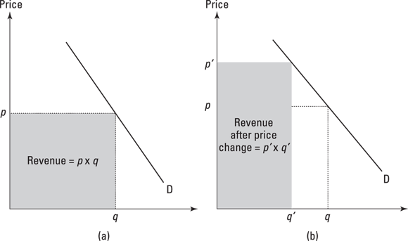
At the equilibrium, you can see on the supply and demand curves a unique price and quantity at the point where they intersect. The interesting thing is that, if you multiply price by quantity at a given point on a demand curve, the result is the revenue yielded from selling q units of a good at price p.
Total revenue always equals price times quantity and also corresponds to the area of a rectangle under the demand curve. When testing the responsiveness of demand using elasticity (a measure of how demand changes for a given change in price — discussed in the later section “Testing the responsiveness of demand using elasticities”), one result shows whether a producer’s revenue will be higher after a price change. You can find that by comparing the size of the rectangles before and after a price change. Later in the “Testing the responsiveness of demand using elasticities” section, we show you the simple formula for how that happens. But for the moment, take a look (in Figure 9-11) at the rectangles under the demand curve for an old price of p and an old quantity of q and for a new price (after a change) of p' and a new quantity of q′. The change in revenue from p to p′ and q to q′ is as follows:
![]()
© John Wiley & Sons, Inc.
Figure 9-11: Revenue changes after a price change.
In Figure 9-11a, original revenue before the change is given by Price times Quantity. In 9-11b, after a price change, the area under the demand curve changes — the revenue gained at the new price and quantity is shown by the shaded area; the dotted lines indicate the old amount of revenue for comparison.
Summing the gains to consumer and producer: Welfare
The equilibrium price at which a market clears provides another useful thing to ponder when analyzing a market: gains made simply by trading, which economists call the gains to trade. The idea is that for any given equilibrium in price and quantity, some consumers would be happy to buy at above the market price, and some producers would be happy to supply at less than the market price. Both parties have made a trade that makes them better off, because they’d have been willing to buy (sell) at a higher (lower) price and don’t have to; so each party captures some value from the trade.
The consumers’ gain is called consumer surplus (see Figure 9-12), which comprises the gain for those willing to have bought at a price above the equilibrium price but don’t have to. It’s given by the area formed by
- The equilibrium price and quantity in the market.
- The highest price that consumers are willing to pay on the demand curve (pmax in Figure 9-12).
- The point where a horizontal line from the equilibrium point crosses the vertical axis (the intersection with the line is p, equilibrium price).

© John Wiley & Sons, Inc.
Figure 9-12: Producer and consumer surplus.
The length of the line between the first and third points in the list is q, and so the size of the area under the demand curve is the area of the triangle, given by:
![]()
A similar reasoning applies to the area above the supply curve and below the market equilibrium price, which comprises producers willing to supply the good for a price lower than the equilibrium price, but who don’t have to because the market clears at that equilibrium. Here, the only substitution is to use pmin for the price at which the cheapest producer is willing to provide the good (see Figure 9-12):
![]()
Welfare, the term used, is the sum of the gains to trade between the two parties, and so is given by the sum of producer and consumer surpluses (summarized in Figure 9-12). Check out Chapter 12 for more on welfare.
Welfare has several meanings in economics, but when you’re using the supply and demand model, it means the sum of consumer and producer surplus. The same also applies to the model of oligopoly in Chapter 11 and monopoly in Chapter 13. You will see that in the long run perfect competition model in Chapter 10, all the welfare goes to the consumer (nice!).
Testing the responsiveness of demand using elasticities
The most direct calculation you can make from the supply and demand model relates to responsiveness to a change in price, or to a change in something else that has been held constant in the particular market you’re considering. The way we measure responsiveness is called an elasticity.
In this section, we discuss the three most important cases:
- Own price elasticity of demand measures the percentage change in quantity demanded in response to a percentage change in the price of the good. This measure corresponds to movement along the demand curve.
- Cross-price elasticity of demand measures the percentage change in quantity demanded in response to a percentage change in the price of another good. This measure corresponds to shifts in the demand curve.
- Income elasticity of demand measures the percentage change in quantity demanded in response to a percentage change in income. Again, this measure corresponds to shifts in the demand curve.
Effect of an own price change
The own price elasticity of demand measures the effect of the change in the price of a good on quantity demanded of the good. Hence, it can tell us whether the revenue that producers get increases or decreases as the price changes.
You can arrive at the revenue change by reading off prices and quantities and comparing the size of the rectangles under the demand curve (see the earlier section “Reading off revenue from under the demand curve”). But you can measure the size of the effect more simply by using the own price elasticity of demand formula. A change in price from p to p′ is p′ – p. Using the mathematical shorthand Δ to indicate a change, we write this as Δp.
Now we do the same for quantity, again reading off the change in quantity for the two points p and p′ (whose associated quantities are given by q and q′), which gives Δq. To find the percentage change in quantity demanded we divide Δq by q and to find percentage change in price we divide Δp by p. Own price elasticity is the ratio of the Δq/q to Δp/p and measures the responsiveness of demand.
Economic variables come in different types of measurement units, from different currencies to different sizes of supply (diamonds, for example, aren’t generally supplied by the ton, and steel isn’t generally supplied in ounces). A great advantage of the elasticity measure is that it doesn’t depend on units of measurement. By using percentages, elasticity measures are not affected by whether we measure gold in kilograms or ounces.
The own price elasticity of demand (P.E.D) can be expressed as follows:
![]()
Or the other way is to start by using percentage changes so that
![]()
Both ways are valid and give the same number. Sometimes, percentage changes are given to you by the data you receive, and sometimes you have to calculate them. But for both methods, the inferences you can make are the same.
The own price elasticity of demand is almost always a negative number. This reflects the fact that an inverse relationship lies along a demand curve between price and quantity, and so it follows that as price rises quantity falls. This is also a backhanded way of saying that a demand curve slopes downwards.
Three cases exist for the own price elasticity of demand:
- Elasticity of demand is more negative than –1 (or its absolute value is greater than 1): A percentage increase in prices leads to a greater percentage decrease in quantity demanded and hence to a fall in revenue. The reverse is true for a percentage decrease in price. In this case, revenue rises.
- Elasticity of demand is less negative than –1 (or its absolute value is between 0 and 1): A percentage increase in prices leads to a smaller percentage decrease in quantity demanded and hence to an increase in revenue. The reverse is true for a percentage decrease in price. In this case, revenue falls.
- Elasticity of demand is exactly 1: A percentage increase in prices leads to the same percentage decrease in quantity demanded and hence revenue stays the same. The same is true for a percentage decrease in price. In this case, revenue also stays the same.
Economists don’t always put the minus sign before an own price elasticity of demand, because in the overwhelming majority of cases they assume it to be negative. In these cases we’re considering the mathematical operator absolute value and so we strip off the minus sign. Unless there’s a very important reason why the own price elasticity may be positive — for instance, in a Veblen good — the general practice is to assume that own price elasticity of demand has a negative sign as the downward-sloping demand curve indicates.
The price elasticity of demand divides into cases where the elasticity is more negative than –1 (that is, the absolute value is greater than 1 as, for instance, in the elasticity of –1.2) and those where it’s less negative than –1 (for instance, an own price elasticity of –0.8). If it’s more negative than –1 you’ve found a case of elastic demand:
- Demand is elastic: A decrease in price results in greater revenue, but a rise in price results in lower revenue.
- Demand is inelastic: A rise in price results in greater revenue, but a decrease in price results in lower revenue.
At some point on a linear demand curve, demand is unit elastic. At this point any rise in revenue caused by raising prices is exactly counterbalanced by the fall in revenue from selling fewer units of the product. In numerical terms, this is the same thing as saying that the own price elasticity of demand is exactly –1 at that point. Examples of demand functions do exist that yield elasticities of –1 at all points along the demand curve: These aren’t straight lines.
Effect of a cross-price change
The cross-price elasticity of demand measures the effect of a change in the price of another good. Typically, you calculate it by knowing the prices and quantities before and after the change for two goods, i and j. So the effect of a change in the price of good j on the quantity demanded of good i is like this:
![]()
The cross-price elasticity of demand measures the effect of a shift in the demand curve, not a movement along it (it’s changing something other than the price of the good in which you’re interested). Three basic cases exist here:
- Cross-price elasticity of demand is positive: A rise in the price of good j has a positive effect on the sales of good i and so the two goods are substitutes. The greater the value of a positive cross-price elasticity of demand, the more substitutable the two goods are. So an estimate of the cross-price elasticity of demand that finds a high and positive sign allows the inference that the two goods, such as Coke and Pepsi, are in the same market.
- Cross-price elasticity of demand is negative: A rise in the price of good j has a negative effect on the sales of good i and thus you can infer that the two goods complement each other in consumption. They are complements. An example is that when the price of gas goes up, sales of big gas-guzzling cars fall because the two are complementary goods.
- Cross-price elasticity is zero or very near: The two goods have very little quantifiable effect on each other.
Effect of a change in income
The income elasticity of demand measures what happens to consumption of a good when income changes. Income is of course held constant along the demand curve, and so the income elasticity measures the effect of a shift in the demand curve caused when income moves from M to M′. (Check the earlier Figure 9-7b for an example of a demand curve shifting.)
Typically, economists use ΔM or Δy for a change in income — more usually y. They then evaluate a percentage change in quantity caused by the percentage change in income. Unlike the effect of an own price change, however, the income elasticity doesn’t simply rely on the slope of the demand curve being negative, and so the income elasticity may be positive or negative. Here we evaluate the formula for the income elasticity of demand:
![]()
Here are the four general cases:
- Quantity demanded rises as income rises: Makes the income elasticity of demand positive (economists call these types of goods normal goods).
- Quantity demanded rises by far more than income rises: For example, when a 10% rise in income yields a 20% rise in quantity (so that the income elasticity of demand is 2). This behavior is associated with a superior good (often associated with consumption of luxury products).
- Quantity falls as income rises: The income elasticity of demand is negative. This is associated with inferior goods, where demand falls as income rises.
- Income elasticity is zero: Consumption of the good is unaffected by income. Necessities generally have income elasticities between zero and +1, and you’d expect their consumption to rise as income rises, but not by as much as the rise in income.