Just as the tie-dyed T-shirts you wore in school no longer work in a buttoned-down office, what works for one organization may not be right for another. Even if you stay at the same job or on the same project, what you need to see changes as you go along.
Fortunately, Project gives you lots of control over what you view in its window. You can customize or create views to present the right project information in the right way. For example, you can set up Gantt Chart task bars to emphasize the critical path, progress, or at-risk tasks. Most views include a table of information, and these tables are customizable as well. You can add, remove, or rearrange columns and tweak tables in other ways. Of course, text is omnipresent, and its formatting is at your command—so you can accommodate the reading-glasses crowd or make key information stand out. Project can apply formatting to text that falls into a specific category, like critical tasks, or to individual elements like a crucial task bar.
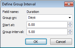
You can also customize filters and groups. You can modify or create filters and groups to show particular types of information. By filtering tasks and resources, you can display only what meets the conditions you set, such as tasks with duration longer than 2 months. Alternatively, you can use groups to shuffle information into categories. Because groups can roll up the values of the items in the group, it’s easy to see how much you’re spending on a particular group of contractors. Sorting information also helps you evaluate your project from every angle—for example, to see tasks listed from longest duration to shortest. You can sort any table you display or specify sort order for groups you define.
Note
You’ll find other ways you can make Project your own in the next few chapters. You can customize fields (Chapter 24), the ribbon (Chapter 25), and templates (Chapter 26).
When you don’t have the full information, making decisions becomes a matter of luck (just ask the contestants on Deal or No Deal). Yet too much data can obscure the information you need (as anyone trying to choose an insurance policy can tell you). But the right data shown in the right light exposes flaws, highlights solutions, and generally makes managing projects easier.
Project comes with many views that present project information in different ways, but they boil down to seven basic types. This chapter describes how to customize each of the types. Here are the seven and what they do:
Gantt Chart. The charts project managers spend their days gazing at are called Gantt Charts because Charles Gantt created a winner. This view lists project tasks and information about them in a table on the left side. In the timescale on the right side, task bars visually indicate when tasks occur and how they relate to one another. With additional task bars to show slack time, progress, or delays, a Gantt Chart presents a lot of what a project manager needs to know.
Usage. A Gantt Chart doesn’t show specific assignments or values for each time period, which is why you need usage views like Task Usage or Resource Usage. These views have a table on the left like the Gantt Chart does, showing totals for tasks, resources, and their assignments. Instead of task bars on the right, a usage view has another table, where the columns represent time periods. The rows show assignments with summary rows for each task or resource. Each cell in the timescale contains assignment (or summary) values for that period (for instance, work, baseline work, or cost).
Timeline. New in Project 2010, the Timeline view (Changing Manually Scheduled Tasks to Auto Scheduled) distills a project to a simple linear diagram. Out of the box, a bar on the Timeline view indicates the timeframe that’s displayed in the timescale of a Gantt Chart or usage view. You can drag that bar to control the dates you see in the timescale (Changing Manually Scheduled Tasks to Auto Scheduled). But you can also add tasks to the timeline—for example, to keep project phases, key milestones, or critical tasks in view at all times.
Team Planner. Another new view in Project 2010, Team Planner (Quickly Assigning Resources with Team Planner) includes a row for each project resource and the tasks to which it’s assigned, like competitive swimmers lined up in a swimming pool. That’s why these rows are referred to as swimlanes.
Resource Graph. The Resource Graph shows values for work, cost, and so on in a bar graph. Although the Resource Usage view does show resource allocation, the colored bars let you easily see when resources are overallocated.
Network Diagram. Many project managers use a network diagram to define relationships between tasks and to evaluate the critical path. A network diagram draws a box (or node) for each task and lines for the relationships between them. However, because the diagram isn’t drawn to a timescale, each task is the same size, which makes it easier for the eye to focus on task dependencies. As long as you use Project, you can build your schedule in the view you prefer, and let Project translate from one diagram to another.
Calendar. Gantt Charts take getting used to, but everyone understands calendars. You can show tasks as bars spanning the days or weeks the way you mark off your much-needed vacation. In Project, the Calendar view is great for showing teams what their upcoming schedule looks like.
Depending on the work at hand, you can switch to the view that’s most helpful. Within that view, you can change the information you see and how it’s displayed. For example, when you’re monitoring the critical path, red task bars let you more easily see critical tasks, and variance fields tell you whether progress is good or bad. Creating a view from scratch is an option if none of the existing views are close to what you want. The box on Where Are My View Changes? explains how Project saves the changes you make to views.
Tip
Project is set up initially to display the Gantt Chart view with the timeline above it, which makes it easy to see your project schedule and adjust the date range. However, if you prefer to work with another view—for example, the Task Entry view, which includes the Gantt Chart in the top pane and the Task Form in the bottom—you can change Project’s default view. Choose File→Options. In the Project Options dialog box, click General. In the “Default view” drop-down list, choose the view you want Project to apply when you create a new project.
In Project, a view is nothing more than a compilation of many elements: fields, tables, filters, groups, layouts (called screens), and forms. To make big, sweeping changes in a view, you change its screens and forms. For example, you may prefer to have the Task Details Form appear in the Gantt Chart view’s bottom pane instead of the Task Form.
Modifying views gets a lot easier when you understand the difference between single-pane and combination views. As its name implies, a single-pane view is like a picture window that shows one thing, like the Resource Sheet. A combination view is like a window in which the top and bottom panes slide up and down; it can have one single-pane view on the top and a different single-pane view on the bottom, like the Resource Allocation view, which shows the Resource Usage view on top and the Leveling Gantt on the bottom.
Most of Project’s built-in views are single-pane views. The Gantt Chart, Task Usage, and Network Diagram views are all single-pane views; you can display them in the top or bottom pane of a view. You see the Gantt Chart and Task Form together so often because the built-in Task Entry combination view puts them there.
You get to modify different things in single-pane and combination views. Here’s what each one contains:
Single-pane views. The screen is a basic layout of view elements. For example, all Gantt Chart views use a Gantt Chart screen with a table on the left and a timescale on the right. You can specify the screen to use only when you create a new view. Once a view exists, you can change other settings, but not the screen it uses. A single-pane view also contains a table, group, and filter to apply when the view appears. (It’s perfectly OK to set the group to No Group and use a wide-open filter like All Tasks.)
Combination views. A combination view is just a pairing of two single-pane views, so you simply pick the views to show in the top and bottom pane.
Note
Some single-pane views like the Gantt Chart actually have two side-by-side panes: a table on the left and a timescale on the right. These side-by-side panes are features of the screens that the views use, which is why a Gantt Chart is still a single-pane view.
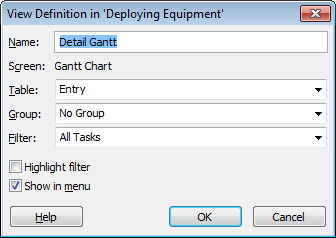
The View Definition dialog box shows the settings for the type of view you’re working on. For a single-pane view, you can change the table, group, or filter. Here’s how to customize an existing single-pane view:
If you plan to use a table, group, or filter that doesn’t exist, then create it before you open the View Definitions dialog box.
You can’t create elements on the fly in the View Definition dialog box. When you modify a view, you tell it the names of the elements to use. The view applies the table, group, and filter you specify, which automatically display any customizations you’ve made to them—as long as their names haven’t changed. See Creating a New Table on page 616, Creating and Editing Filters on page 620 and Creating a Group on page 633 for instructions.
Choose View, click the down arrow next to any view on the ribbon, and then, on the drop-down menu, choose More Views.
The More Views dialog box opens.
In the Views list, select the single-pane view you want to modify, and then click Edit.
The View Definition dialog box opens with the single-pane settings, as shown in Figure 23-1. The screen for the view appears, but you can’t edit it. (Project includes several layouts, which it calls screens. For example, the Gantt Chart screen has a table on the left side and a timescale on the right. The Resource Graph screen shows the resource on the left side and a timescale bar graph on the right.) To choose a different screen, you must create a view from scratch (Creating a New View) or start with a view that uses the screen you want.
Tip
If you want to use the existing view as a foundation for a new view, select the single-pane view, and then click Copy. After you save the copy with a new name, make the changes you want to the copy. That way, you can use the original view or the new one.
Figure 23-1. The View Definition title ends with “in ‘Project xyz’”, which tells you that Project stores the modified view in the project file. You can tell Project to automatically copy views to the global template (page 669), or keep customized views in your Project file unless you explicitly copy them with the Organizer (page 668) to use them in other files.
In the Table drop-down list, choose the table you want the view to display.
The tables you see in the drop-down list depend on whether you’re editing a task or resource view. For example, if you edit the Gantt Chart or Task Usage view, the drop-down list contains task tables; you see resource tables for views like the Resource Sheet and Resource Usage.
In the Group drop-down list, choose the group you want.
To forgo grouping, simply choose No Group. If you want to use a custom group that doesn’t exist, then you must close the dialog box and then create the custom group (Creating a Group) first.
In the Filter drop-down list, choose the filter you want to apply.
Choose All Tasks or All Resources to leave the view unfiltered. Initially, filters hide items that don’t pass the filter tests. You can set up a view that shows all tasks or resources but emphasizes the ones that pass the tests. To do so, turn on the “Highlight filter” checkbox, which uses blue text in rows that make the cut.
To list the view on drop-down menus for faster access, make sure the “Show in menu” checkbox is turned on.
You can apply views from the view drop-down menus with a single click, including views you create yourself, as you can see in Figure 23-2. In fact, the “Show in menu” checkbox is turned on automatically, so you must turn it off if you don’t want the view in the drop-down menus. You can remove built-in views you never use by editing them and then turning off their “Show in menu” checkboxes.
Click OK.
The View Definition dialog box closes. To immediately apply the modified view, in the More Views dialog box, click Apply.
Tip
If you make changes to a view as you work—for example, adding a column to a table, applying a group, or filtering the task list—you can quickly save the view as a new view or update the definition of the view. On the ribbon, click a view button’s down arrow, and then, on the drop-down menu, choose Save View. In the Save View dialog box, select “Save as a New View” to create a new view in your project. In the Name box, type a name for the view, and then click OK. Project saves the view with the table, fields, filters, and groups you’ve applied. To update the current view with the changes you’ve made, select Update Current View, and then click OK.
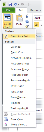
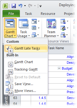
Figure 23-2. When you click the down arrow next to a view button on the ribbon, a view drop-down menu appears. Customized views that you’ve created appear at the top of the menu under the Custom heading. Built-in views are listed under the Built-In heading, even if you’ve customized those views in some way.
Project has only a few built-in combination views, such as Task Entry and Resource Allocation. However, combination views are great because they display the single-pane views you want in both the top and bottom panes. If you create your own combination views (Modifying a single-pane view), you can set them up with the single-pane views you want or edit them to change the views they display. The box on Hide and Seek with Panes explains how to change the size of each pane or hide the bottom pane. Here are the steps for modifying a combination view:
If you plan to use a single-pane view that doesn’t exist, create it first (as described in the next section).
You can’t create a new single-pane view from within the View Definition dialog box.
Choose View, click the down arrow next to any view on the ribbon, and then, on the drop-down menu, choose More Views.
In the Views list, select the view you want to modify, and then click Edit.
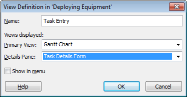
The View Definition dialog box opens with combination view settings, as shown in Figure 23-3.
In the Primary View box, choose the view you want in the top pane. In the Details Pane box, choose the view for the bottom pane.
Both drop-down lists include all available views, so you can put any view in either pane.
Click OK.
The View Definition dialog box closes, and the view is ready to use.
Most often, you create a new single-pane view to choose the screen you want, because that’s the one element you can’t change when you edit a view. New combination views come in handy when you prefer a specific combination of views but don’t want to touch the ones that Project provides.
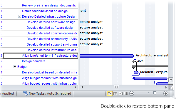
Figure 23-4. When you hide the bottom pane, it waits patiently to reappear. You can change the view in the top pane as many times as you want. When you restore the bottom pane, it shows the view it contained when you hid it.
The easiest way to create a new view, whether it’s a single-pane or a combination view, is by modifying one that already exists. You can tweak the view until it looks exactly the way you want and then save it with a new name. Here’s how:
Display a view that’s similar to the new view you want.
For example, if you want to create a combination with a Gantt Chart and the Task Details Form, click the down arrow on a view button, and then choose More Views. In the More Views dialog box, select Task Entry, and then click Apply.
Modify the view until it looks the way you want.
Apply a different table (Changing Tables), add columns to the table (Changing Table Contents), apply a group (Creating a Group), or filter the list (Creating and Editing Filters).
Click the down arrow on a view button, and then, on the drop-down menu, choose Save View.
The Save View dialog box opens.
Select the “Save as a New View” option. In the Name box, type a name for the view, and then, click OK.
Project saves the view and adds it to the list of custom views in your project.
Creating a new view from scratch is easy, too, although you won’t see what the view looks like until you apply it. If you’re creating a combination view and want to include a single-pane view that doesn’t exist, create it by following these steps once through first:
Choose View, click the down arrow next to any view on the ribbon, and then, on the drop-down menu, choose More Views. In the More Views dialog box, click New.
The Define New View dialog box opens. If you want to create a view from an existing one, select the view, and then click Copy. If you’re copying a single-pane view, you can’t change the screen, but everything else is up for grabs.
Select the “Single view” or “Combination view” option, and then click OK.
The View Definition dialog box opens with the settings for the type of view you selected. The Name box is filled in automatically with a name like "View 1.”
In the Name box, type a new name.
In addition to imbuing a name with meaning, you can add a keyboard shortcut to open the view from the View menu. When entering the name, simply type an ampersand (&) before the letter for the shortcut, in the same way that the built-in Gantt Chart view is set to &Gantt Chart. For example, if you create a view named Gantt Late Tas&ks, you can apply the view by pressing Alt to display keyboard shortcuts, as shown in Figure 23-5. Then, press W to display the View tab, press G to display the Gantt Chart view drop-down menu, and finally press K (the letter after the ampersand) to display the view. (If another entry uses the same letter for its keyboard shortcut, then you need to press the letter a second time to access your view.)
Figure 23-5. When you first press the Alt key, the keyboard shortcuts for the ribbon tabs appear, for example, H for the Task tab and W for the view tab. Once you press a key to choose a tab, the tab keyboard shortcuts disappear, and the keyboard shortcuts for commands on the tab take their place, such as G for the Gantt Chart view drop-down menu and K for the Task Usage view drop-down menu. If you press a key for a command that displays a drop-down menu, shortcut keys appear on the drop-down menu.
If you’re creating a single-pane view, then in the Screen drop-down list, choose the screen you want.
The Screen drop-down list includes names that look familiar: Gantt Chart, Task Usage, Calendar, and so on. Each screen represents a particular layout, like the table and task bar timescale of the Gantt Chart and the table and tabular time-phased data of Task Usage. You can’t create your own screens.
To save the view, click OK.
From here on, the steps for creating a view are exactly the same as modifying one, as described on Modifying a single-pane view and Modifying a combination view. For example, for a single-pane view, you choose the table, filter, and group you want. For a combination view, you select the single-pane views to display in the top and bottom panes.
A Gantt Chart view is a fertile field for formatting. In the table area, you can apply a table, which, in turn, displays columns of Project fields. The timescale displays task bars to show when tasks occur and how they relate to one another.
Every component of a Gantt Chart view has its own formatting features:
Table. The most obvious change is choosing a different table. Within a table, you can add, remove, or rearrange columns; moreover, the column width, title, and alignment are at your command. Changing Tables on page 610 is your guide to all these customization features.
Timescale. The timescale chops the project up into time periods, which can be modified to fit the length of your project. Short projects may use days, whereas months may be better for multiyear projects. You can change the timescale units, labels, and how many different units the timescale heading holds. See Customizing the Timescale on page 595 for instructions. For more off-the-cuff timescale changes, you can simply drag the bar in the Timeline view to change the date range or timescale units (Changing Manually Scheduled Tasks to Auto Scheduled). Dragging the Zoom slider (ScreenTips and Smart Tags) when a timescaled view is active also changes the date range and timescale units.
Text. Text is everywhere. You can modify text appearance to highlight different information, like summary tasks or task bar text. You can also format only selected text. See Changing the Way Text Looks on page 616 to learn how.
Task bars. Changing formatting on different types of task bars emphasizes information. For example, you can show critical task bars in red and noncritical task bars in blue. You can also display different types of task bars for each baseline you’ve set. You can modify the appearance of a category of task bars or only the task bars you select. Link lines and gridlines are customizable, too. The following sections explain how to change the appearance of task bars and other lines in the timescale.
Tip
With the Gantt Chart Style gallery, one click is all it takes to change the colors of tasks set to Auto Scheduled and Manually Scheduled mode. When a Gantt Chart view is active, choose Format→Gantt Chart Style, and then click one of the color combination buttons. The top task bar on the button represents manually scheduled tasks; the bottom task bar on the button shows the color for auto-scheduled tasks. The Gantt Chart Style section displays four buttons at a time, but you can scroll to see additional color options.
Task bar color, fill pattern, and shape are all customizable, like the formatting you see in views that highlight critical tasks and progress. Task bars can also have marks at one or both ends, like the diamond for milestone tasks. Project has two categories for task bar formatting. You can apply formatting only to the bars you select, which is perfect for highlighting individual tasks that have special importance, like milestones that trigger a payment. Or you can specify bar styles to format all task bars in a specific category, like external tasks from other projects.
Tip
Displaying critical tasks with red task bars is a lot easier in Project 2010. In any Gantt Chart view, simply choose Format→Bar Styles, and then turn on the Critical Tasks checkbox.
Formatting a category of task bars is efficient, because Project keeps track of which tasks fall into which category and changes formatting if their category status changes. For example, when you’re trying to shorten the schedule, you may want critical tasks to appear in a bright red color with stars at the end. If a task falls off the critical path, the stars disappear and the color changes to that of a noncritical task. To change the looks for a category of task bars, do the following:
Display the view with the task bars you want to format.
Bar styles apply only to the active view in the active project. (You can use a customized view in other projects if you copy the view to the global template, as described on Storing Project Settings and Elements.) If you want task bars in another view to use the same formatting, then you must repeat these steps for that view.
Choose Format→Bar Styles→Format→Bar Styles or double-click working time in the background of the Gantt Chart timescale.
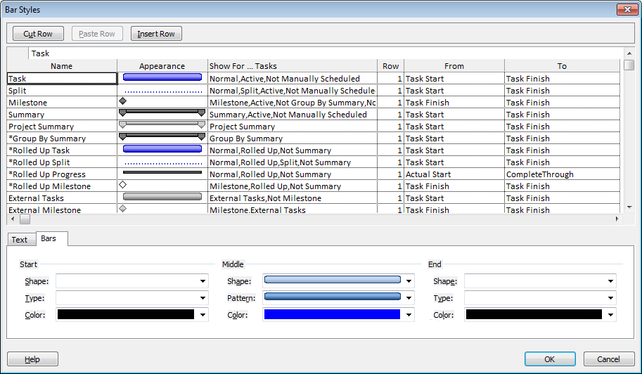
The Bar Styles dialog box opens, as shown in Figure 23-6. (If you double-click nonworking time in the timescale, the Timescale dialog box opens to the “Non-working time” tab, presumably so you can format the appearance of nonworking time.
In the table, select the type of task bar, and then select the Bars tab.
The Bars tab contains three sections: Start, Middle, and End. The Start and End sections define the marks that appear at the beginning and end of a task bar. You can choose a shape, color, and whether the mark is solid or outlined. The Middle section sets the appearance of the bar itself.
To format a mark at one of the task bar ends, in the Shape drop-down list (in either the Start or End section), select a shape.
Your choices are some exciting geometric shapes: the familiar milestone diamond, various arrows, and even a star. In Project 2010, the Shape drop-down list includes shapes for manually scheduled tasks, like the caps that indicate that a task has a start or finish date. Task bars don’t have to have a mark at the ends. You can leave the Start and End boxes empty. To remove a mark, at the top of the Shape drop-down list, select the empty entry.
If you choose a mark, Project initially fills in the Type box with Solid, which is usually the best choice, because it makes small marks more visible. You can also choose Dashed or Framed. If you want a color other than black, you can choose it from the Color drop-down list. Try several colors until you find one that looks good. Darker colors are better, because bright colors like lime and yellow disappear into the white background.
To format the bar, in the Middle section, choose the bar shape you want.
Bars can be wide, medium, or narrow, just like men’s ties. When bars aren’t full height, you can choose a position at the top, middle, or bottom of the task bar row. For example, regular and critical tasks are usually full height. Progress bars are narrow bars in the middle. Slack is a narrow bar at the bottom.
Because narrow task bars take up less space, you can display more than one in the same task row. That’s how the Multiple Baselines Gantt view (Viewing baseline and current values in a Gantt Chart view) shows three baselines on the same row.
To apply a pattern or color to a bar, in the Middle section, choose the pattern and color you want.
Task bars start with a solid pattern. To emphasize task bars or to print a schedule on a black-and-white printer, use crosshatch patterns. Test colors to see how they look in the timescale. In the task bar table, the Appearance cell to the right of the task bar name previews your masterpiece.
To format a different type of task bar, select it in the table, and then repeat steps 4–6. When you’re done, click OK.
The dialog box closes, and the new formatting appears in the view.
To change the look of individual task bars (for example, to change several deliverable sign-off meetings to purple bars), you format bars, not bar styles. Here’s how:
Select the tasks whose bars you want to format, and then choose Format→Bar Styles→Format→Bar. To format a single bar, double-click it in the timescale.
The Format Bar dialog box opens to the Bar Shape tab, which has the familiar Start, Middle, and End sections with the same options that are available for bar styles.
Pick the shapes, styles, and colors you want.
The preview appears at the bottom of the dialog box. (The background isn’t white, though, so you can’t judge colors until you see them in the view.)
Click OK.
The dialog box closes, and the selected bars sport their new look.
Tip
If all you want to change on a task bar is its color, you can do that from the task bar mini-toolbar (new in Project 2010). Right-click the task bar you want to change. On the mini-toolbar that appears above the task bar, click the Bar Color down arrow, and then choose the color you want. You can find attractive color-coordinated shades under Theme Colors, basic colors under Standard Colors—or click More Colors to pick the exact hue you want.
Attaching fields to task bars means you can see key information right in the timescale. For example, displaying the initials of people assigned to tasks lets you see resources without checking the form in the bottom pane. Adding dates to milestones emphasizes key dates.
Working with text on task bars is similar to working with the task bars themselves. You can specify the fields to show for a category, or assign fields to selected task bars. Actually, you can customize the task bar and its text at the same time, because the bar and text formatting are two tabs in the Bar Styles (or Format Bar) dialog box.
To display fields as text for a category of task bars, follow these steps:
Display the view whose task bars you want to format.
Bar styles that you customize or create apply only to the active view in the active project. If you want task bars in another view to use the same formatting, then you must repeat these steps.
Choose Format→Bar Styles→Format→Bar Styles or double-click the background of the Gantt Chart timescale.
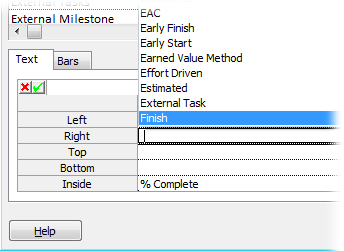
In the Bar Styles table, select the type of task bar, like Critical, and then select the Text tab.
The Text tab shows fields already associated with the selected task bar type. Task bars have five places for text, although using them all makes the bars almost unreadable. You can add fields at the left, right, top, bottom, and inside task bars.
Select a position box, like Right for the finish date. Click the down arrow, and then choose the field to display at that position, as shown in Figure 23-7.
Repeat this step to add fields at other positions. To remove a field, select the position box, and then press Backspace.
To add fields to another type of task bar, repeat steps 3 and 4. When you’re done, click OK.
The Bar Styles dialog box closes and task bars that fall in the categories you changed now show values.
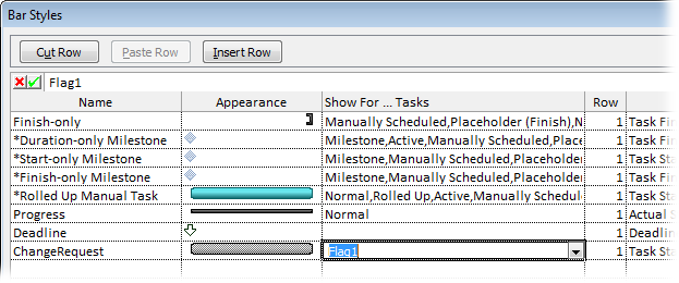
Project views usually have several different task bar styles already defined. For example, the Detail Gantt view includes task bars for regular tasks, critical tasks, progress, milestones, slack, slippage, summary tasks, and more. You may want a new type of task bar, for example to highlight tasks added for change requests and flagged with the Flag6 field.
Designing a new task bar style requires more choices than modifying existing ones. You must tell Project when to use the task bar style and the dates to start and end the bar. To show off your creativity with a custom task bar, follow these steps:
Display the view whose task bars you want to format.
Your task bar work of art applies only to the active view in the active project, unless you copy the view to the global template or another file (Storing Project Settings and Elements).
Choose Format→Bar Styles→Format→Bar Styles or double-click the background of the Gantt Chart timescale.
The Bar Styles dialog box opens.
Scroll to the end of the table, and then, in the first blank row, select the Name cell.
To insert a new task bar style in the middle of the list, select the row below where you want to insert the new row, and then click Insert Row. Project inserts a blank row above the selected row. The box on Task Bars Are Missing explains why you might insert rows in the middle of the table.
There’s no Copy Row button, but you can fake it. Select the task bar style you want to copy, and then click Cut Row. The task bar style disappears from the table, but don’t worry. Before you do anything else, click Paste Row to insert the row back into the table. Now select the row below where you want the copy, and then click Paste Row again. The copied row appears above the row you selected, and you can modify it.
In the Name field, type the name for the task bar style.
Make the name meaningful. For example, if you’re creating a task bar style for change request tasks, you might name it "ChangeRequestFlag" or simply "Change-Request.”
To tell Project when to use the style, select the style’s Show For…Tasks cell.
Click the down arrow, and then choose the category of task to which this style applies, as illustrated in Figure 23-8. For example, choose Flag1 if the Flag1 field is your change request indicator. (The style appears when Flag1 equals Yes.) The Show For…Tasks drop-down menu includes useful choices like Critical, Noncritical, In Progress, Not Started, Not Finished, and so on.
A bar style can also apply when a condition isn’t true. Suppose you create a task bar style for active change requests. The combination “Active, Flag1” tells Project to use the style for active tasks with Flag1 set to Yes. For inactive change request tasks, choose “Not Active, Flag1”. (You must type the Not for these combinations.)
Figure 23-8. Sometimes, a style applies to more than one condition in the drop-down list, like active tasks with the change request flag turned on. Choose the first condition in the drop-down list. Without closing the list, type a comma, and then choose the second condition. Rinse and repeat for additional conditions.
In the From and To columns, choose the date fields that specify when the task bar starts and ends.
For many task bars, the choices are easy: Choose “Start” in the From cell and “Finish” in the To cell to draw the task bar from the start date to the finish date. But other types of task bars use different dates. For example, a progress bar goes from the Start date to the Complete Through date. Slippage runs from the Baseline Start date to the Start date, to show how far the start has slipped.
On the Bars tab and Text tab, select the settings for the bar style and fields you want.
See Changing the way types of task bars look and Changing the way selected task bars look for formatting bars and fields.
If you’re done, click OK.
Custom bar styles have a way of multiplying. For example, if you create a bar style for flagged tasks, you usually want another style for flagged milestones, and possibly flagged critical tasks. To add more bar styles, repeat steps 3–7.
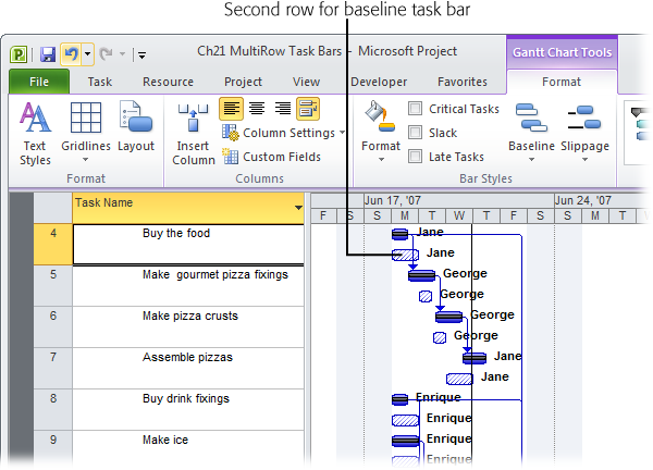
While defining a new task bar style, you may have noticed the Bar Styles dialog box’s Row column, usually containing the number 1. This property is the key to displaying more than one row for each task. For example, the Tracking Gantt view uses narrow bars to show the baseline and current task bars in the same row. If you’d rather use full-height task bars for each, then you can include regular task bars on the first row and baseline task bars on the second row. Here’s how it’s done:
Open the view that you want to modify, and then choose Format→Bar Styles→Format→Bar Styles.
The Bar Styles dialog box opens.
To add another task bar in another row, either insert a new row or copy one of the existing task bar styles.
To insert a new row, select the row below the new row, and then click Insert Row.
To copy an existing task bar style, select the row you want to copy, and then click Cut Row. Click Paste Row twice, once to re-insert the original style, the second time to insert the copy.
In the new or copied row, change the name—for example to “Task Baseline.”
Use the Bars tab and Text tab to define the bar appearance and text that surrounds it. For example, you might use a full-height task bar with blue diagonal lines for the baseline.
In the Row cell, type 2.
Project adds a second row to the timescale for each task, as shown in Figure 23-9.
Repeat steps 2–4 to add other rows, or click OK to close the dialog box.
The rows in the table double their height, and the new bars appear for the tasks that meet the task bar style conditions.
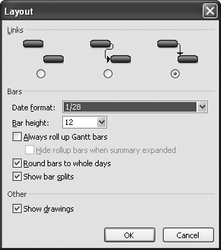
You’ve probably struggled to follow link lines between predecessor and successor tasks. Even simple projects can look like a bowl of tangled spaghetti. You can lay out the timescale to clear up clutter or improve readability. In addition to how link lines appear, you can change the height of task bars, roll up task bars from subtasks to summary tasks, or change the date format. To reach the layout options, choose Format→Format→Layout. Then use any or all of the following settings:
Link lines. The Layout dialog box, shown in Figure 23-10, has three link line options: an S, an L, or completely hidden.
Task bar date format. In the Layout dialog box, the “Date format” box sets the date format only for task bars. It’s best to choose an abbreviated format (like 1/28), and leave the full dates to table columns.
Task bar height. With bar styles and bar formatting, you can choose task bars that are thin, medium, or full-height. “Bar height” defines full-height; 12 is the standard. You can vary the height from 6 to 24.
Roll up task bars to summary tasks. You know that summary tasks roll up field values like cost and work. The “Always roll up Gantt bars” checkbox is different; turning it on shows subtasks and milestones on summary task bars. These roll-ups get messy fast. When the “Always roll up Gantt bars” checkbox is turned on, you can also turn on the “Hide rollup bars when summary expanded” checkbox. This hides the roll-up bars whenever the subtasks are visible, and shows roll-up bars only when subtasks are hidden.
Round bars to whole days. Initially, Project draws task bars to the exact task duration. Very short tasks practically disappear when the timescale is set to weeks or months. Turn on the “Round bars to whole days” checkbox to round out durations in the timescale to whole days. The durations in the table area are still exact.
Show splits. Project chops up task bars into pieces if they contain splits (small delays between working times). Most of the time, you want to see splits. If they become too distracting, then turn off the “Show bar splits” checkbox, and Project draws the task bars as solid lines.
Show drawing shapes. If you use the Drawing toolbar to add shapes or text to the timescale, you can hide those shapes by turning off the “Show drawings” checkbox.
Even the gridlines that separate table, timescale, and column heading elements are customizable. For example, you can change the line color of the lines that show the project start date and current date. Although the timescale doesn’t draw lines between task bar rows initially, you can add them to make it easier to correlate bars to rows in the table. To format gridlines, follow these steps:
Display the view you want to modify, and then choose Format→Format→Gridlines→Gridlines.
The Gridlines dialog box opens.
In the “Line to change” list, choose the type of line.
The “Line to change” list includes table and timescale categories, like Sheet Rows and Sheet Columns for the table, and Gantt Rows, Current Date, and so on for the timescale.
In the Type drop-down list, choose the line style you want. Choose the color you want.
You can draw solid, dotted, small dashed, and long dashed lines. To remove a line, choose the white entry at the top of the list. For example, to show the current date as a bright blue line, in the “Line to change” drop-down list, first select Current Date. In the Type drop-down list, choose the solid line, and then, in the Color drop-down list, choose blue.
To draw lines at intervals, for instance after every fifth row in the table, in the “At interval” section, select the option for the number.
If the interval is larger than 4, select the Other option, and then type the number in the box. When you use intervals, select the line style and color for the intervals.
If you want to format another gridline, repeat steps 2–4.
When you’re done, click OK.
When you want to format the Gantt Chart to exacting specifications, you can work through the Bar Styles, Text Styles, and Layout dialog boxes one by one. On the other hand, Project 2010 puts the commands for more common formatting right on the ribbon—like the Critical Tasks checkbox, which automatically changes critical tasks to red. But if you’re looking for several types of basic Gantt Chart formatting, the Gantt Chart Wizard could be the answer.
Note
The easiest way to use the Gantt Chart Wizard is to add it to the Quick Access toolbar. Click the down arrow to the right of the Quick Access toolbar, and then choose More Commands. In the Project Options dialog box, in the “Choose commands from” drop-down list, choose All Commands, select Gantt Chart Wizard, and then click Add. Click OK to close the Project Options dialog box.
The Gantt Chart Wizard can show the critical path or baseline information, display text on task bars, and hide or show link lines. Here’s how to use the Gantt Chart Wizard:
Display the view you want to format.
The Gantt Chart Wizard makes changes to the view definition as if you were doing the work yourself. To keep the current view definition, make a copy of the view before starting the wizard.
In the custom group on the ribbon, choose Gantt Chart Wizard. On the first screen, click Next.
The first screen describes what the wizard does.
Select the option corresponding to the task bars you want to see, and then click Next.
Standard is selected initially, and it shows blue task bars. “Critical path” changes critical tasks to red. The Baseline option shows the baseline as a narrow gray bar with the current schedule in a narrow blue bar below it. The Other option lets you pick alternative bar styles.
Select the option for the fields you want on the task bars, and then click Next.
You can show no text at all, dates, resources, or both. If you select the “Custom task information” option, then the wizard lets you pick the fields you want.
The Gantt Chart Wizard is a shortcut to removing text on task bars. Select the None option, and the wizard removes all the fields from the task bars that appear in the view.
Keep the Yes option selected to show link lines. Click Next or Finish (they both go to the Format It screen).
Select the No option to hide link lines.
On the last page, click Format It, and then click Exit Wizard.
The box on the left side of the screen is a preview of what your Gantt Chart will look like. If it’s not what you want, click Back to the appropriate page, and then select different options.
When you exit the wizard, the view shows the new formatting.
Views like Gantt Chart and Task Usage have a timescale on the right side, which shows information over time. Because of this timescale, Gantt Chart task bars lengthen or shorten depending on their duration. In a usage view, each column is a time period, so you can see work or cost per day, per week, and so on.
Note
Timescale modifications apply only to the active view. They appear every time you use the view, but you have to repeat the changes to see them in other views.
Time units are the part of the timescale you change the most. For long projects, units like weeks or months squeeze more onto the screen. Short projects are better with units like days so the task bars don’t look scrawny. (To change the time units quickly, drag the Zoom slider on the status bar at the bottom right of the window.) You can customize more of the timescale—for example, choosing the time period labels and their alignment, or shrinking or expanding column width to specific dimensions. A view can show up to three tiers of units in the heading area—for instance, to show the year on the top, then months, and finally weeks; or to show the fiscal year, and then fiscal quarters. To format the timescale, follow these steps:
Display a view like a Gantt Chart view, usage view, or the Resource Graph.
The view displays a timescale on the right side.
Double-click the timescale heading or right-click the timescale heading, and then, on the shortcut menu, choose Timescale.
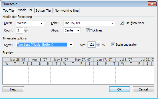
The Timescale dialog box opens, as shown in Figure 23-11.
Figure 23-11. The Timescale dialog box has four tabs: one for each tier of units and the fourth for nonworking time. The Middle Tier tab appears initially. To change the number of tiers, under “Timescale options”, choose the number of tiers in the Show drop-down list. When you use less than three, Project drops off the Top Tier first.
Select the tab for the tier you want to format.
The top, middle, and bottom tiers have the same settings: units, unit label, alignment, and so on.
The “Non-working time” tab, on the other hand, controls how nonworking time looks on the timescale; it doesn’t change the nonworking time itself. See Defining the working and nonworking days and times for a work week to learn about setting working and nonworking time in project and resources calendars. Nonworking time starts as gray shading behind task bars. You can change the color and pattern, which calendar the nonworking time comes from, and whether to hide nonworking time or draw it in front of task bars.
In the Units box, choose the time unit you want to use for the selected tier.
For the middle tier, typical units are weeks or months. The top tier may be months or years, while the bottom tier may be days or weeks. Choose units that work with the length of your project. Keep in mind that the units for a lower tier must be shorter than the units in the tier above it. If the bottom tier is days, the middle tier must be at least weeks.
If you track your project by an interval other than one time unit, choose the number in the Count box. For example, a Count equal to 2 and units set to weeks would change the timescale units to 2-week increments.
Change how the tier label looks by choosing one of the formats in the Label box.
The formats you see depend on the units you choose. For example, formats for weeks include the robust “Sun January 23, 2011” as well as the most concise “23” (which is the first day of that week). Quarter formats include “1st Quarter”, “Q1”, and “Q1, Q2, Q3, Q4,…(From Start)”, which numbers quarters sequentially from the project start date.
To display the fiscal year instead of the calendar year, turn on the “Use fiscal year” checkbox. You set the fiscal year in the Project Options dialog box (Setting the Project Fiscal Year). For example, if the starting month is June, and the calendar year in which the fiscal year starts denotes the fiscal year, then June 2010 is fiscal year 2010. However, if you don’t use the starting calendar year, the fiscal year is based on the ending calendar year, so June 2010 represents the beginning of fiscal year 2011.
To position the label within its tier, in the Align drop-down list, choose Left, Center, or Right.
When the “Tick lines” checkbox is turned on, vertical lines appear between each period in a timescale tier.
If you use more than one tier, repeat steps 3–6 to format the other tiers.
Although the “Timescale options” section is below the tier formatting section, timescale options apply to all tiers.
If the headings in the Preview section are scrunched up, in the Size box, increase the percentage.
The Size box is like zooming. Increasing the percentage from 75% to 100% stretches each time unit out, which is helpful when task bars are too skinny. If you see pound symbols (#) instead of values in the view itself, increase the percentage until the values appear. Decreasing the percentage squeezes the periods together to fit more duration on the screen.
Keep the “Scale separator” checkbox turned on to draw horizontal lines between each tier.
When you’re finished, click OK.
The dialog box closes, and the settings appear in the timescale.
Usage views like Task Usage and Resource Usage have a table on the left and a timescale on the right, both of which you can customize. The usage timescale is a grid in which each column represents one time unit, and each row represents an assignment or summary row also known as time-phased data. You can choose the fields to display in the timescale. This section describes how to change the fields in a usage timescale and how to format their values. The box on Quickly Change Column Widths describes a shortcut for changing column widths in the usage timescale. See other sections in this chapter for customizing the table, text, and timescale.
To choose fields to show in a usage view, follow these steps:
Display a usage view like Task Usage or Resource Usage.
Remember, the changes you make to the view apply only to the active view in the active project unless you copy the view to your global template (Storing Project Settings and Elements).
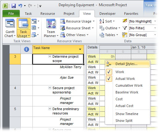
In the timescale grid, right-click any cell, and then, on the shortcut menu, choose Detail Styles, as shown in Figure 23-12. In the Details Styles dialog box, select the Usage Details tab.
The Usage Details tab includes a list of fields you can add to the timescale and lists the different time-phased fields that you can display in the timesheet: work fields, cost fields, allocation, performance measures like CV, and so on.
If you right-click the timescale heading instead, then you don’t see Detail Styles on the menu.
To add a field to the timescale, in the “Available fields” list, select the field, and then click Show.
The field jumps to the “Show these fields” list, as illustrated in Figure 23-13. Project adds a new row for the field to each assignment.
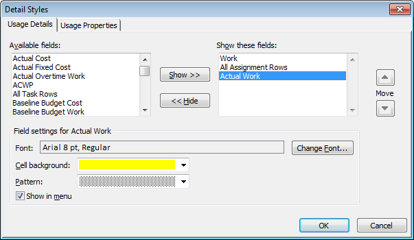
To format the timescale cells for a field, select the field in the “Show these fields” list, and then change the settings in the dialog box’s bottom half.
The built-in views use a light yellow background for the task or resource rows. The assignment rows have a white background. You can choose a different font, background color, or background pattern. If you want the field listed on the shortcut menu that appears when you right-click the timescale cells, turn on the “Show in menu” checkbox.
If you want to format the headers and data, select the Usage Properties tab, and then choose the settings you want.
Typically, these settings are fine as they are. The “Align details data” box controls whether values in cells are aligned to the left, center, or right. When “Display details header column” is set to Yes, the timescale starts with a column that shows the field names for each row. Changing this box to No isn’t a good idea, because it means you have to remember which row is which when you type or review values. The “Repeat details header on all assignment rows” checkbox is turned on by default so that each row has a header. The “Display short detail header names” checkbox is turned on to abbreviate field names so that the first column is as narrow as possible.
Click OK.
The dialog box closes, and the changes you made appear in the timescale.
The new Timeline view (Changing Manually Scheduled Tasks to Auto Scheduled) can control the timeframe shown in the timescale of a Gantt Chart or usage view. You can drag the timeline bar to change the timescale dates and scale. By adding tasks to the timeline, you can emphasize key tasks, such as critical tasks or payment milestones, in a simple linear diagram. Like other Project views, the Timeline view has its own set of customization tools. To customize the timeline, click the timeline pane and then choose the Format tab, shown in Figure 23-14.
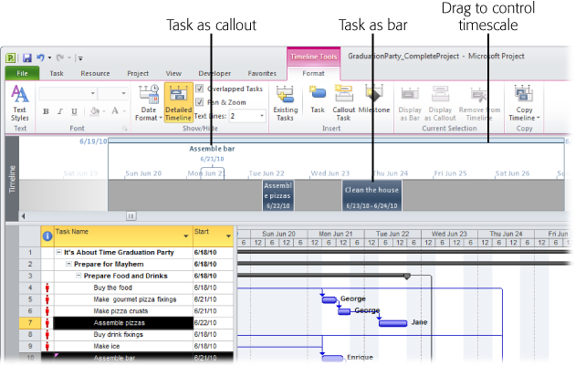
Figure 23-14. After you get the Timeline just so, you can copy it to share with others. Choose Format→Copy→Copy Timeline, and then choose how you want to share the Timeline, for example, by email or pasting it into another program. Project places the Timeline on the Clipboard, so you can paste it into an email message, Word document, PowerPoint slide, or another program file.
Note
You have to choose between displaying the timeline and the Details pane (the bottom pane of a combination view). To display the timeline, choose View→Split View, and then turn on the Timeline checkbox. If you turn on the Details checkbox, Project automatically turns off the Timeline checkbox, and vice versa.
Here are the ways you can modify the timeline’s look:
Format text styles. You can modify the appearance of different categories of timeline text as you can in other views. Choose Format→Text→Text Styles. Creating a New Table provides the full scoop on formatting text styles.
Format text. Any text in the timeline is fair game for unique formatting. For example, you may want deliverable milestones to stand out with bold green text. Right-click the text you want to format, and then choose formatting commands from the mini-toolbar that appears. Or select the text, choose Format→Font, and then choose the commands you want. Either way, you can change the font, font size, font color, bold, italic, and background color (Changing Categories of Text).
Format dates. Choose Format→Show/Hide→Date Format, and then choose the date format for the timeline. The choices are the same ones you can choose in Project Options (choose File→Options; in the Project Options dialog box, click General, and then click the “Date format” down arrow). When space is at a premium, use abbreviated formats like 1/26. For more detail, choose a format like Wed Jan 26, ’11. At the bottom of the Date Format drop-down menu, you can turn the checkmarks on or off to show or hide task dates, today’s date, and the timescale dates.
Show timeline details. For tasks you add to the timeline, choose Format→Show/Hide→Detailed Timeline to toggle between showing only bars and showing bars that contain the task name and dates.
Show tasks that overlap. Turn on the Overlapped Tasks checkbox if you want to see all the tasks added to the timeline, even if they overlap date-wise. With this checkbox turned on, the timeline adds rows to show more tasks on the same dates. If you turn this checkbox off, the timeline shows only the first task for a set of dates.
Pan and zoom. The Pan & Zoom checkbox is turned on initially, so you can drag the timeline scale to change the dates that appear in the timescale. To keep the timeline set to the full project date range, turn this checkbox off.
Set the number of text lines in task bars. In the Text Lines drop-down list, choose the number of lines of text you want to see in tasks you add to the timeline. Initially, only one line of text appears. For longer task names, choose 2 or 3. Although you can choose up to 10 lines of text, larger values mean the timeline takes up more room on the screen.
Add tasks to the timeline. The Insert section of the Format tab has commands for adding existing or new tasks to the timeline. If you choose Existing Tasks, the Add Tasks to Timeline dialog box opens. Turn on the checkboxes for the tasks you want to add to the timeline.
Display a task as a bar or callout. When you select a task in the timeline, the Current Selection section of the Format tab becomes active. The Display as Bar command shows tasks as bars in the timeline. Display as Callout shows the task above the timeline, perfect for project phases. Figure 23-14 shows an example of each. To remove a task from the timeline, choose Remove from Timeline.
Team Planner (Quickly Assigning Resources with Team Planner) is a new resource-centric view in Project 2010. It contains a row for each resource and shows the tasks to which the resource is assigned in the same row (also known as a swimlane). To change the appearance of the Team Planner view, display the view and then choose the Format tab. Many of the formatting options should be familiar: You can format text styles and change the appearance of different types of tasks. However, the Team Planner view has a few unique formatting options. Here are your choices:
Show parent tasks. The Team Planner view starts out showing all subtasks, which means that each bar in the view shows the name of the actual task. To see a summary of your project, choose Format→Format→Roll-Up, and then choose the outline level you want to see. Instead of the subtask name, bars show the parent task names for the outline level you specify.
Format gridlines and text. Choose Format→Format, and then choose Gridlines, Text Styles, or the number of lines of text to display. See Changing Categories of Text for text styles and Changing how gridlines look for formatting gridlines. Choosing a number for text lines determines how many lines of text appear in task bars.
Format task bars. The Styles section of the Format tab has commands for formatting categories of tasks. You can change the border color and fill color for auto-scheduled, manually scheduled, external, and late tasks. You can also specify how to display the actual work that’s been done.
Prevent Overallocations. Confusingly, the Prevent Overallocations command appears on the Format tab. When you turn on Prevent Overallocations and assign a task to a resource whose time is already fully allocated for those days, Project automatically moves the task to the resource’s next available time. If you turn this command off and assign a task to a resource who’s already fully allocated for those days, Project leaves the task where you place it and draws red borders on the top and bottom of the task bars to show the overallocation.
Expand resource rows. This checkbox is turned on initially, which tells Project to expand a resource row if you assign multiple tasks to the resource during the same timeframe. If you turn the checkbox off, you see only the first assigned task for those days.
Show unassigned tasks. This checkbox is turned on initially, which is what you want. That way, the bottom pane shows tasks that aren’t assigned to specific resources, so it’s easy to see which tasks still require resources.
Show unscheduled tasks. This checkbox is also turned on initially, so that manually scheduled tasks without dates appear in the Unscheduled Tasks column. That makes it easy to see which tasks need additional information.
The Resource Graph is a bar graph of resource data by time period. Although the bars in the Resource Graph are vertical, the right side of the view is still a timescale with values indicated by the height of the bars. Choosing fields to include in the Resource Graph, shown in Figure 23-15, is similar to choosing fields in a usage view. As in a Gantt Chart, you can change the appearance of bars and categories of text.
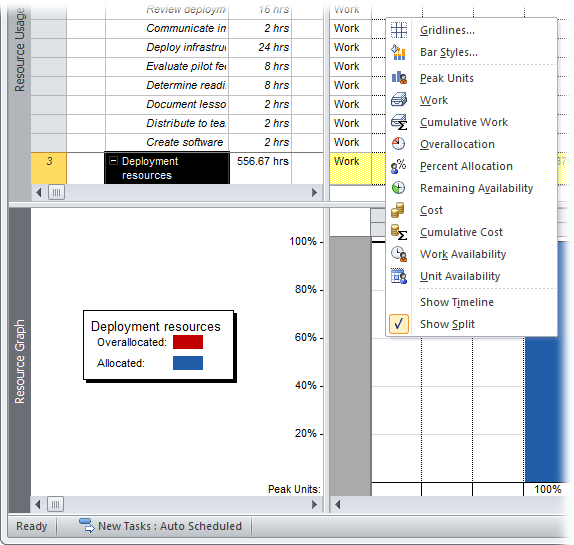
Figure 23-15. The Resource Graph has a few formatting limitations. For example, you can’t format individual bars and text, and you must pick fields from the fixed list that the Resource Graph provides.
To choose fields in the Resource Graph, right-click the background of the timescale, and then, on the shortcut menu, choose the field name. (You can also choose Format→Data and then choose the fields in the Graph drop-down list.) Here’s what each field represents:
Peak Units. The highest percentage of units assigned to a resource during a period. If the peak units are higher than the resource’s maximum units, the bar shows overallocation.
Work. The hours assigned to a resource during a period. If the assigned hours are more than the resource’s total available hours (based on maximum units and the resource calendar), the over-the-top hours show up as overallocated.
Cumulative Work. The total work assigned to the resource since the beginning of the project.
Overallocation. Only the hours that the resource is overallocated during the period. This field is helpful for finding someone with enough available time to pitch in.
Percent Allocation. The work assigned as a percentage of the resource’s available time.
Remaining Availability. The available hours that haven’t been assigned.
Cost. The work-hour and per-use cost for the resource during the period.
Cumulative Cost. The total cost for the resource since the beginning of the project.
Work Availability. A resource’s total available hours based on maximum units and resource calendar. Unlike Remaining Availability, this field doesn’t subtract hours from existing assignments.
Unit Availability. This field is Work Availability as a percentage.
The Resource Graph displays different information depending on whether it’s a combination view’s top or bottom pane. For example, if you show the Gantt Chart in the top pane, the Resource Graph in the bottom shows data for one resource at a time for the resources assigned to the selected task. You can scroll in the Resource Graph’s left pane to see values for other resources. On the other hand, if the Resource Graph is in the top pane, it can also show values for all resources. The Bar Styles dialog box for the Resource Graph contains boxes for formatting each type of bar, but the information that the bars represent changes, depending on the information you choose to display in the Resource Graph itself. For example, if the graph shows a work-related field, then you can format bar styles for overallocated work, allocated work, and proposed bookings. If the Resource Graph displays cost, the bar styles include resource cost and proposed bookings.
To modify bar styles, double-click the background of the Resource Graph, or right-click the background, and then, on the shortcut menu, choose Bar Styles. In the Bar Styles dialog box, the settings on the left side relate to a larger group of tasks or resources (all tasks or filtered resources, for example); the settings on the right side apply to selected tasks or resources. The Resource Graph draws separate bars for the selected resource and the group of filtered resources so you can compare values. To see bars for only selected resources, be sure to choose Don’t Show for all the Filtered resources settings on the left side of the dialog box. In the Bar Styles dialog box, choose the bar look you want, the color, and the pattern. You can draw values in different ways by choosing one of the following from the “Show as” drop-down list:
Bar. Displays a separate bar for each time period.
Area. Fills in a triangular or trapezoidal area equal to the value, which can span one or more periods.
Step. Instead of separate bars for each period, all adjacent bars are drawn as one filled-in area.
Line. Draws only the boundary of the area you see if you choose the Area option.
Step Line. Draws the border of the Step filled-in area.
Don’t Show. Doesn’t show the value on the graph.
A project management network diagram is a latticework of boxes (called nodes) with link lines connecting them. The boxes represent project tasks, and the link lines are the same task dependencies you see in a Gantt Chart view.
Before the dawn of computers and Project software, a network diagram was where you manually calculated the early start, early finish, late start, and late finish dates that, in turn, identify the critical path. You no longer need a network diagram and an abacus to calculate the critical path, because Project does it for you.
A network diagram is perfect for working on task dependencies, because it doesn’t show time at all. Whether a task takes 1 day or 6 months, the network diagram box is the same size, and its successor task is right next door. Because a network diagram doesn’t have a table area, task fields appear within each network diagram box. Choosing fields to display in boxes is the most common customization, but you can also change the appearance of boxes and how Project lays them out.
Views in Project are simply different ways to look at the same information. In a network diagram, boxes replace the task bars in a Gantt Chart view. Similar to the fields you can attach to each side of a task bar, network diagram boxes can contain several task fields. Before computers, the fields were the early and late start and finish dates, so you could calculate slack and the critical path. Because Project calculates early and late dates, you can pick the fields you want to see and change what the boxes look like.
Like bar styles for a Gantt Chart view, box styles set the content and appearance of boxes within a category, like Critical, Critical Summary, or Noncritical External. To format a category of boxes, follow these steps:
Choose Task→View, click the down arrow on the Gantt Chart button, and then, on the drop-down menu, choose Network Diagram.
The Network Diagram view appears, showing each task in its own box. Every box is the same size, regardless of the duration of the task.
Choose Format→Format→Box Styles (or double-click the background of the Network Diagram).
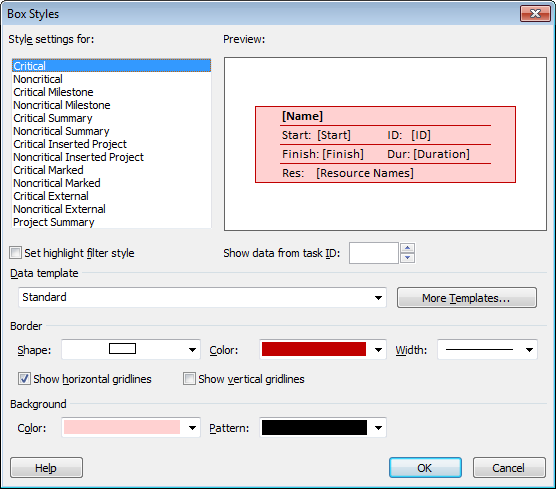
The Box Styles dialog box opens and lists the box styles for the active view, as shown in Figure 23-16.
Figure 23-16. To format individual boxes instead of categories, select the boxes you want to format, and then choose Format→Format→Box (or double-click the border of a box). The Data Template dialog box includes settings like the ones in the Box Styles dialog box: data template, shape, color, and border.
In the “Style settings for” list, select the category of box you want to format.
The categories for network diagrams focus on critical and noncritical tasks. Each category combines critical or noncritical with another condition like milestone, summary, marked, or external.
To choose the fields that appear in a box, in the “Data template” drop-down list, choose the template you want to apply.
Data templates define a set of fields and their position in a box. To see which fields a template includes, select it in the drop-down list and then, in the Preview area, look at the box. To see what a box looks like with real data, in the “Show data from task ID” box, choose a task ID number.
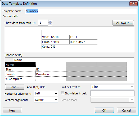
To choose exactly the fields you want—for instance to include a custom field, to create a new data template, or to modify an existing one—click More Templates. In the Data Templates dialog box, choose a template, and then click Edit or Copy. (Or click New to start one from scratch.) The Data Template Definition dialog box opens, as shown in Figure 23-17.
In the Border section, select the box shape, color, and width of the box border.
Turn on the “Show horizontal gridlines” checkbox or “Show vertical gridlines” checkbox to add horizontal or vertical lines between the fields inside a box. To choose a different background color or pattern for the box, choose the color and pattern in the drop-down lists. Check the preview when you choose colors and patterns to make sure the fields are still legible.
To change the formatting for another category, repeat steps 3–5.
When you’re done, click OK to close the Box Styles dialog box.
A network diagram lays out tasks like a flowchart, with predecessor tasks flowing across link lines to successor tasks. In Project, you can change the arrangement of boxes, including the alignment between rows and columns, the spacing between boxes, row height, and column width. You can also draw link lines straight from one box to the next, or use a combination of horizontal and vertical line segments. Your layout choices also include color selections and a host of other options. Choose Format→Format→Layout, and then use one or more of the following settings:
Manual or automatic layout. In the Layout Mode section, select “Automatically position all boxes” to entrust positioning to Project. The program uses the “Box layout” settings to arrange and space boxes. When Project positions boxes, turn on the “Adjust for page breaks” checkbox so Project doesn’t place boxes on top of a page break (which then displays the box on both pages when you print).
If you can’t resist fine-tuning box positions, select the “Allow manual box positioning” option. Project initially lays out the boxes based on the settings in the Box Layout section, but you can move the boxes, too.
Box layout. The Box Layout section controls where boxes go, and which boxes you see. The Arrangement drop-down list includes layouts like Top Down From Left and Top Down Critical First. The Row and Column settings include alignment (Left, Center, or Right), spacing (in pixels) between rows and columns, and box width and height.
Unlike the organizing influence of summary tasks in a Gantt Chart, summary tasks tend to muddle a Network Diagram view, which is why turning off the “Show summary tasks” checkbox is a good idea. Without summary tasks, you can see the relationships between work tasks more clearly. On the other hand, if you link summary tasks to other tasks, then keeping the “Show summary tasks” checkbox turned on shows all your links. The “Keep tasks with their summaries” checkbox tells Project to position subtasks near their summary tasks.
Tip
In Project 2010, you can quickly change the display of the network diagram using the ribbon. To turn off summary tasks, choose Format→Show/Hide and then turn off the Summary Tasks checkbox. To display link lines as straight lines, choose Format→Show/Hide and then turn on the Straight Links checkbox.
Link line look. The Link Style section lets you switch link lines from rectilinear (horizontal and vertical segments) to straight from one box to another. The “Show arrows” checkbox is turned on initially, and that’s usually what you want. You can also add task dependency text on link lines by turning on the “Show link labels” checkbox.
Color. The Link Color section starts with critical links drawn in red and noncritical links drawn in black. If you use other colors for critical and noncritical, choose them in this section.
Other options. The Diagram Options section is a hodgepodge of settings: background color, background pattern, whether page break lines appear in the diagram, whether to show in-progress and completed tasks, and whether to hide all the fields except the ID (perfect when you’re concerned only with task dependencies).
The Calendar view can’t display the entirety of a project, but it’s a great view for showing teams what they’re doing during a particular period, as Figure 23-18 shows. The bar styles, text styles, and gridlines are all within your aesthetic control. You can also customize the timescale for bars and change the calendar to show 1 week, several weeks, or whole months.
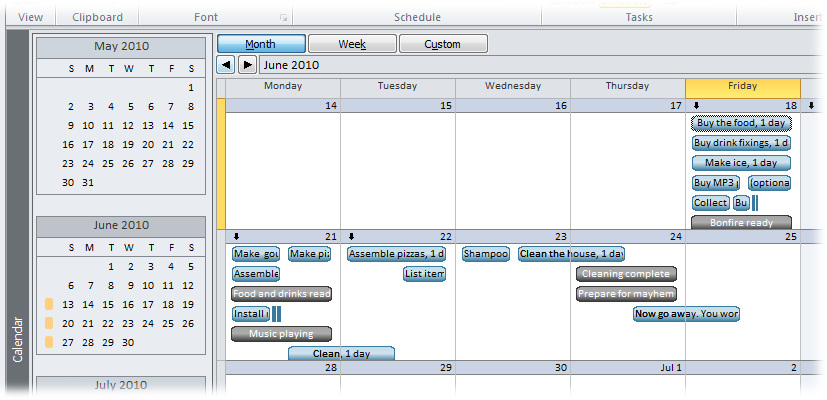
Figure 23-18. In a calendar view, move to the next or previous period by clicking the left or right arrows just below the Month, Week, and Custom buttons. For example, when the calendar shows an entire month, the left arrow switches to the previous month.
Note
A calendar view is different from a project, resource, or task calendar (Defining Work Schedules with Calendars). It’s like the electronic version of an appointment book filled in with project tasks and assignments. Project, resource, and task calendars are like the shift schedules that workers receive, telling them which days they work or have off, and which shift they work, but not what work they do during that time.
Here’s an overview of calendar view settings:
Choose a time period. A calendar view displays 1 month at a time initially, but changing the time period is easy. Above the calendar, click Month, Week, or Custom. If you click Custom, the Zoom dialog box opens, and you can set a number of weeks or the specific dates you want to see. Alternatively, you can drag the Zoom slider to see shorter or longer periods.
Add a monthly preview. To include a preview of the previous and next months like many paper calendars do, right-click the calendar background and then, on the shortcut menu, choose Timescale (or double-click the top of the calendar). In the Timescale dialog box, select the Week Headings tab, and then select the “Display month pane” checkbox.
Format the timescale. Right-click the calendar background, and then choose Timescale (or double-click the timescale header) to open the Timescale dialog box. Select the Week Headings tab to choose the titles for months (for instance, March 2010 or 3/10), weeks (March 25 or M 25), and days (Monday, Mon, or M). To focus on weekdays, select the “5 days” option. For round-the-clock operations, “7 days” shows every day of the week.
The Date Boxes tab determines the information that appears at the top and bottom of each calendar box. For example, the day of the month sits at the top right, and the overflow indicator (which tells you there’s more information than you can see), at the top left. You can add text at each corner of the box.
The Date Shading tab controls how working and nonworking time appear. For example, nonworking days on the base calendar are shaded, while working days are white.
Layout tasks. Choose Format→Layout. Click the small arrow at bottom right of the Layout section to open the Layout dialog box. Initially, the calendar shows tasks based on the sort order that’s applied (ID, initially). If you select the “Attempt to fit as many tasks as possible” option, then the calendar sorts tasks by Total Slack and then by Duration.
Turn on the “Automatic layout” checkbox to tell Project to reapply the layout options as you add, remove, or sort tasks.
Customize calendar bar styles. Calendar bars are different from their Gantt Chart siblings, so the bar style options are different, too. To change the way calendar bar styles look, choose Format→Format→Bar Styles. You can use a bar, a line, or simply text, and you can set the pattern and color for each type of bar. In the Field(s) box, choose the field you want to display inside bars. To include more than one field, separate each field with a comma.
Views like the Gantt Chart and Task Usage come with a table of information—each column is a Project field. Sometimes, the table is the view, like in the Resource Sheet. Either way, Project comes with several built-in tables, like Entry and Cost, that contain frequently used collections of fields. Like most elements in Project, you can change tables to suit your needs.
You can easily swap the table you see in a view, for instance to switch from a summary to a table that shows performance compared to the baseline. But you can also change the columns in a table, temporarily adding columns to correct a problem, or permanently adding, removing, and rearranging columns to reflect how you work. Going a step further, the column width, row height, and a few other options are customizable so you can make a table look exactly the way you want.
Project offers two ways to swap out a table in a view. To choose any existing table, the More Views dialog box is the place to go. For tables on the Table menu, there’s a shortcut.
To change the table, use one of these methods:
Fast method. Right-click the Select All box at the intersection of the row and column headings (above the first ID cell), and then, on the shortcut menu, choose the table you want.
Never-fails method. Choose View→Data→Tables→More Tables (or right-click the Select All box, and then, on the shortcut menu, choose More Tables). In the More Tables dialog box, double-click the table name. The More Tables dialog box lists every table that exists in your global template and the current Project file.
Note
Project dutifully records every change you make to a table, so the table shows those changes every time you apply it. Project stores the customized table in your Project file, although it has the same name as the original built-in one. To use both the original and your custom version, make a copy of the built-in table, and then modify it, as described on Creating a New Table. For custom tables that you want to use in other files, use the Organizer to copy the custom table from your Project file to the global template or another file (Sharing Custom Elements).
You can most easily make table changes by working on the table directly in a view. You can see the results immediately and try again until you get it right. Project records changes in the table’s definition, so working in a view changes the table just as working in the Table Definition dialog box (Modifying a Table Definition) does. Here are the techniques to use if you like seeing results as you go:
Add a column. Right-click the column heading to the right of the new column, and then choose Insert Column. In the “Field name” drop-down list, choose the field, as shown in Figure 23-19. To quickly scroll to the field you want, start typing the field name. Project selects the first field that matches the letters you’ve typed. You can also click the Add New Column heading in the last column of the table, and then choose the field you want from the drop-down list.
Remove a column. Right-click the column you want to remove, and then choose Hide Column. Project removes the column from the table definition and view. The box on Where’s That Column? provides another way to hide columns.
Rearrange columns. If the table has the right columns in the wrong order, you can drag columns into other positions in the table. Click the column heading for the column you want to move. When the pointer turns into a four-headed arrow, drag the column to the new location. A dark gray vertical line jumps from column edge to edge to show you where the column will appear if you release the mouse button.
Edit a column. Right-click a column and then, on the shortcut menu, choose Field Settings. The Field Settings dialog box opens with the “Field name” box set to the selected field. Then you can change the title, column width, alignment, and text wrapping.
Change column width. Move the pointer between two column headings with the column you want to resize on the left. When the pointer changes into a two-headed arrow, drag to the left or right until the left column is the width you want.
Tip
When values don’t fit in a column, Project replaces the text with a series of pound symbols (#), which aren’t very informative. There’s a quick way to resize a column to show all its values. Move the pointer to the right edge of the column heading. When the pointer changes to a two-headed arrow, double-click the edge. In the Field Settings dialog box, click Best Fit to do the same thing.
Wrap text. Project 2010 automatically sets some columns like Task Name to wrap text—for example, to wrap very long task names over several lines as you change the column width. To wrap text in a column, right-click the column, and then, on the shortcut menu, choose Wrap Text.
Change row height. You can change the height of specific rows in a table. Move the pointer to the lower border of the row’s ID number, and then drag up or down until the row is the height you want.
Fine-tune the column heading. If you want the column heading to be something besides the field name, in the Field Settings dialog box, in the Title box, type the heading you want. “Align Title” can be Left, Center, or Right. Turn on the “Header Text Wrapping” checkbox to wrap the words in the title over several lines when the column is narrow.
Align data. In the Field Settings dialog box, “Align data” positions values in the column.
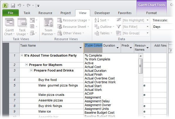
If you prefer to do all your table editing in one dialog box, choose View→Data→Tables→More Tables. In the More Tables dialog box, select the table you want to work on, and then click Edit. (If the list doesn’t contain the table you want, check that you’ve selected the Task or Resource option to show the correct list of tables.) The Table Definition dialog box opens, with all the customization features available in the view—and a few more besides.
Knowing which keys to press in the Table Definition dialog box is, well, the key to success. To move to the next cell in the grid, press the right arrow. (Pressing Enter doesn’t move to the next cell; it closes the dialog box as if you clicked OK.) Tab jumps from group to group. If you’re in the grid area and you press Tab, Project fills in the rest of the row with standard choices, and then jumps to the “Date format” box below the grid. To move to the end, press Ctrl+right arrow. To move back again, press Ctrl+left arrow.
The Table Definition dialog box contains a table of its own, so terminology is a challenge. Although Project doesn’t have official names for these elements, in this section, the Table Definition table is called the grid. A column in the Table Definition grid is a property, while a column in the table you’re working on is called the table column. A row in the Table Definition grid is called a row and represents a Project field within the table you’re working on. A row in the table is called a table row and represents a task, resource, or assignment.
Tip
If you want to go back to the original table definition for the current table, choose View→Data→Tables→Reset to Default.
Here’s how you make changes to a table in the Table Definition dialog box:
Add a table column. You can insert a table column in any row in the Table Definition grid. To insert a table column at the end, click the first blank Field Name cell, and then choose the field you want for the new table column. Keep in mind that the top row in the grid represents the leftmost table column; the bottom row in the grid is the rightmost table column.
To add a table column in the middle, select the row below the new grid row, and then click Insert Row to insert a blank row, as illustrated in Figure 23-20. In the Field Name cell, choose the field you want to use.
Remove a table column. In the Table Definition dialog box, select the row containing the field name you want to remove, and then click Delete Row.
Rearrange table columns. Select the field name you want to move, and then click Cut Row. Project places the cut row on the Clipboard. Select the row below where you want to insert the cut field, and then click Paste Row. The cut row slides into its new location.
Change table column width. Select the Width cell, and then type a number.
Fine-tune a table column. The rest of the row cells are the same items you can set in the Field Settings dialog box (Changing Table Contents): Title, Align Title, Align Data, and Header Wrapping. Change the Text Wrapping property to Yes if you want Project to automatically wrap the text in a column as you change its width.
Specify date format. In the “Date format” drop-down list, choose the date format you want for date fields in the table. Choosing a table date format overrides the project-wide date format (choose File→Options, click General, and then choose a date format in the “Date format” box).
Change table row height. If you want to adjust the height of all the table rows, then in the Row Height box, type or choose a number. The number is a multiple of the standard height; that is, “2” represents row heights that are twice the standard.
Keep the first column visible. Project turns on the “Lock first column” checkbox, which means the ID column remains visible even if you scroll all the way to the right in the table. You can keep task names or resource names in view by making Task Name or Resource Name the first column and then turning on the “Lock first column” checkbox.
To lock the Task Name column, for example, in the Field Name column, select Name, and then click Cut Row. Select the first row in the grid, and then click Paste Row to insert the Name field in the first row. Make sure the “Lock first column” checkbox is turned on, and then click OK. In the view, the Task Name column is in the first column and shaded to show that it’s locked. As you scroll, it remains steadfastly in place.
Adjust heading row height. With header wrapping turned on, Project automatically wraps column headings to fit column width. Project initially turns on the “Auto-adjust header row heights” checkbox, and you should keep it that way. When this setting is turned on, Project adjusts the row height of the column heading to show the entire column title, increasing the height for narrow columns and decreasing the height as the column widens. With the checkbox turned off, the column heading still wraps, but some of the text disappears at the bottom of the cell.
Show “Add New Column”. Out of the box, Project turns on the “Show ‘Add New Column’ interface” checkbox, which means the rightmost column in the table is Add New Column. Changing Table Contents explains how to use this column to add new fields to a table.
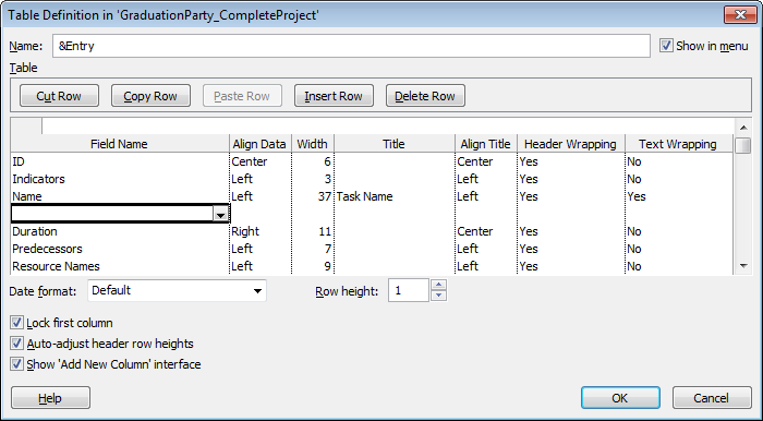
You can create a new table from scratch or by copying one that’s close to what you want. If you’ve inserted the fields you want into the current table, you can quickly turn it into a new table by choosing View→Data→Tables→Save Fields as a New Table. In the Save Table dialog box, type the name for the table and then click OK.
If you want to start from scratch or choose other settings, the More Tables dialog box is the place to start. To create a new table in this way, follow these steps:
Choose View→Data→Tables→More Tables.
The More Tables dialog box opens.
To create a table from scratch, select the Task or Resource option to specify the type of table, and then click New. If you want to copy an existing table, select it in the list, and then click Copy.
The Table Definition dialog box opens.
In the Name box, type the name for the table.
Project initially fills in names like “Table 1” for a new table or “Copy of” and the table name for a copied table. Replace Project’s name with one that describes the table contents, like “Baseline2” or “DateSummary.”
To display the table when you choose View→Data→Tables, turn on the “Show in menu” checkbox.
The table also appears when you right-click the Select All box at the intersection of the column headings and row IDs.
The table is ready for you to add columns, as described on Changing Table Contents and Changing Table Contents.
Different Gantt Chart views may show the critical path in red or slack time as narrow green lines, but text appears in the same old 8-point Arial font. Project text styles make it easy to format text for different categories of information, like row and column headings, text for critical tasks, or text at the same position on task bars.
Whether you want to emphasize critical tasks with bold red letters or your tired eyes beg for larger text, you can use text styles to change formatting quickly and keep formatting consistent. Choose the type of information to format (headings, milestones, and so on) and the text formatting you want (font, font size, font style, color, and background color). Or you can reformat a single string of text for special emphasis, like the “Manager of the Year” caption under your boss’s picture. This section explains how to do both.
Project text styles are watered-down versions of their Word cousins: Project doesn’t let you change as many text characteristics. Just as a heading style in Word changes all the headings in a document, a text style drapes itself over every occurrence of text in its category. Set the text style for milestone tasks to bold green Blackadder ITC font, and the text for every milestone task follows suit. If a task or resource no longer fits the category, then Project takes care of changing the text formatting to that of the task’s or resource’s new category. Here’s how to format text using text styles:
Open the view in which you want to format text.
When you modify text styles, the changes appear only in the active view in the active project. Sadly, you can’t copy these text styles to other views; you must repeat the text style formatting in each view you want to use them in. On a brighter note, once you modify a view to use attractively formatted text styles, you can use the Organizer (Sharing Custom Elements) to copy the view to your global template or another Project file.
Choose Format→Format→Text Styles.
In the Item to Change drop-down list, choose the category you want to reformat, as shown in Figure 23-21.
The categories you can format are built-in, so you can’t add your own.
If you want to format all text in a view, for instance to enlarge text for your aging stakeholders, select All in the Item to Change drop-down list. The formatting applies to all text in the active view, including table headings, table text, and task bar text.
Figure 23-21. The last two items in the drop-down list are Changed Cells and Inactive Tasks. Changed Cells corresponds to the change highlighting feature. You can change the text and background color for this category to make changed values stand out. The box on page 618 describes change highlighting in more detail. Choosing Inactive Tasks lets you change the appearance of tasks that you set to inactive (page 353).
Choose the font, font style, and font size you want for the category.
The Font list displays the fonts installed on your computer. Font Style represents formatting like bold and italic. The Size list shows standard font sizes, but you can type a number in the Size box to pick another size. You can also turn on the Underline checkbox to underline text, although underlining gets lost in view tables.
In the Color drop-down list, choose the color you want.
Colors other than black can be hard to read, although dark colors are better than light shades. Look at the text after you’ve formatted it, and maybe print samples on both color and black-and-white printers to make sure the colors work.
To highlight cells that use a text style, in the Background Color drop-down list, choose the color you want.
Similar to the shading that Project applies to changed cells, you can change the background color for critical tasks, summary tasks, and so on. If you tend to print to black-and-white printers, then it’s a good idea to choose a background pattern in the Background Pattern drop-down list, because these patterns show up even in black and white. The Sample box shows you what your formatting choices look like.
Click OK.
The Text Styles dialog box closes. Any text in your selected category displays the new formatting.
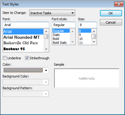
Suppose one or two tasks are the CEO’s favorites, so you want them to stand out from everything else. You can format text that you select down to an individual cell in a table. In Project 2010, formatting selected text is a snap with the mini-toolbar that appears when you right-click a cell, as shown in Figure 23-22.
You can apply the same kinds of formatting as with text styles, but the basic steps are a little different:
Select all the cells with the text you want to format, and then right-click one of the selected cells.
Select a single cell, several cells, a row, or several rows. The formatting commands format whatever text is selected.
On the mini-toolbar that appears above the top selection, click the formatting commands you want.
The first line of the toolbar has drop-down lists for fonts and font sizes. The second line has buttons for changing text to bold or italic. Click the down arrows to choose a cell background color or text color. The selected text immediately displays its new formatting. If the CEO becomes enamored with another part of the project, you must select the text again to remove the special formatting you applied.
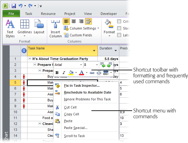
Figure 23-22. In addition to the shortcut menu that appears when you right-click a cell, a mini-toolbar perches above the cell you right-click. Click a tool to change the font, font size, font color, bold, italic, or cell background color. The mini-toolbar also has frequently used commands, such as Link Tasks, Outdent Task, and Indent Task.
Finding project information can be like sifting for gold—lots of project sediment can obscure the nuggets you’re looking for. In Project, filters screen out information you don’t care about so you can easily see the information you do want. Project comes with several built-in filters to get you started. For example, the Using Resource filter shows tasks that use specific resources, and the Tasks with Estimated Durations filter shows tasks with question marks in their Duration fields, so you can fill in duration values. You can also create ad hoc filters with AutoFilter. Either way, this section shows you how. The box on Summarizing a Project talks about a few commands that act like filters.
Built-in filters can act as a tutorial when you want to create your own filters. They provide examples of combining several tests in one filter, comparing the value of one field to another, or asking for input. You could create a filter to find critical tasks whose dates are slipping by starting with the built-in Slipping Tasks filter and adding a test on the Critical field. Here are some ideas for helpful filters:
Critical tasks with overallocated resources. Filter for tasks whose Critical and Overallocated fields are both equal to Yes, to find tasks that are at risk.
Incomplete tasks using a resource. If a resource gets reassigned to another project, you can find all the tasks that person was assigned to that are in progress or haven’t started. Then you can work on finding replacements.
Work packages. Create a filter to turn off the display of both summary tasks and milestones so the task list shows only work packages.
Generic resources. Display only generic resources so you can see which tasks you still need to staff.
Changes you make to a project can affect what should appear in the filtered list—but you have to update the filter each time. For example, if you shorten a task so that it’s no longer on the critical path, you’d expect it to disappear when the Critical filter is in place. It turns out that Project doesn’t automatically update the filtered list as you make changes. To make sure you’re seeing the right items, quickly reapply the current filter by pressing Ctrl+F3.
Filters are a great way to confirm that you’ve made all the changes you need. For example, when you apply the “Tasks with Estimated Durations” filter, the task list displays only tasks with estimated durations. After you change durations on those tasks, reapply the filter (by pressing Ctrl+F3). When the filtered list is empty, you know you’re done.
Filters can be as simple as the Critical filter, which just checks that the Critical field is equal to Yes. AutoFilter (Quick and Dirty Filtering with AutoFilter) makes quick work of simple filters like these. But filters can also have several nested tests, like the Slipped/Late Project filter. An existing filter makes a great template, whether you want filter-building guidance or just a shortcut. For example, to set up a group that uses both the Critical and Duration fields, you can copy the built-in Critical group and then modify the copy to add a condition for Duration.
Creating filters from scratch or from copies is almost identical. You create the new filter, change the name Project assigns, and then define the filter conditions. Here are the steps:
Choose View→Data. Click the Filter down arrow and then, on the drop-down menu, choose More Filters.
If a task-oriented view is visible, the More Filters dialog box opens with the Task option selected. The Filters list includes all the task-oriented filters, like Completed Tasks and Milestones. If a resource-oriented view like the Resource Sheet is visible, the Resource option is selected automatically. To work on a task or resource filter, select the Task or Resource option.
To start with an existing filter, in the Filters list, select the filter you want to copy, and then click Copy. To start with a blank slate, click New. To edit an existing filter, select the filter, and then click Edit.
You can also start a new filter by choosing View→Data, clicking the Filter down arrow, and then, on the drop-down menu, choosing New Filter.
In the Name box in the Filter Definition dialog box, type a new name for the filter.
Project fills in the Name box with something like “Filter 1” for new filters and “Copy of” followed by the filter name for copied filters, as shown in Figure 23-23. Replace the standard name with one that describes what the filter does, like “Work packages.”
Add or modify the filter tests, and then click OK to save the filter.
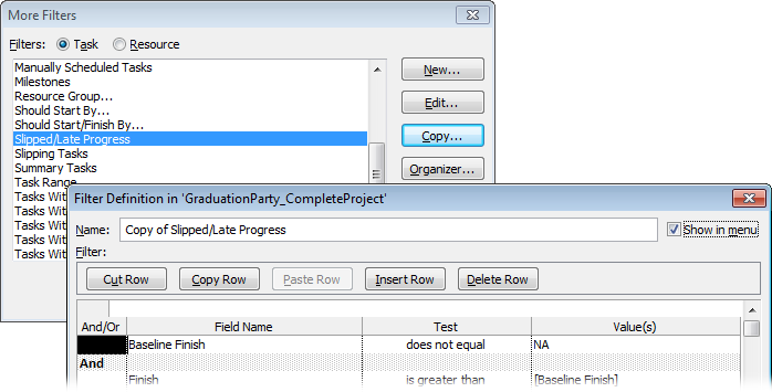
Filters are a gauntlet of tests that tasks, resources, or assignments have to pass in order to appear in the view. For example, the In Progress Tasks filter first tests whether a task has started, and then tests whether it is not finished. If a task has started but not finished (that is, it passes both tests), then it appears in the task list. This section describes how to create different types of tests, including the following:
Comparing a field to a value. The simplest tests compare a field to a specific text string, number, or other value, like the Critical filter testing whether the Critical field equals Yes.
Comparing two fields. You can set up a filter to compare the values from two fields like the Cost Overbudget built-in filter, which tests whether Cost is greater than Baseline Cost.
Multiple tests. Filters are often made up of several tests, like the Should Start/Finish By built-in filter. When you combine more than one test, you must tell Project whether items must pass all tests or some combination of them, as you’ll learn on Comparing a field to a value.
Interactive tests. In some cases, you want a different filter value each time you apply the filter. For example, you filter tasks by a specific assigned resource depending on whom you’re trying to free up. An interactive filter asks for a value and then uses your answer to filter the list.
Comparing a field to a value is a good introduction to tests. Many basic filters need only one of these tests—like the perennial favorite Critical filter. Here are the steps to create a test that compares a field to a value, using a filter for critical tasks as an example:
In the Filter Definition dialog box, select the Field Name cell, click the down arrow that appears, choose the field you want to test (in this example, Critical), and then press Enter.
The field appears in the Field Name cell. When you press Enter, Project selects the Test cell in the same row.
To quickly select a field in the drop-down list, click the down arrow to open the drop-down list. Then start typing the first few letters of the field name. When Project selects the field you want, press Enter.
Click the Test cell down arrow, and then choose the type of test you want to apply, as illustrated in Figure 23-24. For the critical filter, choose the “equals” test. Press Enter to move to the Value(s) cell in the same row.
Table 23-1 describes the tests that Project offers and gives an example of each one. For example, the Work Overbudget filter uses “is greater than” to see whether actual work hours are greater than baseline work hours.
In the Value(s) cell, type or choose the value to compare to the field.
If the field you’re testing is a Yes/No field, you can type Yes or No or choose the values from the drop-down list. In Figure 23-24, the test checks to see if the outline level is less than or equal to 1.
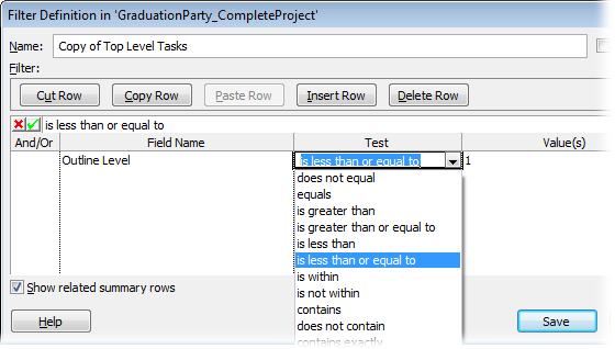
Table 23-1. Project offers several tests for you to use in your filters.
Test | What it does; example |
|---|---|
Equals | The field and test value must be equal. The Critical filter tests whether the Critical field equals Yes. |
Does Not Equal | The field does not equal the test value. The Incomplete Tasks filter tests whether % Complete does not equal 100%. |
Is Greater Than | The field value must be greater than the test value. The Slipping filter tests whether the Finish field is greater than the Baseline Finish field. Later dates are greater than earlier dates. |
Is Greater Than Or Equal To | The field value must be greater than or equal to the test value. The Date Range filter tests whether the start date is greater than or equal to the date you specify. |
Is Less Than | The field value must be less than the test value. The Should Start By filter tests whether the Start field is less than (earlier than) the date you specify. |
Is Less Than Or Equal To | The field value must be less than or equal to the test value. You can test whether the Schedule Variance field is less than or equal to 0 to find tasks that are on time or early. |
Is Within | The field value must be equal to or between two values you specify. The Task Range filter tests whether the ID field is within two task ID numbers. In the Value(s) cell, you type the two numbers separated by a comma, like 50,100. |
Is Not Within | The values must be outside the range you specify. For example, to find the cheapest and most expensive resources, test whether Standard Rate is not within 25,300. |
Contains | This string test checks whether the field value contains the string in the Value(s) cell. For example, you can see whether the Task Name field contains “Payment” to find all the payment milestones. |
Does Not Contain | This string test looks for field values that don’t contain a string. For example, to eliminate all phase two tasks, you can test whether the Task Name field does not contain “Phase 2.” |
Contains Exactly | This test looks for exact matches between the field and the test value. The Using Resource filter tests whether Resource Name contains the exact resource name you type. |
Tip
The “equals” and “does not equal” tests can compare text field values to strings with wildcard characters. “*” is the wildcard for one or more characters; “?” replaces just one character. For example, “* Supervisor” finds all the resources with “Supervisor” at the end of their names. On the other hand, “BigDig ???” finds the BigDig 300 backhoe and the BigDig 500, but not the apartment-cleaning BigDig 50.
The most useful filters seem to be ones that compare two fields. For example, if the date in the Finish field is greater than the date in the Baseline Finish field, then a task is running late. Setting up a test to compare two fields is similar to comparing a field to a value. Here are the steps:
In the Filter Definition dialog box, select the Field Name cell, click the down arrow that appears, choose the field you want to test (Finish in this example), and then press Enter.
Project jumps to the Test cell in the same row, ready for you to choose a test.
Click the Test cell down arrow, and then choose the test you want to apply—“is greater than” in this example.
Press Enter to move to the Value(s) cell in the same row.
In the Value(s) cell, click the down arrow, and then choose the comparison field, Baseline Finish in this example.
In the Value(s) column, Project differentiates fields from text by enclosing the field name in square brackets ([ ]), as shown in Figure 23-25.
Repeat steps 1–3 to add more tests to the filter.
When you’ve finished adding tests, click OK to save the filter.
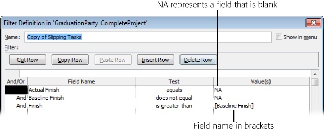
In many cases, a filter needs more than one test to do what you want. Compound filters mean you have more choices for how you put the tests together. You can set up filters in which items must pass every test or only some of the tests.
Initially, Project evaluates tests in the order they appear in the Filter Definition table, like a worried mother might ask, “Is he single?” “Is he rich?” and only then, “Is he ready to get married?” The items that pass the first test move on to the next test. Project keeps testing until there are no more tests.
And and Or are called Boolean (logic) operators, which you use to specify whether an item has to pass both tests or only one. And and Or work just like they do in real life. If you want items to pass both tests, use And; for instance, “Is he single?” and “Is he ready to get married?” Use Or if the items must pass only one test, like “Is he rich?” or “Is he smart?”
You (or, in this case, your mother) can use additional Ands or Ors to change the order of tests. For example, he has to be smart or rich; only then does it matter whether he’s ready to get married.
The following example creates a filter that finds tasks that have overallocated resources and are running late. It first finds baselined tasks with overallocated resources. For those tasks, it checks for delayed finish dates or work that’s behind schedule. If a task passes both sets of tests, it appears in the task list.
Each multiple test filter is different, but the following steps demonstrate the concept:
In the Filter Definition dialog box, in the Name box, type a filter name.
Because multitest filters do so much, build a name from the key features of the filter like “Slipped/LateProgress/Overallocated.” If you plan to use the filter frequently, turn on the “Show in menu” checkbox. The filter then appears in the filter list—for example, when you choose View→Data and then click the Filter down arrow, or when you click the down arrow in a table column header and then choose Filters.
In the first table row, define the condition you want (including field, test, and value).
In this example, the first condition checks that the task has a baseline (that is, Baseline Finish does not equal NA). The Baseline Finish field contains a date if the task is baselined, NA if it isn’t. Type NA whenever you want to test for a value that’s blank.
In the second row’s And/Or cell, choose And, and then add the condition in the other cells. Use Or instead, if a task or resource has to pass only one of the tests.
If you add a condition to the row, And appears on the right side of the cell with unbolded text, as shown in Figure 23-26. This And indicates that the condition is one of several that work as a team.
In the third row’s And/Or cell, choose And, and then click another row.
As soon as you click any other row, several things happen. The And you just added moves to the left side of the cell, the text is bolded, and the row is shaded. This formatting is Project’s way of saying that the row acts like the parentheses in a mathematical equation before and after the empty row. For example, with And in the third row, Project evaluates the first two tests as a set and evaluates the tests after the third row as a set, as the following steps show.
If you forget to include a test, you don’t have to start from the beginning. The box on Inserting, Deleting, and Rearranging Rows explains how to add, remove, and otherwise change condition order after the fact.
In the fourth row, bypass the And/Or cell, and then simply add the test for slipped tasks.
You don’t have to include an And or an Or, because this test is the first one of the second set. The test for slipped tasks checks whether the Finish field is greater than the Baseline Finish field.
In the fifth row, choose Or in the And/Or cell, and then add the test for late progress.
The Or in front of this condition, shown in Figure 23-27, tells Project that a task has to pass either the slipped task test or the late progress test. Either situation means the task is in trouble.
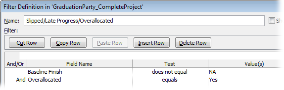
With some filters, you want to use different values each time you apply the filter, which is known as an interactive filter. An interactive filter simply means that the filter asks for values to use in tests. For example, when you’re trying to find tasks scheduled during people’s vacations, you can apply the Using Resource In Date Range filter. Each time you apply this filter, you tell it which resource you’re looking for and the beginning and ending dates you’re interested in. These values act exactly as though you had placed them in the Filter Definition dialog box, in Value(s) cells.
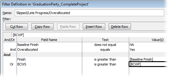
Figure 23-27. The test for late progress checks for budgeted cost of work scheduled (page 420) greater than the budgeted cost of work completed. What the test means in English is this: For the duration that’s passed, was more work scheduled than what has been completed?
Creating these inquisitive filters is easy once you learn how to define a prompt. Here are the steps:
In the row for the interactive condition, choose the field and the test you want.
For example, to find a specific resource, choose the Resource Names field, and the “contains exactly” test.
In the Value(s) cell, type the prompt in quotation marks followed by a question mark, as shown in Figure 23-28.
For example, type a prompt like “Show tasks assigned to this lucky devil”?
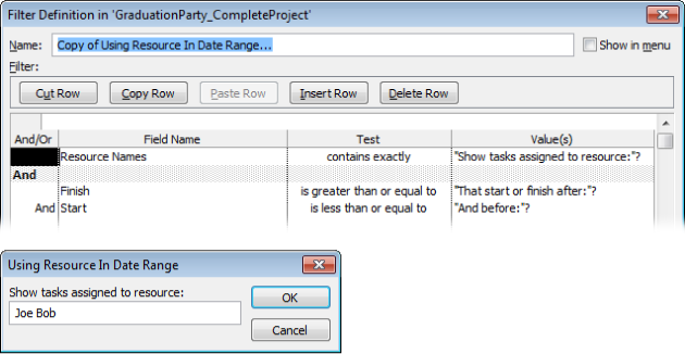
Interactive filters are great when you frequently filter for different values, like when you filter for just a few resources or different date ranges. But sometimes you just have a quick, one-time question, so saving a filter doesn’t make sense. AutoFilter, which is like its relative in Excel, lets you pick filter fields and values as you go. You can change the fields or the values at will, and combine filters on several fields at the same time. The box on Building Custom Filters with AutoFilter shows you how to whip up a custom AutoFilter test, if the filter you want goes beyond the choices on an AutoFilter drop-down menu.
Here’s how to use AutoFilter:
If AutoFilter isn’t turned on (down arrows aren’t visible to the right of each column heading), then choose View→Data, click the Filter down arrow, and then choose Display AutoFilter.
Project comes with AutoFilter turned on. If you want to turn off AutoFilter for new projects for some reason, choose File→Options. In the Project Options dialog box, click Advanced, and then, under the General heading, turn off the “Set AutoFilter on for new projects” checkbox.
Display the view and table you want to filter.
A table must be visible, because AutoFilter works on table columns.
Click the down arrow in the column you want to filter, for instance, Duration.
The AutoFilter drop-down menu includes several filter values based on the data in the column, as illustrated in Figure 23-29.
To filter by specific values, keep the AutoFilter checkboxes turned on for the values you want to use. Turn off the AutoFilter checkboxes off for values you want to filter out. Click OK to apply the AutoFilter.
For example, to filter by longer duration, you can turn off the checkboxes for shorter Duration values.
To apply a quick AutoFilter test, in the drop-down menu, choose Filters. Then in the submenu, choose the test or condition you want.
For example, to filter for longer durations, choose “Greater than”. The Custom AutoFilter dialog box opens. In the value drop-down list, choose the duration to use, such as "10 days“, and then click OK. As soon as you apply an AutoFilter to a column, Project filters the list and displays the AutoFilter icon (which looks like a funnel) to the right of the column name.
To remove a filter in a column, click the AutoFilter filter icon (which looks like a funnel) in that column, and then choose Clear Filter.
The filtered list updates to show items that pass the AutoFilters still in place.
To add an AutoFilter to another column, click the down arrow in that column’s heading row, and then repeat steps 4–6.
AutoFilter doesn’t have all the options the Filter Definition dialog box provides. AutoFilter tests act like they’re joined with And operators. The results show items that pass all the tests. You can’t tell AutoFilter to show items that pass one AutoFilter test or another.
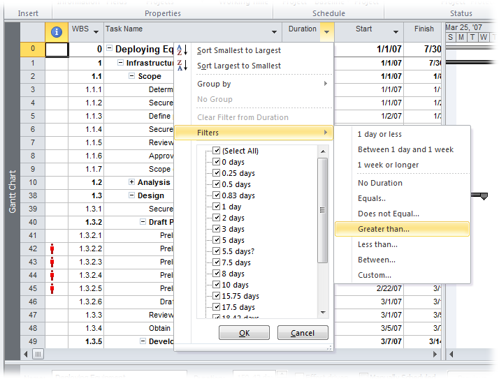
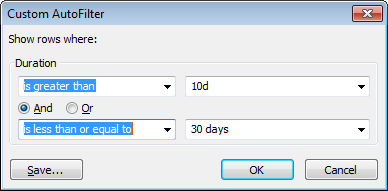
Grouping tasks, resources, and assignments with similar characteristics makes it easy for you to scan and analyze your project information. For example, if you group tasks by schedule variance, troubled tasks will jump right out at you. You can group resources by hourly rate to find low-cost options. In Project, the Group feature lets you segregate tasks, resources, or assignments by field values. For example, you can group tasks into critical and noncritical (Critical field Yes or No) to find ones to shorten. Grouping resources by overtime rate helps identify the least expensive people for a weekend assignment.
Tip
If you’re confused by the different uses of the word “group” in Project, see the box on Groups, Groups, and More Groups for clarification.
Like filtering and sorting, groups can work with several fields, as Figure 23-31 shows. For example, you can group first by critical and noncritical, and then by task duration, so you can find the longest critical tasks for fast-tracking (Finding Tasks to Fast-Track).
Here a few methods for applying a group:
Choose a popular group. Choose View→Data. Click the Group down arrow, and then, on the drop-down menu, choose the group you want, like Critical, Milestones, or Complete and Incomplete Tasks.
Choose any group. Choose View→Data. Click the Group down arrow, and then, on the drop-down menu, choose More Groups. In the More Groups dialog box, double-click the group you want.
Group by a field. Click the down arrow to the right of the column heading for the field you want to group by, and then, on the drop-down menu, choose “Group on this field” (for Yes/No fields). For other fields, the drop-down menu may contain the “Group by” command. When you choose “Group by”, a submenu of group options appears, for example, if you choose “Group by” in the Duration field, the submenu includes Duration and Weeks.
To remove groupings, choose View→Data. Click the Group down arrow, and then, on the drop-down menu, choose No Group. Or click the down arrow to the right of a column heading and choose No Group on the drop-down menu.
Changes you make to a project can affect the group to which a task, resource, or assignment belongs. For example, if you add resources to shorten task duration, the task should appear in a different Duration subgroup. However, you don’t see that happen until you reapply the group.
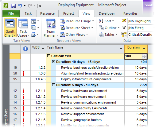
Figure 23-31. When you group items, the group summary rows calculate the values in the group’s numeric fields, as the box on page 636 explains. For example, if you group assignments by employees and contractors, you can see the total hours and cost for each group. Group calculations appear in a Gantt Chart view’s table area, the Resource Sheet, as well as the timescale in usage views.
As with Project tables, the easiest way to create a group is to copy and edit an existing one. That way you get to keep the original group definition, and customize the copy. For example, to set up a group that uses both the Critical and Duration fields, you can copy the built-in Critical group and then add the second condition to the copy. (Basic groups are so simple, though, that there’s no problem starting from scratch.)
Project comes with several groups that apply to tasks and resources, but you can expand the list to analyze your projects in many ways. Here are a few examples:
Overallocated resources. Group tasks by the Overallocated field to find tasks with overallocated resources.
Overbudget tasks. Group tasks by Cost Variance to categorize tasks by how much they’re over budget.
Critical tasks with overallocated resources. Critical tasks that use overallocated resources are risking a late finish date. Group tasks first by the Critical field, and then by Overallocated, to see the group of critical tasks broken into overallocated and not overallocated resources.
Internal and external resources. Group assignments by the Resource Group field to see how much work you’ve assigned to outside resources.
Long critical tasks with little or no work done. If you’re looking for tasks to crash (Using a Spreadsheet to Choose Tasks to Crash) to bring a project back on track, critical tasks with longer durations give you the most benefit. If the project is already in progress, tasks that are almost complete won’t help. Filter first by Critical, then by % Complete (in ascending order), and finally by Duration (in descending order) so you can see the critical tasks with the least amount of work done and the longest duration.
The steps for creating and copying groups are almost identical. You create the new group (from scratch or by copying), name it, and then define the fields to group by. Here are the steps:
Choose View→Data. Click the Group down arrow, and then, on the drop-down menu, choose More Groups.
If a task-oriented view is active, the More Groups dialog box opens with the Task option selected and task-related groups displayed in the Groups list. To work on a resource-related group (for instance, to group the resources in the Resource sheet by their standard rates), select the Resource option.
In the Groups list, select the group you want to copy, and then click Copy. To start a new group from scratch, simply click New.
The Group Definition dialog box opens. Copying a group, and then editing the copy, is usually the better approach. You’ll still have the original group definition in addition to the new one.
In the Name box in the Group Definition dialog box, type a new name for the group.
New groups start with a name like "Group 1,” whereas copied groups are named "Copy of" followed by the copied group name. Replace Project’s name with one that identifies what the group does, like "Critical/Duration.”
To add a new field to group by, select the first blank Field Name cell, click the down arrow, and then choose the field you want to group by.
For example, to add the Duration field to the Critical/Duration group, choose Duration in the first Then By row, as shown in Figure 23-32.
Figure 23-32. Project fills in the Field Type cell with Task for a task-related group or Resource for a resource-related group. If you want to group by assignments, for instance to see which assignments are taking too long, choose Assignments in the Field Type cell and then turn on the “Group assignments, not tasks” checkbox.
In the Order cell, choose Descending or Ascending.
For example, to show tasks from the longest duration to the shortest, choose Descending. To show resources from lowest to highest hourly rate, choose Ascending. Ascending shows text fields grouped in alphabetical order. If you group by a Yes/No field like Critical, then choose Descending if you want the fields with Yes to appear first.
To group by assignment instead of by task, turn on the “Group assignments, not tasks” checkbox.
In a task usage view, you can group by task or by assignment. For example, group by task to see which tasks have the highest schedule variance. If you want to find out which resources produce those variances, then group by assignments. In a resource usage view, the checkbox label is “Group assignments, not resources”.
To change the appearance of the group summary rows, change the values in the “Font”, “Cell background”, and “Pattern” boxes.
When Project subtotals groups, it applies a different font to the summary rows and shades the cells. For example, the primary group rows use 8-point Arial, bolded, with a solid yellow cell background. To print groups to a black-and-white printer, change the Pattern to cross-hatching, or choose colors that show up as different shades of gray. The box on Calculating Rolled-Up Group Values explains how group calculations work.
Note
If you want to see summary tasks in the groups, turn on the “Show summary tasks” checkbox. On the other hand, turning on the “Maintain hierarchy” checkbox shows all the levels of summary tasks for subtasks within groups. You can also maintain hierarchy from the ribbon by choosing View→Data, clicking the Group down arrow, and then, on the drop-down menu, choosing Maintain Hierarchy in Current Group.
Click OK.
The Group Definition dialog box closes. In the More Groups dialog box, click Apply to see the results of your handiwork.
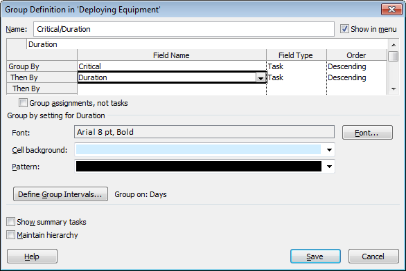
Note
To make changes to an existing group, choose View→Data. Click the Group down arrow, and then, on the drop-down menu, choose More Groups. In the More Groups dialog box, select the group to edit, and then click Edit. The Group Definition dialog box opens, as if you’re creating a new group. Make the changes you want, and then click OK.
Groups often start out with subgroups for each distinct value in the field you’re grouping by. This approach is fine for Yes/No fields like Critical or Milestone. When you group by cost, duration, and similar fields, the number of unique values could spawn hundreds of subgroups, for tasks that cost $3,450, $3,455, and so on. Setting group intervals makes subgroups more meaningful. For example, on a short project, the intervals for the Duration group could be days. On a multiyear project, you might modify the Duration group to use 2-week intervals. Here’s how you define intervals for a field in a group:
In the Group Definition dialog box, select the field whose interval you want to set, and then click Define Group Intervals.
The Define Group Interval dialog box opens, as shown in Figure 23-33. If the selected field doesn’t work with intervals like Yes/No fields, then the Define Group Intervals button is grayed out.
To change the interval, in the “Group on” box, click the down arrow, and then choose the units or type of interval you want.
The choices in the “Group on” drop-down list vary based on the field you select. For example, for Duration, the “Group on” choices range from Minutes to Days to Months. % Complete lists typical percentage intervals like “0, 1-99, 100” which groups tasks into unstarted, in progress, and complete. On the other hand, for Cost, choose Interval in the drop-down list to set the interval size (“1000” to group on every $1,000).
To start the interval at a specific value, type the number in the “Start at” box.
You can group all the rows with tiny values by setting a “Start at” value. For example, if you start with a 1-day duration, then one group contains all tasks that last less than a day.
To define the interval size, type the number in the “Group interval” box.
For example, if “Group on” is set to Days and “Group interval” is set to 5-day increments, then tasks are grouped 0 to 5 days, 6 to 10 days, and so on.
Click OK.
The Define Group Interval dialog box closes, and you’re ready to click OK to save the edited group.