2 motion graphics in film and television
on overview
Since the 1950s, when legendary Saul Bass revolutionized film title design, the movie and broadcast design industries have integrated the language of traditional graphic design with the dynamic visual language of cinema. Today, motion graphic designers have become leading players in the creation of film titles and many forms of television graphics.
“When we did Tron there were four companies in the U.S..” says Rosebush. “By the end of the decade there were 100 companies in New York atone. That opened up a tremendous amount of competition.”
–Judson Rosebush
Film Titles
A film’s opening titles are the first images that viewers experience once the lights are dimmed. Since the 1950s, movie title sequences have evolved as a form of experimental filmmaking in commercial motion pictures. A film’s opening credits are designed to create the context of a film and establish expectations about its atmosphere and tone.
During the 1950s, Saul Bass used suggestive, metaphorical images as storytelling devices for priming the audience. For example, in Anatomy of a Murder (1959), he introduces a silhouette that disappears from view and reappears in disjointed parts that jump on and off the frame in concert with Duke Ellington’s musical theme. A mood of betrayal and impending doom is established early on, keeping viewers on the edge of their seats. In The Man with the Golden Arm, a jagged arm foreshadows the schizophrenic mindset of the main character. The Seven Year Itch (1955) uses abstract graphic shapes to form a sealed-off door that separates the main characters’ apartments. In North by Northwest, bars of text ascend and descend to emulate the motion of elevators. Anticipation grows as racing horizontal and vertical lines invade the frame and intersect to form the grid pattern of a skyscraper for the film’s opening shot. Bass’s humorous closing sequence to Around the World in 80 Days (1956) shows a frantic clock on legs journeying around the world, encountering symbols that represent various places (i.e., elephants in India, pyramids in Egypt, saloon doors in the American West, etc.). In Hitchcock’s comedy–thriller Psycho (1960), parallel lines and type convey the dark side of the human psyche.
Bass’s use of typography was also revolutionary during a time when motion pictures used plain, static text for their credits. In West Side Story (1961), the credits are treated as graffiti, and in The Age of Innocence (1993), as epistolary script. Around the World in 80 Days intro?duces the credits as fireworks that illuminate the scene when the clock encounters Paris. In the opening to Cape Fear (1991), Saul and Elaine Bass enlarged a sign reading “Cape Fear” on a Xerox machine. Using a kitty-litter box, Elaine put ink in the water to make it more reflective, submerged the sign in the water, and created ripples with a hair dryer. As the shimmering water settled, the words slowly appeared.
Maurice Binder’s 007 opening sequences during the 1960s combined realistic and abstract images of undulating liquids and silhouettes of sensuous, female dancers to create erotic, mysterious environments.The titles to For Your Eyes Only (1981) show a nude female ina background consisting of a close-up of a fiber-optic lamp. In theopening sequence to The Spy Who Loved Me (1977), female smove like belly dancers, as if they were conjuring up the vivid massesof background colors. After Bond jumps off a mountain slope and hisparachute opens, a silhouette of a woman’s hands rises from the bottomof the frame to cradle the parachute as the tune of “Nobody DoesIt Better” begins. In You Only Live Twice (1967), the credits begin with aclose-up of a deceased 007 lying in a pool of blood that transforms intoa Japanese fan. A solarized background of an erupting volcano fills thescreen with red lava, and silhouetted parasols burst from the lava,giving way to the silhouette of a mountainside fading into a sunrise.
Kyle Cooper’s groundbreaking opening credits to the movie Se7en(1995) incorporate scratched, hand-drawn letter forms that nervouslyjump around on the screen to the soundtrack by Trent Reznor (NineInch Nails), as close-up shots of instruments of torture (scissors, trays,and tape) flash before the audience’s eyes. Profane words appear inconjunction with biblical, nihilistic images to contribute to the moodof dementia and cold, calculated precision. When the negative wassent out for processing, the lab was told that pieces of film leader andtwisted film were part of the finished product.
Today, motion graphics studios continue to produce award-winningtitles for feature films. The titles to Guillermo Del Toro’s Mimic (1997),by Imaginary Forces, introduced the crisis of a genetic experimentgone awry by displaying close-up images of moths and butterfliespinned to a wall. X-rays sporadically flash upon the screen to revealthe insects in menacing positions. These images are interchanged withpinned up newspaper clippings featuring an insect-based epidemicand photographs of children affected by the disease. Torn headlinesthat read “disaster” and “tragic” appear beneath the insects, and mapsof NewYork City subways convey the atmosphere of a subterraneanunderworld. Quick cuts display accompanying credits that jumparound to different in the frame to the sound of flapping wings anddistant voices of screaming children. According to Kyle Cooper, “we dida temp sequence where we took a bunch of photographs, integratedthem with graphics on a Mac-based Photoshop program, then dissolvedback and forth and filmed it out.” The engaging title sequenceto Nickelodeon Movies’ feature film Clockstoppers (2002) is based on the premise of a wristwatch that has the power to slow down oraccelerate time. Creative Director Karin Fong from Imaginary Forcesconceived the idea of exploring the mechanics of a watch on a rnicioscopiclevel to convey the theme of time travel. Footage of clockmechanisms, lights, and rich textures were composited and timewarpedto symbolize the distortion of time in a virtual world. This futuristicsequence places us inside the watch so that we can observe itscompelling mechanics while discovering the credits along the way, aslines of typography spin in 3D space to form the hands of a clock (2.1).
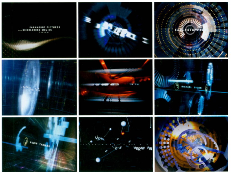
2.1 Frames from the opening titles to Clockstoppers (2002). Designed and produced by Imaginary Forces.© Nickelodeon Movies and Paramount Pictures.
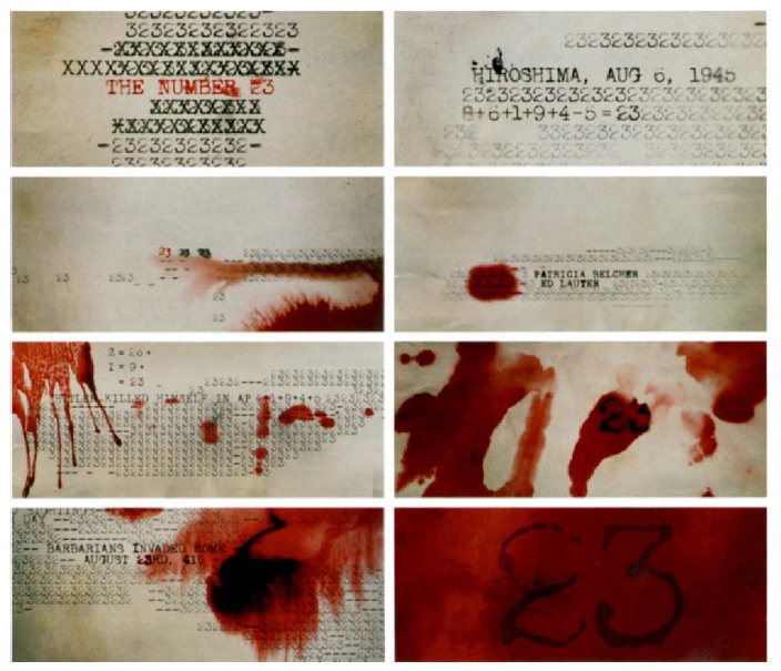
Joel Schumacher’s psychological thriller, The Number 23 (2007), portrays an average man whose obsession with recurring instances of the number 23 in human history thrusts him into a nightmarish underworld of sex and death. Imaginary Forces’ haunting title sequence indoctrinates us to the cryptic enigma of the number 23 byshowing us coincidental connections and catastrophes in history. Forexample, humans have 23 pairs of chromosomes; the Hiroshima bombthat was dropped August 6,1945 (8+6+1+9+4+5= 23); 230 people diedon TWA flight 800; blood pumps through the body every 23 seconds;the attack on the TwinTowers occurred on 9/11/2001 (9+11+2+0+0+1= 23). Accompanied by unsettling music, the sequence is imbued withthe color red, an obvious motif that references the deep red color ofthe book that is prominent in the story. The interaction of vernaculartypography with the movement of a typewriter and the blood seepinginto the fabric brings the composition to life and effectively expressesthe downward spiral of the film’s narrative (2.2).
2.2 Frames from the opening title sequence to The Number 23 (2007). Designed and produced by Imaginary Forces.Q New Line Cinema.
Imaginary Forces’ stylish titles to director Andrew Niccol’s futuristicthriller Gattaca (1997) are based on the movie’s concept of geneticmodification and its possible future use in human genetic engineeringin the near future (2.3). Extreme close-ups of nail clippings fall to theground with oppressive thuds and clatters, followed by hair and deadskin, all carriers of our genetic codes. These images are accompaniedby the credits that display the letters A, T, C, and G-the four nucleotidebases of DNA (Adenine, Thymine, Cytosine, and Guanine)-in abolder, semi-serif face typeface. This subtle introduction of the maincharacters communicates the movie’s premise of “perfect” humansbeing bred and trained for elite jobs, while imperfect “Godchildren”born the old-fashioned way are doomed to marginal lives.
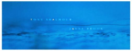
2.3 Frame from the opening title sequence to Gotiaco 1997). Designed and produced by Imagi nary Forces. © jersey Films and Columbia TriStar.

2.4 Kyle Cooper’s stunning opening credits for Spider-Mon (2001) re-cap the sheer power of the film and build anticipation for the film in a very memorable way.The vintage comic-style imagery by Alex Ross supports the credits that get caught in the web as they are introduced. Designed and produced by Imaginary Forces.© Columbia Pictures.
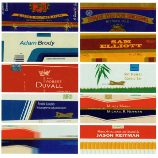
The opening title sequence for the film Thank You For Smoking (2006) borrows from an eclectic mix of cigarette package designs to give viewers a nostalgic spin on the movie’s playful atmosphere. Shadowplay Studios turned the director’s initial idea, which was to present a slide show of various package designs, into a rich, animated presentation that brings to life various brands of cigarettes (2.5).
2.5 The clever title sequence to Thank You for Smoking (2006) borrows from an eclectic mix ofcigarette package designs togive viewers a nostalgic spin onthe movie’s playful atmosphere.Courtesy of Shadowplay Studios.
In an experimental short film, Onesize, a motion graphics studio in the Netherlands created the opening and ending credits for Genesis 3:19 (2007), a compelling independent movie directed by Dany Saadia. The film depicts a story of how people are bound together by coincidence. The title sequence shows a journey through space in which we enter a “3D blue-print” of our galaxy the way God created it,” according to Rogier Hendriks, the company’s founder. “We see how everything in the galaxy is connected to a big clock mechanism. … The film is all about how everything is connected” (2.6).
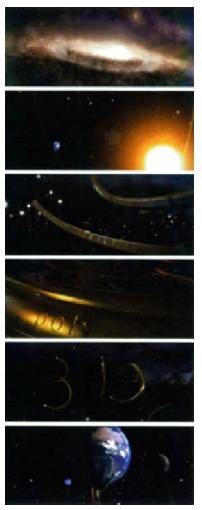
2.6 Frames from the opening titles to Genesis 3:19 (2007). Courtesy of Onesize.
In the prologue to A Thousand Suns (2007), a documentary about the dangers of nuclear power, Dutch designer Joost Korngold was given several photographs and a written narrative from director Matthew Modin. He decided to place the photographs inside of glass frames and film them falling to the ground and breaking. The event was played back slowly in reverse to create the effect of the images and frames becoming whole again. This concept served as a metaphor for turning back time in order to pursue a second chance to make things different for future generations. Typography was treated in very subtle manner to give the appearance of melting—a second metaphor conveying the idea of nuclear meltdown—the strength of a thousand suns (2.7).
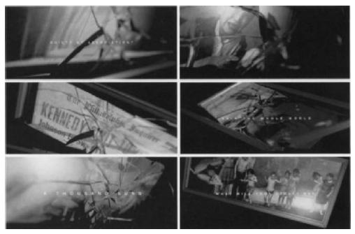
2.7 Frames from the opening titles to A Thousand Suns (2007). Courtesy of Joost Korngold. © Renascent.
In addition to large design studios, individual designers, such asDeborah Ross, have established worldwide reputations for their highlyacclaimed work. Deborah’s opening titles for Anthony Minghella’s The Talented Mr. Ripley (1999) is one of the longest credit sequences (overeight minutes) to be produced on a Mac G4 desktop computer. (TrishMeyer of Cybermotion, Sherman Oaks, California, was the predominantanimator). Los Angeles-based designer Deborah Ross playedupon the theme of jazz by referencing 1950s and 1960s album cover artfrom the Blue Note jazz label; this look is characterized by the liberaluse of graphic shapes and typography. A distressed typewriter fontfades in and out in concert with emerging hard-edged shapes thatcontain actor Matt Damon’s face looking to the side in a contemplativepose. The letters of the title are compressed together with a rapidsuccession of adjectives that express Ripley’s personality. Portions ofthe film were tinted with animated bars of color that served as masksto create transitions between the scenes. According to Deborah: “Thisunderscored the dueling musical themes of jazz versus classical in thestory, as well as the bohemian ‘coolness’ of the period. Sometimes,these bars echo playful piano keys; other times, they are jagged shapesthat foretell the disturbing psychological aspects of the story.” (2.8)
Network Branding
The average supermarket carries thousands of individual productlines. In order to get us to “tune in” to a particular product, its ownermust gain our attention before we get to the supermarket. Similarly,within today’s multichannel universe, branding is often necessary fora network to keep up with its competition. Television companies havebecome increasingly image conscious, investing large amounts of timeassessing their audiences and spending huge sums of money ondeveloping their on-screen look. Increased competition for viewerscontinues to drive the need for more compelling on-air graphics.
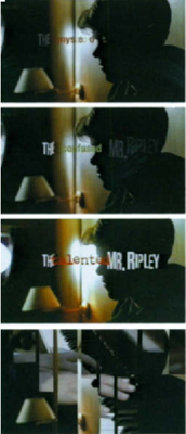
2.8 Frames from the titles to The Talented Mr. Ripley. Designed and produced by Deborah Ross Film Design. © Miramax.
station IDS
Station identifications (also called stings or network IDS) identify thestation or network being aired. Because of the number of signalsthat are available, the Federal Communications Commission (FCC)requires that all television and radio stations in the U.S. identifythemselves on an hourly basis and at the beginning and end of eachbroadcast period. The station’s call letters must be included, as well asits city of license and channel number signifymg its dial position (eventhough television sets do not come with dials anymore). Additionally,the communities that the station serves must either appear on screenor be announced verbally. The FCC offers some flexibility so thatstations can schedule around their programming and commercials.Many television stations have their identifications programmed to playautomatically during the period of five minutes before the hour. Manyhave also developed clever ways to utilize their station identificationas a promotional tool. A promotion for an upcoming show or newscastcan fulfill its identification requirements while building its audience bytelling viewers to tune in to an event.
When animating a station ID, you must be able to apply the aestheticsof effective logo treatment to a time-based environment. Attentionmust be given to negative and positive shape relationships, as well asto contextual design elements that contribute toward the message thatthe ID is sending. Additionally, consideration must be given to howelements move, change, and interact with each other over time andacross space. Although station identities are typically between 5–10 seconds, story structure should be explored in order to establish thetone and affect how the audience perceives and sustains thebelievability of the message.
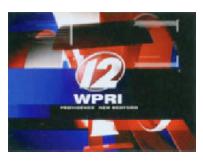
2.9 The call letters of this station ID are “WPRI,” and the city is Providence.The channel “ 12” identifies the dial position. Courtesy of Giant Octopus.
Shilo, an award-winning design studio located on the East and West Coasts and throughout Europe, designed a set of station IDs for AMC’s twentieth anniversary celebration. Each is a short vignette depicting different genres that AMC has featured. For example, “big-screen battles” are portrayed with iconic images of airplanes and parachutes, "great action movies" with police cars and headlights, and "romantic movies" with rose petals and jewelry (Chapter 7, 7.33).
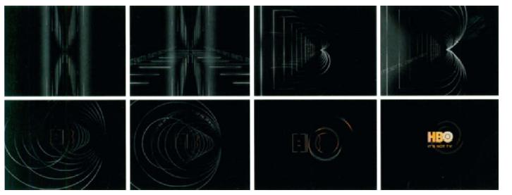
2.10 Station ID storyboard. Courtesy of Susan Detrie and The Studio at New Wave Entertainment. © HBO. As part of a network campaign for HBO, this storyboard was created with the idea of using geometric outlines of the logo.
During the late 1980s, world-renowned graphic designer April Greiman developed twelve IDs for Lifetime Television, using available low-end technology, including computers, Kodak disposable cameras, and 8mm video shot without a tripod. Her goal was to produce the most innovative use of the Lifetime Television identity from “hybridized” footage elements (2.12). In Imaginary Forces’ more recent identity package for Lifetime Television, an elegant composition was created that comprised of handwritten images, Polaroid photographs, and free-floating natural images such as leaves and butterflies (2.13).
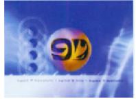
2.11 Station ID for KGMB-TV, the first TV station in Hawaii and a licensed broadcast affiliate of CBS. Courtesy of Giant Octopus.
show openers
Like a magazine cover or the introductory credits to a movie, a show opener sets the stage for the upcoming program. Imaginative show openers help to promote the network’s identity and tone and can make the difference between captivating viewers or making them reach for the remote. Show openings typically last between 15–30 seconds.
In an opener to Court TV Movies, Court TV wanted a direct, yet engaging means of promoting their movie block. Hatmaker, a broadcast design studio located in Massachusetts, combined fresh takes of
2.12 ID for Lifetime Television. Courtesy ofApril Greiman, Made In Space. © Lifetime Television.

2.13 LifetimeTelevision network ID. Courtesy of Imaginary Forces. © Lifetime Television.

2.14 Frames from an ID for Tech TV,a 24-hour cable channel in San Francisco (2001). Courtesy of Viewpoint Creative. © Tech TV.
iconic cinematic imagery that suggested story snippets of original video footage and a rich theatrical palette. The graphics embrace the genre while conveying a sense of sheer entertainment (2.17).
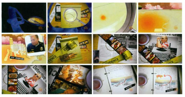
The opening to The Hungry Detective, a program on Food Network that was hosted by Chris Cognac, was outsourced to four independent artists living in Chile. The underlying concept was based on a police investigator in search of the best off-the-beaten path restaurants in the U.S. to write about. With a tight budget and a time-frame of three weeks to deliver an entire package consisting of an open, lower thirds, and transitions, Matias Rivera, one of the artists, managed to deliver an intriguing kinetic collage of objects that exist on an investigator’s desktop. For example, a magnifying glass communicated a “micro and macro” concept that would allow viewers to “fly” inside the elements almost microscopically (2.18).

2.15 Frames from the opening titles to Lawbreakers. Courtesy of ZONA Design and The History Channel.
Combinations of live footage punctuated with shattered glass reflects the program’s pacing and episodic quality.
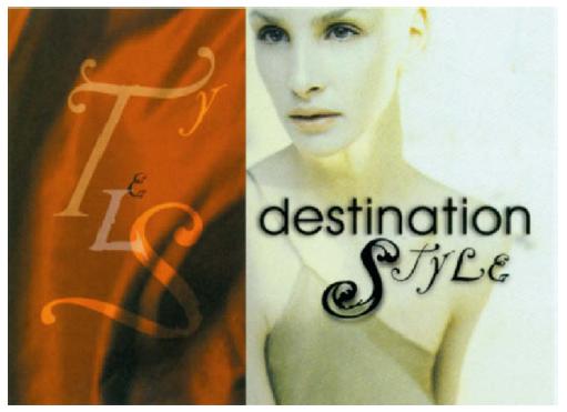
2.16 In a show open to Destination Style, typography was treated in a haiku-like way to complement the beauty and poetry of fashion and to express the global aspect of the show. Courtesy of Susan Detrie and The Travel Channel.
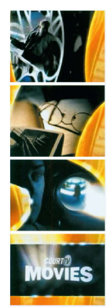
2.17 Frames from show opeing to Court W Movies. Courtesy of Hatmaker and Court TV.
ZDF (Zweites Deutsches Fernsehen or Second German Television) isa public service German television channel based in Mainz. Velvet, amotion design studio based in Munich, designed an opening and showpackage for ZDF’s culture program Aspekte, which is based on the conceptof the mirror of culture and society. Combinations of photographicand live-action images showing various artistic and cultural eventscontain “people with mirrorheads” that “awake illusions or open newperspectives.” The dynamic typographic animations consist of letterformsthat move into an empty block, or spread out of a violin playerlike musical sounds or notes. This content is found in everyelement of the package including the logo, which contains a mirror asa means of self-reflection (2.19).
On September 10 and September 11, 2006, a two-part miniseries entitled The Path to 911, was broadcast on ABC television. Written by Cyrus Nowrasteh and directed by David L. Cunningham, the film dramatized the 1993 and September 11, 2001 attacks upon the World Trade Center in New York City. The opening sequence sets the tone of the film in a very poignant and beautiful way through the mind of a New Yorker. Digital Kitchen, a Seattle-based motion graphics studio, aimed to portray this sensitive subject in a way that engaged the viewer, while setting the mood for the film (2.20). The concept began as a short piece that showed vignettes of New Yorkers involved in their mundane
2.18 above: Frames from the show opener to The Hungry Detective. Courtesy of Reality Check Studios.
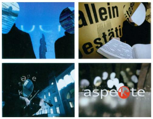
2.19 Frames from the show opener for ZDF’s culture program Aspekte. Courtesy ofvelvet.![]()
morning routines before leaving for work. Over time, it evolved into alonger sequence, beginning from the first person point-of-view shotlooking out of a Brooklyn window, to activities centered around getting to work, and then to shots showing the city waking up, slowly migrating toward the Trade Center buildings. According to designerLindsay Daniels, two days of shooting the live-action imagery in NewYork City was challenging, in that the goal was to capture interestingand unusual, yet structured angles, and voyeuristic viewpoints alludeto the concept that someone was watching the city. Another conceptualelement of the composition is the use of moir6 patterns that becomemore prominent as the pace of the editing increases, to depict the citywaking up. Throughout the composition, they serve a double purpose:1) to enforce the concept of the city being watched, and 2) to transitioninto the architecture of the Trade Center buildings.
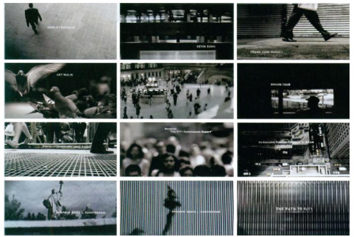
2.20 Frames from the opening titlesto The Path to 911. Courtesy of Digital Kitchen.
ZONA Design, Inc., a NewYork-based design and branding studio,created the sexy and exciting opening title sequence for Orchard Films’Indie Sex, a four-part mini-series that aired on The Independent FilmChannel (IFC) in August, 2007. The series investigated a vast rangeof highly controversial topics relating to how sex is presented to thepublic, from underage sex, to censorship, taboos, fetishism, and sexualextremes. Repetitive, stylistic representations of teen sex, bondage, and homo-erotica, which are infused with tactile patterns and a hot, fierycolor palette, demonstrate a tasteful, yet bold approach and attitudethat captures the diversity and heat of the series, and gives viewersa sense of voyeurism. According to Zoa Martinez, ZONA’s creativedirector, “The zipper on the black leather bustier opens to expose aseries of sexually-charged images—a sensual kiss, the interlocking offingers while in the throes of passion, bondage, the graphic elementof the condoms, which I wanted to represent the lights and neon ofsex shops, but also to portray safe sex. The muscular male nude (‘liveboys live’) and the repetition of his image is a stylistic representationof random sex. Lolita and her lollipop depict teen sex, and, of course,the suggestive opening and closing of a woman’s gartered legs are astitillating as the move was in Basic Instinct. In addition, as sexualityinfuses the sense, we wanted some of the graphics to have a tactile feel,so we added the leopard and red satin graphic patterns to the mix.”With regard to the logo design, the graphic shape representing cut film was juxtaposed with gestural letterforms in order to create a contrastthat generates “the energy of this thing we call sex” (2.21).
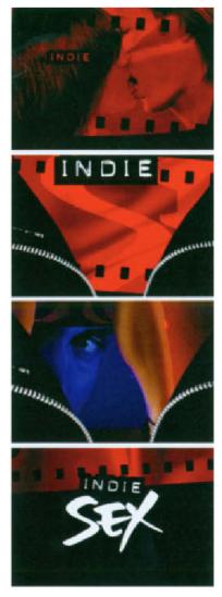
2.21Frames from the openter to lndie Sex. Courtesy of ZONA Design.
Studio Blanc, a Canadian graphic design agency, developed an openerfor a television series on Radio-Canada television about places aroundwestern Canada. The sequence, which portrays traveling through BC,Alberta, Saskatchewan, and Manitoba, is infused with iconographyrepresenting Canada’s western provinces. Delivered in a modern style,the opening’s kitsch, colorful journey leads you into Radio-Canada’s A la carte program hosted by Jacky Essombe (2.22).

2.22 Frames from the opener to A lo carte. Courtesy of Studio Blanc.
Show openers for news programs are often referred to as topicalopenings, since they are designed to inform viewers of upcomingstories or events (2.23). They often integrate live-action video, stillphotography, typography, and graphics (including the station ID) toenhance their entertainment value. Design strategies and storytellingdevices, such as cropping, angle of view, and montage, are used toorganize the clarity and readability of information and frame theveracity of the news by reinforcing the truth value of the coverage andthe reputation of the station.
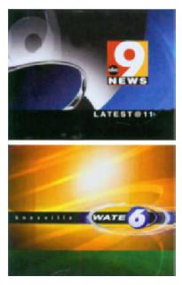
2.23 Topical news opening frames for ABC/Channel 9 and WATE/ Channel 6. Courtesy of Giant Octopus.
show packages
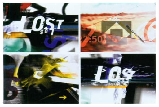
A show package is a “video information system” containing an assortment of design elements that are used to promote a program. These elements must demonstrate a visual synergy, although the vibe and pacing between them may be slightly different. For example, ZONA Design’s branding package for NBC-TV’s reality series LOST includes an opening, a series of bumpers, mortises, lower thirds, maps, and a logo for print and on-air design. The show, which has been deemed as a global adventure with unexpected twists and turns, depicts six strangers who are paired off, blindfolded, and shipped to an undisclosed location to find their way back to the Statue of Liberty. ZONA devised a look that captures the sense of being confused and disoriented. A multilayered explosion of bold graphic elements and a fast editing pace exudes a heart-pounding kinetic energy. International signage, transportation symbols, and bold graphic icons, such as grids, arrows, and numbers, were incorporated as textural devices to express the feeling of billboards being peeled away. Throughout the piece, the words “lost,” “north,” “south,” “east,” and “west” appear in various languages, including Chinese, Russian, and Arabic (2.24). According to Creative Director Zoa Martinez: “Our design had to convey the excitement of the unknown, that envelops both the competitors and the audience. The contestants’ starting points are strictly concealed. They are in a race against time and they must confront and conquer any barriers in their path.” Zoa further continued: “We designed a crisp, modular system from global, continent, country, and local specific maps complete with team comparisons and actual footage. We gave them a very stylized look in a neutral palette contrasted with vibrant colors for punctuation … there is nothing peaceful about the series and our designs are meant to keep the viewer on edge as well.”
2.24 Frames from branding package for NBC-TV’s reality series LOST. Courtesy of ZONA Design.
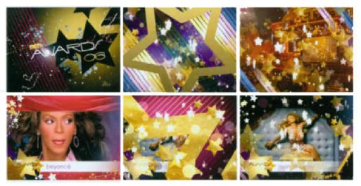
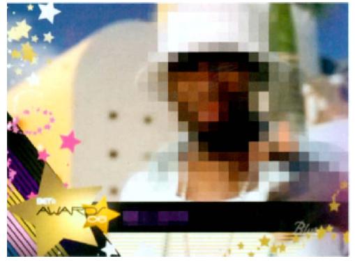
Kids’ Choice Awards is Nickelodeon’s annual flagship awards show honoring the year’s most popular television, movie, and music acts, as voted by children who watch the Nickelodeon cable channel. Eachyear, the theme of the show changes in order to appeal to Nickelodeon’s teen audience. In 2006, Nickelodeon hired the motion graphics company Blur to develop a rock ‘n’ roll circus theme. The concept was inspired by psychedelic poster art and vernacular typography from the 1960s (2.25). In Blur’s awards show package for Black Entertainment Television, the graphics and rich color palette intended to portray the luxury and expense of being a celebrity. An open mortise was usedin the opening segment, and a keyable (versus a full screen) logo was placed over the live footage in the show opening and was also used in bumpers that were aired between commercial breaks. A combination of header and lower thirds is used to introduce the best female R&Bartists (2.26). Blur’s show package for FOX’s 2005 Teen Choice Awards, which was televised on FOX and on Global TV in Canada, was based on Venice, California’s skateboard/surf boarding “dogtown” culture during the 1970s. The gritty, raw look of graffiti and spray paint was applied to combinations of gothic and hand-drawn elements. The theme behind the package depicted reggae and rock safari culture with a younger teen twist involving live-action shoots of models surfing. The hand?made quality of the lettering, in the spirit of doodling, is effective in making the feel of the package accessible to the show’s target teenage audience (2.27).

2.25 Frames from Nickelodeon’s show package for Kids’ Choice Awards, 2006. Courtesy of Blur.
2.26 Frames from Black Entertainment Television’s awards show package, 2006. Courtesy of Blur.
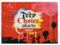
2.27 Frames from the opening for FOX’S Teen Choice Awards 2005 show package. Courtesy of Blur.
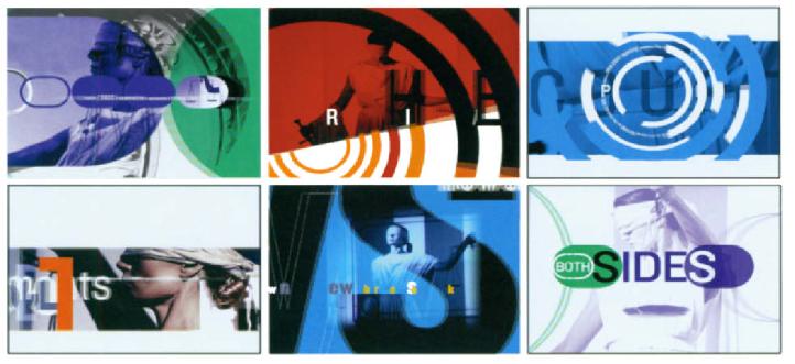
2.28 In a distinctive network redesign for CourtTV’s daytime show, the image of Lady Justice, blindfolded, with a sword and scale, was used as an icon. Strong typography, at times abstracted, along with a sharp color palette, adds a high degree of depth and energy. Courtesy of ZONA Design, Inc.
![]()
interstitials
Interstitials are 30- to 60-second mini-programs that appear between movies or other events, each having a specific objective. For example, some are designed to highlight key issues, people, or events to establish a show’s sense of context. Others might function from a commer?cial standpoint to promote a network’s brand by creating a link with an existing program. For example, Freestyle Collective designed and animated a new character named “Squidley” to be used for Cartoon Network (2.29). Noggin’s interstitials are presented as special mini shows hosted that are by various characters such as Moose and Zee. Others may feature hands-on demonstrations of signature sports “moves” from star athletes or interviews with the stars on premium movie channels.
News interstitials are used to inform viewers that a top story is about to be featured, or to suggest developing or continued coverage of a story. They also provide a convenient way to transition from the anchor or studio into a live or prerecorded story. This form of interstitial is typically no more than 1–2 seconds in duration.

2.29 Frames from “Squidley,” aninterstitial for Cartoon Network. Courtesy of Freestyle Collective. © Cartoon Network.
bumpers
A bumper (or bump) is a brief presentation that transitions between a program and a commercial break. Bumpers typically are between 2–5 seconds in duration, and in most cases, the name or logo of the show is displayed and is accompanied by an announcement that states the title (if any) of the presentation, the name of the program, and the broadcast or cable network. Late night bumpers often produce quirky and amusing presentations that play on pop culture. For example, an episode of Late Night with Conan O’Brien depicted Conan as Hermey the Elf in the televised Christmas special Rudolph, the Red-Nosed Reindeer (1964). In children’s television, it is a common practice for a bumper to distinguish between the program and a paid commercial, because of the fact that children are not always able to discern the dif-ference between the two.
Digital Kitchen, a motion graphics studio based in Seattle, Chicago, and New York, designed two compelling bumpers for the Sundance Film Festival in Park City, Utah. Using the theme of fire as a metaphor for the process of filmmaking, these innovative bumpers were shown onscreen between films to identify the sponsors and to promote Sundance. “Ignite” provides a visual story of how ideas ignite or come to fruition by showing a dance between fire and water. Live-action footage of flames, water, and explosive elements was filmed at a high speed to achieve a slowed down “hyper-real” look, providing an anal?ogy to how filmmakers come up with vision by feeding the creative fire. The mechanical look of “Industry,” which also incorporates fire, illustrates how ideas are generated in a “factory-filled brain.” Both compositions succeed in symbolizing the creative fervor, passion, and power of storytelling through the moving image (2.30).
2.30 Frames from “Ignite” &“Industry.” Courtesy of Digital Kitchen. ![]()
Figure 2.31 illustrates a bumper for Flux Television, a music television program on digital culture that featured techno and future culture music during the mid-1990s. A bright, highly saturated color palette, in addition to flat, highly stylized graphics and looped live-action footage, reflected the northern California aesthetic and technological flavor of the pre-dotcom era.
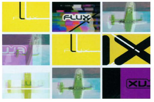
2.31 Frames from i bumper for Flux Televrsren. Courtesy of twenty 2product.© 1994 Flux Television.
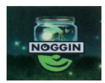
2.32 Frames from “Firely,” a bumper for Noggin (1 999). Courtesy of Big Blue Dot and Nickelodeon.

2.33 Frames from a bumper pitch for MTV. Courtesy of Joseph Silver.
lower thirds
Lower thirds are combinations of graphics and text that appear on the bottom portion of the screen to identify the station, the presenter(s), and the content being aired. They most commonly are found in news production and sometimes in documentaries. In most cases, lower third graphics do not occupy a full third of the screen, especially when the only requirement is a name and title. In cases where the programming necessitates additional information, a side panel is usually added. Lower thirds can range from simple graphical elements to complex animations that add impact in a subtle and tasteful manner that does not interfere from the main programming. Text and graphics often animate as they arrive on screen and then stay still; sometimes animated backgrounds consisting of subtle shapes, colors, and patterns are designed to loop while the underlying video continues to play.

2.34 Lower thirds are often arranged in tiers. In these news-related scenarios, one-tiers identify the presenter; two-tiers identify the person on the first line and thenews program below it; threetiers include a heading, sub-heading, and a locator identifying where the story is taking place. These examples also identify the channel and network. © 2007 Jon Krasner.
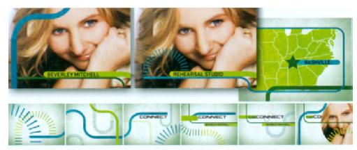
2.35 In a promotional package forCW Connect Beverley Mitchell,the lower thirds design complementsthe style of other insertelements, including a close andmap. Courtesy of Susan Detrie

2.36 This lower third design for the FUELTV Experiment, a twoyearprogram that launched inMay, 2004 to support up to tenaspiring action sports filmmakers.Courtesy of FUELTV.
2.37 Lower thirds design for BlackEntertainment Television’s awardsshow package. Courtesy of Blur.

2.38 In a lower thirds template for KTVK’s news program, theanimated 3D structure from thebackground of KTVKs end tag(2.46) is placed in the foregroundon a smaller scale. Courtesy ofReality Check Studios.
mortises
Mortises—full screen graphics that are used to frame live footage—are sometimes used in combination with lower thirds. In a mortise for KTVK (2.39), Phoenix’s twenty-four hour news channel, the design maintains the graphic continuity of KTVK’s end tag (2.46). Repeated three-dimensional structures from the channel’s logo and live video footage of moving clouds appear again in the background, this time within a more compressed horizontal space. The color scheme, consisting of deep red, yellow, and magenta, is also carried over.
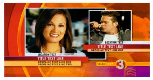
2.39 Mortise for KTVK. Courtesy of Reality Check Studios.
In most awards shows, mortises are used to showcase individual talent being featured. In an awards show package for Black Entertainment Television, an open mortise was used in the opening segment (2.40). The design is effective in that all graphic elements carry over between the mortises representing each person, while at the same time, the general arrangement of the mortise’s elements vary. In Blur’s package for Nickelodeon’s Kids’ Choice Awards, the ending compilation of the show's best moments consists of a hybrid lower thirds mortise (2.41).

2.40 Mortise for Black Entertainment Television, Courtesy of Blur.
In figure2.42, the mortise for Fox’s Action Sports Awards was designed to work closely with the theme of the television show’s opening, which took viewers on an “intense journey through a monumental world of action sports iconography,” according to Shilo. The overall design package employed oversized background elements to create a whim?sical 3D character animation context that departs from the typical grunge graphics that are often associated with this subject matter.
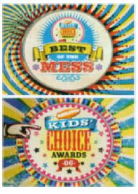
2.41 Mortise for Nickelodeon’s Kids’ Choice Awards. Courtesy of Blur.
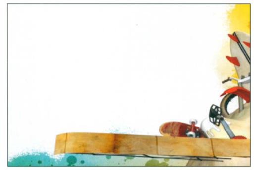
2.42 Mortise design for Fox’s Action Sports Awards. Courtesy of Shilo and FuelN.
lineups and upfronts
A lineup is a full screen graphic that informs viewers about a networksupcoming program schedule by displaying the names of the shows,dates, and times. An upfront is a marketing piece that is designed topromote a networks shows to advertisers. Upfronts also unveil thefollowing season’s lineup to give viewers a first glimpse of what showsare returning, which have been cancelled, and what new series havebeen picked up. Similar to an awards show, they often involve stagepresentations that may feature comedy routine and star walk-ons.Both lineups and upfronts have become more elaborate, dictating theneed for supporting, eye-catching motion graphics.
2.43 Frames from an upfront for Country Music Television. Courtesy of Nailgun*.

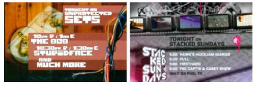
2.44 Lineup designs for Unprotected Sets and Stocked Sundays. Courtesy of FUELTV.
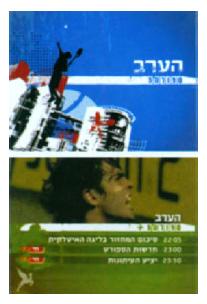
2.45 Frames from a lineup for Sports5.Courtesy Of Flying Machine.
tags
A tag is a succinct, 3–4 second presentation that occurs at the beginningor end of a spot, news opening, or commercial. For example,FUELTV’s wide variety of tag designs have been used to promote theunique personalities and the epic moments of action sports (2.47). Incommercials, tags are customized to reinforce a particular brand of theproduct being described, recap its directive, and inform viewers whereto go for additional information by providing a phone number or Website address. The end tag in a promotional spot for Verb, a youth campaigndesigned by Saatchi & Saatchi to help teenagers lead healthy lifestylesby increasing and maintaining physical activity, simply providesviewers with a URL in a colorful and refreshing animated presentation.The end tag forWPRI/Channel 12’s news open also functions as a legal ID—a quick message that is aired at the top and bottom of every hour,indicating the station’s call letters and city of license (2.48).
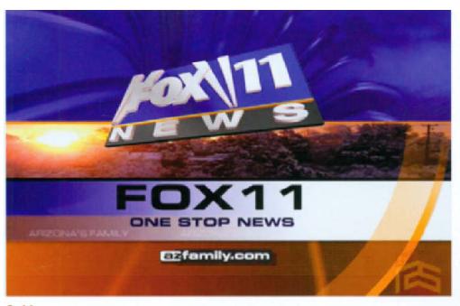
2.46 End tag frame for KTVK, an independent news station in Phoenix. Courtesy of Reality Check Studios.
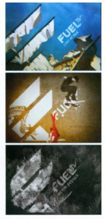
2.47 A variety of network tags are used by FUELTV to promote the unique personalities and the epic moments of action sports. Courtesy of FUEL TV.
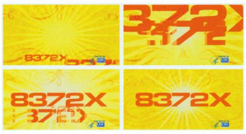
2.48 Frames from the end tag of promotional spot for Verb. a campaign to help teenagers lead healthy lifestyles. Courtesy of Nailgun*.
network packages
Similar to a show package, a network package is a complete “video information system” that is comprised of promotional elements including station identifiers, bumpers, lower thirds, and mortises.
New York-based design studio, Freestyle Collective created a networklaunch for MTV K, the first premium channel under the MTV Worldfamily geared toward young Korean-Americans. Like its intended audience, the MTV K network package presents dreamlike visions withbrilliant colors and vibrant 2D and 3D graphic animations. The provocativecombinations of live-action video, still photos and vibrant 2D and3D animations evoke the young, cool lifestyle that has become synonymouswith MTV culture. According to Elizabeth Kiehner, executiveproducer on the project, “This is not MTV Korea. … [it] is a premium,commercial-free network that features between 70 and 80% Koreanmusic videos, and is specifically meant to speak to Korean-Americansaged 13 to 30. That is a very diverse group, so there was a great dealto consider when we were coming up with our package.” (The teamrented a nightclub and karaoke bar in Manhattan’s Koreatown, andcast a variety of young talent.) The resulting package was not stereotypically Korean, but covered different niches of Korean-American lifestyles” (2.49).
2.49 Frames from MTV K. Courtesy of Freestyle Collective.

2.50 Frames from BET J. Courtesy of Freestyle Collective.
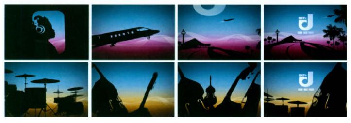
Freestyle Collective also created a full network rebrand for BET J, aspin-off cable channel of Black Entertainment Television, to showcasejazz music-related programming. Conceptually drawing on the souland funk of jazz, the design conveyed all the ideas the network wantedto achieve and introduced a modular system offering a limitless set ofpossibilities (2.50).
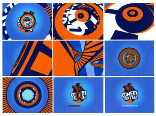
2.51 Frames from a network package for Comedy Central. Designed and produced by Imaginary Forces. © Comedy Central.
Kemistry, a branding and communications agency in the UnitedKingdom, developed an identity package across all in-flight channelsfor KLM Television’s Royal Dutch Airlines, based in the Netherlands(2.52). (This Netherlands-based subsidiary of Air France is the oldestcarrier in the world that continues to operate under its original name.)According to the company’s Web site, the project demonstrated “a newspin on mile-high entertainment” by violating their own strict brandingguidelines in deconstructing KLM’s logo. Although the client wasinitially reluctant, he was eventually delighted with the final product.
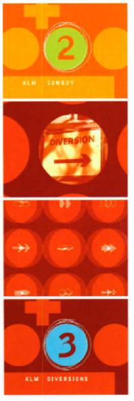
2.52 Frames from KLM network package. Courtesy of Kemistry.
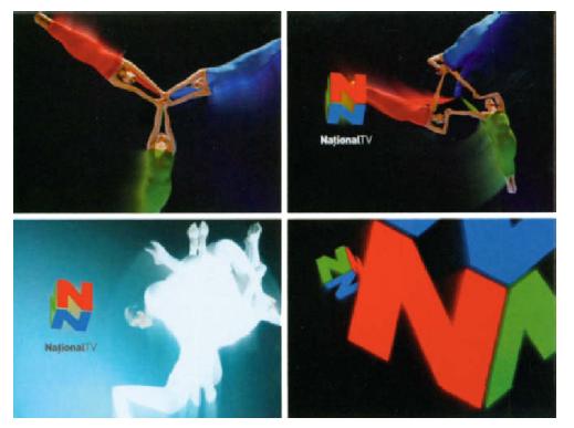
Kernistry’s branding, identity, on-air graphics, and news set designhelped launch National Tv, a TV station in Romania that featureseverything from live news bulletins, to magazine shows, dating shows,horoscope programs, reality TV, and sports coverage. The channel waslaunched by Vorel Micula, a Romanian food and drinks businessman,whose most famous product is his TransylvanianVodka. He harnessed the best Romanian talent with experts from the United Kingdom, andcontracted with the on-air design company Kemistry, to help him getthe channel off the ground. In less than six months the televisionstation became transformed into an on-air reality with its own offices,studios, and top quality technical infrastructure (2.53).
2.53 Frames from the network package launching NationalN in Romania. Courtesy of Kemistry.
In 2006, NBC decided to reinvent its on-air image across its primetime, daytime, news, sports, and online divisions, with a consistentnew look for the 2006–07 season. This look would be based on the ideaof convergence of digital and broadcast television, and the presence ofcontent on the Internet. After an intense competition between designand advertising firms, NBC’s in-house design department, MAGIC, washired. Its mission was to give the network a distinctive, interactive feelby using a single feather from the original “peacock logo” as a navigationaldevice (similar to a cursor or a mouse pointer) to guide viewersthrough informational content pertaining to show names, dates, andair times. This concept speaks to the idea of rebranding the peacocknetwork for the digital age. Additionally, their challenge was to makethe identity flexible enough to be customized and paired with the toneand personality of different shows and genres and to adapt to changingschedules. Capacity TV was then hired to implement their vision.“It was our challenge to out a way to bring personality to thepeacock feather as it accessed information, selected characters, and navigated between shows,” explained creative director Ellerey Gave.Capacity delivered hundreds of variations for the prime time motiongraphics alone, and the final network package consisted of showopeners, bumpers, tags, identifications, transitions, and trailers (2.54).
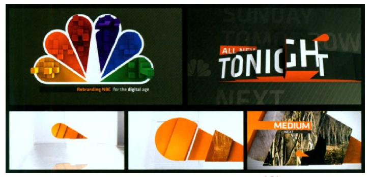
6.54 Frames from Capacity’s 2006 rebrandingof the peacock network.Courtesy of CapacityTMC. reativeDirector: Ellerey Gave; ExecutiveProducer: Jennifer Gave; Producer:Jill Marklin; DesignedAnimator:Ellerey Gave and Gene Sung;Editor: Benji Thiem; Music: DaveHummel.
In 2006, award-winning design studios Onesize and yU+Co collaboratedto rebrand the G4 Network, a fast-growing Los Angeles-basednetwork viewed in approximately 61 million homes (2.55). (Onesize,based in Delft, the Netherlands, is internationally recognized for itswork in design, animation, visual effects, and direction for commercials,broadcast, and film. yU+co, with offices in Los Angeles and HongKong, is also considered an industry leader in television show opens, network graphics packages, film titles, television trailers, theatricallogos, and commercials.) As an entertainment-based network, G4 features shows about technology, gadgets, video games, and web cultureto appeal to a demographic of males between the ages of 18–34. Theconcept involved an array of 3D photo-realistic and abstract images,such as an iPod, a video game joystick, and a hip cell phone floatingaround a silhouetted box containing G4’s logo. A bold color palette isaccented by a circular pattern that visually suggests a tornado of iconicimages-complete with wires dangling everywhere-coming togetherinside the G4 logo and tagline “TVThat’s Plugged In.’ This uniquevisual style offered a high degree of control over the design, whichempowered G4 to internally create their own specialized, programspecific animation sequences. The key to the design is that it neverhas to look the same way twice. Every aspect, from the color of thebackground textures to the specific imagery, is customizable, withOnesize and yU+co creating hundreds of animation sequences thatcan be stacked in any way imaginable. According to Rogier Hendriks,co-founder and creative director of Onesize: “We wanted to create alook that would encapsulate all of the network’s components into oneiconic image, while at the same time give them everything they neededto create their own specialized short animations within the frameworkof our design,” says Hendriks. “Basically the redesign is a big toolkitconsisting of about 300 different animation sequences.” Although it’s unusual for two design companies, who might normally competeagainst each other, to collaborate so closely, GarsonYu, owner ofyU+co, stated that this is the future for the global minded design studio—“It helped us grow as a company to work with new people withdifferent ideas and ways of communicating.”
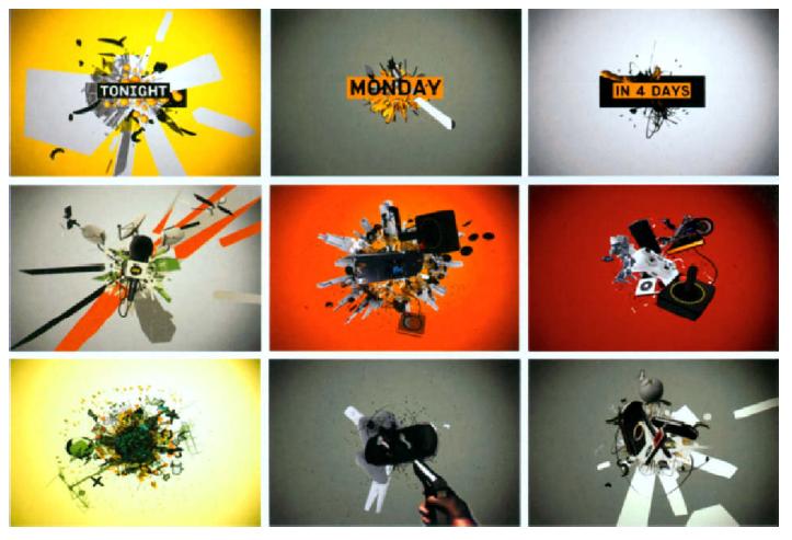
2.55 Frames from G4’s networkPackage. Courtesy of Onesizeand yU+co.
Sky, an Italian satellite platform in Milan and Rome, began its launchin 2003 with over 130 television, interactive, and pay-per-view channels.Micha Riss, founder and creative director of New York designagency Flying Machine, attempted to give Sky’s Cinema Classics’movie channel a new look while maintaining the integrity of thenetworks programming. He developed a concept that pays homage tostylized film posters of the 1930s through the 1980s. These cinematicelements were carefully crafted into a nostalgic presentation (2.56). On Thursday evenings in Milan and Rome, SKY Cinema Italia airs SpazioItalia (Italian Space), which features classic Italian movies through the1970s for native Italian audiences. Micha directed an extensive videoshoot in Rome that tells a story of a man posting vintage film posters tothe walls of a theatre. The scenes are intercut with real moments fromfamous movies, and written names of famous directors and actors thatanimate on the screen are deliberately flipped upside-down so that theviewer’s attention would not be detracted away from the main story.
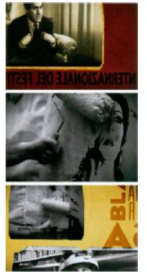
2.56 Frames from Sky’s Spozio Itolio. Courtesy of Flying Machine.
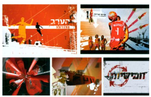
2.57 Frames from Sports 5’s 200 I network launch. Courtesy of Flying Machine.
Sports, Israel’s premiere sportcaster, commissioned Flying Machine to execute the channel’s first major rebrand since 2001 in its seventeen-year history. This emotionally-driven package not only celebrates the glory of sports, but brings local fanculture to the forefront of the channel’s branding.
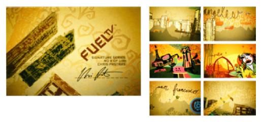
Launched in 2003 by Fox Cable Networks, FUEL TV is one of the firstaction sports networks dedicated to surfing, skateboarding, snowboarding,BMX, motocross, and wakeboarding. Within FUEL’S series ofchannel identifiers are Signature IDS, which function to associate thechannel with a well-known athlete, promote artistic endeavors, andinspire new artists in art or music (2.58–2.59).
2.58 Frame from “Chris Pastras Signature Series” Produced by Brand New School, LA: Creative Director: Chris Pastras; Music: Echo Park. Courtesy of FUEL TV.
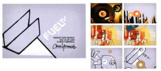
2.59 Frame from "ChrisYormick Signature Series" Produced by Todd Dever; Creative Director: Chris Yormick: Music: Barrington Levy. Courtesy of FUEL TV.
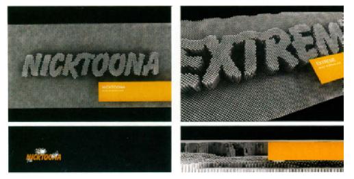
2.60 Elements from show package for Nicktoona. Courtesy of Joost Korngold and Renascent.
This spin-off of Nlcktoons features quirky. bizarre-style cartoons. The package includes a show open, credit roll, lower thirds design, and bug (or stationlogo) which maintains the familiar Nickelodeon "Splat" that had been a Nick trademark since the network relaunched in 1984.
promotional campaigns
Promotional campaigns are designed to make the public more awareof a product, brand, or service. Getting the right message across andmaking sure it is clear is vital to a campaign’s success. This involvesdeveloping a brief outlining the campaign’s objectives, identifying andexamining the intended target audience related to gender, age, occupation, leisure pursuit, and lifestyle, and assessing marketingopportunities and communication channels such as personal salespresentations, print, radio, or television advertisements. Developing apromotional message usually requires a collaborative effort to createthe content, appeal, structure, format, and source of the message.
In television, promotional campaigns have been around since the1970s and have opened up many artistic opportunities for broadcastdesigners. In 1977, ABC launched “Still the One,” a promotional campaignthat was used on several television networks around the world.The slogan was originated by the American Broadcasting Company(ABC) and later adopted by the Nine Network in Australia, Channel 2 inNew Zealand, and Sky Television (now British Sky Broadcasting) in theUnited Kingdom. The spots that were created featured a version of the1976 song by the group Orleans called “Still The One.”
In the Cartoon Network’s campaign to markvalentine’s Day specialpromotions, Susan Detrie experimented with numerous found objects,from candy boxes to flowers, and arrived at the image of a cupid asthe ultimate Valentine’s Day symbol. Crayons on Color-aid paper wereadded to make the background look like a handmade valentine, andthe cupids selected were from oldVictorian cut-out books (2.61). Theglobe was then added to signify love round the world.
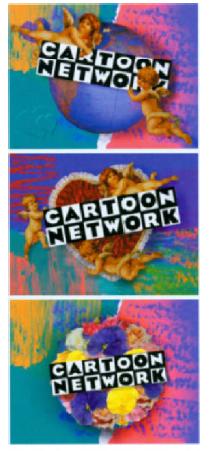
2.61 Frames from “Cupids,” a promo for the Cartoon Network. Courtesy of Susan Detrie.
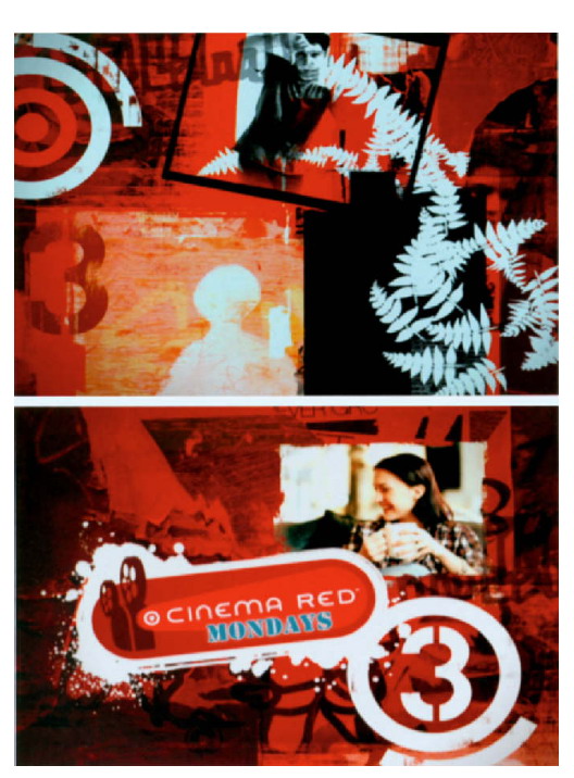
In the spirit of “indie” film, Freestyle Collective developed a dynamic Courtesy of Susan Detrie.spot promoting the Independent Film Channel’s Cinema Red Mondays.The initial storyboard concept involved developing an environmentcontaining various “pods” comprised of video-photographic collages.Each pod was designed to represent an aspect of Target and IFC’sweekly indie film presentations. The spot imitates the organic, texturallook of collage by layering 16-millimeter film footage ranging from acinema marquee to unfurling plant tendrils with still photographs ofnature, such as blooming flowers, flying birds, ferns, and tree silhouette.Additionally, the spot also incorporated cinema-related graphics,such as a 16-millimeter film cameras and typed and handwritten pagesfrom a screenplay. Textural depth was achieved by bringing certainelements to the foreground and placing others in the background.Throughout the promo, Target’s presence is branded through the useof red, white, and black—the colors of Target’s bull’s-eye logo. Additionally,the logo appears in different forms such as an old-fashionedfilm countdown, a rising sun, and a stream of floating bubbles (2.62).
2.62 Frames from a spot promoting the Independent Film Channel’s Cinema Red Mondays. Courtesy of freestyle Collective.
Blur, a motion graphic design studio located inVenice, California,developed a promotional network campaign for Kids’ WB, the Saturdaymorning cartoon portion of The CW Television Networks weekendprogramming. The campaign comprised of twenty-two spots, all ofwhich were built around the crazy, quirky, Kids’ WB logo and the studiowater tower, the main elements of the networks previous branding.Blur Studios’ goal was to develop a novel, Japanese anime look thatincorporated kids into a 3D animated environment, while retaining core elements of a brand that has been successful over many years.Each spot features a backlot, or stage area, and Pokémon-type characters that are transformed from the network’s logo. The watertower graphic is also transformed into an anime-type robot (2.63).

2.63 Frames from a promotional network spot for Kids’ WB. Courtesy of Blur.
In 2004, Blur created an on-air promotional campaign for the film,Lemony Snicket’s A Series of Unfortunate Events (2004), starring JimCarrey. Aired on Nickelodeon, these promos humorously portray thedark, morbid, yet eccentric nature of the popular children’s mysterybook series written by Daniel Handler (under the pseudonym of LemonySnicket) and illustrated by Brett Helquist. The imagery reflects thewoody nature of the books (2.64), and the mood is synonymous withthe flavor of the film, which one reviewer at amazon.com describes as “a highly stylized mixture of Edwardian times and the 1950’s … wheredeath is ever present and where the whole world has conspired tomake the Baudelaire children’s life a misery.’

2.64 frames from an on-air promotional campaign for Lemony Snkket’s A Series of Unfortunote Events. Courtesy of Blur.
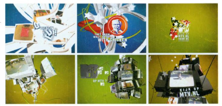
In 2005, Onesize was given complete creative liberty to develop theformat and style for a series of “cromos” (or commercial promos) forKentucky Fried Chicken (2.65). Three spots aired on MTV Productionsin the Netherlands over a period of three months. The first spot wasa call for entries that invited the MTV audience to submit videos ofwhat they can do best: the second displayed the video clips that weresubmitted and encouraged viewers to vote for the best video online;the third broadcasted and rewarded the winner.
2.65 Frnmes from a series of KFC spots. Courtesy of Onesixe.
Commercials
Television commercials are one of the most desired campaign vehicles and one of the most effective methods of generating brand recognition to facilitate product sales. Most commercials today, which sell everything from household items to political campaigns, can range from 5–10 seconds to hour-long infomercials. (30-second commercials are often referred to as spots.) The vast expenditures that television studios spend on advertising—according to wikipedia.org, the average cost of a single spot during the Super Bowl has reached approximately $2.6 million—has resulted in elaborate productions, many of which can be considered miniature movies.
In 2005, Stardust Studios, a creative design firm in New York, teamed up with McCann Erickson, a global advertising agency in San Francisco, to create the largest branding effort in the history of Microsoft Windows, reaching eleven countries over a period of fifteen months. The Windows “Start Something” campaign, a series of nine 30-second spots, was designed to support the global launch of Windows XP (2.66). Stardust Studios also designed a spot for Nokia in Singapore that aired in global broadcast outlets and in theaters. In the spot, a man and woman find inspiration from the phones of the Nokia L’Amour Collection (2.67).
2.66 Frames from the Windows’ “Start Something” campaign. Courtesy of Stardust Studios.
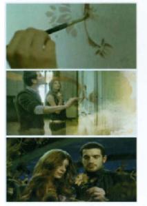
2.67 Frames from an ad for Nokia. Courtesy of Stardust Studios.
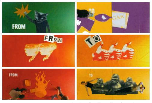
In a televised spot for KEXP, a Seattle-based radio station featuring musical styles ranging from bluegrass to electronica, Digital Kitchen developed a concept that involved translating a static print campaign for a band or solo artist into a time-based context. Low-tech graphic representations of bands and independent artists, which emulate the style of wheat-pasted posters displayed in the city, along with stop-motion, communicates the independent nature of the station’s music. The words “from” and “to” continuously appear to show the range of diversity among the artists that are represented (2.68).
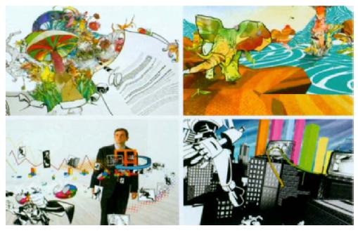
2.68 Frames from a spot for KEXP Courtesy of Digital Kitchen.
Since the 1960s, the gap has narrowed between prugrammar and odvertisements. Due to the intraducbon of drgr ed rodeo recorders. and sentes such as Trbto and On demand, which allow users to slop advertisements. many media trucs speculate that TV commercials will be replaced by the octual content of tekvrs+on programs.
Public Service Announcements
A public service announcement (PSA) is a noncommercial spot that aims to raise public awareness about specific issues such as energy conservation, global warming, homelessness, and drunk driving. PSAs are also used to promote nonprofit organizations such as United Way, Red Cross, and American Cancer Society. One of the most memorable PSAs of the 1970s was the “Crying Indian,” sponsored by Keep America Beautiful, an environmental organization founded in 1953. Launched on Earth Day in 1971, it became an iconic symbol of environmental responsibility and has been deemed one of the most successful PSA campaigns in American history. Anti-smoking campaigns during the 1970s were also effective, in that smoking rates declined when the tobacco industry withdrew cigarette advertising when Congress declared it illegal after 1971. (Although cigarette consumption rose when the spots disappeared, public health professionals credit them with having saved millions of lives.) “This is Your Brain on Drugs” was a large-scale anti-narcotics campaign launched in 1987 by Partnership for a Drug-Free America. As a result, teenagers and young adults quickly popularized the phrase, ”This is your brain on drugs.” Since 1989, NBC Universal’s “The More You Know” campaign has featured personalities from various NBC programs during its prime time, late night and Saturday morning programming. Topics include anti-prejudice, HIV/AIDS, seat belts, and child abuse, to name just a few. Other examples of U.S. network campaigns are “CBS Cares” and ABC’s “A Better Community.”
Since 1942, the Ad Council has created some of our country’s nmr; memorable PSA slogans including “Friends Don’t Let Friends Drive Drunk.”“A Mind n a Ternbk Thong to Waste,” “ Only You Can Prevent Forest Fires” (personified by Smokey the Bear). and “Fight Cancer with a Checkup and a Check”.“A Mond Is a Terrible Thing to Waste” raised molhons for the United Negro College Fund. and the American Cancer Society’s “Fight Cancer with a Checkup and o Check”roiled public awareness and funding for research and patient services.
Motion graphics have played an increasing role in television PSAs. David Carson’s “Partnership for Drug Free America” spot offers an example of how a powerful concept and effective broadcast design can persuade and educate parents on how to help their children cope with this critical social issue. According to Carson, “It was just a novel way to do a very ‘tired’ subject. It caused me to think about things in a different way and that’s what made it good. Very clever solution.”
The Diabetes Fonds in the Netherlands, enlisted Addikt, a motion graphics company based in Amsterdam, to raise awareness about re-lated health issues among diabetes patients. The advertisements were designed to encourage fundraising for further diabetes research (2.69).
2.69 Frames from a public service announcement for the Diabetes Fonds. Courtesy of Addikt.

2.70 Frames from a PSA for Unicef to raise AIDS awareness. Courtesy of DesignOMotion.
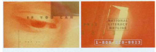
2.71 Frame from TV 1 2’s “ICBC Roadsense,” a PSA promoting vehicle safety. Courtesy of Tiz Beretta and Erwin Chiong.
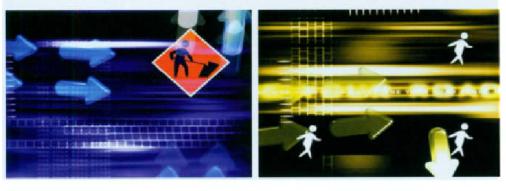
2.72 Frames from a PSA for the national literacy hotline. Courtesy of twenty2product.
Music Videos
Cinematic traditions that have been carried over from film into musicvideos have been enhanced with the incorporation of special effectsand animation. For example, a live singing or dancing performancemay be placed in a setting that is literally suggestive of the lyrics. Onthe other hand, they have deviated from narrative conventions, wheretraditional notions of past, present, and future are lost in an incoherentflow of pictorial content, and contradictions in meaning between lyrics and images, along with the use of suggestive metaphors, have beendesigned to invoke thought. When used well, this approach canproduce a poetic experience. However, the larger the gap is betweenthe lyrics and the imagery, the more challenging it becomes to discernthe context. Other times, music videos are intended to function aspure “eye candy” to create a temporal experience in which meaning isinterpreted subjectively.
During the 1980s, the music video was a cinematic art form that conrnbuted the trans formation from narrotive to nonnorrative film. Although music videos were predammontly filmic in nature. they broke the norms of troditonal cinema reahsm and allowed video artists to explore new visual possibilities of integrating anrmared and live-action imagery.
In 2004, abstr^ct:Groove, a design studio based in Milan, produceda music video for “Go Down” (by The House Keepers) for Net’s WorkInternational, an Italian record company specializing in electronic,hip hop, and pop music. In this provocative arrangement, which wonthe “ItalianVideoclip Award” for best editing in the independent videocategory (the only official Italian music video award), a sushi man, ahair stylist, and a supermodel share a strange, surreal world composedof inanimate objects and abstract motion graphics (2.73).
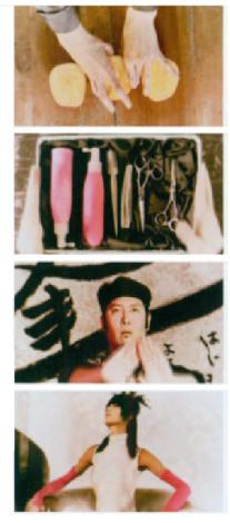
2.73 Frames from“Go Down” by The House Keepers. Courtesy of abstr"ct:Groave.
In 2004, Stardust Studios designed a music video for the band Incubusand its Sony/Epic Records label. The live footage for “Megalomaniac,”the debut single for the band’s forthcoming album, was shot over twodays in downtown Los Angeles. This five-minute piece integrates thevideo with animated sequences that incorporate historical footage tobarrage viewers with imagery complementing the song’s powerfulmessage. Ten designers handled the project over a three-week scheduleto create the dark aesthetic the director sought. “Making a musicvideo is tough on any level; to animate four minutes, tougher still,”explained Jake Banks, Stardust’s founder and creative director (2.74).
Acclaimed music video director Thomas Mignone commissioned theLos Angeles-based studio Heavenspot to create the motion graphicsfor the song “Dress Like ATarget,” by New Orleans-based heavy metal/thrash band Superjoint Ritual. The look and feel of the footage, inaddition to the powerful graphics and pulsating editing style, effectivelyportrays the heavy metal genre. This video was frequently airedon MTV’s “Headbanger’s Ball” and Fuse Network (2.75).
The motion graphic studio Shilo produced award-winning music videos for the bands Angels and Airwaves and H.I.M. The sensuous lighting and color treatment in the video for “Do It For Me Now,” by the band Angels and Airwaves, is a stylistic departure from the common trend of fast-paced, complex mixing of images in many of today’s videos (Chapter 6, Figure 6.24). The beautifully melodramatic video to “Love Said No” expresses the dark and tumultuous nature of H.I.M.,the first and only Finnish rock band to sell a gold record in the UnitedStates. This epic performance-based piece blurs the line betweenfantasy and reality by seamlessly combining striking photography andanimated typography (2.76).
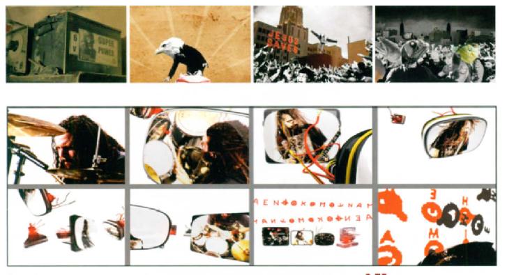
2.75 Frames from "Dress Like A Target by Superjoint Ritual. Courtesy of Heavenspot.
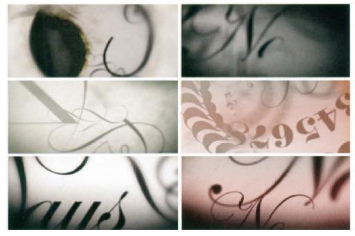
2.76 Frames from the music video for “Love Said No” by H.I.M. Courtesy of Shido.
Summary
Since the 1950s, film title sequences have been designed to create the context of a film and arouse an audience’s anticipation of the events that are about to unfold.
In more recent years, television networks have become increasingly image conscious, and increased competition for viewers has driven the need for more sophisticated and compelling on-air motion graphics. This is evidenced in station identifications (or station IDs), show openers, interstitials, show packages, network packages, television cam?paigns, public service announcements, and music videos.
A station identification is what identifies a network’s call letters, city of license, and channel number. Many television stations have developed clever ways to utilize their station IDs as promotional tools to brand their network. A promotion for an upcoming show or newscast can fulfill its identification requirements while building its audience by telling viewers to tune in to an event. Station IDs must be able to apply the aesthetics of effective logo treatment to a time-based environment, consider contextual design elements, and explore story structure.
A show opener sets the stage for an upcoming program and helps promote a network’s identity. Topical openings for news programs are designed to inform viewers of upcoming stories or events and often integrate live-action, photographic, and typographic elements (including the station identity) to enhance the entertainment value of the broadcast. A show package is a “video information system” that contains an assortment of designs that are used to promote a particular program. These designs must demonstrate a visual “synergy.”
Interstitials are mini-programs that appear between programs or other events. Some are designed to highlight key issues, people, or events, while others function to promote a network’s brand by creating a link with an existing show. News interstitials inform viewers that a top story is about to be featured, or suggest developing or continued coverage of a story. They are also used as transition from the anchor or studio into a live or prerecorded story.
Similar to a show package, a network package is comprised of a set of promotional elements that, today, dictate the need for supporting, eye-catching motion graphics. Bumpers (or bumps), for example, are brief 2- to 5-second transitions between programs and commercial breaks. Lower thirds are combinations of graphics and text that appear on the bottom portion of the screen to identify the station, the presenter(s), and the content being aired. They can range from simple graphical elements to complex animations. Mortises—full screen graphics that are used to frame live footage—are sometimes used in combination with lower thirds. Lineups inform viewers about upcoming programs by displaying their names, dates, and times. Upfronts are used to promote shows to advertisers and give viewers a glimpse of a network’s upcoming schedule. Tags occur at the beginning or end of a spot, news open, or commercial, to inform viewers on how to get additional information, by providing a phone number or Web site address.
Television campaigns have been around since the 1970s and have opened up many artistic opportunities for designers. Television commercials are one of the most desired mediums for campaigns and one of the most effective methods of generating brand recognition to facilitate product sales. The vast expenditure that production studios spend on advertising has resulted in elaborately produced commercials, many of which can be considered miniature movies.
Public service announcements (or PSAs) are noncommercial spots that strive to raise public awareness about issues such as global warming, energy conservation, and drunk driving. Motion graphics are playing an increasing role in the design of television PSAs.
Last, motion graphic animations have had an increasing presence in music videos, which are now considered multifaceted forms of art and popular culture.

