7 the pictorial composition
designing in space
There are many ways that pictorial compositional space has been interpreted, constructed, and deployed in motion graphics compositions. Innovative creative strategies have given designers the potential of overcoming the homogeny of the fixed rectangular frame that has been associated with conventional film and television production.
“The painter’s canvas was too limited for me. I have treated canvas and wooden board as a building site, which placed the fewest restrictions on my constructional ideas.”
–El Lissitzky
Space and Composition: An Overview
Space is interpreted through the prism of composition—in this case, pictorial (versus sequential) composition. Spatial composition is the blueprint from which elements are organized. In painting, it describes the two-dimensional canvas. In graphic design, it is the viewing area of a poster or an interface. In motion graphics, it describes the environment containing the action—the frame.
Through history, artists have explored different types of space because of its affinity with the content they are trying to express. Primitive space (or flat space), for example, is characterized by a flat surface that has little or no depth or perspective and is devoid of three dimensions. Utilized by many early and untrained artists, it often has a decorative quality, emphasizing pure design, flat colors, and repetitive patterns. During the late nineteenth century, many French painters and poster designers were influenced by Japanese prints and began an evolution toward using primitive space in western painting, a tradition that continues today. Illusionistic space (also referred to as Renaissance space or traditional space) was developed during the Italian Renaissance by painters such as Piero della Francesca, Filippo Brunelleschi, and Leon-ardo da Vinci, who used the devices of linear and atmospheric perspective to depict forms receding into space. (Brunelleschi is credited with inventing linear perspective.) Modern space was developed by the Post-Impressionist painter Paul Cezanne during the early twentieth century. His unique method of comparing and contrasting planes of color combined, resulted in a combination of primitive and illusionistic space, which had a major impact on twentieth century art. Modern space was further developed by Jackson Pollock, whose drip paintings resemble an infinite or all-over space.
Compositional styles have differed across cultures and across art movements throughout history. Japanese painting, for example, delights in the generous use of negative space and intuitive placement of objects within an asymmetrical layout. Art Nouveau, Arts and Crafts, and Vienna Secessionist artists were characterized by their use of arbitrary compositional arrangements, while De Stijl and Constructivist painters carried abstraction to its furthest limits in their quest for rational, geometric order.
In animation, experimental film pioneers of the 1920s gave high regard to the manner that pictorial space was organized. Hans Richter, for example, saw animation as a logical step for expressing the kinetic interplay between positive and negative forms and considered the film frame as a space that could be divided and “orchestrated” in time. In films like Rhythmus 21 and Rhythmus 23, motion was choreographed in horizontal and vertical movements and scale changes of the forms to establish depth. Nonobjective lines and rectangles move in alignment, as figure-ground is broken from the changing interplay between positive and negative space. Taken out of context, individual frames from Richter’s Rhythmus series demonstrate a liberal use of negative space, an interplay between figure and ground, and a purposeful alignment of shapes to the frame’s edges (Chapter 1, figure 1.12).
Prineiples of Composition
Today, designers continue to explore how compositional principles can be used to express concepts and emotions and to establish clear and effective communication.
unity
Most of us seek unity in our day-to-day experiences to make order of “the big picture.” In design, unity is an underlying principle that refers to the coherence of the whole—the sense that all of the parts are working together to achieve an overall harmony. It creates a sense of cohesiveness within a composition and is one of the primary ways designers create stability.
gestalt theory
Originating in Germany around 1912, the Gestalt school of psychology explored how visual elements in a composition could be comprised into an integrated “whole” to achieve a sense of harmony. The conviction of this theory is that the whole is greater than the summation of its parts. A guitar, for example, is made up of strings, a body, a neck, tuning knobs, and so forth. Each of these components is unique and can be examined individually. The guitar as a single unit, however, has a greater presence than its individual components. This overall perception gives a sense of purpose and completeness to an object or to a composition through certain visual cues such as balance, proportion, and proximity.
case studies
Pictorial unity in motion graphics can be established through consistency in the use of elements and their visual properties such as value, color, and texture. Additionally, it is achieved in the treatment of elements with regard to their relative scale, positioning, orientation, and proximity in the frame.
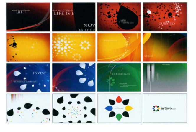
In a teaser for Artevo, the largest, most organized, fine art collection in North America, the shapes of the logo are cleverly repeated and animated in various themes that occur throughout the composition. Each theme creates a different mood and ambience through changing backgrounds, colors, and typography. The consistency in the use of the logo and similarity of background imagery, as well as the repetition and variation of both background and foreground elements and colors maintain a sense of order and unity (7.2).
7.2 Frames from a teaser for Artevo. Courtesy of Studio Dialog.
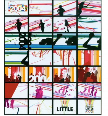
The program opener for Entertainment Weekly’s “The Biggest Little Things of 2004” (7.3) achieves unity through repeating patterns of stripes that are interwoven between graphic silhouettes of figures. Between each transition, there is consistency in the relationships of colors, patterns, and subjects that are presented in each scene.
7.3 Frames from the show opiner to Entertainment Weekly’s “The Courtesy of Nailgun Biggest Litt,eThings of 2004:”Courtesy of Nailgun*
In figure 7.4, various images ranging in graphic style, shape, color, size, and spatial proximity are unified by a large screened object in the background. This solution is commonly used in complex compositions containing multiple levels of information.
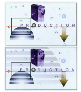
7.4 Because there is a wide variety Of images that range in graphic style, color, size, and proximity, alarge background element helps to establish unity. © Jon Krasne
balance
Balance is a primary component of our day-to-day lives and one of the primary methods of achieving unity. We seek balance in our experiences to make order out of work and play, finances, family life, and so forth. Within the frame, balance suggests a sense of cohesiveness. It is one of the primary devices that designers use to create stability or instability.
Symmetrical balance is the division of a space into parts that are equal in size and weight. As human beings, we are symmetrically balanced on a vertical plane. Synthetic objects, such as cars, tables, and chairs, also exhibit symmetry. In the early days of film, titles were usually placed symmetrically in the center of the frame. Radial balance is a type of symmetrical balance in which images are emitted from a central focal point (i.e., ripples emanating from a stone thrown into water). Crystallographic balance (also referred to as “all over” balance) contains numerous focal points that are strategically arranged into a repeating pattern. Quilts, for example, consist of crystallographic patterns that are organized into gridlike designs. The random effect of scattered confetti also produces a sense of crystallographic balance that is evenly distributed throughout. However, there is too much uniformity without enough variety.
Balance does not always necessitate symmetry. For instance, a small object in a composition that is visually engaging in color, texture, or shape can balance a much larger object that is visually less exciting. Asymmetrical balance is an informal type of balance that achieves a dynamic division of space. It can be used to create a more dynamic sense of organization or establish emphasis. Asymmetrical compositions allow a more dynamic use of negative space, giving the designer greater freedom in composing the frame.
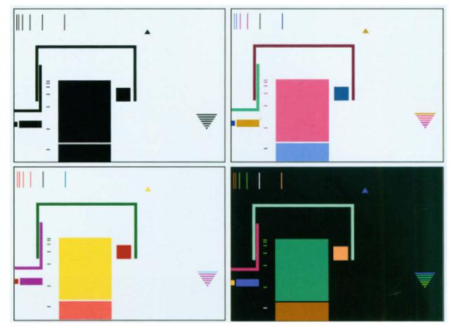
7.5 In this asymmetrical composition. varying shapes and spaces are unevenly dispersed, creating an active and energetic picture plane. Color is used to counteract the dissimilarity of shapes. sizes. and positions to achieve balance. © Jon Krasner.
figure and ground
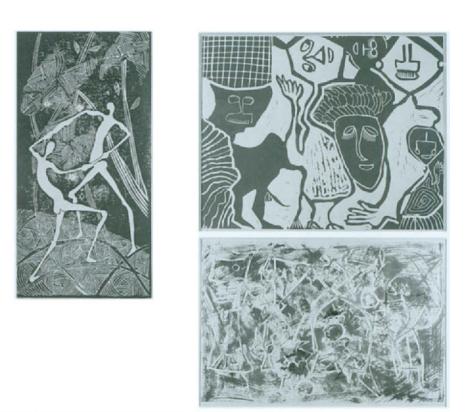
Ground (also known as the picture plane) defines the surface area of a composition; figure refers to the subjects that occupy the foreground space. Throughout history, works of art have ranged from clearly defined delineations of foreground and background elements (for example, a figure posing in a landscape) to the complete eradication of figure and ground, where space becomes ambiguous to the viewer. Abstract Expressionist and Cubist paintings have continuous two-dimensional space, where negative and positive forms are interchangeable (7.8). In motion graphics, figure and ground relationships can change as the positioning, orientation, and sizes of elements vary over time. For example, the compositions in figures 7.7 through 7.9 emphasize the structural and dynamic use of positive and negative shape interaction. As the positioning of the elements shift in the frame, foreground and background spaces become interchangeable.
7.6 left “Eketete and Erbeybuye” top right: “Igbo and His People.” bottom right: “Chaos.” Courtesy of the Harmon Foundation Collection and NARA. These three paintings vary from a clear interpretation of figure-ground in which foreground and background relationships are clearly defined to its extreme obliteration through the use of heavily layered visuals that vary in color, texture. and opacity.
7.7 Frames from a network re-launch for SCI FI Channel, Courtesy of Flying Machine.

7.8 Frames from a fictional station ID assignment, by Jim Reynolds, Fitchburg State College, Professor Jon Krasner. The black shape on the red ground becomes the ground that holds the red shapes


7.9 Frame from Mijnwitplafond (2002), by Violette Belzer, An interchangeability between foreground and background forms eliminates the sense of figure and ground. © il Luster Productions.
negative space
Related to figure and ground is the concept of positive and negative space. Positive spaces are areas that are occupied in a composition; negative spaces are areas that are unoccupied or empty. Negative space (also referred to as ground) is analogous to white space in print design and is evaluated using the same criteria that applies to the rest of the elements in a design-unity, balance, contrast, etc. Negative space can add to or detract from a composition’s overall balance and rhythm and can provide visual emphasis and eye movement.
“One can furnish a room very luxuriously by taking out furniture rather than putting it in.”
—Francis Jourdain
Dramatic or subtle, negative space can affect the viewer visually and emotionally. In a series of network identifications for the Middle Eastern network Al Jazeera Sport, live footage of athletes are isolated from their natural environment and integrated into minimal, dream-like landscapes to depict duality between figure and space, allowing us to focus on the subject’s “bare essentials” (Chapter5,figure 5.28). Designers often use extensive negative space to create a feeling of sophistication and elegance for upscale brands of clothing, shoes, and cosmetics to express their high level of quality to viewers. An example of this is German designer Daniel Jennett’s instore video presentation for ESCADA, an international luxury fashion group specializing in women’s fashion (Chapter 9, figures 9.25-9.26).
From an aesthetic standpoint, negative space provides breathing room for the eye, making the frame feel less dense, confusing, or overwhelming. It is important to realize that negative space is not just empty space that serves as a ground for positive components; rather, it has weight and mass and should be deliberately planned. In a series of program IDs for Unsolved History, a show on Discovery Channel that investigates mysteries of the past, negative space is strategically constructed to organize free-floating photographic images, graphic images and symbols, and typographic information (7.10).
7.10 Frames from a series of program IDs for Unsolved History (2002–2003). Courtesy of Discovery Channel and Viewpoint Creative.

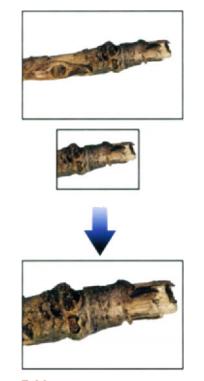

7.11 An image can appear “heavy” or “light” depending On the demensions of the frame it occupies.
size and scale
Many compositional possibilities can be derived from manipulating size and scale. Size relates to the format (or the frame) that elements are placed in; scale describes the relative relationships that exist between elements. Objects that are in scale give the appearance of belonging together; objects that are out of scale exhibit a visual imbalance. Whether objects are static or moving, both devices play a major role in composition. Size can contribute conceptually to the message being communicated by establishing weight or mass. For example, an object may appear “heavier” or “lighter” depending on the dimensions of the frame it occupies. Size can also help improve composition. The use of large elements gives you the opportunity to divide a frame into a variety of positive and negative structures. These, in turn, can establish a more active sense of “architecture” from which other elements can be positioned and directed to move along.
edge
Throughout art history, edge relationships have been a fundamental component of design. They define a composition’s parameters and play a critical role in establishing eye movement and hierarchy, Early Egyptian manuscripts, which established consistent design formats with rigid sets of compositional rules, strongly emphasized the relationship of visuals to the borders of the picture plane. Edges were given considerable attention with regard to the placement of illustrations and hieroglyphics. Horizontal bands containing small illustrations were often placed across the top, while larger images and adjacent hieroglyphic text columns hung from the top border (7.12).

7.12 Psychostasis (weighing of the souls). Book of the Dead of Tsekhons. Ptolemaic period. Museo Egizio, Turin © Erich LessinglArt Resource. NY.
In motion graphics, the frame’s edges provide you with four possible points of entry and exit into. For example, an object can touch an edge, and its movement can be strategically aligned to it, reinforcing the vertical or horizontal nature of the frame. In a television commercial for Citibank, David Carson’s alignment of elements to the edges of the frame emphasizes its horizontal and vertical structure. (7.13).

7.13 Frames from a commercial for Citibank. Courtesy of David Carson.
direction
Direction has powerful control over how a viewer’s eye moves within a space. It helps establish a composition’s sense of purpose by providing a point of entry and exit for the viewer, and in complex compositions, can be used to organize, connect, or separate dominant and subordinate elements. Direction can also be used as a means of counteracting motion in order to stabilize eye movement within the frame. For example, the movement of a figure in one direction can be neutralized by another figure’s movement in the opposite direction. In figure 7.14, the horizontal motion of an element is stabilized with a vertical wipe that exposes a new background image. In figure 7.15, a large letter-form animates from the bottom left corner toward the top right edge of the frame. A series of smaller typographic items, aligned parallel to the image’s path of motion, animate into the frame from the left edge, reinforcing eye movement diagonally upward.
7.14 A horizontal movement across the frame is counteracted by a vertical transitional wipe.

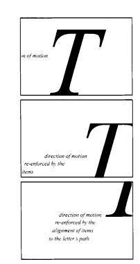
7.15 The alignment and repetition of structures tilt the eye toward the top right edge of the frame.
contrast
Visual contrast is one of the most important principles of graphic communication and expression. It can introduce variety into composition, clarify or simplify information, intensify meaning, or refine the message being communicated. The most standard types of contrast are scale, value, color, shape, surface, proximity, and orientation.
Scale is the most elemental and widely used form of contrast. Along with value and color, it can emphasize a point of interest or create the illusion of spatial depth. In visual perception, smaller objects naturally appear to recede into the background, while larger objects appear to project closer to the viewing picture plane. Extreme scale differences can capture the imagination of the viewer. For example, taking an object out of its original context and juxtaposing it with other objects that have been altered in size can dramatize its impact, as evidenced in figures 7.19 through 7.21. In these compositions, scale differences create the illusion of depth, accentuate the impact of the subject, and enhance the visual impact of the frame. In the opener for Arte Kurzschluss, a weekly TV program that features short, experimental films on the Franco-German TV network, the extreme scale between human figures and film equipment fracture our logical sense of space (7.16). The opening to a teen-targeted identity package for Cosmopolitan Television also employs scale contrast in the juxtaposing of spirited, joyful young women and iconic objects to suggest a playful, liberating atmosphere (7.17).
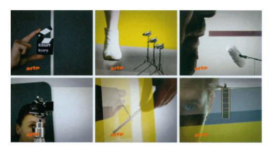
7.16 Frames from Arte Kurzschlus. Gourtesy of Velvet
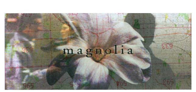
Value, which measures the lightness or darkness of an image’s tones or colors, is also a widely practiced form of contrast. (As newborns, we first distinguish objects in black and white.) It can enrich visual messages and can be used to create focal points in a composition. In the title sequence to the film Magnolia (1999), an image of a blooming magnolia flower is superimposed with street maps and content from the film, producing a dynamic blending of tonal ranges. This interplay between light and dark helps express the concept of people’s lives overlapping and intersecting. On an aesthetic level, it helps clearly differentiate the elements in the frame (7.18).
Next to value, color contrasts can be used to create mood, symbolize ideas, and express emotions to produce a desired audience response. It is important to understand that color is relative to its surroundings; a color that stands alone in a visual field is perceived differently than a color that is surrounded by other colors. For example, value contrast between light and dark tonalities is the strongest method of distinguishing colors. Generally, colors containing a greater range of values produce more contrast than those that are close in value. Temperature contrast between warm and cool hues has been used to suggest spatial proximity and depth. The recessive qualities in the cool blue-green spectrum can indicate distance, while warm ranges in the red-yellow spectrum can express closeness. Complementary contrast occurs when colors that are opposite from one another on the color wheel are placed in close proximity to produce dramatic or shocking effects.

7.17 Cosmo Fun Zane Courtesy of Cosmopolitan TV and Hearst Entertainment & Syndication
7.18 Title frame from Magnolia ( 1999). © MXMXCIX, Fine Line Features. All rights reserved. Photo by Peter Sorel: Photo appears courtesy of New Line Productions, Inc.
In figures 7.20 and 7.21, the program opening for Hallmark Channel’s, Crown Cinema and television spot for Espirit Kids both demonstrate complementary color contrast. Simultaneous contrast occurs when a neutral gray tone assumes the complementary hue of a color that is in close proximity. For example, if a gray tone is close to a green hue, a neutralization process makes it appear as warm, reddish gray (7.22).

7.19 Temperature contrast is evident in an animated banner ad for Washington Mutual. Courtesy of twenty 2 product.
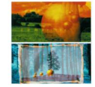
7.20 Frames from Crown Cinema (200 I). Courtesy of Viewpoint Creative. © Hallmark Channel.

7.21 Espirit Kids was aired throughout Japan and in several boutiques. Courtesy of April Greiman, Made In Space. © Espirit.
Contrast in the graphic representation of texture and pattern can also add spatial depth and emphasis. In figure 7.23, Stephen Seeley, creative director of Studio Dialog, employed a unique background texture that makes the images look as if they have been silk screened or stamped in ink. This quality heightens the impact of the contrasting polished shapes and lines that are characteristic of the foreground images that animate on top of the background. Fuel TV’s signature network identity in figure 7.24 incorporates images of aged fabric as fills for the background and foreground elements. The unique, tactile characteristics of the patterns create an aesthetically engaging contrast against the flat, graphic imagery and typography.
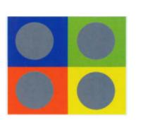
7.22 Simukaneous color contrast.
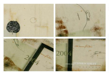
7.23 Frames from Stephen Seeley’s motion design reel. Courtesy of Stephen Seeley and Studio Dialog.
Shape contrasts can be deliberately arranged in a composition to create visual conflict in the frame. In a “Visual Music” assignment at the Massachusetts College of Art, students created mesmerizing soundscapes of live-action images to represent sound. Ted Roberts’ composition entitled “Organic Unit” combined natural, abstract for of filmed liquids with hard-edged forms of buildings in cityscapes (7.25). In an opening for the Travel Channel’s Destination Style, a program that features a behind-the-scenes look at the people who work on fashion photography shoots around the globe, dissimilar shapes can create interest by introducing visual conflict (7.26).
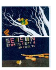
7.24 Frames from Fuel TV’s signature network identity for its fall season. Courtesy of FUEL TV.
“All colors are the friends of their neighbors and the lovers of their opposites.”
—Marc Chagall
7.25 Frames from “Organic Unit” from an assignment entitled “Visual Music” by Ted Roberts, Professor Jan Kubasiewicz, Dynamic Typography (2003), Massachusetts College of Art.

7.26 Frames from Destination Style show opening for the Travel Channel. Courtesy of Susan Detrie Design. Dissimilar shapes create interest by introducing visual conflict.
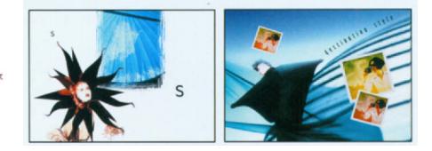
Contrast in the proximity between objects and their relative positioning to the frame’s edges can also increase their distinction. Further, the direction that objects point can vary to distinguish different types of graphic information and to create emphasis (7.27).
7.27 Varying the orientation of objects throughout the frame draws our eye in different directions.

In addition to these standard forms of contrast, other methods can be considered: line versus mass; symmetry versus asymmetry; ornamental versus simple; representational versus nonobjective; premeditated versus spontaneous; deliberate versus chance; ordered versus random; cerebral versus emotional; duplicated versus varied; cohesion versus disparity; clarity versus ambiguity; and open versus closed. Graphic designers who are starting out in the field should explore all of these methods to find out what suits their temperament and sensibility.
hierarchy
A principle that is related to contrast is hierarchy. (In fact, it is usually dependent upon contrast.) Most viewers rely upon visual clues to direct their attention. Visual hierarchy is a product of their need for direction. It allows you to organize complex information and direct a viewer’s attention throughout the frame on an informational and a visual level.
The most artistically innovative designs can function on an aesthetic level but fail to communicate the information. In contrast, compositions that demonstrate effective hierarchy are organized in a clear, systematic, and easily understood manner by differentiating elements by their order of importance. In a publication design, headings, subheadings, paragraphs, and side notes are clearly differentiated with regard to their typeface, size, spacing, color, and so forth. In motion graphics, the primary, secondary, and tertiary elements form the basis of their visual communication. The primary, most important elements in the frame must capture the immediate attention of viewers and lead them into the design. They should offer the most important information and create a mood or emotional response, based on what is being communicated. Viewers should then be drawn to the secondary components, which should reinforce the overall message and enhance the impact of the design. Finally, tertiary elements should also support the primary and secondary elements and overall message.
Visual hierarchy can be achieved by establishing contrasts in shape, scale, value, weight, positioning, scale, orientation, color, and proximity. In figure 7.28, for example, shape is used to establish visual hierarchy by connecting or separating visual information. The most dominant shapes act as directional tangents to help our eye move throughout the frame, while smaller graphics function as accents to contribute toward the composition’s secondary hierarchy.
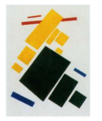
7.29 “Suprematist Painting: Aeroplane Flying,” 1915, by Kazmir Malevich. The Russian Suprematist art movement gave size and scale considerable attention in establishing spatial relationships and hierarchy between objects
repetition and variety
Repetition is the recurrence of one or more elements in a composition. With subtle variations, repetition can inject a provocative, visual beat. Pop artist Andy Warhol’s paintings, for example, demonstrate a monotonous repetition of images to convey the idea of consumerism. In furniture design, the articulation of surfaces through decoration and ornamentation can be visually engaging because of their repeating
7.28 Prototype splash page design for Salon de Fatima, by Jon Krasner. © Jon Krasner. A large semicircular background shape is used to help organize the most important information while balancing and unifying the composition. Smaller graphics function as accents to contribute toward the composition’s secondary hierarchy.

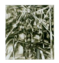
7.30 Cubist painting of the Brooklyn’ Bridge (c 1917–19181, artist unknown Courtesy of NARA.
forms and textures. In painting and static design, repetition can be achieved through the spacing of elements. In a Cubist painting of the Brooklyn Bridge, for example, a rhythmic vocabulary of architectural, volumetric forms is established in the manner in which the image is fragmented into overlapping geometric planes (7.30).

7.31 Composition study by Mike Cena. Fitchburg State College. Professor Ion Krasner.
The pictorial recurrence of elements can also create spatial rhythm, as seen in a show opener for Fine Living Network (7.32). AMC’s 20th anniversary station IDs employ repetitive geometric forms to emphasize the concept of “twenty years of big-screen battles.” In “twenty years of romantic movies,” the repetition of similar patterns provides rhythm, pictorial continuity, and compositional balance to the frame (7.33).
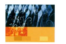
7.32 Frame from Live Like You Mean It. Courtesy of Detrie Design and Another-Large Production.
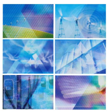
Within repetition, variety can break predictability by introducing change. Repeating shapes that differ in scale, color, orientation, or proximity can enhance visual interest by adding variety to what might be an otherwise monotonous or boring design. Together, repetition and variation can contribute to a composition’s pictorial rhythm. In Loop (2003), a short, animated film that expresses a romantic view of alternative energy, pictorial rhythm is established through repeating images that vary in shapes, texture, and pattern of motion (7.34).
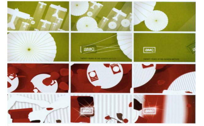
7.33 Frames from a series of station IDs promoting AMC’s 20th anniversary. Courtesy of Shilo.
7.34 Frames from Loop (2003), by Terry Green and Nori-Zso Tolson. Courtesy of twenty-Zproduct. This piece was inspired by a cover design for Hemispheres, a United Airlines in-flight magazine. Live footage of wind farms, sunsets, and cityscapes were combined with 2D graphics to communicate solar energy and to reinforce the piece’s overall continuity.

7.35 Evenly spaced lines on a ground establish a repetitious rhythm. Varying their proximity produces a more dynamic rhythm.
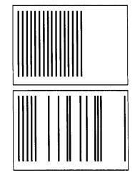
Pictorial rhythm can range from monotony to chaos, depending on the degree of variation that is introduced. It is important to recognize the distinction between pictorial rhythm and sequential rhythm. Pictorial rhythm considers the distances that elements are repeated in the space of the frame; sequential rhythm considers the continuity and recurrence of elements between frames.
Constructing Space
juxtaposition and superimposition
Juxtaposition and superimposition are two methods of constructing space. Spatial juxtaposition is the placement of two or more elements that are related or unrelated in meaning in close proximity to suggest a new meaning. During the Modernist era, the Surrealist movement employed bizarre juxtapositions of objects in unusual settings and in absurd situations. Pop artists juxtaposed fragments of popular culture in painting. Superimposition involves overlaying one element on top of another. (In broadcast production, a title can be “supered” over live background footage.) In collage, superimposition allows the original identity of found objects to be maintained in tandem with the new meaning that each takes on in association with other objects. In photomontage, it provides a method of combining two or more images to create a new image or scene. In motion graphics, digital compositing has allowed designers to create unique framic combinations of moving images and type through these techniques, which are at the heart of today’s film titles, network IDs, show openers, and so forth.
grids
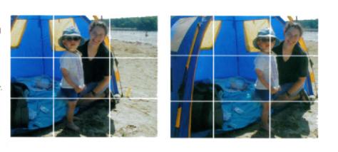
A grid is a formal, underlying structure that can serve as a guide to making purposeful design decisions regarding the placement, sizes, and proportions of elements in a composition to maintain a sense of organized unity.
Today, more casual grids are used in print to provide consistency in column widths, margin sizes, the space surrounding images, and the placement of repeating elements such as body text, headers, and footers from page to page. Web designers have also embraced the grid as an alignment tool for graphics and type positioned inside tables or layers. In motion graphics presentations that are tailored for interactive interfaces (e.g., Web, multimedia, DVD-Video titles), grids can be used to align elements in the frame and provide consistency between pages or scenes by ensuring continuity in the positioning of elements. When used in conjunction with aesthetic intuition, they can help organize complex information and achieve balance between visuals in the frame to allow information to be communicated clearly.
The modern grid is the result of an evolutionary process that can be traced back to the inception of graphic design in Mesopotamia 4,000 years ago. Consisting of horizontal and vertical lines, grids have been used as a reliable method of organizing diverse information into logical, coherent arrangements of text and images.
Should you decide to use a grid, it is best to sketch it out on paper first and then implement it in the application that you are using. (Most motion graphics programs provide guidelines that can be adjusted and locked to position elements into vertical or horizontal alignment.)
Once a grid system has been established, you can deviate from it to add visual interest or emphasize particular elements. While certain objects may be aligned to specific regions of the grid, others may break away.
A grid system should be guided by the design concept and the content. It should only act as a guide—not as a substitute for creative intuition.
7.36 The"Rule of Thirds" uses a grid to divide a space into three equal segments, where the points of focus are at the intersections of the grid lines. This strategy can prevent elements from being placed in the dead center of the composition. © 2007 Jon Krasner.
7.37 This CD-ROM presentation for Ascential Software suggests the use of an underlying grid to ensure continuity in the alignment and placement of images and text. Courtesy of Corporate Graphics. © Ascential Software.

7.38 Underlying grid structures used in print and Web design can be applied to motion graphics to provide pictorial order to a kinetic composition. Here, action-safe and title-safe regions have been incorporated.

breaking spatial conventions
It is important to identify with the imposed rectilinear parameters that the “frame”—which remains the basis of traditional cinematic composition-circumscribes, as we struggle to find opportunities for creative expression on the screen. As new, nonconventional approaches to composition involve spatial, rather than framic, arrangements, the frame has moved to a subsidiary position, and restrictions that have been imposed by spatial norms of film and video become eliminated.
The fact that film and television screens are rectangular does not imply that your work must conform to the frame’s rectangular format! (In fact, many interactive motion graphic artists feel confined by the fixed aspect ratios and zoning laws of film and television screens.)
“Photography is all right… if you don’t mind looking at the from the point of view of a Paralyzed cyclops—for a split second.”
—David Hackney
Historical Perspective
Since the beginning of the twentieth century, artists have challenged classical assumptions of space in order to break the homogeny of the rectangular frame. Throughout the modern era, Cubist and Constructivist painters gravitated toward traditional approaches to composition by investigating multiple viewpoints, asymmetry, and diagonal eye movement. During this period, graphic designers also began to deviate from popular spatia1 conventions. Russian Constructivist painters and designers broke away from vertical and horizontal arrangements in favor of diagonal eye movement. during this period , graphic desongners alse began to deviate from popular spatital conventions. Russian Constructivist painters and designers broke away from vertical and horizonal arrangements in favor of diagonal layouts. Later, Swiss and Dutch postmodern designers began pushing scale cunrrasts, angular forms, and dramatic camera angles in their compositions.
Attempts to break the rectangular format were striking during the early twentieth century. Modern artists such as Robert Delaunay, Piet Mondrian, and Giorgio de Chirico were among the first io introduce circular, diamond, and triangular compositions Eventually.painters began to investigate ways to exetend their content beyond the confines of the frame. Many negated the idea of enclosure and considered borders as visual devices. Frank Stclla’s mixed media, decorative abstractions from the 1970s broke deadlock of the poctorial surface by leaping off the wall onto the gallery floor. His book Working Space (1986) has chanllenged. Influenced by Cubist aesthetics, American photographer David Hockney brought to the late twenti-eth century an increased desire for spatial exploration. His photocollages, which were constructed from 35mm prints, were compiled to create a “complete” picture by eliminating the idea of a fixed field.
nonrectangular boundaries
Since paintings during the early Renaissance were created strictly for religious purposes, artists took into consideration the structures that existed in ecclesiastical vaults of churches (7.39). When the context shifted from religious to secular, canvases were needed to display artwork. As a result, the rectangle became the most widely accepted picture format.

7.39 Byzantine painting (476–1453). © Erich Lessing/Art Resource, NY
Recently, designers have become liberated to “think outside of the box.” Although the viewing area may remain fixed in the case of film and television compositions, nonrectangular y structures inside the frame can serve as “compositions within a composition.” In figure 7.40, the motion graphics in a CD-ROM interface were designed to conform to a nonconventional shape, rather than to the frame’s boundaries. The client requested an entertaining design that conveyed the idea of information management software while holding the audience’s attention. With this in mind, I felt compelled to push the envelope and became intrigued with the possibility of using masks to frame animations that were part of the interface. Members of the production team, who had little regard for artistic experimentation, were grounded on the supposition that live-action video should always be presented in a 4:3 aspect ratio format. I politely ignored their beliefs, and with a little client convincing, I finally arrived at an idea that worked!
7.40 Frames from Candle’s lntelliwatch CD-ROM by Jon Krasner. Courtesy of Candle Corporation and The Devereux Group. © 2004 Candle Corporation.

absence of boundaries
In motion graphics compositions, space can also be suggested, rather than defined by the hard-edged physical boundaries that the screen imposes. This allows the eye to consider the possibility of time passing through an infinite, undefined viewing area that continues in all directions. For example, the backdrop of the inner city playground in figure 7.41 abandons the idea of boundaries within a fixed frame. The five main figures leap forward out of the inner circle, providing a feeling of continuous space without borders.
7.41 Mural painting in Hell’s Kitchen, Manhattan, NewYork, courtesy of the EPA and NARA.

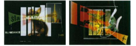
In the opening titles to a fast paced top ten countdown for ZeD, a CBC Television program that showcases Canadian films and music, the majority of the action is composed to occur within or break out of the skewed image of an index card, which serves as the backdrop for the composition. Free-floating cutout silhouettes and abstract symbols demonstrate a complete disregard for the frame (7.42). The darkand edgy motion graphics for ZeDS third season ignores the frame’s rectangular format by giving us a “slice” of the action inside a narrow, horizontal strip (7.43). In a rich, action-packed trailer for the Slamdance Film Festival, America’s most prominent festival ”by filmmakers forfilmmakers,” the frame only serves the purpose of “housing” an open compositional format. Similar to figure 7.42, images seem unbound by the composition’s rectangular constraints (7.44).
7.42 Opener to ZeD, season 4, CBC Television, Courtesy, Studio Blanc.


7.43 Show opener to ZeD, season 3, CBC Television.Courtesy of Studio Blanc.
7.44 Frames from Slamdance. Designed by Brumby Boylston and Elizabeth Rovnick. Courtesy of FUE TV.
frame division
Dividing up the frame can fracture time and space, allowing viewers to use their peripheral vision to observe several actions and perspectives simultaneously. In the opener for Movie Magic, a television show that gives audiences a behind-the-scenes look at how things are made, segments of live-action footage of physically constructed letter forms and intimate close-up shots of silk screening, welding, carving, and sand blasting are duplicated in the frame as multiple video windows. The relative positions and scale relationships of the windows changes in each scene, emphasizing the sensitivity and complexity of these artistic processes used to handcraft the three-dimensional letters of the composition’s title “movie magic” (7.45). Susan Detrie’s pitch for ESPN expresses the concept of a runner who pre-visualizes himself crossing the finish line. Splitting the composition reinforces the nature of sports footage, which is often presented in a divided frame format togive viewers a chance to observe the action from multiple viewpoints. The type, which reads “small is beautiful,” refers to the fact that a tiny fraction of a second can separate winning from losing (7.46).

7.45 Frames from Movie Magic. Courtesy of Velvet.

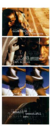
7.46Frames from a IS-second spot for ESPN. Courtesy of Susan Detrie.

7.47The motion in Rockshox’s 2000 Web site was composed to work within a split screen format. Courtesy of twenty2product.
The concept of the divided frame was explored in the 1880s during the English Arts and Crafts movement by graphic designers such as Selwyn Image, who used this device to organize his compositions, which were packed with graphic detail.
In the motion picture industry, the divided screen was one of the oldest effects to be used during the silent film era to depict telephone conversations between people. Filmmakers that were a product of formal modernist aesthetics also entertained its concept. Abel Gance’s three-screen classic titled Napoleon (1927) used a process that he called “Polyvision” Gance predicted that the capacity of the viewer to navigate through multiple images was a result of an increasingly shortened attention span. During the 1960s, underground filmmakers such as Jordan Belson and the Eames brothers projected multiple images in light shows in galleries, planetariums, and public settings. Their technique of super-imposing images with as many as seventy individual projectors became known as the expanded cinema (a quintessential method of expressing the effect of a hallucinogenc drug trip).Pop artist Andy Warhol also applied a split-screen technique in Chelsea Girls {1966), the first double-screen film tu be commercially released.
During the 1970s, multi-image slide projection allowed numerous dissolving images to be displayed in unison with sound. Video wall technology during the 1980s elaborated on this idea by offering modular, multi-screen systems that could display large images without sacrificing picture resolution. Exciting compositional possibilities could be attained as signals from different sources could appear across adjacent monitors or be divided up, repeated, and shown separately in various shape and size configurations.
Today, prime-time television shows and motion pictures have embraced split-screen juxtaposition. In Mike Figgis’s film, Timecode (2000), four panels depict four interconnected personal experienees that unfold in real-time. Stephen Hopking ’s television drama 24 also uses this technique to depict a range of viewpoints and camera angles in as many as six simultaneous scenes.
mobile framing
Changing the framing of a composition by simulating camera motion can guide our perception of onscreen and offscreen space. It can give us a sense of mystery, as important elements that were once concealed gradually become visible within the frame. For example, in an assignment that challenges students to animate a famous poster from the history of graphic design, Mike Sokol investigated several compositional possibilities through various camera angles and movements that expose us to the components of Bruno Monguzzi’s typographic poster. We travel on various trajectories through space in a graphic landscape of two-dimensional planes and letterforms. At the very end, all the elements of the full poster are presented in the frame (7.49).
Frame mobility can link elements and emphasize relationships between elements and their environment. For example, zooming in or forward tracking moves elements off the edges of the screen, while images and overlooked clues that exist beyond the frame’s boundaries are revealed. This alternative to cutting or transitioning between the views arouses our curiosity about the story, since we anticipate what the result of the zoom will yield. Camera motion can also function to keep our attention focused on a moving element by following it. For example, a tracking shot may follow a bird in flight, or a crane shot may pursue an object plummeting to earth.

7.48 Mural painting for the Harlem Art workshop. Courtesy of the Harmon Foundation Collection and NARA. The concept of spatial division functions as a means to show multiple views of Harlem.

7.49 Frames from “Monguzzi Poster,” an animated poster by Mike Sokol, Professor Jan Kubasiewicz, Dynamic Typography (2005), Massachusetts College of Art.
In her short film entitled About Face, animator Marilyn Cherenko employed the cinematic techniques of dollying and zooming to allow viewers to follow the cat from room to room at spatial distances ranging from wide shots to extre e close-ups (7.50). In figure 7.23, we are led throughout the composition by a graphic of an apple that moves in coordination with a long, emulated camera tilt downward. The apple fades out, and a -90 degree frame rotation changes our eye movement to a horizontal direction, which supports the movement of the type off the right edge of the frame. In both these cases, reframing was achieved by adjusting the camera angle, height, and distance to accommodate the subject as it shifts its position in space. Additionally, reframing allowed the composition’s balance to be maintained as the movement of the main subject changed.
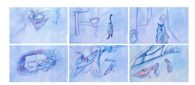
7.50 Frames from About Face (2000) by Marilyn Cherenko.
Frame mobility can be used to impart information by establishing visual hierarchy and emphasis. In a PSA designed to engage private companies to help fight against AIDS in Africa, Ryan Leonard employed camera movement to establish a clear legibility and sequential hierarchy of information (7.51).

7.51 Frames from a PSA promoting joinred.com, by Ryan Leonard, Art Institute of Philadelphia, Professor Genevieve Okupniak.
3D space
Although the fixed rectangular frame may be restricting in its top, bottom, left, and right edges, there are fewer limitations to what can be achieved in three dimensions. Three-dimensional space moves our eye into a realm that is less constricting than the frame’s two-dimensional parameters. Visual advance, recession, frontal view, and oblique view from any location, as well as the device of perspective through the use of lines and angles, allow us to create the illusion of three dimensions within a two-dimensional framework.
In Reality Check Studios’ 2007 show reel, overlapping, transparent square shapes from the company’s logo emphasize the illusion of depth. Two-dimensional lines, planes, and typographic elements arepositioned at various angles in a digital three-dimensional space to give us a sense of deep perspective. Further, the use of mobile framing enhances their positioning as they animate on different spatia trajectories (7.53).
New York’s motion graphics company Flying Machine was hired to design a graphics package for two shows, CNET News.com and CNET TV.com, both of which feature news and business reports on information technology. CNET, Inc., a San Francisco-based media company specializing in computers, the Internet, and digital technologies, wanted a “techno” feel that maintained the human connection to technology. The graphic design incorporated a variety of live-action content and computer-generated backgrounds and elements, while picking up on the yellow and red color scheme from CNET’s branded Internet network. In a spot for CNET’s television news program, three people engage in a playful journey along the information superhighway. They interact with various handheld devices, video displays, and touchscreens in a three-dimensional space that conveys the effect of technology in the workplace, the home, and in daily life (7.54).
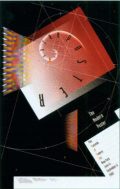
7.52 “The Modern Poster” (1985), The Museum of Modern Art Collection. Courtesy ofApril Greiman Made in Space.

7.53 Frames from the introductory animatio to Reality Check Studios’ show reel. Courtesy of Reality Check Studios.
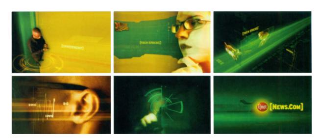
7.54 Frames from a spot for CNET’s news network (http://news.com.com) and television program. Courtesy of Flying Machine.
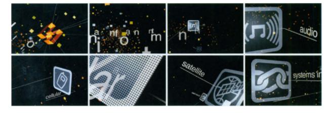
In a branding video for Harman International Industries, Inc., an audio and electronics systems manufacturer, a combination of perspective and frame mobility emphasizes the relationships between elements in their environment. Humunculus, an advertising and broadcast design company inVenice, California, produced a spot that demonstrated Harmon’s twenty-first century technological capabilities in providing information and entertainment through a single delivery system. The concept involved a single pixel becoming the source of the universe with the company logo in the center of the “big bang.” Camera movements allow us to navigate through a vast, 3D universe to observe how communications technologies (i.e., email, satellite, voice activation) and Harman’s client brands are interconnected. The use of 3D space and mobile framing allowed Humunculus to take a complex, multitiered message and communicate it in a visually stunning way (7.55).
7.55 Frames from “Infotainment,” a branding video for Harman International Industries, Inc. Courtesy of Humunculus.
summary
Through history, the artistic approach to space and composition has differed across cultures and across various art movements. Today, designers continue to explore how compositional principles can be used to express concepts and emotions and to establish clear and effective communication.
Design principles such as unity, figure and ground, negative space, visual contrast, hierarchy, juxtaposition, and superimposition can all be used to construct space.
Nonconventional approaches to composition involve spatial, rather than framic, arrangements. Space can be suggested rather than defined by the physical boundaries that the screen imposes. The technique of frame division can fracture time and space, allowing viewers to use their peripheral vision to observe several actions and perspectives simultaneously. Mobile framing, or camera movement, can also guide our perception of onscreen and offscreen space.
Emphasizing spatial depth moves our eye into a dimension that is less constricting than the frame’s two-dimensional parameters. Visual advance, recession, frontal view, and oblique view from any location, as well as the device of perspective, allow us to create the illusion of three dimensions within a two-dimensional framework.
Assignments
line, plane, asymmetry, balance
overview
The objective of modern, asymmetrical composition is to encourage the viewer’s eyes to explore and move about the frame. You will create a series of studies that demonstrate how line and plane can be used to choreograph an asymmetrical changing space.
objective
To explore line, plane, asymmetry, and balance in a time-based context.
stages
Create two square compositions measuring 500×500 pixels. Create a black 400×400 pixel square, and animate its position and rotation properties over ten seconds, keeping it away from the composition. Your goal is to maintain an asymmetrical chaging space.
Incorporate this animation into another into another 500×500 pixel composition, and place a black line measuring 200 pixels in length. Animate the line over ten seconds, keeping it away from the center of the composition. (Again, your objective is to maintain a dynamic sense of asymmetrical space.) Be deliberate in how the line’s positioning, spatial orientation, and direction of travel changes in relation to the changing space of the first study. Consider how this element can enhance asymmetry, but at the same time, be used to establish balance.
Incorporate your animation into a third 500×500 pixel, 10-second composition, and animate a second line, keeping it away from the center of the composition. Think carefully about how this third element can contribute to asymmetrical balance.
specifications
Avoid using any 3D transformations that involve a z axis, since the illusion of depth can detract from the purpose of this assignment-to choreograph two-dimensional, asymmetrical space. You are not allowed to scale the elements.
considerations
Give attention to relationships between positive and negative space. As space changes over time, consider how the supporting element of line can be used to achieve compositional balance. How can balance and imbalance potentially work together on a conceptual or purely formal, visual level to heighten the viewer’s interest?
Consider how the elements of line and plane relate to and/or interact with the edges of the frame.
animated space: figure and ground #I
overview
You will develop an animated space that changes over time with regard to its figure and ground relationships.
objectives
- To develop a sensitivity to positive and negative structure.
- To explore the interchangeability of figure and ground in animation.
stages
Create three compositions based on the formats listed below:
- square: 480×480 pixels
- horizontal rectangle: 720×480 pixels
- vertical rectangle: 480×720 pixels
In each composition, create a simple square measuring 720×720 pixels. Animate the square’s position and rotation properties of the square within a 10–15 second time limit.
specifications
You are not allowed to duplicate the square or change its dimensions.
You are allowed to use only black and white. Colors, shades of gray, drop shadows, and special effects are prohibited, since your goal is to focus on form and space.
The duration of each composition should be 10–15 seconds.
considerations
Your goal is to establish interchangeability between figure and ground over time. Consider how the frame’s division of positive and negative space can be choreographed to establish new figure and ground relationships. Give attention to the absolute and relative positioning of the shapes and their relationship to the edges of the frame.
animated space: figure and ground #2
In this assignment, you are to substitute the square from the last assignment with a simple graphic of a mechanical object that has an interesting combination of shapes that vary in geometry and size. Give careful consideration to establishing an interchangeability between figure and ground over the given time period. Consider the positioning of the shapes and their relationship to the edges of the frame.
typographic hierarchy: early letterform
overview
You will develop three typographic animations based on a letterform from the Phoenician or Greek alphabet.
objective
To explore multiple design solutions to achieving typographic hierarchy.
stages
Research a symbol from the Phoenician or Greek alphabet and find approximately 3–4 phrases of text that pertain to its history. Create three compositions based on the symbol, its display type (e.g., phi, sigma, delta), and the copy. In the first, the symbol should be the most dominant element. In the second, the display type will be the prominent focus. In the third, the copy should be given emphasis.
specifications
The dimensions of each composition will measure 720×480 pixels. Images are prohibited. However, you may perform alterations through traditional or digital processes or a combination of the two. However, the legibility of the type must be maintained.
Use no more than two typefaces that complement each other. You may duplicate the elements as many times as you wish and vary their sizes, spatial orientation, colors, shades, transparency, and letter spacing values to establish visual hierarchy.
considerations
Consider how the relative positioning, scale, orientation, and spatial proximity of elements contribute to hierarchy.
PSA: juxtaposition and superimposition
overview
You will compose an animated PSA that combines disparate images in a manner that conveys the meaning of a message.
objective
To investigate how juxtaposition and superimposition can help create meaning between two or more unrelated images.
stages
Choose one of the following topics: global warming, drunk driving, domestic violence, or depression. Find a minimum of three photographic images. You are encouraged to use your own photos or found objects.
The following categories of text are to be included in your composition:
- title
- subtitle
- word list (for example, statistics relating to drunk driving)
- Two quotes associated with your topic
specifications
You may work in color or grayscale. Images should be digitized at a resolution that will accommodate scaling.
considerations
Consider how the meaning of your original images creates a new meaning when they are juxtaposed or superimposed in the frame.
continuity through the grid: storyboard design
overview
Choreographing how things move and change over time and space requires careful planning during the early phases of storyboarding.
You will design a storyboard to be used for a potential television bumper based on a concept or theme of your choice.
objective
To explore how grids can help organize content clearly and systematically.
stages
Once you have gathered or created the images and type elements, develop an initial storyboard comprehensive that portrays the major events and transitions. Observe the relative placement of elements in each frame, as well as their directions of travel and their alignment to each other and to the frame’s edges. Develop a rough grid structure on paper that relates to your observations.
In Photoshop, implement your grid system using guides. Keep an open mind and be prepared to deviate from the grid in order to add visual interest or emphasize particular elements. While certain elements may be aligned to specific regions of the grid, others may break away.
specifications
The storyboard will consist of eight frames, each measuring 4 × 5 inches. All eight frames can fit into one tabloid size (11 × 17 inch) document. The frames can then be cut out and pasted onto a scored 2-fold bristol board.
considerations
Consider how the placement and alignment of elements and their relationship to the frame’s edges is influenced by the structure of the grid. Also consider how the directions that elements move can adhere to or deviate from this structure.


