3 motion graphics in interactive media
an overview
Late nineteenth century optical inventions were the fist to entertain audiences through persistence of vision. These evolved into sophisticated device that were capable of displaying animating figures over static backgrounds. These eventually gave way to the lumiere brothers’ contributions to modern cinema. Approximately one century later, advancements in computer processors, desktop video and animation software led to a repeated evolution from a slide show format to superimposed elements over static backgrounds, and finally to full-screen moving images-a complete reinvention of cinema on the computer screen.
“Once you made it, it stayed put. Great care was taken to get everything in just right spot, just the right relationship. Now, increasingly, the output is a variable, not a constant.”
—Chris Pullman

The Interactive Fnviroment
For centuries, books have been used to deliver information. As linear information systems, they imply continuity through a prescribed beginning and end. In contrast, interactive environments redirect information into a structure that is branching and nonsequential; as a result, the user’s role shifts from passive viewer to an active participant. Many paths through the material can be taken, and inputting information through mouse selections, keystrokes, controllers, or voice commands can control the manner in which content is displayed.
Incorporating motion graphics into the interface has introduced new design possibilities and has afforded designers opportunities to exercise their talents beyond the film and television screen. (Ironically, it has had a major impact on design trends in the film and broadcast industries.) Motion graphics can enhance the user’s sensory experience if they are designed well and are logically integrated. Depending upon the complexity of interactivity, motion can enhance the navigational process by entertaining users while emphasizing the hierarchy of information.
Motion Over the Web
Facilitating real-time animation over the Web has had its technical challenges over the years, and designers have been forced to overcome the limitations of connection speed and bandwidth. The lack of an industry-standard animation format also remains a concern. Some types of animations require browser plug-ins, while others can run on their own. Despite these limitations, motion graphic designers continue pursuing their artistic vision while waiting for the Web to mature. The development of higher bandwidth connections and streaming video has made the prospect of motion over the Web enticing, allowing designers to push their artistic envelope beyond the movie and television screen. Many view today’s constraints as creative guidelines and welcome the opportunity to communicate beyond national boundaries and help shape our growing global visual language.
Today, the incorporation of dynamic information into Web sites can enhance the user’s experience if it is designed well and is logically integrated into the interface. Many graphic design studios that showcase their work online have used motion effectively as a vehicle to heighten
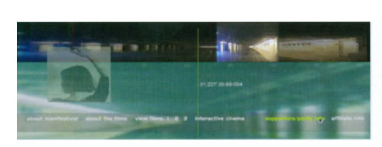
3.1 During the late 1990s a group of independent filmmakers conceived of the idea of an online film festival site to showcase the work of independent filmmakers and video artists. Recognizing the potential that the Web had to offer for online distribution of films, hillmancurtis, inc. developed the Manifestival, an online film festival Web site that features independent digital film and video shorts. This site was notable for its innovative use of Flash, which at the time, was limited in its capacity to handle live-action video. Courtesy of hillmancurtis, inc.

3.2 The unique Web interface for Kranestyle.com, the online portfolio of Taras Lesko, offers a rich palette of images that animate in response to the user’s horizontal mouse movements. Courtesy of LeskoMedia.
visual interest and enhance viewer longevity. For example, Studio Dialog, a design agency in Calgary, Alberta, represents its multidisciplinary work in a professional “drawing board” format that integrates subtle types of animation (3.3). The site begins with three pale orange, green, and blue horizontal bars moving across the screen from the right edge, leaving their “tail ends” visible on the left edge of the enclosed frame. Simultaneous to this movement, the header displays a succession of vertical rectangles which close from right to left in the manner of a window blind. As they close, the bars shift from a pale blue to an orange hue, then disappear to reveal one of the company’s featured works. Thin blue lines animate to refresh page content in response to activating a link. The “window blind” effect in the heading’s opening is echoed in the site’s contact page in which two sets of horizontal bars that close from top to bottom reveal a listing of clients and agencies. Overall, the dynamic movement of the site’s elements, tempered by smooth graphic transitions and a clear, sensible navigation system exude firm control over the work and its online presentation.
“There are no masters of Internet animation. Yet. But it’s only a matter of time before people start to establish themselves as animators exclusive to the Internet. By coming up with new, mind-bending, Web-savvy ways to present its content and improve the medium as a whole, this new guard of animators will truly set itself apart.”
—Anna McMillan
3.3 Frames from Studio Dialog’s Web site. Courtesy of Studio Dialog.
Nessim Higson’s online portfolio, IAAH (I Am Always Hungry), embraces a variety of styles and genres, ranging from clean contemporary to heavily layered, textured elements that appear distressed and worn. Images slide in smoothly from every edge, and the background’s colors and content (including the site’s identity) randomly changes, offering us a multitude of compositional possibilities. This unique approach attests to the wide range of work that this award-winning Los Angeles graphic designer from Birmingham, Alabama produced. In a neverending sea of online portfolios, this dynamic site stands out as an island of graphic innovation. Its progressive, yet intuitive, interface features a wide gamut of sophisticated print, identity, and collage designs, as well as original typography that includes hand-drawn fonts (3.4).

3.4 The Web site for IAAH (I Am Always Hungry) represents the multidisciplinary design studio and portfolio of Nessim Higson. As an advocate of converging media, Nessim claims “… I am always hungry for life …” and dedicates his work to New Orleans, which he describes as “The city that care forgot and the people that called it home.”
Made In Space features April Greiman’s multidisciplinary design firm in Los Angeles, California (3.5). Referred to as “a visual, verbal think tank,” the site’s bold, kinetic exploration of image manipulation, type, and color are rooted in an innovative fusion of technology and design.
Resn’s company’s interface consists of large images from their show reel flickering behind a simple, typographic navigation structure (3.6). This interactive design agency in New Zealand won the Business for Profit category for their innovative “Resn 2B2” Web site at South by Southwest’s 10th Annual SXSW Web Awards Ceremony in Austin, Texas.
3.5 Frames from Made In Space (http://www.madeinspace.la). Courtesy of April Greiman

3.6 Resn’s use of animation in their company’s interface won them the Business for Profit category at the South by Southwest’s 10th Annual SXSW Web Awards Ceremony in Austin,Texas. Courtesy of Resn.
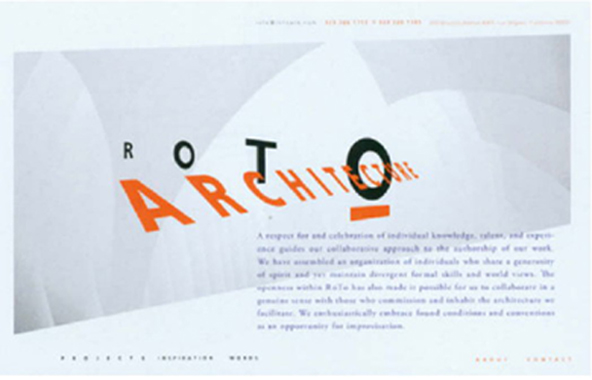
In contrast to Resn’s site, the trend in many business-to-business Web sites has shifted tomuch more simple and delicate presentations. An example of this is April Greiman’s Web site design for RoTo Architects (3.7). RoTo Architects’ collaborative practice, headed by Michael Rotondi, is invested in the study of how natural and social conditions form the spatial conditions of everyday life, serving potential clients and providing opportunities for individuals who embrace architecture to share their work and ideas. Like architecture, the site is treated as a spatial medium which, through layering motion and change, reflects the collaborative nature of artistic process. The interface presents a delicate balance of typography, graphics, and images in a visual landscape that we, as viewers, can travel through to access a large archive of information including sketches, notes, and snapshots. (This was one of the most important aspects of the site, because it shows the process of ideation.)
3.7 April Greiman’s design for RoTo Architects (http://www.rotoark. com) illustrates a growing trend toward simplicity in Web design. The site’s interface realizes April’s vision of how ideas and images can be treated as objects in space. Courtesy of April Greiman.
animation formats
Java
In the early 1990s, Sun Microsystems introduced Java to the Internet. This network-oriented programming language enabled Web developers to create applications called applets that users could download and apply to their Web pages. Today, Java continues to be used to produce interactive animations and to incorporate movement into Web page designs. Java applets can generate successive frames that play back at relatively high speeds, and can range from typographic animations to stylish cartoons and 3D motion graphics. The advantage of Java’s platform independence ensures that they can run on any supported hardware or operating-system platform. However, many designers avoid Java as an animation format, because it requires programming knowledge (Java derives much of its syntax from C and C++).
April Greimon has been acclaimed as a pioneer of digital design and has been internationally recognized as one of the most innovative and influential designers of the twentieth early 1980s, she has been instrumental in embracing digital technology in her rodical experiments with the Apple Mocintosh and Quantel Paintboxes.
April considers the computer to be a vital element to the design process, Her unique “Transmedia” approach considers successful design solutions to be capable of expression in any delivery format including Web sites, print, motion graphics, textiles, surfaces, video, and three-dimensional design. Presently she heads the Los Angelesbased design firm Made in Space (http://www. madeinspace. la).
animated GIF
Among rapidly developing Web technologies, animated GIFs continue to be one of the most popular low-tech options for adding motion to Web pages since the advent of the Gif 89a format. Built into a single file, sequential images are displayed in succession like a traditional frame-by-frame animation. The GIF format is supported by all browsers and does not require special plug-ins for viewing. Additionally, programming skills are not needed to create GIF animations, giving this format significant advantages over other formats that have been introduced to the Web.
The size and bandwidth requirements of animated GIFs are smaller than those of noncompressed RGB images since they are color-indexed from an 8-bit (256) color palette. This palette can be derived from Websafe colors, the Macintosh or Windows color systems, or an adaptive palette. Reducing the number of colors can result in smaller file sizes and faster download times. The most effective GIF animations utilize colors that appear consistent on all video displays and play back smoothly on all platforms.
GIF animations can be used on a Web page as navigational buttons, links, or image maps. Looping offers an efficient solution of holding a viewer’s attention while he or she waits for other material to download. Alternatively, GIF animations can play back for a specified, finite number of times at designated frame durations.
Animates GIFs “stream” in the sense that they beginto play before they fully download.
Animated GIFs can be produced in any motion graphics application. Alternatively, the individual frames can be generated in imaging software, such as Adobe Photoshop, or by traditional hand-executed methods. Criteria for determining file size, download time, and playback efficiency include frame dimensions, timing, the number of frames, and color depth. All of these factors can affect the smoothness of the motion, as well as the file size, which in turn affects playback efficiency. Successful GIF animations do not necessarily need large numbers of frames. Reducing the frame number to a minimum can maintain the illusion of movement while conserving file size. Additionally, large areas of flat colors and horizontal patterns compress better than color blends, shadows, and vertical patterns. The most effective GIF animations contain solid geometric shapes, horizontal lines, and single colors (i.e. logos and informational graphics).
Flash
Today, the majority of graphic designers consider Adobe Flash (formerly Macromedia Flash) to be the most effective interactive animation tool for delivering vector-based content to Web pages. Its capacity for full-screen playback on all monitor sizes and across multiple platforms, in addition to its video integration capabilities, have made it an enticing Web distribution format. The Flash player comes bundled with most browsers to date.
One of Flash’s many advantages is its ability to scale vector images without loss of resolution. This allows motion graphic designers to simulate the effects of camera zooming with minimal effort. Flash-based content downloads quickly, especially if it is composed of vector graphics (versus bitmapped or pixel-based images). Action Script, Flash object-oriented programming language, offers endless possibilities of integrating interactivity and motion. Mouse events-such as rollovers and rollouts-can be designed to set variables, and trigger certain behaviors and actions.
Flash evolved from a simple, Web-deployed animation tool to a complete interactive media development tool for creating CD/DVD-ROMs, interactive games, and Internet applications. Iranically, it is even used to create motion graphics in the broadcost and film industries.
Despite these advantages, Flash content can be difficult to update and to index by search engines. For this reason, many e-commerce, business, and database-driven Web sites incorporate Flash into HTML pages in the form of animated banners, navigation systems, and transitions, versus using it as a running platform. Since Flash uses streaming to transfer data, animations that play smoothly on systems connected to the Internet through a DSL or cable modem may stutter when being received by slower transmissions. For this reason, users with slow modem connections need to be considered. Using vector images can take advantage of Flash’s low bandwidth requirements, since bitmaps are bandwidth-heavy. Alternatively, bitmaps can be converted into editable, scalable vector paths with tools such as Flash’s Trace Bitmap function or Adobe Illustrator’s Autotrace feature.
Although Flash’s integration of QuickTime has significantly improved, adding video capabilities to Flash-based presentations over the Web can impede download time. A link to a QuickTime movie or employing an alternative viewing method, such as an animated GIF or image map, may be a better technical solution.
dHTML
During the release of 4.0 browsers, another programming development that occurred was Dynamic HTML (dHTML). Composed from a combination of complex programming languages, dHTML allowed Netscape to display hierarchical layers and provided a sophisticated way of handling text through the use of Cascading Style Sheets (CSS). Although dHTML was not developed to provide animation, it can be used to animate HTML elements on a Web page. For example, a dHTML script can tell the browser to change the placement of an image, allowing it to travel around the page.
Like the animated GIE dHTML animation is recognized by most Web browsers and does not require users to download extra components. It is, however, limited in its animation capabilities and is challenging to code. Although applications, such as Macromedia Dreamweaver or Adobe GoLive, can produce the script, it is not always consistent between browsers.
video over the Web
The predominant Web video formats over the Internet today are Quick- Time, Windows Media Player, and Realplayer. All of these formats allow data to be delivered over the Web through downloading or streaming. Basic download involves copying the content from a server to a local computer and playing it from the local machine’s hard drive. Progressive download places the most critical information at the beginning of the file structure. Duration is no longer a determining factor for download time; the viewer only has to wait for the first portion of data to be copied. As this portion plays, the second portion downloads, and so forth. If the user’s connection is within the animation’s data rate, the piece plays smoothly from beginning to end. If the user’s bandwidth is too slow, delays in playback may occur during download. Once the entire piece is downloaded, it can be played back repeatedly without being hindered by a slow connection speed or network congestion. Streaming allows animations to be delivered almost immediately, without the hassle of downloading. Since the user’s computer stays in constant contact with a dedicated server running the movie, the content begins playing as soon as the download process begins. New data continues to stream during playback, while old data is automatically discarded after it is viewed. If the client’s connection is slow, or if there is network congestion, data transfer rate is reduced and frames are dropped in order to preserve real-time playback. This method delivery is best suited for situations where audience attention span is a factor or for long animations that are over two minutes in length. Downloading, on the other hand, is the better solution for short works, since it usually offers higher quality video. It is your responsibility to understand your audience and choose a method that suits their needs.
Connection speed and bandwidth are the largest factors in determining an animation’s data transfer rate, the amount of data that can be delivered each second for the animation to play back smoothly. Digital video is one of the most bandwidth-intensive assets that are delivered over the Internet. Because of bandwidth constraints, there is still not enough “horsepower” to deliver rich, full-screen video presentations on the Web. Until the technology matures and public data networks change, the prospect of a purely video-driven Web site seems far i f f in the future. For now, motion designers are forced to make compromises and decide where to place their priorities. For example, if motion is the most critical goal, frame dimensions may need to be sacrificed in order to facilitate smooth playback. (Most QuickTime movies on the Web use frame sizes of 320Χ240 or smaller.) Data compression through the application of a Codec (Compression/Decompression algorithm) is usually necessary to achieve reasonable download times. If image details are of prime importance, decreasing the frame rate may be a necessary trade-off for retaining acceptable picture quality. (In fact, frame rates between 8–12 fps are acceptable for collage and cutout animations that are intended to look disjointed and jerky. A limitedmovement approach transfers well to the Web environment, where file size and bandwidth are critical agents.)
Common display sizes for Quick-Time or Video for Windows files are 320Χ120, while standard frame rates are between 8–15 fps.
Codecs are capable of reducing video file size significantly by eliminating data redundancy, such as areas of the image that remain the similar over time and large areas of similar colors or values.Most codecs are lassy, resulting in some degree of image degradation. The type of content being animated, the speed in which elements move, and the size of the images relative to the frame can help determine which codec is most appropriate for your particular situation. Crossplatform Quick Time codecs differ with regard to how compression is performe, and some allow the degree of compression to be adjusted to provide contral over balancing between image and playback quality. The decreasing cost of storage capacity and network bandwidth may eventually obviote the need for lossy codecs in the future.
animated navigation systems
Successful navigation design provides an infrastructure that supports and directs users in a meaningful, logical way through the complexities of a Web site. It considers the interface—the intermediary between users and content—as well as the message, client, users, and medium.
Incorporating motion into the navigational structure of a Web site can entertain and inform users. Animated icons, buttons, and text links can help place emphasis on items that users might otherwise overlook. Additionally, entire menus can be animated and accompanied by sounds to enhance a user’s level of interactivity or to simply entertain.
Animated navigation offers an infinite amount of interactive, kinetic design possibilities. For example, the simple typographic menu in Nessim Higson’s IAAH portfolio is accompanied by a subtle black arrow that moves in from the left edge of the frame, signifymg the selected item (3.4). In Studio Dialog’s Web site, moving the cursor over a text link generates a quick movement of the type in a slightly upward direction to the right. This motion is accompanied by the appearance of an underlying bar that changes in weight from thin to thick (3.3). In contrast, LeskoMedia’s Web site for The Plumbing Joint uses representational images with less subtle motions that mimic the physical experience of turning on a faucet handle or pulling a stopper from a drain. In addition to activating menu items with a mouse-over or click, the navigational graphics are choreographed to animate during the brief transitional periods between pages (3.18). A similar approach is Taras Lesko’s award-winning site entitled “Stickman On Fire,” which is based on a bizarre, yet clever concept of personified matchsticks that allow users to view photographs and movie clips of intimate, hand-made stick figures and fire. As navigational elements, the matchsticks pop up and down when the user mouses over them. A giant matchbook, which serves as the main showcase, closes after a new menu item is selected and re-opens to feature updated content (3.8).
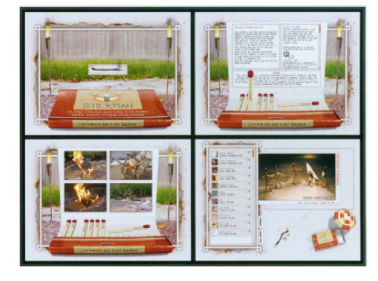
3.8 Web site for “Stickman On Fire.”This Web site’s innovative idea which was conceived by Jenny Solima at Omar College of Design won several prestigious industry awards for its bizarre content and originality.What started out as a simple, school project grew to become an instant online hit, attracting over 70,000 unique visitors within a month after its inception. Courtesy of LeskoMedia.
In Belgian movie director Philipo’s Web site, the navigation structure is a group of bound cards. When one is activated by a mouse click, it moves to the foreground and shifts its position and orientation to align with the frame’s edges. During the course of its motion, an extension of the “photos” or “videos” card slides out to reveal a series of thumbnail images. Activating one of these images with a mouse click generates a second window that slides out to display the selected photograph or video clip. The user can control the navigation by clicking any of the cards in the upper left corner or selecting the typographical items at the bottom of the frame (3.13). This type of animated, interactive navigation system creates an entertaining presentation and provides a straightforward, convenient way for users to retrieve information.
3.9 Web site for Philipo, a Belgian film director. Courtesy of Dizynotip.

3.10 Prototype navigation design, by Heather Reno, Fitchburg State College, Professor Jon Krasner.
Navigational items potentially function as video clips that play in response to a mouse rollover.
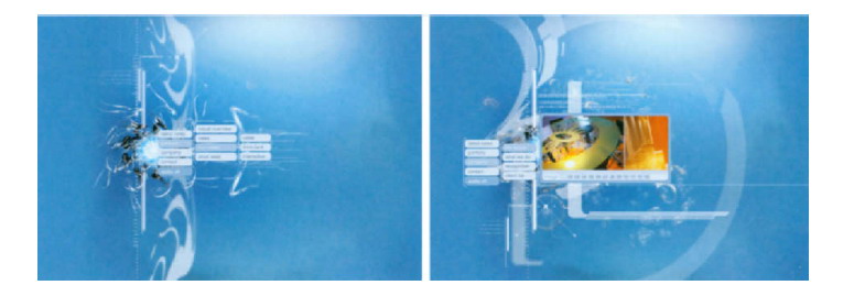
3.11 Giant Octopus’ Web site. Courtesy of Giant Octopus.
Floating menus move as if they are suspended in water when they are activated.
3.12 Navigation designs, by Matthew Brunelle, Chris Roux, andJohn Brissette, Fitchburg State College, Professor Jon Krasner.
This assignment involved creating a set of icons and corresponding rollovers to establish an identity for a fictional, music-based Web site. All of these designs have the potential to be animated.
animated transitions
The Internet is a virtual space that consists of complex levels of information. In a Web interface, animated transitions can be effective in moving users between various levels of detail while maintaining the original context of a site. Brookfield Properties’ interface design for Bankers Court, for example, uses two-dimensional lines and simple geometric planes that act as sets of windows or architectural structures that rotate, change position, and slide open to reveal new content when a link is activated. The compositional possibilities that result from the framing of these transitions look content downloads quickly,content downloads quickly, Dutch De Stijl artist Piet Mondrian. The smooth, visual changes in composition and content that occur in this simple design solution make the site stand apart from other local office Web sites (3.13).
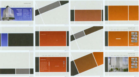
3.13 Brookfield Properties’ Web site for Bankers Court, an office tower development for downtown Calgary,Alberta. Courtesy of Studio Dialog.
In Studio Dialog’s Web site, activating a link triggers a pair of thin, horizontal blue lines that move vertically in opposite directions to the top and bottom of the screen. Once they reach their destination, new interactive content is featured. A compelling video wall presentation of company work features striking graphic transitions across the frames to display a large image associated with a particular mouse-over. In tandem with this transition, a blue rectangle slides out from the frame to identify the client, title of the work, and design category (i.e. motion, print, interface, etc.) according to a simple legend (3.14).

3.14 Frames from Studio Dialog’s Web Site. Courtesy Of Studio Dialog.
Manuel Piton of DizyNotip, an interactive design, print, and photography studio in Brussells, uses Flash’s animation abilities to achieve subtle, yet highly innovative animated transitions in his Web designs for commercial arts studios in Belgium. In particular, his site LB.0 - lentillebioptique, a film company specializing in independent shorts, affirms that motion can enhance both the form and functionality of an interface. Aside from three simple text links that feature the writing, technique, and production aspects of filmmaking, the orange-highlighted “Choix du menu” (menu choice) allows you to choose upcoming events, achievements, filmmakers, and relevant links. The “Nos realisations” (achievements) link generates an animation of Polaroid photographs that move inward from the edges to fill the frame. Meanwhile, a larger foreground image of a video/DVD cover featuring the short film Le Sens De L’Orientution (2006) moves and rotates into position from the right to the left edge of the screen. Clicking anywhere on the screen triggers a shift in the position of background photos to accommodate scrollable text content and links to related images, videos, and music. Choosing a different film from the floating, secondary navigation menu produces the same transition with different Polaroid shots relating to the film (3.15).
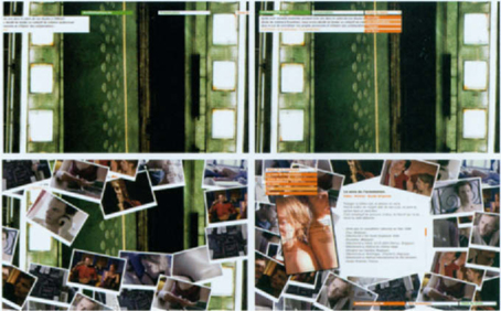
3.15 Web site design for LB.0 - lentillebioptique, a Belgium film production company specializing in independent, collaborative shorts. Courtesy of DizyNotip.
Resn’s lush Web interface design for the New Zealand band, The Black Seeds, (3.16) offers another example of how animation can serve as a means of changing content. The site is an engaging kinetic collage of cheeky, cutout photographs, flat and linear graphic images, and gold type superimposed over a black background. In response to selecting a navigation item, varieties of animals, plants, and props, such as musical instruments and disco balls, move on and off the frame to change the composition’s scenery, similar to how stage props might be updated to accommodate the scenes of a live play. The images and animation create the feeling of a Pacific dance floor, an atmosphere that well suits the fun, laid-back nature of the music. The aim of this project was simply to help the band earn global exposure and recognition. According to Resn director Steve Le Marquand, “It’s one of those sites that you either love or you hate, because it’s quite in your face.”

3.16 Web Site design for The Black Seeds, a New Zealand band that fuses blend of reggae, funk, soul, and dub. Courtesy of Resn.
3.17 Web site forThe Plumbing Joint, a privately owned plumbing business in Alabama. Courtesy of LeskoMedia.
The idea of water provided a clever design solution to transitioning between pages. Many graphic elements, including the site’s navigational items, the main backdrop, and the header, were carefully choreographed to animate during the transitions.
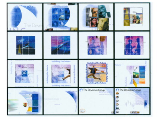
3.18 Storyboard pitch for a Web site’s opening for The Devereux Group. © Jon Krasner 2007.
The opening animation shows an atural transition into the site’s home page. © Jon Krasner 2007.
splash page animations
Splash pages are introductory pages to a Web site that appear before the main content of the site loads. Similar to traditional book covers, their purpose is to set a mood, reinforce a brand, intrigue visitors, and entice them into entering the site to learn more. They may also provide users with technical viewing requirements and give them a choice of how to enter the site (i.e. html, Flash). Splash pages that employ motion graphics are typically 5 to 10 seconds in length.
The popularity of splash pages has declined due to the complaints of users who experience unnecessary download time. Usability tests, focus groups, and Web analytics data have indicated that target audiences respond negatively to the presence of a splash page; in particular, first-time visitors are often turned away because of the time commitment of waiting for the splash page to load before the site’s main content loads. Further, the graphic appeal of a splash page quickly drops when repeated users make subsequent visits to a Web site. Statistics have also shown that splash pages can decrease search engine rankings. Most search engines rank Web pages according to their HTML code, text content, and links. Because splash pages typically lack body text and only provide a link to a site’s home page, search engine spiders only recognize the home page or ignore the site entirely. META tags with keywords and descriptions can help spiders index splash pages, however, the absence of links and content may be detrimental to a Web site’s overall search engine ranking. Since search engine spiders usually only crawl through a site’s first three levels when indexing and ranking, splash pages can hide valuable content by adding another level.
In lieu of these circumstances, splash pages can present information quickly and ensure that viewers see the information at least once. Design studios and advertising agencies that sell creativity can benefit from a well-designed splash page that boasts their design skills and level of creativity. For example, “be-Designer” is a site created for two Belgian interior architects who specialize in commercial and residential architecture, interior design, and furniture design. Its intriguing animated introduction begins with a single, large green number “4” which spins into view over a background of elegant grey patterns. solution make the site stand apart from grey as the title “be-designer” animates in from the frame’s right edge to its final position. Clicking on the “enter” link generates a clever animated progress indicator consisting of a smaller version of the number “4” gradually filling up with a bright green color fill, similar to how liquid fills a glass. Once the green color reaches the top of the number, the screen suddenly changes to display a series of horizontal wipes that introduce the site’s main content (3.19).

3.19 Frames from a Flash opener for“be-Designerq” a Web for Belgian interior architects Stephanie Simov and Gilles Fostier.Courtesy of DizynotiP.
Like motion picture title sequences, splash pages can establish mood and atmosphere. For example, the site opening to Salon de Fatima, a New England chain of hair salons and day spas, animates an elegant mix of typography and natural images, such as water droplets, flower petals, and steam, to convey the feel of a nurturing environment (3.20). Depending on a site’s demographics, viewers may be willing to tolerate the download time in exchange for being enticed and entertained.
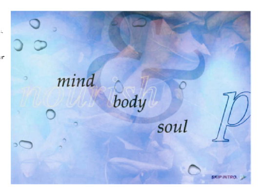
3.20 Salon de Fatima, a New England chain of hair salons and day spas. © Jon Krasner 2007.
An elegant mix of typography and natural images, such as water droplets, flower petals, and steam, convey the feeling of a nurturing environment.
Businesses that take into account audience demographics and measure site traffic usually request an “Enter” or “Skip” link if they have a legitimate reason to use a splash page on their site. This allows users to forge ahead to the site’s main content instead of waiting for the animation to load. Often, splash pages embed a script that checks for cookies that can redirect repeated visitors to the site’s home page. This solution is more effective than relying on the client’s audience to bookmark the site’s home page on their own. Further, the content of splash pages is usually optimized to ensure the quickest possible download time. Most splash animations utilize vector-based images, since bitmaps and QuickTime video clips take longer to download.
banners
Banners are often a key element of Internet advertising campaigns. As marketing devices, their strategy is to establish a strong, professional Web presence and create a favorable and lasting impression on those who view its content. A banner design that successfully brands a company’s image can generate a higher ‘click-through’ rate (CTR) to generate more traffic to a Web site.
As a form of advertising, banner design mandates a strong marketing approach involving extensive research on the subject being advertised, including its benefits, features, competitors, and past campaigns. Designers must understand what the banner needs to accomplish, its specific requirements, its key communication points, and intended audience. Additionally, they must be aware of the hosting sites that the banner will be running on and other banners that may be placed on the same page.
The dynamic application of motion graphics to banner design can help attract the attention of a site’s users. Studies have shown that animated banners generate higher click-thru rates than static banners.
The two principle animation formats that are used for animated banners are animated GIF and Flash. Although animated GIFs have been extensively used in Web advertisement banners, Flash-based banners have become quite popular, due to Flash’s ability to easily generate motion, along with their smooth playback rates and small file sizes. Further, Flash banners can be designed to be interactive, involving visitors directly. (Designers that submit a Flash banner for a banner ad campaign are often asked for the animated GIF version as well.)
Effective banner design can make or break a campaign. Studies have shown that typical Web surfers spend less than 10 seconds viewing the top portion of a Web page. Therefore, banners that get the point across quickly through concise, direct communication are often the most successful in their advertising. Incorporating motion can be an effective device to draw users in; however, it should be kept simple and subtle, since its purpose is to attract visitors, not irritate them. Additionally, it should blend in naturally and not clash with the design of the hosting page. The animation’s length should be between 3-5 seconds, keeping in mind the differences in browser speeds. Since animations that loop endlessly can be distracting, they are often designed to loop four or five times before displaying the main message on the last animation frame. Text that is displayed should be clear and legible, and should take no longer than two seconds to read. (On the screen, serif fonts are often difficult to read at sizes below 14 points.) All of these criteria take into careful account the interest and patience of the viewers.
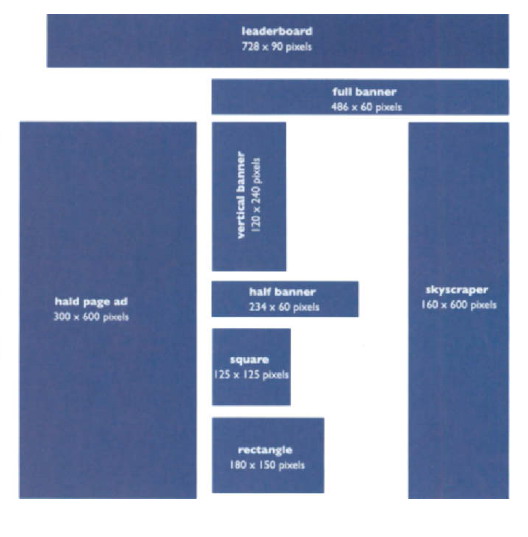
3.21 These banner styles and sizes are some of the most accepted ones that are used today as outlined by the Standards and Practices Committee of the Internet Advertising Bureau.
Note: These sizes only show relative proportions and not at 100% scale.
As a rule of thumb, standard “healthy” file sizes for banners that are 468Χ60 pixels large are typically between 4–25 K. Small button banner styles may range between 1.5–3 K.
From a technical standpoint, file size is a critical factor. File sizes that are too “heavy” can result in slow downloads and choppy playback. File size depends on several factors, including the duration of the animation, the delivery method (Flash or animated GIF), and the dimensions. GIF and JPEG optimization processes that involve data compression and color depth reduction can significantly reduce file size without changing the content’s integrity. Once the animation is optimized, it is best to test it on different browsers, platforms, and connection speeds to ensure maximum and consistent results.
Businesses often require banner ads to go through a period of testing, which involves running the banner over a period of time and measuring the CTRs and resulting sales. They may slightly alter the design and run the banner again to measure the results. Unless the designer has conducted thorough research on his or her audience preferences and behavior patterns, it is unlikely that a single banner is sufficient for an ad compaign. Since CTRs tend to drop significantly after two weeks, most designers start with 6 to 10 banners, allowing the client to rotate them in order to measure the click-thru rates.
Some designers have expressed frustration with the limitations that banner design imposes, while others feel inspired to push the limits and make the content work in their favor. Taras Lesko of LeskoMedia designed and produced eye-catching motion graphics for a series of banner advertisements and surrounding header graphics for Anthrax’s official reunion Web site (anthrax.com). Each banner was individually tailored to a theme that corresponded to a different album cover. These designs, which were animated to bring life to the album cover art, can be accessed through the site’s theme selection feature, giving viewers the option to customize the look of the Web site (3.22).

3.22 This series of Flash banners for the heavy metal band Anthrax was used to promote the band’s official reunion site, anthrax.com. Courtesy of LeskoMedia.
advertisements
Web advertisements, like television commercials, are designed to make viewers captive to information that might be missed in a banner ad. They appear for approximately 5-10 seconds before the expected content page loads or may appear between a main page and its secondary pages. Web advertisements are typically display sizes that are smaller than the destination page and must be viewed in their entirety, unless the user takes a step to remove it from view. (Many include a “Skip” option to accommodate viewers who choose not to wait.)
Two principal types of Web ads are Pop Up and inline interstitials. PopUp advertisements (currently the most popular form) appear as temporary windows in the foreground, while the destination page’s content loads in the background. Inline interstitials, which occur in environments such as Shockwave, Java, or VRML, are usually interactive with the intention of keeping users occupied during the intended download.
Due to the active participation that users engage in online (versus the passive role of television audiences), many Web advertisers have reduced the level of intrusiveness and disruption of online ads. Design formats, such as interstitials and video-based ads, are faced with the challenge of getting the message across to users as quickly as possible while maintaining their involvement with the experience. For example, Hillman Curtis’s online advertisement for Lycos delivers the message quicklywith only a few thin, green, vertical lines, six photographic images, and simple animated text (3.23). The letters to the word “discover” fade in one by one as they are introduced by two green lines that animate across the screen from left to right. The letters perform a 3600 rotation, spinning into the word “fun,” which then fades out to reveal “educate” and “share,” as one of the empty frames at the bottom shows a young girl opening the lid to her laptop and then turning to smile at the camera. Other words, such as “research,” “inspire,” “interact,” “future,” “headlines,” and “global,” follow in sequence as they are accompanied by other photos. In an interview for Adobe’s Web Gallery by Susan Davis, Hillman stated, “The emotional message is simply that Lycos has something for everyone, even your daughter… we made the text very futuristic to add to that simple picture.”

3.23 Frames from an online advertisement for Lycos. Courtesy of hillmancurtis, inc.
Hillman’s promotional advertisement for Roger Blacks Interactive Bureau is also effective in quickly informing us that the Bureau combines the power of traditional graphic design with fluency in the latest technology (Chapter 5, figure 5.44). His online interstitial for Softcom, an Internet communications company specializing in e-business, also succeeds in describing the company’s working process in a matter of seconds (3.25). Last, Hillman’s approach to straightforward communication is evident in his online interstitial for Cysive, Inc., a provider of Interaction Server software. The objective of this animated, interactive piece was to promote the company’s principal activities in building and developing Web, wireless, and voice-activated technologies (3.24).
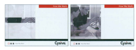
3.24 Frames from an online advertisement for Cysive. Courtesy of hillmancurtis, inc.
“I don’t think any animation is worth a 30-second download.”
—Hillman curtis
Many designers feel that as the Internet continues to grow, it will adopt more traditional television formats to make the future of online advertising more engaging. The appearance of online advertisements has already improved through the incorporation of animation, video, and high-quality sound, making them look more like television commercials. As our comfort with the Web continues to grow, advertisers will continue searching for more effective ways to get their messages across. This, in turn, will give motion graphic designers more opportunities for growth.
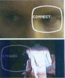
3.25 Frames from an online advertisement for Softcom. Courtesy of hillmancurtis, inc.
Motion in lnformutionul Kiosks
Public information facilities have become effective communication vehicles because of their ability to transmit messages in a nonlinear, multidimensional fashion. The education, entertainment, and advertising industries have made extensive investments in digital communications technologies, enabling rich sensory experiences to be delivered across the world. The advancement of interactive display technology has created exciting new opportunities for motion graphic designers. Informational kiosks, for example, are interactive digital displays that can provide information to the public and retrieve information from individual users based on a variety of input devices involving touch, voice, and even body movement. Like Web sites, kiosks can be tailored toward the types of content being delivered, the languages it supports, and the feel of the surrounding environment. Today’s advanced kiosk systems are capable of displaying high resolution images and dynamic information. They can also communicate in multiple languages, stream live video content to consumers, and drive interactions between customers and sellers.
Like computer mice, keyboards, pushbuttons, and trackballs, touchscreens are devices that are capable of displaying and receiving information on the same screen. This technology allows a screen display to be used as an input device for interacting with content, removing the keyboard or the mouse as the primary input device. These systems, which can be attached to computers and networks, have assisted in the development of the PDA and cell phone industries, making these devices more advanced and user friendly. Since Dr. Samuel C. Hurst’s invention of the electronic touch interface in 1971, touchscreen technology has become commonplace in retail settings, on ATM machines, and on PDAs. The integration of touchscreens into kiosk design has allowed users to perform a wide variety of operations from online transactions, to collecting money in exchange for merchandise, to entering and retrieving information. The increased popularity of information appliances, such as smart phones and portable game consoles, is continuing to drive the demand for touchscreens.
Motion in Multimedia
The advent of film and television allowed motion graphic designers to deliver high quality moving images, combined with sound, to their audiences. Due to the high cost of producing and showing films and videos, newer and less expensive technologies, such as multiple projector slide shows, were developed. On the computer screen, animation and interactivity began with applications such as Hyper- Card, Supercard, and Director.
Today, motion graphics are an integral component of interactive CDROM and DVD-ROM titles. Education, business, and entertainment are the most popular forms of multimedia, all of which utilize new ways of informing and entertaining users through the integration of text, audio, graphics, animation, video, and interactivity. In education, computer-based training courses (or CBTs) and reference books, such as encyclopedias and almanacs, allow users to access various informational formats about a particular topic. Educational CD-ROMs can challenge users to move to higher levels of performance by accumulating points or by inputting a correct answer. In the business sector, promotional CD-ROMs have been used to advertise company services to new customers or provide information to repeated customers.
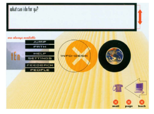
3.26 Concept sketch for an informational kiosk for Total Entertainment Network. Courtesy of twenty2product.
The informal term “edutainment” is used to describe the integration of education and entertainment in multimedia industry.
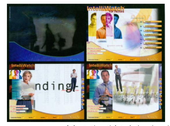
Candle Corporation, a leading developer of software solutions for networked businesses, requested an interactive CD-ROM to promote its IntelliWatch management software that was designed to automate the daily administration processes of a Lotus Notes network (3.27). The interface’s primary navigation system features four individuals—an administrator, an information technology director, and a small and large business manager—all of whom represent potential users of the software. Mousing over an image activates a transition in which a larger version of the person escapes from the rectangle to occupy more screen real estate, while the rest of the navigation palette shrinks down into a smaller menu. The right portion of the frame displays a motion graphics sequence in which the chosen individual explains his or her daily pressure and the need for a Notes network management system. For example, the administrator informs us of the daily frustrations he encounters with network crashes and their effects on email users, business managers whose applications quit midstream, and large attachments clogging the mail path. An omnipresent voick responds to his need by pitching the power of Candle’s Intelliwatch for Notes software. During this dialogue, multiple static poses of the administrator show various facial expressions and body gestures in response to the dialogue. These poses, juxtaposed over a rich animated background consisting of moving typography, emulate camera moves that pan or zoom into graphic landscapes, while screen shots of the Intelliwatch software pass by. The bottom navigation also features motion sequences that depict IntelliWatch’s integrated software and consulting services.
In the entertainment industry, the cinematic experience has become more interactive. Over the past decade, a myriad of portable video game consoles and interactive entertainment applications have been developed to revolutionize home entertainment. Examples include Sega’s Dreamcast, Nintendo’s Game Cube, Microsoft’s Xbox, and Sony’s Playstation. As a result, the demand for video game designers to develop dynamic, interactive content has grown dramatically.
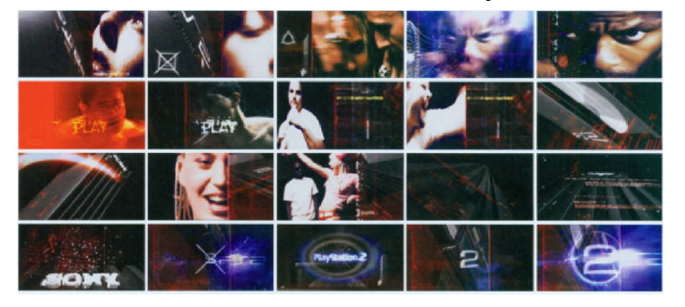
In 1999, Sony Computer Entertainment developed the Playstation 2 (PS2), the successor to the Playstation (1994). The PS2 introduced a new concept called “Emotion Synthesis” and devised an authentic 128 bit processor, the “Emotion Engine,” that could perform complex calculations to support its graphics demands. This processor allows the movements of characters to be determined by interactive events, as opposed to the playback of prerecorded data. For example, NBA ShootOut (2003) emulates a lifelike NBA presentation. The player’s movements are the result of over a dozen NBA stars being motion-captured in dribbling, passing, shooting, and performing signature dunks (3.28).
3.28 Opening for PlayStation®2, “Emotion.” Courtesy of Humunculus. © Sony Computer Entertainment America Inc. All rights reserved.
In 2006, Sony released the Playstation 3 in Japan and North America as part of the seventh generation of video game consoles. Considered by many to be the most commercially successful home console in video game history, PS3’s Cell architecture integrates more evolved graphic expressions, live-action video, 3D animation, and high-fidelity sound. A software market of over 13,000 titles has already been developed, and high expectations for continued game development should offer a full range of artistic opportunities for motion graphic designers.
The Cell Broadband EngineTM, developed by sony, Tashiba, and IBM, is a breakthrought processor that had a major impact on mation graphic in game design. The PlayStation 3 video game consale a more vivid experience through sophisticoted special effects and artificial intelligence that can make objects or actions behave unpredictably.
The specialized field of game design requires a strong foundation in aesthetics, conceptual and imaginative thinking, and interactive and motion design experience, an understanding of the dynamics of gameplay, and the ability to work in a team-based environment. Many schools and universities offer courses in interactive game design, most of which emphasize the artistry (versus the programming) involved.
Motion in DVD — Video
When DVD-Video replaced the LaserDisc in the mid 199Os, the motion picture industry aimed to use digital media as a means of presenting full-length feature films. As an alternative to standardVHS, the image quality of DVD-Video is superlative, and the content does not degrade over time. Like the Web, its nonlinear, interactive navigation structure can allow users to use a remote control or a joystick as a means to view individual scenes of a movie, access additional bonus information, and customize settings such as multi-angle viewing, surround sound, and random shuffle playback to create a more engaging experience. Personal biographies, directors’ commentaries, playlists, Web links, and interactive DVD-ROM content can be viewed on a personal computer.
Although some users only judge DVD titles on usability, others attribute their success to the design of the menus and consider attractive, stylish menus to be a large part of their initial visual appeal. Given the nature of DVD menu graphics for movie pictures, independent films, bands, documentaries, and training programs, most designers would agree that if the content on a DVD is worth watching, then the supporting menu structure should be equally engaging.
DVD titles typically consist of a background and a menu system. Background animations usually last between 15–30 seconds. Motion menus are typically short, lasting between 15 seconds to a minute. Motion can enhance the navigational process and add to the viewing experience, similar to how the opening titles to a film can set the mood beforehand. Many animated menus are designed to loop until the user makes a selection. This time limit is partly due to the DVD’s storage capacity and to the length of the background animation or soundtrack.
Motion menus can be customized to incorporate animation or a moving preview of the DVD’s contents. Special effects and video compositing techniques can be applied, and the video can be edited to be a compilation of different scenes. Additionally, any type of interactive menu item can be blended into the background or designed to conform to a nonregular shape. These approaches can open up many intriguing design possibilities that break away from many of the template-based packages on the market.
The clever introduction to the DVD title for Gunshy (2000) features navigational items, such as bullets that fly into the frame in succession. In keeping with the theme of this action/adventure film, an animated sequence of a target moving over the free-floating characters loops seamlessly until a menu is activated (3.29).
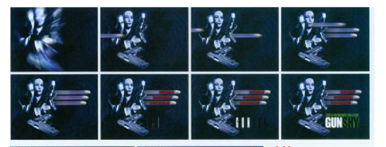
3.29 Frames from the DVD title of Gunshy (2000). Courtesy of Berretta Design.

3.30 Motion menus for Macross II (2000). Courtesy of Berretta Design.
These menus effectively reflect the style of this Japanese anime cartoon. Seamless loops of dynamic character poses, animated sound levels, flying aircraft and space ships are contained inside graphic shapes over a high tech, futuristic background consisting of subtle kinetic shapes, lines, and bands of color.
Figures 3.31 and 3.32 illustrate DVD titles that were designed by undergraduate graphic design majors in an interface design class. Daniel Dumont presented a collection of visuals depicting his family heritage based in Lowell, Massachusetts. He deliberately chose to incorporate a minimal amount of text, since representation through photographs of family and events, news clippings, and images of natural incidents, such as the flooding of the Merrimack River over the Bridge Street bridge (down the street from the house where he was raised) would arouse the curiosity and motivate users to dig through his family’s past. Executed in a “grunge style,” menu items would move slowly across the background of an old postcard that was mailed to a family member from Daniel’s great-great-uncle who served in the military. When a user highlights a link, it would shake to generate a subtle earthquake effect to indicate what it might feel like to travel backward in time. Upon entering a scene, yellow silhouettes of birds would be flying intermittently across the background. Each new scene would transition into the frame with a fade and exit the frame through a quick wipe when a new link is activated. Again, the new content would fade into the foreground.

3.31 DVD title design by Daniel Dumont, Fitchburg State College. Professor Jon Krasner.
John Brissette’s Cathedral tells a fictional story about a single piece of architecture and how its mere existence shapes human lives around it. Each scene represents a specific period in time, ranging from the building’s construction, to its inevitable demise, and finally to its “rebirth.” More than just time periods, the scenes also represent emotional themes, from harmony to chaos to isolation to fear, and so on. The cathedral occupies the same position and scale in every scene, giving us the sense that we are shifting between time periods from a single vantage point. John envisions incorporating narration by using the voices of actors who would assume the role of a character living in his respective time period.
In each of the scenes, various positions and body movements of static figures in the foreground would fade in and out, signifying lapses in time. For example, the foundation of the building in 600 AD would be accompanied by images of laborers fading in and out, hauling and shaping stones, cutting lumber and smelting iron. 1225 AD depicts the oath of a knight defending the cathedral from its enemies. While he stands alert and vigilant in the foreground, images of knights patrolling the building and worshippers entering and exiting from the left would become part of the visual landscape. The scene in “Forgotten” (date unknown) reveals the cathedral abandoned in the winter. Cloud cover would animate in the background, and drifts of snow would occasionally blow across the frame from the right. 1996 AD shows a working father whose complicated life and stress level is elevated by the unwelcome ringing of church bells. Images of him returning from work and entering his home would accompany an animated flock of geese migrating across the skies to symbolize that change is needed. 2065 AD shows the ruins of the cathedral in a futuristic cityscape. An unknown enemy has wiped out most of the population, but a resistance has been using the cathedral’s underground chambers to seek refuge and coordinate efforts to defend themselves. Figures would move in shadows across the middle-ground, while an airship would hover in the background sky looking for potential targets.
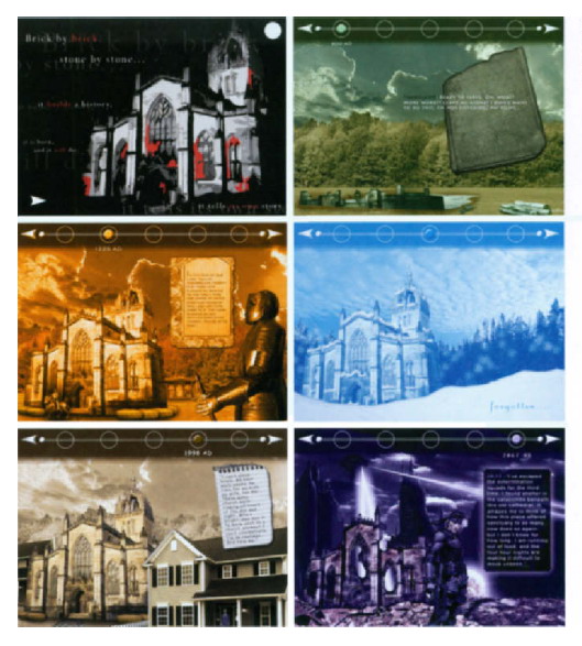
3.32 Frames from Cathedral by John Brissette, Fitchburg State College, Professor Jon Krasner
Summary
Interactive environments can redirect linear information into a branching, nonsequencial structure, allowing the user’s role to become active. Incorporating motion graphics into an interface introduces new design possibilities and affords motion graphic designers opportunities to exercise their talents beyond the film and television screen.
The development of higher bandwidth connections and streaming video has made the prospect of motion over the Web enticing, and many designers welcome the opportunity to communicate beyond national boundaries while waiting for the Web to mature.
Today, the most common Web animation formats are Java, animated GIE Flash, QuickTime, Windows Media Player, and Realplayer. Since the 199Os, Java applets have been used to produce interactive animations in Web page designs. Although Java’s platform independence ensures that they can run similarly on any supported hardware or operating-system, many designers avoid Java because it requires some programming knowledge. Animated GIFs continue to be a popular low-tech option since all browsers support the GIF format. Additionally, animated GIFs do not require plug-ins for viewing, and programming skills are not necessary. Many designers consider Flash to be the most effective interactive animation tool for delivering vector-based content to Web pages, due to its capacity for full-screen playback on all monitor sizes and platforms and its ability to scale vector images without loss of resolution. Action Script, Flash object-oriented programming language, offers endless possibilities of integrating interactivity and motion. Despite these advantages, Flash content can be difficult to update and index by search engines. dHTML animation is recognized by most Web browsers and does not require users to download extra components. It is, however, limited in its animation capabilities and is challenging to code so that it plays consistently on all browsers. Quick- Time, Windows Media Player, and RealPlayer formats can deliver video data over the Web through downloading or streaming. Since video is one of the most bandwidth-intensive assets, the prospect of purely video-driven Web sites seems far off in the future.
Successful navigation design supports and directs users through the complexities of an interface. Incorporating motion into a menu structure can enhance a user’s level of interactivity and place emphasis on items that users might overlook. Animated transitions can help move users between various levels of detail while maintaining the original context of a Web site. Likewise, animated splash pages can set a mood, reinforce a brand, and entice visitors into entering a site. However, their popularity has declined due to their download time and hindrance to a Web site’s search engine ranking.
The application of motion graphics into banner design can help attract a site’s potential users. Since concise, direct communication is most effective in advertising, animations should be kept simple and subtle. Banner animations are often tested on various browsers, platforms, and connection speeds to ensure maximum and consistent results.
Web advertisements, like television commercials, are designed to make viewers aware of information that might be missed in a banner ad. Design formats, such as interstitials and video-based ads are faced with the challenge of getting a message across quickly. Many designers feel that as the Internet continues to grow, it will adopt more traditional television formats to make online advertising more engaging.
Public information facilities have become effective communication vehicles, in that they are capable of displaying high resolution images and dynamic information. The integration of touchscreen technology and the increased popularity of smart phones and portable game consoles continues to drive the need for motion designers.
Motion graphics have also become an integral component of multimedia authored media. In education, computer-based training courses and reference books allow users to access various informational formats. In the entertainment industry, the cinematic experience has become more interactive, and the demand for video game designers has increased.
Like the Web, the nonlinear menu structure of DVD video titles can create engaging, interactive experiences. The integration of motion into DVD menu design can enhance the navigational process and add to the viewing experience. Motion menus can be customized to incorporate animation or a moving preview of the DVD’s contents. They can also be blended into the background or designed to conform to nonregular shapes. These approaches can open up many intriguing design possibilities that break away from templates that are on the market.


