6 images, live-action,and type
design considerations
The visual power of images, the connotative power of typographu, and the union between these elements are the foundations of effective graphic design. These dynamic elements function as a visual language when they are combined on the printed page or in a timebased environment. In contrast to static designs, which can imspire stories, imbuing visual and verbal information with the dimensions of motion and time can tell stories with expression, clarity, and meaning.
“When type meets image, there is automatically a dialogue between them, and each can pull the other in many different directions.”
—Nancy Skolos and Tom Wedell (Type, Image, Message: A Graphic Design Layout Workshop)
Visual Proparties
It is critical that graphic designers understand the symbolic language of aesthetics as it applies to images and typography.
form
In addition to line, form is the most basic element of visual communication. Whether it is purely graphic, photographic, or typographic, it can be strategically used to symbolize or suggest ideas, or convey moods or emotions. It can also imply spatial depth, provide emphasis, and help organize information by directing the viewer’s eye throughout the frame.
Geometric forms have always fascinated designers because of their identifiable qualities and mathematically-defined parameters. Culturally derived shapes such as the octagon which means “stop,”or a starburst which can identify something new or powerful, have been used to represent literal objects or ideas. Ubiquitous images, such as a vertical rectangle with a folded corner or a hollow circle with a diagonal line running through it, have become universally recognized.
Natural forms, which are often derived from organic elements such as water droplets, flower petals, and microbial organisms, offer a sense of freedom and spontaneity. Structures such as honeycombs and crystals display geometric qualities of symmetry and pattern. Natural forms are often seen in Chinese calligraphic writing and in the Ukiyo-e and Art Nouveau movements.

6.1 Frames from Opus IV (c.1924) by Walter Ruttmann.This animated film expressed a minimal style that was characteristic of the Bauhaus. From Experimental Animation. Courtesy of Cecile Starr.
abstract form
Modern art was founded on the exploration of pure, nonobjective abstraction, and the basis of visual experience was the perceptual effect of form and color on the viewer. Form became the content, and its expressive qualities were often developed from intuition.
An emphasis of abstract form was evident in early German avantgarde films from the 1920s that made the transition from nonobjective painting to animation. Artists such as Hans Richter and Walter Ruttmann saw abstraction as the basis of the film’s form. Hans Richter’s motion studies explored the linguistics of rhythm and motion through the use of geometric structures. Rhythmus 21 explored the manipulation of elemental square and rectangular shapes,and Rhythmus 23 experimented with negative reversals and crisscross patterns (6.3).
Walter Ruttmann’s Opus series investigated how converging abstract shapes could exhibit playful animated qualities. Viking Eggeling’s films demonstrated a painstaking analysis of linear forms and their positivenegative interplay (Chapter 1, figure 1.13).
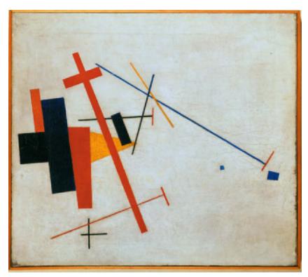
6.2 “Suprematist Composition,”(1915) by Kazmir Malevich. Wilhelm Hack Museum, Ludwigshafen © Erich Lessing/Art Resource.NY.
Kazmire Malevich’s Suprematist style is founded on the extreme reduction of images to elemental geometric shapes.
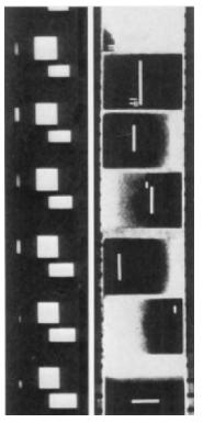
6.3 Filmstrips from (1921) and Rhythmus 23 (1923) by Hans Richter. Courtesy of Cecile Starr.
Animators who followed in the footsteps of these early experimental filmmakers have continued the tradition of abstraction in both independent animation and commercial motion graphics. Processes such as drawing, painting,stop-motion,cut-out, and direct-on-film allowed animators to create kinetic abstractions that moved to the rhythm of a soundtrack. Stan Brakhage’s film entitled Mothlight (1963) was produced by randomly adhering the wings of moth bodies to a strip of clear film and duplicating the results on a negative. When projected on the screen,the positions of the wings change between frames, and a flickering effect of the changing shapes is produced. Although these images came from a realistic source, the end result is semiabstract in nature (6.4).
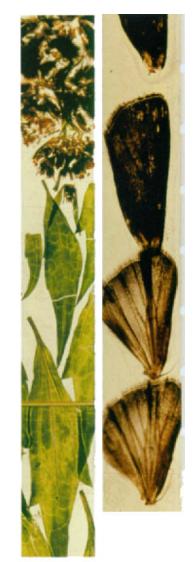
6.4 Frames from Mothlight (1963), by Stan Brakhaee. Courtesy of the Estate of Stan Brakhage and Fred Camper (www.fredcamper.com).
3D form
3D modeling and animation have been used in motion graphics since the 1970s in opening movie credits and in early animated station identifications. Today, the integration of 2D and 3D imagery has become a major practice in film titles, network packages, and digital interfaces.Common desktop applications, such as Cinema 4D (Maxon), LightWave (NewTek), Maya (Autodesk), and Motion (Apple), have become more affordable and more sophisticated with respect to modeling, rendering,object animation,and camera animation.They have also become more intuitive, allowing designers to see their results in real time and make adjustments during playback without having to render.
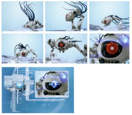
6.5 Frames from the Web site of Giant Octopus, a broadcast motion graphics studio located in Clearwater, Florida.This entertaining 3D animation is used as an introduction to the company’s news reel. Courtesy of Giant Octopus.
Each year, Blur Studios produces an in-house opening animation for its demo reel. On a recent trip to Venice, Italy, the design team was awed by structures such as St. Marks Cathedral and the Rialto Bridge. Inspired by this imagery and the two-dimensional look of Italian woodblock prints, they hired Adam Schwaab to model and animate elements, such as the lion, the gondolas, and the bridge, in Cinema 4D. The final production is an astounding graphic interpretation ofVenice, California andvenice, Italy (6.6).

6.6 Frames from “Design lntro:Blur Venice.”Courtesy of Biur Studios.

6.7 Frames from an animated identification for Karl Storz Endoscopy,a leading enterprise of endoscopic instruments equipment. Courtesy of Reality Check Studios.
This well-crafted animation derives an endoscope from the letter “o”and gives us an entertaining.exploded view of the contents of the instrument.
value and color
Value, one of the strongest methods of visual contrast, measures the lightness or darkness of an image’s tones or colors. It can enrich visual messages and can be used to create focal points in a composition. Next to value, color has the ability to create mood, symbolize ideas, and express emotions to produce a desired audience response. Studies have indicated that most human beings make a subconscious assessMent about what they see within 90 seconds of initial viewing, and that their evaluation is based on color alone.
Managing color can be complex in its technical application and conceptual and aesthetic direction. As graphic messages are being designed globally, color selection and coordination takes on a special burden in psychological and social contexts. Familiarity with basic color principles and the psychological and cultural aspects of color can help you simplify color decisions and make intentional color choices to foster a desired audience response.
the components of color
Color can be divided into three components: hue, saturation, and value.Hue denotes colors with regard to their identification (e.g, orange, green, red, cyan). Saturation (or chroma) measures a hue’s purity or intensity. Reducing a color’s saturation by adding gray or by mixing a complementary hue on the opposite end of the color wheel has the effect of becoming muted (6.10). Value (also referred to as tone or brightness) describes a color’s lightness or darkness. Decreasing value produces the effect of adding black pigment, while increasing its value gives the effect of adding white. Every hue has a different value range.Yellow,for example, has a lighter tonal range than blue.

6.8 In traditional analog color theory hues are referenced by their angl on a color wheel.
emotional,gender,and cultural associations
Psychological reactions to color vary, depending on the demographics of the target audience. Understanding how color can evoke different emotional responses can help dictate color decisions that we make as designers. Universally, light red is commonly associated with cheerfulness; however, bright or dark red can induce irritability. We commonly associate yellow-green with freshness and youth while sometimes associating a dark shade of olive with death and decay. A light blue sky can produce tranquility, while a deep indigo can induce melancholy.

6.9 The top two hues share the same brightness but differ in saturation. The bottom hues share the same saturation but differ in brightness.
Color preferences and perceptions also vary with respect to gender and culture. Studies have shown that men are attracted to dark, saturated colors, while women prefer cool colors and softer tints. North American mainstream culture associates red with urgency, heat, love, blood, and danger, and green with nature, health, money, and abundance. Chinese culture represents death with white, while Brazilian culture depicts death with purple. Greek culture often interprets yellow as sadness, while the French associate it with jealousy.

6.10 Decreasing a hue’s saturation leveeliminates its“purity,”bringing it closer to a muted gray value.
The color palette used in MOJO, a male-oriented entertainment network, was carefully selected to reflect the upscale nature of its programming. Deep crimson, black, and white serve as signature hues, while subdued variants of blue and orange function as secondary colors (6.11). In the show package for Black Entertainment Television, a rich color palette of gold, royal blue, and magenta was intended to portray the luxury of being a celebrity (Chapter 2, figure 2.26). In a music video for“Decent Days & Nights”by The Futureheads, fluorescent colors were used to express the band’s part vintage rock and part progressive nature.“Analog”color washes were used to give it a late’OS, early’80s appeal (6.12).
Although color choices are often subjective, designers must exercise appropriate color usage according to certain conventions that have been established. Within those conventions, however, they should be willing to experiment and take risks.
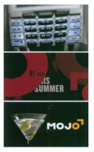
6.11 Frames from MOJO.Courtesy of Flying Machine.
texture and pattern
In addition to value and color, surface texture and pattern can add contrast and depth to a composition while providing viewers with the sensory experience of touch. Since the days of cartoon marker renderings, film animators have scratched, painted, and chemically altered the surface of film to achieve rich, tactile-looking content.
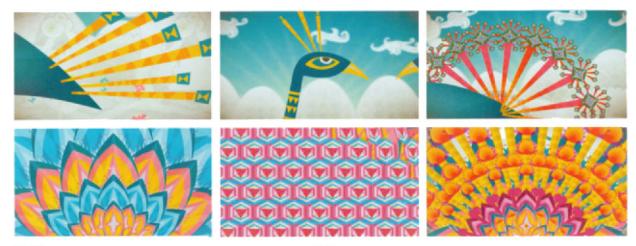
Motion graphic designers have also simulated textural effects to add richness and depth to their compositions. For example, Susan Detrie’s bumper for TBS Network incorporates a rich palette of digitally generated 3D textures into the letters of the identity (6.13).In a promotionalanimation for an experimental project called Promsite In Motion, Ritxi Ostariz, a young digital designer from Bilbao, Euskal Herria, employed colorful patterns to add a sense oftexture to his animation (6.14).
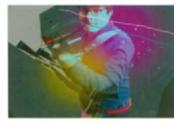
6.12 Frame from “Decent Days & Nights.” Courtesy of Stardust Studios.

6.13 Frames from “The Big Screen.” Courtesy of Susan Detrie and DesignEFX.
6.14 Frames from Promsite In Motion, by Ritxi Ostariz, iikki.com.
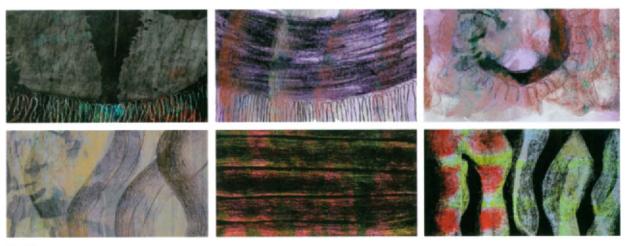
6.15 Frames from“ORG1,”by Helga Arnalds, Iceland Academy of Art. Professor Kristin Maria Ingimarsdottir. Images consisting of rich textures dance to a percussive rhythm.
Image Considerutions
Choosing the appropriate images is critical to supporting a concept, message, or mood. Images can take on many visual characteristics ranging from graphic to textural, sketchy, blended, whimsical, realistic, abstract, or layered. Cropping, distortion, value and color alteration, deconstruction, and effects can enhance their expressive properties before they are animated. In figures 6.16–6.18, simplification and exaggeration were used to translate the most dominant forms of images into pure, elemental structures. The resulting slightly abstract, graphic depiction of the subject matter yields a very different result than a detailed, realistic illustration or photographic representation.
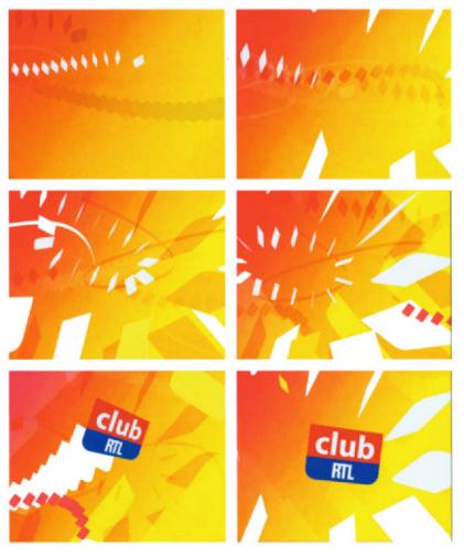
Club RTL, a Belgian network, needed to refresh its daytime programming to appeal to a younger audience. German designer Daniel Jennett borrowed the shapes and colors of the existing identity (6.19). In his station identifications for The Voice, the image treatment was dictated by the product’s existing brand. Stripes and ribbons were a primary component of the networks style, and these elements needed to fit its brand and technical requirements (Chapter 5, figure 5.42).
6.16 Metamorphosis study, by Donna Tappin, Fitchburg State College. Professor Jon Krasner.
This assignment involved creating a graphic interpretation of two different objects and choreographing smooth transitions between them in a storyboard.

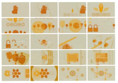
6.17 Frames from JWT“CET re-launch.” Courtesy of L.inc Design and JWr Worldwide.
6.18 Mechanical object studies by Ferah lleri and Aimee Lydon, Fitchburg State College, Professor Jon Krasner. Students were encouraged to exaggerate the geometry and relative sizes of the forms.
German Expressionist films shared many of Expressionist painting, the most common one beingstylized imagery. Many of the image’s details were reduced through extreme tonal contrast, allowing viewers to pay attention to the main forms that were often wore heavy makeup and moved with exaggerated gestures to enhance the film’s expressive quality.
6.19 Frames from a channel redesign for Club RTL. Courtesy of Danie Jennett.

Hatmaker, a Boston-based broadcast design studio, created a realm of cinematic splendor by integrating highly stylized images, halftone dot patterns, lush colors, and dimensional lighting to reflect the grandeur of “the event” befitting Cinemax’s initial showing of the latest hit movies. In a spot for Cinemax’s prime movie slot, Hatmaker put a fresh spin of the concept of the film projector lens by showing the emergence of light and color from darkness (6.20).

6.20 Frames from Cinemax’s “See It Sunday.”Courtesy of Hatmaker.
Live-Action Considerations
Over the past decade, live-action content has had a stronger presence in motion graphics due in part to the growing cinematic vocabulary of designers and to technical advancements in digital compositing. Today, motion graphic designers are expected to have a basic understanding of cinematic principles as they relate to film and video. Whether live-action content is appropriated, filmed,or recorded, its qualities must contribute toward the concept being communicated. Additionally,it must work aesthetically with other graphic elements,regardless of the space that it occupies in the frame.
Factors that should be considered when working with live-action content include the form or context of the project, filmic properties, and cinematic properties such as tone, contrast, lighting, depth-of-field, focus, camera angle, shot size, and mobile framing.
filmic form
While film scholars consider the narrative, the documentary, and the experimental film to be the three major forms of filmmaking, most commercial forms of motion graphics are narrative. For example, public service announcements address topics,such as global warming,homelessness, and energy conservation, to modify public attitudes and raise social awareness. Title sequences establish the context and set the tone of a movie.
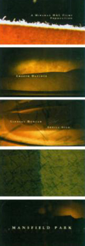
6.21 Frames from the opening title sequence to Mansfield Pork (1999).Courtesy of Kemistry.
Narrative forms of motion graphics can be realistic or abstract. For example, Kemistry, a branding and communications agency in the UK, filmed eighteenth century writing tools to express the distance between two sisters who exchange letters in the opening credits to Mansfield Park (6.21). In contrast, the abstract qualities of David Carson’s television advertisement for Nike fulfill the commercial’s narrative purpose and enhance the emotional impact of power and speed (Chapter 8, figure 8.18). Here, formal devices of shape, color, and texture serve as a basis for the composition’s form.
Being aware of the form of your project is critical in determining the type of live-action content that will be used, how the content will be treated, and how it will fit into the larger motion graphics composition.
Historical Perspective
Experimental forms of filmmaking have been a significant part of the history and legacy of motion graphics.Experimental films are often characterized by the absence of a linear narrative,giving priority to formal design elements,such as line form,value,color,texture,and composition,over story. One of the oldest examples of experimental filmmakig is Man Ray’s lyrical Surrtalist film, Emak Bakia(1926),which interwove bizarre fragments of liveaction elements,such as dancing pins,swimming figures,dancing legs,and electric rurntables,with out-of-focus light forms,silhouettes,and revolving type.
filmic properties
tone and contrast
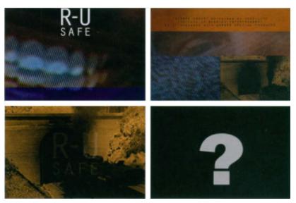
Tonality and contrast are visual, filmic properties that affect the reception of the image. Tonality refers to an image’s full range of values between extreme dark and light. Contrast,in this context, refers specifically to the ratio of dark to light values. For example,“high contrast”films that utilize low-key lighting are used in genres such as the horror film and the film noir, while many motion picture films use low contrast to achieve naturalistic lighting.
Like still photography, exposure, lighting, image processing, and digital manipulation can control tone and contrast. Exposure can be manipulated by widening or narrowing the lens’aperture to govern the degree of light that passes onto the film. Narrow apertures that allow less light produce underexposed images, while wider apertures can result in overexposure. Lighting can also control tone (as described in the next section). In film processing, the chemicals used,the manipulation of the optical printer, and techniques, such as tinting and hand-coloring, can also change the tonal and chromatic appearance of black-and-white and color film stocks. Further, the range of tools and techniques for digital alteration offer endless visual possibilities.
6.22 a public service spot for safe sex, the quality of low-resdution video footage has a dark undertone and graininess that conveys the urgency of the topic at hand. Courtesy of twenty2product.
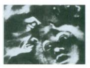
6.23 lexander Alexeieff’s and Claire arker’s pinboard animation techique produced dramatic tonal and extural effects that resembled traitional etchings. In their film, Night on Bald Mountain (1933), the forms ave 3D, chiaroscuro-like qualities as hey dissolve from and into space. Courtesy of Cecile Starr.
lighting
Lighting is one of the most important aspects of visual storytelling in cinematography. It must serve the story or concept and in some cases, even can become the story.
Although lighting can be subjective (some film directors prefer to shoot in natural light, others depend on the effects of artificial lighting), over-lit scenes or deficient lighting can be blatantly obvious and detract from the story. Effective lighting, by comparison, is “invisible”to viewers, since it melds with the story.
Lighting is usually established during the time of capture, although lighting effects can be applied digitally during production and post-production. Key lights establish a subject’s main illumination. High-key and low-key lighting can vary the emotional impact of the subject considerably. Fill lights are used to soften the contrast of the key light and provide illumination for the areas of an image that are in a shadow to bring out subtle details (6.24). A fill light that is at least half the intensity of the key light will produce flat, low-contrast tonalities, while lower intensities can produce high-contrast images.
Key-to-fill ratios can vary to establish different effects. Low key-to-fill ratios,for example, are sometimes used for interior scenes that consist of white or highly reflective surfaces, as well as overcast or snowy out-door scenes. High key-to-fill ratios are used in night scenes to produce dramatic, suspenseful effects. Experimenting with the positioning of the key and fill lights can accentuate shadows to create the illusion of depth and texture. Back lights are used to illuminate foreground elements from the rear to visually separate them from the background.This technique often creates a defining edge between the element and the background and sometimes causes the edges to glow (6.25).

6.24 The sensuous low-key lighting in the music video“Do It For Me Now,”by Angels and Airwaves, contributes to the emotional mood of the soundtrack. Fill lights are used to soften and extend the key light’s illumination in order to bring out subtle image details. Courtesy of Shilo.
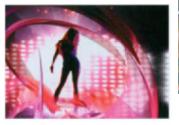
6.25 Frame from ZOOM, a network package forTimes India’s Zoom Channel. Back lighting is used to provide a separation between the subject and the background.Courtesy of Belief.
Traditional three-point lighting (or portraiture-style lighting) positions a key light overhead at approximately 900 downward and 45O to the side of the subject. The fill light is typically eye level and is angled approximately 450 toward the opposite side of the subject. A back light is positioned between the subject and the background at a 450 angle to the subject’s left or right shoulder (6.26).
depth-offield and focus
The devices of depth-of-field and focus can be used to enhance the emotional nature of an image or scene.
Depth-of-field is the distance in front of and beyond the part of a scene that appears to be in sharp focus. This property can be controlled by lighting, lens aperture, and focal distance—the distance between the lens and the object that is in focus. High-key lighting and wide-angle lenses tend to produce images with very large depths-of-field, while close-up shooting in low light conditions often produces shallow depths-of-field. As an alternative to cutting, restricting depth-of-field can focus an audience’s attention on a particular aspect of a scene.
Focus refers to the “sharpness” of an image as it is registered in a scene. It is directly connected to, but not to be confused, with depth-of-field, which involves the extent to which the space represented is in focus.

6.26 Traditional three-point lighting.
camera angle and shot size
Changing a camera’s angle can affect the appearance and function of a shot and help determine the audience’s point of view. A “bird’s-eye view,” for example, provides an aerial perspective of a scene, allowing us to feel as if we were hovering above a subject. High camera angles can make characters appear smaller, younger, weak, or harmless. Eye level shots from five to six feet off the ground provide a frame of reference and capture the clearest view of a subject. Frontal angles tend to flatten three-dimensionality, while three-quarter or profile angles reveal a greater degree of depth. Placing a camera below eye level and angling it upward establishes a low angle shot. This effect is typically used to exaggerate the impression of height and inspire awe or excitement, making subjects appear larger, stronger, or nobler.
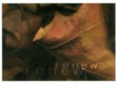
6.27 Restricting depth-of-field can be achieved by shooting close-up in low lighting conditions.
6.28 The technique of racking focus can create psychological link between elements.

Giving elements at very different spatial depths or planes the same degree of focus produces deep focus. Restricting the depth-of-field to keep only one plane in sharp focus produces shallow focus. Shallow focus can direct the viewer’s attention to a particular element of a scene and is quite common in close-up shots to suggest psychological introspection, where the actions or thoughts of a character prevail over everything else. Racking focus involves changing the focus of a lens so that an element occupying one plane goes out of focus and an element in another plane comes into focus. This technique can steer audiences through a scene or link two subjects or spaces. Its effect is often used to mimic a brief, fleeting glance from one subject to the other (6.31).
Shot size (or camera distance) identifies how large an area is visible within the frame. An establishing shot, such as a “bird’s-eye view,”is taken from a great distance to establish an overall context. A longshot portrays a subject from a lesser distance to reveal aspects of the environment, such as architectural details. Medium shots typically frame people from the waist up and are used to focus attention on the interaction between two people or objects. Medium-wide shots are wide enough to show the physical setting where the action is taking place, yet close enough to reveal facial expressions. Over-the-shoulder shots are used to focus the viewer’s attention on one actor at the time during their interaction. Close-up shots are designed to direct the audience’s attention on facial expressions or object details and are among the most powerful storytelling devices. An extreme close-up fills the screen with the details of the subject.
6.29 In an in-store video for Nike, an unusual low camera angle was shot from below to express the power and endurance of theAir Max line of running and training shoes. Courtesy of twenty-Zproduct Copyright 1994 Nike, all rights reserved.

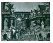
6.30 In D.W.Griffith’s film Intolerance, slow crane shots of the setting were employed to create the feeling of majesty and monumentality.
integrating live-action
Whether live-action content occupies the full frame or is incorporated as smaller elements into a larger frame, its presence can accentuate the message and mood being communicated.
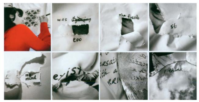
In the film “Crossword,” Karolina Novitska created a cinematic visualization of Alzheimer’s disease by revealing video content through layers of torn paper and fabric that are peeled away. The partially concealed quality of the video accentuates the dream-like, disoriented feel that is associated with this disease (6.31).
6.31 Frames from“Crossword”by Karolina Novitska, Massachusetts College ofArt, Professor Jan Kubasiewicz.(Winner of 2006 Adobe Design Achievement Awards).
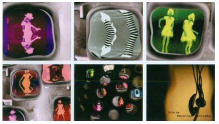
In her other short film “Sound Inside Out,” Karolina takes us on a visual 3D journey inside a pair of headphones where the elements of sound are broken down,translated into human dance, and displayed in different spaces. In this experimental approach to visualizing music, the treatment of the live-action image sequences was critical. Content is contained inside of windows which we, the viewers, can travel between. Unusual color combinations, image negatives, and mirrored body parts create strange, surrealistic visions that punctuate the style and mood. Additionally Karolina played with accelerated time, care-fully synchronizing the movements to the beat of the music. At the end of the experience, we are pulled outside of the headphones from a colorful world of fantasy into a darker, sepia-toned reality (6.32).
“Videographers must be pre-pared to learn the language that film shooters have built over the last 100 years. It’s a language made up of cameramovements, filtering techniques, subtleties of focus, and depth of field. And it’s a language coming into the video world through the gateway of high-definition television.”
—Pierre de Lespinois
The humorous title sequence to a music video competition called “Handle The Jandal”demonstrates a seamless integration of liveaction figures into compositional spaces that contain a rich, eclectic mix of graphic information by shooting them against a green screen (6.34). In contrast,combinations of small, free-floating, and contained live-action elements were seamlessly integrated with photography, illustration, and 3D graphics in the television show opening to The Hungry Detective (Chapter 2, figure 2.18). The idea of containing liveaction images inside of specific shapes is also evident in Kemistry’s identity package for KLM Television’s Royal Dutch Airlines, based in the Netherlands (Chapter 2, figure 2.52) and in Onesize’s commercial promos for Kentucky Fried Chicken which was aired on MTV (Chapter 2,figure 2.65).Corey Hankey’s approach to integrating live-action in the design of a video diary assignment also restricted the images to’“live”inside of specific shapes (6.36).
6.32 Frames from“Sound Inside Out.” Written,performed, filmed, directed, and edited by Karolina Novitska, Massachusetts College of Art,Professor Jan Kubasiewicz.
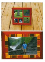
6.33 Frames from“a video diary,”by Corey Hankey, Rochester Institute of Technology. Professor Jason Arena.
A very different type of live-action treatment is illustrated in the captivating opening sequence to Voxtours, a popular German travel program that is known for reporting authentic and cultural aspects of holiday destinations (6.36). Velvet, a German broadcast and film design firm, effectively integrated numerous live-action elements with stunning graphic visuals and type. The scale of the footage elements, which all retain a traditional 4:3 aspect ratio, varies throughout the composition as they play and animate inside the pictorial space of the frame, establishing visual contrast and hierarchy. Some of the clips play in real time, while others have been slowed down to emphasize the romantic quality of the subjects.

6.34 Frames from“Handle The Jandal.”Courtesy of Krafthaus.
Nori-zso Tolson of twenty2product expressed the importance of live-action images and graphic elements looking like they belong together visually.In the concept sketches for Sky Bridge (Chapter 5,figure 5.38), the video and graphics were designed to perform a“dance.”If this project had been carried to production, the movements of both live-action and graphic content would have been coordinated so that they look connected. For example, the translucent rectangle might be treated as a sliding window that moves across the footage, revealing it or obscuring it. It becomes part of the overall pattern, like a tapes-try that weaves the live-action and graphic image content together, as opposed to slapping a box on top of a picture. The half grayscale, half
Nori-zso Tolson of twenty2product expressed the importance of live-action images and graphic elements looking like they belong together visually.In the concept sketches for Sky Bridge (Chapter 5,figure 5.38), the video and graphics were designed to perform a“dance.”If this project had been carried to production, the movements of both live-action and graphic content would have been coordinated so that they look connected. For example, the translucent rectangle might be treated as a sliding window that moves across the footage, revealing it or obscuring it. It becomes part of the overall pattern, like a tapes-try that weaves the live-action and graphic image content together, as opposed to slapping a box on top of a picture. The half grayscale, half
6.35 Manifestivalf online film festival Web site incorporates small, sequential static images to emulate the look of live,low resolution video.This clever integration of live-action derived imagery effectively contributes toward the site’s experimental,artistic flavor. Courtesy of hillmancurtis,inc.
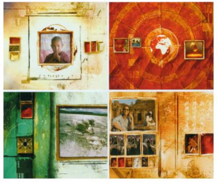
6.36 Frames from the show opening to Voxtours, a German travel program.Courtesy ofvelvet.
color aspect of the video adds diversity and interest to the composi-tion. In the other sketch, a larger, screened back video clip occupies the background space behind the rectangle containing the more recognizable footage. The duality between these footage elements could suggest the same image shown from a different point of view or scale, or two juxtaposing images that deliberately conflict.
Typograghrc Considerations
Type is one of the principle means of constructing messages in graphic design. The meticulous craft of typography lives on in our digital millennium, and experimental forms of type design have leapt off the page and onto the screen. Numerous examples of typography in print, film, television, and digital media have demonstrated that the expressive treatment of letterforms can enrich visual messages.
“Graphic design is painting with typography.”
—Paul Rand
6.37 Storyboard design for Sprint’s (RED)campaignto raise awareness and money for the fight against AIDS in Africa, by Chris Swenson, California Institute of the Arts.
Today, text is no longer limited to static, spatial forms of communication; it is also governed by time and motion. These added dimensions further enhance its communicative power.
The typographic milestones that have been made in print design have lead to new innovations and forms of expression in the area of motion graphics. During the 1980s and 199Os, the impact of film titles helped kinetic typography become mainstream in the eyes of the public. The opening credits to the Warner Brothers film Altered States (1980) used a simple transformation of two words to express the film’s theme. The sequence begins with a transparent pattern of the title’s words slowly overlapping each other as they move across the screen. Superimposed against them, the film’s credits appear in white. The title’s letterforms become smaller against the dark background, causing the effect of the camera pulling away. Finally, the complete title,“Altered States,”sits alone against a vast, black background. In the film True Lies (1994), four faint blue streaks of light begin rotating in space, revealing the letterforms of the word “true.” These letters continue rotating in space as four individual three-dimensional cube-shaped forms, revealing the word “lies,” which is reversed on black on the adjacent face of each cube. Such a simple effect succeeds in illustrating the title’s oxymoron. Kyle Cooper deliberately manipulated the film credits and names of the cast in David Fincher’s psychopath serial killer thriller Se7en (1995) to make it look scratchy and carelessly handwritten. In addition, the type was placed in and out of focus with a play of camera angles.
Distinctive handwriting became one of the trademarks of Cuban-born filmmaker Pablo Ferro, who earned his reputation as a master of title design, along with Kyle Cooper and legendary designer, Saul Bass. Ferro is best known for the revitalization of hand-lettered movie titles. In the classic Dr.Strangelove (1964), he conceived the idea of filling the film frame with lettering of different sizes and weights. Ferro’s elongated, hand-drawn lettering is also apparent in his more contemporary film titles such as Stop Making Sense (1984), Beetlejuice (1988), Good Will Hunting (1997), Men in Black II (2003), For Love of the Game (1999), and My Big Fat Greek Wedding (2002).
typographic form and motion
The role of expressive kinetic typography is to represent a concept in a visual format. Rather than being literal, it can convey an intended emotion through its unique graphic impact and its movement in space.
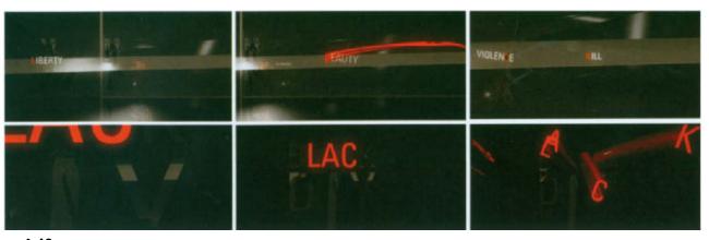
In many cases, it no longer reads as text but is perceived as physical shapes that create complex semiotic experiences through metaphor and motion. An example of this is the opening animation to Black Day to Freedom (20051, a 100-page book and DVD released by BeyondTM, a company that aims to raise a greater awareness of social issues through design, illustration, and motion. The motivation behind this project was to help educate people and raise awareness of the global displacement of people and the challenges they encounter in obtaining their freedom. Shown in animation festivals worldwide, this short film portrays the displacement of refugees, asylum seekers, and immigration detainees by showing a city in turmoil and the loss and tragedy of a young family. Dutch graphic designer Joost Korngold of Renascent created an emotionally charged animation that combines typographic form and motion to expressively communicate the tension and discomfort associated with the DVD’s content. The words “liberty” and“beauty”race across the frame, as if determined to escape from a prison-like background of dark lines and shapes that loop with abrupt back-and-forth movements. An emulated camera zoom then brings us closer to the words“darkness,”“violence,” and “kill,”which fade into the foreground space and animate off the left edge of the frame in succession. As we zoom back out, the red letterforms “1,”“a,”and “c”fly off of the word “black”in the title, and portions of the title are intercepted with stuttering, nervous movements. The composition’s dark, underlying tone, coupled with the deconstructed treatment of the type, serve as a metaphor for the frustration and despair that displaced people encounter as a result of the unfair and discriminatory practices (6.40).
“Typographic communication today is not a tutorial, not a how-to. It’s a critical review of twentieth century typographic design. It aims to open eyes and minds to the potential power of typograph y…”
—1-Hsuan Wang
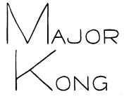
6.38 Inspired by the hand lettering of film title designer Pablo Ferro,Yuji Adachi developed a font called Major Kong.
In a graduate assignment entitled“Memory and Recollection,”Eddy Roberts’s subtle use of projected typography addresses childhood games and their deeper meaning.“Axis & Allies,”leads the viewer into a shifting interior, representing the psychological space of distant memory. The subsequent sequence recalls games of youth and the embedded emotions associated with them. The texts examine the underlying power structures inherent in many children’s games and their implications in the adult world: dominance and submission, aggression and passiveness, winning and losing (6.39).
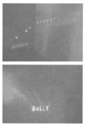
6.39 Frames from’Axis & Allies”by Eddy Roberts, University of Houston,Professor Beckham Dossett.
Throughout her film“Crossword,”Karolina Novitska expressed the mental and emotional state of Alzheimer’s disease by manipulating handwritten words and phrases in an environment consisting of images of shattered glass, Doured liauids, and lavers of fabric and torn
6.40 Frames from the open to Black Day to Freedom.Courtesy of Renascent.
paper. At times, words are crossed out and appear partially concealed with overlying images and textures to portray the conceptual element of confusion. (This is further enhanced by the soundtrack, which plays in reverse during the film’s“dream”sequence.) Variations of scale, orientation, transparency, and the speed in which the type animates, are well choreographed to interact with the moving and changing image content (6.31).
“Type is like actors to me. It takes on characteristics of its own. When I was younger. I used to pick a word from the dictionary and then try to design it so that I could make the word do what it meant.”
—Kyle Cooper
Apart from communication, typographic form and motion can be explored on a purely formal, aesthetic basis. For example, a distinctive combination of both clear and abstracted letterforms, along with a sharp and bold color palette, helped position Court TV’s daytime showbranding by adding depth and energy to the composition (6.41).
We have been conditioned to view typography as being distinct from images. One of the keys to innovative design is to consider text elements as pure forms that consist of positive and negative shapes. For example,letters such as“d,”“g,”and “0”contain closed shapes, while others such as“s,”“f,”and “w”are open shapes. Closed and open spaces emerge when letterforms are juxtaposed or superimposed. Additionally,letterforms that are in close proximity create negative shapes between them, which are sometimes referred to as counterforms.
6.41 Frames from CourtWs daytime show package.Courtesy of ZONA Design,Inc.

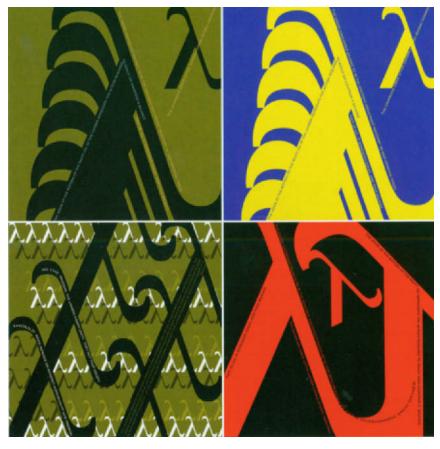
6.42 In a beginning-level typography assignment, students investigated the aesthetic qualities of form by developing studies that integrated display type, body text, and a symbol from the Greek alphabet. Design by Michael Michaelides, Fitchburg State College, Professor Jon Krasner.

6.43 Closed and open spaces emerge from positive and negative shapes and spaces of letterforms. Letterforms that are in close proximity create negative shapes or counteforms.

6.44 Frames from the opeing title sequence to Lawbreakers,a show of ZONA Design,Inc.The treatment of the letterforms corresponds to the visuals of shattereds,a show ov the History Channel.Courtesy of ZONA Design,Inc.
The treatment ofthe letterforms corresponds to the visuals of shattered glass and aged sepiatone photographs.
In a motion graphic design class, students were asked to animate their first and last initials to create dynamic relationships of form and space. They were encouraged to consider pictorial issues such as asymmetry, positive and negative, scale contrast, and the abandonment of figureground (6.45–6.46).
6.45 Frames from a kinetic typography assignment.by Takafumi Fujimura, Fitchburg State College, Professor Jon Krasner.
Takafumi Fujimura combined the properties of position, rotation, and scale togive the characters believable,lifelike movements.
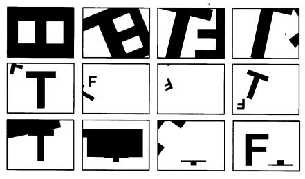
6.46 Frames from a 4D type project, by Kathy Beck, Fitchburg State College,Professor Jon Krasner.
Accelerated movementS of the small letterforms appear to be trampling down the larger letter.
6.47 Typography assignment based on a symbol from the Greek alphabet by Becky Foden, Fitchburg State College, Professor Jon Krasner.
Typographic form, dynamic motion,and visual hierarchy were given strong attention.

6.48 Frames from an online advertisement for Lycos. Courtesy of hillmancurtis,inc.

6.49 In a dynamic type assignment, students were challenged to convey a word’s intrinsic meaning in print through implied motion.Fitchburg State College, Professor Jon Krasner.

6.50 Frames from a“self referential type”assignment by Ryan Hammond, Ringling School ofArt and Design, Professor Eddy Roberts

6.51 Frames from a“self referential type”assignment by Jonah Page, Ringling School ofArt and Design,Professor Eddy Roberts.

6.52 Frame from an animated creative writing project,by Amanda Woodward, Ringling School ofArt & Design, Professor Eddy Roberts.
6.53 Frames from“Invisible Cities,”by Ryan Duda, Professor Jan Kubasiewicz, DynamicTypography (2003).Massachusetts College of Art.
A combination of 2D and 3D elements heighten the composition’s spatial depth and give the type a highly textural flavor.

expression through typeface
In addition to a font’s ability to look good and move smoothly is its ability to match the style and tone of the other elements in a composition. For example, Dutch motion graphic designer Joost Korngold is specific in his preference for simple, sans serif fonts, such as Universe Condensed,to complement the style of his work (6.54).
6.54 Frames from Archetype,“an inherited pattern of thought or symbolic imagery derived from the past collective experience and present in the individual unconscious.”Courtesy of Joost Korngold.©Renascent.

On a conceptual level, choosing typefaces that appropriately express the message is key to achieving effective communication.“Planted,”a motion identity for CapacityTM design agency in Los Angeles, involve designing a full typeface, Capacity Light, which was based on the company’s logo-type (Chapter 9,figure 9.3). The team wanted a font that could be used for all design purposes and incorporated it into their Web site (w.capacity.tv). In Capacity’s 2006 rebranding of the peacock network, NBC Magic’s choice font was Klavikac (Chapter 2, figure 2.54). According to creative director Ellerey Gave,“It’s usually bad news to hear that we have to use a certain typeface, but in this case, we were actually really pleased with their selection. It was designed within the last few years and has seemed to lend itself well to the interactive feel of the branding without trying too hard to be digital.”(Digital Arts magazine, Neil Bennett)
In 2007, Viewpoint Creative, an award-winning design agency in Boston and Los Angeles, was given the task of creating a new and unusual typographic treatment for the third season’s opening to Discovery Channel’s Deadliest Catch television series (6.55). This documentarystyle series depicts the incredibly brutal conditions and lifestyle that commercial crab fishermen experience aboard their fishing boats in the Bering Sea during the Alaskan and Opilio crab fishing seasons. Discovery requested a bold and crisp look that conveyed the content of the program from a human perspective. After experimenting with at least ten different fonts, styles, weights, lowercase, and a mixture of lowercase and capitals, Viewpoint decided that an uppercase typeface would yield a more powerful cinematic experience. The distressed, eroded quality of the letterforms, along with their traditional looking old style serifs, gives the typeface a physical, tactile quality that reflects the hardships that the fishermen encounter out at sea. The type’s centered alignment and positioning is straightforward in accordance with the visuals.Its transparency allows the background images of sky and sea to partially show through. This treatment effectively conveys the ominous and mysterious atmosphere of the series.
“I’ve seen beautiful commercials where the phqtography is unbelievable, but then some graphic designer comes in and throws on some cheesy animation or bad type. They’ve taken this wonderful series of images and made it pedestrian.”
—Kyle Cooper

6.55 Frame from the opening title sequence to Deadliest Catch. Deadliest Catch is a trademark owned by Discovery Communications, LLC.Image courtesy ofviewpoint Creative and Discovery Communications, LLC and used under permission by Discovery Communications, LLC.
type anatomy 101
The basic anatomy of letterforms began over 500 years ago, when monks were hunched over in scriptoriums engaged in the painstaking process of hand lettering Bibles. Understanding the“anatomy”of letters gives you an appreciation for the integrity of typeface design and makes it easier to identify and select a given font in order to make purposeful design decisions.
6.56 “Type Anatomy 101.”©2007 Jon Krasner.
“letters are things,they are not pictues of things.While the genenic letter ‘A’ may indicate a variety of sounds,the lowercase ‘a’as rendered in Bembo is a specific character,different in form and sensibility from the lowercase ‘a’rendered in Bauer Bodoni,Serifa 55,Helvetica,or Futura.All five convey the idea of ‘A’;each presents a unique esthetic.”
—Eric Gill
typeface classificatuions
A well-combined variety of typefaces can contribute to overall message or story,set the stage or emotional tone,and brign expression and harmony to a design.Since every typeface has distinct aesthetic and functional qualities with regard to its proportions,line weights,widths,directional slants,and so forth,it is important to understand basic classifications of fonts.The classifications that are described in this section demonstrate a response to advancements in technology,commercial needs,and aesthetic trends.Within these classifications,each typeface has its own expressive personality.
Blackletter: Blackletter typefaces are derived from handwritten manuscripts in Europe during the Medieval era. The Gutenberg Bible, the first book to be printed with movable type, was set in a Blackletter face to emulate the look of these illuminated manuscripts. Examples include Cloister Black and Goudy Text. Approximate date: 1450.
Oldstyle: Oldstyle typefaces were developed during the Italian Renaissance to replace the heavy gothic feel of the Blackletter style. Based on ancient Roman inscriptions and lowercase letterforms used by humanist schol- ars for book copying, they are characterized by bracketed serifs and a low contrast between thick and thin strokes. Examples include Bembo, Garamond, Caslon, Jenson, and Palatino. Approximate date: 1475.
Italic: Italic typefaces mimic the look of Italian handwriting. This classification has unique features not found in upright roman faces. Venetian printer Aldus Manutius and his type designer, Francesco Griffo are credited with creating the first italic typeface. From a practical standpoint, this condensed style allowed more words per page. Approximate date: 1500.
Script: Script typefaces have been designed to replicate engraved calligraphy. Due to their high degree of embellishment, they are not recommended for lengthy body text. Examples include Kuenstler Script, Mistral, and Snell Roundhand. Approximate date: 1550.
Transitional: Transitional typefaces were designed to refine Oldstyle letterforms as a response to advances in casting and printing. Thick-to-thin relationships are exaggerated, and bracketing between the stem stroke and the serif is lightened. Examples include Cloister Black, Goudy Baskerville, Bulmer, Century, and Times Roman. Approximate date: 1750.
Modern: Modern typefaces were developed in the late eighteenth century as a further rationalization of Oldstyle fonts and continued through most of the nineteenth century. They are characterized by extreme contrasts between thick and thin strokes. Examples include Bodoni, Didot, Bell, and Walbaum. Approximate date: 1775.
Square and Slab Serij: In response to needs of advertising in commercial printing, Square Serif fonts were designed with heavy bracketed serifs with minimal variation between thick and thin strokes. When the brackets were eventually eliminated, this style became known as the “Slab Serif.”Examples of Square and Slab Serif fonts include Clarendon, Memphis, Rockwell, and Serifa. Approximate date: 1825.
Sans Serij: First introduced byWilliam Caslon IV in 1816, Sans Serif typefaces became widespread beginning in the twentieth century. These fonts are described in five classifications: Grotesque, Neo-Grotesque, Geometric, Humanist, and Informal. Within each classification, these fonts share similarities in stroke thickness, weight, and basic geometry.Examples include Helvetica, Arial, Futura, Univers, Frutiger, Gill Sans, Meta, and Akzidenz Grotesk. Approximate date: 1900.
SeriflSans Serij: Serif/Sans Serif typefaces are the most recent development, based on the notion that a family of fonts can be designed with and without serifs. Examples include Rotis, Stone, and Scala. Approximate date: 1990.
Intepatirg Images, Live I Action, & Type
The possibilities that exist when animated images, live-action, and typography are combined are endless, and they can push the limits of artistic experimentation and expression. In a Sunday morning show package for Breakfast With The Arts, ZONA Design moved away from a classical mindset toward a younger demographic by integrating liveaction, images, and expressive typography (6.57). The piece begins with a coffee mug that is lifted, leaving a ring on the table. According to creative director Zoa Martinez,“The exhilaration, the caffeine syndrome begins. Typography evolves and comes jetting out from under and behind the mug enumerating the many subjects covered in the programming; music, performance, the Arts. The combination of this typography and images of performers—juxtaposed with arrangements of flowers, film strips, unusual perspectives, action painting, an architectural stage, and a DJ spinning wax, provide the color and texture that give the package its youthful exuberance.”
In figure 6.58, Blur’s show package for Nickelodeon’s Kids’ Choice Awards 2006 combined 3D imagery, such as ribbons and smoke trails, with 2D graphics. These elements were carefully choreo-graphed and composited in After Effects to create a Rock‘n’ Roll circus theme that embraced psychedelic poster art from the Fill-more in San Francisco in the 1960s. This piece was geared toward kids between the ages of 8–13.

6.57 Frames from Breakfast With The Arts.Courtesy of ZONA Design.
ZOOM, Belief’s comprehensive network package for Times India’s Zoom Channel is another example of how live-action images can be integrated with three-dimensional graphics and type. A cross between “E!”and “Fine Living,”this example of India’s expanding airwaves offers a behind-the-scenes look into celebrity lifestyles. A surreal discotheque environment, combined with slick, exotic images of glamour and glitz, conveys the sexy feel of this new Indian network (6.59).In the first sequence, Belief shot the car on a black stage to avoid any reflection or spill problems. Next, they
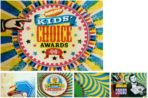
6.58 Frames from a graphics package for Nickelodeon’s Kids’Choice Awards 2006. Courtesy of Blur.
filmed various types of moving foreground and background elements to provide flexibility for the compositing stage.The studio was split into three areas to obtain the amount of shots needed: a green screen area on rises to get low camera angles, an enclosed area covered in black that allowed the team to wet the floors and control the smoke while shooting the cars, and the interior nightclub set where they suspended large metal sheets on revolving motors. According to Mike Goedecke, Belief’s founder/executive creative director,“What’s really unique about Zoom is the fact that it’s an Indian network, but the execs there wanted it to evoke a very western sensibility in style and design. We definitely achieved this with our upscale nightclub/lounge setting.”Richard Gledhill, Belief’s creative director, stated: “It was imperative that the look and feel of this new channel be glossy and exclusive, yet mysterious. By shooting the talent in a dark environment with lots of hard edge lighting, we were able to achieve that effect. The exotic car and limousine really helped to pull off the exclusive, VIP nature of this new channel.”
6.59 Frames from ZOOM, a network package for Times India’s Zoom Channel.Courtesy of Belief.

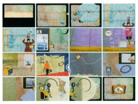
6.60 Frames from the show opening to A la carte, a television series on Radio-Canada television about places around Western Canada.
Two-dimensional graphics and type were animated and type were animated and then composited with live-action video clips that run throughout the piece. Courtesy of Studio Blanc.
Summary
The union of images and typography can function as a visual language in a time-based environment.
Form can symbolize or suggest ideas, imply spatial depth, and help organize information by establishing hierarchy. Value and color can create mood, symbolize ideas, and express emotions to produce a desired audience response. Understanding methods of color contrast and how color can evoke different emotional responses according to individual, gender, and culture can help dictate how we make color decisions. Texture and pattern can also add contrast and depth to a composition while providing viewers with the sensory experience of touch.
In recent years, live-action images have had a stronger presence in motion graphics due to the growing cinematic vocabulary of designers and technical advancements in compositing. Filmic properties such as tone and contrast and cinematic properties such as lighting, depth-of-field, focus, camera angle, shot size, and mobile framing must serve the story and in some cases, even can become the story. Motion graphic designers have become liberated to“think outside of the box”and experiment with new ways of incorporating live-action content into motion graphics compositions.
Kinetic forms of typography can convey emotions through graphic impact and movement. In many cases, type no longer reads as text but is perceived as physical shapes that create complex semiotic experiences through metaphor and motion.
We have been conditioned to view typography as being distinct from images. One of the keys to innovative design is to consider text elements as pure forms that consist of positive and negative shapes. Choosing typefaces that appropriately express the message is also critical to achieving effective communication. Understanding the basic anatomy of letterforms and general classifications of fonts gives you an appreciation for the integrity of typeface design and makes it easier to identify and select fonts in order to make purposeful design decisions.
The unusual creative possibilities that exist when animated images,live-action, and typography are combined can push the limits of artistic experimentation and expression.
Assignments
image and motion #1
overview
Visual style can have an enormous impact on the messages that images convey. In a time-based environment, movement can also convey messages and emotions.
The self-portrait is one of the earliest methods of communicating inner feelings and emotions to the outside world. Since shoes can say a lot about their owner, you will create an animated self-portrait based on your shoes. You are to choreograph the movement according to the subject’s visual characteristics of line, form, color, texture, and pattern.The animation will demonstrate a dynamic interplay between image and motion.
objectives
- To investigate how time-based images can create meaning.
- To discover how motion can strengthen visual messages.
stages
Begin by creating a storyboard sketch that demonstrates how the animations will be tailored toward the style of the shoes. Critique the sketches, and develop revised editions that clarify the events and types of movements and transitions that will occur.
Image the shoes from one or more direct scans or scanned photographs. Alternatively, you may recreate them using any one or combination of conventional or digital processes such as drawing, painting, rubbing,collage, photocopy, and digital manipulation. Be sure to stay true to the integrity of the original image.
If you decide to develop a motion test or an animatic, be open to new ideas during production.You may go back to your initial sketches if you wish to explore other possibilities.
Animate the imagery using any combination of frame-by-frame and interpolation processes discussed in Chapter 10.
specifications
You may use any combination of traditional and digital media to create the illustrations. Background elements or supplemental images and type are prohibited, since your goal is to focus on the style and movement of the image alone. You may, however, use the image more than once, if necessary. The duration of the composition should be between 15–20 seconds. It is critical that you are able to tell a story within a specified time frame, so be sure to adhere to this limit.
considerations
Consider how the style of the movement complements the image’s visual style. Lifelike, nonlinear motions that accelerate and decelerate will generate a different feeling than mechanical, uniform motions. Be sure to give attention to the birth and death of the image, and how the device of frame mobility might be used to accentuate the style of the image’s visual and kinetic qualities.
Last,consider the association and possible interaction of the image with the frame’s edges as it moves throughout the composition.
image and motion #2
overview
You will create an animation based on a group of objects that have sentimental meaning to you.
objectives
- To investigate how animated images can create meaning.
- To discover how motion can enhance visual messages.
stages
Collect 5–8 small artifacts that describe your past, present, or future. Write a short 30–50 word explanation of each item. Be descriptive, yet open to interpretation, allowing the readers to use their imagination. Your description may be literal or metaphorical. Consider the roles of language, gender, inflection, and mood.
Recreate the artifacts using any combination of conventional and digital processes including drawing, painting, rubbing, collage, photocopy alteration, and digital manipulation. Keep in mind that the treatment of the content will set the mood or tone of the piece. Images may be symbolic, metaphorical,or iconic and can range from realistic to abstract or any form in between.Free experimentation is highly encouraged.
Animate the imagery using any combination of frame-by-frame and key frame interpolation processes discussed in Chapter 10.
specifications
The content should be created and scanned at a size that is large enough to ensure stable quality if they are to be scaled up in the animation.
considerations
Consider the inherent meaning of these artifacts with respect to your written descriptions. Consider how visual style and motion style can support and enhance the other. Be imaginative and expressive!
animation and live-action
overview
You will investigate kinetic relationships between animation and live-action content.
overview
- To become aware of how animated motion can influence how natural, live-action movement is perceived.
- To explore how motion can be choreographed to support live-action.
stages
Videotape 10–15 seconds of a figure moving in space. Import the footage into a motion graphics program of your choice, and create 2–3 additional graphic images. These may be lines, simple abstract, geometric shapes, or a combination of lines and shapes.
In a composition integrating the live-action and graphics, animate the graphic elements in a way that relates to the movements of the liveaction footage. Create a second study, this time choreographing the animation to complement the live-action motion.
considerations
Consider how supporting and contradictory motions influence your overall perception of the animation. How can these scenarios potentially communicate a concept with further development? How might the relationships between the animated motions and live-action motions work together on a purely formal, aesthetic level to heighten the viewer’s interest?
type as kinetic form
overview
We have been conditioned to view typography as being distinct from images. Considering text elements as pure geometric forms that consist of positive and negative shapes is a key to innovative design.
You will develop an animation using the first and last initials.
objective
To investigate pictorial and kinetic relationships between positive and negative forms.
specifications
You are restricted to one sans-serif typeface and black and white. Colors, gray tones, drop shadows, and effects are prohibited, since your goal is to focus on the form and motion. The duration will be 10 seconds. It is critical that you are able to tell a story within a specified time frame, so be sure to adhere to this limit. Specify your frame dimensions and frame rate according to the final format of delivery.
stages
Develop a rough storyboard sketch and critique it as you would critique a film script. Then develop an edited iteration that conveys the events more clearly.
If you decide to develop an animatic, be sure to clarify the types of motion, camera angles, and transitions that will occur.
Keep an open mind and be prepared to deviate, to an extent, from your original ideas. You may decide to go back to your initial sketches to explore other possibilities.
considerations
Top priority should be given to positive and negative form as it changes through motion and transition. Asymmetry, scale contrast, and the abandonment of figure-ground should also be considered. The manner in which elements appear and leave the frame (birth and death) should also be considered. Last, consider the interaction of the letterforms with the edges of the frame.
“typographic fortunes”
overview
You will create a self-portrait based on your fortune using only letterforms, numbers, and punctuation marks.
objectives
- To use typographic form and motion as expressive tools.
- To explore typography as image.
stages
Enjoy a good meal at your favorite Chinese restaurant! Be sure to get a fortune cookie on your way out,and read your fortune.
Recreate the fortune by cutting out letters from newspapers, magazines, and other printed sources, and scan them.
Animate the type using any one or combination of frame-by-frame or interpolation processes as discussed in Chapter 10.
specifications
You are only allowed to use type. Images are prohibited. All elements must be appropriated from physical sources such as books, newspapers, magazines, and other printed materials. You may duplicate elements in your animation as many times as you wish.
considerations
Typographic elements should represent your concept by virtue of their unique geometric qualities and their movement in space. Consider how motion can enhance the intrinsic meaning of the concept. Since you are allowed to mix and match different fonts from appropriated sources, be deliberate in choosing typefaces that best express the message.
metamorphosis: form and transition
overview
You will develop a metamorphosis based on two illustrations that express two different meanings to create a third meaning or tertium quid.
objectives
- To communicate the meaning of a concept by synthesizing two ideas.
- To imply motion and transition in a print-based context.
stages
Choose two different objects and create a graphic interpretation of each. You may use black marker, assemble them from cut-out pieces of construction paper, or generate them digitally. They should show a high level of refinement by reducing detail and simplifying form.
Create a five-step metamorphosis that illustrates smooth transitions between the images. The fourth image should demonstrate a 50/50 synthesis of the first and last.
specifications
Each composition must be the same size and should be no larger than 10’vertically or horizontally. Use black, white and a maximum of two gray tones. Colors, outlines, patterns, and shading are prohibited, since the focus of this assignment is on form and implied motion.
This project requires careful planning through the development of thumbnail sketches. The more possibilities you exhaust on paper, the more dynamic the composition will be.
considerations
Be creative and allow your imagination to run wild. Don’t be afraid to interject humor. Consider implied primary motion versus implied secondary or camera motion. Consider how figure and ground will be treated, and give attention to the relationship of elements to the frame’s edges. The background should also be given attention. Background shapes can be static, or they can imply movement or change. Last, consider repetition and variation of positive and negative, and visual contrast of shape, size, and spatial orientation.


