
Chapter 11. Exploratory Data Analysis and Visualization
Exploratory data analysis (EDA) is the process of examining a dataset without preconceived assumptions about the data and its behavior. Real-world datasets are messy and complex, and require progressive filtering and stratification in order to identify phenomena that are worth using for alarms, anomaly detection, and forensics. Attackers and the internet itself are moving targets, and analysts face a constant influx of weirdness. For this reason, EDA is a constant process.
The point of EDA is to get a better grip on a dataset before pulling out the math. To understand why this is necessary, I want to walk through a simple statistical exercise. In Table 11-1, there are four datasets, each consisting of a vector X and a vector Y. For each dataset, calculate these values:
-
The mean of X and Y
-
The variance of X and Y
-
The correlation between X and Y
| I | II | III | IV | ||||
|---|---|---|---|---|---|---|---|
X |
Y |
X |
Y |
X |
Y |
X |
Y |
10.0 |
8.04 |
10.0 |
9.14 |
10.0 |
7.46 |
8.0 |
6.58 |
8.0 |
6.95 |
8.0 |
8.14 |
8.0 |
6.77 |
8.0 |
5.76 |
13.0 |
7.58 |
13.0 |
8.74 |
13.0 |
12.74 |
8.0 |
7.71 |
9.0 |
8.81 |
9.0 |
8.77 |
9.0 |
7.11 |
8.0 |
8.84 |
11.0 |
8.33 |
11.0 |
9.26 |
11.0 |
7.81 |
8.0 |
8.47 |
14.0 |
9.96 |
14.0 |
8.10 |
14.0 |
8.84 |
8.0 |
7.04 |
6.0 |
7.24 |
6.0 |
6.13 |
6.0 |
6.08 |
8.0 |
5.25 |
4.0 |
4.26 |
4.0 |
3.10 |
4.0 |
5.39 |
19.0 |
12.50 |
12.0 |
10.84 |
12.0 |
9.13 |
12.0 |
8.15 |
8.0 |
5.56 |
7.0 |
4.82 |
7.0 |
7.26 |
7.0 |
6.42 |
8.0 |
7.91 |
5.0 |
5.68 |
5.0 |
4.74 |
5.0 |
5.73 |
8.0 |
6.89 |
You will find that the mean, variance, and correlation are identical for each dataset, but simply looking at the numbers should make you suspect something fishy. A visualization will show just how diverse they are. Figure 11-1 plots these sets and shows how each dataset results in a radically different distribution. The Anscombe Quartet was designed to show the impact of outliers (such as in dataset IV) and visualization on data analysis.
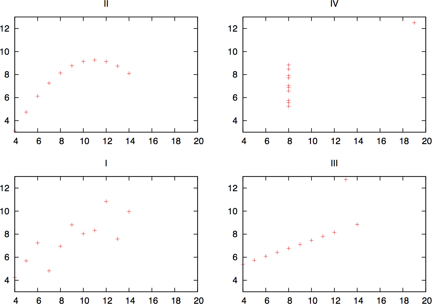
Figure 11-1. The Anscombe Quartet, visualized
As this example shows, simple visualization will identify significant features of the dataset that aren’t identified by reaching for the stats. The classic mistake in statistical analysis involves pulling out the math before looking at the data. For example, analysts will often calculate the mean and standard deviation of a dataset in order to produce a threshold value (normally around 3.5 standard deviations from the mean). This threshold is based on the assumption that the dataset is normally distributed; if it isn’t (and it rarely is), then simple counting will produce more effective results.
The Goal of EDA: Applying Analysis
The point of any EDA process is to move toward a model; that model might be a formal representation of the data, or it might be as simple as “raise an alarm when we see too much stuff” (where “too much” and “stuff” are, of course, exquisitely quantified). For the purposes of information security, we have four goals: alarm construction, forensics, defense construction, and situational awareness.
When used as an alarm, an analytic process involves generating some kind of number, comparing it against a model of normal activity, and determining if the observed activity requires an analyst’s attention. An anomaly isn’t necessarily an attack, and an attack doesn’t necessarily merit a response. A good alarm will be based on phenomena that are predictable under normal circumstances, that the defender can do something about, and which the attacker must disrupt to reach his goals.
The problem in operational informational security isn’t creating alarms; it’s making them manageable. The first thing an analyst has to do when she receives an alarm is provide context—validating that the threat is real, ensuring that it’s relevant, determining the extent of the damage, and recommending actions to take. False positives are a significant problem, but they do not represent the whole scope of failure modes for alarms. Good analysis can increase the efficacy of alarms.
The majority of security analysis is forensic analysis, taking place after an event has occurred. Forensic analysis may begin in response to information from anywhere: alarms, IDS signals, user reports, or newspaper articles.1
A forensic analysis begins with some datum, such as an infected IP address or a hostile website. From there, the investigator has to find out as much as possible about the attack—the extent of the damage, other activities by the attacker, a timeline of the attack’s major events. Forensic analysis is often the most data-intensive work an analyst can do, as it involves correlating data from multiple sources ranging from traffic logs to personnel interviews and looking through archives for data stored potentially years ago.
Alarms and forensic analysis are both reactive measures, but an analyst can also use data proactively and construct defenses. As analysts, we have a set of tools, such as policy recommendations, firewall rules, and authentication, that can be used to implement defenses. The challenge when doing so is that these measures are fundamentally restrictive; from the users’ perspective, security is a set of rules that limit their behavior now in order to prevent some abstract bad thing from happening later.
People are always the last line of defense in information security. If security is implemented poorly or arbitrarily, it encourages an adversarial relationship between system administrators and users, and before long, everything is moving on port 80. Analysis can be used to determine reasonable constraints that will limit attackers without imposing an undue burden on users.
Alarms, forensics, and remediation are all focused on the attack cycle—detecting attacks, understanding attacks, and recovering from attacks. Throughout this cycle, however, there is a constant dependence on knowledge management. Knowledge management in the form of inventories, past history, lookup data, and even phone books changes processes from rolling disasters into manageable disasters.
Knowledge management affects everything. For example, almost all intrusion detection systems (especially signature management systems) focus on packet contents without knowing, for example, that the IIS exploit they’ve helpfully identified was aimed at an Amiga 3000 running Apache.2 In IDSs, a false positive is usually a sign that the IDS copped out early. Maintaining inventory and mapping information is a necessary first step toward developing effective alarms; many attacks are failures, and those failures can be identified through context and the alerts trashed before they annoy analysts.
Good inventory and past history data can also be used to speed up a forensic investigation. Many forensic analyses are cross-referencing different data sources in order to provide context, and this information is predictable. For example, if I have an internal IP address, I’ll want to know who owns it and what software it’s running.
Knowledge management requires pulling data from a number of discrete sources and putting it in one place. Information like ASNs, WHOIS data, and even simple phone numbers is often stored in dozens if not hundreds of variably maintained databases and subject to local restrictions and politics. Internal network status is often just as chaotic, if not more so, because almost invariably people are running services on the network that nobody knows about. Often, the very process of identifying assets will help network management and IT concerns in general.
As you look at data, keep in mind the goals of the data analysis. In the end, you have to figure out what the process is for—whether it’s an alarm, timeline reconstruction, or figuring out whether you can introduce a firewall rule without dealing with pitchforks and torches.
EDA Workflow
Figure 11-2 is a workflow diagram for EDA in infosec. As this workflow shows, the core EDA process is a loop involving applying EDA techniques, extracting phenomena, and analyzing them in more depth. EDA begins with a question, which can be as open-ended as “What does typical activity look like?” The question drives the process of data selection. For example, addressing a question such as “Can BitTorrent traffic be identified by packet size?” could involve selecting traffic communicating with known BitTorrent trackers or traffic that communicated on ports 6881–6889 (the common BitTorrent ports).
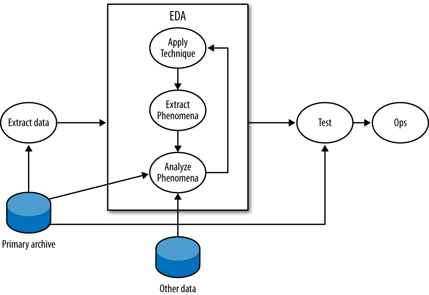
Figure 11-2. A workflow for exploratory data analysis
In the EDA loop, an analyst repeats three steps: summarizing and examining the data using a technique, identifying phenomena in the data, and then examining those phenomena in more depth. An EDA technique is a process for taking a dataset and summarizing it in some way that allows a person to identify phenomena worth investigating. Many EDA techniques are visualizations, and the majority of this chapter is focused on visual tools. Other EDA techniques include data-mining approaches such as clustering, and classic statistical techniques such as regression analysis.
EDA techniques provide behavioral cues that can then be used to go back to the original data, extract particular phenomena from that dataset and examine them in more depth. For example, looking at port 6881–6889 traffic, an analyst finds that hosts often have flows containing between 50 and 200 bytes of payload. Using that information, he goes back to the original data and uses Wireshark to find out that those packets are BitTorrent control packets.
This technique–extract–analyze process can be repeated indefinitely; finding phenomena and knowing when to stop are arts learned through experience. Analysis involves an enormous number of false positives because the most effective initial formulations are broad and prone to false positives. The EDA process will often require looking at multiple data sources. For example, an analyst looking at BitTorrent data could consult the protocol definition or run a BitTorrent client himself to determine whether the properties observed in the data hold true.
At some point, the EDA process has to stop. On the completion of EDA, an analyst will usually have multiple potential mechanisms for answering the initial question. For example, when looking for periodic phenomena such as dial-homes to botnet command and control (C&C) servers, it’s possible to use autocorrelation, Fourier analysis, or simply count time in bins. Once an analyst has options, the real question is which one to use, which is determined by a process usually driven by testing and operational demand.
The testing process should take the techniques developed during EDA and determine which ones are most suitable for operational use. This phase of the process involves constructing alarms and reports.
Variables and Visualization
The most accessible and commonly approached EDA techniques are visualizations. Visualizations are tools, and based on the type of data examined and the goal of the analysis, there are a number of specific visualizations that can be applied to the task.
In order to understand data, we have to start by understanding variables. A variable is a characteristic of an entity that can be measured or counted, such as weight or temperature. Variables can change between entities or over time; the height of a person changes as he ages, and different people have different heights.
There are four categories of variables, which readers who have had an elementary statistics course will be familiar with. I’ll review them briefly here, in descending order of rigor:
- Interval
-
An interval variable is one where the difference between two values is meaningful, but the ratio between two values has no meaning. In network traffic data, the start time of an event is the most common form of interval data. For example, an event may be recorded at 100 seconds after midnight, and another one at 200 seconds after midnight. The second event takes place after the first one, but it isn’t meaningful to talk about it taking place “twice as long” after the first one since there’s no real concept of “zero start time.”
- Ratio
-
A ratio variable is like an interval variable, but also has a meaningful form of “zero,” which enables us to discuss ratio variables in terms of multiplication and division. One form of a ratio variable is the number of bytes in a packet. For example, we can have a packet with 200 bytes, and another one with 400 bytes. As with interval variables, we can describe one as larger than the other, and we can also describe the second packet as “twice as large” as the second one.
- Ordinal
-
Data is in numerical order, but does not have fixed intervals. Customer ratings fall in this category. A rating of 5 is higher than 4, and 4 is higher than 3, so you can be assured that 5 is also higher than 3. But you can’t say that the degree of customer satisfaction goes up the same from 3 to 4 and from 4 to 5. (A common error is to base calculations on this, treating ratings as interval or ratio data.)
- Nominal
-
This data is just named rather than numeric, as the term “nominal” indicates. There is no order to it. Data of this type that you commonly track includes your hosts and your services (web, email, etc.).
Data isn’t necessarily ordinal just because it’s designated by numbers. Your ports are nominal data. Port 80 is not “higher” in some way than port 25; it’s best just to think of the numbers as alternative names for your HTTP port, your SMTP port, etc.
Interval, ratio, and ordinal variables are also referred to as quantitative, while nominal variables are also called qualitative or categorical. Interval and ratio variables can be further divided into discrete and continuous variables. A discrete variable has an indivisible difference between every value, while continuous variables have infinitely divisible differences. In network traffic data, almost all data collected is discrete. For example, a packet can contain 9 or 10 bytes of payload, but nothing in between. Even values such as start time are discrete, even if the subdivisions are extremely fine. Continuous variables are generally derived in some way, such as the average number of bytes per packet.
Univariate Visualization
Based on the type of variable measured, we can choose different visualizations. The most basic visualizations are applied to univariate data, which consists of one observed variable per unit measured. Examples of univariate measurements include the number of bytes per packet or the number of IP addresses observed over a period.
Histograms
A histogram is the fundamental plot for ratio and interval data; it is a count of how often a variable takes each possible value. A histogram consists of a set of bins, which are discrete ranges of values, and frequencies. Thus, if you can receive packets at any rate from 0 to 10,000 a second, you can create 10 bins for the ranges 0 to 999, 1,000 to 1,999, and so on. A frequency is the number of times that the observed value occurred within the range of the bin.
A histogram is valuable for data analysis because it helps you find structure in a variable’s distribution, and structure provides material for further investigation. In the case of the histogram, that structure is generally a mode, the most commonly occurring value in a distribution. In a histogram, modes appear as peaks. Histogram analysis almost invariably consists of two questions:
-
Is the distribution normal or another one I know how to use?
-
What are the modes?
As an example of this type of analysis, take a look at the histogram in Figure 11-3. This is a histogram of flow size distributions for BitTorrent sessions, showing a distinctive peak between about 78–82 bytes. This peak is defined by the BitTorrent protocol: it’s the result of a BitTorrent peer asking another peer if it has a particular piece of a file, and getting back “no” as an answer.
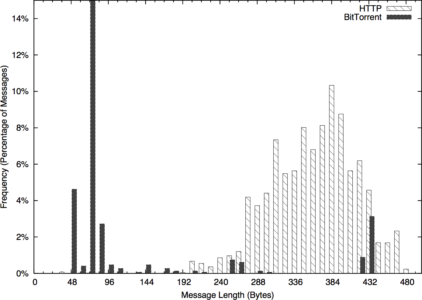
Figure 11-3. A distribution of BitTorrent flow sizes
Modes enable you to ask new questions. Once you’ve identified modes in a distribution, you can go back to the source data and examine the records that produced a mode. In the example in Figure 11-3, you could go back to the times in the 250–255 mode and see whether the traffic showed any distinctive characteristics—short flows, long flows, communications with empty addresses, and so on. Modes direct your questions.
This process of visualizing, then returning to the repository and pulling more detailed data is a good example of the iterative analysis shown in Figure 11-2. EDA is a cyclic process where analysts will return to the source (or multiple sources) repeatedly to understand why something is distinctive.
Bar Plots (Not Pie Charts)
A bar plot is the analog to a histogram when working with univariate qualitative data. Like a histogram, it plots the frequency of values observed in the dataset by using the heights of various bars. Figure 11-4 is an example of such a plot, in this case showing the counts of various services from network traffic data.
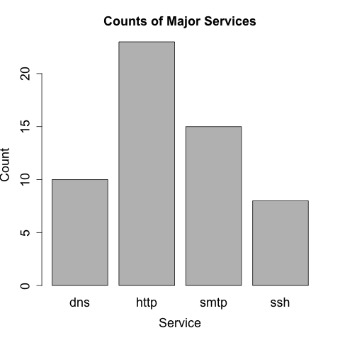
Figure 11-4. A bar plot showing the distribution of major services
The difference between bar plots and histograms lies in the binning. Qualitative data can be grouped into ranges, and in histograms, the bins represent those ranges. These bins are approximations, and the range of values they contain can be changed in order to provide a more descriptive image. In the case of bar plots, the different potential values of the data are discrete, enumerable, and often have no ordering. This lack of ordering is a particular issue when working with multiple bar plots—when doing so, make sure to keep the same order in each plot and to include zero values.
In scientific visualization, bar plots are preferred over pie charts. Viewers have a hard time differentiating fine variations in pie slice sizes—variations that are much more apparent in bar plots.
The Five-Number Summary and the Boxplot
The five-number summary is a standard statistical shorthand for describing a dataset. It consists of the following five values:
-
The minimum value in a dataset
-
The first quartile of the dataset
-
The second quartile or median of the dataset
-
The third quartile of the dataset
-
The maximum value in the dataset
Quartiles are points that split the dataset into quarters, so the five numbers translate into the smallest value, the 25% threshold, the median, the 75% threshold, and the maximum. The five-number summary is a shorthand, and if you’re looking at a lot of datasets very quickly, it can provide you with a quick feel for what the sets look like.
The five-number summary can be visualized using a boxplot (Figure 11-5), which is also called a box-and-whiskers plot. A boxplot consists of five lines, one for each value in the five-number summary. The center three lines are then connected as a box (the box of the plot), and the outer two lines are connected by perpendicular lines (the whiskers) of the plot.
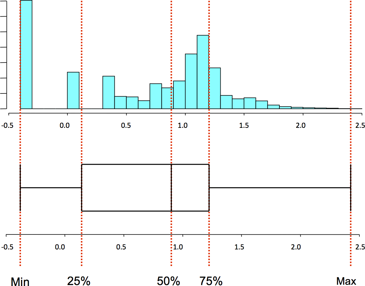
Figure 11-5. A boxplot and the corresponding histogram
Generating a Boxplot
Pandas directly provides a five-number summary via the describe
method on a Series. For example:
>>> import numpy as np
>>> import pandas as pd
>>> data = pd.Series(np.random.normal(25,5,size=100))
>>> data.describe()
count    100.000000
mean      24.747831
std        4.905132
min       13.985350
25%       21.432594
50%       24.666327
75%       27.704180
max       36.785944
dtype: float64
matplotlib provides basic plotting functionality with boxplot (Figure 11-6):
> boxplot(data)
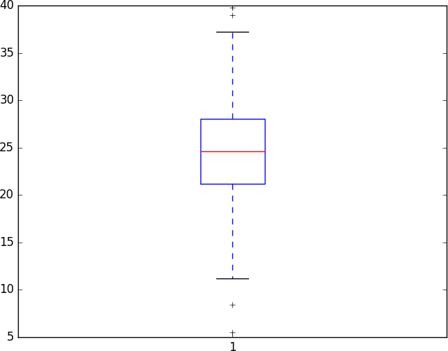
Figure 11-6. An example boxplot
Note that this plot produced a series of crosses outside the whiskers. These are outliers, meaning they are far outside the first and third quartiles. By default, a low value is considered an outlier if its distance to the first quartile is more than 1.5 times the interquartile range (the difference between the first and third quartiles). Similarly, a high value is considered an outlier if its distance to the third quartile is more than 1.5 times the interquartile range.
I rarely find boxplots to be useful on their own. If I’m dealing with a single variable, I’m going to get more information out of a histogram. Boxplots become more valuable when you start stacking bunches of them together—a situation where histograms are going to be just too busy to be meaningfully examined.
Bivariate Description
Bivariate data consists of two observed variables per unit measured. Examples of bivariate data include the number of bytes and packets observed in a traffic flow (which is an example of two quantitative variables), and the number of packets per protocol (an example of a quantitative and qualitative variable). The most common plots used for bivariate data are scatterplots (for comparing two quantitative variables), multiple boxplots (for comparing quantitative and qualitative variables), and contingency tables (for comparing two qualitative variables).
Scatterplots
Scatterplots are the workhorse of quantitative plots, and show the relationship between two ordinal, interval, or ratio variables. The primary challenge when analyzing scatterplots is to identify structure among the noise. Common features in a scatterplot are clusters, gaps, linear relationships, and outliers.
Let’s start exploring scatterplots by looking at completely unrelated data. Figure 11-7 is an example of a noisy scatterplot, generated in this case by plotting two uniform distributions against each other. This is a boring plot.
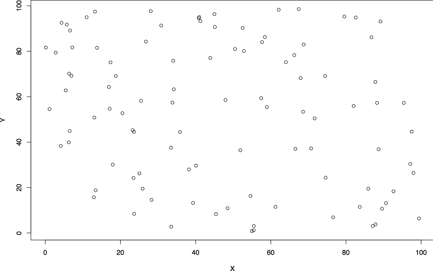
Figure 11-7. A boring scatterplot
Clusters and gaps are changes in the density of a scatterplot. The boring scatterplot in Figure 11-7 is a plot of uniform variables of unrelated density. If the two variables are related, then there should be a change in the density of the data somewhere on the plot. Figure 11-8 shows an example of clusters and gaps. In this example, there is a marked increase in activity in the lower-left quadrant, and a marked decrease in the upper-right quadrant.
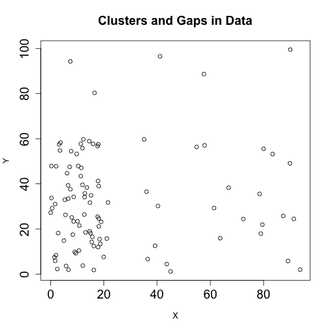
Figure 11-8. Clusters and gaps in data
Linear relationships, as the name indicates, appear in scatterplots as a line. The strength of the relationship can be estimated from the density of the points around the line. Figure 11-9 shows an example of three simple linear relationships of the form y=kx, but each relationship is progressively weaker and noisier.
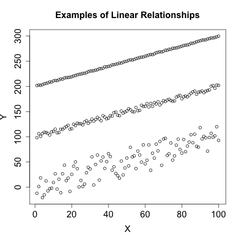
Figure 11-9. Linear relationships in data
Multivariate Visualization
A multivariate dataset is one that contains at least three variables per unit measured. Multivariate visualization is more of a technique rather than a specific set of plots. Most multivariate visualizations are built by taking a bivariate visualization and finding a way to add additional information. The most common approaches include colors or changing icons, plotting multiple images, and using animation.
Building good multivariate visualizations requires providing information from each of the datsets without drowning the reader in details. It’s easy to plot a dozen different datasets on the same chart, but the results are often confusing.
The most basic approach for multivariate visualization is to overlay multiple datasets on the same chart, using different tick marks or colors to indicate the originating dataset. As a rule of thumb, you can plot about four series on a chart without confusing a reader. When picking the colors or symbols to use, keep the following in mind:
-
Don’t use yellow; it looks too much like white and is often invisible on printouts and monitors.
-
Choose symbols that are very different from each other. I personally like the open circle, closed circle, triangle, and cross.
-
Choose colors that are far away from each other on the color wheel: red, green, blue, and black are my preferred choices.
-
Avoid complex symbols. Many plotting packages offer a variety of asterisk-like figures that are hard to differentiate.
-
Be consistent with your color and symbol choices, and don’t overlap their domains. In other words, don’t decide that red is HTTP and triangles are FTP.
Animation is pretty much what it says on the tin: you create multiple images and then step through them. In my experience, animation doesn’t work very well. It reduces the amount of information directly observable by an analyst, who has to correlate what’s going on in her memory as opposed to visually.
Other Visualizations and Their Role
The visualizations discussed in this chapter are, so far, derived from the data represented. A number of specialized visualizations are also useful for the analyst; we will discuss them here.
Pairs plots and trellising
A pairs plot is a form of specialized multivariate visualization for
data analysis and exploration. Given a data frame with a set of
columns, a pairs plot is a stacked set of scatterplots representing
every combination of columns. Pandas provides a scatterplot via its
plotting tools, in the form of a scatter_matrix function:
>>> import pandas as pd
>>> import matplotlib.pyplot as plt
>>> data = pd.read_csv('voldata.csv')
>>> data.columns.values
array(['Time', 'Volume', 'Articles', 'Users'], dtype=object)
>>> axes = pd.tools.plotting.scatter_matrix(data)
>>> plt.show()
The result is shown in Figure 11-10. As this figure shows, the 4 columns in the array result in 16 plots, 1 for each variable pairing. Pairs plots vary in practice, and different tools will tweak the results in different ways—the default Pandas version in Figure 11-10 plots the diagonal (which consists of the variable plotted against itself) with a histogram, where other platforms may use the title, or remove the redundant plots and leave a stairstep-like visualization.
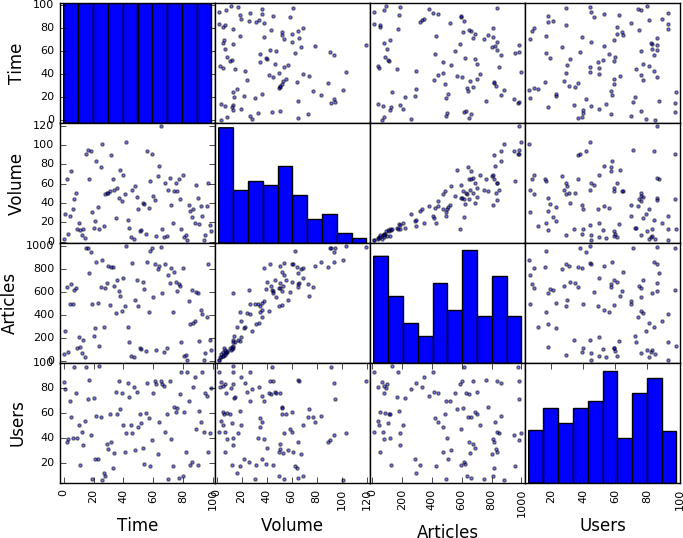
Figure 11-10. The resulting pairs plot from volume data
A pairs plot, like this one, is also a good example of trellising, a good technique for clearly visualizing multivariate data. A trellised plot consists of one or more small plots that are stacked adjacent to each other (horizontally, vertically, or both). Trellis plots are, in my experience, preferable to multicolor plots.
When developing trellis plots, you will have to consider how to coordinate information across multiple axes. Since trellis plots generally consist of multiple small plots, wasting space reprinting the same labels is confusing and expensive. Note that the plot in Figure 11-10 relies on the fact that the various pairs share axes in common and consequently only prints the axis labels on the outside of the plot. If you are plotting a trellis, align all the values on a common axis and provide a single label.
Spider plots
Spider plots (so called because they look like a spiderweb) are a specialized type of two-dimensional plot that plots information radially. Figure 11-11 shows an example of this type of plot: in this case, the number of active hours a host showed per day for a week.
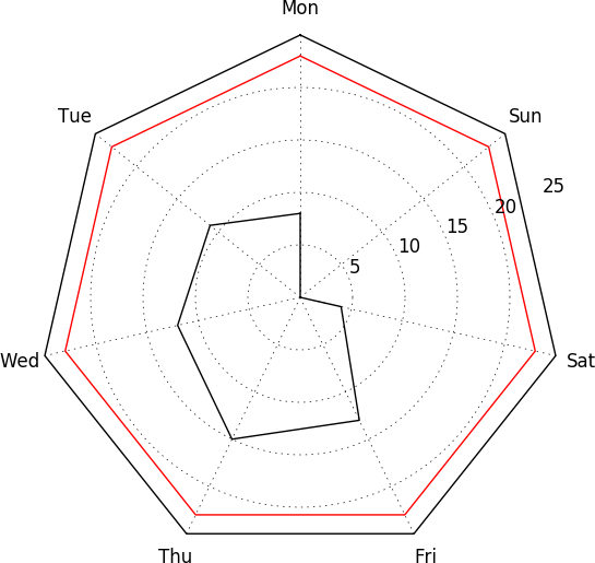
Figure 11-11. An example of a spider plot
I find spider plots most useful for visualizing cyclical data, such as activity over the course of the business cycle for several weeks, or activity per hour. Since the plot links the end of one cycle to the beginning of the next, common activity is more clearly represented than if you’re looking at a set of linear plots. An alternative use of spider plots is to visualize attributes along multiple differing datasets. This approach lends itself well to trellising.
Building a spider plot in matplotlib requires a bit of work. An
example of spider plot generation is available on the matplotlib
website, but
it requires more work than the other plots shown so far.
ROC curves
Receiver operating characteristic (ROC) curves are a form of specialized visualization associated with binary classification systems (such as most IDSs). Binary classifiers end up with one of four results when run: they either detect something that is there (a true positive), detect something that isn’t there (false positive), don’t detect something that is there (false negative), or don’t detect something that isn’t there (true negative). ROC curves evaluate the true positive and false positive rates of a detection system: the sensitivity of the system as a function of its (inverted) specificity.
Figure 11-12 shows an example of a ROC curve in action. Despite being on a two-dimensional field, ROC curves are actually three-value plots. These three values are the false positive rate, the true positive rate, and an operating characteristic, which is the variable you use to tune the ROC curve. In the example in Figure 11-12, the operating characteristic is the number of packets used for the threshold, and is expressed using lines pointing to the label. Depending on the plotter, ROC curves may individually label points with the operating characteristic or use pointers, as in this example.
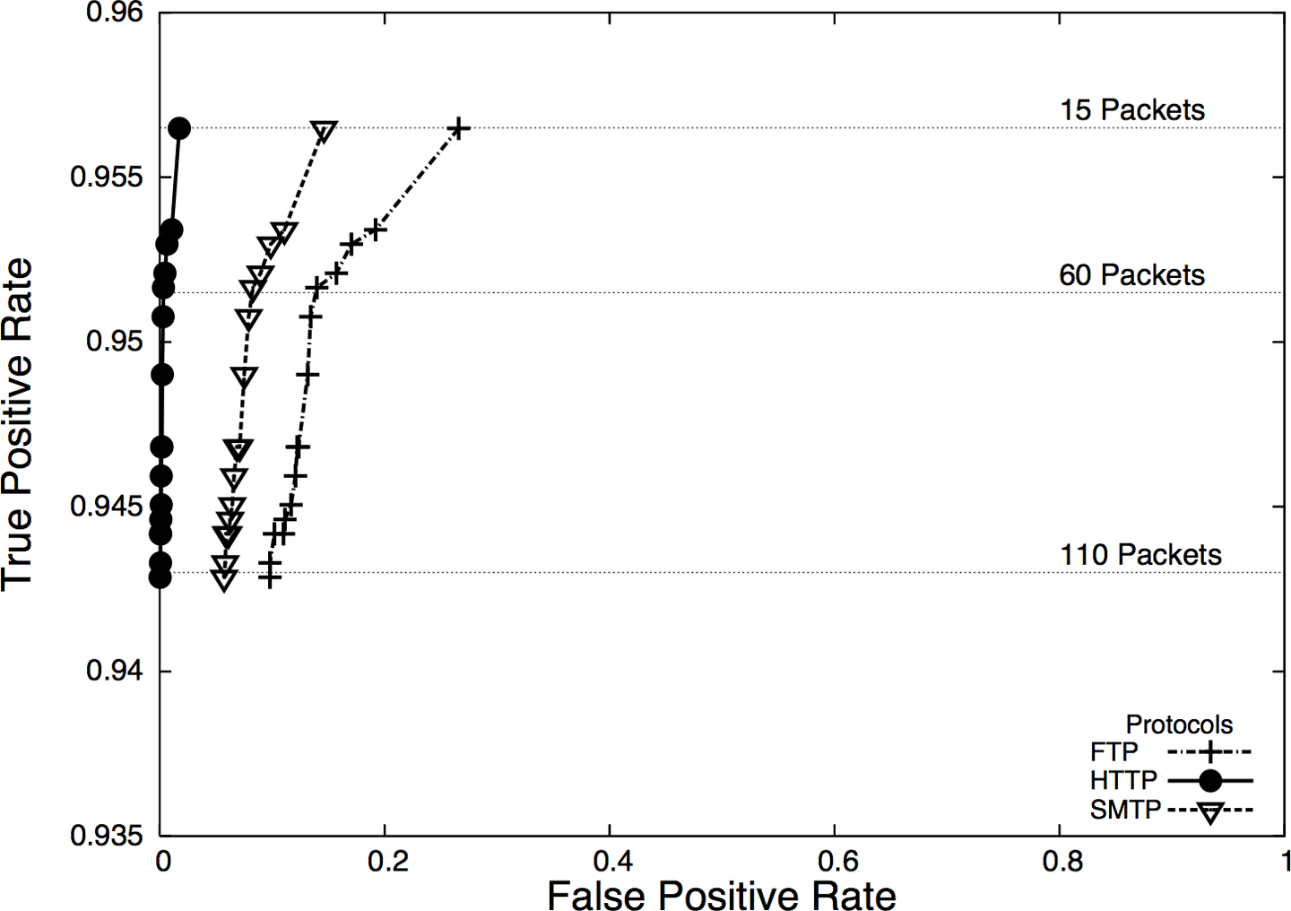
Figure 11-12. An example ROC curve
ROC curves are a common visualization technique for binary classification, but be aware that the rates used in ROC curves are conditional—the true positive rate is the probability of detecting an event if the event happened, and the false positive rate is the probability of detecting an event if the event didn’t happen. Both of these rates are ultimately driven by the probability of the event happening in the first place,4 which brings us back to the base rate problem, as discussed in Chapter 3.
Operationalizing Security Visualization
EDA and visualization are part of the exploratory process and, as such, are somewhat rough around the edges. The EDA process involves a large number of dead ends and false starts. During the operationalization phase of an analytic process, the visualizations will need to be modified in order to supplement action and response. Additional processing and modification are needed to polish a visualization sufficiently for it to work on the floor. The following subsections provide examples of good and bad visualizations and rules for addressing the problems of visualizing data for information security.
Rule one: Bound and partition your visualization to manage disruptions
When plotting security information, you need to expect and manage disruptions—after all, the whole point of looking for security events is to find disruptive activity. Plotting features like autoscaling can work against you by hiding data when something weird happens. For example, consider a count of anomalous events such as in Figure 11-13. This plot has two anomalies, but one is obscured by the need to plot the second.
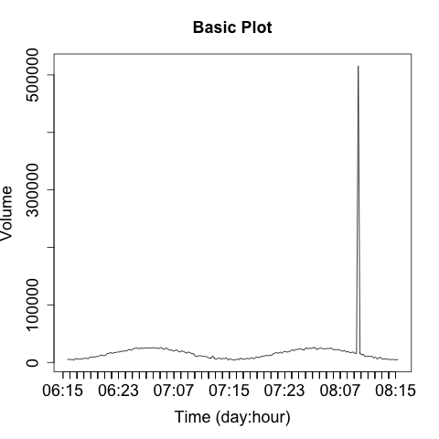
Figure 11-13. Autoscale’s impact on disruptive event visualization
There are two strategies for dealing with these spikes. The first is to use logarithmic scaling on the dependent (y) axis. Log scaling replaces the linear scale with a logarithmic scale. For example, the ticks on the axis go from being 10, 20, 30, 40 to 10, 100, 1000, 10000. Figure 11-14 shows a logarithmic plot of the same phenomenon. Using a logarithmic scale will reduce the difference between the major anomaly and the rest of the data.
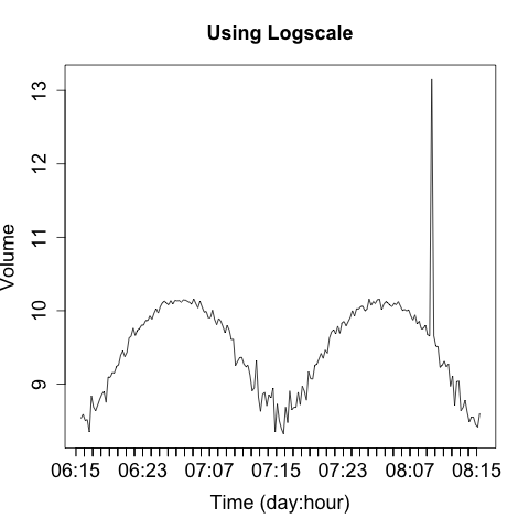
Figure 11-14. Using a log scale plot to limit the impact of large outliers
A logarithmic scale is suitable for EDA, and most tools provide an
option to automatically plot data this way. With R, you pass in a
log parameter to the plotting command to indicate which axis should
be logarithmic (e.g., log="y").
I don’t like using logarithmic scales when developing an operational visualization, however. With logarithmic scales you tend to lose information about typical phenomena—the curve for typical traffic in Figure 11-14 is deformed by the logarithmic scale. Also, the explanation of what a logarithmic scale is a bit recondite; I don’t want to have to explain logarithmic scaling over and over again. When somebody is looking at the same data repeatedly, I’d rather keep it linear.
For these reasons, I prefer to keep the scaling on a plot consistent and identify and remove outliers. When developing an operational plot, I estimate the range of the plot, and usually set the upper limit displayed to the 98th percentile of the observed data. Then, when an anomaly occurs, I plot it separately and differently from the other data to indicate that it is an anomaly. Figure 11-15 shows a simple example of this.
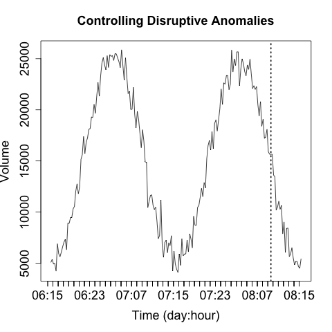
Figure 11-15. Partitioning anomalies out from normal data
The anomaly in Figure 11-15 is identified by the single line indicating that it’s off the scale. The second anomaly (at 07:11) is not detected by that process, but the event is now obvious through visualization. That said, the anomaly marker is completely meaningless without further information and training, which leads into rule two.
Rule two: Label anomalies
If rule one is in place, then you’ve already established some basic rules for discerning anomalies from normal traffic. Now, apply those rules to identify the anomalies and modify the visualization to make them stand out for the reader.
An operational visualization is an aid to anomaly detection, so the same rules apply as for constructing IDSs (see “Prefetching Data”)—you should prefetch data to reduce the operator’s response time. As an example, the anomaly in Figure 11-16 is annotated with information about what caused the anomaly as well as some statistics.
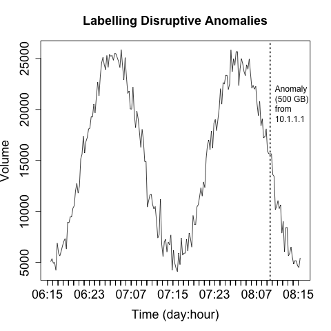
Figure 11-16. Labeling anomalies to aid investigation
Labeling anomalies on the plot can be useful for rapid reference, but if there are too many anomalies (and working off of rule one, you should expect that there will be too many anomalies), you will end up sacrificing clarity in the image. You can see this happening in Figure 11-16, where the label, while informative, is already consuming about a fifth of the horizontal space available. A better approach is to explain the anomalies in a separate table next to the visualization, which allows you to include as much data as necessary.
Rule three: Use trendlines, distinguish artifacts from observations
Operational visualizations need to balance summarization and smoothing techniques that can help the analyst process data without getting mired in details, while at the same time providing the analyst with the actual data and not thinking for him. As a result, when I operationally visualize data I prefer to include the raw data and some kind of smoothing trendline at the same time. Figure 11-17 is a simple example of this kind of visualization, where a moving average is used to smooth out the observed disruptions.
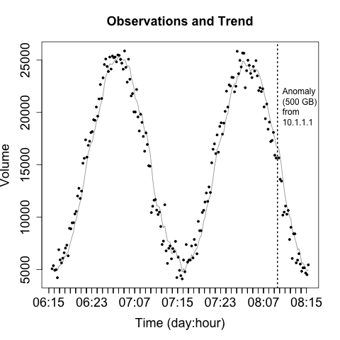
Figure 11-17. Moving average over direct observations
When creating visualizations like this, you need to ensure that the analyst can clearly differentiate between the data (the original information) and the artifacts you’ve created to aid analysis. You also need, as per rule one, to keep track of the impact of disruptive events—you don’t want them interfering with your smoothing.
Rule four: Be consistent across plots
Visualization exploits our pattern matching capabilities. However, those capabilities just love to run rampant on the vaguest hint. For example, say you decide to pick a red line to represent HTTP traffic in a per-host activity. If you then decide to use a red line to represent incoming traffic in the same suite of visualizations, somebody is going to assume it’s HTTP traffic again.
Rule five: Annotate with contextual information
In addition to labeling anomalies, it’s good to include unobtrusive contextual data that can help facilitate analysis. The example shown in Figure 11-18 adds some gray bars to indicate whether activity is taking place during or outside business hours.
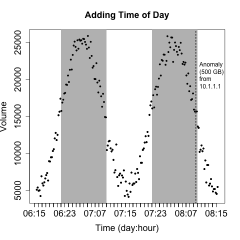
Figure 11-18. Adding some color to identify time of day
Rule six: Avoid flash in favor of expressiveness
Recognize that operational visualizations are intended to be processed quickly and repeatedly. They’re not a showcase for innovative graphic representation. The goal of an operational visualization should be to express information quickly and clearly. Graphically excessive features like animation, unusual color choices, and the like will increase the time it takes to process the image without contributing information.
Be particularly careful about visualizations based on real-world or cyberspace metaphors. Whimsy wears thin very quickly, and we’re not dealing with the physical world here. Metaphors such as “opening a desk” or “rattling all the doors in a building” (visualizations I’ve seen tried, and the less said about them the better) often look neat in concept, but they usually require complex interstitial animations (which take up time) and lose information because of the metaphor. Focus on simple, expressive, serious displays.
Rule seven: When performing long jobs, give the user some status feedback
When I run SiLK queries, I have a habit of running them with the
--print-file switch active, not because I care about which files are
being accessed, but in order to have an indicator of whether the process is running or the system is hung. When building
visualizations, it’s important to know how long it will take to
complete one and to provide the user with some feedback that the
visualization is actually being generated.
Fitting and Estimation
Once you’ve got some data, and you know how it’s weird and have identified its outliers, the next step is generating some kind of estimate for it—a threshold. In this section, I’m going to discuss the general problem of estimating statistical data for information security.
The general problem is that the data doesn’t fit common distributions particularly well. Data is heavy-tailed, and the results just aren’t that precise.
Is It Normal?
There are a diverse family of techniques for determining whether or not a dataset is normally distributed, or, to be more precise, can be satisfactorily modeled using a normal distribution. Parametric distributions, if applicable, open up a number of tools to us. The problem is that in raw network data they’re rare. Among the techniques discussed in this chapter are:
-
Histograms, for visualizing the distribution
-
Quantile-quantile (QQ) plots, for comparing the data against a normal distribution
-
Goodness of fit tests, such as the K-S or S-W tests
Visualizations (histograms and QQ plots) are, in my opinion, the preferable option. My interest in acquiring a distribution is utilitarian. I’m looking for reasonable thresholds and something that matches a theoretical distribution well enough that I can use other tools, because I don’t have the control to make very sensitive measurements. Attackers will usually be fairly easy to identify once you’ve picked the right metric.
The classic mistake with using means and standard distributions without looking at the data is that most network security datasets have a number of outliers. These outliers end up producing ridiculously large standard deviations, and the resulting threshold is triggered only for egregious events.
Simply Visualizing: Projected Values and QQ Plots
There are two ways to generate a visualization to test against a
distribution. The first approach is to compare a histogram against a
theoretical model (generally some distribution). There are a variety
of ways to do this using Pandas, so I’m going to show one simple
example. This example, using matplotlib’s mlab (MATLAB
compatibility) module, is representative of the basic process: generate a
histogram with a fixed set of bins that will serve as the x points,
then generate the y values using the normpdf function, and plot the
results:
>>> import matplotlib.pyplot as plt
>>> from scipy.stats import norm
>>> import matplotlib.mlab as mlab
>>> import numpy.random
# Generate a hundred points of normally distributed random data
# with a mean of 20 and a standard deviation of 5
>>> data = numpy.random.normal(20,5,100)
>>> n,bins,other = plt.hist(data,normed=1)
# Generate the mean and standard distribution for a model
>>> mean,sd = norm.fit(data)
>>> mean, sd
(20.596980651919221, 5.1886885182512357)
# You can just as easily do this 'by hand'
>>> yv = mlab.normpdf(bins,mean,sd)
>>> plt.plot(bins,yv,'r',linewidth=2)
[<matplotlib.lines.Line2D object at 0x113bc1990>]
>>> plt.xlabel('Value')
<matplotlib.text.Text object at 0x113f1e810>
>>> plt.ylabel('Probability')
<matplotlib.text.Text object at 0x114d8a710>
>>> plt.title('Comparison of Histogram and Model')
<matplotlib.text.Text object at 0x113f0e850>
>>> plt.show()
The resulting image is shown in Figure 11-19.
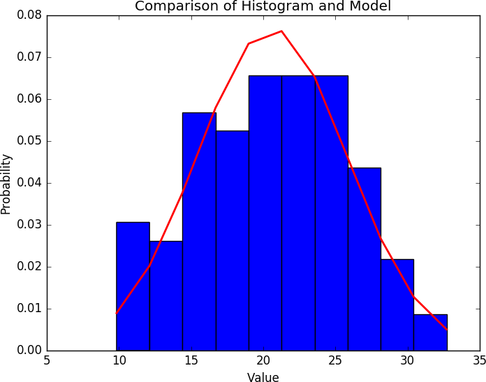
Figure 11-19. Example of comparing distributions
Straight comparison against an assumed distribution (that is, assuming a distribution is normal and plotting it just to eyeball it) is trivial. I do it by default, whatever toolkit I’m using, just so that I have some idea of what the data looks like; it’s quick, but it’s really just testing against one assumption. For more exploratory work, you need to use something like a QQ plot or the other visualizations discussed in this chapter.
A QQ plot compares the distributions of two variables against each other. It’s a two-dimensional plot, with the x-axis being the values of one distribution normalized as quantiles, and the y-axis being values of the second distribution normalized as quantiles. For example, if I break each distribution into 100 centiles, the first point is the first percentile for each, the 50th point is the 50th percentile for each, and so on.
Figures 11-20 and 11-21 show two QQ plots, with the companion
code following. These plots were generated using the probplot
function found in the scipy stats library. The first plot, a normal
distribution, shows the expected behavior when two similar
distributions are plotted on a QQ plot—the values track the diagonal.
There is some deviation but it isn’t very severe. Compare the results
with the uniform distribution in the second figure; in this one,
significant deviations happen on the ends of the plot.
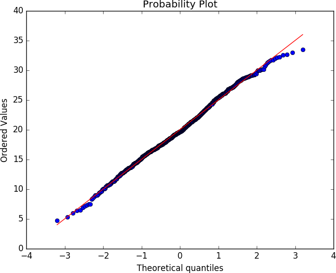
Figure 11-20. Example QQ plot against a normal distribution
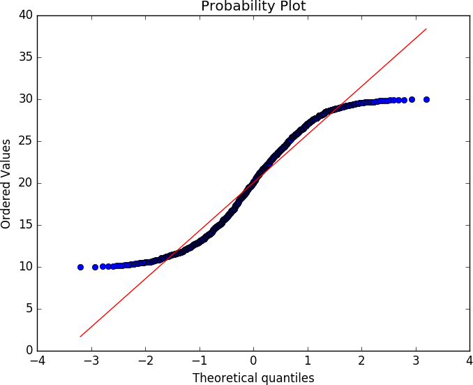
Figure 11-21. Example QQ plot against a uniform distribution
Here’s the code that generates these plots:
# Generate normal and uniform distribution data
>>> normal = numpy.random.normal(20,5,1000)
>>> uniform = numpy.random.uniform(10,30,1000)
>>> results = stats.probplot(normal,dist='norm',plot=plt)
>>> plt.show()
>>> results = stats.probplot(uniform,dist='norm',plot=plt)
>>> plt.show()
The full pandas stack has QQ plotting stuffed away in a number of
locations. In addition to the calls in stats, the
statsmodels.qqplot function will provide a similar plot.
Fit Tests: K-S and S-W
Goodness of fit tests compare observed data against a hypothetical distribution in order to determine whether or not the data fits the distribution. Determining that a phenomenon can be satisfactorily modeled with a distribution enables you to use the distribution’s characteristic functions to predict the values.
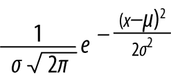
Everyone’s standard approach for this is the normal, or Gaussian, distribution, also known as the bell curve. If data can be modeled by a normal distribution (and snarking aside, it’s called normal because it’s pretty normal), you can generate an estimate from a small sample of data and reasonably predict the probability of other values. Given a mean of μ and a standard deviation of σ, a normal distribution has a probability density function of the form:
If traffic can be satisfactorily modeled with a distribution, it provides us with a mathematical toolkit for estimating the probability of an occurrence happening. To get something that does behave that way, expect that you will have to run heavy heuristic filtering to remove the outliers, oddities, and other strange conditions.
This matters because if you use the mathematics for a model without
knowing if the model works, then you run the risk of building a
faulty sensor. There exist, and any toolkit provides, an enormous
number of different statistical tests to determine whether you can use
a model. For the sake of brevity, this text focuses on two tests,
among a number provided by scipy’s stats library. These are:
- Shapiro-Wilk (
shapiro.test) -
The Shapiro-Wilk test is a goodness of fit test against the normal distribution. Use this to test whether or not a sample set is normally distributed.
- Kolmogorov-Smirnov (
ks.test) -
A goodness of fit test to use against continuous distributions such as the normal or uniform distribution.
All of these tests operate in a similar fashion: the test function is run by comparing two sample sets (either provided explicitly or through a function call). A test statistic describing the quality of the fit is generated, and a p-value produced.
The Shapiro-Wilk test is a normality test; the null hypothesis is that the data provided is normally distributed. See Example 11-1 for an example of running the test.
Example 11-1. Running the Shapiro-Wilk test
# Test to see whether a random normally distributed
# function passes the Shapiro test
>>> scipy.stats.shapiro(numpy.random.normal(100,100,120))
(0.9825371503829956, 0.12244515120983124)
# W = 0.98; p-value = 0.12
# We will explain these numbers in a moment
# Test to see whether a uniformly distributed function passes the Shapiro test
>>> scipy.stats.shapiro(numpy.random.uniform(1,100,120))
(0.9682766199111938, 0.006203929893672466)
All statistical tests produce a test statistic (W in the
Shapiro-Wilk test), which is compared against its distribution under
the null hypothesis. The exact value and interpretation of the
statistic are test-specific, and the p-value should be used instead as
a normalized interpretation of the value.
The Kolmogorov-Smirnov (KS) test is a simple goodness of fit test that is used to determine whether or not a dataset matches a particular continuous distribution, such as the normal or uniform distribution. It can be used either with a function (in which case it compares the dataset provided against the function) or with two datasets (in which case it compares them to each other). See the test in action in Example 11-2.
Example 11-2. Using the KS test
># The KS test in action; let's create two random uniform distributions
>>> scipy.stats.ks_2samp(
          numpy.random.normal(100,10,1000),
	  numpy.random.normal(100,10,1000))
Ks_2sampResult(statistic=0.026000000000000023, pvalue=0.88396190167972111)
#------------------------------------------
The KS test has weak power. The power of an experiment refers to its ability to correctly reject the null hypothesis. Tests with weak power require a larger number of samples than more powerful tests. Sample size, especially when working with security data, is a complicated issue. The majority of statistical tests come from measurements in the natural sciences, where acquiring 60 samples can be a bit of an achievement. While it is possible for network traffic analysis to collect huge numbers of samples, the tests will start to behave wonkily with too much data; small deviations from normality will result in certain tests rejecting the data, and it can be tempting to keep throwing in more data, effectively crafting the test to meet your goals.
Further Reading
-
J. Tukey, Exploratory Data Analysis (London: Pearson Education, 1977).
-
E. Tufte, The Visual Display of Quantitative Information (Cheshire, CT: Graphics Press, 2001).
-
P. Bruce and A. Bruce, Practical Statistics for Data Scientists (Sebastopol, CA: O’Reilly Media, 2017).
-
R. Langley, Practical Statistics Simply Explained (Mineola, NY: Dover Publications, 1971).
-
W. McKinney, Python for Data Analysis: Data Wrangling with Pandas, NumPy, and IPython, 2nd ed. (Sebastopol, CA: O’Reilly Media, 2017).
1 There’s nothing quite like the day you start an investigation based on the attacker being written up in the New York Times.
2 It still exists.
3 When looking at visualization tools, you should always pay attention to scanning, bins, outliers, and other algorithmic features that the tool may handle for you automatically. With EDA, hand-holding is a good thing; but when you start stacking and comparing plots, you will need to exert more fingernail-grip control in order to make sure, if nothing else, that your numbers line up.
4 This entire discussion is an exercise in conditional probabilities and Bayes’ theorem.