
 FEATURES: EDITING AND PROJECTION
The essentials of subediting are the same for features as for news. You check copy for factual and grammatical accuracy and for legality, you edit it to the required length, and eliminate ambiguity, sloppy writing and errors of house style. You write headlines and captions in the type and setting required and – these days – fit the text and the pictures together on to a layout blocked out on screen until the page corresponds with the ideas of the page executive who originated it.
So far so good, but the features sub needs to be aware of some important differences from news in the handling of text and the projecting of material. Headline writing, for instance, can be very different.
Accuracy
First a warning: do not assume experts always to get their facts right. Some who are close to their subject rely too much on their knowledge and memory and let through basic mistakes where the less informed would have checked. Memory can play false with names, titles and functions and with dates – for instance, of Acts of Parliament. Politicians as contributors are notorious for factual blind spots when not being briefed by their researchers. Always add up figures and check statistics and tables in stories, where possible, to see that they work out.
It is with non-journalist and some freelance contributors, unused to newspaper discipline, where the greatest chance of error lies. Since such contributions are often specially ordered and well displayed they throw a greater burden of checking on the subeditor. It will be no use you blaming the writer when you have been put there to spot any errors.
With regular staff writers the danger is less but the responsibility remains. Advice columns, upon which readers will rely, cannot afford to make mistakes. Merchandizing information in fashion pages has to be right. Crossword puzzles have to be checked to see that the clues work out. Television and radio programme details, a tedious editing chore that can fall to new subs, are a minefield for the unwary. Readers are quick to complain if anything is wrong.
Mistakes in figures in newspaper competitions, usually looked after by the features department, can result in bad publicity and cost newspapers money. A greater danger arises from the failure to spot factual errors or unjustified statements that might get the paper into legal trouble (see Chapter 9). Features material is not only more deliberately displayed than news; it can also be controversial and provocative, and this makes checking for accuracy a high priority in features subbing.
Language
Because features are mostly written to length and are often important for the way they say things rather than what they say, they are not normally given ‘heavy’ editing. The sort of rewriting carried out on news stories, because of bad copy, complex copy sources or shifts in emphasis, should not be needed.
There is a freer approach to intro, structure and sequence. These, however, are normally imposed by the writer. A feature that needs re-nosing and re-structuring by the subeditor is an exception, although it can happen.
Freed from the pressure on space and relentless word economy of the news pages, feature writers writing under their own by-lines adopt a wider range of vocabulary and idiosyncrasy of phrase. In some specialist areas the vocabulary might seem outside an ordinary reader’ s, as for example in articles on science, finance and some areas of sport.
Another reason why ‘heavy’ editing should not normally be needed is that the pages are free of the changes of space arising from the arrival of late news pictures, the revising for later editions or the organizing of running stories. In this sense the features subs’ work lacks the excitement and ‘dicing with the clock’ of the news pages.
Style
What has to be allowed for is a greater regard for style. Copy can contain persuasive argument and description by which specialist writers communicate more directly and more personally with their readers. This can involve longer sentences and longer paragraphs. ‘Repair’ and improvements may still be necessary but in correcting weaknesses of grammar or word sequence you must be careful to preserve the writer’s way with words. Style is a fugitive thing that can be damaged by insensitive or unnecessary editing. You should be seeking to keep in the colour, feel and pace of a well written feature, to use editing as a means of preserving and enhancing these qualities in addition to checking that the facts are right.
Here, from The Times, is an example of style in a feature from columnist Nigella Lawson:
Seriously: how can anyone be shocked by the idea of an Oxford undergraduate earning money as a stripper? Modesty is a defunct virtue, informing most people’s lives as little as that other superannuated accomplishment, watercolouring. We retain enough of a memory of decorum to enjoy the frisson of surprise. But it’s just a mime, not rooted in any moral dismay.
Far from it: those under a certain age would rather admire Melissa Butler for strutting her stuff at the Sunset Strip in Soho. For them, the stripper is not some sleazy figure, but a strong woman who owns her body and is happy with it; a woman who gets what she wants – money and applause – for revealing what she is.
The first sentence establishes the tone of gentle mockery. And from the same edition of the same paper, Alan Coren pursues an almost equally idiosyncratic vein on the subject of telly watching in Bosnia:
For what has stricken the Bosnian Serbs is the lack of decent telly. Confronted with an unremitting barrage of regional cultural programmes, many of them repeats, those previously loyal to Nanja Luka’s SRT TV have fled in their pitiable hordes. Unable to take any more wobbly documentaries about well-dressing or donkey enemas or jamjar museums, or rural hats, they have taken instead to the street. They have become box refugees. They do not know which way to turn.
Even seasonal fare can take on a certain quality in the hands of a stylist (this from the Daily Telegraph):
Our Christmas feastings are nothing to those of our ancestors. From medieval times until Cromwell’s Commonwealth the Twelve Days of Christmas were celebrated with feasting that could reach wild excess. Then the Puritans abolished Christmas festivities. A popular song of the time ran:
Plum broth was Popish, and mince-pies,
Oh, that was for idolatryWith the restoration of the monarchy under Charles II, feasting returned, though never to the same extent, and favourite Christmas foods could be safely enjoyed once more.
Plum broth, or Christmas Porridge or pottage, was the forerunner to the Christmas Pudding. A rich soup stuffed with dried fruit, thickened with breadcrumbs and enlivened with alcohol, it is quite delicious. Pepys noted on Christmas Day, 1662, that he enjoyed ‘a mess of brave plum pottage’ before his roast beef.
Not just a recipe, but titbits of information enlivened by a snatch of song and a cascade of mouth-watering verbs.
Some by-line contributors whose style is their brand image have contracts that specify that their copy should not be altered without their agreement Editors try to limit the number of these arrangements since they can constrict production. Also, however good the writer there can still be space problems due to changes in advertising, or writers exceeding the ordered length, or where parts of a feature are not liked for legal reasons or on grounds of taste. The task of amendment remains with the subeditor. It is just that tact and discretion have to be added on to the attributes a news sub would be expected to have.
If one is looking for sacred cows then the one piece of copy you should not cut or alter is the paper’s editorial opinion, although the facts, dates, quotations etc. still have to be checked. An error allowed through here would be akin to an act of sabotage. Ask the editor or leader writer for any cuts needed.
Ghost writing
In some newspapers, notably the national Sundays, the practice of ghost writing might be found. This is where a feature or even a book, is written by a professional writer for the person under whose name it appears.
Ghosting might at first sight seem an indefensible practice. It is certainly not one that newspaper journalists want to see encouraged, yet it may be the only means by which important one-off pieces of writing can reach the reader. It is used where a newspaper wants to carry a personal story by someone in the news, or whose experiences and opinions are of interest to the readers, but who might be too busy or have insufficient skill with words to provide copy in an acceptable form.
A feature writer who is an experienced ‘ghost’ is put in with the person by agreement, often with a tape recorder, but sometimes with a notebook, to ‘talk out’ the material. Ghosting can be done even over the telephone. The feature is then written, keeping intact the opinions and verbal style of the person – who might perhaps be a trade union leader, a sports personality or even a politician. When complete, the text is shown for approval to the celebrity whose name it will carry. Any adjustments to wording or content are made and the finished article is signed as being agreed by the ‘author’. It is then printed as an authentic piece of writing.
Writers employed on ghosting have to be adept at picking up nuances and shades of expression in conversation which they use in the writing, and they are expected to carry out their role sympathetically. The best are often professional freelances whose skill brings them a regular living from this sort of work.
If given ghosted work as the page sub you should handle the copy with the same care as the written work of any big-name outside contributor, checking back for approval any proposed changes in text or cutting to length, but checking above all for its accuracy and legality.
Reader participation
Reader participation is the stuff of features pages. Not only are readers’ views aired regularly in letters columns but their opinions are solicited on subjects on which it is intended to run ‘viewpoint’ features – the Government’s standing, favourite holiday stories, the popularity of TV programmes, the state of the roads, and so on. Advice and service columns also live off letters, while competitions of many sorts could not survive without willing and hopeful participants.
This promotional side of the paper is, in fact, carried out largely by the features department, helped by the promotions department where there is one. It serves the triple purpose of providing the readers with a platform, and often a service, and also getting the paper publicized and talked about.
Yet publishing letters can be fraught with danger. Readers write in hundreds and thousands each week with no idea of the limitations of space into which they have to fit if used (fewer than one in twenty letters to The Times, for instance, get published). Choosing them is the easy part – topicality and originality are looked for – but editing them to fit can court complaints of misrepresentation when perhaps fourteen to twenty paragraphs are reduced to three or four to give the point of a letter along with nine or ten others.
The total area available for them in a national paper might come to no more than a column and a half, including the space for the main headline and a number of smaller ones. There is usually more room set aside for them in regional and local papers. Some evening papers (see Figure 55) run a double page spread of letters to foster feedback to the editor of topics occupying readers’ minds.
You need to be a sympathetic subeditor to edit letters in a succinct fashion without upsetting the writers. The practice with most papers is to check with the writer if the subject is controversial or personal. At The Times, the letters used are cut only by permission of the writers and the cut version read back to them, or faxed, over the telephone. A check with the writer is made by most papers if there is a fear that a seemingly newsworthy letter might not be genuine, or be part of a publicity stunt – a practice not unknown to editors.
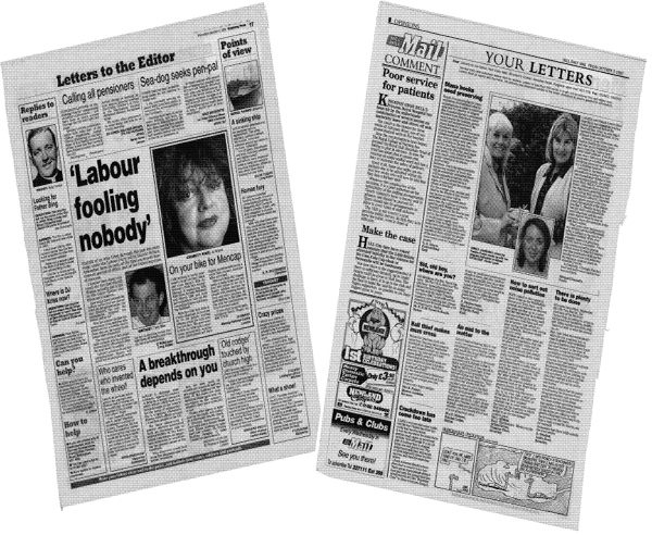
Figure 55 Reader participation: letters are rated highly in all manner of newspapers, but there can be traps in running a Letters to the Editor column. These busy, well-filled examples are from the Nottingham Evening Post and the Huii Daiiy Mail
In cutting letters, try to keep in the essential point the reader is making by using their own words with the minimum of alteration even if a good deal of the letter cannot be used for space reasons. Well known in newspaper offices is the dictum of the old Press Council (now the Press Complaints Commission) that in a letters column ‘editing should be done solely to qualify a letter for publication, and it should never be allowed to defeat or obscure the points or points the correspondent wanted to make.’
In other words, beware of taking phrases away from their context. In more general letters-based features, readers’ views are quoted as part of a pattern of opinion supporting the aim of the article. When they are quoted in advice columns, usually only the relevant part of the reader’s question is used.
Features and the law
Features pages give the office lawyer a lot more trouble than the news pages. The opinion and criticism they contain are more likely to wound than the objective reporting of fact. Some of the more sensational ‘confessions’ and ‘lid off it all’ series that appear in the national Sunday papers can suffer legal revision – and applications to the court for injunctions – right up to press time and have been known to die to the death as a result of the court’s intervention after the page has been made up.
In buying such series, newspapers are aware that they are dependent on what the lawyer will allow because of the danger that lurks in the law of libel and contempt of court. Editors’ belief that the public has a right to know what they have uncovered has to be tempered by their preference not to have to go to jail.
Investigative journalism in which matters of public concern, often concerning crime, are examined by skilled reporters who might get evidence from unorthodox sources, are a particular headache to lawyers.
You are likely to be given tricky jobs like these to edit only after the legal vetting process is complete, but the need for vigilance remains. A shift in a delicate situation or legal second thoughts – or even the wording of a headline – can result in a page being ripped apart at an inconveniently late hour and in changes in editing being carried out, and even pictures having to be replaced.
Projection
You are more involved with the projection of the edited material on features pages than is the case with news. A main feature is ‘sold’ visually to the reader by a complex of headlines, pictures, blurb, stand-firsts and quotations in which the sub has the vital promotional role. Not only are you editing the copy; you are persuading the reader of its importance and drawing attention to special aspects.
Thus editing ideas go beyond headline and intro. They require a degree of identity with the aims of the writer and an ability to exploit display techniques. You are drawing out the mood and underlying substance of the material and transmuting these in terms of picture, caption and significant quotation as well as headline. The editing, in short, is more visual and the subeditor is integrally involved in the design of the page.
Even in stock features occupying regular slots, such as a nature column or the arts reviews, mood is an important ingredient of the headline and you have to be responsive to this.
A blurb, which a feature might require (see Figure 56), is best described as a piece of self-advertisement carried by the newspaper, not necessarily on the same page as the feature, inviting readers to turn to it. Sometimes it consists only of one selling line that identifies the story (for example, ‘confessions of a wayward star’ or ‘your verdict on the great drugs debate’) accompanied by a page reference; or it might have several sentences of description. You aim to present a compelling reason, or reasons, why the reader should read the feature. Blurbs are mostly given a bold display that will stand out from the page. They might include a picture as well as type, with maybe the use of type reversed as a WOB or BOT. They combine the visual role of a display advertisement with that of a news bill or poster.
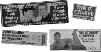
Figure 56 The front page blurb – and sometimes the back page – is the shop window for the day’s big feature offering
A stand-first (see examples on pages 198, 201 and 203) is likely to be used on a feature, especially a series which arises from special circumstances, to explain how or why the article came to be written. The aim is to justify or qualify what follows so as to enhance the readers’ understanding or acceptance of it.
Blurbs and stand-firsts, the writing of which falls to the sub, are fundamental to the projection and call for imaginative and yet concise use of words so that within a small compass the reader can be given a compelling reason for reading on.
• Here, for students, is a useful exercise in features projection. An investigation has been made by a small team into the effects of loneliness on the aged in a big city. Three separate reports have been filed plus an exceptionally good mood picture worth running as a deep horizontal six-column illustration. There are two other smaller pictures of interior shots and some statistics from the local council. From these, devise a page one blurb, one main headline and two subsidiary ones, a stand-first and a panel of statistics, and project the material:
1 As a broadsheet display on a page with modest advertising.
2 As a double-page spread in a tabloid paper with no advertising.
A separate static feature, perhaps the Opinion column, could be used in each case as a foil to the main projection.
A number of scenarios like this could set a pattern for workshop projects. They could also include devising a static layout for television and radio programmes, and one for a weekly ‘name’ columnist writing pithy comments on current news, in which witty one-liners in, say, 14-point, might be used.
Features headlines
Headline writing, as with page design, has a freer approach than with news. The headline must still draw attention to the text and form a focal point in the display but these aims are merged in a big feature into a general projection in which pictures play a bigger part (most news stories are fairly short and do not have pictures) and in which blurb, stand-first, display quotations and even cross-heads and by-line all have a role.
While a headline might sum up the vital facts it need not necessarily do so. For a start, many features are built around comment or opinion or deduction arising out of facts that are already known. The headline is more likely to hinge on what the writer is trying to say or what the pictures on the page symbolize.
Take, for example, the features spread from the Birmingham Evening Mail (Figure 51, page 198). The headline LOOKING INTO THE EYES OF TERROR owes its existence to the boldly cut pictures of the frightened girl and the one of the eyes through the partly opened door. On its own it would be a meaningless label. But having been caught by the main display, the reader wants to know more. The ‘Talking Point’ logo and the strap heading, THE TORMENTED WOMEN WHO ARE PLAGUED BY STALKERS supply the necessary information. The stand-first and by-line pull the reader’s eye down into the text. The Factfile WOB is there to give back-up. The combined assault upon the reader by the page designer and subeditor has worked.
The main picture also dominates The Guardian feature on TV drama (Figure 52 on page 201). The young mother holding the feeding bottle and looking bleakly across the page symbolizes the poignancy of Cathy Come Home. It is a striking picture cut to accentuate the look in the woman’s eyes and it says more about a landmark TV drama than any words could have done. It is the woman and the feeding bottle that captures the eye and the imagination, compared to which the headline PRISON’S TOO GOOD FOR US remains an enigma and has to await explanation from the text. The stand-first does, however, give an inkling. The smaller pictures are there to support the thesis, and to invite the reader to play a who-was-who game with clips from yesteryear’s dramas – no bad thing in a show-business feature.
The main headline and picture occupy about equal billing visually in the Daily Mail books page (Figure 53 on page 202). Actor-novelist Stephen Fry (also in cameo flashback) is a good picture subject, but the headline LOVE, SELF-LOATHING AND THE LIFE OF FRY is an inspired ‘comment’ headline that a reader with any interest in the subject would find it hard to resist, and it has to take precedence. The intro supports the headline immediately.
One summer afternoon at prep school, when he was about 11, Stephen Fry was off games and sloping around one of the dormitories when he came upon a joke shop catalogue.
Discovering that a half-crown postal order would acquire him, among other delights, chattering false teeth, a bar of soap that turned the user black, and a sugar cube that melted leaving a realistic-looking spider floating in the victim’s teacup, etc.
Quiet elegance is the only additive such readable text requires. This is provided by clean 11-em setting, drop-letter eye-breaks and the discreet use of white space. It is a path that has been well trodden by the Mail.
The Liverpool Echo’s main feature (Figure 54 on page 203) invites the readers’ participation by yoking headline and main picture together in a successful read-me compo. SHOW CONCERN is the message for the day. Printing it across the top of the picture in this case highlights both headline and illustration, but it is the quality of the picture – in this case the old couple – that again dominates. The stand-first and the smaller picture are used to turn the text neatly round and under, leaving a useful amount of space on which to display the rest of the leader page contents. The result is a busy and attractive features page.
Here are examples of particular styles of features page headlines:
The emotive phrase
The Sun is rather good at this sort of headline, as in I JUST WANT TO DIE WITH DIGNITY IN THE ARMS OF PEOPLE I LOVE, and the terser MY EX IS SLEEPING WITH MY MOTHER.
The whimsical phrase
This goes well with the less serious sort of feature, as with the Daily Telegraph’s GREAT COATS for a fashion feature on women’s coats. Whimsy, however, can be serious, as in The Times’s THE UNDERWRITING ON THE WALL.
The informative phrase
A headline that is better with a verb, even though it can still manage without the active voice, as in, HOLY GHOSTS: HOW A VICAR CAME TO BELIEVE SPIRITS ARE EVERYWHERE, in the Daily Mail, about a vicar with psychic powers. An enigmatic example from The Independent: HOW TO LEARN TO LOVE STOCK MARKETS EVEN WHEN THEY CRASH. And another how-it’s-done one in the Daily Mail, on a Lynda Lee-Potter interview: HOW JOHN CLEESE BECAME AN EX-NEUROTIC.
The decorative phrase
Harnessing a pun or an old song title is the resort of the subeditor when confronted by an awkward review, a feature full of useful titbits for readers – or a bland holiday article. The Daily Mail offers, OH, ISLANDS IN THE SUN on its travel page; the Liverpool Echo counters with WE DO LIKE TO BE BESIDE THE SEASIDE. A review in The Times (they’ re good at word play) of a play once attributed to the Bard, has the neat HAM WROTE SHAKESPEARE, NOT BACON.
The confessional
My fifth category remains the tour de force of headline approaches and one that Fleet Street believes sells papers. The News of the World has unrivalled experience in this field with such blockbusters as MY ELECTRIC NIGHT SHIFTS WITH SORAYA and AGONY OF LOVING MY EAST-EASTENDERS CO-STAR. Then there is The Express’s more sedate, CHILDHOOD TRAUMA HAS LEFT ME HAUNTED BY FEAR, and The Guardian’s avante garde version of the genre, I’ M ALWAYS HOPING THAT I WILL WEAR OUT BEFORE MY CLOTHES DO.
You will see from these examples that space and word count are not usually the problem with features headlines since the page pattern is less formularized and the items fewer. Even with the constraints of narrow measure which can apply with static features in regular single- and double-column slots you have greater freedom of wording, and a good deal more professional pleasure, because of the variety of headline approaches possible with features material.
Moreover, you will find that the use of mood and colour in headlines and the freedom from hard news concepts removes dependence on headlinese even in tight headlines. Such tired cliché words as probe, shock, horror, quiz, rap and drama, which mar news page headlines, should not have to be resorted to.