
 A SUB’S GUIDE TO DESIGN AND TYPOGRAPHY
The plan of a newspaper – what it contains and the order in which it is presented – is decided by the editor in consultation with senior executives. An outline plan is initiated at an editor’s conference, held early in the day on a morning or evening paper or midweek on a Sunday or weekly, and thereafter adjusted, through informal discussions with executives, in the light of copy and picture input.
Editorial space which, as we saw, can vary day to day in response to the amount of advertising, is shown at the start of each day or week in a dummy of the paper prepared for the editor by the advertising department. This is put out on screen these days, and it shows the number of pages (pagination) agreed and the placings and sizes of advertisements sold.
The advertising, over which the editor has no control, provides fixed points around which the editorial content of each page is planned. This does not mean that the placing of advertisements is entirely arbitrary. Papers have a general policy of placement; as a rule, the front page is kept fairly clear, often completely clear, and other key pages, including the back and the main features page are kept ‘light’ to accommodate known editorial needs.
Beyond this, the number and shapes of advertisements, and where they are booked for, can vary a good deal. Some trading of space might be possible between editorial and advertising departments but, on the whole, advertising once placed cannot be shifted. Many positions have been bought at a premium. Advertising also has to keep its own balance in the paper to avoid clash of product or having cut-out reply coupons that back on to each other.
Format
All newspapers cultivate a visual format which is distinctively their own, and by which they are recognized, and page planning adapts to this. By format, in this case, we mean the consistent use of the same typography and style of presentation, and the placing of things such as sport, editorial opinion, women’s pages, TV programmes and late news in the same part of the paper in each issue so that the shape is familiar to the readers. This familiarity is important in page planning.
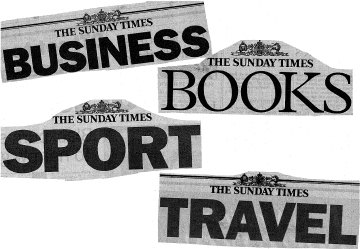
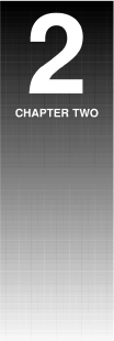
Figure 12 A Sunday paper in parts: how the logo identifies the Sunday Times sections
A newspaper’s format is its visual brand image. While it can be modified in various ways, both in content and in typography, it is not usually subject to drastic change unless the paper is being relaunched in the face of falling circulation, or is seeking for some reason to change its market.
In all papers specialist areas such as financial news and sport, and sometimes foreign news, have their own part of the paper. The quality dailies and Sundays give separate sections to finance, sport and arts and leisure (in what used to be called the American pattern) with each section having its own pagination and masthead logo. Some provincial papers bring out separate sections on certain days, and might sectionalize their advertising features or holiday or Christmas shopping promotions. In all the sections the broad type style and presentation is in accord with that of the paper (Figure 12).
Balance of contents
Within the broad format it is necessary to achieve a balance of subject on the pages and a visual balance of text, headlines and pictures in relation to each other. It would be unbalanced, for instance, to run all stories of gloom and doom, or death and destruction, on one page, to put all human interest stories on one page, or to fill a page with stories without pictures. Account is also taken of the advertisements on the page so that the editorial part does not clash with it either visually or in content.
The editor might occasionally vary the usual balance of space allocated to news, features and sport to suit special circumstances – an election edition or a heavy weekend sports programme, for instance.
Each newspaper arrives at a general contents balance to suit its market. Evening papers give more space to news than Sunday or weekly papers. This is because they are exposed to the main daily news breaks whereas Sunday papers, produced on Saturday nights, mop up and explain the background to the week’s news and run more weekend leisure features. Morning papers, too, tend to have more features than evening papers because of their tradition of giving in-depth explanation to the day’s news. Town evening and county weeklies are careful to gather together pages of area news which their readers come to expect.
However, newspaper markets are by no means fixed and there can be subtle shifts in the balance of contents and news coverage over a period.
No matter how the balance is arrived at it is achieved within a total editorial space which remains at about the same percentage of the whole in relation to the advertisements, whatever the number of pages. Advertising is at its lightest, around 30 per cent or less, in town evening papers which have relatively low overheads; around 40 to 45 per cent in national popular dailies, which have high overheads but a high circulation revenue; and 60 per cent or more in the quality Sundays, which have high production and distribution costs coupled with less circulation revenue.
You can say, then, that the essential points in planning an issue of a newspaper are:
1 Balance of editorial items in relation to each other – i.e. news, sport and features.
2 Balance of subject content, including pictures and advertisements, within each page.
3 Preservation of the general ‘shape’ of the paper’s format.
Who does what
Editorial manning varies according a paper’s size. Big national dailies have a battery of executives, some with precise editorial functions, some with managerial, administrative or liaison roles, some with general overlord responsibilities for areas. While there is usually only one deputy editor who actually deputizes in the editor’s absence, there can be a number of assistant editors with titles such as assistant editor (news), assistant editor (features), assistant editor (special projects). At departmental level (akin to middle management) there are more defined roles. The titles of news editor, features editor and sports editor mean that they are head of these respective departments, each with a deputy.
Producing a big daily or Sunday paper is the responsibility of the night editor, who is the senior production executive, usually equal in status, and sometimes senior, to the assistant editors. To the night editor is delegated the physical editing functions of the editor once the departmental heads have gathered the material and the production cycle begins. From the night editor flow the delegated roles of the chief subeditor, picture editor and art editor, and thence the subeditors and page editors who carry out the actual editing and make-up (Figure 8 on page 16).
On smaller papers some of these roles are merged. On weeklies and on some evenings the deputy editor, and even the editor, take a more active role in page planning. On such papers there is seldom an art desk, the chief sub and senior subs originating the page schemes. Subs might scan in and correct pictures as well as edit text and make up the pages (Chapter 3). Similarly, the subs’ table might combine the news and features functions and even that of sport, although sports production on most papers is carried out separately under the sports editor (see Figure 40 on page 71).
Whatever the scale, the role of the chief sub is the fulcrum of the operation. Into his (or her) electronic basket land the copy, pictures and ideas that have been ordered and discussed, and they leave it, checked, edited and corrected, to take their place in the pages being made up on screen. Through the long production shift this important executive, aided by a deputy and supported by the copy taster, works through the material of the day, page by page, edition by edition, roughing out pages, briefing subs on the handling of stories, accepting or rejecting headlines, solving problems that arise, checking the finished work until the last edition has gone to press.
The deputy chief sub, or an assistant, might take over the revise function, an important role in computerized systems where there are no longer proof readers to check for mistakes missed – or created – by busy subs, and to see that house style is adhered to.
You could say that the job of the chief sub combines a piece-by-piece planning operation with quality control of the material being processed. It is an arduous and unrelenting task. On a small paper it might include the planning and scheming of most of the pages and a major share in decisions about the balance of the paper. In a big national paper with the back-bench system this part of the work is covered by the night editor and assistants, leaving the chief sub to give more time to polishing the material and controlling the pages being put together.
Designing the pages
Once the overall plan of the paper is agreed, the presentation of the contents becomes an exercise in design. Now takes place the scheming of the pages, of which the end product is the page design or layout.
On a big morning paper the night editor and assistant night editor roughly scheme the main news and features pages, with the chief sub and features chief sub, if there is one, usually scheming the others. (On small papers, as we have seen, the chief sub plays a bigger part, with some pages being given to senior subs to scheme.) Layout artists under the direction of an art editor draw the schemed pages in detail directly on to screen, call down any computer graphics needed, and prepare artwork such as blurbs, headline-picture composites (compos), and logos called for in the design.
The layouts, with artwork, page and advert boxes and story boxes precisely shown, then go on screen to the chief sub who puts them out with type instructions to the sub or page editor chosen to handle the page. According to the production method used, the stories are then subbed to length, the headlines written and pictures (see Chapter 3) and adverts called down into their boxes. The page editor adjusts the items to fit until the page is judged to be ready. After being cleared by editor and lawyer, it is sent electronically to the darkroom where it is turned into a high resolution negative from which the printing plate is derived. Under the latest page-to-plate systems, as we have seen, it can be sent at a keystroke direct to the platemaker thus dispensing with the darkroom.
Important note: the chief sub, or the production supremo by whatever designation, must not neglect an important task where a tabloid-sized newspaper is being produced. Since the pairing of pages at printing means that each page goes on the press with its printing pair (i.e. in a 36-page paper page 36 pairs with page 1, page 35 with page 2 and so on) the making up on screen of double-page spreads must be carefully checked so that text levels, and headlines and print borders crossing the page, match their partner page accurately.
It is possible to formulate some general principles about page design without contradicting what has been said about format or stultifying the use of new ideas. But first it should be said that to succeed, the design must project successfully the sort of content in which the paper specializes to the sort of market that it seeks, In other words, content governs projection. Design, therefore, must look to content and readership market for its inspiration.
The pages reproduced in this and the previous chapter (Figures 9, 10, 11, 13, 14 and 15) demonstrate the sort of content and projection to be found in a varied selection of British newspapers, each depending on its market.
Focal points
The examples referred to show how newspaper design is harnessed to do a job. What works for a popular tabloid paper (Figure 13) would be as unsatisfactory for a county weekly paper with many area editions (Figure 9) as it would be for the Sunday Times (Figure 15), while for the Financial Times (Figure 11) to be projected as self-consciously artistic as a quality Sunday paper would mystify the readers accustomed to its simple authority. Each approach has to be judged by how far it achieves what it sets out to do.
If you draw boxes to represent the areas to which the eye is first drawn on each of the pages referred to, you will see that they ail have one thing in common. They form asymmetrical patterns in which the pictures and main headlines are the focal points.
These focal points, by their location, first demand the reader’s attention for the page as a whole. Then, as they guide the eye round the page, they lead from larger focal points to smaller, alighting on the things that first attracted the eye and, once attention is secured, taking in the lesser items. The design has succeeded in claiming the reader.
The location of the focal points around which the page design is constructed depends upon the material chosen and the position and content of the advertising. The shape of the editorial space being worked on will determine whether the pictures need to be horizontal or vertical, the stories short or long. What the advertising consists of – illustrations or mainly type – has to be taken into account. A picture should be kept clear of pictures in an adjoining advertisement, while headline type should not be alongside advertising type of a similar size. The page examples show how these problems have been tackled.
It is because of this combination of circumstances under which pages are schemed that layouts vary so much in design (though remaining within the type format) in any one paper. In describing newspaper page designs as asymmetrical it should be said that a symmetrical layout is impossible on pages with adverts because of the varieties of editorial shape left by the advertising space. Symmetry also tends towards visual monotony and is seldom tried even on the occasional page without advertising.
Figure 13(a) How a layout becomes a page: this example from The Sun in the run-up to full screen make-up still carried written headline, intro and picture instructions for the subeditor, (b) The Sun news page as it appeared.
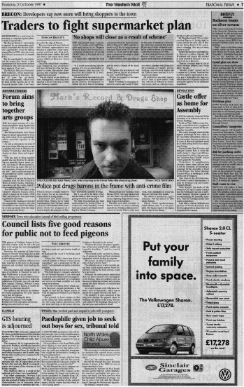
Figure 14 How a leading provincial morning paper covers its territory: place names flag the stories in this busy Western Mail news page
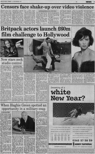
Figure 15 All-serif lower case type, standard column measure throughout, and thick-and-thin-cut-off rules, produce elegance and readability in the Sunday Times’s news pages. Note, in this one, the use of a cut-out, which are easier to achieve in screen make-up programs
It can be argued that the focal points in the examples given above are bolder in the tabloid pages, both national (Figure 13) and town evening (Figure 10) than in, say, the Financial Times example (Figure 11). This is an indication of differences of approach to the readership market rather than of fundamental difference in design philosophy. News is more pictorial in a popular tabloid, while boldness in picture and headline is less required in a paper such as the Financial Times and in some of the quality broadsheets. Yet the purpose and function of the visual pattern is the same, each in its market.
Order
The order in which headlines appear on a page, and their size, signify the relative importance of the text they cover in relation to the other items. In all pages there is the main or lead story, which has the biggest headline and sometimes, though not necessarily, the longest text. The second most important story is the half lead, with the second biggest headline. Then there are the intermediate tops (the term which used to signify top of the page is now applied to stories of intermediate length in any part), and a number of one or two-paragraph stories, usually down page. These are called fillers. Sometimes they are schemed into the page; other times they are kept handy to fill spaces when bigger stories fall short. In some papers they are gathered into a column of news in brief, or nibs (see Figure 25 on page 46).
The reader, drawn to a page by a picture or bold headline, might have time only to scan the main items, but if the reader has more time the initial impact might draw the eye into reading the whole page. A picture with its caption, for instance, can act as a taster, persuading the reader to run through the story that accompanies it.
A way of looking at modern newspaper design is as a form of packaging by which the contents are commended to the reader. In this sense it signifies a breakaway from earlier days when newspapers had columns of unrelieved small type with little or no illustration before display was discovered as a means of targeting readership.
Type character
Looking at successive issues of a newspaper you will become aware that there is a consistent use in the pages of one or two stock types with judiciously placed variants. It would be easy to work right through the book choosing typefaces, since most modern systems offer a wide range of types, but this does not happen. If it did it would produce a hotchpotch effect on the eye and make pleasing design hard to achieve.
Yet the consistency, which is common to all newspapers, is not just a question of arriving at a design. It is a way of giving a newspaper its visual character. It is a major item in its format by which it is differentiated from other newspapers. This is demonstrated in the examples in this chapter.
Summing up in this section, we can say that there are three purposes in newspaper design:
1 To draw the reader’s eye to a page by creating an attractive visual pattern.
2 To signpost the items and signal, by placings and typesizes, their relative importance.
3 To give the newspaper a recognizable visual character by the consistent use of chosen types.
Typography
It will be seen that page design is made up of four elements:
Text ![]() headlines
headlines ![]() pictures
pictures ![]() advertisements
advertisements
Since the content and positions of advertisements are decided before the editorial material is placed, the designer – the person who schemes the page – can only note them. The emphasis on design is therefore on text, headlines and pictures. In dealing with the first two a knowledge of typography is needed.
By typography we mean the arrangement and appearance of printed matter and, for this, some awareness of the uses and purposes of types chosen is fundamental.
There are two main type families by which the Western, or Roman alphabet is rendered in print: the serif and the sanserif (or sans). The serif, of which are examples in Figures 16, 17, and 19, is characterized by letters in which the strokes are of varying thickness with the ends finished off with a decorative flourish or tail which is called the serif. This style dates back to early Latin inscriptions and from it has sprung many designs of which a number are still widely used today.
The sans family has letters of mostly even strokes without the decorative flourishes or serifs, hence the name sanserif. Sans types, of which there is a vast and ever increasing number, appeared in modern times in response to the demand from advertising and newspapers for types with boldness rather than elegance. Figure 18 gives a popular one currently used in newspapers.
In referring to type, the word face is used to mean the appearance of the type as it prints, while font (formerly fount) means all the characters – i.e. letters, figure, punctuations marks etc. – of any given type face in any one size.
Many of the thousands of types in the two main families are used only for advertising and publicity purposes. Newspapers adopt a conservative approach, choosing one or two readable stock types which they use in various sizes and weights through the paper, with perhaps another quite different face to give variety or special emphasis on occasions, or for use on the features pages.
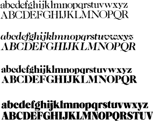
Figure 16 Examples of different weights in a well used stock type. Caslon in four of its variants (top to bottom): light, regular italic, extra bold, black
Of the two serif types illustrated in Figures 16 and 17, Times New Roman is the stock type of The Times and the Sunday Times and several other newspapers, while Caslon bold is popular with many regional and some Continental papers. Other popular serif faces are Century bold, Bodoni and Cheltenham. The sans face illustrated in Figure 18, Helvetica, has gained in popularity in recent years over older sans types such as Gill sans and Grotesque. Other sans types widely used are Tempo, Gothic, Futura and Univers.
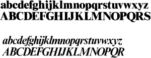
Figure 17 Two variants from the Times New Roman range: extra bold and bold italic
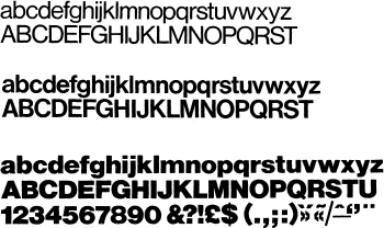
Figure 18 Helvetica (sometimes bit-mapped as Geneva) in three of its guises. Top to bottom: light, medium and bold
There is also a variation of the serif family referred to as slab serif in which the serifs or tails are squared off, giving a characteristic chunky look. An example is the Rockwell range, used in the Daily Mail features pages and in many American newspapers (Figure 19).
Under bit-mapping conversion into computer faces many of the traditional newspaper types, including some of the above, where very minor changes of shape have been made, are presented under new names.
It is usual for a newspaper to opt either for a serif or a sans type style and stick to it. Sans is more popular with tabloids, especially national dailies such as The Sun (Figure 13(b)) and The Mirror and many town evenings (Figure 10), while a mainly serif style is used in the more traditional broadsheet papers such as The Times and the Daily Telegraph and in some provincial morning papers.
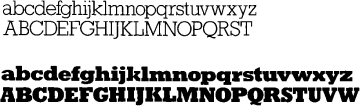
Figure 19 Taking variants to an extreme: the slab-seriffed Rockwell light and its partner, Rockwell extra bold
Using type
Page design has to take account of the stock types in use in a newspaper. Fortunately, within these there exists plenty of scope for variety and a type style can be evolved by using the variants within a type range.
For example, types exist in capital letters (caps) and in lower case (l.c.), and a noticeable modern trend is for newspapers using stock serif faces such as Times Roman, Century bold or Bodoni, to have all headlines in lower case (see Figures 9, 11, 14 and 15). It is generally agreed by type experts that lower case type with its more flowing contour and variety of stroke is easier to read than capitals. To judge for yourself you can carry out a simple test by printing out this paragraph first in lower case and then in capitals.
Yet some tabloids using sans type have many of their main headlines in capitals (Figures 10 and 13(b)) on the ground that the boldness of sans caps has the sort of impact they seek. Titling Gothic, used for some of the biggest headlines, is an example of a type that exists only in caps.
Some types offer italic (the slope being top right to bottom left) for use along with the roman or upright face. Most italics in newspapers are in the sans ranges, although italic type generally is becoming less favoured.
There also exist variants based on the thickness of the letter strokes. The standard roman letter is accompanied by a thicker bold version and sometimes by a light and an extra bold (see Figures 16, 17, 18 and 19). Century is an example of a type that exists in all thickness variants. Other variants within ranges are based on the width of the letter. Gothic has variants ranging from extra condensed and medium condensed to bold and square, while many types are designed with an expanded version.
Condensed faces are useful in the narrower columns of tabloid pages, with lower case the more favoured, especially in single column, for better readability and easier eye traverse down the lines. A condensed face enables a bigger type to be used without limiting too much the number of characters (i.e. letters and figure) on a line. Condensed faces are not much used across wider measures where they are less readable, especially in caps. Expanded faces are noticeable in the more horizontal pages of the quality press. See Figure 15, top headline.
An oddity about type faces is that the ascenders and descenders – the bits that stick above and below the body, or x-height, of lower case letters b, d, f, g, h, j, k, l, p, q, t – can very in length from type to type (see Figure 20). This produces the phenomenon of types that are ‘big on their body’ or ‘small on their body’(as the typeface Bembo in Figure 20).
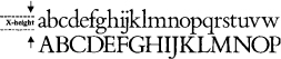
Figure 20 A line of Bembo lower case showing the x-height of the characters in relation to the ascenders and descenders – in this type their length results in a type ‘small on its body’
In computerized setting the characters in any type can be stretched or squeezed to produce condensed or expanded forms at the stroke of a key, or even tilted to give italic. Yet the need for precise control over the typography of a page has resulted in newspapers programming their typesetting with shapes that correspond with fonts as designed by the typefounder which they use rather than risk a hotchpotch of variations. Only with awkward text problems as in the crossword clues (Figure 21) is the squeeze facility used. Another attribute of the computer is that it will deliver headline type tinted with a screen tint or reversed as white on black (or on colour).
Points to watch
![]() In designing pages, give the greatest number of headlines to the stock type in appropriate sizes. Too many variants can confuse the eye just as much as too many different types.
In designing pages, give the greatest number of headlines to the stock type in appropriate sizes. Too many variants can confuse the eye just as much as too many different types.
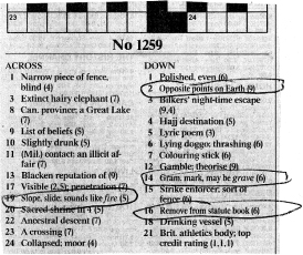
Figure 21 A space problem with these Times crossword clues has forced the subeditor to squeeze four of the lines to keep them within the measure.
![]() In introducing a different typeface into the pages for special effect, choose one opposed in shape and character – i.e. a light sans against a bold serif or a light serif against a bold sans. Two sort of sans or two sort of serif used together invariably clash.
In introducing a different typeface into the pages for special effect, choose one opposed in shape and character – i.e. a light sans against a bold serif or a light serif against a bold sans. Two sort of sans or two sort of serif used together invariably clash.
Typesizes
The main variation in type use is by size. Type which, as we have seen, can vary greatly in width, is measured for size by its height, using a 250-year-old system of points of which, as a guide, there are approximately 72 to the inch and 28 to the centimetre.
To simplify typesetting, typefounders in western and most other countries from the early 18th century designed type to a series of set point sizes which have long been accepted as the basis of print design. These traditionally had names such as minion (7pt), brevier (8pt), long primer (10pt) and pica (12 pt). Today they are simply referred to by their point sizes. The series runs: 5½, 6, 7, 8, 10, 12, 14, 18, 24, 30, 36, 42, 48, 60, 72, 84, 96, 120, 144
Sizes up to 14pt are used for reading text (see Figure 41 on page 76). Standard reading text, or body type, in most newspapers is in 7pt or 8pt, with the opening paragraphs set lOpt orl2pt or even 14pt in the case of the page one lead or splash story. While body type of up to 14pt is available in serif and sans ranges, serif is more commonly used on the well tested theory that, as with lower case headlines, it is easier to read as the eye travels across the contours of the letters.
From 14pt upwards are the headline sizes. Papers of more traditional appearance seldom go beyond 72pt for their splash story. Headlines of up to 120pt and more can be found on the front and back pages of the popular tabloids.
Choosing the right type sizes is important not only to give certain items prominence but, as we have seen, to give visual balance to the page. It is for this reason that the computer, although it can vary sizes by intervals of a quarter point right through the range, is programmed through command keys to deliver type in traditional print sizes. A facility remains to override the programmed size to get a wanted headline to fit but, to protect type balance, it is used sparingly to vary sizes by seldom more than 5 per cent.
Setting widths
As with the points system of typesizing, so with setting widths (measure) have old printing terms been retained in computerized systems. Page widths and column widths are calculated in Britain in ems, an em being the width of a standard roman 12pt lower case letter m, which is as wide as it is deep. An em is equivalent to a pica, which is the old name for type of 12pt size. In US practice, ems, in fact, are called picas. An 84-em page would be an 84-pica page, and a 9-em column a 9-pica column. In typesetting systems of American origin measures are commanded in picas and this is now the normal practice in this area in all systems. Since an em equals 12 points it is useful to remember that 6 ems equals approximately an inch (25 mm).
Ens, based on the width of the standard 12pt roman lower case n, are half the width of an em. They are used particularly to denote measures that are indented to give white space either in front or on both sides – i.e., indent ‘en each side’, or more commonly ‘nut each side’ or ‘nut front’, all of which setting is programmed on to keys
Newspapers usually have a standard number of columns. Most broadsheet pages have columns 9 or 9½ ems wide, and tabloid pages 8 or 8½ ems, although these can be varied, especially for features display. In scheming pages the column measure of text and headlines is nominated as well as the type size. In the case of standard single-column, two-column or three-column measures it is only necessary to nominate the measure in columns, which is programmed setting in the computer.
Any setting less or greater than single-column or its multiples is called bastard measure. A variety of bastard setting, such as around cut-out shapes (Figure 35 on page 65), can be easily achieved in modern systems by mouse controls. These days there are more and more automatic setting formats for given story boxes on pages so that the sub can concentrate on editing to fit rather than on arranging the setting.
Design workshop
Within the established format of a newspaper there exists a selection of typographical devices that can be used to give variety and emphasis to a page. Subs and page editors, as well as page designers, should familiarize themselves with them because of their use in the editing and page building stage.
Most papers give the first one or two words in capitals to signal the start of a story. Some, more particularly on features pages, make the first letter of the intro a 24pt or 30pt drop letter as a form of decoration. This can be set into the first paragraph, or it can line up on the first line and stand clear, making a stand-up drop. Where used, two-line or three-line drop letters are programmed on to a key as a setting format but drop letters of up to six lines are used (see Figure 22).
A subeditor might use selected bold or italic paragraphs (never both) within a story to give an eye-break or to highlight a point; they should be used sparingly (if allowed by style) to avoid bittiness.
Breakers
Crossheads, usually single lines of 12pt or 14pt to style, are used to help the eye cope with long texts and also prevent greyness in display. If set flush left they are called sideheads (or shoulders on some papers). In features display, crossheads can be more ornamental, often deriving from the main headline type being used. See Figures 23, 24 and 25.
Figure 22 Giving emphasis to lists: black blobs and squares are used to separate as well as emphasize these connected items. Bold caps in a roman context have similar function in the horoscope setting, bottom right
While crossheads are principally eye-breaks in the text, they should occur in natural breaks in the story and not interrupt the sequence. Full lines should be avoided since they cut off text from text and halt the eye. They should have at least 4pts of space above and below.
In some features display, and in magazines, words are dispensed with and breaks achieved by using a piece of ornamental print rule, or by dividing off sections by the use of selected stand-up drops (see examples in Chapters 11 and 12) with attendant white space. These can sometimes fall badly, or result in repeated use of the same letter. One way to locate eye-breaks tidily in a long features spread is to use quotes from the text in, say, three lines of 12pt, and locate them around the spread where they can usefully act as tasters to the story as in Figure 24.
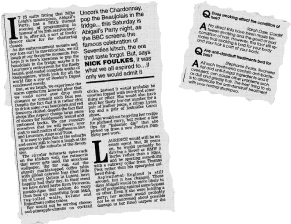
Figure 23 Six-line drop letters give style to the Daily Mail feature, left, as well as acting as eye-breakers in place of crossheads in a long text. Drop letters are used as guides for the reader in the Western Mail’s question-and-answer medical column above
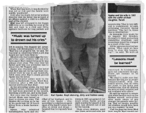
Figure 24 Another device used in place of crossheads to break up a long text: poignant quotes have been taken from this news feature and used between thick-and-thin rules as breakers. They are located in mid-paragraph to avoid halting the eye above the rule
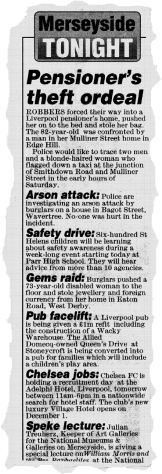
Figure 25 Run-on sideheads in 18pt italic are used under a stock logo to tabulate the items in this column of news brief from the Liverpool Echo. Note the text setting – set left, ragged right
Indicators
Initial words in bold caps are a useful way of introducing ‘news in brief paragraphs or items in commodity reports or market prices. These can be preceded by a black blob or open square, often included as standard ‘furniture’ in a type range (see examples in Figure 22). Stars, black or open, are useful on short showbiz items – but beware of using too many of these things on the same page.
Figures in lists can be set bold up a size – or even as drop figures – or reversed as white on black. By-lines and sign-offs can be give a special style, perhaps a simple lOpt Metro line on news stories and something more decorative (reflecting the writer’s eminence) on the features pages (see Chapter 11 and 12).
Headlines
Headlines can be delivered to the page as white on black, or type on tint or colour – a much used device on the popular tabloids when a page is thin on pictures and the display demands bold highlights. Underscores can give headlines extra boldness but are less used these days. They should break around the descenders on lower case headlines to avoid excessive white between underscore and type.
Special setting
While pages, particularly news, are generally schemed within their columnar format, setting widths can be varied for design purposes. A rectangular space clear of adverts can be divided into equal widths of bastard measure, as in Figure 51 on pages 198–9. ‘Colour’ can be give by setting a whole story in bold, sometimes inside a ruled panel to provide the page with a kicker. The computer enables time to be saved by being programmed to deliver setting formatted into panels of nominated size to fit page slots.
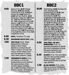
Figure 26 The use of white space and bold setting for times and titles is important in giving the reader easy-to-follow TV programme details
Fine rules normally divide item from item, but 2pt or 3pt rules can be used to enclose a spread of pictures or related items. Some papers have abolished dividing rules and rely on white space, a popular ploy in The Guardian (Figure 52 on page 201). White space remains an important element on features pages and, if used properly, can give designs of great elegance (see Chapters 11 and 12).
Special setting for such things as television programmes, race cards and football and election results needs devising and putting into the system with great care so that it is instantly readable despite the weight of information it has to carry (Figure 26). Abbreviations and the use of bold and roman, caps and lower case should be consistent and meaningful, and several dummy runs should be tried before settling for a style that is informative and at the same time easy on the eye and not too space-taking.
An advantage for the subeditor is that such setting can be formatted on to keys, thus cutting out laborious and time-consuming keying at the subbing stage. Agencies provide ready-formatted material of this sort for direct input into the system if called for.