
Creating a Basic Chart
LUCKY FOR US ALL, given how important charts can be to the effective use and distribution of our data, they’re really easy to create. They’re even easier in Excel 2010, where simply selecting the data to be charted and clicking a button for the type of chart you want—Column, Bar, Pie, Line, and so on—gives you an instant chart.
Choosing the Right Kind of Chart
Selecting the Right Source DataThe one tricky part of this very easy process is selecting the data to be charted. This is the point in the process with the largest margin for error, but you can eliminate that by understanding how charts work. Charts plot data points, which are grouped in logical data series, along a horizontal x or “category” axis, and a vertical y or “value” axis. Sales for a given city over the course of a year would be one series, with each of the month’s data being the data points. If you’re tracking multiple cities, as you will in the examples throughout this chapter, one quarter or month’s worth of data for all the cities would be another collection of data points, making yet another data series. Figure 11-1 shows the source data and the resulting Column chart, where six cities’ sales are plotted in the chart, on a quarterly basis. The quarters are in the chart’s legend, to help you identify the colored bars and interpret the chart. Figure 11-1. The selected data on the left winds up in a chart—with just a few clicks of the mouse.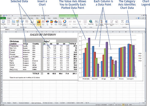
|
So inserting, or adding, a chart to your Excel worksheet is quite simple, but it does require a little preparation. First, you need to decide which data you want to plot in the chart, and at the same time—because it affects the amount of data you select—which kind of chart you want to create. You also want to decide if the chart will live on its own worksheet or be placed alongside the data from which it is created. You can always move a chart after you’ve created it (as I’ll discuss later in this chapter), so that’s not something you have to be completely sure of from the start.
Choosing the Right Kind of Chart
Although you’ll actually select the chart type after you’ve selected your data, it’s important to decide on the type of chart you’ll be creating before you make the selection. Excel gives you six main choices for chart types (all listed on the Insert menu, as shown in Figure 11-1), plus an Other Charts button, which gives you five more types to choose from. Your six main choices, however, are:
Column: As shown in Figure 11-2, you can create five different types of Column charts, ranging from 2D rectangular columns to 3D pyramid columns. Each of the five types has at least three subtypes, with individual columns for each data point or stacked columns, showing multiple data points per column. Your choice is both cosmetic—do you prefer the more modern 3D look, or do you want a simple, flat, 2D chart—and logical. The logical part of the decision rests on choosing between individual and stacked columns, and whether or not the columns are on one row or in multiple rows. If you strive for real simplicity, with little or no contemplation required of the person viewing the chart, go for individual columns in one row.
Figure 11-2. Choose the kind of Column chart you want to create.

Line: The Line chart button offers 2D and 3D lines, and allows you to choose whether or not each of the data points plotted over the course of each line is represented by a dot. Using dots makes the value of each point more obvious, but not using them allows for a more obvious, uncluttered trend to be depicted. If you don’t care exactly what the sales were in a particular month but you want it to be completely obvious that sales have been rising steadily, a 2D line with no dots will be your best choice.
Column, Line, and Bar Charts, Oh My!
Column, Line, and Bar charts are great for showing both trends and comparisons. If the columns in a chart, for example, show sales figures over the course of a year, the height of the columns not only shows what the sales were for each location, but because they appear in date order, they also show the sales trend over the 12 months. The columns, lines, and bars can also be compared, so that one can easily see that one location’s sales are higher or lower than another location’s sales. The other great feature of Column, Line, and Bar charts? They can show multiple data series in one chart (unlike Pies, as discussed shortly). So you can pack a lot of data into a still-easy-to-understand chart.
Pie: As shown in Figure 11-3, your Pie chart options include 2D and 3D variations, plus pies with an optional bar. You can also choose a pie with an exploded slice, which means a slice that’s pulled away from the pie for emphasis.
Figure 11-3. Compare your data in a simple or more complex Pie chart.

Don’t Mix Your Pies
Pie charts can show only one data series at a time. If you want to show sales for several locations for one quarter or one month, that’s one data series. If you want to look at a single location for the entire year, that’s another data series, and would be in a separate pie, not combined in one pie. Why? Because for a Pie chart to be effective, each slice needs to be a different color. If you’re charting the New York location’s sales for a whole year, you’d have 12 different-colored slices, and all would be clear. If you tried to show both New York and Los Angeles’ sales for a year, you’d have 24 slices, and need 24 different colors—and it would be impossible to simply compare, say, March sales for New York and Los Angeles, in such a complex pie.
Bar: Bar charts are the same as Column charts, except that the bars run horizontally, rather than vertically. Your choices here are the same as in the Column button menu, in terms of dimensions and shapes.
Area An Area chart combines the trend and comparison features of Column, Bar, and Line charts with the simple comparison features of a pie. As shown in Figure 11-4, your choices are between 2D and 3D Area charts that stack or appear in rows.
Figure 11-4. Area charts can be a useful variation on Column and Pie charts.

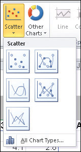
Scatter: Scatter charts are used to show frequency—the number of people who gave a particular response to a survey question, medical test results, anything that shows how often something happens over time or under specific circumstances. They’re a little more difficult for the viewer to interpret, so you’ll want to use them only when the viewers are familiar with the data and the information that the chart is meant to impart. Figure 11-5 shows your Scatter chart options, including lines connecting the scattered dots.
Figure 11-5. Study and survey data can be plotted to show frequency in a Scatter chart.
Other Charts Too
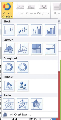
What about the Other Charts button? It offers five additional chart types for you to choose from—Stock, Surface, Doughnut, Bubble, and Radar. These are less commonly used chart types, but some of them, such as Doughnut and Surface charts, can be used in the same way as Pie, Line, and Area charts, respectively. Figure 11-6 shows the Other Charts menu, and the variations on each of the five chart types.
Figure 11-6. Specialized needs find a home in the Other Charts category.
Selecting Chart Data and Creating the Chart
So now that you know what kind of chart you need—one that shows comparisons, trends, or both, most likely—you can begin choosing the data that will be plotted in the chart. To do so, follow these step:
1. | Open the worksheet containing the data you want to chart. |
2. | Using your mouse and/or keyboard, select the cells containing the data you want to plot in the chart. You should include column and row headings, as shown in Figure 11-7, because this information will become part of the chart, populating the category axis and the legend. Figure 11-7. Select the headings and numeric data that you want to use in your chart.
|
3. | Click the Insert tab to display that ribbon. |
4. | Click the button for the type of chart you want—Column, Line, Pie, Bar, Area, Scatter, or one of the Other Charts—and make a selection from the drop-down menu. |
5. | Observe the resulting chart, shown in Figure 11-8, overlapping your data. Figure 11-8. The default location for the chart is rarely where you want it—it covers the data used to make it.
|
6. | As needed, drag the chart to an unpopulated section of the worksheet, so your data is not obscured. Figure 11-9 shows a chart in transit. Figure 11-9. Drag and drop your chart to a spot where it doesn’t cover up any data.
|
Tip
When moving your chart within the same worksheet, mouse over the border and keep an eye on your mouse pointer— when it turns to a four-headed arrow, you’re ready to drag the chart to a new location.
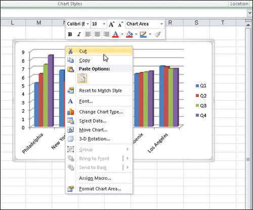
If you want to move your chart to its own sheet, it’s easy to do—you can hover over one of the chart’s borders, and when your mouse pointer turns to a four-headed arrow, right-click. From the resulting pop-up menu (shown in Figure 11-10), choose Cut. Then go to the worksheet where you want to place the chart, and right-click again, choosing Paste from the pop-up menu. Once the chart is in place, you can enlarge it even more, for greater visibility.
Figure 11-10. Cut and then paste your chart to a new worksheet—or an existing sheet with more room on it—to give your chart some real elbow room.
Tip
The Move Chart button (on the Design tab, within the Chart Tools section of the ribbon) opens a dialog box asking where you want to take your chart. Shown in Figure 11-11, you can choose New Sheet (which creates and names the new sheet for you) or choose an existing sheet from the Object In option. Make your choice and click OK—the chart is moved automatically, ready for formatting and enhancement, as needed.
Figure 11-11. Use the Move Chart dialog box to send your chart packing—to a new or existing sheet elsewhere in the open workbook.

Resizing Your Chart
Once your chart is where you want it (assuming you’ve got it in a worksheet with other content, not on its own sheet, where resizing is not needed), you can resize it easily—just point to any corner, and when your mouse turns to a two-headed arrow (as shown in Figure 11-12), press and hold the Shift key and drag. Drag outward to enlarge the chart, or inward to reduce its size. Why press the Shift key? To maintain your chart’s aspect ratio, or proportions. If you drag without pressing that key, you risk elongating or narrowing the chart. Although that’s okay to do—and sometimes you want to do just that— sometimes it distorts the chart’s content and size relative to other objects—the legend, titles, and so on.

Tip
If you elect to place your chart on a new sheet (in the Move Chart dialog box), it is automatically full size within that new sheet, and therefore cannot be resized. Although your mouse pointer will turn to a two-headed arrow when you point to a corner, you are not able to make the chart larger or smaller if it’s on its own sheet.