
C H A P T E R 10
Rich Drag-and-Drop Components
Being able to drag and drop items inside a browser is cool and becoming an important feature. RichFaces provides a set of features that enable you to drag and drop almost any JSF component. The available drag-and-drop components provide everything you need, so you won't have to deal with any JavaScript. Although drag-and-drop is happening on the client side, RichFaces allows binding drag-and-drop events to server-side listeners. Another thing to keep in mind is that drag-and-drop components are actually just functional components (similar to the Core tag library in JSF), so they don't provide a lot in terms of UI, only the functionality to drag-and-drop other components.
Using <rich:dragSource> and <rich:dropZone>
Enabling drag-and-drop in JSF pages using RichFaces can be done by only using two tags: <rich:dragSource> and <rich:dropTarget>. <rich:dragSource> is nested inside the component that you want to drag and <rich:dropTarget> is nested inside the component that should become the drop zone. Let's first cover some of the basic attributes and then run through an example.
As we mentioned, these drag and drop components are added as children to any components, and will encode all the necessary JavaScript to make the source draggable and the target a drop zone. Listing 10-1 shows an example of making the image component draggable.
Listing 10-1. An example of making the image component draggable
<h:graphicImage value="/images/nikon-dx3100.png" id="dragImage">

   <rich:dragSource/>

</h:graphicImage>
An image is rendered but it is also now draggable. Drag it with the mouse as you usually do with any desktop items. The result is shown in Figure 10-1.
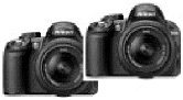
Figure 10-1. Dragged image
 Note Two examples of components in JSF that don't encode an id to the client unless you specify it explicitly are
 <h:outputText> and <h:graphicImage>. If you are adding drag-and-drop capability to such components and no id is present, drag-and-drop will not work. Adding drag-and-drop capability to component requires that the client id is present. So, a good practice is always to specify the id for a component.
So far nothing is happening after we release the element. The dragged image simply disappears from the screen; but that's what is supposed to happen. RichFaces drag-and-drop components do not provide client-side reordering of elements within a DOM tree or any sort of absolute position change. To process the drop of the component, we need to define a drop zone. Once a component is dropped into this zone, we can send an Ajax request in order to process the drop event. Basically, <rich:dropTarget> provides a way to attach a client-side listener for a drop operation that will send a standard Ajax request. Let's add <rich:dropTarget> to the page. Remember that both tags register listeners on parent components, so we will use <rich:panel> as a drop zone. Listing 10-2 shows the code.
Listing 10-2. Adding <rich:dropTarget> to the page
<h:form>

   <a4j:status startText="Processing drop event"/>

   <rich:panel id="dropZone" header="Drop Here">

      <rich:dropTarget/>

   </rich:panel>

</h:form>
The result shown in Figure 10-2.

Figure 10-2. <rich:panel> as a drop zone
As you see we also added <a4j:status> to show the Ajax request status. However, after we drag the image and drop it into the panel, we still don't see status component activation. So the request is not being sent. We are still missing one thing to make it work.
You can attach the drag component to any component and also attach the drop component to any component. It's required to declare which drag sources correspond to which drop zones. In other words, you need to define that items of type A, for example, can be dropped into only one particular drop zone and not any other.
To make this work, we need to define a type attribute on the <rich:dragSource> component. It should be any string identifier that will be used to attach it to the drop target. Then we should define an acceptedTypes attribute for <rich:dropTarget>. It should be set to all accepted drag sources. You can use a comma or a space to separate string values or bind the attribute to a bean property that holds Set or List of types.
Listing 10-3 shows the code with all the updates.
Listing 10-3. Shows the updated code
<h:graphicImage value="/images/nikon-dx3100.png" id="dragImage">

   <rich:dragSource type="img"/>

</h:graphicImage>

<a4j:status startText="Processing drop event" />

<h:form>

   <rich:panel id="dropZone" header="Drop Here">

      <rich:dropTarget acceptedTypes="img"/>

   </rich:panel>

</h:form>
Finally, after dropping the image into the panel, the Ajax request status should be shown as illustrated in Figure 10-3.
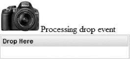
Figure 10-3. Ajax request sent after drop event
In this example we set the drag source type (type="img") and then defined acceptedTypes="img" to make sure that only the component of that type can be dropped into this drop zone. If you have a drop zone that should accept any types of draggable components, then, instead of listing each accepted type, we could set the drop zone to accept any type, such as the following:
acceptedTypes="@all"
Even though any component can now be dropped into this drop zone, we still need to define the drag source type for every <rich:dragSource> component.
Invoking Server-side Listener on Drop
Things are looking good—we can drag-and-drop components—but we are still missing something. The missing part is the ability to invoke server-side listeners when a drop occurs, in order to add some business logic to those operations.
To add a server-side listener, we define the dropListener attribute for <rich:dropTarget> with a method expression to the listener inside the bean. The listener method signature is as follows:
public void listenerName(org.richfaces.event.DropEvent event)
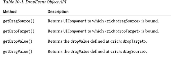
We will touch on DropEvent and the information it exposes in listener code shortly, but for now let's cover two more attributes that should be used to handle a drop operation on the server side and which are related to the DropEvent. dragValue defined on <rich:dragSource> and dropValue defined on <rich:dropTarget> are used in order to pass additional information to the listener.
Now let's review DropEvent closer. Table 10-1 lists methods available on the DropEvent object.
Note It's also possible to use <f:param> or <a4j:param> tags to pass parameters to <rich:dropTarget> as we do for JSF links, buttons, or any other action component. However, because <rich:dragSource> is not an action component, it will not process the additional parameters.
Shopping Cart Example
Let's create an example that consists of a list of products and a shopping cart. Moving products into the cart will be implemented using drag and drop. Listing 10-4 shows the Product object.
Listing 10-4. Shows the Product object
public class Product {


   private static final String IMAGES_EXT = ".jpg";

   private static final String IMAGES_DIR = "/images/";

   private String title;

   private String description;

   private String img;


   public Product(String title, String description, String img) {

      super();

      this.title = title;

      this.description = description;

      this.img = img;

   }


   public String getIconURI() {

      return IMAGES_DIR + this.img +  IMAGES_EXT;

   }

   // Getters and setters

}
The Product object provides three properties—name, description, and icon—all used to represent it in the list.
Listing 10-5 shows a bean that initializes a collection of products.
Listing 10-5. Shows a bean that initializes a collection of products
@ManagedBean

@RequestScoped

public class ShoppingCartBean {

   public List<Product> items;

   public List<Product> cartItems;


   public String getProductsCountString() {

      return cartItems.size() + " products in cart";

   }

   public ShoppingCartBean() {

      items = new ArrayList<Product>();

      cartItems = new ArrayList<Product>();

      items.add(new Product("Nikon D3100",

         "14.2MP Digital SLR Camera with 18-55mm f/3.5-5.6 AF-S DX VR Nikkor
            Zoom Lens", "nikon-d3100"));

      items.add(new Product("Canon Rebel XS",

         "10.1MP Digital SLR Camera with EF-S 18-55mm f/3.5-5.6 IS Lens
            (Black)", "canon-xs"));

         //More items initialization code

    }

    //Getters and setters

}
Not much to explain here. We create shopping items and place them in a list.
Now, let's create the page that will display a list of items and add drag-and-drop to it. Listing 10-6 shows the initial page code.
Listing 10-6. Shows the initial page code
<h:form>

   <h:panelGrid columns="2" id="panel">

      <rich:panel header="Products" style="width:300px">

         <rich:dataGrid value="#{shoppingCartBean.items}" var="item">

            <rich:panel style="width:275px">

               <rich:dragSource type="products" dragValue="#{item}" />

                  <h:panelGrid columns="2">

                     <h:graphicImage value="#{item.iconURI}" />

                        <fieldset>

                        <legend><b>#{item.title}"</b></legend>

                        #{item.description}

                        </fieldset>

                  </h:panelGrid>

            </rich:panel>

         </rich:dataGrid>

      </rich:panel>

      <rich:panel header="Shopping Cart">

         <rich:dropTarget render="panel" acceptedTypes="products"
            dropListener="#{shoppingCartBean.processDrop}" />

         <h:panelGrid>

            <h:outputText value="#{shoppingCartBean.productsCountString}"

               rendered="#{not empty shoppingCartBean.cartItems}" />

            <h:graphicImage value="#{empty shoppingCartBean.cartItems ?

               '/images/empty_cart.png' :

               '/images/cart.png'}" />

            <h:link outcome="checkout" rendered="#{not empty

               shoppingCartBean.cartItems}">

               Checkout

            </h:link>

         </h:panelGrid>

      </rich:panel>

   </h:panelGrid>

</h:form>
Now let's review the code. We created two panels. The left panel will display a list of products using the <rich:dataGrid> component. Inside every cell, a panel is displayed with product details. We then add drag capability to the panel using <rich:dragSource>. The <rich:dragSource> component is defined with the products type and also defines the drag value (using dragValue attribute) as the current iteration object.
The right panel contains an icon of a shopping cart and will get updated when items are dropped into it. It will display an added products count, and the link to the checkout page will become enabled once an item is added to the cart. <rich:dropTarget> defines the entire panel as a drop zone and defines the same products as an accepted type.
Figure 10-4 shows how the page is rendered initially.
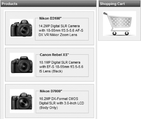
Figure 10-4. Products page with shopping cart
The only thing we are missing is the drop listener method implementation. So let's add it to the ShoppingCartBean class, as defined in Listing 10-7.
Listing 10-7. Adding the drop listener method to the ShoppingCartBean class
public void processDrop(DropEvent event) {

   Product dragValue = (Product)event.getDragValue();

   cartItems.add(dragValue);

   items.remove(dragValue);

}
Recall that we are passing the Product object exposed as an iteration variable and as a drag value (#{item}). Inside the listener, we are getting the object and adding it to the cartItems list, and then removing it from items list. Figure 10-5 shows the page after we drag-and-drop two items.
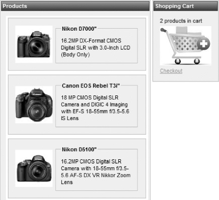
Figure 10-5. A few products were dropped into the shopping cart.
Looks pretty simple, doesn't it? And finally, to complete the example, let's navigate to the checkout page by using <h:link> with a checkout outcome. This means that we have the checkout.xhtml page in the same directory as the shopping page. Listing 10-8 shows the page.
Listing 10-8. Navigating to the checkout page by using <h:link> with a checkout outcome
<rich:dataTable value="#{shoppingCartBean.cartItems}" var="item">

   <f:facet name="header">Items for checkout</f:facet>

   <rich:column>#{item.title}</rich:column>

   <rich:column>#{item.description}</rich:column>

</rich:dataTable>
We use a table that is bound to the cartItems list in the ShoppingCartBean object. When we click on the checkout link in the cart, we should see the result shown in Figure 10-6.
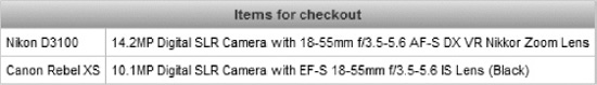
Figure 10-6. Checkout page
Two-way Drag-and-Drop Operations
Let's improve our example and ability to remove some items from the shopping cart and place them back in the products list. There is nothing complicated here; we will just need the same drag support on the target items (shopping cart) and define drop support on the source list (products list).
Let's review page changes in segments, starting with changes to the products size. Listing 10-9 shows the products panel modified.
Listing 10-9. Shows the modified products panel
<rich:panel header="Products" style="width:300px">

   <rich:dropTarget acceptedTypes="targetProducts"

      dropListener="#{shoppingCartBean.processRemove}" render="panel"/>

   <rich:dataGrid value="#{shoppingCartBean.items}" var="item">

      <rich:panel style="width:275px">

         <rich:dragSource type="products" dragValue="#{item}" />

         <h:panelGrid columns="2">

            <h:graphicImage value="#{item.iconURI}" />

            <fieldset>

               <legend><b>#{item.title}"</b></legend>

               #{item.description}

            </fieldset>

         </h:panelGrid>

      </rich:panel>

   </rich:dataGrid>

</rich:panel>
It's almost the same as before, but now we have added <rich:dropTarget> to the entire products panel, which accepts dragged elements of the targetProducts type and calls the processRemove() drop listener from the same ShoppingCartBean bean. Listing 10-10 shows the method code.
Listing 10-10. The method code
public void processRemove(DropEvent event) {

   Product dragValue = (Product)event.getDragValue();

   cartItems.remove(dragValue);

   items.add(dragValue);

}
Listing 10-11 shows the modified panel with shopping cart.
Listing 10-11. The modified panel with shopping cart
<rich:panel header="Shopping Cart">

   <h:panelGrid>

      <h:outputText value="#{shoppingCartBean.productsCountString}"

         rendered="#{not empty shoppingCartBean.cartItems}" />

      <h:graphicImage value="#{empty shoppingCartBean.cartItems ?
         '/images/empty_cart.png' : '/images/cart.png'}" />

      <h:link outcome="checkout" rendered="#{not empty

         shoppingCartBean.cartItems}">

         Checkout

      </h:link>

      <rich:dataGrid value="#{shoppingCartBean.cartItems}" var="item">

         <a4j:outputPanel layout="block">

            <rich:dragSource type="targetProducts" dragValue="#{item}" />

            <h:panelGrid columns="2">

               <h:graphicImage value="#{item.iconURI}" style="width:30px; height:30px;" />

               #{item.title}

            </h:panelGrid>

         </a4j:outputPanel>

      </rich:dataGrid>

   </h:panelGrid>

   <rich:dropTarget render="panel" acceptedTypes="products"

      dropListener="#{shoppingCartBean.processDrop}" />

</rich:panel>
There, we added a small list of items that appear below the cart. Every item was added with drag capability using <rich:dragSource> with targetProducts as the type and the current iteration object (#{item}) as the value. Now we are able to pass the items either way between the lists. Figure 10-7 shows the page when two items are added to the cart.
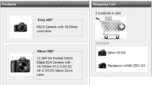
Figure 10-7. List in shopping cart allows you to return drag-and-drop items
Now you can take any item in the shopping cart, remove it from the shopping cart, and put it back into the products list via drag and drop.
Customizing the Drag Indicator
Figure 10-8 shows what you see when an item is dragged on the page using the default drag indicator.
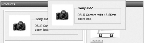
Figure 10-8. Dragged state default indication
By default, the drag indication element is achieved by cloning the DOM section that is being dragged.
Using the default is fine, but we would like to have the option to customize the object that's being dragged with some styling, for example, and other options.
Luckily, as with everything else in RichFaces, it's pretty easy to do. The RichFaces drag-and-drop feature adds a set of predefined CSS classes (the same as with UI-rich components) that are applied to the cloned indicator element in different states. Table 10-2 shows the style names and explains when they should be used.
Now it should be a pretty easy task to make the indicator change in different states in order to better notify the user about current action options. In Listing 10-12, let's add the CSS classes to our previous sample page.
Listing 10-12. Adding the CSS classes to our previous sample page
<style>

   .rf-ind-drag{

   }

   .rf-ind-acpt{

      border:3px solid green;

   }

   .rf-ind-rejt{

      border:3px solid red;

   }

</style>
Based on this styling, the indicator is defined to look as it is when just dragged. A green border is added when hovering over the drop zone that accepts this object. And, a red border is shown when hovering the components over a drop zone that doesn't accept this object type. So when we hover one of the items over the cart, we will see it updated with a green border, as shown in Figure 10-9.
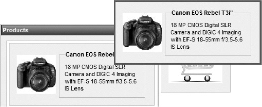
Figure 10-9. Drag indicator customized with green border in accept state
Being able to style in this way looks a lot more user-friendly.
The next section describes how to customize the drag indicator with custom content using a special <rich:dragIndicator> component.
Using <rich:dragIndicator>
<rich:dragIndicator> is a pretty simple component that allows you to define some custom static content that is shown under the mouse cursor when you perform a drag operation.
There are two things you need to know to start using this component. First, the content of indicator should be defined using any nested components. Second, the indicator itself should be attached to <rich:dragSource> using same named dragIndicator attribute on the <rich:dragSource> behavior with the indicator id specified.
So, let's proceed with an example. Using the cart sample, we will add the indicator anywhere on the page, as shown in Listing 10-13.
Listing 10-13. Adding the indicator anywhere on the page using the cart sample
<rich:dragIndicator id="indicator">

   <rich:panel>

      <h:outputText value="Drop product to cart" />

   </rich:panel>

</rich:dragIndicator>
Now you need only to point our drag behaviors to it using code as follows:
<rich:dragSource ... dragIndicator="indicator" />
When you drag any product, you will no longer see the panel. Instead, you will see a smaller panel with only the content defined. And, if we don't remove our style class definitions for rf-ind-drag and two other styles (drop accepted, drop not accepted), we should see the results shown in Figures 10-10 and 10-11.
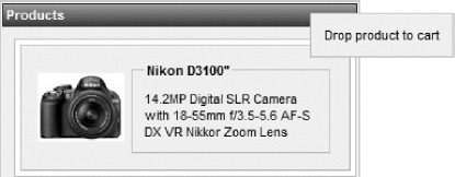
Figure 10-10. Panel with static indicator dragged
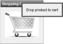
Figure 10-11. Panel with static indicator over the drop zone
Besides the rf-* classes, which are applied to all the indicators in the page, you can use <rich:dragIndicator> component attributes to define specific styles for that particular indicator. Those attributes are acceptClass, draggingClass, and rejectClass.
Note As of the writing of this book, there are no options to redefine markup for different indicator states, only the option of restyling it using CSS. In other words, if you need to show a different icon to indicate the reject or accept state inside the indicator, it can be done—but only by using CSS selectors (to hide and show some elements in some states) or by using background images defined in CSS classes. The option to redefine markup could be added in a future release, so check the JBoss Community RichFaces page at www.jboss.org/richfaces often for new updates.
Using Drag-and-Drop with Tree Components
Drag-and-drop with tree components might sound complicated; however, once you finish this section, you will see that it's actually not that difficult. All we are doing is combining knowledge from Chapter 9 with knowledge from this chapter. We will implement moving the leaf nodes between different parent nodes. Although this is a basic example, you should be able to extend it to any more complicated case.
Let's create a simple tree model, as we did in Chapter 9. Listing 10-14 shows the code for Swing's TreeNode implementation, which will be used to create a tree model.
Listing 10-14. Shows the code for the Swing's TreeNode implementation
public class FileSystemNode extends org.richfaces.model.SwingTreeNodeImpl<Object> {

   private String label;


   public FileSystemNode(String label) {

      super();

      this.label = label;

   }


   public String getNodeType() {

      return isLeaf() ? "leaf" : "node";

   }

}
Note We use the SwingTreeNodeImpl default implementation class from richfaces-api as it is more convenient for that specific sample because it already provides the getParent() method implemented. We will use that method to perform moving between nodes more easily. org.richfaces.TreeNodeImpl doesn't have such a method and we would have to add it if we wanted to switch to that implementation.
It's as simple as possible. It will store either the file or directory name and will return two string types, leaf and node, according to the isLeaf() method. Later, we will use a different type of node on the page.
Now, let's look at the bean that initializes the model in Listing 10-15.
Listing 10-15. The bean that initializes the model
@ManagedBean

@SessionScoped

public class TreeDnDBean {


   private List<SwingTreeNodeImpl<Object>> nodes;


   public TreeDnDBean() {

      nodes = new ArrayList<SwingTreeNodeImpl<Object>>();

      for (Integer i = 1; i < 5; i++) {

         FileSystemNode rootNode = new FileSystemNode("folder " + i);

         for (Integer j = 1; j <= 5; j++) {

            FileSystemNode leafNode =

               new FileSystemNode("pic" + i + "." + j + ".jpg");

            rootNode.addChild(leafNode);

         }

         nodes.add(rootNode);

      }

   }

   public List<SwingTreeNodeImpl<Object>> getNodes() {

      return nodes;

   }

}
This bean creates a set of “folder” nodes and adds numerous “pic” leaf nodes inside. We already know how to create tree models using SwingTreeNodeImpl and other options, thus let's just jump to the JSF page, shown in Listing 10-16.
Listing 10-16. The JSF page
<h:form>

   <rich:tree value="#{treeDnDBean.nodes}" nodeType="#{node.nodeType}" var="node"

      id=" tree" toggleType="client">

      <rich:treeNode type="leaf">

         <h:outputText value="#{node.label}" />

      </rich:treeNode>

      <rich:treeNode type="node">

         <h:outputText value="#{node.label}" />

      </rich:treeNode>

   </rich:tree>

</h:form>
Note that we are using two <rich:treeNode> tags on the page, with the same content in them. Why did we do that? We are going to implement drag-and-drop of leafs between different nodes. The simplest way to achieve this is to define leafs as draggable and nodes as drop zones. An easy way to do it is to have different placeholders for the drag-and-drop behaviors. In a more complicated case where you might need to support moving folders, you would need to have folders as drag sources and as drop zones at the same time, plus be able to handle a restriction such as not being able to drop the node on itself.
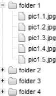
Now let's see the result of the page rendered. We should check that our tree was created successfully before proceeding with adding drag-and-drop functionality. The correct tree is shown in Figure 10-12.
Now we are ready to add drag-and-drop to the tree. The updated page is shown in Listing 10-17 and followed by an explanation of what we did.
Listing 10-17. Adding drag-and-drop to the tree
<style>

   .rf-ind-acpt {

      border: 2px solid green;

   }

</style>

<h:form>

   <rich:tree value="#{treeDnDBean.rootNode}" nodeType="#{node.type}" var="node"

      toggleType="client" id="tree">

      <rich:treeNode type="node">

         <a4j:outputPanel>

            <rich:dropTarget acceptedTypes="file" render="tree" execute="tree"

               dropListener="#{treeDnDBean.moveFile}" dropValue="#{node}" />

            <h:outputText value="#{node.label}" />

         </a4j:outputPanel>

      </rich:treeNode>

      <rich:treeNode type="leaf">

         <a4j:outputPanel>

            <rich:dragSource type="file" dragValue="#{node}" />

            <h:outputText value="#{node.label}" />

         </a4j:outputPanel>

      </rich:treeNode>

   </rich:tree>

</h:form>
Leafs are marked as draggable using <rich:dragSupport> and nodes became drop zones using <rich:dropTarget>. We pointed value attributes (dragValue, dropValue) of both components to the #{node} iteration variable, so we will get corresponding node objects inside listeners.
<rich:dropTarget> performs a complete tree re-render in order to update the markup after the nodes movement. We set the execute attribute to the tree itself to save its state during submission. (Nodes toggling occurs on the client according to the toggleType attribute, so by default, we will lose the state.)
Ideally you may want to use partial rendering of the updated nodes. But that just out of scope for this sample and will make the code more complicated. We want to concentrate on drag-and-drop functionality instead. Partial rendering using the @rows() function described in iteration components chapter can also work for trees.
Note We wrapped the content of the draggable node with an additional <a4j:outputPanel> because the drag indicator created by default is just a clone of the dragged element, and we wouldn't want a nested tree structure together with the selection and connecting lines (in the case of a draggable node with child nodes) to be cloned. In the current markup, only a <span> with a text label will be moved when dragged. The same goes for a drop zone node. We want just the node without its child components to become drop target.
The last step is to create the drop listener method that will actually perform movement of the leaf node from one parent to another. Let's look at the code in Listing 10-18.
Listing 10-18. Creating the drop listener method
public void moveFile(DropEvent event) {

   FileSystemNode draggedNode = (FileSystemNode) event.getDragValue();

   FileSystemNode droppedNode = (FileSystemNode) event.getDropValue();

    ((FileSystemNode) draggedNode.getParent()).removeChild(draggedNode);

   droppedNode.addChild(draggedNode);

}
As you can see in the code, DropEvent provides two values: the drag value and drop value. As we are passing complete node objects (referencing it using tree iteration var) in the value attribute, we are getting those objects in the listener. Next, we remove the node that we dragged from its parent and add it to the node to which it was dropped. Figure 10-13 shows the tree after two files from “folder 1” get dropped into “folder 2.”
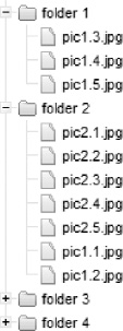
Figure 10-13. Nodes from one folder moved via drag-and-drop to another
As you can see, drag-and-drop with trees is not that complicated. We are defining some node components to be draggable and some node components to act as a drop zone. The only difference is that we are now working with tree nodes and leafs; other than that, all the concepts are the same.
Dragging and Dropping Within Tables
Using drag-and-drop within tables is not difficult (it's actually even easier than dragging and dropping within a tree), we will give you a few pointers in this short section.
As we already know, drag and drop is always added to parent component. This means that drag and drop can either be added to the table itself or a column inside the table, but not to a row. That is, if we add <rich:dragSupport> as an immediate child of table, the entire table will be draggable—probably not what we need. If we add <rich:dragSupport> to a <rich:column>, we will be able to drag only that single column; other columns will not be draggable.
If you want to achieve “row dragging” functionality, the solution is to embed a drag support component within every column of the table. Basically, we get the functionality of the entire row with drag support when we add drag support to each column.
It's also a good idea to create a good drag indicator, so that you don't just drag the current column content (the default drag indicator is the same content that's being dragged). With the custom indicator, no matter which column is actually selected when dragged, the indicator will show the same information and it will appear as only the row is being dragged.
Note Functionality to enable native drag-and-drop support for iteration components is planned in the future. For example, a feature such as row context that can be dragged and dropped might be added. Check the JBoss Community RichFaces page at www.jboss.org/richfaces for updates.
Summary
In this chapter we showed you that adding drag-and-drop capability to your JSF application is very simple with RichFaces. To be able to drag any component on the page, we add the <rich:dragSource> behavior. To make any are on the page to act as a drop zone, we add a <rich:dragTarget> behavior. Although drag-and-drop is happening on the client side, to communicate the drag-and-drop action to the server, we use the standard listener approach. In addition, RichFaces provides options to enforce which items can be dropped into which particular drop zones, as well as the ability to customize the drag indicator. Finally, we showed you how to add drag-and-drop functionality to trees and provided tips on how to achieve drag-and-drop within tables.