
C H A P T E R 8
Rich Menu Components
In this chapter, you’ll explore the various menu components available in RichFaces. First we’ll first cover toolbar and drop-down menu components, and then we’ll show you a panel menu component. The context menu unfortunately was not included into the RichFaces 4.0 final release, but will definitely be added in one of the first 4.x updates.
 Note Component images in this chapter use a slightly customized blueSky skin with a larger general font size. If you want to use it, create a new skin and overwrite the font size as follows:
baseSkin=blueSky

generalSizeFont=12px
If you are not sure how to use this custom skin, Chapter 13 covers skins in detail.
Using <rich:toolbar>
<rich:toolbar> creates a horizontal bar that can hold any other JSF component, including any action components.
You can easily use <rich:toolbar> in conjunction with <rich:panel>, where the panel holds some information associated with a link in the toolbar. Figure 8-1 shows how it looks.
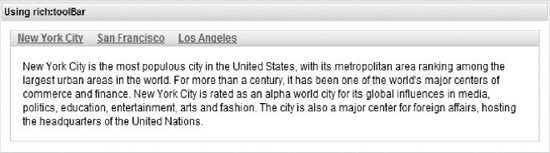
Figure 8-1. Simple toolbar
The code is shown in Listing 8-1.
Listing 8-1. Simple toolbar code
<h:form>

   <rich:toolbar>

      <a4j:commandLink id="nyc" value="New York City" actionListener=

"#{toolbarBean.cityListener}" />

      <a4j:commandLink id="sf" value="San Francisco" actionListener=

"#{toolbarBean.cityListener}" />

      <a4j:commandLink id="la" value="Los Angeles" actionListener=

"#{toolbarBean.cityListener}" />

   </rich:toolbar>

</h:form>

<rich:panel>

   <a4j:outputPanel ajaxRendered="true">

      <h:panelGrid rendered="#{toolbarBean.nyc}">

         New York City is the most populous city in the United States, with its metropolitan

            area ranking among the largest urban areas in the world. For more than a century,

            it has been one of the world's major centers of commerce and finance. New York

            City is rated as an alpha world city for its global influences in media, politics,

            education,  entertainment, arts and fashion. The city is also a major center for

            foreign affairs, hosting the headquarters of the United Nations.

      </h:panelGrid>

      <h:panelGrid rendered="#{toolbarBean.sf}">

         San Francisco is the fourth most populous city in California and the 14th most

            populous city in the United States. San Francisco is a popular international

            tourist destination renowned for its steep rolling hills, an eclectic mix of

            Victorian and modern architecture, and famous landmarks, including the Golden

            Gate Bridge, Alcatraz Island, the cable cars, Coit Tower, and Chinatown.

      </h:panelGrid>

      <h:panelGrid rendered="#{toolbarBean.la}">

         Los Angeles is the largest city in the state of California and the second-largest

            in the United States. Los Angeles is one of the world's centers of culture,

            technology, media, business, and international trade.

      </h:panelGrid>

   </a4j:outputPanel>

</rich:panel>
Two attributes, width and height, are available on components in order to allow simple definitions for those basic properties without using CSS. We will use height across all the examples and width will be set to 100% by default. Besides the attributes usage, you could define the same sizes using Skins CSS (rf-tb class) in order not to repeat the definition for all the toolbars. Skins will be described in later chapter, but for now just keep in mind that you may use CSS instead of the sizes attributes used there.
In this example, the toolbar contains three command links, but keep in mind that any JSF component can be placed inside the toolbar. The links simply change the rendered panel content, and after <a4j:outputPanel> get automatically updated (because of ajaxRendered=true) and corresponding description is rendered. In order for the example to be complete, see the bean code in Listing 8-2.
@ManagedBean

@ViewScoped

public class ToolbarBean implements Serializable {

   private boolean nyc = true;

   private boolean sf = false;

   private boolean la = false;


   public void cityListener(ActionEvent event){

      if (event.getComponent().getId().equals("nyc")) nyc = true; else nyc = false;

      if (event.getComponent().getId().equals("sf")) sf = true; else sf = false;

      if (event.getComponent().getId().equals("la")) la = true; else la = false;

   }

   // Getters and setters

}
It’s also possible to specify a separator between items (components) on the toolbar. Four built-in separators are available: none, line, square, and disc. We set the toolbar to use the line separator using the following:
<rich:toolbar height="24px" itemSeparator="line">
The result shown in Figure 8-2.
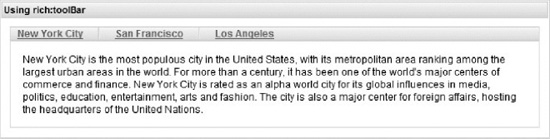
Figure 8-2. Toolbar with items separator
You could also use a custom separator image. Let’s say we slightly modify the declaration again to the following:
<rich:toolbar itemSeparator="/img/ico.gif">
We see our corresponding custom icon applied instead of the line ones from the Figure 8-2.
It’s also possible to place a custom separator by creating a facet named itemSeparator. An example shown in Listing 8-3.
Listing 8-3. Placing a custom separator
<rich:toolbar height="24px">

   <f:facet name="itemSeparator">

      <h:outputText value="|"/>

   </f:facet>

   ...

<rich:toolbar>
The result is shown in Figure 8-3.
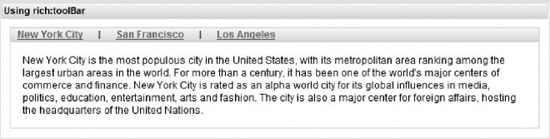
Figure 8-3. Toolbar with custom items separator
You can place any components inside a facet. Just remember that a facet can hold only one child. If you need to place more than one component inside, use <h:panelGroup> to wrap them (JSF limitation).
It is also possible to group items on the toolbar when needed. Suppose you want to group together cities on the West Coast, as it’s done in Listing 8-4.
Listing 8-4. Grouping together cities on the West Coast
<h:form>

   <rich:toolbar itemSeparator="disc" height="24px">

      <a4j:commandLink id="nyc" value="New York City" actionListener=

         "#{toolBarBean.cityListener}" />

      <rich:toolbarGroup itemSeparator="square" location="right">

         <a4j:commandLink id="sf" value="San Francisco" actionListener=

            "#{toolBarBean.cityListener}" />

         <a4j:commandLink id="la" value="Los Angeles" actionListener=

            "#{toolBarBean.cityListener}" />

      </rich:toolbarGroup>

   </rich:toolbar>

<h:form>

<!-- content panels -->
When grouping, you can specify a different itemSeparator for the group, as well as the location of the group. In the previous example, the group is placed to the right, which produces the result shown in Figure 8-4.
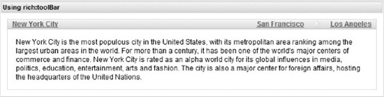
Figure 8-4. Toolbar with the group aligned to the right
You could define any number of left and right aligned groups within the toolbar and they will be aligned according to the order of definition on the page.
You can as easily place any JSF component inside the toolbar. For example, Listing 8-5 shows how to use images inside.
Listing 8-5. Placing any JSF component inside the toolbar
<rich:panel>

   <rich:toolbar itemSeparator="line" height="24px">

      <h:graphicImage value="/images/states/flag_california.gif" width="24" height="21"/>

       <h:graphicImage value="/images/states/flag_newyork.gif" width="24" height="21"/>

       <h:graphicImage value="/images/states/flag_florida.gif" width="24" height="21"/>

       <h:graphicImage value="/images/states/flag_massachusetts.gif" width="24" height="21"/>

   </rich:toolbar>

</rich:panel>
This result produced is shown in Figure 8-5.
Figure 8-5. Toolbar with images
Of course in order for the toolbar to become useful, we need to wrap the images with links or add some click-handling behaviors.
Let’s create a more interesting usage sample. You already know about the <rich:popupPanel> component from Chapter 6. Let’s attach it to <rich:toolbar> and have it activated on a corresponding link click. Let’s take a look at it in Listing 8-6.
Listing 8-6. Attaching <rich:popupPanel> to <rich:toolbar>
<rich:toolbar height="24px">

   <h:outputLink value="#" id="ll">

      <rich:componentControl event="click" operation="show" target="loginPane">

         <a4j:param name="event" value="event" noEscape="true" />

         <rich:hashParam>

            <a4j:param noEscape="true" name="top"

               value="jQuery(#{rich:element('ll')}.parentNode).offset().top +

               jQuery(#{rich:element('ll')}.parentNode).height()" />

            <a4j:param noEscape="true" name="left"

               value="jQuery(#{rich:element('ll')}.parentNode).offset().left" />

         </rich:hashParam>

      </rich:componentControl>

      Account

   </h:outputLink>

</rich:toolbar>

<rich:messages/>

<rich:popupPanel id="loginPane"  modal="false" autosized="true">

   <h:form>

      <h:panelGrid columns="2">

         Name:

         <h:inputText value="#{userBean.userName}" />

         Password:
         <h:inputSecret value="#{userBean.password}" />

      </h:panelGrid>

      <h:commandButton value="Login"

             onclick="#{rich:component('loginPane')}.hide();" action="#{userBean.login}"/>

   </h:form>

</rich:popupPanel>
This allows you to attach a popup component (<rich:popupPanel>) to the <rich:toolbar> control, as shown in Figure 8-6.
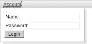
Figure 8-6. Toolbar with attached popup panel
We used the <rich:popupPanel> Java Script API and passed position coordinates dynamically from JavaScript.
Note <rich:hashParam> is described in detail in Chapter 12. All you need to understand in this example is that it groups the nested parameters to JavaScript hash (similar to Java hash map). It's used because the <rich:popupPanel> show() API method accepts two parameters, event and hash map, with named options (we passed left and top position there).
The UserBean code is shown in Listing 8-7.
Listing 8-7. UserBean code
@ManagedBean

@SessionScoped

public class UserBean {


   private String userName;

   private String password;


   public void login() {

      FacesContext.getCurrentInstance().addMessage(null,

         new FacesMessage(FacesMessage.SEVERITY_INFO, userName + " logged!", userName +

            " logged!"));

   }

  //Getters and setters

}
When the button is clicked, a login() action will be executed and a message about a successful login will appear below the toolbar.
That’s it for the <rich:toolbar> component. We will continue using it when we cover the <rich:dropDownMenu> component in the next section.
Using <rich:dropDownMenu>
<rich:dropDownMenu> produces a drop-down menu, as shown in Figure 8-7.
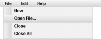
Figure 8-7. Simple drop-down menu
Every menu item can be associated with a particular action or action listener to be invoked via a standard POST request with a full page update or via Ajax. All the standard Ajax concepts apply here as well, such as render, execute, and other Ajax options.
The code to create this menu is shown in Listing 8-8.
Listing 8-8. The code to create the simple drop-down menu
<h:form>

   <rich:toolbar>

      <rich:dropDownMenu mode="ajax" label ="File">

         <rich:menuItem label="New" />

         <rich:menuItem label="Open File..." />

         <rich:menuItem label="Close" />

         <rich:menuItem label="Close All" />

      </rich:dropDownMenu>

      <rich:dropDownMenu mode="ajax" >

         <f:facet name="label">

            <h:outputText value="Edit" />

         </f:facet>

         <rich:menuItem label="Undo" />

      </rich:dropDownMenu>

      <rich:dropDownMenu mode="ajax" >

         <f:facet name="label">

            <h:outputText value="Help" />

         </f:facet>

         <rich:menuItem label="About" />

      </rich:dropDownMenu>

   </rich:toolbar>

</h:form>
<rich:toolbar> is the container component, which we have covered before. Inside, you place one or more <rich:dropDownMenu> components. You use the label facet or attribute to define the top menu label. From there, you use <rich:menuItem> to create each menu item. That’s pretty simple.
Note You are not required to use <rich:toolbar> as a drop-down menu parent. You may choose any other wrapper component or even create your own instead.
Notice that the mode attribute is set to ajax. It has three possible values: ajax, server, and client. client means no request will be sent to the server. In such case you should handle click events on your own using some custom JavaScript handler methods, behaviors or by attaching <a4j:ajax>, for example. You can also set the mode attribute on a particular <rich:menuItem>, which will override the mode on the parent <rich:dropDownMenu> component.
You want to make each menu actually do something. We’ll show you how to add an action listener for each menu. Just to demonstrate that a listener is actually called, you can display the menu name selected each time.
The changes are rather minor. You’ll add an action listener to each menu item. This means you will need to create a managed bean first, so let’s start with the code in Listing 8-9.
Listing 8-9. Creating a managed bean
@ManagedBean

@RequestScoped

public class DropDownBean {


   private String menuSelected;


   public String getMenuSelected() {

      return menuSelected;

   }

   public void listenerNew(ActionEvent event) {

      menuSelected = "New";

   }

   public void listenerOpenFile(ActionEvent event) {

      menuSelected = "Open File...";

   }

   public void listenerClose(ActionEvent event) {

      menuSelected = "Close";

   }

   public void listenerCloseAll(ActionEvent event) {

      menuSelected = "Close All";

   }

   public void listenerUndo(ActionEvent event) {

      menuSelected = "Undo";

   }

}
With the code in Listing 8-9, you have defined a listener for each menu item and also created a property to display the selected menu item that you’ll display on a page. Let’s see what changes are needed on the JSF page. The changes are shown in Listing 8-10.
<h:form>

   <h:panelGrid columns="2">

      <rich:toolbar width="150px">

         <rich:dropDownMenu mode="ajax" label="File">

            <rich:menuItem label="New" actionListener="#{dropDownBean.listenerNew}"

               render="menu" />

            <rich:menuItem label="Open File..." actionListener="#{dropDownBean.listener

               OpenFile}"

               render="menu" />

            <rich:menuItem label="Close" actionListener="#{dropDownBean.listenerClose}"

               render="menu" />

            <rich:menuItem label="Close All" actionListener="#{dropDownBean.listenerCloseAll}"

               render="menu" />

         </rich:dropDownMenu>

         <rich:dropDownMenu label="Edit" mode="ajax">

            <rich:menuItem label="Undo" actionListener="#{dropDownBean.listenerUndo}"

               render="menu" />

         </rich:dropDownMenu>

         <rich:dropDownMenu label="Help">

            <rich:menuItem mode="ajax" label="About" />

         </rich:dropDownMenu>

      </rich:toolbar>

      <h:panelGroup id="menu">

         <h:outputText value="#{dropDownBean.menuSelected}" />

      </h:panelGroup>

   </h:panelGrid>

</h:form>
Every menu item has an action listener associated with it, and the menuSelected property is updated on selection to show what was selected. That’s it!
Figure 8-8 shows what the page would look like after Edit  Undo were selected. Now select File Open File, also as shown in Figure 8-8.

Figure 8-8. Label updated after Undo item selected
“Open File. . .” is now displayed on the right side of the menu, as shown in Figure 8-9.
Figure 8-9. Label updated after Open File item selected
Note In Listing 8-10, we used a different action listener for each menu item. We could also have used just one action listener for each menu, such as actionListener="#{dropDownBean.select}". In this case we would need to use ActionEvent passed to the listener to determine which component activated. It's also possible to use action to invoke a method on the server. action can also be used for navigation.
You have left the About menu item in the Help menu without any action. Let’s use what we have already covered and use client mode to open a modal popup when Help About is selected.
First, you need to create the popup panel, as done in Listing 8-11.
Listing 8-11. Creating a popup panel
<rich:popupPanel id="about">

   <f:facet name="header">

      <h:panelGroup>

         <h:graphicImage value="/images/icons/yellow_lamp.gif" />

         <h:outputText value="About" />

      </h:panelGroup>

   </f:facet>

   <h:panelGrid>

      <h:outputText value="About text goes here" />

      <a href="#" onclick="#{rich:component('about')}.hide();return false">OK </a>

   </h:panelGrid>

</rich:popupPanel>
Next, you need to open the menu when Help About is selected. That’s pretty simple to do. Just change the About menu item declaration to the next, as follows:
<rich:menuItem mode="client" label="About" onclick="#{rich:component('about')}.show();" />
#{rich:component('about')}.show() is used to show the popup. Running the application will produce what you see in Figure 8-10 when Help About is selected.
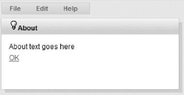
Figure 8-10. Popup opened on menu-item click
Now let’s add some icons to our menu items. <rich:menuItem> provides icon and iconDisabled attribute for that purpose. A simple usage is shown in Listing 8-12.
Listing 8-12. Adding icons to the menu items
<rich:toolbar width="150px">

   <rich:dropDownMenu mode="ajax" label="File">

      <rich:menuItem label="New" icon="/images/icons/new.gif" />

      <rich:menuItem label="Open File..." icon="/images/icons/open.gif" />

      <rich:menuItem label="Save" icon="/images/icons/save.gif" />

      <rich:menuItem label="Save All" icon="/images/icons/save_all.gif" />

   </rich:dropDownMenu>

</rich:toolbar>
The result is shown in Figure 8-11.
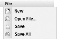
Figure 8-11. Menu items with icons
Using <rich:menuGroup> and <rich:menuSeparator>
There are two more components available for rich menu creation: <rich:menuGroup> and <rich:menuSeparator>.
<rich:menuGroup> allows you to define a sub-menu and <rich:separator> allows you to add a horizontal line separator between two items. Note that menu groups could be nested as needed. Using these components, you will be able to create menus of any depth and complexity. Let’s look at the example in Figure 8-12.
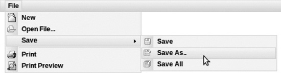
Figure 8-12. Complex menu with nested sub-menus and items separators
The code for this menu creation is shown in Listing 8-13.
Listing 8-13. Code for creating complex menu
<rich:toolbar>

   <rich:dropDownMenu mode="ajax" label="File">

      <rich:menuItem label="New" icon="/images/icons/new.gif" />

      <rich:menuItem label="Open File..." icon="/images/icons/open.gif" />

      <rich:menuGroup label="Save">

         <rich:menuItem label="Save" icon="/images/icons/save.gif" />

         <rich:menuItem label="Save As.." icon="/images/icons/save_as.gif" />

         <rich:menuItem label="Save All" icon="/images/icons/save_all.gif" />

      </rich:menuGroup>

      <rich:menuSeparator />

      <rich:menuItem label="Print" icon="/images/icons/print.gif"/>

      <rich:menuItem label="Print Preview" icon="/images/icons/print_preview.gif"/>

   </rich:dropDownMenu>

</rich:toolbar>
Using <rich:menuItem> as a Standalone Component
<rich:menuItem> is not only used to construct the menu items for <rich:dropDownMenu>, but can also be used as a standalone component. You are probably wondering when and why you would use it.
Let’s say you are using a toolbar, but in addition to menus you also want to place other items, such as About link—which is just a top level link, without menu popups. In such case you can place a link inside the toolbar as we showed in the <rich:toolbar> section. But, at the same time, you want it to look consistent with other items in the menu. So, you would have to add styling and hover CSS selectors. You would also need to add an icon and align it with the link. That’s probably a better job for a composite component. Going back to <rich:menuItem>, being able to use this component as a standalone, we can achieve the same functionality without doing any extra work. An example is shown in Figure 8-13.
Figure 8-13. Menu items in toolbar
The very simple code that creates such a toolbar is shown in Listing 8-14.
Listing 8-14. Simple code to create toolbar
<rich:toolbar width="100px;">

   <rich:menuItem label="New" icon="/images/icons/new.gif" />

   <rich:menuItem label="Open File..." icon="/images/icons/open.gif" />

</rich:toolbar>
Using Menu Components JavaScript API
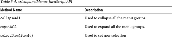
<rich:dropDownMenu> provides JavaScript API, as shown in Table 8-1.
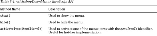
<rich:menuItem> provides a single activate() method that can be useful to call directly if used as a standalone component.
Using <rich:panelMenu>
<rich:panelMenu> builds a vertical, collapsible menu with any depth level. Let’s look at Figure 8-14.
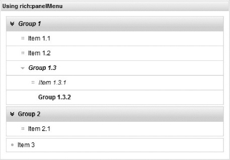
Figure 8-14. Simple panel menu
To start building this menu, you first start with <rich:panelMenu>, which acts as the main container for all menu items or nodes. Inside the container, you can place any number of menu items (<rich:panelMenuItem>) or groups (<rich:panelMenuGroup>). Each group in turn can have many menu items or additional groups, and so on. There is no limit to the depth of the menu that you can create.
Listing 8-15 shows the code for creation of the menu shown in Figure 8-14.
Listing 8-15. Shows code for simple panel menu
<h:form>

   <rich:panel style="width:450px" header="Using rich:panelMenu">

      <rich:panelMenu mode="ajax" topItemLeftIcon="disc" itemLeftIcon="grid"

         topGroupExpandedLeftIcon="chevronDown" groupExpandedLeftIcon="triangleDown"

         expandSingle="false">

         <rich:panelMenuGroup label="Group 1">

            <rich:panelMenuItem label="Item 1.1" />

            <rich:panelMenuItem label="Item 1.2" />

            <rich:panelMenuGroup label="Group 1.3">

               <rich:panelMenuItem label="Item 1.3.1" />

               <rich:panelMenuGroup label="Group 1.3.2">

                  <rich:panelMenuItem label="Item 1.3.2.1" />

               </rich:panelMenuGroup>

            </rich:panelMenuGroup>

         </rich:panelMenuGroup>

         <rich:panelMenuGroup label="Group 2">

            <rich:panelMenuItem label="Item 2.1" />

         </rich:panelMenuGroup>

         <rich:panelMenuItem label="Item 3" />

      </rich:panelMenu>

   </rich:panel>

</h:form>
You can use a facet with the label name instead of the corresponding attribute in <rich:panelMenuGroup>. The content of <rich:panelMenuItem> could be customized using any other nested components. The code in Listing 8-16 will render the same menu shown in Figure 8-14.
Listing 8-16. Code to render the menu shown in Figure 8-14
<h:form>

   <rich:panelMenu mode="ajax" topItemLeftIcon="disc" itemLeftIcon="grid"

      topGroupExpandedLeftIcon="chevronDown" groupExpandedLeftIcon="triangleDown"

      expandSingle="false">

      <rich:panelMenuGroup>

         <f:facet name="label">

            <h:outputText value="Group 1" />

         </f:facet>

         <rich:panelMenuItem>

            <h:outputText value="Item 1.1" />

         </rich:panelMenuItem>

         <rich:panelMenuItem>

            <h:outputText value="Item 1.2" />

         </rich:panelMenuItem>

         ...

      </rich:panelMenuGroup>

      ...

   </rich:panelMenu>

</h:form>
Note the expandSingle attribute used at <rich:panelMenu>. If it’s set to true, only one group at the same level could be expanded and the next expansion will collapse the previous one. We set it to false there so you could see both top groups opened.
The next interesting attribute is bubbleSelection. If it’s set to true, all the parent groups will be visually highlighted if some child item is selected. In other cases only the currently selected menu item will be selected.
Any group or item can be disabled using the disabled="true" declaration.
One last feature related to the look and feel of the component is using the icon attributes. Looking at Figure 8-14, you can see that the groups and items at the higher level are displayed with a special look and feel that is different from the look and feel of their children groups and items (a separate style and icon attributes were used for top level and nested items and groups). Also, groups and items can have both right- and left-side icons and can also have different ones for all the states—collapsed, expanded and disabled. Because the number of attributes to customize this is rather large, see the RichFaces Reference Guide at www.jboss.org/richfaces/docs, or just use your IDE content assist to find all the available attributes. Icon attributes can be defined with the standard icons mentioned in Chapter 6 (we already used them in the earlier example) and, of course, defined with URI to custom icons. An example using icons is shown in Figure 8-15.
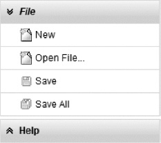
Figure 8-15. Panel menu with both standard and custom icons used
The code to create the menu in Figure 8-15 is shown in Listing 8-17. We used standard RichFaces icons for top groups and custom ones for items.
Listing 8-17. Code to create the menu in Figure 8-15
<h:form>

   <rich:panelMenu topGroupCollapsedLeftIcon="chevronUp" width="200px"

      topGroupExpandedLeftIcon="chevronDown">

      <rich:panelMenuGroup label="File">

         <rich:panelMenuItem label="New" leftIcon="/images/icons/new.gif"/>

         <rich:panelMenuItem label="Open File..." leftIcon="/images/icons/new.gif"/>

         <rich:panelMenuItem label="Save" leftIcon="/images/icons/save.gif"/>

         <rich:panelMenuItem label="Save All" leftIcon="/images/icons/save_all.gif" />

      </rich:panelMenuGroup>

      <rich:panelMenuGroup label="Help">

         <rich:panelMenuItem label="About" leftIcon="/images/icons/yellow_lamp.gif" />

      </rich:panelMenuGroup>

   </rich:panelMenu>

</h:form>
Invoking User Actions for Groups and Items
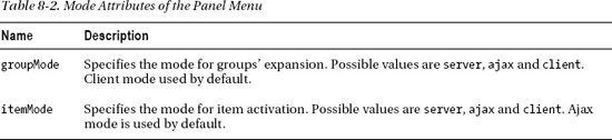
Let’s finish with UI related features review and proceed with functional part of the component. Items and groups could be configured to use different modes. Let’s check the attributes available on <rich:panelMenu> component in Table 8-2.
Modes could be defined for all the groups and items at panel level, but could also be redefined for a particular group or item using the mode attribute on the group or item tag.
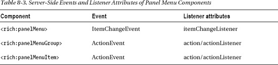
Let’s also review server-side events and listeners provided by the components shown in Table 8-3.
That’s enough theory—now we will build an example of using server-side actions and listeners for the component. We will use the code that is pretty similar to one that we used in the <rich:dropDownMenu> section. Let’s take a look at the page code in Listing 8-18.
Listing 8-18. The page code
<h:form>

   <h:panelGrid columns="2">

      <rich:panelMenu topGroupCollapsedLeftIcon="chevronUp" width="200px"

         topGroupExpandedLeftIcon="chevronDown">

         <rich:panelMenuGroup selectable="true" mode="ajax" label="File" render="menu"

            action="#{panelMenuBean.listenerFileGroup}">

            <rich:panelMenuItem label="New" leftIcon="/images/icons/new.gif"

               actionListener="#{panelMenuBean.listenerNew}" render="menu" />

            <rich:panelMenuItem label="Open File..." leftIcon="/images/icons/new.gif"

               actionListener="#{panelMenuBean.listenerOpenFile}" render="menu" />

            <rich:panelMenuItem label="Save" leftIcon="/images/icons/save.gif"

               actionListener="#{panelMenuBean.listenerSave}" render="menu" />

            <rich:panelMenuItem label="Save All" leftIcon="/images/icons/save_all.gif"
               actionListener="#{panelMenuBean.listenerSaveAll}" render="menu" />

         </rich:panelMenuGroup>

         <rich:panelMenuGroup label="Help">

            <rich:panelMenuItem label="About" leftIcon="/images/icons/yellow_lamp.gif" />

         </rich:panelMenuGroup>

      </rich:panelMenu>

      <h:panelGroup id="menu">

         <h:outputText value="#{panelMenuBean.menuSelected}" />

      </h:panelGroup>

   </h:panelGrid>

</h:form>
The managed bean code is shown in Listing 8-19.
Listing 8-19. The managed bean code
@ManagedBean

@RequestScoped

public class PanelMenuBean {


    private String menuSelected;


    public String getMenuSelected() {

        return menuSelected;

    }


    public PanelMenuBean() {

    }


    public void listenerNew(ActionEvent event) {

        menuSelected = "New";

    }


    public void listenerOpenFile(ActionEvent event) {

        menuSelected = "Open File...";

    }


    public void listenerSave(ActionEvent event) {

        menuSelected = "Save";

    }


    public void listenerSaveAll(ActionEvent event) {

        menuSelected = "Save All";

    }


    public void listenerFileGroup() {

        menuSelected = "File Group";

    }

}
Basically we are just storing the label of the group or item activated and updating it on the page. The result after expanding the File group is shown in Figure 8-16.
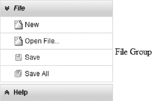
Figure 8-16. Label updated after File group expansion
The result of the Open File menu item activation is shown in Figure 8-17.
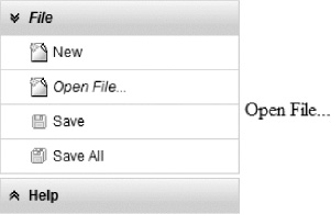
Figure 8-17. Label updated after Open File menu item activation
There is one more interesting attribute that influences menu behavior as well as its look and feel. selectable="true" in the File group means that the group will function as an item when selected and any previously selected item will be cleared. The activeItem attribute, which holds the currently selected item, will be set to the selected group name. In other words group became not just item’s container but also a higher level item.
When would you use this? It’s useful when expanding the group updates on some part of the page with group-related content. And when clicking a item in this group, it will show updated content specific to that item. If selectable is set to false, the group will still expand and collapse, but the action or listener on the group will not be invoked and the activeItem attribute will not be set to that menu group name after the group expansion. In other words, only item could be stored in the model as active in case group has selectable="false". A group simply becomes an item container in such case.
In Chapter 6 we showed you how to manage currently selected item using the activeItem attribute. It should be set to some menu group name (if groups are selectable) or some menu item name. Also, for the groups you could use the expanded attribute to control its current state (if true, the group will be rendered expanded). Both attributes support EL so you could easily manage the <rich:panelMenu> state in your actions.
Listings 8-20 and 8-21 show how the selected item or group could be defined.
Listing 8-20. Defining a group
<rich:panelMenu activeItem="fileGroup">

   ...

   <rich:panelMenuGroup name="fileGroup" selectable="true" label="File">

   ...
Listing 8-21. Defining an item
<rich:panelMenu activeItem="aboutItem">

   ...

   <rich:panelMenuItem name="aboutItem" label="About">

   ...
The expansion state could be controlled in the same manner, as follows:
<rich:panelMenuGroup expanded="true" label="File">
As we’ve already done in drop-down menu section, let’s add an About item that is using client mode with a client-side action. We have no handlers defined for the menu item in the previous sample. So let’s modify it, as shown in Listing 8-22.
Listing 8-22. Modifying the menu items
<rich:panelMenuGroup label="Help">

   <rich:panelMenuItem label="About" leftIcon="/images/icons/yellow_lamp.gif" mode="client"

      onclick="#{rich:component('about')}.show()"/>

</rich:panelMenuGroup>
And we should add the popup to the page, as shown in Listing 8-23.
Listing 8-23. Adding the popup to the page
<rich:popupPanel id="about" header="About">
<h:outputText value="That popup opened from <rich:panelMenuItem> component. " />
<h:commandLink value="Hide" onclick="#{rich:component('about')}.hide();return false;"/>
</rich:popupPanel>
The result of clicking the About menu item is shown in Figure 8-18.
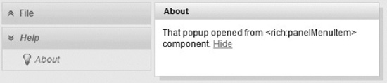
Figure 8-18. Popup panel opened from panel menu
Using Panel Menu Components JavaScript API
<rich:panelMenu> provides JavaScript API, as shown in Table 8-4.
<rich:panelMenuGroup> provides JavaScript API, as shown in Table 8-5.
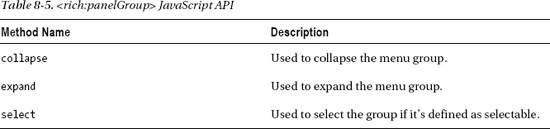
<rich:panelMenuItem> provides only select() method, which is used to select an item.
Summary
This chapter covered various RichFaces menu components. We used them in different modes for calling some server-side actions and performing simple JavaScript calls. Any time a menu item fires an Ajax request, all the basic principles we covered for <a4j:ajax>, such as render, execute, and client queue usage, apply as well.
Even though <rich:contextMenu> is not available at the time of writing, it will surely be added in a future RichFaces release. Check the JBoss Community RichFaces site at www.jboss.org/richfaces for updates.