
C H A P T E R 6
Rich Panel and Output Components
RichFaces offers a good number of out-of-the-box components for different data representation. This chapter will cover output components such as simple panels, collapsible panels, tabbed panels, toggle panels, and popup panels. Be prepared for numerous examples as well as common usages, such as how to use a popup panel to display a wizard or a status message.
Using <rich:panel>
<rich:panel> is just a panel or a container for any other content. You can place anything you want inside it, such as text or any other JSF components. A sample panel with text is shown in Figure 6-1.
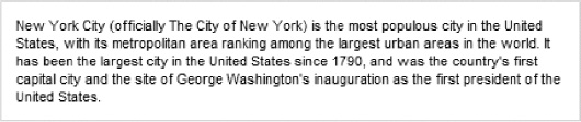
Figure 6-1. Panel without header
The code for this panel is shown in Listing 6-1.
Listing 6-1. Code for the panel without header
<rich:panel style="width:450px">

   New York City (officially The City of New York) is the most populous city

   in the United States, with its metropolitan area ranking among the largest

   urban areas in the world. It has been the largest city in the United

   States since 1790, and was the country's first capital city and the site

   of George Washington's inauguration as the first president of the United

   States...

</rich:panel>
You can easily add a panel header by setting header using attribute or using the same named <f:facet> as shown in Listing 6-2.
Listing 6-2. Adding a panel header with <f:facet>
<rich:panel style="width:450px">

   <f:facet name="header">New York City</f:facet>

   New York City (officially The City of New York) is the most populous city

   in the United States, with its metropolitan area ranking among the largest

   urban areas in the world. It has been the largest city in the United

   States since 1790, and was the country's first capital city and the site

   of George Washington's inauguration as the first president of the United

   States...

</rich:panel>
Figure 6-2 shows what it looks like.
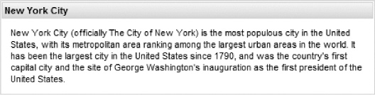
Figure 6-2. Panel with header
Keep in mind that you can place any other JSF components inside and the component is fully skinnable.
Listing 6-3 is an example of a second <rich:panel> nested inside the first one. In this example an image was placed inside the first panel and an image was placed inside the header for the second panel.
Listing 6-3. Example of a second <rich:panel> nested inside the first one
<rich:panel style="width:450px">

   <f:facet name="header">New York City</f:facet>

   <h:graphicImage value="/images/NY-flag.png" style="float:right" />

   New York City (officially The City of New York) is the most populous city

   in the United States, with its metropolitan area ranking among the largest

   urban areas in the world. It has been the largest city in the United

   States since 1790, and was the country's first capital city and the site

   of George Washington's inauguration as the first president of the United

   States...

   <rich:panel>

      <f:facet name="header">

         <h:panelGroup>

            <h:graphicImage value="/images/yellow_lamp.gif" />

            <h:outputText value="5 Boroughs" />

         </h:panelGroup>

      </f:facet>

   New York City comprises five boroughs, each of which is coextensive with a

   county: The Bronx, Brooklyn, Manhattan, Queens and Staten Island. With

   over 8.2 million residents within an area of 322 square miles (830 km),

   New York City is the most densely populated major city in the United
   States.

   </rich:panel>

</rich:panel>
Figure 6-3 shows the result.
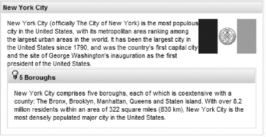
Figure 6-3. Nested panels with various content
The component also supports all standard mouse and keyboard event handlers. Let's check one more example that shows how to use component event handlers in order to highlight the component content. The page code is shown in Listing 6-4.
Listing 6-4. Using component event handlers
<style>

.body:hover {

   font-weight:bold;

}

.highlight-font{

   text-decoration: underline;

}

</style>

<rich:panel bodyClass="body" headerClass="header" style="width:450px"

   onmouseover="jQuery('.header').addClass('highlight-font'),"

   onmouseout="jQuery('.header').removeClass('highlight-font'),">

      <f:facet name="header">New York City</f:facet>

   New York City (officially The City of New York) is the most populous

   city in the United States, with its metropolitan area

   ...

</rich:panel>
We are using the same panels, but with the mouseover event we make the font bold inside the panel, as shown in Figure 6-4.
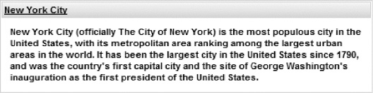
Figure 6-4. Panel with background color changed on mouseover
Two methods were used here. We added a CSS class by using simple jQuery statements to underline text in the header. We also applied a font weight change to the panel body by using a standard CSS hover selector.
Using <rich:collapsiblePanel>
<rich:collapsiblePanel> is similar to the <rich:panel> component with the additional functionality of being closed or open. Listing 6-5 shows an example.
Listing 6-5. <rich:collapsiblePanel> example
<h:form>

   <rich:collapsiblePanel width="450px" switchType="ajax" header="New York City">

   New York City (officially The City of New York) is the most populous city

   in the United States, with its metropolitan area ranking among the largest

   urban areas in the world. It has been the largest city in the United

   States since 1790, and was the country's first capital city and the site

   of George Washington's inauguration as the first president of the United

   States...

   </rich:collapsiblePanel>

</h:form>
You can see in Figure 6-5 and Figure 6-6 how the panel will look collapsed and expanded. In order to change the state of the panel, you can click anywhere in header.
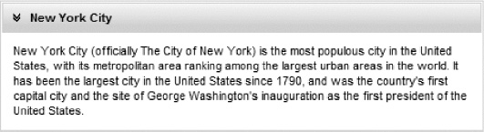
Figure 6-5. Expanded panel
 Note As the panel has two states (open/close) you have the option to define different content for the header using two facets:
 headerExpanded (when open) and headerCollapsed (when closed). When using the header attribute, the header label will stay the same whether opened or closed.
Now let's change the indication icons in the header of the panel by using the other icons, as shown in Listing 6-6.
Listing 6-6. Changing the indication icons
<rich:collapsiblePanel rightCollapsedIcon="triangleUp"

   leftCollapsedIcon="/images/yellow_lamp.gif"

   leftExpandedIcon="/images/yellow_lamp.gif "

   rightExpandedIcon="triangleDown" style="width:450px" switchType="ajax"

   header="New York City">
The result is shown in Figures 6-7 and 6-8.
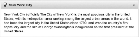
Figure 6-7. Expanded panel with customized and repositioned indication icon
Figure 6-8. Collapsed panel with customized and repositioned indication icon
In addition to the values of triangleUp and triangleDown, leftcollapsedIcon and rightCollapsed-Icon attributes can be set to the following predefined icons: disc, grid, chevron, triangle, chevronUp, chevronDown, none, and transparent. none means there will be no icon and transparent helps the header look consistent when some panels use icons and others don't.
Note The built-in icons could be used across all the panels and some other components, such as <rich:accordion>, <rich:panelMenu>, and so on (some components are planned to be added with support after the first 4.0 release), which provide icon attributes. You will see some of them used later in this and other chapters. It's also possible to use custom icons—simply provide URI to the icon images, as shown in Listing 6-6. Also as you can see, you should use attributes in pairs to define left and right icons for both states.
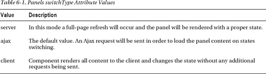
Let's switch our attention to the switchType attribute used in Listing 6-6. There are three switch types available, which are listed in Table 6-1.
Caution <rich:collapsiblePanel> and all the other switchable panels require <h:form> around them in server and Ajax modes to perform a submit. Also note that it's not possible to place a form inside each panel.
In Ajax and server modes, components will fire org.richfaces.event.PanelToggleEvent, which could be processed similarly to button and link action events by using the listener defined in the panelToggleListener attribute, as shown in Listings 6-7 and 6-8.
Note All the Ajax request customization and optimization attributes described in Chapter 3 can be used for the panel when switch mode is Ajax.
Listing 6-7. Using the listener defined in the panelToggleListener attribute
<rich:collapsiblePanel switchType="ajax" expanded="#{cityBean.isOpen}"

   panelToggleListener=”#{bean.loadPanelData}”>

   ...

</rich:collapsiblePanel>
Listing 6-8. Using org .richfaces.event.PanelToggleEvent
private void loadPanelData(PanelToggleEvent event){

   //refresh panel data if needed on expand, for example

}
To control whether the component is closed or opened when rendered for the first time, simply set the expanded attribute to either true or false, as follows:
<rich:collapsiblePanel switchType="ajax" expanded="false">
You can also point to an EL expression to control the attribute inside the managed bean, as follows:
<rich:collapsiblePanel switchType="ajax" expanded="#{cityBean.isOpen}">
JavaScript API
The component currently provides only one JavaScript API method, switchPanel(), which can be invoked on the client and switch the current state to opposite. Check the “RichFaces Component Reference” at www.jboss.org/richfaces/docs for new methods added by the RichFaces team.
Using <rich:tabPanel> and <rich:tab>
<rich:tabPanel> and <rich:tab> let you create tabbed panes on a page. <rich:tabPanel> is the container that consists of one or more tabs (<rich:tab>).
<rich:tab> is the container for a single tab and can contain any other content and any JSF components.
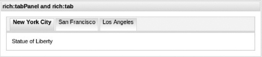
Listing 6-9 shows a sample tab panel.
Listing 6-9. A sample tab panel
<h:form>

   <rich:panel style="width:500px">

      <f:facet name="header">rich:tabPanel and rich:tab</f:facet>

      <rich:tabPanel switchType="ajax">

         <rich:tab header="New York City">

            Statue of Liberty

         </rich:tab>

         <rich:tab header="San Francisco">

            Golden Gate Bridge

         </rich:tab>

         <rich:tab header="Los Angeles">

            Hollywood

         </rich:tab>

      </rich:tabPanel>

   </rich:panel>

</h:form>
The result is shown in Figure 6-9.
Headers for <rich:tab> are created in the same way as <rich:panel>, using an attribute with a header name.
It's easy to mark any tab as disabled by setting disabled="true". Of course, the disabled attribute can point to an EL expression and be controlled via the model during runtime.
You can also use a facet named header instead of a corresponding attribute to define tab headers out of any number of components; for example, if you want to include images in the header for each tab, as shown in Figure 6-10.
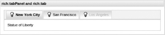
Figure 6-10. Tab panel with custom headers
Listing 6-10 shows the code used.
Listing 6-10. Code for tab panel with custom headers
<h:form>
<rich:panel style="width:500px"> <f:facet name="header">rich:tabPanel and
rich:tab</f:facet>
<rich:tabPanel switchType="ajax">
<rich:tab>
<f:facet name="header">
<h:panelGrid columns="2">
<h:graphicImage value="/images/yellow_lamp.gif"/>
<h:outputText value="New York City" />
</h:panelGrid>
</f:facet>
<h:outputText value="Statue of Liberty" />
</rich:tab>
<rich:tab>
<f:facet name="header">...</f:facet>
<h:outputText value="Golden Gate Bridge" />
</rich:tab>
<rich:tab disabled="true">
<f:facet name="header">...</f:facet>
<h:outputText value="Hollywood" />
         </rich:tab>

      </rich:tabPanel>

   </rich:panel>

</h:form>
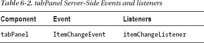
For <rich:collapsiblePanel> you can use the same three switchType's: server, ajax and client. Table 6-2 shows the available events and listeners information.
By setting the activeItem attribute to point to the name of the tab to display, it's possible to control which tab opens when the page is loaded for the first time. Note that each tab will have name generated based on its id if name not set.
Listing 6-11 shows how to open a particular tab and render what is shown in Figure 6-11.
Listing 6-11. Shows how to open a particular tab and render the display
<h:form>

   <rich:panel style="width:500px">

      <f:facet name="header">rich:tabPanel and rich:tab</f:facet>

      <rich:tabPanel switchType="ajax" activeItem="sf">

         <rich:tab header="New York City" name="nyc">

            Statue of Liberty

         </rich:tab>

         <rich:tab header="San Francisco" name="sf">

            Golden Gate Bridge

         </rich:tab>

         <rich:tab header="Los Angeles" name="la">

            Hollywood

         </rich:tab>

      </rich:tabPanel>

   </rich:panel>

</h:form>
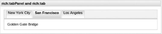
Figure 6-11. Tab panel with initial selected tab defined
A frequent question is: how do you control the selected tab inside the model? Well, that's very simple to do. Just point activeItem using EL expression to the bean property that will hold the currently active tab name, as shown in Listing 6-12.
Listing 6-12. Pointing activeItem using EL expression to the bean property
<h:form>

   <rich:panel style="width:500px">

      <h:selectOneRadio value="#{cityTabBean.city}"

         valueChangeListener="#{cityTabBean.changeCity}">

         <f:selectItem itemLabel="New York" itemValue="nyc" />

         <f:selectItem itemLabel="San Francisco" itemValue="sf" />

         <f:selectItem itemLabel="Los Angeles" itemValue="la" />

         <a4j:ajax event="change" render="cityTabs @this" />

      </h:selectOneRadio>

   </rich:panel>

   <rich:panel style="width:500px" header="rich:tabPanel and rich:tab">

      <rich:tabPanel switchType="ajax" id="cityTabs"

         activeItem="#{cityTabBean.selectedTab}">

         <rich:tab label="New York City" name="nyc">

            Statue of Liberty

         </rich:tab>

         <rich:tab label="San Francisco" name="sf">

            Golden Gate Bridge

         </rich:tab>

         <rich:tab label="Los Angeles" name="la">

            Hollywood

         </rich:tab>

      </rich:tabPanel>

   </rich:panel>

</h:form>
By selecting a radio button, an Ajax request (via <a4j:ajax>) is sent and the selectedTab property, which is bound to the activeItem attribute holding the name of the selected tab, gets updated in select ValueChangeListener. That's pretty simple, right?
The Java bean code is shown in Listing 6-13.
Listing 6-13. The Java bean code
@ManagedBean

@SessionScoped

public class CityTabBean {

   private String city = "sf";

   private String selectedTab = "sf";

   public void changeCity(ValueChangeEvent event) {

      selectedTab = (String)event.getNewValue();

   }

   // getters and setters

}
It renders as shown in Figure 6-12.
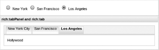
Figure 6-12. Tab panel switched outside
Another option for switching tab panels by external controls is to use its JavaScript API. Listing 6-14 shows the code to switch tabs with JavaScript API.
Listing 6-14. Shows the code to switch tabs with JavaScript API
<rich:panel style="width:500px" header="rich:tabPanel and rich:tab">

   <h:form>

      <rich:panel>

         <a4j:commandLink value="First"

            onclick="#{rich:component('tp')}.switchToItem('@first'),

            return false;" />

         <a4j:commandLink value="Previous"

            onclick="#{rich:component('tp')}.switchToItem('@prev'),

            return false;" />

         <a4j:commandLink value="New York City"

            onclick="#{rich:component('tp')}.switchToItem('nyc'),

            return false;" />

         <a4j:commandLink value="San Francisco"

            onclick="#{rich:component('tp')}.switchToItem('sf'),

            return false;" />

         <a4j:commandLink value="Los Angeles"

            onclick="#{rich:component('tp')}.switchToItem('la'),

            return false;" />

         <a4j:commandLink value="Next"

            onclick="#{rich:component('tp')}.switchToItem('@next'),

            return false;" />

         <a4j:commandLink value="Last"

            onclick="#{rich:component('tp')}.switchToItem('@last'),

            return false;" />

      </rich:panel>

      <rich:tabPanel switchType="ajax" id="tp">

         <rich:tab header="New York City" name="nyc">

            Statue of Liberty

         </rich:tab>

         <rich:tab header="San Francisco" name="sf">

            Golden Gate Bridge

         </rich:tab>

         <rich:tab header="Los Angeles" name="la">

            Hollywood
         </rich:tab>

      </rich:tabPanel>

   </h:form>

</rich:panel>
Figure 6-13 shows a tab panel that can be switched by links to a particular tab or to the first and last tabs using shortcut links (First/Previous, Next/Last).
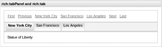
Figure 6-13. Switching the tab panel using JavaScript
The <rich:tabPanel> currently provides no icons attributes for tabs, and the tab component doesn't currently support tabs positioning on the right or along the side. These features are planned to be implemented in next release of RichFaces. Visit the RichFaces community often at www.jboss.org/richfaces/docs for updates and new features.
Caution It's not possible to place a form inside the tab.
JavaScript API
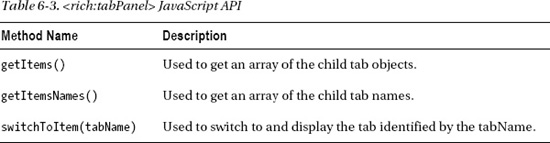
The <rich:tabPanel> component provides the JavaScript API methods shown in Table 6-3.
Using <rich:accordion>
<rich:accordion> allows you to create a set of panels that can be switched when a particular panel is selected to be opened and the currently opened panel is closed or collapsed. Content for each panel could be pre-rendered to the client. This means when you open or close the panels, the change occurs only on the client (the browser). This is an example of switchType = "client". In addition to client switch type, the component can also be switched by using ajax (default type now) and server (full page reload) modes. Note that this component has to be inside a form to work properly.
Using the component is rather simple. An accordion consists of one or more accordion items, as shown in Listing 6-15.
Listing 6-15. An accordion consists of one or more accordion items
<h:form>

   <rich:panel style="width:550px" header="Using rich:accordion">

      <rich:accordion>

         <rich:accordionItem header="New York">

            Statue of Liberty

         </rich:accordionItem>

         <rich:accordionItem header="San Francisco">

            Golden Gate Bridge

         </rich:accordionItem>

         <rich:accordionItem header="Los Angeles">

            Hollywood

         </rich:accordionItem>

      </rich:accordion>

   </rich:panel>

</h:form>
The result is shown in Figure 6-14.
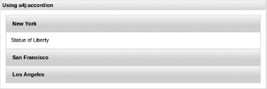
Figure 6-14. Simple accordion control
To define a header for each accordion item, a facet or attribute with the header name is used for panels. A facet is useful when you need to customize the header to include more than just simple text, such as images or more complex content. And for simpler text cases, you can use the header attribute. As with any panel, you can place any content inside each accordion item.
Figure 6-15 shows a sample of the component with a more complex layout and some customization already used in previous panels.
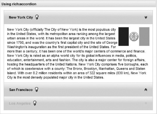
Figure 6-15. Customized accordion control
Listing 6-16 shows the code used.
Listing 6-16. Code used to customize accordion control
<h:form>

   <rich:panel style="width:500px" header="Using rich:accordion">

      <rich:accordion itemRightIconInactive="chevronUp"

         itemRightIconActive="chevronDown" itemRightIconDisabled="grid">

         <rich:accordionItem>

            <f:facet name="header">

               <h:panelGrid columns="2">

                  <h:outputText value="New York City" />

                  <h:graphicImage value="/images/yellow_lamp.gif" />

               </h:panelGrid>

            </f:facet>

            <h:graphicImage value="/images/NY-flag.png"

               style="float:right" />

            New York City (officially The City of New York) is the most

            populous city in the United States, with its metropolitan area

            ranking among the largest urban areas in the world.

         </rich:accordionItem>

         ...

         <rich:accordionItem disabled="true">

            ...

         </rich:accordionItem>
      </rich:accordion>

   </rich:panel>

</h:form>
As you can see from the code in Listing 6-13, an accordion item can be disabled by setting disabled="true" attribute. Listing 6-17 shows how to define icons for the accordion item headers.
Listing 6-17. Shows how to define icons for the accordion item headers
<h:form>

   <rich:accordion itemRightIconInactive="chevronUp"

      itemRightIconActive="chevronDown"

      itemRightIconDisabled="grid">

      ...

   </rich:accordion>

</h:form>
For defining panel icons, you can use RichFaces built-in icons as shown in Listing 6-17. To use custom icons, you can point icon attributes to a custom image URI. The component also offers attributes to position the icons on either the left or right side on the accordion item or group. A complete list of built-in icon names and positioning attributes can be found in RichFaces documentation available at http://jboss.org/richfaces/docs.
As with other panels, switching between sets of states is possible via the activeItem attribute, which holds the name of the selected item, and can be bound to EL to control the selection in runtime. The panel switch modes are similar to other panels we covered: ajax, server, or client . When using ajax and server modes, the component fires a server-side org.richfaces.event.ItemChangeEvent event and provides an itemChangeListener attribute that is used to define the listener that will process it. Listing 6-18 shows how the listener is defined on the component.
Listing 6-18. Shows how the listener is defined on the component
<h:form>

   <rich:accordion activeItem="sf"

      itemChangeListener="#{panelsBean.processAccordionChange}"

      switchType="ajax">

      ...

   </rich:accordion>

</h:form>
Listing 6-19 shows the code for the listener inside the managed bean.
Caution The accordion has to be placed inside a form in ajax and server mode.
Listing 6-19. Shows the code for the listener inside the managed bean
@ManagedBean

@RequestScoped

public class PanelsBean {

   public void processAccordionChange(ItemChangeEvent event){
      // Process the event...

   }

}
JavaScript API
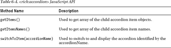
The <rich:accordion> component provides the JavaScript API methods shown in Table 6-4.
Using <rich:togglePanel>
<rich:togglePanel> is actually the base component for <rich:accordion> and <rich:tabPanel>. It's covered last simply because the component is a pretty general implementation of panels with a states-switching feature and components that we covered previously.
<rich:accordion>, <rich:tab>, and <rich:collapsiblePanel>) are more popular and more often used. You define two or more panels using <rich:togglePanelItem> within the <rich:togglePanel> and add <rich:toggleControl> switching behavior to components (it can be inside or outside the panel), which switch those states.
Let's look at an example that uses famous quotes as the content for the panels. Figure 6-16 shows how the panel looks.
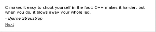
Figure 6-16. Toggle panel initial state
Next, let's hide the current panel and show the next one using the link, as shown in Figure 6-17.
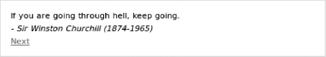
Figure 6-17. Toggle panel switched to next item
Listing 6-20 shows the code to accomplish this.
Listing 6-20. Shows the code to toggle panel switched to next item
<h:form>

   <rich:panel style="width:450px">

      <rich:togglePanel id="quotes" switchType="ajax">

         <rich:togglePanelItem>

            <h:panelGrid>

               <h:outputText value="C makes it easy to shoot yourself in the

                  foot; C++ makes it harder, but when you do, it blows away

                  your whole leg." />

               <h:outputText value="- Bjarne Stroustrup"

                  style="font-style: italic" />

               <h:commandLink value="Next">

                  <rich:toggleControl targetItem="@next" />

               </h:commandLink>

            </h:panelGrid>

         </rich:togglePanelItem>

         <rich:togglePanelItem>

            <h:panelGrid>

               <h:outputText value="If you are going through hell,

                  keep going." />

               <h:outputText value="- Sir Winston Churchill (1874-1965)"

                  style="font-style: italic" />

               <h:commandLink value="Next">

                  <rich:toggleControl targetItem="@next" />

               </h:commandLink>

            </h:panelGrid>

         </rich:togglePanelItem>

         <rich:togglePanelItem>

            <h:panelGrid>

               <h:outputText value="Life is pleasant. Death is peaceful. It's

                  the transition that's troublesome." />

               <h:outputText value="- Isaac Asimov"

                  style="font-style: italic" />

               <h:commandLink value="Next">

                  <rich:toggleControl targetItem="@next" />

               </h:commandLink>

            </h:panelGrid>

         </rich:togglePanelItem>

         ...

      </rich:togglePanel>

   </rich:panel>

</h:form>
The panel is added by using a <rich:panel> component. The panel states (or the content) are defined by the addition of <rich:togglePanel> inside with the set of nested <rich:togglePanelItem> components (there isn't any predefined markup). Controls for switching are a simple <h:commandLink> with <rich:toggleControl> behavior. This adds greater flexibility and allows using the component in various use cases.
Behaviors are a great addition to JSF specification made in JSF 2. We could plug our <rich:toggleControl>'s behavior to any control on any event (click by default is used in this case), so we are not limited to just a button or a link anymore. In this example we use links and switched between states using the @next keyword, but you can also use the following predefined keywords: @prev, @first, and @last.
The order of switching defined by the order of child items within the component. The cycledSwitching attribute controls whether the panel will be switched from the boundary item to the opposite one if you continue switching in the same direction.
There is also another way to perform switching. The <rich:togglePanelItem> can be named using the name attribute. In <rich:toggleControl> you would then use the name in the targetItem attribute.
Finally, the controls with behavior are placed within the panel itself, but you can easily use them outside the panel component. You use the targetPanel attribute on the <rich:toggleControl> behavior defined with the corresponding panel name. In Listing 6-21, let's slightly change the previous sample.
Listing 6-21. Using the targetPanel attribute on the <rich:toggleControl> behavior
<h:form>

   <rich:panel style="width:450px">

      <rich:togglePanel id="tp2" switchType="ajax">

         <rich:togglePanelItem>

            <h:panelGrid>

               <h:outputText value="C makes it easy to shoot yourself in the

                  foot; C++ makes it harder, but when you do, it blows away

                  your whole leg." />

               <h:outputText value="- Bjarne Stroustrup"

                  style="font-style: italic" />

            </h:panelGrid>

         </rich:togglePanelItem>

         <rich:togglePanelItem>

            <h:panelGrid>

               <h:outputText value="If you are going through hell, keep

                  going." />

               <h:outputText value="- Sir Winston Churchill (1874-1965)"

                  style="font-style: italic" />

            </h:panelGrid>

         </rich:togglePanelItem>

         <rich:togglePanelItem name="einstein">

            <h:panelGrid>

               <h:outputText value="Make everything as simple as possible,

                  but not simpler" />

               <h:outputText value="- Albert Einstein (1879-1955)"

                  style="font-style: italic" />

            </h:panelGrid>

         </rich:togglePanelItem>

      </rich:togglePanel>

      <h:panelGrid columns="3">

         <h:commandButton value="Back">

            <rich:toggleControl targetPanel="tp2" targetItem="@prev" />

         </h:commandButton>

         <h:commandButton value="Einstein's quote">

            <rich:toggleControl targetPanel="tp2" targetItem="einstein" />

         </h:commandButton>

         <h:commandButton value="Next">

            <rich:toggleControl targetPanel="tp2" targetItem="@next" />

         </h:commandButton>

      </h:panelGrid>

   </rich:panel>

</h:form>
Note that we used buttons (instead of links) with <rich:toggleControl> behavior attached and placed them outside the toggle panel. Figure 6-18 shows the result after the Einstein button is clicked.
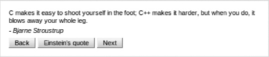
Figure 6-18. After clicking Bjarne's quote button
As with other panels, <rich:togglePanel> can be switched using three common modes: server, ajax, and client. And in the same way, it allows the activeItem attribute to bind the current panel id to the model and itemChangeListener to process the item switching in ajax or server mode.
Caution The panel has to be placed inside a form in ajax and server mode.
Now let's create one more sample that will highlight the flexibility using this component. RichFaces provides the <rich:tabPanel> component out of the box but it does not provide a vertical tabs alignment feature. Let's create custom implementation using the <rich:togglePanel> component as shown in Figure 6-19.
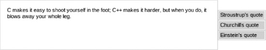
Figure 6-19. Custom tab panel created using <rich:togglePanel>
This lightweight tab panel with vertically oriented tabs is really easy to build using the basic <rich:togglePanel> component, as shown in Listing 6-22.
Listing 6-22. Using the basic <rich:togglePanel> component
<style>

   .tab {

   padding: 2px 3px;

   background-color: #{richSkin.headerBackgroundColor};

}

   a.control {

   color: #{richSkin.headerTextColor};

   text-decoration:none;

}

</style>
<h:form>

   <h:panelGrid columns="2" cellpadding="0" cellspacing="0">

      <rich:panel style="width:450px; height:100px;">

         <rich:togglePanel id="tp2" switchType="ajax">

            <rich:togglePanelItem name="stroustrup">

               <h:outputText value="C makes it easy to shoot yourself in the

                  foot; C++ makes it harder, but when you do, it blows away

                  your whole leg." />

            </rich:togglePanelItem>

            <rich:togglePanelItem name="churchill">

               <h:outputText value="If you are going through hell, keep

                  going." />

            </rich:togglePanelItem>

            <rich:togglePanelItem name="einstein">

               <h:outputText value="Make everything as simple as possible,

                  but not simpler."/>

            </rich:togglePanelItem>

         </rich:togglePanel>

      </rich:panel>

      <h:panelGroup>

         <rich:panel bodyClass="tab">

            <h:commandLink styleClass="control" value="Stroustrup's quote">

               <rich:toggleControl targetPanel="tp2"

                  targetItem="stroustrup"/>

            </h:commandLink>

         </rich:panel>

         <rich:panel bodyClass="tab">

            <h:commandLink styleClass="control" value="Churchill's quote">

               <rich:toggleControl targetPanel="tp2" targetItem="churchill"/>

            </h:commandLink>

         </rich:panel>

         <rich:panel bodyClass="tab">

            <h:commandLink styleClass="control" value="Einstein's quote">

               <rich:toggleControl targetPanel="tp2" targetItem="einstein" />

            </h:commandLink>

         </rich:panel>

      </h:panelGroup>

   </h:panelGrid>

</h:form>
JavaScript API
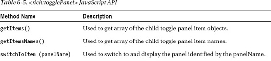
The <rich:togglePanel> component provides the JavaScript API methods shown in Table 6-5.
Using <rich:popupPanel>
The <rich:popupPanel> component implements a popup with various common features like dragging, resizing, screen blocking ability, and more. Popups can be called from one another and easily populated with dynamic content. Opening and closing the panel is done through client JavaScript code.
You can place any other content and any other JSF component inside the popup panel, but let's start with how you can choose the panel type and perform opening or closing the panel. You might also think about the popup panel as being just a div inside the current page that simply is shown or hidden.
Choosing Your Panel Type
A popup panel in RichFaces 4 can be either be modal (blocking the entire screen) or non-modal. RichFaces 3 came only with <rich:modalPanel>, which only provides a modal popup.
You could use the modal boolean attribute according to your use-case requirements. By default it will be opened as modal. To open the popup as non-modal, set modal="false". Listing 6-23 shows an example.
Listing 6-23. To open the popup as non-modal
<rich:popup modal="false">

   ...

</rich:popup>
Opening and Closing the Popup Panel
Listing 6-24 shows the simplest way to open and close the modal popup panel.
Listing 6-24. Simplest way to open and close the modal popup panel
<a href="#" onclick="#{rich:component('modalPanel')}.show()">Open</a>


<rich:popupPanel id="modalPanel">

   <h:outputText value="Cool, I just opened a modal panel!" />

   <a href="#" onclick="#{rich:component('modalPanel')}.hide()">Hide</a>

</rich:popupPanel>
This code will produce the image shown in Figure 6-20.
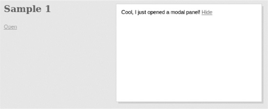
Figure 6-20. Simple modal popup
To open the popup panel, we used the show() JavaScript API method. The #{rich:component(id)} function is a RichFaces client-side EL function that enables you to reference any component. It is described more in Chapter 12.
To close it, you should use the hide() function, as follows:
<a href="#" onclick="#{rich:component('modalPanel')}.hide()">Hide</a>
Adding a Header
It's possible to add a panel header by adding a facet named header or an attribute with the same name. This is virtually identical to adding a header to <rich:panel>. With the header, you can now drag the component across the screen. The code in Listing 6-25 provides an example.
Listing 6-25. Code to drag the component across the screen
<a href="#" onclick="#{rich:component('modalPanel2')}.show()">Open</a>

<rich:popupPanel id="modalPanel2">

   <f:facet name="header">

      Modal panel

   </f:facet>

   <h:outputText value="Cool, I just opened a modal panel!" />

   <a href="#" onclick="#{rich:component('modalPanel2')}.hide()">Hide</a>

</rich:popupPanel>
This produces the image shown in Figure 6-21.
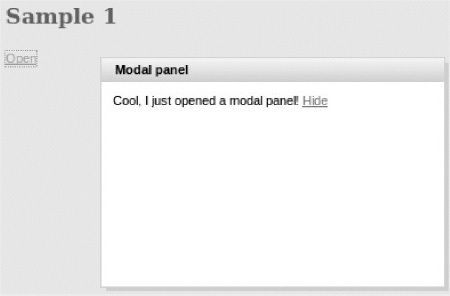
Figure 6-21. Modal panel with header
Adding Header Controls
You can also add a control on the right side of the header to close the popup panel. It's achieved by adding control facets to the popup panel, as shown in Listing 6-26.
Listing 6-26. Adding control facets to the popup panel
<a ref="#" onclick="#{rich:component('modalPanel3')}.show()">Open</a>

<rich:popupPanel id="modalPanel3">

   <f:facet name="header">

      Modal panel

   </f:facet>

   <f:facet name="controls">

      <h:outputLink value="#" style="font-size:large; color:black; text-

         decoration:none;" onclick="#{rich:component('modalPanel3')}.hide();

         return false;">

            X

      </h:outputLink>

   </f:facet>

   <h:outputText value="Cool, I just opened a modal panel!" />

   <a href="#" onclick="#{rich:component('modalPanel3')}.hide()">Hide</a>

</rich:popupPanel>
Inside the facet is an “X” symbol link that can be clicked to close the panel. The onclick event points to the panel hide() function to close the panel, as shown in Figure 6-22.
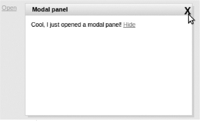
Figure 6-22. Modal panel with close control in header
Other Ways to Open/Close the Panel
Instead of using the #{rich:component(id)}, you can use the <rich:componentControl> component. As described in Chapter 12, it's a universal behavior that allows calling the JavaScript API on any RichFaces component based on a defined event supported by the parent component, such as click or change, as shown in Listing 6-27.
Listing 6-27. Using the <rich:componentControl> component
<h:commandButton value="Open">

   <rich:componentControl operation="show" target="modalPanel4" />

</h:commandButton>

<rich:popupPanel id="modalPanel4" modal="false">

   <f:facet name="header">

      Non-modal popup panel

   </f:facet>

   <f:facet name="controls">

      <h:graphicImage value="/modalPanel/close.png" style="cursor:pointer"

         onclick="Richfaces.hideModalPanel('modalPanel4')" />

   </f:facet>

   <h:outputText value="Cool, I just opened non-modal popup panel!" />

   <h:outputLink value="#">

      <h:outputText value="Hide" />

      <rich:componentControl event="click" operation="hide"

         target="modalPanel4" />

   </h:outputLink>

</rich:popupPanel>
Note that Figure 6-23 shows a popup in non-modal state.
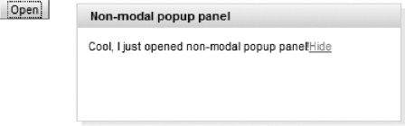
Figure 6-23. Non-modal popup called from button with <rich:componentControl>
This approach to showing and hiding the popup and the one we originally demonstrated are basically identical.
Open/Close Panel from Server-Side Action
One question that often arises in RichFaces related blogs and community forum threads is how to control the opening of a popup panel on the server. It's probably due to the control being client-side; you show or hide it on the client so it's not immediately clear how to control it from the server.
It's actually rather simple and is shown in Listing 6-28. This is an example of a welcome window (popup) shown to the user.
Listing 6-28. Example of a welcome window (popup)
<rich:popupPanel id="modalPanel7" autosized="true" header="Welcome!"

   show="#{simplePopupBean.justRegistered}">

   We hope you're getting much fun playing with RichFaces!!

   <a href="#" onclick="#{rich:component('modalPanel7')}.hide()">Hide</a>

</rich:popupPanel>
In this example, we use the show attribute to determine whether or not to show the component when the page is loaded. When the attribute is bound to EL, it's possible to control whether or not to show the component in runtime.
There is just one thing to keep in mind: if you are making changes via Ajax, don't forget to update the entire component in order for it to get re-initialized and shown or hidden based on a new value.
Component Customization
To manage the placement of an inserted popup, use the zindex attribute, which is similar to the standard HTML style and can specify window placement relative to the content. That is especially important in case multiple non-modal popups are opened from the different page controls. In case of opening one panel from another, the last will be automatically adjusted to be on top.
To manage window placement, use the left and top attributes. They define a window offset relative to the top-left corner of the window. These parameters (and some others, like size parameters) can be defined at tag level or passed to the show() method as we will show next. The last approach allows using a popup in a more dynamic way.
Popup panels can also support resize and move operations on the client side. To allow or disallow these operations, set the resizeable and moveable attributes to true or false. Popup resizing is also limited by the minWidth and minHeight attributes specifying the minimal sizes. Listing 6-29 shows an example.
<h:commandButton value="Show popup">

   <rich:componentControl target="modalPanel5" operation="show">

      <a4j:param noEscape="true" value="event" />

      <rich:hashParam>

         <f:param name="minWidth" value="300px" />

         <f:param name="minHeight" value="150px" />

         <a4j:param noEscape="true" name="left"

            value="(jQuery(window).width()/2)-250" />

            <a4j:param noEscape="true" name="top"

               value="(jQuery(window).height()/2)-150" />

      </rich:hashParam>

   </rich:componentControl>

</h:commandButton>

<rich:popupPanel id="modalPanel5" modal="false" resizeable="true"

   header="Dynamic popup panel" moveable="true">

   <p>Cool, I just opened non-modal popup panel passing parameters from

      script!</p>

   <p>It could be resized and moved to any part of the screen"</p>

   <a href="#" onclick="#{rich:component('modalPanel5')}.hide()">Hide</a>

</rich:popupPanel>
Figure 6-24 shows the result when the page is rendered.
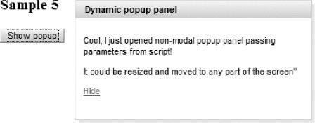
Figure 6-24. Popup panel with dynamic sizes
As you can see, we defined some functional parameters like resizeable and moveable at panel level, but passed positioning and size attributes from a concrete opening link. This adds more flexibility to component. Read more about <a4j:param> and <rich:hashParam> in corresponding sections about core (a4j:tags, features, and concepts) and miscellaneous (RichFaces functions, component control, miscellaneous) components.
Advanced Component Usage Samples
What we have shown you so far is how to open and close popup panels using various methods, as well as performing basic customization. Obviously, you want to use a panel for more interesting things, such as entering and saving input or maybe even building wizard-like behavior.
Performing Content Updates Inside <rich:popupPanel>
So far, you have been using the JavaScript API to open and close the popup panels. This works fine, but you probably want to display some server-side data, such as data from a managed bean. For the data to be updated every time you open the popup panel, the content has to be rendered by Ajax before opening the panel. To be able to update content, use already known Ajax controls such as <a4j:commandlLink> or <a4j:commandButton>.
Suppose you have added a time display to the popup panel, as shown in Listing 6-30.
Listing 6-30. Adding a time display to the popup panel
<a href="#" onclick="#{rich:component('modalPanel6')}.show()">Open</a>

<rich:popupPanel id="modalPanel6" autosized="true" header="Time Panel">   <h:panelGrid>

      <h:outputText value="Cool, I just opened a modal panel!" />

      <h:outputText id="time" value="Time: #{simplePopupBean.now}">

         <f:convertDateTime />

      </h:outputText>

   </h:panelGrid>

   <a href="#" onclick="#{rich:component('modalPanel6')}.hide()">Hide</a>

</rich:popupPanel>
#{simplePopupBean.now} simply returns the current server time, as shown in Listing 6-31.
Listing 6-31. Using #{simplePopupBean.now}
@ManagedBean

@RequestScoped

public class SimplePopupBean {

   public Date getNow(){

      return new Date();

   }

}
When the page is rendered for the first time, the time from the server will be rendered on the page. When the popup panel is opened, the value previously rendered will be shown. The time will not be the current time because you haven't updated it (re-rendered it). To solve this, you'll use <a4j:commandLink> to open the popup panel and re-render the component that shows the time. This way, each time the popup panel is opened you will get the latest time from the server, as demonstrated in Listing 6-32.
Listing 6-32. Using <a4j:commandLink>
<h:form>

   <a4j:commandLink value="Open"

      onclick="#{rich:component('modalPanel6')}.show()" render="time" />

</h:form>

<rich:popupPanel id="modalPanel6" autosized="true" header="Time Panel">

   <h:panelGrid>

      <h:outputText value="Cool, I just opened a modal panel!" />

      <h:outputText id="time" value="Time: #{simplePopupBean.now}">

         <f:convertDateTime />

      </h:outputText>

   </h:panelGrid>

   <a href="#" onclick="#{rich:component('modalPanel6')}.hide()">Hide</a>

</rich:popupPanel>
Figure 6-25 shows the popup opened using Ajax link.

Figure 6-25. Popup panel with the content updated by Ajax
Again, it will help you to think about the popup panel as simply a section of the same page that can be shown or hidden. Other than that, all the rules for Ajax rendering apply as before.
Using Popup Panel As a Wizard
Let's look at an example where you can edit information in the popup panel. When you place input fields or buttons or links inside the popup panel, you need to make sure the popup panel has its own form. One thing to keep in mind is that it's not allowed to nest forms, so the popup panel must not be placed in some external form at the same time.
Note To avoid the problems of overlapping the popup panel with any z-index by the elements that are at upper DOM levels and have relative positioning (a common problem in Internet Explorer), the root node of the popup panel is moved to the top of a DOM tree. That's why you should use a separate <h:form> inside the popup panel if you want to perform submits from this panel.
Listing 6-33 shows an example using a popup panel as a wizard.
Listing 6-33. Popup panel as a wizard
<rich:popupPanel id="modalPanel8" header="Edit User Information"

   width="350" height="150" autosized="true">

   <h:form>

      <rich:tabPanel switchType="client">

         <rich:tab header="personal">

            <h:panelGrid columns="2">

               <h:outputText value="Name:" />

               <h:inputText value="#{userBean.name}" label="username"/>

               <h:outputText value="Age:" />

               <h:inputText value="#{userBean.age}" label="age"/>

            </h:panelGrid>

         </rich:tab>
         <rich:tab header="Location">

            <h:panelGrid columns="2">

               <h:outputText value="City:" />

               <h:inputText value="#{userBean.city}" id="city"/>

               <h:outputText value="Country:" />

               <h:inputText value="#{userBean.country}" label="country"/>

            </h:panelGrid>

         </rich:tab>

      </rich:tabPanel>

      <a4j:commandButton value="Close" id="close"

         onclick="#{rich:component('modalPanel8')}.hide(); return false;" />

      <a4j:commandButton value="Save and Close" id="save" render="input"

         oncomplete="if (#{facesContext.maximumSeverity==null})

         #{rich:component('modalPanel8')}.hide();" />

   </h:form>

</rich:popupPanel>

<a4j:outputPanel ajaxRendered="true">

   <rich:popupPanel id="msgPanel" modal="true" zindex="101" header="Correct

      your input!" autosized="true"

      show="#{facesContext.maximumSeverity!=null}">

      <h:messages style="color:red" />

      <a href="#" onclick="#{rich:component('msgPanel')}.hide()">Hide</a>

   </rich:popupPanel>

</a4j:outputPanel>

<h:form>

   <h:panelGrid id="input">

      <h:outputText value="Name: #{userBean.name}" />

      <h:outputText value="Age: #{userBean.age}" />

      <h:outputText value="City: #{userBean.city}" />

      <h:outputText value="Country: #{userBean.country}" />

      <a onclick="#{rich:component('modalPanel8')}.show()">Edit User

         wizard</a>

   </h:panelGrid>

</h:form>
The managed bean contains just simple User properties, as shown in Listing 6-34.
Listing 6-34. Managed bean
@ManagedBean

@RequestScoped

public class UserBean {

   @Length(min = 3, max = 15, message="Name should be defined(3 to 15

      characters)")

   private String name = "";

   @Min(value = 18, message = "You should be over 18 years to place orders")

   @NotNull(message="Age should be specified")

   private Integer age;

   @NotEmpty(message="City should be specified")

   private String city=null;

   @NotEmpty(message="Country should be specified")

   private String country=null;

   //getters and setters

}
A wizard is launched to enter values for #{userBean} properties. From the popup panel, you can cancel, edit, or save the value when closing the panel. If you save the value, the value entered is then updated in the main page.
One thing to note is that you need to point the render attribute of the Save and Close button to the <h:panelGrid> ID, as shown in Listing 6-33, to see the updated values in the parent page. Notice the separate <h:form> inside the popup panel.
Also notice that to save the input inside the popup panel, we are using <a4j:commandButton> to perform an Ajax submit of the values to the server. Once the request is done, the oncomplete event will be processed and will close the popup.
Note This sample shows you again how to open the panel as a result of server-side actions. The panel with messages that appear in the event of a failed validation are shown automatically, depending on whether messages are added to the context during request.
All the steps are shown here. Figure 6-26 shows the initial page state before opening the edit panel.
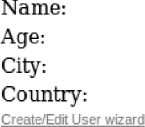
Figure 6-26. User details prior to filling the properties.
Figure 6-27 shows the edit popup.
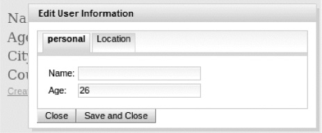
Figure 6-27. Popup panel which accepts user input shown
Figure 6-28 shows the second popup, which contains messages about failed form validation.
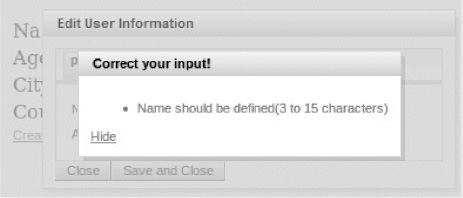
Figure 6-28. Popup panel with messages shown in the result of wrong input
In Figure 6-29 you see the result after successful user information entering.
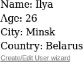
Figure 6-29. User details after editing with popup wizard complete
Opening the Popup Panel from Within a Table
Another common usage is opening a popup panel from within a table to view or edit the selected record.
Figure 6-30 shows an example.
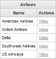
Figure 6-30. Table with airlines information
After clicking a View link, a popup panel opens and shows the selected record information, as shown in Figure 6-31.
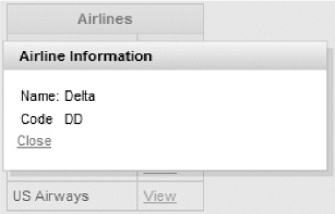
Figure 6-31. Details popup panel shown for the table row
The page source for these example figures is shown in Listing 6-35.
Listing 6-35. Page source
<h:form>

   <rich:dataTable value="#{airlinesBean.airlines}" var="airline">

      <f:facet name="header">Airlines</f:facet>

      <rich:column>

         <f:facet name="header">Name</f:facet>

            #{airline.name}

      </rich:column>

      <rich:column>

         <f:facet name="header">Actions</f:facet>

         <a4j:commandLink value="View"

            oncomplete="#{rich:component('popupPanel9')}.show()"

            render="airlineInfo">

            <f:setPropertyActionListener value="#{airline}"

               target="#{airlinesBean.selected}" />

         </a4j:commandLink>

      </rich:column>

   </rich:dataTable>

</h:form>

<rich:popupPanel id="popupPanel9" width="250" height="100">

   <f:facet name="header">

      Airline Information

   </f:facet>

   <h:panelGrid id="airlineInfo" columns="2">

      <h:outputText value="Name:" />

      <h:outputText value="#{airlinesBean.selected.name}" />

      <h:outputText value="Code" />

      <h:outputText value="#{airlinesBean.selected.code}" />

   </h:panelGrid>

   <a href="#" onclick="#{rich:component('popupPanel9')}.hide();return

      false;">Close</a>

</rich:popupPanel>
The Java code is pretty simple. Note the AirlinesBean code in Listing 6-36.
Listing 6-36. AirlinesBean code
@ManagedBean

@SessionScoped

public class AirlinesBean {

   private Airline selected;

   private List<Airline> airlines;

   public AirlinesBean() {

      airlines = new ArrayList<Airline>();

      airlines.add(new Airline("American Airlines", "AA"));

      airlines.add(new Airline("United Airlines", "UA"));

      airlines.add(new Airline("Delta", "DD"));

      airlines.add(new Airline("Southwest Airlines", "WN"));

      airlines.add(new Airline("US Airways", "US"));

   }

   //Getters and setters

}
And the Airline object is shown in Listing 6-37.
Listing 6-37. Airline object
public class Airline {

   private String name;

   private String code;


   public Airline(String name, String code) {

      this.name = name;

      this.code = code;

   }

   //Getters and setters

}
We are using <f:setPropertyActionListener> to set the object that was selected in the table. The selected object is then updated inside the popup panel. This is no different from selecting the same object, and instead of showing it in a popup panel, you can display the object below the table, for example. To use a popup panel, it will help you to think that from the server perspective it's all one page.
Note Additional details about the iteration components are covered in Chapter 7.
Using the Popup Panel to Show Status
Another common usage for the popup panel is to show some operation status. Because the modal popup panel will block the underlying view, the user can't click any other buttons or links while the current operation is executed. The basic idea is that you click some function and a panel is shown. On completion of the operation, the panel is hidden. You are also going to use <a4j:status> to help with this. <a4j:status> will actually show and hide the popup panel. Listing 6-38 shows the page code.
Listing 6-38. Using <a4j:status>
<h:form>

   <a4j:commandButton actionListener="#{bean.calculate}" value="Calculate" />

</h:form>

<rich:popupPanel id="mp" style="text-align:center">

   <h:outputText value="Please wait..." style="font-weight:bold;font-

      size:large" />

</rich:popupPanel>

<a4j:status id="actionStatus"

   onstart="#{rich:component('mp')}.show('',{height:'80', width:'150'})"

   onstop="#{rich:component('mp')}.hide()" />
The calculate() method (which causes some long-running processing) will be defined, as shown in Listing 6-39.
Listing 6-39. calculate() method
@ManagedBean

@RequestScoped

public class Bean {

   public void calculate(ActionEvent event){

      // some long running calculations or this for testing:

      try {


          Thread.sleep(3000);


        } catch (InterruptedException e) {


           e.printStackTrace();


        }

   }

}
Figure 6-32 shows the result.
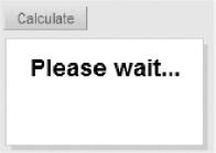
Figure 6-32. Popup panel used as blocking operation status window
When the button is clicked, the #{bean.calculate} listener is invoked. Let's assume it takes a few seconds to complete (you can put the current thread to sleep for a few seconds if you are testing). You know from before that you can use <a4j:status> to display any content while the Ajax request is being processed. In this example facets are not defined, but we are using <a4j:status>'s start and stop events to show and hide the popup panel. Again #{rich:component(id)} is the RichFaces client EL function that allows you to call the JavaScript API on the referenced component. That's exactly what the example does. On the request start, you call show() on the popup panel. When the request has been completed (onstop event handler called), you call hide() on the popup panel.
Popup Panels and Performance
Real-world applications are widely using various popups across the pages. There are some claims about performance downgrades when using <rich:popupPanel> on pages. Usually the reason for this is trying to pre-render every popup panel content to the client. In the past, most of the use-cases were implemented by using navigation between master and details pages. Today many rich controls like tooltip, popup, sliding panel, and so on are available to designers trying to keep as much content on the same page as possible in order to build single-page-like applications.
This is really convenient for the application users. But without mechanisms of lazy loading and some other optimization techniques, it could greatly influence performance. So the main thing you should keep in mind while using the component is to limit the number of instances (especially heavy-weight) as possible. And remember the following:
- Do not include popups in iteration components in order to simply generate popups with row details.
- Do not use several different panel instances in templates for all application pages. This is especially important if the panels themselves use other rich components.
- Do not add Ajax-rendered zones (via
<a4j:outputPanel>) to every panel if only one will be actually updated in most view use-cases.
If you think about it, it all makes sense. First, every panel instance adds additional HTML to be rendered and loaded on the client. Second, every panel adds additional JavaScript initialization for the popup itself and for the components used in markup. Third, defining Ajax-rendered zones is good for panels in templates to catch all the changes without taking care about searching for the concrete panel that needs to be updated (re-rendered). But in that case, Ajax response size (and therefore time) will be increased and so will influence the Ajax performance.
Ideally, where possible, you should use something like Listing 6-40 in your applications.
Listing 6-40. Code to improve performance
<a4j:outputPanel id="updateMeToLoadPanel" layout="block">

   <rich:popupPanel rendered="#{controller.panelNeeded}">

      <a4j:outputPanel id="updateMeWhenPanelExist" layout="block">

         <ui:include src="#{controller.currentPanelURI}" />

      <a4j:outputPanel/>

   </rich:popupPanel>

</a4j:outputPanel>
A single panel instance is used and added only when it's needed. If the panel is already present in a view but has to be updated, then only inner <a4j:outputPanel> should be re-rendered to avoid JavaScript re-initialization of the popup. And <ui:include> src attribute, pointed to the subview, should be shown after the Ajax request. Then the panel could be shown using oncomplete of Ajax controls.
Ideally you should define only as many popups instances that you need nested panels for, and not for every separate case on the view.
JavaScript API
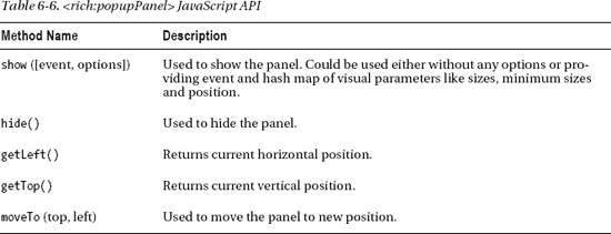
The <rich:popupPanel> component provides the JavaScript API methods shown in Table 6-6.
Using <rich:toolTip>
<rich:toolTip> allows you to display a tooltip based on some event. The most common case would be when you move the mouse over some text label or icon image. The tooltip can contain any other JSF components and content.
Let's say you start with something like this and want to display information about New York City when the mouse cursor moves over the city name, as shown in Figure 6-33.
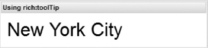
Figure 6-33. Panel with city name
Listing 6-41 shows how to define a simple tooltip for that case. The content of the tooltip is enclosed within <rich:toolTip>. If the tooltip content is just a small amount of text, you can use the value attribute of <rich:toolTip> instead. By default, the tooltip will be displayed when the mouseover event occurs. We will show you later in this chapter how you can specify the event implicitly.
Listing 6-41. Defining a simple tooltip
<rich:panel style="width:350px">

   <f:facet name="header">Using rich:toolTip</f:facet>

   <h:form>

      <h:outputText id="nyc" value="New York City" style="font-size: xx-

         large;" />
      <rich:tooltip mode="ajax" target="nyc">

         <h:panelGroup style="width:200px">

            New York City is the most populous city in the United States,

            with its metropolitan area ranking among the largest urban areas

            in the world. For more than a century, it has been one of the

            world's major centers of commerce and finance.

         </h:panelGroup>

      </rich:tooltip>

   </h:form>

</rich:panel>
The target attribute in Listing 6-41 points to the component whose event should activate the tooltip. It's also possible just to wrap the tooltip inside the actual component. We will show an example later in this chapter.
Finally, the loading mode used is ajax. In other words, when the mouse cursor moves over the text, an Ajax request is sent to the server to get the content of the tooltip. Another option is to use client mode. When using mode="client", the tooltip content will be pre-rendered to the client. Tooltip does not provide server mode because there are no reasons to make a full-page refresh just to show the tooltip.
Figure 6-34 shows the result when mouseover occurs at panel body text.
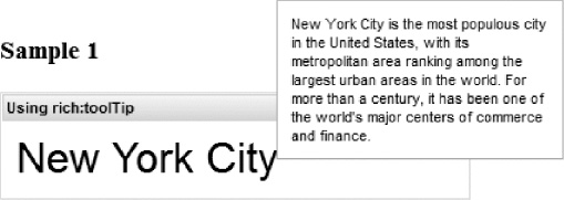
Figure 6-34. Tooltip above the text label
When using ajax mode, you can display a default message while the tooltip content is being retrieved from the server. This is useful if the operation to get the tooltip content might take a little while. To show the default content, you can use a facet named loading. Figure 6-35 shows how it looks in ajax mode when data for tooltip requested by default without even specifying the facet.
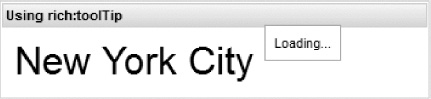
Figure 6-35. Tooltip “loading” label
Another useful attribute is followMouse. When set to true, the tooltip will follow the mouse as long as it stays on the element, as shown in Listing 6-42.
<h:form>

<rich:panel style="width:350px" id="panel">

   <f:facet name="header">Using rich:toolTip</f:facet>


      <rich:tooltip mode="client" followMouse="true">

         <f:facet name="loading">Loading...</f:facet>

         <h:panelGrid style="width:200px">

            New York City is the most populous city in the United States,

            with its metropolitan area ranking among the largest urban areas

            in the world. For more than a century, it has been one of the
            world's major centers of commerce and finance.

         </h:panelGrid>

      </rich:tooltip>

      <h:outputText id="nyc" value="New York City" style="font-size: xx-

         large;" />


   </rich:panel>

</h:form>
In this sample you also see the tooltip defined without target attribute usage. It is attached to the parent component (<rich:panel>).
Note There are components in JSF that don't encode its ID to the client unless you specify it explicitly. Two examples are <h:outputText> and <h:graphicImage>. If you are adding a tooltip to such components as a child and no ID is present, it will not work because it will not find an element to attach to. Adding a tooltip to a component requires that a client id is present. So a good practice is always to add an ID to parent components.
You can include any other JSF components inside the tooltip. Let's add the server time and a counter of the tooltip invocations, as well as an image. As shown in Listing 6-43, we will use mode="ajax", so every time the tooltip is displayed, the time and counter should be updated.
Listing 6-43. Using mode="ajax"
<h:form>

   <rich:panel style="width:350px">

      <f:facet name="header">Using rich:toolTip</f:facet>

      <h:outputText id="nyc" value="New York City" style="font-size: xx-

         large;" />

      <rich:tooltip mode="ajax" for="nyc" followMouse="true"

         showEvent="click">

         <f:facet name="loading">Loading...</f:facet>

         <h:panelGrid style="width:200px">

            <b>#{tooltip.now}"</b>

            New York City is the most populous city in the United States,

            with its metropolitan area ranking among the largest urban

            areas in the world. For more than a century, it has been one

            of the world's major centers of commerce and finance.

            <h:graphicImage value="/images/NY-flag.png"/>

            <h:outputText value="Tooltip invoked #{tooltip.counter} times"

               style="font-weight:italic" />

         </h:panelGrid>

      </rich:tooltip>

   </rich:panel>

</h:form>
This code produces Figure 6-36.
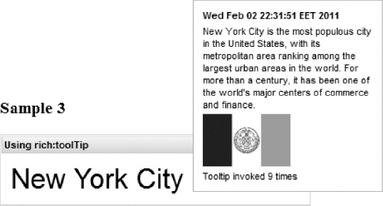
Figure 6-36. Tooltip with complex content and server-side data
You will see that the time was updated. #{tooltip.now} is bound to a getter that just returns the new time and #{tooltip.counter} increases every time the tooltip is requested, shown in Listing 6-44.
Listing 6-44. #{tooltip.now} and #{tooltip.counter}
@ManagedBean

@SessionScoped

public class Tooltip {

   private int counter = 0;


   public Date getNow() {

      return new Date();

   }


   public int getCounter() {

      return ++counter;

   }

}
If you switch to mode="client", the tooltip content, including the time, will be pre-rendered and no longer updated. This also demonstrates how to show a tooltip for a component, and binding it on any event supported by that component.
There we use the click event as defined in the showEvent attribute, as follows:
<rich:tooltip mode="ajax" for="nyc" followMouse="true" showEvent="click">
Note You can use any component event to show the tooltip, but the event should provide positioning information. If a custom event on the component will not provide positioning information, the tooltip will not be positioned properly because it does not know where the event has occurred. focus event provides positioning information only if input was activated with a mouse. Currently, the tooltip can't be shown properly out of the box when the input gets focused using keyboard tabbing.
Using <rich:tooltip> with Data Iteration Components
Like the popup panel, the <rich:toolTip> component can be useful with data iteration components. For example, when mouse cursor is moved over a particular row cell, more information is displayed in the tooltip about that record.
One way to pre-render the content of the tooltip for each row is by setting mode="client", as shown in Listing 6-45.
Listing 6-45. Pre-render the content of the tooltip for each row
<rich:dataTable id="statesTable"

   value="#{statesBean.statesList}" var="state">

   <h:column>

      <f:facet name="header">State</f:facet>

      <h:outputText value="#{state.name}" />

      <rich:tooltip mode="client" >

         <h:panelGrid>

            <h:outputText value="#{state.name}" style="font-weight:bold"/>

            <h:outputText value="#{state.capital}" />

            <h:graphicImage value="#{state.flagImage}"/>

         </h:panelGrid>

      </rich:tooltip>

   </h:column>

</rich:dataTable>
This produces Figure 6-37.
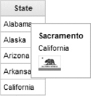
Figure 6-37. Tooltip over the table cell
You are probably wondering how to show the tooltip but not pre-render it to the client. That's definitely a good question as usage of tooltip pre-rendered inside iteration components could also affect the performance if the tooltip component contains complex markup and there are many rows in the iteration component, such as table. However, nothing complicated here—you should just change the mode to ajax and only the default facet will be pre-rendered. Tooltip content will be loaded via Ajax when the tooltip is requested.
Note The best solution would be to define tooltip outside of the table and just show with particular cell information (ideally without any additional requests). But it's not so trivial with the current version of RichFaces. There is still no client templating feature implemented. And without that feature you will need to update the tooltip content using custom JavaScript before showing or updating via ajax anyway.
JavaScript API
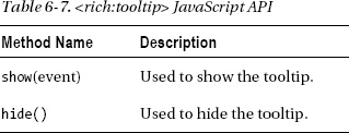
The <rich:tooltip> component provides the JavaScript API method described in Table 6-7.
Summary
RichFaces provides a wide range of rich output components, from a basic panel to popups and tool tips. This chapter showed you many different examples and tips on how to use and customize these components. As with any RichFaces component, you can customize the look and feel of these components with skins. Chapter 13 is dedicated to skins and their customization. To see these and other components in action, go to the RichFaces components demo application available at the JBoss Community RichFaces web site at www.jboss.org/richfaces.
Now that you have learned about output components, we are going to cover data iteration components in the next chapter.