
Controls
Controls are the fundamental building blocks of user interfaces in XAML. Silverlight comes with an extensive set of core controls, quite similar what's available in Windows Forms (and WPF). Where controls are missing, such as the TreeView control, you may find that these additional controls are available in the Silverlight Toolkit project (created and maintained by Microsoft) on the CodePlex web site.
In this section, we'll specifically look at a subset of these core controls used to lay out controls on the user interface surface, which we'll call layout controls. We'll also look at some of the naming differences between control properties in Windows Forms and Silverlight. Then, we'll take a look at specifying event handlers that can handle an event in the code-behind when it is raised by the given control. However, let's first look at the base control classes in Silverlight that all controls derive from.
Base Control Classes
While you will never use these directly, it's worth taking a cursory look at the DependencyObject, UIElement, FrameworkElement, Control, and ContentControl base control classes that other controls derive from. The inheritance hierarchy of these controls is shown in Figure 2-2.
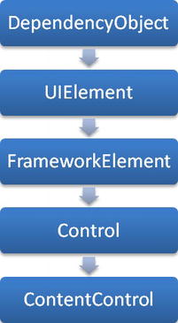
Figure 2-2. Inheritance hierarchy of the base control classes
DependencyObject
One of the concepts for supporting special features required by XAML is the dependency property. Dependency properties are special types of properties on XAML controls that are defined in a different way from normal CLR properties, and they support additional features. Possibly the most important feature dependency properties support is the ability to accept an expression that must be resolved as its value at runtime. This feature enables markup expressions to be assigned to the property in XAML, enabling data binding and so forth, as the values of markup extensions need to be determined at runtime. Dependency properties also enable the concept of attached properties.
In order for dependency properties to be supported on an object, that object must be a dependency object (that is, inherit from the DependencyObject class). Dependency properties register themselves with the dependency object, and the dependency object then maintains the value for each of these dependency properties and provides helper methods for setting/getting these values. All XAML controls derive from DependencyObject, although, as a general rule, indirectly via the Control or ContentControl class.
 Note Whether or not an object is a dependency object or a property is a dependency property are generally not issues you will need to worry about, at least until you try to create your own user/custom controls. A more complete discussion of dependency properties and how to create them will be covered in Chapter 12.
UIElement
The UIElement class derives from DependencyObject and adds functionality for handling user input (keyboard, mouse, and stylus) and control focus. It also adds the base layout functionality for controls.
FrameworkElement
The FrameworkElement class derives from UIElement and adds additional layout functionality to that provided by UIElement, along with object lifetime events (primarily the Loaded event) and support for data binding, via the GetBindingExpression and SetBinding methods.
Control
The Control class derives from FrameworkElement and is the class that most XAML controls inherit from. It adds functionality used to define the appearance of the control, most importantly by defining the Template property.
ContentControl
The ContentControl class inherits from Control and adds functionality to help derived controls define a content area in their control template, using the ContentPresenter control, into which custom content can be inserted by using the Content property that it defines. For example, the Button control inherits from this control indirectly via the ButtonBase class, enabling the content of the button to be customized, such as by displaying an image next to the text in the button, as demonstrated earlier in this chapter in the “Content Element Syntax” section.
Creating content controls will be detailed in Chapter 12.
Layout Controls
When you start experimenting with Silverlight, you'll find that none of the controls have properties to enable you to specify how they should be positioned on the design surface. In Windows Forms, positioning controls was as easy as assigning values to a control's Left and Top properties; however, these are nowhere to be found on Silverlight controls. How exactly can you then position controls on a Silverlight surface? The solution to this problem comes in the form of layout controls.
Layout controls are invisible container controls (controls designed specifically to act as a container for other controls) that handle the positioning of their children. So that controls can specify how they should be laid out, layout controls have attached properties that they can use when required. There are a number of layout controls in Silverlight—each with its own logic and behavior for positioning the controls that they contain. These layout controls can be mixed and matched as required (that is, nested within one another) to achieve the layout you are after.
Using layout controls means that, instead of designing your views using the fixed positioning of controls that you may be used to, you can design very flexible layouts that can automatically adjust to various conditions, such as browser/window resizing and so forth—all controlled by the layout controls that you use.
Out of the box, Silverlight provides three layout controls for positioning controls in a view—the Canvas, Grid, and StackPanel controls. These all inherit from the Panel class, which provides the base layout functionality to which they add their own specific layout functionality. The Silverlight Toolkit also includes some additional layout controls that you may find useful. Let's take a look at each of these now.
Canvas
The Canvas layout control enables you to position controls on its surface using fixed coordinates. With this control, you can easily position controls but doesn't lead to particularly flexible layouts. It can be useful in some circumstances, however. Using it is quite simple. Here, we define a Canvas control and place a TextBlock control within it (see Figure 2-3):
<Canvas Width="300" Height="150" Background="Gainsboro">

    <TextBlock Text="Hello" />

</Canvas>

Figure 2-3. A TextBlock control within a Canvas control, with no positioning
The problem here is that the TextBlock will be positioned in the upper-left corner of the Canvas, as you can see in Figure 2-3, and it has no properties enabling it to specify the coordinates where it should be positioned. Because the properties that would be required to position it depend on the type of layout control that it is contained within, the TextBlock control doesn't have any positioning properties defined on it. Instead, the Canvas provides these properties to the TextBlock as attached properties, enabling the TextBlock to specify where it should be positioned within the Canvas. For this purpose, the Canvas control provides two attached properties: Left and Top. It can then use those values when given the task of positioning all the controls that it contains.
The following XAML demonstrates assigning values to the Left and Top attached properties provided by the Canvas control values on our TextBlock control, enabling the Canvas control to position the TextBlock control on its surface accordingly. You can see the result in Figure 2-4.
<Canvas Width="300" Height="150" Background="Gainsboro">

    <TextBlock Text="Hello" Canvas.Left="100" Canvas.Top="50" />

</Canvas>

Figure 2-4. A TextBlock control positioned within a Canvas control
Grid
The most commonly used layout control in Silverlight is the Grid control. Unlike when using the Canvas control, you do not specify the location of controls within a Grid using absolute coordinates. Instead, you divide up the grid into rows and columns (forming cells) that you can place controls into. Rows and columns can have a fixed height and width, automatically size to fit their contents, expand to fill all the remaining available space, and be sized relative to the size of other rows/columns. This allows for very flexible control layouts, and thus the Grid control is generally preferred over the Canvas control for laying out controls.
When you create a new UserControl or Page in your project, you will find that it already has a Grid control, named LayoutRoot, in place but with no rows or columns defined:
<Grid x:Name="LayoutRoot" Background="White">


</Grid>
The first thing you will need to do is divide it up into rows and columns. You can do so using the RowDefinitions and ColumnDefinitions properties of the Grid control. These are collections, to which you need to add RowDefinition and ColumnDefinition objects, using a combination of property element syntax and collection syntax in XAML. For example, this 300 × 150–pixel grid is divided into two columns and three rows:
<Grid x:Name="LayoutRoot" Background="White" Width="300" Height="150">

    <Grid.ColumnDefinitions>

        <ColumnDefinition />

        <ColumnDefinition />

    </Grid.ColumnDefinitions>
    <Grid.RowDefinitions>

        <RowDefinition />

        <RowDefinition />

        <RowDefinition />

    </Grid.RowDefinitions>

</Grid>
Figure 2-5 shows a Grid control (in the Visual Studio designer) defined using this XAML.
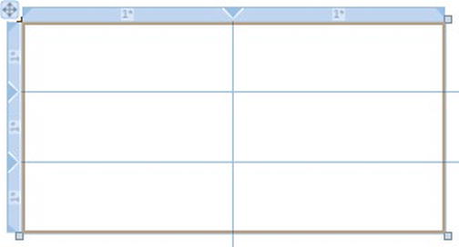
Figure 2-5. A Grid control in the Visual Studio Designer, with two columns and three rows defined
Note The XAML designer in Visual Studio makes the task of defining a Grid control quite easy, so you don't have to write all the XAML-defining rows and columns by hand. When a Grid control is selected, a light-blue margin will appear at the top left of the Grid. Clicking in one of these margins will create a row/column at that position.
Weighted Proportion Sizing
When no column widths and row heights are explicitly set, they will have a default value of an asterisk (*), which is used to specify a weighted proportion. Weighted proportions enable you to have columns or rows whose width and height are relative to one another. Any fixed or automatically sized columns or rows are allocated their requested space in the Grid, after which columns/rows with weighted proportions divide up the remaining available space according to their weights. Essentially, each column/row takes a percentage of this remaining space.
Looking at the columns in the preceding example, each column will have its default width of *. This will result in them dividing their sizes up evenly, with each column taking 50 percent of the width of the Grid. To make the first column take twice the space assigned to the second column, you can prefix the asterisk in the value of the width property with a multiplier. For example, when the columns are defined like so:
<Grid.ColumnDefinitions>

    <ColumnDefinition Width="2*" />

    <ColumnDefinition Width="*" />

</Grid.ColumnDefinitions>
the first column will take 66.67 percent of the Grid's width, and the second column will take 33.33 percent, as shown in Figure 2-6. As the Grid is 300 pixels wide, the first column will be 200 pixels wide, and the second column will be 100 pixels wide.
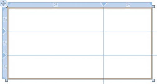
Figure 2-6. A Grid control in the Visual Studio Designer, demonstrating weighted proportions
Note A width of * is the same as 1*.
If the Grid control doesn't have a width/height specified, it will expand to fill the space available to it. As its size is changed, such as when the browser/window is resized, its columns and rows will also resize themselves accordingly. This enables you to design a layout that will automatically resize itself to fill the space available to it, resulting in a very flexible user interface layout that will adjust accordingly to whatever size is allocated to it.
Fixed-Width Sizing
You can give a column or row a fixed width/height by assigning it a numeric value (in pixels). For example, the first column in the following example will have a width of 200 pixels, and the second column will have a width of 100 pixels:
<Grid.ColumnDefinitions>

    <ColumnDefinition Width="200" />

    <ColumnDefinition Width="100" />

</Grid.ColumnDefinitions>
Figure 2-7 shows a Grid control using these column definitions.
Figure 2-7. A Grid control in the Visual Studio Designer, demonstrating fixed width proportions
Note If you simply set the width of the second column to *, the remaining width of the Grid will be filled after the 200 pixels have been assigned to the first column. If the width of the Grid is 300 pixels, the second column will be 100 pixels wide. If the width of the Grid is 500 pixels, the second column will be 300 pixels wide.
Automatic Sizing
At times, you may not know what width or height a column or row should be, but you want it to automatically expand to the size of its contents. To do this, set the column or row's Width/Height property to Auto.
<Grid Width="300" Height="150">

    <Grid.ColumnDefinitions>

        <ColumnDefinition Width="Auto" />

        <ColumnDefinition Width="Auto" />

    </Grid.ColumnDefinitions>


    <Grid.RowDefinitions>

        <RowDefinition />

        <RowDefinition />

        <RowDefinition />

    </Grid.RowDefinitions>


    <Button Width="50" Grid.Column="0" Grid.Row="0" Margin="5" />

    <Button Width="100" Grid.Column="0" Grid.Row="1" Margin="5" />

    <Button Width="75" Grid.Column="0" Grid.Row="2" Margin="5" />


    <Button Width="120" Grid.Column="1" Grid.Row="0" Margin="5" />

</Grid>
As Figure 2-8 shows, the Grid's columns automatically size to fit the largest of their contents, plus their associated margin (ways to position controls within Grid cells are discussed in the next section).
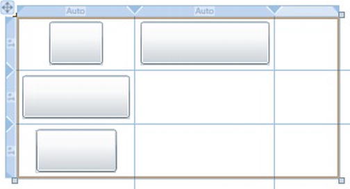
Figure 2-8. A Grid control in the Visual Studio Designer, demonstrating automatic sizing
Note Note that each Button control was assigned a 5-pixel margin. This inserts some space between the controls and their containing cells, which you can see in Figure 2-8.
Assigning Controls to Grid Cells
Once you've defined the rows and columns in your Grid, you can start assigning controls to its cells. As with the Canvas control, the Grid control provides attached properties that your controls can use to tell the Grid which row and column it should be positioned within. These attached properties are Row and Column. These properties specify an index in the RowDefinitions and ColumnDefinitions properties, and thus are zero-based—that is, to put a control in the first row in the Grid, set its Grid.Row attached property to 0. If you want a control to span across more than one row or column in the grid, you can use the Grid's RowSpan and ColumnSpan for this purpose.
The following example demonstrates three controls being positioned within the Grid, which is shown in Figure 2-9. The TextBlock control is being placed in the first column of the first row, while the TextBox control is being placed in the second column of the first row. The Button control is being placed in the first column of the second row but will span both columns in the Grid:
<Grid Width="300" Height="85">

    <Grid.ColumnDefinitions>

        <ColumnDefinition />

        <ColumnDefinition Width="2*" />

    </Grid.ColumnDefinitions>

    <Grid.RowDefinitions>

        <RowDefinition Height="35" />

        <RowDefinition />

    </Grid.RowDefinitions>


    <TextBlock Grid.Column="0" Grid.Row="0" Text="Name:"

               VerticalAlignment="Center" />

    <TextBox Grid.Column="1" Grid.Row="0" Margin="0,5" />

    <Button Grid.Column="0" Grid.Row="1" Grid.ColumnSpan="2" Margin="0,5"

            Content="OK" />

</Grid>
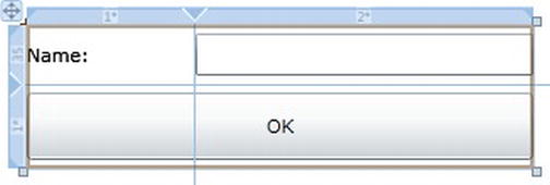
Figure 2-9. A Grid control in the Visual Studio Designer, demonstrating assigning controls to Grid cells
Note When you drop a control from the toolbox into a grid cell, a margin will be applied to the control to position it within that cell. To remove this margin easily, right-click the control, and select Reset Layout  Margin from the menu. Otherwise, you can simply remove it from the XAML defining that control.
StackPanel
The StackPanel control is used for stacking controls one after another, either horizontally or vertically, which you specify via a control's Orientation property. For example, you could put a TextBlock control and a TextBox control within a StackPanel whose Orientation property was set to Horizontal, and this will position the TextBox next to the TextBlock, as shown in Figure 2-10:
<StackPanel Orientation="Horizontal">

    <TextBlock Text="Name: " />

    <TextBox Width="155" />

</StackPanel>
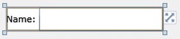
Figure 2-10. A StackPanel control in the Visual Studio Designer, demonstrating horizontal orientation of controls
Alternatively, you could set the StackPanel's Orientation property to Vertical, and this will position the TextBox immediately below the TextBlock, as shown in Figure 2-11:
<StackPanel Orientation="Vertical">

    <TextBlock Text="Name: " />

    <TextBox Width="155" />

</StackPanel>
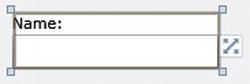
Figure 2-11. A StackPanel control in the Visual Studio Designer, demonstrating vertical orientation of controls
Silverlight Toolkit Layout Controls
The Silverlight Toolkit contains some additional layout controls that you may find useful. In the System. Windows.Controls.Toolkit.dll assembly, you will find the WrapPanel and DockPanel layout controls.
Note Note that the toolkit namespace prefix needs to be declared in the XAML for these code samples to work. To do so, add the following to the root node in your XAML file:
xmlns:toolkit="http://schemas.microsoft.com/winfx/2006/xaml/presentation/toolkit"
Wrap Panel
The WrapPanel is much like the StackPanel, when stacking controls horizontally, but once the controls within it hit the right edge of the WrapPanel, new items will wrap and start being displayed on the next line. You might use this, for example, when you have thumbnails of photos and want to lay them out in much the same way as Windows Explorer does.
The following code demonstrates using this control, positioning Button controls within its area.
<toolkit:WrapPanel Width="200" Height="200" Background="WhiteSmoke">

    <Button Content="1" Width="50" Height="50" Margin="5" />

    <Button Content="2" Width="50" Height="50" Margin="5" />

    <Button Content="3" Width="50" Height="50" Margin="5" />

    <Button Content="4" Width="50" Height="50" Margin="5" />

    <Button Content="5" Width="50" Height="50" Margin="5" />

    <Button Content="6" Width="50" Height="50" Margin="5" />

    <Button Content="7" Width="50" Height="50" Margin="5" />

</toolkit:WrapPanel>
This will produce the output shown in Figure 2-12.
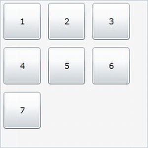
Figure 2-12. A WrapPanel control in the Visual Studio designer, demonstrating horizontal wrapping
As you can see, the Button controls are stacked horizontally and wrapped onto the next “line” once a control will fall outside the WrapPanel control's area. You can alternatively stack the controls vertically by setting the WrapPanel control's Orientation property to Vertical.
Dock Panel
The DockPanel enables you to dock the controls contained within it to one of its edges or fill the remaining space. If you miss the ability to dock controls from Windows Forms, this will provide you the same ability in Silverlight.
To dock a control to a position in the DockPanel control, use the Dock attached property that it provides, as demonstrated in the following code:
<toolkit:DockPanel Width="400" Height="300"

    <Button Height="80" toolkit:DockPanel.Dock="Top" Content="Dock Top" Margin="2" />

    <Button Width="80" toolkit:DockPanel.Dock="Left" Content="Dock Left" Margin="2" />

    <Button Width="80" toolkit:DockPanel.Dock="Right" Content="Dock Right" Margin="2" />

    <Button Height="80" toolkit:DockPanel.Dock="Bottom" Content="Dock Bottom" Margin="2" />

    <Button Content="Fill" Margin="2" />

</toolkit:DockPanel>
As you can see, each button docks itself to an edge, except the final button which will fill the remainder of the space left, as shown in Figure 2-13.
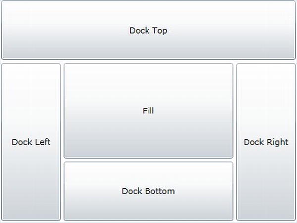
Figure 2-13. A DockPanel control in the Visual Studio designer
XAML vs. Windows Forms Controls' Property Names
You will find that, despite the core control set in Silverlight being quite similar to that available in Windows Forms, Silverlight's controls are actually implemented quite differently in places, having been developed from the ground up. In particular, some of the properties of controls in Windows Forms have different names in Silverlight. For example, most Boolean properties are prefixed with Is (IsEnabled, IsTabStop, IsHitTestVisible, and so on) in XAML. Also worth noting is that the Visibility property, which was named Visible in Windows Forms and used to show or hide controls, is now an enumeration with two possible values: Visible or Collapsed. This may seem rather strange and confusing at first, and in terms of Silverlight development it probably is! The reason for this is purely for compatibility with WPF, which supports an additional value of Hidden, which, in WPF, hides the control like Collapsed does but unlike Collapsed still consumes space in the layout. However, since Silverlight doesn't support that value, we are left with an enumeration with just Visible or Collapsed as its possible values.
Assigning Event Handlers
Controls have the ability to raise events that the code-behind can handle to respond to something that has happened to the control, such as a Button control raising a Click event in response to being clicked. Assigning an event handler to a control in XAML is a case of simply using attribute syntax, the same way you assign a value to a property on the control, to assign the name of the event handler in the code-behind that should be called when the event is raised. For example, assigning an event handler called OKButton_Click to the Click event on a Button control is achieved like so:
<Button Name="OKButton" Content="OK" Click="OKButton_Click" />
Note As a general rule (though not mandatory), the name of event handler methods are of the form ControlName_EventName.
Assigning Event Handlers in XAML in Visual Studio
In Visual Studio, typing in the event name and pressing the equal sign will give you a list of event handler methods in the code-behind to choose from (that match the required method signature), and it will also give you the following option: <New Event Handler>. Clicking this, or simply pressing Tab, will automatically generate a name for the event handler, assigning it to the event in XAML and automatically creating the corresponding event handler method in the code-behind.
However, if you choose to type in the name of the event handler, you will find that the event handler will not be automatically created in the code-behind. In this case, the easiest way to create the event handler is to right-click the name of the event handler in the XAML, and select the Navigate to Event Handler option from the context menu. This will open up the code-behind class and create the event handler method for you.
This option can also be useful if you've deleted the event handler in the code-behind and want to re-create it. It's also particularly useful when you simply want to navigate to an event handler in the code-behind for a given control in XAML.
Note Many controls define a default event, enabling you to simply double-click the control in Visual Studio's designer to automatically assign an event handler to that event on the control and create the event handler method in the code-behind. For example, double-clicking a Button control will create a Click event handler in the code-behind and assign that method to the Button's Click event in the XAML. You can also use the Events view of the Properties window to create event handlers without resorting to writing the XAML yourself.
Assigning Event Handlers in XAML in Expression Blend
Unfortunately, working with events is not so straightforward in Expression Blend. Events don't appear in Expression Blend's IntelliSense; you can't double-click a control to have it generate and assign the event handler for the default event of the control, nor can you right-click an event handler name in XAML and navigate to it in the code-behind. The only way to automatically create an event handler for a control in the code-behind and assign it to the control is to use the Events view in the Properties window.
Routed vs. Direct Events
Silverlight supports a special type of event called a routed event. Routed events are passed up the object hierarchy (which is known as “bubbling” the event), and the event is raised on each control until an event handler marks the event as handled or the root visual is reached. Although most events are direct events (that is, the event handler is called only on the control that raised the event), many user interaction–related events are routed events, such as mouse/key input events and focus events, and these will bubble up the object hierarchy until they are handled.
Note Unlike WPF, Silverlight does not support any tunneling of events (where the event is raised on controls from the root visual object down to the event source).
Assigning Event Handlers in Code
Event handlers can be assigned to control events in the code-behind as per C#'s standard language syntax, for example:
this.Loaded += MainPage_Loaded;
Be particularly aware, however, that adding an event handler to a control can result in the control not being garbage collected once it is no longer required, hence leading to memory leaks. This is because the control will still have a reference to it via the event handler, and thus the garbage collector will assume the control is still required and not clean it up.
For example, say you add a button to a view and add a Click event handler to it, and then remove the button from the view. A reference to the button will still exist by way of the event handler, preventing it from being garbage-collected, for example:
// Add the button and handle its Click event

Button button = new Button();

button.Click += button_Click;

LayoutRoot.Children.Add(button);


// Now remove the button and clear the variable reference

LayoutRoot.Children.Remove(button);

button = null;
Even though, at the completion of this code, the button no longer exists in the object hierarchy and there is no variable referencing it any longer, it still will not be garbage collected because there is still a subscription to the Click event being maintained. This situation will result in a memory leak. Although the impact of this example is small, if you did it many times or with bigger objects that consume more memory, the memory usage of your application could grow over time to potentially unacceptable levels. To avoid such a scenario, when you have a long-lived object with an event handler to a short(er)-lived one, remember to always remove that event handler once the control is no longer required:
button.Click -= button_Click;
Note Another solution is to use a weak event listener that subscribes to the event without maintaining a strong reference, allowing the control to be cleaned up when there are no other references to the control. The Silverlight Toolkit contains a WeakEventListener class that you could use for this purpose if you wish.
 Workshop: Creating a Simple User Interface
Now that we've gone through most of XAML's important concepts, let's put them together to create a simple XAML user interface. For this example, we'll create a simple application where you enter some information about yourself (first and last name), which will then be displayed in a message box when you click a button. We'll be using a form containing two text boxes with corresponding labels, a combo box, and a button, all laid out using a Grid control. When in the designer, it should look similar to Figure 2-14.
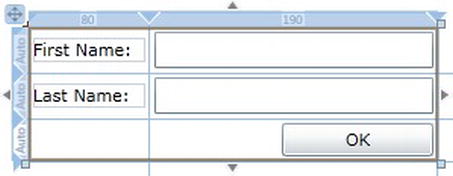
Figure 2-14. A simple user interface layout
- Create a new project named Chapter02Workshop using the Silverlight Application project template.
- Open the
MainPage.xamlfile in this new project. You'll find the following XAML:<UserControl x:Class="Chapter02Workshop.MainPage"
xmlns="http://schemas.microsoft.com/winfx/2006/xaml/presentation"
xmlns:x="http://schemas.microsoft.com/winfx/2006/xaml"
xmlns:d="http://schemas.microsoft.com/expression/blend/2008"
xmlns:mc="http://schemas.openxmlformats.org/markup-compatibility/2006"
mc:Ignorable="d"
d:DesignHeight="300" d:DesignWidth="400">
<Grid x:Name="LayoutRoot" Background="White">
</Grid>
</UserControl> - Note the Grid named
LayoutRoot. We will use this to lay out our controls by configuring the rows and columns (three rows and two columns). This will be used to lay out the controls in your view:<Grid x:Name="LayoutRoot">
<Grid.ColumnDefinitions>
<ColumnDefinition Width="80" />
<ColumnDefinition Width="190" />
</Grid.ColumnDefinitions>
<Grid.RowDefinitions>
<RowDefinition Height="Auto" />
<RowDefinition Height="Auto" />
<RowDefinition Height="Auto" />
</Grid.RowDefinitions>
</Grid> - We can now define our controls within this Grid. Add two TextBlock controls, one displaying the text “First Name:” and the other displaying “Last Name:”. Adding these gives you two TextBox controls for entering the data into and a Button control displaying OK as its content to the Grid's content area.
<Grid x:Name="LayoutRoot">

    <Grid.ColumnDefinitions>

        <ColumnDefinition Width="80" />

        <ColumnDefinition Width="190" />

    </Grid.ColumnDefinitions>

    <Grid.RowDefinitions>

        <RowDefinition Height="Auto" />

        <RowDefinition Height="Auto" />

        <RowDefinition Height="Auto" />

    </Grid.RowDefinitions>


    <TextBlock Text="First Name:" />

    <TextBox />

    <TextBlock Text="Last Name:" />

    <TextBox />

    <Button Content="OK" />

</Grid> - All of these controls will be overlapping each other in the Grid's top-left cell. We now need to assign each control to a specific row/column in the Grid using the Grid's Row and Column attached properties:
<TextBlock Grid.Column="0" Grid.Row="0" Text="First Name:" />

<TextBox Grid.Column="1" Grid.Row="0" />

<TextBlock Grid.Column="0" Grid.Row="1" Text="Last Name:" />

<TextBox Grid.Column="1" Grid.Row="1" />

<Button Grid.Column="1" Grid.Row="2" Content="OK" /> - Give each user input control a name so that we can reference them in the code-behind:
<TextBlock Grid.Column="0" Grid.Row="0" Text="First Name:" />

<TextBox Grid.Column="1" Grid.Row="0" Name="firstNameTextBox" />

<TextBlock Grid.Column="0" Grid.Row="1" Text="Last Name:" />

<TextBox Grid.Column="1" Grid.Row="1" Name="lastNameTextBox" />

<Button Grid.Column="1" Grid.Row="2" Name="OKButton" Content="OK" /> - To complete the layout, add some margins to the controls, align the TextBlock controls so that they are centered vertically in their Grid cells, give the button a width, and align it horizontally to the right:
<TextBlock Grid.Column="0" Grid.Row="0" Margin="3" Text="First Name:"

           VerticalAlignment="Center" />

<TextBox Grid.Column="1" Grid.Row="0" Margin="3" Name="firstNameTextBox" />

<TextBlock Grid.Column="0" Grid.Row="1" Margin="3" Text="Last Name:"

           VerticalAlignment="Center" />

<TextBox Grid.Column="1" Grid.Row="1" Margin="3" Name="lastNameTextBox" />

<Button Grid.Column="1" Grid.Row="2" Margin="3" Name="OKButton" Content="OK"

        Width="100" HorizontalAlignment="Right" />
Note If you're typing this XAML out by hand, you will find that Visual Studio's IntelliSense is a big help, making it quite quick and easy to write. However, this project is available online for you to download if required. - Now, add an event handler for the
Clickevent to the Button control. As theClickevent is the default event for the Button, the easy way to create the event handler in the code-behind and wire up the control to it in the XAML is to simply double-click the button in the designer. Alternatively, you can set theClickattribute on the Button element to the name of the event handler in the code-behind:<Button Grid.Column="1" Grid.Row="2" Margin="3" Name="OKButton" Content="OK"
Width="100" HorizontalAlignment="Right" Click="OKButton_Click" /> - The XAML defining the user interface is now complete. The complete XAML for the page you should now have follows:
<UserControl x:Class="Chapter02Workshop.MainPage"
xmlns="http://schemas.microsoft.com/winfx/2006/xaml/presentation"
xmlns:x="http://schemas.microsoft.com/winfx/2006/xaml"
xmlns:d="http://schemas.microsoft.com/expression/blend/2008"
xmlns:mc="http://schemas.openxmlformats.org/markup-compatibility/2006"
mc:Ignorable="d">
<Grid x:Name="LayoutRoot">
<Grid.ColumnDefinitions>
<ColumnDefinition Width="80" />
<ColumnDefinition Width="190" />
</Grid.ColumnDefinitions>
<Grid.RowDefinitions>
<RowDefinition Height="Auto" />
<RowDefinition Height="Auto" />
<RowDefinition Height="Auto" />
</Grid.RowDefinitions>
<TextBlock Grid.Column="0" Grid.Row="0" Margin="3" Text="First Name:"
VerticalAlignment="Center" />
<TextBox Grid.Column="1" Grid.Row="0" Margin="3" Name="firstNameTextBox" /><TextBlock Grid.Column="0" Grid.Row="1" Margin="3" Text="Last Name:"
VerticalAlignment="Center" />
<TextBox Grid.Column="1" Grid.Row="1" Margin="3" Name="lastNameTextBox" />
<Button Grid.Column="1" Grid.Row="2" Margin="3" Name="OKButton" Content="OK"

        Width="100" HorizontalAlignment="Right" Click="OKButton_Click" />
</Grid>
</UserControl> - Now, we move to the code-behind for the XAML page (in
MainPage.xaml.cs). We need to handle the button click and display a message box containing the text that the user entered in the text boxes. Add the following code to the event handler in the code-behind, to obtain the values from the controls and display them in a message box:private void OKButton_Click(object sender, RoutedEventArgs e)
{
MessageBox.Show("Hello " + firstNameTextBox.Text + " " + lastNameTextBox.Text);
}
And now you're finished with your very first XAML user interface! Run the application, and try it out. As another exercise, try building the same user interface with Visual Studio 2010's designer using a drag-and-drop approach.