
Chapter 1
Think Mobile Touch
“A small step for man, one giant leap for mankind…”
—Neil Armstrong
These are exciting times for those who live and work with technology every day, whether they are young people who have used technology all their lives or they are like those who have adapted to it. These are exciting times because in recent years, no other example of technology has changed our lives so dramatically as the evolution of the mobile device.
In this book, you see how the mobile revolution has changed the way we develop applications and how touch screen technology brings new variablesto the table. First, you learn how to use new touch design techniques to design a touch-based user interface. Then, you learn how to adapt the same touch-based design principles to the specific needs of the iPhone and iPad. We base our project on an agile version of the standard Information Architecture process for optimizing both user and single-developer (or small team) needs.
After the design phase, you learn how to implement the design in the development phase and how to use web standards and WebKit-based frameworks to achieve the project goals.
As a final step in the process, you learn how to test a mobile touch application and how to evaluate tests in a user-centered way before releasing the application through the Apple WebApp portal or other third-party portals.
Why the Mobile Web?
A mobile market exists, it's growing day by day, and it's a revolution that impacts our way of life like few others. The question is, “Why should we invest time and resources in this market?”
From Desktop to Mobile
The history of computing has had five main cycles according to Morgan Stanley (shown in Figure 1–1): mainframe computing (1960s), micro computing (1970s), personal computing (1980s), desktop Internet computing (1990s), and mobile Internet computing (2000s). Looking at the mobile Internet computing era, you can identify the reasons for this evolution.
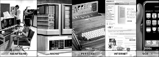
Figure 1–1. Technology cycles in computing history
First, the new touch screen technology increases the interface's usability whilereducing the frustration of mobile web browsing. Second is the incredible evolution of social networks such as Facebook and Twitter. Third are the new VoIP services thatstand as attractive alternatives to traditional 2G and 3G cellular communication, which has been the new cheap dataplans local ISPs have offered in the last few years.
The iPhone is at the center of this process because it catalyzed these three factors (also pioneering some of them) and as you can see from Figure 1–2, it has gained and maintained its dominant position on the market month after month. This is another good reason for starting to design and develop for the iPhone and iPad today. The time invested learning a language such as Objective-C (for native applications) or web standards (for web applications) is surely worth the effort in a short period of time.
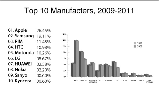
Figure 1–2. Top manufactures on the market in 2011 (source:MobileMix)
The nonstop evolution of mobile devices will, in the near future, involve some interactions that push the mobile ecosystem to optimize some of its services and present them as standard features for all devices while introducing othernew services such as the ones in the following:
Augmented Reality
The mobile device can “browse” Reality using information from services over the Web.
Mobile Device as Wallet
We can make safe payments from our devices, transforming an ordinary smartphone into a debit or credit card. MCommerce also becomes more common.
TV on the Go
Mobile users get broad access to traditional and mobile-oriented content created by professional companies and ordinary users.
“Smart” Mobile Networks
This enables mobile phones to automatically connect to all available access points located in the user's nearby area.
Global Positioning Services
The user's position is automatically updated and exported for use by private and public applications.
Internet in Your Pocket
Today, you can browse the Internet with just a few touch screen devices on the market, but in the future, even “mass-production” mobile phones will come with HTML browsers.
Improved Ergonomics and Usability
Most users know that to run an application or enter inputs on a “mass-production” device, it's necessary to perform a lot of clicks on the phone keypad. In the near future, many such devices will be equipped with touch screen technology.
Mobile Market
Over 4 billion people own or have access to a mobile device today. Of those, almost 50 percent have access to the web through a mobile device and that number grows with each passing year.
Today, six major mobile operating systems are on the market:
- iOS
- Symbian OS
- Android
- RIM OS
- Windows Phone 7
- WebOS
You can see the different percentages of each OS worldwide in Figure 1–3.
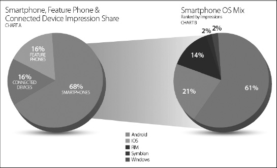
Figure 1–3. Operating system share in 2011 (source:MobileMix).
According to these percentages, the first good reason to start to design and develop for mobile devices today is that the market is large and there are more work opportunities than those in the desktop market.
With a mobile market that has become so greatly expanded, today more people access the web via mobile devices than with desktop computers. For services such as email, RSS, or social networks, the disparity between mobile Internet access and desktop Internet access is even larger. Today, these three services, shown in recent MobileMix reports, are the most used on mobile devices. (“Sixty percent of U.S. traffic came from WiFi-capable devices, and the iPhone is used more on WiFi than other smartphones.” May, 2011 Report, page 17.) Speaking for myself, I can hardly imagine going to work every day without the ability to access RSS feeds and emails on my iPhone.
Why Mobile Now?
With the growth path evident in the evolution of mobile devices, you get the final reason to invest time in developing Apple devices. The reason is that those types of services are unavailable on nontouch screen devices and on some non-Apple devices that do have touch screens.
Today is the right moment to jump on board the train of mobile device development, because the center of our (computer) activities is definitely moving from the inside of our house to inside our pocket.
A Mobile-Oriented Approach
Design and development for mobile devices requires a small change of paradigm; technologies involved are different, user interfaces are different, and even environmental conditions are different because most of the time, your applications and services are used outdoors and not in a quiet and comfortable room.
Despite that, the only suggestion that you always need to keep in mind is common and obvious: Try to walk in the shoes of mobile users and everything will be fine.
In Part II of this book, we work with iPhone and iPad; for now, we show you some general points to remember in approaching the mobile-oriented paradigm for touch devices.
Mobile-Oriented Guidelines
To work with the issues that mobile site design presents and to get a result that is as user-friendly and useful as your standard site, some creative problem-solving skills are required, incluing:
- Understanding the hardware and software available
- Giving the user the feeling of visiting the standard site
- Giving the user the option to visit the standard site
- Designing for both portrait and landscape views
- Including only important content from your standard site
- Prioritizing your content for a linear user experience
- Optimizing your navigation for fingers
- Optimizing your code to reduce bandwidth usage
- Minimizing the use of images to reduce bandwidth usage
- Ensuring your redirects work properly
- Testing, testing, and testing!
Your goal as designer and developer is to build One Web, where the same information is available and optimized for different devices, as detailed in Figure 1–4.
In accordance with the W3C standards, don't be afraid to offer different versions of your content, because the content's role is to bring a message to the users; for this reason, focus on offering the same (optimized) message and not necessarily the exact same content.
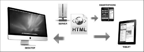
Figure 1–4. The one-web paradigm visually
This concept is the same one used in cross-browser design; unfortunately, many designers still believe that designing a cross-browser website means achieving the same website look in all of the existing browsers.
From a content-out point of view (and not only from that standpoint), the cross-browser design's primary function is to make the same message available through different browsers.
NOTE: We explain in depth the content-out approach in Chapter 2.
Apple's Mobile Hardware
One of the key points that youin this book is that “the hardware is not as important; the user experience is the real killer application.” Despite that, having a deep knowledge of the hardware you use in your project is fundamental and required for designing and developing quality works.
Often people ask for guidance in designing a web site or a web application to be compatible with different models of the same device and the answer is always the same: If you design a web site, optimize your work for the oldest device because a website is a general resource and you need to guarantee to the users the availability of its functions.
If you design an iOS web application, you need to guarantee that a set of functions is available from the oldest device to the newest one and that a subset of those functions is optimized only for the newest device. A reasonable ratio might be 30 percent to 70 percent with 70 percent of functions made available to all device models.
Summary
This chapter showed how and with which technologies computing has gone through four generations. It also showed how devices that run iOS on top of their advanced capabilities are the best solution for both native and web developers.
This chapter described a general approach to the mobile-oriented paradigm and some basic principles for working around the issues that mobile web site and web application design present.
You were introduced to some killer services based on touch-screen devices and saw how almost all of them are used on the go. In addition, you saw how designers and developers need to approach this new type of mobile context to optimize the mobile user experience.