
Chapter 8
Native iOS Environment Development
My goal wasn't to die the richest man in the It was to go to bed at night saying, we've done something wonderful.
—Steve Jobs
In this chapter, we will see how to work in an iOS environment, how to emulate it in our WebApp, and how to optimize its use.
First, we will set up an environment for testing our work on a local network. Next, we will introduce a viewport and see how we can optimize it for developing full-screen WebApps. We will explain how to create a springboard icon, as innative applications, and how to customize a startup image.
We will specify the JavaScript code for redirecting a user from a desktop to our iPhone WebApp and from our iPhone WebApp to a desktop, and explain how to emulate native link and design element behavior once a user has approached our WebApp.
We will also see how to interact with iPhone features, such as phone, mail, and GPS, and how to handle user gesture interaction and device orientation change.
Setting up the Environment
Before placing aWebApp on a public, live web server, it is better to work in a private environment, using a server on a desktop computer. This configuration will make the development and testing phases easier.
In order to do this, we need to perform the following steps:
- Create a folder in: /user/UserName/Sites/MySharedFolder
- Go to System Preferences Sharing
- Enable the service Web Sharing
NOTE: The iPhone or the iPad and the desktop computer must be connected to the same Wi-Fi network in order to establish a connection using the local URL address.
From this point on, we will save everything in this local folder and will access it using the local URL: http://desktopIPaddress/~folderName.

Figure 8–1. The Sharing box preferences.
Figure 8–1 shows the Sharing box with the service to enable and the IP address to use. The IP address shown in Figure 8–1 is related to my desktop computer; yours will have the same structure but will be slightly different.
Once the network environment is set, an HTML5-compliant editor is needed. Unfortunately, not every editor currently available is compatible with HTML5 syntax; be sure to check HTML5 compatibility before starting your project.
Defining Viewport
The viewport is the rectangular area that the user sees when looking at the iPhone or iPad display, and represents an important concept in the world of web design. The viewport dimensions are defined by two values: device-width and device-height. As we learned in previous chapters, different models of the iPhone have different display resolutions; nevertheless device-width and device-height values are set by default at the same value for all iPhone models. In both portrait and landscape modes, there will always be a 320 × 480 px viewport area. This approach ensures that, even with double-pixel resolution, the ratio between viewport elements remains unchanged, as shown in Figure 8–2, ensuring that existing iPhone WebApps continue to function as expected.
<meta name="viewport" content="width=640"/>
Even if it's not indicated by the code just shown, you can still have “full 100% real pixels” on Retina display devices.
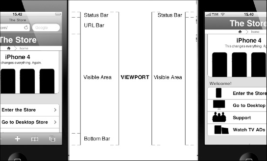
Figure 8–2. The iPhone viewport and its sections in non-WebApp (left) and WebApp mode (right).
The default value for the viewport is set to a width of 980px; this value is the reason a compatible WebApp with a fixed-width structure should be set as 980 px wide. In addition, when the viewport tag is not present, Safari loads the page as a 980 px-wide page and shrinks it to the viewport. This is equal to the following viewport metatag declaration:
<meta name="viewport" content="width=980; user-scalable=1;"/>
Having a 980 px default value means that the old iPhone models will scale down this value by a factor of approximately 3.06:1 or 2.04:1, while the iPhone4 will scale down by a factor of 2.04:1 or 1.02:1. Furthermore, the best option for iPhone and iPad web designers and developers is using the viewport metatag for lettingthe web page fit the width of the device; the viewport metatag properties can be seen in Table 8–1.
In order to achieve this, a constant called device-width needs to be used. The following example shows a typical viewport metatag for a WebApp with two meta-keys: name and content.
<meta name="viewport" content="width=device-width; initial-scale=1.0;

  maximum-scale=1.0; user-scalable=no;"/>
This meta-key content has multiple properties separated by a comma. The constant device-width refers to the width of the device that browses the page. This means that the value will change from device to device, as shown in the following example:
- width=768 (device-width in px for iPad on)
- width=480 (device-width in px for iPhone4 on)
- width=320 (device-width in px for iPhone 2G, 2G, 3GS)
You can also decide to match the device height instead of its width using the constant device-height.
The other property, initial-scale, sets the initial zoom on the web page once it is loaded. The default value of 1 sets the page to the iPhone display resolution.
The last property, user-scalable, sets the capability for the user to zoomin or out using a pinch gesture on the screen. When it is set to no, no zooming is allowed. The user scalability property should be set to no for every native iPhone and iPad WebApp, while it should be set to yes on iPad-compatible projects.
As a final note, remember that the viewport metatag will not in any way affect the rendering of desktop web pages.
Full-Screen Mode Application
The first and major aesthetic difference between a native application and a WebApp is the presence of the Safari URL bar in the latter. Working with Safari and its engine, WebKit, provides a measure of control over this situation.
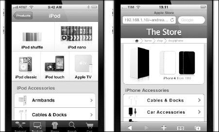
Figure 8–3. Comparison between a native application (left) and a WebApp (right) in non-WebApp mode.
Using the apple-mobile-web-app-capable metatag, you can specify the browser to hide the URL bar, thus providing a native-like lookandfeel to the user.
<meta name="apple-mobile-web-app-capable" content="yes" />
The full-screen mode will work only if the web page is launched from a link in the springboard. We will see how to add a web page to the iPhone or iPad springboard in the next section.
The iPhone and iPad status bar is fixed, and we are unable to hide it. Despite that fact, we can change how it looks using the following metatag:
<meta name="apple-mobile-web-app-status-bar-style" content="black-translucent" />
This metatag works only if the full-screen mode metatag is previously declared; otherwiseit will be ignored by the browser. The best approach is always to choose the Status Bar style according to the application color palette, but if you want to increase the visible area, the only option is to use the black-translucent version. The default Status Bar style in the springboard is set to black-translucentfrom iOS4 onwards.
Adding the Springboard Icon
The second difference between a native application and a WebApp is that a native application is launched from the home screen, also known as a springboard. We can replicate this sort of native pattern by designing a customized icon and adding a web page shortcut to the springboard, and then launch the page directly from there.
The customized springboard icon has some specific characteristics; some are a “must,” while others are just a “should,” and can be considered best practices.
- Measure: 57 × 57 px (iPhone 2G, 3G, 3GS) (required)
- Measure: 114 × 114 px (iPhone 4 on) (required)
- Measure: 72 × 72 px (iPad, iPad2) (required)
- Corners: 90 Degree
- Style: No Shine or Gloss
- Name: apple-touch-icon.png
- Name: apple-touch-icon-precomposed.png
- Format: Portable Network Graphic (PNG) (required)
- Location: Root Directory (required)
If we want to prevent Safari from adding effects like gloss and shine to our icon, we need to use the name apple-touch-icon-precomposed.png.
When the custom image is ready, we can link it to the web page using the following metatag:
<link rel="apple-touch-icon" href="/apple-touch-icon.png"/>
Even if, in theory, it's possible to use different springboard icons for different pages, it is strongly recommended that you use only one image for all your web pages—one WebApp, one springboard icon.

Figure 8–4. Adding a springboard (home screen) icon.
Users can add the springboard icon to their iPhone or iPad home screens using the plus button “+” in the Safari bottom bar and then clicking the “Add to Home Screen” button, as shown in Figure 8–4.
Application Startup Image
A web site, and even more often a WebApp, takesseveral seconds to load completely. We can cover this delay using a startup image, also known as a splash screen, which is displayed while the web page is loading.

Figure 8–5. WebApp startup image in action.
This kind of image must have some specific dimensions based on the principle that we need to cut off from the image the 20 px of space used by the status bar. The startup image is typically a portrait image, is in PNG format, and has exactly the following measurements:
- 320 × 460 px (iPhone 2G, 3G, 3GS)
- 480 × 940 px (iPhone4 on)
- 768 × 1004 px (iPad, iPad2)
Once we have our startup image, we need to link it using the following metatag:
<link rel="apple-touch-startup-image" href="/startup-image.png">
As for the springboard icon, if we link it using the metatag, the startup image does not need to be placed in the root directory; however, this is considered best practice.
Application Redirecting
When we develop a native-like WebApp for iOS, we need to keep in mind that this optimized mobile version is, most of time, not the first choice in terms of availability for the user.
The first thing that will happen in 99% of cases when a user comes to your index web page is that the web server sends the web client the standard desktop version. In addition, we need to know when a user is browsing from a mobile device in order to redirect him to the specific mobile version of our content.
We can achieve this using one of two techniques: JavaScript or CSS. These are not the only solutions available; we can achieve the same result very efficiently from the server (Apache or PHP, for instance), but in this text we are focusing on web standards in a broader sense. For this reason, we will show only HTML, CSS, and JavaScript solutions.
I recommend that you use JavaScript code for your project, but it's also important to remember that in some other cases, CSS detection via media query can be helpful.
<link rel="stylesheet" media="all and (max-device-width: 480px)" href="iphone.css">

<link rel="stylesheet" media="all and (min-device-width: 481px) and (max-device-width:

1024px) and (orientation:portrait)" href="ipad-portrait.css">

<link rel="stylesheet" media="all and (min-device-width: 481px) and (max-device-width:

1024px) and (orientation:landscape)" href="ipad-landscape.css">

<link rel="stylesheet" media="all and (min-device-width: 1025px)" href="ipad-

landscape.css">
In this example, we used three CSS files—one for iPhone, and two for iPad. We also used the ipad-landscape.css file for desktop machines, with a minimum width of 1025 px.
Assuming that we developed a compatible version for our project for both desktop and iPad users, the following code will be used in the compatible index web page for redirecting the iPhone user to the iPhone native-like version.
<script type="text/javascript">

         if ((navigator.userAgent.indexOf('iPhone') != -1) ||

(navigator.userAgent.indexOf('iPod') != -1) ||

(navigator.userAgent.indexOf('iPad') != -1))

        {

                document.location = "http://www.iphone.store.com/";

        }

</script>
The JavaScript code will do a test on the device “user agent,” detecting both iPhone and iPod users. We also need to ensure that an iPad or desktop user will not accidentally browse to the iPhone version, so we need to detect these users employing another small JavaScript code, but this time on the iPhone web page.
<script language="javascript" type="text/javascript">

         if((navigator.userAgent.match(/Macintosh/i)) ||

         (navigator.userAgent.match(/Windows/i)) ||

         (navigator.userAgent.match(/Linux/i)))

                {

                    location.replace("http://www.store.com/");

                }

</script>
This time, the JavaScript code will detect the Macintosh, Linux, and Windows “user agent” and will redirect these desktop users to their specific version.
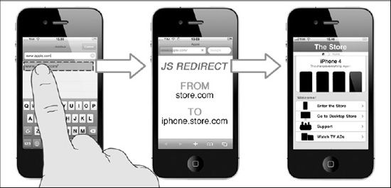
Figure 8–6. WebApp redirecting in action: From desktop to mobile (iPhone) version.
Setting up the Head Section
All the code developed so far is to be inserted into the <head> of our web page. Now it's time to takea bird's eye view of the entire <head> section. The following code is the <head> of the Apple Store use case based on iWebKit 5.0.4.
<head>

<meta charset="utf-8">

<meta name="apple-mobile-web-app-capable" content="yes" />

<meta name="viewport" content="minimum-scale=1.0, maximum-scale=0.6667,É

 width=device-width, user-scalable=no" />

<meta name="description" content="The Store iPhone Use Case" />

<link rel="apple-touch-startup-image" href="pics/startup-image.png" />

<link rel="apple-touch-icon" href="/apple-touch-icon.png" />

<link rel="stylesheet" type="text/css" media="screen" href="css/style.css" />

<script type="text/javascript" src="javascript/functions.js"></script>

<title>The Store</title>

<script language="javascript" type="text/javascript">

          if((navigator.userAgent.match(/iPhone/i)) ||
          (navigator.userAgent.match(/iPod/i)) ||
          (navigator.userAgent.indexOf('iPad') != -1)))

                {

                      location.replace("http://www.iphone.apple.com/");

                }

</script>

</head>
The <head> code intentionally doesn't contain any type of SEO metatags because we will introduce this subject in Chapter 10. Now, we will jump to the <body> section of our web page; in the next section, we'll see how to interact with the native services provided by the Apple mobile device.
Native Link Emulation
The default Safari mobile behavior provides a transparent highlight color as an active state to every link that has been clicked. When designing a web site, this feature could be useful, but when working on a WebApp with, presumably, many well-designed buttons, this feature would not be visually appealing. We can override this default Safari behavior using the following CSS rule:
* {

        -webkit-tap-highlight-color: rgba(0,0,0,0);

}
The syntax of this CSS rule uses the “*” symbol in order to attach it to all the active design elements. We include the RGBA code for using the alpha channel and specify a total transparent color for the element.
Native Text Emulation
A handy feature on Safari is that it is able to resize text automatically and reformat it for use on a small screen. By default, iOS overwrites the site's font size to allow the text to be read without any problems when the user zooms over a paragraph. When designing a native-like WebApp, we don't need this feature and can disable it with the following rule:
* {

        -webkit-text-size-adjust: none;

}
A native-like WebApp is designed for use on the iPhone and does not need any help from Safari to make it more readable.
Native Element Emulation
The copy and paste feature is useful while browsing a web site but, as for the active link state, it is less useful with a WebApp. This feature remains active on all the design elements, making even the header bar of your web page selectable. The following CSS rule creates a more comfortable and native-like environment for the user.
* {

        -webkit-user-select: none;

}


.copiable {

        -webkit-user-select: text;

}
For this purpose, two different CSS rules can be used for disabling the copy and paste feature on all the design elements and texts, using another rule for creating a CSS class that targets only some specific cases where the copy and paste feature can actually be useful. The implementation of this rule depends on the kind of content provided; if we have a lot of “copiable” text, it cansometimes be useful to reverse the rule.
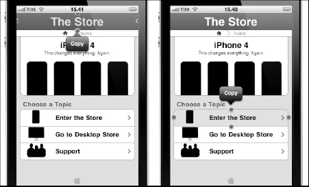
Figure 8–7. Native design element emulation: Unwanted copy andpaste feature in action.
Another feature that is useful to disable when we work on a WebApp is the default Safari callout behavior. Every time the user touches and holds an element such as a link, the browser displays a callout containing information about the link, such as opening it in another window. We can disable the callout behavior using the following CSS rule:
* {

        -webkit-touch-callout: none;

}
We want to prevent this behavior because links used in a WebApp are typically dedicated to internal navigation, and we want to prevent the user from using it and going outside it. If this rule is set to none, the user can hold any link or image as long as he/she wants without getting the default Safari behavior.
Native Scrolling Emulation
One of the most important features available from iOS5 (beta2) is support for the new CSS rule for overflow-scrolling. Until now, there was a noticeable difference in momentum between scrolling a native app and scrolling a native-like WebApp. This behavior was an obstacle for those who wanted to emulate the native look-and-feel of iOS applications.
This new rule provides a native way to scroll content inside a fixed size (width and height) HTML element—for instance, the main <div>—and to reduce or eliminate the GPU overhead caused by the implementation of custom scrolling. An implementation of this rule follows:
.scrollableElement

{

  overflow-y: scroll;

  -webkit-overflow-scrolling: touch;

}
The position—fixed and overflow—scroll rulesd will change the way layouts are designed on iPhone, taking another important step forward in the native look-and-feel emulation process.
Native iOS Service Interaction
Service interaction is one of the drawbacks of developing web applications instead of native applications. Previously, we introduced the pros and cons of this choice; in this section, we will focus only on what we can do and how we can achieve it.
A WebApp is able to interact with the most important, and most used, services provided by iOS: Phone, Mail, SMS, and Maps. This type of user interaction is made using the <a> tag, as with every other ordinary link in our web page, and has the following structure:
<a href="protocolServiceScheme:protocolParameter>linkName</a>
In the next section, we will see how to implement these special types of links for adding an extra level of interaction to our WebApp.
The Phone Application
We can add a link to the Phone application using the following link syntax:
<a href="tel:1–305-555–5555">Call 1–305-555–5555</a>
Using this syntax, Safari will automatically create a phone link on your web page. If the Phone application is not installed on the device, as in the iPad and iPod, we will get a warning message when touching this type of link.
Another good practice is to check the iPhone agent in order to prevent this type of error. Checking the iPhone agent filters access to the service, allowing only iPhone users with phone capability. The following code performs this type of check using the JavaScript “onclick” event handler:
<a href="tel:1–305-555–5555"  onclick="return (navigator.userAgent.indexOf('iPhone')É

 != -1)">1–305-555–5555</a>
iOS provides only partial support to the RFC 2086 protocol. This means that if the number containsspecial characters like “*” or “#”, the device will not attempt to call the number. This happens because iOS, for security reasons, doesn't implement all the special characters in the tel scheme.
iOS number detection is on by default; sometimes you don't want some numbers to be interpreted as phone numbers. In this case, switch off the iOS number detection, adding the following metatag in the <head> section, telling the iPhone to ignore it.
<meta name ="format-detection" content ="telephone=no">
It's important to note that if a phone number is inside an <a> link, it will continue to be displayed as a phone link.
The Mail Application
You can add a link to the Mail application using the following link syntax:
<a href="mailto:[email protected]">Andrea Picchi</a>
Safari will automatically create a link to the Mail application that will be opened in a new window. You can also embed text directly in the e-mail form that will be opened by the link using the following syntax:
<a href="mailto:[email protected]?subject=Book%20Feedback&body=É

Keep%20Up%20the%20Good%20Work!">Send a Feedback to Andrea Picchi</a>
The iOS implements the mailto scheme specified in the RFC 236 and allowsyou to use some optional mailto attributes, as shown in Table 8–3.

As you can see from the last code example, the HTTP convention says to use the “?” character (?subject=...) for the first attribute and use the “&” for the other follower attributes (&body=...).
The SMS Application
We can add a link to the SMS application using the following link syntax:
<a href="sms:1–305-555–5555">1–305-555–5555</a>
The sms scheme will tell Safari to open the SMS application. Unlike the Mail application, with the sms scheme, we can't add text.
The target phone number is an optional parameter, and if we just want to open the SMS application with a blank page, we can use the following syntax:
<a href="sms:">Launch the SMS Application</a>
As for the Phone application, if the SMS application is not installed on the device, as in the case of the iPad and iPod, we will get a warning message when touching this type of link.
<a href="sms:1–305-555–5555"  onclick="return (navigator.userAgent.indexOf('iPhone')É

!= -1)">1–305-555–5555</a>
The preceding code performs the same agent check used with the tel protocol in order to prevent iPod usersfrom accessing a baseband-based service.
The Maps Application
You can add a link to the Maps application using the following link syntax:
<a href="http://maps.google.com/maps?q=cupertino">Cupertino</a>
The Maps application doesn't have its own maps scheme, and the map link is specified using a regular HTTP protocol syntax. Safari reroutes the HTTP request to the Google map server at maps.google.com and then opens its HTTP response using the Maps application.
As with the Mail application, we can combine parameters to provide more information to the Maps application using the “?” character. The following example shows my office in Tuscany, Italy:
<a  href="http://maps.google.com/maps?q=via+dell+olmo+50,É

+livorno,+italy+(Andrea+Picchi's+Office)&t=h&z=7">Andrea Picchi's Office</a>
The “+” character is used for passing the application a phrase composed of multiple words, while the rounded parentheses are used for creating a label. The “t” parameter is used for specifying a hybrid map with the “h” value, and the “z” setting the zoom level at 7.
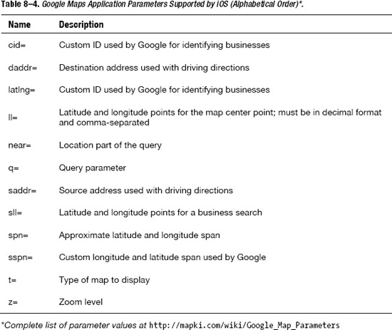
The Google Mapsapplication has a long list of parameters, but the Maps application doesn't support them all. The Google Maps parameters supported by iOS are shown in Table 8–4.
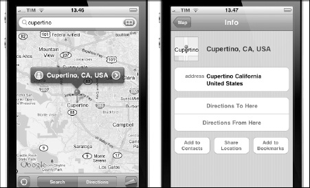
Figure 8–8. The Maps application: Cupertino, CA, USA.
Touch Events and Gesture Interactions
Previously, we saw that a mouse pointer is not a finger and how different it is to design for fingers instead of a mouse pointer. Here, we need to do another paradigm switch, exactly as we did for the pointing concept.
Users employ gestures for browsing web pages and emulate behaviors that they formerly used with a mouse. For this reason, finger actions and gestures have to emulate mouse events. Before the touch era, every event on a web page was triggered only by a mouse movement; button rollover, drop-down menus, and simple links are just a few examples of this type of interaction.
However, the flow of events generated by finger actions is not the same as that generated by a mouse pointer, and a finger event flow is generated by one or more finger touches, depending on whether the selected element is touchable, non-touchable, or scrollable.
NOTE: Whenever we use the word “touchable,” we refer to a “clickable” design element like a link, a drop-down menu, or whatever element triggers a standard mouse event inside the web page structure.
If a finger touches a non-touchable design element, events are generated or added to the gesture event flow. For this reason, when designing for iOS, we need to switch from a “mouse-oriented design paradigm” to a more appropriate “touchable-oriented design paradigm.”
Touch Event Paradigm: Touch Is Not a Click
A touchable element is defined by a design element associated with an event handler. Using the mouse-based web paradigm, we could define it as a clickable element.
Single-finger user actions, two-finger user actions, and more complex gestures are built on top of the WebKit engine used by Safari Mobile. The WebKit engine plays a major role in this game, providing touch support similar to the gesture support built into the native iOS SDK. These types of events are triggered by the user every time his finger or fingers touch the capacitive display of an iOS-based device.
The single- and multi-touch events emulate classic mouse navigation, triggering mouse-related events, while gesture events are captured in addition to the mouse-emulating events, providing an extra level of interaction and possibilities. The WebKit engine and the capacitive display support three types of events:
- Single-touch events: Composed of one single touch at a time on the capacitive display, this type of event is comparable to 99% of mouse-based actions. We will see these events in Table 8–5.
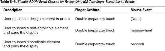
- Multi-touch events: Composed of two or more simultaneous touches on different parts of the display. We will see these events in Table 8–6.
- Gesture events: Composed of one or more touch events plus a specific movement of the finger or fingers on the capacitive display; gesture events are implementable using seven DOM (Document Object Model) event classes, which are shown in Table 8–7.
Single-touch Events
All the basic and browsing-related mouse events are typically triggered by one or two finger touches and are listed in Tables 8–5 and 8–6.
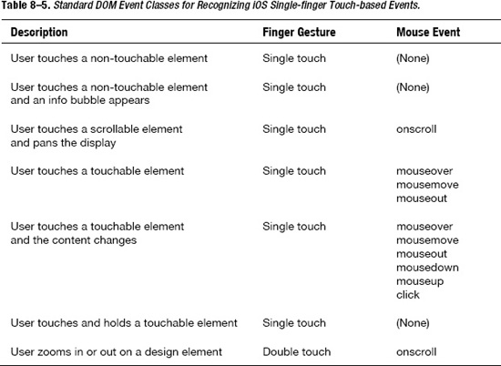
Three of the five single-finger touch actions represented in Table 8–5 are visually represented using flow charts in Figure 8–9.

Figure 8–9. Comparing overtime single-finger actions (flowcharts from official Safari reference).
Multi-touch Events
In contrast, there are two-finger touch events, not as often used in a browsing session, but equally important in order to provide a solid level of user experience. Table 8–6 shows the two-finger touch events.
Two of the three two-finger touch actions represented in Table 8–6 are visually represented using flow charts in Figure 8–10.
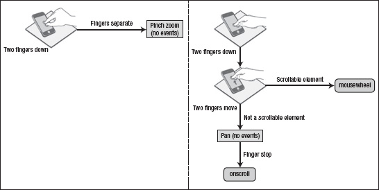
Figure 8–10. Comparing overtime two-finger actions (flowcharts from official Safari reference).
Gesture Events
A gesture could be composed of single- or multi-finger movements on the display. The single- and multi-touch actions seen so far are more related to mouse events and emulate the standard mouse-oriented browsing session. Besides the great increase in user experience, this is just one side of the touch era—the retrocompatible one. What really makes the difference is the gesture support provided by Safari and Apple iOS and offered by the iPhone 3.5-inch and the iPad 9.7-inch capacitive display.
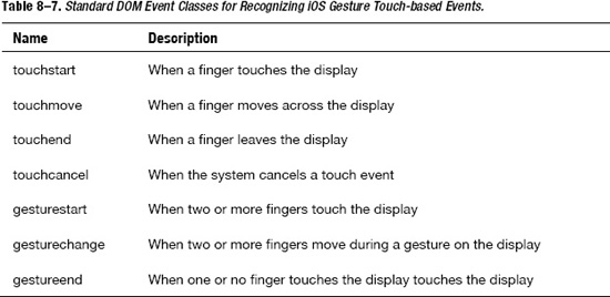
A gesture is composed of one or more finger movements, and a gesture event is a collection of touches triggered by these single or multiple finger movements. Table 8–7 shows the touch and gesture events involved in this context.
In order to use touch or gesture events, we need to convert them into individual touches. This can be achieved using the object properties of every event. Every event is an object and every object has properties. Using the properties of the object shown in Table 8–8, we can reach every single touch inside a gesture event.

Because event objects produce standard arrays, we can use JavaScript array functions and syntax to access these properties. This means that if we want the array with all the touch objects on the web page, we can use the following JavaScript syntax:
event.touches;
If we want to access the first touch object on the web page, we can use the following JavaScript syntax:
event.touches[0];
We know that we need to access single-touch objects for manipulating gesture events, but what next? Just as every event object has its properties, every touch object has its own properties.

In this case, if we want to know the exact coordinates of the first touch object on the web page, we can use the following JavaScript syntax:
event.touches[0].pageX;

event.touches[0].pageY;
Once we access a single-touch object, we can use its properties, shown in Table 8–9, for creating every type of gesture interaction.
Combining JavaScript code and CSS properties, we can create custom touch handling support. Every time we write custom touch handling support, a good practice is to disable the default Safari behavior. This will be the subject of the next section.
Native and Customized Touch Event Handler
In the previous section, we saw that the most used event inside a typical browsing session is the event related to mouse behavior emulation. Some of these well-known activities are one-finger panning, zoom pinching and unpinching, and touch-and-hold. We also said that most of the DOM events supported by Safari Mobile and related to this type of activity are natively handled by the Apple iOS and are provided for free.
Besides these natively supported events, sometimes a project requires a way to customize multi-touch and gesture events. In this case, we can turn off the default Safari behavior, giving the developer the opportunity to implement his fancy touch and gesture support. For example, to prevent scrolling on an element in iOS 2.0, implement the touchmove and touchstart event handlers as follows:
function touchMove(event)

        {

        // prevent scrolling on this element

                event.preventDefault();

        … … …

        }
Similarly, we can prevent pinch open and pinch close gestures, implementing gesturestart and gesturechange event handlers as follows:
function gestureChange(event)

        {

        // disable browser zoom in and out

                event.preventDefault();

        … … …

        }
If we implement the function for the touchmove and touchstart event handlers, we will prevent scrolling in our WebApp, while if we implement it for gesturestart and gesturechange, we will prevent both open and close pinching.
Create Touchable Design Elements
A touch event flow is a collection of single touches, and we know that a design element must be touchable to join this flow during a gesture action. What if we want to interact with a design element that Safari doesn't consider touchable?
<span onmousemove="enableTouch(event)" onclick="void(0)">Element Name</span>
Paying the price of adding a non-semantic <span> element to the code, we can transform a non-touchable element into a touchable element by adding an empty click handler to the element, as shown in the preceding code. If the element is inside a semantic HTML5 tag, we can use it instead of a semantic-empty <span> element. The following example shows how to register handlers for gesture events inside a generic <div> element:
<div

ongesturestart="gestureStart(event);"

ongesturechange="gestureChange(event);"

ongestureend="gestureEnd(event);"

>

</div>
After registering the handler in the HTML5 code, we can implement our handler using JavaScript and the following syntax:
function gestureStart(event) {

        /* Handler Javascript Code Here */

}


function gestureChange(event) {

        /* Handler Javascript Code Here */

}


function gestureEnd(event) {

        /* Handler Javascript Code Here */

}
In the next section, we will see a special type of gesture event; a gesture that doesn't interact with the capacitive display but with the whole device. This gesture is the well-known and widely used device orientation change.
Orientation Change Event
With the iPhone, and even more with the iPad, users change the orientation of their devices constantly according to their needs. Using a framework for a WebApp, we can rely on it for orientation change support. Every time the user changes device orientation, the framework handles it and changes the layout for us. In addition, for a solid developer, it is important to know what's behind the scenes and how to change or add custom behaviors for a specific project requirement.
We can see the device orientation change as a special type of gesture where the user interacts with his/her whole hand on the whole device. The orientationchange event is measured via hardware by the accelerometer. Besides notifying that an orientation change has occurred, iOS also maintains a special “orientation” property in the window object with the four values shown in Table 8–10.
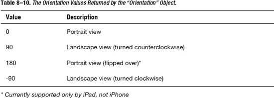
The orientation value inside the window object always reflects the current device orientation. The following code adds an orientation handler to the <body> and implements the updateOrientation JavaScript method to display the current orientation.
<!DOCTYPE HTML>

<head>

<title>Orientation Change Test</title>

<script type="text/javascript" language="javascript">

function updateOrientation()

{

        var displayString = "Orientation : ";

        switch(window.orientation)

        {

                case 0:

                        displayString += "Portrait";

                break;

                case 90:

                        displayString += "Landscape (left, screen turnedÉ

counterclockwise)";

                break;

                case 180:

                        displayString += "Portrait (upside-down portrait)";

                break;

                case -90:

                        displayString += "Landscape (right, screen turned clockwise)";

                break;

        }

        document.getElementById("output").innerHTML = displayString;

}

</script>

</head>

        <body onorientationchange="updateOrientation();">

        <div id="output"></div>

</body>

</html>
Every time the orientationchange event occurs, the updateOrientation method is invoked and the displayed string inside the <div id=”output”> element is updated.
Orientation Change Media Query
Working with the orientationchange event is a solid way to implement any kind of switch based on device orientation, but it is not the only way. The orientationchange event also offers options to a developer, but in some contexts, we can accomplish something similar without using JavaScript. In this case, we will describe how to use a media query.
A media query is a media type composed of one or more expressions that check one or more conditions of certain media features. The concept is the same as the one used with the orientationchange; what will change is the language used and its syntax.
The iWebKit framework used for the Apple Store use case employsthe same approach. The following small piece of code shows one example from this framework style.css file.
@media screen and (max-width: 320px)

{

        #topbar {

                height: 44px;

        }

        #title {

                line-height: 44px;

                height: 44px;

                font-size: 16pt;

        }

}
As previously mentioned, it is always considered best practice to develop three different versions of the WebApp in order to optimize the iPhone, the iPad, and the desktop PC hardware and software characteristics—or at least one mobile version for the iPhone and one compatible version for both the iPad and the desktop PC. In addition, the next example shows a general case where we need to handle seven CSS stylesheets for the same web page.
@media only screen and (device-width: 320px) and (orientation: portrait) {

        /* CSS Rules for iPhone 2G, 3G, 3GS in Portrait Orientation */

}


@media only screen and (device-width: 480px) and (orientation: landscape) {

        /* CSS Rules for iPhone 2G, 3G, 3GS in Landscape Orientation */

}


@media only screen and (device-width: 480px) and (orientation: portrait) {

        /* CSS Rules for iPhone4 in Portrait Orientation */

}


@media only screen and (device-width: 960px) and (orientation: landscape) {

        /* CSS Rules for iPhone4 in Landscape Orientation */

}


@media only screen and (device-width: 768px) and (orientation: portrait) {

        /* CSS Rules for iPad in portrait orientation */

}


@media only screen and (device-width: 1024px) and (orientation: landscape) {

        /* CSS Rules for iPad in Landscape Orientation */

}


@media only screen and (device-width: 980px) {

        /* CSS Rules for Fixed Width Desktop and iPad Compatible Version */

}
The Retina display and its 480 × 960 px display resolution slightly complicated the media query code for the iPhone case, forcing us to add two more cases. Before the Retina display, we always used the min-device-width and max-device-width for targeting the iPhone 320 × 480 px resolution case.
Nowadays, it is no longer possible to use this option because when there is a value of “480” for the device-width property, there is no way of knowing whether it is an old iPhone 2G, 3G, or 3GS in landscape orientation or the new iPhone4 in portrait orientation. Moreover, we added the portrait and landscape test to the media query, creating two new cases for identifying the iPhone modelwhen the “device-width” is set to 480 px.
Expand a Framework for iOS
Frameworks are the Holy Grail for a developer; they reduce development times, offering all the tools required for building a web page. A framework offers the building blocks needed to design and develop our project requirements.
Because perfection isn't possible, sometimes a framework doesn't match all of our needs. In these cases, we are unable to design and develop our specific project requirements with the building blocks offered by our framework. When we face such a situation, the only solution is to expand the framework, adding and developing what we need.
The iWebKit framework contains many files in the root directory; focus on the following:
- css: // style sheet directory
- images: // ui images
- index.html: // index web page
- javascript: // js framework directory
- thumbs: // web page images
When we develop a project, we always need to look for updates, which include both framework core functionality and project specifics. Because newer versions of the framework could be released from its developer at any time, we must maintain, as much as possible, the original framework structure.
If the framework update does not dramatically change its core functions and its folders and files structure, we will easily be able to update our WebApp. Not changing the original framework files and structure will allow us to upload the entire framework, just overriding a few files and directories.
Here is a practical example of what will happen when we start to design the Apple Store use case. The context will be the following:
- Problem: Implement the Apple Store use case.
- Solution: Emulate the native application behavior using the framework core functions. Use the framework building blocks for designing the web page structure. Expand the framework when we need to add or design something that is not provided or supported by the framework templates.
The iWebKit framework provides some templates, but our “The Store” use case is totally different from all of them. For this reason, we will need to expand our framework. What we will do is use the same folders offered by the framework (keeping the framework directory structure untouched), and, instead of modifying the original framework files, we will add what we need (remaining ready for a future framework update). Despite that fact, the downside of this approach will be that overwriting many rules instead of replacing them will add more code to the framework and more HTTP requests from our WebApp. The right approach will be dictated by the WebApp context.

Figure 8–11. Apple Store use case: The Store home page structure.
We will work on the HTML5 structure, and save the new document in the root with all the other web pages. Subsequently, we will start to design the layout, working on a CSS style sheet that we'll save in the “css” folder. In addition, we will save all the additional images for the layout design in the “pics” folder.
- #topbar (pre-defined customized)
- #title (pre-defined customized)
- #breadcrumb (designed from sketch)
- #hero (designed from sketch)
- .greytitle (pre-defined untouched)
- .pageitem (pre-defined customized)
In Figure 8–11 and in the preceding list, we can see how we used some pre-defined framework structures with just a few customizations, while we needed to add a few more structures designed from scratch.
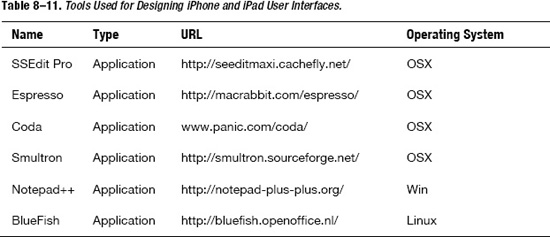
Resources for Coding
Unfortunately, there are only a few HTML5-compliant editors on the market. Table 8–11 indicates one of the HTML5 editors used in this chapter and a valid freeware alternative.
Here are the official resourcesfor the three web standards presented in this chapter. If you are new to one or more of these technologies, I recommend you continue to build your web standard foundations using the following official sources.
Summary
In this chapter, we introduced the fundamental characteristics of a WebApp. First, using some examples, we saw how to set up a development environment, and then we introduced typical web application characteristics.
We presented the most important native iOS applications for a WebApp and how to interact with its services, presenting all the steps necessary for emulating a native-like environment.
We introduced the touch event paradigm and how to use single- and multi-touch events for emulating a traditional mouse browsing session. We also saw more complex gesture events and how to prevent them in case we need to develop custom gesture handling for our WebApp.
Lastly, we saw a special type of gesture, the device orientation change, how to use it via JavaScript, and how to achieve something comparable via media query. We saw when and how to expand the framework for achieving functionality that is not defined and natively supported by the framework itself.