
Chapter 6
iPad UI Design: Think Inverted
“ . . if you would create something,
you must be something …”—Johann Wolfgang von Goethe
After working on the iPhone user interface in the previous chapter, you will now be able to start working on the iPad version of your project. When you work on a project for Apple's tablet, you need to choose if you want a compatible user interface or a native-like user interface. There is no right or wrong approach, because everything is dictated by the project requirements.
In this chapter, you will see how to apply both approaches. In the past chapter, you saw how “think simple” was the basic concept for designing an iPhone user interface. Now, you will see how the iPad design requires a switch of perspective for optimizing the device capabilities.
First, a new approach to simplicity called “think inverted,” will be introduced, and then you will learn how to design an iPad-compatible user interface from a desktop interface, showing the principles behind this important step of the project flow.
Then, like in the iPhone chapter, you will learn how to sketch the user interface, and after that, you will learn how to design it with Adobe Fireworks. The whole design process will be presented separately for both the iPad-compatible and iPad native-like versions.
User Interface Sketching
In Chapter 5, you designed the iPhone version of your Apple Store use case. In Chapter 6, you will work with the same procedure, but you will be presented with both the compatible and the iPad native-like versions. Since both versions share most of the iPad principles but not exactly the same ones, it will be identified when something is specifically needed for one of the versions.
Instead of using the iPhone for presenting the compatible version, you will use the iPad, because, for the iPhone, it is better to switch to a native-like version every time it is possible, while with an iPad this is not always true.
Think Inverted
This section's heading doesn't say everything, and it probably doesn't show any direct relationship with the iPad. The meaning behind this title could sound like: continue to think simple, but in an inverted way. This defines an inverted (simple)approach. The inverted approach arises from the intermediate position of this new device, just between a pure mobile device like the iPhone and a pure fixed desktop like an iMac or a Mac Pro. The term “inverted” stands for a different approach that requires an opposite approach to achieve the same goals achieved with the iPhone version.
In the iPad native-like version, it is necessary to re-factor your thinking because of the new concepts behind the portrait and landscape orientations. In the portrait mode, the device presents a one-column layout, and in landscape mode, it presents a two-column layout.

Figure 6–1. The achieving process of simplicity from a desktop and mobile point of view
This means that you will often need to use two opposite approaches for the same content in order to optimize both orientations. In the two-column design offered by the landscape orientation, you should use the left (small) column as support for the main content. The left column provides orientation to the user and makes it easier to browse complex sites or application contents.
In the portrait orientation, the single-column design doesn't have this navigation support, and for this reason, the user must access the left column as a pop-up menu, using the button placed in the header. This fact suggests using a second CSS file for modifying the main content structure, including some design elements that will compensate for the missing left column. Providing some navigation information inside the main content, you will be able to reduce the access to the left column through the pop-up menu, and increase the quality of the user experience.
In the iPad-compatible version, re-factoring is necessary because you will work on a desktop version, but you will need to apply some rules from the mobile (touch) environment in order to optimize the user touch experience. Desktop and mobile rules, before the iPad, lived and were applied in two separate worlds. In this new kind of design style, you will merge two types of approaches, like the desktop and the mobile one, using a common background that is based on the simplicity concept. Before the iPad came out, these two types of approaches pointed in opposite directions.
As can be learned from the chaos theory, sometimes making things simpler requires more complex procedures in the design phase. As you will see in the next section, sometimes you will need to add features to reduce complexity and make a pattern simpler.
Inverted Simplicity
How can you use simplicity to point in a direction, in order to achieve your design goals, which point in the opposite direction? Examples of this concept are prioritizing the content (mobile approach), keeping a desktop-like structure (desktop approach), or presenting the content with a desktop structure (desktop approach) and a mobile-oriented structure (mobile approach). Each case is an example of two forces that point in opposite directions.
Now you will see, one more time, how the simplicity concept will be a fundamentally common factor between apparently different things, and you will see that your design goals influence these opposite forces to point in the same direction.
NOTE: The simplicity theory is a cognitive theory that seeks to explain the attractiveness of some kind of human-environment interaction with human minds. This theory claims that interesting situations appear simpler than expected to the observer. A well-known implementation of this theory is Ockham's razor (from the name of the English logician and theologian, and Franciscan friar, William of Ockham).
From a cognitive perspective, simplicity is the property of a domain that requires very little information to be exhaustively described. The opposite of simplicity is complexity.
The Google home page is the perfect example of inverted simplicity—how to present a very complex thing in a very easy way. As Marissa Mayer, vice president of Search Products and User Experience at Google said, “Google has the functionality of a really complicated Swiss army knife, but the home page is simple, elegant, and can slip in your pocket.”
NOTE: Marissa Mayer graduated with honors in computer science at Stanford University, has notable public involvement with Google Search and Gmail, and can be considered highly responsible for the success of these UIs. Fortune magazine lists her as one of the 50 most powerful women in the world, and the youngest woman ever to make the list. She is credited with shaping the design of Google Maps, Google Earth, iGoogle, and more.
Google makes good use of this concept, and so does Apple. Its all-in-one iMac is the perfect example of how to reduce complexity by making things simpler.
Before starting to sketch out an iPad use case, in the next section, you will see how to apply simplicity to your design, and apply some of the rules behind this concept.
Remove and Prioritize
“Remove” sounds easy, but think about it—how will you know what to take away from your design? This is the main question that every designer will face when trying to achieve simplicity. This question triggers three main fears
- Fear of missing something: Designers fear that removing elements from the design will decrease the probability of the user finding what he needs. Designers struggling with this fear add endless content without applying any sort of content prioritizing.
- Fear of being misunderstood: Designers fear that removing elements from the design will decrease the probability of the user understanding the content's message. Designers struggling with this fear add technical information or many instructions where they are not strictly necessary.
- Fear of failure: Designers fear that removing elements from the design will increase the probability of failure. Designers struggling with this fear rely on the quantity of information instead of the quality.
Overcoming these fears is important for a designer. Through the simplicity concept, you can reduce the noise level in your web site or web application, and this fact will make useful content or features more prominent. This is a fundamental concept behind every great (simple) design.
The next question is how will you know when you have made something as simple as possible? Unfortunately, there isn't an answer for that; your experience will help you the most, besides a good phase of testing. In your interface design process, good guidelines should be as follows
- Understand the core of a design element: See the element globally in the web site or web application context.
- Decide if removing the element could increase the global design value: You need to be sure that removing the element will not disrupt the design.
When you remove an element, it is always because you saw it as a part of a puzzle, and you decided to remove it. If you do not see its global meaning in the design, you'll never have a chance to increase the global value of your design.
Hide and Shape
Sometimes it is not possible to remove elements or sub-elements from your design. What you can do in this case is hide these elements, in order to focus the (limited) user-cognitive resources only on the most important parts and keep these elements available for a secondary type of user.
It's important to remember your secondary users, but you don't want to confuse or distract your main target user from the main design message. A good example of this concept is the structure of the product pages of the Apple Store web site. The message is nice and clean in the main product page, but there is a toolbar on the top of each product for letting the advanced user have access to the hardware specifics.
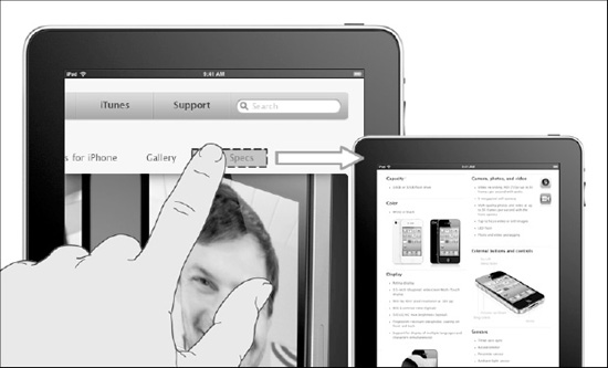
Figure 6–2. The iPhone 4 page: Hiding and shaping in content design
In Figure 6–2, you can see how the main target user isn't distracted from the message behind the design, but the advanced user is also satisfied with all of the specifics; note that this type of strategy works well because the advanced user is not frustrated when looking for content, due to the fact that they don't have to scan a web site or web application's content structure. This kind of user interaction doesn't happen with a beginner user.
This step will dramatically impact the global level of user experience, because if you forget about one kind of audience, you will lose a great number of potential users. Picture the following two situations
- The Apple Store shows, in the iPhone main page, all the hardware features without hiding any type of element or content—CPU, RAM, Wi-Fi, features, applications; everything. A beginner user will get lost in the endless list of incomprehensible words, and he will probably not establish any kind of relationship with the new phone. This will mean only one thing: in 90% of cases, he will never buy an iPhone 4.
- The iPhone main page shows only basic information about the phone, and no links to specific hardware information are provided. The advanced user will probably see the new phone as a phone for the inexperienced user, will not be satisfied by the type of relationship established with the brand through the web page, and he will never buy the new iPhone.

Figure 6–3. The Apple Support page: Hiding and shaping in content design
Figure 6–3 shows another example of shrinking a portion of content, and at the same time, hiding entries in a classic drop-down menu. The drop-down menu can replace a horizontal menu in a design. The Apple Store uses this approach in the Support page when this type of menu hides a portion of content, and at the same time an entry from an alternative horizontal menu.
These are only two kinds of examples of how using the hide and shape concept in a strategic manner can really increase the level of user experience.
Shrink and Group
Sometimes there is also a situation where an element or a portion of content can't be removed or hidden. The typical situation is when this element or portion of content is very important to the secondary type of user and must be accessed quickly. In this case, you will use the shrink and group approach. To achieve a perfect level of organization in your groups, a scheme has to be developed. Shrinking an element or a portion of content could mean visually reducing its size, and in doing so, reducing the impact of the user's attention. The element or portion of content is still available but it doesn't have a primary role in the message for the user anymore.
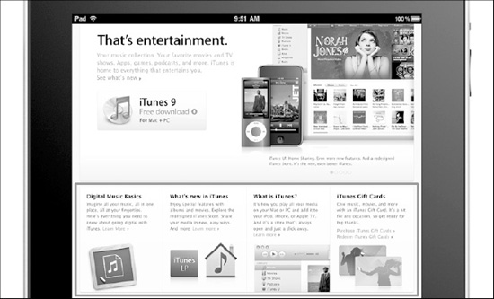
Figure 6–4. The iTunes page: Shrinking and grouping in content design
Figure 6–4 shows how the three portions of content are too important for the general understanding of the page to hide or take away from the design. The solution is to shrink it and group it below the main image, giving the user the opportunity to read it easily, if necessary. In the element highlighted in Figure 6–4, designers from Apple applied the laws of similarity, proximity, and symmetry.
As a last point, it is important to remember that for shrinking and grouping, sometimes you need to add, instead of take away an element or a portion of content in your design.
Key Points of the Simplicity-Complexity Paradox
So far, you have seen that by applying these three fundamental concepts you can reduce complexity and increase simplicity in your design. You can also see that, in a mobile context, simplicity is deeply related to a high quality of user experience.
The important fact is that simplicity is naturally related to complexity, and both are just two different expressions of the same event that happens in our minds. For this reason, it is totally futile trying to eliminate complexity using simplicity because, as the chaos theory suggests about the simplicity-complexity paradox, complex patterns contain simpler patterns within them that are reflections of more complex patterns.
A few important key points:
- Simplicity can't eliminate complexity: Using the simplicity concept, you can't eliminate complexity from your design; simplicity needs complexity in order to stand out in our minds.
- Simplicity can drive you to complexity: Removing, hiding, or shrinking the wrong element in your design increases the global-level complexity.
- Simplicity is subjective: Simplicity is a perception and has its origin in the user's mind. You can't assume that every user will perceive the same level of simplicity in your design.
Now, it's time to go to the practical part and start to analyze the compatible and native-like iPad versions of your Apple Store use case.
Sketching the UI
In this section, you will learn how to apply the three simplicity principles to your compatible and native-like versions. Starting from the iPad-compatible version, you can see the relationship between the sketch and the final design composition in Figure 6–5. When working on this version, besides the fact of being finger-friendly and optimizing the structure for an effort-free touch user experience, the design approach is not so far from the one you use for a desktop version.
Apply the Remove and Prioritize principle, by removing the Special Deals box and the Financing Option box. Despite that, the most important step is removing the layout dominance over the content.
The user needs more cognitive resources in his browsing experience if he needs to look for important information in two opposite places. As you well know, since the cognitive resources are limited, if the navigation structure takes away too many resources from the user, a small quantity will remain available to the user for understanding the content. This will decrease the level of user experience.
As a result of this step, you will prioritize the main content over the content structure and some navigation elements over others.
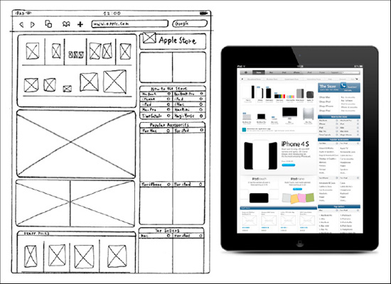
Figure 6–5. The iTunes page: Shrinking and grouping in content design
You should apply the Hide and Shape principle, hiding the Software box and the Gift Cards box from the Popular Accessories box. These boxes will be hidden but still accessible with one touch from the new Popular Accessories box, using one of the “more..” links. You should also hid some of the iPhone and iPad top sellers items; the box will show random items from the top ten, and the complete top ten is available using the “more..” link at the bottom of the list.
You should apply the Hide and Group principle, merging and hiding the two side bars into one bigger side bar. Merging the two columns will group the navigation elements, and as result, you will group the user focus into (only) one zone of your layout. More than any other design improvements, it is the level of use experience that really changes.
Analyzing the native-like iPad version of your use case in Figure 6–6, you can see how the design approach is much more mobile-oriented compared to the previous compatible version.
This time, because of the limited screen real estate available, compared to a desktop monitor, you will apply the Remove and Prioritize principle in a more aggressive way. You will need to integrate the Hero Image from the store index page in the home page, and insert only the Main Content box as a support for the main Hero Image message.
In the side bar, you need to prioritize the four shop options for contextualizing your shopping according with one device and the possibility of a non-standard user changing the profile of the shop. Because you have aggressively prioritized the navigation and main content, you have opened the possibility of switching to the compatible version of the store, and, as a last option, you should insert a shortcut to customer support.
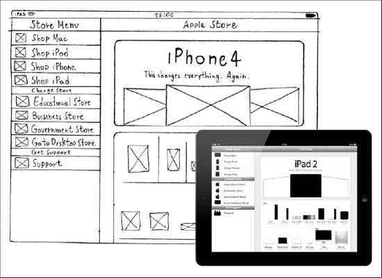
Figure 6–6. The iTunes page: Shrinking and grouping in content design
The first principle, Remove and Prioritize, is the dominant in this mobile approach, and the Hide and Shape principles and the Shrink and Group principles have less application. Once you understand this fact, you will be able to hide almost all of the content behind the following four options, Shop Mac, iPod, iPhone, and iPad, and you won't need to shrink any part of the design because you applied the remove principle to some sensible design elements.
Design Using Tools
The sketches are ready, and this means that you are ready to use the Balsamiq Mockups tool, the same one you used for your iPhone mockup. The Balsamiq Mockups tool offers some great design elements for your compatible version that, even while touch-oriented, still has a desktop-like structure. The native-like version will be designed using Adobe Fireworks because, so far, you don't have any optimized tools for representing an iPad sketch.
Select the Big Menu, and use the Browser Window element to represent your iPad Safari application, as in Figure 6–7. It doesn't look exactly like the iPad Safari window, but it will work for your purposes:
- Browser Windows
Width: 1024px
Height: 2000px
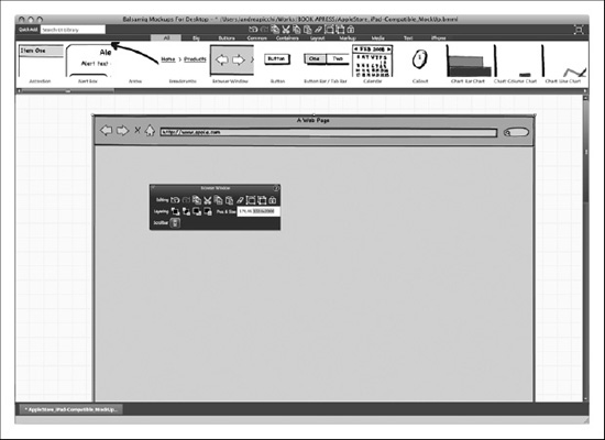
Figure 6–7. Balsamiq Mockups: The browser window.
Once your browser window is open, select the Common Menu, and drag a Menu Bar element for the primary navigation bar, and another Menu Bar element for the secondary navigation bar, as follows:
- Primary Navigation Bar
Width: 980px
Height: 36px
- Secondary Navigation Bar
Width: 980px
Height: 30px
Figure 6–8 illustrates how you can complete the primary navigation bar by using the Button element for representing the search engine bar.
Now that the navigation area is done, you can drag the Rectangle/Canvaz/Panel element from the Common Menu, and design it as follows:
- Content Main Area
Width: 626px
Height: 385px
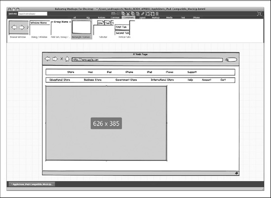
Figure 6–8. Balsamiq Mockups: The primary and second navigation bar and the content main area
Below the content main area, there is the spotlight area, which can be drawn by dragging an Image element from the Common Menu with the following dimensions:
- Spotlight Area
Width: 628px
Height: 250px
Next is the Staff Picks box. It is drawn by using a Dialog/Window element from the Common Menu, as seen as follows:
- Staff Picks Box
Width: 628px
Height: 425px

Figure 6–9. Balsamiq Mockups: The spotlight area and the Staff Picks box
Below the Staff Picksbox, draw the Accessories box using the Rectangle/Canvas/Panel element, and after that, draw the Informational box using the Dialog/Window element. Both of these elements should be selected from the Common Menu. The two elements have the following dimensions:
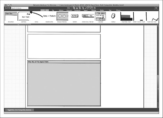
Figure 6–10. Balsamiq Mockups: The Accessories box and the Informational box
You are now finished with the content-related part of your design. Now, you need to insert the navigation-related area, and draw the side bar. Using the Rectangle/Canvas/Panel, draw the side bar main header, and add another Rectangle/Canvas/Panel element for the side bar main menu. The two elements have the following dimensions:
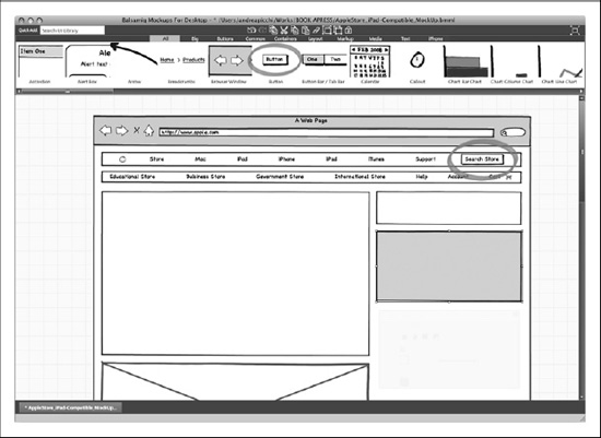
Figure 6–11. Balsamiq Mockups: The side bar main header, the side bar main menu, and the search engine bar
Next, the New to the Store box is drawn by using a Dialog/Window element. Below the New to the Store box, in order to design the Popular Accessories box, the two Balsamiq elements are combined. Drag a Rectangle/Canvas/Panel element for the Popular Accessories box header and a Dialog/Window element for the rest of the box, including the side bar subtitle row, plus the side bar content list.
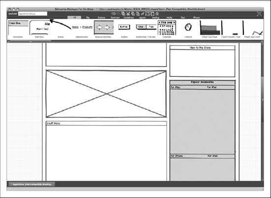
Figure 6–12. Balsamiq Mockups: The side bar main header and side bar main menu
In the end, the site information area will have many links. In order to draw these links, select the Text Menu and drag two Label/String of Text elements. Use a Horizontal Rule/Separator element to select the Layout Menu.
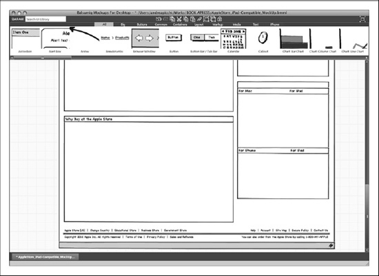
Figure 6–13. Balsamiq Mockups: The site information area
The mock up is now ready and can be exported by using Mockup Export Snapshot, and then transferred to a PNG File. For the native-like iPad version, you will need to change your approach, because, so far, there isn't an optimized mockup tool on the market. If you need to mockup a design composition, you can use OmniGraffle. But you need to design a sketch, and it's much better to jump directly inside Adobe Fireworks and merge the sketch and design phase in one single step. This is what you will do for the native-like iPad version in the next section.
Design with Adobe Fireworks
So far, you have sketched both the compatible and native-like iPad versions, but you have mocked up only the compatible one using the Balsamiq Mockups tool. In the next section, you will learn the standard design composition approach for the compatible version, and then, learn how to merge the sketch and design phase using a gray box design for the native-like version.
iPad-Compatible Version
In this section, you will start to work on the compatible version, and then you will present the native-like one, with both versions following the same process used for the iPhone process.
Create a Canvas
Once you've opened Adobe Fireworks, you'll need to create a new document, using File  New (
New ( N).
N).
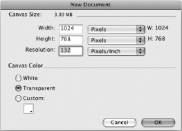
Figure 6–14. Adobe Fireworks: Create a new document
Your document should have the following canvas sizes:
- Width: 768 (px)
- Height: 1024 (px)
- Resolution: 132 (ppi)
This canvas, in accordance with the iPad 9.7-inch IPS display, uses a 132-ppi resolution. Remember that the iPhone, with its traditional LCD 3.5 display, uses 163 ppi on the standard display, and a 326–ppi resolution on the Retina display.
NOTE: The IPS (in-plane switching) is an LCD technology that aligns the liquid crystal cells in a horizontal direction. In this method, the electrical field is applied through each end of the crystal, but this requires two transistors for each pixel instead of the single transistor needed for a standard thin-film transistor (TFT) display.
While most older LCD technologies on smartphones have a 35-degree viewing angle, the new IPS display offers the Apple users a viewing angle of up to 180 degrees. This technology can be found in the Apple iMac, iPad, and in the latest iPhone 4 with its Retina display.
The good news about working with the iPad is that you don't have to deal with different display resolutions like with the iPhone—at least not until the next iPad version comes out.
Organize Levels
Your design will be deployed on several levels, so the first thing you'll want to do is create some folders for organizing assets and keeping the working environment clean.
As you know, the iPad and the iPhone run off of the same operating system; the iOS. This means that the user interface elements have different widths and heights but have the same semantic meanings, so the levels of organization of your workspace will look exactly the same, except for an extra folder called Safari, where you will insert the Safari user interface asset.
Based on the semantic approach, you will create the following folders:
- iOS
- Safari
- Branding Area
- Content Area
- Info Area
- Background
- Templates
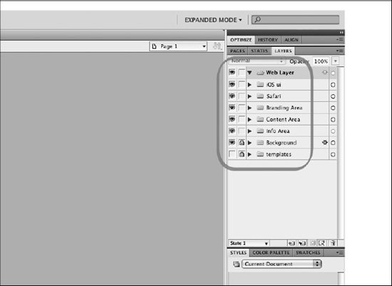
Figure 6–15. Adobe Fireworks: A semantic structure for the assets' folders
The last folder is the Template folder, which is used to collect a copy of certain important assets that you can use for the critical part of your design composition.
Layout Design
Now, you will add the Rulers folder for your design composition boundaries. You will draw four lines, but this time, working inside the Safari environment, you will not have a bottom bar, instead, you will have the Safari URL bar.
On the sides, the boundary lines limit a 15px margin, on the top they limit a 20px for the iOS status bar, and on the bottom the limit is 58px for the Safari URL bar. Once you've added the rulers, you can add a background layer, using the Select Rectangle Tool (U).

Figure 6–16. Adobe Fireworks: The visible area and padding rulers
Now, you'll draw a white rectangle, with the dimensions of 768 × 1024px, in the Background folder. This rectangle will be the basic background color for your canvas, and as you saw with the iPhone version, it will also activate the Align function for the canvas objects.
Now that you've prepared your canvas, everything is ready to start adding the design elements.
Interface Design
Starting at the top, you will design the primary navigation bar (PNB) and the secondary navigation bar (SNB). You will leave 22px of margin on each canvas side, and 20px on the top and bottom. The following elements will be added by using Select Rounded Rectangle:
- Primary Navigation Bar
Width: 980px
Height: 36px
Gradient: Linear
- Secondary Navigation Bar
Width: 980px
Height: 30px
Gradient: Linear
Color: #ECECEC, #F7F7F7
Border: 1px solid #CBCBCB
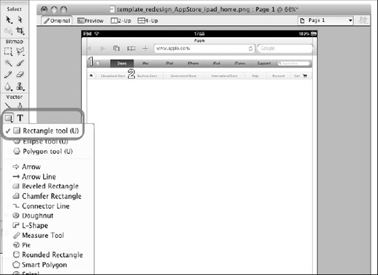
Figure 6–17. Adobe Fireworks: The primary(1) and secondary navigationbars (2)
Every single primary navigation bar button has a fixed dimension. It is as follows:
- Primary Navigation Bar Button
Width: 100px
Height: 36px
Right Border: 3px (1px + 1px + 1px)
Height: 36px
The right border of the primary navigation bar button is composed of 3px, and each single pixel is defined as follows:
- PNB Right Border Left Vertical Line
Gradient: Linear
Color: #8C8C8C, #CECECE
- PNB Right Border Center Vertical Line
Gradient: Linear
Color: #727272, #B6B6B6
- PNB Right Border Right Vertical Line
Gradient: Linear
Color: #8C8C8C, #CECECE
Next, add your text by using the Select Text tool (T). The text will be defined as follows:
- Navigation Bar Text
Font: Myriad Pro, Regular, 16pt
Color: #262626
Drop Shadow: 1px solid, #FFFFFF, 270deg
- Breadcrumb Bar Text
Font: Lucida Grande, Regular, 12pt
Color: #666666
Moving down in your design, the next area to work on is the content main area. Select the Background Level, and use the rounded rectangle tool (Select Rounded Rectangle) to draw a rectangle in the content background. This is defined as follows:
- Content Main Area
Width: 628px
Height: 385px
Color: #FFFFFF
Border: 1px solid #CBCBCB

Figure 6–18. Adobe Fireworks: The content main area (3)
Below the content main area, draw another rounded rectangle (Select Rounded Rectangle) for the spotlight area. This should be drawn as follows:
- Spotlight Area
Width: 628px
Height: 250px
Color: #FFFFFF
Border: 1px solid #CBCBCB
Below the spotlight area, draw three more rounded rectangles (Select Rounded Rectangle) for the Staff Picks, Accessories, and Information boxes. This should be drawn as follows:
- Staff Picks Box
Width: 628px
Height: 425px
Color: #FFFFFF
- Accessories Box
Width: 628px
Height: 215px
Color: #FFFFFF
Border: 1px solid #CBCBCB
- Information Box
Width: 628px
Height: 395px
Color: #FFFFFF
Border: 1px solid #CBCBCB
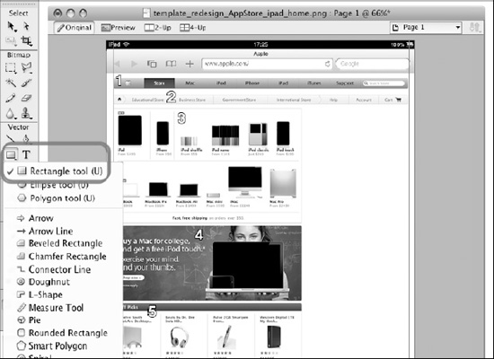
Figure 6–19. Adobe Fireworks: The spotlight (4) and Staff Picks area (5)
The height of each box is not very important here because it changes according to the type of content. What is important, in order to keep the same look-and-feel of the desktop version, is to be consistent with the (general) content box header. This is done by using the following values:
- (General) Content Box Header
Width: 628px
Height: 24px
Gradient: Linear
Color: #224272, #5C6F8D
- Informational Content Box Header
Width: 628px
Height: 24px
Gradient: Linear
Color: #999999, #C2C2C2
The text used in the (general) content box header is as follows:
- (General) Content Box Header Text
Font: Lucida Grande, Regular, 12pt
Color: #FFFFFF
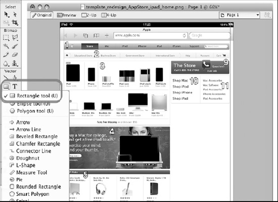
Figure 6–20. Adobe Fireworks: The side bar main header (9) and the side bar main menu (10-11)
The next step is to insert the side bar main header by using the Select Rounded Rectangle tool. You'll need to create a rounded rectangle with the following qualifications:
- Side Bar Main Header
Width: 340px
Height: 80px
- Gradient: Linear
Color: #294876, #5B7396, #A9B5C8
Border: 1px solid #5E7598
NOTE: For designing a linear gradient with three colors, you will need to add one color to the two offered by the default for Adobe Fireworks. For adding a color, just double-click on the color stripe.
The text used in the side bar main header is as follows:
- (General) Content Box Header Text
Font: Myriad Pro, Regular, 30pt
Color: #FFFFFF
Drop Shadow: 1px solid, #3B4C66, 90deg
The side bar main menu is located below the side bar main header. Draw the rounded rectangle, using the rectangle tool (Select Rounded Rectangle) as follows:
- Side Bar Main Menu
Width: 340px
Height: 165px
Color: #FFFFFF
Border: 1px solid #CBCBCB
The text used in the side bar main menu is as follows:
- Side Bar Main Menu Text Right Column
Font: Myriad Pro, Regular, 20pt
Color: #333333
- Side Bar Main Menu Text Right Column
Font: Myriad Pro, Regular, 16pt
Color: #333333

Figure 6–21. Adobe Fireworks: The side bar content list (14)
The bottom part of the sidebar is composed of three more boxes: the New to the Store, the Popular Accessories, and the Top Sellers boxes. Every box is composed of three parts (except for the New to the Store box, which is composed of two parts), identified as follows:
- Side Bar Box Header
Gradient: Linear
Color: #224272, #5C6F8D
Font: Myriad Pro, Regular, 18pt, #FFFFFF
- Side Bar Sub Title Row
Color: #EFEFEF
Border: 1px solid #CBCBCB
Font: Myriad Pro, Regular, 16pt
Icon: Circle, 16px
- Side Bar Content List
Color: #FFFFFF
Border: 1px solid #CBCBCB
Font: Myriad Light, Regular, 16pt
The last element of your design is the information area. This area is not wrapped inside a box and shows some general information concerning the following text:
- Site Information Area Text
Font: Myriad Pro, Regular, 12pt
Color: #999999
- Site Information Area Link
Font: Myriad Pro, Regular, 12pt
Color: #0085CF
Figure 6–22. Adobe Fireworks: The Information box (7) and the site information area (8)
The design composition is complete when your compatible version is complete. Once everything is complete, you are ready to start to work on your native-like version.
iPad Native-Like Version
The canvas values and the workspace organization are the same as the ones you saw for the compatible version. Nothing will change in your design composition setup. What will change is the canvas dimension, because you will have to switch from a portrait orientation to a landscape orientation.
Create a Canvas
Once you've opened Adobe Fireworks, you'll need to create a new document, using File New (N).
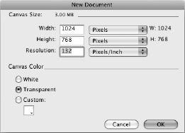
Figure 6–23. Adobe Fireworks: Create a new document
Your document should have the following canvas sizes:
- Width: 1024px
- Height: 960px
- Resolution: 132ppi
Gray Box Design
The gray box design will represent your paper sketch-up, and will be the foundation for your design composition. This is another approach to the design phase. The final goal is a design composition for both approaches; every approach is subjective, and it's up to you (or your team) to choose the one to use.
Figure 6–24 shows you that you are reserving 78px in your composition of the browser window, and also shows you how to use the rectangle tool (Select Rectangle Tool (U)) to design the side bar header and content header. The side bar header and the content header should meet the following qualifications:
- Side Bar Header
Width: 300px
Height: 44px
Text: Helvetica, Bold, 20pt
Text Shadow: 1px solid, #333333, 270deg
- Content Main Header
Width: 724px (723px Content + 1px Left Border)
Height: 44px
Color: #999999
Text: Helvetica, Bold, 20pt
Text Shadow: 1px solid, #333333, 270deg

Figure 6–24. Adobe Fireworks: The side bar and content main header
Two areas of your design have now been allocated, so you can start to use the side bar to add elements. Using the rectangle tool (Select Rectangle Tool (U)), add nine entries from Menu elements and two menu titles that adhere to the following requirements:
- Menu Entry
Width: 300px
Height: 44px
Color: #999999
Bottom Border: 1px solid, #ADADAD (Last Element #666666)
- Menu Title
Width: 300px
Height: 26px
Color: #999999
Top Border: 1px solid, #CCCCCC
Bottom Border: 1px solid, #666666
Text: Helvetica, Bold, 18pt
Text Shadow: 1px solid, #333333, 270deg
Figure 6–25. Adobe Fireworks: The side bar menu elements and titles
The side bar is now finished, and you can now jump to the content main area in the other column. Using the rounded rectangle tool (Select Rounded Rectangle), design the Hero box, the Products box, and the Site Information box, so that they look like the following:
- Hero Box
Width: 644px
Height: 237px
Border: 1px solid, #666666
- Products Box
Width: 644px
Height: 402px
Border: 1px solid, #666666
- Site Information Box
Width: 644px
Height: 62px
Border: 1px solid, #666666
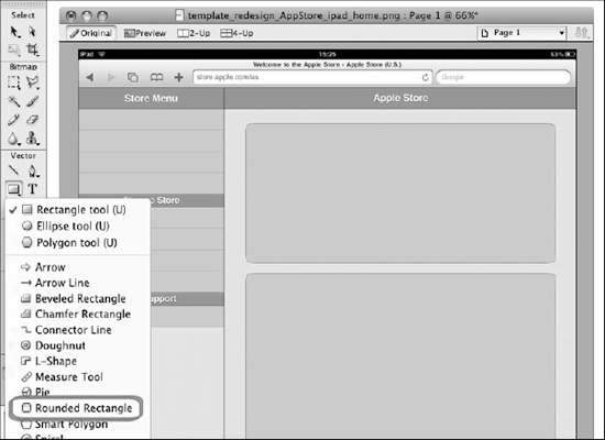
Figure 6–26. Adobe Fireworks: The Hero box and the Products box
Figure 6–27 illustrates the final gray box that you will use as a foundation for your design composition. Since the structure was already made in the design phase, you will just need to change the element colors, and add texts, icons, and images.

Figure 6–27. Adobe Fireworks: The gray box design dimensions
The next step is starting the design composition by organizing the workspace and creating the folders for your assets.
Organize Levels
The workspace will use the same folders, levels, and hierarchy. Based on a semantic approach, you will create the following folders:
- iOS
- Safari
- Branding Area
- Content Area
- Info Area
- Background
- Templates
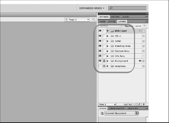
Figure 6–28. Adobe Fireworks: A semantic structure for the assets' folders
Layout Design
Now that the gray box is ready, you can add another folder, called Rulers, to your design composition boundaries. Select this folder (layer), and draw four red lines using the line tool (Select Line Tool (N)). The three lines will set the browser window boundary and the 20px padding boundary for the content main area.
Figure 6–29. Adobe Fireworks: The gray box design with the rulers
Due to the gray box design, your work will now be easier. You will no longer need to design any other elements but just change its color. Starting from the side bar, you will change the element colors to the following:
- Side Bar Area
- Background: #FFFFFF
- Side Bar Header (Store Menu)
- Gradient: Linear
- Color: #294876, #F4F5F7
- Menu Title (Change Store, Get Support)
- Border Top: 1px solid, #CCCCCC
- Border Bottom: 1px solid, #666666
- Menu Entry (Generic Menu Element)
- Color: #FFFFFF
- Border Top: 1px solid, #F0F0F0
- Border Bottom: 1px solid, #D1D1D1 (last entry #666666)
Figure 6–30. Adobe Fireworks: The colored design without the contents
Continuing with the content side, you will change the element colors to the following:
- Content Area
Background: #E1E6EB
- Content Box (Hero Box, Products Box, Site Information Box)
Color: #F7F7F7
Border: 1px solid, #828282
Everything is now ready for the content. In the side bar, start to add the text entry and an icon to its left side, as follows:
- Menu Entry Icon & Text
Width: “variable following the icon design”
Height: 34px
Text: Helvetica, Bold, 16pt
The side bar is complete, so now you can jump to the content main area, and add the following text in the three boxes
- Hero Box
Title Text: Helvetica, Bold, 50pt, #000000
SubTitle Text: Helvetica, Bold, 20pt, #000000
- Products Box
Description Text: Lucida Grande, Bold, 11pt, #000000
Price Text: Lucida Grande, Bold, 11pt, #666666
- Site Information Box
Text: Lucida Grande, Bold, 10pt, #999999
Link: Lucida Grande, Bold, 10pt, #0085CF
- Footer Apple Logo
Width: “variable following the icon design”
Height: 20px
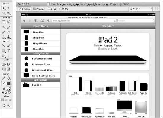
Figure 6–31. Adobe Fireworks: The final native-like design composition
Apart from the dimensions of the menu icons that are a part of the layout structure, the image dimensions are related to the content's meaning and can be changed without affecting the global structure. This is the main reason why these design element dimensions weren't reported.
The design compositions are complete. You have everything necessary to advance to the next big step of your project flow; the implementation phase. In Chapter 7, you will start introducing the three languages that are used in this book: HTML, CSS3, and JavaScript.
Tools for User Interface Design
The tools used (and not used but suggested) in this chapter are both physical tools and applications. Table 6–1 lists some of the useful tools for designing your next user interface.

Summary
In the first part of this chapter, you analyzed the interface design process, and presented the anatomy of sketching and the “think simple” paradigm. The iPhone's limitations, the iPhone's page model, and how cognitive resources influence your design style were all discussed. How all three of these elements are the foundation of the “think simple” design paradigm was also discussed.
In the second part of this chapter, the Balsamiq Mockups tool was used to improve the basic sketch made with pen and paper. The content, an interface connection, and the first visual representation of the concept design were all created.
In the third part of this chapter, Adobe Fireworks was used to design a user interface. This process was approached step-by-step, from the creation of a new canvas to the interface design. At the end of the process, design reuse for creating two more views or pages from the presented home page was introduced, and a visual representation of the interface-content relationship as a deliverable for the implementation phase was also introduced.